Berlin, Germany
27 December 2005
A video of the talk is available via BitTorrent

Hacking the future
But W3C is also evolutionary, in that it wants to progress with small steps, which allow for mistakes to be caught early and which allow existing systems to be integrated. It would be a waste if adopting the Web meant losing everything that is not in HTML and on an HTTP server. One of the “glue” systems of the Web is the URL (or URI, as it is now known): Web resources can link to almost anything on the Web, it doesn't have to be on an HTTP server.
 (Mobile Web
Initiative)
(Mobile Web
Initiative)
An example of W3C's wish to integrate rather than replace is the recently started Mobile Web Initiative (MWI), a project inside W3C in close cooperation with OMA. The goal is to develop guidelines and tests for how to write Web content that is accessible from desktop computers as well as from mobile phones. W3C already had a Device Independence (DI) Working Group, which is developing technology (in particular mark-up and APIs) to facilitate semi-automatic adaptation of content for various devices and situations.
The CSS Working Group is also working on adaptation, in so far as the adaptation is in the domain of style. The technologies by the CSS and DI Working Groups are complementary. W3C believes mobile technologies will be the next big step on the path to the “Semantic Web,” so let's take a closer look at those technologies as they are currently being developed.
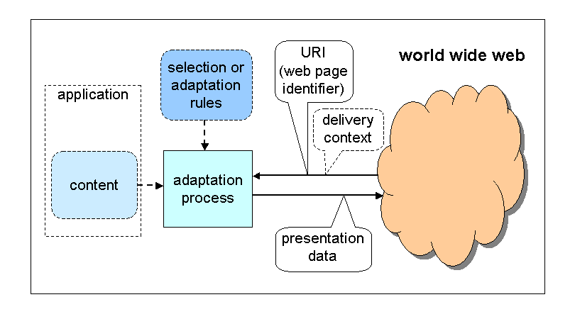
Adaptation: author's view
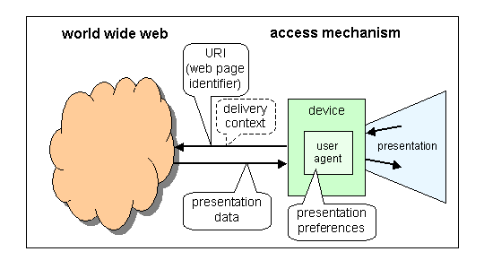
Adaptation: reader's view
Adaptation is necessary to make optimal use of the features of each device and the preferences of each user. The assumption is that most information has an abstract essence (its semantics) that can be represented in various ways. You display it differently on a big screen than on a small one, you may want to replace a layout in four columns by a sequence of small pages, and if there is sound available or even a speech generator, some or all of the information may pass better in audio. Ideally, the user agent (typically a browser) adapts the content to the device and the user's preferences based on the structure and metadata of that content, but fully automatic adaptation doesn't yet work very well and the author or somebody else often has to add extra information to guide the adaptation process.
<RDF xmlns="http://www.w3.org/1999/02/22-rdf-syntax-ns#"
  xmlns:p="http://www.wapforum.org/profiles/UAPROF/ccppschema-20010330#">
 <Description ID="Profile">
  <p:component>
   <Description ID="HardwarePlatform">
    <type resource="http://www.wapforum.org...0#HardwarePlatform"/>
    <p:BitsPerPixel>12</p:BitsPerPixel>
    <p:ColorCapable>Yes</p:ColorCapable>
    <p:ScreenSize>208x320</p:ScreenSize>
    <p:ImageCapable>Yes</p:ImageCapable>
    <p:InputCharSet>
     <Bag>
      <li>ISO-8859-1</li>
      <li>ISO-8859-2</li>
...
</RDF>
Fragment of a device profile
CC/PP is one of the technologies developed by the DI WG. It is a format for exchanging device characteristics and user preferences between a client and a server. The format is based on RDF (and thus on XML). It is extensible and can be used for almost any kind of characteristics, but it is currently used mostly for UAPROF, a set of characteristics of mobile phones defined by OMA. Most mobile phones implement UAPROF.
The goal of CC/PP is to provide the server with enough information about the device and the user to be able to adapt the content it sends. This is especially useful if the author has prepared optimized alternative content for some devices or when the device has limited capabilities of adapting content by itself. See the figure for an example profile.
Profiles can be sent from the client to the server, but typically they are stored somewhere and referred to by URL. It would be too inefficient to send the profile with every request. If the profile is unmodified from the factory default, the URL can point to the version stored on the manufacturer's site.
The server typically doesn't even have to fetch the profile when it recognizes a well-known URL.
<p>The flooding was quite extensive.</p> <p sel:expr="di-cssmq-width('px') > 200"> <object data="image1"/></p> <p>Many people were evacuated from their homes.</p>
The DI WG is finalizing DISelect, an XML-based format for storing alternative versions of documents in one file. The idea is that alternatives typically only differ in small areas so you can write most of the document once and then have multiple branches where needed, very much like “#ifdef” in C. The branches depend on conditions, which are typically device characteristics such as those found in CC/PP or in Media Queries (see below). Here is a fragment (taken from the draft specification):
This fragment expresses that the <object> element (presumably some photo) should only be kept in the document if the document is going to be displayed in a window of more than 200 pixels wide. This example uses a language that is a mixture of XHTML1 and DISelect and the result of processing it with a DISelect implementation is thus an XHTML1 document.
The expression in this case uses a device characteristic ('width') defined by Media Queries (see below), but the syntax is mangled a bit because expressions in this syntax have to be compatible with XPath and are, moreover, embedded in an XML file.
The DISelect format expresses what the alternatives are for each type of client, but doesn't limit where the adaptation is performed. That depends on the protocols and the situation. It may be done by the server, by a proxy that a phone provider offers to its customers, or by the client itself.
DISelect is only for static adaptation. The DISelect document is processed once and yields a new document (an XHTML document in the example above). The adaptation isn't re-run when the device characteristics change.
(Delivery Context Interfaces)

DCI (Delivery Context Interfaces) is the
latest and least stable technology from the DI WG. It is an API
that should eventually be provided by programming libraries on
clients and that gives programs access to device
characteristices, the same characteristics that DISelect uses.
It contains function calls such as hasProperty()
and insertProperty(). Via these calls, a program
can, e.g., find out what the screen size is or the battery
charge and display a warning when the battery is low.
Where DISelect is static, DCI is meant to be dynamic. Programs can not only query and change device characteristics, they can also listen to events that announce that characteristics have changed.
<link rel=stylesheet media="print" href="print.css">
<link rel=stylesheet media="not print" href="common.css">
<link rel=stylesheet media="screen and (min-width: 200px)" href="wide.css">
<link rel=stylesheet media="screen and (max-width: 199px)" href="small.css">
media=)
Media Queries is a technology developed by the CSS WG. It consists of a small expression syntax and eleven keywords for device characteristics. It can be used in CSS, HTML and XML whenever there are different style sheets available and the choice of style sheet depends on the type of device. Media Queries are a generalization of the MEDIA attribute and @media rule that have been in HTML, XML and CSS for many years, the figure shows an example.
Compare this with the DISelect example above, which used the same 'width' feature to exclude an <object> element from an XHTML file. In this case, the conditions are used to determine which style sheets should be used.
In principle, the Media Queries are dynamic, in the sense that a change in device characteristics, such as a change in window size, may cause a different style sheet to be applied instantly. But browsers may have some limitations in how “dynamic” they are, especially when the change requires new style sheets to be downloaded.
WICD Mobile: XHTML + SVG + CSS + JPEG + PNG
The CSS Mobile Profile 1.0 (and there is corresponding Mobile Profile for XHTML1) is not a technology for adaptation. It only defines the baseline that all implementations must conform to. The idea is that an implementation of CSS on a handheld device should either implement all of the profile or nothing at all. It may implement more, but CSS is big and it is unlikely that any implementation implements everything, at least not in the short term.
W3C defined a profile a few years back with help from some mobile phone vendors. Since then, the OMA has defined a new CSS profile, which differs in some details. At the moment, OMA and W3C are working together on the next version, which should be both a W3C and an OMA standard. This is one of the goals of the MWI project.
WICD 1.0 (Core, Mobile and Full) is a profile for compound documents. WICD Mobile 1.0 contains XHTML Basic, CSS Mobile Profile (1.0), SVG Tiny (1.2), PNG and JPEG. The idea is that implementations will claim support for WICD instead of just XHTML, so that content providers can be sure that the implementation supports not just the text, but also its graphical presentation.
WICD 1.0 is currently still a Working Draft, but is not expected to change much anymore.
body     { display: "aaa"
                    "bcd" }
#main    { position: a }
#weather { position: b }
#news    { position: c }
#adv     { position: d }
Web designers know that you can create grid-like layouts with CSS, such as the very popular three-column layout found on many home pages, but it is not as easy as it should be. The properties of CSS each influence small details of the layout and you need many of them to describe a high-level “grid.” When you see a style sheet for a particular layout, it is not easy to see what layout it describes.
Designers who have to provide several different layouts for the same content would like there to be a way to specify the high-level layout and replace that specification easily with another one, without touching other aspects of the style. This is especially true in design for mobile devices, where the different screen sizes require content to be laid out and even ordered differently for each device.
Providing such high-level layout descriptions in CSS is an old idea, first proposed in 1997, but at that time there was little interest. Recently, however, the DI WG asked the CSS WG to take up work on this again. The first result is the CSS3 Advanced Layout draft that has just been published. It is an early draft, but a small example should give the idea of what it tries to do.
Assume you have a “portal” page in HTML, with a big area (a) in the upper half and three blocks (b, c and d) side by side in the lower half. The CSS rules shown in the slide describe that layout.

Of course, layouts can be nested. Note especially that the order of the elements on the screen is determined with the 'position' property and is thus largely independent of the order in the source. When the screen is big enough, less important things can be put above or to the left of more important things, but on a small screen you want to avoid that.
Such layouts can be combined with Media Queries to provide several alternative layouts for the same document.
|
| → | Speech | → | grammars | → | interpretation | → | EMMA | → | integration | → | Interaction Manager | ↔ | application functions | 
|
| → | Handwriting | → | → | → | EMMA | → | |||||||||
| → | Keyboard | → | → | → | EMMA | → | |||||||||
| → | Mouse | → | → | → | EMMA | → | |||||||||
| → | Etc. | → | → | → | EMMA | → | |||||||||
| → | System-generated | → | EMMA | → | ↔ | session component | |||||||||
| ← | Audio | ← | styling (CSS) (XSL) | ← | adaptation (DISelect) (Media Queries) | ← | |||||||||
| ← | Voice | ← | ← | ||||||||||||
| ← | Graphics | ← | ← | ↔ | system & environment | ||||||||||
| ← | Text | ← | ← | ||||||||||||
| ← | ← | ← | |||||||||||||
| ← | Etc. | ← | ← | ||||||||||||
The idea of One Web, i.e., access to the same information, no matter where, when or with what equipment, also has implications in other areas, such as in interaction. Desktop computers typically have a mouse and a keyboard, but phones don't, or if they have something similar, it it not as easy to use. On a phone you may want to use voice and gestures, maybe also handwriting. W3C's Multimodal Interaction (MMI) WG develops technology for these alternative modes of interaction. In fact, its goal is to enable switching interaction modes in the middle of a session, even switching devices. Think of planning a route on your smartphone and then having the board computer of your car take over the interaction when you enter the car and store away the phone.
The MMI WG is developing InkML, a common format for storing the traces you make with a stylus, and EMMA, a format to annotate raw data with partial interpretations. EMMA is used whenever interpreting user input requires multiple passes, possibly done by different processes on different devices. If you speak a word into a voice recognition system, for example, the raw sound undergoes several levels of analysis to determine the set of possible words corresponding to the sound and the most likely words in the given context. EMMA is an XML format in which you can store both the raw data, the possible interpretations and the likelihood that each interpretation is correct. Hopefully, at the end of the processing pipeline there is only one interpretation left.
<ink>
 <desc>Robert's signature</desc>
 <trace>
  130 155 144 159 158 160 170 154
  179 143 179 129 166 125 152 128
  140 136 131 149 126 163 124 177
  128 190 137 200 150 208 163 210
  178 208 192 201 205 192 214 180
 </trace>
</ink>
Here is a simple example of InkML. The <desc> (description) is optional. There is also room for metadata, such as timestamps, the brand of the capture device, the maximum and minimum coordinates of the device, the accuracy, the maximum frequency of capture, the number of the pen/brush in case there are several, etc.
<e:emma version="1.0" xmlns:e="http://www.w3.org/2003/04/emma">
 <e:one-of id="r1" start="1087995961542" end="1087995963542">
  <e:interpretation id="int1" confidence="0.75"
    e:tokens="flights from boston to denver">
   <origin>Boston</origin>
   <destination>Denver</destination>
  </e:interpretation>
  <e:interpretation id="int2" confidence="0.68"
    e:tokens="flights from austin to denver">
   <origin>Austin</origin>
   <destination>Denver</destination>
  </e:interpretation>
 </e:one-of>
</e:emma>
The system has found two likely interpretations so far
The example in the figure
is from the EMMA specification. It shows one stage in a speech
recognition system that eventually should produce a simple XML
file containing the names of two cities as two XML elements
<origin> and
<destination>.
EMMA is currently a Working Draft, but expected to become Candidate Recommendation next.
(Efficient XML Interchange)
Also driven in large part by the mobile Web is another new activity in W3C, called Efficient XML Interchange (EXI). In fact, it has little to do with XML. Its goal is to develop a meta-format that will do for structured binary data what XML has done for structured text data. It will be based on the same tree model of elements and attributes as XML, the so-called XML Infoset, but it will be a binary format. The format should allow quick access to each element in the tree, without parsing intervening elements (as much as possible). It's meant for applications such as streaming video to devices with limited memory or accessing parts of compressed data without the need to uncompress all data up to the desired parts.
All techniques for adaptation of content to new devices carry a privacy concern. On the one hand, giving precise information to a server about a device and the user's preferences enables optimizations that enhance the user's experience, on the other hand, the user may not want all servers to know so much about him. An example is information about handicaps. Even if you don't tell the server exactly what your handicap is, when you ask for certain types of adaptations chances are that you are a certain type of user. And that may result in spam or worse.
At first sight, techniques such as Media Queries that let the adaptation be done on the client side should be safer, but servers can still find out things with carefully designed Web pages: if certain style sheets or certain images are only downloaded by certain types of devices, you know that whoever downloads that resource has that device – unless clients mask their actions with random other downloads.
As long as the adaptation is described declaratively, the client can see what it whould have done in other situations. When programs contain DCI calls, it is not possible for a client to know what it would have done if it had been a different kind of device.
(Rich Web Client)
W3C recently started work on defining a common platform for applications, under the name of RWC (Rich Web Client). Most of W3C's work, apart from the DOM, has so far been concentrated on documents, but there are designers who don't want to leave the UI to the browser (as proved by the interest in DHTML/AJAX). And, of course, there are kinds of information that are more easily distributed procedurally than declaratively, i.e., in the form of a program rather than a document.
With such a platform, the possibilities for hacking are endless (and thus security is of primary concern). The possibilities for my colleagues at W3C who work on the specification to hack it into their ideal programming platform are somewhat more limited, but it may nevertheless turn into something interesting…
http://www.w3.org/Talks/2005/1227-Mobile-22C3
I saw in an entry on the 22C3 blog the question if this presentation and my other one on W3C could be considered to be about hacking. The author thought so. Working for W3C certainly does feel like hacking: hacking the future.
Working for W3C requires idealism, W3C isn't a dot-com. It also requires political skills, the only way to reach a long term goal is often by means of compromises and short-term solutions. And it requires creativity in finding simple solutions for novel problems. And isn't that the essence of hacking?
In fact, W3C is a balancing act. It is an industry consortium with a humanitarian ideal, viz., to let the whole world communicate easily. It has to create short-term solutions in order to reach a long term goal. Sometimes people challenge us to choose: is W3C about evolution or revolution? In fact, the two aren't opposites, they just happen to rhyme. Let me explain why.
W3C is revolutionary in the sense that it wants to replace proprietary systems with open standards; it wants to give the reader the power to use information anywhere at any time; it wants to create an information system that is powerful and easy enough to make things possible that have never been possible before and that nobody has even thought about yet. And it wants all these things as soon as possible.