This document captures the use cases and requirements for standardizing a solution for responsive images. The use cases and requirements were gathered with consultation with HTML Working Group and WHATWG participants, RICG group members, and the general public.
This section describes the status of this document at the time of its publication. Other documents may supersede this document. A list of current W3C publications and the latest revision of this technical report can be found in the W3C technical reports index at http://www.w3.org/TR/.
This is a work in
progress! For the latest updates from the HTML WG, possibly
including important bug fixes, please look at the editor's draft instead. If you find any bugs, typos, or issues please file a bug on Github!
Publication as a Working Draft does not imply endorsement by the W3C Membership. This is a draft document and may be updated, replaced or obsoleted by other documents at any time. It is inappropriate to cite this document as other than work in progress.
In HTML, a user agent's environmental conditions are primarily expressed as CSS media features (e.g., max-width, orientation, monochrome, etc.) and CSS media types (e.g., print, screen, etc.). A responsive image is an image that a developer explicitly adapts in response to different environmental conditions: adaptations can include, but are not limited to, changing the width, height, or even the source of an image.
Many media features are dynamic in nature (e.g., a browser window is re-sized, a device is rotated from portrait to landscape, and so on), thus a user agent constantly responds to events that change the properties of media features. As a web page's layout adapts to changes in media features and media type, an image's ability to communicate effectively can be significantly reduced (e.g., images start to show compression artefacts as they are scaled to match the quality of media or some media feature). When this happens, developers rely on responsive images to present images at different resolutions, or even in different formats (e.g., swapping to SVG), to make sure their images continue communicating effectively.
Furthermore, as the number and varieties of high-density screens has increased (both on mobile and desktop devices), web developers have had to create custom techniques for serving images that best match a browser's environmental conditions. For a list of examples of the range of techniques in use in 2012, see Chris Coyier's article "Which responsive images solution should you use?". These techniques have a number of shortcomings, which are discussed below (and these shortcomings serve as the motivation to reach out to the W3C and WHATWG for standardization).
In formulating the requirements, this document tries to be neutral - it is not predicated on any solution. The document only tries to describe the use cases and what the RICG understands, from practice, would be needed to address the use cases in the form of requirements. The RICG expects that a technical specification can be created to formally address each of the requirements (i.e., the solution). To date, two such specifications are currently under development:
On the one hand, the `srcset` attribute allows authors to define various image resources and “hints” that assist a user agent to determine the most appropriate image source to display. Given a set of image resources, the user agent has the option of either following or overriding the author’s declarations to optimize the user experience based on criteria such as display density, connection type, user preferences, and so on.
On the other hand, the `picture` element defines conditions under which the browser should follow the author's intentions when selecting which resource to display. This includes image source sizes designed to align with layouts variations specified in CSS media queries ( see: design breakpoints, media features and types and relative units ) or content variations for increased clarity and focus based on the client’s display size.
There are a number of problems with the techniques currently being relied on by web developers:
Reliance on semantically neutral elements and CSS backgrounds:
Large images incur unnecessary download and processing time, slowing the experience for users. To solve this problem, web developers provide multiple sources of the same image at different resolutions and then pick the image of the correct size based on the viewport size. This is commonly done for CSS background images in responsive designs, but web developers lack the markup to do so for images in HTML without hacking together a solution. This means that developers have resorted to using div and other container elements to achieve the desired functionality.
In other words, developers are being forced to work around, or completely ignore, authoring requirements of HTML.
Reliance on scripts and server side processing:
The techniques rely on either JavaScript or a server-side solution (or both), which adds complexity and redundant HTTP requests to the development process. Furthermore, the script-based solutions will be unavailable to users who have turned off JavaScript.
The RICG believes standardization of a browser-based solution can overcome these problems.
3 Use cases
The following use cases represent situations in which Web developers see a need for a browser-based solution for working with responsive images.
3.1 Resolution switching
Web developers often need to provide different versions of the same image in order to communicate effectively across the wide range of screen resolutions and pixel densities available on today's devices. If the screen is small and the image is scaled down, its details cannot be seen. Conversely, if the screen is large a larger image that depicts more information can be shown. This can also sometimes help save bandwidth, in that only the image best fits the viewport is served to the user.
Image specifically resized to be targeted at each device. The intention is to save bandwidth and allow the images to download faster on the targeted screen.
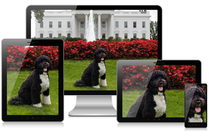
3.2 Art direction
In a responsive design, it is typical to change an image so it can
be targeted towards the features of a particular display (or set of displays). Sometimes this means cropping an image. Other times, it can mean a new form of an
image that may have different proportions or may be changed in other ways to match changes in the layout. This means, for example:
On large screens, a large image is shown (e.g., an object or person with a broad background).
On smaller screens, shrinking the image can reduce its relevance, usefulness, and legibility.
This is illustrated in the figure below.
Using different images that have been cropped to fit a particular screen's features can help in communicating a message effectively.
A related use case is when orientation determines:
the source of the image,
the crop,
and how text flows around the image based on the size of the viewport.
For example, on the Nokia Lumia site where it describes the Meego browser, the Nokia Lumia is shown horizontally on wide screens. As the screen narrows, the Nokia Lumia is then shown vertically and cropped. Bryan and Stephanie Rieger, the designers of the site, explained that on a wide screen, showing the full phone horizontally showed the browser best; but on small screens, changing the image to vertical made more sense because it allowed the reader to still make out the features of the browser in the image.
Video showing how responsive images are used on Nokia's Meego Website.
3.3 Design breakpoints
In Web development, a breakpoint is one of a series of CSS Media Queries that updates the styles of a page based on logical matching of media features. A single breakpoint represents a rule (or set of rules) that determines the point at which the contents of that media query are applied to a page’s layout. For example:
@media screen and (max-width: 16em) { ... }
@media screen and (max-width: 32em) { ... }
@media screen and (max-width: 41em) { ... }
Developers currently match specific breakpoints for images to the breakpoints that they have defined in the CSS of their responsive designs. Being able to match the breakpoints ensures that images are operating under the same rules that define the layout of a design. It also helps developers verify their approach by ensuring that the same viewport measurement tests are being used in both HTML and CSS. If the developer cannot specify breakpoints for images in the same manner that they are defined for the design, developers will need to convert the breakpoints back to the values specified in the layout in order to verify that they match. This increases authoring time and the likelihood of errors on the part of developers.
For example, if a breakpoint is specified as "max-width: 41em", then web developers would like to define a similar breakpoint for images at a max-width of 41em. Otherwise they are forced to transform measurements into another unit like pixels, which is tedious and potentially error-prone for developers.
3.4 Matching media features and media types
According to Wikipedia's article on "dots per inch":
"An inkjet printer … is typically capable of 300-600 DPI. A laser printer … [prints] in the range of 600 to 1,800 DPI."
As printers generally have the ability to pack more points per inch than a device's screen, printers have to compensate for the lack of pixel data by applying reprographic techniques, such as half toning, to simulate continuous tone in imagery. As illustrated below, applying such techniques can cause images to look blurry and low-quality when compared to text.
Example of a 48px by 48px image and text printed at 1,200 DPI. Because of the lack of image data, the printer compensates by using the halftonereprographic technique. Note that the text stays crisp and is printed at the full 1,200 DPI.
Allowing developers to reference images at different resolutions could allow user agents to choose an image that best matches the capabilities of the printer. For example, a photo sharing site could provide a bandwidth-optimized image for display on screen, but a high-resolution image for print. The same technique could also be used for e-book formats, such as EPUB.
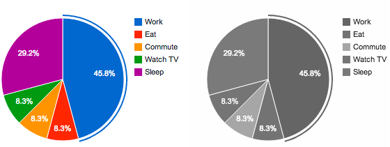
However, displaying a color image on monochrome media (e.g., paper and e-ink displays) can be problematic: different colors with similar luminosity are impossible to distinguish on monochrome media. This problem is illustrated in the figure below, where it becomes nearly impossible to associate slices of a pie chart with corresponding labels.
Two pie charts, one in color and one in black and white, which demonstrate the problem with switching from color to monochrome media. In the black and white graph, it is extremely difficult to know which slice relates to which label (except in the case of "commute", which is a lighter shade).
Currently, server side solutions exist to adapt web content to e-ink displays (e.g., kinstant), but such services only work on text and layout and not on images. As interpreting the meaning of images is a problem of semiotics, it is infeasible that this problem can ever be computationally solved. The only feasible solution is for authors to provide alternative image content that communicates effectively in monochrome media.
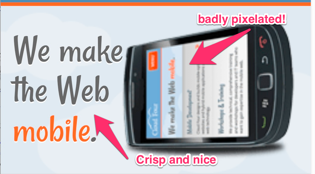
A common practice in creating flexible layouts is to specify the size values in media queries as relative units: em, rem, vw/vh etc. See, for example, Lyza Gardner's article The EMs have it: Proportional Media Queries FTW! . This approach commonly uses ems in order to reflow layouts based on users’ zoom preferences, or to resize elements through JavaScript by dynamically altering a font-size value.
In flexible layout designs, when a user zooms into a design, proportionally scaled images can be blurry or pixelated, affecting the image's impact and function (for example, on televisions or when projecting). So swapping to a more suitable image is used to overcome this problem.
Images become unacceptably blurry and pixelated as a user changes zoom ratio.
3.6 API to manipulate sources
In some cases the image data is dynamically generated (e.g., using the canvas element and related APIs) or is acquired from the device itself (e.g., from the camera on a phone or tablet using some form of media capture). Developers need practical means to interface programmatically with the source of an image or a set of images. Without having a suitable API, it will be difficult for developers to manipulate the sources of images or to even know what source is currently being displayed.
3.7 Image formats
Some images are best suited to a specific file type for reasons such as file size optimization, alpha transparency, scalability, animation, etc. For example, a photo usually requires good color depth, but does not require alpha transparency or animation; JPEG or WebP are well-suited to these needs and offer good optimization between image quality and file size. Icons are often simpler in terms of color depth, but may require alpha transparency; the PNG format is better-suited to these needs.
Sharing URLs for formats that are not interoperable across browsers is a problem in the wild. See issue 11.
In a responsive design, images need to be displayed at different sizes. When possible, a vector format such as SVG might be most appropriate. There have also been proposals for new responsive image formats (see, for example, Christopher Schmitt's .net article).
Although a web developer may want to use a specific image format, new or otherwise, the browser may not always support it. Currently, developers are forced to abandon the most suitable image format in favor of one that has good user agent support.
3.8 User control over sources
In situations where the user knows their bandwidth is limited or expensive (e.g., while roaming), the browser could assist users by:
giving users an option to only download images in the quality they desire - or disable images all together, as Google Chrome currently does through site preferences.
automatically select the most suitable image for the browsing environment.
There are browsers already catering for these kinds of situations: for example Opera Mini provides users with a choice of image quality (but those images are compressed on the server). Amazon's Silk browser also compresses images "in the cloud" (i.e., through their own proxy servers) before serving those images to a user's device.
4 Requirements
The use cases give rise to the following requirements:
The solutionMUST afford developers the ability to match image sources with particular media features and/or media types - and have the user agent update the source of an image as the media features and media types of the browser environment change dynamically.
The solutionMUST degrade gracefully on legacy user agents by, for example, relying on HTML's built-in fallback mechanisms and legacy elements.
The solutionMUST afford developers with the ability to include content that is accessible to assistive technologies.
The solutionMUST NOT require server-side processing to work. However, if required, server-side adaptation can still occur through content negotiation or similar techniques (i.e., they are not mutually exclusive).
The solutionMUST provide developers with a means to programmatically interface with image resources, as well as access relevant attributes and methods that make the solution practical to work with (i.e., it shouldn't require complicated Regex or nested loops to manipulate values). In addition, the solution MUST provide means to hook into relevant events resulting from changes in state (unavailable, partially available, completely available, broken). In any case, an API SHOULD provide a means to:
Determine the current source of the image.
Determine what environmental condition caused the current source to be selected (reflected as, for example, a CSS Media Query).
Add, remove, and update image sources.
Deal with events.
The solutionMUST afford developers the ability to explicitly define different image versions as opposed to only different resolutions of the same image.
The solutionMUST afford developers the ability to define the breakpoints for images as either minimum values (mobile first) or maximum values (desktop first) to match the media queries used in their design.
The solutionSHOULD allow developers to specify images in different formats (or specify the format of a set of image sources).
To provide compatibility with legacy user agents, it SHOULD be possible for developers to polyfill the solution.
The solutionSHOULD afford user agents with the ability to provide a user-settable preference for controlling which source of an image they prefer. For example, preference options could include: "always lowest resolution", "always high resolution", "download high resolution as bandwidth permits", and so on. To be clear, user agents are not required to provide such a user-settable preference, but the solution needs to be designed in such a way that it could be done.
This document is composed of contributions from participants of the responsive images community group.
The editors would like to thank the following people for reviewing this document: Mike Taylor, Doug Shults, David Newton, Barbara Barbosa Neves, Eileen Webb, and Anselm Hannemann.
Participants of the Responsive Images Community Group at the time of publication were: George Adamson, Marie Alhomme, John Allan, Joshua Allen, Angely Alvarez, Aaryn Anderson, Philip Andrews, Phil Archer, Justin Avery, Michael Balensiefer, Toni Barrett, Bruno Barros, Paul Barton, Adrian Bateman, Jesse Renée Beach, Robin Berjon, Seth Bertalotto, Nicolaas Bijvoet, Andreas Bovens, J. Albert Bowden, Adam Bradley, Rodrigo Brancher, Gordon Brander, Paul Bridgestock, Aaron Brosey, Cory Brown, mairead buchan, Kris Bulman, Ariel Burone, Mathias Bynens, Marcos Caceres, Rusty Calder, Ben Callahan, Loïc Calvy, Chuck Carpenter, Brandon Carroll, Frederico Cerdeira, David Clements, Geri Coady, Anne-Gaelle Colom, Cyril Concolato, Pete Correia, Andy Crum, Jason Daihl, Francois Daoust, Kevin Davies, Robert Dawson, Ryan DeBeasi, Anna Debenham, Darryl deHaan, David Demaree, George DeMet, Ian Devlin, peter droogmans, Marlene Frykman, Dennis Gaebel, Nicolas Gallagher, Miguel Garcia, Rafael Garcia Lepper, Larry Garfield, Peter Gasston, David Goss, Chris Grant, Petra Gregorova, Jason Grigsby, Antoine Guergnon, Jeff Guntle, Aaron Gustafson, Jason Haag, Patrick Haney, Anselm Hannemann, chris hardy, Vincent Hardy, Dominique Hazaël-Massieux, Chris Hilditch, Nathan Hinshaw, Sean Hintz, John Holt Ripley, Shane Hudson, Tomomi Imura, Philip Ingrey, Brett Jankord, Scott Jehl, Dave Johnson, Nathanael Jones, Michael Jovel, Chao Ju, Tim Kadlec, Frédéric Kayser, Jin Kim, Andreas Klein, Peter Klein, John Kleinschmidt, Daniel Konopacki, Zoran Kurtin, Gerardo Lagger, Adam Lake, Chris Lamothe, Tom Lane, Matthieu Larcher, Bruce Lawson, Zach Leatherman, Silas Lepcha, Kornel Lesinski, Chris Lilley, grappler login, Tania Lopes, André Luís, Jacine Luisi, David Maciejewski, Kevin Mack, Ethan Malasky, Josh Marinacci, Eduardo Marques, Mathew Marquis, Daniel Martínez, Tom Maslen, Jacob Mather, Chris McAndrew, Denys Mishunov, Sabine Moebs, Ian Moffitt, Orestis Molopodis, jason morita, David Moulton, Brian Muenzenmeyer, Emi Myoudou, Irakli Nadareishvili, Christian Neuberger Jr, David Newton, Todd Nienkerk, Kothary Nishant, Ashley Nolan, Kenneth Nordahl, Lewis Nyman, Alejandro Oviedo, David Owens, Fernando Pasik, Andrew Pez Pengelly, Hassadee Pimsuwan, Manik Rathee, François REMY, Nestor Rojas, Adrian Roselli, Chris Ruppel, Oguzcan Sahin, Viljami Salminen, Luca Salvini, Luke Sands, aron santa, Jad Sarout, Brandon Satrom, Christoph Saxe, Doug Schepers, Jason Schmidt, Christopher Schmitt, Joe Schmitt, Boaz Sender, Tomoyuki Shimizu, Ariel Shkedi, Jen Simmons, Katerina Skotalova, Michael[tm] Smith, Ignacio Soriano Cano, Aaron Stanush, Jared Stilwell, Matt Stow, Kevin Suttle, Satoru Takagi, Philipp Tautz, James Tudsbury, Jacob van Zijp, Jitendra Vyas, Yoav Weiss, George White, Matt Wilcox, Richard Wild, John Albin Wilkins, Owen Winkler, Jeremy Worboys, Mike Wu, Carlos Zepeda, and jintian zheng.
A complete list of participants of the Responsive Images Community Group is available at the W3C Community Group Website.