This document captures the use cases and requirements for standardizing
a solution for responsive images. The use cases and
requirements were gathered with consultation with the HTML Working Group and WHATWG participants, RICG group members, and
the general public.
This section describes the status of this document at the time of its publication. Other
documents may supersede this document. A list of current W3C publications and the latest revision
of this technical report can be found in the W3C technical reports
index at http://www.w3.org/TR/.
Publication as a Working Group Note does not imply endorsement by the W3C Membership.
This is a draft document and may be updated, replaced or obsoleted by other documents at
any time. It is inappropriate to cite this document as other than work in progress.
In HTML, a user agent's
environmental conditions are primarily expressed as CSS
media features (e.g., pixel-density, orientation, max-width,
etc.) and CSS media types (e.g., print, screen, etc.). A
responsive image is an image that adapts in response to
different environmental conditions: adaptations can include, but
are not limited to, changing the dimensions, crop, or even the source
of an image.
Many media
features are dynamic in nature (e.g., a browser window is re-sized,
a device is rotated from portrait to landscape, and so on), thus a user
agent constantly responds to events that change the properties of media
features. As a document's layout adapts to changes in media features
and media type, an image's ability to communicate effectively can be
significantly reduced (e.g., images start to show compression artifacts
as they are scaled to match the quality of media or some media
feature). When this happens, developers rely on various
client/server-side solutions to present images at different
resolutions, or even in different formats. Swapping images provides a
means to continue communicating effectively as the features of media
change dynamically.
In formulating the requirements, this document tries to be
neutral - it is not predicated on any solution. The document
only tries to describe the use cases and what the RICG understands, from
practice, would be needed to address the use cases in the form of
requirements. The RICG expects that a
technical specification can be created to formally address each of the
requirements (i.e., the solution).
1.1
Proposed Solutions
To date, four such specifications are currently under development,
described below. The four proposed solutions are not mutually
exclusive: together they address the set of Use Cases and Requirements for
Responsive Images.
Allows authors to define various image resources and “hints” that
assist a user agent to determine the most appropriate image
source to display. Given a set of image resources, the user agent
has the option of either following or overriding the author’s
declarations to optimize the user experience based on criteria
such as display density, connection type, user preferences, and
so on.
Building on srcset,
this specification defines a declarative solution for grouping
multiple versions of an image based on different characteristics
(e.g., format, resolution, orientation, etc.). This allows the
user agent to select the optimum image to present to an end-user
based on the user agent's environmental conditions, while
also providing the ability to "art
direct" images.
Defines a set of HTTP headers that allow browsers to indicate a
list of device and agent specific preferences. Servers can then
use these "client hints" to assist in content negotiation,
ideally resulting in content being served that best matches the
environmental conditions of the client for the resource
being requested.
The RespImg Syntax introduces a new
"src-n" attribute set on the img
element that accepts a small set of microsyntaxes. These
microsyntaxes address the viewport-based selection,
device-pixel-ratio-based selection, and art direction use cases
described in this document. The proposal claims to avoid the
implementor concerns associated with the `picture` element
proposal.
2.
Limitations of current techniques
As currently there are no standardized solutions implemented in
mainstream browsers, web developers are relying on various
techniques to use responsive images in their applications.
Unfortunately, there are significant limitations with these
techniques:
Reliance on semantically neutral elements and CSS backgrounds:
Large images incur unnecessary download and processing time,
slowing the experience for users. To work around this problem, web
developers specify multiple sources of the same image at different
resolutions and then pick the image of the correct size based on
the viewport size. As web developers lack the markup to achieve
what they need, they end up relying on semantically neutral
elements, CSS
background images, and JavaScript libraries. In other words,
developers are being forced to willfully violate the authoring
requirements of HTML.
Bypass preload scanner
The reliance on semantically neutral elements (e.g., the
div and span elements), instead of
semantically meaningful elements such as img, prevents
browsers from loading the image resources until after the DOM has
(at least partially) loaded and scripts have run. This directly
hinders the performance work browser engineers have done over the
years to optimize resource loading (e.g., WebKit's
HTMLPreloadScanner). Unnecessarily bypassing things like the
preload scanner can have measurable performance impact when loading
documents. See, for example, "The
WebKit PreloadScanner" by Tony Gentilcore for a small study
that demonstrates an up to 20% impact in load time when WebKit's
PreloadScanner is disabled. More recent performance
tests yield similar results.
Reliance on scripts and server-side processing:
The
techniques rely on either JavaScript or a server-side solution
(or both), which adds complexity and redundant HTTP requests to the
development process. Furthermore, the script-based solutions are
unavailable to users who have turned off JavaScript.
The RICG
believes standardization of a browser-based solution can overcome these
limitations.
3.
Use cases
The following use cases represent usage scenarios commonly
seen "in the wild".
3.1
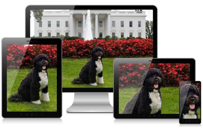
Resolution-based selection
Developers generally want to provide the same image in multiple
resolutions, so that high-res devices can get the optimum image for a
given resolution, while low-resolution devices can avoid wasting time
and bandwidth downloading overly-large files.
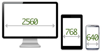
Fig. 1
Figure shows screens that having different resolutions. These
resolutions can be either physical (matching physical pixels) or
virtual (matching css pixels).
3.2
Viewport-based selection
Image dimensions in responsive layouts tend to vary according to the
size of the viewport. This often results in images with large
dimensions (e.g., 2x or more times the size of the viewport) being
sent to browsers with narrow viewports, which are then resized by the
browser to fit the design (see, for example, Retina
Revolution by Daan Jobsis and the compressive
images technique). Ideally, developers would like to serve
images that match the user's viewport dimensions. Without a means to
do this, they sometimes need to send more data to the user than they
would otherwise need to.
For example, a 1000px wide image might be appropriate as a 1x image
when used to fill the background of the page, but it’s far too large
to use for the same purpose on a 320px wide screen. On a screen that
small, it’s more like a 2x or 3x image. In other words, the same
image might be applicable to multiple viewport sizes, but at
different effective resolutions.
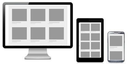
Fig. 2
To avoid sending excess data, developers will send images that
more closely match the size of the viewport.
3.3
Device-pixel-ratio-based selection
To display images in a way that reduces perceptible artifacts (i.e.,
so the images look "crisp"), devices with different screen densities
require images with different minimal resolutions. Thus, the higher
the pixel density, the more pixels an image needs to have to look
good. This also applies to icons, where completely different images
may need to be used for different device-pixel-ratios (see
All the
sizes of iOS app icons, by Neven Mrgan).
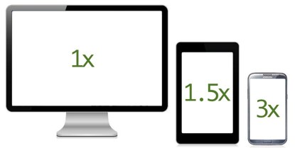
Fig. 3
On a device with a device-pixel-ratio greater than 1, higher
image resolutions are required to reduce visual artifacts
resulting from compression.
3.4
Art direction
In a responsive design, it is typical to change an image so it can be
targeted towards the features of a particular display (or set of
displays). Sometimes this means cropping an image. Other times, it
can mean a different image altogether that may have different
proportions or may be changed in other ways to communicate more
effectively in a layout. This means, for example:
On a large screen, a large image with plenty of details can be
shown (e.g., an object with a broad background).
On a smaller screen, shrinking the same image can reduce its
relevance, usefulness, and legibility. Thus, by "art directing", a
web developer can better control communication by explicitly
dictating which image should be shown at which size (or when some
environmental condition is
met).
This is illustrated in the figure below.
Fig. 4
Using different images that have been cropped to fit a particular
screen's features can help in communicating a message
effectively.
A related use case is when orientation determines:
the source of the image,
the crop,
and how text flows around the image based on the size of the
viewport.
For example, on the Nokia Lumia site where it describes the Meego browser, the
Nokia Lumia is shown horizontally on wide screens. As the screen
narrows, the Nokia Lumia is then shown vertically and cropped. Bryan
and Stephanie Rieger, the designers of the site, explained that on a
wide screen, showing the full phone horizontally showed the browser
best; but on small screens, changing the image to vertical made more
sense because it allowed the reader to still make out the features of
the browser in the image.
Fig. 5
Video showing art direction used on Nokia's Meego Website.
3.5
Design breakpoints
In Web development, a breakpoint is one of a series of
CSS Media
Queries, which can update the styles of a page based on matching
of media features. A single breakpoint represents a rule (or
set of rules) that determines the point at which the contents of that
media query are applied to a page’s layout. For example:
Example 1
@media screen and (max-width: 16em) { ... }
@media screen and (max-width: 32em) { ... }
@media screen and (max-width: 41em) { ... }
Developers currently match specific breakpoints for images to the breakpoints that they
have defined in the CSS for their
applications. Being able to match the breakpoints ensures that images
are operating under the same rules that define the layout of a
design. It also helps developers verify their approach by ensuring
that the same viewport measurement tests are being used in both
HTML and CSS. If the
developer cannot specify breakpoints for images in the same manner
that they are defined for the design, developers will need to convert
the breakpoints back to the values specified in the layout in order
to verify that they match. This increases authoring time and the
likelihood of human-error on the part of developers.
For example, if a breakpoint is specified as "max-width:
41em", then web developers would like to define a similar
breakpoint for images at a max-width of
41em. Otherwise they are forced to transform
measurements into another unit, like pixels, which is tedious and
potentially error-prone.
3.6
Matching media features and media types
According to Wikipedia's article on "dots per inch":
"An inkjet printer … is typically capable of 300-600 DPI.
A laser printer … [prints] in the range of 600 to
1,800 DPI."
As printers generally have the ability to pack more points per inch
than a device's screen, printers have to compensate for the lack of
pixel data by applying reprographic techniques, such as half toning, to
simulate continuous tone in imagery. As
illustrated below, applying such techniques can cause images to look
blurry and low-quality when compared to text.
Fig. 6
Example of a 48px by 48px image and text printed at 1,200 DPI.
Because of the lack of image data, the printer compensates by
using the halftone reprographic technique. Note that the text
stays crisp and is printed at the full 1,200 DPI.
Allowing developers to reference images at different resolutions
could allow user agents to choose an image that best matches the
capabilities of the printer. For example, a photo sharing site could
provide a bandwidth-optimized image for display on screen, but a
high-resolution image for print. The same technique could also be
used for e-book formats, such as EPUB.
However, displaying a color image on monochrome media (e.g., paper
and e-ink displays) can be problematic: different colors with similar
luminosity are impossible to distinguish on monochrome media. This
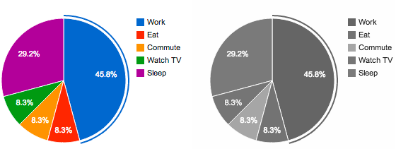
problem is illustrated in the figure below, where it becomes nearly
impossible to associate slices of a pie chart with corresponding
labels.
Fig. 7
Two pie charts, one in color and one in black and white, which
demonstrate the problem with switching from color to monochrome
media. In the black and white graph, it is extremely difficult to
know which slice relates to which label (except in the case of
"commute", which is a lighter shade).
Currently, server-side solutions exist to adapt web content to e-ink
displays (e.g., kinstant), but
such services only work on text and layout and not on images. As
interpreting the meaning of images is a problem of semiotics, it is
infeasible that this problem can ever be computationally solved. The
only feasible solution is for authors to provide alternative image
content that communicates effectively in monochrome media.
A common practice in creating flexible layouts is to specify the size
values in media queries as relative units (e.g., ems or
percentages). This approach allows layouts to match the users’
default font size (based on zoom level), and it avoid cases where the
layout breaks on devices who set a default font-size is set to
something other than the usual 16px.
If art-directed images are not specified in relative units, they can
either break the layout or become distorted when faced with a
uncommon default font-size (e.g., Amazon's Kindle defaults to 20px
instead of the usual 16px).
3.8
Image formats
Developers rely on the different capabilities of a range of image
formats to communicate effectively. These capabilities include, but
are not limited to, alpha transparency, animation, high-color depth
support, or better compression ratios for certain image categories.
For example, JPEG offers developers good optimization between image
quality and file size, but lacks alpha transparency or animation. So,
in cases where alpha transparency or animation is needed, developers
may instead rely on PNG, GIF, and emerging formats like WebP.
In a responsive design, images need to be displayed at different
sizes and device pixel ratios. When possible, a vector format such as
SVG might be most appropriate. There have also been proposals for new
responsive image formats (see, for example, Christopher
Schmitt's .net article).
Although a web developer may want to use a specific image format, new
or otherwise, the browser may not always support it. Currently,
developers are forced to abandon the most suitable image format in
favor of one that has ubiquitous support across user agents.
3.9
User control over sources
In situations where the user knows their bandwidth is limited or
expensive (e.g., while roaming), the browser could assist users by:
Giving users an option to only download images in the quality
they desire - or disable images all together.
Automatically select the most suitable image for the browsing
environment.
There are browsers already catering for these kinds of situations.
For example, Opera Mini provides users with a choice of image quality
(but those images are compressed on the server). Amazon's Silk
browser also compresses images "in the cloud" (i.e., through their
own proxy servers) before serving those images to a user's device.
Google Chrome also allows users to disable images altogether through
"site preferences".
4.
Requirements
The use cases give rise to the following
requirements:
To allow for art direction, the solutionMUST afford
developers the ability to match image sources with particular media
features and/or media types - and the user agent SHOULD update the
source of an image as the media features and media types of the
browser environment change dynamically.
The solutionMUST support selection based on viewport
dimensions, screen resolution, and device-pixel-ratio (DPR).
Sending the right image for the given dimension and DPR avoids
delaying the page load, wasting bandwidth, and potentially reduces
the impact on battery life (as the device's antenna can be powered
off more quickly and smaller images are faster to process and
display). It can also potentially save users money by not
downloading redundant image data.
The solutionMUST degrade gracefully on legacy user agents
by, for example, relying on HTML's built-in fallback mechanisms and
legacy elements.
The solutionMUST afford developers with the ability to
include content that is accessible to assistive technologies.
The solutionMUST NOT require server-side processing to
work. However, if required, server-side adaptation can still occur
through content
negotiation or similar techniques (i.e., they are not mutually
exclusive).
The solutionMUST afford developers the ability to define
the breakpoints for images as either minimum values (mobile first)
or maximum values (desktop first) to match the media queries used
in their design.
The solutionSHOULD allow developers to specify images in
different formats (or specify the format of a set of image
sources).
The solutionSHOULD afford user agents with the ability to
provide a user-settable preference for controlling which source of
an image they prefer. For example, preference options
could include: "always lowest resolution", "always high
resolution", "download high resolution as bandwidth permits", and
so on. To be clear, user agents are not required to provide such a
user-settable preference, but the solution needs to be
designed in such a way that it could be done.
In order to avoid introducing delays to the page load, the solution
MUST integrate well with existing performance optimization provided
by browsers (e.g., the solution would work well with a browser's
the preload scanner). Specifically, the solution needs to result in
faster page loads than the current
techniques are providing.
This document is composed of contributions from participants of the
responsive images community group.
The editors would like to thank the following people for reviewing this
document: Mike Taylor, Doug Shults, Barbara Barbosa Neves, Eileen Webb,
and Anselm Hannemann.
This document repoduces text from Tab Atkin's Proposal for
RespImg Syntax, as permitted by its C0 license.
Participants of the Responsive Images Community Group
at the time of publication were: Barry Atimer, Daniel Abril, George
Adamson, Heide Alexander, Marie Alhomme, John Allan, Joshua Allen,
Angely Alvarez, Agustin Amenabar, Aaryn Anderson, Philip Andrews,
Ritchie Anesco, Phil Archer, Tony Atayi, Tom Atkins, Justin Avery,
Mohsen Azimi, Phillip Baker, Raymond Baker, Michael Balensiefer, Toni
Barrett, Bruno Barros, Paul Barton, Adrian Bateman, Jesse Renée Beach,
Robin Berjon, Seth Bertalotto, Anirban Bhattacharya, Nicolaas Bijvoet,
Barna Bitai, Nathan Bleigh, Andreas Bovens, J. Albert Bowden, Adam
Bradley, Rodrigo Brancher, Gordon Brander, Paul Bridgestock, Aaron
Brosey, Brandon Brown, Cory Brown, mairead buchan, Kris Bulman, Ariel
Burone, Mathias Bynens, Marcos Caceres, Rusty Calder, Ben Callahan,
Loïc Calvy, Welch Canavan, Chuck Carpenter, Brandon Carroll, Frederico
Cerdeira, Daniel Chamberlin, Adi Chikara, David Clements, Geri Coady,
Anne-Gaelle Colom, Cyril Concolato, Jessica Constantine, Greg Cota,
Geoff Cowan, Andy Crum, David D'Amico, Jason Daihl, Francois Daoust,
Kevin Davies, Robert Dawson, Jacques de Klerk, Timothy de Paris, Ryan
DeBeasi, Anna Debenham, Darryl deHaan, David Demaree, George DeMet, Ian
Devlin, Alex DiLiberto, peter droogmans, Ronni Dyrholm Chidekel,
simpson eddie, Sylvia Egger, Dominic Fee, Ève Février, Maximiliano
Firtman, Ben Fonarov, Harry Fozzard, Marlene Frykman, Dennis Gaebel,
Igor Gajosinskas, Nicolas Gallagher, Miguel Garcia, Rafael Garcia
Lepper, Larry Garfield, Peter Gasston, George GeorgeHaeger, David Goss,
Chris Grant, Petra Gregorova, Ilya Grigorik, Jason Grigsby, Aaron
Grogg, Antoine Guergnon, Jeff Guntle, Aaron Gustafson, Jason Haag,
Jordan Haines, Cristina Hanes, Patrick Haney, Anselm Hannemann, chris
hardy, Vincent Hardy, Bridget Harrison, Duncan Hawthorne, Dominique
Hazaël-Massieux, Chris Hilditch, Jon Hill, Nathan Hinshaw, Sean Hintz,
John Holt Ripley, Enrico Hösel, Peter Hrynkow, Kym Huang, Shane Hudson,
Vinicius Ianni, Tomomi Imura, Philip Ingrey, Bryn Jackson, Rihnna
Jakosalem, Brett Jankord, Scott Jehl, Dave Johnson, Nathanael Jones,
Danny Jongerius, Michael Jovel, Chao Ju, Tim Kadlec, Raj Kaimal, Kevin
Joe Kanger, Frédéric Kayser, Serge K. Keller, Arthur Khachatryan, Jin
Kim, Andreas Klein, Peter Klein, John Kleinschmidt, Daniel Konopacki,
Darius Kruythoff, Zoran Kurtin, Vitaliy Kuzmin, Gerardo Lagger, Adam
Lake, Chris Lamothe, Tom Lane, Matthieu Larcher, Christopher Latham,
Bruce Lawson, Zach Leatherman, Silas Lepcha, Kornel Lesinski, Chris
Lilley, grappler login, william lombardo, Tania Lopes, Amie Lucas,
André Luís, Jacine Luisi, David Maciejewski, Kevin Mack, Ethan Malasky,
Josh Marinacci, Eduardo Marques, Mathew Marquis, Daniel Martínez, Tom
Maslen, Jacob Mather, Chris McAndrew, Mark McDonnell, Andre Jay
Meissner, Benjamin Melançon, Julian Mendl, Rick Messer, Zane Milakovic,
Denys Mishunov, Sabine Moebs, Ian Moffitt, Orestis Molopodis, jason
morita, David Moulton, Bobby Mozumder, Brian Muenzenmeyer, Emi Myoudou,
Irakli Nadareishvili, Giorgio Natili, Jonathan Neal, Christian
Neuberger Jr, David Newton, Todd Nienkerk, Ashley Nolan, Johnna Nonboe,
Kenneth Nordahl, Mark Nottingham, Lewis Nyman, Darrel O'Pry, Alejandro
Oviedo, David Owens, Paddy O’Hanlon, Isabel Palomar, suzanne peter,
Hassadee Pimsuwan, Guy Podjarny, Andreas Pollak, gentian polovina, Dave
Poole, Florent Preynat, Manik Rathee, François REMY, Venkatesh
Rengasamy, Jen Reynolds, Ricardo Andrade Belo Ricardo Belo, Michael
Riethmuller, Carlo Rizzante, John Rodler, César Rodríguez, Nestor
Rojas, Adrian Roselli, David Rupert, Chris Ruppel, Oguzcan Sahin,
Viljami Salminen, Luca Salvini, Ana Sampaio, Luke Sands, crazyrohila
sanjay, aron santa, Osny Santos, Jad Sarout, Brandon Satrom, Jeroen
Savat, Stéphane Savona, Christoph Saxe, Doug Schepers, Jason Schmidt,
Christopher Schmitt, Joe Schmitt, Greg Schumacher, Boaz Sender, SHAHINA
SHEIK, Tomoyuki Shimizu, Ariel Shkedi, Abdul Wahid Sial, Pandapotan
Silaban, Mauricio Silva Teixeira de Nobrega, Jen Simmons, Michael
Singleterry, Katerina Skotalova, David Sleight, Michael[tm] Smith, Nick
Snyder, Ignacio Soriano Cano, Steve Souders, Brenden Sparks, Aaron
Staker, Aaron Stanush, Walter Stevenson, Bridget Stewart, Jared
Stilwell, Matt Stow, Shari Sullivan, Kevin Suttle, Patrick Szalapski,
Satoru Takagi, Rob Tarr, Philipp Tautz, Nguyen Thao Thao, Edward
Thurgood, Anthony Ticknor, Erek Tinker, Sebastián Tromer, Tsvetan
Tsvetkov, Yusuke Uchida, Mads Ulsø Østergaard, Katarina Ur, Adam van
den Hoven, Jacob van Zijp, Lucas Vilaboim, Jitendra Vyas, Amy W, Tady
Walsh, Yoav Weiss, George White, Michael Whittet, Matt Wilcox, Richard
Wild, John Albin Wilkins, Chris Williams, Rory Wilson, Owen Winkler,
Robin Winslow, Cyril Wolfangel, Mike Woodard, Jeremy Worboys, Mike Wu,
Bruce Zawalsky, Carlos Zepeda, and jintian zheng.
A complete
list of participants of the Responsive Images Community Group is
available at the W3C Community Group Website.