HTML5
A vocabulary and associated APIs for HTML and XHTML
A vocabulary and associated APIs for HTML and XHTML
details elementsummary element followed by flow content.openinterface HTMLDetailsElement : HTMLElement {
attribute boolean open;
};
The details element represents a
disclosure widget from which the user can obtain additional
information or controls.
The details element is not appropriate
for footnotes. Please see the section on
footnotes for details on how to mark up footnotes.
The first summary element
child of the element, if any, represents the summary or
legend of the details. If there is no child
summary element, the user agent should provide its own
legend (e.g. "Details").
The rest of the element's contents represents the additional information or controls.
The open
content attribute is a boolean attribute. If present,
it indicates that both the summary and the additional information is
to be shown to the user. If the attribute is absent, only the
summary is to be shown.
When the element is created, if the attribute is absent, the additional information should be hidden; if the attribute is present, that information should be shown. Subsequently, if the attribute is removed, then the information should be hidden; if the attribute is added, the information should be shown.
The user agent should allow the user to request that the
additional information be shown or hidden. To honor a request for
the details to be shown, the user agent must set the open attribute on the element to
the value open. To honor a request for the
information to be hidden, the user agent must remove the open attribute from the
element.
The open IDL
attribute must reflect the open content attribute.
The following example shows the details element
being used to hide technical details in a progress report.
<section class="progress window">
 <h1>Copying "Really Achieving Your Childhood Dreams"</h1>
 <details>
  <summary>Copying... <progress max="375505392" value="97543282"></progress> 25%</summary>
  <dl>
   <dt>Transfer rate:</dt> <dd>452KB/s</dd>
   <dt>Local filename:</dt> <dd>/home/rpausch/raycd.m4v</dd>
   <dt>Remote filename:</dt> <dd>/var/www/lectures/raycd.m4v</dd>
   <dt>Duration:</dt> <dd>01:16:27</dd>
   <dt>Color profile:</dt> <dd>SD (6-1-6)</dd>
   <dt>Dimensions:</dt> <dd>320×240</dd>
  </dl>
 </details>
</section>
The following shows how a details element can be
used to hide some controls by default:
<details>
 <summary><label for=fn>Name & Extension:</label></summary>
 <p><input type=text id=fn name=fn value="Pillar Magazine.pdf">
 <p><label><input type=checkbox name=ext checked> Hide extension</label>
</details>
One could use this in conjunction with other details
in a list to allow the user to collapse a set of fields down to a
small set of headings, with the ability to open each one.
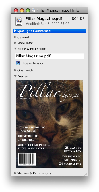
In these examples, the summary really just summarises what the controls can change, and not the actual values, which is less than ideal.
Because the open
attribute is added and removed automatically as the user interacts
with the control, it can be used in CSS to style the element
differently based on its state. Here, a stylesheet is used to
animate the color of the summary when the element is opened or
closed:
<style>
 details > summary { transition: color 1s; color: black; }
 details[open] > summary { color: red; }
</style>
<details>
 <summary>Automated Status: Operational</summary>
 <p>Velocity: 12m/s</p>
 <p>Direction: North</p>
</details>
summary elementdetails element.HTMLElement.The summary element represents a
summary, caption, or legend for the rest of the contents of the
summary element's parent details
element, if any.
dialog elementopeninterface HTMLDialogElement : HTMLElement {
attribute boolean open;
attribute DOMString returnValue;
void show(optional (MouseEvent or Element) anchor);
void showModal(optional (MouseEvent or Element) anchor);
void close(optional DOMString returnValue);
};
The dialog element represents a part of an
application that a user interacts with to perform a task, for
example a dialog box, inspector, or window.
The open
attribute is a boolean attribute. When specified, it
indicates that the dialog element is active and that
the user can interact with it.
A dialog element without an open attribute specified should not
be shown to the user. This requirement may be implemented indirectly
through the style layer. For example, user agents that support the suggested default rendering
implement this requirement using the CSS rules described in the rendering section.
show( [ anchor ] )Displays the dialog element.
The argument, if provided, provides an anchor point to which the element will be fixed.
showModal( [ anchor ] )Displays the dialog element and makes it the top-most modal dialog.
The argument, if provided, provides an anchor point to which the element will be fixed.
This method honors the autofocus attribute.
close( [ result ] )Closes the dialog element.
The argument, if provided, provides a return value.
returnValue [ = result ]Returns the dialog's return value.
Can be set, to update the return value.
When the show()
method is invoked, the user agent must run the following steps:
If the element already has an open attribute, then abort these
steps.
Add an open attribute
to the dialog element, whose value is the empty
string.
If the show() method
was invoked with an argument, set up the position of
the dialog element, using that argument as the anchor.
Otherwise, set up the default static position of the
dialog element.
Each Document has a stack of dialog
elements known as the pending dialog stack. When a
Document is created, this stack must be initialized to
be empty.
When an element is added to the pending dialog stack, it must also be added to the top layer layer. When an element is removed from the pending dialog stack, it must be removed from the top layer. [FULLSCREEN]
When the showModal() method
is invoked, the user agent must run the following steps:
Let subject be the dialog
element on which the method was invoked.
If subject already has an open attribute, then throw an
InvalidStateError exception and abort these
steps.
If subject is not in a
Document, then throw an
InvalidStateError exception and abort these
steps.
Add an open attribute
to subject, whose value is the empty
string.
If the showModal()
method was invoked with an argument, set up the
position of subject, using that argument
as the anchor. Otherwise, set up the default static
position of the dialog element.
Let subject's Document be
blocked by the modal
dialog subject.
Push subject onto subject's Document's pending
dialog stack.
Let control be the first element in tree
order whose nearest ancestor dialog element is subject and that has an autofocus attribute
specified, if any.
If there is no control, then abort these steps.
Run the focusing steps for control.
If at any time a dialog element is removed from a
Document, then if that dialog is in
that Document's pending dialog stack, the
following steps must be run:
Let subject be that dialog
element and document be the
Document from which it is being removed.
Remove subject from document's pending dialog stack.
If document's pending dialog stack is not empty, then let document be blocked by the modal dialog that is at the top of document's pending dialog stack. Otherwise, let document be no longer blocked by a modal dialog at all.
When the close()
method is invoked, the user agent must close the dialog
that the method was invoked on. If the method was invoked with an
argument, that argument must be used as the return value; otherwise,
there is no return value.
When a dialog element subject is
to be closed, optionally with a
return value result, the user agent must run the
following steps:
If subject does not have an open attribute, then throw an
InvalidStateError exception and abort these
steps.
Remove subject's open attribute.
If the argument was passed a result,
then set the returnValue attribute to the
value of result.
If subject is in its Document's
pending dialog stack, then run these substeps:
Remove subject from that pending dialog stack.
If that pending dialog stack is not empty,
then let subject's Document be
blocked by the modal
dialog that is at the top of the pending dialog
stack. Otherwise, let document be no
longer blocked by a modal dialog at all.
Queue a task to fire a simple
event named close at subject.
The returnValue IDL
attribute, on getting, must return the last value to which it was
set. On setting, it must be set to the new value. When the element
is created, it must be set to the empty string.
Canceling dialogs: When a
Document's pending dialog stack is not
empty, user agents may provide a user interface that, upon
activation, queues a task to
fire a simple event named cancel that is cancelable at
the top dialog element on the Document's
pending dialog stack. The default action of this event
must be to close the dialog with no return value.
An example of such a UI mechanism would be the user pressing the "Escape" key.
The containing block of all dialog elements that are absolutely positioned
must be the initial containing block.
All dialog elements are always in one of two modes: mundanely aligned,
or magically aligned. When a dialog element is created, it must be placed
in the mundanely aligned mode and the user agent must set up the default static
position for that element, without an anchor.
When a user agent is to set up the default static position of an element subject without an anchor, if that element is being rendered, it must set up the element such that its top static position, for the purposes of calculating the used value of the 'top' property, is the value that would place the element's top margin edge as far from the top of the viewport as the element's bottom margin edge from the bottom of the viewport, if the element's height is less than the height of the viewport, and otherwise is the value that would place the element's top margin edge at the top of the viewport.
If there is a dialog element that is mundanely aligned and that is
being rendered when its browsing context changes viewport width (as
measured in CSS pixels), then the user agent must set up the default static position
of all such elements in that browsing context again, still without anchors.
When a dialog element that is mundanely aligned starts being
rendered, the user agent must set up the default static position of that
element, without an anchor.
This top static position of a mundanely aligned dialog element must
remain the element's top static position until the set up the default static position
algorithm is once again invoked for that element. (The element's static position is only used in
calculating the used value of the 'top' property in certain situations; it's not used, for
instance, to position the element if its 'position' property is set to 'static'.)
When a user agent is to set up the position of an element subject using an anchor anchor, it must run the following steps:
If anchor is a MouseEvent
object, then run these substeps:
If anchor's target element does not have a rendered box, or is in a different document than subject, then let subject be mundanely positioned, set up the default static position of subject without an anchor, and abort the set up the position steps.
Let anchor element be an anonymous element rendered as a box with zero height and width (so its margin and border boxes both just form a point), positioned so that its top and left are at the coordinate identified by the event, and whose properties all compute to their initial values.
Otherwise, let anchor element be anchor.
Let subject be magically aligned to anchor element.
While an element A is magically aligned to an element B, the following requirements apply:
If at any time either A or B cease having rendered
boxes, A and B cease being in the same
Document, or B ceases being earlier than A
in tree order, let subject be mundanely
positioned, and set up the default static position of subject without an anchor.
A's 'position' property must compute to the keyword 'absolute-anchored' rather than whatever it would otherwise compute to (i.e. the 'position' property's specified value is ignored).
The 'absolute-anchored' keyword's requirements are described below.
The anchor points for A and B are defined as per the appropriate entry in the following list:
The anchor points of A and B are the center points of their respective first boxes' border boxes.
The anchor point of B is the point given by its 'anchor-point' property.
If the anchor point of B is the center point of B's first box's border box, then A's anchor point is the center point of its first box's margin box.
Otherwise, A's anchor point is on one of its margin edges. Consider four hypothetical half-infinite lines L1, L2, L3, and L4 that each start in the center of B's first box's border box, and that extend respectively through the top left corner, top right corner, bottom right corner, and bottom left corner of B's first box's border box. A's anchor point is determined by the location of B's anchor point relative to these four hypothetical lines, as follows:
If the anchor point of B lies on L1 or L2, or inside the area bounded by L1 and L2 that also contains the points above B's first box's border box, then let A's anchor point be the horizontal center of A's bottom margin edge.
Otherwise, if the anchor point of B lies on L3 or L4, or inside the area bounded by L4 and L4 that also contains the points below B's first box's border box, then let A's anchor point be the horizontal center of A's top margin edge.
Otherwise, if the anchor point of B lies inside the area bounded by L4 and L1 that also contains the points to the left of B's first box's border box, then let A's anchor point be the vertical center of A's right margin edge.
Otherwise, the anchor point of B lies inside the area bounded by L2 and L3 that also contains the points to the right of B's first box's border box; let A's anchor point be the vertical center of A's left margin edge.
The anchor point of A is the point given by its 'anchor-point' property.
If the anchor point of A is the center point of A's first box's margin box, then B's anchor point is the center point of its first box's border box.
Otherwise, B's anchor point is on one of its border edges. Consider four hypothetical half-infinite lines L1, L2, L3, and L4 that each start in the center of A's first box's margin box, and that extend respectively through the top left corner, top right corner, bottom right corner, and bottom left corner of A's first box's margin box. B's anchor point is determined by the location of A's anchor point relative to these four hypothetical lines, as follows:
If the anchor point of A lies on L1 or L2, or inside the area bounded by L1 and L2 that also contains the points above A's first box's margin box, then let B's anchor point be the horizontal center of B's bottom border edge.
Otherwise, if the anchor point of A lies on L3 or L4, or inside the area bounded by L4 and L4 that also contains the points below A's first box's margin box, then let B's anchor point be the horizontal center of B's top border edge.
Otherwise, if the anchor point of A lies inside the area bounded by L4 and L1 that also contains the points to the left of A's first box's margin box, then let B's anchor point be the vertical center of B's right border edge.
Otherwise, the anchor point of A lies inside the area bounded by L2 and L3 that also contains the points to the right of A's first box's margin box; let B's anchor point be the vertical center of B's left border edge.
The anchor points of A and B are the points given by their respective 'anchor-point' properties.
The rules above generally use A's margin box, but B's border box. This is because while A always has a margin box, and using the margin box allows for the dialog to be positioned offset from the box it is annotating, B sometimes does not have a margin box (e.g. if it is a table-cell), or has a margin box whose position may be not entirely clear (e.g. in the face of margin collapsing and 'clear' handling of in-flow blocks).
In cases where B does not have a border box but its border box is used by the algorithm above, user agents must use its first box's content area instead. (This is in particular an issue with boxes in tables that have 'border-collapse' set to 'collapse'.)
When an element's 'position' property computes to 'absolute-anchored', the 'float' property does not apply and must compute to 'none', the 'display' property must compute to a value as described by the table in the section of CSS 2.1 describing the relationships between 'display', 'position', and 'float', and the element's box must be positioned using the rules for absolute positioning but with its static position set such that if the box is positioned in its static position, its anchor point is exactly aligned over the anchor point of the element to which it is magically aligned. Elements aligned in this way are absolutely positioned. For the purposes of determining the containing block of other elements, the 'absolute-anchored' keyword must be treated like the 'absolute' keyword.
The trivial example of an element that does not have a rendered box is one whose 'display' property computes to 'none'. However, there are many other cases; e.g. table columns do not have boxes (their properties merely affect other boxes).
If an element to which another element is anchored changes rendering, the anchored element will be be repositioned accordingly. (In other words, the requirements above are live, they are not just calculated once per anchored element.)
The 'absolute-anchored'
keyword is not a keyword that can be specified in CSS; the 'position' property can only compute to
this value if the dialog element is positioned via the APIs described above.
Elements positioned in this way are not clipped by the 'overflow' property of ancestors (nor moved by the resulting scrolling mechanisms), since the containing block is the initial containing block. Anchoring to an element that is so clipped (and shifted) can therefore result in unexpected effects (where the anchored element moves along with the clipped element, but isn't itself clipped).
The open IDL
attribute must reflect the open content attribute.
This section will eventually be moved to a CSS specification; it is specified here only on an interim basis until an editor can be found to own this.
| Value: | none | <position> |
|---|---|
| Initial: | none |
| Applies to: | all elements |
| Inherited: | no |
| Percentages: | refer to width or height of box; see prose |
| Media: | visual |
| Computed value: | The specified value, but with any lengths replaced by their corresponding absolute length |
| Animatable: | no |
| Canonical order: | per grammar |
The 'anchor-point' property specifies a point to which dialog boxes are to be aligned.
If the value is a <position>, the alignment point is the point given by the value, which must be interpreted relative to the element's first rendered box's margin box. Percentages must be calculated relative to the element's first rendered box's margin box (specifically, its width for the horizontal position and its height for the vertical position). [CSSVALUES] [CSS]
If the value is the keyword 'none', then no explicit alignment
point is defined. The user agent will pick an alignment point
automatically if necessary (as described in the definition of the
open() method above).