CSS Masking
W3C Working Draft 15 November
2012
- This version:
- http://www.w3.org/TR/2012/WD-css-masking-20121115/
- Latest version:
- http://www.w3.org/TR/css-masking/
- Editor's draft:
- http://dvcs.w3.org/hg/FXTF/raw-file/tip/masking/index.html
- Editors:
- Dirk Schulze, Adobe Systems, dschulze@adobe.com
- Brian Birtles, Mozilla Japan, bbirtles@mozilla.com
- Tab Atkins Jr., Google, Inc.
Copyright © 2012 W3C® (MIT, ERCIM,
Keio), All Rights Reserved. W3C liability,
trademark
and document
use rules apply.
Abstract
CSS Masking provides two means for partially or fully hiding portions
of visual elements: masking and clipping.
Masking describes how to use another graphical element or image as a
luminance or alpha mask. Typically, rendering an element via CSS or SVG
can conceptually described as if the element, including its children, are
drawn into a buffer and then that buffer is composited into the element's
parent. Luminance and alpha masks influence the transparency of this
buffer before the compositing stage.
Clipping describes the visible region of visual elements. The region
can be described by using certain SVG graphics elements or basic shapes.
Anything outside of this region is not rendered.
Status of this document
This section describes the status of this document at the time of
its publication. Other documents may supersede this document. A list of
current W3C publications and the latest revision of this technical report
can be found in the W3C technical reports
index at http://www.w3.org/TR/.
Publication as a Working Draft does not imply endorsement by the W3C
Membership. This is a draft document and may be updated, replaced or
obsoleted by other documents at any time. It is inappropriate to cite this
document as other than work in progress.
The (archived) public
mailing list public-fx@w3.org (see
instructions) is preferred
for discussion of this specification. When sending e-mail, please put the
text “css-masking” in the subject, preferably like this:
“[css-masking] …summary of comment…”
This document was produced by the CSS Working Group (part of
the Style Activity) and the SVG Working Group (part of the
Graphics Activity).
This document was produced by groups operating under the 5 February
2004 W3C Patent Policy. W3C maintains a public list of any patent disclosures (CSS) and a public list of any patent disclosures (SVG) made in
connection with the deliverables of each group; these pages also include
instructions for disclosing a patent. An individual who has actual
knowledge of a patent which the individual believes contains Essential
Claim(s) must disclose the information in accordance with section
6 of the W3C Patent Policy.
This is the first public Working Draft of css-masking.
Table of contents
1. Introduction
With CSS Masking it is possible to specify another graphics element,
shape or file to be used as clipping region or an luminance or alpha mask
for compositing the current object into the background.
A mask is applied using the ‘mask’, ‘mask-image’ or ‘mask-box-image’
properties. The mask source may be defined using a ‘mask’ element
referenced by the ‘mask’ property. Alternatively, for many simple
uses, the ‘mask-image’ property may refer directly to
graphical elements or images to be used as mask forgoing the need for an
explicit ‘mask’ element. The ‘mask’ property is also a shorthand for other
masking properties. ‘mask-box-image’ splits a mask image into 9
pieces. The pieces may be sliced, scaled and stretched in various ways to
fit the size of the mask image area.
The effect of applying a mask is as if the mask images or mask source
elements are rendered into an off-screen image which has been initialized
to transparent black. The graphical object to which the mask is applied
will be painted onto the background through the mask, thus completely or
partially masking out parts of the graphical object.
Clipping defines a visible region of a visual element. The region can
be specified with SVG graphics
element or basic shapes. Everything outside of a region does not get
rendered.
2. Module interactions
This specification defines a set of CSS properties that affect the
visual rendering of elements to which those properties are applied; these
effects are applied after elements have been sized and positioned
according to the Visual formatting model from [CSS21]. Some values of
these properties result in the creation of a containing block, and/or the creation
of a stacking context.
Definitions of CSS properties and values in this specification comply
with CSS Backgrounds and Borders [CSS3BG].
Some property and element definitions in this specification require an
SVG 1.1 implementation [SVG11]. UAs without support for SVG
must not implement the ‘mask-type’ and ‘clip-rule’ properties as well as the ‘mask’ and ‘clipPath’
elements. Furthermore, the ‘mask’ and ‘clip-path’ properties must not support
references to ‘mask’ and ‘clipPath’
elements.
3. Values
This specification follows the CSS property
definition conventions from [CSS21]. Value types not defined in
this specification are defined in CSS Level 2 Revision 1 [CSS21].
In addition to the property-specific values listed in their
definitions, all properties defined in this specification also accept the
inherit
keyword as their property value. For readability it has not been repeated
explicitly.
4. Definitions
When used in this specification, terms have the meanings assigned in
this section.
- bounding client
rect
-
The union of all border boxes for the element that has an associated
CSS layout box and is not in the http://www.w3.org/2000/svg
namespace and it's descendant elements. Or the object bounding box [SVG11], if the
element does not have an associated CSS layout box and is in the
http://www.w3.org/2000/svg namespace (See getBoundingClientRect
[CSSOM-VIEW]).
- local
coordinate system
-
In general, a coordinate system defines locations and distances on
the current canvas. The current local coordinate system (also user
coordinate system) is the coordinate system that is currently active and
which is used to define how coordinates and lengths are located and
computed, respectively, on the current canvas [CSS3-TRANSFORMS].
For elements that have an associated CSS layout box, the current user
coordinate system has its origin at the top-left corner of the bounding client rect and one
unit equals one CSS pixel. The viewport for resolving percentage values
is defined by the width and height of the bounding client rect.
If the element does not have an associated CSS layout box and is in
the http://www.w3.org/2000/svg namespace, the current local
coordinate system has its origin at the top-left corner of the element's
nearest viewport.
- user
coordinate system
- See definition of local
coordinate system.
- object
bounding box units
- The bounding client
rect defines the coordinate system in which to resolve values, as
defined in object
bounding box units [SVG11].
- mask
- An off-screen image which has been initialized to transparent black.
The graphical object to which the mask is applied will be painted onto
the background through the mask, thus completely or partially masking out
parts of the graphical object.
- mask source
- A mask defined by a ‘
mask’ element.
- clipping path
- A combination of the SVG elements ‘
path’, ‘text’ and basic
shapes which serve as the outline of a (in the absence of
anti-aliasing) 1-bit mask, where everything on
the "inside" of the outline is allowed to show through but everything on
the outside is masked out. See ‘clip-path’.
5. The Mask
Rendering Model
The application of the ‘clip-path’, ‘mask’ or ‘mask-image’ properties to an element formatted
with the CSS box model establishes a stacking context the same way that
CSS ‘opacity’ does, and all the element's
descendants are rendered together as a group with the masking applied to
the group as a whole.
The ‘mask’ and
‘mask-image’
properties have no effect on the geometry of the target element's CSS
boxes.
The compositing model follows the SVG compositing model [SVG11]: first any
filter effect is applied, then any clipping, masking and opacity. These
effects all apply after any other CSS effects such as ‘border’. As per SVG, the application of ‘mask’ or ‘mask-image’ has no
effect on hit-testing.
5.1. Layering Multiple Mask Images
The mask of a box can have multiple layers. The number of layers is determined by the number
of comma-separated values in the ‘mask-image’ property. Note that a value of
‘none’ still creates a
layer.
Each of the images is sized, positioned, and tiled according to the
corresponding value in the other mask properties. The lists are matched up
from the first value: excess values at the end are not used. If a property
doesn't have enough comma-separated values to match the number of layers,
the UA must calculate its used value by repeating the list of
values until there are enough.
For example, this set of declarations:
mask-image: url(flower.png), url(ball.png), url(grass.png);
mask-position: center center, 20% 80%, top left, bottom right;
mask-origin: border-box, content-box;
mask-repeat: no-repeat;
has exactly the same effect as this set with the extra position dropped
and the missing values for ‘mask-origin’ and ‘mask-repeat’ filled
in (emphasized for clarity):
mask-image: url(flower.png), url(ball.png), url(grass1.png);
mask-position: center center, 20% 80%, top left;
mask-origin: border-box, content-box, border-box;
mask-repeat: no-repeat, no-repeat, no-repeat;
The first image in the list is the layer closest to the user, the next
one is painted behind the first, and so on. All mask images are
transformed to alpha masks (if necessary) and combined by compositing on
the mask.
5.2. Calculating mask values
A mask may be interpreted using one of two different methods with
regards to calculating the mask values that will be multiplied with the
target alpha values.
The first and simplest method of calculating the mask values is to use
the alpha channel of the mask source. In this case the mask value at a
given point is simply the value of the alpha channel at that point. The
color channels do not contribute to the mask value.
The second method of calculating the mask values is to use the
luminance of the mask source. In this case the mask value at a given point
is computed from the color channel values and alpha channel value using
the following procedure.
- Compute a luminance value from the color channel values.
- If the computed value of ‘
color-interpolation’ on the ‘mask’ element is ‘linearRGB’, convert the original image color
values (potentially in the sRGB color space) to the linear RGB color
space.
- Then, using non-premultiplied RGB color values, apply the
luminance-to-alpha coefficients (as defined in the ‘
feColorMatrix’ filter primitive [SVG11]) to convert
the RGB color values to luminance values.
- Multiply the computed luminance value by the corresponding alpha value
to produce the mask value.
Regardless of the method used, the procedure for calculating mask values
assumes the content of the mask is a four-channel RGBA graphics object.
For other types of graphics objects, special handling is required as
follows.
For a three-channel RGB graphics object that is used in a mask (e.g.,
when referencing a three-channel image file), the effect is as if the
object were converted into a four-channel RGBA image with the alpha
channel uniformly set to 1.
For a single-channel image that is used in a mask (e.g., when
referencing a single-channel grayscale image file), the effect is as if
the object were converted into a four-channel RGBA image, where the single
channel from the referenced object is used to compute the three color
channels and the alpha channel is uniformly set to 1. Note that when
referencing a grayscale image file, the transfer curve relating the
encoded grayscale values to linear light values must be taken into account
when computing the color channels.
Note that SVG graphics
elements (e.g., ‘circle’ or ‘text’) are all treated as four-channel RGBA
images for the purposes of masking operations.
The effect of a mask is identical to what would have happened if there
were no mask but instead the alpha channel of the given object were
multiplied with the mask's resulting mask values.
6. Mask
This property sets the mask image(s) of an element. Images are drawn
with the first specified one on top (closest to the user) and each
subsequent image behind the previous one. Where:
<mask-image> = [<image> [ alpha | luminance ]? ] | none
- <image>
- A 2D image. (See [CSS3-IMAGES].)
- ‘
alpha’
- A value of ‘
alpha’
indicates that the alpha values of the mask image should be used as the
mask values. See Calculating mask values.
- ‘
luminance’
- A value of ‘
luminance’ indicates that the luminance values of
the mask image should be used as the mask values. See Calculating mask values.
- ‘
none’
- A value of ‘
none’
counts as an image layer but does not mask the element.
If neither ‘luminance’ or ‘alpha’ is specified, a value of ‘alpha’ is used.
A mask image that is empty (zero width or zero height), that fails to
download, is non-existent, or that cannot be displayed (e.g. because it is
not in a supported image format) is ignored. No masking is applied.
See the section “Layering multiple mask
images” for how ‘mask-image’ interacts with other
comma-separated mask properties to form each mask image layer.
Media fragments
can be used to use a portion of an image as a mask. The CSS Images module will
provide fallback syntax for image formats and include additional controls
for image display.
Some examples specifying mask images:
body { mask-image: linear-gradient(black 0%, transparent 100%) }
p { mask-image: none }
div { mask-image: url(tl.png), url(tr.png) }
| Name:
| mask-repeat
|
| Value:
| <repeat-style>#
|
| Initial:
| repeat
|
| Applies to:
| All elements. In SVG, it applies to container
elements and graphics
elements
|
| Inherited:
| no
|
| Percentages:
| N/A
|
| Media:
| visual
|
| Computed value:
| A list, each item consisting of: two keywords, one per dimension
|
| Animatable:
| no
|
Specifies how mask images are tiled after they have been sized and positioned. Where
<repeat-style> = repeat-x | repeat-y | [repeat | space | round | no-repeat]{1,2}
Single values for <repeat-style> have the
following meanings:
- ‘
repeat-x’
- Computes to ‘
repeat no-repeat’.
- ‘
repeat-y’
- Computes to ‘
no-repeat repeat’.
- ‘
repeat’
- Computes to ‘
repeat repeat’.
- ‘
space’
- Computes to ‘
space space’
- ‘
round’
- Computes to ‘
round round’
- ‘
no-repeat’
- Computes to ‘
no-repeat no-repeat’
If a <repeat-style>
value has two keywords, the first one is for the horizontal direction, the
second for the vertical one, as follows:
- ‘
repeat’
- The image is repeated in this direction as often as needed to cover
the mask
painting area.
- ‘
space’
- The image is repeated as often as will fit within the mask painting area
without being clipped and then the images are spaced out to fill the
area. The first and last images touch the edges of the area. If the mask
painting area is larger than the mask positioning area, then the
pattern repeats to fill the mask painting area. The value of ‘
mask-position’
for this direction is ignored, unless there is not enough space for two
copies of the image in this direction, in which case only one image is
placed and ‘mask-position’ determines its position in
this direction.
- ‘
round’
- The image is repeated as often as will fit within the mask painting area.
If it doesn't fit a whole number of times, it is rescaled so that it
does. See the formula under ‘
mask-size’. If the mask painting area
is larger than the mask positioning area, then the pattern repeats to
fill the mask painting area.
- ‘
no-repeat’
- The image is placed once and not repeated in this direction.
Unless one of the two keywords is ‘no-repeat’, the whole mask painting area will be tiled,
i.e., not just one vertical strip and one horizontal strip.
Example(s):
body {
  mask: url(pendant.png);
  mask-repeat: repeat-y;
  mask-position: center;
}
Example(s):
body {
  background-color: blue;
  mask-image: url(dot-mask.png) luminance;
  mask-repeat: space;
}
See the section “Layering multiple mask
images” for how ‘mask-repeat’ interacts with other
comma-separated mask properties to form each mask image layer.
| Name:
| mask-position
|
| Value:
| <position>#
|
| Initial:
| 0% 0%
|
| Applies to:
| All elements. In SVG, it applies to container
elements and graphics
elements
|
| Inherited:
| no
|
| Percentages:
| refer to size of mask painting area minus size of
mask image; see text
|
| Media:
| visual
|
| Computed value:
| A list, each item consisting of: two keywords representing the
origin and two offsets from that origin, each given as an absolute
length (if given a <length>), otherwise as a percentage.
|
| Animatable:
| yes
|
If mask images have been specified, this property specifies their
initial position (after any resizing) within
their corresponding mask painting area.
Where
<position> = [
  [ left | center | right | top | bottom | <percentage> | <length> ]
|
  [ left | center | right | <percentage> | <length> ]
  [ top | center | bottom | <percentage> | <length> ]
|
  [ center | [ left | right ] [ <percentage> | <length> ]? ] &&
  [ center | [ top | bottom ] [ <percentage> | <length> ]? ]
]
If only one value is specified, the second value is assumed to be
‘center’. If two values are given, a length or
percentage as the first value represents the horizontal position (or
offset) and a length or percentage as the second value represents the
vertical position (or offset). <percentage> and
<length> values here represent an offset of the top left
corner of the mask image from the top left corner of the mask painting area.
Note that a pair of keywords can be reordered while a
combination of keyword and length or percentage cannot. So ‘center left’ is valid while ‘50%
left’ is not.
If three or four values are given, then each
<percentage> or<length> represents an
offset and must be preceded by a keyword, which specifies from which edge
the offset is given. For example, ‘mask-position: bottom
10px right 20px’ represents a ‘10px’
vertical offset up from the bottom edge and a ‘20px’ horizontal offset leftward from the right edge.
If three values are given, the missing offset is assumed to be zero.
Positive values represent an offset inward from the edge of the
mask painting area. Negative values represent an offset outward
from the edge of the mask painting area.
The following declarations give the stated (horizontal, vertical)
offsets from the top left corner:
 mask-position: left 10px top 15px;   /* 10px, 15px */
 mask-position: left      top     ;   /*  0px,  0px */
 mask-position:      10px     15px;   /* 10px, 15px */
 mask-position: left          15px;   /*  0px, 15px */
 mask-position:      10px top     ;   /* 10px,  0px */
 mask-position: left      top 15px;   /*  0px, 15px */
 mask-position: left 10px top     ;   /* 10px,  0px */
- <percentage>
-
A percentage for the horizontal offset is relative to (width of
mask painting area - width of mask image). A percentage
for the vertical offset is relative to (height of mask painting
area - height of mask image), where the size of the
image is the size given by ‘mask-size’.
For example, with a value pair of ‘0% 0%’,
the upper left corner of the image is aligned with the upper left
corner of, usually, the box's padding edge. A value pair of ‘100% 100%’ places the lower right corner of the
image in the lower right corner of the area. With a value pair of
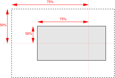
‘75% 50%’, the point 75% across and 50% down
the image is to be placed at the point 75% across and 50% down the
area.
- <length>
- A length value gives a fixed length as the offset. For example, with a
value pair of ‘
2cm 1cm’, the upper left corner
of the image is placed 2cm to the right and 1cm below the upper left
corner of the mask painting area.
- ‘
top’
- Computes to ‘
0%’ for the vertical position
if one or two values are given, otherwise specifies the top edge as the
origin for the next offset.
- ‘
right’
- Computes to ‘
100%’ for the horizontal
position if one or two values are given, otherwise specifies the right
edge as the origin for the next offset.
- ‘
bottom’
- Computes to ‘
100%’ for the vertical
position if one or two values are given, otherwise specifies the bottom
edge as the origin for the next offset.
- ‘
left’
- Computes to ‘
0%’ for the horizontal
position if one or two values are given, otherwise specifies the left
edge as the origin for the next offset.
- ‘
center’
- Computes to ‘
50%’ (‘left
50%’) for the horizontal position if the horizontal position is
not otherwise specified, or ‘50%’ (‘top 50%’) for the vertical position if it is.
The following ‘mask’ shorthand declarations use keywords to
set ‘mask-position’ to the stated percentage
values.
body { mask: url("banner.jpeg") right top }    /* 100%   0% */
body { mask: url("banner.jpeg") top center }   /*  50%   0% */
body { mask: url("banner.jpeg") center }       /*  50%  50% */
body { mask: url("banner.jpeg") bottom }       /*  50% 100% */
In the example below, the (single) image is placed in the lower-right
corner of the viewport.
body {
  mask-image: url("logo.png");
  mask-position: 100% 100%;
  mask-repeat: no-repeat;
}
Mask positions can also be relative to other corners than the top left.
E.g., the following puts the background image 10px from the bottom and
3em from the right:
mask-position: right 3em bottom 10px
See the section “Layering multiple mask
images” for how ‘mask-position’ interacts with other
comma-separated mask properties to form each mask image layer.
6.4. The ‘mask-clip’ property
| Name:
| mask-clip
|
| Value:
| <box>#
|
| Initial:
| border-box
|
| Applies to:
| All elements. In SVG, it applies to container
elements and graphics
elements
|
| Inherited:
| no
|
| Percentages:
| N/A
|
| Media:
| visual
|
| Computed value:
| as specified
|
| Animatable:
| no
|
Determines the mask painting area,
which determines the area that is affected by the mask. The painted
content of an element may be resricted to this area. The syntax of the
property is given with
<box> = border-box | padding-box | content-box | none
Values have the following meanings:
- ‘
border-box’
- The painted content is rectricted to (clipped to) the border
box respectively painting box for objects without
associated layout box.
-
‘
padding-box’
- The painted content is rectricted to (clipped to) the padding
box.
-
‘
content-box’
respectively object bounding box [SVG11] for objects without
associated layout box.
- The painted content is rectricted to (clipped to) the content
box.
- ‘
none’
- The painted content is not restricted (not clipped). The mask painting area is set to the bounding client rect.
Note that there is no corresponding box for ‘padding-box’ on objects without associated layout box
and ‘content-box’
is choosen instead.
See the section “Layering multiple mask
images” for how ‘mask-clip’ interacts with other
comma-separated mask properties to form each mask image layer.
| Name:
| mask-origin
|
| Value:
| <box>#
|
| Initial:
| padding-box
|
| Applies to:
| All elements. In SVG, it applies to container
elements and graphics
elements
|
| Inherited:
| no
|
| Percentages:
| N/A
|
| Media:
| visual
|
| Computed value:
| as specified
|
| Animatable:
| no
|
For elements rendered as a single box, specifies the mask positioning area. For elements
rendered as multiple boxes (e.g., inline boxes on several lines, boxes on
several pages) specifies which boxes ‘box-decoration-break’ operates on to determine the
mask positioning area(s).
-
‘
padding-box’
- The position is relative to the padding box. (For single boxes
‘
0 0’ is the upper left corner of the padding
edge, ‘100% 100%’ is the lower right corner.)
-
‘
border-box’
- The position is relative to the border box respectively painting
box for objects without associated layout box.
- ‘
content-box’
- The position is relative to the content box respectively object
bounding box [SVG11] for objects without
associated layout box.
Note that there is no corresponding box for ‘padding-box’ on objects without associated layout box
and ‘content-box’
is choosen instead.
Note that if ‘mask-clip’ is ‘padding-box’, ‘mask-origin’ is ‘border-box’, ‘mask-position’ is ‘top
left’ (the initial value), and the element has a non-zero border,
then the top and left of the mask image will be clipped.
See the section “Layering multiple mask
images” for how ‘mask-origin’ interacts with other
comma-separated mask properties to form each mask image layer.
Needs to be resolved where the origin for ‘mask-clip: none’ should be.
6.6. The ‘mask-size’ property
| Name:
| mask-size
|
| Value:
| <mask-size>#
|
| Initial:
| auto
|
| Applies to:
| All elements. In SVG, it applies to container
elements and graphics
elements
|
| Inherited:
| no
|
| Percentages:
| see text
|
| Media:
| visual
|
| Computed value:
| as specified, but with lengths made absolute
|
| Animatable:
| yes except keyword values
|
Specifies the size of the mask images. Where
<mask-size> = [ <length> | <percentage> | auto ]{1,2} | cover | contain
Values have the following meanings:
- ‘
contain’
- Scale the image, while preserving its intrinsic aspect ratio (if any),
to the largest size such that both its width and its height can fit
inside the mask positioning area.
- ‘
cover’
- Scale the image, while preserving its intrinsic aspect ratio (if any),
to the smallest size such that both its width and its height can
completely cover the mask positioning area.
- [ <length> | <percentage> | auto ]{1,2}
-
The first value gives the width of the corresponding image, the second
value its height. If only one value is given the second is assumed to be
‘auto’.
A percentage is relative to the background positioning area.
An ‘auto’ value for one dimension is
resolved by using the image's intrinsic ratio and the size of the other
dimension, or failing that, using the image's intrinsic size, or failing
that, treating it as 100%.
If both values are ‘auto’ then the
intrinsic width and/or height of the image should be used, if any, the
missing dimension (if any) behaving as ‘auto’
as described above. If the image has neither an intrinsic width nor an
intrinsic height, its size is determined as for ‘contain’.
Negative values are not allowed.
Here are some examples. The first example stretches the mask image
independently in both dimensions to completely cover the content area:
div {
    mask-image: url(plasma.png);
    mask-repeat: no-repeat;
    mask-size: 100% 100%;
    mask-origin: content-box }
The second example stretches the image so that exactly two copies fit
horizontally. The aspect ratio is preserved:
p {
    mask-image: url(tubes.png);
    mask-size: 50% auto;
    mask-origin: border-box }
This example forces the mask image to be 15 by 15 pixels:
para {
    mask-size: 15px 15px;
    mask-image: url(tile.png)}
This example uses the image's intrinsic size. Note that this is the
only possible behavior in CSS level 1 and 2.
body {
    mask-size: auto;            /* default */
    mask-image: url(flower.png) }
The following example rounds the height of the image to 33.3%, up from
the specified value of 30%. At 30%, three images would fit entirely and a
fourth only partially. After rounding, three images fit. The width of the
image is 20% of the mask area width and is not rounded.
p {
    mask-image: url(chain.png);
    mask-repeat: no-repeat round;
    mask-size: 20% 30% }
If ‘mask-repeat’ is ‘round’ for one (or both) dimensions, there is a second
step. The UA must scale the image in that dimension (or both dimensions)
so that it fits a whole number of times in the mask positioning area. In
the case of the width (height is analogous):
If X ≠ 0 is the width of the image after step one and
W is the width of the mask positioning area, then the rounded
width X' = W / round(W / X)
where round() is a function that returns the nearest natural number
(integer greater than zero).
If ‘mask-repeat’ is ‘round’ for one dimension only and if ‘mask-size’ is ‘auto’ for the other dimension, then there is a third
step: that other dimension is scaled so that the original aspect ratio is
restored.
In this example the mask image is shown at its intrinsic size:
div {
  mask-image: url(image1.png);
  mask-repeat: repeat;         /* default */
  mask-size: auto }            /* default */
In the following example, the mask is shown with a width of 3em and its
height is scaled proportionally to keep the original aspect ratio:
div {
  mask-image: url(image2.png);
  mask-repeat: repeat;         /* default */
  mask-size: 3em }             /* = '3em auto' */
In the following example, the mask is shown with a width of
approximately 3em: scaled so that it fits a whole number of times in the
width of the mask. The height is scaled proportionally to keep the
original aspect ratio:
div {
  mask-image: url(image3.png);
  mask-repeat: round repeat;
  mask-size: 3em auto }
In the following example, the mask image is shown with a width of 3em
and a height that is either the height corresponding to that width at the
original aspect ratio or slightly less:
div {
  mask-image: url(image4.png);
  mask-repeat: repeat round;
  mask-size: 3em auto }
In the following example, the mask image is shown with a height of
approximately 4em: scaled slightly so that it fits a whole number of
times in the mask height. The width is the approximately the width that
correspond to a 4em height at the original aspect ratio: scaled slightly
so that it fits a whole number of times in the mask width.
div {
  mask-image: url(image5.png);
  mask-repeat: round;
  mask-size: auto 4em }
If the mask image's width or height resolves to zero, this causes the
image not to be displayed. (The effect is the same as if it had been a
transparent image.)
See the section “Layering multiple mask
images” for how ‘mask-size’ interacts with other
comma-separated mask properties to form each mask image layer.
6.7. The ‘mask’ property
| Name:
| mask
|
| Value:
| <mask-source> | <mask-layer>#
|
| Initial:
| see individual properties
|
| Applies to:
| All elements. In SVG, it applies to container
elements and graphics
elements
|
| Inherited:
| no
|
| Percentages:
| see individual properties
|
| Media:
| visual
|
| Computed value:
| see individual properties
|
| Animatable:
| see individual properties
|
Where
<mask-layer> = <mask-image> || <position> [ / <mask-size> ]? || <repeat-style> || <box>{1,2}
Currently Mozilla needs to differ between CSS Image and Mask
resource right after parsing and before loading the resource. This is not
possible with the current ‘mask’ property definition.
<mask-source> = [ <url> | child | <child-selector> ] [ alpha | luminance ] ?
<child-selector> = select(<compound-selector>#)
- ‘
<url>’
- A URL reference to a ‘
mask’ element.
For example ‘url(commonmasks.xml#mask)’.
- ‘
child’
- A keyword to indicate that the last child ‘
mask’ element
should be used as the mask source. It is equivalent to ‘select(mask:last-of-type)’.
- ‘
<child-selector>’
- A comma-separated list of compound
selectors scoped at the element to which the ‘
mask’ property is applied. The first matching
element in tree
order (as defined in [DOM]) as a result of evaluating the
list of selectors is taken as the mask source. If there are no matching
elements the mask source is invalid.
- ‘
<compound-selector>’
- A compound
selector as defined in [SELECTORS4].
-
- ‘
alpha’
- A value of ‘
alpha’
indicates that the alpha values of the mask content of the referenced
mask element should be used as the mask values. See Calculating mask values.
- ‘
luminance’
- A value of ‘
luminance’ indicates that the luminance values of
the mask content of the referenced mask element should be used as the
mask values. See Calculating mask values.
The keywords ‘alpha’ or
‘luminance’ may be
used together with a reference to a ‘mask’ element. If
either keyword is specified the effect is to override the value of the
‘mask-type’
property on the referenced ‘mask’ element.
In the following example, the ‘mask-type’ property sets the mask type value
for the ‘mask’ element to ‘alpha’. The ‘mask’ property has a reference to this ‘mask’ element and the keyword ‘luminance’. The ‘mask’ property will
override the definition of ‘mask-type’ to ‘luminance’.
<mask id="SVGMask" mask-type="alpha" maskContentUnits="objectBoundingBox">
  <radialGradient id="radialFill">
    <stop stop-color="white" offset="0"/>
    <stop stop-color="black" offset="1"/>
  </radialGradient>
  <circle fill="url(#radialFill)" cx="0.5" cy="0.5" r="0.5"/>
</mask>

<rect width="200" height="200" style="fill: green; mask: url(#SVGMask) luminance"/>
An invalid or non-existent mask source is ignored and no masking is
applied.
Note that the properties ‘mask-image’, ‘mask-repeat’, ‘mask-position’,
‘mask-clip’,
‘mask-origin’
and ‘mask-size’
have no affect on ‘mask’ elements.
6.8. The ‘mask-type’ property
| Name:
| mask-type
|
| Value:
| luminance | alpha
|
| Initial:
| luminance
|
| Applies to:
| ‘mask’ elements
|
| Inherited:
| no
|
| Percentages:
| N/A
|
| Media:
| visual
|
| Computed value:
| as specified
|
| Animatable:
| yes except keyword values
|
The ‘mask-type’
property defines whether the content of the ‘mask’ is treated
as as luminance mask or alpha mask, as described in Calculating mask values.
Values have the following meanings:
- ‘
luminance’
- Indicates that the luminance values of the mask should be used.
- ‘
alpha’
- Indicates that the alpha values of the mask should be used.
The ‘mask-type’
property is a presentation attribute for SVG elements.
6.9. The ‘mask’ element
| Name:
| mask
|
| Categories:
| Container
element
|
| Content model:
| Any number of the following elements, in any order:
- animation
— ‘animate’, ‘animateColor’, ‘animateMotion’, ‘animateTransform’, ‘set’
- descriptive
— ‘desc’, ‘title’, ‘metadata’
- shape
— ‘circle’, ‘ellipse’, ‘line’, ‘path’, ‘polygon’, ‘polyline’, ‘rect’
- structural
— ‘defs’, ‘g’, ‘svg’, ‘symbol’, ‘use’
- gradient
— ‘linearGradient’, ‘radialGradient’
- ‘a’
- ‘clipPath’
- ‘color-profile’
- ‘cursor’
- ‘filter’
- ‘font’
- ‘font-face’
- ‘foreignObject’
- ‘image’
- ‘marker’
- ‘mask’
- ‘pattern’
- ‘script’
- ‘style’
- ‘switch’
- ‘view’
- ‘text’
- ‘altGlyphDef’
|
| Attributes:
|
- conditional
processing attributes — ‘requiredFeatures’, ‘requiredExtensions’, ‘systemLanguage’
- core
attributes — ‘id’, ‘xml:base’, ‘xml:lang’, ‘xml:space’
- presentation
attributes — ‘alignment-baseline’, ‘baseline-shift’, ‘clip’, ‘clip-path’, ‘clip-rule’, ‘color’, ‘color-interpolation’, ‘color-interpolation-filters’, ‘color-profile’, ‘color-rendering’, ‘cursor’, ‘direction’, ‘display’, ‘dominant-baseline’, ‘enable-background’, ‘fill’, ‘fill-opacity’, ‘fill-rule’, ‘filter’, ‘flood-color’, ‘flood-opacity’, ‘font’, ‘font-family’, ‘font-size’, ‘font-size-adjust’, ‘font-stretch’, ‘font-style’, ‘font-variant’, ‘font-weight’, ‘glyph-orientation-horizontal’, ‘glyph-orientation-vertical’, ‘image-rendering’, ‘kerning’, ‘letter-spacing’, ‘lighting-color’, ‘marker’, ‘marker-end’, ‘marker-mid’, ‘marker-start’, ‘mask’, ‘opacity’, ‘overflow’, ‘pointer-events’, ‘shape-rendering’, ‘stop-color’, ‘stop-opacity’, ‘stroke’, ‘stroke-dasharray’, ‘stroke-dashoffset’, ‘stroke-linecap’, ‘stroke-linejoin’, ‘stroke-miterlimit’, ‘stroke-opacity’, ‘stroke-width’, ‘text-anchor’, ‘text-decoration’, ‘text-rendering’, ‘unicode-bidi’, ‘visibility’, ‘word-spacing’, ‘writing-mode’
- ‘class’
- ‘style’
- ‘x’
- ‘y’
- ‘width’
- ‘height’
- ‘maskUnits’
- ‘maskContentUnits’
|
| DOM Interfaces:
| SVGMaskElement
|
Attribute definitions:
- maskUnits =
"userSpaceOnUse | objectBoundingBox"
- Defines the coordinate system for attributes ‘
x’,
‘y’, ‘width’ and ‘height’.
If maskUnits="userSpaceOnUse", ‘x’, ‘y’,
‘width’ and ‘height’ represent values in the current user
coordinate system in place at the time when the ‘mask’ element
is referenced (i.e., the user coordinate system for the element
referencing the ‘mask’ element via the ‘mask’ property).
If maskUnits="objectBoundingBox", ‘x’, ‘y’,
‘width’ and ‘height’ represent fractions or percentages
of the bounding box of the element to which the mask is applied. (See object bounding box
units.)
If attribute ‘maskUnits’ is not specified, then the effect
is as if a value of ‘objectBoundingBox’ were specified.
Animatable: yes.
- maskContentUnits = "userSpaceOnUse |
objectBoundingBox"
- Defines the coordinate system for the contents of the ‘
mask’.
If maskContentUnits="userSpaceOnUse", the
user coordinate system for the contents of the ‘mask’ element
is the current user coordinate system in place at the time when the ‘mask’ element is referenced (i.e., the user
coordinate system for the element referencing the ‘mask’ element
via the ‘mask’
property).
If maskContentUnits="objectBoundingBox",
the user coordinate system for the contents of the ‘mask’ is
established using the bounding box of the element to which the mask is
applied. (See object
bounding box units.)
If attribute ‘maskContentUnits’ is not specified, then the
effect is as if a value of ‘userSpaceOnUse’ were specified.
Animatable: yes.
- x =
"<length> | <percentage>"
- The x-axis coordinate of one corner of the rectangle for the largest
possible offscreen buffer. Note that the clipping path used to render
any graphics within the mask will consist of the intersection of the
current clipping path associated with the given object and the rectangle
defined by ‘
x’, ‘y’,
‘width’ and ‘height’.
If the attribute is not specified, the effect is as if a value of ‘-10%’ were
specified.
Animatable: yes.
- y =
"<length> | <percentage>"
- The y-axis coordinate of one corner of the rectangle for the largest
possible offscreen buffer.
If the attribute is not specified, the effect is as if a value of ‘-10%’ were
specified.
Animatable: yes.
- width =
"<length> | <percentage>"
- The width of the largest possible offscreen buffer. Note that the
clipping path used to render any graphics within the mask will consist
of the intersection of the current clipping path associated with the
given object and the rectangle defined by ‘
x’,
‘y’, ‘width’ and ‘height’.
A negative value or a value of zero disables rendering of the
element.
If the attribute is not specified, the effect is as if a value of ‘120%’ were
specified.
Animatable: yes.
- height =
"<length> | <percentage>"
- The height of the largest possible offscreen buffer.
A negative value or a value of zero disables rendering of the
element.
If the attribute is not specified, the effect is as if a value of ‘120%’ were
specified.
Animatable: yes.
CSS properties inherit into the ‘mask’ element
from its ancestors; properties do not inherit from the element
referencing the ‘mask’ element.
‘mask’ elements are never rendered directly;
their only usage is as something that can be referenced using the ‘mask’ property. The
‘opacity’, ‘filter’ and ‘display’ properties do not apply to the ‘mask’ element; thus, ‘mask’ elements
are not directly rendered even if the ‘display’ property is set to a value other than
‘none’, and ‘mask’ elements are available for referencing
even when the ‘display’ property on the ‘mask’ element or any of its ancestors is set
to none.
7. Mask Box Image
With ‘mask-box-image’ a mask can be split into nine
pieces: four corners, four edges and the middle piece as demonstrated in
the figure below.
These pieces may be sliced, scaled and stretched in various ways to fit
the size of the mask image
area.
The mask image in the following example is split into four corners
with dimensions of 75 pixels, four edges and the middle piece that is
stretched and scaled.
div {
  background: linear-gradient(bottom, #F27BAA 0%, #FCC8AD 100%);
  mask-box-image-slice: 25 fill;
  mask-box-image-repeat: stretch;
  mask-box-image-source: url(mask.png);
}
Specifies an image to be used as mask. If the value is ‘none’ or if the image cannot be
displayed (or the property doesn't apply), the content won't get masked.
| Name:
| mask-box-image-slice
|
| Value:
| [<number> | <percentage>]{1,4}
&& fill?
|
| Initial:
| 0 fill
|
| Applies to:
| All elements. In SVG, it applies to container
elements and graphics
elements.
|
| Inherited:
| no
|
| Percentages:
| refer to size of the mask image
|
| Media:
| visual
|
| Computed value:
| as specified
|
| Animatable:
| no
|
This property specifies inward offsets from the top, right, bottom, and
left edges of the mask image, dividing it into nine regions: four corners,
four edges and a middle. The middle image part is discarded (treated as
fully transparent black) unless the ‘fill’
keyword is present.
When four values are specified, they set the offsets on the top, right,
bottom and left sides in that order. If the left is missing, it is the
same as the right; if the bottom is missing, it is the same as the top; if
the right is missing, it is the same as the top.
- <percentage>
- Percentages are relative to the size of the mask image: the width of
the image for the horizontal offsets, the height for vertical offsets.
- <number>
- Numbers represent pixels in the mask image (if the image is a raster
image) or vector coordinates (if the image is a vector image).
- ‘
fill’
- The ‘
fill’ keyword, if present, causes the middle part
of the mask image to be preserved. (By default it is discarded, i.e.,
treated as transparent black.)
Negative values are not allowed and values bigger than the size of the
image are interpreted as ‘100%’.
The regions given by the ‘mask-box-image-slice’ values may overlap.
However if the sum of the right and left widths is equal to or greater
than the width of the image, the images for the top and bottom edge and
the middle part are empty, which has the same effect as if a nonempty
transparent image had been specified for those parts. Analogously for the
top and bottom values.
If the image must be sized to determine the slices (for example, for SVG
images with no intrinsic size), then it is sized as for an auto-sized
background, using the mask box image
area as the default object size in place of the mask positioning area.
| Name:
| mask-box-image-width
|
| Value:
| [ <length> | <percentage> |
<number> | auto ]{1,4}
|
| Initial:
| auto
|
| Applies to:
| All elements. In SVG, it applies to container
elements and graphics
elements.
|
| Inherited:
| no
|
| Percentages:
| relative to width/height of the mask box image area
|
| Media:
| visual
|
| Computed value:
| all <length>s made absolute, otherwise as specified
|
| Animatable:
| no
|
The mask image is drawn inside an area called the mask box image area. This is an
area whose boundaries by default correspond to the mask box, see ‘mask-box-image-outset’.
The four values of ‘mask-box-image-width’ specify offsets that are
used to divide the mask box image area into nine parts. They represent
inward distances from the the top, right, bottom, and left sides of the
area, respectively. If the left width is missing, it is the same as the
right; if the bottom is missing, it is the same as the top; if the right
is missing, it is the same as the top. Values have the following meanings:
- <percentage>
- Percentages refer to the size of the mask box image area: the width of
the area for horizontal offsets, the height for vertical offsets.
- <number>
- Numbers represent multiples of the corresponding computed ‘
border-width’.
- ‘
auto’
- If ‘
auto’ is specified then the mask box
image width is the intrinsic width or height (whichever is applicable) of
the corresponding image slice (see ‘mask-box-image-slice’). If the image does not
have the required intrinsic dimension then the corresponding ‘border-width’ is used instead.
Note that for SVG elements without an associated layout box
the ‘border-width’ is considered to be
‘0’.
Negative values are not allowed for any ‘mask-box-image-width’ values.
If two opposite ‘mask-box-image-width’ offsets are large enough
that they overlap, then the used values of all ‘mask-box-image-width’ offsets are
proportionally reduced until they no longer overlap. In mathematical
notation: Given Lwidth as the width of the mask box
image area, Lheight as its height, and
Wside as the mask image width offset for
the side side, let f =
min(Lwidth/(Wleft+Wright),
Lheight/(Wtop+Wbottom)).
If f < 1, then all W are reduced by multiplying
them by f.
| Name:
| mask-box-image-outset
|
| Value:
| [ <length> | <number> ]{1,4}
|
| Initial:
| 0
|
| Applies to:
| All elements. In SVG, it applies to container
elements and graphics
elements.
|
| Inherited:
| no
|
| Percentages:
| N/A
|
| Media:
| visual
|
| Computed value:
| all <length>s made absolute, otherwise as specified
|
| Animatable:
| no
|
The values specify the amount by which the mask box image area extends beyond the border
box. If it has four values, they set the outsets on the top, right, bottom
and left sides in that order. If the left is missing, it is the same as
the right; if the bottom is missing, it is the same as the top; if the
right is missing, it is the same as the top.
As with ‘mask-box-image-width’, a <number>
represents a multiple of the corresponding ‘border-width’. Negative values are not allowed for
any of the ‘mask-box-image-outset’ values.
Note that for SVG elements without associated layout box the
‘border-width’ is considered to be
‘0’.
| Name:
| mask-box-image-repeat
|
| Value:
| [ stretch | repeat | round | space ]{1,2}
|
| Initial:
| stretch
|
| Applies to:
| All elements. In SVG, it applies to container
elements and graphics
elements.
|
| Inherited:
| no
|
| Percentages:
| N/A
|
| Media:
| visual
|
| Computed value:
| as specified
|
| Animatable:
| no
|
This property specifies how the images for the sides and the middle part
of the mask image are scaled and tiled. The first keyword applies to the
horizontal sides, the second to the vertical ones. If the second keyword
is absent, it is assumed to be the same as the first. Values have the
following meanings:
- ‘
stretch’
- The image is stretched to fill the area.
- ‘
repeat’
- The image is tiled (repeated) to fill the area.
- ‘
round’
- The image is tiled (repeated) to fill the area. If it does not fill
the area with a whole number of tiles, the image is rescaled so that it
does.
- ‘
space’
- The image is tiled (repeated) to fill the area. If it does not fill
the area with a whole number of tiles, the extra space is distributed
around the tiles.
This is a shorthand property for setting ‘mask-box-image-source’, ‘mask-box-image-slice’, ‘mask-box-image-width’, ‘mask-box-image-outset’ and ‘mask-box-image-repeat’. Omitted values are set
to their initial values.
7.7.
Masking with the mask-box-image
After the mask-box-image given by ‘mask-box-image-source’ is sliced by the ‘mask-box-image-slice’ values, the resulting
nine images are scaled, positioned, and tiled into their corresponding
mask image regions in four steps:
- Scale to ‘
mask-box-image-width’.
-
The two images for the top and bottom edges are made as tall as the
top and bottom mask image area parts, respectively, and their
width is scaled proportionally.
-
The images for the left and right edge are made as wide as the left
and right mask image area parts, respectively, and their
height is scaled proportionally.
-
The corner images are scaled to be as wide and as tall as the two
mask-box-image edges they are part of.
-
The middle image's width is scaled by the same factor as the top
image unless that factor is zero or infinity, in which case the
scaling factor of the bottom is substituted, and failing that, the
width is not scaled. The height of the middle image is scaled by the
same factor as the left image unless that factor is zero or infinity,
in which case the scaling factor of the right image is substituted,
and failing that, the height is not scaled.
- Scale to ‘
mask-box-image-repeat’.
-
If the first keyword is ‘stretch’, the top, middle and bottom images are
further scaled to be as wide as the middle part of the mask
image area. The height is not changed any further.
-
If the first keyword is ‘round’, the top,
middle and bottom images are resized in width, so that exactly a whole
number of them fit in the middle part of the mask-box-image area,
exactly as for ‘round’ in the ‘mask-image-repeat’ property.
-
If the first keyword is ‘repeat’ or
‘space’, the top, middle, and bottom images
are not changed any further.
-
The effects of ‘stretch’, ‘round’,
‘repeat’, and ‘space’ for the second keyword are analogous, acting
on the height of the left, middle and right images.
- Position the first tile.
-
If the first keyword is ‘repeat’, the
top, middle, and bottom images are centered horizontally in their
respective areas. Otherwise the images are placed at the left edge of
their respective parts of the mask-box-image area.
-
If the second keyword is ‘repeat’, the
left, middle, and right images are centered vertically in their
respective areas. Otherwise the images are placed at the top edge of
their respective parts of the mask-box-image area.
- Tile and mask.
-
The images are then tiled to fill their respective areas. All tiles
are used together to mask the element and its descendants after
drawing all stacking levels.
-
In the case of ‘space’, any partial tiles
are discarded and the extra space distributed before, after, and
between the tiles. (I.e. the gap before the first tile, the gap after
the last tile, and the gaps between tiles are equalized.) Note that this can result in empty mask-box-image side
areas.
8. Clipping paths
The clipping path restricts the region to which paint can be applied,
the so-called clipping region. Conceptually, any parts of the drawing that
lie outside of this region are not drawn. This includes any content,
background, borders, text decoration, outline and visible scrolling
mechanism of the element to which the clipping path is applied, and those
of its descendants.
An element's ancestors may also clip portions of their content (e.g.,
via their own ‘clip’ or ‘clip-path’ properties and/or if their ‘overflow’ property is not ‘visible’). What is rendered is the cumulative
intersection.
If the clipping region exceeds the bounds of the UA's document window,
content may be clipped to that window by the native operating environment.
8.1. The ‘clip-path’ property
<clip-source> = <url> | child |
  <child-selector>
- ‘
<shape>’
- A basic shape function as defined in CSS3 Exclusions. Percentage
values are resolved against the bounding client
rect. (See [CSS3-EXCLUSIONS].)
For SVG percentage values might be resolved according to
the painted bounding box and not bounding client rect (alias object
bounding box).
8.2. The ‘clip-rule’ property
| Name:
| clip-rule
|
| Value:
| nonzero | evenodd
|
| Initial:
| nonzero
|
| Applies to:
| graphics
elements within a ‘clipPath’
element
|
| Inherited:
| yes
|
| Percentages:
| N/A
|
| Media:
| visual
|
| Computed value:
| as specified
|
| Animatable:
| yes
|
- ‘
nonzero’
- See description of ‘
fill-rule’ property [SVG11].
- ‘
evenodd’
- See description of ‘
fill-rule’ property [SVG11].
The ‘clip-rule’
property only applies to graphics elements that are contained within a ‘clipPath’ element.
The following fragment of code will cause an evenodd
clipping rule to be applied to the clipping path because ‘
clip-rule’ is
specified on the
‘path’ element that defines the clipping shape:
<g clip-rule="nonzero">
  <clipPath id="MyClip">
    <path d="..." clip-rule="evenodd" />
  </clipPath>
  <rect clip-path="url(#MyClip)" ... />
</g>
whereas the following fragment of code will not cause an
evenodd clipping rule to be applied because the ‘clip-rule’ is
specified on the referencing element, not on the object defining the
clipping shape:
<g clip-rule="nonzero">
  <clipPath id="MyClip">
    <path d="..." />
  </clipPath>
  <rect clip-path="url(#MyClip)" clip-rule="evenodd" ... />
</g>
8.3. The ‘clip’ property
With this specification the ‘clip’ property is deprecated. Authors are
encouraged to use the ‘clip-path’ property instead. UAs must support
the ‘clip’
property.
The ‘clip’
property applies only to absolutely positioned elements. In SVG, it
applies to elements
which establish a new viewport, ‘pattern’ elements and ‘marker’ elements. Values have the following
meanings:
- ‘
auto’
- The element does not clip.
- <shape>
-
In CSS 2.1, the only valid <shape> value is: rect(<top>, <right>, <bottom>, <left>) where <top> and <bottom> specify offsets from
the top border edge of the box, and <right>, and <left> specify offsets from the
left border edge of the box. Authors should separate offset values with
commas. User agents must support separation with commas, but may also
support separation without commas (but not a combination), because a
previous revision of this specification was ambiguous in this respect.
<top>, <right>, <bottom>, and <left> may either have a
<length> value or ‘auto’.
Negative lengths are permitted. The value ‘auto’ means that a given edge of the clipping region
will be the same as the edge of the element's generated border box
(i.e., ‘auto’ means the same as ‘0’ for <top>
and <left>, the same as the
used value of the height plus the sum of vertical padding and border
widths for <bottom>, and the
same as the used value of the width plus the sum of the horizontal
padding and border widths for <right>, such that four ‘auto’ values result in the clipping region being
the same as the element's border box).
When coordinates are rounded to pixel coordinates, care should be
taken that no pixels remain visible when <left> and <right> have the same value (or
<top> and <bottom> have the same value),
and conversely that no pixels within the element's border box remain
hidden when these values are ‘auto’.
Example: The following two rules:
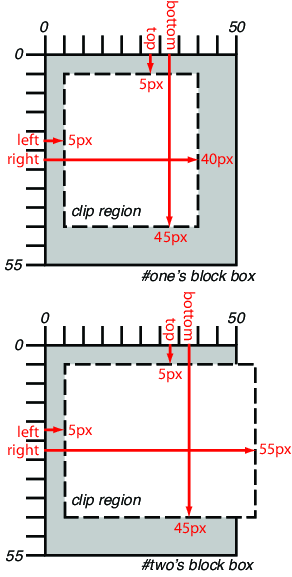
p#one { clip: rect(5px, 40px, 45px, 5px); }
p#two { clip: rect(5px, 55px, 45px, 5px); }
and assuming both Ps are 50 by 55 pixel, will create, respectively,
the rectangular clipping regions delimited by the dashed lines in the
following illustrations:
| Name:
| clipPath
|
| Categories:
| None.
|
| Content model:
| Any number of the following elements, in any order:
- descriptive
— ‘desc’, ‘title’, ‘metadata’
- animation
— ‘animate’, ‘animateColor’, ‘animateMotion’, ‘animateTransform’, ‘set’
- shape
— ‘circle’, ‘ellipse’, ‘line’, ‘path’, ‘polygon’, ‘polyline’, ‘rect’
- ‘text’
- ‘use’
|
| Attributes:
|
- conditional
processing attributes — ‘requiredFeatures’, ‘requiredExtensions’, ‘systemLanguage’
- core
attributes — ‘id’, ‘xml:base’, ‘xml:lang’, ‘xml:space’
- presentation
attributes — ‘alignment-baseline’, ‘baseline-shift’, ‘clip’, ‘clip-path’, ‘clip-rule’, ‘color’, ‘color-interpolation’, ‘color-interpolation-filters’, ‘color-profile’, ‘color-rendering’, ‘cursor’, ‘direction’, ‘display’, ‘dominant-baseline’, ‘enable-background’, ‘fill’, ‘fill-opacity’, ‘fill-rule’, ‘filter’, ‘flood-color’, ‘flood-opacity’, ‘font’, ‘font-family’, ‘font-size’, ‘font-size-adjust’, ‘font-stretch’, ‘font-style’, ‘font-variant’, ‘font-weight’, ‘glyph-orientation-horizontal’, ‘glyph-orientation-vertical’, ‘image-rendering’, ‘kerning’, ‘letter-spacing’, ‘lighting-color’, ‘marker’, ‘marker-end’, ‘marker-mid’, ‘marker-start’, ‘mask’, ‘opacity’, ‘overflow’, ‘pointer-events’, ‘shape-rendering’, ‘stop-color’, ‘stop-opacity’, ‘stroke’, ‘stroke-dasharray’, ‘stroke-dashoffset’, ‘stroke-linecap’, ‘stroke-linejoin’, ‘stroke-miterlimit’, ‘stroke-opacity’, ‘stroke-width’, ‘text-anchor’, ‘text-decoration’, ‘text-rendering’, ‘unicode-bidi’, ‘visibility’, ‘word-spacing’, ‘writing-mode’
- ‘class’
- ‘style’
- ‘externalResourcesRequired’
- ‘transform’
- ‘clipPathUnits’
|
| DOM Interfaces:
| SVGClipPathElement
|
Attribute definitions:
- clipPathUnits = "userSpaceOnUse |
objectBoundingBox"
- Defines the coordinate system for the contents of the ‘
clipPath’.
If clipPathUnits="userSpaceOnUse", the
contents of the ‘clipPath’ represent values in the current
user coordinate system in place at the time when the ‘clipPath’ element is referenced (i.e., the
user coordinate system for the element referencing the ‘clipPath’ element via the ‘clip-path’ property).
If clipPathUnits="objectBoundingBox", then
the user coordinate system for the contents of the ‘clipPath’
element is established using the bounding box of the element to which
the clipping path is applied (see object
bounding box units).
If attribute ‘clipPathUnits’ is not specified, then the
effect is as if a value of ‘userSpaceOnUse’ were specified.
Animatable: yes.
CSS properties inherit into the ‘clipPath’
element from its ancestors; properties do not inherit from the
element referencing the ‘clipPath’
element.
‘clipPath’ elements are never rendered
directly; their only usage is as something that can be referenced using
the ‘clip-path’ property. The ‘display’ property does not apply to the ‘clipPath’ element; thus, ‘clipPath’
elements are not directly rendered even if the ‘display’ property is set to a value other than none, and ‘clipPath’
elements are available for referencing even when the ‘display’ property on the ‘clipPath’
element or any of its ancestors is set to none.
A ‘clipPath’ element can contain ‘path’ elements, ‘text’ elements, basic
shapes (such as ‘circle’) or a ‘use’ element. If a ‘use’ element is a child of a ‘clipPath’ element, it must directly reference
‘path’, ‘text’ or basic
shapes elements. Indirect references are an error and the ‘clipPath’ element must be ignored.
The raw geometry of each child element exclusive of rendering properties
such as ‘fill’, ‘stroke’, ‘stroke-width’ within a ‘clipPath’
conceptually defines a 1-bit mask (with the possible exception of
anti-aliasing along the edge of the geometry) which represents the
silhouette of the graphics associated with that element. Anything outside
the outline of the object is masked out. If a child element is made
invisible by ‘display’ or ‘visibility’ it does not contribute to the clipping
path. When the ‘clipPath’ element contains multiple child
elements, the silhouettes of the child elements are logically OR'd
together to create a single silhouette which is then used to restrict the
region onto which paint can be applied. Thus, a point is inside the
clipping path if it is inside any of the children of the ‘clipPath’.
For a given graphics element, the actual clipping path used will be the
intersection of the clipping path specified by its ‘clip-path’ property
(if any) with any clipping paths on its ancestors, as specified by the
‘clip-path’
property on the elements which establish a new viewport. (See [SVG11])
A couple of notes:
- The ‘
clipPath’ element itself and its child
elements do not inherit clipping paths from the ancestors of the
‘clipPath’ element.
- The ‘
clipPath’ element or any of its children can
specify property ‘clip-path’.
If a valid ‘clip-path’ reference is placed on a ‘clipPath’ element, the resulting clipping
path is the intersection of the contents of the ‘clipPath’
element with the referenced clipping path.
If a valid ‘clip-path’ reference is placed on one of the
children of a ‘clipPath’ element, then the given child
element is clipped by the referenced clipping path before OR'ing the
silhouette of the child element with the silhouettes of the other child
elements.
- An empty clipping path will completely clip away the element that had
the ‘
clip-path’
property applied.
8.5. Clipping paths,
geometry, and pointer events
A clipping path is conceptually equivalent to a custom viewport for the
referencing element. Thus, it affects the rendering of an element, but not
the element's inherent geometry. The bounding client
rect of a clipped element (that is, an element which references a ‘clipPath’ element via a ‘clip-path’ property,
or a child of the referencing element) must remain the same as if it were
not clipped.
By default, pointer
events must not be dispatched on the clipped (non-visible) regions of
a shape. For example, a circle with a radius of 10 which is clipped to a
circle with a radius of 5 will not receive ‘click’ events outside the smaller radius.
Later versions of this specification may define new properties to enable
fine-grained control over the interactions between hit testing and
clipping.
9. Security
9.1. Origin
Restrictions
External references to resources like ‘mask’ or ‘clipPath’ must not violate the same origin
restrictions [CORS].
This restriction includes:
- Any images, either as content or via styling, that are not exposed
with CORS
- Any tainted canvas
- Any cross-origin content referenced by ‘
xlink:href’ or <use>
If content falls under this restriction, the resource must be rejected.
The element is drawn as if the resource was not specified (i.e. the ‘clip-path’ or ‘mask’ property were set to
‘none’).
10. DOM interfaces
10.1. Interface
SVGClipPathElement
The SVGClipPathElement
interface corresponds to the ‘clipPath’
element.
interface SVGClipPathElement : SVGDefinitionElement {
  readonly attribute SVGAnimatedEnumeration clipPathUnits;
};

SVGClipPathElement implements SVGUnitTypes;
-
- clipPathUnits (readonly SVGAnimatedEnumeration)
-
10.2. Interface
SVGMaskElement
The SVGMaskElement interface
corresponds to the ‘mask’ element.
interface SVGMaskElement : SVGDefinitionElement {

  // Mask Types
  const unsigned short SVG_MASKTYPE_LUMINANCE = 0;
  const unsigned short SVG_MASKTYPE_ALPHA = 1;

  readonly attribute SVGAnimatedEnumeration maskUnits;
  readonly attribute SVGAnimatedEnumeration maskContentUnits;
  readonly attribute SVGAnimatedLength x;
  readonly attribute SVGAnimatedLength y;
  readonly attribute SVGAnimatedLength width;
  readonly attribute SVGAnimatedLength height;
};

SVGMaskElement implements SVGUnitTypes;
-
- SVG_MASKTYPE_LUMINANCE (unsigned short)
-
- SVG_MASKTYPE_ALPHA (unsigned short)
-
-
- maskUnits (readonly SVGAnimatedEnumeration)
-
- maskContentUnits (readonly SVGAnimatedEnumeration)
-
- x (readonly SVGAnimatedLength)
-
Corresponds to attribute
‘x’
on the given
‘mask’ element.
- y (readonly SVGAnimatedLength)
-
Corresponds to attribute
‘y’
on the given
‘mask’ element.
- width (readonly SVGAnimatedLength)
-
- height (readonly SVGAnimatedLength)
-
References
Normative references
-
- [CORS]
- Anne van Kesteren. Cross-Origin
Resource Sharing. 3 April 2012. W3C Working Draft. (Work in
progress.) URL: http://www.w3.org/TR/2012/WD-cors-20120403/
- [CSS21]
- Bert Bos; et al. Cascading Style
Sheets Level 2 Revision 1 (CSS 2.1) Specification. 7 June
2011. W3C Recommendation. URL: http://www.w3.org/TR/2011/REC-CSS2-20110607
- [CSS3-EXCLUSIONS]
- Vincent Hardy; Rossen Atanassov; Alan Stearns. CSS
Exclusions and Shapes Module Level 3. 3 May 2012. W3C Working
Draft. (Work in progress.) URL: http://www.w3.org/TR/2012/WD-css3-exclusions-20120503/
- [CSS3-IMAGES]
- Elika J. Etemad; Tab Atkins Jr. CSS Image
Values and Replaced Content Module Level 3. 17 April 2012. W3C
Candidate Recommendation. (Work in progress.) URL: http://www.w3.org/TR/2012/CR-css3-images-20120417/
- [DOM]
- Anne van Kesteren; Aryeh Gregor; Ms2ger. DOM4.
5 April 2012. W3C Working Draft. (Work in progress.) URL: http://www.w3.org/TR/2012/WD-dom-20120405/
- [SELECTORS4]
- Elika J. Etemad. Selectors
Level 4. 23 August 2012. W3C Working Draft. (Work in
progress.) URL: http://www.w3.org/TR/2012/WD-selectors4-20120823/
- [SVG11]
- Erik Dahlström; et al. Scalable
Vector Graphics (SVG) 1.1 (Second Edition). 16 August 2011.
W3C Recommendation. URL: http://www.w3.org/TR/2011/REC-SVG11-20110816/
- [SVG2]
- Cameron McCormack; Scalable Vector
Graphics (SVG) 2. 28 August 2012. W3C Working Draft. (Work in
progress.) URL: http://www.w3.org/TR/2012/WD-SVG2-20120828/
Other references
-
- [CSS3-TRANSFORMS]
- Simon Fraser; et al. CSS
Transforms. 11 September 2012. W3C Working Draft. (Work in
progress.) URL: http://www.w3.org/TR/2012/WD-css3-transforms-20120911/
- [CSS3BG]
- Bert Bos; Elika J. Etemad; Brad Kemper. CSS
Backgrounds and Borders Module Level 3. 24 July 2012. W3C
Candidate Recommendation. (Work in progress.) URL: http://www.w3.org/TR/2012/CR-css3-background-20120724/
- [CSSOM-VIEW]
- Anne van Kesteren. CSSOM View
Module. 4 August 2011. W3C Working Draft. (Work in progress.)
URL: http://www.w3.org/TR/2011/WD-cssom-view-20110804/
Index
- ‘
alpha’, 6.1.
- ‘
auto’
- ‘
border-box’
- <bottom>, 8.3.
- ‘
bottom’
- bounding client rect, 4., 8.1., 8.5.
- <box>, 6.4.
- ‘
center’
- ‘
child’, 6.7.
- <child-selector>, 6.7.
- ‘
<child-selector>’, 6.7.
- clip, 8.3.
- clipPath, 8.4.
- clip-path, 8.1.
- clip-rule, 8.2.
- <clip-source>, 8.1.
- ‘
<compound-selector>’, 6.7.
- ‘
contain’, 6.6.
- ‘
content-box’,
6.5.
- ‘
cover’, 6.6.
- ‘
evenodd’, 8.2.
- ‘
fill’, 7.2.
- <image>, 6.1.
- layers, 5.1.
- <left>, 8.3.
- ‘
left’
- local coordinate system, 4.
- ‘
luminance’, 6.1.
- mask, 6.7., 6.9., 4.
- mask-box-image, 7.6.
- mask box image area, 7.4.
- mask-box-image-outset, 7.4.
- mask-box-image-repeat, 7.5.
- mask-box-image-slice, 7.2.
- mask-box-image-source, 7.1.
- mask-box-image-width, 7.3.
- mask-clip, 6.4.
- <mask-image>, 6.1.
- mask-image, 6.1.
- mask image area, 7.
- <mask-layer>, 6.7.
- mask-origin, 6.5.
- mask painting area, 6.4., 6.2., 6.2., 6.2., 6.2., 6.2., 6.2., 6.3., 6.3., 6.3.
- mask-position, 6.3.
- mask positioning area, 6.5., 6.6.
- mask-repeat, 6.2.
- <mask-size>, 6.6.
- mask-size, 6.6.
- <mask-source>, 6.7.
- mask source, 4.
- mask-type, 6.8.
- ‘
none’, 6.1.
- ‘
nonzero’, 8.2.
- ‘
no-repeat’
- object bounding box units, 4., 8.4.
- ‘
padding-box’
- <position>, 6.3.
- ‘
repeat’
- <repeat-style>, 6.2.
- ‘
repeat-x’, 6.2.
- ‘
repeat-y’, 6.2.
- <right>, 8.3.
- ‘
right’
- ‘
round’
- ‘
<shape>’,
8.1.
- ‘
space’
- ‘
stretch’, 7.5.
- <top>, 8.3.
- ‘
top’
- ‘
<url>’, 6.7.
- user coordinate system, 4.
Property index
| Property
| Values
| Initial
| Applies to
| Inh.
| Percentages
| Media
|
| clip
| <shape> | auto
| see individual properties
| Absolutely positioned elements. In SVG, it applies to elements which
establish a new viewport, ‘pattern’ elements and ‘marker’
elements.
| no
| N/A
| visual
|
| clipPath
|
|
|
|
|
|
|
| clip-path
| <shape> | <clip-source> | none
| none
| All elements. SVG container elements, graphics elements and
‘clipPath’
| no
| as specified
| visual
|
| clip-rule
| nonzero | evenodd
| nonzero
| graphics elements within a ‘clipPath’ element
| yes
| N/A
| visual
|
| mask
|
|
|
|
|
|
|
| mask
| <mask-source> | <mask-layer>#
| see individual properties
| All elements. In SVG, it applies to container elements and graphics
elements
| no
| see individual properties
| visual
|
| mask-box-image
| <‘mask-box-image-source’> ||
<‘mask-box-image-slice’> [ /
<‘mask-box-image-width’> | /
<‘mask-box-image-width’>? /
<‘mask-box-image-outset’> ]? ||
<‘mask-box-image-repeat’>
| See individual properties
| See individual properties
| no
| N/A
| visual
|
| mask-box-image-outset
| [ <length> | <number> ]{1,4}
| 0
| All elements. In SVG, it applies to container elements and graphics
elements.
| no
| N/A
| visual
|
| mask-box-image-repeat
| [ stretch | repeat | round | space ]{1,2}
| stretch
| All elements. In SVG, it applies to container elements and graphics
elements.
| no
| N/A
| visual
|
| mask-box-image-slice
| [<number> | <percentage>]{1,4} && fill?
| 0 fill
| All elements. In SVG, it applies to container elements and graphics
elements.
| no
| refer to size of the mask image
| visual
|
| mask-box-image-source
| <mask-image>
| none
| All elements. In SVG, it applies to container elements and graphics
elements.
| no
| N/A
| visual
|
| mask-box-image-width
| [ <length> | <percentage> | <number> | auto ]{1,4}
| auto
| All elements. In SVG, it applies to container elements and graphics
elements.
| no
| relative to width/height of the mask box image area
| visual
|
| mask-clip
| <box>#
| border-box
| All elements. In SVG, it applies to container elements and graphics
elements
| no
| N/A
| visual
|
| mask-image
| <mask-image>#
| none
| All elements. In SVG, it applies to container elements and graphics
elements
| no
| N/A
| visual
|
| mask-origin
| <box>#
| padding-box
| All elements. In SVG, it applies to container elements and graphics
elements
| no
| N/A
| visual
|
| mask-position
| <position>#
| 0% 0%
| All elements. In SVG, it applies to container elements and graphics
elements
| no
| refer to size of mask painting area minus size of mask image; see
text
| visual
|
| mask-repeat
| <repeat-style>#
| repeat
| All elements. In SVG, it applies to container elements and graphics
elements
| no
| N/A
| visual
|
| mask-size
| <mask-size>#
| auto
| All elements. In SVG, it applies to container elements and graphics
elements
| no
| see text
| visual
|
| mask-type
| luminance | alpha
| luminance
| ‘mask’ elements
| no
| N/A
| visual
|