Chapter 14: Clipping, Masking and Compositing
Contents
14.1. Introduction
SVG supports the following clipping/masking features:
- clipping paths, which uses
any combination of ‘path’, ‘text’ and
basic shapes to serve as
the outline of a (in the absence of anti-aliasing) 1-bit
mask, where everything on the "inside" of the outline is
allowed to show through but everything on the outside is
masked out
- masks, which are
container elements
which can contain graphics elements
or other container elements which define a set of graphics
that is to be used as a semi-transparent mask for compositing
foreground objects into the current background.
One key distinction between a clipping path
and a mask is that clipping paths are hard masks
(i.e., the silhouette consists of either fully opaque pixels or
fully transparent pixels, with the possible exception of
anti-aliasing along the edge of the silhouette) whereas masks
consist of an image where each pixel value indicates the degree
of transparency vs. opacity. In a mask, each pixel value can
range from fully transparent to fully opaque.
SVG supports only simple alpha blending compositing (see
Simple Alpha Compositing).
14.2. Simple alpha compositing
Graphics elements are blended into the elements already
rendered on the canvas using simple alpha compositing, in which
the resulting color and opacity at any given pixel on the
canvas is the result of the following formulas (all color
values use premultiplied alpha):
Er, Eg, Eb    - Element color value
Ea            - Element alpha value
Cr, Cg, Cb    - Canvas color value (before blending)
Ca            - Canvas alpha value (before blending)
Cr', Cg', Cb' - Canvas color value (after blending)
Ca'           - Canvas alpha value (after blending)
Ca' = 1 - (1 - Ea) * (1 - Ca)
Cr' = (1 - Ea) * Cr + Er
Cg' = (1 - Ea) * Cg + Eg
Cb' = (1 - Ea) * Cb + Eb
The following rendering properties, which provide
information about the color space in which to perform the
compositing operations, apply to compositing operations:
14.3. Clipping paths
Note that this section may be moved to a separate CSS Masking specification in
a future draft.
The clipping path restricts the region to which paint can be
applied. Conceptually, any parts of the drawing that lie
outside of the region bounded by the currently active clipping
path are not drawn. A clipping path can be thought of as a mask
wherein those pixels outside the clipping path are black with
an alpha value of zero and those pixels inside the clipping
path are white with an alpha value of one (with the possible
exception of anti-aliasing along the edge of the
silhouette).
14.3.1. The initial clipping path
When an ‘svg’ element is either the root element in the
document or is embedded within a document whose layout is determined
according to the layout rules of CSS or XSL, then the user agent must
establish an initial clipping path for the SVG document fragment. The
‘overflow’ and ‘clip’ properties along with additional SVG
user agent processing rules determine the initial clipping path which
the user agent establishes for the SVG document fragment:
14.3.2. The ‘overflow’
and ‘clip’ properties
This property definition table need to be replaced
with a link to css3-box.
The ‘overflow’ property has the same parameter values and has the
same meaning as defined in CSS 2.1
([CSS21], section 11.1.1);
however, the following additional points apply:
- The ‘
overflow’ property applies to
elements that establish new viewports
(e.g., ‘svg’ elements), ‘pattern’ elements and ‘marker’
elements. For all other elements, the property has no effect (i.e., a clipping
rectangle is not created).
- For those elements to which the ‘
overflow’ property can apply, if
the ‘overflow’ property has the value hidden or scroll,
the effect is that a new clipping path in the shape of a rectangle is created.
The result is equivalent to defining a ‘clipPath’ element whose
content is a ‘rect’ element which defines the equivalent rectangle,
and then specifying the <uri> of this ‘clipPath’ element on the
‘clip-path’ property for the given element.
- If the ‘
overflow’ property has a value other than
hidden or scroll,
the property has no effect (i.e., a clipping rectangle is not created).
- Within SVG content, the value auto is
equivalent to the value visible.
- When an outermost svg element is embedded inline within a
parent XML grammar which uses CSS layout
([CSS21], chapter 9)
or XSL formatting
[XSL], if the
‘
overflow’ property has the value hidden
or scroll, then the user agent will
establish an initial clipping path equal to the bounds of the initial
viewport; otherwise, the initial
clipping path is set according to the clipping rules as defined in CSS 2.1
([CSS21], section 11.1.1).
- When an outermost svg element is stand-alone or embedded
inline within a parent XML grammar which does not use CSS layout
or XSL formatting, the
‘
overflow’ property on the outermost svg element is ignored
for the purposes of visual rendering and the initial clipping path is set to
the bounds of the initial viewport.
- The initial value for ‘
overflow’ as defined
in [CSS21-overflow]
is 'visible', and this applies also to the rootmost ‘svg’ element; however,
for child elements of an SVG document, SVG's user agent style sheet
overrides this initial value and sets the ‘overflow’ property on
elements that establish new viewports
(e.g., ‘svg’ elements), ‘pattern’ elements and
‘marker’ elements to the value 'hidden'.
As a result of the above, the default behavior of SVG user agents is to
establish a clipping path to the bounds of the initial
viewport and to establish a new clipping
path for each element which
establishes a new viewport and each ‘pattern’ and
‘marker’ element.
For related information, see Clip
to viewport vs. clip to ‘viewBox’.
This property definition table need to be replaced
with a link to CSS 2.1
The ‘clip’ property has the same parameter values
as defined in CSS 2.1
([CSS21], section 11.1.2).
Unitless values, which indicate current user coordinates, are
permitted on the coordinate values on the <shape>. The
value of auto defines a clipping path along
the bounds of the viewport created by the given element.
14.3.3. Clip to viewport vs. clip to
‘viewBox’
It is important to note that initial values for the ‘overflow’ and
‘clip’ properties and the user agent
style sheet will result in an initial clipping path that is set to the
bounds of the initial viewport. When attributes ‘viewBox’ and
‘preserveAspectRatio’ attributes are specified, it is sometime
desirable that the clipping path be set to the bounds of the ‘viewBox’
instead of the viewport (or reference rectangle, in the case of
‘marker’ and ‘pattern’ elements), particularly when
‘preserveAspectRatio’ specifies uniform scaling and the aspect ratio of
the ‘viewBox’ does not match the aspect ratio of the viewport.
To set the initial clipping path to the bounds of the ‘viewBox’, set
the bounds of ‘clip’ property to the same rectangle as specified on the
‘viewBox’ attribute. (Note that the parameters do not match.
‘clip’ takes values <top>, <right>,<bottom> and
<left>, whereas ‘viewBox’ takes values <min-x>,
<min-y>, <width> and <height>.)
14.3.4. Establishing a new clipping path: the ‘clipPath’ element
A clipping path is defined with a ‘clipPath’
element. A clipping path is used/referenced using the ‘clip-path’
property.
A ‘clipPath’ element can contain ‘path’ elements,
‘text’ elements, basic shapes (such as
‘circle’) or a ‘use’ element. If a ‘use’ element is a
child of a ‘clipPath’ element, it must directly reference
‘path’, ‘text’ or basic shape elements.
Indirect references are an error (see
Error processing).
The raw geometry of each child element exclusive of rendering properties
such as ‘fill’, ‘stroke’, ‘stroke-width’ within a
‘clipPath’ conceptually defines a 1-bit mask (with the possible
exception of anti-aliasing along the edge of the geometry) which represents
the silhouette of the graphics associated with that element. Anything outside
the outline of the object is masked out. If a child element is
made invisible by ‘display’ or ‘visibility’ it does not contribute
to the clipping path. When the ‘clipPath’ element
contains multiple child elements, the silhouettes of the child elements are
logically OR'd together to create a single silhouette which is then used to
restrict the region onto which paint can be applied. Thus, a point is inside
the clipping path if it is inside any of the children of the
‘clipPath’.
For a given graphics element, the actual clipping path used
will be the intersection of the clipping path specified by its
‘clip-path’ property (if any) with any clipping paths on its
ancestors, as specified by the ‘clip-path’ property on the
ancestor elements, or by the ‘overflow’ property on ancestor
elements
which establish a new viewport. Also, see the discussion of
the initial clipping path.)
A couple of notes:
- The ‘clipPath’ element itself and its child elements do
not inherit clipping paths from the ancestors of the
‘clipPath’ element.
- The ‘clipPath’ element or any of its children can specify
property ‘
clip-path’.
If a valid ‘clip-path’ reference
is placed on a ‘clipPath’ element, the resulting clipping path is the
intersection of the contents of the ‘clipPath’ element with the
referenced clipping path.
If a valid ‘clip-path’ reference is placed on one of the children of
a ‘clipPath’ element, then the given child element is clipped by the
referenced clipping path before OR'ing the silhouette of the child element
with the silhouettes of the other child elements.
- An empty clipping path will completely clip away the element that had the
‘
clip-path’ property applied.
‘clipPath’
- Categories:
- None
- Content model:
- Any number of the following elements, in any order:
- animation elements — ‘animate’, ‘animateColor’, ‘animateMotion’, ‘animateTransform’, ‘set’
- descriptive elements — ‘desc’, ‘title’, ‘metadata’
- shape elements — ‘circle’, ‘ellipse’, ‘line’, ‘path’, ‘polygon’, ‘polyline’, ‘rect’
text, use - Attributes:
- DOM Interfaces:
Attribute definitions:
- clipPathUnits =
"userSpaceOnUse | objectBoundingBox"
- Defines the coordinate system for the contents of the
‘clipPath’.
If clipPathUnits="userSpaceOnUse",
the contents of the ‘clipPath’ represent values in
the current user coordinate system in place at the time
when the ‘clipPath’
element is referenced (i.e., the user coordinate system for
the element referencing the ‘clipPath’ element via the
‘clip-path’ property).
If clipPathUnits="objectBoundingBox",
then the user coordinate system for the contents of the
‘clipPath’ element is established using the bounding box of
the element to which the clipping path is applied (see Object bounding box
units).
If attribute ‘clipPathUnits’
is not specified, then the effect is as if a value of 'userSpaceOnUse' were
specified.
Animatable:
yes.
Properties inherit into the
‘clipPath’ element from its ancestors; properties do not
inherit from the element referencing the ‘clipPath’ element.
‘clipPath’ elements are never rendered directly; their only usage is
as something that can be referenced using the ‘clip-path’ property. The
‘display’ property does not apply to the ‘clipPath’ element;
thus, ‘clipPath’ elements are not directly rendered even if the
‘display’ property is set to a value other than
none, and ‘clipPath’ elements are
available for referencing even when the ‘display’ property on the
‘clipPath’ element or any of its ancestors is set to
none.
- <funciri>
- An IRI reference to another graphical object within the same SVG
document fragment which will be used as the clipping path. If the
IRI reference is not valid (e.g it points to an object that doesn't
exist or the object is not a ‘clipPath’ element) the ‘
clip-path’
property must be treated as if it hadn't been specified.
| Name: |
clip-rule |
| Value: |
nonzero | evenodd |
| Initial: |
nonzero |
| Applies to: |
graphics elements within a ‘clipPath’ element |
| Inherited: |
yes |
| Percentages: |
N/A |
| Media: |
visual |
| Computed value: |
as specified |
| Animatable: |
yes |
- nonzero
- See description of ‘
fill-rule’ property.
- evenodd
- See description of ‘
fill-rule’ property.
The ‘clip-rule’ property only applies to graphics elements that are
contained within a ‘clipPath’ element. The following fragment of code
will cause an evenodd clipping rule to be applied to the clipping path because
‘clip-rule’ is specified on the ‘path’ element that defines the
clipping shape:
<g clip-rule="nonzero">
  <clipPath id="MyClip">
    <path d="..." clip-rule="evenodd" />
  </clipPath>
  <rect clip-path="url(#MyClip)" ... />
</g>
whereas the following fragment of code will not cause an
evenodd clipping rule to be applied because the ‘clip-rule’ is
specified on the referencing element, not on the object defining the
clipping shape:
<g clip-rule="nonzero">
  <clipPath id="MyClip">
    <path d="..." />
  </clipPath>
  <rect clip-path="url(#MyClip)" clip-rule="evenodd" ... />
</g>
14.3.5. Clipping paths, geometry, and pointer events
A clipping path is conceptually equivalent to a custom viewport for
the referencing element. Thus, it affects the rendering of an element,
but not the element's inherent geometry. The bounding box of a clipped
element (that is, an element which references a ‘clipPath’
element via a ‘clip-path’ property, or a child of the
referencing element) must remain the same as if it were not clipped.
By default, pointer events
must not be dispatched on the clipped (non-visible) regions of a shape. For
example, a circle with a radius of 10 which is clipped to a circle with a radius
of 5 will not receive 'click' events outside the
smaller radius. Later versions of SVG may define new properties to enable
fine-grained control over the interactions between hit testing and clipping.
14.4. Masking
Note that this section may be moved to a separate CSS Masking specification in
a future draft.
In SVG, it is possible to specify another graphics element or file
to be used as an alpha mask for compositing the current object into the
background.
A mask is applied using the ‘mask’ property.
The mask source may be defined using a ‘mask’ element.
Alternatively, the ‘mask’ property may refer to a CSS image or
SVG paint server.
The effect of applying a mask is as if the mask source elements are
rendered into an offscreen image which has been initialized to transparent
black.
The graphical object to which the mask is applied
will be painted onto the background through the
mask, thus completely or partially masking out parts of the graphical
object.
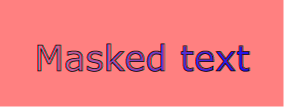
Example mask01 uses
an image to mask a rectangle.
<?xml version="1.0" standalone="no"?>
<svg width="8cm" height="3cm" viewBox="0 0 800 300" version="1.1"
     xmlns="http://www.w3.org/2000/svg" xmlns:xlink="http://www.w3.org/1999/xlink">
  <desc>Example mask01 - blue text masked with gradient against red background
  </desc>
  <defs>
    <linearGradient id="Gradient" gradientUnits="userSpaceOnUse"
                    x1="0" y1="0" x2="800" y2="0">
      <stop offset="0" stop-color="white" stop-opacity="0" />
      <stop offset="1" stop-color="white" stop-opacity="1" />
    </linearGradient>
    <mask id="Mask" maskUnits="userSpaceOnUse"
          x="0" y="0" width="800" height="300">
      <rect x="0" y="0" width="800" height="300" fill="url(#Gradient)"  />
    </mask>
    <text id="Text" x="400" y="200"
          font-family="Verdana" font-size="100" text-anchor="middle" >
      Masked text
    </text>
  </defs>

  <!-- Draw a pale red rectangle in the background -->
  <rect x="0" y="0" width="800" height="300" fill="#FF8080" />

  <!-- Draw the text string twice. First, filled blue, with the mask applied.
       Second, outlined in black without the mask. -->
  <use xlink:href="#Text" fill="blue" mask="url(#Mask)" />
  <use xlink:href="#Text" fill="none" stroke="black" stroke-width="2" />
</svg>View this example as SVG (SVG-enabled browsers only)
14.4.1. The ‘mask’ property
Where:
- <mask-source> =
-
<funciri> | <image> | child |
<child-selector>
The ability for the ‘mask’ property to reference a child element
without an ID reference, or a CSS <image> is new in SVG 2.
The meaning of the different <mask-source> values is as follows:
- <funciri>
- An IRI reference to a ‘mask’ element or paint server element.
- <image>
- A CSS image value used to defined the contents of the offscreen buffer
used for masking.
As per the definition of <image> this value may reference bitmap
images, SVG images, gradients and other graphical elements.
<image> overlaps with <funciri> and hence the
parsing for url(...) needs to be defined
(e.g. references to elements may only refer to ‘mask’
elements or paint server elements, whilst url(...) values without a fragment identifier are
processed in usual fashion for CSS Images).
- child
- A keyword to indicate that the last child ‘mask’
element should be used as the mask source. It is equivalent to
select(mask:last-of-type).
- <child-selector>
- A comma-separated list of compound selectors scoped at the element
to which the ‘
mask’ property applied.
The first matching element in tree order (as defined in [DOM4]) as a result of evaluating the list of
selectors is taken as the mask source.
If there are no matching elements the mask source is invalid.
If a <mask-source> is provided, a mask type may also be specified.
The mask type determines which of the methods described in Calculating mask values should be used for calculating
mask values from the mask source.
If a <mask-source> is provided without a mask type, the value auto is used.
If a mask type other than auto is specified
and the <mask-source> refers to a ‘mask’ element
with a ‘maskType’ attribute, the mask type specified on the ‘mask’ property takes precedence.
The possible values for the mask type are as follows:
- luminance
-
Indicates that the luminance values of the mask source should be used as the
mask values.
- alpha
-
Indicates that the alpha values of the mask source should be used as the mask
values.
- auto
-
If the mask source is a ‘mask’ element, the method used for
calculating the mask values is determined by the ‘maskType’
attribute on the ‘mask’ element.
Otherwise, the alpha values of the mask source should be used as the
mask values.
Should the default be luminance instead?
The Lacuna value for the ‘mask’ property
is 'none'.
14.4.2. Mask source content
The content and behavior of a mask can be defined using a ‘mask’
element, a paint server element, or a CSS
<image> value.
14.4.2.1. Calculating mask values
The ability to use the alpha of a mask source as the mask values is new
in SVG 2.
In SVG 1.1 masks always use the luminance of the mask source as the mask
values.
A mask source may be interpreted using one of two different methods with regards
to calculating the mask values that will be multiplied with the target alpha
values.
The first and simplest method of calculating the mask values is to use the alpha
channel of the mask source.
In this case the mask value at a given point is simply the value of the alpha channel at that point.
The color channels do not contribute to the mask value.
The second method of calculating the mask values is to use the luminance of the mask source.
In this case the mask value at a given point is computed from the color channel values and alpha channel value using the following procedure.
- Compute a luminance value from the color channel values.
-
If the computed value of ‘
color-interpolation’ on the ‘mask’ element is linearRGB, convert the
original image color values (potentially in the sRGB color space) to the linear
RGB color space (see Rendering properties).
- Then, using non-premultiplied RGB color values, apply the
luminance-to-alpha coefficients (as defined in the ‘feColorMatrix’
filter primitive) to convert the RGB color values to luminance
values.
- Multiply the computed luminance value by the corresponding alpha
value to produce the mask value.
Regardless of the method used, the procedure for calculating
mask values assumes the content of the mask is a four-channel RGBA graphics
object.
For other types of graphics objects, special handling is required as
follows.
For a three-channel RGB graphics object that is used in a mask (e.g.,
when referencing a three-channel image file), the effect is as if the object
were converted into a four-channel RGBA image with the alpha channel
uniformly set to 1.
For a single-channel image that is used in a mask (e.g., when
referencing a single-channel grayscale image file), the effect is as if the
object were converted into a four-channel RGBA image, where the single
channel from the referenced object is used to compute the three color
channels and the alpha channel is uniformly set to 1. Note that when
referencing a grayscale image file, the transfer curve relating the
encoded grayscale values to linear light values must be taken into
account when computing the color channels.
Note that SVG ‘path’s, shapes (e.g., ‘circle’) and
‘text’ are all treated as four-channel RGBA images for the purposes
of masking operations.
The effect of a mask is identical to what would have happened if
there were no mask but instead the alpha channel of the given object
were multiplied with the mask's resulting mask values.
14.4.2.2. Defining a mask source: the ‘mask’ element
‘mask’
- Categories:
- Container element
- Content model:
- Any number of the following elements, in any order:
- animation elements — ‘animate’, ‘animateColor’, ‘animateMotion’, ‘animateTransform’, ‘set’
- descriptive elements — ‘desc’, ‘title’, ‘metadata’
- gradient elements — ‘linearGradient’, ‘radialGradient’, ‘meshGradient’
- shape elements — ‘circle’, ‘ellipse’, ‘line’, ‘path’, ‘polygon’, ‘polyline’, ‘rect’
- structural elements — ‘defs’, ‘g’, ‘svg’, ‘symbol’, ‘use’
a, altGlyphDef, clipPath, color-profile, cursor, filter, font, font-face, foreignObject, image, marker, mask, pattern, script, style, switch, text, view - Attributes:
- DOM Interfaces:
Attribute definitions:
- maskUnits = "userSpaceOnUse |
objectBoundingBox"
- Defines the coordinate system for attributes
‘x’, ‘y’, ‘width’ and ‘height’.
If maskUnits="userSpaceOnUse",
‘x’, ‘y’, ‘width’ and ‘height’
represent values in the current user coordinate system in place at
the time when the ‘mask’
element is referenced (i.e., the user coordinate system for
the element referencing the ‘mask’ element via the
‘mask’ property).
If maskUnits="objectBoundingBox",
‘x’, ‘y’, ‘width’ and ‘height’
represent fractions or percentages of the bounding box of
the element to which the mask is applied. (See Object bounding box
units.)
If attribute ‘maskUnits’ is
not specified, then the effect is as if a value of 'objectBoundingBox' were
specified.
Animatable:
yes.
- maskContentUnits =
"userSpaceOnUse | objectBoundingBox"
- Defines the coordinate system for the contents of the
‘mask’.
If maskContentUnits="userSpaceOnUse",
the user coordinate system for the contents of the
‘mask’ element is the current
user coordinate system in place at the time when the
‘mask’ element is referenced
(i.e., the user coordinate system for the element
referencing the ‘mask’
element via the ‘mask’
property).
If maskContentUnits="objectBoundingBox",
the user coordinate system for the contents of the ‘mask’ is established using the
bounding box of the element to which the mask is applied.
(See Object
bounding box units.)
If attribute ‘maskContentUnits’ is not specified,
then the effect is as if a value of 'userSpaceOnUse' were
specified.
Animatable:
yes.
- maskType =
"luminance | alpha"
-
Defines the procedure used for calculating mask values from the
contents of the mask as described in Calculating
mask values.
If attribute ‘maskType’ is not specified,
then the effect is as if a value of 'luminance' were
specified.
Animatable:
yes.
Although authors may find 'alpha' more
intuitive, the default value is 'luminance' to provide backwards
compatibility with SVG 1.1.
- x = "<coordinate>"
- The x-axis coordinate of one corner of the rectangle
for the largest possible offscreen buffer. Note that the
clipping path used to render any graphics within the mask
will consist of the intersection of the current clipping
path associated with the given object and the rectangle
defined by
‘x’, ‘y’, ‘width’ and ‘height’.
If the attribute is not specified, the effect is as if a
value of '-10%' were specified.
Animatable:
yes.
- y = "<coordinate>"
- The y-axis coordinate of one corner of the rectangle
for the largest possible offscreen buffer.
If the attribute is not specified, the effect is as if a
value of '-10%' were specified.
Animatable:
yes.
- width = "<length>"
- The width of the largest possible offscreen buffer.
Note that the clipping path used to render any graphics
within the mask will consist of the intersection of the
current clipping path associated with the given object and
the rectangle defined by
‘x’, ‘y’, ‘width’ and ‘height’.
A negative value is an error (see Error processing).
A value of zero disables rendering of the element.
If the attribute is not specified, the effect is as if a
value of '120%' were specified.
Animatable:
yes.
- height = "<length>"
- The height of the largest possible offscreen
buffer.
A negative value is an error (see Error processing).
A value of zero disables rendering of the element.
If the attribute is not specified, the effect is as if a
value of '120%' were specified.
Animatable:
yes.
Properties inherit into the
‘mask’ element from its ancestors; properties do not
inherit from the element referencing the ‘mask’ element.
‘mask’ elements are never rendered directly; their only
usage is as something that can be referenced using the ‘mask’
property. The ‘opacity’, ‘filter’ and ‘display’ properties do not apply to the
‘mask’ element; thus, ‘mask’ elements are not
directly rendered even if the ‘display’ property is set to a value
other than none, and ‘mask’
elements are available for referencing even when the ‘display’ property
on the ‘mask’ element or any of its ancestors is set to
none.
14.4.2.3. Using an SVG paint server as a mask source
The ability to reference paint servers with the ‘mask’ property
is new in SVG 2.
Besides an SVG ‘mask’ element, the 'mask' property may
also refer to an SVG paint server element such as
a ‘linearGradient’ element or ‘pattern’ element.
When the mask source is an SVG paint server, the effect is as if the following
steps were performed:
- Create a new ‘mask’ element as a sibling of the
paint server element.
- Let the ‘maskUnits’ attribute be 'userSpaceOnUse'.
- Let the dimensions of the mask
(‘x’, ‘y’, ‘width’,
and ‘height’) match the dimensions of the decorated bounding box of the mask target.
- Let the ‘maskContentUnits’ attribute be 'objectBoundingBox'.
- Create a new ‘rect’ element as a child of the newly
created ‘mask’ element.
- Let both the width and the height of the ‘rect’ element be
'100%'.
- Let the ‘
fill’ property of the ‘rect’ element
refer to the paint server element.
- Use the newly created ‘mask’ as the mask source.
14.5. Object and group opacity: the
effect of the ‘opacity’ property
See the CSS Color Module Level 3 for the definition
of ‘opacity’. [CSS3COLOR]
The ‘opacity’ property specifies how opaque a given
graphical element or container element will be when it is
painted to the canvas. When applied to a container element,
this is known as group opacity, and when applied to
an individual rendering element, it is known as object
opacity. The principle for these two operations however
is the same.
There are several other opacity-related properties in SVG:
- ‘
fill-opacity’, which specifies the opacity of a fill
operation;
- ‘
stroke-opacity’, which specifies the opacity of a stroking
operation;
- ‘
solid-opacity’, which specifies the opacity of a solid color
paint server; and
- ‘
stop-opacity’, which specifies the opacity of a gradient stop.
These four opacity properties are involved in intermediate rendering operations.
Object and group opacity however can be thought of as a post-processing
operation. Conceptually, the object or group to which ‘opacity’ applies
is rendered into an RGBA offscreen image. The offscreen image as whole is then blended
into the canvas with the specified ‘opacity’ value used uniformly
across the offscreen image.
An ‘opacity’ value of 0 means fully transparent and 1 means fully
opaque. Opacity values are clamped to the range [0, 1];
see Clamping values which are restricted
to a particular range for details.
The ‘opacity’ property applies to the following SVG elements:
‘svg’, ‘g’, ‘symbol’, ‘marker’,
‘a’, ‘switch’, graphics elements and
text content child elements.
The following example illustrates various usage of the ‘opacity’
property on objects and groups.
<svg xmlns="http://www.w3.org/2000/svg"
     width="600" height="175" viewBox="0 0 1200 350">

  <!-- Background blue rectangle -->
  <rect x="100" y="100" width="1000" height="150" fill="blue"/>

  <!-- Red circles going from opaque to nearly transparent -->
  <circle cx="200" cy="100" r="50" fill="red" opacity="1"/>
  <circle cx="400" cy="100" r="50" fill="red" opacity=".8"/>
  <circle cx="600" cy="100" r="50" fill="red" opacity=".6"/>
  <circle cx="800" cy="100" r="50" fill="red" opacity=".4"/>
  <circle cx="1000" cy="100" r="50" fill="red" opacity=".2"/>

  <!-- Opaque group, opaque circles -->
  <g opacity="1">
    <circle cx="182.5" cy="250" r="50" fill="red" opacity="1"/>
    <circle cx="217.5" cy="250" r="50" fill="green" opacity="1"/>
  </g>
  <!-- Group opacity: .5, opacity circles -->
  <g opacity=".5">
    <circle cx="382.5" cy="250" r="50" fill="red" opacity="1"/>
    <circle cx="417.5" cy="250" r="50" fill="green" opacity="1"/>
  </g>
  <!-- Opaque group, semi-transparent green over red -->
  <g opacity="1">
    <circle cx="582.5" cy="250" r="50" fill="red" opacity=".5"/>
    <circle cx="617.5" cy="250" r="50" fill="green" opacity=".5"/>
  </g>
  <!-- Opaque group, semi-transparent red over green -->
  <g opacity="1">
    <circle cx="817.5" cy="250" r="50" fill="green" opacity=".5"/>
    <circle cx="782.5" cy="250" r="50" fill="red" opacity=".5"/>
  </g>
  <!-- Group opacity .5, semi-transparent green over red -->
  <g opacity=".5">
    <circle cx="982.5" cy="250" r="50" fill="red" opacity=".5"/>
    <circle cx="1017.5" cy="250" r="50" fill="green" opacity=".5"/>
  </g>
</svg>
In the example, the top row of circles have differing opacities,
ranging from 1.0 to 0.2. The bottom row illustrates five ‘g’ elements,
each of which contains overlapping red and green circles, as follows:
- The first group shows the opaque case for reference. The group has
opacity of 1, as do the circles.
- The second group shows group opacity when the elements in the group are
opaque.
- The third and fourth group show that opacity is not commutative. In the
third group (which has opacity of 1), a semi-transparent green circle is
drawn on top of a semi-transparent red circle, whereas in the fourth group a
semi-transparent red circle is drawn on top of a semi-transparent green
circle. Note that area where the two circles intersect display different
colors. The third group shows more green color in the intersection area,
whereas the fourth group shows more red color.
- The fifth group shows the multiplicative effect of opacity settings.
Both the circles and the group itself have opacity settings of .5. The
result is that the portion of the red circle which does not overlap with the
green circle (i.e., the top/right of the red circle) will blend into the
blue rectangle with accumulative opacity of .25 (i.e., .5*.5), which, after
blending into the blue rectangle, results in a blended color which is 25%
red and 75% blue.
14.6. DOM interfaces
14.6.1. Interface SVGClipPathElement
The SVGClipPathElement interface corresponds to the ‘clipPath’ element.
interface SVGClipPathElement : SVGDefinitionElement {
  readonly attribute SVGAnimatedEnumeration clipPathUnits;
};

SVGClipPathElement implements SVGUnitTypes;
-
- clipPathUnits (readonly SVGAnimatedEnumeration)
-
14.6.2. Interface SVGMaskElement
The SVGMaskElement interface corresponds to the ‘mask’ element.
interface SVGMaskElement : SVGDefinitionElement {

  // Mask Types
  const unsigned short SVG_MASKTYPE_LUMINANCE = 0;
  const unsigned short SVG_MASKTYPE_ALPHA = 1;

  readonly attribute SVGAnimatedEnumeration maskUnits;
  readonly attribute SVGAnimatedEnumeration maskContentUnits;
  readonly attribute SVGAnimatedEnumeration maskType;
  readonly attribute SVGAnimatedLength x;
  readonly attribute SVGAnimatedLength y;
  readonly attribute SVGAnimatedLength width;
  readonly attribute SVGAnimatedLength height;
};

SVGMaskElement implements SVGUnitTypes;
-
- SVG_MASKTYPE_LUMINANCE (unsigned short)
-
Corresponds to value 'luminance'.
- SVG_MASKTYPE_ALPHA (unsigned short)
-
Corresponds to value 'alpha'.
-
- maskUnits (readonly SVGAnimatedEnumeration)
-
- maskContentUnits (readonly SVGAnimatedEnumeration)
-
- maskType (readonly SVGAnimatedEnumeration)
-
Corresponds to attribute
‘maskType’ on the given
‘mask’ element. Takes one of the Mask Types constants
defined in this interface.
This will highly likely become a WebIDL Enum in future
(as soon as our toolchain supports it) so implementors are discouraged
from implementing this attribute for the time being.
- x (readonly SVGAnimatedLength)
-
Corresponds to attribute
‘x’ on the given
‘mask’
element.
- y (readonly SVGAnimatedLength)
-
Corresponds to attribute
‘y’ on the given
‘mask’
element.
- width (readonly SVGAnimatedLength)
-
Corresponds to attribute
‘width’ on the given
‘mask’ element.
- height (readonly SVGAnimatedLength)
-
Corresponds to attribute
‘height’ on the given
‘mask’ element.
