Status: Last call for comments
details elementStatus: Last call for comments. ISSUE-93 (details) blocks progress to Last Call
summary element followed by flow content.openinterface HTMLDetailsElement : HTMLElement {
attribute boolean open;
};
The details element represents a
disclosure widget from which the user can obtain additional
information or controls.
The details element is not appropriate
for footnotes. Please see the section on
footnotes for details on how to mark up footnotes.
The first summary element
child of the element, if any, represents the summary or
legend of the details. If there is no child
summary element, the user agent should provide its own
legend (e.g. "Details").
The open
content attribute is a boolean attribute. If present,
it indicates that the details are to be shown to the user. If the
attribute is absent, the details are not to be shown.
If the attribute is removed, then the details should be hidden. If the attribute is added, the details should be shown.
The user agent should allow the user to request that the details
be shown or hidden. To honor a request for the details to be shown,
the user agent must set the open attribute on the element to
the value open. To honor a request for the
details to be hidden, the user agent must remove the open attribute from the
element.
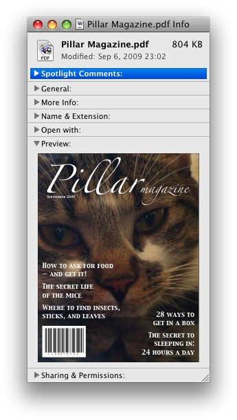
The following example shows the details element
being used to hide technical details in a progress report.
<section class="progress window">
 <h1>Copying "Really Achieving Your Childhood Dreams"</h1>
 <details>
  <summary>Copying... <progress max="375505392" value="97543282"></progress> 25%</summary>
  <dl>
   <dt>Transfer rate:</dt> <dd>452KB/s</dd>
   <dt>Local filename:</dt> <dd>/home/rpausch/raycd.m4v</dd>
   <dt>Remote filename:</dt> <dd>/var/www/lectures/raycd.m4v</dd>
   <dt>Duration:</dt> <dd>01:16:27</dd>
   <dt>Color profile:</dt> <dd>SD (6-1-6)</dd>
   <dt>Dimensions:</dt> <dd>320×240</dd>
  </dl>
 </details>
</section>
The following shows how a details element can be
used to hide some controls by default:
<details>
 <summary>Name & Extension:</summary>
 <p><input type=text name=fn value="Pillar Magazine.pdf">
 <p><label><input type=checkbox name=ext checked> Hide extension</label>
</details>
One could use this in conjuction with other details
in a list to allow the user to collapse a set of fields down to a
small set of headings, with the ability to open each one.
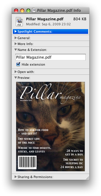
In these examples, the summary really just summarises what the controls can change, and not the actual values, which is less than ideal.
summary elementdetails element.HTMLElement.The summary element represents a
summary, caption, or legend for the rest of the contents of the
summary element's parent details
element, if any.
command elementStatus: Last call for comments
typelabelicondisabledcheckedradiogrouptitle attribute has special semantics on this element.interface HTMLCommandElement : HTMLElement {
attribute DOMString type;
attribute DOMString label;
attribute DOMString icon;
attribute boolean disabled;
attribute boolean checked;
attribute DOMString radiogroup;
};
The command element represents a command that the user
can invoke.
The type
attribute indicates the kind of command: either a normal command
with an associated action, or a state or option that can be toggled,
or a selection of one item from a list of items.
The attribute is an enumerated attribute with three
keywords and states. The "command"
keyword maps to the Command state, the
"checkbox"
keyword maps to the Checkbox state, and
the "radio"
keyword maps to the Radio state. The
missing value default is the Command state.
The element represents a normal command with an associated action.
The element represents a state or option that can be toggled.
The element represents a selection of one item from a list of items.
The label
attribute gives the name of the command, as shown to the user. The
label attribute must be
specified and must have a value that is not the empty string.
The title
attribute gives a hint describing the command, which might be shown
to the user to help him.
The icon
attribute gives a picture that represents the command. If the
attribute is specified, the attribute's value must contain a
valid non-empty URL potentially surrounded by
spaces. To obtain the absolute
URL of the icon when the attribute's value is not the empty
string, the attribute's value must be resolved relative to the element. When the attribute is
absent, or its value is the empty string, or resolving its value fails, there is no icon.
The disabled attribute
is a boolean attribute that, if present, indicates that
the command is not available in the current state.
The distinction between disabled and hidden is subtle. A command would be
disabled if, in the same context, it could be enabled if only
certain aspects of the situation were changed. A command would be
marked as hidden if, in that situation, the command will never be
enabled. For example, in the context menu for a water faucet, the
command "open" might be disabled if the faucet is already open, but
the command "eat" would be marked hidden since the faucet could
never be eaten.
The checked
attribute is a boolean attribute that, if present,
indicates that the command is selected. The attribute must be
omitted unless the type
attribute is in either the Checkbox state or
the Radio
state.
The radiogroup
attribute gives the name of the group of commands that will be
toggled when the command itself is toggled, for commands whose type attribute has the value "radio". The scope of the name is the child list of
the parent element. The attribute must be omitted unless the type attribute is in the Radio state.
The type, label, icon, disabled, checked, and radiogroup
IDL attributes must reflect the respective content
attributes of the same name.
The element's activation behavior depends on the
value of the type attribute
of the element, as follows:
type attribute is
in the Checkbox stateIf the element has a checked attribute, the UA must
remove that attribute. Otherwise, the UA must add a checked attribute, with the
literal value checked. The UA must then
fire a click event at the
element.
type attribute is
in the Radio stateIf the element has a parent, then the UA must walk the list
of child nodes of that parent element, and for each node that is a
command element, if that element has a radiogroup attribute whose
value exactly matches the current element's (treating missing radiogroup attributes as if
they were the empty string), and has a checked attribute, must remove
that attribute.
Then, the element's checked attribute attribute
must be set to the literal value checked and
the user agent must fire a click
event at the element.
The element has no activation behavior.
Firing a synthetic click event at the element does not cause
any of the actions described above to happen.
command elements are not rendered
unless they form part of a menu.
Here is an example of a toolbar with three buttons that let the user toggle between left, center, and right alignment. One could imagine such a toolbar as part of a text editor. The toolbar also has a separator followed by another button labeled "Publish", though that button is disabled.
<menu type="toolbar">
 <command type="radio" radiogroup="alignment" checked="checked"
          label="Left" icon="icons/alL.png" onclick="setAlign('left')">
 <command type="radio" radiogroup="alignment"
          label="Center" icon="icons/alC.png" onclick="setAlign('center')">
 <command type="radio" radiogroup="alignment"
          label="Right" icon="icons/alR.png" onclick="setAlign('right')">
 <hr>
 <command type="command" disabled
          label="Publish" icon="icons/pub.png" onclick="publish()">
</menu>
menu elementStatus: Last call for comments
type attribute is in the toolbar state: Interactive content.li elements.typelabelinterface HTMLMenuElement : HTMLElement {
attribute DOMString type;
attribute DOMString label;
};
The menu element represents a list of commands.
The type attribute
is an enumerated attribute indicating the kind of menu
being declared. The attribute has three states. The context keyword maps to the
context menu state, in which
the element is declaring a context menu. The toolbar keyword maps to the
toolbar state, in which the
element is declaring a toolbar. The attribute may also be
omitted. The missing value default is the list state, which indicates that the element is merely
a list of commands that is neither declaring a context menu nor
defining a toolbar.
If a menu element's type attribute is in the context menu state, then the
element represents the commands of a context menu, and
the user can only interact with the commands if that context menu is
activated.
If a menu element's type attribute is in the toolbar state, then the element
represents a list of active commands that the user can
immediately interact with.
If a menu element's type attribute is in the list state, then the element either
represents an unordered list of items (each represented
by an li element), each of which represents a command
that the user can perform or activate, or, if the element has no
li element children, flow content
describing available commands.
The label
attribute gives the label of the menu. It is used by user agents to
display nested menus in the UI. For example, a context menu
containing another menu would use the nested menu's label attribute for the submenu's
menu label.
The type and label IDL attributes must
reflect the respective content attributes of the same
name.
Status: Last call for comments
This section is non-normative.
The menu element is used to define context menus and
toolbars.
For example, the following represents a toolbar with three menu buttons on it, each of which has a dropdown menu with a series of options:
<menu type="toolbar">
 <li>
  <menu label="File">
   <button type="button" onclick="fnew()">New...</button>
   <button type="button" onclick="fopen()">Open...</button>
   <button type="button" onclick="fsave()">Save</button>
   <button type="button" onclick="fsaveas()">Save as...</button>
  </menu>
 </li>
 <li>
  <menu label="Edit">
   <button type="button" onclick="ecopy()">Copy</button>
   <button type="button" onclick="ecut()">Cut</button>
   <button type="button" onclick="epaste()">Paste</button>
  </menu>
 </li>
 <li>
  <menu label="Help">
   <li><a href="help.html">Help</a></li>
   <li><a href="about.html">About</a></li>
  </menu>
 </li>
</menu>
In a supporting user agent, this might look like this:

In a legacy user agent, the above would look like a bulleted list with three items, the first of which has four buttons, the second of which has three, and the third of which has two nested bullet points with two items consisting of links.
The following implements a similar toolbar, with a single button whose values, when selected, redirect the user to Web sites.
<form action="redirect.cgi">
 <menu type="toolbar">
  <label for="goto">Go to...</label>
  <menu label="Go">
   <select id="goto">
    <option value="" selected="selected"> Select site: </option>
    <option value="http://www.apple.com/"> Apple </option>
    <option value="http://www.mozilla.org/"> Mozilla </option>
    <option value="http://www.opera.com/"> Opera </option>
   </select>
   <span><input type="submit" value="Go"></span>
  </menu>
 </menu>
</form>
The behavior in supporting user agents is similar to the example
above, but here the legacy behavior consists of a single
select element with a submit button. The submit button
doesn't appear in the toolbar, because it is not a direct child of
the menu element or of its li
children.
Status: Last call for comments
A menu (or toolbar) consists of a list of zero or more of the following components:
The list corresponding to a particular menu element
is built by iterating over its child nodes. For each child node in
tree order, the required behavior depends on what the
node is, as follows:
hr elementoption element that has a value attribute set to the empty
string, and has a disabled attribute, and whose
textContent consists of a string of one or more
hyphens (U+002D HYPHEN-MINUS)li elementlabel elementmenu element with no label attributeselect elementmenu or select element, then
append another separator.menu element with a label attributeoptgroup element with a label attributelabel attribute as the label of the menu. The
submenu must be constructed by taking the element and creating a
new menu for it using the complete process described in this
section.Once all the nodes have been processed as described above, the user agent must the post-process the menu as follows:
Status: Last call for comments
The contextmenu
attribute gives the element's context
menu. The value must be the ID of a menu element
in the DOM. If the node that would be obtained by
the invoking the getElementById() method
using the attribute's value as the only argument is null or not a
menu element, then the element has no assigned context
menu. Otherwise, the element's assigned context menu is the element
so identified.
When an element's context menu is requested (e.g. by the user
right-clicking the element, or pressing a context menu key), the UA
must fire a simple event named contextmenu that bubbles and is
cancelable at the element for which the menu was requested.
Typically, therefore, the firing of the contextmenu event will be the
default action of a mouseup or keyup event. The exact sequence of events
is UA-dependent, as it will vary based on platform conventions.
The default action of the contextmenu event depends on
whether the element or one of its ancestors has a context menu
assigned (using the contextmenu attribute) or not. If
there is no context menu assigned, the default action must be for
the user agent to show its default context menu, if it has one.
If the element or one of its ancestors does have a
context menu assigned, then the user agent must fire a simple
event named show at the
menu element of the context menu of the nearest
ancestor (including the element itself) with one assigned.
The default action of this event is that the user agent
must show a context menu built from the menu element.
The user agent may also provide access to its default context menu, if any, with the context menu shown. For example, it could merge the menu items from the two menus together, or provide the page's context menu as a submenu of the default menu.
If the user dismisses the menu without making a selection, nothing in particular happens.
If the user selects a menu item that represents a command, then the UA must invoke that command's Action.
Context menus must not, while being shown, reflect changes in the
DOM; they are constructed as the default action of the show event and must remain as constructed
until dismissed.
User agents may provide means for bypassing the context menu
processing model, ensuring that the user can always access the UA's
default context menus. For example, the user agent could handle
right-clicks that have the Shift key depressed in such a way that it
does not fire the contextmenu
event and instead always shows the default context menu.
The contextMenu
attribute must reflect the contextmenu content attribute.
Here is an example of a context menu for an input control:
<form name="npc">
 <label>Character name: <input name=char type=text contextmenu=namemenu required></label>
 <menu type=context id=namemenu>
  <command label="Pick random name" onclick="document.forms.npc.elements.char.value = getRandomName()">
  <command label="Prefill other fields based on name" onclick="prefillFields(document.forms.npc.elements.char.value)">
 </menu>
</form>
This adds to items to the control's context menu, one called "Pick random name", and one called "Prefill other fields based on name". They invoke scripts that are not shown in the example above.
Status: Last call for comments
When a menu element has a type attribute in the toolbar state, then the user agent
must build the
menu for that menu element, and use the result in the
rendering.
The user agent must reflect changes made to the
menu's DOM, by immediately rebuilding the menu.