Abstract
This module describes multi-column layout in CSS. It builds on the Box
model module [no public working draft yet] and adds functionality to flow
the content of an element into multiple columns.
Status of this document
This document is a Working Draft of the CSS Working Group. See the Style overview pages for more information on W3C's work
on style sheets, including CSS. It is intended to become one of the
modules of CSS level 3. See the introduction to CSS3.
This is a public W3C Working Draft for review by W3C members and other
interested parties. As a draft document, it may be updated, replaced, or
obsoleted by other documents at any time. It is inappropriate to use W3C
Working Drafts as reference material or to cite them as other than "work
in progress." The specifications in this draft may be implemented only for
experimental purposes. The existence of such implementations will not keep
the working group from making changes.
A list of current W3C Recommendations and other technical documents
including Working Drafts and Notes can be found at http://www.w3.org/TR.
Please send comments to the
www-style@w3.org mailing list (see how to
subscribe) or to the editor.
1. Dependencies on other
modules
This CSS3 module depends on the following other CSS3 modules:
- the Box model module, which this module extends
2. Introduction
This module describes multi-column layout in CSS. By using functionality
described in this document, style sheets can declare that the content of
an element is to be laid out in multiple colums.
On the web, tables have also been used to describe multi-column layouts.
This module has two major advantages over table-based layouts. First, it
allows content to flow from one column to another based on available space
rather than document structure. Second, this module allows the column
width to be specified and the number of columns to vary depending on
available space.
3. New properties
This proposal describes a set of new properties in order to support
multi-column layouts in CSS. The new properties can be divided into three
groups. The first group set the number and width of the columns:
- column-count
- column-width
- column-min-width
- column-width-policy
The second group of properties describes the space between columns:
- column-gap
- column-rule
- column-rule-color
- column-rule-style
- column-rule-width
The third group consists of one property which make it possible an
element to span several columns:
4. The column model
Columns are laid out inside boxes generated by elements. Each column is
a box. The border, padding and margin properties do not apply to these
boxes (although they may do so in the future). Therefore, the column box
defines the content area for the column. This is the containing block for
the block children (explicit or anonymous) of the element on which the
columns are defined. There is also no separate "background" properties for
the column (although these may be defined in the future).
The figure below shows the various components of an element with two
columns inside it.
Note that the 'column-gap' property is
used to set aside space between columns. Like padding, this space is
always transparent so that the background of the element on which the
columns are defined shows through. Like, half-leading on line boxes, the
'column-gap' is split in two and applied
equally to each side of the 'column-rule'.
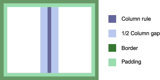
The layout in the figure above can e.g. be achieved with markup like:
<P STYLE="border: solid black 1em; padding: 1em;
    column-count: 2; column-rule: solid black 1em; column-gap: 4em">...</P>
For purposes of illustration in the figures in this document, the border
and column-rule colors are changed from the specified colors to highlight
where the borders and column-rule occur and, for the same reason, the
padding and column-gap are shown as being colored instead of transparent
to the background.
Columns within an element all have the same width, column-gap and
column-rule values.
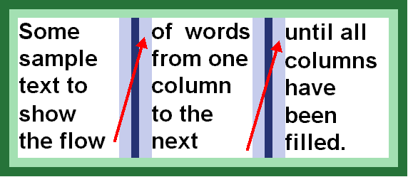
5. Content flow in columns
6. The number and width of
columns
Finding the number and width of columns is fundamental when laying out
multi-column content. There are three different situations:
- the style sheet specifies the number of columns (through 'column-count') and lets the UA choose the column
width (i.e., 'column-width' is 'auto')
- the style sheet specifies the column width (through 'column-width') and lets the UA determine how
many columns there is room for (i.e., 'column-count' is 'auto').
- the style sheet specifies both the number of columns and their width
(through 'column-count' and 'column-width', respectively).
Note that the width of the column rule and column gap must also be taken
into account when computing the widths of the columns. The sum of all
these are called CWRG in this proposal. The mathematical
definitinon is: CWRG = column_count * column_width + (column_count-1)
* (column_rule_width) + (column_count-1) * column_gap).
In all three cases, the UA determines the height of the columns based on
the content which needs to be fitted. Content should be balanced between
columns to minimize the column height, while honoring the 'widows' and 'orphans' properties.
In case 2 and case 3, the content width of the element may be different
from CWRG. In the figure below, the difference is marked by the red area.
6.1. Reducing the number of
columns
In no cases can CWRG be larger than the content width of the element.
If, based on the specified value of the column properties, this is the
case, the actual value of 'column-count'
must be reduced to make the columns fit inside the content area.
Here is one example:
DIV {
  width: 400px;
  column-count: 4;
  column-width: 100px;
  column-gap: 10px
  column-rule: none;
}
In the example above, the number of columns must be reduced since there
isn't room for 4 columns. In order to find the number of columns (n), the
following equation must be solved:
300px >= n * 100px + (n-1) * 0px + (n-1) * 10px * 2
where n is the largest possible integer
Solving the equation yields n=2, i.e., the actual value of
'column-count' is 2 and the element will
therefore have 2 columns.
The minimum actual value of 'column-count'
is 1.
6.2. Increasing the width of
columns
In most cases, the presentation looks best when CWRG is equal to the
content width of the element. In order for this to be achieved without
setting the width of elements explicitly, the column widths can be
computed in a flexible manner. This is controlled with the 'column-width-policy' property.
6.2.1.
'column-width-policy'
Value: flexible | strict | inherit
Initial: flexible
Applies to: block-level elements
Inherited: no
Percentage values: N/A
This property describes how to interpret 'column-width'. The 'flexible' value indicates
that the width of columns can be increased to fill all the available
space. The 'strict' value indicates that 'column-width' is to be honored.
6.3. Distributing extra
space
If 'column-width-policy' has a value of
'strict', CWPB may end up being smaller than the content width of the
element. See the red area of figure X above. The extra space is
distributed according the the value of the 'column-space-distribution' property.
6.3.1.
'column-space-distribution'
Value: [start || end || inner || outer || between] |
inherit
Initial: end
Applies to: block-level elements
Inherited: no
Percentage values: N/A
This property describes how to distribute space in the case where CWPB
is smaller than the content width of the element. The values are:
- start
- The space is placed before the first column.
- end
- The space is placed after the last column.
- inner
- The space is placed on the side closest to the binding. This value is
only valid in the page context.
- outer
- The space is placed on the side most far from the binding. This value
is only valid in the page context.
- between
- The space is distributed equally between all columns.
If more than one value is given, the space is distributed equally
between places. For example:
BODY {
  column-width: 10em;
  column-width-policy: strict;
  column-space-distribution: start between end;
}
In the example above, the extra space is distributed in equal chunks
before the first column, between all columns, and after the last column.
7. Width and count property
definitions
7.1. 'column-count'
Value: <integer> | auto | inherit
Initial: auto
Applies to: block-level elements
Inherited: no
Percentage values: N/A
The 'column-count' property determines the
number of columns into which the content of the element will be
flowed.
The 'auto' value means there will be as many columns as there is room
for. In this case, the number of columns is determined by the column
width, padding and borders.
An integer value sets the number of columns into which the content of
the element will be flowed.
Example:
BODY { column-count: 3 }
When an integer value is specified, the actual value of 'column-count' may be reduced so that all columns
with into the content area of the document.
7.2. 'column-width'
Value: <length> | auto | inherit
Initial: auto
Applies to: block-level elements
Inherited: no
Percentage values: N/A
The 'column-width' property describes the
optimal width of columns within the element. Depending on the value of
'column-width-policy', the actual column
width may be larger than the specified one.
The actual value of 'column-width' may be
smaller than the specified value when there is only one column.
8. Column padding and border
8.1. 'column-gap'
Value: <length> | <percentage> | inherit
Initial: 0
Applies to: block-level elements
Inherited: no
Percentage values: relative to the content width of the element
The 'column-gap' property sets the padding
between columns. If there is no column rule between columns, the value of
this property is equal to the distance between columns. If there is a
column rule between columns, half the gap will appear on each side of the
column rule.
Column gaps cannot be negative.
8.2.
'column-rule-color'
Value: <color> | inherit
Initial: the value of the 'color'
property
Applies to: block-level elements
Inherited: no
Percentage values: N/A
8.3.
'column-rule-style'
Value: <border-style> | inherit
Initial: none
Applies to: block-level elements
Inherited: no
Percentage values: N/A
Note that the 'none' value forces the computed value of 'column-rule-width' to be '0'.
8.4.
'column-rule-width'
Value: <border-width> | inherit
Initial: medium
Applies to: block-level elements
Inherited: no
Percentage values: N/A
8.5. 'column-rule'
Value: [ <'border-width'> || <'border-style'> ||
<color> ] | inherit
Initial: the value of the 'color'
property
Applies to: block-level elements
Inherited: no
Percentage values: N/A
9. Spanning several columns
The 'column-span' property makes it
possible for an element to span across several columns.
9.1. 'column-span'
Value: none | all | <integer> | inherit
Initial: none
Applies to: block-level elements
Inherited: no
Percentage values: N/A
This property describes how many columns the element spans. The 'all'
value means that the element spans across all columns.
An integer value specifies exactly how many columns the element spans.
If the integer value is higher than the number of columns, the element
will span all columns.
A value other than 'none' will enforce column balancing.
Consider this example:
<DIV STYLE="column-count: 3; column-rule: solid black 0.3em; column-gap: 0.3em">
  <H1 STYLE="column-span: all">An imporant element</H1>
  <P>...</P>
  <H2 STYLE="column-span: 2">A not-so important element</H2>
  <P>...</P>
</DIV>
In the above example, the H1 and the H2 elements will span 3 and 2
columns, respectvely. Also, both elements will enforce column balancing to
happen. Here is a sample rendering:
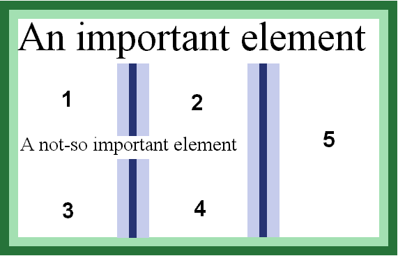
In the above figure, the numbers indidcate in what order the content
will flow. The first P element will flow into area 1 and 2, while the
second P element will flow into area 3, 4 and 5.
Page breaks will also cause column balancing.
Here is another example:
<DIV CLASS="article">
  <H1>The headline</H1>
  <P CLASS="intro">The introduction, sometimes called "ingress".
  <P>A normal paragraph.
  <P>Another normal paragraph.
</DIV>
It's convenient to wrap the DIV element around the whole article.
However, the headline and ingress should span several columns:
  DIV.article { column-count: 3 }
  DIV.article H1 { column-span: all }
  DIV.article P.intro { column-span: 2 }
10. Floating in and between
columns
A common effect in modern typography is to float text elements in and
between columns. Describing this effect in a simple, scalable,
deterministic and visually pleasing manner is difficult. This document
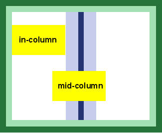
proposes a simple solution by adding two new values to the 'float' property: 'in-column' and 'mid-column'.
Both values has the effect of setting the content width of the floating
element to the column width. The 'in-column' value floats the element
within a column, i.e. the vertical position of the element may change due
to viual considerations. For example, the UA may decide that 'in-column'
elements are to be placed 10em from the top of the box. Similarly, the UA
is free to place "mid-column" elements vertically while making sure the
elements are floated in between columns. See figure below.
Both new values are rather fuzzy: they indicate that an element should
be floated, but does not give precise measurements. For example, there is
no way to say which columns a "mid-column" element should float between.
Here is an example of use:
P.teaser {
  float: mid-column;
}
11. Acknowledgement
This document is based on several older proposals and comments on older
proposals. Contributors include Bert Bos, Dave Raggett, Chris Wilson,
Robert Stevahn, Peter Linss, Chris Lilley, Steve Zilles, Tantek
Çelik, Daniel Glazman and Ian Hickson.