Text tends to change size when translated. For background information about this, see Text size in translation.
This means that any background images you carefully crafted to fit behind your source text may now be too small or too large. This
article looks at a way of dealing with this.
The problem
For a first example we will keep things simple, and assume that we want to implement a fixed-width box on our page. The text can
expand downwards, but not sideways.
Let's also assume that we want a background with a nice gradient behind the title of the box, a line across the bottom, and rounded
corners. To get these effects, designers will often choose to use a background image behind the title.
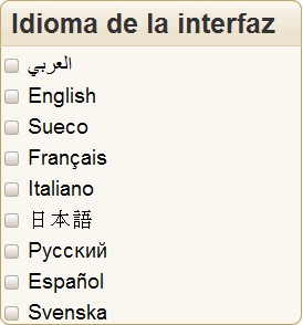
This fixed-width box in Spanish has the title 'Interface Language', and a list of radio buttons to select a language. It uses this
graphic to achieve the graded effect behind the title:

Our CSS would look like this:
div.box h3 {
    margin: 0;
    padding: 6px 8px 4px 10px;
    font-size: 130%;
    color: #333;
    background: url(img/h3-bg.gif) no-repeat top left;
    }
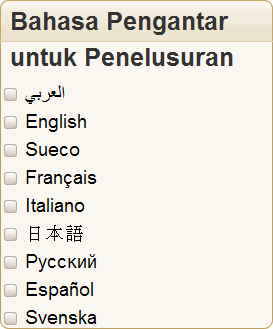
The problem with this approach is that when we translate this dialogue box into something like Malay the title text expands to occupy
two lines. Because the graphic used for the gradient background is only one line deep, things now begin to look a mess.
Similar problems can arise with horizontally expanding text. For example, suppose the original Chinese interface included a tab
metaphor using background images behind each link as follows.

If images were used for the tabs, they would have to all be redrawn for every translation - a time-consuming process. This is because
the labels would all be different sizes in different languages. Sometimes a single background image is used for the graphic part of the tabs. Again,
such a background would have to be redrawn for each translation, otherwise you would see something like this:

Of course, these scenarios are only examples. Such problems are not only limited to box headings and tabs, but can occur anywhere that
you are trying to match background graphics with text.
Solution
The way to deal with this type of issue is to ensure that your graphic backgrounds can automatically expand with the text they are
related to, and to anticipate that the box containing your text may grow during translation and avoid highly constrained spaces.
In the following subsections we will briefly allude to a small number of solutions that may help. These are just illustrations of
possible approaches. For more information on how to apply these, see the original sources cited. We will spend a little more time on the first
example, so that you can understand the basic idea. There may be other approaches that work. The key thing is to think how you will provide the
flexibility for text to grow and shrink across different language versions.
It is important to note that the solutions described below are based on good standards-compliant code, and were initially designed to
support accessibility, since people with poor vision often want to boost the text size. The approach works equally well for localization issues.
Titles in fixed width boxes
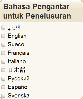
This solution deals with variable text height. One way to approach this issue is to use a graphic that is three or four lines deep behind the title. This example uses a technique
described in Dan Cederholm's book, Bulletproof Web Design.
By attaching the graphic using the CSS background property, only the amount needed to view the title will actually be shown.
Note that the graphic no longer provides the solid line underneath the title. We can still apply such a line, however, by adding to
the CSS as follows.
div.box h3 {
    margin: 0;
    padding: 6px 8px 4px 10px;
    font-size: 130%;
    color: #333;
    background: url(img/h3-bg.gif) no-repeat top left;
    border-bottom: 1px solid #E0CFAB;
   }
This will now produce the effect we are looking for in the translated version.
Of course, a similar technique has to be used for the lower part of the box, since that text may also change and, with different content, add or subtract lines of text.
See an example of how to do this in CSS, for browsers that support the necessary CSS properties.
Tabs
This technique builds on the simple approach just described and shows how to maintain several graphic edges to a box while stretching the interior space horizontally. It is based on the article "Sliding Doors of CSS" by Doug
Bowman. The basic idea is similar to that in the previous section, albeit a little more complicated to code. Each tab has two background
graphics:
 and
and  .
.
The two graphics are attached as backgrounds to two different, overlapping elements. Only the needed parts of the graphics are
visible, and the result looks like a single background. (The article describes some additional code for the currently selected tab and the line at the
base of the other tabs.)
The following tabs in Chinese and Italian use exactly the same code - only the label text has been changed - but the tabs accommodate
the varied label sizes perfectly, even when the text shrinks rather than expands.
These examples are designed into this page - they aren't graphics - so you can test the expanding/shrinking
behavior by increasing/decreasing the text size for this page in Firefox.
Note that we have left some expansion space to the right of the tabs. You should also consider doing this. If there is not enough
space available, you will need to find a solution that allows tabs to wrap onto another line, and allow for the box or column to grow downwards to
accomodate that.
See an example of how to do this in CSS, for browsers that support the necessary CSS properties.
Boxes
This example looks at boxes that can vary in size in both directions. It uses an adaptation of another technique described in Dan Cederholm's book, Bulletproof Web Design, and also draws on the
Sliding Doors approach.
The HTML source code for each box is the same, except for the text. The CSS is also the same.
A max-width property has been used to ensure that the box width is never greater than 250 pixels, but it can be less than that (as is
likely the case for the Japanese, if your font size is the default for this page). This causes new lines to be added to the box if the contained text
is long. Nevertheless, the graphics that create the border and the rounded corners still look right.
You can find the code used for the HTML and CSS by examining the source text for this page.
There is, however, one potential issue that remains. If a single word is longer than the max-width setting, it will stick out of the side
of the box. For example, with the default font settings for this page, the word for internationalization (интернационализации) will probably not fit in a box with max-width set to 100px. There are two things that can be done here.
- Don't make the
max-width too narrow. Remember that not only are foreign words sometimes longer than the source text, but that some
languages create compound nouns by adding the components together to form a single word. For example, the German for "Input processing features" is
"Eingabeverarbeitungsfunktionen".
- Make sure the translator knows where text will be used in restricted width boxes, and by how much, and get them to add soft
hyphens inside the long words (ie. ­ or ­). On major browsers, these hyphens are invisible normally, but where a word is too wide
for its box, then recent versions of major browsers will split the word and the hyphen will appear at the end of the line, like this:
See an example of how to do this in CSS, for browsers that support the necessary CSS properties.