When text is translated from one language to another, the length of the source and translated text is likely to be different. There are
some ways in which these differences in length can be systematic.
This article provides background material that will briefly explore some of these systematic differences. Other articles will deal with
specific implications for the design of Web pages and proposed solutions.
In general, the more flexibly you can design your layout, the better. Allow text to reflow and avoid small fixed-width containers or
tight squeezes where possible. Be especially careful about fitting text snugly into graphic designs. Separate presentation and content, so that font
sizes, line heights, etc. can be easily adapted for translated text. You should also bear these ideas in mind when designing database field widths in
character lengths.
English and Chinese are particularly problematic
English and Chinese text is typically very compact, and text translated from these languages will typically be longer in the translation
than the original – sometimes to an alarming degree.
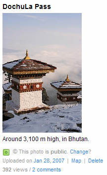 For example, the Flickr user interface was recently
translated into several languages. One of the more common messages when you are looking at your own photos tells you how many times the photo page
has been viewed, eg. "392 views". The following table shows comparative lengths of the word Flickr used for 'views' as a ratio* to the original
English:
For example, the Flickr user interface was recently
translated into several languages. One of the more common messages when you are looking at your own photos tells you how many times the photo page
has been viewed, eg. "392 views". The following table shows comparative lengths of the word Flickr used for 'views' as a ratio* to the original
English:
| Language |
Translation |
Ratio |
| Korean |
조회 |
0.8 |
| English |
views |
1 |
| Chinese |
次檢視 |
1.2 |
| Portuguese |
visualizações |
2.6 |
| French |
consultations |
2.6 |
| German |
-mal angesehen |
2.8 |
| Italian |
visualizzazioni |
3 |
The 300% expansion from English to Italian is not at all surprising for a small string such as this. The following are average expected
expansion rates for text translated from English into European languages, as published by IBM in their Guidelines to design global solutions.
No. of characters
in English source |
Average expansion |
| Up to 10 |
200–300% |
| 11–20 |
180–200% |
| 21–30 |
160–180% |
| 31–50 |
140–160% |
| 51–70 |
151-170% |
| Over 70 |
130% |
The general message is that text will normally expand, but note carefully how the smaller the source message, the higher the likely
translation length.
Of course, this is not true for every string or message, but when it is you must have some way of dealing with it. For example, Flickr
translates "FAQ" as "FAQ" in German and French, but as "Perguntas freqüentes" in Portuguese, and "Preguntas frecuentes" in Spanish.
The problem tends to be that the smaller the English text, the more likely it is to be squeezed into a small space, such as alongside a
form entry field, or inside a graphic, or a set of width restricted tabs, etc.
Bear in mind, also, that text expansion is not exclusively the problem of user interfaces with source text in English and Chinese. If
your original text is in Spanish, the term "Idioma de la interfaz" will be smaller in English ("Interface
language"), but much longer in Malay ("Bahasar pegantar untuk penelusuran"). Also, smaller translations can be
as problematic as bigger ones if they leave too much white space on the page.
When dealing with paragraphs of text, the relative expansion is likely to be less, but there may still be things you should consider. For
example, will you still be able to fit everything you wanted 'above the fold'? Will items still align the way you want if they grow downwards at
different rates?
Complicating factors
In addition to the unpredictability of the number of characters resulting from translation, there are other factors that complicate the
management of text layout.
Compound nouns
A number of languages, such as Finnish, German and Dutch, create single large 'words' to replace what is a sequence of smaller words
in other languages.
For example, the English "Input processing features" may become "Eingabeverarbeitungsfunktionen" in
German. Whereas the English text can easily be wrapped on two lines where there is restricted width available, such as alongside a form entry field,
or in a series of tabs or buttons, or in narrow columns, the German may not wrap automatically, and may pose a challenge for your layout.
Character width
Chinese, Japanese and Korean, amongst others, are scripts that typically have more complicated characters than those in the Latin
script. This can mean that even if the number of characters in translation remains the same, or even slightly less, the horizontal space required may
be much larger.
For example, the English "desktop" becomes "デスクトップ" in Japanese. The Japanese has one less
character, but will typically take up much more horizontal space.
Character and line height
It is very common for non-Latin text to have much taller characters than Latin text. Not only that, but these scripts often require
more vertical space between lines than does Latin text.
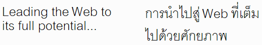
For example, the graphic below shows the same text in English and Thai. Note how there are two lines in each case, but the vertical
space taken up by the Thai is much greater. This is partly due to the complexity of the characters (which leads to taller glyphs, and therefore
increased line height), but it is also typical to have larger inter-line spacing in Thai than is found in Latin text. There are numerous scripts
which require much more height than Latin text, including Arabic (especially in Nastaliq fonts), Chinese, Devanagari (used for Hindi), Japanese, Korean, Tibetan, etc.
Think twice about abbreviations
If you are abbreviating your text to make it fit in a restricted space, you should really consider whether this is a good
idea. Other languages may not be able to replicate such an abbreviation, and the text may need to be bigger in translation.
In many languages abbreviation is uncommon. This may be down to the style of that language. In other cases it may due to more
practical concerns. For example, Arabic 'words' tend to be constructed from very compact, pattern-based roots with prefixes, suffixes and small
internal changes to express the precise meaning. It can be hard to abbreviate without losing meaning.
(Note also that you may need to provide translators with a list of expansions for abbreviations you use.)