Best practices
If you do decide to use a pull-down menu, here are some best practices to keep in mind.
Location
Locate the pull-down menu at or near the top of the page. This location is highly visible, increasing the likelihood that the visitor will see it. Scanning studies for pages in left-to-right scripts show that positioning to the top right increases visibility. Furthermore, an increasing number of Web sites have located their global gateways in this location, conditioning Web users to come to expect it here.
Certainly avoid putting the list at the bottom of the page so that it doesn't appear in the first screenful of information (and bear in mind that one screenful can be a different amount for different users).
List label
Use a recognizable image alongside the pull-down menu to indicate that it is a control which will take the user to localized pages. Do not use text.
You cannot expect Web users who are not fluent in English to understand "Select language". Universally recognized icons communicate to people regardless of what language they speak. In an ideal world there would be a widely recognized symbol for this. That time is still not here, though globe icons seem to be becoming more popular.
Examples of possible graphics would include globes, iconic facial profiles with lines to indicate speech, alphabetic characters from multiple scripts (especially for links to translations), etc.
The alt text for such a graphic doesn't have a great deal of importance. You may think that it needs to be in all languages, or no particular language, for accessibility, but in reality people reliant on screen readers would be able to traverse the pull-down text to find the right link.
The size attribute
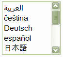
Consider using the size attribute to display the first set of options in a select control.
In some cases it may be effective to use the size attribute to display the first set of options in the list – particularly if this is a long list. This suggests to the user that this is a collection of languages/regions, and may remove the need for a non-language-specific label for the list. Here is an example:

Translations
Translate the menu options into the target language.
Instead of including a link on the pull-down menu to a translation that reads, for example, "French" the link should read "français"; and instead of a link to an alternative country site like "Germany" the link should read "Deutschland".
Pay attention to capitalization rules in other languages. Note how the correct translation of "French" is "français" with a lowercase 'f'. On the other hand, it is sometimes preferred to ignore this practice in favour of consistent casing, for purely stylistic reasons (see for example the top of this page, or Wikipedia's language links).
Encoding
To display a mix of non-Latin languages, such as Arabic, Russian and Japanese, you will need a way to represent all the required characters.
You should always use UTF-8 (Unicode) as the encoding for your page , since this encoding supports all the characters you will need.
If you really cannot use UTF-8, then you should use escapes to represent characters that are not supported by the encoding of your page.
Fonts
Decide whether it is a problem that a user won't have fonts for all the list items or menu options. If it is, use javascript menus or some other graphic-based approach.
Be aware that a Web user in France, for example, may see empty boxes (so-called 'tofu') in place of the Japanese text, while a user in Japan will see the text just fine. This is because the fonts available on the French user's system may not contain Japanese glyphs. One could argue that this is not too important, since French users don't need to be able to read the Japanese. On the other hand, you may feel that empty boxes are unsightly.
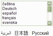
If you feel that empty boxes are unsightly you may be tempted to use text in graphics for non-Latin options. Unfortunately, it is not possible to include graphics in the selection list itself, but some sites add such graphics outside the pull-down menu.
For example:

Be warned, however, that addressing non-Latin text this way may still not solve all problems. Certain accented Latin characters, such as those in 'čeština' may produce the same effect for some users who have Latin fonts that only cover Western European languages.
Descriptions
Decide whether to add a description alongside each option, using the language of the current page, so that users can tell what the native word means.
For example:
français (French)
deutsch (German)
日本語 (Japanese)
This approach is not always necessary or desirable. On the other hand users may feel more comfortable with missing font glyphs if they see
Using parentheses is useful because it shows more clearly that this is a clarification.
Note, also, that names in the language of the current page should really be translated for every page where they appear – if you leave them in English it may give the wrong message.
Ordering
You will need to find the most appropriate way of ordering the list of options , given that this is a multilingual list of language or country names. Ordering multilingual lists is not an issue that is specific to selection lists, and there is no simple answer to this.
It is difficult to apply alphabetic ordering since this varies by language, and there are also likely to be multiple scripts involved. It would be possible to follow the default order prescribed by the Unicode Collation Algorithm, but whether that would be helpful, intuitive or recognizable to the user is another question.
Other possibilities are to order the list by the size of your market, the size of the region or number of speakers of a language, or by some kind of geographical principle. Again, while these may provide a rationale for ordering, none of these approaches are necessarily helpful to the user – especially for long lists.
This page and Wikipedia list language alternatives by (English) alphabetic order of the associated language tags. So, for example, German (de) comes before English (en), and Spanish (es) would come before French (fr). This works best when the user can find his language easily by scanning. For a long list, this may be less appropriate, since the user must not only know the tag for their language but, in order to anticipate its likely position in the list, must also be able to guess that tags have been used as the basis for the ordering.