Shawn urged EO to stay in touch with the work for this week, adding comments in wiki, survey, or GitHub as appropriate. Thanks all for your input, Kevin for your strong effort, progress is good.
Shawn: First agenda item is postponed until we have a larger group in attendance.
<shawn> https://www.w3.org/WAI/EO/wiki/EOWG_Meetings#agenda
Shawn: To note for new participants, Designing Tips have had final review, so if you do want to comment on those, please do so this week as we are trying to wrap that up.
... if you need help with GitHub, Sharron can help. Any questions on status of the Tips pages?
<shawn> https://www.w3.org/WAI/EO/wiki/Quick_Start_Guides/Cross_Activity_Tips
Shawn: There is a wiki page that discusses the Tips that apply to different tasks.
Kevin: we began with the idea to write the Tips targeting various roles. This became problematic since there are people who may perform tasks across roles. We therefore revised our approach to target the activity rather than a role.
Shawn: Since there are some activities that have implications across these tasks (Writing, Designing, Developing, etc) we have to address how to give good guidance with a minimum of redundancy.
... so what Kevin has put in the wiki is a suggestion for the approach to these kind of things. For example, alt text, we have tried to differentiate what the responsibility is across the task definition.
Sharron: So the issue is for the group to consider the balance. On one hand we want the Tips list for each task to be short and focused. On theother hand, we do not want to omit including a tip in one category simply becasue it was mentioned in another. We anticipate that people will not necessarily look at all tips for all roles but focus on their own. So our job is to balance between the goal of brevity and focus while ensuring that each task is given the guidance they need to succeed.
Shawn:Does anyone have concerns about including some forms instruction in all three categories?
<Vicki> +1
<Vicki> +1 for Sharron, +1 in each one
Jon: I like having the form instructions in each one, I agree that people won't necessarily look in others and also that if they have a responsibility there, it should be noted.
Shawn: There are suggestions for tweaking the title of the tip, what do people think aobut the changes suggested?
Jon: I prefer the original statement of the Tip - short, clear and without ensure, ensure, ensure all over the page.
<shawn> +1 to not liking "ensure that" :)
Kevin: is it just the ensure phrase?
<shawn> Make feedback clearly visible
Shawn: What about "Make feedback clear and highly visible"
Jon: Not sure what highly visible means> Visually?
... an alert box would be clear feedback
... does it need sound? more bells and whistles?
<shawn> [ except "visible" is visual only :/]
<kevin> [ yes, was considering that problem ]
Sharron: I don't think we want to give that much detailed instruction. Rather set a direction, we want people to note that a clear and easy to find feedback is needed within their own context and persentation style.
<kevin> [ Suggests: Provide easily identifiable feedback ]
Jon: I like that one
<Vicki> +1
George: I like it as well but I think the word ensure is actually the perfect word
James: +1 to easily identifiable
Shawn: Kevin, is that sufficient feedback?
RESOLUTION: Pursue the direction of "easily identifiable" in Designing Tips and consider smoothing the phrase
Shawn: Next one is "provide clear instruction" in form instruction within Writing task
Kevin: wanted to make the instruction relevant to this specific task.
Shawn: Jon mentioned that it is quite wordy, are you OK with tersification?
Kevin: Sure
<jon> I really don't like the instructions about "Ensuring"
Kevin: put preference for the longer or shorter in IRC please
<shawn> [ Shawn has no concern that it needs to be further differentiated. perfers the shorter one]
<Vicki> short
<shawn> George: short
George: short
Sharron: short
<James> short
<jon> short
RESOLUTION: In writing tip, use the short, original version of the forms related tip
Shawn: Great, now please scroll down to the next one Headings, any concerns with the way this topic is addressed in the two areas?
All: none
Shawn: Next is Responsive design, any concerns about how that point is covered in these two areas?
James: Do we need to mention RD in design? I would consider that there is a role in deisigning as well
... let's say you have a form with cool interactive controls, I would expect the designer to design a non-enhanced experience as well
Kevin: it is something like an interaction design, correct?
James: Yes, if you use JavaScript to create an enhanced experience, I think the designer cares about what it looks like.
Shawn: Why is not too detailed for developing but is too detailed for designing?
Kevin: within developing activity there is much more relevant responsibility than in the inital designing activity.
Sharron: James, are you saying the designing tip should be broader or that we need to add another tip?
James: I just wanted to mention that designers should be working on the Progressive Enhancement aspect as well
Kevin: Rather than have a tip in Designing, could mention in Developing to work with interaction designer
Shawn: My perspective is that I totally agree with James that the interaction design related to Progressive Enhancement should happen early in the design process and that it may be too much to include within the designing role. (not a strong feeling) good to think about.
George: I agree that this is extremely important, not necessarily a tip, but more a case of best practice.
<Vicki> +1 to add something about progressive enhancement to the current design tip
Sharron: Maybe we could just add a short phrase that references the need for enhanced design without adding a tip
Kevin: I think that could potentially work, but the example might then be problematic
<Vicki> No need for a specific additional example.
Sharron Agree there may not be a need to add an additional example
Shawn: we don't need an example for every nuanced point or reference that we make in each Tip
Kevin: In Designing I try to avoid programming references
Sharron: I think it is worth a mention in the design process
Shawn: How much are designers considering varied platforms?
James: In my experience not at all - they look at the ideal and don't think about the other
Kevin: I like the phrase 'Design for degraded experience'
Shawn: But we have nothing to point them to to help them understand - and that bothers me. That might be reason enough not to include it.
Kevin: maybe that is where the example comes in.
James: Create designs for different viewport sizes and degraded experiences
... all of these are totally within the spirit of what we are trying to say and was important to mention.
... to say it is not just the viewport but the experience too.
<Sharron> +1
Shawn: Are you OK with saying we have explored this and it is beyond the scope of the QuickTips?
James: I am OK with calling outside scope
<jon> +1
Shawn: after you think more about it, feel free to bring it up again
<shawn> https://www.w3.org/WAI/EO/wiki/Quick_Start_Guides/Cross_Activity_Tips#Labels
Shawn: next is Labels
... any concerns with having those two related tips?
... OK next is alt text, proposal is to leave it in Writing and Developing but not to have it in Designing
... thoughts about that? Vicki, given the way it is addressed in the other two are youOK with removing it from Designing?
Vicki: I would much prefer to have it remain in Designing
<jon> +1 to Vicki's comment
Vicki: Different people may not go to the other tips and because images are such an impediment and designers do have to deal with images so much, and are often dealing with images that others may not touch, it seems important and I like the way it is currently addressed.
Sharron: I felt strongly that way at first. Then I listened to Eric, who was pretty adament that designers don't think about specific images - they look at space and layout, but not about what things are called. That perspective convinced me that we could safely leave it outside of Designing... that was tipping point for me that it's alright to let that go
Jon: I agree with Eric's comment about the way that designers typically behave. But in some cases, they may choose stock images or something where they may need to choose one and may need to know about the need.
... don't think it would hurt to leave it in there for that reason.
Sharron: I am not so sure. If we have to prioritize, decide what's more important within each task, this may not be at the top f the list. In my view, other things(e.g., degraded experience) seem more important than the few times when designing task thinks about alt text. If as Eric suggested, it is not a critical part of what design is responsible for, and if the issue is covered well in those other places where there is more responsibility, then maybe we can safely omit it from this category.
Jon: you make a good point, but I would still want to keep alt text in all of them
<Vicki> +1 jon
Sharron: The example I see implemented most often where I wish a designer thought about alt text is the case where they place a widget with + and - sign for expand and collapse. That seems to me to be a case where the designer should be aware and give that function a name that follows it throughout the places where it is implemented. As long as we are addressing that example in the development stage, I am OK.
Shawn: Let's use the wiki to put reasons for inclusion etc, gather persepctives there and then do another vote in the survey
Kevin: I wanted to add that the challenge with this particular tip is how to create relevant examples that would be appropriate for the specific task - like Writing, Developing, etc - and I have not found one specific to Designing.
Sharron: iconography - + and - for expand/collapse
<kevin> Existing tip on alt text in Designing -> https://github.com/w3c/wai-quick-start/issues/78
Shawn: Thanks for input, let's move on.
<shawn> http://w3c.github.io/wai-quick-start/writing.html
Shawn: Go through Writing examples under Page titles
... Reactions on what you like and not like
Jon: I would cut "unique page titles" altogether
Shawn: The survey has already included this.
Jon: The examples are fine
Shawn: The dots at the front are distracting. Also the fact that they are centered rather than justified
<Vicki> I'm with Shawn on her comments.
Kevin: It's just to imitate what it would look like in the browser
Shawn: Looking at page title examples, issue with them being displayed differently in various OS
Vicki: Kevin has done exactly what the browser would look like and has tried to imitate that so not sure how it would change.
Shawn: But it looks totally different however in other browsers and so it would be distracting to people who do not use that browser. Can you do something without that kind of distraction that still has good affordance for the Tip?
<Vicki> true
Sharron: What about the page title examples from EasyChecks?
<shawn> http://www.w3.org/WAI/eval/preliminary.html#title
Shawn: Kevin, can you make these less distracting and specific to one browser?
Kevin: get rid of everything that makes it look like the title bar of the browser?
Shawn: Can you do anything that makes it look more cross-platform?
Kevin: Not sure since all platforms have different ways of presentation of the page title?
Vicki: Could you mention the browser name to be sure that people know that this is only true on this one?
George: It seems that if you remove the color you would get closest to a universal example as you could and would be understood by most everyone.
<Vicki> +1 George (?)
Kevin: let me have another round and run it by the group.
James: It is very Mac-centric and my suggestion would be to go for more of a Windows model to make it more geenric. Could left align the text and add a X (close) icon.
Shawn: next is headings example
<Vicki> I like the examples
Kevin: The design is still a bit early stage and is being tweaked
James: I like the examples
George: I think it good as well in the reduced view vs full size
<Zakim> shawn, you wanted to say like this approach. maybe make heading levels a bit more distinct
Shawn: Would only suggest that the h1, h2, h3 need a bit more differentiation
... good job Kevin, thanks for plugging away at it.
... keep content clear and concise as an individual Tip
... make link text meaningful
... is this example useful?
<Vicki> I like the example.
George: It is useful, it addresses a real problem and it is a good simple example
<jon> Awesome example IMO
Shawn: We had suggested to use an example from Images Tutorial and I commented on this example in GitHub. It changed the alt text from that in the Tutorial. In context there is no need to know it is a Golden Lab.
Kevin: It is nice to know
Shawn: More important to match the example in the Tutorial
... other comments overall?
<Vicki> Fine
<Vicki> ;) jon
Shawn: I am not convinced that the distraction is worth it, this example sucks my attention away from the point. In the context of the page, it is more of a distraction than a help.
Sharron: +1
... It could be argued that the best alt text in this case is empty.
Kevin: I tried to find an example that was just out of the Tutorial and rather than put in a full article to provide context, it was something that seemed to illustrate the point.
Shawn: Thanks for looking at the Tutorial but we think this is not useful in the context of the Quick Tips. Can we find a more useful example that does not need as much context.
... were there other candidates?
... I put some examples in designing, I can share
<shawn> For example, appropriate text alternative for a search button would be "search", not "magnifying glass".
<shawn> maybe use an example from BAD. Could use the "logo"and show both the too detailed bad alt and the good alt.
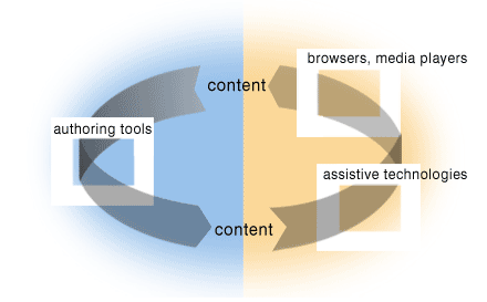
<shawn> http://www.w3.org/WAI/intro/cycle.png alt = illustration with arrow going from content at the top through authoring tools at left to content at the bottom, and an arrow going from the content at the bottom through assistive technologies and user agents at the right and back to content at the top" - but maybe too complex
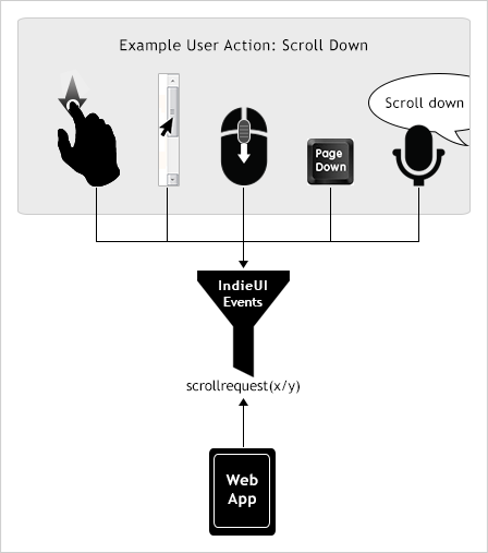
<shawn> http://www.w3.org/WAI/intro/iui-scroll.png alt="Illustration of 4 scroll down user actions (described in the main content) going into a filter labeled IndieUI Events. Under filter is 'scrollrequest(x/y)', and an arrow pointing to it from a Web App." - but maybe too complex
<Vicki> +1 for example
Shawn: let's go back to the idea...we are in Writing, do we actually need an example here?
James: If you wanted a second one, a lock - the icon is saying you are secure, not here is a picture of a lock.
Kevin: I was looking for something more than an icon, more like a complex image that needed interpretation. More of a challenge for the witing activity.
Vicki: I like the example that Kevin chose because there is text attached that gives it relevance to the Writing task
<shawn> Shawn: icons are more designing :)
Sharron: I agree that we need to be more specific to the writers task. Could you find one picture and show that it would have different alt text depending on its task in context? For example, I recall a place where a bank put a box of different kinds of chocolates. It was to show that their bank gave customers choice, so the chocolates were almost irrelevant. Although a picture of a box of chocolate maight be pretty distracting as well.
<kevin> +1 to Sharron's idea
<Vicki> Shawn, we can keep the icons for the design images tips :)
<shawn> +1 to vicki
George: one thing I wanted to add was that I saw what Kevin was shooting for in the task of Writing. Whether the dog it is distracting, I don't really know. But it does get the issue across. So whether it is worth the time to search for another seems a question. This is a good example.
Shawn: Taking an example where the alt text is different based on context.
<Vicki> I might also have an example... I'll have a look.
RESOLUTION: Find another example for alt text in Writing. Maybe different alt text in context.
James: Not sure we want to make this any more complex than this. What about a building, using the same layout we have, just replace dog, name building in text, describe building in alt.
Shawn: The last one for today is example under provide clear instruction.
... this example seems unclear to me, since we do not see the form input
... other quick comments on this one?
<Vicki> It's a little too complex perhaps.
Sharron: I did not understand this example, what was being illustrated exactly.
<jon> Kevin, I would move the error directly underneath the Username for context
Shawn: we will have a weekly survey, looking at examples in Developing
... Kevin will provide a list of some of the recent changes to the Tips for your review.
... another issue is that we have several points in the Writing Tips that have been proposed to be combined into one SuperTip. We are circulating that question once more for your consideration.
... make sure you update your availability and complete the survey that indicate you have read the homework. Watch for email as things become ready for review, happy Friday, good weekend.