The EOWG convened to review the survey data from the weekly questionnaire and confirm the decisions made related to adding accessible solutions to Images cover page; relationship of the tutorials to WCAG2.0 and Techniques; and the Tutorial permalinks. After consideration of survey data and discussion, EO agreed to:
The group then reviewed the new work flow focused on using the questionairres for input. Most like the new organization of work, Brent noted that the in-person orientation was more useful than the written materials, and the discussion of possible Face to Face meetings tended to settle on Austin in May around AccessU. Shawn reminded everyone to keep current on availability surveys and adjourned.
<shawn> h ttps://www.w3.org/2002/09/wbs/35532/EOweek14Jan2015/results< /p>
Shawn: Let's talk about comments, take a minute to look at the new ones that came in last night
<shawn> h ttps://www.w3.org/2002/09/wbs/35532/EOweek14Jan2015/results< /p>
Eric: I don't think it is clear, most people think saying "Accessible Images" is a good idea but I understand your point.
... another idea was to remove the word "Concepts"
Shawn: So the three ideas are 1. leave as is 2. Accessible Images concepts 3. Accessible Images 4. Images
<Wayne> 1
<shadi> 1
<Lydia> 1
Shawn: ...any strong feelings?
<Sylvie> 1 or 4
<kevin> 4 but happy with 1
<Howard> 1
<yatil> 1 or 4
Wayne: Don't want to see Accessible first since when it is magnified it takes time to get to the actual topic
<Brent> 1
Brent: I am happy with that.
<Lydia> yes
<Howard> yes
<Wayne> exstatic
<yatil> RESOLUTION: Leave as is.
Shawn: Everyone OK with leaving as is?
Shawn: Take a minute to skim...
<Lydia> no
Shawn: What do people think? Does everyone agree that we should have something on the cover page and that it should have more to say about the relationship of WCAG to the Tutorials? Any objections?
<Wayne> +1 and I like the if ... then .. else
Shawn: Then how to handle it on subsequent pages?
<yatil> RESOLUTION: Add a section to the tutorial cover page on the relationship to WCAG 2.0 with more context.
<Lydia> no
Shawn: The question came up about normative and non-normative. Do we need to not use it? Explain it?
Kevin: It is a term that needs clarification or simplification
Wayne: Our definition is not far from the non technical defintion of normative.
... it is related to the idea of standard. Standard and non-standard. It may not be as jargony as we think.
Shawn: My perspective is that outside of W3C I don't think I would know what it means.
<yatil> [[See the WCAG 2.0 standard and additional guidance in the techniques.]]
Shawn: how about if we try to include a bit more in context.
AnnaBelle: I share Kevin's confusion with the term but it seems to fit within the context of WCAG
<shawn> ? [[See the normative WCAG 2.0 standard and additional guidance in the techniques.]]
Howard: I agree it is confusing, can we link to the glossary? It is an academic word so that link would help.
Shawn: Are we OK to leave these comments for editor's discretion?
All: Yes
Shawn: It looks like there are people who mildly don't like them and one who strongly likes them. Proposal is leave the permalinks
<Lydia> Will the image change
Eric: I wonder if it would be a possibility to offer the option to show or hide the Permalinks and therefore meet both preferences.
<Wayne> +1 for option to hide
Shawn: So there would be at the top of the page an option to Hide Permalinks?
<Lydia> Is there a way to make the permalink icon smaller
Eric: I am in favor of them since people like to share specific places on a page
Sharron: Can't you grab the URL anyway?
Shadi: Yes if you are reading, you would have to go back to the menu and capture it. The permalink is easier
<Lydia> would a rollover text work when one points to the icon?
Shawn: The icons are not self explanatory, so if we include an explanation of what they do, we could include the optional off switch there.
Lydia: Could we provide a rollover that explains the icon?
Eric: We had more explanation of the Permalink but it was considered too long so we removed that.
Shadi: Let's work something related to Lydia's suggestion that if you click on it, a message is delivered that says "copy this link" or something short and instructive.
Shawn: On the WAI website under the left nav we sometimes have a legend for icons. Would that work on these page, maybe under "On this page"
... in terms of the ARIA hidden, with this new approach should we still discuss.
Wayne: It was a conditional suggestion based on whether it was in fact problematic for screen readers.
Shadi: I don't think it is simply a screen reader issue, since you Shawn had an issue with the visual clutter.
Wayne: Now that it has been said, I don't think aria hidden is appropriate.
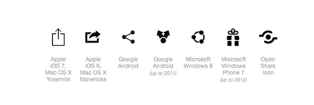
Howard: Where is the example of the Permalink?
<Sylvie> The problem is not the permalink but the link text which is not really explicit when you don't look at the title. Paragraph sign does not mean much to me.
Shawn: The icon is an anchor on the Tools page, previously it was a chain link
<kevin> +1 for making it a sharing link
Sylvie: The current icon is read by the screen reader says only "paragraph sign" and I don't hear Permalink
Shawn: What is a shring link?
<yatil> Share buttons: http://www.fastcodesign.com/3031872/why-isnt-there-a- standard-share-button
Kevin: There is a common sharing icon.
... I am not worried about which one you choose it is just that using one of those is aligned to what you are actually doing.
<shadi> +1
Brent: But usually when you choose an icon like that you immediately are provided with options of how to share
Eric: It is not that hard to add a link to soem options if we want to do that.
Shawn: We don't
... even though it may be easy it opens up issues we don't want to deal with here.
... so we are back to the chain or the anchor, any preference?
Wayne: Why not have the options be email this link or save this link?
Shawn: Seems to be scope creep and not really worth it.
<shawn> Sharron: share icon makes sense since that is exactly what we are trying to facilitate.
<shadi> "Copy this link and share"
<shadi> "Copy and share this link"
Howard: In terms of usability, something should happen when you click on it. Some kind of feedback to the user. Maybe something along the lines of just an option to copy or email the link to help understand what it is for
Eric: I think the share icon would work quite well. It is better to have an icon that people recognize and want to use. That makes it worth it
Shawn: What are thoughts about expectations that a share icon that does not provide the expected options?
Brent: As long as some kind of options are given, I think it will be fine. It is used several ways. So if we indicate that you can copy or email that would be enough
Sharron: +1
Shawn: The proposal is to use the share icon and when you click it you get...what? A popup message to email or copy the link? Is that easy to implement?
Eric: Yes it is do-able
<Wayne> +1 for consisstency
<shadi> +1 if eric thinks it *doable*
Shawn: Any objections?
<Howard> no objections here
<kevin> +1
<Brent> +1
<yatil> +1
Shawn: Will we change it everywhere else we have permalinks?
... if we like it when we see it in context, we may want to consider consistency and make the change throughout the WAI pages.
<yatil> RESOLUTION: Eric to develop a permalink widget to be used in the tutorials first and probably apply it to other permalinks in other projects at some time as well.
<shawn> current version http://www.w3.or g/WAI/tutorials/forms/labels/
<shawn> revised version: http://w3c.github.io/wai- tutorials/forms/labels/
<shawn> Added color to the left navigation (red instead of gray squares, blue instead of gray list headings).
<shawn> Added color to the right in-page navigation (blue border and heading instead of - you guessed it - gray).
<shawn> Changed link color to blue in the content area (not from gray).
<shawn> Removed the white box around "Related WCAG resources" (to gray ;-).
Eric: People especially on WCAG complained that the design was too grey. We added color to navigation and inpage navigation menus. added blue background and to the bottom a grey background
AnnaBelle: I don't know if it is just because I was accustomed to the old one, but I am having some trouble shifting gears. I liked the old look very much. So my reactions now is slightly negative. I like the red number in the left nav but otherwise I am not warming to it.
... I think I need more time
Shawn: OK...others?
Howard: The blue on the right and the red number, I think it is great. Otherwise it was blending in This makes scanning the page much easier. It hink the changes are positive.
<shadi> +1 to Howard
Sharron: I like it
Howard: The colors improved my mood
Shadi: I love it, excellent work Eric. It highlights, gives better focus to the central content because the side content is clearly a side bar
Kevin: I don't have a lot to add, I think it is a great use of color, not too much, just enough to make it pop. I agree with Shadi about perhaps adding styling to related Resources. Only unsure about the border of the side navigation the On This Page - there is something about it that does not quite gel
<AnnaBelle> If going to use dark blue, I'd recommend making the blues align with the WAI graphic at top right. It's #005A9C which is different family of blues than #003366
Shawn: Agree to make the Related Resources more distinguished, a border would be fine as long as it looks deliberate and maybe a smaller font
... did not like the reverse color
... don't feel strongly
Brent: I agree with Kevin and Shadi that the Related Resources are good in a white box and could use a border.
Shawn: Maybe a subtle grey background to align with the pages that it links to?
<shawn> https://www.w3.org/WAI/EO/wiki/EOWG_Meetings#Work_for_this_week< /a>
Shawn: We ask everyone to put comments into a weekly survey and to make tasks very clear, the email will link to the one wiki page where current assignment lives
... how is it working?
Wayne: Seems to be a disconnect between work for this week and the agenda
... so we did not look at the results of the surveys for example.
AnnaBelle: I think I may be able to be there after all in Austin so it might work out for me
Shawn: Any other comments about meeting/usability testing at AccessU?
<AnnaBelle> It will depend on exact days of meetings. Also have my daughter's wedding on 5/16 which I kinda have to be at beforehand :-)
<yatil> Survey works well for the editor as well. Much more efficient.
Shawn: Great, from my perspective the surveys work well, it allows us to gather everyone's initial thoughts quickly and can use the conference to get through more things more effective. Thanks to everyone. Happy Friday, have a good week end