- From: Mats Palmgren via GitHub <sysbot+gh@w3.org>
- Date: Mon, 06 Jan 2020 17:51:28 +0000
- To: public-css-archive@w3.org
MatsPalmgren has just created a new issue for https://github.com/w3c/csswg-drafts:
== [css-grid-2] Masonry layout ==
### Overview
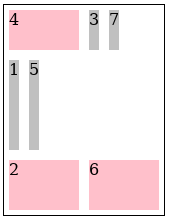
This is a proposal to extend CSS Grid to support masonry layout in one of the axes while doing normal grid layout in the other. I'll use `grid-template-rows/columns: masonry`to specify the masonry-axis in the examples (and I'll call the other axis the grid-axis). Here's a simple example:
```html
<style>
.grid {
display: inline-grid;
grid: masonry / 50px 100px auto;
grid-auto-columns: 200px;
grid-gap: 10px;
border: 1px solid;
}
item { background: silver; }
</style>
<div class="grid">
<item style="border:10px solid">1</item>
<item>2</item>
<item>3</item>
<item style="height:50px">4</item>
<item>5</item>
<item>6</item>
</div>
```
Result:

The grid-axis behaves pretty much the same as in a normal grid container. Line names and track sizes can be specified and items can be placed and span multiple tracks using `grid-column/row`. CSS Box Alignment works normally etc. In the masonry-axis, items are placed into the grid-axis track(s) with the most space (typically) after the margin-box of the last item in those tracks.
### Line name resolution and grid item placement
Grid items are formed and blockified the same as in a normal grid container. Line name resolution works the same as if `masonry` were replaced with `none`, i.e. names resolve *in both axes*. Grid item placement is done normally as well, although most of this result is discarded. Any items that were placed in the first hypothetical "track" in the masonry-axis keep their placement. Other items that have a definite position in the grid-axis keep that. Other placement results are ignored. These items will instead be placed according to the Masonry layout algorithm. (This implies that items can only be placed into the same grid area in this first hypothetical "track"). The flow axis specified by `grid-auto-flow` is ignored - items are always placed by filling the grid-axis. `direction:rtl` works as usual (reverses the grid) if the grid-axis is the inline-axis.
### Containing block
The containing block for a grid item is formed by the grid area in the grid-axis and the grid container's content-box in the masonry-axis. Self-alignment works normally in the grid-axis, but is ignored in the masonry-axis. Margins do not collapse in either axis.
### Track sizing
The [Track Sizing Algorithm](https://drafts.csswg.org/css-grid/#algo-track-sizing) works as usual in the grid-axis, except only the subset of items with a definite placement in the grid-axis contribute to the intrinsic sizing. This makes the first (implicit grid) "track" in the masonry-axis special since those items always contribute to the intrinsic sizing. `auto`-placed items which don't end up in the first track don't contribute (since which track they end up in depends on layout results). The min/max-content size of a grid container in the masonry-axis is the largest distance between the item margin-edges in each of the tracks in the grid-axis, when sized under a min/max-content constraint.
### Grid container alignment and spacing
[Alignment](https://drafts.csswg.org/css-grid/#alignment) etc works normally in the grid-axis. Gutters are supported in both axes. In the masonry-axis the spacing is applied between each item. Alignment in the masonry-axis is applied to the content as a whole (same as for a block container in the block-axis).
### Masonry layout algorithm
Items are placed in [order-modifed document order](https://drafts.csswg.org/css-flexbox-1/#order-modified-document-order) but items with a definite placement are placed before items with an indefinite position (as for a normal grid). For each of the tracks in the grid-axis, keep a running position initialized to zero. For each item that has an indefinite placement:
1. starting at line 1...
2. find the largest running position of the tracks that the item spans at this position, call it `min_pos`
3. increment the line and repeat step 2 until the item would no longer fit inside the grid
4. pick the line number that resulted in the smallest `min_pos`as the definite placement
Calculate the size of the containing block and flow the item. Then calculate its resulting margin-box size in the masonry-axis. Set the running position of the tracks the item spans to `min_pos` + margin-box + grid-gap.
There are a few variations of this algorithm that might be useful to authors. First, the "definite items first" might be useful to skip in some cases, so that a plain *order-modifed document order* is used instead. Also, opting out from the packing behavior described above and instead placing each item in order (a couple of existing masonry JS packages provides this option). So, perhaps something like this: `masonry-auto-flow: [ definite-first | ordered ] || [ pack | next ]`. Example:
```html
<style>
.grid {
display: inline-grid;
grid: 50px 100px auto / masonry;
border: 1px solid;
masonry-auto-flow: next;
}
.grid > * {
margin: 5px;
background: silver;
}
.grid > :nth-child(2n) {
background: pink;
width: 70px;
}
</style>
<div class="grid">
<item>1</item>
<item style="height: 50px">2</item>
<item>3</item>
<item style="order: -1">4</item>
<item>5</item>
<item>6</item>
<item>7</item>
</div>
```
Result:
(Without `masonry-auto-flow: next`, 1,3,5,6 are placed in the middle row.)
### Fragmentation
Fragmentation in the masonry-axis is supported. Each grid-axis track is fragmented independently. If an item is fragmented, or has a forced break before/after it, then the running position for the tracks that it spans in the grid-axis are set to the size of the fragmentainer so that no further items will be placed in those tracks. Placement continues until all items are placed or pushed.
### Subgrid
Masonry layout is supported also in subgrids (e.g. `grid: subgrid / masonry`). However, only a parent grid-axis can be subgridded. A `subgrid` axis with a parent masonry-axis will behave as `masonry`, unless the subgrid's other axis is also `masonry` in which case it behaves as `none`. (A grid container can only have one masonry-axis). `auto`-placed subgrids don't inherit any line names from their parent grid, but are aligned to the parent's tracks as usual.
### Absolute Positioning
Grid-aligned absolute positioned children are supported. The containing block is the grid-area in the grid-axis and the grid container padding edges in the masonry-axis, except for line 1 in the masonry-axis which corresponds to the start of the "grid" (the content-box start edge usually). It might be useful to define a *static position* in the masonry-axis though, given that we only have a one line in that axis to align to. Maybe it could defined as the max (or min?) current running position of the grid-axis tracks at that point?
### repeat(auto-fit)
I don't see a way to support `repeat(auto-fit)` since `auto`-placed items depend on the layout size of its siblings. Removing empty tracks after layout wouldn't be possible in most cases since it might affect any intrinsic track sizes. Even if all track sizes are definite the containing block size could change for grid-aligned abs.pos. descendants. So `repeat(auto-fit)` behaves as `repeat(auto-fill)` when the other axis is a masonry-axis.
Please view or discuss this issue at https://github.com/w3c/csswg-drafts/issues/4650 using your GitHub account
Received on Monday, 6 January 2020 17:51:29 UTC