Bert Bos | A Walkthrough of CSS Grid
●●●●●●●●●●●●●●●●●●●●●●●●●●●●●●●
For projection: switch to full screen
(With Javascript: press A)
Presented
at:
CWI / W3C Benelux
Office
Amsterdam, Netherlands
15 June 2017
●●●●●●●●●●●●●●●●●●●●●●●●●●●●●●●

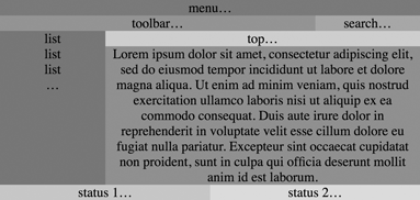
See example.
CSS Grid is designed for making GUIs:
Both the overall layout
and individual components.
Easy to change layout,
e.g., for narrow screen
or landscape/portrait.
●●●●●●●●●●●●●●●●●●●●●●●●●●●●●●●
Row & column sizes can be:
●●●●●●●●●●●●●●●●●●●●●●●●●●●●●●●
#main {grid-area: 2 / 4} /* 2nd row 4th col */
#main {grid-area: top-line / main-start}
#main {grid-area: area4}
●●●●●●●●●●●●●●●●●●●●●●●●●●●●●●●
An item can be vertically and horizontally aligned within its slot.
Two items in the same area will overlap (see also limitations below), but you can control which is on top with ‘z-index’.
Abbreviated syntax for very large grids
grid: 1fr 1fr 1fr / repeat(18, 1fr)
●●●●●●●●●●●●●●●●●●●●●●●●●●●●●●●
* unless absolutely positioned
●●●●●●●●●●●●●●●●●●●●●●●●●●●●●●●
explicit = template implicit = auto
●●●●●●●●●●●●●●●●●●●●●●●●●●●●●●●
Grid items can be placed anywhere in the grid.
But navigation is still based on source order, not visual order.
Make sure the source order is logical!
(If needed, you can also transform the DOM first.)
●●●●●●●●●●●●●●●●●●●●●●●●●●●●●●●
Grids are oriented depending on 'direction' and 'writing-mode'
(I.e., like tables, but unlike absolute positioning or floats.)
(Floats will soon offer a choice between physical and relative directions.)
<div dir=ltr>
 <div dir=rtl>...
 <div dir=rtl>...
</div>
→ if you have text in Arabic or Hebrew scripts, you may need to add an explicit DIR=ltr on the grid element (and then reset to DIR=rtl on the grid items), otherwise the whole GUI may end up mirrored.
In some cases, mirroring is in fact the right thing to do. E.g., a grid of photo thumbnails may well start at the top right and fill rows from right to left in an Arabic context and labels may be to the left of checkboxes, But many parts of a GUI do not change place.
●●●●●●●●●●●●●●●●●●●●●●●●●●●●●●●
display: grid or display: inline-grid
The Display Module is meant to enhance the 'display' property to allow sepate specification of ‘outside’ and ‘inside’ aspects of boxes. The idea is to say, e.g., that an element can act as a table cell on the outside and as a grid on the inside. But not so many display values can be cleanly split and after many years of trying various models and syntaxes, we're still not sure it's actually useful. Also, because grid is meant for GUIs and requires a specific document structure on its inside already, it is probably not a big deal to say that, to put a grid inside a table cell, you'll have to make a tree that has actual table cell element around the grid….)
●●●●●●●●●●●●●●●●●●●●●●●●●●●●●●●
<div class=grid>
 <div>...</div>
 ...
 <div>...</div>
</div>
●●●●●●●●●●●●●●●●●●●●●●●●●●●●●●●
By default, grid items fill their area (‘stretch’).
justify-self: auto, normal,
stretch, left, right, start, end, self-start or self-end
align-self: auto, normal,
stretch, start, end, self-start, self-end or baselineFor 'baseline', see further down.
You can also set alignment on all items together with ‘justify-items’/‘align-items’ on the grid container.
'normal' and 'stretch' are the same, except on replaced elements. 'Auto' is usually the same as 'normal', unless the grid container has a 'justify-items' property other than 'auto' or 'normal'.
●●●●●●●●●●●●●●●●●●●●●●●●●●●●●●●
the size is computed similar to a float.
●●●●●●●●●●●●●●●●●●●●●●●●●●●●●●●
See example
The order property applies to grid items
unless they have an explicit position ('grid-area').
When unplaced items are assigned to empty slots,
items with lowest order are placed first.
●●●●●●●●●●●●●●●●●●●●●●●●●●●●●●●
Z-index applies to grid items
By default, if items overlap, the document order determines the z-order: later items on top.
●●●●●●●●●●●●●●●●●●●●●●●●●●●●●●●
grid-template-rows, grid-template-columns,
grid-template-areas or use the
shorthand grid
A grid with 3 rows and 2 columns:
grid: 10px auto 1fr / auto 3em
Ditto, but with limits on the first column:
grid: 10px auto 1fr / minmax(2em,15em) 3em
A grid with 18 columns, the first 17 of equal width:
grid: 10px auto 1fr / repeat(17, 1fr) 5em
●●●●●●●●●●●●●●●●●●●●●●●●●●●●●●●
A grid with 6 named areas, 3 empty areas and all sizes 'auto'
(An area name consisting only of dots indicates an unused area)
grid: "a1      a2   a2    a3"
      "left    left right right"
      "my-slot ...  ...   ..."
Ditto with explicit sizes:
grid: "a1      a2    a2    a3"     10px
      "left    left  right right"  auto
      "my-slot ...   ...   ..."    1fr
      / 1fr    1fr   1fr   1fr
●●●●●●●●●●●●●●●●●●●●●●●●●●●●●●●
grid: [top] 10px [high] 1fr [bottom] / repeat(17, [a] 1fr [b])
Note that many lines have the same name, many have two names.
grid: "top top top" "left middle right"●●●●●●●●●●●●●●●●●●●●●●●●●●●●●●●
The grid grows automatically if
The final grid, including these additional grid cells is called the implicit grid
●●●●●●●●●●●●●●●●●●●●●●●●●●●●●●●
The 'grid' shorthand allows to specify either
If you need a combination, you'll need to use the longhand properties.
●●●●●●●●●●●●●●●●●●●●●●●●●●●●●●●
Example: ← example
grid: auto-flow auto 1em / repeat(10, 5em)
Above is equivalent to:
grid-template-columns: repeat(10, 5em);
grid-auto-rows: auto 1em;
grid-auto-flow: row  /* default */
●●●●●●●●●●●●●●●●●●●●●●●●●●●●●●●
Example:← example
grid: 50px auto auto / auto-flow 6em 4em
Above is equivalent to:
grid-template-rows: 50px auto auto;
grid-auto-columns: 6em 4em;
grid-auto-flow: column
●●●●●●●●●●●●●●●●●●●●●●●●●●●●●●●
By default, grid items are placed in order: each grid item without an explicit placement is either placed to the right of or below its immediate predecessor (whether automatically placed or not).
If you set replace auto-flow by auto-flow
dense, the UA will put grid items without an explicit placement
in the earliest possible free area that fits. I.e., such items may end
up before a preceding sibling.
E.g., if there is a free slot of size 1x1 and one of 2x1, and two auto-placed items, one of 2x1 and one of 1x1, the first goes into the larger free slot and the second into the smaller.
●●●●●●●●●●●●●●●●●●●●●●●●●●●●●●●
Into a named area:
grid-area: a2
Into a single cell:
grid-area: 2 / 3 /* 2nd row 3rd column */
Into a span of cells:
grid-area: 2 / 3 / 4 / 7
or:
grid-area: 2 / 3 / span 2 / span 4
●●●●●●●●●●●●●●●●●●●●●●●●●●●●●●●
Assume
grid: [a-line] 10px [mid] 1fr [b-line] / [lft] auto [rgt]
Now a-line=1, mid=2, b-line=3, lft=1, rgt=2, thus
grid-area: mid / lft / b-line / rgt
puts the item in the 2nd row.
●●●●●●●●●●●●●●●●●●●●●●●●●●●●●●●
An area and a line may have the same name
and multiple lines may have the same name. E.g.:
grid: "      w       x       y       z"      1fr
      "      v       v       v       v"      1fr
      / [v] 1fr [v] 1fr [v] 1fr [v] 1fr [v];
has an area ‘v’ and 5 vertical lines called ‘v’. ← example
Names are first searched among areas, then among lines. If there
are multiple lines, add a number to indicate which you mean:
grid-area: | v | / | v
2
|
| ↑ area | ↑ 2nd line |
●●●●●●●●●●●●●●●●●●●●●●●●●●●●●●●
Grid items without grid-area (or grid-area:
auto) are automatically placed in the next free cell.
To give auto-placed items a specific size:
grid-area: span 2 / span 5
finds the next free slot
that has size for a cell of 2 rows high and 5 columns wide.
●●●●●●●●●●●●●●●●●●●●●●●●●●●●●●●
Adding empty space between rows and columns (by default none):
grid-row-gap: 2ex;
grid-column-gap: 0.3em
or
grid-gap: 2ex 0.3em
Note: If you use the grid shorthand, set the
gap after the grid, because the shorthand resets all
properties, including the gap
●●●●●●●●●●●●●●●●●●●●●●●●●●●●●●●
Just as table cells, grid items can be
baseline-aligned:
align-self:
baseline
← example
●●●●●●●●●●●●●●●●●●●●●●●●●●●●●●●
The (deeply nested) structure of documents rarely matches what Grid expects, but if it does, just use it!
Some of the limitations:
●●●●●●●●●●●●●●●●●●●●●●●●●●●●●●●
https://www.w3.org/Talks/2017/0615-CSS-Amsterdam
To Lead the Web to its full potential
To Anticipate the Trends
To Increase your company value
Join W3C
https://www.w3.org/Consortium/join
or contact: Annette Kik or Bernard Gidon
Bert Bos <bert@w3.org>
GPG fingerprint: 7744 0204 52A5
14D9 147D
2A13 2D7A E420 184B 5BA4
 New! Front-End course
on
  !
!
Using numbers is probably easiest when style rules are generated by a program. There is probably already some loop variable that has the right value, so no need to translate that to a name.
Using names is probably easiest when writing style rules by hand. More readable and less chance of mistakes, especially if you change a grid, or add another for different screen dimensions.
Whether to use names for areas or names for lines (or both) is probably just a matter of taste. Named areas lead to shorter and easier to read style rules than named lines, as long as the grid isn't too big and has no, or few, overlapping areas.