Bert Bos | CSS tutorial – columns
Multi-column layout
If an element has a fixed height, columns can be filled in two ways:
column-fill: balancecolumn-fill: auto
In both cases it is possible that there is too much text. In
that case, extra columns are added on the right side, outside the
element's box. Whether they are visible depends on the value of
overflow.
float: top
    next-column
?)
There is no solution for the color inversion in any of our drafts yet. The overlap itself is also tricky, but a negative margin or an overflow can probably do it.
If we consider the top right article as a single region with a 'columns: 3' property, then the top-right image spans two columns. This is a reasonable extension for multicol. As an alternative, the three columns and the image can also be seen as four separate regions, three of which form a chain.
We have no way to guarantee that an element (or border) has exactly the height of the digits of a font, but if we can be reasonably sure of the font (thanks to Web fonts), it is probably OK to measure the font on server side.
Similarly, the kerning in the page header is probably a question of setting a fixed negative margin.
To fill all columns exactly to the bottom, there has to be some flexibility to exploit. The space between the paragraphs could be made stretchy (as in TEX), and the images could be cropped slightly differently. But we have no such features in any CSS draft yet.
The rules between the columns can be made in several ways: as borders on the slots ('::slot()' pseudo-element), or as narrow slots filled with a black background.
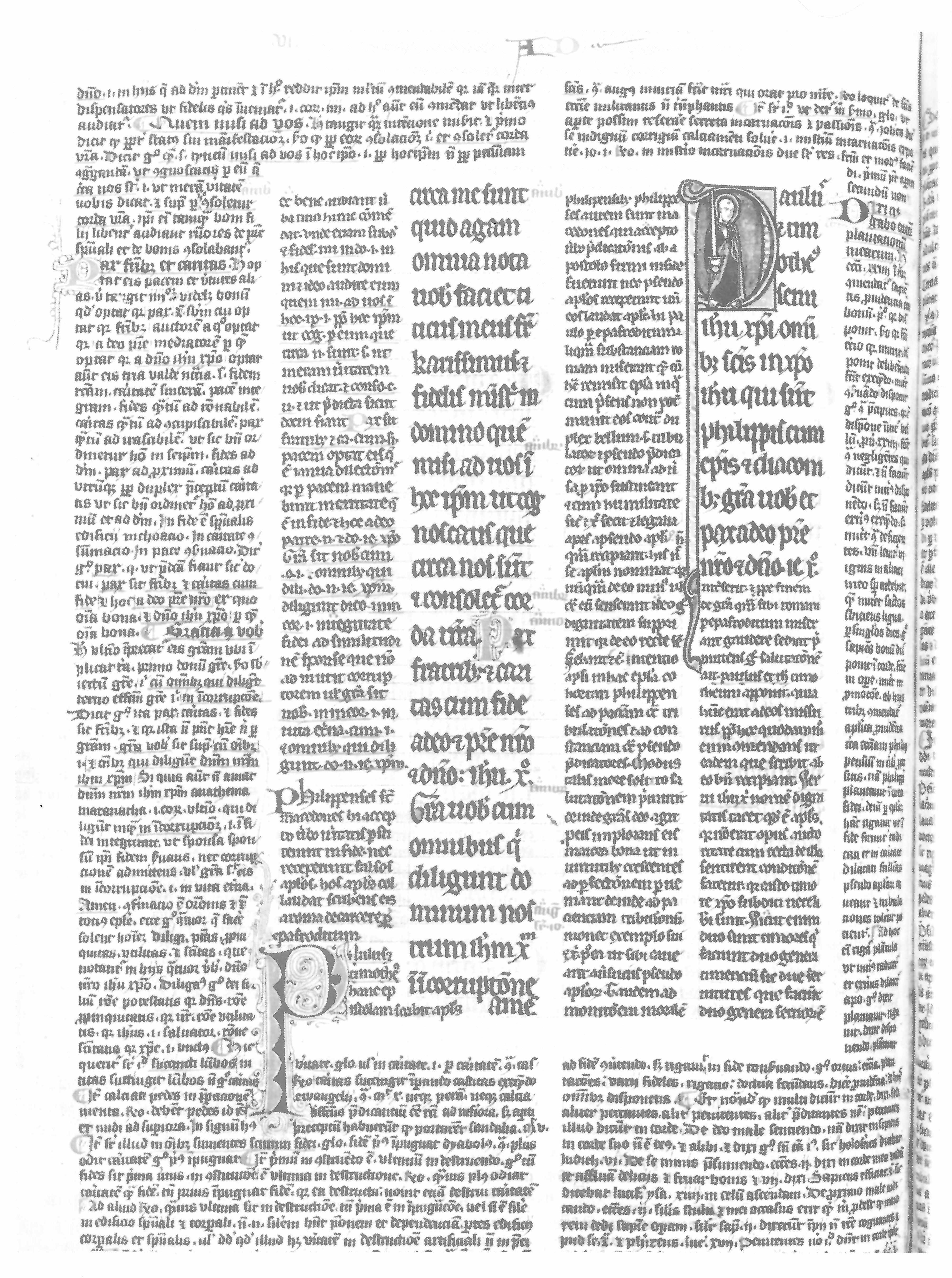
13th c. manuscript
Considered as a template with 6 areas (a…f):
a a a a a a . b b b b b
a a . . . . . . . . . b
a a . c . d . e . f . b
a a . c . d . e . f . b
a a . c . d . e . e . b
a a . c . d . e . e . b
a a . . . . . . . . . b
a a a a a a . b b b b b
a a a a a a . b b b b b
This manuscript is the result of adding more annotations (a and b) in the margins of a text that itself already had a main text (d and f) and annotations (c and e). That partly explains the irregular width of the columns.
In modern designs, e.g., in newspapers, columns may also be of different widths, but the wider columns are typically an exact multiple of the narrow ones. So one way to look at such a design is as a set of regular columns, except that some columns are combined into one.
And if the element is narrower than the desired width of one column, there will be only one column and it will be the narrower than what 'columns' specified.