Bert Bos & Eva Kasal | CSS3 in Style
CSS3 animations defines a property to animate elements (such as div, h1 and span) without JavaScript or Flash.
@-moz-keyframes example { This is the animation code
   from { -moz-transform: scale(1.0); }
   to   { -moz-transform: scale(2.0); }
}
div { This is the element we apply the animation to
 -moz-animation-name:example;
 -moz-animation-duration:1s;
 -moz-animation-timing-function:ease; /* ease by default */
 -moz-animation-delay:1s;             /* 0 by default */
 -moz-animation-iteration-count:1;    /* 1 by default */
 -moz-animation-direction:alternate;  /* normal by default */
}
Internet Explorer and Opera do not yet support the @keyframes
rule or the animation property.
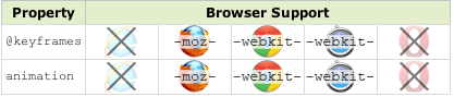
April 2012: experimental implementations (prefixes), the syntax is exactly the same for each browser, with only a prefix change required
span:nth-child(1){
  animation-name: cloud1;
  animation-timing-function: ease-in-out;
  animation-duration: 10s;
  animation-iteration-count: infinite;
}
@keyframes cloud1 {
  from { left: 10px;}
  50% { left: 90px;}
  to { left: 10px;}
}
from demo 1
@-moz-keyframes ball {
  0% { -moz-transform: translateY(-300px) scaleY(1.2); }
  33% { -moz-transform: translateY(0px) scaleY(1.2); }
  35% { -moz-transform: translateY(10px) scaleY(0.8); }
  66% { -moz-transform: translateY(-100px) scaleY(1.2); }
  100% { -moz-transform: translateY(0px); }
}
from demo 2
@-moz-keyframes ball {
  0% { -moz-transform: translateY(-300px) scaleY(1.2); }
  35% { -moz-transform: translateY(-300px) scaleY(1.2); }
  /* Same position as 0% */
  65% { -moz-transform: translateY(0px) scaleY(1.2); }
  /* Starts moving after 35% to this position */
  67% { -moz-transform: translateY(10px) scaleY(0.8); }
  85% { -moz-transform: translateY(-100px) scaleY(1.2); }
  100% { -moz-transform: translateY(0px); }
}
from demo 3
@-moz-keyframes ball {
  0% { -moz-transform: translateY(-300px); }
  35% { -moz-transform: translateY(-300px);
  		-moz-animation-timing-function: ease-in; }
  65% { -moz-transform: translateY(0px);
  		-moz-animation-timing-function: ease-out; }
  85% { -moz-transform: translateY(-100px);
  		-moz-animation-timing-function: ease-in; }
  100% { -moz-transform: translateY(0px); }
}
from demo 4
<div class="ball-arc">
   <div class="ball"></div>
</div>

.ball-arc {
-webkit-animation: ball-x 2.5s cubic-bezier(0, 0, 0.35, 1);
}
/* cubic-bezier here is to adjust the animation-timing speed.
   This example makes the ball take longer to slow down. */

@-webkit-keyframes ball-x {
   0% { -webkit-transform: translateX(-275px); }
   100% { -webkit-transform: translateX(0px); }
}
from demo 5
.running .spin {-webkit-animation: spin 2.5s; -moz-animation: spin 2.5s;}
.running .wobble {-webkit-animation: wobble 2s; -moz-animation: wobble 2s;}

@-moz-keyframes wobble {
  0%, 24%, 54%, 74%, 86%, 96%, 100% { -moz-transform: scaleX(1.0); }
  25%, 55%, 75% { -moz-transform: scaleX(1.3) scaleY(0.8) translateY(10px); } /* Points hitting floor */
  30%, 60%, 80% { -moz-transform: scaleX(0.8) scaleY(1.2); } /* Wobble inwards */
  75%, 87% {-moz-transform: scaleX(1.2);}
  97% {-moz-transform: scaleX(1.1);}
}
@-moz-keyframes spin {
    0% { -moz-transform: rotate(-180deg); }
    100% { -moz-transform: rotate(360deg); }
}
Source: smashing magazine
#demo {
  -webkit-transform-style: preserve-3d;
  -webkit-animation-name: rotate;
  -webkit-animation-duration: 30s;
  -webkit-animation-iteration-count: infinite;
  -webkit-animation-timing-function: linear;
  -webkit-animation-play-state: paused}
#demo:target {
  -webkit-animation-play-state: running
}
Pausing the animation is different from stopping it