Lorem ipsum dolor sit amet, consectetur
adipisicing elit, sed do eiusmod tempor
incididunt ut labore et dolore magna aliqua.
1 Ut enim ad minim veniam, quis nostrud
exercitation ullamco laboris nisi ut aliquip ex ea
commodo consequat.
- First bullet
- Second bullet
- Third bullet
- Fourth bullet
Duis aute irure dolor in reprehenderit in
voluptate velit esse cillum dolore eu fugiat nulla
pariatur.
2 Ut enim ad minim veniam, quis nostrud
exercitation ullamco laboris nisi ut aliquip ex ea
commodo consequat.
- First bullet
- Second bullet
- Third bullet
- Fourth bullet
Excepteur sint occaecat cupidatat non proident,
sunt in culpa qui officia deserunt mollit anim id est
laborum
3 Ut enim ad minim veniam, quis nostrud
exercitation ullamco laboris nisi ut aliquip ex ea
commodo consequat.
- First bullet
- Second bullet
- Third bullet
- Fourth bullet
Lorem ipsum dolor sit amet, consectetur
adipisicing elit, sed do eiusmod tempor
incididunt ut labore et dolore magna aliqua.

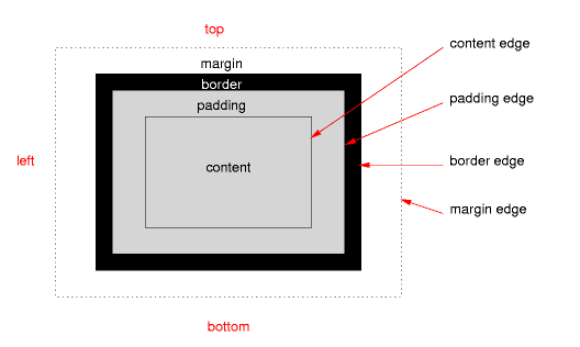
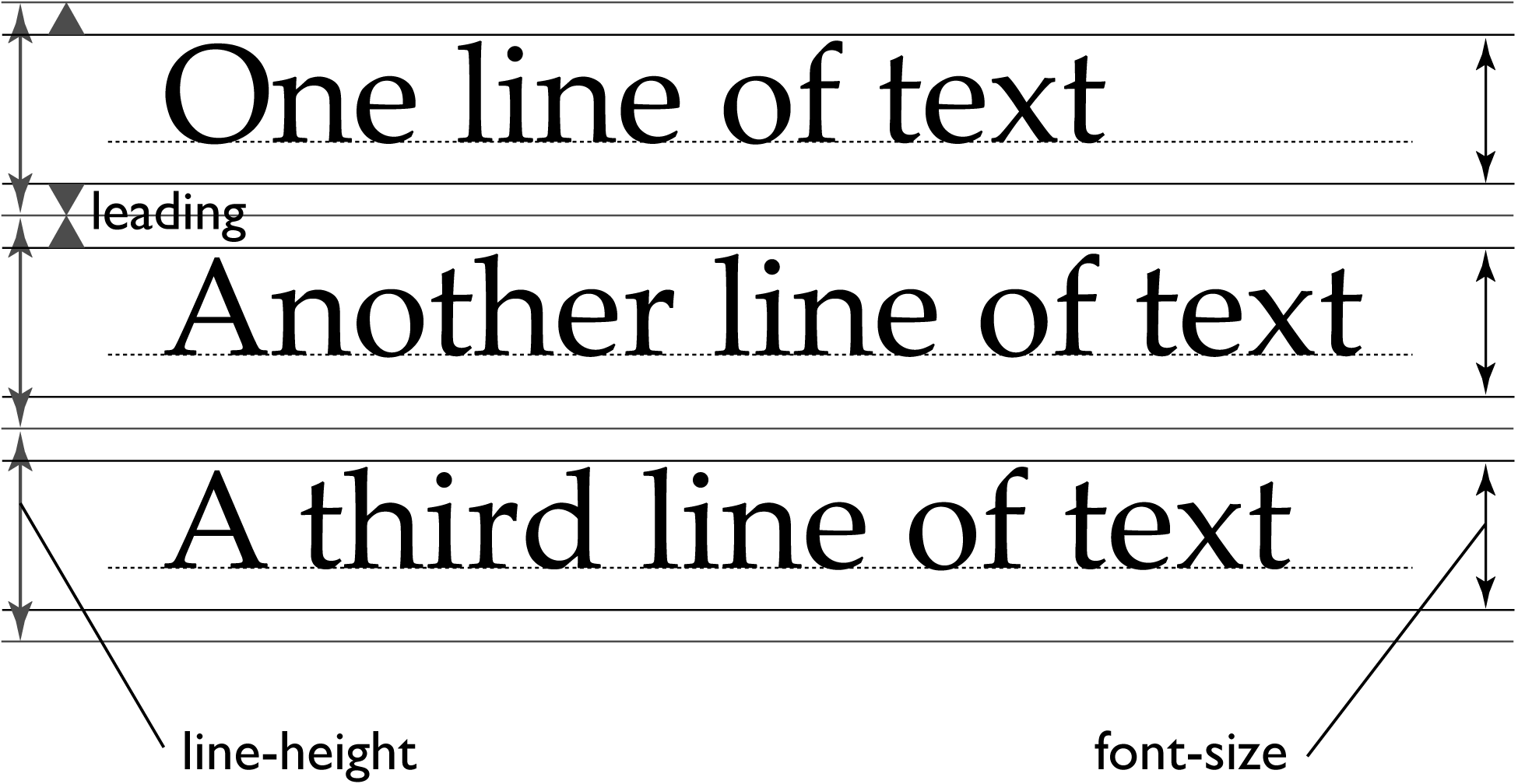
 This talk explores the limits of
level 2 of the box model (and thus potential requirements for
level 3). Examples include leading, centering and vertical
text.
This talk explores the limits of
level 2 of the box model (and thus potential requirements for
level 3). Examples include leading, centering and vertical
text.

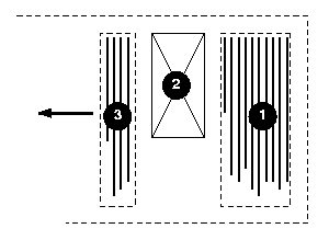 For
Japanese and Chinese (Mongolian is a bit harder
still…)
For
Japanese and Chinese (Mongolian is a bit harder
still…)


Håkon's idea for “Cascading HTML Style Sheets” and my implementation of a style language for SGML with context-sensitive selectors led quickly, after October 1994, to a system with the main features of both and the syntax of neither.
CSS has been developed since 1995 by W3C. That has resulted, among other things, in specifications for CSS level 1 and level 2. At the moment the working group in W3C is working on several modules for level 3 and a revision of level 2.
As for me, I have, among other things, set up the internationalization activity of W3C and participated in the standardization of HTML and XML. At the moment I'm coordinator for both CSS and MathML.
But you have read the programme, so I'm not telling you anything new…