#overlay {position: absolute; top: 50px; left: 50px; height: 100px;
width: 100px; border: thin solid red;}
Applied to an empty <DIV>, this would look something like:

Contents
The width of a box generated by an element does not depend on the width of its children nor on its content -- it is given by the 'width' property.
| Property name: | 'width' |
|---|---|
| Value: | <length> | <percentage> | auto |
| Initial: | auto |
| Applies to: | block-level and replaced elements |
| Inherited: | no |
| Percentage values: | refer to parent element's width |
This property can be applied to text elements, but it is most useful with replaced elements such as images.
Negative values for 'width' are not allowed.
For example:
IMG.icon { width: 100px }
If the 'width' and 'height' of a replaced element are both 'auto', these properties will be set to the intrinsic dimensions of the element.
See the section on the the box model for an illustration of box rendering objects.
The width of a block-level element's box is determined by seven properties: 'margin-left', 'border-left', 'padding-left', 'width', 'padding-right', 'border-right', and 'margin-right'.
For elements in the flow, the sum of these seven is equal to the content 'width' of the parent element.
If 'auto' is set as the value for one of the seven properties in an element that is inline or floating, it will be treated as if it were set to zero.
Horizontal margins are not collapsed.
For floats and replaced elements (i.e., block-level or inline elements whose markup is replaced by other content such as the IMG element in HTML), the calculation of width is as follows:
Three of the seven properties given above can be set to 'auto': 'margin-left', 'width', and 'margin-right'. For replaced elements, a value of 'auto' on 'width' is replaced by the intrinsic width, so for them there can only be two 'auto' values.
If exactly one of 'margin-left', 'width', or 'margin-right' is 'auto', the UA will assign that property a value that will make the sum of the seven equal to the parent's width.
If none of the properties have the value 'auto', the value of 'margin-right' will be assigned 'auto'.
If more than one of the three is 'auto', and one of them is 'width', then the others ('margin-left' and/or 'margin-right') will be set to zero and 'width' will get the value needed to make the sum of the seven equal to the parent's width.
Otherwise, if both 'margin-left' and 'margin-right' are 'auto', they will be set to equal values. This will center the element inside its parent.
The width of an absolutely positioned element's box is specified with the 'width' property.
However, if the 'width' has the value 'auto', the width of the box is given by the 'left' and 'right' properties. Note that these take the place of the 'left-margin' and 'right-margin' properties, which don't apply to absolutely positioned elements.
If all three properties have the value 'auto', the box has exactly the width of the inherited reference box.
It is sometimes useful to constrain the width of elements to a certain range. Two properties offer this functionality:
| Property name: | 'min-width' |
|---|---|
| Value: | <length> | <percentage> |
| Initial: | 0 |
| Applies to: | all |
| Inherited: | no |
| Percentage values: | refer to parent's width |
| Property name: | 'max-width' |
|---|---|
| Value: | <length> | <percentage> |
| Initial: | 100% |
| Applies to: | all |
| Inherited: | no |
| Percentage values: | refer to parent's width |
This algorithm describes how the two properties influence the width calculations:
When the algorithm terminates, use the calculated width as the width of the element.
The height of a box is the minimal height necessary to include the vertical content of the element and that of all its flowed children (see also the section on minimum and maximum heights). This is the height necessary before any relative offset of children.
However, the height of an element may be set explicitly with the 'height' property.
| Property name: | 'height' |
|---|---|
| Value: | <length> | auto |
| Initial: | auto |
| Applies to: | block-level and replaced elements |
| Inherited: | no |
| Percentage values: | refer to parent element's width |
This property can be applied to text, but it is most useful with replaced elements such as images.
IMG.icon { height: 100px }
If the 'width' and 'height' of a replaced element are both 'auto', these properties will be set to the intrinsic dimensions of the element.
If applied to a textual element, the height can be enforced by the user interface (e.g., a scrollbar).
Negative values for 'height' are not allowed.
User agents may ignore the 'height' property (i.e., treat it as 'auto') if the element is not a replaced element.
The height of a replaced element is calculated in a way analogous to the calculation of the width of a replaced element.
The height of an absolutely positioned element's box is specified with the 'height' property. A percentage value for the 'height' property is computed with respect to the height of the parent element. However, specifying a percentage value for 'height' when the parent element's height is set to 'auto' results in undefined behavior.
If the 'height' has the value 'auto', the height of the box is given by the 'top' and 'bottom' properties. Note that these take the place of the 'top-margin' and 'bottom-margin' properties, which don't apply to absolutely positioned elements.
If all three properties have the value 'auto', the box has exactly the height of the inherited reference box.
It is sometimes useful to constrain the height of elements to a certain range. Two properties offer this functionality:
| Property name: | 'min-height' |
|---|---|
| Value: | <length> | <percentage> |
| Initial: | 0 |
| Applies to: | all |
| Inherited: | no |
| Percentage values: | refer to parent's height |
| Property name: | 'max-height' |
|---|---|
| Value: | <length> | <percentage> |
| Initial: | 100% |
| Applies to: | all |
| Inherited: | no |
| Percentage values: | refer to parent's height |
This algorithm describes how the two properties influence the height calculations:
When the algorithm terminates, use the calculated height as the height of the element.
Two or more adjoining vertical margins (i.e., with no border, padding or content between them) are collapsed to use the maximum of the margin values. In most cases, after collapsing the vertical margins the result is visually more pleasing and closer to what the designer expects. Please consult the examples of margin, padding, and borders for an illustration of collapsed margins.
In the case of negative margins, the absolute maximum of the negative adjoining margins is deducted from the maximum of the positive adjoining margins. If there are no positive margins, the absolute maximum of the negative adjoining margins is deducted from zero.
As described in the section on inline layout, user agents flow inline boxes horizontally into a series of line boxes. Each line box is a rectangle whose width is defined by the first enclosing block element (see the section on box width calculations)
The line box height is determined as follows. All elements have the 'line-height' property, which has the following meaning:
Since several inline elements may generate inline boxes on the same line, the final height of a given line box is the maximum of the minimal line height specified for the parent block-level element and the heights required by all inline boxes on the current line. Replaced elements that create inline boxes (e.g., inline images) also affect the line height, but via the 'height' and 'vertical-align' properties, not the 'line-height' property. Replaced elements increase the line box height if the top of the replaced element (i.e., including all of its padding, border and margin) is above the tallest text section, or if the bottom is below the lowest.
When text on a line is smaller than the line box height, space may be added above and below the text. For example, if the text is 12pt high and the current line height is '14pt', 2pts of extra space is added, namely 1pt above and 1pt below the line. Empty elements influence these calculations just like elements with content.
The difference between the font size and the line height is called the leading . Half the leading is called the half-leading . If a line of text contains inline elements with different 'line-height' values, then each inline element has its own half-leading above and below.
Note that the top and bottom of a line box do not necessarily correspond to the tallest element, since elements can be positioned vertically with the 'vertical-align' property.
Padding, borders, or margins above and below non-replaced inline elements do not influence the height of the line. In other words: if the 'line-height' is too small for the chosen padding or border, it will overlap with text on other lines.
In the normal case, when there is only one value of 'line-height' throughout a paragraph, and no tall images, the above definition will ensure that baselines of successive lines are exactly 'line-height' apart. This is important when columns of text in different fonts have to be aligned, for example in a table.
Note that this doesn't prevent text on two adjacent lines from overlapping. The 'line-height' may be smaller than the height of the text, in which case the leading will be negative. This is useful if you know that the text will contain no descenders (e.g., because it only contains uppercase), so the lines can be put closer together.
| Property name: | 'line-height' |
|---|---|
| Value: | normal | <number> | <length> | <percentage> |
| Initial: | normal |
| Applies to: | all elements |
| Inherited: | yes |
| Percentage values: | relative to the font size of the element itself |
The property sets the distance between the baselines of two adjacent lines.
When a <number>, the line height is given by the font size of the current element multiplied by the <number>. This differs from a <percentage> value in the way it inherits: when a <number> value is specified, child elements will inherit the factor itself, not the resultant value (as is the case with <percentage> and other units).
Negative values are not allowed.
The three rules in the example below have the same resultant line height:
  DIV { line-height: 1.2; font-size: 10pt }     /* number */
  DIV { line-height: 1.2em; font-size: 10pt }   /* length */
  DIV { line-height: 120%; font-size: 10pt }    /* percentage */
A value of 'normal' sets the 'line-height' to a reasonable value for the element's font. It is suggested that UAs set the 'normal' value to be a number in the range of 1.0 to 1.2.
| Property name: | 'vertical-align' |
|---|---|
| Value: | baseline | sub | super | top | text-top | middle | bottom | text-bottom | <percentage> | <length> |
| Initial: | baseline |
| Applies to: | inline elements |
| Inherited: | no |
| Percentage values: | refer to the 'line-height' of the element itself |
The property affects the vertical positioning of the element. Some of the possible values refer to the parent element:
Other possible values refer to the formatted line that the element is a part of:
Using the 'top' and 'bottom' alignment, unsolvable situations can occur where element dependencies form a loop.
Percentage values refer to the value of the 'line-height' property of the element itself. They raise the baseline of the element (or the bottom, if it has no baseline) the specified amount above the baseline of the parent. Negative values are possible, e.g., a value of '-100%' will lower the element so that the baseline of the element ends up where the baseline of the next line should have been. This allows precise control over the vertical position of elements (such as images that are used in place of letters) that don't have a baseline.
A floating element is positioned subject to the following constraints (see the section on box dimensions for an explanation of the terms):
Elements that are after the floating element will overlap.
Normally, child boxes are positioned within the box of their parent. However, a child box may extend horizontally beyond the bounding box of its parent in the following situations:
The 'overflow' property is used to specify the user agent's behavior when the contents of an absolutely positioned element exceed its declared bounds.
| Property name: | 'overflow' |
|---|---|
| Value: | visible | hidden | scroll | auto |
| Initial: | visible |
| Applies to: | elements with the <position> property set to 'absolute' |
| Inherited: | no |
| Percentage values: | N/A |
This property determines what happens when an element's rendered contents exceed its height or width.
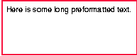
Even if 'overflow' is set to 'visible', contents may be clipped to a UA's document window by the native operating environment. In addition, the 'clip' property can cause otherwise visible "overflowed" contents to be clipped. The examples below utilize the following stylesheet, which describes a simple 100 pixel box with a thin solid red border:
#overlay {position: absolute; top: 50px; left: 50px; height: 100px;
          width: 100px; border: thin solid red;}
Applied to an empty <DIV>, this would look something like:
First, let's consider the default value of 'overflow', which is 'visible'. This value indicates that all contents of an element should be rendered, even if these contents exceed the declared width or height of the element.
Consider a block of long, preformatted text:
<P id="overlay">
<PRE>Here is some long preformatted text.
</PRE>
<P>
With 'overflow' set to 'visible', all of the text will be visible even though it exceeds the declared width of the element. The element will be made wider than its declared width, and any padding or border will be rendered outside of this new width. The example might be rendered something like:
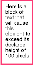
Similarly, the height of the element will be extended should the rendered contents exceed the declared height. Consider the following:
<DIV id="overlay">Here is a block of text that will
cause this element to exceed its declared height of 100 pixels.
</DIV>
This division should be rendered something like this:
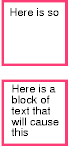
The 'hidden' value of the 'overflow' property indicates that any content which exceeds the declared bounds of the element should not be rendered at all. The user will have no way to view this "overflowed" content. With 'overflow' set to 'hidden', the two examples above should be rendered something like this:
Another value for 'overflow' is 'auto', which indicates that the user agent should provide for a scrolling mechanism when the contents overflow the bounds of the element. Finally, a value of 'scroll' indicates that a scrolling mechanism should always be present, whether or not the contents exceed the element's bounds.
Clipping alters a document's display, though it does not affect how it is laid out. The clipping region defines what portion of the element's physical representation is visible. It is computed by the intersection of the parent's clipping region with the value of the element's 'clip' property.
| Property name: | 'clip' |
|---|---|
| Value: | <shape> | auto |
| Initial: | auto |
| Applies to: | elements with the <position> property set to 'absolute' |
| Inherited: | no |
| Percentage values: | N/A |
The value types <top> , <right> , <bottom> , and <left> may either have the values <length> or 'auto'.
Lengths are specified with respect to the element's top-left corner. Negative lengths are permitted.
The values for <top>, <bottom> <right>, and <left> are distances from the respective extents of the parent element's clipping region.
When converted to pixel coordinates, the bottom-right corner is excluded from the clipping rectangle. This rule is necessary to permit the definition of zero-width or zero-height rectangles.
Any length can be replaced by the value 'auto', which causes the respective extent of the clipping rectangle to match the element's extent in the given direction, including padding, borders and child elements. The default value for the 'clip' property causes the clip rectangle to encompass the entire element. In effect, 'auto' provides for an infinite clipping region.
Note. For now, all clipping regions are rectangular. We anticipate future extensions to permit non-rectangular clipping.
If the clipping region exceeds the bounds of the UA's document window, contents may be clipped to that window by the native operating environment.
Some elements of the document tree cause boxes to be generated that follow the normal positioning rules, but are not rendered; their presence is "felt," but they are invisible.
| Property name: | 'visibility' |
|---|---|
| Value: | inherit | visible | hidden |
| Initial: | inherit |
| Applies to: | all elements |
| Inherited: | if value is 'inherit' |
| Percentage values: | N/A |
The 'visibility' property determines whether or not an element is initially displayed. The visibility of an element does not affect its layout. Elements that are hidden still take up the same physical space as they would were they visible, they are just rendered transparently. This differs from the behavior of 'display:none', in which the element is ignored, as if it were not present in the document at all. Visibility can be used in a scripting environment to dynamically display only one of several elements which overlap one another.
In the following example, pressing either form button invokes a user-defined script function that causes the corresponding element to become visible and the other element to be hidden. Since the containers occupy the same position, and are the same size, the effect is that one replaces the other.
<HEAD>
<STYLE type="text/css">
<!--
   #container1 { position: absolute; top: 2in; left: 2in; width: 2in}
   #container2 { position: absolute; top: 2in; left: 2in; width: 2in;
                 visibility: hidden; }
-->
</STYLE>
</HEAD>
<BODY>
<P>Choose a suspect:</P>
<DIV id="container1">
   <IMG width=100 height=100 src="suspect1.jpg">
   <P>Name: Al Capone</P>
   <P>Residence: Chicago</P>
</DIV>

<DIV id="container2">
   <IMG width=100 height=100 src="suspect2.jpg">
   <P>Name: Lucky Luciano</P>
   <P>Residence: New York</P>
</DIV>

<FORM NAME="myform">
   <INPUT type="button" value="Capone" onclick='show("container1");hide("container2")'>
   <INPUT type="button" value="Luciano" onclick='show("container2");hide("container1")'>
</FORM>
Note that the 'position' property of each DIV element has the value 'relative', so the elements observe the standard flow model. A more visually appealing version of the above might be designed using overlapping 'absolute' positioned elements:
Certain dynamic aspects of managing positioned elements, such as hiding, displaying and movement can only be performed using an external scripting language.
This draft does not specify the behavior of dynamic elements in scripting environments. For example, what happens when an element having 'width: auto' is repositioned? Do the contents reflow, or do they maintain their original formatting? The answer is outside the scope of this draft, and such behavior is likely to differ in initial implementations of CSS2.