Abstract
This module describes integration of grid-based layout (similar to the
grids traditionally used in books and newspapers) with CSS sizing and
positioning.
Status of this document
This section describes the status of this document at the time of
its publication. Other documents may supersede this document. A list of
current W3C publications and the latest revision of this technical report
can be found in the W3C technical reports
index at http://www.w3.org/TR/.
Publication as a Working Draft does not imply endorsement by the W3C
Membership. This is a draft document and may be updated, replaced or
obsoleted by other documents at any time. It is inappropriate to cite this
document as other than work in progress.
The (archived) public
mailing list www-style@w3.org (see
instructions) is preferred
for discussion of this specification. When sending e-mail, please put the
text “css3-grid” in the subject, preferably like this:
“[css3-grid] …summary of
comment…”
This document was produced by the CSS
Working Group (part of the Style Activity).
This document was produced by a group operating under the 5 February 2004 W3C Patent
Policy. W3C maintains a public list of any patent disclosures made in
connection with the deliverables of the group; that page also includes
instructions for disclosing a patent. An individual who has actual
knowledge of a patent which the individual believes contains Essential
Claim(s) must disclose the information in accordance with section 6 of the
W3C Patent Policy.
This is the first public working draft of this module.
Table of contents
1. Dependencies on other
modules
This CSS3 module depends on the following other CSS3 modules:
It has non-normative (informative) references to the following other
CSS3 modules:
2. Introduction
Grid systems have provided great value to print designers for many years
[THEGRID]. Now
same concepts are applied to online content [SXSWGRIDS], [AGBDL]. Unlike print media however,
dimensions of online devices vary broadly; a single fixed-sized grid that
worked perfectly for print pages only works in a subset of web scenarios.
Really adaptable solutions require dealing with a grid that adapts to fit
devices of varying form factors.
This module adds capabilities for sizing and positioning in terms of a
scalable grid . The grid can be specified directly by author, or can be
implied from existing two-dimensional structures (tables or multi-column
elements).
Grid positioning addresses layout in continuous media and in paged
media.
Note that the adaptive grid is even more powerful when used in
combination with [MEDIAQ].
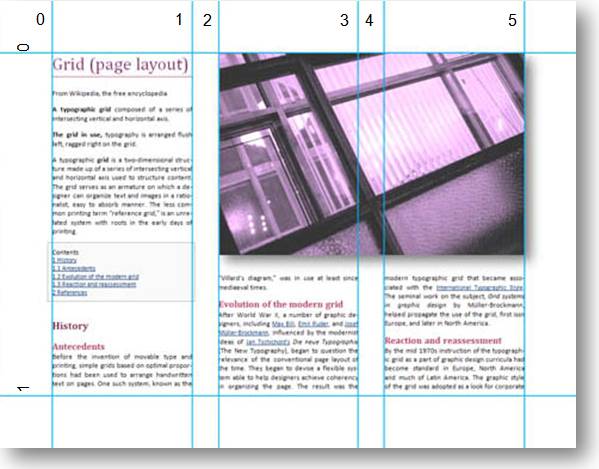
3. Examples
Let's start with an illustration of grid positioning in action.
3.1. Example 1
Figure 1 shows a 3-column layout in paged media. It can be seen as a
grid with 6 vertical lines and 2 horizontal lines.
We can use the grid lines to position the floating image:
body { columns:3; column-gap:0.5in; }
img { float:page top right; width:3gr; }
/* Figure 1 */
The statement "float:page top right" here positions the image
at the top right corner of the page (as defined in [CSS3GCPM])
"width:3gr" makes image 3 "grid units" wide, where a
"grid unit" is the distance between two adjacent grid lines.
Each boundary between a column and a gap automatically produces a grid
line, therefore to specify "two columns, including the gap between
columns, but not including any gaps outside the columns" we can just
say "3gr".
3.2. Example 2
The previous example addressed grid lines created automatically by
multi-column layout (an implicit grid). In more complex pages, base grid
of the page is designed in advance, and it is not necessarily used to be
filled with content directly. Instead, elements of page content are
aligned to the grid.
For this case, grid can be specified explicitly. It is not required
(although common) that grid has evenly spaced columns with gaps in
between. The grid is simply a collection of horizontal and vertical lines.
These additional grid lines allow to position elements in ways that
would be impossible otherwise:
body { grid-columns: * * (0.5in * *)[2];
       grid-rows: 20% *;
       columns:3; column-gap:0.5in; }

img  { float:page top left;
       float-offset: 4gr 1gr; }

/* Figure 2 */
In this example,
- An explicit grid is specified
- Group in parentheses is a repeating pattern
- Integer in square brackets is the number of repetitions
- star syntax (as in multi-length [HTML401])
represents a proportional length (each * gets equal space allocation; you
can use 2*, 3* etc.)
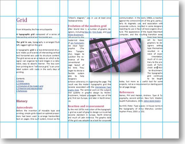
3.3. Example 3
The following example illustrates the use of a grid in construction of a
complex web site. Note how groups of elements are aligned with different
sets of grid lines.
4. Grid declarations
There are three ways to define a grid.
- Explicit grid: defined with 'grid-columns',
'grid-rows' properties.
- Natural grid: automatically created by elements with a natural grid
structure (multi-column elements and tables).
- Default grid: all other block elements define a single-cell grid.
4.1. Explicit grid
Outer edges of padding box always define grid lines. In LTR layout, left
and top edges define lines that we refer as horizontal and vertical line
zero (right and top in RTL). The opposite edges also define grid lines.
Additional grid lines can be added in the middle with ‘grid-columns’ and ‘grid-rows’ properties.
| Name:
| grid-columns
|
| Value:
| [[<length>|<percentage>|<relative length>] |
([<length>|<percentage>|<relative length >
]+)[‘[’<integer>‘]’]? ]+ |
none | inherit
|
| Initial:
| none
|
| Applies to:
| all elements
|
| Inherited:
| no
|
| Percentages:
| refer to width of containing block
|
| Media:
| visual, paged
|
| Computed value:
| specified value
|
| Name:
| grid-rows
|
| Value:
| [[<length>|<percentage>|<relative length>] |
([<length>|<percentage>|<relative length >
]+)[‘[’<integer>‘]’]? ]+ |
none | inherit
|
| Initial:
| none
|
| Applies to:
| all elements
|
| Inherited:
| no
|
| Percentages:
| refer to height of containing block
|
| Media:
| visual, paged
|
| Computed value:
| specified value
|
Space for each column or row of the grid can be defined as
- Length.
- Note that gr unit can also be used here (it refers to grid of the
containing block)
- Percentage of containing block height and width
- Relative length (as defined in multi-length
type in [HTML401]):
A relative length has the form "i*", where "i" is
an integer. When allotting space among elements competing for that space,
user agents allot pixel and percentage lengths first, then divide up
remaining available space among relative lengths. Each relative length
receives a portion of the available space that is proportional to the
integer preceding the "*". The value "*" is
equivalent to "1*". Thus, if 60 pixels of space are available
after the user agent allots pixel and percentage space, and the competing
relative lengths are 1*, 2*, and 3*, the 1* will be allotted 10 pixels,
the 2* will be allotted 20 pixels, and the 3* will be allotted 30 pixels.
This definition is taken directly from HTML4.01. But it
doesn't have to be exactly same. The number doesn't have to be
integer. And maybe the number should be required for consistency with
other units.
For example this rule
div { grid-columns: 50% * * 4em }
- adds one grid line in the middle of containing block,
- another one 4em from the right
- another one in the middle of remaining space
Also, grid lines can be defined in repeating groups. A group is enclosed
in parentheses and optionally specifies a maximum number of repetitions in
square brackets. Nested repeating groups are not allowed.
For example this rule
div { grid-rows: 4em (0.25em 1em); }
- defines a header row of 4em
- adds as many additional rows as necessary, alternating heights of
0.25em and 1em.
For another example this rule
div { grid-columns: * (1em *)[2]; }
defines 3 columns of equal widths with 1em gaps, which matches a
multi-column layout defined as
(assuming 1em is the default value of column gap).
4.2. Natural grid
Elements with a natural grid structure define a grid that aligns with
the structure. Such elements are
4.2.1. Multi-column element
Left and right edges of each column form a grid line. There are twice as
many grid lines as there are columns.
4.2.2. Table
There is one grid line per row and per column. The line is at the
row/column boundary.
A possible alternative is to have two lines per table
row/column, on both sides of border-spacing. In collapsing borders model
these border lines would also collapse in one.
4.2.3. Priority of explicit grid
definition
If explicit grid properties grid-columns or grid-rows are specified on
an element with an implicit grid the explicit properties have priority.
4.3. Default grid
Element that does not define an explicit grid and that is not any of
elements defining an implicit grid is considered to have a single-cell
grid, equivalent to having this explicit definition in default stylesheet:
* { grid-columns:*; grid-rows:*; }
5. Grid container
Using grid does not require any new rules on how the positioning
container is determined. When grid units are used with all applicable
sizing positioning methods, the grid is always taken from the applicable
containing block (which is found as defined as defined in CSS2.1 section
10.1).
In this example, div1 is the positioning parent and therefore grid of
div1 is used for positioning:
<style>
 .div1 { position:absolute; grid-columns:4.5em (1em 4.5em); } /* this grid is used */
 .div2 { columns-width:10em; column-gap:1em; }
 img { position:absolute; left:2gr; width:3gr; }
</style>
<div class="div1">
 <div class="div2">
  <img />
 </div>
</div>
However in the next example, grid of div2 is used by the float, because
it is the float's containing block:
<style>
 .div1 { position:absolute; grid-columns:4.5em (1em 4.5em); }
 .div2 { columns-width:10em; column-gap:1em; } /* this grid is used */
 img { float:left; float-offset:2gr; width:3gr; }
</style>
<div class="div1">
  <div class="div2">
   <img />
  </div>
</div>
6. Grid units
‘gr’ is used to position
in relation to the grid lines. Actual value of each gr depends on the grid
cell in which it is used.
Example
div { columns:3; }
div img { float: top left column;
          float-offset: 2gr;
          width: 1gr }
The image is positioned over the 2nd column (left edge of
second column is 2nd grid line from left; its width is the
distance to the next grid line).
Lorem ipsum dolor
sit amet. Nam at jus.
Sed imp er di et ris.
Cur abi tur et sapen.
Vivamus a metus.
Aenean at risus
pharetra ante luctu
feugiat quis enim.
Cum sociis natoque
penatibus et magni.
Lorem ipsum dolor
sit amet. Nam at jus.
Sed imp er di et ris.
Cur abi tur et sapen.
Lorem ipsum dolor
sit amet. Nam at jus.
Sed imp er di et ris.
Cur abi tur et sapen.
Vivamus a metus.
Aenean at risus
pharetra ante luctu
feugiat quis enim.
Cum sociis natoque
penatibus et magni.
Fractions of gr unit can be used too. In this example
div img { float:column; float-offset: 0.5gr; width: 2gr; }
the image takes exactly the width required to stretch from the middle of
first column to the middle of second column. width:2gr in the example
doesn't start from exactly a grid line, therefore it is calculated as
a sum of grid parts (2gr = 0.5gr + 1gr + 0.5gr), which ends in the middle
of second column.
Lorem ipsum dolor sit amet. Nam at jus. Sed imp er di et
ris. Cur abi tur et sapen. Fusce sed ligula a turpis. Vivamus a metus.
Lorem ipsum dolor sit amet. Nam jus.
Sed imp
er di et ris. Cur abi tur et sapen. Fusce sed ligula a turpis.
Lorem ipsum dolor
sit amet. Nam at jus.
Sed imp er di et ris.
Cur abi tur et sapen.
Aenean at risus
pharetra ante luctu
feugiat quis enim.
Cum sociis natoque
penatibus et magni.
6.1. Applicability of grid
units
Grid units are applicable to all properties of block elements that take
values of type <length>.
When applied to margins, borders and padding, grid units refer to grid
lines in the direction of line progression (horizontal in layout with
horizontal lines).
Grid units never apply to inline elements, including inline blocks.
6.2. Reference point for grid
units
ISSUE: Calculating grid units require a
reference point within the grid and direction. This needs a precise
definition. For the same element, grid units for position and size may
have different reference points (but probably not different directions).
6.3. Undefined grid units
Because of positional nature of 'gr' unit it is ambiguous in
absence of position. Also, grid size may not be defined when a grid unit
has to be applied.
In such case values specified in 'gr' units are ignored (set to
their initial value).
Need some examples here. E.g. what happens to '1gr'
float in a multi-column element within a table that is sized to content?
Grid size depends on the float's size so 'gr' should be
ignored.
7. Grid in overflow
When a measure defined in grid units extends outside the boundaries of
grid container, grid lines are repeated according to the following rules
- If overflow is in positive direction (right/bottom in
left-to-right/top-to-bottom flow, direction of text and block progression
in other flows)
- Explicit grid
- If the grid definition ends with a repeat pattern (regardless of
repeat count), the same pattern continues indefinitely
- Otherwise, the last column or row size is repeated
- Default grid
- Same as non-repeating pattern: equally spaced lines are added,
separated by the size of the element
- Multi-column element
- Additional (gap, column) pairs are added.
- Current definition of multi-column layout doesn't allow
variable-width columns; when it does, the last column with the last
column gap should be repeated
- Table
- The last column is repeated
- If overflow is in negative direction
- The same sequence is used as in positive direction, but mirrored.
TODO: example
8. Issues
8.1. Snap to grid
Should there be an option to align flow content to next
available gridline? It opens really cool scenarios. But are they
compelling enough to create a next available notion?
8.2. Named grid lines and cells
If grid is used extensively, named grid locations would be
quite helpful. Defining named grid lines could look for example like this:
body { grid-columns: "left-edge" * 1em * 0.5em "center" 0.5em * 1em * "right-edge";
But this syntax doesn't easily extend to named cells
8.3. Templates in CSS3 Advanced
Layout module
"Template-based positioning" in CSS3 Advanced Layout module
[CSS3LAYOUT] defines scalable
templates for content to fill and also used the term "grid".
The relationship between these modules certainly needs
to be well defined.
Note that technically these modules are not
contradictory (as long as is defined how an advanced-layout template
produces an implicit grid).
Acknowledgments
This specification is made possible by input from Håkon
Wium Lie, Steve Zilles, Mike Duggan, Bill Hill, Geraldine Wade, [to be
added].
Thanks to Khoi Vinh for the “Yeeaahh!” Example.
References
Normative references
-
- [CSS3VAL]
- Håkon Wium Lie; Chris Lilley. CSS3 module: Values and
Units. 19 September 2006. W3C Working Draft. (Work in progress.)
URL: http://www.w3.org/TR/2006/WD-css3-values-20060919
- [HTML401]
- David Raggett; Arnaud Le Hors; Ian Jacobs. HTML 4.01
Specification. 24 December 1999. W3C Recommendation. URL: http://www.w3.org/TR/1999/REC-html401-19991224
Other references
-
- [AGBDL]
- Charles Jacobs; et al. "Adaptive Grid Based Document Layout" in:
ACM Transactions on Graphics. 22. 3. pp. 838–847. July
2003. URL: http://grail.cs.washington.edu/pub/papers/Jacobs2003.pdf
- [CSS3COL]
- Håkon Wium Lie. Multi-column layout in CSS. 6 June
2007. W3C Working Draft. (Work in progress.) URL: http://www.w3.org/TR/2007/WD-css3-multicol-20070606
- [CSS3GCPM]
- Håkon Wium Lie. CSS Generated Content for Paged Media
Module. 4 May 2007. W3C Working Draft. (Work in progress) URL: http://www.w3.org/TR/2007/WD-css3-gcpm-20070504
- [CSS3LAYOUT]
- Bert Bos. CSS3 Advanced Layout Module. 9 August 2007. W3C
Working Draft. (Work in progress) URL: http://www.w3.org/TR/2007/WD-css3-layout-20070809
- [MEDIAQ]
- Håkon Wium Lie; Tantek Çelik; Daniel Glazman. Media
Queries. 6 June 2007. W3C Candidate Recommendation. (Work in
progress.) URL: http://www.w3.org/TR/2007/CR-css3-mediaqueries-20070606
- [SXSWGRIDS]
- Khoi Vinh; Mark Boulton. Grids Are Good. March 2007. SXSW
Interactive, Austin, TX. URL: http://www.subtraction.com/pics/0703/grids_are_good.pdf
- [THEGRID]
- Allen Hurlburt. Grid: A Modular System for the Design and
Production of Newpapers, Magazines, and Books. 1982. ISBN
0-471-28923-X.
Index
- grid-columns, #
- grid-rows, #
Property index
| Property
| Values
| Initial
| Applies to
| Inh.
| Percentages
| Media
|
| grid-columns
| [[<length>|<percentage>|<relative length>] |
([<length>|<percentage>|<relative length >
]+)[‘[’<integer>‘]’]? ]+ | none | inherit
| none
| all elements
| no
| refer to width of containing block
| visual, paged
|
| grid-rows
| [[<length>|<percentage>|<relative length>] |
([<length>|<percentage>|<relative length >
]+)[‘[’<integer>‘]’]? ]+ | none | inherit
| none
| all elements
| no
| refer to height of containing block
| visual, paged
|
![[image of a complex page with overlaid grid]](Yeeaahh_grid.png)
![[image of complex page]](Yeeaahh.png)