CSS3 Module: Paged Media
W3C Working Draft 10 October 2006
- This version:
- http://www.w3.org/TR/2006/WD-css3-page-20061010
- Latest version:
- http://www.w3.org/TR/css3-page
- Previous version:
- http://www.w3.org/TR/2004/CR-css3-page-20040225/
- Editors:
- Håkon Wium Lie, Opera Software
- Melinda Grant, Hewlett-Packard
Copyright © 2006 W3C® (MIT, ERCIM, Keio), All Rights Reserved. W3C liability, trademark and document use rules apply.
Abstract
This module describes the page model that partitions a flow into pages. It builds on the Box model module and introduces and defines the page model and paged media. It adds functionality for pagination, page margins, page size and orientation, headers and footers, widows and orphans, and image orientation. Finally it extends generated content to enable page numbering and running headers / footers.
Status of this Document
This section describes the status of this document at the time of its publication. Other documents may supersede this document. A list of current W3C publications and the latest revision of this technical report can be found in the W3C technical reports index at http://www.w3.org/TR/.
Publication as a Working Draft does not imply endorsement by the W3C Membership. This is a draft document and may be updated, replaced or obsoleted by other documents at any time. It is inappropriate to cite this document as other than work in progress.
The (archived) public mailing list www-style@w3.org (see instructions) is preferred for discussion of this specification. When sending e-mail, please put the text “css3-page” in the subject, preferably like this: “[css3-page] …summary of comment…”
This document was produced by the CSS Working Group (part of the Style Activity).
This document was produced by a group operating under the 5 February 2004 W3C Patent Policy. W3C maintains a public list of any patent disclosures made in connection with the deliverables of the group; that page also includes instructions for disclosing a patent. An individual who has actual knowledge of a patent which the individual believes contains Essential Claim(s) must disclose the information in accordance with section 6 of the W3C Patent Policy.
This document contains the CSS3 Paged Media Module W3C Last Call Working Draft of 10 October 2006. The Last Call period ends on 3 November 2006.
Relative to the previous Candidate Recommendation, this version removes page-based floats, string-set, and page-policy features, which have been moved to CSS3 Generated Content for Paged Media; adds two new features ('fit' and 'fit-position'); and incorporates a new algorithm for determining margin box sizes as well as miscellaneous clarifications and editorial improvements.
Table of Contents
- 1. Dependencies on other CSS Modules
- 2. Introduction
- 3. Page Boxes: the @page Rule
- 4. Margin Boxes
- 5. Page Breaks
- 6. Page-based Extensions to Counters
- 7. Orienting an Image on the Page
- 8. The 'fit' and 'fit-position' Properties
- References
1. Dependencies on other CSS Modules
This CSS3 module depends on Cascading Style Sheets Level 2 Revision 1 [CSS21] for all underlying requirements such as syntax, selectors, box model, fonts, etc. It may in the future be updated to depend on other CSS3 modules rather than on CSS 2.1.
2. Introduction
Paged media (e.g., paper, transparencies, pages that are displayed on computer screens, etc.) differ from continuous media in that the content of the document is split into one or more discrete static display surfaces. To handle pages, CSS3 Paged Media describes how:
- page breaks are created and avoided,
- the page properties such as size, orientation, margins, border, and padding are specified,
- headers and footers are established within the page margins,
- content such as page counters are placed in the headers and footers, and
- orphans and widows can be controlled.
CSS3 defines a page model that specifies how a document is formatted within a rectangular area, called the page box, that has finite width and height. Often, but not always, the page box has a one-to-one correspondence to a physical sheet onto which the document is ultimately rendered (paper, transparency, screen etc.). The CSS3 page model specifies formatting within the page box, but it is the user agent's responsibility to transfer the page box to the sheet. Some user agent transfer possibilities that are not addressed by CSS3 include:
- Transferring one page box to one sheet (e.g. single-sided printing);
- Transferring two page boxes to the front and back surfaces of the same sheet (e.g. double-sided printing);
- Transferring N (small) page boxes to one sheet (called "N-up");
- Transferring one (large) page box to N x M sheets (called "tiling");
- Creating signatures. A signature is a group of pages printed on a sheet, which, when folded and trimmed like a book, appear in their proper sequence;
- Printing one document to multiple output trays;
- Generating files containing print instructions.
Although CSS3 does not specify how user agents transfer page boxes to sheets, it does include certain mechanisms for telling user agents about the intended page sheet size and orientation. In the general case, CSS3 assumes that one page box will be transferred to one surface of a sheet of similar size.
2.1. Terminology
The keywords "MUST", "SHALL", "MUST NOT", "SHALL NOT", "REQUIRED", "SHOULD", "SHOULD NOT", "RECOMMENDED", "MAY", and "OPTIONAL" when used in this document are to be interpreted as described in RFC 2119 [RFC2119]. However, for readability, these words do not appear in all uppercase letters in this specification.
3. Page Boxes: the @page Rule
In the page model, the document is transferred into one or more page boxes. The page box is a specialized CSS box that maps to a rectangular print media surface. It is roughly analogous to the viewport. As for other boxes, a page box consists of margin, border, padding, and content areas. The content and margin areas of a page box have special functions:
- The content area of a page box is called the page area. The content of the document is flowed into the page area. The edges of the page area on the first page establish the rectangle that is the initial containing block of the document.
- The margin area of a page box is divided into 16 margin boxes. Each margin box has its own margin, border, padding and content areas. Margin boxed are typically used to display running headers and footers.
The properties of a page box are determined by properties established within the page context, which is the rule set of the @page rule. Page boxes differ from other boxes in that the 'width' and 'height' properties do not apply to a page box. The size of the page box is specified using the 'size' property in the page context.
3.1. Page Terminology and the Page Model
The following terminology and accompanying diagrams help to describe the page model:
- Page sheet
-
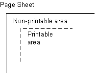 The page sheet is one surface of the
physical medium. The illustration to the right shows a representation of
the upper-left corner of a page sheet.
The page sheet is one surface of the
physical medium. The illustration to the right shows a representation of
the upper-left corner of a page sheet. - Non-printable area
- The non-printable area is the area of a page sheet that a physical device such as a printer is not capable of marking reliably, usually due to the printer's paper handling mechanism. This value is printer dependent and is usually a small area along each edge of the page sheet. The unprintable region along the left and right edges of the page are usually the same size, as are the top and bottom areas. However, the top/bottom and left/right areas can be different. A user agent may not be aware of this area or how it varies from device to device. Printing devices MAY adjust the layout of the document so that content is not lost. How this adjustment is accomplished is device dependent within the constraints expressed in the sections Rendering page boxes that do not fit a page sheet and Content outside the page box.
- Printable area
- The printable area is the area of page sheet that a printer is capable of marking reliably. The size of the printable area is the size of the page sheet reduced by the size of the non-printable area. This value is printing device dependent. A user agent may not be aware of this area or how it varies from printing device to printing device. Printing devices MAY adjust the layout of the document so that content falls within the printable area. How this adjustment is accomplished is device dependent within the constraints expressed in the sections Rendering page boxes that do not fit a page sheet and Content outside the page box.
- Page box
-
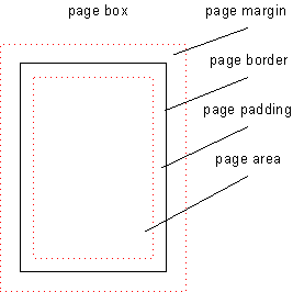 A page box is derived from the box model and contains
portions of the document flow destined for rendering on a page sheet.
The width and height of the page box are determined by the size
property. Unlike other boxes, the margins of the page box are subdivided
into margin boxes. In the simplest case, the
page box is congruent with the page sheet. However, there are more
complex use cases (see the transfer
possibilities in the Introduction) where the
page box differs from the page sheet in values such as size or
orientation.
A page box is derived from the box model and contains
portions of the document flow destined for rendering on a page sheet.
The width and height of the page box are determined by the size
property. Unlike other boxes, the margins of the page box are subdivided
into margin boxes. In the simplest case, the
page box is congruent with the page sheet. However, there are more
complex use cases (see the transfer
possibilities in the Introduction) where the
page box differs from the page sheet in values such as size or
orientation. - Page area
- The page area is a synonym for the content area of the page box. The page area acts as a container for all the boxes laid out within a given page box.
- Margin box
- Margin boxes act as containing boxes for header/footer content. The
following margin boxes are defined and illustrated in the diagram below:
Table 1 Margin Box Definitions Box Description Placement
top-left-corner a fixed-size box filling the area defined by the intersection of the top and left margins of the page box 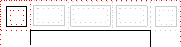
top-left a variable-width box within the area defined by the top margin and adjoining the top-left-corner margin box 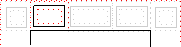
top-center a variable-width box within the area defined by the top margin, centered on the page area, and between the top-left and top-right margin boxes 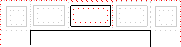
top-right a variable-width box within the area defined by the top margin and adjoining the top-right-corner margin box 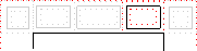
top-right-corner a box filling the area defined by the intersection of the top and right margins of the page box 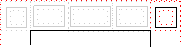
left-top a variable-height box within the area defined by the left margin and adjacent to the bottom of the top-left-corner. 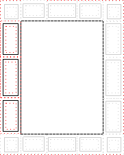
left-middle a variable-height box in the area defined by the left margin, centered on the page area, and between the left-top and left-bottom margin boxes. left-bottom a variable-height box within the area defined by the left margin and adjacent to the top of the bottom-left-corner. right-top a variable-height box within the area defined by the right margin and adjacent to the bottom of the top-right-corner. 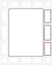
right-middle a variable-height box in the area defined by the right margin, centered on the page area, and between the right-top and right-bottom margin boxes. right-bottom a variable-height box within the area defined by the right margin and adjacent to the top of the bottom-right-corner. bottom-left-corner a box filling the area defined by the intersection of the bottom and left margins of the page box 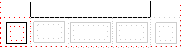
bottom-left a variable-width box within the area defined by the bottom margin and adjoining the bottom-left-corner margin box 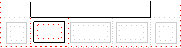
bottom-center a variable-width box within the area defined by the bottom margin, centered on the page area, and between the bottom-left and bottom-right margin boxes 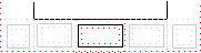
bottom-right a variable-width box within the area defined by the bottom margin and adjoining the bottom-right corner margin box 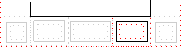
bottom-right-corner a box filling the area defined by the intersection of the bottom and right margins of the page box 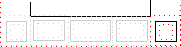
- Content-empty Page
- a page surface whose page area contains no printable content other than backgrounds and/or borders. A page containing generated content or invisible content such as a zero-width space within the page area is not a content-empty page. On the other hand, a page containing only a background and/or borders and/or padding and/or margin-box content is a content-empty page.
3.2. Page types
Page layouts have many possible realizations. Among the aspects of page layout that can vary are paper size, orientation of the layout with respect to the paper, order of the pages, how the document will be printed, and how the document will be bound. Some of these depend upon factors such as the major writing direction and the media type that are not specified by this module. The following terminology is used to describe pages and page treatments:
- Page Orientation
- The page orientation is defined by comparing the length of the edges of a page box. The page box is a rectangle with two perpendicular edges called the long edge and the short edge. The length of the long edge is always greater than or equal to the length of the short edge. When the page box is square, the two edges are of the same length and either can be used as the long edge with the other being the short edge.
- Portrait Orientation
- A portrait page's height is greater than or equal to its width. Horizontal elements are parallel to the short edge and vertical elements to the long edge.
- Landscape Orientation
- A landscape page's width is greater than or equal to its height. Horizontal elements are parallel to the long edge and vertical elements to the short edge.
- Front Side
- Media used as a stack of sheets have two sides known as the front and the back. Typically, the user agent prints on the front side of the media when using only one side of the page sheet. Media used from a roll or continuous form will print only on the front side. CSS does not provide a mechanism to deal directly with the front and back sides, rather page layouts must be designed in terms of left and right pages.
- Back Side
- The back side of a sheet medium is the side that cannot be seen when looking at the front side. Typically, the back side is only used when printing on both sides of the medium. Unless using special paper stock such as letterhead it does not usually matter which side is the front and which is the back.
- Duplex Printing
- Duplex printing uses one page box per side of a page sheet and uses both sides of the page sheet. This module provides no ability to specify whether a document is duplex printed, but the concept of left and right pages is based on the assumption that the document is duplex printed, regardless of whether it actually is.
- Binding Edge treatment
- The binding edge is the edge of the page box that is towards the binding if the material is bound. The binding edge often has a larger margin than the opposite edge to provide for the space used by the binding. The binding edge can be any of the four edges. However, page sheets are customarily bound so that the binding edge of page boxes with portrait orientation is vertical. This module provides no method to specify the binding edge. In duplex printing, the binding edge is on opposite sides of the page box for the left and right pages.
- Facing Pages
- Facing pages are two sequential pages such that when the document is duplex printed they are on separate sheets of paper. Typically, the earlier page will be the back side of one sheet and the later page will be the front side of another. They are usually laid out so that the binding edges of facing pages are vertical and adjacent when the pages are placed in their normal reading orientation. It is up to the UA to determine whether the left page or the right page of a pair of facing pages is the earlier one of the sequence. How the UA makes this determination is implementation dependent but often depends upon the predominant writing direction of the document.
- Major Writing Direction
- The major writing direction for the document is determined by the UA. If the UA supports the 'direction' property from CSS2 or the CSS 3 Text Module it MUST determine it using the value of that property on the root element.
- Left Page
- A page that will be on the left if it is part of a pair of facing pages as typically laid out. Page layouts for documents using a left-to-right major writing direction have the earlier of the facing pages on the left. Rules for the left page can be specified using the ':left' page selector.
- Right Page
- A page that will be on the right if it is part of a pair of facing pages as typically laid out. Page layouts for documents using a right-to-left major writing direction have the earlier of the facing pages on the right. Rules for the right page can be specified using the ':right' page selector.
- First Page
- The first page in a document. The first page is generally printed on
the front side of a medium. Rules for the first page can be specified
using the
':first'page selector. A first page can be either a left page or a right page but a UA MUST apply any rules defined for a first page in preference to those defined on a left page or a right page.
3.3. Page size
Different parts of the world use different paper sizes. It is a goal of this specification that web content should be adaptable to a range of different sizes without having to write a specific style sheet for each paper size.
However, in some situations it is important that a certain page size achieves a certain style. One way to achieve this goal is to utilize the 'size' property, which requests that the document is printed on a page which has a certain size; another method is to use Media Queries [MEDIAQ] which allow different style sheets to be applied to different page sizes.
3.3.1. Page size: the 'size' property
| Name: | size |
| Value: | <length>{1,2} | auto | [ <page-size> || [ portrait | landscape] ] |
| Initial: | auto |
| Applies to: | page context |
| Inherited: | N/A |
| Percentages: | N/A |
| Media: | paged |
| Computed value: | specified value |
This property specifies the size and orientation of the containing box for page content, the page box. In the general case, where one page box is rendered onto one page sheet, the 'size' property also indicates the size of the destination page sheet.
The size of a page box MAY either be "absolute" (fixed size) or "relative" (scalable, i.e., fitting available sheet sizes). Relative page boxes allow user agents to scale a document and make optimal use of the page size.
Three values for the 'size' property create a relative page box:
- auto
- The page box will be set to the size and orientation of the page sheet chosen by the UA.
- landscape
- Specifies that the page's content be printed in landscape
orientation. The page box is the same size as the page, and the longer
sides are horizontal. If a
'<length>'or '<page-size>' is not specified, the size of the page sheet is chosen by the UA. - portrait
- Specifies that the page's content be printed in portrait orientation. The page box is the same size as the page, and the shorter sides are horizontal. If a '<length>' or '<page-size>' is not specified, the size of the page sheet is chosen by the UA.
In the following example, the outer edges of the page box will align with the page. The percentage value on the 'margin' property is relative to the page size so if the page sheet dimensions are 210mm x 297mm (i.e., A4), the margins are 21mm and 29.7mm.
@page {
  size: auto;/* auto is the initial value */
  margin: 10%;
}
Other values define a fixed-size page box, and thereby indicate the preferred output media size. When possible, output should be rendered on the media size indicated; if not available, a larger size should be used; if not available, the contents of the page box should be scaled down to fit the smaller page sheet.
- <length>
- The page box will be set to the given absolute length. If only one length value is specified, it sets both the width and height of the page box (i.e., the box is a square). The page context has a font associated with it either by an explicit use of the 'font-family' and 'font-size' properties or from the UA's default style sheet. Therefore, values in units of 'em' and 'ex' refer to the page context's font.
For example:
@page {
  size: 8.5in 11in;/* width height */
}
The above example sets the width of the page box to be 8.5 inches and the height to be 11 inches. The page box in this example requires a page sheet size of 8.5"x11" or larger.
- <page-size>
- A page size can be specified using one of the following media names.
This is the equivalent of specifying the '<page-size>' using length values. The
definition of the the media names comes from Media Standardized
Names [PWGMSN].
- A5
- The page box SHOULD be set to the size of ISO A5 media: 148mm wide and 210 mm high.
- A4
- The page box SHOULD be set to the size of IS0 A4 media: 210 mm wide and 297 mm high.
- A3
- The page box SHOULD be set to the size of ISO A3 media: 297mm wide and 420mm high.
- B5
- The page box SHOULD be set to the size of ISO B3 media: 176mm wide by 250mm high.
- B4
- The page box SHOULD be set to the size of ISO B4 media: 250mm wide by 353mm high.
- letter
- The page box SHOULD be set to the size of North American letter media: 8.5 inches wide and 11 inches high
- legal
- The page box SHOULD be set to the size of North American legal: 8.5 inches wide by 14 inches high.
- ledger
- The page box SHOULD be set to the size of North American ledger: 11 inches wide by 17 inches high.
These media size names can be used in conjunction with 'landscape' or 'portrait' to indicate size and orientation.
For example:
@page {
  size: A4 landscape;
}
The above example sets the width of the page box to be 297mm and the height to be 210mm. The page box in this example should be rendered on a page sheet size of 210 mm by 297 mm.
User agents SHOULD also support Media Size Self-Describing Names as defined in Section 5 of [PWGMSN].
3.3.2. Media Queries
This section is informative.
By using Media Queries [MEDIAQ], one style sheet can express different stylistic preferences for different page sizes. Consider this example:
   /* style sheet for "A4" printing */
   @media print and (width: 21cm) and (height: 29.7cm) {
      @page {
         margin: 3cm;
      }
   }

   /* style sheet for "letter" printing */
   @media print and (width: 8.5in) and (height: 11in) {
      @page {
          margin: 1in;
      }
   }
In the example above, "A4" sheets are given a "3cm" page margin, and "letter" sheets are given a "1in" page margin.
In Media Queries, the page is always considered to be in Portrait Orientation. That is, it is not necessary to write Media Queries that swap the width and height values to make sure the style sheet is applied.
3.3.3. Rendering page boxes that do not fit a page sheet
If a page box does not match the target page sheet dimensions, the user agent MAY choose (in order of preference) to:
- Render the page box at the indicated size on a larger page sheet.
- Rotate the page box 90° if this will make the page box fit the page sheet.
- Scale the page box to fit the page sheet. (There is no requirement to maintain the aspect ratio of the page or of any elements on the page when scaling; however, preservation of the aspect ratio is preferred.)
- Reformat the page contents, including 'spilling' onto other page sheets.
- Clip overflowed content (least preferred).
The user agent SHOULD consult the user before performing these operations.
3.3.4. Positioning the page box on the sheet
When the page box is smaller than the page size, the user agent SHOULD center the page box on the sheet since this will align double-sided pages and avoid accidental loss of information that is printed near the edge of the sheet.
3.4. Page Selectors and the Page Context
Authors specify the dimensions, orientation, margins, etc. of a page box within an @page rule. An @page rule consists of the keyword '@page', an OPTIONAL page name followed with no intervening space by an OPTIONAL page pseudo-class and a block of declarations and margin rules (said to be in the page context).
The OPTIONAL page name and OPTIONAL page pseudo-class constitutes the page selector. The page selector specifies for which pages the declarations apply. In CSS3, page selectors MAY designate the first page of a document, all left pages, all right pages, or pages with specific names.
Properties for the page box are specified within the page context.
3.4.1. Page selector grammar
The syntax for a page selector is a specialization of the generic at-rule and MUST adhere to the following (more strict) grammar:
See [CSS21], Section 4.1.1 and Appendix G for the expansion of missing productions:
All new lexical tokens are specializations of the ATKEYWORD lexical token:
PAGE_SYM ::= "@page" TOPLEFTCORNER_SYM ::= "@top-left-corner" TOPLEFT_SYM ::= "@top-left" TOPCENTER_SYM ::= "@top-center" TOPRIGHT_SYM ::= "@top-right" TOPRIGHTCORNER_SYM ::= "@top-right-corner" BOTTOMLEFTCORNER_SYM ::= "@bottom-left-corner" BOTTOMLEFT_SYM ::= "@bottom-left" BOTTOMCENTER_SYM ::= "@bottom-center" BOTTOMRIGHT_SYM ::= "@bottom-right" BOTTOMRIGHTCORNER_SYM ::= "@bottom-right-corner" LEFTTOP_SYM ::= "@left-top" LEFTMIDDLE_SYM ::= "@left-middle" LEFTBOTTOM_SYM ::= "@right-bottom" RIGHTTOP_SYM ::= "@right-top" RIGHTMIDDLE_SYM ::= "@right-middle" RIGHTBOTTOM_SYM ::= "@right-bottom" page : PAGE_SYM S* IDENT? pseudo_page? S*'{'S* [ declaration | margin ]? [';'S* [ declaration | margin ]? ]*'}'S* ; pseudo_page :':'[ "left" | "right" | "first" ] ; margin : margin_sym S*'{'declaration [';'S* declaration? ]*'}'S* ; margin_sym : TOPLEFTCORNER_SYM | TOPLEFT_SYM | TOPCENTER_SYM | TOPRIGHT_SYM | TOPRIGHTCORNER_SYM | BOTTOMLEFTCORNER_SYM | BOTTOMLEFT_SYM | BOTTOMCENTER_SYM | BOTTOMRIGHT_SYM | BOTTOMRIGHTCORNER_SYM | LEFTTOP_SYM | LEFTMIDDLE_SYM | LEFTBOTTOM_SYM | RIGHTTOP_SYM | RIGHTMIDDLE_SYM | RIGHTBOTTOM_SYM ;
The following restrictions and relaxations are made to the syntax above:
- The value 'auto' may not be used as a page name and MUST be treated as a syntax error.
The following are examples of page selectors (declaration block intentionally left blank)
@page { ... }
@page :left { ... }
@page :right { ... }
@page LandscapeTable { ... }
@page CompanyLetterHead:first { ... } /*  identifier and pseudo page. */
@page:first { ... };
The following are examples of margin boxes where the declaration blocks are intentionally left blank.
@page {
   @top-left { ... /* document name */ }
   @bottom-center { ... /* page number */}
}
@page :left { @left-middle { ... /* page number in left margin */ }}
@page :right{ @right-middle { ... /* page number in right margins of right pages */}}

@page :left { @bottom-left-corner { ... /* left page numbers */ }}
@page :right { @bottom-right-corner { ... /* right page numbers */ }}
@page :first { @bottom-left-corner { ... /* empty footer on 1st page */ }
               @bottom-right-corner { ... /* empty footer */ } }
3.4.2. Cascading in the page context
Optionally, @page rules can have one pseudo-class (':first',':left', or 'right') and/or one named page. The specificity of @page rules are computed in an analogous manner to the computations defined in the Selectors module:
- if an @page rule has a named page, f=1
- if an @page rule has a
':first'pseudo-class, g=1 - if an @page rule has a
':left'or':right'pseudo-class, h=1
Concatenating the three numbers f-g-h gives the specificity.
Some page specificity calculation examples follow:
        @page { } /* f=0 g=0 h=0 -> specificity = 0 */
        @page :left { } /* f=0 g=0 h=1 -> specificity = 1 */
        @page :first { } /* f=0 g=1 h=0 -> specificity = 10 */
        @page artsy { } /* f=1 g=0 h=0 -> specificity = 100 */
        @page artsy:left { } /* f=1 g=0 h=1 -> specificity = 101 */
        @page artsy:first { } /* f=1 g=1 h=0 -> specificity = 110 */
Consider the following usage example:
@page {
  margin-left: 3cm;
}

@page :left {
  margin-left: 4cm;
}
Due to the higher specificity of the pseudo-class selector, the left margin on left pages will be 4 centimeters and all other pages (i.e., the right pages) will have a left margin of 3 centimeters.
In this example, the higher specificity of the green rules wins over the red rule. Therefore the first page will have blue text in the top-left margin box and green text in the top-right margin box, while subsequent pages will have red text in the margin boxes.
@page :first {
  color: green;

  @top-left {
    content: "foo";
    color: blue;
  }
  @top-right {
    content: "bar";
  }
}

@page { color: red;
  @top-center {
    content: "Page " counter(page);
    }
}
Page contexts cascade, so the following stylesheet would style pages with 25 millimeter margins and 14 point type in the margin boxes:
@page { margin: 25mm;}
@page { font-size: 14pt;}
3.5. Page Properties
The following properties can be used in the page context to style the appearance of the page box:
These properties can be used in the page context to set counters:
These properties can be used in the page context to style the content of margin boxes:
That is, when set in the page context, the values become the initial values for the margin boxes.
These properties can be used in the margin context to style margin boxes and their content:
- background properties,
- border properties,
- margin properties,
- padding properties,
- color,
- font properties,
- text properties
- content,
The normal rules for box properties apply with the following exceptions:
- Values in units of 'em' and 'ex' refer to the page context's font. The page context has a font associated with it either by an explicit use of the 'font-family' and 'font-size' properties or from their initial values.
- Percentage values on the margin, padding and border properties are relative to the dimensions of the containing box (defined by the 'size' property in the page context). For left and right, the margin, border and padding percentages are relative to the width of the containing box; for top and bottom, the margin, border and padding percentages are relative to the height of the containing box.
- The 'width' and 'height' properties do not apply to the page box (and SHOULD be treated as if they were set to 'auto').
- The page background applies to the entire page box, including the page margins.
The page background is painted first, and covers the entire page box. A margin-box background is painted over (on top of) the page background. The root element then paints the canvas within the page area, which contains the portions of the root element formatted for a single page (including the margins of the root element).
The origin of the page background is the upper-left corner of the page area.
When a box is interrupted at the bottom of one page and continued on the top of the next, the box's margins, borders, and padding are not rendered at the bottom and top of the respective pages. Properties in other modules may modify this behavior. (At the time of writing, a property 'border-break' [CSS3BG] is under consideration.)
It is recommended that user agents with a non-printable area (that is, user agents which cannot print over the entire sheet surface) establish a default page margin via the user agent stylesheet that includes the non-printable area. It is further recommended that authors assume that the default page area will not include unprintable regions.
3.6. Left, right, and first pages
When printing double-sided documents, the page boxes on left and right pages MAY be different. This can be expressed through CSS pseudo-classes defined in the page context.
All pages are automatically classified by user agents into either the ':left' or ':right' pseudo-class. The following example creates left and right binding edges using these pseudo-classes.
@page :left {
  margin-left: 3cm;
  margin-right: 4cm;
}

@page :right {
  margin-left: 4cm;
  margin-right: 3cm;
}
If different declarations have been given for left and right pages, the user agent MUST honor these declarations even if the user agent does not transfer the page boxes to left and right sheets (e.g., a printer that only prints single-sided).
Authors MAY also specify style for the first page of a document with the ':first' pseudo-class:
@page { margin: 2cm } /* All margins set to 2cm */

@page :first {
  margin-top: 10cm /* Top margin on first page 10cm */
}
Whether the first page of a document is ':left' or ':right' depends on the major writing
direction of the document and is outside the scope of this document.
However, to force a ':left' or ':right'
first page, authors
MAY insert a page break before the first generated box (e.g., in
HTML, specify this for the BODY element).
Note. Adding declarations to the ':left' or ':right' pseudo-class does not necessarily influence
whether the document comes out of the printer double- or single-sided
(which is outside the scope of this specification).
Note. Future versions of CSS may include other page pseudo-classes.
3.7. Content outside the page box
When formatting content in the page model, some content MAY end up outside the page box. For example, an element whose 'white-space' property has the value 'pre' MAY generate a box that is wider than the page box. Also, when boxes are positioned absolutely, they MAY end up in "inconvenient" locations. For example, images MAY be placed on the edge of the page box. Similarly when boxes use fixed or relative positioning, they MAY also end up outside of the page box.
A specification for the exact formatting of such elements lies outside the scope of this document. However, we recommend that authors and user agents observe the following general principles concerning content outside the page box:
- User agents SHOULD avoid generating a large number of empty page boxes to honor the positioning of elements (e.g., you don't want to print 100 blank pages). Note, however, that generating a small number of empty page boxes MAY be necessary to honor the 'left' and 'right' values for 'page-break-before' and 'page-break-after'.
- Authors SHOULD not position elements in inconvenient locations
just to avoid rendering them. Instead:
- To suppress box generation entirely, set the 'display' property to 'none'.
- To make a box invisible, set the 'visibility' property.
- User agents MAY handle boxes positioned outside the page box in several ways, including discarding them or creating page boxes for them at the end of the document.
4. Margin Boxes
Margin boxes can be used to create page headers and footers, which are portions of the page set aside for supplementary information such as the page number or document title. The location of page headers and footer is one of the many graphic design choices a document's author makes.
- Page Header
- Typically, a page header is located at the top of the page in documents with a predominately horizontal writing direction and on the side opposite the binding edge for documents with a predominately vertical writing direction. One possible design of page headers for horizontally written documents uses the 'top-left-corner', 'top-left', 'top-center', 'top-right' and 'top-right-corner' margin boxes. Another design, for vertically written documents, could use the 'right-top', 'right-middle', and 'right-bottom' margin boxes for right facing pages and 'left-top', 'left-middle', and 'left-bottom' for left facing pages. However, there are no constraints placed on the use of margin boxes for page headers, other than those expressed in the discussion of restrictions to the grammar of the page selector
- Page Footer
- Typically, the page footer is at the opposite end of the page from the page header. For example, the design of a horizontally written document with a page header at the top of the page could use the 'bottom-left-corner', 'bottom-left', 'bottom-center', 'bottom-right' and 'bottom-right-corner' margin boxes as the page footer. The design of a vertically written document could use the margin boxes of the binding edge of the page for the page footer. However, there are no constraints placed on the use of margin boxes for page footers, other than those expressed in the discussion of restrictions to the grammar of the page selector
Please note that the margin boxes are oriented with respect to the content and are independent of page orientation, for example the top margin boxes are above the page box in both portrait and landscape orientation.
Margin boxes are created through margin at-rules inside the page context.
4.1. At-rules for margin boxes
A margin at-rule consists of an ATKEYWORD that identifies the margin box (e.g. '@top-left') and a block of declarations (said to be in the margin context).
The following style sheet establishes a page header containing the title ("Hamlet") on the left side and the page number, preceded by "Page ", on the right side:
@page {
  size: 8.5in 11in;
  margin: 10%;

  @top-left {
    content: "Hamlet";
  }
  @top-right {
    content: "Page " counter(page);
  }
}
4.2. Maximum Dimension of margin boxes
The maximum potential width and height of each margin box is determined by establishing the containing box for the margin box in the steps shown below. There are two quantities used in the following calculations:
- max box width, which is the sum of the width of the page's left padding area, the width of the page area, and the width of the page's right padding area. In other words, it is the distance between the left page border and the right page border. This quantity is used when calculating dimensions of the top and bottom margin boxes.
- max box height, which is the sum of the height of the page's top padding area, the height of the page area, and the height of the page's right padding area. In other words, it is the distance between the top page border and the bottom page border. This quantity is used when calculating dimensions of the left and right margin boxes.
4.3. Dimension of margin boxes
Definitions: The "outer width" of a margin box is the sum of its used left and right margin, used left and right border, used left and right padding, and used width. The "outer height" of a margin box is the sum of its used top and bottom margin, used top and bottom border, used top and bottom padding and used height.
The following rules apply to 'top-left', 'top-center' and 'top-right' margin boxes, which are referred to as [1], [2], and [3], respectively, in the expression below.
Rules:
- The UA chooses used values for each box's width, left and right
margin, left and right border thickness, and left and right padding. It
chooses them in such a way that the value of:
is as small as possible under the constraints below. ("foo[n]" stands for the used value of property foo of the n'th box and "x²" for the square of x.)
left-margin[1]² + left-margin[2]² + left-margin[3]² + right-margin[1]² + right-margin[2]² + right-margin[3]²- The sum of the outer widths of the three boxes is equal to max box width.
- If the center box is not empty or if its computed width is not 'auto', then the outer widths of the other two boxes are equal to each other (i.e., the center box is centered in that case).
- If a box is empty and its computed width is 'auto', then the used values of its left and right padding and left and right border are all 0. (This makes such a box invisible, because, by item 5, its width is also 0.)
- If a box is empty and its computed width is 'auto', then the used values of its left and right padding and left and right border are all 0. (This makes such a box invisible, because, by item 5, its width is also 0.)
- If a box's computed width is 'auto', then: min intrinsic width <= used width <= max intrinsic width.
- The used values of the left box's left margin, the center box's left and right margin and the right box's right margin are their respective computed values, unless that computed value is 'auto'.
- The used values of the left box's right margin and the right box's left margin are their respective computed values, unless that computed value is 'auto'.
- If the above constraints are contradictory
("over-constrained"), then constraint 7 is replaced by 7a:
- 7a. If the computed values of the left box's left and right margins are 'auto and not 'auto', respectively, then the used value of the right margin is its computed value. If the computed values of the right box's left and right margins are not 'auto' and 'auto', respectively, then the used value of the left margin is its computed value. This effectively means that the specified right margin of the left box is ignored if necessary, and ditto for the left margin of the right box.
- Note that, by their definitions, margins may be negative, but widths may not.
The used values for bottom-left, bottom-center and bottom-right are established by the same rules.
The used values for left-top, left-middle and left-bottom boxes are established by the same rules, with "width" replaced by "height", "left" by "top", "right" by "bottom" and "center" by "middle".
The used values for right-top, right-middle and right-bottom boxes are established by the same rules as for left-top, left-middle and left-bottom.
4.4. Margin boxes and default values
Margin boxes have an initial value of zero for padding, border and margin. The default height of top boxes is the value of the page box's top margin. The default height of the bottom boxes is the value of the page box's bottom margin.
The initial value for 'content' is 'none'. The initial 'width' and 'height' of margin boxes is 'auto'. The initial value of text-align and vertical-align is defined below:
| Margin box | 'text-align' | 'vertical-align' |
|---|---|---|
| top-left-corner | right | middle |
| top-left | left | middle |
| top-center | center | middle |
| top-right | right | middle |
| top-right-corner | left | middle |
| left-top | center | top |
| left-middle | center | middle |
| left-bottom | center | bottom |
| right-top | center | top |
| right-middle | center | middle |
| right-bottom | center | bottom |
| bottom-left-corner | right | middle |
| bottom-left | left | middle |
| bottom-center | center | middle |
| bottom-right | right | middle |
| bottom-right-corner | left | middle |
4.4.1. Margin box examples
The following is a collection of examples of margin box usage.
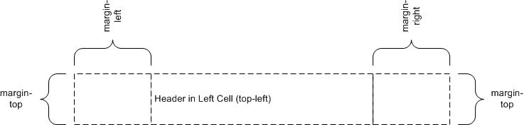
Here is an example of a page with only a top-left header:
@page {
  @top-left { content: "Header in Left Cell (top-left)" }
}
Because there are no contents defined for the top-center or the top-right margin boxes, the extent of the top-left margin box is allowed to cross the center of the page box.
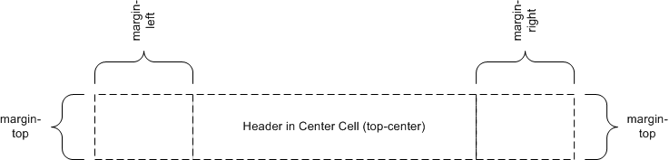
The following is an example of a page with a centered header:
@page {
  @top-center { content: "Header in Center Cell (top-center)" }
}
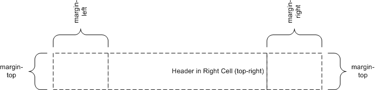
The following is an example of a page with a single header in the top-right margin box:
@page {
  @top-right { content: "Header in Right Cell (top-right)" }
}
Because the content of the center cell is empty, the extent of the top-right margin box is allowed to cross the center of the page box.
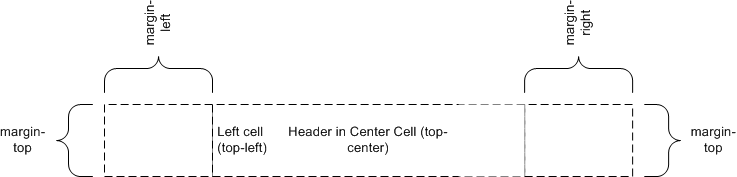
The following is an example of a page with a top-center and a top-left header:
@page {
  @top-left { content: "Left Cell (top-left)" }
  @top-center { content: "Header in Center Cell (top-center)" }
}
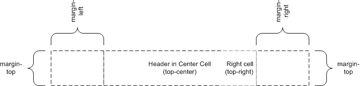
The following is an example of a page with a top-center and a top-right header:
@page {
  @top-center { content: "Header in Center Cell (top-center)" }
  @top-right { content: "Right Cell (top-right)" }
}
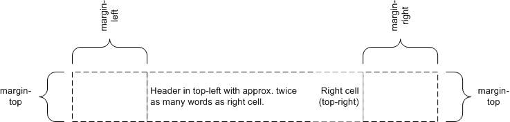
The following is an example of a page with top-left and top-right headers:
@page {
  @top-left { content: "Header in top-left with approx. "
                     "twice as many words as right cell." }
  @top-right { content: "Right cell (top-right)" }
}
Because there are no center cell contents, the extent of the top-left is allowed to cross the center of the page box. As the intrinsic width of the top-left contents is approximately twice the intrinsic width of that of the top-right, the top-left margin box is approximately twice as wide as the top-right margin box.
4.5. Populating margin boxes
A margin box is instantiated if a margin context is established and one of the following conditions holds:
- The computed value of 'content' is not 'none'.
- The properties 'width' and 'height' are set in the margin context.
This example style sheet could be used to create a centered header with the current chapter name:
body {counter-reset: chapter;}
div.chapter {counter-increment: chapter;}
@page {
  margin: 10%;
  @top-center { content: "Chapter" counter(chapter) }
}
Note that a counter value could be updated many times on a given page. The value of the counter at the beginning of page processing MUST be used by default.
5. Page Breaks
The following sections explain page formatting in CSS3 paged media. Five properties indicate where the user agent MAY or SHOULD break pages, and on what page (left or right) the subsequent content SHOULD resume. Each page break ends layout in the current page box and causes remaining pieces of the document tree to be laid out in a new page box.
5.1. Break before/after elements: 'page-break-before', 'page-break-after', 'page-break-inside'
| Name: | page-break-before |
| Value: | auto | always | avoid | left | right |
| Initial: | auto |
| Applies to: | block-level elements |
| Inherited: | no |
| Percentages: | N/A |
| Media: | paged |
| Computed value: | specified value |
| Name: | page-break-after |
| Value: | auto | always | avoid | left | right |
| Initial: | auto |
| Applies to: | block-level elements |
| Inherited: | no |
| Percentages: | N/A |
| Media: | paged |
| Computed value: | specified value |
| Name: | page-break-inside |
| Value: | auto | avoid |
| Initial: | auto |
| Applies to: | block-level elements |
| Inherited: | yes |
| Percentages: | N/A |
| Media: | paged |
| Computed value: | specified value |
Values for these properties have the following meanings:
- auto
- Neither force nor forbid a page break before (after, inside) the generated box.
- always
- Always force a page break before (after) the generated box.
- avoid
- Avoid a page break before (after, inside) the generated box.
- left
- Force one or two page breaks before (after) the generated box so that the next page is formatted as a left page.
- right
- Force one or two page breaks before (after) the generated box so that the next page is formatted as a right page.
A potential page break location is typically under the influence of the parent element's 'page-break-inside' property, the 'page-break-after' property of the preceding element, and the 'page-break-before' property of the following element. When these properties have values other than 'auto', the values 'always', 'left', and 'right' take precedence over 'avoid'. See the section on allowed page breaks for the exact rules on how these properties MAY force or suppress a page break.
5.2. Using named pages: 'page'
| Name: | page |
| Value: | auto | <identifier> |
| Initial: | auto |
| Applies to: | block-level elements |
| Inherited: | yes |
| Percentages: | N/A |
| Media: | paged |
| Computed value: | specified value |
The 'page' property can be used to specify a particular type of page where an element SHOULD be displayed.
This example will put all tables on a right-hand side landscape page (named "rotated"):
@page rotated { size: landscape }
table { page: rotated; page-break-before: right }
The 'page' property works as follows: If a block box with inline content has a 'page' property that is different from the preceding block box with inline content, then one or two page breaks are inserted between them, and the boxes after the break are rendered on a page box of the named type. See "Forced page breaks" below.
In this example, the two tables are rendered on landscape pages (indeed, on the same page, if they fit). The page type "narrow" is used for the <p> after the second table, as the page properties for the table element are no longer in effect:
@page narrow { size: 9cm 18cm }
@page rotated { size: landscape }
div { page: narrow }
table { page: rotated }
with this document:
<div>
<table>...</table>
<table>...</table>
<p>This text is rendered on a 'narrow' page</p>
</div>
5.3. Breaks inside elements: 'orphans', 'widows'
| Name: | orphans |
| Value: | <integer> |
| Initial: | 2 |
| Applies to: | block-level elements |
| Inherited: | yes |
| Percentages: | N/A |
| Media: | visual |
| Computed value: | specified value |
| Name: | widows |
| Value: | <integer> |
| Initial: | 2 |
| Applies to: | block-level elements |
| Inherited: | yes |
| Percentages: | N/A |
| Media: | visual |
| Computed value: | specified value |
The 'orphans' property specifies the minimum number of lines of a paragraph that MUST be left at the bottom of a page. The 'widows' property specifies the minimum number of lines of a paragraph that MUST be left at the top of a page. Examples of how they are used to control page breaks are given below.
If a paragraph contains fewer lines than the value of 'widows' or 'orphans', the rule is relaxed.
5.4. Allowed page breaks
In the normal flow, page breaks may occur at the following places:
- In the vertical margin between block boxes (or rows in a table).
When a page break occurs here, the computed values of the relevant
'margin-top' and 'margin-bottom' properties are set to
'0'. - Between line boxes inside a block box.
These breaks are subject to the following rules:
- Rule A: Breaking at (1) is allowed only if the 'page-break-after' and 'page-break-before' properties of all the elements generating boxes that meet at this margin allow it, which is when at least one of them has the value 'always', 'left', or 'right', or when all of them are 'auto'.
- Rule B: However, if all of them are 'auto' and the nearest common ancestor of all the elements has a 'page-break-inside' value of 'avoid', then breaking here is not allowed.
- Rule C: Breaking at (2) is allowed only if the number of line boxes between the break and the start of the enclosing block box is the value of 'orphans' or more, and the number of line boxes between the break and the end of the box is the value of 'widows' or more.
- Rule D: In addition, breaking at (2) is allowed only if the 'page-break-inside' property is 'auto'.
If the above doesn't provide enough break points to keep content from overflowing the page boxes, then rules B and D are dropped in order to find additional breakpoints.
If that still does not lead to sufficient break points, rules A and C are dropped as well, to find still more break points.
5.5. Forced page breaks
A page break MUST occur at (1) if, among the 'page-break-after' and 'page-break-before' properties of all the elements generating boxes that meet at this margin, there is at least one with the value 'always', 'left', or 'right'.
When multiple 'page-break-before' and/or 'page-break-after; properties with values of "always",
"left" or "right" apply at a margin, only one of them should generate
page breaks. That is, no content-empty pages are generated by page-break
properties, except for at most one content-empty page as may be required
by :right and :left values to position ensuing content on a right- or
left-facing page.
A page break MUST also occur at (1) if the last line box above this margin and the first one below it do not have the same value for 'page'.
5.6. "Best" page breaks
CSS3 does not define which of a set of allowed page breaks MUST be used; except as defined earlier in the section, CSS3 does not forbid a user agent to break at every possible break point, or to not break at all. But CSS3 does recommend that user agents observe the following heuristics (while recognizing that they are sometimes contradictory):
- Break as few times as possible.
- Make all pages that don't end with a forced break appear to have about the same height.
- Avoid breaking inside a block that has a border.
- Avoid breaking inside a table.
- Avoid breaking inside a floated element.
Suppose, for example, that the style sheet contains 'orphans : 4', 'widows : 2', and there are 20 lines (line boxes)
available at the bottom of the current page:
- If a paragraph at the end of the current page contains 20 lines or fewer, it SHOULD be placed on the current page.
- If the paragraph contains 21 or 22 lines, the second part of the paragraph MUST not violate the 'widows' constraint, and so the second part MUST contain exactly two lines.
- If the paragraph contains 23 lines or more, the first part SHOULD contain 20 lines and the second part the remaining lines.
Now suppose that 'orphans' is
'10', 'widows' is '20', and there are 8 lines available at the bottom
of the current page:
- If a paragraph at the end of the current page contains 8 lines or fewer, it SHOULD be placed on the current page.
- If the paragraph contains 9 lines or more, it cannot be split (that would violate the orphan constraint), so it SHOULD move as a block to the next page.
6. Page-based Extensions to Counters
6.1. Page-based counters
Counters apply to page contexts defined by means of the '@page' rule. This is useful
for maintaining a page count.
The following rules result in the placement of the current page number in the middle of the outside margin of each page.
@page {
  margin: 10%;
  counter-increment: page;

  @top-center {
    font-family: sans-serif;
    font-weight: bold;
    font-size: 2em;
    content: counter(page);
  }
}
7. Orienting an Image on the Page
Images from camera phones, digital cameras or scanners may be encoded sideways. For example, the first row of image data may represent the leftmost or rightmost column of image pixels. Furthermore, often such devices have limited resources, and do not have the capability to rotate the image into an upright orientation. However, this type of device may have internal knowledge or can accept input from its user on the rotational correction to perform.
The image-orientation property provides a way to specify a rotation to be applied to an image. This facility is not intended to specify other image transformations such as flipping the image in the horizontal or vertical direction. Also, this facility is not needed to correctly orient an image when printing in landscape versus portrait orientation.
| Name: | image-orientation |
| Value: | auto | <angle> |
| Initial: | auto |
| Applies to: | images |
| Inherited: | N/A |
| Percentages: | N/A |
| Media: | paged |
| Computed value: | specified value modulo full circle value |
'image-orientation' specifies a rotation in the right or clockwise direction that a user agent applies to an image. In terms of the order of transformations, the image is first rotated, then sized, then positioned. Thus height and width properties apply to the rotated rather than the original image dimensions.
Two values for the 'image-orientation' property apply to an image:
- auto
- The image will be set to the orientation of the page. That is, for a pixelated image consisting of rows and columns of pixels, a row is displayed across the width of the display surface and a column along the height.
- <angle>
- A positive value rotates the image to the right (in a clockwise direction) by the given number of degrees. Negative values rotate to the left or in a counter-clockwise direction. Specified values outside the range of ]-360, 360[ degrees are moduloed by 360 to produce a computed value within that range. User agents MUST support values which compute to 0, 90, 180, and 270 degrees. Support for other values is optional.
The following examples rotate the image in four major orientations:
img.original   { image-orientation: auto  }
img.zero       { image-orientation: 0 }
img.ninety     { image-orientation: 90deg }
img.tilt       { image-orientation: -1deg }
...
<img class="ninety" src=... />
8. The 'fit' and 'fit-position' Properties
| Name: | fit |
| Value: | fill | hidden | meet | slice |
| Initial: | fill |
| Applies to: | replaced elements |
| Inherited: | yes |
| Percentages: | N/A |
| Media: | visual |
| Computed value: | specified value |
| Name: | fit-position |
| Value: | [ [<percentage> | <length> ]{1,2} | [ [top | center | bottom] || [left | center | right] ] ] | auto |
| Initial: | 0% 0% |
| Applies to: | replaced elements |
| Inherited: | yes |
| Percentages: | refer to width and height of box itself |
| Media: | visual |
| Computed value: | specified value |
The 'fit' property gives a hint
for how to scale a replaced element if neither its 'width' nor its 'height' property is 'auto'. Not all replaced objects can be scaled, but
images typically can.
- fill
- Scale the object's height and width independently so that the content just touches all edges of the containing box.
- hidden
- Do not scale the object.
- meet
- Make the object as large as possible with its width <= 'width' and height <= 'height', while preserving its aspect ratio.
Position the object as for the
'hidden'value. - slice
- Make the object as small as possible with its width >= 'width' and height >= 'height', while preserving its aspect ratio.
Position the object as for the
'hidden'value.
'Hidden' is not really an intuitive name, 'none' might be better. But SMIL already uses 'hidden'...
See the 'overflow' property for how to render parts of the object that extend beyond the edges of the box.
The keywords are intended to convey the visual effect in
the case that 'overflow' is 'hidden', which is expected to be the most common
case.
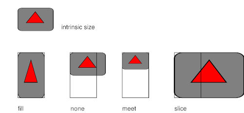
An example showing how each of the four values of 'fit' causes the object (gray rectangle) to be scaled to fit the given box (red dotted outline).
The 'fit-position'
determines the alignment of the object inside the box. The values have
the same meaning as the values on 'background-position', with the addition of the
value 'auto', specifically:
- <percentage> <percentage>
- With a value pair of
'0% 0%', the upper left corner of the image is aligned with the upper left corner of the box's padding edge. A value pair of'100% 100%'places the lower right corner of the image in the lower right corner of padding area. With a value pair of'14% 84%', the point 14% across and 84% down the image is to be placed at the point 14% across and 84% down the padding area. - <length> <length>
- With a value pair of
'2cm 2cm', the upper left corner of the image is placed 2cm to the right and 2cm below the upper left corner of the padding area. - 'top left',
'left top' - Same as
'0% 0%'. - 'top',
'top center','center top' - Same as
'50% 0%'. - 'right top',
'top right' - Same as
'100% 0%'. - 'left',
'left center','center left' - Same as
'0% 50%'. - 'center',
'center center' - Same as
'50% 50%'. - 'right',
'right center','center right' - Same as
'100% 50%'. - 'bottom left',
'left bottom' - Same as
'0% 100%'. - 'bottom',
'bottom center','center bottom' - Same as
'50% 100%'. - 'bottom right',
'right bottom' - Same as
'100% 100%'. - auto
- Put the object's top left corner in the top left corner of the box. Properties in other modules may modify this behavior. (At the time of writing, a property 'writing-mode' is under consideration.)
The computed value is the same as the specified value, i.e., the keywords are not replaced by percentages and the percentages are not replaced by something else. (This is an exception to the general rule that percentages are computed to some other value before being inherited.)
Note: areas of the box not covered by the replaced element will show the element's 'background'.
Note: the 'fit' property has the same meaning as the fit attribute in [SMIL10], except that the value 'scroll' is not available, because the 'overflow' property can be used instead.
References
Normative References
- [CSS21]
- Bert Bos; et al. Cascading Style Sheets, level 2 revision 1. 11 April 2006. W3C Working Draft. (Work in progress.) URL: http://www.w3.org/TR/2006/WD-CSS21-20060411
- [PWGMSN]
- Ron Bergman; Tom Hastings. Media Standardized Names. 26 February 2002. IEEE ISTO Printer Working Group 5101.1-2002. URL: ftp://ftp.pwg.org/pub/pwg/candidates/cs-pwgmsn10-20020226-5101.1.pdf
- [RFC2119]
- S. Bradner. Key words for use in RFCs to Indicate Requirement Levels. Internet RFC 2119. URL: http://www.ietf.org/rfc/rfc2119.txt
Informative References
- [CSS3BG]
- Tim Boland; Bert Bos. CSS3 Backgrounds and Borders Module. 16 February 2005. W3C Working Draft. (Work in progress.) URL: http://www.w3.org/TR/2005/WD-css3-background-20050216
- [MEDIAQ]
- Håkon Wium Lie; Tantek Çelik; Daniel Glazman. Media Queries. 8 July 2002. W3C Candidate Recommendation. (Work in progress.) URL: http://www.w3.org/TR/2002/CR-css3-mediaqueries-20020708
- [SMIL10]
- Philipp Hoschka (ed). Synchronized Multimedia Integration Language (SMIL) 1.0 Specification. 15 June 1998. W3C Recommendation. URL: http://www.w3.org/TR/1998/REC-smil-19980615