Abstract
This CSS level 3 module describes how lists are styled.
Status of this document
This document is a draft of one of the "modules" [CSS3-intro] for the upcoming CSS3 specification. It
extends, but also proposes changes to the functionality provided by the
existing CSS level 2.
This document is a working draft of the CSS working group which is part of
the style activity.
Comments on, and discussions of this draft can be sent on the (archived) public
mailing list www-style@w3.org (see
instructions). W3C Members can
also send comments directly to the CSS working group.
This is a working draft and may therefore be updated, replaced or rendered
obsolete by other W3C documents at any time. It is inappropriate to use W3C
Working Drafts as reference material or to cite them as other than "work in
progress". Its publication does not imply endorsement by the W3C membership
or the CSS Working Group (members only).
To find the latest version of this working draft, please follow the
"Latest version" link above, or visit the list of W3C Technical Reports.
This document may be available in translations in the future. The English
version of this specification is the only normative version.
Table of contents
1. Dependencies on other
modules
This CSS3 module depends on the following other CSS3 modules:
2. Introduction
The list model in this module differs in some important ways from the list
model in CSS2, specifically in its handling of markers. Implementation
experience suggested the CSS2 model overloaded the ::before and ::after
pseudo-elements with too much behavior, while at the same time introducing
new properties when existing properties were sufficient.
Most block-level elements in CSS generate one principal block box. In this
module, we discuss two CSS mechanisms that cause an element to have an
associated marker: one method associates one principal block box (for the
element's content) with a separate marker box (for decoration such as a
bullet, image, or number), and the other inserts a marker box into the
principal box. Unlike :before and :after content, the marker box cannot
affect the position of the principal box, whatever the positioning scheme.
For instance, the following example illustrates how markers may be used to
add periods after each numbered list item. This HTML application and style
sheet:
<!DOCTYPE HTML PUBLIC "-//W3C//DTD HTML 4.0//EN">
<HTML>
 <HEAD>
  <TITLE>Creating a list with markers</TITLE>
  <STYLE type="text/css">
   LI::marker { content: counter(list-item, lower-roman) "."; }
   LI { display: list-item; }
  </STYLE>
 </HEAD>
 <BODY>
  <OL>
   <LI> This is the first item. </LI>
   <LI> This is the second item. </LI>
   <LI> This is the third item. </LI>
  </OL>
 </BODY>
</HTML>
should produce something like this:
   i. This is the first item.
  ii. This is the second item.
 iii. This is the third item.
With descendant selectors and child selectors, it's possible to specify
different marker types depending on the depth of embedded lists.
A future level of CSS may provide a way to specify different
bullet types at arbitrary nesting levels. XXX
3. Declaring a List Item
To declare a list item, the 'display'
property should be set to 'list-item'. This, in addition to generating a
::marker pseudo-element and enabling the properties described below for that
element, causes that element to increment the list item counter list-item. (This does not affect the specified or computed
values of the counter properties.)
The list-item counter is a real counter, and can
be directly affected using the 'counter-increment' and 'counter-reset' properties. It can also be used in
the counter() and counters() function forms.
Actually, setting 'display' to list-item should be
generalized to "setting 'display' to a list type" or some such, because we
want to be able to handle inline list items, and we want floats to still have
list items. XXX
Note that this new model makes the marker display
type redundant. That display type is therefore obsolete in the CSS3 Lists
model.
| Name:
| 'list-style-type'
|
| Value:
| disc | circle | square | box | decimal | decimal-leading-zero |
lower-roman | upper-roman | lower-greek | lower-alpha | lower-latin |
upper-alpha | upper-latin | hebrew | armenian | georgian | cjk-ideographic |
hiragana | katakana | hiragana-iroha | katakana-iroha | simp-chinese-formal |
simp-chinese-informal | trad-chinese-formal | trad-chinese-informal |
japanese-formal | japanese-informal | hangul | hangul-consonant |
cjk-heavenly-stem | cjk-earthly-branch | arabic-indic | persian | devanagari
| gurmukhi | gujarati | kannada | malayalam | bengali | tamil | telugu | thai
| lao | myanmar | khmer | hangul | hangule-consonant | ethiopic-halehame |
ethiopic-abegede | ethiopic-numeric | urdu | oriya | none
|
| Initial:
| disc
|
| Applies to:
| all elements with 'display: list-item'
|
| Inherited:
| yes
|
| Percentages:
| N/A
|
| Media:
| visual
|
| Computed value:
| specified value
|
This property specifies appearance of the list item marker if 'list-style-image'
has the value 'none' or if the image pointed to by the URI cannot be
displayed. The value 'none' specifies no marker, otherwise there are three
types of marker: glyphs, numbering systems, and alphabetic systems.
Note. Numbered lists improve document accessibility by
making lists easier to navigate.
Glyphs are specified with disc, circle, square, and box. Their exact rendering depends on the user agent.
Numbering systems are specified with:
- decimal
- Decimal numbers, beginning with 1.
- decimal-leading-zero
- Decimal numbers padded by initial zeros (e.g., 01, 02, 03, ..., 98, 99).
- lower-roman
- Lowercase roman numerals (i, ii, iii, iv, v, etc.).
- upper-roman
- Uppercase roman numerals (I, II, III, IV, V, etc.).
- hebrew
- Traditional Hebrew numbering.
- georgian
- Traditional Georgian numbering (an, ban, gan, ..., he, tan, in, in-an,
...).
- armenian
- Traditional Armenian numbering.
- cjk-ideographic
- Plain ideographic numbers
- hiragana
- a, i, u, e, o, ka, ki, ...
- katakana
- A, I, U, E, O, KA, KI, ...
- hiragana-iroha
- i, ro, ha, ni, ho, he, to, ...
- katakana-iroha
- I, RO, HA, NI, HO, HE, TO, ...
- ...
- ...
Alphabetic systems are specified with:
- lower-latin or lower-alpha
- Lowercase ascii letters (a, b, c, ... z).
- upper-latin or upper-alpha
- Uppercase ascii letters (A, B, C, ... Z).
- lower-greek
- Lowercase classical Greek alpha, beta, gamma, ... (έ, ή,
ί, ...)
- ...
- ...
A lot more detail is needed in the above lists, including
modulus, more examples, etc. Some of the values are missing. This
specification currently does not define how alphabetic systems wrap at the
end of the alphabet. For instance, after 26 list items, 'lower-latin'
rendering is undefined. This should be changed. XXX
A user agent that does not recognize a numbering system should ignore the
declaration in which the numbering system is used.
For example, the following HTML document:
<!DOCTYPE HTML PUBLIC "-//W3C//DTD HTML 4.0//EN">
<HTML>
 <HEAD>
  <TITLE>Lowercase latin numbering</TITLE>
  <STYLE type="text/css">
   OL { list-style-type: lower-roman; list-style-type: ethiopic-halehame; }
  </STYLE>
 </HEAD>
 <BODY>
  <OL>
   <LI> This is the first item.
   <LI> This is the second item.
   <LI> This is the third item.
  </OL>
 </BODY>
</HTML>
might produce something like this in a user agent that does not support
the ethiopic-halehame list style type:
  i This is the first item.
 ii This is the second item.
iii This is the third item.
Note that the list marker alignment (here, right justified) depends on the
user agent's initial rules for the ::marker pseudo-element.
| Name:
| 'list-style-image'
|
| Value:
| <uri> | none
|
| Initial:
| none
|
| Applies to:
| all elements with 'display: list-item'
|
| Inherited:
| yes
|
| Percentages:
| N/A
|
| Media:
| visual
|
| Computed value:
| specified value
|
This property sets the image that will be used as the list item marker.
When the image is available, it will replace the marker set with the 'list-style-type'
marker.
The following example sets the marker at the beginning of each list item
to be the image "ellipse.png".
LI { list-style-image: url("http://png.com/ellipse.png") }
5. List Content: Generating
the automatic value of the 'content' property
If a ::marker pseudo-element has its 'content' property set to auto, the following
algorithm should be used to generate the computed value of the property. Note
that there being a computed value of the 'content' property is not enough for the ::marker
pseudo-element to be rendered. See the section on the 'list-style-position' property below.
- If 'list-style-image' is not none, and if
the image is valid, then the content is the value of the 'list-style-image'
property.
- Otherwise, if the list-style-type property is not none, then
the computed value of the 'content' property is
counter(list-item,
<list-style-type>), where
<list-style-type> is the computed value of the 'list-style-type'
property.
- Otherwise the computed value is none. (Note: This is not the same as the
empty string.)
Should there be a new keyword to use in counter() and
counters() to refer to the computed value of list-style-type? XXX
| Name:
| 'list-style-position'
|
| Value:
| inside | outside
|
| Initial:
| outside
|
| Applies to:
| all elements with 'display: list-item'
|
| Inherited:
| yes
|
| Percentages:
| N/A
|
| Media:
| visual
|
| Computed value:
| specified value
|
This property specifies the position of the marker box in the principal
block box. Values have the following meanings:
- outside
- The marker box is outside the principal block box, as described in the
section on the ::marker pseudo-element below.
- inside
- The ::marker pseudo-element is an inline element placed immediately
before the ::before pseudo-element in the principal block box, after which
the element's content flows. Note that if there is no inline content, this
will create a line box, just as content in an inline ::before pseudo-element
would. Also note that all the properties that apply to inline elements apply
to the ::marker pseudo-element in this state, and this ::marker box
participates in the inline box model in the normal manner.
Note that a marker is only generated if the computed value of the 'content' property for the element's ::marker
pseudo-element is not none.
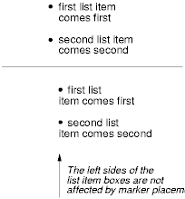
For example:
<!DOCTYPE HTML PUBLIC "-//W3C//DTD HTML 4.0//EN">
<HTML>
 <HEAD>
  <TITLE>Comparison of inside/outside position</TITLE>
  <STYLE type="text/css">
   UL         { list-style: outside }
   UL.compact { list-style: inside }
  </STYLE>
 </HEAD>
 <BODY>
  <UL>
   <LI>first list item comes first</LI>
   <LI>second list item comes second</LI>
  </UL>
  <HT>
  <UL class="compact">
   <LI>first list item comes first</LI>
   <LI>second list item comes second</LI>
  </UL>
 </BODY>
</HTML>
The above example may be formatted as:
In right-to-left text, the markers would have been on the right side of
the box.
7. The 'list-style' shorthand
property
| Name:
| 'list-style'
|
| Value:
| [ <'list-style-type'> || <'list-style-position'> || <'list-style-image'> ]
|
| Initial:
| not defined for shorthand properties
|
| Applies to:
| all elements with 'display: list-item'
|
| Inherited:
| not defined for shorthand properties
|
| Percentages:
| N/A
|
| Media:
| visual
|
| Computed value:
| not defined for shorthand properties
|
The 'list-style'
property is a shorthand notation for setting the three properties 'list-style-type',
'list-style-image', and 'list-style-position' at the same
place in the style sheet.
For example:
UL { list-style: upper-roman inside }  /* Any UL */
UL > UL { list-style: circle outside } /* Any UL child of a UL */
Although authors may specify 'list-style' information directly on list item
elements (e.g., LI in HTML), they should do so with care. The following rules
look similar, but the first declares a descendant selector and the second a
(more specific) child selector.
OL.alpha LI   { list-style: lower-alpha } /* Any LI descendant of an OL */
OL.alpha > LI { list-style: lower-alpha } /* Any LI child of an OL */
Authors who use only the descendant selector may not achieve the results
they expect. Consider the following rules:
<!DOCTYPE HTML PUBLIC "-//W3C//DTD HTML 4.0//EN">
<HTML>
 <HEAD>
  <TITLE>WARNING: Unexpected results due to cascade</TITLE>
  <STYLE type="text/css">
   OL.alpha LI  { list-style: lower-alpha }
   UL LI        { list-style: disc }
  </STYLE>
 </HEAD>
 <BODY>
  <OL class="alpha">
   <LI>level 1
    <UL>
     <LI>level 2</LI>
    </UL>
   </LI>
  </OL>
 </BODY>
</HTML>
The desired rendering would have level 1 list items with 'lower-alpha'
labels and level 2 items with 'disc' labels. However, the cascading order
will cause the first style rule (which includes specific class information)
to mask the second. The following rules solve the problem by employing a
child selector instead:
OL.alpha > LI   { list-style: lower-alpha }
UL LI           { list-style: disc }
Another solution would be to specify 'list-style' information only on the list type
elements:
OL.alpha   { list-style: lower-alpha }
UL         { list-style: disc }
Inheritance will transfer the 'list-style' values from OL and UL elements to
LI elements. This is the recommended way to specify list style information.
A URI value may be combined with any other value, as in:
UL { list-style: url("http://png.com/ellipse.png") disc }
In the example above, the 'disc' will be used when the image is
unavailable.
A value of 'none' for the 'list-style' property sets both 'list-style-type' and
'list-style-image' to 'none', because it
sets the 'list-style-type' to none (that is the
first value in the list), and the initial value of the 'list-style-image'
property, which isn't listed in that declaration, is none. For this reason,
LI { list-style: none; }
will ensure that no list-item marker is displayed on LI elements, except
if a value is explicitly given to the 'content'
property of the ::marker pseudo-element. In general, the best way to ensure
that no marker is rendered is to not set the 'display' property to list-item.
8. Markers: The ::marker pseudo-class
The name ::marker is temporary. We need a better name. At
the moment the word 'marker' is seriously overloaded. XXX
Markers are created by setting an element's 'display' property to list-item. The list-item display
type is, in every other respect, identical to the block display type.
If the elements' 'list-style-position' property has the
value outside, then the value of the element's ::marker pseudo-element's 'content' property is formatted in an independent
marker box, outside the principal box. Marker boxes are formatted as a single
line (i.e., one line box), so they are not as flexible as floats or
absolutely positioned boxes. The marker box is only created if the 'content' property for the pseudo-element is not
none. The rest of this section discusses the details
of the positioning of the marker box if it is positioned outside. For details
on positioning the marker box when it is an inside list marker, see the
section on 'list-style-position'.
Marker boxes have padding, borders and margins, just like inline elements.
The marker box will be vertically aligned with the first line of content in
the principal box, as specified by the pseudo-element's 'vertical-align' property. If the principal box
contains no text, the top outer edge of the marker box will be aligned with
the top outer edge of the principal box. The marker box participates in the
height calculation of the principal box's first line box. Thus, markers are
aligned with the first line of an element's content. If no first line box
exists in a principal box, the marker box establishes its line box alone.
The marker box is horizontally aligned with the start of the line box.
Thus if a float intersects the element, moving the line box start, the marker
box is moved as well. It is the responsibility of the author to ensure that
sufficient margins are provided to prevent marker boxes overlapping with the
floats. If the marker box is generating the line box, then it is aligned with
the content area's start edge.
If the value of the 'width' property is
auto, the marker box content width is that of the
content, otherwise it is the value of 'width'.
For values of 'width' less than the content
width, the 'overflow' property specifies
overflow behavior. For values of 'width' greater
than the content width, the 'text-align'
property determines the horizontal alignment of the content in the marker
box.
Marker boxes may overlap principal boxes and other marker boxes. Overlap
could happen for several reasons. If several nested elements without inline
content all have marker boxes, for instance, or if a marker box has negative
margins.
The CSS2 'marker-offset'
property is obsoleted in this model and has no effect. (It is replaced by the
'margin-end' property.)
In the following example, the content is centered within a marker box of a
fixed width. This document:
<!DOCTYPE HTML PUBLIC "-//W3C//DTD HTML 4.0//EN">
<HTML>
 <HEAD>
  <TITLE>Content alignment in the marker box</TITLE>
  <STYLE type="text/css">
   LI::marker {
     content: "(" counter(counter) ")";
     width: 6em;
     text-align: center;
   }
   LI {
     display: list-item;
     counter-increment: counter;
   }
  </STYLE>
 </HEAD>
 <BODY>
  <OL>
   <LI> This is the first item. </LI>
   <LI> This is the second item. </LI>
   <LI> This is the third item. </LI>
  </OL>
 </BODY>
</HTML>
should produce something like this:
  (1)    This is the
         first item.
  (2)    This is the
         second item.
  (3)    This is the
         third item.
The next example uses markers to number notes (paragraphs).
The following document:
<!DOCTYPE HTML PUBLIC "-//W3C//DTD HTML 4.0//EN">
<HTML>
 <HEAD>
  <TITLE>Markers to create numbered notes4>/TITLE>
  <STYLE type="text/css">
   P { margin-left: 12 em; }
   P.Note::marker {
      content: url("note.gif") "Note " counter(note-counter) ":";
      text-align: left;
      width: 10em;
   }
   P.Note {
     display: list-item;
     counter-increment: note-counter;
   }
  </STYLE>
 </HEAD>
 <BODY>
  <P>This is the first paragraph in this document.</P>
  <P CLASS="Note">This is a very short document.</P>
  <P>This is the end.</P>
 </BODY>
</HTML>
should produce something like:
            This is the first paragraph
            in this document.

  Note 1:   This is a very short
            document.

            This is the end.
The following example illustrates how markers may be offset from their
element. This HTML application and style sheet:
<!DOCTYPE HTML PUBLIC "-//W3C//DTD HTML 4.0 Transitional//EN">
<HTML>
 <HEAD>
  <TITLE>Marker example 5</TITLE>
  <STYLE type="text/css">
   P { margin-left: 8em } /* Make space for counters */
   LI::marker { margin: 0 3em 0 0; content: counter(list-item, lower-roman) "."; }
   LI { display: list-item }
  </STYLE>
 </HEAD>
 <BODY>
  <P> This is a long preceding paragraph ...</P>
  <OL>
   <LI> This is the first item.
   <LI> This is the second item.
   <LI> This is the third item.
  </OL>
  <P> This is a long following paragraph ...</P>
 </BODY>
</HTML>
should produce something like this:
        This is a long preceding
        paragraph ...

   i.   This is the first item.
  ii.   This is the second item.
 iii.   This is the third item.

        This is a long following
        paragraph ...
(Note the use of the implicit counter increment.)
9. Profiles
This module has two profiles: CSS Level 1 and Full. There is no CSS2
profile because this module is incompatible with the CSS2 list model.
The CSS Level 1 module consists of 'list-style', 'list-style-position', 'list-style-image',
and 'list-style-type' (but only the following
values: disc, circle, square, decimal, lower-roman, upper-roman, lower-alpha,
upper-alpha, none). It does not include the ::marker pseudo element.
The Full profile contains everything.
Acknowledgments
[acknowledgments -- suggestions welcome]
Changes From CSS2
As described in the introduction section, there are significant changes in
this module when compared to CSS2.
- display:marker has been replaced with ::marker
- It is no longer possible to make end markers.
- The 'marker-offset' property is obsoleted.
- The marker display type is obsoleted.
- Markers are now aligned relative to the line box edge, rather than the
border edge.
- Markers now have margins.
- The introduction of the box list style type as well as a number of
alphabetic and numbering types.
- Error handling rules for unknown list style types were changed to be
consistent with the normal parsing error handling rules.
- The list-item predefined counter identifier has been introduced.
References
Normative references
-
- [CSS3-box]
- Bert Bos. CSS3 module: box model. 26 July 2001. W3C working
draft. (Work in progress.) URL: http://www.w3.org/TR/2001/WD-css3-box-20010726
- [CSS3-generated]
- Hĺkon Wium Lie; Ian Hickson. CSS3 module: generated text.
(forthcoming). W3C working draft. (Work in progress.)
- [CSS3-linebox]
- Eric A. Meyer. CSS3 module: linebox model. (forthcoming).
W3C working draft. (Work in progress.)
Other references
-
- [CSS3-intro]
- Eric A. Meyer; Bert Bos. Introduction to CSS3. 23 May 2001.
W3C working draft. (Work in progress.) URL: http://www.w3.org/TR/css3-roadmap
Index
- box, #
- circle, #
- disc, #
- 'list-style', #
- 'list-style-image', #
- 'list-style-position', #
- 'list-style-type', #
- square, #