In some cases, authors may want user agents to render content that
does not come from the document
tree. One familiar example of this is a numbered list; the author
does not want to list the numbers explicitly, he or she wants the user
agent to generate them automatically. Similarly, authors may want the
user agent to insert the word "Figure" before the caption of a figure.
In CSS 2.1, content may be generated by several mechanisms:
- The 'content'
property, in conjunction with the :before and :after pseudo-elements.
- Elements with a value of 'list-item'
for the 'display' property.
Below we describe the mechanisms associated with the 'content' property.
Authors specify the style and location of generated content with
the :before and :after pseudo-elements. As their names indicate, the
:before and :after pseudo-elements specify the location of content
before and after an element's document
tree content. The 'content'
property, in conjunction with these pseudo-elements, specifies what is
inserted.
Example(s):
For example, the following rule inserts the string "Note: "
before the content of
every "p" element whose "class" attribute has the value "note":
p.note:before { content: "Note: " }
The formatting objects (e.g., boxes) generated by an element include
generated content. So, for example, changing the above style sheet
to:
p.note:before { content: "Note: " }
p.note        { border: solid green }
would cause a solid green border to be rendered around the entire
paragraph, including the initial string.
The :before and :after pseudo-elements inherit any inheritable properties
from the element in the document tree to which they are attached.
Example(s):
For example, the following rules insert an open quote mark before every
Q element. The color of the quote mark will be red, but the font will
be the same as the font of the rest of the Q element:
q:before {
  content: open-quote;
  color: red
}
In a :before or :after pseudo-element declaration, non-inherited
properties take their initial
values.
Example(s):
So, for example, because the initial value of the 'display' property is 'inline', the
quote in the previous example is inserted as an inline box (i.e.,
on the same line as the element's initial text content).
The next example explicitly sets the
'display' property to
'block', so that the inserted text becomes a block:
body:after {
    content: "The End";
    display: block;
    margin-top: 2em;
    text-align: center;
}
User agents must ignore the following properties with :before and
:after pseudo-elements: 'position', 'float', list
properties, and table properties.
The :before and :after pseudo-elements elements allow
values of the 'display'
property as follows:
- If the subject of the
selector is a block-level
element, allowed values are 'none', 'inline' and 'block'.
If the value of the pseudo-element's
'display' property
has any other value, the pseudo-element will behave as if its value
were 'block'.
- If the subject of the
selector is an inline-level
element, allowed values are 'none' and 'inline'.
If the value of the pseudo-element's
'display' property
has any other value, the pseudo-element will behave as if its value
were 'inline'.
-
'content'
-
| Value: | [ <string> | attr(X) | open-quote | close-quote
| no-open-quote | no-close-quote ]+ | inherit
|
| Initial: | empty string
|
| Applies to: | :before and :after pseudo-elements
|
| Inherited: | no
|
| Percentages: | N/A
|
| Media: | all
|
This property is used with the :before and :after pseudo-elements
to generate content in a document. Values have the following
meanings:
- <string>
- Text content
(see the section on strings).
- open-quote and
close-quote
- These values are replaced by the appropriate string
from the 'quotes' property.
- no-open-quote
and no-close-quote
- Inserts nothing (the empty string), but increments (decrements)
the level of nesting for quotes.
- attr(X)
- This function returns as a string the value of attribute X
for the subject of the selector. The
string is not parsed by the CSS processor. If the subject of the selector
doesn't have an attribute X, an empty string is returned. The
case-sensitivity of attribute names depends on the document language.
In CSS 2.1 it is not possible to refer to
attribute values for other elements than the subject of the selector.
The 'display' property
controls whether the content is placed in a block or inline
box.
Example(s):
The rule below inserts the text of the HTML "alt" attribute before the
image. If the image is not displayed, the reader will still see the
"alt" text.
img:before { content: attr(alt) }
Authors may include newlines in the generated content by writing
the "\A" escape sequence in one of the strings after the 'content' property. This inserts a
forced line
break, similar to the BR element in HTML. See "Strings" and "Characters and case" for
more information on the "\A" escape sequence.
Example(s):
h1:before {
    display: block;
    text-align: center;
    content: "chapter\A hoofdstuk\A chapitre"
}
Generated content does not alter the document tree. In particular, it
is not fed back to the document language processor (e.g., for
reparsing).
12.3 Interaction of :before and :after
with 'run-in' elements
The following cases can occur:
- A 'run-in' element has a :before pseudo-element of type
'inline': the pseudo-element is rendered inside the same
block box as the element.
- A 'run-in' element has an :after
pseudo-element of type 'inline': The rules of the previous
point apply.
- A 'run-in' element has a :before
pseudo-element of type 'block': the pseudo-element is
formatted as a block above the element.
- A 'run-in' element has an :after
pseudo-element of type 'block': both the element and its
:after pseudo-element are formatted as block boxes. The element
is not formatted as an inline box in its own :after
pseudo-element.
- The element following a 'run-in' element has
a :before of type 'block': the decision how to format the
'run-in' element is made with respect to the block box
resulting from the :before pseudo-element.
- The element following a 'run-in' element has
an :before of type 'inline': the decision how to format the
'run-in' element depends on the 'display' value of the element to which
the :before is attached.
Example(s):
Here is an example of a 'run-in' header with an :after
pseudo-element, followed by a paragraph with a :before pseudo-element. All
pseudo-elements are inline (the default) in this example. When the
style sheet:
h3 { display: run-in }
h3:after { content: ": " }
p:before { content: "... " }
is applied to this source document:
<h3>Centaurs</h3>
<p>have hoofs
<p>have a tail
The visual formatting will resemble:
Centaurs: ... have hoofs
... have a tail
In CSS 2.1, authors may specify, in a style-sensitive and
context-dependent manner, how user agents should render quotation
marks. The 'quotes' property
specifies pairs of quotation marks for each level of embedded
quotation. The 'content'
property gives access to those quotation marks and causes them to be
inserted before and after a quotation.
This property specifies quotation marks for any number of embedded
quotations. Values have the following meanings:
- none
- The 'open-quote' and 'close-quote' values of the
'content' property
produce no quotation marks.
- [<string>
<string>]+
- Values for the 'open-quote' and 'close-quote' values of the
'content' property are taken
from this list of pairs of quotation marks (opening and
closing). The first (leftmost) pair represents the outermost level of
quotation, the second pair the first level of embedding, etc. The user
agent must apply the appropriate pair of quotation marks according to
the level of embedding.
Example(s):
For example, applying the following style sheet:
/* Specify pairs of quotes for two levels in two languages */
q:lang(en) { quotes: '"' '"' "'" "'" }
q:lang(no) { quotes: "«" "»" '"' '"' }

/* Insert quotes before and after Q element content */
q:before { content: open-quote }
q:after  { content: close-quote }
to the following HTML fragment:
<HTML lang="en">
  <HEAD>
  <TITLE>Quotes</title>
  </HEAD>
  <BODY>
    <P><Q>Quote me!</Q>
  </BODY>
</HTML>
would allow a user agent to produce:
"Quote me!"
while this HTML fragment:
<HTML lang="no">
  <HEAD>
  <TITLE>Quotes</TITLE>
  </HEAD>
  <BODY>
    <P><Q>Trøndere gråter når <Q>Vinsjan på kaia</Q> blir deklamert.</Q>
  </BODY>
</HTML>
would produce:
«Trøndere gråter når "Vinsjan på kaia" blir deklamert.»
Note.
While the quotation marks specified by 'quotes' in the previous examples are
conveniently located on computer keyboards, high quality typesetting
would require different ISO 10646 characters. The following
informative table lists some of the ISO 10646 quotation
mark characters:
| Approximate rendering | ISO 10646 code (hex) | Description
|
|---|
| " | 0022 | QUOTATION MARK [the ASCII double quotation mark]
|
| ' | 0027 | APOSTROPHE [the ASCII single quotation mark]
|
| < | 2039 | SINGLE LEFT-POINTING ANGLE QUOTATION MARK
|
| > | 203A | SINGLE RIGHT-POINTING ANGLE QUOTATION MARK
|
| « | 00AB | LEFT-POINTING DOUBLE ANGLE QUOTATION MARK
|
| » | 00BB | RIGHT-POINTING DOUBLE ANGLE QUOTATION MARK
|
| ` | 2018 | LEFT SINGLE QUOTATION MARK [single high-6]
|
| ' | 2019 | RIGHT SINGLE QUOTATION MARK [single high-9]
|
| `` | 201C | LEFT DOUBLE QUOTATION MARK [double high-6]
|
| '' | 201D | RIGHT DOUBLE QUOTATION MARK [double high-9]
|
| ,, | 201E | DOUBLE LOW-9 QUOTATION MARK [double low-9]
|
Quotation marks are inserted in appropriate places in a document
with the 'open-quote'
and 'close-quote' values of the
'content' property. Each
occurrence of 'open-quote' or 'close-quote' is replaced by one of the
strings from the value of 'quotes', based on the depth of
nesting.
'Open-quote' refers to the first of a pair of quotes, 'close-quote'
refers to the second. Which pair of quotes is used depends on the
nesting level of quotes: the number of occurrences of 'open-quote' in
all generated text before the current occurrence, minus the number of
occurrences of 'close-quote'. If the depth is 0, the first pair is
used, if the depth is 1, the second pair is used, etc. If the depth is
greater than the number of pairs, the last pair is repeated. A
'close-quote' that would make the depth negative is in error and is
ignored (at rendering time): the depth stays at 0 and no quote mark is
rendered (although the rest of the 'content' property's value is still
inserted).
Note. The quoting depth is independent of the nesting
of the source document or the formatting structure.
Some typographic styles require open quotation marks to be repeated
before every paragraph of a quote spanning several paragraphs, but
only the last paragraph ends with a closing quotation mark. In CSS,
this can be achieved by inserting "phantom" closing quotes. The
keyword 'no-close-quote' decrements
the quoting level, but does not insert a quotation mark.
Example(s):
The following style sheet puts opening quotation marks on every
paragraph in a "blockquote", and inserts a single closing quote at the
end:
blockquote p:before     { content: open-quote }
blockquote p:after      { content: no-close-quote }
blockquote p.last:after { content: close-quote }
This relies on the last paragraph being marked with a class "last",
since there are no selectors that can match the last child of an
element.
For symmetry, there is also a 'no-open-quote' keyword,
which inserts nothing, but increments the quotation depth by one.
Example(s):
If a quotation is in a different language than the surrounding
text, the quote marks of the language of the surrounding text is often
used. For example, French inside English:
The device of the order of the garter is “Honi soit qui mal y
pense.”
English inside French:
Il disait: « Il faut mettre l'action en ‹ fast
forward ›.»
A style sheet like the following will set the 'quotes' property so
that 'open-quote' and 'close-quote' will work correctly on all elements.
These rules are for documents that contain only English, French, or
both. One rule is needed for every additional language.
Note the use of the child combinator (">") to set
quotes on elements based on the language of the surrounding
text:
[lang|=fr] > *  { quotes: "« " " »" "\2039 " " \203A" }
[lang|=en] > *  { quotes: "\201C" "\201D" "\2018" "\2019" }
The quotation marks for English are shown here in a form that most
people will be able to type. If you can type them directly, they will
look like this:
[lang|=fr] > * { quotes: "«" "»" "‹" "›" }
[lang|=en] > * { quotes: "“" "”" "‘" "’" }
CSS 2.1 offers basic visual formatting of lists. An element with
'display: list-item' generates a principal box for the element's
content and an optional marker box as a visual indication that the
element is a list item.
The list
properties describe basic visual formatting of lists:
they allow style sheets to specify the marker type (image, glyph, or
number), and the marker position with respect to the principal box
(outside it or within it before content). They do not allow authors to
specify distinct style (colors, fonts, alignment, etc.) for the list
marker or adjust its position with respect to the principal box.
The background
properties apply to the principal box only; an 'outside' marker
box is transparent.
-
'list-style-type'
-
| Value: | disc | circle | square | decimal | decimal-leading-zero |
lower-roman | upper-roman | lower-greek |
lower-alpha | lower-latin | upper-alpha | upper-latin |
hebrew | armenian | georgian |
cjk-ideographic | hiragana | katakana | hiragana-iroha | katakana-iroha |
none | inherit
|
| Initial: | disc
|
| Applies to: | elements with 'display: list-item'
|
| Inherited: | yes
|
| Percentages: | N/A
|
| Media: | visual
|
This property specifies appearance of the list item marker if
'list-style-image' has
the value 'none' or if the image pointed to by the URI cannot be
displayed. The value 'none' specifies no marker, otherwise there are
three types of marker: glyphs, numbering systems, and alphabetic
systems.
Glyphs are specified with
disc,
circle, and
square. Their exact
rendering depends on the user agent.
Numbering systems are specified with:
- decimal
- Decimal numbers, beginning with 1.
- decimal-leading-zero
- Decimal numbers padded by initial zeros (e.g., 01, 02, 03, ..., 98, 99).
- lower-roman
- Lowercase roman numerals (i, ii, iii, iv, v, etc.).
- upper-roman
- Uppercase roman numerals (I, II, III, IV, V, etc.).
A user agent that does not recognize a numbering system should use
'decimal'.
Alphabetic systems are specified with:
- lower-latin or lower-alpha
- Lowercase ascii letters (a, b, c, ... z).
- upper-latin or upper-alpha
- Uppercase ascii letters (A, B, C, ... Z).
This specification does not define how alphabetic systems wrap at
the end of the alphabet. For instance, after 26 list items,
'lower-latin' rendering is undefined. Therefore, for long lists, we
recommend that authors specify true numbers.
For example, the following HTML document:
<!DOCTYPE HTML PUBLIC "-//W3C//DTD HTML 4.0//EN">
<HTML>
   <HEAD>
     <TITLE>Lowercase latin numbering</TITLE>
     <STYLE type="text/css">
          ol { list-style-type: lower-roman }
     </STYLE>
  </HEAD>
  <BODY>
    <OL>
      <LI> This is the first item.
      <LI> This is the second item.
      <LI> This is the third item.
    </OL>
  </BODY>
</HTML>
might produce something like this:
  i This is the first item.
 ii This is the second item.
iii This is the third item.
The list marker alignment (here, right justified) depends on the user agent.
This property sets the image that will be used as the list item
marker. When the image is available, it will replace the marker set
with the 'list-style-type' marker.
Example(s):
The following example sets the marker at the beginning of each list
item to be the image "ellipse.png".
ul { list-style-image: url("http://png.com/ellipse.png") }
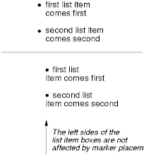
This property specifies the position of the marker box in the
principal block box. Values have the following meanings:
- outside
- The marker box is outside the principal block box. CSS 2.1 does not specify the precise location
of the marker box.
- inside
- The marker box is the first inline box in the
principal block box, after which the element's content flows.
For example:
<HTML>
  <HEAD>
    <TITLE>Comparison of inside/outside position</TITLE>
    <STYLE type="text/css">
      ul         { list-style: outside }
      ul.compact { list-style: inside }
    </STYLE>
  </HEAD>
  <BODY>
    <UL>
      <LI>first list item comes first
      <LI>second list item comes second
    </UL>

    <UL class="compact">
      <LI>first list item comes first
      <LI>second list item comes second
    </UL>
  </BODY>
</HTML>
The above example may be formatted as:
In right-to-left text, the markers would have been on the right
side of the box.
The 'list-style' property
is a shorthand notation for setting the three properties 'list-style-type', 'list-style-image', and 'list-style-position' at
the same place in the style sheet.
Example(s):
ul { list-style: upper-roman inside }  /* Any "ul" element */
ul > li > ul { list-style: circle outside } /* Any "ul" child
                                             of an "li" child
                                             of a "ul" element */
Although authors may specify 'list-style' information directly
on list item elements (e.g., "li" in HTML), they should do so with
care. The following rules look similar, but the first declares a descendant selector
and the second a (more specific) child
selector.
ol.alpha li   { list-style: lower-alpha } /* Any "li" descendant of an "ol" */
ol.alpha > li { list-style: lower-alpha } /* Any "li" child of an "ol" */
Authors who use only the descendant selector may
not achieve the results they expect. Consider the following rules:
<HTML>
  <HEAD>
    <TITLE>WARNING: Unexpected results due to cascade</TITLE>
    <STYLE type="text/css">
      ol.alpha li  { list-style: lower-alpha }
      ul li        { list-style: disc }
    </STYLE>
  </HEAD>
  <BODY>
    <OL class="alpha">
      <LI>level 1
      <UL>
         <LI>level 2
      </UL>
    </OL>
  </BODY>
</HTML>
The desired rendering would have level 1 list items with
'lower-alpha' labels and level 2 items with 'disc' labels. However,
the cascading order will
cause the first style rule (which includes specific class information)
to mask the second. The following rules solve the problem by employing
a child
selector instead:
ol.alpha > li  { list-style: lower-alpha }
ul li   { list-style: disc }
Another solution would be to specify 'list-style' information only on
the list type elements:
ol.alpha  { list-style: lower-alpha }
ul        { list-style: disc }
Inheritance will transfer the 'list-style' values from OL and
UL elements to LI elements. This is the recommended way to
specify list style information.
Example(s):
A URI value may be combined with any other value, as in:
ul { list-style: url("http://png.com/ellipse.png") disc }
In the example above, the 'disc' will be used when the image is
unavailable.
A value of 'none' for the 'list-style' property sets both
'list-style-type' and
'list-style-image' to
'none':
ul { list-style: none }
The result is that no list-item marker is displayed.