![]()
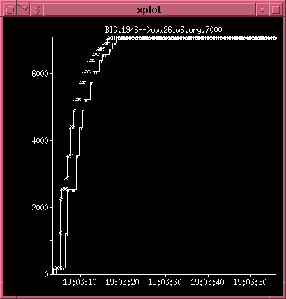
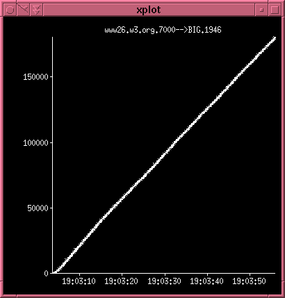
I find this a very illustrative example of the effects of pipelining over a PPP link. The graphs shows number of bytes (payload) transferred as a function of time. Note that the scales are not the same on the two graphs. The data is taken from the HTTP performance paper and illustrates the libwww robot accessing the microscape website using Apache. We have similar data for Jigsaw as well.
The left image illustrates the HTTP requests going from the client to the server. Each arrow represents data and the line just a bit to the right of the arrows illustrate the TCP window size catching up. You can see that the requests only take about 1/3 of the time. The vertical line is an indication of no data being sent - only TCP ACKs that inform the other end that it can send more data.
To the right you see the response coming from the server. The straight line indicates that the transfer is not limited by the applications sending data but by the channel itself. Hence, we have reached the upper limit for how fast you can transfer this amount of data from the server to the client. The only way to optimize this further is to cut down on the amount of data.
We have tried to do this by using the zlib library to compress the HTML which is roughly 1/3 of the data transmitted and it indeed has a positive effect. Of course, using CSS1 and PNG are very important factors in this equation as well as they contribute significantly to cut down the number of bytes that has to be transmitted.
Read more in the paper itself.