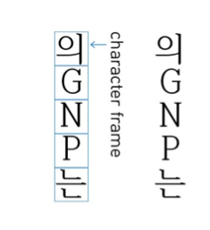
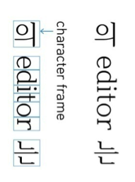
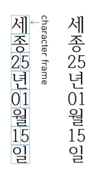
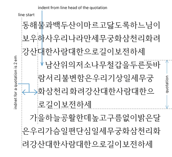
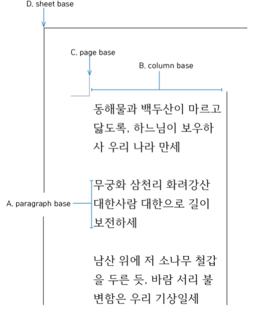
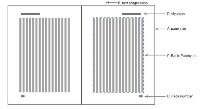
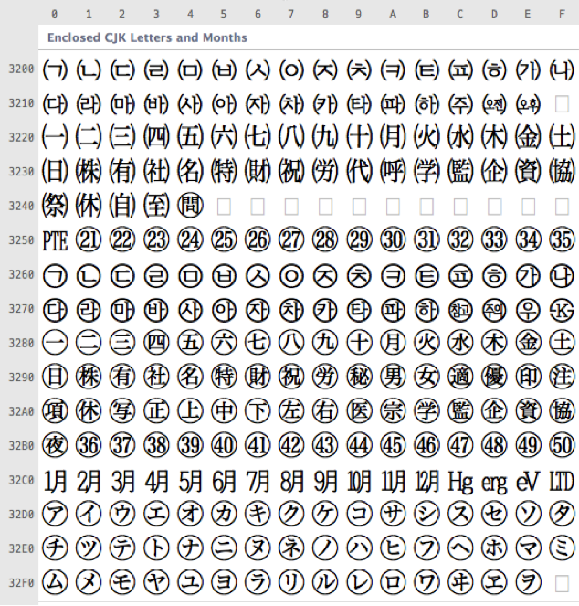
This document is an editor's copy. It supports markup to identify changes from a previous version. Two kinds of changes are highlighted: new, added text , and deleted text .
[ contents ]
Copyright © 2013 W3C ® ( MIT , ERCIM , Keio , Beihang ), All Rights Reserved. W3C liability , trademark and document use rules apply.
This document describes requirements for general Korean language – Hangul language/Hangul text layout and typography realized with technologies like CSS, SVG and XSL-FO. The document is mainly based on a project to develop the international standard for Korean text layout.
This document is an editor's copy that has no official standing.
This section describes the status of this document at the time of its publication. Other documents may supersede this document. A list of current W3C publications and the latest revision of this technical report can be found in the W3C technical reports index at http://www.w3.org/TR/.
This document describes requirements for general Korean language – Hangul text layout realized with technologies like CSS, SVG and XSL-FO. The document is mainly based on a project to develop the international standard for Korean text layout.
This is a W3C Editor's Draft produced by members of the Internationalization Interest Group , and published by the Internationalization Working Group , part of the W3C Internationalization Activity . The Working Group expects this Working Draft to become a Working Group Note. The document was originally authored in Korean, then translated to English under the guidance of the authors. The Korean version of this document is also available.
This document was developed by participants from Korean typographic experts and standardization experts.
Please send comments on this document to public-i18n-cjk@w3.org ( publicly archived ). See also the latest editor's draft .
Publication as a Working Draft does not imply endorsement by the W3C Membership. This is a draft document and may be updated, replaced or obsoleted by other documents at any time. It is inappropriate to cite this document as other than work in progress.
This document was produced by a group operating under the 5 February 2004 W3C Patent Policy . W3C maintains a public list of any patent disclosures made in connection with the deliverables of the group; that page also includes instructions for disclosing a patent. An individual who has actual knowledge of a patent which the individual believes contains Essential Claim(s) must disclose the information in accordance with section 6 of the W3C Patent Policy .
Every cultural group has its own language and writing system. Especially between East and West, the difference is great. Thus to digitize the writing system, a lot of data and technology is needed that accurately represents the language and writing system.
The purpose of this document is to explain the important differences between the Korean writing system and others, in order to digitize it. However this document does not provide the solution for actual implementations or problems, but only describes the basic information that should be treated as important issues.
This document was created by discussing the Korean related issues through Korea's Standard Infrastructure Enhancement Program and surveying needs from actual users and technical experts.
The following types of experts were involved in the creation of this document:
The contents of this document are related to the Korean writing system, so all discussions took place in Korean, and were then translated into English once the document had been finished.
The technical terms for discussing and describing the Korean writing system were carefully selected after considering potential differences in nuance even if a direct translation exists, and in some parts they were described in both languages so the discussion can be continued in the future. Also many figures are included to promote understanding for certain parts that are hard to describe in English.
This document describes the characteristics of the Korean language system along the lines of the following principles.
It does not cover every issue of Korean typography, but only the important differences from the Western language systems.
All texts text in the figures are is in Korean, but the technical aspect aspects of actual implementation is are not covered by this document.
In order to help readers' understanding of how it Korean is used, typical real life examples are provided to explain the core combination properties.
The text Text layout rules and the recommendations for readable design are different matters, but it is hard to discuss these two aspects separately. In this document, these two issues are separated carefully.
This document consists of six parts as below:
Introduction
Hangul fonts
Character typography
Paragraph typography
Components besides paragraphs
Page layout
The glyph of characters used in Hangul Fonts consists of followings: consist of the following: Hangul characters, punctuation marks, Roman alphabets, Latin alphabetic characters, numbers, and special characters.
The Hangul code filed ranges in Unicode consists consist of precomposed Hangul syllables and the Hangul 'Jamo' alphabet. (Refer to Appendix A for the code table.)
Following punctuation marks are used in a Hangul environment. (Refer to Appendix A for the code table.)
CJK Symbols and Punctuation (u+3008~u+300F) (U+3008~U+300F) are used as a by default. However, in the case of punctuations, punctuation, half-width punctuations punctuation (pause (comma); u+002C, (comma) U+002C, full stop (period); u+002E) are (period) U+002E) is used for horizontal writing, and full-width punctuations punctuation (ideographic comma; u+3001, comma U+3001, ideographic full stop; u+3002) stop U+3002) are used for vertical writing.
CJK Symbols and Punctuation (u+3000~) (U+3000~) for Horizontal Writing
Figure 2-1: CJK Symbols and Punctuation (u+FE30~) (U+FE30~) for Vertical Writing
Hangul uses both fixed width and proportional width. width fonts.
In this mode, Hangul (Hangul Syllables; u+AC00 Syllables U+AC00 ~ u+D7A3) glyph uses U+D7A3) glyphs use 'character frame width proportional to each letter face width' width'.
In this mode, Hangul (Hangul Syllables; u+AC00 Syllables U+AC00 ~ u+D7A3) glyph uses U+D7A3) glyphs use fixed value values for character frame width.
'Letter Standardization of 'letter face position in character frame' of fixed width Hangul font standardization is to improve fonts improves the compatibility of the space between Hangul font characters characters. (The relation of between each side's spaces remains even when the Hangul font is changed. It prevents a paragraph's left outline being scattered when the opening quotation mark·parenthesis mark or parenthesis at the line head has an unexpected space).
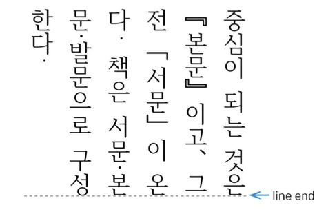
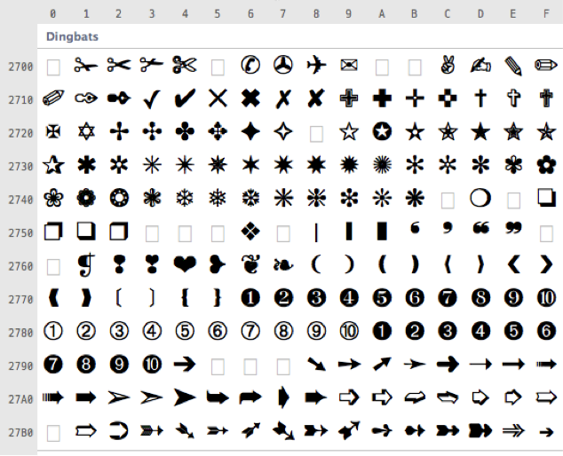
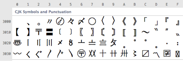
Figure 2-2: Letter face position in the character frame
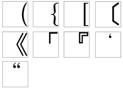
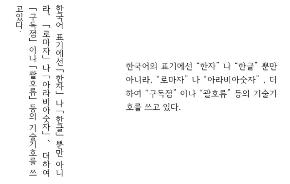
In horizontal writing, the letter face of a full width opening parenthesis is placed on the right end of the character frame, and the left space is considered as a user control controlled area. In vertical writing, the letter face of a full width opening parenthesis is placed on the bottom end of character frame, and the space is considered as a user control controlled area.
Figure 2-3: Full-width opening parenthesis·quotation parentheses and quotation marks position in positioned in the character frame ({[〔《「『 ' " (u+FF08, u+FF5B, u+FF3B, u+3014, u+300A, u+300C, u+300E, u+ (U+FF08, U+FF5B, U+FF3B, U+3014, U+300A, U+300C, U+300E, U+ 02BB, u+201C) U+201C)
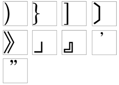
In horizontal writing, the letter face of a full width closing parenthesis is placed on the left end of the character frame, and the space is considered a user control controlled area. In vertical writing, the letter face of a full width closing parenthesis is placed on the top end of the character frame, and the space is considered as a user control controlled area.
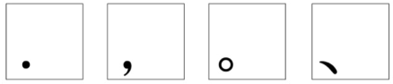
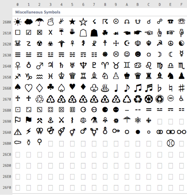
Figure 2-4: Full-width closing parenthesis·quotation parentheses and quotation marks position in positioned in the character frame )}]〕》」』' " (u+FF09, u+FF5D, u+FF3D, u+3015, u+300B, u+300D, u+300F, u+02BC, u+201D) (U+FF09, U+FF5D, U+FF3D, U+3015, U+300B, U+300D, U+300F, U+02BC, U+201D)
The letter face of punctuation mark marks is placed on at the left end of the character frame. The insert: <del> left insert: </del> insert: <ins> remaining insert: </ins> space is available for use as a controllable margin by the font user.
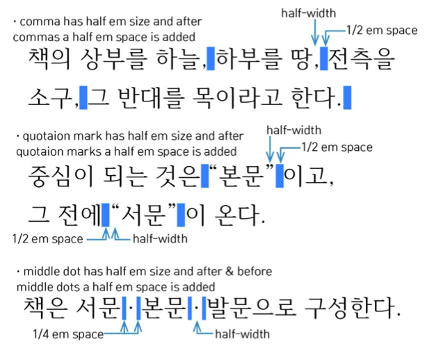
Figure 2-5: Punctuation marks position in positioned in the character frame . , 。、(u+002E, u+002C, u+3002, u+3001) 。、(U+002E, U+002C, U+3002, U+3001)
It is Other glyphs are designed with either proportional width or fixed width.
This is a typographic option for adjusting the kerning between all characters or character classes used in a Hangul environment. insert: <span class="ed"> [Ednote: Is there some content missing that should come after the definition, or is this sentence meaning to say that Hangul characters do kerning?] insert: </span>
Typographic options consist of include the control for of characters and the control for of paragraphs. In this chapter, the font itself and options in the system for controlling the font are described.
Characters·symbols Characters or symbols with same characteristics in the typographic environment are classified, then writing options are applied for each character classes. class.
In a Hangul environment, characters and symbols are classified by typographic characteristics, into 32 classes.
Characters like Hangul, Hanja, or Kana have 0 zero space between characters as a by default. Additionally, there are inter-character space settings like narrower writing, wider writing, such as narrower, wider, or insert: <ins> equal on insert: </ins> each side setting side.
Mixed writing is a Hangul sentence with Roman alphabet, number, Latin alphabetic characters, numbers, or symbols inside.
Hangul syllables, proportional width basic Latin, and fixed width or proportional width Arabic numerals are used.
Figure 3-1: Example of horizontal mixed writing
Hangul syllables, proportional width basic Latin, and fixed width or proportional width Arabic numerals are used.
Each Roman Latin character is placed vertically vertically.
Figure 3-2: Example of vertical Roman Latin in mixed writing delete: </p> delete: </div> delete: </li> delete: <li> delete: <p> Roman writing. insert: </p>
insert: </div>Latin characters are placed 90 degrees rotated.
Figure 3-3: Example of vertical Roman Latin rotated in mixed writing writing.
Partial horizontal writing in vertical writing; two digit two-digit numbers are rotated 90 degrees as a group, then align aligned by the center of a the line. Used mainly for two digit two-digit numbers.
Figure 3-4: Example of partial horizontal writing in vertical writing writing.
Superscripts and subscripts are placed next to a base character. Superscripts and subscripts are used for SI unit, units, numeric·chemical formula, formulae, footnote numbers, etc. The space between the base character and superscript·subscript is 0 as a the superscript or subscript is zero by default.
Usually the size of superscript·subscript is the the superscript or subscript is 60~70% of the size of the base character.
Figure 3-5: Examples of superscript·subscript
Typographic options consist of character unit include the control option and paragraph unit of characters and the control option. of paragraphs. This issue describes the writing/layout/editing system settings that control the font, not the font itself.
There are horizontal and vertical writing in Hangul writing is written both horizontally and vertically.
Figure 4-1: Horizontal writing and vertical writing (arrow indicates the text direction)
In cases of vertical writing:
Characters go on progress from top to bottom, and lines go on progress from right to left.
Columns go on progress from top to bottom, pages go on progress from right to left, and pages are turned from left to right.
Figure 4-2: Character direction in vertical writing writing.
In cases of horizontal writing:
Characters go on progress from left to right, and lines go on progress from top to bottom.
Columns go on progress from left to right, and pages go on progress from left to right, and pages are turned from right to left.
Figure 4-3: Character direction in horizontal writing writing.
Regular direction is used in horizontal writing, and there are three arrangement modes ways of arranging text in vertical writing.
Each character is arranged in the same direction as the Hangul characters.
Figure 4-4: Character arrangement in vertical writing – normal arrangement arrangement.
Characters are arranged in rotated 90 degrees rotated, degrees, mainly for Roman Latin alphabet words.
Figure 4-5: Character arrangement in vertical writing – 90-degree-rotation arrangement 90-degree-rotation.
Arrangement is the same as Hangul characters. Two digit numbers are rotated 90 degrees as a group, then aligned by the center of a line.
Figure 4-6: Character arrangement in vertical writing – composed character arrangement arrangement.
Captions or titles of tables, figures, etc. are rotated clockwise or counter-clockwise.
Figure 4-7: 90 degree rotated table and table caption in vertical writing writing.
In vertical writing, the caption top of tables, figures, etc. is positioned to the right side of the page. If the caption is in a horizontal direction, the caption top is positioned to the top side of the page.
Figure 4-8: Example of a figure using the top side of the page in vertical writing writing.
In horizontal writing, the caption top of tables, figures, etc. is positioned to the left side of the page. If the caption is in a horizontal direction, the caption top is positioned to the top side of the page.
Figure 4-9: 90-degree-rotated table and table caption in horizontal writing writing.
Line adjustment; it is possible to do line adjustment regardless of columns in multi-column layout.
Vertical writing, align vertical lines in each columns. column.
Figure 4-10: Example of line adjustment in vertical writing
Horizontal writing, align horizontal lines in each columns. column.
Figure 4-11: Example of line adjustment in horizontal writing writing.
Indentation, by emptying the beginning of a line when a new paragraph starts, is applied so that the division of paragraph into paragraphs is shown clearly. For the unit of indentations, the The value of the character width in the specific paragraph is used as a default. the default unit for indentation.
Line head indentations on every paragraph. The most common writing mode.
Figure 4-12: Indentation on the first lines in horizontal writing writing.
No indentation on all paragraphs. More suitable for horizontal writing where the length of lines is relatively shorter shorter, relatively, than vertical writing.
Figure 4-13: No indentation on all lines in horizontal writing writing.
Indentation is on the first line of every paragraph, but not applied to the first paragraph of a page or the paragraph right after a title.
Figure 4-14: No indentation on the first line in horizontal writing.
Indentation is applied to all lines beside besides the first line of a paragraph for bulleted list, numbered list, etc.
Inward paragraph indentation is a writing placed inside of the page body by the a certain number of characters, and outward paragraph indentation is a writing placed outside of the page body body.
Figure 4-15: Inward and outward paragraph indentation in horizontal writing.
Line alignment means aligning a line to the position of a certain character.
Center Alignment: apply 0 zero or a specified value to the space between adjacent characters, and equally apply the same amount of space at both sides of the line. Align to the center of the line.
Line Head Alignment (left side alignment in horizontal writing): apply 0 zero or a specified value to the space between adjacent characters, and align to the line head. If the number of characters in the last line is not enough to be a full line, fill from the line head and empty the line end.
Line End Alignment (right side alignment in horizontal writing): apply 0 zero or a specified value to the space between adjacent characters, and align to the line end. If the number of characters in the last line is not enough to be a full line, fill from the line end and empty the line head.
Even Space Alignment: apply 0 zero or a specified value to the space between adjacent characters, and align by the line head and the line end. If the number of characters in the last line is not enough to be a full line, fill from the line head and empty the line end.
Even Space Alignment with Forced End: apply 0 zero or a specified value to the space between adjacent characters, then align by the line head and the line end. If the number of characters in the last line is not enough to be a full line, fill from the line head to the line end by force-adjusting the space between characters.
Figure 4-16: Paragraph Line Alignment.
This is a process to avoid a situation when the number of characters in the last line of a paragraph is lower than the recommended minimum number. This is also called as a the widow process.
Periods and commas.
Brackets, quotation marks.
Figure 4-17: Brackets and quotation marks in vertical and horizontal writing
Following The following settings are recommended for automatic space placement (up to 4.3.6).
Opening parentheses, closing parentheses, and middle dots are half-width as a by default, but a half-width space is inserted before/after if these punctuation marks are with full-width characters like Hangul, Hanja, or Kana.
Hangul opening parentheses (cl1) must have a half-width space inserted before.
Hangul closing parentheses (cl2) must have a half-width space inserted after.
Middle dots (cl7) must have quarter-width spaces inserted before and after.
Figure 4-18: Space inserting insertion principles for automatic space adjustment adjustment.
When an opening parenthesis is followed by an opening parenthesis, no space is added between them, and a half-width space is added in front of the first opening parenthesis.
When a closing parenthesis is followed by a closing parenthesis, no space is added between them, and a half-width space is added after the last closing parenthesis.
When a closing parenthesis is followed by a middle dot, a quarter-width space is added between them.
When a middle dot is followed by an opening parenthesis, a quarter-width space is added after the middle dot.
Figure 4-19: Space inserting principles for automatic space adjustment adjustment.
Lines cannot start with closing parenthesis (cl2), hyphen (cl5), dividing punctuation marks (cl6), middle dots (cl7), periods and commas (cl8~9), iteration marks (cl11), or prolonged sound marks (cl12).
Opening parenthesis (cl1) cannot be placed at the end of a line.
In cases of characters or symbols are in a sequence like following, there is no line break between them.
Between a sequence of triple dot ellipses (……) or double dot ellipses (‥‥).
In between Between a sequence of Arabic numerals.
Between prefix symbols (cl13) and Arabic or Hanja numerals numerals.
Between Arabic or Hanja numbers and suffix symbols (cl14).
Between a base character and a superscript·subscript. superscript or subscript.
Between strings of footnote numbers.
In cases like below during adjusting line, the following inter-character width cannot be expanded. expanded during line adjustment. This is done in order to group characters and symbols as one word.
All the cases mentioned in 4.3.6.
Before and after of Hangul opening parenthesis (cl2) and Hangul closing parenthesis (cl3).
Before and after of periods, commas (cl8~9) and middle dots (cl7).
Before and after of dividing punctuation marks (cl6).
Before and after of hyphens (cl5).
Line is Lines are expressed by information like such as line spacing or paragraph spacing.
There are four ways of approaches to line spacing: character size, fixed value, space, and minimum line spacing.
Figure 4-20: Certain percentage of the character size: 160% 160%.
'Line height' is applied by using a fixed value, using units like point (pt), millimeter (mm), centimeter (cm), pica (pi), pixel (px), character (ch), 'Geop' (gp), inch ("), etc.
Figure 4-21: Fixed value: 20pt 20pt.
'Fixed value interline space' is applied by only specifying a value for the space, using units like point (pt), millimeter (mm), centimeter (cm), pica (pi), pixel (px), character (ch), 'Geop' (gp), inch("), etc.
Figure 4-22: Specifying the space: 20pt 20pt.
'Minimum line height' is applied by specifying the minimum value for line spacing, using units like point (pt), millimeter (mm), centimeter (cm), pica (pi), pixel (px), character (ch), 'Geup' (gp), inch (˝), etc.
Figure 4-23: Minimum value: 20pt 20pt.
Line breaking is done by setting the basis rules for dividing the end of each line, and by adjusting the space between words in the line before.
Line Breaking Basis Rules in Hangul.
If a line ends in Hangul, line breaking is done on character or word basis. insert: <span class="ed"> [Ednote: What dictates the choice between character/word basis? Presumably you stick with one or the other for a whole document?] insert: </span>
Line Breaking Basis Rules in English.
If a line ends in English, line breaking is done on character basis or word basis, or by using a hyphen.
Minimum Space for Breaking Line.
By specifying a minimum value for inter-word spaces, inter-word spaces in a line can be reduced in order to keep the word at the end of the line from breaking into onto the next line.
Even space alignment is the default setting in Hangul writing. Lines are aligned in using even spaces if fixed-width Hangul characters are arranged without spaces, but in cases like those below, line adjustment (adjusting inter-character spaces) is applied to align any dislocated each line ends.
When proportional width glyphs like Roman alphabet, Roman Latin alphabet text, Latin alphabet punctuation marks, numerals, etc. are included (Hangul-Roman (Hangul-Latin mixed writing. writing).
When the character sizes in a line are different to each other.
When restrictions, or such as line breaking restriction restrictions, are applied
The position of a tab and the alignment method (tab type) are specified, then the tab code is entered before the character or the word in the specified position.
Adjustment mode (tab type) is specified at the tab position.
(Upper) left corner adjustment tab: in horizontal writing, the left end of characters/words is aligned to the tab position, and in vertical writing, the top end is aligned.
Figure 4-24: Left tab tab.
(Bottom) right corner adjustment tab: in horizontal writing, the right end of characters/words is aligned to the tab position, and in vertical writing, the bottom end is aligned.
Figure 4-25: Right tab tab.
Center adjustment tab: the center of characters/words is aligned to the tab position.
Figure 4-26: Center tab tab.
Specific character adjustment tab: the front end of a specific character in characters/words is aligned to the tab position.
Figure 4-27: Specific character tab tab.
Note A note is used for presenting supplementary information about the main content, or presenting the source of cited information.
When footnotes are used in multi-column, there are three processing modes.
Showing footnotes at the bottom of the column with the corresponding text text.
Figure 5-1: Bottom of the corresponding column
Showing footnote as footnotes in a single-column, aligned to the page width width.
Figure 5-2: Page width single-column single-column.
Showing all the footnotes on in a column on the right side.
Figure 5-3: Right side column
The position of footnotes can be specified when the page is not full.
Placing the footnote right above the specified footer area. If the footnote is increased, it goes toward the main text and the main text area is decreased.
Figure 5-4: Decreased main text area when the footnote content is changed (Cases of single changed. (Single column and multi-columns) multi-column cases.)
Placing the footnote right below the main text If the main text content is increased, the footnote content goes downward
Figure 5-5: Moved footnote content when main text content is changed (Cases of single changed. (Single column and multi-columns) multi-column cases.)
Numbers used in footnotes and endnotes are use many types of symbols and characters, such as Arabic numerals, alphabet, Latin alphabet characters, Hangul characters, Hanja characters, etc.
Figure 5-6: Examples of footnote/endnote number number.
In order to divide the note and the main text, a dividing line or a space is inserted. Spaces are added on the above and the below of the dividing line, and spaces between each notes note are specified.
Figure 5-7: Example of dividing the main text and the note with a dividing line.
Note A note has many different positions due to the characteristics of footnote and endnote. footnotes and endnotes.
Footnote Position
Footnote A footnote can be presented at the below of the annotated main text, right above the footer of the page including the annotated main text (refer to the figure in 5.1.2.).
Endnote Position
Endnote is Endnotes can be presented all together at the end of the document, document. If the document is separated into many chapters and each chapter needs different endnotes presented, endnote endnotes can be gathered at a specified location.
Note Restrictions
Notes can be used in any part of the text body including paragraphs with tables or boxes, but cannot be used in footers or headers.
Page numbers can be presented in many forms, and it can also can be located on any sides of side of the corresponding page.
Page numbers can be at 10 different positions as below. follows. The appearance of numbers can also be different in many ways, sometimes used with a dash ('-') on each sides. side.
Figure 5-8: Positions for page numbers
Elements beside paragraph paragraphs (objects) are processed the same as characters, or as objects.
Object The object is positioned in a certain location between characters, and the size affect affects the line spacing spacing.
Figure 5-9: Processing as a character character.
Figure 5-10: Processing as an object object.
Objects have 4 processing modes, as below.
Text Wrap mode
Figure 5-11: Text wrap mode mode.
Top and Bottom mode
Figure 5-12: Top and bottom mode mode.
Behind text mode
The object is placed like a background.
Figure 5-13: Behind text mode mode.
Front of text mode
The object is placed on top of the text, covering it.
Figure 5-14: Front of text mode mode.
The object's placement in text and vertical/horizontal position is changed, depending on where the basis base is.
Paragraph basis base position
The vertical and horizontal position is calculated on from the paragraph basis. base.
Column basis base position
The horizontal position is calculated on from the column basis. base.
Page basis base position
The vertical and horizontal position is calculated on from the page basis. base.
Sheet basis base position
The vertical and horizontal position is calculated on from the sheet basis. base.
Basis Figure 5-15: Base for positioning elements beside paragraph paragraph.
When objects are set to 'text wrap' or 'top and bottom' modes, objects do not overlap as a default. However such objects can be overlap by using an 'overlap' setting.
Figure 5-16: Objects overlapping overlapping.
The outer margin of elements beside a paragraph means the space between the object and the paragraph elements around it. If an outer margin is set for an object, the caption for the object starts from the original object area, not the outer margin area.
Left: A space between the text and the left side of the object.
Right: A space between the text and the right side of the object.
Top: A space between the text and the upper side of the object.
Bottom: A space between the text and the lower side of the object.
Figure 5-17: Example of setting the outer margin to 5mm 5mm.
Numbers, titles, or simple descriptions can be added to the elements beside paragraph, paragraphs, if needed. Such titles added to objects are called captions.
Captions are positioned outside of objects' an object's outline, as below.
Figure 5-18: Caption positioning modes modes.
The space between caption and object can be adjusted. If the caption is on the right/left side of the object, the size for the title area is specified.
Figure 5-19: Examples of specifying caption spacing spacing.
Captions are entered in a line, or expanded to the margin of the corresponding object.
Figure 5-20: Caption presentation mode mode.
Objects can have borders in with various types of line line.
Left: A space between the text and the left side of the object.
Right: A space between the text and the right side of the object.
Top: A space between the text and the upper side of the object.
Bottom: A space between the text and the lower side of the object.
Figure 5-21: Example of assigning line type type.
Tables are composed of cells, and each cell can be configured into various forms like as shown below.
Example Figure 5-22: Examples of table composition composition.
Cells can be selected individually and have various settings settings.
Font and paragraph format of the cell
Border and background style
Merging and dividing cells
Size and margin adjusting
Space between cells
Figure 5-23: Example of spacing between cells cells.
If inner padding space is applied to both table and cell, the value is applied to the cell prior to that of the table. The size of table does not change even if the value of inner padding is high.
Figure 5-24: Diagonal lines in a cell of a table table.
Figure 5-25: Diagonal lines in through multiple cells cells.
The background of table and cell can be color, gradation, or background images.
Figure 5-25: Example of background in tables tables.
The Hangul text layout system is approached in from two perspectives: overall page layout design and page body design.
Page size (size of selected page·screen), page direction or screen), page direction.
Text direction (horizontal/vertical writing) writing).
Page body (the area excluding top/bottom/left/right margin from the page size) size).
Running head and page numbers numbers.
Figure 6-1: Running head and page numbers (left to right) right).
Figure 6-2: Running head and page numbers (right to left) left).
In the case of pages in books, the elements are as below:
Size and name of fonts.
Writing direction (vertical/horizontal).
Number and spacing of columns columns.
Width of line (text box width=page body width).
Number of lines per page (per columns in multi-column format).
Line height value.
Figure 6-3: Example of page body body.
It is noted Note that the position of the page body is linked to the margin values. The following are examples of positioning and setting size of page body.
Vertical position: center of page, Horizontal position: center of page.
Vertical position: upper or lower margin specified, Horizontal position: center of page.
Vertical position: upper or lower margin specified: Horizontal position: inner margin specified.
Figure 6-4: Position based on margins margins.
Running heads and page numbers are placed outside of the page body, and typical positions are like as shown below.
Figure 6-5: Running head positions positions.
Figure 6-6: Page number positions positions.
Following The following punctuation marks are used in Hangul environment.
Basic Latin (u+0020~u+007F): Roman (U+0020~U+007F): Latin alphabet and numerals
General Punctuation (u+2010~) (U+2010~)
Superscripts and Subscripts (u+2070~) (U+2070~)
Currency Symbols (u+20A0~) (U+20A0~)
Letterlike Symbols (u+2100~) (U+2100~)
Number Forms (u+2050~) (U+2050~)
Arrows (u+2190~) (U+2190~)
Mathematical Operators (u+2200~) (U+2200~)
Enclosed Alphanumerics (u+2460~) (U+2460~)
Box Drawing (u+2500~) (U+2500~)
Block Elements (u+2580~) (U+2580~)
Geometric Shapes (u+25A0~) (U+25A0~)
Miscellaneous Symbols (u+2600~) (U+2600~)
Dingbats (u+2700~) (U+2700~)
CJK Symbols and Punctuation (u+3000~) (U+3000~)
Hangul Compatibility Jamo (u+3130~) (U+3130~)
Enclosed CJK Letters and Months (u+3200~) (U+3200~)
Hangul Jamo Extended-A (u+A960~) (U+A960~)
Hangul Syllables (u+AC00~u+D7A3) (U+AC00~U+D7A3)
Hangul Jamo Extended-B (u+D7B0~) (U+D7B0~)
CJK Compatibility Ideographs (u+F900~) (U+F900~)
CJK Compatibility Forms (u+FE30~FE48) (U+FE30~FE48)
ISO/IEC 10646-1:1993. Information technology -- Universal Multiple-Octet Coded Character Set (UCS) -- Part 1: Architecture and Basic Multilingual Plane
W3C Working Group Note. 2009. "Requirements for Japanese Text Layout" 1st ed., http://www.w3.org/TR/2009/NOTE-jlreq-20090604/
Korea Font Development Center. 2000. Korean Font Dictionary, King Sejong Memorial Foundation.
Sang-Soo Ahn, Jae-Joon Han, and Yong-Je Lee. 2009. Hangeul Design Textbook. Ahn Graphics.
S. J. Song. 2008. Book design textbook. Ahn Graphics. (translated from Andrew Haslam. 2006. Book design. Laurence King Publishing.)
Adobe Systems. 2010. User Guide. Using Adobe® InDesign® CS5 for Windows® and Mac OS. Adobe Systems.
This is the first publication of this document as a Working Group Note. Draft.
This document has been developed with contributions from participants of Korean standardization committee members and Korean Society of Typography. The project to develop this document was supported by Korea's Standard Infrastructure Enhancement Program from KATS (Korean Agency for Technology and Standards).