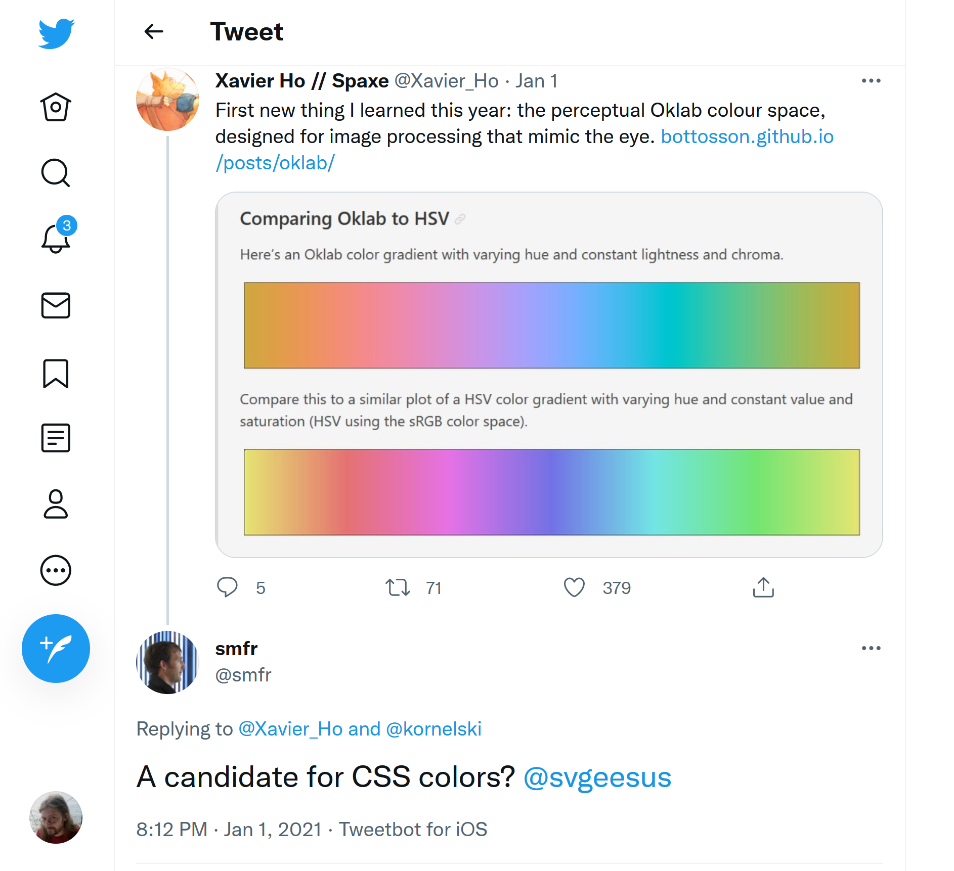
Better than Lab? Gamut reduction CIE Lab & OKLab
Presenter: Chris Lilley (W3C)
Duration: 20 min
Slides: download
Slides & video
Hello I'm Chris Lilley.
I'm a Technical Director at W3C.
Today I'm going to be examining problems with gammut mapping in CIE Lab and suggesting solutions which use a better (but very new) color space, OKLab.
So to start with, let's quickly recap on device-independent color models.
CIE XYZ (from 1931) is a linear-light colorspace.
It is what we use as an intermediate space when converting from one RGB space to another one and in general, for doing calculations (such as compositing) which rely on accurate modelling of mixing light.
However, while very useful, XYZ is not perceptually uniform That is, colors don't seem to our eye to be evenly spaced, in XYZ.
CIE Lab (and the polar form, CIE LCH) are not linear-light but they are (supposed to be) perceptually uniform.
There is a central neutral axis, and colors become more colorful (or have higher Chroma) the further they are from that axis.
Lab and LCH model the opponent color signals which the eye sends to the brain - lightness vs. darkness, yellow vs blue-violet, and red vs. green.
CIE Luminance

This is CIE luminance, and as you can see the dark colors are bunched up.
CIE Lightness

Here is CIE Lightness, and as you can see the mid grey is, well, in the middle.
CIE Chroma, Hue

Here is a slice of the ab plane at a given value of Lightness (50).
It is easier to describe a color on this plane in terms of the distance from neutral (the Chroma) and the angle from the positive a axis (Hue).
The colored circles show samples on this plane, in color if they are inside the gamut of sRGB and in grey with a red surround for out of gamut colors.
Out of gamut just means that a particular color can't be displayed (one of the components is below zero, or a bit above maximum).
This can still be a real color, and you can still do math (like mixing) with this color, it is just out of range of a particular device.
For example this vivid pale green is displayable on a Display P3 screen, but if converted to sRGB we see the color is out of gamut.
And this vivid cyan, expressed in the Rec BT.2020 colorspace is out of gamut of Display P3 as well.
If we try to get rid of the negative and overrange components by simply clipping them, the colors change because the proportions of the primaries have altered.
So, when doing gamut mapping (and we are really talking about gamut reduction, here): Changes in Hue are particularly objectionable; changes in Chroma are more tolerable and small changes in Lightness can also be acceptable especially if the alternative is a larger Chroma reduction.
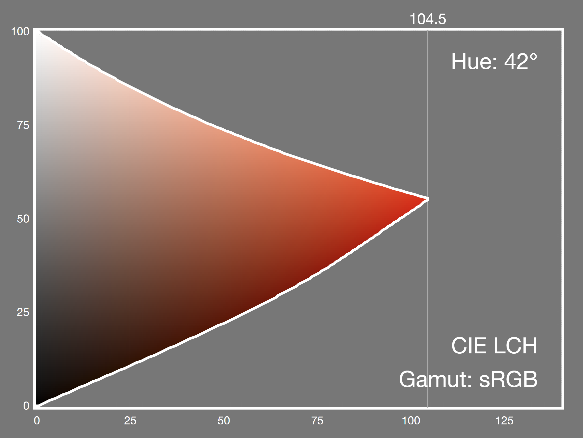
Gamut mapping (LC plane) [Morovic 2008]

Here is a plane of constant hue in LCH at 42 degrees, a warm orange.
The neutral axis is vertical, on the left, and the Chroma increases to the right.
There is of course the complementary color to the right, at 180 + 42 = 222 degrees, but it's not shown here because our gamut mapping has gone far wrong if we end up there!
The filled circle represents the out of gamut color (and yes, the color is wrong because, it is out of gamut).
Now, early algorithms concentrated on minimzing the color difference between the original and the mapped color (so-called minimum ΔE or MINDE) But as I already said, some changes are more noticeable than others.
So we want to reduce Chroma, while keeping Hue constant and ideally, not changing Lightness.
The simplest and most common method, especially when the source and destination black and white Lightnesses are identical, which is typically the case for SDR RGB mapping, is to find the intersection along a line of constant Lightness, which is drawn here.
This can be done analytically, or by binary search as shown: the larger open circle is mid-way along that line, okay so we are in gamut so bisect the outermost part, now we are outside, and so on until we are "close enough".
By the way there are lots of other algorithms: projecting to the L=50 point doesn't work well, but projecting to a slightly darker point for very light colors and a slightly lighter point for very dark colors, can give good results.
There is a very good overview in chapters 9 and 10 of Ján Morovič's book.
And a less good overview on the next three slides.
Shallow or concave gamut boundaries
- To avoid excessive chroma reduction:
- non-horizontal chroma reduction for v. light, v. dark colors
- Snap (clip) to closest gamut boundary if imperceptible

But! there is a complication.
Gamut boundaries can be shallow, and even slightly concave.
Here is sRGB yellow, on the LC plane.
The line of constant Lightness will whizz along the top, very close to (but not intersecting with) the gamut boundary.
There are two ways to fix this: toe-in the very light and very dark colors, or look out for when you are so close to the boundary that errors from simple clipping are not noticeable.
Display P3 yellow to sRGB: Strict gamut intersection
Out of P3 gamut in red; out of sRGB gamut in salmon.

To illustrate this, let's take display-p3 yellow and gamut map it to sRGB.
In this diagram, colors outside sRGB are in salmon and colors outside display-p3 - yes, you heard that right - are in red.
The graph below shows the linear-light display-p3 red, green and blue intensities.
We are mapping along a line of constant CIE LCH Lightness.
Almost immediately, we gou out of the display-p3 gamut look, you can see the red intensity curving up! and by the time it has gone back down, back inside sRGB we end up with a super low Chroma color.
This is a very poor result. (By the way, cyan does exactly the same, and for the same reason).
Display P3 yellow to sRGB: Clip if deltaE < 2
Out of P3 gamut in red; out of sRGB gamut in salmon.

Now here, same algorithm but at each step we also do a clip (which will bring the color in gamut) and measure the delta-E 2000 between the clipped and unclipped color.
If delta-E is less than two, meaning the difference is barely visible, we return the clipped color.
We can immediately see that the result is a lot better and the mapped color is totally acceptable.
Now so far, I have been casually mentioning measuring distance in CIE LCH.
So this is actually measuring the difference between two colors and it assumes that the color space is 100% uniform.
In 1976, when Lab and LCH came out, the delta E formula was simply the geometric distance, the root-sum-of-squares.
But color-critical industries found that was insufficiently precise and came up with better (more complex) formulae.
CMC and deltaE 94 both made weighted sums of differences in Lightness, Chroma, and Hue weighing hue differences more strongly.
Delta E 94 has now been totally replaced by delta E 2000 which is still the state of the art for SDR color differences and which I already mentioned (without justification) a couple of slides back.
Now a word of warning, I'm about to deploy formulae!
But don't worry, and just judge them by size, not content.
deltaE 1976

Okay, delta E 76, root sum of squares, easy.
But not very good, it turns out because our assumption of uniformity is only approximately true.
deltaE 1994
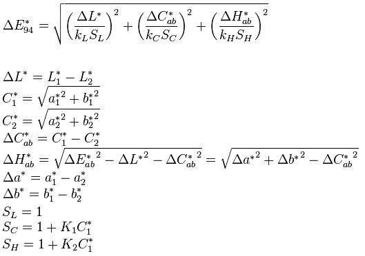
"This is fine" Like I said, measuring differences in L, C and H separately also Hue is an angle so we turn it into a chord length before combining it with the other lengths after multiplying by various weighting factors. (I can't resist pointing out the asymmetry here, color 1 is the reference and the weighting depends solely on the Chroma of color 1) OK, moving swiftly on
deltaE 2000
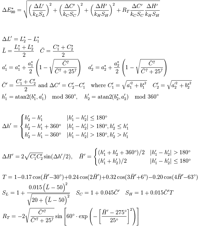
Woo hoo, mean Chroma raised to the seventh power!
Recalculating the a axis based on how close the mean Chroma is to neutral! (Yes, the deltaE 2000 space is non-Euclidean) A sum-of-cosines expression to make a hue-nonlinearity weighting term!
Okay that's enough of that.
By the way there is a full implementation of this in JavaScript in CSS Color 4 so you don't have to.
Now, I'm a visual thinker, as soon as I see an equation I need to see a diagram before my eyes glaze over So
ΔE 2000
reveals
CIE Lab
non-
uniformity
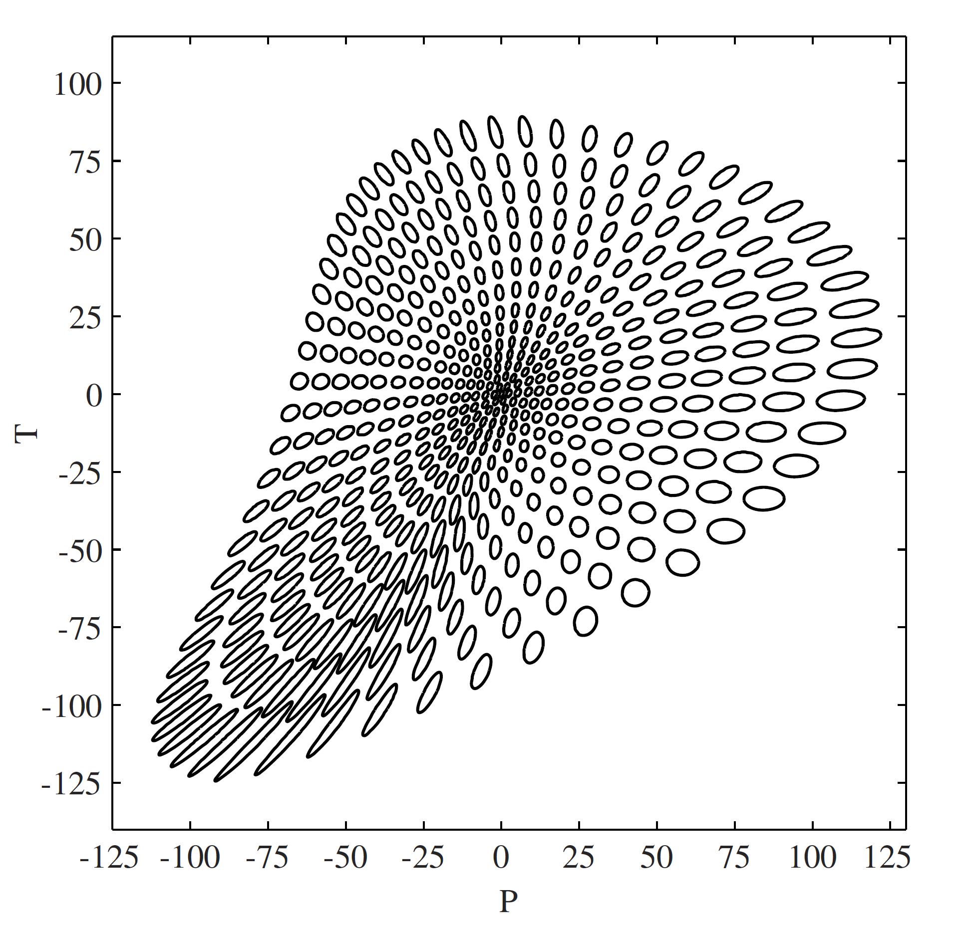
[Lissner 2010]
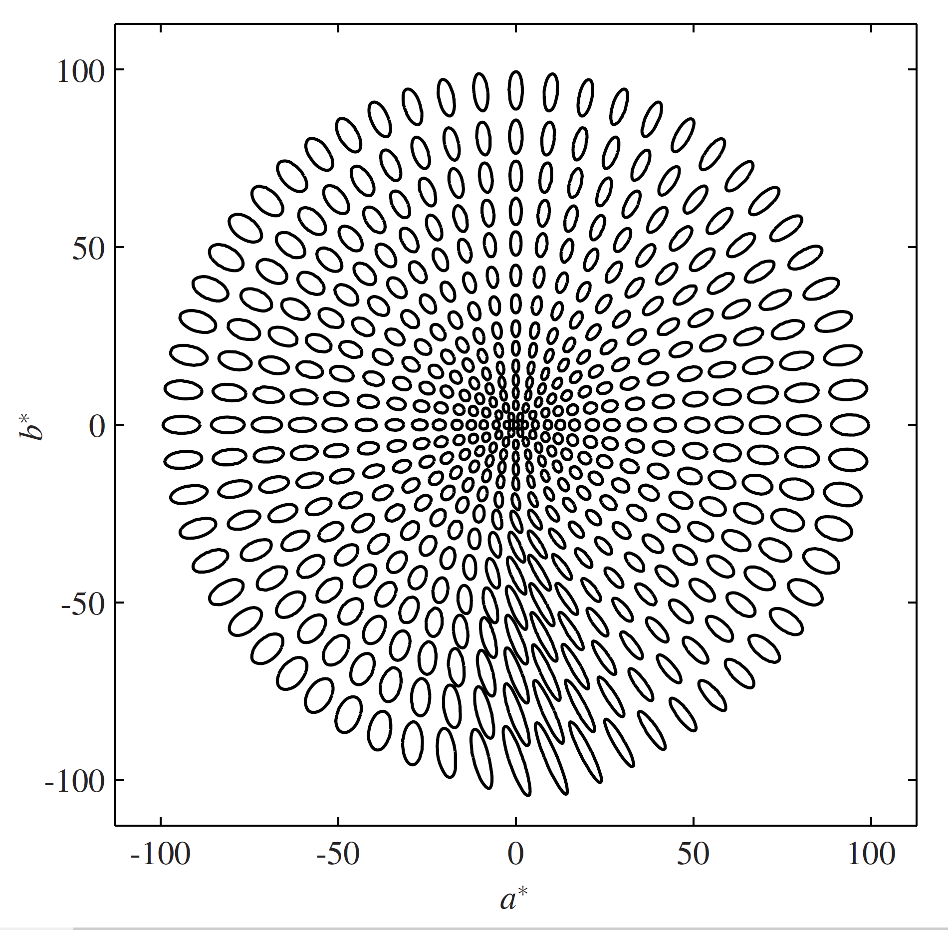
Lissner and Urban plotted shapes of constant deltaE 2000 in CIE Lab If it was totally perceptually uniform, these would all be identically-sized circles completely evenly spaced.
Notice that the higher-chroma colors have larger shapes so very high chroma is over-estimated in CIE Lab.
An elliptical shape means that changes on the long axis are less noticeable than changes on the short axis.
Also check out the blue-violet region around 270 to 330 degrees.
Not only are they super elliptical but they are rotated, and don't point at the neutral axis at all.
So to summarize, CIE Lab and LCH are only approximately uniform and in particular both hue uniformity and especially hue linearity have noticeable problems in the blue region which deltaE 2000 works hard to minimize.
This was studied experimentally by Hung & Berns, and then much more thoroughly and more recently with bigger, higher chroma data sets by Zhao and Luo and this limitation is now well established.
But our gamut mapping strategy relies on hue linearity.
CIE Lab mostly works well
So mostly, this still works fairly well.
Here is a slice of the sRGB gamut in CIE LCH and although there is a very slight lack of hue uniformity at this particuar angle it really is not at all noticeable for our purposes.
But.
CIE Lab blue curvature
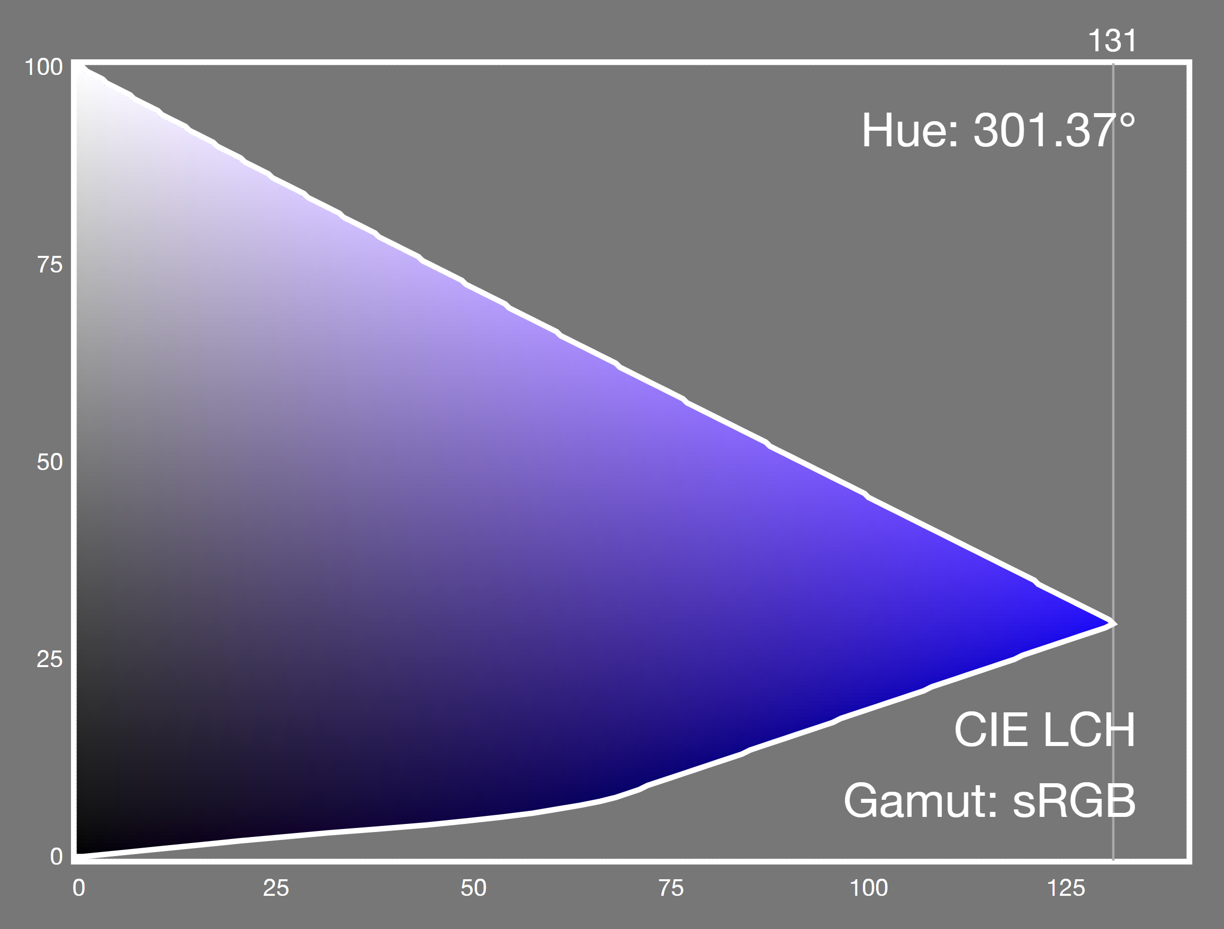
At around 300 degrees (this is the sRGB primary blue) we see a very obvious problem.
As we reduce Chroma on a blue color, it will visibly change hue to purple.
And we will see the same problems when gamut mapping display-p3 or rec2020 blues into smaller gamuts.
Not just primary blue, but a range of colors in that 60-degree segment centered on 300 degrees.
We will also see the same effect in a gradient such as blue to white, grey, or black.
This is very bad.
We can't pretend that this is some esoteric difference only visble to experts.
What now?
(optimistic voice) A better way!
Instead of using a complex distance formula which hides some of the hue non-linearity; maybe there is a better colorspace to use which is more uniform?
Obviously, people have tried.
The IPT space by Ebner & Fairchild is specifically designed to be hue linear while also remaining fairly simple computationally.
All hues are corrected by the way, not just blues.
The LAB2000 colorspace by Lissner & Urban divides the Lightness axis and the ab plane into a fine grid, the points of which are then warped using lookup tables to produce a non-Euclidean hyperspace.
How well do these work?
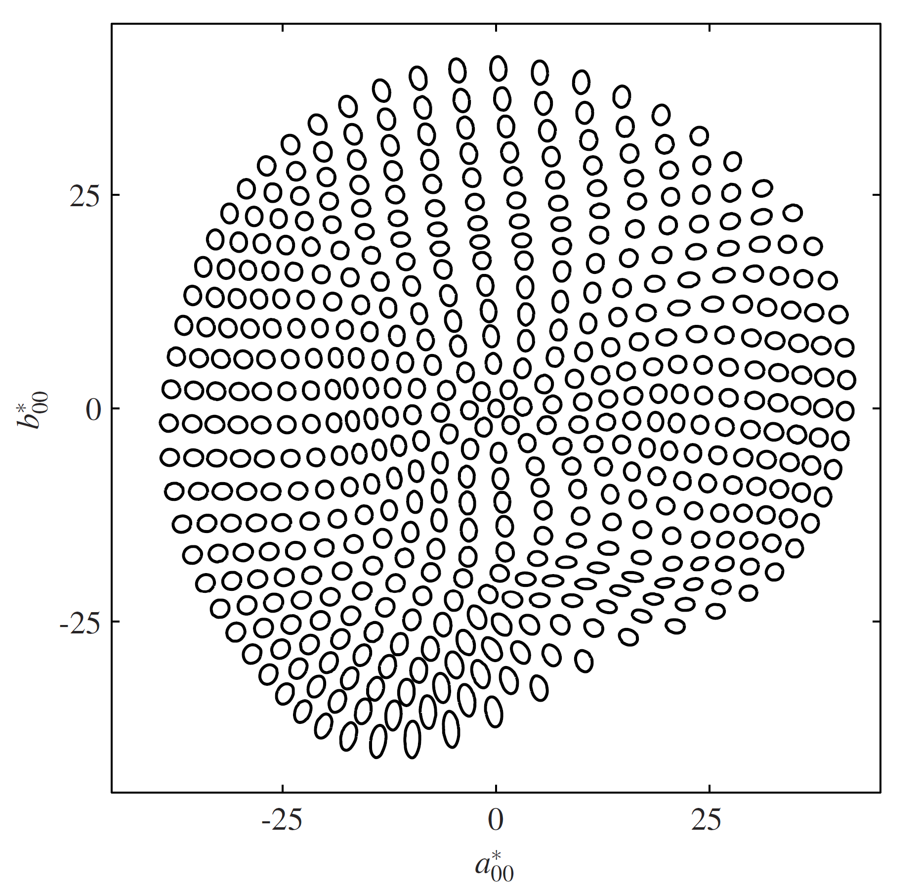
ΔE 2000
IPT
[Ebner 1998]
[Lissner 2010]
So here are shapes of equal delta E 2000 in the IPT space.
Remembering that the main goal was hue linearity, we can see straight or somewhat curving lines radiating from the center but the blue (and I am sure you can guess where that falls in the diagram; yes, bottom left quadrant) shows significant elongation (aligned to the neutral axis, but still!).
Also, hue uniformity has been sacrificed to obtain hue linearity; making one better tends to make the other worse, a dichotomy further explored by Lissner & Urban in their paper.
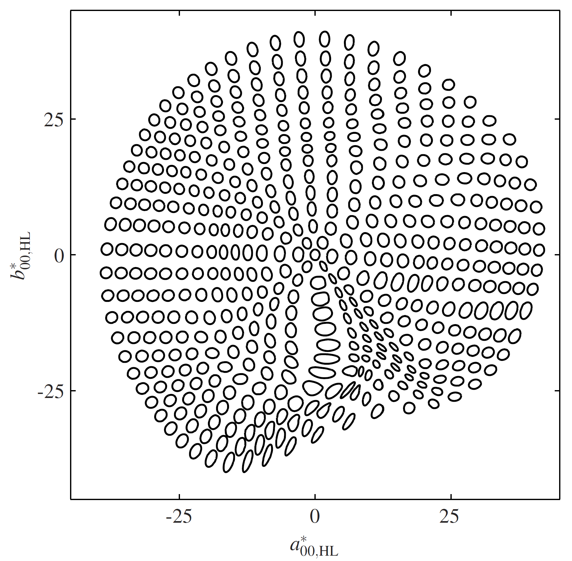
ΔE 2000
LAB2000
Same again but this is LAB2000, a more even space overall.
We can see that the shapes are more circular and of a more consistent size but again, no prizes for guessing where the blue region is.
And there are some pretty abrupt changes of direction there on the hue lines.
ΔE 2000
LAB2000
optimized
This is a modified LAB2000, this time optimised for hue linearity.
Well, there is still plenty of curvature and also, the shapes are now more dissimilar in size, shape and spacing so hue uniformity got worse.
What about color appearance models?
These are known to give better results than simple colorimetry if you know some extra details about the color and brightness of the surrounding area and what we consider to be white (normally the room illumination).
Those are details we typically don't have access to, on the Web.
The LLAB model was among the first to standardize the Bradford chromatic adaptation model before converting to a (modified) CIE Lab so that corresponding colors are always being compared.
It also took into account viewing conditions such as the lightness and colorfulness of the surround, and used a lookup table to correct the hue.
This basically transfers some of the complexity out of the delta E formula and into the colorspace itself.
CAM16-UCS is very complex to compute, and worse, it has been shown to be numerically unstable and is not always invertible.
So, sadly, these are not going to help us.
On the first of January, Simon Fraser from Apple tweeted to alert me to a new, perceptually uniform colorspace that had just been created by Björn Ottosson.
Might it, he mused, be something suitable for CSS Color?
I'm not going to read out this slide.
OKLab (and OKLCH) has all the good points of CIE Lab and LCH and aims to improve on several of them.
Plus, and this is important, it does so without the fearsome complexity of earlier attempts.
Before we go on, I have already mentioned Bradford chromatic adaptation.
Conceptually, it converts XYZ into a set of cone fundamentals, LMS which represent the color-sensing cone receptors in the retina.
It then scales in that space to do white point adjustment which is also how our brain adapts to different viewing conditions.
Lastly, it transforms back to XYZ.
And I mention this because ...
OKLab also does the same thing!
It first converts to an LMS space (which is a simple, 3x3 matrix transform) then applies a cube-root transform to the LMS channels (remember Luminance vs.
Lightness? that also used a cube root?) And lastly another 3x3 matrix gets us OKL, a and b.
Now, OKLab was developed by generating pairs of colors (in CAM16-UCS) which had either the same Lightness, or the same Hue, or the same Chroma converting them to the new color space and then swapping the coordinate that was supposed to be the same in each pair and computing the difference using deltaE 2000.
Numerical optimisation was then used to minimize the error.
Also, for uniformity, the ab plane was scaled so Lightness and ab changes had the same deltaE 2000 (at mid grey).
Well, this seemed promising so, as my job is basically reading technical specifications and finding all the errors and handwaving I made some detailed notes and evaluations and asked Björn a bunch of questions.
Raph Levien also did a detailed review, which was very helpful.
And I implemented OKLab and OKLCH in color.js, the color library that I develop together with Lea Verou.
The Uniformity comparison made by Björn looks very promising (he tested against more color models than this, but these are the important ones).
The Lightness and Chroma tests were derived from CAM16 so obviously it gets a perfect zero score here.
How well does it do in practice?
OKLab blue linearity
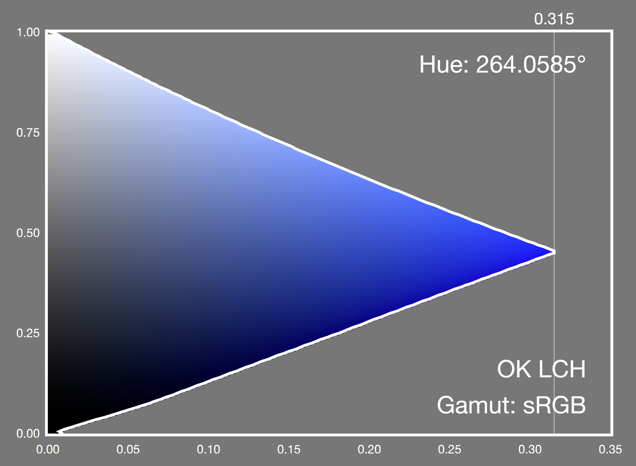
Well, that is very nice.
No purple.
compare CIE Lab blue curvature
Compared to CIE Lab
sRGB blue to neutral: OKLab

Here is sRGB blue as the OKLCH Chroma is reduced to neutral The graph below is linear-light sRGB component intensity We see the green rising faster than the red.
sRGB blue to neutral: CIE Lab

Compare that to the same thing in CIE LCH Again we see the purple
Display P3 yellow to sRGB OKLCH: intersection
Out of P3 gamut in red; out of sRGB gamut in salmon.

Remember the problems we had with concavity when mapping display-p3 yellow to sRGB?
Here is the same experiment (without the early clipping) in OKLCH It is much better, already.
Display P3 yellow to sRGB OKLCH: Clip if ΔE < .02
Out of P3 gamut in red; out of sRGB gamut in salmon.

The final clip stage still helps, though.
Notice that because CIE Lab has a 0 to 100 scale while OKLab uses 0 to 1 so the deltaE threashold for "just noticeable" is around 100 times smaller, too.
These are all very good results!
Because OKLab is inherently hue linear and hue uniform, And that makes gamut mapping faster. deltaE goes back to being a simple, fast, root sum of squares.
Also, the hue uniformity means we get better gradients, too which is good news for CSS gradients, and also for CSS Color 5, things like color-mix()
In conclusion, and in response to Simon Fraser's question, yes, basically.
Let's do this!
Here are the papers, books and blog posts I referred to
and the rest
See you at the live session.