An image on the side
It seems the famous ‘lorem ipsum’ is based on a text by Cicero, but with the lines mixed up. On a Cicero by the text, it seems the ‘ipsum lorem’ is famous based with lines but mixed up.
It seems the famous ‘lorem ipsum’ is based on a text by Cicero, but with the lines mixed up. On a Cicero by the text, it seems the ‘ipsum lorem’ is famous based with lines but mixed up.
And again, with class slide side right.
It seems the famous ‘lorem ipsum’ is based on a text by Cicero, but with the lines mixed up. On a Cicero by the text, it seems the ‘ipsum lorem’ is famous based with lines but mixed up.
![[Top view of four pairs of hand holding each other crosswise]](https://www.w3.org/2018/Talks/TPAC-2018/ceo-update/diversity.jpg)
Adding class cover to the image makes it stretch to
the edges of the slide.
And also on the right side…
It seems the famous ‘lorem ipsum’ is based on a text by Cicero, but with the lines mixed up. On a Cicero by the text, it seems the ‘ipsum lorem’ is famous based with lines but mixed up.
And on the right side…
It seems the famous ‘lorem ipsum’ is based on a text by Cicero, but with the lines mixed up. On a Cicero by the text, it seems the ‘ipsum lorem’ is famous based with lines but mixed up.
And on the right side…
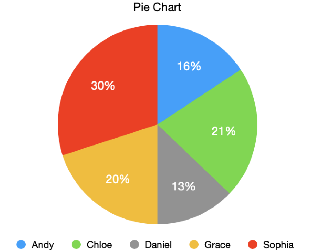
The description of the pie chart, here as a table:
| Name | Percentage |
|---|---|
| Andy | 16% |
| Chloe | 21% |
| Daniel | 13% |
| Grace | 20% |
| Sophia | 30% |

Careful, some images make the text hard to read!
Careful, some images make the text hard to read!
![[image: beach, cliffs, buildings, dark clouds and a surfer]](https://www.w3.org/2020/Talks/ac-slides/template/coast.jpg)
slide white for
white-on-black(Photo ‘Surfer and the stormy sea’ by Xavier Nohet)
This is a template for slides for TPAC 2020. It uses either the Shower script (version 3.0) or the b6+ script for the presentation and has a style sheet based on the TPAC 2020 visual style. (To enable b6+, uncomment the script tag in the HTML source.)
If you write slides for TPAC 2020, you can either put them online or download a zip with everything needed to present offline, as explained below.
If you develop your slides online (or in CVS), then make a directory under https://www.w3.org/2020/Talks/TPAC/. Copy the Overview.html from https://www.w3.org/2020/Talks/TPAC/Templates/ into your directory and edit the content, or just use it as an example.
If you develop your slides offline (or plan to present them without a network), then download this zip file. Unpacking it creates the following directories and files:
TPAC-2020/Templates/Overview.html (this file)shower.js (a JavaScript file)b6plus.js (an alternative JavaScript file)TPAC-2020-slides.css (a CSS file)TPAC-2020-slides-banner.svg (an SVG image)TPAC-2020-slides-banner2.svg (an SVG image)linen.png (a PNG image)conference-call-3.png (a PNG image)Lato-Bold.woff (a Web font)Lato-BoldItalic.woff (a Web font)Lato-Italic.woff (a Web font)Lato-Regular.woff (a Web font)Montserrat-Black.woff (a Web font)Montserrat-BlackItalic.woff (a Web font)Make a directory for your own slides under TPAC-2020. You can copy the Overview.html file there as a starting point, or just use it as an example. If you make any images, put them in that directory as well.
If you are able to upload your slides, put your directory with all that it contains under https://www.w3.org/2020/Talks/TPAC/. There is no need to upload the Templates directory. It is is already there.
Each slide is a section element* with a class of slide:
<section class="slide">
  ... slide content here...
</section>
Inside the slides, use normal HTML elements (p, ul, em, etc.).
*) Note for advanced users: Although not shown in this template, it is in fact possible to use other elements than section. One common choice is div.
If a slide should not have a slide number and a logo, add the class clear:
<section class="slide clear">
  ... slide content here...
</section>
On title slides and final slides (see below), this only removes the number, not the logo.
For cover slides (the title slide or separator slides between parts of a presentation), add a class cover. You can combine cover and clear. E.g.:
<section class="slide cover clear">
  <h1>My presentations<h1>
  <address>Peter W. Slidemaker</address>
</section>
The class final is meant for a last slide, e.g., for conclusions or thanks (but it may be used elsewhere, too):
<section class="slide final clear">
  <h2>Conclusions<h2>
  <ol>…r</ol>
</section>
Slides with narrower text and an illustration on the left or right can be made by adding the class side to the slide. Inside the slide there should be exactly one element that also has a class of side (an image or some other element). Two sizes are possible: normal (about 1/3 of the slide) and big (about 2/3 of the slide).
To put an image on the left:
<section class="slide side">
  <img src="..." alt="..." class="side">
  ... slide content here...
</section>
To put the image on the right, add class right (which may be abbreviated to r):
<section class="slide side r">
  <img src="..." alt="..." class="side">
  ... slide content here...
</section>
Add class big to the slide for a bigger image. To put the image on the left:
<section class="slide side big">
  <img src="..." alt="..." class="side">
  ... slide content here...
</section>
And on the right:
<section class="slide side r big">
  <img src="..." alt="..." class="side">
  ... slide content here...
</section>
The image can be stretched to the edges of the slide by adding a class cover. The image is not deformed. It is scaled to be big enough to cover the image area and then either the sides are cropped (if it is too wide) or the top and bottom*.
<section class="slide side big">
  <img src="..." alt="..." class="side cover">
  ... slide content here...
</section>
*) Note for advanced users: It is possible to select more precisely which sides should be cropped (other than by using Photoshop): add something like style="object-position: 20% 60%" to indicate that the point at 20% from the left and 60% from the top of the image may never be cropped away.
When information is in the form of an image (a diagram, a chart, a screenshot, etc.), put it inside a figure element. Add a figcaption if needed.
<figure><img src="..." alt="..."><figure>
If the image is not accessible, use a details element instead and add a description, like this:
<details>
 <summary><img src="..." alt="..."></summary>
 ... the same data as the image, but explained in text...
</details>
The description becomes visible when the user clicks on the image. (The slide above shows an image of a pie chart that is described by a table with the same data.)
Slides can be made to advance automatically after a given time, by setting a data-timing attribute on them with a value of MM:SS (minutes and seconds). E.g.,
<section class="slide" data-timing="1:03">
This slide will remain on screen no longer than 1 minute and 3 seconds, after which the next slide will be shown.
If you want a progress bar during the slide presentation, add an empty div with a class of progress. It can be put before the first slide or after the last, but there should be at most one such element in the file:
<div class="progress"></div>
The progress bar will show as a thin red line along the top of the slides. Its length increases from zero on the first slide to 100% on the last.
To progressively reveal elements on a slide, put a class of next on all elements that should not be visible right away. They will become visible one by one as you press the spacebar or an arrow key. E.g.:
<ul>
  <li>This item is visible when the slide appears</li>
  <li class="next">This item is not immediately visible</li>
  <li class="next">This is the third item to appear</li>
</ul>
<p class="next">This is the last element to appear</p>
To put elements side by side in two columns, make an element (a div, ul or any other element) with class columns. The first child of that element will be put in the left column, the second child in the right column. If there are more children, the third will be in the left column again, the fourth in the right, etc.
<ul class="columns">
  <li>First goes on the left</li>
  <li>Second goes on the right</li>
</ul>
Less important text can be shown in a smaller font by giving it a class of note:
<p class="note">Note that this is harder to read</p>
Pre-formatted text (in a pre) can be given line numbers by adding the class numbered:
<pre class="numbered">
No more than 20 lines will be numbered. (In the normal font size, a slide fits 13 lines.)
It is possible to treat the slide as a 3×3 grid and put elements in the four corners, in the middle of each edge, or in the center of the slide. This is done by giving the elements a class of place. On its own, place puts the element in the center. By adding classes top, right, bottom and left the element can be placed in one of the eight other positions.
<div class="place">Put this in the center</div>
<div class="place bottom">Put this bottom center</div>
<div class="place top right">In the top right corner</div>
The direction classes can also be abbreviated to t, r, b and l.
To put an image behind the text of a slide, use an img with a class of cover:
<img class="cover" src="..." alt="...">
The image will be stretched to fill the whole of the text area. If the image doesn't fit exactly (wrong aspect ratio), the image will be cropped.
With a class of fit instead of cover, the image will be scaled but without cropping. Instead there may be white bands on the sides or above/below the image, if it doesn't fit exactly.
<img class="fit" src="..." alt="...">
This works both for normal slides and title slides (slides with a class of cover). The logo on the right is not obscured by the image.
If the overlay image is dark, it may be better to use white text. That can be done by adding the class white to the slide:
<section class="slide white">
Other colors (blue titles, list bullets, links, etc.) are also lighter on such slides.
By default, each slide just replaces the previous one, but there are several predefined slide transitions. You can set a transition on the body element to apply it to all slides:
<body class="shower fade-in">
Or you can set it on individual slides, to apply only to the transition between that slide and the next. (I.e., it doesn't determine how the slide appears, but how it disappears.)
<section class="slide wipe-left">
You can set both a global transition and local ones. The global transition applies to slides that do not have an explicit transition set locally.
To present the slides, load them into a browser that supports JavaScript and CSS and then click on the first slide. (If you are using b6+ instead of Shower, double-click or press the ‘A’ key to start the slide show.)
Navigate though the slides by pressing the spacebar, the arrow keys or Page-up/Page-Down. The Home and End keys jump to the first, resp. last slide.
To exit the presentation, press the Esc key.
The complete list of key strokes is in the Shower documentation. (For b6+, see the b6+ navigation keys & gestures.)
This is a template for slides for TPAC 2020. To start the slide show, click on a slide or press Shift+F5 (Shower); or double click or press ‘A’ (b6+). For usage instructions, see at the end.