Warning:
This wiki has been archived and is now read-only.
Css3-background/impl
Contents
- 1 介紹
- 2 取值與關係
- 3 背景
- 3.1 多個背景圖像的層疊
- 3.2 底色 ― ‘background-color’ 屬性
- 3.3 圖像源 ― ‘background-image’ 屬性
- 3.4 圖像鋪成 ― ‘background-repeat’ 屬性
- 3.5 圖像固定 ― ‘background-attachment’ 屬性
- 3.6 圖像定位 ― ‘background-position’ 屬性
- 3.7 描繪區域 ― ‘background-clip’ 屬性
- 3.8 定位區域 ― ‘background-origin’ 屬性
- 3.9 圖像伸縮 ― ‘background-sizing’ 屬性
- 3.10 背景縮寫 ― ‘background’ 屬性
- 3.11 特殊元素的背景
- 4 邊框
- 5 圓角
- 6 圖像邊框
- 7 其他效果
- 8 定義
- 9 更動
介紹
取值與關係
本規範遵守 [CSS21] 的 CSS 屬性定義常規。
模組關係
本模組取代並擴展了 [CSS21] 章節 8.5 與 14.2 定義的背景與邊框功能。
取值型態
本規範定義資料型態 <image> 為 <image> = <uri>。別的取值型態由《層級樣式表等級 2 更新版本 1》定義 [CSS21],其他 CSS 模組可擴充這些取值型態 ― 舉例來說,同時使用 [CSS3COLOR] 與本模組會擴充本規範使用的 <color> 取值型態的定義。
本規範定義的所有屬性,除了在取值欄位列出的特定屬性可使用的取值以外,還接受 ‘inherit’ 關鍵字作為屬性值。為了規範的可讀性不重複將該值列進取值欄位。
取值動畫化
未來 CSS 會有動畫化樣式轉場的方法。(《 CSS3 轉場模組》的「取值型態的動畫化」章節換定義轉場中各種取值型態的插值方法 [CSS3TRANSITIONS]。)有鑑於此,本模組對每一個屬性加一個「動畫」欄位,以表示該屬性可以動畫化與否。
背景
每一個盒有一個背景層,可以是透明的(預設)也可以以某個顏色或一個以上的圖像填滿。背景屬性可以用來指定背景使用的顏色(‘background-color’)與圖像(‘background-image’)及圖像如何伸縮、定位、鋪設等等。
背影屬性不繼承,但是因為 ‘background-color’ 的初始值是 ‘transparent’,預設情況下父盒的背景會穿過來。
多個背景圖像的層疊
在 CSS3 裡,盒的背景可以有多個背景圖像層,數目由 ‘background-image’ 屬性逗號分隔的取值數目而定。取值 ‘none’ 也產生一個層。
舉例來說,以下宣告整體:
background-image: url(flower.png), url(ball.png), url(grass.png);
background-position: center center, 20% 80%, top left, bottom right;
background-origin: border-box, content-box;
background-repeat: no-repeat;
跟下面去除多餘取值(原上面的粗體部份)、補上 ‘background-origin’ 和 ‘background-repeat’不夠的取值(在下面用粗體顯示)後的宣告整體有同樣的效果:
background-image: url(flower.png), url(ball.png), url(grass1.png);
background-position: center center, 20% 80%, top left;
background-origin: border-box, content-box, border-box;
background-repeat: no-repeat, no-repeat, no-repeat;
列中的第一個圖像是最接近使用者的那一個,下一個圖像的繪製在第一個之後,以此類推。底色層的繪製在所有背景圖像層之後。
底色 ― ‘background-color’ 屬性
| 名称: | background-color |
| 取值: | <color> |
| 初始: | transparent |
| 适用于: | 所有元素 |
| 继承: | 否 |
| 百分比: | (不適用) |
| 媒介: | 視覺 |
| 计算值: | 顏色計算值 |
| 动画: | 是 |
本屬性決定元素的底色。底色畫在任何背景圖像之下。
例子:
h1 { background-color: #F00 } /* 設背景為紅色。 */
background-clip’ 值剪裁圖像源 ― ‘background-image’ 屬性
圖像鋪成 ― ‘background-repeat’ 屬性
圖像固定 ― ‘background-attachment’ 屬性
圖像定位 ― ‘background-position’ 屬性
| 名称: | background-position |
| 取值: | <position> [ , <position> ]* Error creating thumbnail: Unable to save thumbnail to destination
|
| 初始: | 0% 0% |
| 适用于: | 所有元素 |
| 继承: | 否 |
| 百分比: | 相對於背景定位區域的尺寸減背景圖像的尺寸 ― 參見下文 |
| 媒介: | 視覺 |
| 计算值: | 代表原點的兩個關鍵字和從該原點算的兩個偏移,偏移為絕對長度(如果給定 <length>),不然就是百分比 Error creating thumbnail: Unable to save thumbnail to destination 。
|
| 动画: | 是 |
若網頁作者指定了背景圖像,本屬性可以用來指定圖像(伸縮之後)在對應的背景定位區域的初始位置。
其中
<position> = [
  [ left | center | right | top | bottom | <percentage> | <length> ]
|
  [ left | center | right | <percentage> | <length> ]
  [ top | center | bottom | <percentage> | <length> ]
|
  [ center | [ left | right ] [ <percentage> | <length> ]? ] &&
  [ center | [ top | bottom ] [ <percentage> | <length> ]? ]
]
top left’ 合法但是 ‘top 0%’ 不合法。center’。若給定的取值有兩個且其中有一個是 ‘left’、‘right’、‘top’、‘right’,則有 ‘left’、‘right’ 的那個取值表示水平位置,另一個值表示垂直位置(或偏移),有 ‘top’、‘bottom’ 的那個取值表示垂直位置,另一個值表示水平位置(或偏移),否則,第一個值表示水平位置(或偏移),第二個值表示垂直位置(或偏移)若給定的取值有三個或四個,則每個 <percentage> 或 <length> 表示偏移量,前面必須有給定偏移相對的邊的關鍵字。舉例來說,‘background-position: bottom 10px right 20px’ 代表從底邊 ‘10px’ 向上的垂直偏移與從右邊 ‘20px’ 向左的水平偏移。若給定的取值僅有三個,則推定未給定的偏移為零。
正值表示從背景定位區域的對應邊「向內」的偏移,負值表示從背景定位區域的對應邊「向外」的偏移。
以下宣告給出後面說明(水平、垂直)的偏移(從左上角):
background-position: left 10px top 15px;   /* 10px, 15px */
background-position: left      top     ;   /*  0px,  0px */
background-position:      10px     15px;   /* 10px, 15px */
background-position: left          15px;   /*  0px, 15px */
background-position:      10px top     ;   /* 10px,  0px */
background-position: left      top 15px;   /*  0px, 15px */
background-position: left 10px top     ;   /* 10px,  0px */
<percentage>
用來作為水平偏移的百分比相對於(「背景定位區域的寬度」-「背景圖像的寬度」),用來作為純直偏移的百分比相對於(「背景定位區域的高度」-「背景圖像的高度」),其中圖像的尺寸是 ‘background-size’ 決定的尺寸。
舉例來說,如果取值對是 ‘0% 0%’,背景圖像的左上角會跟盒的邊距盒(一般來說)的左上角對齊。取值對 ‘100% 100%’ 會將圖像的右下角放在區域的右下角。取值對 ‘75% 25%’ 會將圖像中從左往右 75% 從上往下 25% 的點放在區域中從左往右 75% 從上往下 25% 的點。

background-position: 75% 50%’ 意義的圖解<length>
長度取值用來給偏移量一個固定長度。舉例來說,取值對 ‘2cm 1cm’ 會將圖像的左上角放在背景定位區域左上角向右 2cm 向下 1cm 的地方。
‘left’
若給定的取值是一個或兩個,算成水平位置 ‘0%’,否則 ‘left’ 代表將左邊作為下一個偏移的原點。
‘right’
若給定的取值是一個或兩個,算成水平位置 ‘100%’,否則 ‘right’ 代表將右邊作為下一個偏移的原點。
‘top’
若給定的取值是一個或兩個,算成垂直位置 ‘0%’,否則 ‘top’ 代表將頂邊作為下一個偏移的原點。
‘bottom’
若給定的取值是一個或兩個,算成垂直位置 ‘100%’,否則 ‘bottom’ 代表將底邊作為下一個偏移的原點。
‘center’
若其他地方未指定水平位置,算成水平位置 ‘50%’(‘left 50%’),否則算成垂直位置 ‘50%’(‘top 50%’)。
以下 ‘background’ 縮寫宣告使用的關鍵字把 ‘background-position’ 設為後面說明的百分比取值。
body { background: url("banner.jpeg") right top }    /* 100%   0% */
body { background: url("banner.jpeg") top center }   /*  50%   0% */
body { background: url("banner.jpeg") center }       /*  50%  50% */
body { background: url("banner.jpeg") bottom }       /*  50% 100% */
以下的範例會把(單一個)圖像放在視口的右下角。
body {
  background-image: url("logo.png");
  background-attachment: fixed;
  background-position: 100% 100%;
  background-repeat: no-repeat;
}
背景可以相對於不是左上角的角落定位。例:下面宣告將背景圖像放在底邊 10px 從右邊 3px 的位置:
background-position: right 3em bottom 10px
參見「多個背景圖像的層疊」小節以了解 ‘background-position’ 如何與其他用逗號隔開取值的背景屬性作用並產生各個背景圖像層。
描繪區域 ― ‘background-clip’ 屬性
定位區域 ― ‘background-origin’ 屬性
圖像伸縮 ― ‘background-sizing’ 屬性
背景縮寫 ― ‘background’ 屬性
| 名称: | background |
| 取值: | [ <bg-layer> , ]* <final-bg-layer> Error creating thumbnail: Unable to save thumbnail to destination
|
| 初始: | 參見各屬性 |
| 适用于: | 所有元素 |
| 继承: | 否 |
| 百分比: | 參見各屬性 |
| 媒介: | 視覺 |
| 计算值: | 參見各屬性 |
| 动画: | 參見各屬性 |
其中
<bg-layer> = <bg-image> || <position> [ / <bg-size> ]? || <repeat-style> || <attachment> || <box>{1,2} <final-bg-layer> = <bg-image> || <position> [ / <bg-size> ]? || <repeat-style> || <attachment> ||<box>{1,2} || <'background-color'>
background’ 屬性是在樣式表裡一次設定所有背景屬性的縮寫屬性。逗號分隔的項目數(重新)決定了背景層的數目。給定一個合法縮寫宣告,對於每一層,使用者代理先將 ‘background-image’、‘background-position’、‘background-size’、‘background-repeat’、‘background-origin’、‘background-clip’ 與 ‘background-attachement’ 的對應層設為屬性的初始值,再設定宣告中這個層有的所有取值。最後,將 ‘background-color’ 設為指定的值(若存在),不然就是初始值background-origin’ 與 ‘background-clip’ 都設為該值。若有兩個值,則第一個是 ‘background-origin’ 第二個 ‘background-clip’下面例子的第一個規則中,給定的只有一個 ‘background-color’ 而其他屬性會被設為初始值。第二個規則指定了所有屬性。
body { background: red }
p { background: url("chess.png") 40% / 10em gray
       round fixed border-box; }
第一個規則與下面同等:
body {
   background-color: red;
   background-position: 0% 0%;
   background-size: auto;
   background-repeat: repeat;
   background-clip: border-box;
   background-origin: padding-box;
   background-attachment: scroll;
   background-image: none }
第二個與下面同等:
p {
    background-color: gray;
    background-position: 40% 50%;
    background-size: 10em auto;
    background-repeat: round;
    background-clip: border-box;
    background-origin: border-box;
    background-attachment: fixed;
    background-image: url("chess.png") }
下面例子展示了同時設定底色(‘#CCC’)和背景圖像(‘url("mental.jpg"’)。使用者代理會放大圖像到跟元素寬度一致。
div { background: #CCC url("metal.jpg") top left / 100% auto no-repeat}
另一個展示同等性的例子:
div { background: padding-box url(paper.jpg) white center }
div {
    background-color: white;
    background-image: url(paper.jpg);
    background-repeat: repeat;
    background-attachment: scroll;
    background-position: center;
    background-clip: padding-box;
    background-origin: padding-box;
    background-size: auto }
以下具有逗號區隔的多個取值的宣告
background: url(a.png) top left no-repeat,
            url(b.png) center / 100% 100% no-repeat,
            url(c.png) white;
等同於
background-image:      url(a.png),  url(b.png),  url(c.png);
background-position:   0% 0%,       center,      0% 0%;
background-repeat:     no-repeat,   no-repeat,   repeat;
background-clip:       border-box,  border-box,  border-box;
background-origin:     padding-box, padding-box, padding-box;
background-size:       auto,        100% 100%,   auto;
background-attachment: scroll,      scroll,      scroll;
background-color:      white;
特殊元素的背景
邊框
邊框可以有預定義的樣式(實線、雙線、點線、偽 3D 邊框等等)也可以是圖像。在前一種情形裡,幾個屬性決定了邊光的樣式(‘border-style’)、顏色(‘border-color’)與粗細(‘border-width’)。
線段顏色 ― ‘border-color’ 屬性
線段圖樣 ― ‘border-style’ 屬性
線段寬度 ― ‘border-width’ 屬性
邊框縮寫屬性
| 名称: | border-top、border-right、border-bottom、border-top |
| 取值: | <border-width> || <border-style> || <color> |
| 初始: | 參見各屬性 |
| 适用于: | 所有元素 |
| 继承: | 否 |
| 百分比: | (不適用) |
| 媒介: | 視覺 |
| 计算值: | 參見各屬性 |
| 动画: | 參見各屬性 |
這分別是設定盒的頂邊、右邊、底邊、左邊邊框的寬度、樣式與顏色的縮寫屬性。沒有取值的屬性被設成初始值。
| 名称: | border |
| 取值: | <border-width> || <border-style> || <color> Error creating thumbnail: Unable to save thumbnail to destination
|
| 初始: | 參見各屬性 |
| 适用于: | 所有元素 |
| 继承: | 否 |
| 百分比: | (不適用) |
| 媒介: | 視覺 |
| 计算值: | 參見各屬性 |
| 动画: | 參見各屬性 |
‘border’ 屬性是用相同的寬度、樣式與顏色設定盒的四個邊的縮寫屬性。與縮寫屬性 ‘margin’ 與 ‘padding’ 不同,‘border’ 不能在四個邊框設定不同的值。網頁作者需要用一個以上的其他邊框屬性才能在四個邊框設定不同的值。
border’ 縮寫也會重設 ‘border-image’ 為初始值border’ 縮寫而不是其他縮寫或各個屬性,這確保 ‘border-image’ 得到重設而讓新的樣式可以發揮作用。
border’ 重設所有邊框屬性。舉例來說,假如未來引入了用文字來當作邊框的 ‘border-characters’ 屬性,‘border’
縮寫仍會重設這個屬性。也就是說,不管未來引入什麼樣的邊框屬性,網頁作者可以用 ‘border’ 縮寫來確保得到一個「空白畫布」。舉例來說,下面的第一個宣告等同於後面的五個宣告的集合:
p { border: solid red }
p {
  border-top: solid red;
  border-right: solid red;
  border-bottom: solid red;
  border-left: solid red;
  border-image: none;
}
因為在某種程度上邊框屬性的功能重疊,宣告書寫的順序很重要。
考慮這個範例:
blockquote {
  border-color: red;
  border-left: double;
  color: black
}
在上面範例中,左邊邊框的顏色是黑色,其他邊框是紅色,這是因為 ‘border-left’ 同時設定寬度、樣式與顏色。由於範例未指定 ‘border-left’ 的顏色,顏色從 ‘color’ 屬性取得,這跟 ‘color’ 屬性的設置在 ‘border-left’ 屬性之後這點無關。圓角
圖像邊框
網頁作者可以指定一個圖像來取代邊框樣式。在這種情況下,邊框的樣式由 ‘border-image-source’ 指定的圖像的邊與角落得來,網頁作者可用各種方法分割、伸縮、拉長圖像,最後的大小即是圖像邊框區域。圖像邊框屬性不影響布局 ― 盒、其內容與周圍內容的布局只與 ‘border-width’ 屬性有關這個例子中的頂邊與底邊邊框由整數個橙色菱形構成,左邊與右邊邊框是單一個拉長的菱形,四個角落是不同顏色的菱形。用來鋪設的圖像為下,除了菱形部份以外,圖像是透明的:
圖像的像素是 81x81,分為九個一樣大的部份,樣式宣告為以下情形:

使用在 12x5 em 的 DIV 上的結果跟下面類似:

這是一個展示圖像邊框如何使用備用邊框樣式,但也擴展到邊框區域以外的複雜例子。圖像邊框是坡浪狀的綠色邊框,並有特殊的角落效果:
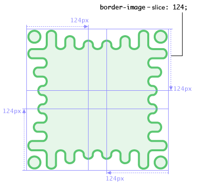
圖 10. ‘border-image-source’ 圖像,用四個 ‘border-image-slice’ 切在 124px 的地方,將圖像切成九的部份。
其餘的邊框屬性則將各部份鋪設成下面的樣子:
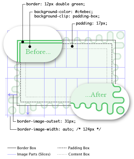
圖 11. 所有圖線邊框屬性與互相之間如何影響的圖,包含有或沒有圖像邊框時的渲染情形。
在這裡,儘管邊框寬度是 12 px,‘border-image-width’ 還是算成 124px,圖像邊框區域是邊框盒往邊界區域延伸 31px 的結果。如果圖像邊框載入失敗(或是使用者代理不支援圖像邊框),使用者代理會用雙線綠色邊框作為備用。請注意 ‘border’ 屬性會重設 ‘border-image’,讓取消、重設邊框效果更為簡單:
    .notebox {
      border: double orange;
      /* 必須先設置 'border' 縮寫,否則會蓋掉 'border-image' */
      border-image: url("border.png") 30 round;
      /* 可以在這裡設置其他 'border' 屬性 */
      border-width: thin thick;
    }
    ...
    .sidebar .notebox {
      box-shadow: 0 0 5px gray;
      border-radius: 5px;
      border: none; /* 取消所有邊框 */
      /* 'border' 縮寫重設了 'border-image' */
    }
圖像源 ― ‘border-image-source’ 屬性
| 名称: | border-image-source |
| 取值: | none | <image> |
| 初始: | none |
| 适用于: | 除了當 ‘border-collapse’ 是 ‘collapse’ 的內部表格元素外的所有元素
|
| 继承: | 否 |
| 百分比: | (不適用) |
| 媒介: | 視覺 |
| 计算值: | ‘none’ 或是 URI 變成絕對 URI 的圖像
|
| 动画: | 否 |
這個屬性用來指定圖像以取代 ‘border-style’ 屬性指定的邊框樣式,並作為元素的另一個背景層。若取值為 ‘none’ 或是圖像不能顯示,使用者代理會使用邊框樣式。
圖像分割 ― ‘border-image-slice’ 屬性
| 名称: | border-image-slice |
| 取值: |
[ <nubmer> | <percentage> ]{1,4} && fill? |
| 初始: | 100% |
| 适用于: | 除了當 ‘border-collapse’ 是 ‘collapse’ 的內部表格元素外的所有元素
|
| 继承: | 否 |
| 百分比: | 相對於邊框圖像的尺寸 |
| 媒介: | 視覺 |
| 计算值: | 同指定值 |
| 动画: | 否 |
繪製區域 ― ‘border-image-width’ 屬性
邊擴展 ― ‘bprder-image-outset’ 屬性
圖像鋪成 ― ‘background-image-repeat’ 屬性
繪製圖像邊框
圖像邊框縮寫 ― ‘border-image’ 屬性
| 名称: | border-image |
| 取值: | <‘border-image-source’> || <‘border-image-slice’> [ / <‘border-image-width’>? [ / <‘border-image-outset’> ]? ]? || <‘border-image-repeat’> Error creating thumbnail: Unable to save thumbnail to destination
|
| 初始: | 參見各屬性 |
| 适用于: | 除了當 ‘border-collapse’ 是 ‘collapse’ 的內部表格元素外的所有元素
|
| 继承: | 否 |
| 百分比: | 參見各屬性 |
| 媒介: | 視覺 |
| 计算值: | 參見各屬性 |
| 动画: | 否 |
‘border-image’ 是同時設定 ‘border-image-source’、‘border-image-slice’、‘border-image-width’、‘border-image-outset’和‘border-image-repeat’ 的縮寫屬性。沒有取值的屬性被