
Bert Bos |
Complex layouts: can we push the limits of CSS? | 9 May 2012
Complex layouts: can we push the limits of CSS?
●
●
●
●
●
●
●
●
●
●
●
●
●
●
●
●
●
●
●
●
●
●
●
●
●
●
Some layout challenges for CSS, extrapolated
from published printed material
Bert Bos
(W3C) <bert@w3.org>
9 May 2012
Premise
●
●
●
●
●
●
●
●
●
●
●
●
●
●
●
●
●
●
●
●
●
●
●
●
●
●
For any layout feature, As long as there is a simple model and syntax for CSS,
it is easier for users to bypass XSLT*
* or a similar tool
Examples
●
●
●
●
●
●
●
●
●
●
●
●
●
●
●
●
●
●
●
●
●
●
●
●
●
●
| To create… | | Use…
|
|---|
| ToC | → | XSLT,
hxtoc, Module postprocessor,
perl…
|
| Index | → | XSLT,
Module preprocessor, hxindex…
|
| Table-like layout | → | CSS (grid)? or XSLT
(+flexbox)?
|
| Connected regions | → | CSS? or XSLT?
or both?
|
Templates – basic idea
●
●
●
●
●
●
●
●
●
●
●
●
●
●
●
●
●
●
●
●
●
●
●
●
●
●
- No elements that correspond to the visual regions?
→ create pseudo-elements (= “template”)
- Visual order ≠ logical order?
→ use position (or flow) property
1996:
- One template per document (@-rule)
- Many layouts (grid, spiral, stack, abs. pos…)
2004:
- Templates for all elements + template for printed page
- Only grid
Templates – second idea
●
●
●
●
●
●
●
●
●
●
●
●
●
●
●
●
●
●
●
●
●
●
●
●
●
●
Grid Layout added two more ideas:
- Use the template to replace x/y coordinates of absolutele
positioning with symbolic locations
- Use a repeating templates as a way to generalize tables (
grid-position-x: next)
(Absolute positioning is rarely needed anymore
once you have template-based layout. But the with keywords
next and same for the position, it is
still useful to create a table-like layout with an a-priori unknown
number of elements, e.g., to make column-major tables.)
Sushi demo
●
●
●
●
●
●
●
●
●
●
●
●
●
●
●
●
●
●
●
●
●
●
●
●
●
●
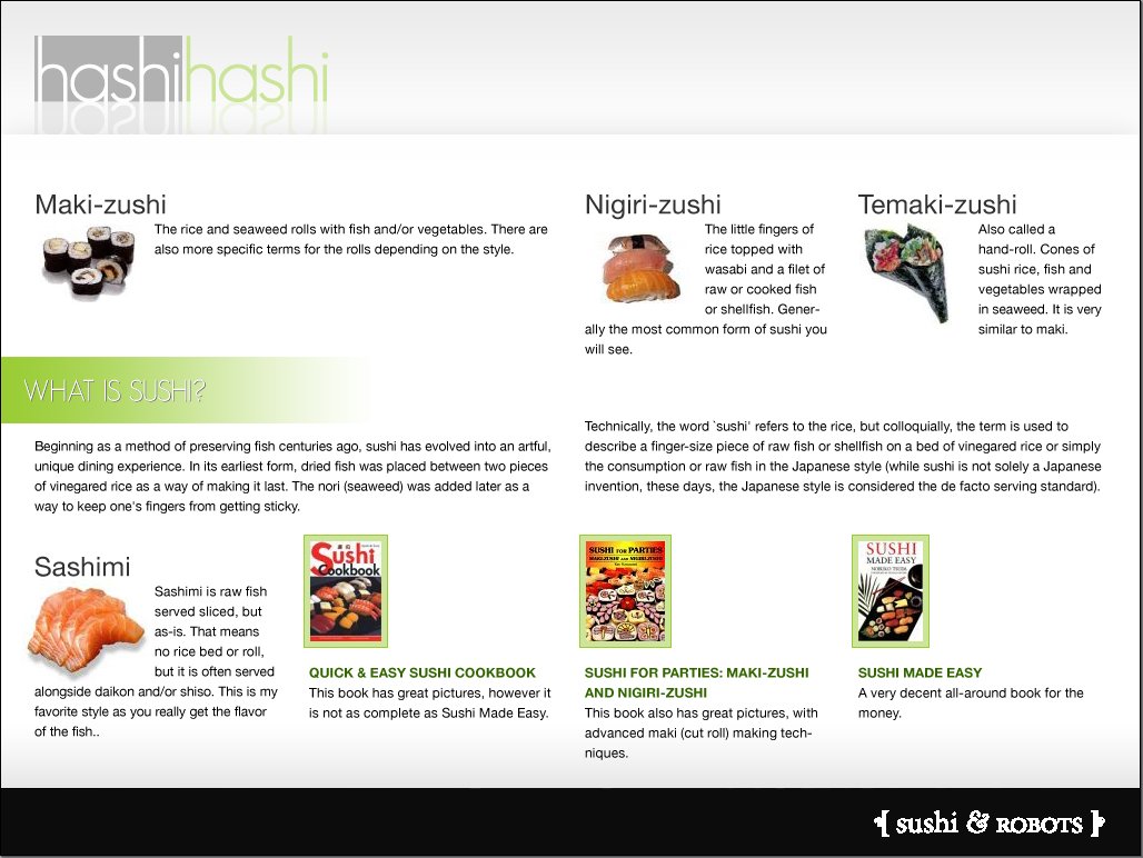 A demo by Jina Bolton
(NB. Uses syntax from an older draft. Prototype
implementation by César Acebal.)
Challenge 1: a simple grid?
●
●
●
●
●
●
●
●
●
●
●
●
●
●
●
●
●
●
●
●
●
●
●
●
●
●
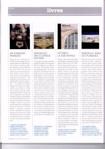
- Four columns, two rows ✔
- Bottom-aligned paragraph ✘
- “Reverse run-in” signatures ✘
- Complex running header/footer ✔?
Challenge 1: HTML source
●
●
●
●
●
●
●
●
●
●
●
●
●
●
●
●
●
●
●
●
●
●
●
●
●
●
<H1>Guide</H1> ← running header
<H2>Livres</H2> ← running header

<H3 ID=jacquemart>Un florilège français</H3>
<P><IMG SRC="..." ALT="..."> ← move up
<P>Directrice de recherche...
...
<P CLASS=signature>G. B. ← reverse run-in
<P CLASS=info>Le musée Ja... ← bottom-aligned

<H3 ID=versailles>Versailles...
<P><IMG SRC="..." ALT="...">
...
Challenge 1: CSS rules
●
●
●
●
●
●
●
●
●
●
●
●
●
●
●
●
●
●
●
●
●
●
●
●
●
●
BODY {grid: "aceg"
            "bdfh"}
#jacquemart + P {flow: a} ← image
#jacquemart     {flow: b} ← heading
#jacquemart ~ * {flow: b} ← rest of text
#versailles + P {flow: c}
#versailles ~ * {flow: d}
#versailles ~ * {flow: d}
#hittorf + P    {flow: e}
#hittorf        {flow: f}
#hittorf ~ *    {flow: f}
#planque + P    {flow: g}
#planque        {flow: h}
#planque ~ *    {flow: h}
Challenge 1: other solutions?
●
●
●
●
●
●
●
●
●
●
●
●
●
●
●
●
●
●
●
●
●
●
●
●
●
●
With multicol/GCPM:
H3 {break-before: always}
H3 + P {float: column-top; height: 12em}
With XSLT & flexbox
DIV.container1, DIV.container2,
DIV.container3, DIV.container4,
DIV.container5... {display: flexbox}
...
Challenge 2: column span
●
●
●
●
●
●
●
●
●
●
●
●
●
●
●
●
●
●
●
●
●
●
●
●
●
●
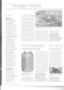
- Color inversion ✘
- Columns with partial spans or chained regions ✔?
- Gray bar has same height as page number digits ✔?
- Kerning in page header ✔?
- All columns 100% filled ✘
- Some horizontal and vertical rules ✔
Challenge 2: CSS rules
●
●
●
●
●
●
●
●
●
●
●
●
●
●
●
●
●
●
●
●
●
●
●
●
●
●
grid: 15em *  *  *
       "a  .  e  e"
       "a  b  e  e"
       "a  b  c  d"
       "a  .  .  ."
       "a  f  f  i"
       "a  g  h  j";
chains: b c d, g, h;
Variant: include the gaps between the columns explicitly in the
template.
Challenge 2: other solutions?
●
●
●
●
●
●
●
●
●
●
●
●
●
●
●
●
●
●
●
●
●
●
●
●
●
●
Multicol with spans:
::slot(p) {columns: 3}
::slot(q) {columns: 2}
#maquette img {float: top-corner;
  column-span: 2}
#broderies {column-span: all}
Challenge 3: column float
●
●
●
●
●
●
●
●
●
●
●
●
●
●
●
●
●
●
●
●
●
●
●
●
●
●
- Three columns with a floating image (
float: top
    next-column
?) ✔?
- … or use chained regions ✔
- Image extends slightly above columns ✔?
Challenge 4: centered floating images
●
●
●
●
●
●
●
●
●
●
●
●
●
●
●
●
●
●
●
●
●
●
●
●
●
●
- Floating images vertically centered in columns, can be done
with grid template and chained slots ✔
- Or maybe with absolute positioning and exclusions
Challenge 5: mixed horizontal & vertical
●
●
●
●
●
●
●
●
●
●
●
●
●
●
●
●
●
●
●
●
●
●
●
●
●
●
- Horizontal and vertical slots, including a 6-column vertical
region with a non-rectangular intrusion ✔
::slot(a) {writing-mode: vertical-rl}
::slot(b) {writing-mode: horizontal}
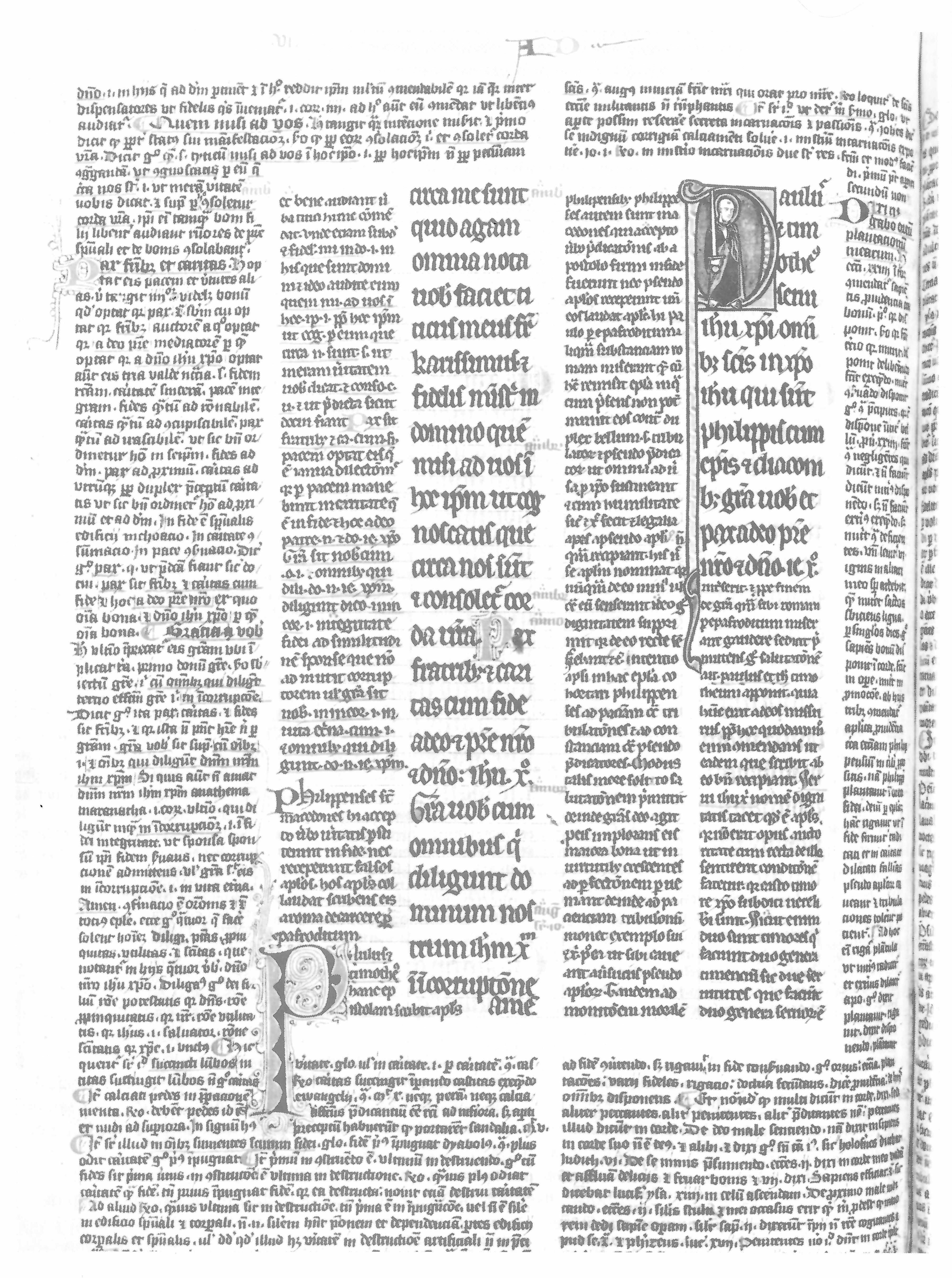
Challenge 6: manuscript ☺
●
●
●
●
●
●
●
●
●
●
●
●
●
●
●
●
●
●
●
●
●
●
●
●
●
●
- Drop cap intrusion in a different column ✘
- Non-rectangular regions ✘?
"aaaaaa.bbbbb"
"aa.........b"
"aa.c.d.e.f.b"
"aa.c.d.e.f.b"
"aa.c.d.e.f.b"
"aa.........b"
"aaaaaa.bbbbb"
"aaaaaa.bbbbb"
Challenge 7: seven different sets of slots
●
●
●
●
●
●
●
●
●
●
●
●
●
●
●
●
●
●
●
●
●
●
●
●
●
●

- Seven pages with different page templates, but all on the same
underlying grid ✘?
@page p15 {
  grid: "ABBCCC"
        "ABBCCC"
        "ABBCCC"
        "DEEFFF"
        "DEEFFF"}
}
●
●
●
●
●
●
●
●
●
●
●
●
●
●
●
●
●
●
●
●
●
●
●
●
●
●
- Declaring templates:
grid-template: "a*c" "abc" ← names
grid-columns: 20em * 15em ← widths
grid-rows: 10em min-content * * ← heights
grid: 20em * 15em "abc" "adc" ← shorthand
- Default slot:
*
- Putting content into a grid element:
flow: b ← add to flow
grid-position-x: b ← Absolute pos.
grid-position-y: 1 + 3 ← span 3 rows
grid-position: 2 - 4, 3 ← shorthand
●
●
●
●
●
●
●
●
●
●
●
●
●
●
●
●
●
●
●
●
●
●
●
●
●
●
- Styling slots:
::slot()
- Region-based styling ← level 4?
- Vertical alignment:
vertical-align: middle
margin-top: 1em + 1fill - 0.5em
- Page and column breaks
- Grid templates in
@page ← level 4?
- Chaining slots:
chains: a b d, e f


Historically, the first time this was proposed, the outcome was absolute positioning. Not quite what the inventors (Dave Raggett, Håkon Lie and Bert Bos) wanted, but the only possibility in those days of browser wars and immature browser technology.
In 2004, the Device Independence Working Group was looking for a standard way to easily create layouts for different screen sizes: varying the number of columns, creating designs that resemble “stacks of cards”, and capturing the idea of a “portal” (several independently authored mini-documents assembled into a single layout).
Its members had been relying on proprietary HTML postprocessors, but because those had to run on the server, what went over the “wire” was non-semantic HTML. They were hoping the layout could be done with CSS instead. And so we revived the old idea of templates (originally called “frames,” before Netscape adopted that name for something else).
Discussions in the CSS WG led to dropping the stack-of-cards idea, for lack of immediate interest from members of the CSS WG. (In 2012, a solution for card deck layout is still missing…)