
WWW2005, May 13, 2005
Bert Bos (W3C) <bert@w3.org>
“What browser?”
No browser
just two reasons for stronger layout in CSS:
Browsers help making Web more Semantic
But author still has to help:
More CSS needed (structure → visual)
But has to be easier
In short, you can say that people are making better use of the Semantic Web and wanting the Web to be more semantic.
But artificial intelligence is still not very intelligent and browsers need help from the authors of Web pages. Web pages need to have good, logical structures and useful data in attributes. Many people and companies have proposed "good practice" conventions for HTML and, of course, W3C is developing XHTML2, with better structure and more powerful metadata elements.
The “microformats” session on Developers Day at WWW2005 is an example of the increased interest in rich structure and other metadata.
Steven Pemberton's talk at WWW2005 gives more info about the increased support for logical structures in XHTML2 relative to HTML.
But if Web pages get more and more logical structures, the requirements on CSS increase to translate the logical structure into a visual one. The visual order is not necessarily the same on all devices and the joint constraints of “liquid” layout and absolute positioning aren't yet very well supported with CSS2.

CSS level 1 provides
W3C Recommendation (1996)
Reliably implemented since 2000
So what seems to be needed in CSS is a way to define a visual grid in which to display the document's elements, and an easy way to switch to different grids based on device characteristics, in particular screen size.
In level 1, CSS provides some simple control over the margins of elements, which allows elements to be positioned relative to their predecessor and parent. Elements can also be floated to the side, causing the other text to wrap around it. It is good for article-like documents, one element after the other, with maybe an image here and there.
CSS1 was made a W3C Recommendation in 1996, but it took until 2000 before implementations were sufficiently reliable to use it for precise layout.
CSS level 2 provides
CSS2 currently being revised.
Reliably implemented end 2005? Or 2006?
Level 2 adds table layout, to lay out a series of elements as rows and columns and it also provides a way to position elements anywhere on the screen, almost independent of their order in the document. This technique is called “absolute positioning”.
The CSS2 Recommendation is currently being revised. This first revised edition (nicknamed CSS 2.1) is now a Candidate Recommendation. Implementations aren't yet reliable enough with CSS2, but they are getting closer and closer to full support. It is too early to declare 2005 the year of CSS2, but if it won't be this year, it will almost certainly be next year.
Although positioning elements anywhere on the screen, independent of other elements, sounds very powerful (and it is), in practice it is often difficult to use. The position of elements usually does depend on the position of other elements, although not necessarily the ones immediately around it in the source document. In a typical layout, certain elements must be aligned horizontally or vertically, they must be the same size or some multiple of another size, etc. Often, designers use a grid to help them layout a page.
Elements in absolute positioning each have their own position (x-y coordinates) and size, with no intrinsic relation to anything else. Changing a design becomes difficult (the designer has to recompute all numbers) and it is difficult to express sizes relative to the window size or to differentiate between elements that have a fixed size and those that resize with the window.
Proposed for CSS level 3
Therefore the CSS working group has started to develop a way to let designers specify their grid directly in CSS and position elements with reference to that, rather than with their own absolute coordinates. Just like in tables, elements are automatically aligned and resized together. But unlike in tables, this works for elements that aren't necessarily next to each other in the source.
Another advantage is that the grid is specified in one place, which allows the designer to use a graphical tool to draw it. Such a tool would not be able to recognize which of the absolutely positioned elements are supposed to be aligned with each other, but when all elements refer to a common grid, it is clear that they are supposed to align with each other.
Typical use case for mobile content: “portal” page (several, independent pieces of content)
Not only graphic designers use grids, adaptation of content to different devices, in particular mobile ones, also proceeds in part by changing the grid. On a wide desktop screen, there is room for three columns of text and something above and below, on a cellphone, there is room for much less, depending on the size of the screen.
Sometimes the contents also have to change to make a document easily readable on a small screen, but it is clear that changing the layout is essential. Specifying the grid in one place makes it easy to change just that part of the style, without recomputing any individual positions.
The typical use case for mobile content is a “portal” page. A page that contains various menus and short articles that link to more detailed information. If the window is wide, the most efficient use of the space is to put several things side by side. On smaller screens the number of columns in the grid has be reduced, eventually to just one.
On systems with limited memory, the page may also have to be split into multiple smaller pages, but whether that is a style question is under discussion. On the other hand, replacing large amounts of scrolling with clicking links or turning pages might be a matter for the style sheet.
Both use same vocabulary
(Example later)
CSS has a technology called Media Queries that allows different styles to be automatically selected based on such things as the size of the screen, so all that remains is to develop the properties with which a designer can specify the various grids for each kind of device. Another, complementary technology, called DISelect can do the same as Media Queries, but only from within XML documents, not from within HTML or within style sheets. On the other hand, DISelect, can also select other things than style sheets, e.g., it can choose between a piece of text and an image.
As far as selection of the style is concerned, DISelect uses the same vocabulary for the same device characteristics as Media Queries.
Questions:
[“demo”]
The basic idea for grid layout is that the designer selects how many rows and columns the grid has and for each row and column whether it has a fixed or a flexible size. A fixed size is independent of the window size and the rest of the grid. All rows or columns with a flexible size equally divide the remaining space. When the window resizes, all the flexible rows and columns resize proportionally. Next, elements are aligned to the lines of the grid: as in tables, elements may occupy one slot in the grid or they may span several.
Under discussion is whether there are different kinds of flexibility. For example, is it possible that at a certain size two columns have the same width, but when the available space grows, one column grows faster than the other. Some people think that this is necessary for laying out dialog boxes or forms.
It is probably necessary that the size of some columns is does not depend on the available space, but on the contents of the column. This is the usual way HTML tables behave, but for grid layouts it will probably an exceptional situation.
Grids can be nested. For example, one slot in a grid can be occupied by an element with its descendants and those descendants are laid out in a smaller grid of their own.
The purpose of a grid is to provide alignment for elements, but it is an open question whether the grid as such is visible on the screen even when there are no elements in it. In other words, does the grid draw any borders or backgrounds on the screen of its own, or are only the elements in the grid drawing anything? An invisible grid seems easier to specify and explain and closer to the orignal purpose.
Old idea (1996): @-rules
@page {...}
@frame frame1 {...}
...
#banner { flow: frame1 }
Apart from these high-level requirements, there is also the question of the syntax. At the very least it must be easier to use than absolute positioning. But it must also be so that a graphical tool such as mentioned earlier can both interpret and generate the description of a grid.
An old idea (published in 1996!) is to use @-rules to descibe one or more grids, each with a unique name. Elements then have a property to select a grid by name. A newer idea is more compact: rather than select a grid by name, the grid itself is described in the property.
New idea: single property
body { display: "aaa"
                "..." 1em
                "bcd" }
...
#banner { position: a }
Obviously, if the grid is to be described fully in the value of a single property, the syntax has to be compact and there cannot be too many different parameters. But grids don't have many parameters anyway: the grid itself, i.e., a number of rows and columns, and the size for any row or column that is fixed. Unless there are many rows and columns, which is unlikely, that should easily fit in a handful of characters on one or two lines.
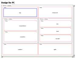
Here is one possible syntax. It specifies a grid with three rows, the top one has a single slot (a) spanning the full width, the second row is empty but has a fixed height of 1em and the third row has three columns (b, c and d) of equal width. The value is shown on three lines, but there is no reason for that other than to make it look good. It fits on one line.
body {
    display: "aaa"
             "..." 1em
             "bcd"
}
role attribute
[role=navigation] { position: b }
Grids are also a nice complement to a proposed feature of XHTML2. In order to add more semantics to the structure of a document, XHTML2 proposes a “role” attribute to express what the high-level role of an element is. An element can be a list or a paragraph structurally, and at the same time play the role of menu or copyright at a higher level. With CSS and grids, it will be easy to select the element that has the role of menu and put it in a designated slot in the grid.
The rule to do that would be extremely simple. For example, to put elements with a role of “menu” in the left column of the previous example, this rule is enough:
[role=menu] { position: b }
@media screen
{
  body { display: "aaa" "bcd" }      /* 2×3 */
}
@media screen and (max-width: 40em)
{
  body { display: "ab" "cd" }        /* 2×2 */
}
@media screen and (max-width: 20em)
{
  body { display: "a" "b" "c" "d" }  /* 4×1 */
}
[role=menu] { position: d }
[role=main] { position: b }
...
Here is an example of Media Queries to select different grids for different screen sizes. This example puts all the grid specifications together in one file, but it is just as easy to put them each in a separate file. (Basically, the change would be that @media would becomes an @import.) The example shows three grids for increasingly narrow viewports.
So how do grids work with layouts that aren't rectangular? In modern layouts, some elements may partly overlap others, some may be positioned diagonally below others, etc. Well, grids don't replace margins, floats and absolute positioning, they just add one more tool to the toolbox. It is perfectly possible to put some elements in a grid and position others absolutely. Or to put elements in a grid, but slightly offset from the grid lines by means of a non-zero margin. Negative margins already worked in CSS1 to make elements overlap and they still work, even if the elements to overlap aren't the previous or the next paragraph anymore, but whatever element happens to be in the previous grid slot.
Not for tomorrow…
Needed: help
Grid layout isn't for tomorrow, though. The Device Independence working group of W3C and the CSS working group have formed a task force to discuss the requirements and develop a specification, but the highest priority is still to finish the revision of CSS2 and make it a Recommendation. Grid layout is part of level 3 of CSS and a level 3 only makes sense if level 2 is reliably implemented.
So, assuming browsers fix enough of their bugs this year and we also finish the test suite to test them with by the end of this year, the revised edition of CSS2 might become a Recommendation some time next year, and the high-level layout module the year after, i.e., 2007.
Grid layout isn't the only new feature of CSS3, though. Other people might be more interested in the ability to overlay multiple background images and scale them, or use images as borders, or the new features for vertical text and mixing vertical and horizontal text. Or any of a range of other new features.
Richard Ishida already talked about some of the CSS3 developments for non-western typography. All these developments compete for attention.
So we need help. Examples, test cases and especially implementations help to speed up the development process. If you are in a position to add an experimental grid layout module to a browser or other CSS implementation, you can make a big impact. Especially the people working in content adaptation for mobile applications will be very grateful.
The title combines the topic of the talk, designing visual structures through CSS, with the two reasons for talking about it: smarter browsers and device-independence.
The title doesn't really refer to any particular browser, but to the fact that users are accessing the same Web pages in multiple ways, possibly with the same browser, but also with multiple browsers and with multiple devices. Pages are viewed by people, of course, but also syndicated, indexed, printed, cut & pasted, automatically adapted to various devices and user preferences, etc.
Browsers have learned new tricks, such as using one page as a table of contents for another, blocking pop-ups, adapting the page to various screen sizes more intelligently, extracting metadata and RSS feeds.