Bert Bos
Bert Bos <bert @w3.org>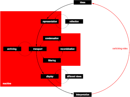
The Web...
information
The Web has only uni-directional links and no location-independent names for resources. If the target of a link changes, the source of the link becomes useless. Thus it is important to think about the stability of a resource before assigning a URL to it.
There are many different devices and new ones, with new capabilities, are constantly being added. Resources have to be created in such a way that as many as possible devices can access it, and, with some luck, future devices as well.
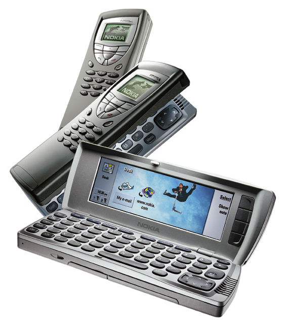
Consider, e.g., the case of somebody who has collected a number of URLs of useful resources before going on a journey. He has collected them with his desktop computer, because it has the easiest interface, but he then stores them on his mobile phone for use on the road. The presentation of the information on the phone will be different (maybe partially in voice), but it is the same information with the same URL. Another example is when this user then finds a Bluetooth equipped printer and prints a page from his phone. The presentation will again be different.
The image, b.t.w., shows an example of a device that has two modes of interaction in one: a 20-key keyboard and a small, black & white display, and a full (but still small) keyboard and a somewhat bigger, color display. Such devices that have different capabilities depending on the circumstances and on peripherals are likely to become more common.
The obvious example of accessibility is a blind user, who cannot see the structure or the text, but relies on it to be rendered as speech or braille. If the information is served only visually, i.e., as one or more images, the computer cannot render the information otherwise, short of doing OCR on it.
But there are other handicaps: low vision, deafness, motor handicaps. Some handicaps are temporary: no mouse while driving a car or while operating on a patient, no sound when on a noisy construction site...

 Extensibility
Methods:
"Usability" is the word that summarizes all the other principles of Web architecture. It also implies that resources should not just be accessible, but that they should be "user friendly" (to use the old term).
And the Web should not just be usable for the consumer of information, but also for the producer! Because the Web is fundamentally a peer-to-peer system: everybody can be reader, but can also publish information. (A few years ago, the future was described as: every user his own CPU. That question of hardware has been more than solved. The current target is: every user his own Web server.)
Of course, that immediately leads to the problem for which we are developing so much technology: how can the "same" resource be usable on devices so diverse as a mobile phone, a desktop PC and a braille reader, without asking the information provider to redesign the resource for each of these devices (which is clearly not possible).
The best standards are those that are aware of their own limits. Even if we don't know what needs to be improved, we can be sure that technology in the future will be more capable than what we can design now. Designing with future extensibility (or transformation) in mind can protect investments.
There are many reasons to modularize resources: distributed maintenance, reuse of components, upgrades of some technologies and not others... But in this case I want to concentrate on modularization of resources for the purpose of making them device-independent.
Examples:
Whether or not some characteristics are important depends on the resource. It isn't always necessary for an author to adapt the presentation to the device, often the "user agent" (browser) can adapt in the obvious way with no ill results.
Metadata:
The standard technique on the Web is to stitch information together from smaller units, each identified by a URL. HTML is the best known example, with its use of LINK, IMG, OBJECT, etc., but most W3C specification follow the same principle: SVG, CSS, SMIL...
Indeed, SMIL is the most extreme example: a SMIL file contains not much more than timing information and for the rest it is just a list of links to the actual resources.
SMIL also pioneered the idea of putting expressions in the links (in SMIL they are in so-called system attributes) that describe some device-dependent characteristics of a resource, in order to allow the user agent to select the best links from among a set of possibilities.
HTML and CSS already had similar attributes, but they were limited to about 10 broad classes of media: print, handheld, screen, aural, etc., without any possibility for parametrization. Too broad for some resources that depended on certain precise device characteristics.
Since style sheets are the primary means for adapting information to a particular environment, the latest addition to this technology is the "Media Queries" specification, that allows to write expressions (for use in HTML, CSS or XML) that describe the devices for which a style sheet was written. A user agent that finds a link with an associated media query, can match the query against its own capabilities and thus know whether to download and use that style sheet or not.
Another approach is to let the client describe itself to the server, after which the server generates a version of a resource specifically for that client. This is useful for cases where proper representation of a resource depends very much on certain device characteristics and there are too many (unpredictable) variations in clients to prepare all versions in advance. HTTP content negotiation and CC/PP work on this principle.
HTTP content negotiation is very simple: it just tells the server which formats the client support, so that, e.g., the server can send PNG if the client support that, or GIF if it support that. CC/PP is much more advanced: it sends a profile of the client device and the user's preferences to the server, in the form of an RDF fragment. (To save bandwidth, it can also point to a profile, instead of sending it.)
For reasons of privacy and scalability, it is better to let the client do the work (using the metadata expressed in media queries), but CC/PP is available if needed. The WAP standard includes CC/PP and defines a specific vocabulary, called "UAPROF." UAPROF contains many more device characteristics than Media Queries.
Example using HTML:
<link rel="stylesheet"
      href="style-cs.css"
      media="handheld and (color)
             and (min-width: 150px)">
Means: use "style-cs.css" if:
 Yes!
Yes!
HTML2 was, XHTML2 will be, but in between...
Some people have said that HTML is lost for the Web: too many designers have used it as a page-layout language, either from ignorance or because they consider short-term graphic design goals more important than accessibility or longevity of the information. But W3C hasn't given up on HTML yet. HTML 3.2 integrated many elements & attributes that we didn't really want, in order to give designers at least a common standard, but since then all those extraneous elements & attributes have been eliminated. HTML 4 still had two modes: "transitional," which contains the deprecated elements; and HTML 4 proper, which doesn't contain them. XHTML 2.0 (currently in draft) is even cleaner. Instead of device-dependent elements, such as FONT or CENTER, it contains new device-independent, structural features, such as navigation links and sections and sub-sections.
The primitive elements for forms of HTML have been removed and replaced by the very abstract, but very powerful XForms.
Of course, by the time XHTML 2.0 becomes a Recommendation, XSL and CSS will need to have a few new features, such as mixed visual/aural presentations (e.g., for phones with tiny screens, but good sound), better paged display (e.g., to replace the "card" metaphor of WML) and interaction by keys and softkeys..
HTML pages relying on CSS work great on phones, PDAs, etc.
UAProf contains fields to describe such things as the screen size, whether scripting is supported, color support, type of keyboard, etc. UAProf is a particular vocabulary, which uses the CC/PP framework as syntax. CC/PP in turn is built on top of RDF, W3C's general metadata framework. (And RDF, finally, uses XML syntax.)
UAProf is part of WAP 1. The idea is that a client (a mobile phone) sends its profile to the server and the server adapts the contents to the capabilities of the device and the preferences of the user. Since profiles are a bit long to send with each request, there are mechanisms to refer to profiles by URL, in which case the server can even cache the profile for the duration of a "session."
CSS has properties for different media (many for visual media such as screens and printers, not so many for speech, audio and braille yet). One way to adapt an XML or HTML page to different media is to attach a few different style sheets to it.
The full CSS is getting quite big, but many platforms only need a part of it. That's why there are a number of profiles, developed by W3C or by others.
CSS doesn't do transformations, so for user agents that are very different from what the information provider had in mind, an extra step is required to transform the information. That can be done in many ways, but W3C proposes XSLT.
XSLT is a transformation language for XML documents. It is, in fact, something that I said should never exist: a programming language in XML syntax. But apart from the syntax, it works :-) (Cobol's syntax is also not very usable, but it, too, has worked for a long time...)
Most XSLT application run server-side, using server modules such as Cocoon (by the Apache project), but some browsers also support client-side transformations. XSLT is neutral: it was designed to be usable at both sides.
MI is the most recent addition to the list of W3C's activities. It will try to develop specifications for interaction that involves handwriting, speech input and other technologies.
HTML is still the work horse of Web technologies. HTML proper is being replaced by XHTML, which is an evolutionary development of HTML: XML syntax, cleaner design (no more presentation-related elements & attributes), and some added functionality.
HTML is meant for all documents where the outer level is a text document, with possibly other media types embedded (image, video, audio, etc.).
RDF is an abstract model for expressing knowledge, based on the idea of a network of nodes that relate to one another via typed links. E.g., the node for some book can have an arrow pointing to the node for a person, where the arrow is labeled as being the relation "author". The canonical syntax for RDF is XML. At least that is the syntax in which RDF is exchanged. There are more convenient notations for local use and for easier typing. (One example is "N3," created by Tim Berners-Lee.)
RDF is just a framework; it needs applications built on top to be useful. Such applications are often referred to as "ontologies" (a misnomer) or vocabularies. CC/PP is a subset of RDF, in the sense that it restricts certain features of RDF. UAProf is an example of a vocabulary. Another vocabulary, the most commonly used, in fact, is "Dublin Core," developed by the library community for expressing the traditional metadata that a library deals with: author, publisher, date, subject, title, etc.
SMIL files contain the time-line for a multimedia presentation: which things play at the same time, which play after one another, delays between them, constraints (one cannot start until the other has finished), etc.
SMIL has special features for dealing with different device capabilities and user preferences. It allows the designer of a presentation to provide alternatives for different bandwidth, to suppress or display closed captioning, etc.
Web Services are device-independent by nature. They let servers talk to each other, there is no UI involved. There are experiments underway to use SOAP for location-based services: a device that moves (such as the computer in a car or a mobile phone) can receive information that is adapted to the location where the device is at that moment: traffic info, nearest gas station...
SVG is a format for vector graphics. Vector graphics are mathematical descriptions of shapes; there are no pixels in the description and thus the graphic is resolution-independent. Which goes a long way to making it device-independent. SVG files can contain textual alternatives for situations where there are no graphics (or even no display at all), but that is of course not the same as a document that is generated for such a device specifically.
To deal with resource constraints on small devices, there are two profiles of SVG: "basic" and "tiny." They leave out some of the more expensive image operations.
Media Queries were already mentioned above. A media query is an expression that describes the features a device must have for a certain style sheet to apply to that device, e.g., minimum color depth 4 bits and minimum screen size 150 pixels.
There are many larger and smaller pieces still missing. We are getting closer to correct layout of documents on TV's, for example, but the author still has little influence over the interactive part: which keys do what.
Multimodal interaction is only just starting. We have multimodal presentations (SMIL), but the interaction is limited to clicking on a hyperlink. Style sheets (XSL and CSS) can render to monomedia (visual or audio), but not multimedia (visual and audio). The BGSOUND attribute in HTML is far too simplistic.
But the biggest problem is not the technology as such, but how to make it so that people use it. To make content usable on multiple devices, it needs to be machine-readable. In other words, it needs to be not just content, but it must have metadata to describe the structure and the assumptions behind the content. Only then can the computer adapt the content to other environments. But metadata hardly benefits the author, at least not directly.
Money can be an incentive for information providers, but that is not a scalable solution. Reader feedback can be another. Education can help to make doing the right thing easier.
Of course, what never will go away is dishonesty. The more people do the right thing, the bigger the benefit for the crook, who mislabels his information.
B.t.w., the printed version of this talk and the version presented "live" are one and the same file. The only difference is in the parameters of their respective style sheets. The projection mode uses one style, the print mode uses another. The browser selects them automatically (as long as those style sheets exist, of course).
The Web is a channel for publishing information. One of the advantages over other channels is that there is a computer involved. The goal of W3C is to make maximum use of the possibilities that offers: finding information quickly, comparing and merging multiple sources, adapting the display to different environments, etc. The Web is a library and the computer allows it to be personalized to every individual user.
The act of publishing (PUT) adds information to the Web, the act of reading (GET) has no effect on the state of the Web.
Much of the Web's technology can also be used for transactions (POST). But transactions are between two parties and the goal of a transaction is that something changes in the world, often outside the Web itself.