 WD-forms-960410
WD-forms-960410
WD-forms-960410This is a W3C Working Draft for review by W3C members and other interested parties. It is a draft document and may be updated, replaced or obsoleted by other documents at any time. It is inappropriate to use W3C Working Drafts as reference material or to cite them as other than "work in progress". A list of current W3C working drafts can be found at: http://www.w3.org/pub/WWW/TR
Note: since working drafts are subject to frequent change, you are advised to reference the above URL, rather than the URLs for working drafts themselves.
The HyperText Markup Language (HTML) is a simple markup language used to create hypertext documents that are portable from one platform to another. HTML documents are SGML documents with generic semantics that are appropriate for representing information from a wide range of applications. This document reviews the design requirements for forms in hypertext documents and presents some possible directions for extending HTML 2.0 to meet these requirements. A phased implementation plan is proposed.
The initial version of HTML provided a crude mechanism for entering one or more keywords to be sent to an HTTP server to perform a query. It soon became obvious that a more general approach was needed. NCSA Mosaic added markup for basic form fields such as radio buttons, checkboxes, single and multiline text fields, single and multiselect menus etc. When the user presses the submit button the contents of the form are converted into a list of attribute/value pairs and sent to the server for processing.
The approach allowed for initializing form fields but suffers from a number of problems:
Tabbing order for moving between fields or hypertext links is undefined.
There is no provision for keyboard short cuts for particular actions, or for access keys for driving menus etc.
Label text for radio buttons and checkboxes is not active, i.e. clicking on label text doesn't effect the button state.
There is no provision for checking values as they are entered into form fields. All checking is done at the server when the form's contents are submitted.
The range of form field types is too limited in comparison with modern user interfaces. For instance there is no provision for tabular data entry, sliders or multiple pages.
There is no means to markup groups of related form fields in a way that effectively supports browsing with speech based user agents.
Servers can't update the fields in a submitted form and instead have to send a complete HTML document causing screen flicker.
There is no provision for client-side scripting, and the extension of forms with externally define field types, e.g. defined by Java applets or OLE controls.
These also cause problems for speech based browsers, making it difficult for the visual impaired to interact with HTML forms.
Some new idioms are only useable in an interactive context, unlike traditional form fields like radio buttons, check boxes and text fields which also make sense on paper. The following features have no hope of backwards compatibility because they either require scripting to be useful, or because old browsers can't provide a reasonable way of dealing with them.
Other proposed extensions will work acceptably with existing browsers, e.g. labelled INPUT fields, SELECT with LIST and COMBO, labelled groups and card sets (tab controls).
This document doesn't cover all the potential dialog elements, for instance, tree-based browsers for hierarchies, and perhaps more importantly for traditional database applications, a good mechanism for record entry which allows multiple records to be entered on the same form.
Some people may say: "Why don't you just do all these things as Java applets or OLE controls?". The answer is that such an approach will limit portability of HTML documents across media. For this to work well, its important to preserve a declarative semantics for the common interaction idioms that have been developed over the last twenty years. This is vital for the use of HTML for non-graphical or speech-based browsers.
It is proposed that changes to HTML form capabilities are phased in during two or more rounds of extensions:
The ability to drive forms without needing to use the mouse (or other pointing device) can be met by several new attributes:
The keyboard focus determines which object in a document gets keyboard events. Until now, most browsers require you to use the mouse (or other pointer device) to give the focus to the form field you wish to interact with.
The proposed tabindex attribute:
Incremental display of documents as data is received from the Net creates special problems. The idea that the focus is given to the lowest valued tabindex seems reasonable enough at first glance, but would mean having to wait until all of the document's text is received, as until then, the lowest valued tabindex is liable to change. If the user hits the tab key before then, it is reasonable to move the focus to the lowest currently available tabindex.
Browsers should prevent forms from being submitted until all of the form's elements have been received. If forms are associated with client-side scripts, there is further potential for problems. For instance, a script handler for a given field may refer to a field which doesn't yet exist!
A variety of HTML elements may in principle be associated with keyboard events, for instance, form fields, hypertext links, embedded objects and client-side image maps. Embedded objects capable of receiving the keyboard focus should form part of the tabbing sequence. Such objects may in turn consist of subsidiary objects which themselves can get the focus. In this situation, these objects form a tabbing sequence that is inserted into the tabbing sequence of the parent HTML document. Client-side image maps may define a tabbing sequence, giving users the ability to tab through the various hotzones. The Enter key can be used to activate the object with the focus, whether this is a hypertext link or a radio button in a form field.
What is the default tabbing behaviour for form fields without a tabindex attribute? One approach is to define tab order according to the order in which the fields appear in the HTML markup. What happens if the some, but not all fields have tabindex attributes? How does this interact with incremental display? For instance when the first few fields don't have tabindex attributes, and the next few do. In this case, the browser would apply the default tabbing behaviour until fields were seen with the tabindex attribute.
It might seem reasonable to disable tabbing through fields without a tabindex attribute, but this is probably unacceptable to terminal-based browsers without pointer devices. The safest course is for tabindices to be implicitly defined unless explicitly overridden by the tabindex attribute. One possible approach is to assume the initial value for tabindex is one and is incremented for each subsequent form field, or hypertext link. Any element with the tabindex attribute causes the index to be reset to that value. This works just like the Netscape VALUE attribute for list items.
Each successive tab key takes the cursor to the input element with the next greater value of tabindex. After visiting the element with the greatest value of tabindex, the next tabkey returns to the initial element. Pressing Shift-tab should be interpreted as a reverse tab.
There is no requirement that the values of tabindex be consecutive or that they begin with any particular value. If multiple elements in the same form have the same tabindex value, the browser may choose any one of them or all of them in turn -- this is a markup error.
The intent is to treat the new tabindex attribute in the same way that OS/2 Presentation Manager and Microsoft Windows treat the tabindex attribute in their controls.
Most windowing systems allow authors to specify short cuts for certain actions, for instance Control-X to cut and Control-V to paste. The SHORTCUT attribute is proposed for defining short cuts, e.g. shortcut="x". The attribute value is case sensitive and specifies a letter or other character to be used with the control key or command key, depending on the platform. On the Macintosh, the command (or apple key) is used, while other platforms tend to use the control key.
On Windows, you can use the Alt key plus a letter to drive menus without needing to use the pointer device. For a given menu action, you typically need to use several Alt+letter key presses to invoke the action. This is in contrast to keyboard short cuts which invoke actions with a single key press. The ACCESSKEY attribute is proposed for defining access keys. The attribute value is a case sensitive letter, e.g. accesskey="T". Browsers are recommended to underline the corresponding letter in the label.
Labels for radio buttons and checkboxes are currently missing from HTML. Authors can place text next to the fields, but the connection is missing from the markup. This means clicking on the label text doesn't work. This is a minor nuisance for most of us, but a critical failing for the visually impaired. Speech-based browsers are forced into the unsatisfactory position of having to use the NAME and VALUE attributes to describe each field.
The LABEL element is proposed to solve this problem. LABEL is a container that encloses the label for an input field. The binding between the LABEL element and the INPUT element can be implicit as when the LABEL encloses the INPUT element, e.g.
<LABEL><INPUT SIZE=20 NAME=flavor VALUE=vanilla> Vanilla</LABEL>
Alternatively the FOR attribute can be used to explicitly reference the INPUT element via its ID attribute or NAME/VALUE attribute pair, e.g.
    <INPUT TYPE=RADIO NAME=flavor VALUE=vanilla>
    <LABEL FOR="#field:flavor/vanilla">Vanilla</LABEL>
FOR uses a URL to reference an INPUT field. The URL fragment identifier takes one of the following formats:
The above syntax allows you to take advantage of the NAME and VALUE attributes that are present with all form fields. You aren't required to add an ID attribute merely for the purposes of attaching a label. When matching on field NAMEs, the scope is that of the form enclosing the LABEL element. The LABEL element offers backwards compatibility with existing browsers and provides considerable freedom in placing the label and associated field. For instance, the label and fields can be placed in adjacent table cells.
There are three generic flags controlling the behaviour of form fields:
These are used to display status info, for instance status messages and gauges. Read-only fields are represented using the INPUT element with the READONLY attribute, e.g.
<INPUT READONLY NAME=status1 SIZE=20 VALUE="40 Topics Found">
Sometimes fields need to be disabled (greyed out) for instance when a particular choice in a set of radio buttons is unavailable. The DISABLED attribute is used for this purpose, e.g.
<INPUT DISABLED TYPE=RADIO NAME=flavor VALUE="chocolate">
Some combinations of choices on a form may be forbidden, or the value of a given field may be simply invalid, e.g. an out of range value. In this situtation the ERROR attribute can be included with the field to mark the field as being in error. Browsers can use color and other emphasis to indicate this to the user, e.g.
<INPUT ERROR NAME=date SIZE=20 VALUE="20/13/96">
Most form builders allow you to specify mask patterns that constrain the allowed input strings. A control string or "mask" defines a pattern, for instance MASK="##-##-##" matches strings like "12-03-96" but not strings like "12/05/94". The mask consists of a sequence of symbols. Certain symbols match only digits, others match only letters and may force input to upper or lower case. In the example, the "#" symbol matches a digit. Other characters match themselves, e.g. "-". The intent is to support the same mask patterns as the Visual Basic Masked Edit Control.
The conventions for dates and currency values vary between countries:
The global nature of the Web means that servers will have to deal with users in different countries. One approach is for the server to have to recognize and cope with all possible variations. This is problematic to say the least! When do you interpret a comma as a decimal point rather than as a list separator? How do you decide that "4/12/96" is the 4th December rather than the 12th April?
One solution is to get browsers to send a locale parameter that can be used by servers to disambiguate values. This places the intelligence in servers, and requires us to agree on the naming conventions for locales. Another solution is to use canonical values for transferring field values and place the intelligence in the browser for mapping to and from local values. This approach can take advantage of operating system support for locales, and seems inherently more scalable.
It is proposed INPUT elements can be designated for use with canonical number, currency and date values using the TYPE attribute. This provides for backwards compatibility with existing browsers which will treat them as text fields.
The canonical format is a minus sign for negative numbers followed by one or more digits. If a fractional part is needed, this is followed by a "." character denoting the decimal point, and zero or more digits. If an exponent is needed, a letter "e" is given followed by a minus sign if needed and one or more digits. All numbers are given in base 10.
The canonical format is a string denoting the currency type followed by a space character and then a number in the canonical format defining the amount. Currency types are given in upper case using the internationally agreed abbreviations for banking, e.g. "USD" for Dollars.
The canonical format is defined as the number of days since 1st January 1970. Browsers should accept/display both short and long date styles according to the length of the field as set by the SIZE and MAXLENGTH attributes.
For compatibility with JavaScript, the INPUT element is extended to support simple buttons with TYPE=Button. The button label is specified by the VALUE attribute.
The new BUTTON element is more flexible and allows images as well as text, for instance:
    <BUTTON NAME=button1>
        <IMG SRC=icon.gif><BR>Button1
    </BUTTON>
The button's label is centered. The width and height are by default adjusted to fit the label, but you can specify WIDTH and HEIGHT attributes in pixels. Leading and trailing white space characters on each line are ignored. The DISABLE attribute greys the button's label and disactivates the button. The ACTIVE attribute places the button into a permanently depressed state, and works independently of the DISABLE attribute.
Authors can specify tabbing order with the new TABINDEX attribute, common to all form field elements.
The INPUT element can be used for both of these.

<INPUT CLASS=slider TYPE=RANGE NAME=slider1 MIN=1 MAX=10 VALUE=1>
Users can move the slider between the limits designated by MIN and MAX.

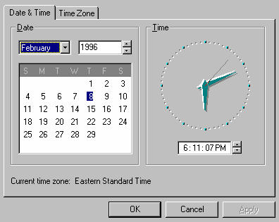
<INPUT CLASS=spin TYPE=RANGE NAME=spin1 VALUE="06:11:07PM" SIZE=10>
This is rendered as a single line text input box next to a pair of spin up/down buttons. The semantics of up/down defaults to incrementing or decrementing an integer value between the optional limits specified by the MIN and MAX attribute values. The semantics for richer values like dates may be defined by associated script handlers. The SIZE attribute acts as per the TYPE=TEXT field, i.e. it gives the width in characters (or half the point size for variable pitch fonts).
The SELECT element was designed for selecting from a number of options, with the ability to allow one-from-many or many-from-many choices. However, for use with scripts, it falls short of what is needed:
These can be easily provided by extensions to the SELECT/OPTION elements, plus a new element MENUBAR for menubars.
The MENUBAR element is a container and requires a start and an end tag. It can only contain one or more SELECT elements, e.g.
    <MENUBAR>
      <SELECT> ... </SELECT>
      <SELECT> ... </SELECT>
      ...
    </MENUBAR>
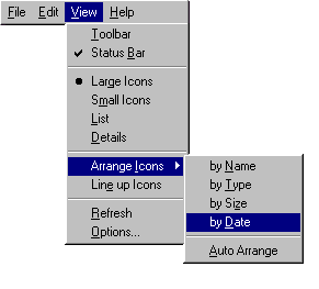
The SELECT element is modified to start with an optional title, followed by one or more OPTION, HR or nested SELECT elements. The optional SHORTCUT and ACCESSKEY attributes are added to SELECT and OPTION to specify short cuts and access keys respectively. The optional FLAG attribute is added to OPTION for check marks of various kinds.
    <SELECT CLASS=menu NAME=View ACCESSKEY=V>
      View
        <OPTION VALUE=toolbar ACCESSKEY=T>Toolbar
        <OPTION VALUE=statusbar ACCESSKEY=B FLAG=checked>Status Bar
        <HR>
        <OPTION VALUE=large-icons ACCESSKEY=g FLAG=selected>Large Icons
        <OPTION VALUE=small-icons ACCESSKEY=m >Small Icons
        <OPTION VALUE=list ACCESSKEY=L >List
        <OPTION VALUE=detail ACCESSKEY=D >Details
        <HR>
        <SELECT CLASS=menu NAME=arrange-icons ACCESSKEY=I>
          Arrange Icons
             <OPTION VALUE=name ACCESSKEY=N >by Name
             <OPTION VALUE=type ACCESSKEY=T >by Type
             <OPTION VALUE=size ACCESSKEY=s >by Size
             <OPTION VALUE=date ACCESSKEY=D >by Sate
             <HR>
             <OPTION VALUE=auto ACCESSKEY=A >Auto Arrange
        </SELECT>
        <OPTION VALUE=lineup-icons ACCESSKEY=e >Line up Icons
        <HR>
        <OPTION VALUE=refresh ACCESSKEY=R >Refresh
        <OPTION VALUE=options ACCESSKEY=O >Options
    </SELECT>
The DISABLED attribute may be used with SELECT and OPTION to disable (grey out) a menu or menu item. The TABINDEX attribute is added to SELECT to specify tab order within the document. The MULTIPLE attribute for many-from-many selections is retained for SELECT.
Note that menu items can contain images: Just place an IMG or OBJECT element in the OPTION text.
The SELECT element can be used for a variety of controls as well as for menus. The behaviour is determined by the CLASS attribute:
Note what units should we use with WIDTH and HEIGHT to allow allow authors to specify width in characters and height in text lines? Should we support the SIZE attribute as per TEXT fields?
These allow you to group related fields of a form and to give the group a label. This is a common feature of modern user interfaces, where it is generally rendered as a line or 3D groove with the label inset in the top left. For the visually impaired, labelled groups permit efficient traversal of forms, providing the context for related form fields.
 The proposed markup uses a new element
LGROUP and looks like:
The proposed markup uses a new element
LGROUP and looks like:
    <LGROUP> Group label> <IS>
       ... group contents ...
    </LGROUP>
The width is set by the space between the left and right margins. The height is automatically determined by the contents of the group. The IS element delimits the label and syntactically contains the contents of the group. Its end tag can always be left out.
This feature allows you to define a sequence of equally sized labelled cards only one of which is (normally) shown at a time. In Windows 95 this is known as a "tab control". The basic structure looks like:
    <CARDSET>
      <CARD> Card label <IS>
       ... card contents ...
      <CARD TOP> Card label <IS>
       ... card contents ...
      more cards ...
    </CARDSET>
The width of the cards is set by the space between the left and right margins. Only one card is shown at a time, with the all the card labels as tabs at the top. Click the label to see the card. The height is the same for all cards and autmatically determined to ensure its sufficient for each card in the set. The TOP attribute specifies which card is at the top. This means the browser has to make a single pass through all cards before it can display the card set.
Note that card sets provide a means for organizing forms, but don't alter the semantics of form processing in any way.
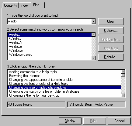
Under this proposal this example would be represented as the following in HTML:
<CARDSET>
<CARD>Contents<IS>
<TABLE WIDTH="100%">
<TR>
<TD>
<SELECT CLASS=Combo NAME=findword ACCESSKEY=T>1 Type the words you want to Find
  <OPTION>...
  <OPTION>...
</SELECT>

<TD ROWSPAN=2>
<BUTTON NAME=clear ACCESSKEY=e SIZE=18>Clear</BUTTON><BR>
<BUTTON NAME=options ACCESSKEY=O SIZE=18>Options...</BUTTON><BR>
<BUTTON NAME=findsimilar ACCESSKEY=m DISABLED SIZE=18>Find Similar...</BUTTON><BR>
<BUTTON NAME=findnow ACCESSKEY=F DISABLED SIZE=18>Find Now</BUTTON><BR>
<BUTTON NAME=rebuild ACCESSKEY=R SIZE=18>Rebuild</BUTTON>

<TR>
<TD>
<SELECT CLASS=LIST NAME=narrow ACCESSKEY=S HEIGHT="7 lines">2 Select some
matching words to narrow your search
  <OPTION>window
  <OPTION>Window
  ...
</SELECT>
</TABLE>

<P>
<SELECT CLASS=LIST NAME=topic ACCESSKEY=C WIDTH="100%" HEIGHT="7 lines">3 Click a
topic, then click Display
  <OPTION>Adding comments to a Help topic
  <OPTION>Browsing the Internet
  ...
</SELECT>

<P>
<OUPUT NAME=found WIDTH="48%" VALUE="40 Topics Found">
<OUPUT NAME=found WIDTH="48%" VALUE="All words,Begin,Auto,Pause">

<CARD>Index<IS>
... contents ...
<CARD>Find<IS>
... contents ...
</CARDSET>
HTML representation to be added ...
HTML representation to be added ...
The World Wide Web Consortium:
http://www.w3.org/