10 Visual rendering model
10.1 Introduction to the visual rendering model
The following sections describe how user agents construct a tree of
box rendering
objects.
Most elements in the document
tree generate a corresponding box in the tree of rendering objects
that participates in the formatting algorithms known as the visual flow model. The dimensions of each
rectangular box, the relationship of the box to its parent and
children in the tree of rendering objects, and other factors all
affect how the user agent will lay out these boxes on the canvas.
All elements that have text content (block or inline) generate
"anonymous" boxes in the tree of boxes. These anonymous boxes, which contain "chunks" of text,
inherit properties (colors, fonts, etc.) from their ancestor
boxes. By default, anonymous boxes are inline, i.e., text is laid out
horizontally. Decisions about the construction of anonymous boxes
depend on many factors (language, hyphenation, etc.) and lie outside
the scope of this specification.
Elements with a value of 'none' for the 'display' property generate no box in
the tree of rendering objects. Thus, those elements have no impact on
the positioning of any boxes.
Finally, some elements in the document tree generate a box in the
tree of rendering objects but that box is invisible. It cannot be
seen, but it does participate in formatting algorithms. Please consult
the section on visibility for
details.
Normally, child boxes are positioned within the box of their
parent. However, a child box may extend horizontally beyond the
bounding box of its parent in certain situations. These are described
in the section on overflow.
CSS2 does not specify all aspects of formatting (e.g.,
letter-spacing algorithm). Conforming user agents may format
differently for situations not covered in this specification.
The visual rendering model describes how user
agents generate a tree of box rendering
objects. The bulk of this model involves calculating the positions
of boxes based on their dimensions, their position in the rendering
tree, and the dimensions of the canvas.
The value of the 'position'
property determines which of the positioning models will determine
a box's final position on the canvas.
'position'
| Property name: | 'position' |
|---|
| Value: | absolute | relative | static |
|---|
| Initial: | static |
|---|
| Applies to: | all elements |
|---|
| Inherited: | no |
|---|
| Percentage values: | N/A |
|---|
The values of this property have the following meanings:
- 'static': Static boxes belong to the normal flow and are described
in this section.
- 'relative': The box generated for this element will first be
positioned according to the normal flow, then offset. Relative
positioning is described in a separate
section.
- 'absolute': The box generated for this element will be given an
absolute position (and possibly size) with respect to a positioning
block. Absolutely positioned elements are described in a separate section.
- 'fixed; Fixed positioning is a variant of absolute positioning
where elements are fixed with respect to the canvas. These are
described in the section on fixed
positioning.
Note.
The 'static' value causes some user agents to
ignore the 'left' and 'top' properties. To ensure that values of
'left' and 'top' are taken into account, authors should
explicitly set the value of the 'position' property to 'relative'.
In CSS2, all box positions are calculated with respect to a
rectangular box called a containing block
The containing block is defined as follows:
- If a box has no parent, then it has no containing block
- Otherwise, if the value of the
'display' property for the
parent box is anything else besides 'inline' then the containing block
is that parent
- Otherwise, the containing block is the containing block
of the parent.
For example, for an inline element like EM, the containing block is
typically the enclosing paragaph (P). On the other hand, the
containing block of a positioned element is the element relative to
which it is positioned.
10.2.2 Direction of flow
'direction'
| Property name: | 'direction' |
|---|
| Value: | ltr | rtl | ltr-override | rtl-override |
|---|
| Initial: | ltr |
|---|
| Applies to: | all elements |
|---|
| Inherited: | yes |
|---|
| Percentage values: | N/A |
|---|
This property determines the whether inline boxes are laid out
left-to-right or right-to-left and how children of block-level boxes
flow. It may take the following values:
- ltr
- Left to right flow. This is the default value.
- rtl
- Right to left flow.
- ltr-override
- [Ian: What does this mean?]
- rtl-override
- [Ian: What does this mean?]
[Ian: Examples here.]
This property also specifies the direction of
table layout.
Block-level boxes are laid out one after the other,
vertically.
The vertical distance between the top of a box and its preceding
sibling (or parent if no preceding sibling exists) is determined
by the 'margin' properties.
Vertical margins between adjacent block-level boxes collapses, as
described in the section on collapsing margins.
For left-to-right flowing content, a block-level box flows inside
the left side of its parent, at a horizontal distance specified by the
'margin' properties. For
right-to-left flowing content, boxes flow inside the right side of
their parent.
For information about page breaks in paged media, please consult
the section on allowed
page breaks.
Some block elements generate boxes that may be formatted as
lists. In terms of flow, lists are formatted as other block-level
elements.
For information about lists and examples of list formatting, please
consult the section on lists.
Inline boxes
are laid out one after the other, horizontally, within a horizontal
space defined by the containing block (see the section on
box width calculations for more
information).
For left-to-right flow, the horizontal distance between the left
side of a box and its preceding sibling's right side (or parent's
right side if no preceding sibling exists) is determined by the 'margin' properties. For right-to-left
flow, the horizontal distance is between the right side of a box and
its preceding sibling's left side (or parent's left side if no
preceding sibling exists).
Horizontally adjacent inline boxes form a
line box. To
form a paragraph, line boxes are stacked vertically. Note that in the
same block, stacked line boxes have the same width but may vary in
height.
When an inline box is less wide than the width of the line box that
contains it, its horizontal alignment within the line box is
determined by the 'alignment' property.
When an inline box is wider than a line box, it it may be split
into several inline boxes and these boxes distributed across several
lines.
Inline boxes in the same line may have different heights (e.g., an
inline image surrounded by text), so the final height of each line box
is determined by the rules given in the section on line height calculations. When
an inline box's height is less than the line box height, the vertical
alignment of the inline box within the line box is determined by the
'vertical-align'
property.
When a block-level element contains text that is not the content of
an inline element, the element generates one or more "anonymous"
inline boxes in the tree of boxes, each of which contains a chunk of
this text.
For example, the following paragraph (created by the HTML block-level
element P) contains chunks of text separated by
the inline elements EM and STRONG:
  <P>Several <EM>emphasized words</EM> appear
  <STRONG>in this</STRONG> sentence, dear.</P>
In terms of the document tree, P has five children elements
that contain the following pieces of text:
- Anonymous: "Several"
- EM: "emphasized words"
- Anonymous: "appear"
- STRONG: "in this"
- Anonymous: "sentence, dear."
To format the paragraph, the user agent generates an inline box
for each child and lays all five of them out into successive line
boxes. The width of the P element determines the width of these line
boxes. If the width of P is sufficient, all the inline boxes will fit
into a single line box:
  Several emphasized words appear
  in this sentence, dear.
If the inline boxes do not fit within a single line box, they will
be split up and distributed across several lines. The previous
paragraph might be split as follows:
  Several emphasized
  words appear
  in this
  sentence, dear.
or like this:
Several emphasized
words appear
in this
sentence, dear.
In this last example, the EM inline box has been split into
two EM boxes (call them "split1" and "split2"). If a inline box split
this way has margins, borders, padding, or text decorations, these
have no visible effect after split1 or before split2 (e.g., the border
is not drawn and the margin and padding are not included after
split1).
Consider the following example:
  <STYLE>
  EM { padding: 2px ;
       margin: 1em ;
       border-width: medium;
       border-style: dashed;
       line-height: 2.4em;
  }
  </STYLE>
  <BODY>
  <P>Several <EM>emphasized words</EM> appear here.</P>
  </BODY>
Depending on the width of the P, the boxes may be distributed as
follows:
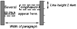
- The margin is inserted before "emphasized" and after "words".
Recall that margins above and below inline elements have no effect.
- The padding is inserted before, above, and below
"emphasized" and after, above, and below "words" (i.e.,
neither after "emphasized" nor before "words"). A
dashed border surrounds the padding.
Note that with a small line height, the padding and borders
around text in different lines may overlap.
10.3.3 Dual-mode elements: run-in and compact
There are two types of boxes that are inline or block depending on
the context. A compact
box is one that is put in the margin of the following
block if there is enough room, otherwise, it will be rendered as a
block. A run-in
box is one that is rendered inline in the following block,
or as a block if there is no following block. The 'display' property determines whether
a box is 'compact' or 'run-in'.
The following example illustrates a compact box.
This document:
<style>
DT {display: compact}
DD {margin-left: 4em}
</style>
<dl>
<dt>Short
<dd><p>Description goes here.
<dt>too long for the margin
<dd><p>Description goes here.
</dl>
may be rendered as:
short    Description goes here

too long for the margin
         Description goes here
A 'run-in' element, on the other hand, is useful for run-in
headers, as in this example:
<style>
  H3 {display: run-in}
  H3:after {content: ". "}
</style>
<h3>A run-in heading</h3>
<p>And a paragraph of text that
follows it.
which may be rendered as follows:
A run-in heading. And a
paragraph of text that
follows it.
A 'run-in' element is rendered exactly like a 'block' element if
the following sibling element is not of type 'block' or is floating or
positioned absolutely. Otherwise the run-in element is rendered inline
as if it were the first inline box of the following block.
Properties apply to a run-in element depending on whether it is
rendered inline or as a block. For example, the 'white-space' property only applies
if the element is rendered as a block.
For a 'compact' element to be rendered as an inline box, it must be
followed by a 'block' element that doesn't float and is not positioned
absolutely. That block must have a 'margin-left' (or 'margin-right'
if it's 'direction' is 'rtl')
that is wide enough for the compact element. That means: the compact
element, when rendered as an inline box, must be a single box (no line
breaks) with overall width (including margins, border and padding) that
is no larger than the margin of the block.
The compact box is outside (to the left or right) of the first line
box of the block, but it takes part in the calculation of that line
box's height. The 'vertical-align' property of
the compact box determines its vertical position relative to that line
box.
The horizontal position is always in the margin of the block, as
far to the outside as possible. The compact box's left margin (or
right, if the block's 'direction' is 'rtl') determines the position.
Once a block-level or inline box has been assigned its position
according to the flow model, it may be shifted relative to this
position. This is called relative positioning and the offset is
specified by the the 'top', 'bottom', 'left', and 'right' properties. Offsetting a box in
this way has no effect on sibling boxes; they are not "reflowed" as a
result of the offset. This implies that relative positioning may cause
boxes to overlap.
Relatively positioned elements establish a new reference box
that child elements can be positioned with respect to. See the section
on absolutely positioned elements
for more on this.
Relatively positioned elements keep their natural shape, including
line breaks and the space originally reserved for them.
Dynamic movement of relatively positioned elements can provide
animation effects in scripting environments (see the section on dynamic positioning for
details).
Elements are positioned relatively by setting the 'position' property to 'relative'.
Relative positioning could also be used as a general form of
superscripting and subscripting except that line height is not
automatically adjusted to take the positioning into consideration. See
the description of line height
calculations for more information.
Examples of relative positioning are provided in the section comparing normal, relative, floating, and
absolute positioning.
10.3.5 Controlling layout behavior: the 'display' property
An element of the document language is not inherently inline or block-level (except, perhaps in the minds of the language's designers). CSS
does not assume any default layout behavior for elements. The layout
behavior of every element is determined by the value of its 'display' property.
'display'
| Property name: | 'display' |
|---|
| Value: | block | inline | list-item | run-in | compact | none |
|---|
| Initial: | block |
|---|
| Applies to: | all elements |
|---|
| Inherited: | no |
|---|
| Percentage values: | N/A |
|---|
An element with a 'display'
value of 'block' causes the generation of a block-level box.
A value of 'list-item' is similar to 'block' except that a
list-item marker is added. For example, in HTML, LI will typically
have this value.
An element with a 'display'
value of 'inline' generates an inline box. The
box is dimensioned according to the formatted size of the content. If
the content is text, it may span several lines, and there will be a
box on each line. The margin, border, and padding properties apply to 'inline'
elements, but will not have any effect at the line breaks.
A value of 'none' turns off the display of the element (including
any border around the element); 'none' completely removes the element
so that it does not affect layout at all. Descendent elements will
also be turned off and cannot override this by setting the 'display' property themselves.
  P { display: block }
  EM { display: inline }
  LI { display: list-item }
  IMG { display: none }
The last rule turns off the display of images.
[Add pointers to run-in and compact -IJ]
The initial value of 'display' is 'block', but a user agent
will typically have default values for all document language elements.
UAs may ignore 'display' and use
only the UA's default values. See the section on conformance for details.
For many document languages, and in particular for HTML, user agents
may provide a default style sheet that implements the layout behavior
expected of the language's elements. Please consult the sample style sheet in the appendix for
information about the default layout behavior of HTML 4.0.
At times, authors may want to control the positioning of a box in a
way that cannot be done within the normal flow. There are three ways to
place a box outside the normal flow:
- Create a floating box that floats
to the left or right of where
it would normally appear in the flow. For instance, authors may
float paragraph boxes in order to place them side-by-side.
- Use absolute positioning.
- Set the value of the 'display' property to 'none' (in which
case, the element does not generate a box at all).
The primary difference between a floating box and one that is
absolutely positioned is that absolute positioning has no impact on
the flow of later siblings; later siblings are laid out as though
their absolutely positioned sister did not exist at all. Later
siblings of floating objects flow with respect to the final
position of the floating element.
Floating and absolutely positioned boxes do affect the flow of
children elements: children elements always flow relative to the
position of their parent (the floater or absolutely positioned
element) unless positioned absolutely themselves.
A floated box is moved to the left or right until the margin,
padding, or border of another block-level element is reached.
User agents take the boundaries of floated boxes into account when
flowing subsequent boxes, i.e., boxes that follow flow around the
floated box. The margins, borders and padding of the floated box are
honored, and the margins never collapse with the margins of adjacent
elements.
To float a box, set the 'float'
property for the element generating the box.
'float'
| Property name: | 'float' |
|---|
| Value: | left | right | none |
|---|
| Initial: | none |
|---|
| Applies to: | all elements |
|---|
| Inherited: | no |
|---|
| Percentage values: | N/A |
|---|
With the value 'none', the generated box will be displayed where
it appears in the text. With a value of 'left' ('right') the element
will be moved to the left ('right') and the text will wrap on the
right (left) side of the element. With a value of 'left' or 'right',
the element is treated as block-level (and
thus the 'display' property is
ignored).
This property is most often used with inline images, but also
applies to text elements.
The following example will place all IMG elements with
class="icon" along the left side of the parent element:
  IMG.icon {
    float: left;
    margin-left: 0;
  }
The following HTML source:
  <STYLE type="text/css">
    IMG { float: left }
    BODY, P, IMG { margin: 2em }
  </STYLE>

  <BODY>
    <P>
      <IMG src=img.gif>
      Some sample text that has no other...
  </BODY>
could be formatted as:
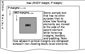
Note that the margin of the P element encloses the floating
IMG element.
10.4.1 Controlling floats
The 'clear' property specifies whether an
element will allow floating elements on its sides.
'clear'
| Property name: | 'clear' |
|---|
| Value: | none | left | right | both |
|---|
| Initial: | none |
|---|
| Applies to: | all elements |
|---|
| Inherited: | no |
|---|
| Percentage values: | N/A |
|---|
When set for an element E, this property indicates which sides of E
may not be adjacent to sides of a floating element. A value of 'left'
means that E may not be positioned next to any floating elements to
its left; when flowed, E will therefore be moved to the next available
line below. The value 'right' means the same thing, but on the right
side of E.
A value of 'none' means that E may be placed next to
floating objects to the left or right.
A value of 'both' means that E may not be placed next to floating
objects on either side.
The following style rule means that no H1 element may have a floating
element to its left. All H1 elements will be positioned at the current
left margin.
H1 { clear: left }
Consult the section on floating constraints for
more information about controlling floats.
Elements that are positioned with respect to a reference
box are said to be absolutely positioned .
The default reference box is the box
generated for the root element of the document tree. However, an element
for which the 'position'
property has been set to a value other than 'static' establishes a new
reference box. Absolutely positioned descendents of the element will
be positioned with regard to the inner edges of the reference box.
Furthermore, an absolutely positioned element establishes a new
context in which normally flowing descendents are aligned.
When the reference box is established by a block-level element, it
has the same width, height, and position as the content and padding
area of the block-level element. When the reference box is established
by an inline element, it has the same width, height, and position as
the content and padding area of the first box generated by the inline
elements. In other words, if the inline element is split into several
boxes on different lines, the reference box is defined by the first
box.
The contents of an absolutely positioned element do not flow around
any other elements. They may or may not obscure the contents of
another element, depending on the z-order of
the overlapping elements.
An absolutely positioned element lives inside of this reference
block, as illustrated below:
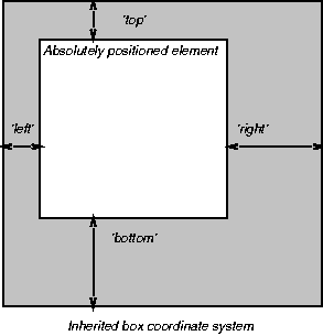
The position of an relatively,
absolutely or fixed positioned (see below) element is
determined from four properties:
'top'
| Property name: | 'top' |
|---|
| Value: | <length> | <percentage> | auto |
|---|
| Initial: | auto |
|---|
| Applies to: | all elements |
|---|
| Inherited: | no |
|---|
| Percentage values: | N/A |
|---|
'right'
| Property name: | 'right' |
|---|
| Value: | <length> | <percentage> | auto |
|---|
| Initial: | auto |
|---|
| Applies to: | all elements |
|---|
| Inherited: | no |
|---|
| Percentage values: | N/A |
|---|
'bottom'
| Property name: | 'bottom' |
|---|
| Value: | <length> | <percentage> | auto |
|---|
| Initial: | auto |
|---|
| Applies to: | all elements |
|---|
| Inherited: | no |
|---|
| Percentage values: | N/A |
|---|
'left'
| Property name: | 'left' |
|---|
| Value: | <length> | <percentage> | auto |
|---|
| Initial: | auto |
|---|
| Applies to: | all elements |
|---|
| Inherited: | no |
|---|
| Percentage values: | N/A |
|---|
Each of these four properties specifies an offset between the
reference box and the element which is being positioned. More
specifically, values indicate the offset between the edge of the
reference box and the corresponding content+padding+border box of the
element that is being positioned.
The values have the following meanings:
- <length>
- The offset is a fixed distance from the edge.
- <percentage>
- The offset is a percentage of the reference box's width (for 'left' or 'right') or height (for 'top' and 'bottom').
- auto
- The offset depends on the width and height specified
for the element.
For absolutely positioned elements, the values of the 'left', 'right', 'top', and 'bottom' properties take over the roles
of the corresponding margin properties
(i.e., absolutely positioned element boxes do not have margins but do
have padding and borders).
For more information about the width and height of absolutely
positioned elements, please consult the sections on box width calculations and box height calculations
respectively.
Fixed positioning is a variant of absolute positioning. The only
difference is that absolutely positioned elements are positioned with
respect to a reference box, while fixed positioned elements are
positioned with respect to the canvas. Fixed positioned elements are,
as the name indicates, fixed to the canvas.
For scrolled media, fixed boxes do not move when the document is
scrolled. In this respect, they are similar to fixed background
images.
In a paged medium, fixed positioned elements are repeated on every
page. This is useful for placing, for instance, a signature at the
bottom of each page.
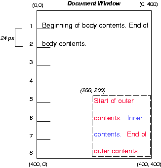
To illustrate the relationship between normal flow, relative
positioning, floats, and absolute positioning, we provide a series of
examples in the following sections based on the following HTML
fragment:
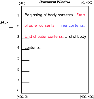
<BODY>
  <P>Beginning of body contents.
  <SPAN id=outer> Start of outer contents.
  <SPAN id=inner> Inner contents.</SPAN>
  End of outer contents.</SPAN>
  End of body contents.
  </P>
</BODY>
The final positioning of the outer and inner
spans vary in each example. In each illustration, the numbers to
the left of the illustration indicate the normal position of the
double-spaced (for clarity in this example) lines.
Consider the following CSS declarations for outer and
inner that don't alter the normal flow of elements:
  #outer {color: red;}
  #inner {color: blue;}
This results in something like the following:
10.6.2 Relative positioning
To see the effect of relative positioning, consider the following CSS rules:
  BODY {line-height: 200%}
  #outer {position: relative; top: -12px; color: red;}
  #inner {position: relative; top: 12px; color: blue;}
First, the outer text is flowed into its "normal" position and
dimensions at the end of line 1. Then, the entire box (distributed
over three lines) is shifted upwards by 12px.
The contents of inner, as a child of outer, would
normally flow immediately after the words "of outer contents" (on line
1.5). However, the inner contents are themselves offset
relative to the outer contents by 12px downwards, back to
their original position on line 2.
Note that the content following outer is not affected by the
relative positioning of outer.
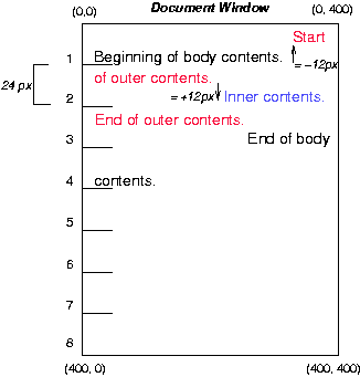
Note also that if the relative positioning of outer were -24px, the
text of outer and the body text would have overlapped.
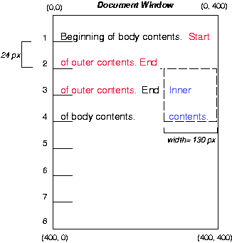
10.6.3 Floating a box
Now consider the effect of floating the inner text to the right by
means of the following rules:
  #outer {color: red;}
  #inner {float: right; width: 130px; color: blue;}
First, the inner box (whose width has been set explicitly) is
floated to the right margin. The text that follows flows in the space
left by the inner box, and respects the new right margin imposed by
the left border of inner.
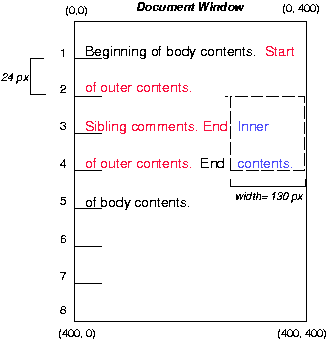
To show the effect of the 'clear' property, we add a sibling
element to the example:
<BODY>
  <P>Beginning of body contents.
  <SPAN id=outer> Start of outer contents.
  <SPAN id=inner> Inner contents.</SPAN>
  <SPAN id=sibling> Sibling contents.</SPAN>
  End of outer contents.</SPAN>
  End of body contents.
  </P>
</BODY>
The following rules:
  #inner {float: right; width: 130px; color: blue;}
  #sibling {color: red;}
cause the inner box to float to the right and the
sibling box to flow in the available space:
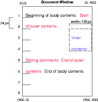
However, if the 'clear'
property on the sibling box is set to 'right' (i.e., the
sibling box will not accept being positioned next to floating
objects to its right), the sibling box flows on the next
available line below:
  #inner {float: right; width: 130px; color: blue;}
  #sibling {clear: right; color: red;}
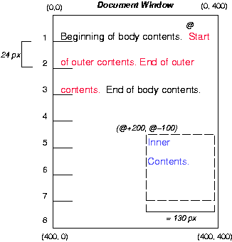
10.6.4 Absolute positioning
Finally, we consider the effect of absolute positioning on
elements. Consider the following CSS declarations for outer and
inner:
  #outer {position: absolute; top: 200px; left: 200px; width: 200px; color: red;}
  #inner {color: blue;}
which causes the top of the outer box to be positioned
with respect to the reference box (which we suppose
is set on the root of the document). The top side of the
outer box is 200px from the top of the reference box
and the left side is 200px from the left side. The child element of
outer flows with respect to its parent.
Note that because outer has been absolutely positioned, it
establishes a new reference box for any absolutely positioned
children (there aren't any in this example).
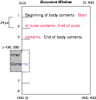
Recall that absolutely positioned elements are positioned with
respect to a reference box set on an ancestor element. The
following example shows an absolutely positioned element that is a
child of a relatively positioned element. Although the parent
outer box is not actually offset, setting its 'position' property to 'relative'
causes its box to serve as the reference box for any
descendents. Since the outer box is an inline box that is
split across several lines, only the first box (whose upper left-hand
corner is designated by a "@" in the illustration below) establishes
the reference box for the descendents.
  #outer {position: relative; color: red;}
  #inner {position: absolute; top: 200px; left: -100px; height:
     130px; width: 130px; color: blue;}
This results in something like the following:
Recall that statically positioning an element is equivalent to
using the 'position' property
to put an element back in the normal flow. Statically positioned
elements do not establish a reference box for their
children. Thus, the following rules:
  #outer {position: static; color: red;}
  #inner {position: absolute; top: 200px; left: -100px; height:
    130px; width: 130px; color: blue;}
are equivalent to:
  #outer {color: red;}
  #inner {position: absolute; top: 200px; left: -100px; height:
    130px; width: 130px; color: blue;}
and cause the inner box to be positioned with respect to
the reference box (which we assume here is set on the root element
of the document tree).
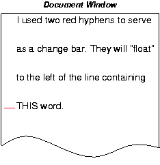
Relative and absolute positioning may be used to implement change
bars, as shown in the following example. We use a value of 'auto' for
the value of the 'top' property,
which results in the element being placed at the "current"
location in the document window, just as if the element were being
flowed into that space. The following HTML text:
<P style="position: relative; margin-right: 10px; left: 10px;">
I used two red hyphens to serve as a change bar. They
will "float" to the left of the line containing THIS
<SPAN style="position: absolute; top: auto; left: 0px; color: red;">--</SPAN>
word.</P>
might result in something like:
10.7 Z-order: Layered presentation
CSS allows authors to specify the position of an element in three
dimensions. The stack
level of an element refers to its position above or below
other elements. The stack level is particularly relevant to elements
that overlap visually.
10.7.1 Specifying the stack level: the 'z-index' property
In the following sections, the expression "in front of" means
closer to the user as the user faces the screen.
The stack level of an element may be determined in two ways:
- By an element's place in the document tree (i.e., with respect to
parent and sibling elements). Elements are stacked in the order they
appear in the document tree. Thus, an element is stacked in
front of its parent and "older" siblings (i.e., those to the left of
the element in the document tree) and behind its children and later
siblings.
- Explicitly, via the 'z-index' property.
'z-index'
| Property name: | 'z-index' |
|---|
| Value: | auto | <integer> |
|---|
| Initial: | auto |
|---|
| Applies to: | elements that may be positioned |
|---|
| Inherited: | no |
|---|
| Percentage values: | N/A |
|---|
The 'z-index' property is
used to specify the stacking order of elements that may be positioned (i.e.,
element's whose 'position'
property has a value of 'absolute' or 'relative').
The default ('auto') behavior is to stack elements back-to-front
in the order they appear in the document tree.
An integer value for 'z-index' specifies stacking order
for an element relative to its sibling and parent elements:
- Sibling elements are stacked bottom-to-top in order of
increasing 'z-index'
value. Sibling elements with identical 'z-index' values have unspecified
relative stacking order.
- Elements that have negative 'z-index' values are stacked below
their parent element and elements with positive 'z-index' values are stacked in
front of their parent element. In other words, each element that
may be positioned defines a positioning context for z-order in
which their own 'z-index' is
0.
- A 'z-index' value of 0 is
equivalent to a value of 'auto'.
The relative z-order of two elements that are neither siblings
nor parent/child can be determined by evaluation of the above
rules for both elements' ancestors.
By default, a positioned element will be placed just above (in
z-space) its parent in the document tree.
It is not possible to position an element behind a grandparent.
In the following example, the order of the elements, listed
back-to-front is:
<STYLE type="text/css">
<!--
.pile { position: absolute; left: 2in; top: 2in; width: 3in; height: 3in; }
-->

<IMG src="butterfly.gif" class="pile" id="image" style="z-index: 1">

<DIV class="pile" id="text1" style="z-index: 3">
   This text will overlay the butterfly image.
</DIV>

<DIV class="pile" id="text2" style="z-index: 2">
   This text will underlay text1, but overlay the butterfly image
</DIV>
The previous example demonstrates the notion of transparency. The
default behavior of an element is to allow elements below it to be
visible through transparent areas in its content. In the example, each
element transparently overlays the elements below it. This behavior
can be overridden by utilizing one of the existing background-related
properties like 'background'.
10.8 Multicolumn layout
Flowing content into several columns is a common way of presenting
text, especially in print. When multiple columns are use, line lengths
are shorter and the font size and line height can be reduced while
maintaining legibility. In CSS, columns are vertical boxes formed in
the content area of an column element. In HTML, the column
element will typically be of type DIV and its child elements will be
flowed into the columns.
All columns in a column element have the same width. The UA
should attempt to balance the content so that each column is filled to
the same extent. When breaking elements over several columns, the
'widows' and 'orphans' properties should be
consulted (in the section on
page breaks).
In a paged medium, page breaks may occur
within the column element. This can be due to lack of space, or from
a page break property value for a child element. When this
happens, the column element should be continued on the next page with
the same number of columns.
Authors may specify a column gap and a vertical column rule
between columns.
The 'columns' property
determines the number of columns into which the content of the element
will be flowed.
By specifying a numeric value, a fixed number of columns is set. In
the following example, DIV elements will have three columns:
DIV { columns: 3 }
By specifying a length value, the UA creates as many columns as
possible within the available space. So, if the available space
increases (for example when the user enlarges the UA window), the number of
columns may increase. The number of columns (n) is a function of the
width of the element (w), the desired column width (cw), the column
gap (cg) and the width of the column rule (cr):
  n' = (w + cg + cr) / (cw + cg + cr)
  n = round(n')
See a description of the column gap and column rule below.
Child elements that are flowed into the columns will be "adapted"
by them. Consider this example:
<STYLE>
  DIV {
    columns: 3;
    column-gap: 1em;
  }
  IMG.logo {
    width: 100%;
  }
</STYLE>
<BODY>
  <DIV>
    <IMG CLASS="logo">
    <P>Some text.<P>
    <P>Some more text.<P>
  </DIV>
</BODY>
The percentage value on the 'width' property refers to the width of
the parent element, but since the IMG element appears inside a column,
the width of the column will take the place of the width of the parent
element.
'column-gap'
| Property name: | 'column-gap' |
|---|
| Value: | <length> | <percentage> |
|---|
| Initial: | UA-specific |
|---|
| Applies to: | block-level elements |
|---|
| Inherited: | no |
|---|
| Percentage values: | the width of the element itself |
|---|
This property sets the gap between adjacent columns. The initial
value is UA-specific, but should be greater than zero. Negative values
are not allowed.
'column-rule-width'
| Property name: | 'column-rule-width' |
|---|
| Value: | <border-width> |
|---|
| Initial: | medium |
|---|
| Applies to: | block-level elements |
|---|
| Inherited: | no |
|---|
| Percentage values: | the width of the element itself |
|---|
'column-rule-style'
| Property name: | 'column-rule-style' |
|---|
| Value: | <border-style> |
|---|
| Initial: | none |
|---|
| Applies to: | block-level elements |
|---|
| Inherited: | no |
|---|
| Percentage values: | the width of the element itself |
|---|
'column-rule-color'
| Property name: | 'column-rule-color' |
|---|
| Value: | <color> |
|---|
| Initial: | the value of the <color> property |
|---|
| Applies to: | block-level elements |
|---|
| Inherited: | no |
|---|
| Percentage values: | N/A |
|---|
'column-rule'
| Property name: | 'column-rule' |
|---|
| Value: | <column-rule-width> || <column-rule-style> || <column-rule-color> |
|---|
| Initial: | see individual properties |
|---|
| Applies to: | block-level elements |
|---|
| Inherited: | no |
|---|
| Percentage values: | N/A |
|---|
These properties set the vertical column rule between adjacent
columns. The rule will appear in the middle of the column gap. On each
side of the rule there will be a gap equal to half the specified
column gap.
Vertically, the column rule extend up to, but not including, the
padding area. If there is a border, but no padding the column rule
will abut the border. In this case, the UA should attempt to
gracefully join the column rule and the border.