Abstract
This module contains CSS features for aligning
content to a baseline grid. CSS is a language for describing the
rendering of structured documents (such as HTML and XML) on screen, on
paper, in speech, etc.
Status of this document
This section describes the status of this document at the time of
its publication. Other documents may supersede this document. A list of
current W3C publications and the latest revision of this technical report
can be found in the W3C technical reports
index at http://www.w3.org/TR/.
Publication as a First Public Working Draft does not imply endorsement
by the W3C Membership. This is a draft document and may be updated,
replaced or obsoleted by other documents at any time. It is inappropriate
to cite this document as other than work in progress.
The (archived) public
mailing list www-style@w3.org (see
instructions) is preferred
for discussion of this specification. When sending e-mail, please put the
text “css-line-grid-1” in the subject, preferably like this:
“[css-line-grid-1] …summary of comment…”
This document was produced by the CSS Working Group (part of
the Style Activity).
This document was produced by a group operating under the 5 February
2004 W3C Patent Policy. W3C maintains a public list of any patent disclosures made in
connection with the deliverables of the group; that page also includes
instructions for disclosing a patent. An individual who has actual
knowledge of a patent which the individual believes contains Essential
Claim(s) must disclose the information in accordance with section
6 of the W3C Patent Policy.
The following features are at risk: …
Table of contents
1. Introduction
1.1. Background
This section is not normative.
This specification provides features to align lines and blocks to
invisible grids in the document.
Aligning lines and blocks to grids provides the following benefits:
- Vertical rhythm is kept for better readability.
- Lines are aligned between columns in multi-column documents.
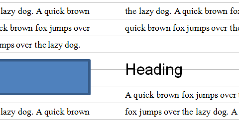
- The top and the bottom margins of pictures are made equal, while
keeping the vertical rhythm of text before and after the pictures.
- Layout lines are at the same position on every page in paged media.
Keeping the position of the bottom line of a page has benefits for design
and readability. This also improves the readability of duplex printing,
two pages spreads, and displaying on slow display devices like e-ink.
- East Asian layouts require vertical rhythm more often than other
scripts do, even in single column, non-paged media documents, as defined
in [JLREQ].
There are several types of objects in a document that can break the
vertical rhythm. Examples include lines with different sizes of text,
pictures, and tables.
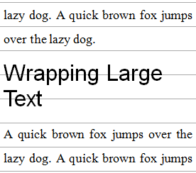
When a different size of text, such as a headings, wraps, it is usually
aligned to grids as a block and the lines within the block do not align.
East Asian layouts may require grid-like features in inline progression
direction as well.
It is often desirable in East Asian layouts to make the line width a
multiple of em without fractions. Because most East Asian
characters have 1em advance and most East Asian documents are justified,
this minimizes cases where justification needs to expand character
spacing.
This module provides the following capabilities:
- Defining grids in the line progression direction.
- Controling how lines and blocks align to the grids.
- Rounding lengths to multiples of units.
It is important to control these capabilities independently, so that,
for example, aligning to grids can be turned off for tables, but can then
be turned back on for aligning the following text to the grids.
1.2. Module Interactions
This module extends the line box model defined in [CSS21] sections 9.4.2 and 10.8.
1.3. Values
This specification follows the CSS property
definition conventions from [CSS21]. Value types not defined in
this specification are defined in CSS Level 2 Revision 1 [CSS21]. Other CSS
modules may expand the definitions of these value types: for example [CSS3COLOR],
when combined with this module, expands the definition of the
<color> value type as used in this specification.
In addition to the property-specific values listed in their definitions,
all properties defined in this specification also accept the inherit
keyword as their property value. For readability it has not been repeated
explicitly.
2. Defining a Line Grid: the
‘line-grid’
property
| Name:
| line-grid
|
| Value:
| match-parent | create
|
| Initial:
| match-parent
|
| Applies to:
| block containers
|
| Inherited:
| no
|
| Animatable:
| no
|
| Percentages:
| N/A
|
| Media:
| visual
|
| Computed value:
| specified value
|
| Canonical order:
| per
grammar
|
Specifies whether this box creates a new baseline grid for its
descendants or uses the same baseline grid as its parent. (Each box always
has an associated line grid. However, whether a box or its contents snap
to a line grid is determined by ‘line-snap’ and ‘box-snap’.)
- ‘
match-parent’
- Box assumes the line grid of its parent.
- ‘
create’
- Box creates a new line grid using its own font and line layout
settings. The line grid consists of a series of horizontal lines
corresponding to all the baselines (alphabetic, text-top, text-bottom,
mathematic, central, hanging, etc.) and to the line-over and line-under
edges, positioned where they would fall if the contents of this element
consisted entirely of line boxes filled with text (no sub-elements) using
the first available font. If the box is paginated, the line grid is
restarted on each page; since line boxes cannot be fragmented, no page
begins with the bottom part of a line's grid.
The names of these values is currently up for debate.
Current suggestions for ‘match-parent’ include ‘match-parent’ and
‘normal’; those for ‘create’ include ‘create’ and ‘new’.
The original proposal for line grids allowed an element to
create a named grid. This property could still be extended to do this in
the future.
Håkon
points out that there might be a need to have line grids aligned to
the page box rather than the page content box. The current proposal has no
way to switch between the two.
There might need to be an offset for more complicated
designs. How to set this offset is problematic: usually it's not a fixed
length, but the distance to clear some header content.
3. Snapping to a Grid
3.1. Snapping Line Boxes: the
‘line-snap’
property
| Name:
| line-snap
|
| Value:
| none | baseline | contain
|
| Initial:
| none
|
| Applies to:
| all elements
|
| Inherited:
| yes
|
| Animatable:
| no
|
| Percentages:
| N/A
|
| Media:
| visual
|
| Computed value:
| specified value
|
| Canonical order:
| per
grammar
|
This property applies to all the line boxes directly contained by the
element, and, when not ‘none’, causes each line box to shift downward
(possibly by zero) until it snaps to the line grid specified by ‘line-grid’. (The
unshifted position is the position that would be determined by normal line
stacking rules, with consideration of any new controls defined by other
modules such as [CSS3LINE].) Values have the
following meanings:
- ‘
none’
- Line boxes do not snap to the grid; they stack normally.
- ‘
baseline’
- The dominant baseline snaps with the matching baseline on the line
grid applying to the element.
- ‘
contain’
- Two baselines are used to align the line box: the line box is snapped
so that its ‘
central’ baseline (halfway
between the ‘text-over’ and ‘text-under’ baselines) is centered between one of the
line grid's ‘text-over’ baselines and a
subsequent (but not necessarily consecutive) ‘text-under’ baseline.
In some cases lines of equal line height will not align perfectly to a
baseline grid: this happens, for example, when fonts (of the same size)
with different baseline tables are mixed on a line. For this reason, if
shifting the line by the largest difference between the smallest ascent
and largest ascent of a single size used on the line would result in a
smaller shift, then the contents of the line box are shifted up within the
line box so as to allow the line to snap without jumping downward to the
next grid line.
3.2. Line Snap Allowance: the
‘line-slack’
property
| Name:
| line-slack
|
| Value:
| none | <integer>
|
| Initial:
| none
|
| Applies to:
| all elements
|
| Inherited:
| yes
|
| Animatable:
| no
|
| Percentages:
| N/A
|
| Media:
| visual
|
| Computed value:
| specified value
|
| Canonical order:
| per
grammar
|
This property specifies the slack in snapping lines to a grid.
- ‘
none’
- No slack: each line box is snapped to the grid.
- <integer>
- Nominally, each nth line box is snapped to the grid
or each nth grid line has a line box snapped to it,
whichever results in smaller shifts, for the specified integer as
n. A value of ‘
1’ allows, for
example, lines of half the grid height to fit twice as densely, while a
value of ‘2’ also allows lines 1.5 times the
grid height to match the grid 2:3. A value less than ‘1’ is invalid.
When ‘line-snap’ is given as a <baseline>, the
‘line-slack’
property interpolates a grid against the main line grid and snaps the
element's line boxes against this grid. The interpolated grid is drawn by
creating a new line grid using the baseline table and ‘line-height’ of the current element and increasing
the inter-line spacing of this new grid to snap according to the element's
‘line-snap’ and
‘line-slack’
values. The first snapped line is chosen to minimize the shift of the
first line box of the element. The interpolated grid is only used for this
block's line boxes; descendant boxes interpolate their own grid against
the main grid.)
Define something sane for ‘line-snap:
contain’.
User Agents are not required to support values greater than 4;
unsupported used values higher than 4 must be clamped to 4.
Can it be extended to handle vertical justification?
3.3. Snapping Block Boxes: the
‘box-snap’
property
This is a rough draft of trying to solve the box-snapping
problem.
| Name:
| box-snap
|
| Value:
| [ none | margin-box | border-box | half-border ]? ]{1,4} [ /
<identifier>{1,4} ]
|
| Initial:
| none
|
| Applies to:
| block-level boxes and internal table elements except table cells
|
| Inherited:
| yes
|
| Animatable:
| no
|
| Percentages:
| N/A
|
| Media:
| visual
|
| Computed value:
| specified value
|
| Canonical order:
| per
grammar
|
Specifies which edges, if any, are snapped to the line box grid. If four
values are specified, they apply to the before, end, after, and start
edges of the box, respectively. If the start edge is omitted, it is the
same as the end. If the after edge is omitted, it is the same as the
before. If the end edge is omitted, it is assigned ‘none’. Values have the
following meanings:
- none
- The edge is not snapped to any grid.
- margin-box
- The margin edge is snapped to the nearest grid line.
- border-box
- The border edge is snapped to the nearest grid line.
- half-border
- The edge halfway between the border and padding edges is snapped to
the nearest grid line.
- <identifier>
- Names the grid to snap to. Defaults to the effective ‘
line-grid’. If the
named grid does not exist (or has no lines in the appropriate dimension),
then the affected edge is not snapped.
This allows the author to specify a grid that is not a line
grid.
When snapping to baselines on a line grid, either the text-over
or text-under baseline is chosen: whichever one is on the matching
side of the central baseline. For example, when snapping the before edge
in horizontal writing mode, the over edge is chosen. In some cases
the under edge might be used instead for the before edge: for
example, when the writing mode of the line grid doesn't match that of the
affected element, or when due to the ‘text-orientation’ settings the under side
corresponds to the after edge.
To snap a before, start, or end edge of a block-level element or its
after margin-box edge to a grid line, the effective margin is increased at
that edge. To snap an after border-box or half-border edge to a grid line,
the effective content-box height is increased. If, however, the box is an
empty block that could be collapsed through, then
this property has no effect. [CSS21]
When applied to table row group and table row boxes, ‘box-snap’ only affects
the before and after edges, and only if those edges are not at the
beginning or end of the table, respectively. To snap a before edge on a
table row or row group, the preceding row's height is increased. To snap
an after edge on a table row or row group, the affected row's height is
increased.
When applied to table column group and table column boxes, ‘box-snap’ only affects
the start and end edges, and only if those edges are not at the start or
end of the table, respectively. How the space is redistributed among
columns to satisfy snapping constraints is not defined, however:
- In an auto-sized table no column may be smaller than its minimum
content width.
- The resulting table must not exceed its original measure if it had a
non-‘
auto’ measure.
- The adjusted widths must not cause the table to overflow its
containing block any more than it would with ‘
box-snap:
    none
’.
To satisfy these constraints, some column edges may remain unsnapped.
For internal table elements in separated borders tables, ‘margin-box’ represents the
edge at the midpoint of the border spacing. For collapsed tables, ‘margin-box’ and ‘border-box’ are treated as
‘half-border’. When
two coinciding edges have conflicting snap values, the later value wins.
4. Layout in Grid
Units
This section is mostly unrevised brainstorming.
4.1. Grid Length Units:
the ‘gd’ unit
The existence of a grid in an element makes it possible and very useful
to express various measurements in that element in terms of grid units.
Grid units are used very frequently in East Asian typography, especially
for the left, right, top and bottom element margins.
Therefore, a new length unit is necessary, gd, to enable the author to
specify the various measurements in terms of the grid.
For example, consider the following style:
P { layout-grid: strict both 20pt 15pt; margin: 1gd 3gd 1gd 2gd }
This way, all P elements would effectively acquire a 15pt top margin, a
60pt right margin, a 15pt bottom margin and a 40pt left margin.
If no grid is specified, the gd unit should be treated the same as the
em unit.
Just copied from old WD, need to refresh
The most common addition of vertical space is that inserted between
paragraphs. If the rhythm of the page is to be maintained, the spacing of
paragraphs should be related to the basic leading. This is achieved by
setting top- and bottom-margins equal to ‘1gd’.
p {
  layout-grid-line: 1.5;
  layout-grid-mode: baseline;
  margin-top: 1gd;
  margin-bottom: 1gd;
}
East Asian layout often requires heights specified by the count of the
line grids. In Japanese, this method is called Gyou-dori. Refer to [JLREQ] for more
details about Gyou-dori.
h1 {
  line-grid-mode: block;
  min-height: 3gd; /* 3 Gyou-dori */
  margin-top: 1gd;
}
‘gem’ length unit is also
requested
4.2. Rounding Lengths to
Multiple of Units: ‘rounddown()’ and ‘roundup()’
The ‘width’ and ‘height’ properties accept ‘rounddown(length)’ and ‘roundup(length)’ values.
The ‘rounddown(length)’ computes to
‘auto’, and then the result will be rounded
down to the largest multiple of the specified unit that is equal to or
less than the original computed value.
Similarly, the ‘roundup(length)’
computes to ‘auto’, and then the result will be
rounded up to the smallest multiple of the specified unit that is equal to
or greater than the original computed value.
The fraction is distributed evenly to the computed values of margins on
each side. If it is used for ‘height’,
half the fraction is added to the top and the bottom margins. If for
‘width’, to the left and the right
margins.
When the element is a float, the fraction is added to the opposite side
of the float direction instead. For example, if the ‘float’ property is ‘left’, the fraction is added to the right margins.
Is this design appropriate to solve text with floats case?
Are there requirements for table cell width?
Should have an option to left/right align instead of center?
Can author align running head and page numbers with body with this design?
Use cases for non-East Asian layouts?
It is often desirable for East Asian layouts to make the line width to
be multiple of em without fractions. Because most East Asian
characters have 1em advance and most East Asian documents are justified,
this minimizes cases where justification is needed to expand lines.
body {
  margin: 3cm 3.5cm 3cm 3cm;
  text-align: justify;
  width: rounddown(1em);
}
.sidefigure {
  float: right;
  width: roundup(1em);
}
5.1. Document Conventions
Conformance requirements are expressed with a combination of descriptive
assertions and RFC 2119 terminology. The key words “MUST”, “MUST
NOT”, “REQUIRED”, “SHALL”, “SHALL NOT”, “SHOULD”,
“SHOULD NOT”, “RECOMMENDED”, “MAY”, and “OPTIONAL” in the
normative parts of this document are to be interpreted as described in RFC
2119. However, for readability, these words do not appear in all uppercase
letters in this specification.
All of the text of this specification is normative except sections
explicitly marked as non-normative, examples, and notes. [RFC2119]
Examples in this specification are introduced with the words “for
example” or are set apart from the normative text with
class="example", like this:
This is an example of an informative example.
Informative notes begin with the word “Note” and are set apart from
the normative text with class="note", like this:
Note, this is an informative note.
Conformance to CSS Line Grid Level 1 is defined for three conformance
classes:
- style
sheet
- A CSS
style sheet.
- renderer
- A UA
that interprets the semantics of a style sheet and renders documents that
use them.
- authoring tool
- A UA
that writes a style sheet.
A style sheet is conformant to CSS Line Grid Level 1 if all of its
declarations that use properties defined in this module have values that
are valid according to the generic CSS grammar and the individual grammars
of each property as given in this module.
A renderer is conformant to CSS Line Grid Level 1 if, in addition to
interpreting the style sheet as defined by the appropriate specifications,
it supports all the properties defined by CSS Line Grid Level 1 by parsing
them correctly and rendering the document accordingly. However, the
inability of a UA to correctly render a document due to limitations of the
device does not make the UA non-conformant. (For example, a UA is not
required to render color on a monochrome monitor.)
An authoring tool is conformant to CSS Line Grid Level 1 if it writes
syntactically correct style sheets, according to the generic CSS grammar
and the individual grammars of each property in this module.
5.3. Partial Implementations
So that authors can exploit the forward-compatible parsing rules to
assign fallback values, CSS renderers must treat as
invalid (and ignore as
appropriate) any at-rules, properties, property values, keywords, and
other syntactic constructs for which they have no usable level of support.
In particular, user agents must not selectively ignore
unsupported component values and honor supported values in a single
multi-value property declaration: if any value is considered invalid (as
unsupported values must be), CSS requires that the entire declaration be
ignored.
5.4. Experimental
Implementations
To avoid clashes with future CSS features, the CSS specifications
reserve a prefixed
syntax for proprietary property and value extensions to CSS. The CSS
Working Group recommends that experimental implementations of features in
CSS Working Drafts also use vendor-prefixed property or value names. This
avoids any incompatibilities with future changes in the draft. Once a
specification reaches the Candidate Recommendation stage, implementors
should implement the non-prefixed syntax for any feature they consider to
be correctly implemented according to spec.
5.5. CR Exit Criteria
For this specification to be advanced to Proposed Recommendation, there
must be at least two independent, interoperable implementations of each
feature. Each feature may be implemented by a different set of products,
there is no requirement that all features be implemented by a single
product. For the purposes of this criterion, we define the following
terms:
- independent
- each implementation must be developed by a different party and cannot
share, reuse, or derive from code used by another qualifying
implementation. Sections of code that have no bearing on the
implementation of this specification are exempt from this requirement.
- interoperable
- passing the respective test case(s) in the official CSS test suite,
or, if the implementation is not a Web browser, an equivalent test. Every
relevant test in the test suite should have an equivalent test created if
such a user agent (UA) is to be used to claim interoperability. In
addition if such a UA is to be used to claim interoperability, then there
must one or more additional UAs which can also pass those equivalent
tests in the same way for the purpose of interoperability. The equivalent
tests must be made publicly available for the purposes of peer review.
- implementation
- a user agent which:
- implements the specification.
- is available to the general public. The implementation may be a
shipping product or other publicly available version (i.e., beta
version, preview release, or “nightly build”). Non-shipping product
releases must have implemented the feature(s) for a period of at least
one month in order to demonstrate stability.
- is not experimental (i.e., a version specifically designed to pass
the test suite and is not intended for normal usage going forward).
The specification will remain Candidate Recommendation for at least six
months.
Acknowledgments
This module was made possible by the advice and contributions of …
References
Normative references
-
- [CSS21]
- Bert Bos; et al. Cascading Style
Sheets Level 2 Revision 1 (CSS 2.1) Specification. 7 June
2011. W3C Recommendation. URL: http://www.w3.org/TR/2011/REC-CSS2-20110607
- [RFC2119]
- S. Bradner. Key
words for use in RFCs to Indicate Requirement Levels. RFC
2119. URL: http://www.ietf.org/rfc/rfc2119.txt
Other references
-
- [CSS3COLOR]
- Tantek Çelik; Chris Lilley; L. David Baron. CSS Color
Module Level 3. 7 June 2011. W3C Recommendation. URL: http://www.w3.org/TR/2011/REC-css3-color-20110607
- [CSS3LINE]
- Michel Suignard; Eric A. Meyer. CSS3
module: line. 15 May 2002. W3C Working Draft. (Work in
progress.) URL: http://www.w3.org/TR/2002/WD-css3-linebox-20020515
- [JLREQ]
- Yasuhiro Anan (阿南 康宏); et al. Requirements
for Japanese Text Layout. 3 April 2012. W3C Working Group
Note. URL: http://www.w3.org/TR/2012/NOTE-jlreq-20120403/
Index
- authoring tool, 5.2.
- ‘
baseline’, 3.1.
- border-box, 3.3.
- box-snap, 3.3.
- ‘
contain’, 3.1.
- ‘
create’, 2.
- half-border, 3.3.
- <identifier>, 3.3.
- <integer>, 3.2.
- length unit
- line-grid, 2.
- line-slack, 3.2.
- line-snap, 3.1.
- margin-box, 3.3.
- ‘
match-parent’, 2.
- none, 3.3.
- ‘
none’, 3.1., 3.2.
- renderer, 5.2.
- style sheet
- as conformance class, 5.2.
Property index
| Property
| Values
| Initial
| Applies to
| Inh.
| Percentages
| Media
|
| box-snap
| [ none | margin-box | border-box | half-border ]? ]{1,4} [ /
<identifier>{1,4} ]
| none
| block-level boxes and internal table elements except table cells
| yes
| N/A
| visual
|
| line-grid
| match-parent | create
| match-parent
| block containers
| no
| N/A
| visual
|
| line-slack
| none | <integer>
| none
| all elements
| yes
| N/A
| visual
|
| line-snap
| none | baseline | contain
| none
| all elements
| yes
| N/A
| visual
|