CSS Fonts Module Level 3
W3C Working Draft 23 August 2012
Copyright © 2012 W3C® (MIT, ERCIM, Keio), All Rights Reserved. W3C liability, trademark and document use rules apply.
Copyright © 2012 W3C® (MIT, ERCIM, Keio), All Rights Reserved. W3C liability, trademark and document use rules apply.
This CSS3 module describes how font properties are specified and how font resources are loaded dynamically. The contents of this specification are a consolidation of content previously divided into CSS3 Fonts and CSS3 Web Fonts modules.
This section describes the status of this document at the time of its publication. Other documents may supersede this document. A list of current W3C publications and the latest revision of this technical report can be found in the W3C technical reports index at http://www.w3.org/TR/.
Publication as a Working Draft does not imply endorsement by the W3C Membership. This is a draft document and may be updated, replaced or obsoleted by other documents at any time. It is inappropriate to cite this document as other than work in progress.
The (archived) public mailing list www-style@w3.org (see instructions) is preferred for discussion of this specification. When sending e-mail, please put the text “css3-fonts” in the subject, preferably like this: “[css3-fonts] …summary of comment…”
This document was produced by the CSS Working Group (part of the Style Activity).
This document was produced by a group operating under the 5 February 2004 W3C Patent Policy. W3C maintains a public list of any patent disclosures made in connection with the deliverables of the group; that page also includes instructions for disclosing a patent. An individual who has actual knowledge of a patent which the individual believes contains Essential Claim(s) must disclose the information in accordance with section 6 of the W3C Patent Policy.
A font provides a resource containing the visual representation of characters. At the simplest level it contains information that maps character codes to shapes (called glyphs) that represent these characters. Fonts sharing a common design style are commonly grouped into font families classified by a set of standard font properties. Within a family, the shape displayed for a given character can vary by stroke weight, slant or relative width, among others. A given font face is described by a unique combination of these properties. For a given range of text, CSS font properties are used to select a font family and a specific font face within that family to be used when rendering that text. As a simple example, to use the bold form of Helvetica one could use:
body {
    font-family: Helvetica;
    font-weight: bold;
}
Font resources may be local, installed on the system on which a user agent is running, or downloadable. For local font resources descriptive information can be obtained directly from the font resource. For downloadable font resources (sometimes referred to as web fonts), the descriptive information is included with the reference to the font resource.
Families of fonts typically don't contain a single face for each possible variation of font properties. The CSS font selection mechanism describes how to match a given set of CSS font properties to a given font face.
This section is included as background for some of the problems and situations that are described in other sections. It should be viewed as informative only.
Typographic traditions vary across the globe so there is no unique way to classify all fonts across languages and cultures. For even common Latin letters, wide variations are possible:
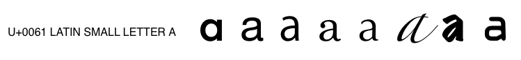
One character, many glyph variations
Differences in the anatomy of letterforms is one way to distinguish fonts. For Latin fonts, flourishes at the ends of a character's main strokes, or serifs, can distinguish a font from those without. Similar comparisons exist in non-Latin fonts between fonts with tapered strokes and those using primarily uniform strokes:
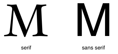
Letterforms with and without serifs
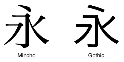
Similar groupings for Japanese typefaces
Fonts contain letterforms and the data needed to map characters to these letterforms. Often this may be a simple one-to-one mapping but more complex mappings are also possible. The use of combining diacritic marks creates many variations for an underlying letterform:
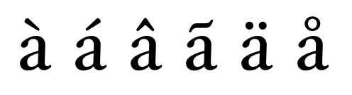
Variations with diacritic marks
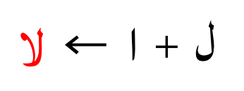
A sequence of characters can be represented by a single glyph known as a ligature:
Ligature example
Visual transformations based on textual context like this may be a stylistic option for European languages but are required to correctly render languages like Arabic; the lam and alef characters below must be combined when they exist in sequence:
Required Arabic ligature
The relative complexity of these shaping transformations requires additional data within the font.
Sets of font faces with various stylistic variations are often grouped together into font families. In the simplest case a regular face is supplemented with bold and italic faces but much more extensive groupings are possible. Variations in the thickness of letterform strokes, or the weight, or the overall proportions of the letterform, or the width, are most common. In the example below, each letter uses a different font face within the Univers font family. The width used increases from top to bottom and the weight increases from left to right:
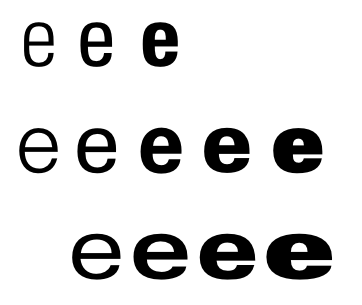
Weight and width variations within a single font family
Creating fonts that support multiple scripts is a difficult task; designers need to understand the cultural traditions surrounding the use of type in different scripts and come up with letterforms that somehow share a common theme. Many languages often share a common script and each of these languages may have noticeable stylistic differences. The Arabic script is shared by Persian and Urdu and Cyrillic is used with many languages, not just Russian.
The character map of a font defines the mapping of characters to glyphs for that font. If a document contains characters not supported by the character maps of explicitly specified fonts, a user agent may use a system font fallback procedure to locate an appropriate font that does. If no appropriate font can be found, some form of "missing glyph" character will be rendered by the user agent. Fallback can occur because fonts are not explicitly specified or because authors fail to explicitly indicate the encoding used by a document.
Although the character map of a font maps a given character to a glyph for that character, modern font technologies such as OpenType and AAT (Apple Advanced Typography) provide a richer set of rules for performing this mapping. Fonts in these forms allow these features to be embedded in the font itself and controlled by applications. Common typographic features which can be specified this way include ligatures, swashes, contextual alternates, proportional and tabular figures, and automatic fractions, to list just a few. For a visual overview of OpenType features, see the [OPENTYPE-FONT-GUIDE].
The particular font face used to render a character is determined by the font family and other font properties that apply to a given element. This structure allows settings to be varied independent of each other.
| Name: | font-family |
| Value: | [ <family-name> | <generic-family> ]# |
| Initial: | depends on user agent |
| Applies to: | all elements |
| Inherited: | yes |
| Percentages: | N/A |
| Media: | visual |
| Computed value: | as specified |
This property specifies a prioritized list of font family names or generic family names. Unlike other CSS properties, component values are a comma-separated list indicating alternatives. A user agent iterates through the list of family names until it matches an available font that contains a glyph for the character to be rendered. This allows for differences in available fonts across platforms and for differences in the range of characters supported by individual fonts.
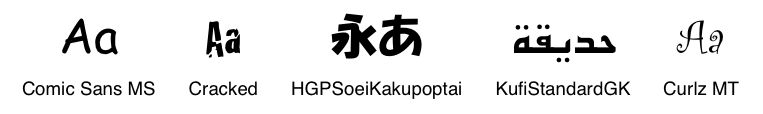
A font family name only specifies a name given to a set of font faces, it does not specify an individual face. Given the availability of the fonts below, Futura would match but Futura Medium would not:
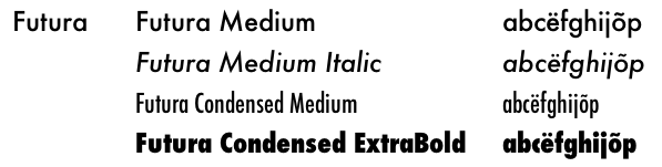
Family and individual face names
Consider the example below:
body {
    font-family: Helvetica, Verdana, sans-serif;
}
If Helvetica is available it will be used when rendering. If neither Helvetica nor Verdana is present, then the user-agent-defined sans serif font will be used.
There are two types of font family names:
serif’, ‘sans-serif’, ‘cursive’, ‘fantasy’, and ‘monospace’. These
keywords can be used as a general fallback mechanism when an author's
desired font choices are not available. As keywords, they must not be
quoted. Authors are encouraged to append a generic font family as a last
alternative for improved robustness.
Font family names must either be given quoted as strings, or unquoted as a sequence of one or more identifiers. This means most punctuation characters and digits at the start of each token must be escaped in unquoted font family names.
For example, the following declarations are invalid:
font-family: Red/Black, sans-serif;
font-family: "Lucida" Grande, sans-serif;
font-family: Ahem!, sans-serif;
font-family: test@foo, sans-serif;
font-family: #POUND, sans-serif;
font-family: Hawaii 5-0, sans-serif;
If a sequence of identifiers is given as a font family name, the computed value is the name converted to a string by joining all the identifiers in the sequence by single spaces.
To avoid mistakes in escaping, it is recommended to quote font family names that contain white space, digits, or punctuation characters other than hyphens:
body { font-family: "New Century Schoolbook", serif }

<BODY STYLE="font-family: '21st Century', fantasy">
Font family names that happen to be the same as a keyword value
(‘inherit’, ‘serif’, ‘sans-serif’, ‘monospace’, ‘fantasy’, and ‘cursive’) must be quoted to prevent confusion
with the keywords with the same names. The keywords ‘initial’ and ‘default’ are reserved for future use and must also
be quoted when used as font names. UAs must not consider these keywords as
matching the ‘<family-name>’ type.
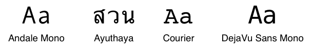
Some font formats allow fonts to carry multiple localizations of the family name. User agents must recognize and correctly match all of these names independent of the underlying platform localization, system API used or document encoding:
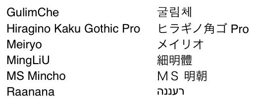
Localized family names
All five generic font families are defined to exist in all CSS implementations (they need not necessarily map to five distinct actual fonts). User agents should provide reasonable default choices for the generic font families, which express the characteristics of each family as well as possible within the limits allowed by the underlying technology. User agents are encouraged to allow users to select alternative choices for the generic fonts.
Glyphs of serif fonts, as the term is used in CSS, have finishing
strokes, flared or tapering ends, or have actual serifed endings
(including slab serifs). Serif fonts are typically proportionately-spaced.
They often display a greater variation between thick and thin strokes than
fonts from the ‘sans-serif’ generic font family. CSS uses the
term ‘serif’ to apply
to a font for any script, although other names may be more familiar for
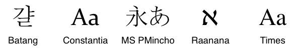
particular scripts, such as Mincho (Japanese), Sung, Song or Kai
(Chinese), Batang (Korean). Any font that is so described may be used to
represent the generic ‘serif’ family.
Sample serif fonts
Glyphs in sans-serif fonts, as the term is used in CSS, have stroke
endings that are plain -- without any flaring, cross stroke, or other
ornamentation. Sans-serif fonts are typically proportionately-spaced. They
often have little variation between thick and thin strokes, compared to
fonts from the ‘serif’ family. CSS uses the term ‘sans-serif’ to apply
to a font for any script, although other names may be more familiar for
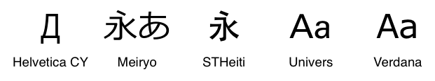
particular scripts, such as Gothic (Japanese), Hei (Chinese), or Gulim
(Korean). Any font that is so described may be used to represent the
generic ‘sans-serif’ family.
Sample sans-serif fonts
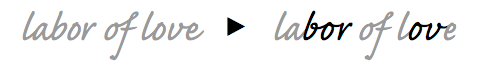
Glyphs in cursive fonts generally have either joining strokes or other
cursive characteristics beyond those of italic typefaces. The glyphs are
partially or completely connected, and the result looks more like
handwritten pen or brush writing than printed letterwork. Some scripts,
such as Arabic, are almost always cursive. CSS uses the term ‘cursive’ to apply to a
font for any script, although other names such as Chancery, Brush, Swing
and Script are also used in font names.
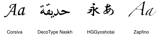
Sample cursive fonts
Fantasy fonts are primarily decorative fonts that contain playful representations of characters. These do not include Pi or Picture fonts which do not represent actual characters.
Sample fantasy fonts
The sole criterion of a monospace font is that all glyphs have the same fixed width. This is often used to render samples of computer code.
Sample monospace fonts
| Name: | font-weight |
| Value: | normal | bold | bolder | lighter | 100 | 200 | 300 | 400 | 500 | 600 | 700 | 800 | 900 |
| Initial: | normal |
| Applies to: | all elements |
| Inherited: | yes |
| Percentages: | N/A |
| Media: | visual |
| Computed value: | see description |
The ‘font-weight’
property specifies weight of glyphs in the font, their degree of blackness
or stroke thickness.
Values have the following meanings:
400’.
700’.
Font formats that use a scale other than a nine step scale should map their scale onto the CSS scale so that 400 roughly corresponds with a face that would be labeled as Regular, Book, Roman and 700 roughly matches a face that would be labeled as Bold. Or weights may be inferred from the style names, ones that correspond roughly with the scale above. The scale is relative, so a face with a larger weight value must never appear lighter. If style names are used to infer weights, care should be taken to handle variations in style names across locales.
Quite often there are only a few weights available for a particular font family. When a weight is specified for which no face exists, a face with a nearby weight is used. In general, bold weights map to faces with heavier weights and light weights map to faces with lighter weights (see the font matching section below for a precise definition). The examples here illustrate which face is used for different weights, grey indicates a face for that weight does not exist so a face with a nearby weight is used:
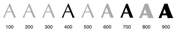
Weight mappings for a font family with 400, 700 and 900 weight faces
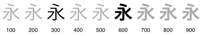
Weight mappings for a font family with 300 and 600 weight faces
Although the practice is not well-loved by typographers, bold faces are often synthesized by user agents for faces that lack actual bold faces. For the purposes of style matching, these faces must be treated as if they exist within the family.
Values of ‘bolder’ and ‘lighter’ indicate values relative to the weight of
the parent element. Based on the inherited weight value, the weight used
is calculated using the chart below. Child elements inherit the calculated
weight, not a value of ‘bolder’ or
‘lighter’.
| Inherited value | bolder | lighter |
|---|---|---|
| 100 | 400 | 100 |
| 200 | 400 | 100 |
| 300 | 400 | 100 |
| 400 | 700 | 100 |
| 500 | 700 | 100 |
| 600 | 900 | 400 |
| 700 | 900 | 400 |
| 800 | 900 | 700 |
| 900 | 900 | 700 |
The table above is equivalent to selecting the next relative bolder or lighter face, given a font family containing normal and bold faces along with a thin and a heavy face. Authors who desire finer control over the exact weight values used for a given element should use numerical values instead of relative weights.
| Name: | font-stretch |
| Value: | normal | ultra-condensed | extra-condensed | condensed | semi-condensed | semi-expanded | expanded | extra-expanded | ultra-expanded |
| Initial: | normal |
| Applies to: | all elements |
| Inherited: | yes |
| Percentages: | N/A |
| Media: | visual |
| Computed value: | as specified |
The ‘font-stretch’
property selects a normal, condensed, or expanded face from a font family.
Absolute keyword values have the following ordering, from narrowest to
widest:
The scale is relative, so a face with a font-stretch value higher in the list above should never appear wider. When a face does not exist for a given width, normal or condensed values map to a narrower face, otherwise a wider face. Conversely, expanded values map to a wider face, otherwise a narrower face. The figure below shows how the nine font-stretch property settings affect font selection for font family containing a variety of widths, grey indicates a width for which no face exists and a different width is substituted:

Width mappings for a font family with condensed, normal and expanded width faces
| Name: | font-style |
| Value: | normal | italic | oblique |
| Initial: | normal |
| Applies to: | all elements |
| Inherited: | yes |
| Percentages: | N/A |
| Media: | visual |
| Computed value: | as specified |
The ‘font-style’
property allows italic or oblique faces to be selected. Italic forms are
generally cursive in nature while oblique faces are typically sloped
versions of the regular face. Oblique faces can be simulated by
artificially sloping the glyphs of the regular face. Compare the
artificially sloped renderings of Palatino ‘a’ and Baskerville ‘N’ in grey with the actual italic versions:
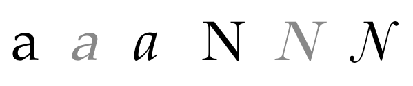
Artificial sloping versus real italics
A value of ‘normal’ selects a face that is classified as
‘normal’, while
‘oblique’ selects a font that is labeled
‘oblique’. A value of ‘italic’ selects a font that is labeled ‘italic’, or, if that is not available, one labeled
‘oblique’. If no italic or oblique faces
is available, an oblique face can by synthesized by rendering the normal
face with a sloping transformation applied.
Many scripts lack the tradition of mixing a cursive form within text rendered with a normal face. Chinese, Japanese and Korean fonts almost always lack italic or oblique faces. Fonts that support a mixture of scripts will sometimes omit specific scripts such as Arabic from the set of glyphs supported in the italic face. User agents should be careful about making character map assumptions across faces.
| Name: | font-size |
| Value: | <absolute-size> | <relative-size> | <length> | <percentage> |
| Initial: | medium |
| Applies to: | all elements |
| Inherited: | yes |
| Percentages: | refer to parent element's font size |
| Media: | visual |
| Computed value: | absolute length |
This property indicates the desired height of glyphs from the font. For scalable fonts, the font-size is a scale factor applied to the EM unit of the font. (Note that certain glyphs may bleed outside their EM box.) For non-scalable fonts, the font-size is converted into absolute units and matched against the declared font-size of the font, using the same absolute coordinate space for both of the matched values. Values have the following meanings:
[ xx-small | x-small | small | medium | large | x-large | xx-large ]
[ larger | smaller ]
For example, if the parent element has a font size of ‘medium’, a value of ‘larger’ will make the font size of the current
element be ‘large’. If the parent
element's size is not close to a table entry, the user agent is free to
interpolate between table entries or round off to the closest one. The
user agent may have to extrapolate table values if the numerical value
goes beyond the keywords.
em’s, leads to more robust and
cascadable style sheets.
The following table provides user agent's guideline for the
absolute-size scaling factor and their mapping to XHTML heading and
absolute font-sizes. The ‘medium’ value is
used as the reference middle value. The user agent may fine-tune these
values for different fonts or different types of display devices.
| CSS absolute-size values | xx-small | x-small | small | medium | large | x-large | xx-large | |
|---|---|---|---|---|---|---|---|---|
| scaling factor | 3/5 | 3/4 | 8/9 | 1 | 6/5 | 3/2 | 2/1 | 3/1 |
| XHTML headings | h6 | h5 | h4 | h3 | h2 | h1 | ||
| XHTML font sizes | 1 | 2 | 3 | 4 | 5 | 6 | 7 |
Note 1. To preserve readability, an UA applying these guidelines should nevertheless avoid creating font-size resulting in less than 9 pixels per EM unit on a computer display .
Note 2. In CSS1, the suggested scaling factor between adjacent indexes was 1.5 which user experience proved to be too large. In CSS2, the suggested scaling factor for computer screen between adjacent indexes was 1.2 which still created issues for the small sizes. The new scaling factor varies between each index to provide a better readability.
The actual value [link to Cascading module] of this property may differ
from the computed value due a numerical value on ‘font-size-adjust’ and the unavailability of
certain font sizes.
Child elements inherit the computed ‘font-size’ value (otherwise, the effect
of ‘font-size-adjust’ would compound).
p { font-size: 12pt; }
blockquote { font-size: larger }
em { font-size: 150% }
em { font-size: 1.5em }
| Name: | font-size-adjust |
| Value: | <number> | none |
| Initial: | none |
| Applies to: | all elements |
| Inherited: | yes |
| Percentages: | N/A |
| Media: | visual |
| Computed value: | as specified |
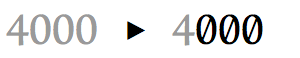
For any given font size, the apparent size and legibility of text varies across fonts. For scripts such as Latin or Cyrillic that distinguish between upper and lowercase letters, the relative height of lowercase letters compared to their uppercase counterparts is a determining factor of legibility. This is commonly referred to as the aspect value. Precisely defined, it is equal to the x-height of a font divided by the font size.
In situations where font fallback occurs, fallback fonts may not share the same aspect ratio as the desired font family and will thus appear less readable. The font-size-adjust property is a way to preserve the readability of text when font fallback occurs. It does this by adjusting the font-size so that the x-height is the same regardless of the font used.
The style defined below defines Verdana as the desired font family, but if Verdana is not available Futura or Times will be used.
p {
    font-family: Verdana, Futura, Times;
}

<p>Lorem ipsum dolor sit amet, ...</p>
Verdana has a relatively high aspect ratio, lowercase letters are relatively tall compared to uppercase letters, so at small sizes text appears legible. Times has a lower aspect ratio and so if fallback occurs, the text will be less legible at small sizes than Verdana.
How text rendered in each of these fonts compares is shown below, the columns show text rendered in Verdana, Futura and Times. The same font-size value is used across cells within each row and red lines are included to show the differences in x-height. In the upper half each row is rendered in the same font-size value. The same is true for the lower half but in this half the font-size-adjust property is also set so that the actual font size is adjusted to preserve the x-height across each row. Note how small text remains relatively legible across each row in the lower half.
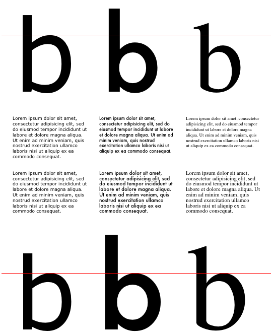
Text with and without the use of font-size-adjust
This property allows authors to specify an aspect value for an element that will effectively preserve the x-height of the first choice font, whether it is substituted or not. Values have the following meanings:
c = ( a / a' ) s
where:
s  =  font-size value
a  =  aspect value as specified by the font-size-adjust property
a' =  aspect value of actual font
c  =  adjusted font-size to use
This value applies to any font that is selected but in typical usage it should be based on the aspect value of the first font in the font-family list. If this is specified accurately, the (a/a') term in the formula above is effectively 1 for the first font and no adjustment occurs. If the value is specified inaccurately, text rendered using the first font in the family list will display differently in older user agents that don't support font-size-adjust.
Authors can calculate the aspect value for a given font by comparing spans with the same content but different font-size-adjust properties. If the same font-size is used, the spans will match when the font-size-adjust value is accurate for the given font.
Two spans with borders are used to determine the aspect value of a font. The font-size is the same for both spans but the font-size-adjust property is specified only for the right span. Starting with a value of 0.5, the aspect value can be adjusted until the borders around the two letters line up.
p {
    font-family: Futura;
    font-size: 500px;
}

span {
    border: solid 1px red;
}

.adjust {
    font-size-adjust: 0.5;
}

<p><span>b</span><span class="adjust">b</span></p>
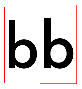
Futura with an aspect value of 0.5
The box on the right is a bit bigger than the one on the left, so the aspect value of this font is something less than 0.5. Adjust the value until the boxes align.
| Name: | font |
| Value: | [ [ <‘font-style’> || <font-variant-css21> ||
<‘font-weight’> ]? <‘font-size’>
[ / <‘line-height’> ]? <‘font-family’> ] | caption | icon | menu |
message-box | small-caption | status-bar
|
| Initial: | see individual properties |
| Applies to: | all elements |
| Inherited: | yes |
| Percentages: | see individual properties |
| Media: | visual |
| Computed value: | see individual properties |
The ‘font’ property is, except as described
below, a shorthand property for setting ‘font-style’,
‘font-variant’, ‘font-weight’, ‘font-size’, ‘line-height’, ‘font-family’ at the same place in the
stylesheet. Values for the ‘font-variant’ property may also be
included but only those supported in CSS 2.1, none of the font-variant
values added in this specification can be used in the ‘font’ shorthand:
<font-variant-css21> = [normal | small-caps]
The syntax of this property is based on a traditional typographical shorthand notation to set multiple properties related to fonts.
All font-related properties are first reset to their initial values,
including those listed in the preceding paragraph plus ‘font-stretch’, ‘font-size-adjust’, ‘font-kerning’ and all font feature
properties. Then, those properties that are given explicit values in the
‘font’ shorthand are set to those
values. For a definition of allowed and initial values, see the previously
defined properties. For reasons of backwards compatibility, it is not
possible to set ‘font-stretch’ and ‘font-size-adjust’ to other than their
initial values using the ‘font’
shorthand property; instead, set the individual properties.
p { font: 12pt/14pt sans-serif }
p { font: 80% sans-serif }
p { font: x-large/110% "new century schoolbook", serif }
p { font: bold italic large Palatino, serif }
p { font: normal small-caps 120%/120% fantasy }
p { font: oblique 12pt "Helvetica Neue", serif; font-stretch: condensed }
In the second rule, the font size percentage value (‘80%’) refers to the font size of the parent element.
In the third rule, the line height percentage (‘110%’) refers to the font size of the element itself.
The first three rules do not specify the ‘font-variant’ and ‘font-weight’ explicitly, so these
properties receive their initial values (‘normal’). Notice that the font family name
"new century schoolbook", which contains spaces, is enclosed in quotes.
The fourth rule sets the ‘font-weight’ to ‘bold’, the ‘font-style’ to ‘italic’, and implicitly sets ‘font-variant’ to ‘normal’.
The fifth rule sets the ‘font-variant’ (‘small-caps’), the
‘font-size’ (120% of the parent's font
size), the ‘line-height’ (120% of the font size) and
the ‘font-family’ (‘fantasy’). It follows
that the keyword ‘normal’ applies to the two remaining
properties: ‘font-style’ and ‘font-weight’.
The sixth fifth rule sets the ‘font-style’, ‘font-size’, and ‘font-family’, the other font
properties being set to their initial values. It then sets ‘font-stretch’ to ‘condensed’ since that property cannot be set to
that value using the ‘font’
shorthand property.
The following values refer to system fonts:
System fonts may only be set as a whole; that is, the font family, size,
weight, style, etc. are all set at the same time. These values may then be
altered individually if desired. If no font with the indicated
characteristics exists on a given platform, the user agent should either
intelligently substitute (e.g., a smaller version of the ‘caption’ font might be used for the ‘smallcaption’ font), or substitute a user agent
default font. As for regular fonts, if, for a system font, any of the
individual properties are not part of the operating system's available
user preferences, those properties should be set to their initial values.
That is why this property is "almost" a shorthand property: system fonts
can only be specified with this property, not with ‘font-family’ itself, so ‘font’ allows authors to do more than
the sum of its subproperties. However, the individual properties such as
‘font-weight’ are still given values
taken from the system font, which can be independently varied.
button { font: 300 italic 1.3em/1.7em "FB Armada", sans-serif }
button p { font: menu }
button p em { font-weight: bolder }
If the font used for dropdown menus on a particular system happened to be, for example, 9-point Charcoal, with a weight of 600, then P elements that were descendants of BUTTON would be displayed as if this rule were in effect:
button p { font: 600 9pt Charcoal }
Because the ‘font’ shorthand resets to its initial
value any property not explicitly given a value, this has the same effect
as this declaration:
button p {
  font-style: normal;
  font-variant: normal;
  font-weight: 600;
  font-size: 9pt;
  line-height: normal;
  font-family: Charcoal
}
| Name: | font-synthesis |
| Value: | none | [ weight || style ] |
| Initial: | weight style |
| Applies to: | all elements |
| Inherited: | yes |
| Percentages: | N/A |
| Media: | visual |
| Computed value: | as specified |
This property controls whether user agents are allowed to synthesize
bold or oblique font faces when a font family lacks bold or italic faces.
If ‘weight’ is not specified, user agents
must not synthesize bold faces and if ‘style’ is not specified user agents must not
synthesize italic faces. A value of ‘none’
disallows all synthetic faces.
The style rule below disables the use of synthetically obliqued Arabic:
*:lang(ar) { font-synthesis: none; }
The @font-face rule allows for linking to fonts that are automatically activated when needed. This allows authors to select a font that closely matches the design goals for a given page rather than limiting the font choice to a set of fonts available on all platforms. A set of font descriptors define the location of a font resource, either locally or externally, along with the style characteristics of an individual face. Multiple @font-face rules can be used to construct font families with a variety of faces. Using CSS font matching rules, a user agent can selectively download only those faces that are needed for a given piece of text.
The general form of an @font-face at-rule is:
@font-face { <font-description> }
where <font-description> has the form:
descriptor: value;
descriptor: value;
[...]
descriptor: value;
Each @font-face rule specifies a value for every font descriptor, either implicitly or explicitly. Those not given explicit values in the rule take the initial value listed with each descriptor in this specification. These descriptors apply solely within the context of the @font-face rule in which they are defined, and do not apply to document language elements. There is no notion of which elements the descriptors apply to or whether the values are inherited by child elements. When a given descriptor occurs multiple times in a given @font-face rule, only the last specified value is used, all prior values for that descriptor are ignored.
To use a downloadable font called Gentium:
@font-face {
  font-family: Gentium;
  src: url(http://example.com/fonts/Gentium.ttf);
}

p { font-family: Gentium, serif; }
The user agent will download Gentium and use it when rendering text within paragraph elements. If for some reason the site serving the font is unavailable, the default serif font will be used.
A given set of @font-face rules define a set of fonts available to containing documents. Multiple rules can be used to define a family with a large set of faces. When font matching is done fonts defined using these rules are considered before other available fonts on a system.
Downloaded fonts are only available to documents that reference them, the process of activating these fonts should not make them available to other applications or to documents that don't directly link to the same font. User agent implementers might consider it convenient to use downloaded fonts when rendering characters in other documents for which no other available font exists as part of the system font fallback procedure. This would cause a security leak since the contents of one page would be able to affect other pages, something an attacker could use as an attack vector. These restrictions do not affect caching behavior, fonts are cached the same way other web resources are cached.
User agents which do not understand the @font-face rule encounter the opening curly bracket and ignore forward until the closing curly bracket. This at-rule conforms with the forward-compatible parsing requirement of CSS, parsers may ignore these rules without error. Any descriptors that are not recognized or implemented by a given user agent must be ignored. @font-face rules require a font-family and src descriptor, if either of these are missing the @font-face must be ignored.
In cases where user agents have limited platform resources or implement the ability to disable downloadable font resources, @font-face rules must simply be ignored; the behavior of individual descriptors as defined in this specification should not be altered.
| Name: | font-family |
| Value: | <family-name> |
| Initial: | N/A |
This descriptor defines the font family name that will be used in all CSS font family name matching, overriding font family names contained in the underlying font data. If the font family name is the same as a font family available in a given user's environment, it effectively hides the underlying font for documents that use the stylesheet. This permits a web author to freely choose font-family names without worrying about conflicts with font family names present in a given user's environment. Errors loading font data do not affect font name matching behavior. User agents that apply platform font aliasing rules to font family names defined via @font-face rules are considered non-conformant.
| Name: | src |
| Value: | [ <uri> [format(<string>#)]? | <font-face-name> ]# |
| Initial: | N/A |
This descriptor specifies the resource containing font data. It is required, whether the font is downloadable or locally installed. Its value is a prioritized, comma-separated list of external references or locally installed font face names. When a font is needed the user agent iterates over the set of references listed, using the first one it can successfully activate. Fonts containing invalid data or local font faces that are not found are ignored and the user agent loads the next font in the list (platform substitutions for a given font must not be used).
As with other URIs in CSS, the URI may be partial, in which case it is resolved relative to the location of the style sheet containing the @font-face rule. In the case of SVG fonts, the URL points to an element within a document containing SVG font definitions. If the element reference is omitted, a reference to the first defined font is implied. Similarly, font container formats that can contain more than one font must load one and only one of the fonts for a given @font-face rule. Fragment identifiers are used to indicate which font to load. If a container format lacks a defined fragment identifier scheme, implementations should use a simple 1-based indexing scheme (e.g. "font-collection#1" for the first font, "font-collection#2" for the second font).
src: url(fonts/simple.ttf);   /* load simple.ttf relative to stylesheet location */
src: url(/fonts/simple.ttf);  /* load simple.ttf from absolute location */
src: url(fonts.svg#simple);   /* load SVG font with id 'simple' */
External references consist of a URI, followed by an optional hint describing the format of the font resource referenced by that URI. The format hint contains a comma-separated list of format strings that denote well-known font formats. Conformant user agents must skip downloading a font resource if the format hints indicate only unsupported or unknown font formats. If no format hints are supplied, the user agent should download the font resource.
/* load WOFF font if possible, otherwise use OpenType font */
@font-face {
  font-family: bodytext;
  src: url(ideal-sans-serif.woff) format("woff"),
       url(basic-sans-serif.ttf) format("opentype");
}
Format strings defined by this specification:
| String | Font Format | Common extensions |
|---|---|---|
| "woff" | WOFF (Web Open Font Format) | .woff |
| "truetype" | TrueType | .ttf |
| "opentype" | OpenType | .ttf, .otf |
| "embedded-opentype" | Embedded OpenType | .eot |
| "svg" | SVG Font | .svg, .svgz |
Given the overlap in common usage between TrueType and OpenType, the format hints "truetype" and "opentype" must be considered as synonymous; a format hint of "opentype" does not imply that the font contains Postscript CFF style glyph data or that it contains OpenType layout information (see Appendix A for more background on this).
When authors would prefer to use a locally available copy of a given font and download it if it's not, local() can be used. The locally installed <font-face-name> is a format-specific string that uniquely identifies a single font face within a larger family. The syntax for a <font-face-name> is a unique font face name enclosed by "local(" and ")".
/* regular face of Gentium */
@font-face {
  font-family: MyGentium;
  src: local(Gentium),   /* use locally available Gentium */
       url(Gentium.ttf); /* otherwise, download it */
}
The name can optionally be enclosed in quotes. For OpenType and TrueType fonts, this string is used to match only the Postscript name or the full font name in the name table of locally available fonts. Which is used varies by platform and font, so authors should include both of these names to assure proper matching across platforms.
/* bold face of Gentium */
@font-face {
  font-family: MyGentium;
  src: local(Gentium Bold),   /* full font name */
       local(Gentium-Bold),   /* Postscript name */
       url(GentiumBold.ttf);  /* otherwise, download it */
  font-weight: bold;
}
Just as a @font-face rule specifies the characteristics of a single font within a family, the unique name used with local() specifies a single font, not an entire font family. Defined in terms of OpenType font data, the Postscript name is found in the font's name table, in the name record with nameID = 6 (see [OPENTYPE] for more details). The Postscript name is the commonly used key for all fonts on OSX and for Postscript CFF fonts under Windows. The full font name (nameID = 4) is used as a unique key for fonts with TrueType glyphs on Windows.
For OpenType fonts with multiple localizations of the full font name, the US English version is used (language ID = 0x409 for Windows and language ID = 0 for Macintosh) or the first localization when a US English full font name is not available (the OpenType specification recommends that all fonts minimally include US English names). User agents that also match other full font names, e.g. matching the Dutch name when the current system locale is set to Dutch, are considered non-conformant. This is done not to prefer English but to avoid matching inconsistencies across font versions and OS localizations, since font style names (e.g. "Bold") are frequently localized into many languages and the set of localizations available varies widely across platform and font version. User agents that match a concatenation of family name (nameID = 1) with style name (nameID = 2) are considered non-conformant.
This also allows for referencing faces that belong to larger families that cannot otherwise be referenced.
Use a local font or reference an SVG font in another document:
@font-face {
  font-family: Headline;
  src: local(Futura-Medium),
       url(fonts.svg#MyGeometricModern) format("svg");
}
Create an alias for local Japanese fonts on different platforms:
@font-face {
  font-family: jpgothic;
  src: local(HiraKakuPro-W3), local(Meiryo), local(IPAPGothic);
}
Reference a font face that cannot be matched within a larger family:
@font-face {
  font-family: Hoefler Text Ornaments;
  /* has the same font properties as Hoefler Text Regular */
  src: local(HoeflerText-Ornaments);
}
Since localized fullnames should never match, a document with the header style rules below would always render using the default serif font, regardless whether a particular system locale parameter is set to Finnish or not:
@font-face {
  font-family: SectionHeader;
  src: local("Arial Lihavoitu");  /* Finnish fullname for Arial Bold, matching should fail */
  font-weight: bold;
}

h2 { font-family: SectionHeader, serif; }
A conformant user agent should never load the font ‘gentium.eot’ in the example below, since it is
included in the first definition of the ‘src’ descriptor which is overridden by the
second definition in the same @font-face rule:
@font-face {
  font-family: MainText;
  src: url(gentium.eot); /* for compatibility with older non-conformant user agents */
  src: local("Gentium"), url(gentium.ttf);  /* Overrides src definition */
}
| Name: | font-style |
| Value: | normal | italic | oblique |
| Initial: | normal |
| Name: | font-weight |
| Value: | normal | bold | 100 | 200 | 300 | 400 | 500 | 600 | 700 | 800 | 900 |
| Initial: | normal |
| Name: | font-stretch |
| Value: | normal | ultra-condensed | extra-condensed | condensed | semi-condensed | semi-expanded | expanded | extra-expanded | ultra-expanded |
| Initial: | normal |
These descriptors define the characteristics of a font face and are used
in the process of matching styles to specific faces. For a font family
defined with several @font-face rules, user agents can either download all
faces in the family or use these descriptors to selectively download font
faces that match actual styles used in document. The values for these
descriptors are the same as those for the corresponding font properties
except that relative keywords are not allowed, ‘bolder’ and ‘lighter’. If these descriptors are omitted,
default values are assumed.
The value for these font face style attributes is used in place of the style implied by the underlying font data. This allows authors to combine faces in flexible combinations, even in situations where the original font data was arranged differently. User agents that implement synthetic bolding and obliqueing must only apply synthetic styling in cases where the font descriptors imply this is needed, rather than based on the style attributes implied by the font data.
| Name: | unicode-range |
| Value: | <urange># |
| Initial: | U+0-10FFFF |
This descriptor defines the range of Unicode characters supported by a given font. The values of <urange> are expressed using hexadecimal numbers prefixed by "U+", corresponding to Unicode character code points. The unicode-range descriptor serves as a hint for user agents when deciding whether or not to download a font resource.
Unicode range values are written using hexadecimal values and are case insensitive. Each is prefixed by "U+" and multiple, discontinuous ranges are separated by commas. Whitespace before or after commas is ignored. Valid character code values vary between 0 and 10FFFF inclusive. A single range has three basic forms:
?’ characters imply
‘any digit value’ (e.g. U+4??)
Ranges that do not fit any of the above three forms are considered to be parse errors and the descriptor is omitted. Interval ranges consisting of a single code point are valid. Ranges specified with ‘?’ that lack an initial digit (e.g. "U+???") are also valid, and are treated as if there was a single 0 before the question marks (thus, "U+???" = "U+0???" = "U+0000-0FFF"). "U+??????" is not a syntax error, even though "U+0??????" would be. Ranges can overlap but interval ranges that descend (e.g. U+400-32f) are invalid and omitted rather than treated as parse errors; they have no effect on other ranges in a list of ranges. Ranges are clipped to the domain of Unicode code points (currently 0 – 10FFFF inclusive); a range entirely outside the domain is omitted. Without any valid ranges, the descriptor is omitted. User agents may normalize the list of ranges into a list that is different but represents the same set of character code points.
The character range can be a subset of the full character map of the underlying font. The effective unicode-range used when mapping characters to fonts is the intersection of the unicode range specified and the underlying character map of the font. This means that authors do not need to define the unicode-range of a font precisely, broad ranges for which a sparse set of code points are defined in the font can be used. Code points outside of the defined unicode-range are ignored, regardless of whether the font contains a glyph for that code point or not. User agents that download fonts for characters outside the defined unicode-range are considered non-conformant. Likewise, user agents that render a character using a font resource for which the defined unicode-range does not include that character are also considered non-conformant.
Example ranges for specific languages or characters:
The BBC provides news services in a wide variety of languages, many that are not well supported across all platforms. Using an @font-face rule, the BBC could provide a font for any of these languages, as it already does via a manual font download.
@font-face {
  font-family: BBCBengali;
  src: url(fonts/BBCBengali.ttf) format("opentype");
  unicode-range: U+00-FF, U+980-9FF;
}
Technical documents often require a wide range of symbols. The STIX Fonts project is one project aimed at providing fonts to support a wide range of technical typesetting in a standardized way. The example below shows the use of a font that provides glyphs for many of the mathematical and technical symbol ranges within Unicode:
@font-face {
  font-family: STIXGeneral;
  src: local(STIXGeneral), url(/stixfonts/STIXGeneral.otf);
  unicode-range: U+000-49F, U+2000-27FF, U+2900-2BFF, U+1D400-1D7FF;
}
Multiple @font-face rules with different unicode ranges for the same family and style descriptor values can be used to create composite fonts that mix the glyphs from different fonts for different scripts. This can be used to combine fonts that only contain glyphs for a single script (e.g. Latin, Greek, Cyrillic) or it can be used by authors as a way of segmenting a font into fonts for commonly used characters and less frequently used characters. Since the user agent will only pull down the fonts it needs this helps reduce page bandwidth.
If the unicode ranges overlap for a set of @font-face rules with the same family and style descriptor values, the rules are ordered in the reverse order they were defined; the last rule defined is the first to be checked for a given character.
This example shows how an author can override the glyphs used for Latin characters in a Japanese font with glyphs from a different font. The first rule specifies no range so it defaults to the entire range. The range specified in the second rule overlaps but takes precedence because it is defined later.
@font-face {
  font-family: JapaneseWithGentium;
  src: local(MSMincho);
  /* no range specified, defaults to entire range */
}

@font-face {
  font-family: JapaneseWithGentium;
  src: url(../fonts/Gentium.ttf);
  unicode-range: U+0-2FF;
}
Consider a family constructed to optimize bandwidth by separating out Latin, Japanese and other characters into different font files:
/* fallback font - size: 4.5MB */
@font-face {
  font-family: DroidSans;
  src: url(DroidSansFallback.ttf);
  /* no range specified, defaults to entire range */
}

/* Japanese glyphs - size: 1.2MB */
@font-face {
  font-family: DroidSans;
  src: url(DroidSansJapanese.ttf);
  unicode-range: U+3000-9FFF, U+ff??;
}

/* Latin, Greek, Cyrillic along with some
   punctuation and symbols - size: 190KB */
@font-face {
  font-family: DroidSans;
  src: url(DroidSans.ttf);
  unicode-range: U+000-5FF, U+1e00-1fff, U+2000-2300;
}
For simple Latin text, only the font for Latin characters is downloaded:
body { font-family: DroidSans; }

<p>This is that</p>
In this case the user agent first checks the unicode-range for the font containing Latin characters (DroidSans.ttf). Since all the characters above are in the range U+0-5FF, the user agent downloads the font and renders the text with that font.
Next, consider text that makes use of an arrow character (⇨):
<p>This ⇨ that<p>
The user agent again first checks the unicode-range of the font containing Latin characters. Since U+2000-2300 includes the arrow code point (U+21E8), the user agent downloads the font. For this character however the Latin font does not have a matching glyph, so the effective unicode-range used for font matching excludes this code point. Next, the user agent evaluates the Japanese font. The unicode-range for the Japanese font, U+3000-9FFF and U+ff??, does not include U+21E8, so the user agent does not download the Japanese font. Next the fallback font is considered. The @font-face rule for the fallback font does not define unicode-range so its value defaults to the range of all Unicode code points. The fallback font is downloaded and used to render the arrow character.
| Name: | font-variant |
| Value: | normal | [ <common-lig-values> || <discretionary-lig-values> || <historical-lig-values> || <contextual-alt-values> || stylistic(<feature-value-name>) || historical-forms || styleset(<feature-value-name>#) || character-variant(<feature-value-name>#) || swash(<feature-value-name>) || ornaments(<feature-value-name>) || annotation(<feature-value-name>) || [ small-caps | all-small-caps | petite-caps | all-petite-caps | titling-caps | unicase ] || <numeric-figure-values> || <numeric-spacing-values> || <numeric-fraction-values> || ordinal || slashed-zero || <east-asian-variant-values> || <east-asian-width-values> || ruby ] |
| Initial: | normal |
| Name: | font-feature-settings |
| Value: | normal | <feature-tag-value># |
| Initial: | normal |
These descriptors define settings that apply when the font defined by an
@font-face rule is rendered. They do not affect font selection. Values are
identical to those defined for the corresponding ‘font-variant’ and ‘font-feature-settings’ properties defined
below except that the value ‘inherit’ is
omitted. When multiple font feature descriptors or properties are used,
the cumulative effect on text rendering is described below.
The @font-face rule is designed to allow lazy loading of fonts, fonts are only downloaded when needed for use within a document. A stylesheet can include @font-face rules for a library of fonts of which only a select set are used; user agents must only download those fonts that are referred to within the style rules applicable to a given page. User agents that download all fonts defined in @font-face rules without considering whether those fonts are in fact used within a page are considered non-conformant. In cases where a font might be downloaded in character fallback cases, user agents may download a font if it's listed in a font list but is not actually used for a given text run.
@font-face {
  font-family: GeometricModern;
  src: url(font.ttf);
}

p {
  /* font will be downloaded for pages with p elements */
  font-family: GeometricModern, sans-serif;
}

h2 {
  /* font may be downloaded for pages with h2 elements, even if Futura is available locally */
  font-family: Futura, GeometricModern, sans-serif;
}
In cases where textual content is loaded before downloadable fonts are available, user agents may render text as it would be rendered if downloadable font resources are not available or they may render text transparently with fallback fonts to avoid a flash of text using a fallback font. In cases where the font download fails user agents must display text, simply leaving transparent text is considered non-conformant behavior. Authors are advised to use fallback fonts in their font lists that closely match the vertical metrics of the downloadable fonts to avoid large page reflows where possible.
User agents must implement a same-origin restriction when loading fonts via the @font-face mechanism. This restriction limits the loading of fonts for a given document to fonts loaded from the same origin. Fonts can only be loaded via the same host, port, and method combination as the containing document, using the origin matching algorithm described in the [HTML5] specification. The origin of the stylesheet containing @font-face rules is not used when deciding whether a font is same origin or not, only the origin of the containing document is used. The restriction applies to all font types.
Given a document located at http://example.com/page.html, fonts defined
with ‘src’
definitions considered cross origin must not be loaded:
/* same origin (i.e. domain, protocol, port match document) */
src: url(fonts/simple.ttf);
src: url(//fonts/simple.ttf);

/* cross origin, different protocol */
src: url(https://example.com/fonts/simple.ttf);

/* cross origin, different domain */
src: url(http://another.example.com/fonts/simple.ttf);
User agents must also implement the ability to relax this restriction
using cross-site origin controls [CORS]. Sites can explicitly allow
cross-site downloading of font data using the
Access-Control-Allow-Origin HTTP header.
The algorithm below describes how fonts are associated with individual runs of text. For each character in the run a font family is chosen and a particular font face is selected containing a glyph for that character.
The procedure for choosing fonts consists of iterating over the font families determined by the font-family property, selecting a font face with the appropriate style based on other font properties and then determining whether a glyph exists for a given character.
font-family’ property.
font-stretch’ is tried first. If the
matching set contains faces with width values matching the ‘font-stretch’ value, faces with other width
values are removed from the matching set. If there is no face that
exactly matches the width value the nearest width is used instead. If
the value of ‘font-stretch’ is ‘normal’ or one of the
condensed values, narrower width values are checked first, then wider
values. If the value of ‘font-stretch’ is one of the expanded
values, wider values are checked first, followed by narrower values.
Once the closest matching width has been determined by this process,
faces with other widths are removed from the matching set.
font-style’ is tried next. If the
value of ‘font-style’ is ‘italic’, italic faces are checked first, then
oblique, then normal faces. If the value is ‘oblique’, oblique faces are checked first, then
italic faces and then normal faces. If the value is ‘normal’, normal faces
are checked first, then oblique faces, then italic faces. Faces with
other style values are excluded from the matching set. User agents are
permitted to distinguish between italic and oblique faces within
platform font families but this is not required, they may treat all
italic or oblique faces as italic faces. However, within font families
defined via @font-face rules, italic and oblique faces must be
distinguished using the value of the ‘font-style’ descriptor.
font-weight’ is matched next, it
will always reduce the matching set to a single font face. If
bolder/lighter relative weights are used, the effective weight is
calculated based on the inherited weight value, as described in the
definition of the ‘font-weight’ property. Given the desired
weight and the weights of faces in the matching set after the steps
above, if the desired weight is available that face matches. Otherwise,
a weight is chosen using the rules below:
font-size’ must be matched within a
UA-dependent margin of tolerance. (Typically, sizes for scalable fonts
are rounded to the nearest whole pixel, while the tolerance for
bitmapped fonts could be as large as 20%.) Further computations, e.g.,
by ‘em’ values in other properties, are
based on the ‘font-size’ value that is used, not
the one that is specified.
The procedure above is always performed on text runs containing Unicode characters, documents using legacy encodings are assumed to have been transcoded before matching fonts. For fonts containing character maps for both legacy encodings and Unicode, the contents of the legacy encoding character map must have no effect on the results of the font matching process.
The font matching process does not assume that text runs are in either normalized or denormalized form (see [CHARMOD-NORM] for more details). Layout engines often convert base character plus combining character sequences into precomposed characters if they exist. Fonts can generally support both ways of matching characters but variations can occur. Authors should always tailor their choice of fonts to their content, including whether that content contains normalized or denormalized character streams.
If a text run contains Unicode variation selectors, special handling is required. For each character + variation selector pair, if the first font with a glyph for the base character also contains a glyph for the variant specified by the variation selector, user agents must display the variant glyph instead of the default one. If the first font with a glyph for the base character does not have a glyph for the variation selector pair, the default glyph is displayed.
If a given character is a Private-Use Area Unicode codepoint and none of the fonts in the fontlist contain a glyph for that codepoint, user agents must display some form of missing glyph symbol for that character rather than attempting system font fallback for that codepoint. When matching the replacement character U+FFFD, user agents may skip the font matching process and immediately display some form of missing glyph symbol, they are not required to display the glyph from the font that would be selected by the font matching process.
In general, the fonts for a given family will all have the same or similar character maps. The process outlined here is designed to handle even font families containing faces with widely variant character maps. However, authors are cautioned that the use of such families can lead to unexpected results. A special character only available in the condensed italic face of a family may still be used even when font properties imply a bold expanded face should be used instead.
Optimizations of this process are allowed provided that an implementation behaves as if the algorithm had been followed exactly. Matching occurs in a well-defined order to insure that the results are as consistent as possible across user agents, given an identical set of available fonts and rendering technology.
How to match grapheme clusters needs to be specified explicitly.
The algorithm above is different from CSS 2.1 in a number of key places. These changes were made to better reflect actual font matching behavior across user agent implementations.
Differences compared to the font matching algorithm in CSS 2.1:
It's useful to note that the CSS selector syntax may be used to create language-sensitive typography. For example, some Chinese and Japanese characters are unified to have the same Unicode code point, although the abstract glyphs are not the same in the two languages.
*:lang(ja-jp) { font: 900 14pt/16pt "Heisei Mincho W9", serif; }
*:lang(zh-tw) { font: 800 14pt/16.5pt "Li Sung", serif; }
This selects any element that has the given language - Japanese or Traditional Chinese - and uses the appropriate font.
Modern font technologies support a variety of advanced typographic and language-specific font features. Using these features, a single font can provide glyphs for a wide range of ligatures, contextual and stylistic alternates, tabular and old-style figures, small capitals, automatic fractions, swashes, and alternates specific to a given language. To allow authors control over these font capabilities, the font-variant property has been expanded for CSS3, it now functions as a shorthand for a set of properties that provide control over stylistic font features.
Simple fonts used for displaying Latin text use a very basic processing model, fonts contain a character map which maps a given character to a glyph for that character. Glyphs for subsequent characters are simply placed next in line along a run of text. Font formats such as OpenType and AAT (Apple Advanced Typography) use a richer processing model, the glyph for a given character can be chosen and positioned not just based on a single character, but also based on surrounding characters along with the language, script, and features enabled for the text. Font features may be required for specific scripts, or recommended as enabled by default or they may be stylistic features meant to be used under author control.
For a good visual overview of these features, see the [OPENTYPE-FONT-GUIDE]. For a detailed description of glyph processing for OpenType fonts, see [WINDOWS-GLYPH-PROC].
Stylistic font features can be classified into two broad categories, ones that affect the harmonization of glyph shapes with the surrounding context, such as kerning and ligature features, and those such as the small-caps, subscript/superscript and alternate features that affect shape selection.
The subproperties of font-variant listed below are used to control these stylistic font features; they do not control features that are required for displaying certain scripts, such as the OpenType features used when displaying Arabic or Indic language text. They affect glyph selection and positioning, they do not affect font selection as described in the font matching section (except in cases required for compatibility with CSS 2.1).
To assure consistent behavior across user agents, the equivalent OpenType property settings are listed for individual properties and must be considered normative. When using other font formats these should be used as a guideline to map CSS font feature property values to specific font features.
The complete set of features on by default is not completely specified in OpenType documentation. Should these be listed in a normative appendix or should a more complete list be requested from those controlling the OpenType specification?
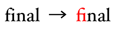
OpenType also supports language-specific glyph selection and positioning, so that text can be displayed correctly in cases where the language dictates a specific display behavior. Languages often share a common script but the shape of certain letters may vary across those languages, such as the variations in certain Cyrillic letters used in Russian and Bulgarian text. In Latin text, it's common to render "fi" with an explicit fi-ligature that lacks a dot on the "i". However, in languages such as Turkish which uses both a dotted-i and a dotless-i, it's important to not use this ligature or use a specialized version that contains a dot over the "i". The example below shows language-specific variations based on stylistic traditions found in Spanish, Italian and French orthography:


Users agents are required to infer the OpenType language system from the
value of the ‘lang’ attribute and use that
when selecting and positioning glyphs using an OpenType font. If the
‘lang’ attribute is not defined, the
default OpenType language system must be used.
In some cases it may be necessary to explicitly declare the OpenType
language to be used, for example when displaying text in a given language
that uses the typographic conventions of another language, or when the
font does not explicitly support a given language but supports a language
that shares common typographic conventions. The ‘font-language-override’ property is used for
this purpose.
Should user agents be allowed to infer the Opentype language or simply use only the default language system?
| Name: | font-kerning |
| Value: | auto | normal | none |
| Initial: | auto |
| Applies to: | all elements |
| Inherited: | yes |
| Percentages: | N/A |
| Media: | visual |
| Computed value: | as specified |
Kerning is the contextual adjustment of inter-glyph spacing. This
property controls metric kerning, kerning that utilizes adjustment data
contained in the font. The value ‘normal’ implies that kerning is applied while
the value ‘none’ implies that kerning is
not applied when rendering text. If the value is ‘auto’, a user agent is free to choose whether
kerning is enabled or not by default and to vary that default based on the
underlying text script.
For fonts that do not include kerning data this property will have no
visible effect. When rendering with OpenType fonts, the [OPENTYPE]
specification suggests that kerning be enabled by default. When kerning is
enabled, the OpenType kern feature is enabled (for
vertical text runs the vkrn feature is enabled).
User agents must also support fonts that only support kerning via data
contained in a ‘kern’ font table, as
detailed in the OpenType specification. Authors may prefer to disable
kerning in situations where performance is more important that precise
appearance. If the ‘letter-spacing’
property is defined, kerning adjustments are considered part of the
default spacing, letter spacing adjustments are made after kerning has
been applied.
| Name: | font-variant-ligatures |
| Value: | normal | none | [ <common-lig-values> || <discretionary-lig-values> || <historical-lig-values> || <contextual-alt-values> ] |
| Initial: | normal |
| Applies to: | all elements |
| Inherited: | yes |
| Percentages: | N/A |
| Media: | visual |
| Computed value: | as specified |
Ligatures and contextual forms are ways of combining glyphs to produce
more harmonized forms. A value of ‘normal’ implies that common default features
are enabled, as described in detail in
the next section. For OpenType fonts, common ligatures and contextual
forms are on by default, discretionary and historical ligatures are not. A
value of ‘none’ implies that all types of
ligatures and contextual forms covered by this property are explicitly
disabled. In situations where ligatures are not considered necessary, this
may improve the speed of text rendering.
<common-lig-values> = [ common-ligatures | no-common-ligatures ]
<discretionary-lig-values> = [ discretionary-ligatures | no-discretionary-ligatures ]
<historical-lig-values> = [ historical-ligatures | no-historical-ligatures ]
<contextual-alt-values> = [ contextual | no-contextual ]
Individual values have the following meanings:


Required ligatures, needed for correctly rendering complex scripts, are
not affected by the settings above, including ‘none’ (OpenType feature: rlig).
| Name: | font-variant-position |
| Value: | normal | sub | super |
| Initial: | normal |
| Applies to: | all elements |
| Inherited: | yes |
| Percentages: | N/A |
| Media: | visual |
| Computed value: | as specified |
This property is used to enable typographic subscript and superscript glyphs. These are alternate glyphs designed within the same em-box as default glyphs and are intended to be laid out on the same baseline as the default glyphs, with no resizing or repositioning of the baseline. They are explicitly designed to match the surrounding text and to be more readable without affecting the line height.
Subscript glyphs (top) vs. typical synthesized subscripts (bottom)
The values ‘sub’ and ‘super’ imply the appropriate variant glyph is
displayed when available in the font (OpenType features: subs, sups). A value of ‘normal’ implies neither of these alternate
glyphs are substituted.
Because of the semantic nature of subscripts and superscripts, when the
value is either ‘sub’ or ‘super’ for a given run of text and a variant glyph
is not available for all the characters in the run, simulated glyphs are
synthesized for all characters using reduced forms of the default glyph.
This is done to avoid a mixture of variant glyphs and synthesized ones
within the same run of text, since there is no guarantee that two types of
glyphs would be aligned correctly.
In the case of OpenType fonts that lack subscript or superscript glyphs for a given character, user agents must use the appropriate subscript and superscript metrics specified in the selected font's OS/2 table [OPENTYPE] to calculate the size and offset of the synthesized substitutes.
In the past, user agents have used font-size and vertical-align to simulate subscripts and superscripts for the sub and sup elements. To allow a backwards compatible way of defining subscripts and superscripts, it is recommended that authors use conditional rules [CSS3-CONDITIONAL] so that older user agents will still render subscripts and superscripts via the older mechanism.
Authors should note that fonts typically only provide subscript and superscript glyphs for a subset of all characters supported by the font. While subscript and superscript glyphs are often available for Latin numbers, glyphs for punctuation and letter characters are less frequently provided. The synthetic fallback rules defined for this property assure that subscripts and superscripts will always appear but the appearance may not match author expectations if the font used does not provide the appropriate alternate glyph for all characters contained in a subscript or superscript.
Superscript alternate glyph (left), synthesized superscript glyphs (middle), and incorrect mixture of the two (right)
This property is not cumulative, applying it to subelements within a
subscript or superscript won't nest the placement of a subscript or
superscript glyph. Images contained within text runs where the value of
this property is ‘sub’ or ‘super’ will be drawn just as they would if the
value was ‘normal’.
Likewise, text decorations such as underlines or emphasis marks will
render in the same position as they would for the default glyphs, since
this property does not affect the baseline position.
Because of these limitations, font-variant-position is not recommended for use in user agent stylesheets. Authors should use it in cases where subscripts or superscripts will only contain the narrow range of characters supported by the fonts specified.
A typical user agent default style for the sub element:
sub {
  vertical-align: sub;
  font-size: smaller;
  line-height: normal;
}
Using font-variant-position to specify typographic subscripts in a way that will still show subscripts in older user agents:
@supports ( font-variant-position: sub ) {

  sub {
    vertical-align: inherit;
    font-size: 100%;
    line-height: inherit;
    font-variant-position: sub;
  }

}
User agents that support the ‘font-variant-position’ property will select a
subscript variant glyph and render this without adjusting the baseline or
font-size. Older user agents will ignore the ‘font-variant-position’ property definition
and use the standard defaults for subscripts.
| Name: | font-variant-caps |
| Value: | normal | small-caps | all-small-caps | petite-caps | all-petite-caps | titling-caps | unicase |
| Initial: | normal |
| Applies to: | all elements |
| Inherited: | yes |
| Percentages: | N/A |
| Media: | visual |
| Computed value: | as specified |
Specifies control over capitalized forms.
Individual values have the following meanings:
For backwards compatibility with CSS 2.1, if ‘small-caps’ or ‘all-small-caps’
is specified but small-caps glyphs are not available for a given font,
user agents should simulate a small-caps font, for example by taking a
normal font and replacing the lowercase letters by scaled uppercase
characters (and also uppercase letters in the case of ‘all-small-caps’).
The availability of these glyphs is based on whether a given feature is
defined or not in the feature list of the font. User agents can optionally
decide this on a per-script basis.
As a last resort, unscaled uppercase letter glyphs in a normal font may
replace glyphs in a small-caps font so that the text appears in all
uppercase letters. If either ‘petite-caps’ or ‘all-petite-caps’
is specified for a font that doesn't support these features, the property
behaves as if ‘small-caps’ or ‘all-small-caps’,
respectively, had been specified. If ‘titling-caps’ is specified with a font that
does not support these features, this property has no visible effect. For
scripts that lack uppercase and lowercase letters, ‘small-caps’, ‘all-small-caps’,
‘petite-caps’,
‘all-petite-caps’ and ‘unicase’ have no visible
effect.
Quotes rendered italicised, with small-caps on the first line:
blockquote            { font-style: italic; }
blockquote:first-line { font-variant: small-caps; }

<blockquote>I'll be honor-bound to slap them like a haddock.</blockquote>
Insofar as this property causes text to be transformed to uppercase, the
same considerations as for ‘text-transform’ apply.
| Name: | font-variant-numeric |
| Value: | normal | [ <numeric-figure-values> || <numeric-spacing-values> || <numeric-fraction-values> || ordinal || slashed-zero ] |
| Initial: | normal |
| Applies to: | all elements |
| Inherited: | yes |
| Percentages: | N/A |
| Media: | visual |
| Computed value: | as specified |
Specifies control over numerical forms.
<numeric-figure-values> = [ lining-nums | oldstyle-nums ]
<numeric-spacing-values> = [ proportional-nums | tabular-nums ]
<numeric-fraction-values> = [ diagonal-fractions | stacked-fractions ]
Individual values have the following meanings:
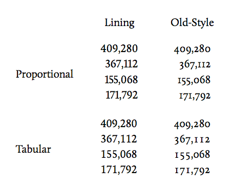
The example below shows how these different properties can be combined to influence the rendering of tabular data with fonts that support these features. Within normal paragraph text, proportional numbers are used while tabular numbers are used so that columns of numbers line up properly:
Using number styles


A simple flank steak marinade recipe, rendered with automatic fractions and old-style numerals:
.amount { font-variant-numeric: oldstyle-nums diagonal-fractions; }
<h4>Steak marinade:</h4>
<ul>
<li><span class="amount">2</span> tbsp olive oil</li>
<li><span class="amount">1</span> tbsp lemon juice</li>
<li><span class="amount">1</span> tbsp soy sauce</li>
<li><span class="amount">1 1/2</span> tbsp dry minced onion</li>
<li><span class="amount">2 1/2</span> tsp italian seasoning</li>
<li>Salt & pepper</li>
</ul>
<p>Mix the meat with the marinade and let it sit covered in the refrigerator
for a few hours or overnight.</p>
| Name: | font-variant-alternates |
| Value: | normal | [ stylistic(<feature-value-name>) || historical-forms || styleset(<feature-value-name>#) || character-variant(<feature-value-name>#) || swash(<feature-value-name>) || ornaments(<feature-value-name>) || annotation(<feature-value-name>) ] |
| Initial: | normal |
| Applies to: | all elements |
| Inherited: | yes |
| Percentages: | N/A |
| Media: | visual |
| Computed value: | as specified |
For any given character, fonts can provide a variety of alternate glyphs in addition to the default glyph for that character. This property provides control over the selection of these alternate glyphs.
In cases where multiple alternates are possible, authors define a <feature-value-name>
using the @font-feature-values rule described below to
indicate the specific alternate to be used. The nature of these alternates
is font specific, so the rule defines values for a specific font family or
set of families. When a particular value has not been defined for a given
family, the named value is treated as if the feature had omitted from the
style rule. If a given value is outside the range supported by a given
font, the value is ignored. These values never apply to generic font
families, nor to families selected as part of system font fallback. Values
that behave this way are marked as font specific.
Individual values have the following meanings:
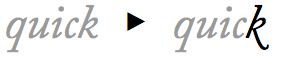


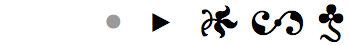
Several of the possible values of ‘font-variant-alternates’ listed above are
labeled as "font specific". For these features fonts may define not just a
single glyph but a set of alternate glyphs with an index to select a given
alternate. Since these are font family specific, the @font-feature-values
rule is used to define named-values for these indices for a given family.
In the case of the swash Q in the example shown above, the swash could be specified using these style rules:
@font-feature-values Jupiter Sans {
  @swash delicate 1, flowing 2;
}

h2 { font-family: Jupiter Sans, sans-serif; }

/* show the second swash variant in h2 headings */
h2:first-letter { font-variant-alternates: swash(flowing); }

<h2>Quick</h2>
When Jupiter Sans is present, the second alternate swash alternate will be displayed. When not present, no swash character will be shown, since the specific named-value "flowing" is only defined for the Jupiter Sans family. The @-mark indicates the name of the property value for which a named-value can be used. The name "flowing" is chosen by the author.
The syntax of the @font-feature-values rule is defined as:
@font-feature-values <font-family># {
  <font-feature-values-declaration>;
  <font-feature-values-declaration>;
     .
     .
}
where:
<font-feature-values-declaration> = @<font-variant-property-value> <feature-value-list>#
<font-family> = font family name, same syntax as font-family property
<font-variant-property-value> = the name of one of the font specific font-variant property values (e.g. swash, styleset, annotation)
<feature-value-list> = <feature-value-name> <feature-index>+
<feature-value-name> = a user-defined identifier used to describe the index
<feature-index> = an integer value greater than 0 specific to a given font or set of fonts
These @font-feature-values rules can appear anywhere within a stylesheet and are exposed bidirectionally across @import boundaries. Within each font feature values declaration, syntax errors such as unknown property value names, invalid identifiers or values result in the declaration being dropped, similar to the way syntax errors in style declarations are handled.
If multiple @font-feature-values rules are defined for a given family, the resulting values defined are the union of these rules. This allows a set of named-values to be defined for a given font family globally for a site and specific additions made per-page. If the same <feature-value-name> is defined mulitple times for a given font-variant value, the last defined value is used.
site.css:

  @font-feature-values Mercury Serif {
    @styleset stacked-g 3, stacked-a 4; /* "two-storey" versions of g, a */
  }

page.css:

  @font-feature-values Mercury Serif {
    @styleset geometric-m 7; /* alternate version of m */
  }

  body {
    font-family: Mercury Serif, serif;

    /* enable both the use of stacked g and alternate m */
    font-variant-alternates: styleset(stacked-g, geometric-m);
  }
Only named font families are allowed for <font-family>, rules that include generic or system fonts in the list of font families are considered syntax errors and the contents of the rules are ignored. However, if a user agent defines a generic font to be a specific named font (e.g. Helvetica), the settings associated with that family name will be used.
For <font-variant-property-value>, only font specific property value
names supported by the ‘font-variant’ property are recognized,
definitions for other value names cause a syntax error and are ignored.
Each property value that is font specific is clearly marked as such.
Feature value names follow the rules of CSS identifiers and are case
insensitive. They are unique only for a given set of font families and
font-variant property value; the same identifier used with a different
font-variant property value is treated as a separate and distinct value.
Using a commonly named value allows authors to use a single style rule to cover a set of fonts for which the underlying selector is different for each font. If either font in the example below is found, a circled number glyph will be used:
@font-feature-values Taisho Gothic {
  @annotation boxed 1, circled 4;
}

@font-feature-values Otaru Kisa {
  @annotation circled 1, black-boxed 3;
}

h3.title {
  /* circled form defined for both fonts */
  font-family: Taisho Gothic, Otaru Kisa;
  font-variant: annotation(circled);
}
Most font specific font-variant property values take a single value (e.g. swash). The character-variant property value allows two values and styleset allows an unlimited number. If a larger number of values are assigned to a given name, a syntax error occurs and the entire <font-feature-values-declaration> is ignored.
For the styleset property value, multiple values indicate the style sets to be enabled. Values between 1 and 20 enable OpenType features ss01 through ss20. For OpenType fonts, values greater than 20 or 0 are ignored but do not generate a syntax error when parsed.
@font-feature-values Mars Serif {
  @styleset alt-g 1,        /* implies ss01 = 1 */
            curly-quotes 3, /* implies ss03 = 1 */
            code 4 5;       /* implies ss04 = 1, ss05 = 1 */
  @styleset dumb 25;        /* >20, ignored */
  @swash    swishy 3 5;     /* more than 1 value for swash, syntax error */
}

p.codeblock {
  /* implies ss03 = 1, ss04 = 1, ss05 = 1 */
  font-variant-alternates: styleset(curly-quotes, code);
}
For character-variant, a single value between 1 and 99 indicates the enabling of OpenType feature cv01 through cv99. For OpenType fonts, values greater than 99 or 0 are ignored but do not generate a syntax error when parsed. When two values are listed, the first value indicates the feature used and the second the value passed for that feature. When two value names imply different settings for the same underlying feature the last setting is used.
@font-feature-values MM Greek {
  @character-variant alpha-2 1 2;   /* implies cv01 = 2 */
  @character-variant beta-3 2 3;    /* implies cv02 = 3 */
  @character-variant epsilon 5 3 6; /* more than 2 values, syntax error, ignored */
  @character-variant gamma 12;      /* implies cv12 = 1 */
  @character-variant zeta   20 3;   /* implies cv20 = 3 */
  @character-variant zeta-2 20 2;   /* implies cv20 = 2 */
  @character-variant silly 105;     /* >99, ignored */
  @character-variant dumb 323 3;    /* >99, ignored */
}

#title {
  /* use the third alternate beta, first alternate gamma */
  font-variant-alternates: character-variant(beta-3, gamma);
}

p {
  /* zeta-2 follows zeta, implies cv20 = 2  */
  font-variant-alternates: character-variant(zeta, zeta-2);
}

.special {
  /* zeta follows zeta-2, implies cv20 = 3  */
  font-variant-alternates: character-variant(zeta-2, zeta);
}
See Appendix B for a description of the interfaces used to modify these rules via the CSS Object Model.
Byzantine seal text displayed with character variants
In the figure above, the text in red is rendered using a font containing character variants that mimic the character forms found on a Byzantine seal from the 8th century A.D. Two lines below is the same text displayed in a font without variants. Note the two variants for U and N used on the seal.
@font-feature-values Athena Ruby {
  @character-variant
    leo-B 2 1, leo-M 13 3,
    leo-alt-N 14 1, leo-N 14 2,
    leo-T 20 1,
    leo-U 21 2, leo-alt-U 21 4;
}

p {
  font-variant: discretionary-ligatures, character-variant(leo-B, leo-M, leo-N, leo-T, leo-U);
}

span.alt-N {
  font-variant-alternates: character-variant(leo-alt-N);
}

span.alt-U {
  font-variant-alternates: character-variant(leo-alt-U);
}

<p>ENO....UP͞RSTU<span class="alt-U">U</span>͞<span class="alt-U">U</span>ΚΑΙTỤẠG̣IUPNS</p>

<p>LEON|ΚΑΙCONSTA|NTI<span class="alt-N">N</span>OS..|STOIBAṢ.|LIṢROM|AIO<span class="alt-N">N</span></p>
| Name: | font-variant-east-asian |
| Value: | normal | [ <east-asian-variant-values> || <east-asian-width-values> || ruby ] |
| Initial: | normal |
| Applies to: | all elements |
| Inherited: | yes |
| Percentages: | N/A |
| Media: | visual |
| Computed value: | as specified |
Allows control of glyph substitute and positioning in East Asian text. In cases where multiple alternates are possible, an integer is included to indicate the index of the alternate to be used. Omitting the integer indicates the first alternate.
<east-asian-variant-values> = [ jis78 | jis83 | jis90 | jis04 | simplified | traditional ]
<east-asian-width-values> = [ full-width | proportional-width ]
Individual values have the following meanings:


| Name: | font-variant |
| Value: | normal | none | [ <common-lig-values> || <discretionary-lig-values> || <historical-lig-values> || <contextual-alt-values> || stylistic(<feature-value-name>) || historical-forms || styleset(<feature-value-name>#) || character-variant(<feature-value-name>#) || swash(<feature-value-name>) || ornaments(<feature-value-name>) || annotation(<feature-value-name>) || [ small-caps | all-small-caps | petite-caps | all-petite-caps | titling-caps | unicase ] || <numeric-figure-values> || <numeric-spacing-values> || <numeric-fraction-values> || ordinal || slashed-zero || <east-asian-variant-values> || <east-asian-width-values> || ruby ] |
| Initial: | normal |
| Applies to: | all elements |
| Inherited: | yes |
| Percentages: | N/A |
| Media: | visual |
| Computed value: | as specified |
The value ‘normal’ resets all other font feature
properties to their inital value. The ‘none’ value sets ‘font-variant-ligatures’ to ‘none’ and resets all other font feature properties
to their initial value. Like other shorthands, using ‘font-variant’ resets unspecified font-variant
subproperties to their initial values. It does not reset the values of
either ‘font-language-override’ or ‘font-feature-settings’.
| Name: | font-feature-settings |
| Value: | normal | <feature-tag-value># |
| Initial: | normal |
| Applies to: | all elements |
| Inherited: | yes |
| Percentages: | N/A |
| Media: | visual |
| Computed value: | as specified |
This property provides low-level control over OpenType font features. It
is intended as a way of providing access to font features that are not
widely used but are needed for a particular use case. A value of ‘normal’ means that no
change in glyph selection or positioning occurs due to this property.
/* enable small caps and use second swash alternate */
font-feature-settings: "smcp", "swsh" 2;
Feature tag values have the following syntax:
<feature-tag-value> = <string> [ <integer> | on | off ]?
The <string> is a case-sensitive OpenType feature tag. As specified in the OpenType specification, feature tags contain four ASCII characters. Tag strings longer or shorter than four characters, or containing characters outside the U+20–7E codepoint range are invalid. User agents must not use a feature tag created by truncating or padding the string to four characters. Feature tags need only match a feature tag defined in the font, they are not limited to explicitly registered OpenType features. Fonts defining custom feature tags should follow the tag name rules defined in the OpenType specification [OPENTYPE-FEATURES]. Feature tags not present in the font are ignored; a user agent must not attempt to synthesize fallback behavior based on these feature tags.
This means that explicitly disabling the kern
feature will not affect the application of kerning data found in the
‘kern’ table (as opposed to kerning data
associated with the kern feature in the ‘GPOS’ table). Authors should use the ‘font-kerning’ property to explictly enable or
disable kerning since this property affects both types of kerning.
If present, a value indicates an index used for glyph selection. An
<integer> value must be 0 or greater. A value of 0 indicates that
the feature is disabled. For boolean features, a value of 1 enables the
feature. For non-boolean features, a value of 1 or greater enables the
feature and indicates the feature selection index. A value of ‘on’ is synonymous with 1 and ‘off’ is synonymous with 0. If the value is
omitted, a value of 1 is assumed.
font-feature-settings: "dlig" 1;       /* dlig=1 enable discretionary ligatures */
font-feature-settings: "smcp" on;      /* smcp=1 enable small caps */
font-feature-settings: 'c2sc';         /* c2sc=1 enable caps to small caps */
font-feature-settings: "liga" off;     /* liga=0 no common ligatures */
font-feature-settings: "tnum", 'hist'; /* tnum=1, hist=1 enable tabular numbers and historical forms */
font-feature-settings: "tnum" "hist";  /* invalid, need a comma-delimited list */
font-feature-settings: "palin" off;    /* good idea but invalid tagname */
font-feature-settings: "PKRN";         /* PKRN=1 enable custom feature */
font-feature-settings: dlig;           /* invalid, tag must be a string */
Authors should generally use ‘font-variant’ and its related subproperties
whenever possible and only use this property for special cases where its
use is the only way of accessing a particular infrequently used font
feature.
Although specifically defined for OpenType feature tags, feature tags for other modern font formats that support font features may be added in the future. Where possible, features defined for other font formats should attempt to follow the pattern of registered OpenType tags.
The Japanese text below will be rendered with half-width kana characters:
body { font-feature-settings: "hwid"; /* Half-width OpenType feature */ }

<p>毎日カレー食べてるのに、飽きない</p>
| Name: | font-language-override |
| Value: | normal | <string> |
| Initial: | normal |
| Applies to: | all elements |
| Inherited: | yes |
| Percentages: | N/A |
| Media: | visual |
| Computed value: | as specified |
The value of ‘normal’ implies that when rendering with
OpenType fonts the language of the document is used to infer the OpenType
language system, used to select language specific features when rendering.
The value of the <string> is a single three-letter OpenType language
system tag, defined in the layout tag registry of the OpenType
specification.
The Universal Declaration of Human Rights has been translated into a wide variety of languages. In Turkish, Article 9 of this document might be marked up as below:
<body lang="tr">

<h4>Madde 9</h4>
<p>Hiç kimse keyfi olarak tutuklanamaz, alıkonulanamaz veya sürülemez.</p>
Here the user agent uses the value of the ‘lang’ attribute when rendering text and
appropriately renders this text without ‘fi’ ligatures. There is no need to use the ‘font-language-override’ property.
However, a given font may lack support for a specific language. In this situation authors may need to use the typographic conventions of a related language that are supported by that font:
<body lang="mk">     <!-- Macedonian lang code -->

body { font-language-override: "SRB"; /* Serbian OpenType language tag */ }

<h4>Члeн 9</h4>
<p>Никoj чoвeк нeмa дa бидe пoдлoжeн нa прoизвoлнo aпсeњe, притвoр или прoгoнувaњe.</p>
The Macedonian text here will be rendered using Serbian typographic conventions, with the assumption that the font specified supports Serbian.
As described in the previous section, font features can be enabled in a
variety of ways, either via the use of ‘font-variant’ or ‘font-feature-settings’ in a style rule or
within an @font-face rule. The resolution order for the union of these
settings is defined below. Features defined via CSS properties are applied
on top of layout engine default features.
For OpenType fonts, user agents must enable the default features defined
in the OpenType documentation for a given script and writing mode.
Required ligatures, common ligatures and contextual forms must be enabled
by default (OpenType features: rlig, liga, clig,
calt), along with localized forms (OpenType feature: locl), and features required for proper display of
composed characters and marks (OpenType features: ccmp,
mark, mkmk). These features must always be enabled, even when the
value of the ‘font-variant’ and ‘font-feature-settings’ properties is ‘normal’. Individual
features are only disabled when explicitly overridden by the author, when
‘font-variant-ligatures’ is set to ‘no-common-ligatures’ for example. For handling
complex scripts such as Arabic,
Mongolian
or Devanagari
additional features are required. For upright text within vertical text
runs, vertical alternates (OpenType feature: vert)
must be enabled.
General and font specific font feature property settings are resolved in the order below, in ascending precedence order. This ordering is used to construct a combined list of font features that affect a given text run.
font-variant’ or ‘font-feature-settings’. For example, setting
a non-default value for the ‘letter-spacing’ property disables ligatures.
font-variant’ property, the related
font-variant subproperties and any other CSS property that may use
OpenType features (e.g. the ‘font-kerning’ property).
font-feature-settings’ property.
This ordering allows authors to set up a general set of defaults for
fonts within their @font-face rules, then override them with property
settings for specific elements. General property settings override the
settings in @font-face rules and low-level font feature settings override
‘font-variant’ property settings.
For situations where the combined list of font feature settings contains more than one value for the same feature, the last value is used. When a font lacks support for a given underlying font feature, text is simply rendered as if that font feature was not enabled; font fallback does not occur and no attempt is made to synthesize the feature except where explicitly noted for specific properties.
With the styles below, numbers are rendered proportionally when used within a paragraph but are shown in tabular form within tables of prices:
body {
  font-variant-numeric: proportional-nums;
}

table.prices td {
  font-variant-numeric: tabular-nums;
}
When the font-variant descriptor is used within an @font-face rule, it only applies to the font defined by that rule.
@font-face {
  font-family: MainText;
  src: url(http://example.com/font.ttf);
  font-variant: oldstyle-nums proportional-nums styleset(1,3);
}

body {
  font-family: MainText, Helvetica;
}

table.prices td {
  font-variant-numeric: tabular-nums;
}
In this case, old-style numerals will be used throughout but only where
the font "MainText" is used. Just as in the previous example, tabular
values will be used in price tables since ‘tabular-nums’
appears in a general style rule and its use is mutually exclusive with
‘proportional-nums’. Stylistic alternate sets
will only be used where MainText is used.
The @font-face rule can also be used to access font features in locally
available fonts via the use of local() in the ‘src’ descriptor of
the @font-face definition:
@font-face {
  font-family: BodyText;
  src: local("HiraMaruPro-W4");
  font-variant: proportional-width;
  font-feature-settings: "ital"; /* Latin italics within CJK text feature */
}

body { font-family: BodyText, serif; }
If available, a Japanese font "Hiragino Maru Gothic" will be used. When text rendering occurs, Japanese kana will be proportionally spaced and Latin text will be italicised. Text rendered with the fallback serif font will use default rendering properties.
In the example below, discretionary ligatures are enabled only for a downloadable font but are disabled within spans of class "special":
@font-face {
  font-family: main;
  src: url(fonts/ffmeta.woff) format("woff");
  font-variant: discretionary-ligatures;
}

body         { font-family: main, Helvetica; }
span.special { font-variant-ligatures: no-discretionary-ligatures; }
Adding an discretionary style rule with the @font-face above:
body         { font-family: main, Helvetica; }
span         { font-feature-settings: "dlig"; }
span.special { font-variant-ligatures: no-discretionary-ligatures; }
Within spans of class "special", discretionary ligatures will
be rendered. This is because both the ‘font-feature-settings’ and ‘font-variant-ligatures’ properties apply to
these spans. Although the ‘no-discretionary
ligatures’ setting of ‘font-variant-ligatures’ effectively disables
the OpenType dlig feature, because the ‘font-feature-settings’ is resolved after
that, the ‘dlig’ value reenables
discretionary ligatures.
This appendix is included as background for some of the problems and situations that are described in other sections. It should be viewed as informative only.
Font properties in CSS are designed to be independent of the underlying font formats used; they can be used to specify bitmap fonts, Type1 fonts, SVG fonts in addition to the common TrueType and OpenType fonts. But there are facets of the TrueType and OpenType formats that often cause confusion for authors and present challenges to implementers on different platforms.
Originally developed at Apple, TrueType was designed as an outline font
format for both screen and print. Microsoft joined Apple in developing the
TrueType format and both platforms have supported TrueType fonts since
then. Font data in the TrueType format consists of a set of tables
distinguished with common four-letter tag names, each containing a
specific type of data. For example, naming information, including
copyright and license information, is stored in the ‘name’ table. The character map (‘cmap’) table contains a mapping of character
encodings to glyphs. Apple later added additional tables for supporting
enhanced typographic functionality; these are now called Apple Advanced
Typography, or AAT, fonts. Microsoft and Adobe developed a separate set of
tables for advanced typography and called their format OpenType [OPENTYPE].
In many cases the font data used under Microsoft Windows or Linux is slightly different from the data used under Apple's Mac OS X because the TrueType format allowed for variation across platforms. This includes font metrics, names and character map data.
Font family names for TrueType and OpenType fonts are contained in the
‘name’ table, in name records with name ID
1. Mulitple names can be stored for different locales but Microsoft
recommends fonts always include at least a US English version of the name.
On Windows, the family name can only be used for a maximum of four faces;
for larger groupings the "preferred family" (name ID 16) or "WWS family"
(name ID 21) can be used. The full font name (name ID 4) and the
Postscript name (name ID 6) describe a single face uniquely. The bold face
of the Gill Sans family has a fullname of "Gill Sans Bold" and a
Postscript name of "GillSans-Bold". There can be multiple localized
versions of the fullname for a given face but the Postscript name is
always a unique name made from a limited set of ASCII characters.
On various platforms, different names are used to search for a font. For example, with the Windows GDI CreateIndirectFont API, either a family or fullname can be used to lookup a face while on Mac OS X the ATSFontFindFromName and ATSFontFindFromPostScriptName API calls are used to lookup a given face using the fullname and Postscript name. Under Linux, the fontconfig API allows fonts to be searched using any of these names. In situations where platform API's automatically substitute other font choices, it may be necessary to verify a returned font matches a given name.
The weight of a given face can be determined via the usWeightClass field of the OS/2 table or inferred from the style name (name ID 2). Likewise, the width can be determined via the usWidthClass of the OS/2 table or inferred from the style name. For historical reasons, font designers have sometimes skewed values in the OS/2 table to work around problems in the Windows GDI API.
Rendering complex scripts that use contextual shaping such as Thai, Arabic and Devanagari requires features present only in OpenType or AAT fonts. Currently, complex script rendering is supported on Windows and Linux using OpenType font features while AAT font features are used under Mac OS X. Apple has indicated it intends to support complex script rendering using OpenType font features in the future.
Need to define normatively how WWS names are handled across platforms.
This appendix is normative.
Font feature values defined within @font-feature-values
rules are accessible via the following modifications to the CSS Object
Model.
The following additional rule type is added to the
CSSRule interface.
interface CSSRule {
...
const unsigned short FONT_FEATURE_VALUES_RULE = 14;
...
};
The CSSFontFeatureValuesRule interface represents font
feature selector values for a given set of font families.
interface CSSFontFeatureValuesRule : CSSRule {
  attribute DOMString fontFamily;
                        // raises(DOMException) on setting
  attribute DOMString valueText;
                        // raises(DOMException) on setting
};
fontFamily of
type DOMString
valueText of
type DOMString
DOMException SYNTAX_ERR
Major changes include:
none’ value for ‘font-variant-ligatures’
I'd like to thank Tal Leming, Jonathan Kew and Christopher Slye for all their help and feedback. John Hudson was kind enough to take the time to explain the subtleties of OpenType language tags and provided the example of character variant usage for displaying text on Byzantine seals. Ken Lunde and Eric Muller provided valuable feedback on CJK OpenType features and Unicode variation selectors. The idea for supporting font features by using font-variant subproperties originated with Håkon Wium Lie, Adam Twardoch and Tal Leming. Elika Etemad supplied some of the initial design ideas for the @font-feature-values rule. Thanks also to House Industries for allowing the use of Ed Interlock in the discretionary ligatures example.
A special thanks to Robert Bringhurst for the sublime mind expansion that is The Elements of Typographic Style.
| Property | Values | Initial | Applies to | Inh. | Percentages | Media |
|---|---|---|---|---|---|---|
| font-family | [ <family-name> | <generic-family> ]# | depends on user agent | all elements | yes | N/A | visual |
| font-feature-settings | normal | <feature-tag-value># | normal | all elements | yes | N/A | visual |
| font-kerning | auto | normal | none | auto | all elements | yes | N/A | visual |
| font-language-override | normal | <string> | normal | all elements | yes | N/A | visual |
| font-size-adjust | <number> | none | none | all elements | yes | N/A | visual |
| font-size | <absolute-size> | <relative-size> | <length> | <percentage> | medium | all elements | yes | refer to parent element's font size | visual |
| font | [ [ <‘font-style’> || <font-variant-css21> || <‘font-weight’> ]? <‘font-size’> [ / <‘line-height’> ]? <‘font-family’> ] | caption | icon | menu | message-box | small-caption | status-bar | see individual properties | all elements | yes | see individual properties | visual |
| font-stretch | normal | ultra-condensed | extra-condensed | condensed | semi-condensed | semi-expanded | expanded | extra-expanded | ultra-expanded | normal | all elements | yes | N/A | visual |
| font-style | normal | italic | oblique | normal | all elements | yes | N/A | visual |
| font-synthesis | none | [ weight || style ] | weight style | all elements | yes | N/A | visual |
| font-variant-alternates | normal | [ stylistic(<feature-value-name>) || historical-forms || styleset(<feature-value-name>#) || character-variant(<feature-value-name>#) || swash(<feature-value-name>) || ornaments(<feature-value-name>) || annotation(<feature-value-name>) ] | normal | all elements | yes | N/A | visual |
| font-variant-caps | normal | small-caps | all-small-caps | petite-caps | all-petite-caps | titling-caps | unicase | normal | all elements | yes | N/A | visual |
| font-variant-east-asian | normal | [ <east-asian-variant-values> || <east-asian-width-values> || ruby ] | normal | all elements | yes | N/A | visual |
| font-variant-ligatures | normal | none | [ <common-lig-values> || <discretionary-lig-values> || <historical-lig-values> || <contextual-alt-values> ] | normal | all elements | yes | N/A | visual |
| font-variant-numeric | normal | [ <numeric-figure-values> || <numeric-spacing-values> || <numeric-fraction-values> || ordinal || slashed-zero ] | normal | all elements | yes | N/A | visual |
| font-variant-position | normal | sub | super | normal | all elements | yes | N/A | visual |
| font-variant | normal | none | [ <common-lig-values> || <discretionary-lig-values> || <historical-lig-values> || <contextual-alt-values> || stylistic(<feature-value-name>) || historical-forms || styleset(<feature-value-name>#) || character-variant(<feature-value-name>#) || swash(<feature-value-name>) || ornaments(<feature-value-name>) || annotation(<feature-value-name>) || [ small-caps | all-small-caps | petite-caps | all-petite-caps | titling-caps | unicase ] || <numeric-figure-values> || <numeric-spacing-values> || <numeric-fraction-values> || ordinal || slashed-zero || <east-asian-variant-values> || <east-asian-width-values> || ruby ] | normal | all elements | yes | N/A | visual |
| font-weight | normal | bold | bolder | lighter | 100 | 200 | 300 | 400 | 500 | 600 | 700 | 800 | 900 | normal | all elements | yes | N/A | visual |
| Descriptor | Value | Initial | Percentages | Media |
|---|---|---|---|---|
| font-family | <family-name> | N/A | ||
| font-feature-settings | normal | <feature-tag-value># | normal | ||
| font-stretch | normal | ultra-condensed | extra-condensed | condensed | semi-condensed | semi-expanded | expanded | extra-expanded | ultra-expanded | normal | ||
| font-style | normal | italic | oblique | normal | ||
| font-variant | normal | [ <common-lig-values> || <discretionary-lig-values> || <historical-lig-values> || <contextual-alt-values> || stylistic(<feature-value-name>) || historical-forms || styleset(<feature-value-name>#) || character-variant(<feature-value-name>#) || swash(<feature-value-name>) || ornaments(<feature-value-name>) || annotation(<feature-value-name>) || [ small-caps | all-small-caps | petite-caps | all-petite-caps | titling-caps | unicase ] || <numeric-figure-values> || <numeric-spacing-values> || <numeric-fraction-values> || ordinal || slashed-zero || <east-asian-variant-values> || <east-asian-width-values> || ruby ] | normal | ||
| font-weight | normal | bold | 100 | 200 | 300 | 400 | 500 | 600 | 700 | 800 | 900 | normal | ||
| src | [ <uri> [format(<string>#)]? | <font-face-name> ]# | N/A | ||
| unicode-range | <urange># | U+0-10FFFF |