Abstract
This module contains the features of CSS relating to the alignment of
boxes within their containers in the various CSS box layout models: block
layout, table layout, flex layout, and grid layout. (The alignment of text
and inline-level content is defined in [CSS3TEXT] and [[CSS3LINEBOX]].)
CSS is a language for describing the rendering of structured documents
(such as HTML and XML) on screen, on paper, in speech, etc.
Status of this document
This section describes the status of this document at the time of
its publication. Other documents may supersede this document. A list of
current W3C publications and the latest revision of this technical report
can be found in the W3C technical reports
index at http://www.w3.org/TR/.
Publication as a Working Draft does not imply endorsement by the W3C
Membership. This is a draft document and may be updated, replaced or
obsoleted by other documents at any time. It is inappropriate to cite this
document as other than work in progress.
The (archived) public
mailing list www-style@w3.org (see
instructions) is preferred
for discussion of this specification. When sending e-mail, please put the
text “css3-align” in the subject, preferably like this:
“[css3-align] …summary of comment…”
This document was produced by the CSS Working Group (part of
the Style Activity).
This document was produced by a group operating under the 5 February
2004 W3C Patent Policy. W3C maintains a public list of any patent disclosures made in
connection with the deliverables of the group; that page also includes
instructions for disclosing a patent. An individual who has actual
knowledge of a patent which the individual believes contains Essential
Claim(s) must disclose the information in accordance with section
6 of the W3C Patent Policy.
This is the first public working draft.
Table of Contents
1. Introduction
This section is not normative.
CSS Levels 1 and 2 allowed for the alignment of text via ‘text-align’ and the alignment of blocks by
balancing ‘auto’ margins.
However, except in table cells, vertical alignment was not possible. As
CSS3 adds further capabilities, the ability to align boxes in various
dimensions becomes more critical. This module attempts to create a
cohesive and common box alignment model to share among all of CSS.
The alignment of text and inline-level content is defined in
[CSS3TEXT] and
[[CSS3LINEBOX]].
Inspiration for this document:
1.1. Module interactions
This module adds some new alignment capabilities to the block layout
model described in [CSS21] chapters 9 and 10 and defines
the interaction of these properties with the alignment of table cell
content using ‘vertical-align’, as defined
in [CSS21] chapter
17. The interaction of these properties with Grid Layout [CSS3-GRID-LAYOUT] and
Flexible Box Layout [CSS3-FLEXBOX] is defined in
their respective modules.
No properties in this module apply to the ::first-line or
::first-letter pseudo-elements.
1.2. Values
This specification follows the CSS property
definition conventions from [CSS21]. Value types not defined in
this specification are defined in CSS Level 2 Revision 1 [CSS21]. Other CSS
modules may expand the definitions of these value types: for example
[[CSS3VALUES]], when combined with this module, adds the ‘initial’ keyword as a possible property value.
In addition to the property-specific values listed in their definitions,
all properties defined in this specification also accept the inherit
keyword as their property value. For readability it has not been repeated
explicitly.
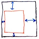
2. Overview of Alignment
Properties
The alignment properties in CSS can be described along two axes:
- which dimension they apply to (inline vs. stacking), and
- whether they control the position of the box within its parent, or the
box's content within itself.
This proposal uses the terms ‘justify’ and ‘align’ to distinguish between alignment in the
inline and stacking dimensions, respectively. The choice is somewhat
arbitrary, but having the two terms allows for a consistent naming scheme
that works across all of CSS's layout models.
The following table summarizes the proposed alignment properties and the
display types they can apply to.
| Common
| Axis
| Aligns
| Applies to
|
‘justify-self’
| inline
|  element within parent
(effectively adjusts margins) element within parent
(effectively adjusts margins)
| block-level elements and grid items
|
‘align-self’
| stacking
| flex items and grid items
|
‘justify-content’
| inline
|  content within element
(effectively adjusts padding) content within element
(effectively adjusts padding)
| block containers and flex containers
|
‘align-content’
| stacking
| block containers and flex containers
|
‘justify-items’
| inline
|  items inside element
(controls child items’ ‘ items inside element
(controls child items’ ‘align/justify-self:
auto’)
| grid containers
|
‘align-items’
| stacking
| flex containers and grid containers
|
The exact behavior of these properties on layout models
other than Flexbox is still to be determined. This is a
First Public Working Draft and is NOT
STABLE.
The ‘-items’ values don't
affect the element itself. When set on a flex container or grid container,
they specify the interpretation of any ‘align/justify-self: auto’ used on the items in the
container element.
True alignment vs. safe alignment. Maybe make safe by
default, true if ‘true’ is
specified? Or safe/true depending on layout model (e.g. safe for blocks,
true for flexbox)? Current draft introduces a ‘true’ keyword, but other options should be
considered.
3. Self-Alignment: Aligning
the Box within its Parent
The ‘justify-self’ and ‘align-self’
properties control alignment of the box within its containing block.
3.1. Inline/Main-Axis
Alignment: the ‘justify-self’ property
| Name:
| justify-self
|
| Value:
| auto | [ start | end | center ] && true?
|
| Initial:
| auto
|
| Applies to:
| block-level elements and grid items
|
| Inherited:
| no
|
| Percentages:
| N/A
|
| Media:
| visual
|
| Computed value:
| specified value
|
| Animatable:
| no
|
| Canonical order:
| per
grammar
|
Justifies the box within its parent along the inline/row axis: the box's
outer edges are aligned within its containing block as described below.
- ‘
auto’
- For block-level elements, use alignment specified by the ‘
justify-content’ property of the containing
block. For grid items, indicates that the element should stretch to fill
its slot.
- ‘
start’
- Start-aligns the box within its containing block.
- ‘
center’
- Centers the box within its containing block.
- ‘
end’
- End-aligns the box within its containing block.
- ‘
true’
- If specified, alignment is "true", and may cause the box to overflow
the start edge of the containing block. Otherwise, the box is forced to
start-align when its outer measure is wider than the containing block.
In terms of CSS2.1 block-level formatting, the rules for
"over-constrained" computations in section 10.3.3 are used only when the
element's margin box overflows the containing block and the ‘true’ keyword is not specified.
Otherwise those rules are ignored in favor of alignment as specified
above, and the used value of the end margin is not adjusted to correct for
the over-constraint.
The effect of these rules is that an auto-sized block-level table, for
example, can be aligned while still having side margins. If the table's
max-content size is narrower than its containing block, then it is
shrink-wrapped to that size and aligned as specified. If the table's
max-content size is wider, then it fills its containing block, and the
margins provide appropriate spacing from the containing block edges.
For block-level elements that establish a block formatting context and
are placed next to a float, alignment is with respect to the available
space (subtracting out from the containing block measure the space taken
up by the float), not with respect to the containing block. (Note: This is
the legacy behavior of HTML align.)
This property will replace ‘grid-column-align’.
3.2. Stacking/Cross-Axis
Alignment: the ‘align-self’ property
| Name:
| align-self
|
| Value:
| auto | [ baseline | head | foot | center | stretch ] && true?
|
| Initial:
| auto
|
| Applies to:
| flex items and grid items
|
| Inherited:
| no
|
| Percentages:
| N/A
|
| Media:
| visual
|
| Computed value:
| specified value
|
| Animatable:
| no
|
| Canonical order:
| per
grammar
|
Aligns the box within its parent along the block/column/cross axis: the
box's outer edges are aligned within its containing block as described
below.
- ‘
auto’
- For flex items, computes to alignment specified by the ‘
align-items’
property of the flex container. For grid items, computes to ‘stretch’.
- ‘
baseline’
- Shifts the box such that the baseline of its first formatted
line aligns with the corresponding baselines of other ‘
baseline’-aligned siblings
in the same row/line.
- ‘
head’
- Head-aligns the box within its containing block.
-
- Foot-aligns the box within its containing block.
- ‘
center’
- Centers the box within its containing block.
- ‘
stretch’
- Sizes the box to exactly fit its containing block.
- ‘
true’
- If specified, alignment is "true", and may cause the box to overflow
the head edge of the containing block. Otherwise, the box is forced to
head-align if its outer extent is longer than the containing block.
For flex items, if the "head" and "foot" are not in the alignment
dimension, the "start" and "end" sides are used instead.
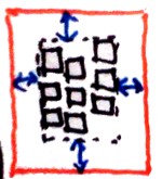
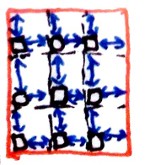
4. Content-Alignment:
Aligning the Content within the Box
The ‘justify-content’ and ‘align-content’
properties control alignment of the box's content within the box.
4.1. Inline/Main-Axis
Alignment: the ‘justify-content’ property
| Name:
| justify-content
|
| Value:
| auto | [ start | end | left | right | flex-start | flex-end | center
| space-between | space-around ] && true?
|
| Initial:
| auto
|
| Applies to:
| block containers and flex containers
|
| Inherited:
| no
|
| Percentages:
| N/A
|
| Media:
| visual
|
| Computed value:
| specified value
|
| Animatable:
| no
|
| Canonical order:
| per
grammar
|
Gives the default alignment of the box's content along the inline/row
axis. For block containers, this simply changes the meaning of ‘justify-self: auto’ on its children. For flex
containers, this aligns the contents of each flex line within its flex
line box. See [[!CSS3FLEXBOX]] for exact details.
- ‘
auto’
- If the element has ‘
display: block’ and
‘justify-self: auto’, computes to the value
inherited from the parent. Otherwise computes to ‘start’.
- ‘
start’
- Start-aligns the content within its box.
- ‘
end’
- End-aligns the content within its box.
- ‘
flex-start’
- For flex containers, aligns the items to the main-start edge.
Otherwise equivalent to ‘
start’.
- ‘
end’
- For flex containers, aligns the items to the main-end edge. Otherwise
equivalent to ‘
end’.
- ‘
left’
- Aligns content to the line-left edge. On a flex container, this is
treated as ‘
auto’ if the
line-left direction is in the wrong dimension.
- ‘
right’
- Aligns content to the line-right edge. On a flex container, this is
treated as ‘
auto’ if the
line-right direction is in the wrong dimension.
- ‘
center’
- Centers the content within its box
- ‘
space-between’
- Distributes the content evenly throughout the line by adjusting
inter-child spacing. If there is only one child (or if the element is a
block container), this is equivalent to centering.
- ‘
space-around’
- Distributes the content evenly throughout the line by adjusting
inter-child spacing and applying half of that spacing between the
first/last child and the box edges. If there is only one child (or if the
element is a block container), this is equivalent to centering.
- ‘
true’
- If specified, alignment is "true", and may cause the contents to
overflow the start edge of the box. Otherwise, the content is forced to
start-align if its total outer measure (before ‘
space-between’ or
‘space-around’ is
applied) is wider than the containing block.
For flex containers, if the "start" and "end" are not in the alignment
dimension, the "head" and "foot" sides are used instead, respectively.
This would, in conjunction with ‘text-align’, implement the HTML align
attribute and <center>. The weird behavior of ‘auto’ is for that and because
‘display: block’ elements are essentially
transparent, layout-wise, so passing through the alignment unchanged is
useful and probably intuitive to authors (though it's really weird for
implementers).
4.2. Stacking/Cross-Axis
Alignment: the ‘align-content’ property
| Name:
| align-content
|
| Value:
| auto | [ head | foot | flex-start | flex-end | baseline | center |
space-between | space-around ] && true?
|
| Initial:
| auto
|
| Applies to:
| block containers and flex containers
|
| Inherited:
| no
|
| Percentages:
| N/A
|
| Media:
| visual
|
| Computed value:
| specified value
|
| Animatable:
| no
|
| Canonical order:
| per
grammar
|
Aligns the box's content within the box along the block/column/cross
axis. Values have the following meanings:
- ‘
auto’
- For block containers, equivalent to ‘
head’, except that it does not cause the block to
establish a block formatting context. For table cells, defers alignment
to ‘vertical-align’ as specified in [CSS21] chapter 17.
For flex containers, it causes any positive free space to be distributed
equally across the lines. [CSS3-FLEXBOX]
- ‘
head’
- Head-aligns the box's content within its content box: the content is
laid out beginning at the box's head content edge.
- ‘
center’
- Centers the box's content within its content box: the content is
centered between the box's head and foot content edges.
-
- Foot-aligns the box's content within its content box: the content is
laid out so that it finishes at the foot content edge.
- ‘
flex-start’
- For flex containers, aligns the items to the cross-start edge.
Otherwise equivalent to ‘
head’.
- ‘
end’
- For flex containers, aligns the items to the cross-end edge. Otherwise
equivalent to ‘
foot’.
- ‘
baseline’
- For table cells, grid items, and flex items, aligns this elements's
first formatted line's baseline, if any, with the same
baseline in other ‘
baseline’-aligned cells/items in the same row.
This is equivalent to the behavior of ‘vertical-align:
baseline’ on table cells; see [CSS21] chapter 17 for details. If
size constraints prevent the baselines from fully aligning, alignment is
as close as possible. If the content's position is not fully determined
by baseline alignment, the content is head-aligned insofar as possible
while preserving the baseline alignment. (Content that has no first-line
baseline is thus also head-aligned.)
- ‘
space-between’
- For flex containers, distributes lines evenly by adjusting inter-line
spacing. If there is only one line (or if the element is container of
line boxes), this is equivalent to centering. UAs may also apply ‘
space-between’ to
lines in a block container.
- ‘
space-around’
- For flex containers, distributes lines evenly by adjusting inter-line
spacing and applying half of that spacing between the first/last child
and the box edges. If there is only one line (or if the element is not a
container of line boxes), this is equivalent to centering. UAs may also
apply ‘
space-between’ to lines in a block container.
- ‘
true’
- If specified, alignment is "true", and may cause the content to
overflow the head edge of the containing block. Otherwise, the content is
forced to head-align if is longer than the box's content area, and will
thus overflow only the foot edge.
All values other than ‘auto’ cause a block box to establish a block
formatting context such that its margins do not collapse with its children
and floats do not intrude into its content box.
For flex containers, if the "head" and "foot" are not in the alignment
dimension, the "start" and "end" sides are used instead, respectively.
5. Default Alignment of
Child Items
The ‘align-items’ and ‘justify-items’
properties, when set on a flex or grid container, set the default ‘align-self’ and
‘justify-self’ behavior of the items contained
by the element.
5.1. Inline/Main-Axis
Alignment: the ‘justify-items’ property
This could be applied to grid elements and set the default
alignment of the grid items. It mainly exists because Flexbox wants ‘align-items’; see
below.
| Name:
| justify-items
|
| Value:
| auto | [ start | center | end ] && true?
|
| Initial:
| auto
|
| Applies to:
| grid containers
|
| Inherited:
| no
|
| Percentages:
| N/A
|
| Media:
| visual
|
| Computed value:
| specified value
|
| Animatable:
| no
|
| Canonical order:
| per
grammar
|
Sets the default ‘justify-self’ of the grid container's items.
5.2. Stacking/Cross-Axis
Alignment: the ‘align-items’ property
| Name:
| align-items
|
| Value:
| auto | [ head | foot | flex-start | flex-end | center | baseline |
stretch ] && true?
|
| Initial:
| auto
|
| Applies to:
| flexbox and grid containers
|
| Inherited:
| no
|
| Percentages:
| N/A
|
| Media:
| visual
|
| Computed value:
| specified value
|
| Animatable:
| no
|
| Canonical order:
| per
grammar
|
Sets the default ‘align-self’ of the flex container's children
or the grid container's items. The ‘auto’ value computes to ‘stretch’ on flex and grid containers.
6.1. Document conventions
Conformance requirements are expressed with a combination of descriptive
assertions and RFC 2119 terminology. The key words “MUST”, “MUST
NOT”, “REQUIRED”, “SHALL”, “SHALL NOT”, “SHOULD”,
“SHOULD NOT”, “RECOMMENDED”, “MAY”, and “OPTIONAL” in the
normative parts of this document are to be interpreted as described in RFC
2119. However, for readability, these words do not appear in all uppercase
letters in this specification.
All of the text of this specification is normative except sections
explicitly marked as non-normative, examples, and notes. [RFC2119]
Examples in this specification are introduced with the words “for
example” or are set apart from the normative text with
class="example", like this:
This is an example of an informative example.
Informative notes begin with the word “Note” and are set apart from
the normative text with class="note", like this:
Note, this is an informative note.
Conformance to CSS Box Alignment Module Level 3 is defined for three
conformance classes:
- style
sheet
- A CSS
style sheet.
- renderer
- A UA
that interprets the semantics of a style sheet and renders documents that
use them.
- authoring tool
- A UA
that writes a style sheet.
A style sheet is conformant to CSS Box Alignment Module Level 3 if all
of its statements that use syntax defined in this module are valid
according to the generic CSS grammar and the individual grammars of each
feature defined in this module.
A renderer is conformant to CSS Box Alignment Module Level 3 if, in
addition to interpreting the style sheet as defined by the appropriate
specifications, it supports all the features defined by CSS Box Alignment
Module Level 3 by parsing them correctly and rendering the document
accordingly. However, the inability of a UA to correctly render a document
due to limitations of the device does not make the UA non-conformant. (For
example, a UA is not required to render color on a monochrome monitor.)
An authoring tool is conformant to CSS Box Alignment Module Level 3 if
it writes style sheets that are syntactically correct according to the
generic CSS grammar and the individual grammars of each feature in this
module, and meet all other conformance requirements of style sheets as
described in this module.
6.3. Partial implementations
So that authors can exploit the forward-compatible parsing rules to
assign fallback values, CSS renderers must treat as
invalid (and ignore as
appropriate) any at-rules, properties, property values, keywords, and
other syntactic constructs for which they have no usable level of support.
In particular, user agents must not selectively ignore
unsupported component values and honor supported values in a single
multi-value property declaration: if any value is considered invalid (as
unsupported values must be), CSS requires that the entire declaration be
ignored.
6.4. Experimental
implementations
To avoid clashes with future CSS features, the CSS2.1 specification
reserves a prefixed
syntax for proprietary and experimental extensions to CSS.
Prior to a specification reaching the Candidate Recommendation stage in
the W3C process, all implementations of a CSS feature are considered
experimental. The CSS Working Group recommends that implementations use a
vendor-prefixed syntax for such features, including those in W3C Working
Drafts. This avoids incompatibilities with future changes in the draft.
6.5. Non-experimental
implementations
Once a specification reaches the Candidate Recommendation stage,
non-experimental implementations are possible, and implementors should
release an unprefixed implementation of any CR-level feature they can
demonstrate to be correctly implemented according to spec.
To establish and maintain the interoperability of CSS across
implementations, the CSS Working Group requests that non-experimental CSS
renderers submit an implementation report (and, if necessary, the
testcases used for that implementation report) to the W3C before releasing
an unprefixed implementation of any CSS features. Testcases submitted to
W3C are subject to review and correction by the CSS Working Group.
Further information on submitting testcases and implementation reports
can be found from on the CSS Working Group's website at http://www.w3.org/Style/CSS/Test/.
Questions should be directed to the public-css-testsuite@w3.org
mailing list.
6.6. CR exit criteria
[Change or remove the following CR exit criteria if the spec
is not a module, but, e.g., a Note or a profile. This text was decided on
2008-06-04.]
For this specification to be advanced to Proposed Recommendation, there
must be at least two independent, interoperable implementations of each
feature. Each feature may be implemented by a different set of products,
there is no requirement that all features be implemented by a single
product. For the purposes of this criterion, we define the following
terms:
- independent
- each implementation must be developed by a different party and cannot
share, reuse, or derive from code used by another qualifying
implementation. Sections of code that have no bearing on the
implementation of this specification are exempt from this requirement.
- interoperable
- passing the respective test case(s) in the official CSS test suite,
or, if the implementation is not a Web browser, an equivalent test. Every
relevant test in the test suite should have an equivalent test created if
such a user agent (UA) is to be used to claim interoperability. In
addition if such a UA is to be used to claim interoperability, then there
must one or more additional UAs which can also pass those equivalent
tests in the same way for the purpose of interoperability. The equivalent
tests must be made publicly available for the purposes of peer review.
- implementation
- a user agent which:
- implements the specification.
- is available to the general public. The implementation may be a
shipping product or other publicly available version (i.e., beta
version, preview release, or “nightly build”). Non-shipping product
releases must have implemented the feature(s) for a period of at least
one month in order to demonstrate stability.
- is not experimental (i.e., a version specifically designed to pass
the test suite and is not intended for normal usage going forward).
The specification will remain Candidate Recommendation for at least six
months.
Acknowledgments
Special thanks goes to Markus Mielke, Alex Mogilevsky, and the
participants in the CSSWG's March 2008 F2F alignment discussions.
References
Normative references
-
- [CSS21]
- Bert Bos; et al. Cascading Style
Sheets Level 2 Revision 1 (CSS 2.1) Specification. 7 June
2011. W3C Recommendation. URL: http://www.w3.org/TR/2011/REC-CSS2-20110607
- [CSS3-FLEXBOX]
- Tab Atkins Jr.; Alex Mogilevsky; L. David Baron. CSS
Flexible Box Layout Module. 22 March 2012. W3C Working Draft.
(Work in progress.) URL: http://www.w3.org/TR/2012/WD-css3-flexbox-20120322/
- [CSS3-GRID-LAYOUT]
- Alex Mogilevsky; et al. CSS
Grid Layout. 22 March 2012. W3C Working Draft. (Work in
progress.) URL: http://www.w3.org/TR/2012/WD-css3-grid-layout-20120322/
- [RFC2119]
- S. Bradner. Key
words for use in RFCs to Indicate Requirement Levels. Internet
RFC 2119. URL: http://www.ietf.org/rfc/rfc2119.txt
Other references
-
- [CSS3TEXT]
- Elika J. Etemad; Koji Ishii. CSS Text
Level 3. 19 January 2012. W3C Working Draft. (Work in
progress.) URL: http://www.w3.org/TR/2012/WD-css3-text-20120119/
Index
- align-content, 4.2.
- align-items, 5.2.
- align-self, 3.2.
- authoring tool, 6.2.
- ‘
auto’, 3.1., 3.2., 4.1., 4.2.
- ‘
baseline’, 3.2., 4.2.
- ‘
center’, 3.1., 3.2., 4.1., 4.2.
- ‘
end’, 3.1., 4.1., 4.1., 4.2.
- ‘
flex-start’, 4.1., 4.2.
- ‘
foot’, 3.2., 4.2.
- ‘
head’, 3.2., 4.2.
- justify-content, 4.1.
- justify-items, 5.1.
- justify-self, 3.1.
- ‘
left’, 4.1.
- renderer, 6.2.
- ‘
right’, 4.1.
- ‘
space-around’, 4.1., 4.2.
- ‘
space-between’, 4.1., 4.2.
- ‘
start’, 3.1., 4.1.
- ‘
stretch’, 3.2.
- style sheet
- as conformance class, 6.2.
- ‘
true’, 3.1., 3.2., 4.1., 4.2.
Property index
| Property
| Values
| Initial
| Applies to
| Inh.
| Percentages
| Media
|
| align-content
| auto | [ head | foot | flex-start | flex-end | baseline | center |
space-between | space-around ] && true?
| auto
| block containers and flex containers
| no
| N/A
| visual
|
| align-items
| auto | [ head | foot | flex-start | flex-end | center | baseline |
stretch ] && true?
| auto
| flexbox and grid containers
| no
| N/A
| visual
|
| align-self
| auto | [ baseline | head | foot | center | stretch ] && true?
| auto
| flex items and grid items
| no
| N/A
| visual
|
| justify-content
| auto | [ start | end | left | right | flex-start | flex-end | center
| space-between | space-around ] && true?
| auto
| block containers and flex containers
| no
| N/A
| visual
|
| justify-items
| auto | [ start | center | end ] && true?
| auto
| grid containers
| no
| N/A
| visual
|
| justify-self
| auto | [ start | end | center ] && true?
| auto
| block-level elements and grid items
| no
| N/A
| visual
|