Abstract
This CSS3 module defines properties for text manipulation and specifies
their processing model. It covers line breaking, justification and
alignment, white space handling, text decoration and text transformation.
Status of This Document
This section describes the status of this document at the time of
its publication. Other documents may supersede this document. A list of
current W3C publications and the latest revision of this technical report
can be found in the W3C technical reports
index at http://www.w3.org/TR/.
Publication as a Working Draft does not imply endorsement by the W3C
Membership. This is a draft document and may be updated, replaced or
obsoleted by other documents at any time. It is inappropriate to cite this
document as other than work in progress.
This CSS module has been produced as a combined effort of the W3C Internationalization
Activity, and the Style
Activity and is maintained by the CSS Working Group. It also
includes contributions made by participants in the XSL Working Group (members only).
This document was produced by a group operating under the 5 February
2004 W3C Patent Policy. W3C maintains a public list of any patent disclosures made in
connection with the deliverables of the group; that page also includes
instructions for disclosing a patent. An individual who has actual
knowledge of a patent which the individual believes contains Essential
Claim(s) must disclose the information in accordance with section
6 of the W3C Patent Policy.
Feedback on this draft should be posted to the (archived) public
mailing list www-style@w3.org (see instructions) with
[css3-text] in the subject line. You are strongly
encouraged to complain if you see something stupid in this draft. The
editors will do their best to respond to all feedback.
If you have implemented properties from the May 2003 CSS3 Text
CR please let us know so we can take that into
account as we redraft the spec. You can post to www-style
(public), post to the CSS WG mailing
list (Member-restricted),
or email fantasai
directly (personal).
The following features are at risk and may be cut from the spec during
its CR period:
Table of Contents
1. Introduction
[document here]
1.1. Script Groups
Typographic behavior varies somewhat by language, but varies drastically
by writing system. For convenience, CSS3 Text defines the following script
groups, which combine typographically-similar scripts together.
- block scripts
- CJK (including Hangul and half-width kana) and by extension all "wide"
characters. (See [UAX11])
- clustered
scripts
- South-East Asian scripts that have discrete units but do not use space
between words (such as Thai, Lao, Khmer, Myanmar). This category also
includes the Tibetan script.
- discrete scripts
- Scripts that use spaces or visible word-separating punctuation between
words and have discrete, unconnected (in print) units within words, such
as Latin, Greek, Ethiopic, Cyrillic, Hebrew.
- cursive scripts
- Arabic and similar cursive scripts.
- connected
scripts
- Devanagari, Ogham, and other scripts that use spaces between words and
baseline connectors within words. By extension this group also includes
Gurmukhi, Tamil and any other Indic scripts whose typographic behavior is
similar to Devanagari.
Provide an appendix using Unicode script names.
These definitions are used primarily in describing line-breaking and justification behavior.
Conformance requirements are expressed with a combination of descriptive
assertions and RFC 2119 terminology. The key words “MUST”, “MUST
NOT”, “REQUIRED”, “SHALL”, “SHALL NOT”, “SHOULD”,
“SHOULD NOT”, “RECOMMENDED”, “MAY”, and “OPTIONAL” in the
normative parts of this document are to be interpreted as described in RFC
2119. However, for readability, these words do not appear in all uppercase
letters in this specification. All of the text of this specification is
normative except sections explicitly marked as non-normative, examples,
and notes. [RFC2119]
Examples in this specification are introduced with the words “for
example” or are set apart from the normative text with
class="example", like this:
This is an example of an informative example.
Informative notes begin with the word “Note” and are set apart from
the normative text with class="note", like this:
Note, this is an informative note.
Conformance to CSS Text Level 3 is defined for three classes:
- style
sheet
- A CSS
style sheet.
- renderer
- A UA that interprets the semantics of a style sheet and renders
documents that use them.
- authoring tool
- A UA that writes a style sheet.
A style sheet is conformant to CSS Text Level 3 if all of its
declarations that use properties defined in this module have values that
are valid according to the generic CSS grammar and the individual grammars
of each property as given in this module.
A renderer is conformant to CSS Text Level 3 if, in addition to
interpreting the style sheet as defined by the appropriate specifications,
it supports all the properties defined by CSS Text Level 3 by parsing them
correctly and rendering the document accordingly. However the inability of
a UA to correctly render a document due to limitations of the device does
not make the UA non-conformant. (For example, a UA is not required to
render color on a monochrome monitor.)
An authoring tool is conformant to CSS Text Level 3 if it writes
syntactically correct style sheets, according to the generic CSS grammar
and the individual grammars of each property in this module.
2.1. Partial and Experimental
Implementations
UAs must treat as invalid any properties or values they do not support.
Experimental implementations of a feature should support only a
vendor-prefixed syntax for the property/value.
3.1.
Transforming Text: the ‘text-transform’ property
| Name:
| text-transform
|
| Value:
| none | [ [ capitalize | uppercase | lowercase ] || fullwidth ||
large-kana ]
|
| Initial:
| none
|
| Applies to:
| all elements
|
| Inherited:
| yes
|
| Percentages:
| N/A
|
| Media:
| visual
|
| Computed value:
| as specified
|
This property transforms text for the styling purpose. Values have the
following meanings:
none
- No effects.
capitalize
- Puts all words in titlecase.
uppercase
- Puts all characters in uppercase.
lowercase
- Puts all characters in lowercase.
fullwidth
- Puts all characters in fullwidth form. If the character does not have
corresponding fullwidth form, it is left as is. This value is typically
used to typeset Latin characters and digits like ideographic characters.
large-kana
- Converts all small Kana characters to normal Kana. This value is
typically used for ruby annotation text, where all small Kana should be
drawn as large Kana.
Authors using this for ruby text may also want to use
‘font-variant: ruby’. [CSS3FONT]
Although limited, the case mapping process has some language
dependencies. Some well known examples are Turkish and Greek. If the
content language is known then any such language-specific rules must be
used.
The case mapping rules for the character repertoire specified by the
Unicode Standard can be found on the Unicode Consortium Web site. [UNICODE] Only
characters belonging to bicameral scripts are affected.
The definition of fullwidth and halfwidth forms can be found on the
Unicode consortium web site at [UAX11].
The following example converts the ASCII characters in abbreviations in
Japanese to their fullwidth variants so that they lay out and line break
like ideographs:
abbr:lang(ja) { text-transform: fullwidth; }
4. White Space
Processing
The source text of a document often contains formatting that is not
relevant to the final rendering: for example, breaking the source into
segments (lines) for ease of editing or adding white space characters such
as tabs and spaces to indent the source code. CSS white space processing
allows the author to control interpretation of such formatting: to
preserve or collapse it away when rendering the document.
Segments in the document source can be separated by a carriage return
(U+000D), a linefeed (U+000A) or both (U+000D U+000A), or by some other
mechanism that identifies the beginning and end of document segments, such
as the SGML RECORD-START and RECORD-END tokens. If no segmentation rules
are specified for the document language, each line feed (U+000A), carriage
return (U+000D) and CRLF sequence (U+000D U+000A) in the text is
considered a segment break. (This default rule also applies to generated
content.) In CSS, each such segment break is treated as a single line feed
character (U+000A).
White space processing in CSS interprets white space characters for
rendering: it has no effect on the underlying document data. In the
context of CSS, the document white space set is defined to be any space
characters (Unicode value U+0020), tab characters (U+0009), and line feeds
(U+000A).
Note that the document parser may have not only normalized
segment breaks, but also collapsed other space characters or otherwise
processed white space according to markup rules. Because CSS processing
occurs after the parsing stage, it is not possible to restore
these characters for styling. Therefore, some of the behavior specified
below can be affected by these limitations and may be user agent
dependent.
Control characters other than U+0009 (tab), U+000A (line feed), U+0020
(space), and U+202x (bidi formatting characters) are treated as characters
to render in the same way as any normal character. Copied from CSS2.1 but this has got to be wrong.
This section is still under discussion and may change in
future drafts.
| Name:
| white-space-collapsing
|
| Value:
| collapse | discard | [ [preserve | preserve-breaks] && trim-inner ]
|
| Initial:
| collapse
|
| Applies to:
| all elements
|
| Inherited:
| yes
|
| Percentages:
| N/A
|
| Media:
| visual
|
| Computed value:
| specified value
|
Rename to white-space-trim or white-space-adjust?
white-space-collapsing has an ‘ing’ and is confusing with XSL
This property declares whether and how white space inside the element is
collapsed. Values have the following meanings, which must be interpreted
according to the white space processing
rules:
collapse
- This value directs user agents to collapse sequences of white space
into a single character (or in some
cases, no character).
preserve
- This value prevents user agents from collapsing sequences of white
space. Segment breaks are preserved as forced line breaks.
preserve-breaks
- This value collapses white space as for ‘
collapse’, but preserves segment breaks as forced
line breaks.
discard
- This value directs user agents to "discard" all white space in the
element.
trim-inner
- This value directs UAs to discard all whitespace at the beginning of a
block up to and including the last line break before the first
non-white-space character in the block as well as to discard all white
space at the end of a block starting with the first line break after the
last non-white-space character in the block.
4.2. The White Space
Processing Rules
For each inline (including anonymous inlines), white space characters
are handled as follows, ignoring bidi formatting characters as if they
were not there:
-
If ‘white-space-collapsing’ is set to
‘collapse’ or ‘preserve-breaks’, white space characters are
considered collapsible and are processed by
performing the following steps:
- All spaces and tabs immediately following a line feed character are
removed. (This has the effect of discarding all white space at the
start of a line but preserving a trailing space if one exists at the
end.)
- If ‘
white-space-collapsing’ is not
‘preserve-breaks’, line feed
characters are transformed for rendering according to the line break transformation rules.
- Every tab (U+0009) is converted to a space (U+0020)
- Any space (U+0020) following another collapsible space
(U+0020)—even a space before the inline—is removed.
However, if removing this space would eliminate a line breaking
opportunity in the text, that opportunity is still considered to exist.
-
If ‘white-space-collapsing’ is set to
‘preserve’, any sequence of
spaces (U+0020) unbroken by an element boundary is treated as a sequence
of non-breaking spaces. However, a line breaking opportunity exists at
the end of the sequence.
-
If ‘white-space-collapsing’ is set to
‘discard’, the first white space
character in every white space sequence is converted to a zero width
non-joiner (U+200C) and the rest of the sequence is removed.
Then, the entire block is rendered. Inlines are laid out, taking bidi
reordering into account, and wrapping as specified by the ‘text-wrap’ property.
As each line is laid out,
- A sequence of collapsible spaces (U+0020) at the beginning of a line
is removed.
- Each tab (U+0009) is rendered as a horizontal shift that lines up the
start edge of the next glyph with the next tab stop. Tab stops occur at
points that are multiples of 8 times the width of a space (U+0020)
rendered in the block's font from the block's starting content edge.
- A sequence of collapsible spaces (U+0020) at the end of a line is
removed.
- If spaces (U+0020) or tabs (U+0009) at the end of a line are
non-collapsible but have ‘
text-wrap’ set to ‘normal’ or ‘avoid’ the UA may visually collapse them.
4.2.1. Example of
bidirectionality with white space collapsing
Consider the following markup fragment, taking special note of spaces
(with varied backgrounds and borders for emphasis and identification):
<ltr>A <rtl> B </rtl> C</ltr>
where the <ltr> element represents a left-to-right
embedding and the <rtl> element represents a
right-to-left embedding. If the ‘white-space-collapsing’ property is set
to ‘collapse’, the above
processing model would result in the following:
- The space before the B ( ) would
collapse with the space after the A ( ).
- The space before the C ( ) would
collapse with the space after the B ( ).
This would leave two spaces, one after the A in the left-to-right
embedding level, and one after the B in the right-to-left embedding
level. This is then ordered according to the Unicode bidirectional
algorithm, with the end result being:
A BC
Note that there are two spaces between A and B, and none between B and
C. This is best avoided by putting spaces outside the element instead of
just inside the opening and closing tags and, where practical, by relying
on implicit bidirectionality instead of explicit embedding levels.
When line feeds are collapsible, they are either
transformed into a space (U+0020) or removed depending on the script
context before and after the line break.
The script context is determined by the Unicode-given script value [UAX24] of the first
character that side of the line feed. However, characters such as
punctuation that belong to the COMMON and INHERITED scripts are ignored in
this check; the next character is examined instead. The UA must not
examine characters outside the block and may limit its examination to as
few as four characters on each side of the line feed. If the check fails
to find an acceptable script value (i.e. it has hit the check limits),
then the script context is neutral.
Note that the white space processing rules have already
removed any tabs and spaces after the line feed before these checks take
place.
- If the character immediately before or immediately after the line feed
is the zero width space character (U+200B), then the line feed is
removed.
- Otherwise, if the script context on one side of the line feed is
Hangul, then the line feed is converted to a space (U+0020).
- Otherwise, if the East Asian Width property [UAX11] of both the character before
and after the line feed is F, W, or H (not A), then the line feed is
removed.
- Otherwise, if ‘
text-autospace’ property is set to add
extra spaces for the combination of the character before the line feed
and after, then the line break is removed.
- Otherwise, the line feed is converted to a space (U+0020).
Comments on how well this would work in practice would be
very much appreciated, particularly from people who work with Thai and
similar scripts.
4.2.3. Informative
Summary of White Space Collapsing Effects
- Consecutive white space collapses into a single space.
- A sequence of line breaks and other white space between two
ideographic characters collapses into nothing unless there is a space
before the first line break in the sequence.
- A zero width space immediately before or anywhere after a line break
causes the entire sequence of white space beginning with the line break
to collapse into a zero width space.
4.3. White Space and Text
Wrapping Shorthand: the ‘white-space’ property
| Name:
| white-space
|
| Value:
| normal | pre | nowrap | pre-wrap | pre-line
|
| Initial:
| not defined for shorthand properties
|
| Applies to:
| all elements
|
| Inherited:
| yes
|
| Percentages:
| N/A
|
| Media:
| visual
|
| Computed value:
| see individual properties
|
The ‘white-space’ property is a shorthand for
the ‘white-space-collapsing’ and ‘text-wrap’
properties. Not all combinations are represented. Values have the
following meanings:
normal
- Sets ‘
white-space-collapsing’ to ‘collapse’ and ‘text-wrap’ to
‘normal’
pre
- Sets ‘
white-space-collapsing’ to ‘preserve’ and ‘text-wrap’ to
‘none’
nowrap
- Sets ‘
white-space-collapsing’ to ‘collapse’ and ‘text-wrap’ to
‘none’
pre-wrap
- Sets ‘
white-space-collapsing’ to ‘preserve’ and ‘text-wrap’ to
‘normal’
pre-line
- Sets ‘
white-space-collapsing’ to ‘preserve-breaks’ and ‘text-wrap’ to
‘normal’
The following informative table summarizes the behavior of various
‘white-space’ values:
|
| New Lines
| Spaces and Tabs
| Text Wrapping
|
| normal
| Collapse
| Collapse
| Wrap
|
| pre
| Preserve
| Preserve
| No wrap
|
| nowrap
| Collapse
| Collapse
| No wrap
|
| pre-wrap
| Preserve
| Preserve
| Wrap
|
| pre-line
| Preserve
| Collapse
| Wrap
|
5. Line Breaking and Word
Boundaries
In most writing systems, in the absence of hyphenation a line break
occurs only at word boundaries. Many writing systems use spaces or
punctuation to explicitly separate words, and line break opportunities can
be identified by these characters. Scripts such as Thai, Lao, and Khmer,
however, do not use spaces or punctuation to separate words. Although the
zero width space (U+200B) can be used as an explicit word delimiter in
these scripts, this practice is not common. As a result, a lexical
resource is needed to correctly identify break points in such texts.
In several other writing systems, (including Chinese, Japanese, Yi, and
sometimes also Korean) a line break opportunity is based on character
boundaries, not word boundaries. In these systems a line can break
anywhere except between certain character combinations.
Additionally the level of strictness in these restrictions can vary with
the typesetting style.
CSS does not fully define where line breaking opportunities occur,
however some controls are provided to distinguish common variations.
Further information on line breaking conventions can be found
in [JIS4051] for
Japanese, [ZHMARK]
for Chinese, and [?] for Korean, and in [UAX14] for all scripts in Unicode.
Any guidance for appropriate references here would be much
appreciated.
Information on line-breaking in the absence of dictionaries:
for
Thai
Floated and absolutely-positioned elements do not introduce a line
breaking opportunity. The line breaking behavior of a replaced element is
equivalent to that of a Latin character.
It is not clear whether this section handles Southeast Asian
scripts well. Additionally, some guidance should be provided on how to
break or not break Southeast Asian in the absence of a dictionary.
5.1. Line Breaking Strictness:
the ‘line-break’ property
| Name:
| line-break
|
| Value:
| auto | loose | normal | strict
|
| Initial:
| auto
|
| Applies to:
| all elements
|
| Inherited:
| yes
|
| Percentages:
| N/A
|
| Media:
| visual
|
| Computed value:
| specified value
|
This property specifies the strictness of line-breaking rules applied
within an element: particularly how line-breaking interacts with
punctuation. Values have the following meanings:
auto
- The UA determines the set of line-breaking restrictions to use, and it
may vary the restrictions based on the length of the line; e.g., use a
less restrictive set of line-break rules for short lines.
loose
- Breaks text using the least restrictive set of line-breaking rules.
Typically used for short lines, such as in newspapers.
normal
- Breaks text using the most common set of line-breaking rules.
strict
- Breaks text using the most stringent set of line-breaking rules.
CSS distinguishes between three levels of strictness in the rules for
implicit line breaking. The precise set of rules in effect for each level
is up to the UA and should follow language conventions. However, this
specification does recommend that:
- Following breaks be forbidden in ‘
strict’ line breaking and allowed in ‘normal’:
- breaks before Japanese small kana
- breaks before the KATAKANA-HIRAGANA PROLONGED SOUND MARK (U+30FC)
Additionally, if the language is known to be Chinese or Japanese, breaks
before hyphens (U+2010, U+2013, U+301C, U+30A0) may be allowed in
‘normal’.
- Following breaks be forbidden in ‘
normal’ and ‘strict’ line breaking and allowed in ‘loose’:
- breaks before iteration marks (U+3005, U+303B, U+309D, U+309E,
U+30FD, U+30FE)
- breaks between inseparatable characters (U+2014, U+2025, U+2026,
U+3033, U+3034, U+3035)
If the language is known to be Chinese or Japanese, then additionally the
following breaks may be allowed in ‘loose’:
- breaks before middle dots (U+003A, U+003B, U+30FB, U+FF1A, U+FF1B,
U+FF65)
- breaks before dividing punctuation marks (U+0021, U+003F, U+203C,
U+2047, U+2048, U+2049, U+FF01, U+FF1F)
- breaks before postfixes (U+0025, U+00A2, U+00B0, U+2030, U+2032,
U+2033, U+2103, U+FF05, U+FFE0)
- breaks after prefixes (U+0024, U+00A3, U+00A5, U+20AC, U+2116,
U+FF04, U+FFE1, U+FFE5)
5.2. Word Breaking Rules: the
‘word-break’ property
| Name:
| word-break
|
| Value:
| normal | keep-all | break-all | keep-words
|
| Initial:
| normal
|
| Applies to:
| all elements
|
| Inherited:
| yes
|
| Percentages:
| N/A
|
| Media:
| visual
|
| Computed value:
| specified value
|
This property specifies line break opportunities within words. Values
have the following meanings:
normal
- Break lines according to their usual rules.
break-all
- Lines may break between any two grapheme clusters within words.
Hyphenation is not applied. This option is used mostly in a context where
the text is predominantly using CJK characters with few non-CJK excerpts
and it is desired that the text be better distributed on each line.
keep-all
- Block characters can no longer create
implied break points. Otherwise this option is equivalent to ‘
normal’. This option is mostly used where the
presence of word separator characters still creates line-breaking
opportunities, as in Korean.
keep-words
- Lines may not break within words, even in block scripts (which would require the use of a
dictionary in languages such as Chinese and Japanese). This option is
sometimes used in combination with start-aligned (unjustified) text.
When shaping scripts such as Arabic are allowed to break within words
due to ‘break-all’, the characters must
still be shaped as if the word were not broken.
6. Hyphenation
Hyphenation allows the controlled splitting of words to improve the
layout of paragraphs. CSS3 Text does not define the exact rules for
hyphenation, but defines six properties and an at-rule that influence
hyphenation.
Whether hyphenation is applied can controlled with the ‘hyphens’ property.
6.1. Hyphenation Control: the
‘hyphens’
property
| Name:
| hyphens
|
| Value:
| none | manual | auto | all
|
| Initial:
| manual
|
| Applies to:
| all elements
|
| Inherited:
| yes
|
| Percentages:
| N/A
|
| Media:
| visual
|
| Computed value:
| specified value
|
This property controls whether hyphenation is allowed to create more
break opportunities within a line of text. Values have the following
meanings:
- none
- Words are not broken at line breaks, even if characters inside the
word suggest line break points.
- manual
- Words are only broken at line breaks where there are characters inside
the word that suggest line break opportunities. Characters can be
explicit or conditional.
In Unicode, U+00AD is a conditional "soft hyphen" and U+2010 is an
explicit hyphen. Unicode Standard Annex #14 describes the role of soft hyphens
in Unicode line breaking. [UAX14]
In HTML, ­ represents the soft hyphen character which
suggests a line break opportunity.
ex­ample
- auto
- Words can be broken at appropriate hyphenation points either as
determined by hyphenation characters inside the word or as determined
automatically by a language-appropriate hyphenation resource (such as
those provided via ‘
@hyphenation-resource’). Explicit hyphenation
characters inside a word take priority over automatic resources when
determining hyphenation points within the word.
- all
- All possible hyphenation points, as would be determined for
‘
auto’, are marked. The visual
appearance of the mark is UA-dependent. This value is intended for
debugging. Do we really need this value?
Correct automatic hyphenation requires a hyphenation resource
appropriate to the language of the text being broken. The UA is therefore
only required to automatically hyphenate text for which the author has
declared a language (e.g. via HTML lang or XML
xml:lang) and for which it has an appropriate hyphenation
resource.
When shaping scripts such as Arabic are allowed to break within words
due to hyphenation, the characters must still be shaped as if the word
were not broken.
| Name:
| hyphenate-character
|
| Value:
| auto | <string> <string>?
|
| Initial:
| auto
|
| Applies to:
| all elements
|
| Inherited:
| yes
|
| Percentages:
| N/A
|
| Media:
| visual
|
| Computed value:
| specified value
|
This property specifies strings that are shown between parts of
hyphenated words. The ‘auto’ value
means that the user agent should find an appropriate value. If one string
is specified, it appears at the end of lines. If two strings are
specified, the second string appears at the beginning of lines.
Is the use of hyphenate characters at the beginning of lines
common enough for this to be part of the specification?
In Latin scripts, the hyphen character (U+2010) is often used to
indicate that a word has been split. Normally, it will not be necessary
to set it explicitly. However, this can easily be done:
article { hyphenate-character: "\2010" }
| Name:
| hyphenate-limit-before
|
| Value:
| <integer> | auto
|
| Initial:
| auto
|
| Applies to:
| all elements
|
| Inherited:
| yes
|
| Percentages:
| N/A
|
| Media:
| visual
|
| Computed value:
| specified value
|
This property specifies the minimum number of characters in a hyphenated
word before the hyphenation character. The ‘auto’ value means that the UA chooses a value that
adapts to the current layout.
Unless the UA is able to calculate a better value, it is
suggested that ‘auto’ means 2.
| Name:
| hyphenate-limit-after
|
| Value:
| <integer> | auto
|
| Initial:
| auto
|
| Applies to:
| all elements
|
| Inherited:
| yes
|
| Percentages:
| N/A
|
| Media:
| visual
|
| Computed value:
| specified value
|
This property specifies the minimum number of characters in a hyphenated
word after the hyphenation character. The ‘auto’ value means that the UA chooses a value that
adapts to the current layout.
Unless the UA is able to calculate a better value, it is
suggested that ‘auto’ means 2.
| Name:
| hyphenate-limit-lines
|
| Value:
| no-limit | <integer>
|
| Initial:
| no-limit
|
| Applies to:
| block containers
|
| Inherited:
| yes
|
| Percentages:
| N/A
|
| Media:
| visual
|
| Computed value:
| specified value
|
This property indicates the maximum number of successive hyphenated
lines in an element. In some cases, user agents may not be able to honor
the specified value. The ‘no-limit’
value means that there is no limit.
| Name:
| hyphenate-limit-last
|
| Value:
| none | always | column | page | spread
|
| Initial:
| none
|
| Applies to:
| block containers
|
| Inherited:
| yes
|
| Percentages:
| N/A
|
| Media:
| visual
|
| Computed value:
| specified value
|
This property indicates hyphenation behavior at the end of elements,
column, pages and spreads. A spread is a set of two pages that are visible
to the reader at the same time. Values are:
- ‘
none’
- No restrictions imposed.
- ‘
always’
- The last full line of the element, or the last line before any column,
page, or spread break inside the element should not be hyphenated.
- ‘
column’
- The last line before any column, page, or spread break inside the
element should not be hyphenated.
- ‘
page’
- The last line before page or spread break inside the element should
not be hyphenated.
- ‘
spread’
- The last line before any spread break inside the element should not be
hyphenated.
p { hyphenate-limit-last: always }
div.chapter {  hyphenate-limit-last: spread }
A paragraph may be formatted like this when ‘hyphenate-limit-last: none’ is set:
This is just a
simple example
to show Antarc-
tica.
With ‘hyphenate-limit-last: always’
one would get:
This is just a
simple example
to        show
Antarctica.
6.5. Hyphenation
Resources
ISSUE: this ‘@hyphenate-resource’ at-rule is a proposal
that would replace the ‘hyphenate-resource’ property.
- advantages of ‘
@hyphenate-resource’
-
- Minimal data storage (set per-language, not per-element).
- Requires language-tagging, which also enables the correct use of
local dictionaries (and can also trigger other typographic
improvements).
- Can use RFC4647 language-mapping, which is more intelligent than
:lang()'s prefix-matching. (Could also argue that :lang() should use
RFC4647.)
- disadvantages of ‘
@hyphenate-resource’
-
- Requires language-tagging; cannot select on any other criteria.
Variations in hyphenation rules within the same language in a given
document will require use of subtags.
- advantages of ‘
hyphenate-resource’
-
- Can use any selector, not just language-mapping.
- Implemented in Prince.
- disadvantages of ‘
hyphenate-resource’
-
- Requires per-element data storage.
Feedback on this issue is requested.
The ‘@hyphenate-resource’ at-rule
allows the author to specify hyphenation resources that the UA may use to
help it hyphenate text correctly.
The ‘@hyphenate-resource’ rule consists of the
‘@hyphenate-resource’ at-keyword followed by a
hyphenation mapping declaration block, which has the same syntax as a
declaration block, except that the properties are language codes and the
property values are comma-separated lists of <url> component values
indicating the location of author-suggested hyphenation resources ordered
from most to least preferred. The keyword value ‘local’ may be used in place of one of the
<url> values to suggest the use of a local (UA-provided)
hyphenation resource. If the ‘local’
value is missing, it is assumed to be the first (most-preferred) resource
in the list.
The hyphenation resource list that applies to the text in an element is
the one given by the last hyphenation mapping declaration whose language
code matches the language of the element. Language code matching must be
performed using RFC4647 [RFC4647] explain exactly how.
Since the last matching declaration takes effect, authors
should list the most general mapping first, and the most specific last.
Note also that declarations are not concatenated, so if multiple
dictionaries are needed, they must be listed completely in each
declaration.
@hyphenate-resource {
  /* English */
  en:    url(en-GB.hy);
  en-US: url(en-US.hy);
  en-x-hixie:    url(hixie.hy), local, url(en-GB.hy);
  en-US-x-hixie: url(hixie.hy), local, url(en-US.hy);
  /* français */
  fr:    url(fr.hy);
}
In the example above, the ‘en-x-hixie’ rule is used for both ‘en-x-hixie’ and ‘en-GB-x-hixie’. It is not used for ‘en-US-x-hixie’ because the ‘en-US-x-hixie’ rule is given last. If the order
were reversed, the ‘en-US-x-hixie’
rule would never be used.
Use a format specifier, like @font-face? What is the
format?
UAs are not required to support this at-rule.
| Name:
| hyphenate-resource
|
| Value:
| none | <uri> [, <uri> ]*
|
| Initial:
| none
|
| Applies to:
| all elements
|
| Inherited:
| yes
|
| Percentages:
| N/A
|
| Media:
| visual
|
| Computed value:
| specified value
|
This property specifies a comma-separated list of external resources
that can help the UA determine hyphenation points. If more than one
resource is specified, the UA should consult each resource – in
turn, from the beginning – until it finds one that is able to
determine hyphenation points in a word. The ‘none’ value indicates that no external
resources are available. In any case, the UA can also use local resources
not listed on this property.
Often, finding the right hyphenate resource is based on knowing the
language of the text. The lang attribute is recommended for
encoding the language, and the corresponding selector is used in this
example:
:lang(dk) { hyphenate-resource: url("hyph_da_DK.dic"), url("hyph_da_NO.dic") }
UAs are not required to support this property.
Use a format specifier, like @font-face? What is the format?
7. Text Wrapping
Text wrapping is controlled by the ‘text-wrap’ and ‘word-wrap’
properties:
7.1. Text Wrap Settings: the
‘text-wrap’ property
| Name:
| text-wrap
|
| Value:
| normal | unrestricted | none | avoid
|
| Initial:
| normal
|
| Applies to:
| all elements
|
| Inherited:
| yes
|
| Percentages:
| N/A
|
| Media:
| visual
|
| Computed value:
| specified value
|
This property specifies the mode for text wrapping. Possible values:
normal
- Lines may break at allowed break points, as determined by the
line-breaking rules in effect. Line breaking behavior defined for the WJ,
ZW, and GL line-breaking classes in [UAX14] must be honored.
none
- Lines may not break; text that does not fit within the block container
overflows it.
unrestricted
- Lines may break between any two grapheme clusters. Line-breaking
restrictions have no effect and hyphenation does not take place.
Character shaping is performed on each side of the break as if the break
had not occurred. This value is for terminal-style dumb
line breaking. But has no use cases.
avoid
- Line breaking is suppressed within the element: the UA may only break
within the element if there are no other valid break points in the line.
If the text breaks, line-breaking restrictions are honored as for
‘
normal’.
Regardless of the ‘text-wrap’ value, lines always break at
forced breaks: for all values, line-breaking behavior defined for the BK,
CR, LF, CM NL, and SG line breaking classes in [UAX14] must be honored.
When ‘text-wrap’ is set to ‘normal’ or ‘avoid’, UAs that allow breaks at punctuation
other than spaces should prioritize breakpoints. For example, if breaks
after slashes have a lower priority than spaces, the sequence "check /etc"
will never break between the ‘/’ and
the ‘e’. The UA may use the width
of the containing block, the text's language, and other factors in
assigning priorities. As long as care is taken to avoid such awkward
breaks, allowing breaks at appropriate punctuation other than spaces is
recommended, as it results in more even-looking margins, particularly in
narrow measures.
7.1.1. Example of using
‘text-wrap: avoid’ in presenting a
footer
The priority of breakpoints can be set to reflect the intended grouping
of text.
Given the rules
footer { text-wrap: avoid; /* inherits to all descendants */ }
and the following markup:
<footer>
<venue>27th Internationalization and Unicode Conference</venue>
• <date>April 7, 2005</date> •
<place>Berlin, Germany</place>
</footer>
In a narrow window the footer could be broken as
27th Internationalization and Unicode Conference •
April 7, 2005 • Berlin, Germany
or in a narrower window as
27th Internationalization and Unicode
Conference • April 7, 2005 •
Berlin, Germany
but not as
27th Internationalization and Unicode Conference • April
7, 2005 • Berlin, Germany
7.2. Emergency Wrapping: the
‘word-wrap’ property
| Name:
| word-wrap
|
| Value:
| normal | break-word
|
| Initial:
| normal
|
| Applies to:
| all elements
|
| Inherited:
| yes
|
| Percentages:
| N/A
|
| Media:
| visual
|
| Computed value:
| specified value
|
This property specifies whether the UA may break within a word to
prevent overflow when an otherwise-unbreakable string is too long to fit
within the line box. It only has an effect when ‘text-wrap’ is
either ‘normal’ or ‘avoid’. Possible values:
normal
- Lines may break only at allowed break points. However, the
restrictions introduced by ‘
word-break:
    keep-all
’ may be relaxed to match ‘word-break: normal’ and the various hyphenation
limit properties may be ignored if there are no otherwise-acceptable
break points in the line.
break-word
- An unbreakable "word" may be broken at an arbitrary point if there are
no otherwise-acceptable break points in the line. Shaping characters are
still shaped as if the word were not broken, and grapheme clusters must
together stay as one unit.
Should there be a ‘hyphenate’ value, that turns on hyphenation only
for emergency breaking? (This would give better results than ‘break-word’.)
Should there be a ‘none’
value, that prevents the relaxation of ‘word-break’ and hyphenation limit
restrictions?
8. Alignment and
Justification
8.1. Text Alignment: the
‘text-align’ property
| Name:
| text-align
|
| Value:
| [ start | end | left | right | center | justify | match-parent ] ||
<string>
|
| Initial:
| start
|
| Applies to:
| block containers
|
| Inherited:
| yes
|
| Percentages:
| N/A
|
| Media:
| visual
|
| Computed value:
| specified value, except for ‘match-parent’ (see prose)
|
This property describes how inline contents of a block are horizontally
aligned if the contents do not completely fill the line box. Values have
the following meanings:
start
- The inline contents are aligned to the start edge of the line box.
end
- The inline contents are aligned to the end edge of the line box.
left
- The inline contents are aligned to the left edge of the line box. In
vertical text, ‘
left’ aligns to
the edge of the line box that would be the start edge for left-to-right
text.
right
- The inline contents are aligned to the right edge of the line box. In
vertical text, ‘
right’ aligns to
the edge of the line box that would be the end edge for left-to-right
text.
center
- The inline contents are centered within the line box.
justify
- The text is justified according to the method specified by the ‘
text-justify’ property.
<string>
- The string must be a single character; otherwise the declaration must
be ignored.
When applied to a table cell, specifies the alignment character around which the cell's
contents will align. See below for
further details.
match-parent
- This value behaves the same as ‘
inherit’ except that an inherited
‘start’ or ‘end’ keyword is calculated against its
parent's ‘direction’ value and
results in a computed value of either ‘left’ or ‘right’.
A block of text is a stack of line boxes. In
the case of ‘start’, ‘end’, ‘left’, ‘right’ and ‘center’, this property specifies how the
inline-level boxes within each line box align with respect to the start
and end sides of the line box: alignment is not with respect to the viewport or
containing block.
In the case of ‘justify’, the UA
may stretch or shrink any inline boxes by adjusting their text in addition to shifting
their positions. (See also ‘text-justify’, ‘letter-spacing’, and ‘word-spacing’.) If an element's white
space is set to be collapsible, then the UA is not
required to adjust its text for the purpose of justification and may
instead treat the text as having no expansion opportunities. If the UA
chooses to adjust the text, then it must ensure that tab stops continue to
line up as required by the white space
processing rules.
8.1.1. Details on
Character-based Alignment in a Table Column
When multiple cells in a column have an alignment character specified,
the alignment character of each such cell in the column is centered along
a single column-parallel axis and the rest of the text in the column
shifted accordingly. (Note that the strings do not have to be the same for
each cell, although they usually are.)
If the alignment character appears more than once in the text, the first
instance is used for alignment. If the alignment character does not appear
in a cell at all, the string is aligned as if the alignment character had
been inserted at the end of its contents.
Character-based alignment occurs before table cell width computation so
that auto width computations can leave enough space for alignment. Whether
column-spanning cells participate in the alignment prior to or after width
computation is undefined. If width constraints on the cell contents
prevent full alignment throughout the column, the resulting alignment is
undefined.
A keyword value may be specified in conjunction with the <string>
value; if it is not given, it defaults to ‘right’. This value is used:
- when character-based alignment is applied to boxes that are not table
cells.
- when the text wraps to multiple lines.
- when the column is wide enough that the character alignment alone does
not determine the positions of its character-aligned contents. In this
case the keyword alignment of the first cell in the column with a
specified alignment character is used to slide the position of the
character-aligned contents to match the keyword alignment insofar as
possible without changing the width of the column. For ‘
center’, the UA may center the aligned contents
using its extremes, center the alignment axis itself (insofar as
possible), or optically center the aligned contents some other way (such
as by taking a weighted average of the extent of the cells' contents to
either side of the axis).
- when a character-aligned cell spans more than one column. In this case
the keyword alignment value is used to determine which column's axis to
align with: the leftmost column for ‘
left’, the rightmost column for ‘right’ and ‘center’, the startmost column for ‘start’, the endmost column for ‘end’.
The following style sheet:
TD { text-align: "." center }
will cause the column of dollar figures in the following HTML table:
<TABLE>
<COL width="40">
<TR> <TH>Long distance calls
<TR> <TD> $1.30
<TR> <TD> $2.50
<TR> <TD> $10.80
<TR> <TD> $111.01
<TR> <TD> $85.
<TR> <TD> N/A
<TR> <TD> $.05
<TR> <TD> $.06
</TABLE>
to align along the decimal point. The table might be rendered as
follows:
+---------------------+
| Long distance calls |
+---------------------+
|        $11.30       |
|        $22.50       |
|         $0.80       |
|    $200567.01       |
|        $85.         |
|        N/A          |
|          $.05       |
|          $.06       |
+---------------------+
Right alignment is used by default for character-based
alignment because numbering systems are almost all left-to-right even in
right-to-left writing systems, and the primary use case of character-based
alignment is for numerical alignment.
8.2. First Line
Alignment: the ‘text-align-first’ property
| Name:
| text-align-first
|
| Value:
| auto | start
|
| Initial:
| auto
|
| Applies to:
| block containers
|
| Inherited:
| yes
|
| Percentages:
| N/A
|
| Media:
| visual
|
| Computed value:
| specified value
|
This property describes how the first line of a block or a line right
after a forced line break is aligned. Values have the following meanings:
- ‘
auto’
- Use the alignment given by ‘
text-align’ (or by ‘text-align-last’ if that applies
instead).
- ‘
start’
- The inline contents are aligned to the start edge of the line box.
(This overrides ‘
text-align-last’ if both apply to this
line.)
8.3. Last Line Alignment:
the ‘text-align-last’ property
| Name:
| text-align-last
|
| Value:
| auto | start | end | left | right | center | justify
|
| Initial:
| auto
|
| Applies to:
| block containers
|
| Inherited:
| yes
|
| Percentages:
| N/A
|
| Media:
| visual
|
| Computed value:
| specified value
|
This property describes how the last line of a block or a line right
before a forced line break is aligned. ‘auto’ is equivalent to the value of the ‘text-align’
property except when ‘text-align’ is set to ‘justify’, in which case it is ‘justify’ when ‘text-justify’ is ‘distribute’ and ‘start’ otherwise. All other values have the same
meanings as in ‘text-align’.
8.4. Justification Method:
the ‘text-justify’ property
| Name:
| text-justify
|
| Value:
| auto | none | inter-word | inter-ideograph | inter-cluster |
distribute | kashida
|
| Initial:
| auto
|
| Applies to:
| block containers and, optionally, inline elements
|
| Inherited:
| yes
|
| Percentages:
| N/A
|
| Media:
| visual
|
| Computed value:
| specified value
|
This property selects the justification method used when a line's
alignment is set to ‘justify’. (See
‘text-align’.) The property applies to
block containers, but the UA may (but is not required to) also support it
on inline elements. It takes the following values:
auto
- The UA determines the justification algorithm to follow, based on a
balance between performance and adequate presentation quality.
One possible algorithm is to determine the behavior based
on the language of the paragraph: the UA can then choose appropriate
value for the language, like ‘inter-ideograph’ for CJK, or ‘inter-word’ for English. Another possibility is
to use a justification method that is a universal compromise for all
scripts, e.g. the ‘inter-cluster’
method with block scripts raised to first priority.
none
- Justification is disabled. This value is intended for
use in user stylesheets to improve readability or for accessibility
purposes.
inter-word
- Justification primarily changes spacing at word separators. This value
is typically used for languages that separate words using spaces, like
English or (sometimes) Korean.
inter-ideograph
- Justification primarily changes spacing at word separators and at
inter-graphemic boundaries in scripts that use no word spaces. This value
is typically used for CJK
languages.
inter-cluster
- Justification primarily changes spacing at word separators and at
grapheme cluster boundaries in clustered
scripts. This value is typically used for Southeast Asian scripts
such as Thai.
distribute
- Justification primarily changes spacing both at word separators and at
grapheme cluster boundaries in all scripts except those in the connected
and cursive groups. This value is sometimes used in e.g. Japanese.
-
kashida
- Justification primarily stretches cursive
scripts through the use of kashida or other calligraphic elongation.
When justifying text, the user agent takes the remaining space between
the ends of a line's contents and the edges of its line box, and
distributes that space throughout its contents so that the contents
exactly fill the line box. If the ‘letter-spacing’ and ‘word-spacing’
property values allow it, the user agent may also distribute negative
space, putting more content on the line than would otherwise fit under
normal spacing conditions. The exact justification algorithm is
UA-dependent; however, CSS provides some general guidelines which should
be followed when any justification method other than ‘auto’ is specified.
CSS defines expansion opportunities as points where
the justification algorithm may alter spacing within the text. These
expansion opportunities fall into priority levels as defined by the
justification method. Within a line, higher priority expansion
opportunities should be expanded or compressed to their limits before
lower priority expansion opportunities are adjusted. (Expansion and
compression limits are given by the letter-spacing and word-spacing properties.)
How any remaining space is distributed once all expansion opportunities
reach their limits is up to the UA. If the inline contents of a line
cannot be stretched to the full width of the line box, then they must be
aligned as specified by the ‘text-align-last’ property. (If ‘text-align-last’ is ‘justify’, then they must be aligned as for
‘center’ if ‘text-justify’
is ‘distribute’ and as ‘start’ otherwise.)
The expansion opportunity priorities for values of ‘text-justify’
are given in the table below. Space must be distributed evenly among all
types of expansion opportunities in a given prioritization group, but may
vary within a line due to changes in the font or letter-spacing and
word-spacing values. Since justification behavior varies by writing
system, expansion opportunities are organized by script group. The different types of expansion
opportunities are defined as follows:
- spaces
- An expansion opportunity exists at spaces and other word separators. Expand as for ‘
word-spacing’.
- block
- clustered
- discrete
- An expansion opportunity exists between two grapheme clusters when at least one of them
belongs to the affected script group and the spacing that point has not
already been altered at a higher priority.
- cursive
- Words may be expanded through kashida elongation or other cursive
expansion processes. Kashida may be applied in discrete units or
continuously, and the prioritization of kashida points is UA-dependent:
for example, the UA may apply more at the end of the line. The UA should
not apply kashida to fonts for which it is inappropriate. It may instead
rely on other justification methods that lengthen or shorten Arabic
segments (e.g. by substituting in swash forms or optional ligatures).
Because elongation rules depend on the typeface style, the UA should rely
on on the font whenever possible rather than inserting kashida based on a
font-independent ruleset. The UA should limit elongation so that, e.g. in
multi-script lines a short stretch of Arabic will not be forced to soak
up too much of the extra space by itself. If the UA does not support
cursive elongation, then no expansion points exist between grapheme
clusters of these scripts.
- punctuation
- An expansion opportunity exists between a pair of characters from the
Unicode symbols (S*) and punctuation (P*) classes and at enabled autospace points. The default justification
priority of these points depends on the justification method as defined
below; however there may be additional rules controlling their
justification behavior due to typographic tradition. For example, there
are traditionally no expansion opportunities between consecutive EM DASH
U+2014, HORIZONTAL BA U+2015, HORIZONTAL ELLIPSIS U+2026, or TWO DOT
LEADER U+2025 characters [JLREQ]. The UA may introduce
additional levels of priority to handle expansion opportunities involving
punctuation.
- connected
- No expansion opportunities occur between pairs of connected script
grapheme clusters. Is this correct?
Prioritization of Expansion Points
| method:
| inter-word
| inter-ideograph
| distribute
| inter-cluster
| kashida
| auto
|
| priority:
| 1st
| 2nd
| 1st
| 2nd
| 1st
| 2nd
| 1st
| 2nd
| 1st
| 2nd
| 3rd
| 1st
| 2nd
|
| spaces
| •
|
| •
|
| •
|
| •
|
|
| •
|
| ¿?
|
|
| block
|
| •
| •
|
| •
|
|
| •
|
|
| •
| ¿?
|
|
| clustered
|
| •
|
| •
| •
|
| •
|
|
|
| •
| ¿?
|
|
| cursive
|
| •
|
| •
|
| •
|
| •
| •
|
|
|
| ¿?
|
| discrete
|
| •
|
| •
| •
|
|
| •
|
|
| •
|
| ¿?
|
| connected
|
|
|
|
|
|
|
|
|
|
|
|
|
|
| punctuation
|
| •
| •
|
| •
|
| ???
| ???
|
|
| •
| ¿?
| ¿?
|
The ‘auto’ column defined
above is informative.
The UA may enable or break optional ligatures or use other font features
such as alternate glyphs to help justify the text under any method. This
behavior is not defined by CSS.
Japanese is one of the languages for which compression is preferred to
expansion in applying justification.
3.8 Line Adjustment in [JLREQ] gives an example of a set of
rules for how a text formatter can justify Japanese text. It describes
rules for cases where the ‘text-justify’ property is ‘trim inter-ideograph’.
It produces an effect similar to cases where the computed value of
‘text-trim’ property does not specify
‘force-end’ or ‘keep-end’. If the UA wants to prohibit this
behavior, rule b. of 3.8.3 should be omitted.
Note that the rules described in the document specifically target
Japanese. Therefore they may produce non-optimal results when used to
justify other languages such as English. To make the rules more
applicable to other scripts, the UA could, for instance, omit the rule to
compress half-width spaces (rule a. of 3.8.3).
9. Spacing
The next two properties refer to the
<spacing-limit> value type, which is defined as follows:
<spacing-limit>
- [ normal | <length> | <percentage> ]
normal
- Specifies the normal optimum/minimum/maximum spacing, as defined by
the current font and/or the user agent. Normal spacing should be
percentage-based. Normal minimum and maximum spacing must be based on the
optimum spacing so that the minimum and maximum limits increase and
decrease with changes to the optimum spacing. Normal minimum and maximum
spacing may also vary according to some measure of the amount of text on
a line (e.g. block width divided by font size): larger measures can
accommodate tighter spacing constraints. Normal optimum/minimum/maximum
spacing may also vary based on the value of the ‘
text-justify’ property, the element's
language, and other factors. Normal minimum, maximum, and optimal spacing
between a pair of connected or cursive grapheme
clusters is always zero.
<length> or <percentage>
- Specifies extra spacing in addition to the normal spacing.
Percentages are with respect to the width of the affected character.
Values may be negative, but there may be implementation-dependent limits.
9.1. Word Spacing: the
‘word-spacing’ property
| Name:
| word-spacing
|
| Value:
| <spacing-limit> {1,3}
|
| Initial:
| normal
|
| Applies to:
| all elements
|
| Inherited:
| yes
|
| Percentages:
| refers to width of space (U+0020) glyph
|
| Media:
| visual
|
| Computed value:
| ‘normal’ or computed value
or percentage
|
This property specifies the minimum, maximum, and optimal spacing
between words. If only one value is specified, then it represents the
optimal spacing and the minimum and maximum are both ‘normal’. If two values are specified, then the
first represents both the optimal spacing and the minimum spacing, and the
second represents the maximum spacing. If three values are specified, they
represent the optimum, minimum, and maximum respectively.
If the value of the optimum or maximum spacing is less than the value of
the minimum spacing, then its used value is the minimum spacing. If the
optimum spacing is greater than the maximum spacing then its used value is
the maximum spacing. (This substitution occurs after inheritance.)
In the absence of justification the optimal spacing must be used. The
text justification process may alter the spacing from its optimum (see the
‘text-justify’ property, above) but must
not violate the minimum spacing limit and should also avoid exceeding the
maximum.
Spacing is applied to each word-separator character
left in the text after the white space
processing rules have been applied and should be applied half on each
side of the character. This is correct for Ethiopian and
doesn't matter for invisible spaces, but is it correct for Tibetan? Most
publications seem to add space after the tsek mark during
justification. Word-separator characters include the space
(U+0020), the no-break space (U+00A0), the Ethiopic word space (U+1361),
the Aegean word separators (U+10100,U+10101), the Ugaritic word divider
(U+1039F), and the Tibetan tsek (U+0F0B, U+0F0C). Is
this list correct? If there are no word-separator characters, or if
the word-separating character has a zero advance width (such as the zero
width space U+200B) then the user agent must not create an additional
spacing between words. General punctuation and fixed-width spaces (such as
U+3000 and U+2000 through U+200A) are not considered word-separators.
9.2. Tracking: the
‘letter-spacing’ property
| Name:
| letter-spacing
|
| Value:
| <spacing-limit>{1,3}
|
| Initial:
| normal
|
| Applies to:
| all elements
|
| Inherited:
| yes
|
| Percentages:
| refers to width of space (U+0020) glyph
|
| Media:
| visual
|
| Computed value:
| ‘normal’ or computed value
or percentage
|
This property specifies the minimum, maximum, and optimal spacing
between grapheme clusters. If only one
value is specified, then it represents all three values. If two values are
specified, then the first represents both the optimal spacing and the
minimum spacing, and the second represents the maximum spacing. If three
values are specified, they represent the optimum, minimum, and maximum
respectively.
If the value of the optimum or maximum spacing is less than the value of
the minimum spacing, then its used value is the minimum spacing. If the
optimum spacing is greater than the maximum spacing then its used value is
the maximum spacing. (This substitution occurs after inheritance.)
In the absence of justification the optimal spacing must be used. The
text justification process may alter the spacing from its optimum (see the
‘text-justify’ property, above) but must
not violate the minimum spacing limit and should also avoid exceeding the
maximum. Letter-spacing is applied in addition to any word-spacing.
‘normal’ optimum letter-spacing is
typically zero.
A grapheme cluster
is what a language user considers to be a character or a basic unit of the
script. The term is described in detail in the Unicode Technical Report:
Text Boundaries [UAX29]. This specification uses the
extended grapheme cluster definition in [UAX29] (not the legacy grapheme
cluster definition). The UA may further tailor the definition as
allowed by Unicode.
Letter-spacing must not be applied at the beginning or at the end of a
line. At element boundaries, the letter spacing is given by and rendered
within the innermost element that contains the boundary.
For example, given the markup
<P>a<LS>b<Z>cd</Z><Y>ef</Y></LS>g</P>
and the style sheet
LS { letter-spacing: 1em; }
Z { letter-spacing: 0.3em; }
Y { letter-spacing: 0.4em; }
the spacing would be
a[0]b[1em]c[0.3em]d[1em]e[0.4em]f[0]g
UAs may apply letter-spacing to cursive scripts. In this case, UAs
should extend the space between disjoint graphemes as specified above
and extend the visible connection between cursively connected
graphemes by the same amount (rather than leaving a gap). The UA may use
glyph substitution or other font capabilities to spread out the letters.
If the UA cannot expand a cursive script without breaking the cursive
connections, it should not apply letter-spacing between grapheme clusters
of that script at all.
When the resulting space between two characters is not the same as the
default space, user agents should not use optional ligatures.
9.3. Fullwidth Kerning: the ‘text-trim’
property
        Syntax is derived as a shorthand of the following theoretical
        properties (defaults given first):

           text-trim-start:      keep-start | force-start
           text-trim-end:        allow-end | force-end | keep-end | keep-fullstop
           text-trim-adjacent:   force-adjacent | keep-adjacent
           text-trim-kana:       ...
           text-trim-justify:    justify | no-justify

        Filtering out the default values (and ignoring trim-kana),
        we get the following shorthand:
           text-trim: normal |
                      force-start ||
                      [ force-end | keep-end | keep-fullstop] ||
                      keep-adjacent ||
                      no-justify
| Name:
| text-trim
|
| Value:
| normal | force-start || [ keep-end | force-end ] || no-justify
|
| Initial:
| normal
|
| Applies to:
| all elements
|
| Inherited:
| yes
|
| Percentages:
| N/A
|
| Media:
| visual
|
| Computed value:
| specified value
|
This property determines whether or not a fullwidth punctuation
character should be trimmed (kerned). Values are defined as follows:
- normal
- Trim (kern) the blank half of fullwidth closing punctuation at the end
of each line if it does not otherwise fit prior to justification.
- force-start
- Trim (kern) the blank half of fullwidth opening punctuation at the
beginning of each line.
- keep-end
- Do not trim the blank half of fullwidth opening punctuation at the end
of each line.
- force-end
- Trim (kern) the blank half of fullwidth closing punctuation at the end
of each line.
- no-justify
- The blank portions of fullwidth punctuation must not be trimmed during
the justification process. (If this value is not specified, the
justification process may trim the blank portions of fullwidth
punctuation glyphs.) An example of compression rules is
given for Japanese in 3.8 Line Adjustment in [JLREQ].
Figure out proper interaction with text-align: end. Does
allow-end behavior make sense? Do we want allow-start instead?
In all cases, the UA must trim (kern) the blank half of fullwidth
opening punctuation if its previous adjacent character is a fullwidth
opening punctuation, fullwidth middle dot punctuation, fullwidth closing
punctuation, or ideographic space (U+3000). It must also trim (kern) the
blank half of fullwidth closing punctuation if its next adjacent character
is a fullwidth closing punctuation, fullwidth middle dot punctuation, or
ideographic space (U+3000).
The following example table lists the punctuation pairs affected by
adjancent-pairs trimming. It uses halfwidth equivalents to approximate
the trimming effect.
Demonstration of adjacent-pairs punctuation trimming
| Combination
| Sample Pair
| Looks Like
|
| Opening—Opening
| 〔+(
| 〔(
|
| Middle Dot—Opening
| ・+(
| ・(
|
| Closing—Opening
| 〕+(
| 〕(
|
| Ideographic Space—Opening
| +(
| (
|
| Closing—Closing
| )+〕
| )〕
|
| Closing—Middle Dot
| )+・
| )・
|
| Closing—Ideographic Space
| )+
| )
|
In the context of this property the following definitions apply:
classes and Unicode code point should be reviewed.
- fullwidth opening punctuation
- Includes any opening punctuation character (Unicode category
Ps) that belongs to the CJK Symbols and Punctuation
block (U+3000–U+303F) or is categorized as East Asian Fullwidth
(F) by [UAX11].
Also includes LEFT SINGLE QUOTATION MARK (U+2018) and LEFT DOUBLE
QUOTATION MARK (U+201C). When trimmed, the left (for horizontal text) or
top (for vertical text) half is kerned.
- fullwidth closing punctuation
- Includes any closing punctuation character (Unicode category
Pe) that belongs to the CJK Symbols and Punctuation
block (U+3000–U+303F) or is categorized as East Asian Fullwidth
(F) by [UAX11].
Also includes RIGHT SINGLE QUOTATION MARK (U+2019) and RIGHT DOUBLE
QUOTATION MARK (U+201D). May also include fullwidth colon punctuation
and/or fullwidth dot punctuation (see below). When trimmed, the right
(for horizontal text) or bottom (for vertical text) half is kerned.
- fullwidth middle dot
punctuation
- Includes MIDDLE DOT (U+00B7), HYPHENATION POINT (U+2027), and KATAKANA
MIDDLE DOT (U+30FB). May also include fullwidth colon punctuation and/or
fullwidth dot punctuation (see below).
- fullwidth colon punctuation
- Includes FULLWIDTH COLON (U+FF1A) and FULLWIDTH SEMICOLON (U+FF1B).
- fullwidth dot punctuation
- Includes IDEOGRAPHIC COMMA (U+3001), IDEOGRAPHIC FULL STOP (U+3002),
FULLWIDTH COMMA (U+FF0C), FULLWIDTH FULL STOP (U+FF0E).
Fullwidth opening and closing punctuation must not be trimmed if the
glyph is not actually fullwidth. This includes the case where the glyph is
not fullwidth as a result of the kerning in the font. A fullwidth glyph is
one that has the same advance width as a typical Han character in the same
font.
Whether fullwidth colon punctuation and fullwidth dot punctuation should
be considered fullwidth closing punctuation or fullwidth middle dot
punctuation depends on where in the glyph's box the punctuation is drawn.
If the punctuation is centered, then it should be considered middle dot
punctuation. If the punctuation is drawn to one side (left in horizontal
text, top in vertical text) and the other half is therefore blank then the
punctuation should be considered closing punctuation and trimmed
accordingly.
The UA must classify fullwidth colon punctuation and fullwidth dot
punctuation under either the fullwidth closing punctuation category or the
fullwidth middle dot punctuation category as appropriate. The UA may rely
on language conventions and the layout orientation (horizontal vs.
vertical), and/or font information to determine this categorization. The
UA may also add additional characters to any category as appropriate.
The following informative table summarizes language conventions for
classifying fullwidth colon and dot punctuation:
|
| colon punctuation
| dot punctuation
|
| Simplified Chinese (horizontal)
| closing
| closing
|
| Simplified Chinese (vertical)
| closing
| closing
|
| Traditional Chinese
| middle dot
| middle dot
|
| Korean
| middle dot
| closing
|
| Japanese
| middle dot
| closing
|
Note, that for Chinese fonts at least, the author observes that the
standard convention is often not followed.
| Name:
| text-autospace
|
| Value:
| none | [ ideograph-numeric || ideograph-alpha || punctuation ]
|
| Initial:
| none
|
| Applies to:
| all elements
|
| Inherited:
| yes
|
| Percentages:
| N/A
|
| Media:
| visual
|
| Computed value:
| specified value
|
When a run of non-ideographic or numeric characters appears inside of
ideographic text, a certain amount of space is often preferred on both
sides of the non-ideographic text to separate it from the surrounding
ideographic glyphs. This property controls the creation of that space when
rendering the text. That added width does not correspond to the insertion
of additional space characters, but instead to the width increment of
existing glyphs.
(A commonly used algorithm for determining this behavior is specified in
JIS X-4051 [JIS4051].)
This property is additive with the ‘word-spacing’ and ‘letter-spacing’ [CSS21] properties. That is, the
amount of spacing contributed by the ‘letter-spacing’ setting (if any) is added
to the spacing created by ‘text-autospace’. The same applies
to ‘word-spacing’.
The space added can be compressed or expanded during the justification
process as specified in the ‘text-justify’ property.
This property applies only to the same inline element context, and can
apply across elements if in the same inline element context.
Values have the following meanings:
none
- No extra space is created.
ideograph-numeric
- Creates 1/4em extra spacing between runs of ideographic letters and
non-ideographic numeric glyphs.
ideograph-alpha
- Creates 1/4em extra spacing between runs of ideographic letters and
non-ideographic letters, such as Latin-based, Cyrillic, Greek, Arabic or
Hebrew.
punctuation
- Creates extra non-breaking spacing around punctuation as required by
language-specific typographic conventions. For example, if the element's
content language is French, narrow no-break space (U+202F) and no-break
space (U+00A0) should be inserted where required by French typographic
guidelines.
It was requested to add a value for doubling the space after
periods.
At element boundaries, the font size of the extra spacing is given by
and rendered within the innermost element that contains the boundary.
In the context of this property the following definitions apply:
Reviews and feedbacks to the classes/code points are
appreciated.
- Ideographic letters
-
- All characters in the range of U+3041 to U+30FF, except that belongs
to Unicode Punctuation [P*] category.
- CJK Strokes (U+31C0 to U+31EF).
- Katakana Phonetic Extensions (U+31F0 to U+31FF).
- All characters that belongs to Han Unicode Script Property [UAX24].
- Non-ideographic numerals
-
- All characters that belongs to Unicode Number, Decimal Digit [Nd]
category.
- Except any of the following conditions are met:
- Is categorized as East Asian Fullwidth (F) by [UAX11].
- Is upright in vertical text flow using the ‘
text-orientation’ property or the
‘text-combine’ property.
- Non-ideographic letters
-
- All characters that belongs to Unicode Letters [L*] and Mark [M*]
category.
- Except any of the following conditions are met:
- Is defined as Ideographic letters.
- Is categorized as East Asian Fullwidth (F) by [UAX11].
- Is upright in vertical text flow using the ‘
text-orientation’ property or the
‘text-combine’ property.
10. Edge Effects
10.1. First Line Indentation:
the ‘text-indent’ property
| Name:
| text-indent
|
| Value:
| [ <length>
| <percentage>
] && [ hanging || each-line ]?
|
| Initial:
| 0
|
| Applies to:
| block containers
|
| Inherited:
| yes
|
| Percentages:
| refers to width of containing block
|
| Media:
| visual
|
| Computed value:
| the percentage as specified or the absolute length
|
This property specifies the indentation applied to lines of inline
content in a block. The indent is treated as a margin applied to the start
edge of the line box. Unless otherwise specified via the ‘each-line’ and/or
‘hanging’
keywords, only lines that are the first
formatted line of an element. For example, the first line of an
anonymous block box is only affected if it is the first child of its
parent element.
Values have the following meanings:
- <length>
- Gives the amount of the indent as an absolute length.
- <percentage>
- Gives the amount of the indent as a percentage of the containing
block's logical width.
each-line
- Indentation affects the first line of the block container as well as
each line after a forced line break, but does not affect lines after a
text wrap break.
hanging
- Inverts which lines are affected.
If ‘text-align’ is ‘start’ and ‘text-indent’
is ‘5em’ in left-to-right text with no
floats present, then first line of text will start 5em into the block:
     Since CSS1 it has been possible
to indent the first line of a block
element using the 'text-indent'
property.
Note that since the ‘text-indent’ property inherits, when
specified on a block element, it will affect descendant inline-block
elements. For this reason, it is often wise to specify ‘text-indent: 0’ on elements that are specified
‘display: inline-block’.
10.2. Hanging
Punctuation: the ‘hanging-punctuation’ property
| Name:
| hanging-punctuation
|
| Value:
| none | [ first || last || [ allow-end | force-end ] ]
|
| Initial:
| none
|
| Applies to:
| inline elements
|
| Inherited:
| yes
|
| Percentages:
| N/A
|
| Media:
| visual
|
| Computed value:
| as specified
|
This property determines whether a punctuation mark, if one is present,
may be placed outside the line box (or in the indent) at the start or at
the end of a full line of text. Such hanging punctuation is not considered
when measuring the line's contents for indentation, alignment, or
justification. Values have the following meanings:
first
- Punctuation (specifically, opening brackets and quotes) may hang
outside the start edge of the first line. This applies to all characters
in the Unicode categories Ps, Pf, Pi.
last
- Punctuation (specifically, closing brackets and quotes) may hang
outside the start edge of the first line. This applies to all characters
in the Unicode categories Pe, Pf, and Pi.
allow-end
- Punctuation (specifically, stops and commas) may hang outside the end
edge of any line if the punctuation does not otherwise fit prior to
justification.
force-end
- Punctuation (specifically, stops and commas) may hang outside the end
edge of any line.
Stops and commas allowed to hang include: U+002C COMMA, U+002E FULL
STOP, U+060C ARABIC COMMA, U+06D4 ARABIC FULL STOP, U+3001 IDEOGRAPHIC
COMMA, U+3002 IDEOGRAPHIC FULL STOP, U+FF0C FULLWIDTH COMMA, U+FF0E
FULLWIDTH FULL STOP, U+FE50 SMALL COMMA, U+FE51 SMALL IDEOGRAPHIC COMMA,
U+FE52 SMALL FULL STOP, U+FF61 HALFWIDTH IDEOGRAPHIC FULL STOP, U+FF64
HALFWIDTH IDEOGRAPHIC COMMA. The UA may include other characters as
appropriate.
Should other characters be included?
The CSS Working Group would appreciate if such UAs would
inform the working group of such additional characters.
In all cases only one punctuation character may hang outside the edge of
the line. Furthermore, start and end borders or padding on an inline
element are never allowed to hang.
Note that if there is not sufficient padding on the block
container, hanging punctuation may trigger overflow.
Check for Western use-cases. Add hyphens value?
11.1. Line Decoration:
Underline, Overline, and Strike-Through
Sync this against CSS2.1.
The following properties describe line decorations that are added to the
content of an element. When specified on an inline element, such
decoration affects all the boxes generated by that element; for all other
elements, the decorations are propagated to an anonymous inline box that
wraps all the in-flow inline children of the element, and to any
block-level in-flow descendants. They are not, however, further propagated
to floating and absolutely positioned descendants, nor to the contents of
inline-table
and inline-block
descendants. The value of the text-decoration-line
property on descendant elements therefore cannot have any effect on the
decoration of the ancestor; to skip descendants, use the text-decoration-skip
property.
By default underlines, overlines, and line-throughs are applied only to
text (including white space, letter spacing, and word spacing): margins,
borders, and padding are skipped. Elements containing no text, such as
images, are likewise not decorated. The text-decoration-skip
property can be used to modify this behavior, for example allowing inline
replaced elements to be underlined or requiring that white space be
skipped.
The UA should place the start and end of the line inwards from the
content edge of the decorating element so that, e.g. two underlined
elements side-by-side do not appear to have a single underline. (This is
important in Chinese, where underlining is a form of punctuation.)
In determining the position and thickness of text decoration lines, user
agents may consider the font sizes and dominant baselines of descendants,
but for a given element's decoration must use the same baseline and
thickness on each line. Relatively positioning a
descendant moves all text decorations affecting it along with the
descendant's text; it does not affect calculation of the decoration's
initial position on that line. The color and line style of decorations must remain
the same on all decorations applied by a given element, even if descendant
elements have different color or line style values.
The following figure shows the averaging for underline:
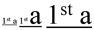
In the three fragments of underlined text, the underline is drawn
consecutively lower and thicker as the ratio of large text to small text
increases.
In the following style sheet and document fragment:
   blockquote { text-decoration: underline; color: blue; }
   em { display: block; }
   cite { color: fuchsia; }
   <blockquote>
    <p>
     <span>
      Help, help!
      <em> I am under a hat! </em>

      <cite> —GwieF </cite>
     </span>
    </p>
   </blockquote>
...the underlining for the blockquote element is propagated to an
anonymous inline element that surrounds the span element, causing the
text "Help, help!" to be blue, with the blue underlining from the
anonymous inline underneath it, the color being taken from the blockquote
element. The <em>text</em> in the em block is
also underlined, as it is in an in-flow block to which the underline is
propagated. The final line of text is fuchsia, but the underline
underneath it is still the blue underline from the anonymous inline
element.
This diagram shows the boxes involved in the example above. The rounded
aqua line represents the anonymous inline element wrapping the inline
contents of the paragraph element, the rounded blue line represents the
span element, and the orange lines represent the blocks.
11.1.1. Text
Decoration Lines: the ‘text-decoration-line’ property
| Name:
| text-decoration-line
|
| Value:
| none | [ underline || overline || line-through ]
|
| Initial:
| none
|
| Applies to:
| all elements
|
| Inherited:
| no (but see prose)
|
| Percentages:
| N/A
|
| Media:
| visual
|
| Computed value:
| as specified
|
Specifies what line decorations, if any, are added to the element.
Values have the following meanings:
- none
- Produces no text decoration.
- underline
- Each line of text is underlined.
- overline
- Each line of text has a line above it (i.e. on the opposite side from
an underline).
- line-through
- Each line of text has a line through the middle.
11.1.2. Text
Decoration Color: the ‘text-decoration-color’ property
| Name:
| text-decoration-color
|
| Value:
| <color>
|
| Initial:
| currentColor
|
| Applies to:
| all elements
|
| Inherited:
| no
|
| Percentages:
| N/A
|
| Media:
| visual
|
| Computed value:
| as specified
|
This property specifies the color of text decoration (underlines
overlines, and line-throughs) set on the element with text-decoration-line.
11.1.3. Text
Decoration Style: the ‘text-decoration-style’ property
| Name:
| text-decoration-style
|
| Value:
| solid | double | dotted | dashed | wave
|
| Initial:
| solid
|
| Applies to:
| all elements
|
| Inherited:
| no
|
| Percentages:
| N/A
|
| Media:
| visual
|
| Computed value:
| as specified
|
This property specifies the style of the line(s) drawn for text
decoration specified on the element. Values have the same meaning as for
the border-style
properties [CSS3BG].
11.1.4. Text Decoration
Shorthand: the ‘text-decoration’ property
This property is a shorthand for setting text-decoration-line, text-decoration-color, and
text-decoration-style
in one declaration. Omitted values are set to their initial values. A text-decoration declaration that
omits both the text-decoration-color and
text-decoration-style
values is backwards-compatible with CSS Levels 1 and 2.
If the blink keyword is specified the text blinks
(alternates between visible and invisible). Conforming user agents may
simply not blink the text. Note that not blinking the text is one
technique to satisfy checkpoint
3.3 of WAI-UAAG.
The following example underlines unvisited links with a solid blue
underline in CSS1 and CSS2 UAs and a navy dotted underline in CSS3 UAs.
:link {
    color: blue;
    text-decoration: underline;
    text-decoration: navy dotted underline; /* Ignored in CSS1/CSS2 UAs */
}
11.1.5. Text
Decoration Line Continuity: the ‘text-decoration-skip’ property
| Name:
| text-decoration-skip
|
| Value:
| none | [ objects || spaces || ink || all ]
|
| Initial:
| objects
|
| Applies to:
| all elements
|
| Inherited:
| yes
|
| Percentages:
| N/A
|
| Media:
| visual
|
| Computed value:
| as specified
|
This property specifies what parts of the element's content any text
decoration affecting the element must skip over. It controls all text
decoration lines drawn by the element and also any text decoration lines
drawn by its ancestors. Values have the following meanings:
- none
- Skip nothing: text-decoration is drawn for all text content and for
inline replaced elements.
- objects
- Skip this element if it is an atomic inline (such as an image or
inline-block).
- spaces
- Skip white space: this includes regular spaces (U+0020) and tabs
(U+0009), as well as nbsp (U+00A0), ideographic space (U+3000), all fixed
width spaces (such as U+2000–U+200A, U+202F and U+205F), and any
adjacent letter-spacing or word-spacing.
- ink
- Skip over where glyphs are drawn: interrupt the decoration line to let
text show through where the text decoration would otherwise cross over a
glyph. The UA may also skip a small distance to either side of the glyph
outline.
- all
- Skip over all content in this element.
Do we need a value that doesn't skip margins and
padding?
Note that this property inherits and that descendant elements can have a
different setting. Therefore a child of an element with
text-decoration-skip: all can cause its grandparent's
underline to be drawn by specifying text-decoration-skip:
none.
11.1.6. Text
Underline Position: the ‘text-underline-position’ property
| Name:
| text-underline-position
|
| Value:
| auto | alphabetic | below left | below right
|
| Initial:
| auto
|
| Applies to:
| all elements
|
| Inherited:
| yes
|
| Percentages:
| N/A
|
| Media:
| visual
|
| Computed value:
| as specified
|
This property sets the position of an underline specified on the same
element: it does not affect underlines specified by ancestor elements.
Values have the following meanings:
- ‘
auto’
- The user agent may use any algorithm to determine the underline's
position; however in vertical tyographic mode, if the language of the
element is set to Japanese or Korean (matches
:lang(ja) or
:lang(ko)) the underline must be drawn on the right side of
the text as described for ‘below
right’.
It is suggested that the underline position be ‘alphabetic’ unless it crosses either subscripted
(or otherwise lowered) text, or it affects characters from Asian scripts
such as Han or Tibetan, for which an alphabetic underline is too high:
in such cases, aligning to the em box edge as described for ‘below left’ is more appropriate.
- ‘
alphabetic’
- The underline is aligned with the alphabetic baseline. In this case
the underline is likely to cross some descenders.
- ‘
below
left’
- The underline is aligned with the under edge of the element's content
box. In this case the underline usually does not cross the descenders.
(This is sometimes called "accounting" underline.) If the underline
affects descendants with a lower content edge, the user agent should
shift the underline down further to the lowest underlined content box
edge. The user agent may ignore elements with ‘
vertical-align’ values given as lengths,
percentages, ‘top’, or ‘bottom’ when making this adjustment. (Note that
images that are not affected by the underline per ‘text-decoration-skip’ will not affect the
position of the underline.)
- ‘
below
right’
- In horizontal typographic mode, this value is equivalent to
‘
below left’. In vertical typographic
mode, the underline is aligned as for ‘below
left’, except it is aligned to the right edge of the text.
If this causes the underline to be drawn on the "over" side of the text,
then an overline also switches sides and is drawn on the "under" side.
In some cases (such as in OpenType) the font format can offer
information about the appropriate position of an underline. Typically
this information gives the position of an ‘alphabetic’ underline; in some cases (especially
in CJK fonts), it gives the position of a ‘below
left’ underline. (In this case, the font's underline metrics
typically touch the bottom edge of the em box). The UA is encouraged to
use information (such as the underline thickness, or appropriate
alphabetic alignment) from the font wherever appropriate.
11.2. Emphasis Marks
East Asian documents traditionally use small symbols next to each glyph
to emphasize a run of text. For example:
11.2.1. Emphasis Mark
Style: the ‘text-emphasis-style’ property
| Name:
| text-emphasis-style
|
| Value:
| none | [ [ filled | open ] || [ dot | circle | double-circle |
triangle | sesame ] ] | <string>
|
| Initial:
| none
|
| Applies to:
| all elements
|
| Inherited:
| yes
|
| Percentages:
| N/A
|
| Media:
| visual
|
| Computed value:
| ‘none’, a pair of keywords
representing the shape and fill, or a string
|
This property applies emphasis marks to the element's text. Values have
the following meanings:
none
- No emphasis marks.
filled
- The shape is filled with solid color.
open
- The shape is hollow.
dot
- Draw small circles as marks. The filled dot is U+2022 ‘
•’, and the open dot is U+25E6 ‘◦’.
circle
- Draw large circles as marks. The filled circle is U+25CF ‘
●’, and the open circle is U+25CB
‘○’.
double-circle
- Draw double circles as marks. The filled double-circle is U+25C9
‘
◉’, and the open double-circle
is U+25CE ‘◎’.
triangle
- Draw triangles as marks. The filled triangle is U+25B2 ‘
▲’, and the open triangle is U+25B3
‘△’.
sesame
- Draw sesames as marks. The filled sesame is U+FE45 ‘
﹅’, and the open sesame is U+FE46
‘﹆’.
<string>
- Draw the given string as marks. Authors should not specify more than
one grapheme cluster in <string>. The UA may truncate or ignore
strings consisting of more than one grapheme cluster.
If a shape keyword is specified but neither of ‘filled’ nor ‘open’ is specified, ‘filled’ is assumed. If only ‘filled’ or ‘open’ is specified, the shape keyword computes to
‘circle’ in horizontal writing mode and
‘sesame’ in vertical writing mode.
The marks should be drawn using the element's font settings with its
size scaled down to 50%. However, not all fonts have all these glyphs, and
some fonts use inappropriate sizes for emphasis marks in these code
points. The UA may opt to use a font known to be good for emphasis marks,
or the marks may instead be synthesized by the UA. Marks must remain
upright in both horizontal and vertical typographic modes: they do not
rotate to match the writing mode.
One example of good fonts for emphasis marks is Adobe's opensource
project, Kenten
Generic OpenType Font, which is specially designed for the emphasis
marks.
The marks are drawn once for each grapheme cluster. However, emphasis
marks are not drawn for a grapheme cluster consisting of:
- Word separators or characters belonging
to the Unicode separator classes (Z*). (But note that emphasis marks
are drawn for a space that combines with any combining
characters.)
- Characters belonging to the Unicode classes for control codes and
unassigned characters (Cc, Cf, Cn).
- Anything else? Probably need to exclude punctuation,
but which punctuation exactly? Can we determine that Unicode-wide?
If emphasis marks are drawn for grapheme clusters for which ruby is
drawn in the same position as the emphasis mark, the ruby should be
stacked between the emphasis marks and the base text. In this case, the
position of the emphasis marks for a given element should be determined as
if all grapheme clusters have ruby boxes of the same height as the highest
ruby box in the element. If the UA is not capable of drawing ruby and
emphasis marks on the same side, the UA may hide ruby and draw only
emphasis marks.
11.2.2. Emphasis Mark
Color: the ‘text-emphasis-color’ property
| Name:
| text-emphasis-color
|
| Value:
| <color>
|
| Initial:
| currentcolor
|
| Applies to:
| all elements
|
| Inherited:
| yes
|
| Percentages:
| N/A
|
| Media:
| visual
|
| Computed value:
| as specified
|
This property describes the foreground color of the emphasis marks.
11.2.3. Emphasis Mark
Shorthand: the ‘text-emphasis’ property
| Name:
| text-emphasis
|
| Value:
| ‘<text-emphasis-style>’
|| ‘<text-emphasis-color>’
|
| Initial:
| see individual properties
|
| Applies to:
| all elements
|
| Inherited:
| yes
|
| Percentages:
| N/A
|
| Media:
| visual
|
| Computed value:
| see individual properties
|
This property is a shorthand for setting text-emphasis-style and text-emphasis-color in one
declaration. Omitted values are set to their initial values.
Note that ‘text-emphasis-position’ is not reset in
this shorthand. This is because typically the shape and color vary, but
the position is consistent for a particular language throughout the
document. Therefore the position should inherit independently.
11.2.4. Emphasis
Mark Position: the ‘text-emphasis-position’ property
| Name:
| text-emphasis-position
|
| Value:
| above right | below right
|
| Initial:
| above right
|
| Applies to:
| all elements
|
| Inherited:
| yes
|
| Percentages:
| N/A
|
| Media:
| visual
|
| Computed value:
| as specified
|
This property describes where emphasis marks are drawn at. The values
have following meanings:
- ‘
above right’
- Draw marks above the text in horizontal layout, to the right in
vertical typographic mode. This is the default position.
- ‘
below
    right
’
- Draw marks below the text in horizontal layout, to the right in
vertical typographic mode.
Do we need to add ‘left’
combinations?
Emphasis marks are drawn exactly as if each grapheme cluster was
assigned the mark as its ruby annotation text with the ruby position given
by ‘text-emphasis-position’ and the ruby
alignment as centered.
The effect of emphasis marks on the line height is the same as for ruby
text.
11.3. Text Shadows: the
‘text-shadow’ property
| Name:
| text-shadow
|
| Value:
| none | [<shadow>, ] * <shadow>
|
| Initial:
| none
|
| Applies to:
| all elements
|
| Inherited:
| yes
|
| Percentages:
| N/A
|
| Media:
| visual
|
| Computed value:
| a color plus three absolute <length>s
|
This property accepts a comma-separated list of shadow effects to be
applied to the text of the element. <shadow> is the same as defined for the
‘box-shadow’ property except that
the ‘inset’ keyword is not allowed. The
shadow is applied to all of the element's text as well as any text
decorations it specifies. When a text outline
is specified, the shadow shadows the outlined shape rather than the glyph
shape.
The shadow effects are applied front-to-back: the first shadow is on
top. The shadows may thus overlay each other, but they never overlay the
text itself. The shadow must be painted at a stack level between the
element's border and/or background, if present, and the elements text and
text decoration. UAs should avoid painting text shadows over text in
adjacent elements belonging to the same stack level and stacking context.
(This may mean that the exact stack level of the shadows depends on
whether the element has a border or background: the exact stacking
behavior of text shadows is thus UA-defined.)
Unlike ‘box-shadow’, text
shadows are not clipped to the shadowed shape and may show through if the
text is partially-transparent. Like ‘box-shadow’, text shadows do not influence
layout, and do not trigger scrolling or increase the size of the
scrollable area.
The painting order of shadows defined here is the opposite of
that defined in the 1998 CSS2
Recommendation.
The text-shadow property
applies to both the ::first-line and
::first-letter pseudo-elements.
11.4. Text Outlines: the
‘text-outline’ property
This property specifies a text outline where the first length represents
the outline's thickness and the second represents an optional blur radius.
The outline never overlays the text itself. Its shape is the same as that
obtained by applying text shadows in every radial direction, i.e. all text
shadows whose offsets satisfy the equation x2 +
y2 = thickness2. The blur radius is treated
the same as for ‘text-shadow’.
The Timed-Text WG had
suggestions for some keywords (text-outline: normal|heavy|light;) as
well as a <length> thickness. Should these be added? How would they
be defined? (Maybe use (thin|medium|thick) as in border-width?)
A color value must be specified before or after the length values of the
outline effect. The color value will be used as the color of the outline.
Implementations may ignore the blur radius when text outline is combined
with a text shadow.
The spread radius argument added to the ‘text-shadow’
property makes this property somewhat redundant. Should it be kept?
Changes
Major changes include:
Acknowledgements
This specification would not have been possible without the help from:
Ayman Aldahleh, Bert Bos, Tantek Çelik, Stephen Deach, Martin Dürst,
Laurie Anna Edlund, Ben Errez, Yaniv Feinberg, Arye Gittelman, Ian
Hickson, Martin Heijdra, Richard Ishida, Koji Ishii, Masayasu Ishikawa,
Michael Jochimsen, Eric LeVine, Ambrose Li, Håkon Wium Lie, Chris Lilley,
Ken Lunde, Shinyu Murakami, Paul Nelson, Chris Pratley, Marcin Sawicki,
Arnold Schrijver, Rahul Sonnad, Michel Suignard, Takao Suzuki, Frank Tang,
Chris Thrasher, Etan Wexler, Chris Wilson, Masafumi Yabe and Steve Zilles.
Appendix A: References
Normative references
-
- [CSS21]
- Bert Bos; et al. Cascading Style
Sheets Level 2 Revision 1 (CSS 2.1) Specification. 8 September
2009. W3C Candidate Recommendation. (Work in progress.) URL: http://www.w3.org/TR/2009/CR-CSS2-20090908
- [CSS3BG]
- Bert Bos; Elika J. Etemad; Brad Kemper. CSS
Backgrounds and Borders Module Level 3. 12 June 2010. W3C
Working Draft. (Work in progress.) URL: http://www.w3.org/TR/2010/WD-css3-background-20100612
- [RFC2119]
- S. Bradner. Key
words for use in RFCs to Indicate Requirement Levels. Internet
RFC 2119. URL: http://www.ietf.org/rfc/rfc2119.txt
- [RFC4647]
- A. Phillips; M. Davis. Matching of Language
Tags. September 2006. Internet RFC 4647. URL: http://www.ietf.org/rfc/rfc4647.txt
- [UAX11]
- Asmus Freytag. East
Asian Width. 23 March 2001. Unicode Standard Annex #11. URL:
http://www.unicode.org/unicode/reports/tr11/tr11-8.html
- [UAX14]
- Asmus Freytag. Line
Breaking Properties. 29 March 2005. Unicode Standard Annex
#14. URL: http://www.unicode.org/unicode/reports/tr14/tr14-17.html
- [UAX24]
- Mark Davis. Script
Names. 28 March 2005. Unicode Standard Annex #24. URL: http://www.unicode.org/unicode/reports/tr24/tr24-7.html
- [UAX29]
- Mark Davis. Text
Boundaries. 25 March 2005. Unicode Standard Annex #29. URL: http://www.unicode.org/unicode/reports/tr29/tr29-9.html
- [UNICODE]
- The Unicode Consortium. The
Unicode Standard. 2003. Defined by: The Unicode Standard,
Version 4.0 (Boston, MA, Addison-Wesley, ISBN 0-321-18578-1), as updated
from time to time by the publication of new versions URL: http://www.unicode.org/unicode/standard/versions/enumeratedversions.html
-
- [CSS3FONT]
- John Daggett. CSS Fonts
Module Level 3. 18 June 2009. W3C Working Draft. (Work in
progress.) URL: http://www.w3.org/TR/2009/WD-css3-fonts-20090618
- [CSS3UI]
- Tantek Çelik. CSS3 Basic
User Interface Module. 11 May 2004. W3C Candidate
Recommendation. (Work in progress.) URL: http://www.w3.org/TR/2004/CR-css3-ui-20040511
- [JIS4051]
- Formatting rules for Japanese documents
(『日本語文書の組版方法』).
Japanese Standards Association. 2004. JIS X 4051:2004. In Japanese
- [JLREQ]
- Kenzou Onozawa; et al. Requirements
for Japanese Text Layout. 4 June 2009. W3C Note. URL: http://www.w3.org/TR/2009/NOTE-jlreq-20090604
- [ZHMARK]
- 标点符号用法 (Punctuation
Mark Usage). 1995.
中华人民共和国国家标准
Appendix B: Property index
| Property
| Values
| Initial
| Applies to
| Inh.
| Percentages
| Media
|
| hanging-punctuation
| none | [ first || last || [ allow-end | force-end ] ]
| none
| inline elements
| yes
| N/A
| visual
|
| hyphenate-character
| auto | <string> <string>?
| auto
| all elements
| yes
| N/A
| visual
|
| hyphenate-limit-after
| <integer> | auto
| auto
| all elements
| yes
| N/A
| visual
|
| hyphenate-limit-before
| <integer> | auto
| auto
| all elements
| yes
| N/A
| visual
|
| hyphenate-limit-last
| none | always | column | page | spread
| none
| block containers
| yes
| N/A
| visual
|
| hyphenate-limit-lines
| no-limit | <integer>
| no-limit
| block containers
| yes
| N/A
| visual
|
| hyphenate-resource
| none | <uri> [, <uri> ]*
| none
| all elements
| yes
| N/A
| visual
|
| hyphens
| none | manual | auto | all
| manual
| all elements
| yes
| N/A
| visual
|
| letter-spacing
| <spacing-limit>{1,3}
| normal
| all elements
| yes
| refers to width of space (U+0020) glyph
| visual
|
| line-break
| auto | loose | normal | strict
| auto
| all elements
| yes
| N/A
| visual
|
| text-align
| [ start | end | left | right | center | justify | match-parent ] ||
<string>
| start
| block containers
| yes
| N/A
| visual
|
| text-align-first
| auto | start
| auto
| block containers
| yes
| N/A
| visual
|
| text-align-last
| auto | start | end | left | right | center | justify
| auto
| block containers
| yes
| N/A
| visual
|
| text-autospace
| none | [ ideograph-numeric || ideograph-alpha || punctuation ]
| none
| all elements
| yes
| N/A
| visual
|
| text-decoration
| <text-decoration-line> || <text-decoration-color> ||
<text-decoration-style> || blink
| none
| all elements
| no
| N/A
| visual
|
| text-decoration-color
| <color>
| currentColor
| all elements
| no
| N/A
| visual
|
| text-decoration-line
| none | [ underline || overline || line-through ]
| none
| all elements
| no (but see prose)
| N/A
| visual
|
| text-decoration-skip
| none | [ objects || spaces || ink || all ]
| objects
| all elements
| yes
| N/A
| visual
|
| text-decoration-style
| solid | double | dotted | dashed | wave
| solid
| all elements
| no
| N/A
| visual
|
| text-emphasis
| ‘<text-emphasis-style>’ ||
‘<text-emphasis-color>’
| see individual properties
| all elements
| yes
| N/A
| visual
|
| text-emphasis-color
| <color>
| currentcolor
| all elements
| yes
| N/A
| visual
|
| text-emphasis-position
| above right | below right
| above right
| all elements
| yes
| N/A
| visual
|
| text-emphasis-style
| none | [ [ filled | open ] || [ dot | circle | double-circle |
triangle | sesame ] ] | <string>
| none
| all elements
| yes
| N/A
| visual
|
| text-indent
| [ <length> | <percentage> ] && [ hanging || each-line ]?
| 0
| block containers
| yes
| refers to width of containing block
| visual
|
| text-justify
| auto | none | inter-word | inter-ideograph | inter-cluster |
distribute | kashida
| auto
| block containers and, optionally, inline elements
| yes
| N/A
| visual
|
| text-outline
| none | [ <color> <length> <length>? |
<length> <length>? <color> ]
| none
| all elements
| yes
| N/A
| visual
|
| text-shadow
| none | [<shadow>, ] * <shadow>
| none
| all elements
| yes
| N/A
| visual
|
| text-transform
| none | [ [ capitalize | uppercase | lowercase ] || fullwidth ||
large-kana ]
| none
| all elements
| yes
| N/A
| visual
|
| text-trim
| normal | force-start || [ keep-end | force-end ] || no-justify
| normal
| all elements
| yes
| N/A
| visual
|
| text-underline-position
| auto | alphabetic | below left | below right
| auto
| all elements
| yes
| N/A
| visual
|
| text-wrap
| normal | unrestricted | none | avoid
| normal
| all elements
| yes
| N/A
| visual
|
| white-space
| normal | pre | nowrap | pre-wrap | pre-line
| not defined for shorthand properties
| all elements
| yes
| N/A
| visual
|
| white-space-collapsing
| collapse | discard | [ [preserve | preserve-breaks] && trim-inner ]
| collapse
| all elements
| yes
| N/A
| visual
|
| word-break
| normal | keep-all | break-all | keep-words
| normal
| all elements
| yes
| N/A
| visual
|
| word-spacing
| <spacing-limit> {1,3}
| normal
| all elements
| yes
| refers to width of space (U+0020) glyph
| visual
|
| word-wrap
| normal | break-word
| normal
| all elements
| yes
| N/A
| visual
|
Appendix C: Default UA Stylesheet
This section is informative, and is to help UA developers to implement
default stylesheet, but UA developers are free to ignore or change.
/* make list items align together */
li { text-align: match-parent; }
/* disable inheritance of text-emphasis marks to ruby text:
emphasis marks should only apply to base text */
rt { text-emphasis: none; }
:root:lang(zh) {
/* default emphasis mark position is 'under' for Chinese */
text-emphasis-position: under;
}
If you find any issues, recommendations to add, or
corrections, please send the information to www-style@w3.org with
[css3-text] in the subject line.
Index
- alignment character, 8.1.
- ‘
alphabetic’, 11.1.6.
- ‘
always’, 6.4.
- authoring tool, 2.
- ‘
auto’, 8.2., 11.1.6.
- ‘
below
    left
’, 11.1.6.
- ‘
below right’, 11.1.6.
- block scripts, 1.1.
- clustered scripts, 1.1.
- collapsible, 4.2.
- ‘
column’, 6.4.
- connected scripts, 1.1.
- cursive scripts, 1.1.
- discrete scripts, 1.1.
each-line, 10.1.
- expansion opportunities, 8.4.
- fullwidth closing punctuation, 9.3.
- fullwidth colon punctuation, 9.3.
- fullwidth dot punctuation, 9.3.
- fullwidth middle dot punctuation, 9.3.
- fullwidth opening punctuation, 9.3.
- grapheme cluster, 9.2.
hanging, 10.1.
- hanging-punctuation, 10.2.
- hanging-punctuation:allow-end, 10.2.
- hanging-punctuation:first, 10.2.
- hanging-punctuation:force-end, 10.2.
- hanging-punctuation:last, 10.2.
- hyphenate-character, 6.2.
- hyphenate-limit-after, 6.3.
- hyphenate-limit-before, 6.3.
- hyphenate-limit-last, 6.4.
- hyphenate-limit-lines, 6.4.
- hyphenate-resource, 6.5.2.
- hyphens, 6.1.
- Ideographic letters, 9.4.
- letter-spacing, 9.2.
- line-break, 5.1.
- line-break:auto, 5.1.
- line-break:loose, 5.1.
- line-break:normal, 5.1.
- line-break:strict, 5.1.
- ‘
none’, 6.4.
- Non-ideographic letters, 9.4.
- Non-ideographic numerals, 9.4.
- ‘
page’, 6.4.
- <percentage>, 9.
- renderer, 2.
- <shadow>, 11.3.
- <spacing-limit>, 9.
- <spacing-limit>:<length>, 9.
- <spacing-limit>:normal, 9.
- ‘
spread’, 6.4.
- ‘
start’, 8.2.
- style sheet
- text-align, 8.1.
- text-align:center, 8.1.
- text-align:end, 8.1.
- text-align-first, 8.2.
- text-align:justify, 8.1.
- text-align-last, 8.3.
- text-align:left, 8.1.
- text-align:match-parent, 8.1.
- text-align:right, 8.1.
- text-align:start, 8.1.
- text-align:<string>, 8.1.
- text-autospace, 9.4.
- text-autospace:ideograph-alpha, 9.4.
- text-autospace:ideograph-numeric, 9.4.
- text-autospace:none, 9.4.
- text-autospace:punctuation, 9.4.
- text-decoration, 11.1.4.
- text-decoration-color, 11.1.2.
- text-decoration-line, 11.1.1.
- text-decoration-skip, 11.1.5.
- text-decoration-skip:all, 11.1.5.
- text-decoration-skip:ink, 11.1.5.
- text-decoration-skip:none, 11.1.5.
- text-decoration-skip:objects, 11.1.5.
- text-decoration-skip:spaces, 11.1.5.
- text-decoration-style, 11.1.3.
- text-emphasis, 11.2.3.
- text-emphasis:above right, 11.2.4.
- text-emphasis:below right, 11.2.4.
- text-emphasis:circle, 11.2.1.
- text-emphasis-color, 11.2.2.
- text-emphasis:dot, 11.2.1.
- text-emphasis:double-circle, 11.2.1.
- text-emphasis:filled, 11.2.1.
- text-emphasis:none, 11.2.1.
- text-emphasis:open, 11.2.1.
- text-emphasis-position, 11.2.4.
- text-emphasis:sesame, 11.2.1., 11.2.1.
- text-emphasis-style, 11.2.1.
- text-emphasis:triangle, 11.2.1.
- text-indent, 10.1.
- text-justify, 8.4.
- text-justify:auto, 8.4.
- text-justify:distribute, 8.4.
- text-justify:inter-cluster, 8.4.
- text-justify:inter-ideographic, 8.4.
- text-justify:inter-word, 8.4.
- text-justify:kashida, 8.4.
- text-justify:none, 8.4.
- text-outline, 11.4.
- text-shadow, 11.3.
- text-transform, 3.1.
- text-transform:capitalize, 3.1.
- text-transform:fullwidth, 3.1.
- text-transform:large-kana, 3.1.
- text-transform:lowercase, 3.1.
- text-transform:none, 3.1.
- text-transform:uppercase, 3.1.
- text-trim, 9.3.
- text-trim:force-end, 9.3.
- text-trim:force-start, 9.3.
- text-trim:keep-end, 9.3.
- text-trim:no-justify, 9.3.
- text-trim:normal, 9.3.
- text-underline-position, 11.1.6.
- text-wrap, 7.1.
- text-wrap:avoid, 7.1.
- text-wrap:none, 7.1.
- text-wrap:normal, 7.1.
- text-wrap:unrestricted, 7.1.
- white-space, 4.3.
- white-space-collapsing, 4.1.
- white-space-collapsing:collapse, 4.1.
- white-space-collapsing:discard, 4.1.
- white-space-collapsing:preserve, 4.1.
- white-space-collapsing:preserve-breaks, 4.1.
- white-space-collapsing:trim-inner, 4.1.
- white-space:normal, 4.3.
- white-space:nowrap, 4.3.
- white-space:pre, 4.3.
- white-space:pre-line, 4.3.
- white-space:pre-wrap, 4.3.
- word-break, 5.2.
- word-break:break-all, 5.2.
- word-break:keep-all, 5.2.
- word-break:keep-words, 5.2.
- word-break:normal, 5.2.
- word-spacing, 9.1.
- word-wrap, 7.2.
- word-wrap:break-word, 7.2.
- word-wrap:normal, 7.2.

applied below a fragment of Chinese text")