The background painting area is defined to be the border box; however
if the background image is not repeated in a particular direction, then
the image is not clipped in that direction and may paint outside the
border box. (Background images may still be clipped by ‘overflow’ or by the viewport.) A value of
‘no-clip’ for
the bottommost image also clips the background color to the border
box.
Note that the background is always drawn behind
the border, if any. See “Elaborate description of Stacking Contexts”
in [CSS21].
See the section “Layering multiple background
images” for how ‘background-clip’ interacts with
other comma-separated background properties to form each background
image layer.
| Name:
| background-origin
|
| Value:
| [border-box | padding-box | content-box] [, [border-box |
padding-box | content-box]]*
|
| Initial:
| padding-box
|
| Applies to:
| all elements
|
| Inherited:
| no
|
| Percentages:
| N/A
|
| Media:
| visual
|
| Computed value:
| same as specified value
|
For elements rendered as a single box, specifies the
background positioning area. For elements
rendered as multiple boxes (e.g., inline boxes on several lines, boxes
on several pages) specifies which boxes the ‘background-break’ operates on
to determine the background positioning area(s).
- padding-box
- The position is relative to the padding box. (For single boxes
‘
0 0’ is the upper left corner of
the padding edge, ‘100% 100%’ is the
lower right corner.)
- border-box
- The position is relative to the border box.
- content-box
- The position is relative to the content box.
If the ‘background-attachment’
value for this image is ‘fixed’, then
this property has no effect: in this case the background positioning
area is the initial containing block.
Note that if ‘background-clip’ is
‘padding-box’, ‘background-origin’ is
‘border-box’, and ‘background-position’ is
top left (the initial value), then the top left of the
background image will be clipped.
See the section “Layering multiple background
images” for how ‘background-clip’ interacts with
other comma-separated background properties to form each background
image layer.
| Name:
| background-size
|
| Value:
| [ [ <length> |
<percentage> |
auto ]{1,2} | cover | contain ] [ [ , [ <length> | <percentage> | auto
]{1,2} ] | cover | contain ]*
|
| Initial:
| auto
|
| Applies to:
| all elements
|
| Inherited:
| no
|
| Percentages:
| see text
|
| Media:
| visual
|
| Computed value:
| for <length> the absolute value, otherwise as specified
|
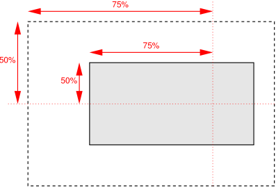
Specifies the size of the background images. Values have the following
meanings:
- contain
- Scale the image, while preserving its intrinsic aspect ratio (if
any), to the largest size such that both its width and its height can
fit inside the background positioning area.
- cover
- Scale the image, while preserving its intrinsic aspect ratio (if
any), to the largest size such that both its width and its height can
completely cover the background positioning area.
- [ <length> |
<percentage> | auto ]{1,2}
-
The first value gives the width of the corresponding image, the
second value its height. If only one value is given the second is
assumed to be ‘auto’.
A percentage is relative to the background positioning area.
An ‘auto’ value for one dimension
is resolved by using the image's intrinsic ratio and the size of the
other dimension, or failing that, using the image's intrinsic size, or
failing that, treating it as 100%.
If both values are ‘auto’ then
the intrinsic width and/or height of the image should be used, if any,
the missing dimension (if any) behaving as ‘auto’ as described above. If the image has
neither an intrinsic width nor an intrinsic height, its size is
determined as for ‘contain’.
Negative values are not allowed. A size of zero is allowed, but
causes the image not to be displayed. (The effect is the same as if it
had been a transparent image.)
Here are some examples. The first example stretches the background
image independently in both directions to completely cover the content
area:
div {
    background-image: url(plasma.png);
    background-size: 100% 100%;
    background-origin: content-box }
The second example stretches the image so that exactly two copies fit
horizontally. The aspect ratio is preserved:
p {
    background-image: url(tubes.png);
    background-size: 50% auto;
    background-origin: border-box }
This example forces the background image to be 15 by 15 pixels:
para {
    background-size: 15px 15px;
    background-image: url(tile.png)}
This example uses the image's intrinsic size. Note that this is the
only possible behavior in CSS level 1 and 2.
body {
    background-size: auto;            /* default */
    background-image: url(flower.png) }
The following example rounds the height of the image to 25%, down
from the specified value of 30%. At 30%, three images would fit
entirely and a fourth only partially. After rounding, four images fit.
The width of the image is 20% of the background area width and is not
rounded.
p {
    background-image: url(chain.png);
    background-repeat: no-repeat round;
    background-size: 20% 30% }
If ‘background-repeat’ is
‘round’ for one
(or both) directions, there is a second step. The UA must reduce the
size in that direction (or both directions) so that the image fits a
whole number of times in the background area. In the case of the width:
If X ≠ 0 is the width of the image after step one and
W is the width of the background area, then the rounded
width X' = W / ceil(W / X)
The height is analogous. ceil() is a function that returns its
argument if it is a whole number, otherwise the next bigger whole
number.
If ‘background-repeat’ is
‘round’ for one
direction only and if ‘background-size’ is
‘auto’ for the other direction, then
there is a third step: that other direction is scaled so that the
original aspect ratio is restored.
In this example the background image is shown at its intrinsic size:
div {
  background-image: url(image1.png);
  background-repeat: repeat;         /* default */
  background-size: auto }            /* default */
In the following example, the background is shown with a width of 3em
and its height is scaled proportionally to keep the original aspect
ratio:
div {
  background-image: url(image2.png);
  background-repeat: repeat;         /* default */
  background-size: 3em }             /* = '3em auto' */
In the following example, the background is shown with a width of 3em
or slightly smaller, so that it fits a whole number of times in the
width of the background. The height is scaled proportionally to keep
the original aspect ratio:
div {
  background-image: url(image3.png);
  background-repeat: round repeat;
  background-size: 3em auto }
In the following example, the background image is shown with a width
of 3em and a height that is either the height corresponding to that
width at the original aspect ratio or slightly less:
div {
  background-image: url(image4.png);
  background-repeat: repeat round;
  background-size: 3em auto }
In the following example, the background image is shown with a height
of 4em or slightly less, so that it fits a whole number of times in the
background height. The width is the width that correspond to a 4em
height at the original aspect ratio or slightly less:
div {
  background-image: url(image5.png);
  background-repeat: round;
  background-size: auto 4em }
See the section “Layering multiple background
images” for how ‘background-clip’ interacts with
other comma-separated background properties to form each background
image layer.
| Name:
| background-break
|
| Value:
| bounding-box | each-box | continuous
|
| Initial:
| continuous
|
| Applies to:
| all elements
|
| Inherited:
| no
|
| Percentages:
| N/A
|
| Media:
| visual
|
| Computed value:
| same as specified value
|
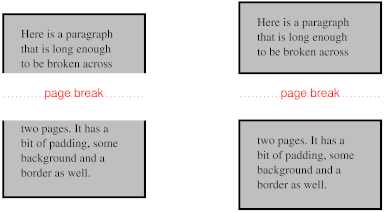
This property applies to elements when they are broken into several
boxes (for example, across lines or across pages). It specifies how the
background positioning area is derived from
these multiple boxes and how the element's background is drawn within
them.
Values have the following meanings:
- bounding-box
- The background positioning area is the smallest rectangle that
encloses all broken boxes of the element. If the boxes are on different
pages, the pages are treated as one continuous page—as if their
page content areas were glued together in the block progression
direction of the root element (i.e. glued together top to bottom for
horizontal writing mode)—and the rectangle drawn on this
continuous page. If the page content areas have different widths, then
they are aligned on the start edge (as defined by the properties
applied to the root element). The background is only painted where
indicated by ‘
background-clip’.
- each-box
- The background is drawn independently in each box of the element. A
no-repeat background image will thus be rendered once in each box of
the element.
- continuous
-
The effect is as if, after the element has been laid out (including
any justification, bidi reordering, page breaks, etc.), all the
element's boxes are taken and put one after the other in visual order.
The background is applied to the bounding box of this composite box
and then the boxes are put back, with their share of the background.
For boxes broken across lines, first boxes on the same line are
connected in visual order. Then boxes on subsequent lines are ordered
according to the {containing block's |
element's} inline progression direction and aligned on the
baseline. For example in a left-to-right containing block
(‘direction’ is ‘ltr’), the first box is the leftmost box on the
first line and boxes from subsequent lines are put to the right of it.
In a right-to-left containing block, the first box is the rightmost on
the first line and subsequent boxes are put to the left of it.
For boxes broken across columns, the the columns are treated as one
continuous element, as if the column boxes were glued together in the
block progression direction of the multi-column element. For boxes
broken across pages, the page content areas are glued together in the
block progression direction of the root element. In these cases, if
the pieces have different widths (heights, if the root element /
multi-column element is in vertical writing moode), then each piece
draws its background assuming that the whole element has the same
width (height) as this piece. This ensures that right-aligned images
stay aligned to the right edge, left-aligned images stay aligned to
the left edge, and centered images stay centered.
3.11 The ‘background’
shorthand property
| Name:
| background
|
| Value:
| [ <bg-layer> , ]*
<final-bg-layer>
|
| Initial:
| see individual properties
|
| Applies to:
| all elements
|
| Inherited:
| no
|
| Percentages:
| see individual properties
|
| Media:
| visual
|
| Computed value:
| see individual properties
|
<bg-layer>
stands for:
<'background-image'>
|| <'background-position'>
|| / <'background-size'>
|| <'background-repeat'>
|| <'background-attachment'>
|| <'background-origin'>
|| no-clip
where ''/ <‘background-size’>‘ must occur after ’<‘background-position’>''
if both are present.
<final-bg-layer> stands
for:
< 'background-image'>
|| <'background-position'>
|| / <'background-size'>
|| <'background-repeat'>
|| <'background-attachment'>
|| <'background-origin'>
|| no-clip
|| <'background-color'>
where ''/ <‘background-size’>‘ must occur after ’<‘background-position’>''
if both are present.
Note that a color is permitted in <final-bg-layer>, but not in
<bg-layer>.
The ‘background’ property is a shorthand
property for setting most background properties at the same place in the
style sheet. It sets each of ‘background-color’,
‘background-position’,
‘background-size’, ‘background-repeat’,
‘background-origin’,
‘background-attachment’
and ‘background-image’ to the value
given, or to its initial value, if no explicit value was specified. If
the ‘no-clip’ keyword is present, it sets
‘background-clip’ to that value.
Otherwise if ‘background-origin’ is present
then it also sets ‘background-clip’ to that value,
and if not it sets ‘background-clip’ to its initial
value. I.e. background: no-clip sets ‘background-clip’ to
‘no-clip’
and ‘background-origin’ to its
initial value. background: border-box sets both
‘background-origin’ and
‘background-clip’ to
‘border-box’. The ‘background’
shorthand does not set ‘background-break’.
The ‘::first-line’ pseudo-element
is like an inline-level element for the purposes of the background (see
section 5.12.1 of [CSS21]). That means, e.g., that in
a left-justified first line, the background does not necessarily extend
all the way to the right margin.
Examples:
In the first rule of the following example, only a value for
‘background-color’ has been
given and the other individual properties are set to their initial
values. In the second rule, many individual properties have been
specified.
body { background: red }
p { background: url("chess.png") (10em) gray
       40% round fixed border border}
The first rule is equivalent to:
body {
    background-color: red;
    background-position: 0% 0%;
    background-size: auto auto;
    background-repeat: repeat repeat;
    background-clip: border-box;
    background-origin: padding-box;
    background-attachment: scroll;
    background-image: none }
The second is equivalent to:
p {
    background-color: gray;
    background-position: 40% 50%;
    background-size: 10em 10em;
    background-repeat: round round;
    background-clip: border-box;
    background-origin: border-box;
    background-attachment: fixed;
    background-image: url(chess.png) }
The following example shows how a both a background color (#CCC) and a background image (url(metal.jpg)) are set. The image is stretched to the
full width of the element:
E { background: #CCC url("metal.jpg") (100% auto) no-repeat top left }
Another example shows equivalence:
div { background: padding url(paper.jpg) white center }
div {
    background-color: white;
    background-image: url(paper.jpg);
    background-repeat: repeat;
    background-attachment: scroll;
    background-position: center;
    background-clip: padding-box;
    background-origin: padding-box;
    background-size: auto auto }
The following declaration with multiple, comma-separated values
background: url(a.png) top left no-repeat,
            url(b.png) center (100% 100%) no-repeat,
            url(c.png) white;
is equivalent to
background-image:      url(a.png),  url(b.png),        url(c.png);
background-position:   top left,    center,            top left;
background-repeat:     no-repeat,   stretch no-repeat, repeat;
background-clip:       border-box,  border-box,        border-box;
background-origin:     padding-box, padding-box,       padding-box;
background-size:       auto auto,   100% 100%,         auto auto;
background-attachment: scroll,      scroll,            scroll;
background-color:      white;
Note that ‘background: url(foo)
white’ and ‘background: url(foo),
white’ have the same effect.
3.12 The background of
the canvas
The background of the root element becomes the background of
the canvas and extends to cover the entire canvas, although any
images are positioned and stretched relative to the root element as if
they were painted for that element alone. If the root's background-color
value is ‘transparent’, the color is
UA dependent. The root element does not paint this background again.
For HTML documents, however, it is recommended that authors
specify the background for the BODY element
rather than the HTML element. User agents must
observe the following precedence rules to fill in the background of the
canvas of HTML documents: if either or both of the ‘background-image’ and
‘background-color’ properties
on the HTML element is different from their
initial values, then use the background of the HTML element, else use the background of the BODY element. This does not apply to
XHTML documents.
According to these rules, the canvas underlying the following HTML
document will have a “marble” background:
<!DOCTYPE html PUBLIC '-//W3C//DTD HTML 4.0//EN'
  >
<html>
  <head>
    <title>Setting the canvas background</title>
    <style type="text/css">
       body { background: url("http://example.org/marble.png") }
    </style>
  </head>
  <body>
    <p>My background is marble.</p>
  </body>
</html>
4. Border properties
| Name:
| border-top-color , border-right-color, border-bottom-color, border-left-color
|
| Value:
| <color>
|
| Initial:
| currentcolor
|
| Applies to:
| all elements
|
| Inherited:
| no
|
| Percentages:
| N/A
|
| Media:
| visual
|
| Computed value:
| the computed color
|
| Name:
| border-color
|
| Value:
| <color>{1,4}
|
| Initial:
| (see individual properties)
|
| Applies to:
| all elements
|
| Inherited:
| no
|
| Percentages:
| N/A
|
| Media:
| visual
|
| Computed value:
| see individual properties
|
These properties set the foreground color of the border specified by
the border-style properties.
‘Border-color’ is a shorthand for
the four ‘border-*-color’ properties.
The four values set the top, right, bottom and left border,
respectively. A missing left is the same as right, a missing bottom is
the same as top, and a missing right is also the same as top.
| Name:
| border-top-style, border-right-style, border-bottom-style, border-left-style
|
| Value:
| <border-style>
|
| Initial:
| none
|
| Applies to:
| all elements
|
| Inherited:
| no
|
| Percentages:
| N/A
|
| Media:
| visual
|
| Computed value:
| specified value
|
| Name:
| border-style
|
| Value:
| <border-style>{1,4}
|
| Initial:
| (see individual properties)
|
| Applies to:
| all elements
|
| Inherited:
| no
|
| Percentages:
| N/A
|
| Media:
| visual
|
| Computed value:
| see individual properties
|
These properties set the style of the border, unless there is a border
image (see ‘border-image’).
‘Border-style’ is a shorthand for
the other four. Its four values set the top, right, bottom and left
border respectively. A missing left is the same as right, a missing
bottom is the same as top, and a missing right is also the same as top.
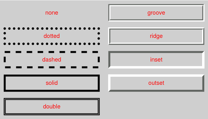
<border-style> is:
none | hidden | dotted | dashed | solid | double | groove | ridge | inset | outset
Values have the following meanings:
- none
- No border. Color and width are ignored (i.e., the border has width
0, unless the border is an image, see ‘
background-image’
- hidden
- Same as ‘
none’, but has
different behavior in the conflict resolution rules for tables [CSS3TBL].
- dotted
- A series of round dots.
- dashed
- A series of square-ended dashes.
- solid
- A single line segment.
- double
- Two parallel solid lines with some space between them. (The
thickness of the lines is not specified, but the sum of the lines and
the space must equal ‘
border-width’.)
- groove
- Looks as if it were carved in the canvas. (This is typically
achieved by creating a “shadow” from two colors that are slightly
lighter and darker than the ‘
border-color’.)
- ridge
- Looks as if it were coming out of the canvas.
- inset
- Looks as if the content on inside of the border is sunken into the
canvas. Different meaning on table[ref] elements.
- outset
- Looks as if the content on the inside of the border is coming out
of the canvas. Different meaning for table[ref] elements.
Borders are drawn in front of the element's background, but behind the
element's content (in case it overlaps).
Note: There is no control over the spacing of the dots and
dashes, nor over the length of the dashes. Implementations are
encouraged to choose a spacing that makes the corners symmetrical.
Note: This specification does not define how borders of
different styles should be joined in the corner. Also note that rounded
corners may cause the corners and the contents to overlap, if the
padding is less than the radius of the corner.
| Name:
| border-top-width, border-right-width, border-bottom-width, border-left-width
|
| Value:
| <border-width>
|
| Initial:
| medium
|
| Applies to:
| all elements
|
| Inherited:
| no
|
| Percentages:
| width* of containing block
|
| Media:
| visual
|
| Computed value:
| absolute length; ‘0’ if the
border style is ‘none’ or
‘hidden’
|
| Name:
| border-width
|
| Value:
| <border-width>{1,4}
|
| Initial:
| (see individual properties)
|
| Applies to:
| all elements
|
| Inherited:
| no
|
| Percentages:
| see individual properties
|
| Media:
| visual
|
| Computed value:
| see individual properties
|
These properties set the thickness of the border.
The <border-width> is
<length> | thin | medium | thick
The <length> may not
be negative. The lengths corresponding to ‘thin’, ‘medium’ and ‘thick’ are not specified, but the values are
constant throughout a document and thin ≤
medium ≤ thick. A UA could, e.g., make the thickness depend on the
‘medium’ font size: one choice might
be 1, 3 & 5px when the ‘medium’ font size is 17px or less.
‘Border-width’ is a shorthand that
sets the four ‘border-*-width’
properties. If it has four values, they set top, right, bottom and left
in that order. If left is missing, it is the same as right; if bottom is
missing, it is the same as top; if right is missing, it is the same as
top.
Note that the initial width is ‘medium’, but the initial style is
‘none’ and therefore the used
width is 0.
When the used width of the border is 0, we say that the border is
absent.
| Name:
| border-image
|
| Value:
| none | <image> [ <number> |
<percentage>]{1,4} [ /
<border-width>{1,4}
]? [ stretch | repeat | round ]{0,2}
|
| Initial:
| none
|
| Applies to:
| All elements, except table elements when ‘border-collapse’ is ‘collapse’
|
| Inherited:
| no
|
| Percentages:
| N/A
|
| Media:
| visual
|
| Computed value:
| any URI made absolute, any <length> made absolute, other
parts as specified
|
Specifies an image to use instead of the border styles given by the
‘border-style’ properties and an
additional background image for the element. If the value is
‘none’ or if the image cannot be
displayed, the border styles will be used.
The up to four numbers or percentages immediately following the
<image> specify which part of that image is used for
which part of the border. They divide the image into nine parts: four
corners, four edges and a middle part. The middle part is used as an
extra background image.
The first of the four values is the height of the top edge and of the
two top corners. The second is the width of the right edge and the two
right corners. The third is the height of the bottom edge and the two
bottom corners. The fourth is the width of the left edge and the two
left corners.
If the fourth number/percentage is absent, it is the same as the
second. If the third one is also absent, it is the same as the first. If
the second one is also absent, it is the same as the first.
Percentages are relative to the size of the image. Numbers represent
pixels in the image (if the image is a raster image) or CSS px units (if
not). Negative values are not allowed and values bigger than the size of
the image are interpreted as 100%.
If the sum of the right and left widths is equal to or greater than
the width of the image, the images for the top and bottom edge and the
middle part are empty, which has the same effect as if a nonempty
transparent image had been specified for those parts. Analogously for
the top and bottom values.
If the slash is present in the property value, the one to four values
after it are used for the width of the border instead of the
‘border-width’ properties (but only
if the specified image can be displayed). The order of the values is the
same as for ‘border-width’.
At the end of the value, there may be up to two keywords, that specify
how the images for the sides and the middle part are scaled and tiled.
If the second is absent, it is assumed to be the same as the first. If
both are absent, the effect is the same as ‘stretch stretch’.
The nine images are scaled and tiled in four steps:
- step 1
-
-
The two images for the top and bottom edges are made as tall as
the top and bottom borders, respectively, (either using ‘border-width’ or the values
specified after the slash) and their width is scaled proportionally.
-
The images for the left and right edge are made as wide as the
left and right borders, respectively, and their height is scaled
proportionally.
-
The corner images are scaled to be as wide and as tall as the two
borders they are part of.
-
The middle image's width is scaled by the same factor as the top
image unless that factor is zero or infinity, in which case the
scaling factor of the bottom is substituted, and failing that, the
width is not scaled. The height of the middle image is scaled by the
same factor as the left image unless that factor is zero or
infinity, in which case the scaling factor of the right image is
substituted, and failing that, the height is not scaled.
Clarify that failing means factor is zero or infinity
- step 2
-
-
If the first keyword is ‘stretch’, the top, middle and bottom images
are further scaled to be as wide as the element's padding box. The
height is not changed any further.
-
If the first keyword is ‘round’, the top, middle and bottom
images are reduced in width, so that exactly a whole number of them
fit in the width of the padding box, as follows:
If X ≠ 0 is the width of the image and W
is the width of the padding area, then the rounded width
X' = W / ceil(W / X)
-
If the first keyword is ‘repeat’, the top, middle, and bottom
images are not changed any further.
-
The effects of ‘stretch’,
‘round’, and
‘repeat’
for the second keyword are analogous, acting on the height of the
left, middle and right images.
- step 3
-
-
If the first keyword is ‘round’, the top, middle, and bottom
images are placed at the left edge of their respective parts of the
border (the middle image is put in the padding area). Otherwise the
images are centered horizontally in their respective areas.
-
If the second keyword is ‘round’, the left, middle, and right
images are placed at the top edge of their respective parts of the
border/padding area. Otherwise the images are centered vertically in
their respective areas.
- step 4
-
This example creates a top and bottom border consisting of a whole
number of orange diamonds and a left and right border of a single,
stretched diamond. The corners are diamonds of a different color. The
image to tile is as follows. Apart from the diamonds, it is
transparent:

The image is 81 by 81 pixels and has to be divided into 9 equal
parts. The style rules could thus be as follows:
DIV {
  border-image: url("border.png") 27 round stretch;
  border: double orange 1em }
The result, when applied to a DIV of 12 by 5em, will be similar to
this:

The ‘border-image’ property does not
apply to table elements in a table with ‘border-collapse’ set to ‘collapse’.
| Name:
| border-top-right-radius,
border-bottom-right-radius,
border-bottom-left-radius,
border-top-left-radius
|
| Value:
| <length> <length>?
|
| Initial:
| 0
|
| Applies to:
| all elements (but see prose)
|
| Inherited:
| no
|
| Percentages:
| N/A
|
| Media:
| visual
|
| Computed value:
| two absolute <length>s
|
| Name:
| border-radius
|
| Value:
| <length>{1,4} [ /
<length>{1,4} ]?
|
| Initial:
| 0
|
| Applies to:
| all elements, except table element when ‘border-collapse’ is ‘collapse’
|
| Inherited:
| no
|
| Percentages:
| N/A
|
| Media:
| visual
|
| Computed value:
| see individual properties
|
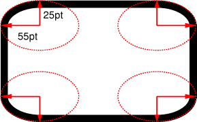
The two length values of the ‘border-*-radius’ properties define the radii of a
quarter ellipse that defines the shape of the corner of the outer border
edge (see the diagram below). The first value is the horizontal radius.
If the second length is omitted it is equal to the first (and the corner
is thus a quarter circle). If either length is zero, the corner is
square, not rounded.
The ‘border-radius’ shorthand sets all
four ‘border-*-radius’ properties. If
values are given before and after the slash, then the values before the
slash set the horizontal radius and the values after the slash set the
vertical radius. If there is no slash, then the values set both radii
equally. The four values for each radii are given in the order top-left,
top-right, bottom-right, bottom-left. If bottom-left is omitted it is
the same as top-right. If bottom-right is omitted it is the same as
top-left. If top-right is omitted it is the same as top-left.
border-radius: 4em;
would be equivalent to
border-top-left-radius:     4em;
border-top-right-radius:    4em;
border-bottom-right-radius: 4em;
border-bottom-left-radius:  4em;
and
border-radius: 2em 1em 4em / 0.5em 3em;
would be equivalent to
border-top-left-radius:     2em 0.5em;
border-top-right-radius:    1em 3em;
border-bottom-right-radius: 4em 0.5em;
border-bottom-left-radius:  1em 3em;
The padding edge (inner border) radius is the outer border radius
minus the corresponding border thickness. In the case where this results
in a negative value, the inner radius is zero. (In such cases its center
might not coincide with that of the outer border curve.)
Backgrounds, but not the border-image,
are clipped to the inner, resp., outer curve of the border if
‘background-clip’ is
‘padding-box’ resp., ‘border-box’. Other
effects that clip to the border or padding edge (such as ‘overflow’) also must clip to the curve.
It is recommended that the UA style sheet apply
overflow: hidden to elements (such as the
<img> element in HTML) that are expected to be
replaced elements so that their corners automatically trim to the border
radius.
When two adjoining borders are of different thicknesses the corner
will show a smooth transition between the thicker and thinner borders.
One of the borders may even have zero width.
The center of color and style transitions between adjoining borders is
at the point on the curve that is at an angle that is proportional to
the ratio of the border widths. For example, if the two widths are
equal, that point is at a 45° angle, and if one is twice the width
of the other the point is at a 30° angle. The line demarcating this
transition is drawn between the point at that angle on the outer curve
and the point at that angle on the inner curve. The transition must be
contained within the segment of the border where the tangent of the
inner curve either not defined or is not parallel with the sides of the
box. It is not defined what the transition looks like, but a gradient is
recommended for color transitions that don't involve dotted or dashed
borders.
All border styles ( ‘solid’, ‘dotted’, ‘inset’, etc.) follow the curve of the
border.
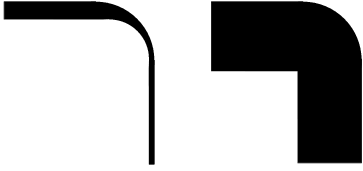
Corners do not overlap: When the sum of two adjacent corner radii
exceeds the size of the border box, UAs must reduce one or more of the
radii. The algorithm for reducing radii is as follows:
The sum of two adjacent radii may not be more than the width or height
(whichever is relevant) of the box. If any sum exceeds that value, all
radii are reduced according to the following formula: Let f =
min(Li/Si), where
i ∈ {top, right, bottom, left}, Si is
the sum of the radii of the corners on side i, and
Ltop = Lbottom = the width of the box,
and Lleft =
Lright = the height
of the box. If f < 1, then all corner radii are reduced by
multiplying them by f.
Note that this formula ensures that quarter circles remain
quarter circles and large radii remain larger than smaller ones, but it
may reduce corners that were already small enough, which may make
borders of nearby elements that should look the same look different.
For example, the borders A and D of the figure below might be the result of
box-width: border-box;
width: 6em;
height: 2.5em;
border-radius: 0.5em 2em 0.5em 2em
The height (2.5em) is enough for the specified radii (0.5em plus
2.5em). However, if the height is only 2em,
box-width: border-box;
width: 6em;
height: 2em;
border-radius: 0.5em 2em 0.5em 2em
all corners need to be reduced by a factor 0.8 to make them fit. The
used border radii thus are 0.4em (instead of 0.5em) and 1.6em (instead
of 2em). See borders B and C in the figure.
The UA may apply the border-radius properties to ‘table’ and ‘inline-table’ elements when ‘border-collapse’ is ‘collapse’ but is not required to. In this case
not only must the border radii of adjacent corners not intersect, but
the horizontal and vertical radii of a single corner may not extend past
the boundaries of the cell at that corner (i.e. the cell's other corners
must not be affected by this corner's border-radius). If the computed
values of the border radii would cause this effect, then the used values
of all the border radii of the table must be reduced by the same factor
so that the radii neither intersect nor extend past the boundaries of
their respective corner cells.
The CSS3 UAs should ignore border-radius properties applied to
internal table elements when ‘border-collapse’ is ‘collapse’. The effect of border-radius on
internal table elements is undefined in CSS3 Backgrounds and Borders,
but may be defined in a future specification.
The UA may reduce or treat as zero the border-radius for a given
corner if a scrolling mechanism is present in that corner.
This example draws ovals of 15em wide and 10em high:
DIV.standout {
    width: 13em;
    height: 8em;
    border: solid black 1em;
    border-radius: 7.5em 5em }
This example adds appropriate padding, so that the contents do not
overflow the corners. Note that there is no border, but the background
will still have rounded corners.
DIV {
    background: black;
    color: white;
    border-radius: 1em;
    padding: 1em }
| Name:
| border-break
|
| Value:
| close | [ <border-width> || <border-style> ||
<color> ]
|
| Initial:
| none
|
| Applies to:
| elements with a border
|
| Inherited:
| no
|
| Percentages:
| N/A
|
| Media:
| visual
|
| Computed value:
| any <length;> made absolute; any color computed; otherwise
as specified
|
When a box that has a border is broken at a page break, column break,
or, for inline elements, at a line break, a border and some padding can
be inserted at the break, or the border can be left open.
If the value of ‘border-break’ is ‘close’, then each box is independently wrapped
with the border and padding.
If the style is set to ‘none’, no
border and no padding are inserted at the break.
Otherwise, padding is added as wide as the corresponding side of the
‘padding’ property and a border
is added with the specified style, width, and color.
Note this means that padding is added if the border style
is ‘hidden’,
but not if the border style is ‘none’.
| Name:
| border-top, border-right, border-bottom, border-left
|
| Value:
| <border-width> ||
<border-style> ||
<color>
|
| Initial:
| See individual properties
|
| Applies to:
| all elements
|
| Inherited:
| no
|
| Percentages:
| N/A
|
| Media:
| visual
|
| Computed value:
| see individual properties
|
This is a shorthand property for setting the width, style, and color
of the top, right, bottom, and left border of a box. Omitted values are
set to their initial values.
| Name:
| border
|
| Value:
| <border-width> ||
<border-style> ||
<color>
|
| Initial:
| See individual properties
|
| Applies to:
| all elements
|
| Inherited:
| no
|
| Percentages:
| N/A
|
| Media:
| visual
|
| Computed value:
| see individual properties
|
The ‘border’ property is a shorthand
property for setting the same width, color, and style for all four
borders of a box. Unlike the shorthand ‘margin’ and ‘padding’ properties, the ‘border’ property
cannot set different values on the four borders. To do so, one or more
of the other border properties must be used.
For example, the first rule below is equivalent to the set of four
rules shown after it:
p { border: solid red }
p {
  border-top: solid red;
  border-right: solid red;
  border-bottom: solid red;
  border-left: solid red;
}
Since, to some extent, the properties have overlapping functionality,
the order in which the rules are specified is important.
Consider this example:
blockquote {
  border-color: red;
  border-left: double;
  color: black
}
In the above example, the color of the left border is black, while
the other borders are red. This is due to ‘border-left’
setting the width, style, and color. Since the color value is not given
by the ‘border-left’ property, it will be
taken from the ‘color’
property. The fact that the ‘color’ property is set after the
‘border-left’ property is not
relevant.
| Name:
| box-shadow
|
| Value:
| none | <shadow> [ ,
<shadow> ]*
|
| Initial:
| none
|
| Applies to:
| all elements
|
| Inherited:
| no
|
| Percentages:
| N/A
|
| Media:
| visual
|
| Computed value:
| any <length> made absolute; any color computed; otherwise as
specified
|
The ‘box-shadow’ property attaches one or
more drop-shadows to the box. The property is a comma-separated list of
shadows, each specified by 2-4 length values, an optional color, and an
optional ‘inset’
keyword. Omitted lengths are 0, omitted colors are a UA-chosen color.
The type <shadow> stands
for:
inset || [ <length> <length> <length>? <length>? || <color> ]
where the first two lengths are required. The components of each
<shadow> are interpreted as
follows:
- The first length is the horizontal offset of the shadow. A positive
value draws a shadow that is offset to the right of the box, a negative
length to the left.
- The second length is the vertical offset. A positive value offsets
the shadow down, a negative one up.
- The third length is a blur radius. Negative values are not allowed.
If it is 0, the shadow is sharp, otherwise the larger the value, the
more the shadow is blurred. The exact algorithm is not specified.
- The fourth length is a spread radius. Positive values cause the
shadow to grow in all directions by the specified radius. Negative
values cause the shadow to shrink. The shadow should not change shape
when a spread radius is applied: sharp corners should remain sharp.
- The color is the color of the shadow.
- The ‘
inset’
keyword, if present, changes the drop shadow from an outer shadow (one
that shadows the box onto the canvas, as if it were lifted above the
canvas) to an inner shadow (one that shadows the canvas onto the box,
as if the box were cut out of the canvas and shifted behind it). Should this keyword be called "inner" instead?
An outer box-shadow casts a shadow as if the border-box of the element
were opaque. The shadow is drawn outside the border edge only: it is not
drawn inside the border-box of the element.
An inner box-shadow casts a shadow as if everything outside the
padding edge were opaque. The inner shadow is drawn inside the padding
edge only: it is not drawn in outside the padding box of the element.
If the box has a nonzero ‘border-radius’, the shadow
is rounded in the same way. If an element has multiple boxes, all of
them get drop shadows, but shadows are only drawn where borders would
also be drawn, see ‘border-break’.
The shadow effects are applied front-to-back: the first shadow is on
top and the others are layered behind. Shadows do not influence layout
and may overlap other boxes or their shadows. In terms of stacking
contexts and the painting order, the outer shadows of an element are
drawn immediately below the background of that element, and the inner
shadows of an element are drawn immediately above the background of that
element (below the borders and border-image, if any).
Here is an example of single words with a drop shadow. Assume the
words were enclosed in <span> and the
style rule was
span {border: thin solid; box-shadow: 0.2em 0.2em #CCC}
The result might look like this:
5. Definitions
5.1 Profiles
(NOTE: Check profiles because of changes made!)
CSS1 Profile:
CSS2 Profile:
Mobile and TV Profiles (informative, see their specifications):
CSS3 Profile:
- Everything (as described in this specification)
A UA conforms to this module if it satisfies the
rules given next. However, it is recommended that UAs try to conform to
one of the levels (1, 2 or 3) or profiles ([CSS-MOBILE], [CSS-PRINT],
etc.) of CSS, rather than to individual modules.
A UA that renders documents
must interpret CSS style sheets according to the generic CSS grammar [CSS3SYN] and the
individual grammars of each property in this module, it must understand
at least type selectors [SELECT], it must apply the rules
of cascading and inheritance [CSS3CASCADE], and it must
render documents as defined for each property in this module.
A UA that writes style sheets, must write syntactically correct style
sheets, according to the generic CSS grammar [CSS3SYN] and the individual
grammars of each property in this module.
The inability of a UA to correctly render a document due to
limitations of the device does not make the UA non-conformant. (For
example, a UA cannot render color on a monochrome monitor.)
5.3 Glossary
The following terms and abbreviations are used in this module.
- UA
- User Agent
-
A program that reads and/or writes CSS style sheets on behalf of a
user in either or both of these categories: programs whose purpose is
to render documents (e.g.,
browsers) and programs whose purpose is to create style sheets (e.g.,
editors). A UA may fall into both categories. (There are other
programs that read or write style sheets, but this module gives no
rules for them.)
- document
- source document
-
A tree-structured document with elements and attributes, such as an
SGML or XML document [XML11].
- HTML document
-
A document that has the MIME type text/html [RFC2854] and conforms to that
type.
- XHTML document
-
A document that has the MIME type text/xhtml+xml or
application/xhtml+xml [RFC3236] and conforms to either
type.
- style sheet
-
A document conforming to the generic CSS grammar [CSS3SYN].
5.4 CR exit criteria
As described in the W3C process document, a Candidate
Recommendation (CR) is a specification that W3C recommends for use
on the Web. The next stage is “Recommendation,” when the
specification is sufficiently implemented.
For this specification to be proposed as a W3C Recommendation, the
following conditions shall be met:
-
There must be at least two interoperable implementations for every
feature in the Module. For the purposes of this criterion, we define
the following terms:
- feature
-
a section or subsection of the specification
- interoperable
-
passing the respective test case(s) in the CSS test suite, or, if
the implementation is not a web browser, an equivalent test. Every
relevant test in the test suite should have an equivalent test
created if such a UA is to be used to claim interoperability. In
addition if such a UA is to be used to claim interoperability, then
there must one or more additional UAs which can also pass those
equivalent tests in the same way for the purpose of
interoperability. The equivalent tests must be made publicly
available for the purposes of peer review.
- implementation
-
a user agent which:
- implements the feature.
- is available (i.e. publicly downloadable or available through
some other public point of sale mechanism). This is the "show me"
requirement.
- is shipping (i.e. development, private or unofficial versions
are insufficient).
- is not experimental (i.e. is intended for a wide audience and
could be used on a daily basis.)
-
A minimum of sixth months of the CR period must have elapsed. This
is to ensure that enough time is given for any remaining major errors
to be caught.
-
Features will be dropped if two or more interoperable
implementations are not found by the end of the CR period.
-
Features may/will also be dropped if adequate/sufficient (by
judgment of CSS WG) tests have not been produced for those feature(s)
by the end of the CR period.
6. Acknowledgments
Tapas Roy was editor of the Border Module, before it was merged with
the Background Module.
A set of properties for border images was initially proposed by
fantasai. The current simplification (one image cut into nine
parts) is due to Ian Hickson. (Though the original idea seems to
originate with some anonymous Microsoft engineers.)
Thanks to Ben Stucki for defining what happens with rounded corners if
the two adjoining borders are of unequal thickness or one of them is
zero; to Arjan Eising and Anne van Kesteren for the ‘border-radius’
syntax.
Emrah Baskaya and
Simon Pieters were among the people who argued for a fallback color
(see ‘backgound-color’), which
is only shown when any specified image(s) cannot be loaded.
Finally, special thanks go to Brad Kemper for his feedback and
suggestions for many of the features in the draft.
7. References
Normative references
-
- [CSS21]
- Bert Bos; et al. Cascading
Style Sheets Level 2 Revision 1 (CSS 2.1) Specification. 19
July 2007. W3C Candidate Recommendation. (Work in progress.) URL: http://www.w3.org/TR/2007/CR-CSS21-20070719
- [CSS3CASCADE]
- Håkon Wium Lie. CSS3
module: Cascading and inheritance. 15 December 2005. W3C
Working Draft. (Work in progress.) URL: http://www.w3.org/TR/2005/WD-css3-cascade-20051215
- [CSS3COLOR]
- Tantek Çelik; Chris Lilley. CSS3
Color Module. 14 May 2003. W3C Candidate Recommendation.
(Work in progress.) URL: http://www.w3.org/TR/2003/CR-css3-color-20030514
- [CSS3SYN]
- L. David Baron. CSS3
module: Syntax. 13 August 2003. W3C Working Draft. (Work in
progress.) URL: http://www.w3.org/TR/2003/WD-css3-syntax-20030813
- [SELECT]
- Daniel Glazman; Tantek Çelik; Ian Hickson. Selectors.
15 December 2005. W3C Working Draft. (Work in progress.) URL: http://www.w3.org/TR/2005/WD-css3-selectors-20051215
Other references
-
- [CSS-MOBILE]
- Svante Schubert. CSS
Mobile Profile 2.0. 19 October 2007. W3C Working Draft.
(Work in progress.) URL: http://www.w3.org/TR/2007/WD-css-mobile-20071019
- [CSS-PRINT]
- Melinda Grant. CSS Print
Profile. 13 October 2006. W3C Working Draft. (Work in
progress.) URL: http://www.w3.org/TR/2006/WD-css-print-20061013
- [CSS1]
- Håkon Wium Lie; Bert Bos. Cascading
Style Sheets (CSS1) Level 1 Specification. 17 December 1996.
W3C Recommendation. Revised 11 January 1999. URL: http://www.w3.org/TR/1999/REC-CSS1-19990111
- [CSS3TBL]
- Bert Bos; David Hyatt. CSS3 Tables Module.
(forthcoming). W3C Working Draft. (Work in progress.)
- [CSS3VAL]
- Håkon Wium Lie; Chris Lilley. CSS3
Values and Units. 19 September 2006. W3C Working Draft.
(Work in progress.) URL: http://www.w3.org/TR/2006/WD-css3-values-20060919
- [RFC2854]
- D. Connolly; L. Masinter. The 'text/html'
Media Type. June 2000. Internet RFC 2854. URL: http://www.rfc-editor.org/rfc/rfc2854.txt
- [RFC3236]
- P. Stark; M. Baker. The
'application/xhtml+xml' Media Type. January 2002. Internet
RFC 3236. URL: http://www.rfc-editor.org/rfc/rfc3236.txt
- [XML11]
- Tim Bray; et al. Extensible
Markup Language (XML) 1.1 (Second Edition). 4 February 2004.
W3C Recommendation. Revised 29 September 2006 URL: http://www.w3.org/TR/2006/REC-xml11-20060816
Property index
| Property
| Values
| Initial
| Applies to
| Inh.
| Percentages
| Media
|
| background
| [ <bg-layer> , ]* <final-bg-layer>
| see individual properties
| all elements
| no
| see individual properties
| visual
|
| background-attachment
| scroll | fixed | local [, scroll | fixed | local]*
| scroll
| all elements
| no
| N/A
| visual
|
| background-break
| bounding-box | each-box | continuous
| continuous
| all elements
| no
| N/A
| visual
|
| background-clip
| [border-box | padding-box | content-box | no-clip] [ , [border-box
| padding-box | content-box | no-clip] ]*
| border-box
| all elements
| no
| N/A
| visual
|
| background-color
| <color> [ / <color> ]? | / <color>
| transparent
| all elements
| no
| N/A
| visual
|
| background-image
| [ <image> | none ] [ , [ <image> | none ] ]*
| none
| all elements
| no
| N/A
| visual
|
| background-origin
| [border-box | padding-box | content-box] [, [border-box |
padding-box | content-box]]*
| padding-box
| all elements
| no
| N/A
| visual
|
| background-position
| <bg-position> [ , <bg-position> ]*
| 0% 0%
| all elements
| no
| refer to size of background positioning area minus size of
background image; see text
| visual
|
| background-repeat
| <repeat> [ , <repeat> ]*
| repeat
| all elements
| no
| N/A
| visual
|
| background-size
| [ [ <length> | <percentage> | auto ]{1,2} | cover |
contain ] [ [ , [ <length> | <percentage> | auto ]{1,2} ]
| cover | contain ]*
| auto
| all elements
| no
| see text
| visual
|
| border
| <border-width> || <border-style> || <color>
| See individual properties
| all elements
| no
| N/A
| visual
|
| border-break
| close | [ <border-width> || <border-style> ||
<color> ]
| none
| elements with a border
| no
| N/A
| visual
|
| border-color
| <color>{1,4}
| (see individual properties)
| all elements
| no
| N/A
| visual
|
| border-image
| none | <image> [ <number> | <percentage>]{1,4} [
/ <border-width>{1,4} ]? [ stretch | repeat | round ]{0,2}
| none
| All elements, except table elements when
‘border-collapse’ is ‘collapse’
| no
| N/A
| visual
|
| border-radius
| <length>{1,4} [ / <length>{1,4} ]?
| 0
| all elements, except table element when
‘border-collapse’ is ‘collapse’
| no
| N/A
| visual
|
| border-style
| <border-style>{1,4}
| (see individual properties)
| all elements
| no
| N/A
| visual
|
| border-top, border-right, border-bottom, border-left
| <border-width> || <border-style> || <color>
| See individual properties
| all elements
| no
| N/A
| visual
|
| border-top-color ,
border-right-color,
border-bottom-color, border-left-color
| <color>
| currentcolor
| all elements
| no
| N/A
| visual
|
| border-top-right-radius, border-bottom-right-radius, border-bottom-left-radius, border-top-left-radius
| <length> <length>?
| 0
| all elements (but see prose)
| no
| N/A
| visual
|
| border-top-style,
border-right-style,
border-bottom-style, border-left-style
| <border-style>
| none
| all elements
| no
| N/A
| visual
|
| border-top-width,
border-right-width,
border-bottom-width, border-left-width
| <border-width>
| medium
| all elements
| no
| width* of containing block
| visual
|
| border-width
| <border-width>{1,4}
| (see individual properties)
| all elements
| no
| see individual properties
| visual
|
| box-shadow
| none | <shadow> [ , <shadow> ]*
| none
| all elements
| no
| N/A
| visual
|
Index
- background, #
- background-attachment, #
- background-break, #
- background-clip, #
- background-color, #
- background-image, #
- background-origin, #
- background painting area, #
- background-position, #
- background positioning area, #
- background-repeat, #
- background-size, #
- border, #
- border-bottom, #
- border-bottom-color, #
- border-bottom-left-radius, #
- border-bottom-right-radius, #
- border-bottom-style, #
- border-bottom-width, #
- border-box, #, #
- border-break, #
- border-color, #
- border-image, #
- border-left, #
- border-left-color, #
- border-left-style, #
- border-left-width, #
- border-radius, #
- border-right, #
- border-right-color, #
- border-right-style, #
- border-right-width, #
- border-style, #
- border-style-none, #
- border-top, #
- border-top-color, #
- border-top-left-radius, #
- border-top-right-radius, #
- border-top-style, #
- border-top-width, #
- border-width, #
- bottom, #
- bounding-box, #
- box-shadow, #
- center, #
- contain, #
- content-box, #, #
- continuous, #
- cover, #
- dashed, #
- document, #
- dotted, #
- double, #
- each-box, #
- fallback color., #
- groove, #
- hidden, #
- HTML document, #
- inset, #
- left, #
- <border-style>, #
- <length>, #
- <percentage>, #
- no-clip, #
- no-repeat, #, #
- outset, #
- padding-box, #, #
- repeat, #, #
- repeat-x, #
- repeat-y, #
- ridge, #
- right, #
- round, #, #
- solid, #
- source document, #
- space, #, #
- style sheet, #
- top, #
- UA, #
- User Agent, #
- <bg-layer>, #
- <bg-position>, #
- <border-width>, #
- <final-bg-layer>,
#
- [ <length> | <percentage> | auto ]{1,2},
#
- <repeat>, #
- <shadow>, #
- viewport, #
- XHTML document, #