Abstract
CSS (Cascading Style Sheets) is a language for describing the rendering of
structured documents (such as HTML and XML) on screen, on paper, in speech,
etc. This draft contains the proposed functionality for CSS level 3 to
describe borders and backgrounds, including borders consisting of images and
backgrounds with multiple images. It includes and extends the functionality
of CSS level 2 [CSS2], which builds on CSS level 1
[CSS1].
This module replaces two earlier drafts: CSS3 Backgrounds and CSS3 Border.
Status of this document
This section describes the status of this document at the time of its
publication. Other documents may supersede this document. A list of current
W3C publications and the latest revision of this technical report can be found
in the W3C technical reports index
at http://www.w3.org/TR/.
Publication as a Working Draft does not imply endorsement by the W3C
Membership. This is a draft document and may be updated, replaced or
obsoleted by other documents at any time. It is inappropriate to cite this
document as other than work in progress.
The (archived) public
mailing list www-style@w3.org (see instructions) is preferred for
discussion of this specification. When sending e-mail, please put the text
“css3-background” in the subject, preferably like this:
“[css3-background] …summary of
comment…”
This document was produced by the CSS Working
Group (part of the Style Activity).
This document was produced under the 24 January 2002 CPP as
amended by the W3C Patent Policy
Transition Procedure. The Working Group maintains a public list of patent
disclosures relevant to this document; that page also includes
instructions for disclosing a patent. An individual who has actual knowledge
of a patent which the individual believes contains Essential Claim(s) with
respect to this specification should disclose the information in accordance
with section 6 of
the W3C Patent Policy.
Table of contents
1. Dependencies with other
CSS 3 Modules
2. Context
Members of the CSS Working Group proposed during the Clamart meeting to
modularize the CSS specification.
This modularization, and the externalization of the general syntax, of CSS
will reduce the size of the specification and allow new types of
specifications to use selectors and/or CSS general syntax.
This specification will have its own test suite, with
several tests per concept introduced in this document, as well as tests for
multiple concepts used together. This test suite will not consist of full
conformance tests, but is intended to ensure interoperability between
implementations and will form part of the CR exit criteria.
2.1. Changes from CSS 2.1
[This section needs to be revised.]
'Background-clip', 'background-break',
and 'background-origin' are new. Also there
are changes to the 'background' shorthand property.
'Background-attachment' has a new
value 'local'.
The background can now have multiple images. As a consequence, several
properties now accept a comma-separated list of values.
3. The layout model of
backgrounds and borders
(This section is informative.)
When elements are rendered according to the CSS box model [CSS3BOX], each
element is either not displayed at all, or formatted as one or more
rectangular boxes. Each box has a rectangular content area, a band of padding
around the content, a border around the padding, and a margin outside the
border. (The margin may actually be negative, but margins have no influence
on the background and border, so that doesn't concern the model for borders
and backgrounds.)
The child elements of an element usually create boxes of their own, that
are placed inside the content area of their parent, although they may also be
placed outside it.
The reason an element may result in more than one box, is that elements
may be broken at the end of a line (for inline elements), at the end of a
column or at the end of a page and create further boxes in the next line,
column or page.
The properties of this module deal with the contents of the border area
and the background of the content, padding and border areas.
That background may be fully transparent (the default), or it may be
filled with a color, one or more images, or both. The background properties
specify what color ('background-color') and images ('background-image')
to use, where they are placed ('background-position'), whether they
are repeated or scaled ('background-repeat', 'background-size'),
etc.
The border can either be a predefined style (solid line, double line,
dotted line, pseudo-3D border, etc.) or it can be an image. In the former
case, three properties define the style of the four border sides ('border-style'), color
('border-color')
and thickness ('border-width'). In the latter case, the
sides and corners are taken from the sides and corners of an image specified
with 'border-image'. The image can be sliced,
scaled and stretched in various ways to fit the size of the border.
If an element is broken into multiple boxes, 'border-break' and 'background-break' define how the borders
and background are divided over the various boxes.
There is also another kind of border-like decoration that can be added to
an element: a drop shadow, via the 'box-shadow' property.
4. The
'background-color' property
| Name:
| background-color
|
| Value:
| <color>
|
| Initial:
| transparent
|
| Applies to:
| all elements
|
| Inherited:
| no
|
| Percentages:
| N/A
|
| Media:
| visual
|
| Computed value:
| as specified
|
This property sets the background color of an element. Valid color values
are defined in the Color Module [CSS3COLOR].
Example(s):
h1 { background-color: #F00 }
5. The
'background-image' property
| Name:
| background-image
|
| Value:
| <uri> [ , <uri> ]* | none
|
| Initial:
| none
|
| Applies to:
| all elements
|
| Inherited:
| no
|
| Percentages:
| N/A
|
| Media:
| visual
|
| Computed value:
| absolute URI(s)
|
This property sets the background image(s) of an element, or 'none' for no image.
Images are drawn with the first specified one on top (closest to the user)
and each subsequent image behind the previous one. The 'background-color' is
painted below all the images.
See the section “Layering multiple background
images” for how each image is tiled or stretched.
Example:
body { background-image: url("marble.svg") }
p { background-image: none }
div { background-image: url(tl.png), url(tr.png) }
Implementations may optimize by not downloading and drawing
images that are not visible (e.g., because they are behind other, fully
opaque images).
An image that is empty (zero width or zero height), that fails to
download, or that otherwise cannot be displayed (e.g., because it is not in a
supported image format) has the same effect as a non-empty transparent image.
If 'background-repeat' or 'background-position' has more
comma-separated values than 'background-image', the series of values
is repeated as needed.
For example, these rules
background-image: url(a), url(b);
background-position: top, right, bottom, left, center;
background-repeat: no-repeat, no-repeat;
have the same effect as:
background-image: url(a), url(b), url(a), url(b), url(a);
background-position: top, right, bottom, left, center;
background-repeat: no-repeat, no-repeat, no-repeat,
  no-repeat, no-repeat;
It seems more intuitive to let 'background-image' determine the number
of layers and truncate or extend 'background-repeat' and 'background-position' accordingly.
Also because only 'background-image' has the value 'none'.
Editor's Note: Conformance properties for an image should be
addressed here: MIME type image/*, require support for PNG, refer to
profiles…
6. The
'background-repeat' property
| Name:
| background-repeat
|
| Value:
| <repeat> [ , <repeat> ]*
|
| Initial:
| repeat
|
| Applies to:
| all elements
|
| Inherited:
| no
|
| Percentages:
| N/A
|
| Media:
| visual
|
| Computed value:
| as specified
|
The value <repeat> stands for:
repeat-x | repeat-y | [repeat | space | no-repeat]{1,2}.
See the section “Layering multiple background
images” for how each comma-separated value is applied to each image
of the 'background-image' property.
The tiling and positioning of the background image on inline elements is
described under the 'background-break' property.
Should there also be values of "repeat-up", "repeat-down",
"repeat-right", and "repeat-left" for this property?
Values have the following meanings:
- repeat-x
- Equivalent to 'repeat no-repeat'.
- repeat-y
- Equivalent to 'no-repeat repeat'
Otherwise, if there is one value, it sets both the horizontal and vertical
repeat. If there are two, the first one is for the horizontal direction, the
second for the vertical one. As follows:
- repeat
- The image is repeated in this direction as often as needed to cover the
area. The image is clipped at the border or padding edge (depending on 'background-clip').
- no-repeat
- The image is not repeated in this direction. If it is too large, the
image is clipped at the border or padding edge (depending on 'background-clip').
- space
- The image is repeated as often as it will fit without being clipped and
then the images are spaced out to fill the area. The value of 'background-position' for this
direction is ignored. Be more precise? Is the space at
the edge the same as between the images or is there no space at the edge
(unless there is only one image)? If the image is too big to fit, one
image is placed in the center and clipped. Or: If the
image is too big, it is positioned according to 'background-position'.
Unless one of the two keywords is 'no-repeat', the whole background will be tiled,
i.e., not just one vertical strip and one horizontal strip.
Example(s):
body {
  background: white url("pendant.png");
  background-repeat: repeat-y;
  background-position: center;
}
p {
  background-image: url(star.svg), url(pattern.png);
  background-repeat: no-repeat, repeat
}
7. The
'background-attachment' property
| Name:
| background-attachment
|
| Value:
| scroll | fixed | local [, scroll | fixed | local]*
|
| Initial:
| scroll
|
| Applies to:
| all elements
|
| Inherited:
| no
|
| Percentages:
| N/A
|
| Media:
| visual
|
| Computed value:
| as specified
|
If background images are specified, this property specifies whether they
are fixed with regard to the viewport
('fixed') or scroll along with
the document ('scroll' and
'local').
See the section “Layering multiple background
images” for how each comma-separated value is applied to each image
of the 'background-image' property.
The difference between 'scroll' and 'local' is only visible when the element has a
scrolling mechanism (see 'overflow'): in the case of 'scroll', the background does not scroll with the
element's content. (It is attached to the element's border, as it were.) In
the case of 'local', the
background scrolls along with the element's content. In the this case, the
background behind the element's border (if any) scrolls as well, even though
the border itself does not scroll with the contents.
Even if the image is fixed, it is still only visible when it is in the
content, padding, or border area of the element. Thus, unless the image is
tiled ('background-repeat: repeat'), it may be
invisible.
Example(s):
This example creates an infinite vertical band that remains
“glued” to the viewport when the element is scrolled.
body {
  background: red url("pendant.gif");
  background-repeat: repeat-y;
  background-attachment: fixed;
}
User agents that do not support 'fixed' backgrounds (for example due to limitations
of the hardware platform) should ignore declarations with the keyword
'fixed'. For example:
body {
   /* For all UAs: */
   background: white url(paper.png) scroll;
   /* For UAs that do fixed backgrounds: */
   background: white url(ledger.png) fixed;
}
h1 {
   /* For all UAs: */
   background: silver;
   /* For UAs that do fixed backgrounds: */
   background: url(stripe.png) fixed, white url(ledger.png) fixed;
}
8. The
'background-position' property
| Name:
| background-position
|
| Value:
| <bg-position> [ , <bg-position> ]*
|
| Initial:
| 0% 0%
|
| Applies to:
| all elements
|
| Inherited:
| no
|
| Percentages:
| refer to the size of the box itself
|
| Media:
| visual
|
| Computed value:
| for <length> the absolute value, otherwise a percentage
|
The <bg-position> stands
for: [ [ <percentage> |
<length> | left | center | right ]
[ <percentage> | <length> | top | center | bottom ]? ] | [
[ left | center | right ] || [ top | center | bottom ] ]
If a background image has been specified, this property specifies its
initial position. The section “Layering multiple
background images” defines to which image of 'background-image'
each of the comma-separated values applies.
- <percentage> <percentage>
- With a value pair of '0% 0%', the upper left
corner of the image is aligned with the upper left corner of some area,
usually the box's padding edge, but possibly the border
edge, content edge or the viewport (see below). A value pair of '100%
100%' places the lower right corner of the image in the lower right
corner of the area. With a value pair of '14% 84%',
the point 14% across and 84% down the image is to be placed at the point 14%
across and 84% down the area.
- <length> <length>
- With a value pair of '2cm 1cm', the upper left
corner of the image is placed 2cm to the right and 1cm below the upper left
corner of the area.
- top left,
- left top
- Same as '0% 0%'.
- top,
- top center,
- center top
- Same as '50% 0%'.
- right top,
- top right
- Same as '100% 0%'.
- left,
- left center,
- center left
- Same as '0% 50%'.
- center
- center center
- Same as '50% 50%'.
- right,
- right center,
- center right
- Same as '100% 50%'.
- bottom left
- left bottom
- Same as '0% 100%'.
- bottom,
- bottom center,
- center bottom
- Same as '50% 100%'.
- bottom right
- right bottom
- Same as '100% 100%'.
If only one percentage or length value is given, it sets the horizontal
position only, and the vertical position will be 50%. If two values are
given, the horizontal position comes first. Combinations of keyword, length
and percentage values are allowed, (e.g., '50% 2cm'
or 'center 2cm' or 'center
10%'). For combinations of keyword and non-keyword values, 'left' and
'right' may only be used as the first value, and 'top' and 'bottom' may only
be used as the second value. Negative positions are allowed.
Example:
body { background: url("banner.jpeg") right top }    /* 100%   0% */
body { background: url("banner.jpeg") top center }   /*  50%   0% */
body { background: url("banner.jpeg") center }       /*  50%  50% */
body { background: url("banner.jpeg") bottom }       /*  50% 100% */
If the background image is fixed within the viewport
(see the 'background-attachment' property),
the image is placed relative to the viewport. Otherwise, it is placed
relative to the element's padding or border area, depending on 'background-origin'.
Example:
body {
  background-image: url("logo.png");
  background-attachment: fixed;
  background-position: 100% 100%;
  background-repeat: no-repeat;
}
In the example above, the (single) image is placed in the lower-right
corner of the viewport.
9. The
'background-clip' property
| Name:
| background-clip
|
| Value:
| [border | padding] [, [border | padding]]*
|
| Initial:
| border
|
| Applies to:
| all elements
|
| Inherited:
| no
|
| Percentages:
| N/A
|
| Media:
| visual
|
| Computed value:
| same as specified value
|
Determines whether the background extends into the border area or not. If
the value is 'padding', the
background is clipped to the padding edge and the background of the border is
transparent. If the value is 'border', the background extends into the border
area.
Each comma-separated value applies to one image of 'background-image'.
See the section “Layering multiple background
images” for how clip values and images are paired.
Editor's Note: Can the background color be placed under the
border but not background images? Not currently.
Is it useful to allow separate clip values for each image,
or is one value for the whole background enough?
10. The
'background-origin' property
| Name:
| background-origin
|
| Value:
| [border | padding | content] [, [border | padding | content]]*
|
| Initial:
| padding
|
| Applies to:
| all elements
|
| Inherited:
| no
|
| Percentages:
| N/A
|
| Media:
| visual
|
| Computed value:
| same as specified value
|
Determines how the 'background-position' is calculated.
With a value of 'padding', the position is relative to the
padding edge ('0 0' is the upper left corner of the
padding edge, '100% 100%' is the lower right
corner). 'Border' means the position is relative to the
border edge, and 'content' means relative to the content edge.
Each comma-separated value applies to one image of 'background-image'.
See the section “Layering multiple background
images” for how origin values and images are paired.
Note that if 'background-clip' is 'padding', 'background-origin' is
'border', and 'background-position' is 'top left' (the initial value), then the top left of the
background image will be clipped.
11. The
'background-size' property
| Name:
| background-size
|
| Value:
| [ [ <length> | <percentage> | auto ]{1,2} || round ]
[ [ , [ <length> | <percentage> | auto ]{1,2} ] || round
]*
|
| Initial:
| auto
|
| Applies to:
| all elements
|
| Inherited:
| no
|
| Percentages:
| see text
|
| Media:
| visual
|
| Computed value:
| same as specified value
|
Is 'background-stretch' a better name?
Specifies the size of the background images. The section “Layering multiple background images”
defines to which image of the 'background-image' property each of the
comma-separated values applies.
If a comma-separated value has only one part (not counting the keyword
'round'), the second part is set to 'auto'. Of the two parts, the first one refers to the
width, the second to the height of the corresponding background image. The
addition of the keyword 'round' indicates that the
width and height are approximate, as explained below. 'round' on its own is equivalent to 'auto auto round'.
The size of an image is established in two steps. The first step derives
sizes as follows:
- auto
- The size that keeps the background image's original aspect ratio.
Additionally, if the other part of the value is also 'auto', the image has its intrinsic size.
- <length>
- A specific size.
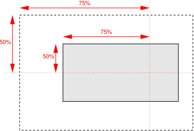
- <percentage>
- The percentage is relative to the width or height of the area given by
'background-origin'.
Negative values are not allowed. A size of zero is allowed, but causes the
image not to be displayed. (The effect is the same as if it had been a
transparent image.)
If the given size is accompanied by the keyword 'round', and the computed value of 'background-repeat'
is repeat for the horizontal
and/or vertical direction, there is a second step: The UA must reduce the
width, resp., height so that the image fits a whole number of times in the
background area. In the case of the width:
If X ≠ 0 is the width of the image (i.e., the specified
length or percentage, or the intrinsic width if the 'background-size' is 'auto') and W is the width of the background
area, then the rounded width X' = W / ceil(W
/ X)
The height is analogous. ceil() is a function that returns its argument if
it is a whole number, otherwise the next bigger whole number.
If the width is reduced because of this formula, the aspect ratio is not
retained, not even if the height was specifed as 'auto' and the vertical repeat as 'no-repeat'. Ditto if the height is reduced.
Should 'round' be specified for width and height separately?
It then becoems possible to round in one direction and keep the aspect ratio
in the other. E.g., instead of allowing the keyword in 'background-size', it
could be one of the possible values in 'background-repeat': [ repeat | space
| no-repeat | round ]{1,2}.
Is 'round' the right word? How about '~' in front of the
number, or 'approx' or 'about'?
Is it better allow the size of the image to be rounded up as
well as down?
Here are some examples. The first example stretches the background image
independently in both directions to completely cover the content area:
div {
    background-image: url(plasma.png);
    background-size: 100%;
    background-origin: content}
The second example stretches the image so that exactly two copies fit
horizontally. The aspect ratio is preserved:
p {
    background-image: url(tubes.png);
    background-size: 50% auto;
    background-origin: border}
This example forces the background image to be 15 by 15 pixels:
para {
    background-size: 15px;
    background-image: url(tile.png)}
This example uses the image's intrinsic size. Note that this is the only
possible behavior in CSS level 1 and 2.
body {
    background-size: auto;
    background-image: url(flower.png)}
The following example rounds the height of the image to 25%, down from the
specified value of 30%. At 30%, three images would fit entirely and a fourth
only partially. After rounding, four images fit. The width of the image is
20% of the background area width and is not rounded.
p {
    background-image: url(chain.png);
    background-repeat: repeat-y;
    background-size: 20% 30% round; }
12. The
'background-break' property
| Name:
| background-break
|
| Value:
| bounding-box | each-box | continuous
|
| Initial:
| continuous
|
| Applies to:
| inline elements and block-level elements (see text)
|
| Inherited:
| no
|
| Percentages:
| N/A
|
| Media:
| visual
|
| Computed value:
| same as specified value
|
This property applies to inline flow elements (specifically, it does not
apply to elements that are inline-block or inline-table), and to block-level
elements when they are broken into several boxes (for example, across pages).
The property does different things for different types of boxes.
For inline flow elements, values have the following meanings:
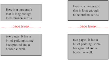
- bounding-box
- The background is drawn in a rectangle which is the smallest rectangle
that encloses all inline boxes of the element. It is only visible within the
padding (or border, depending on the 'background-clip' property) area of the
inline boxes. If the boxes are on different pages, the pages are treated as
one continuous page, glued together at their top and bottom (after stripping
away the top and bottom page margins) and the rectangle is drawn on this
continuous page. Still an issue if the pages aren't the
same width, e.g., one is in landscape.
- each-box (or discontinuous?)
- The background is drawn in each inline box of the element. A no-repeat
background image will thus be rendered once in each inline box of the
element.
- continuous
- The effect is as if, after the element has been laid out (including any
justification, bidi reordering, page breaks, etc.), all the element's boxes
are taken and put one after the other in one long row; the background is
applied to the bounding box of this row and then the boxes are put back, with
their share of the background. The order in the row is the visual order of
the boxes, not the logical order of the source. I.e., in a right-to-left
containing block ('direction' is 'ltr'), the first box is the leftmost box on the first
line and subsequent boxes are put to the right of it. In a right-to-left
containing block, the first box is the rightmost on the first line and
subsequent boxes are put to the left of it. Is this true?
or the direction of the element itself?
For block-level elements, values have the following meanings: (EDITOR'S NOTE: following needs to be checked against what was
in old "background-break (open|close)" property)
- bounding-box
- The background is tiled in a rectangle which is the smallest rectangle
that encloses all boxes of the block-level element.
- each-box
- (or 'discontinuous'?) Each box of the
block-level element is treated separately for background rendering.
- continuous
- For block-level elements, 'continuous' works
identical to 'bounding-box'
13. Layering multiple background
images
The properties 'background-image', 'background-origin',
'background-clip', 'background-repeat',
'background-size', and 'background-position' may have
multiple comma-separated values. Excepting the case that 'background-image' is
'none', if the values are specified as follows:
backgound-image:
w1,…wM
backgound-repeat:
x1,…xR
backgound-size:
y1,…yS
backgound-position:
s1,…sP
the number of layers is N = max(M, R,
S, P) [shouldn't it be M
instead?].
Each of the properties is interpreted as if it had N values, by
repeating the specified values like this:
backgound-image:
w1,…wM,
w1,…wM,
w1,… /* N values */
backgound-repeat:
x1,…xR,
x1,…xR,
x1,… /* N values */
backgound-size:
y1,…yS,
y1,…yS,
y1,… /* N values */
backgound-position:
s1,…rP,
s1,…rP,
s1,… /* N values */
This set of declarations:
background-image: url(flower.png), url(ball.png), url(grass.png);
background-position: center center, 20% 80%, top left;
background-origin: border, content;
has exactly the same effect as this set with the origin values repeated
(bolded for clarity):
background-image: url(flower.png), url(ball.png), url(grass1.png);
background-position: center center, 20% 80%, top left;
background-origin: border, content, border;
Likewise, this set of declarations:
background-image: url(red.png), url(blue.png);
background-repeat: repeat-x, repeat-y, repeat-y;
background-position: 20% 25%, 40% 10%, 50% 15%, 70% 40%, 90% 35%;
has the same effect as:
background-image: url(red.png), url(blue.png), url(red.png),
    url(blue.png), url(red.png);
background-repeat: repeat-x, repeat-y, repeat-y, repeat-x, repeat-y;
background-position: 20% 25%, 40% 10%, 50% 15%, 70% 40%, 90% 35%;
There are other ways to add missing values: repeat the last
value at the end, repeat the first value at the start, fill either at the end
or at the start with the initial value…
Each of the images is repeated, sized, and positioned according to the
corresponding value in the other properties. The first image in the list is
the layer closest to the user, the next one is painted behind the first, and
so on.
If 'background-image' is 'none', there are no layers (N = 0).
14. The 'background'
property
| Name:
| background
|
| Value:
| [ <bg-layer> , ]* <final-bg-layer>
|
| Initial:
| see individual properties
|
| Applies to:
| all elements
|
| Inherited:
| no
|
| Percentages:
| see individual properties
|
| Media:
| visual
|
| Computed value:
| see individual properties
|
<bg-layer> stands for:
<'background-image'> && [
( <'background-size'> ) ]?
&& <'background-repeat'>?
&& <'background-position'>?
&& <'background-attachment'>?
&& [ <'background-clip'> <'background-origin'>? ]?
<final-bg-layer>
stands for: <'background-image'> || (
<'background-size'> ) ||
<'background-repeat'> ||
<'background-position'> ||
<'background-attachment'> ||
[ <'background-clip'> <'background-origin'>? ] ||
<'background-color'>
Note that <bg-layer> requires a <uri> for an image, while an image is
optional in <final-bg-layer>; a color and
attachment are permitted in <final-bg-layer>, but not in
<bg-layer>.
The 'background'
property is a shorthand property for setting most background properties at
the same place in the style sheet. It sets each of 'background-color', 'background-position', 'background-size',
'background-repeat', 'background-clip',
'background-origin', 'background-attachment' and 'background-image' to
the value given, or to its initial value, if no explicit value was specified.
(It does not set 'background-break'.)
Note that the ::first-line pseudo-element is like
an inline-level element for the purposes of the background (see section
5.12.1 of [CSS21]).
That means, e.g., that in a left-justified first line, the background does
not necessarily extend all the way to the right margin.
Examples:
In the first rule of the following example, only a value for 'background-color'
has been given and the other individual properties are set to their initial
values. In the second rule, many individual properties have been specified.
body { background: red }
p { background: url("chess.png") (10em round) gray
       40% repeat fixed border border}
The first rule is equivalent to:
body {
    background-color: red;
    background-position: 0% 0%;
    background-size: 30% 30%;
    background-repeat: repeat repeat;
    background-clip: border;
    background-origin: padding;
    background-attachment: scroll;
    background-image: none }
The second is equivalent to:
p {
    background-color: gray;
    background-position: 40% 50%;
    background-size: 10em 10em round;
    background-repeat: repeat repeat;
    background-clip: border;
    background-origin: border;
    background-attachment: fixed;
    background-image: url(chess.png) }
The following example shows how a both a background color (#CCC) and a background image (url(metal.jpg)) are set. The image is stretched to the
full width of the element:
E { background: #CCC url("metal.jpg") (100% auto) no-repeat top left }
Another example shows equivalence:
div { background: padding url(paper.jpg) white center }
div {
    background-color: white;
    background-image: url(paper.jpg);
    background-repeat: repeat;
    background-attachment: scroll;
    background-position: center;
    background-clip: padding;
    background-origin: padding;
    background-size: auto auto }
The following declaration with multiple, comma-separated values
background: url(a.png) top left no-repeat,
  url(b.png) center (100% 100%) no-repeat, url(c.png) white
is equivalent to
background-image:      url(a.png), url(b.png),        url(c.png);
background-position:   top left,   center,            top left;
background-repeat:     no-repeat,  stretch no-repeat, repeat;
background-clip:       border,     border,            border;
background-origin:     padding,    padding,           padding;
background-size:       auto auto,  100% 100%,         auto auto;
background-attachment: scroll,     scroll,            scroll;
background-color:      white;
Note that 'background: url(foo)
white' and 'background: url(foo), white' have
the same effect.
Having both clip and origin in the shorthand may be
confusing, since they use the same keywords and their order is thus
important. Maybe a simplification (due to Fantasai) is to allow '[border |
padding | content]?' only once and use it to set clip and origin to the same
value (or to their defaults, if absent).
15. The 'border-color'
properties
| Name:
| border-top-color , border-right-color, border-bottom-color, border-left-color
|
| Value:
| <color>
|
| Initial:
| currentcolor
|
| Applies to:
| all elements
|
| Inherited:
| no
|
| Percentages:
| N/A
|
| Media:
| visual
|
| Computed value:
| <color>
|
| Name:
| border-color
|
| Value:
| <color>{1,4}
|
| Initial:
| (see individual properties)
|
| Applies to:
| all elements
|
| Inherited:
| no
|
| Percentages:
| N/A
|
| Media:
| visual
|
| Computed value:
| see individual properties
|
These properties set the foreground color of the border specified by the
border-style
properties.
'Border-color'
is a shorthand for the four 'border-*-color' properties. The four values set
the top, right, bottom and left border, respectively. A missing left is the
same as right, a missing bottom is the same as top, and a missing right is
also the same as top.
16. The 'border-style'
properties
| Name:
| border-top-style , border-right-style, border-bottom-style, border-left-style
|
| Value:
| <border-style>
|
| Initial:
| none
|
| Applies to:
| all elements
|
| Inherited:
| no
|
| Percentages:
| N/A
|
| Media:
| visual
|
| Computed value:
| specified value
|
| Name:
| border-style
|
| Value:
| <border-style>{1,4}
|
| Initial:
| (see individual properties)
|
| Applies to:
| all elements
|
| Inherited:
| no
|
| Percentages:
| N/A
|
| Media:
| visual
|
| Computed value:
| see individual properties
|
These properties set the style of the border, unless there is a border
image (see 'border-image').
'Border-style'
is a shorthand for the other four. Its four values set the top, right, bottom
and left border respectively. A missing left is the same as right, a missing
bottom is the same as top, and a missing right is also the same as top.
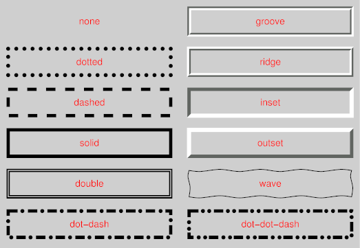
<border-style> is: none
| hidden | dotted | dashed | solid | double | dot-dash | dot-dot-dash | wave
| groove | ridge | inset | outset. Values have the following meanings:
- none
- No border. Color and width are ignored (i.e., the border has width 0,
unless the border is an image, see 'background-image'
- hidden
- Same as 'none', but has different behavior in the conflict resolution
rules for tables [CSS3TBL].
- dotted
- A series of dots.
- dashed
- A series of dashes.
- solid
- A single line segment.
- double
- Two parallel solid lines with some space between them. (The thickness of
the lines is not specified, but the sum of the lines and the space must equal
'border-width'.)
- dot-dash
- Alternating dots and dashes.
- dot-dot-dash
- Two dots and a dash.
- wave
- A wavy line.
- groove
- Looks as if it were carved in the canvas. (This is typically achieved by
creating a “shadow” from two colors that are slightly lighter and
darker than the 'border-color'.)
- ridge
- Looks as if it were coming out of the canvas.
- inset
- Looks as if the content on inside of the border is sunken into the
canvas. Different meaning on table[ref] elements.
- outset
- Looks as if the content on the inside of the border is coming out of the
canvas. Different meaning for table[ref] elements.
Borders are drawn in front of the element's background, but behind the
element's content (in case it overlaps).
Note: There is no control over the spacing of the dots and
dashes, nor over the length of the dashes. Implementations are encouraged to
choose a spacing that makes the corners symmetrical.
Note: This specification does not define how borders of
different styles should be joined in the corner. Also note that rounded
corners may cause the corners and the contents to overlap, if the padding is
less than the radius of the corner.
17. The 'border-width'
properties
| Name:
| border-top-width, border-right-width, border-bottom-width, border-left-width
|
| Value:
| <border-width>
|
| Initial:
| medium
|
| Applies to:
| all elements
|
| Inherited:
| no
|
| Percentages:
| width* of containing block
|
| Media:
| visual
|
| Computed value:
| specified value
|
| Name:
| border-width
|
| Value:
| <border-width>{1,4}
|
| Initial:
| (see individual properties)
|
| Applies to:
| all elements
|
| Inherited:
| no
|
| Percentages:
| see individual properties
|
| Media:
| visual
|
| Computed value:
| see individual properties
|
[Border-width doesn't allow percentages in CSS2; should we
allow percentages (of the containing block's width) in CSS3?]
These properties set the thickness of the border.
The <border-width> is
'<length> | <percentage> | thin | medium | thick'.
The <length> and <percentage> may not be negative. The
lengths corresponding to 'thin', 'medium' and 'thick' are not specified, but
the values are constant throughout a document and thin ≤ medium ≤
thick. A UA could, e.g., make the thickness depend on the 'medium' font size:
one choice might be 1, 3 & 5px when the 'medium' font size is 17px or
less.
'Border-width'
is a shorthand that sets the four 'border-*-width' properties. If it has four
values, they set top, right, bottom and left in that order. If left is
missing, it is the same as right; if bottom is missing, it is the same as
top; if right is missing, it is the same as top.
Note that the initial width is 'medium', but the initial
style is 'none' and therefore the used width is 0.
When the used width of the border is 0, we say that the border is absent.
18. The 'border-image'
property
| Name:
| border-image
|
| Value:
| none | <uri>
[<number> | <percentage>]{4} [ / <border-width>{1,4} ]? [stretch |
repeat | round]{0,2}
|
| Initial:
| none
|
| Applies to:
| All elements, except table element when 'border-collapse' is 'collapse'
|
| Inherited:
| no
|
| Percentages:
| N/A
|
| Media:
| visual
|
| Computed value:
| Specified value, with any URI made absolute
|
Specifies an image to use instead of the border styles given by the 'border-style' properties
and an additional background image for the element. If the value is 'none' or if the image cannot be displayed, the border
styles will be used.
The four numbers or percentages immediately following the <uri> specify which part of that image is
used for which part of the border. They divide the image into nine parts:
four corners, four edges and a middle part. The middle part is used as an
extra background image.
The first of the four values is the height of the top edge and of the two
top corners. The second is the width of the right edge and the two right
corners. The third is the height of the bottom edge and the two bottom
corners. The fourth is the width of the left edge and the two left corners.
Percentages are relative to the size of the image. Numbers represent
pixels in the image (if the image is a raster image) or CSS px units (if
not). Negative values are not allowed and values bigger than the size of the
image are interpreted as 100%.
The <number>s are slightly confusing.
People may be tempted to write 5px instead of 5, since on most screens, 5px
is the same size as 5 image pixels.
If the sum of the right and left widths is equal to or greater than the
width of the image, the images for the top and bottom edge and the middle
part are empty, which has the same effect as if a non-empty transparent image
had been specified for those parts. Analogously for the top and bottom
values.
If the slash is present in the property value, the one to four values
after it are used for the width of the border instead of the 'border-width'
properties (but only if the specified image can be displayed). The order of
the values is the same as for 'border-width'.
At the end of the value, there may be up to two keywords, that specify how
the images for the sides and the middle part are scaled and tiled. If the
second is absent, it is assumed to be the same as the first. If both are
absent, the effect is the same as 'stretch stretch'.
The nine images are scaled in two steps:
- step 1
-
-
The two images for the top and bottom edges are made as tall as the top
and bottom borders, respectively, (either using 'border-width' or the values specified after
the slash) and their width is scaled proportionally.
-
The images for the left and right edge are made as wide as the left and
right borders, respectively, and their height is scaled proportionally.
-
The corner images are scaled to be as wide and as tall as the two borders
they are part of.
-
The middle part is not scaled.
- step 2
-
-
If the first keyword is 'stretch', the top,
middle and bottom images are further scaled to be as wide as the element's
padding box. The height is not changed any further.
-
If the first keyword is 'round', the top, middle
and bottom images are reduced in width, so that exactly a whole number of
them fit in the width of the padding box, as follows:
If X ≠ 0 is the width of the image and W is the
width of the padding area, then the rounded width X' =
W / ceil(W / X)
-
The effects of 'stretch' and 'round' for the second keyword are analogous, acting on
the height of the left, middle and right images.
The resulting images are placed centered in their respective parts of the
border (the middle image is put in the middle of the padding area) and then
tiled. All images are drawn behind the element's content, in front of the
element's background.
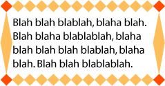
This example creates a top and bottom border consisting of a whole number
of orange diamonds and a left and right border of a single, stretched
diamond. The corners are diamonds of a different color. The image to tile is
as follows. Apart from the diamonds, it is transparent:

The image is 81 by 81 pixels and has to be divided into 9 equal parts. The
style rules could thus be as follows:
DIV {
  border-image: url("border.png") 27 27 27 27 round stretch;
  border: double orange 1em }
The result, when applied to a DIV of 12 by 5em, will be similar to this:
The 'border-image' property does not apply to
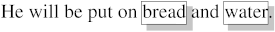
table elements in a table with 'border-collapse' set to 'collapse'.
19. The 'border-radius'
properties
| Name:
| border-top-right-radius, border-bottom-right-radius, border-bottom-left-radius, border-top-left-radius, border-radius
|
| Value:
| <length> <length>?
|
| Initial:
| 0
|
| Applies to:
| all elements, except table element when 'border-collapse' is 'collapse'
|
| Inherited:
| no
|
| Percentages:
| N/A
|
| Media:
| visual
|
| Computed value:
| specified values
|
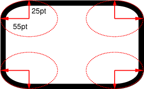
The two length values of the 'border-radius' properties define the radii
of a quarter ellipse that defines the shape of the corner (see the diagram
below). The first value is the horizontal radius (or vertical if the 'writing-mode' is
vertical). If the second length is omitted it is equal to the first (and the
corner is thus a quarter circle). If either length is zero, the corner is
square, not rounded. The border radius also causes the element's background
to be rounded, even if the border is 'none'.
Negative values are not allowed.
All border styles ('solid',
'dotted', 'inset', etc.) follow the curve of the border.
Border images specified with 'border-image', however, are clipped at the
outer edge of the curve. Or are they not affected at
all?
20. The 'border-break'
property
| Name:
| border-break
|
| Value:
| <'border-width'> || <border-style> || <color>
|
| Initial:
| none
|
| Applies to:
| elements with a border
|
| Inherited:
| yes
|
| Percentages:
| N/A
|
| Media:
| visual
|
| Computed value:
| specified value
|
When a box that has a border is broken at a page break, column break, or,
for inline elements, at a line break, a border and some padding can be
inserted at the break, or the border can be left open.
If the style is set to 'none', no border and no
padding are inserted.
Otherwise, padding is added as wide as the corresponding side of the 'padding' property and a
border is added. If borders on that side would get an image, the image is
used, scaled to the given width, otherwise the border gets the given style
and color.
Note that, unlike for the other borders of the element, a
value of 'none' suppresses any image border as well.
If you want an image or nothing, use 'hidden' instead.
Is this asymmetry in the meaning of 'none' a problem?
Another possibility is to have a simple on/off switch for the border at the
break: 'border-break: show | hide'.
21. The
'border-top', 'border-bottom', 'border-right', 'border-left', and 'border'
properties
| Name:
| border-top, border-right, border-bottom, border-left
|
| Value:
| <'border-width'> || <border-style> || <color>
|
| Initial:
| See individual properties
|
| Applies to:
| all elements
|
| Inherited:
| no
|
| Percentages:
| N/A
|
| Media:
| visual
|
| Computed value:
| absolute values
|
This is a shorthand property for setting the width, style, and color of
the top, right, bottom, and left border of a box. Omitted values are set to
their initial values.
| Name:
| border
|
| Value:
| <'border-width'> || <border-style> || <color>
|
| Initial:
| See individual properties
|
| Applies to:
| all elements
|
| Inherited:
| no
|
| Percentages:
| N/A
|
| Media:
| visual
|
| Computed value:
| absolute values
|
The 'border' property
is a shorthand property for setting the same width, color, and style for all
four borders of a box. Unlike the shorthand 'margin' and 'padding' properties, the 'border' property cannot set
different values on the four borders. To do so, one or more of the other
border properties must be used.
For example, the first rule below is equivalent to the set of four rules
shown after it:
p { border: solid red }
p {
  border-top: solid red;
  border-right: solid red;
  border-bottom: solid red;
  border-left: solid red;
}
Since, to some extent, the properties have overlapping functionality, the
order in which the rules are specified is important.
Consider this example:
blockquote {
  border-color: red;
  border-left: double;
  color: black
}
In the above example, the color of the left border is black, while the
other borders are red. This is due to 'border-left' setting the width, style, and
color. Since the color value is not given by the 'border-left' property, it will be taken from
the 'color' property. The
fact that the 'color'
property is set after the 'border-left' property is not relevant.
22. The 'box-shadow'
property
Multiple shadows may be overkill and hard to implement. What
are the use cases?
One or more drop-shadows can be attached to a box. They are drawn just
outside the border edge. The property is a comma-separated list of shadows,
each specified by 3 length values and a color. Omitted lengths are 0, omitted
colors are equal to the computed value of the 'color' property.
Shadows do not influence the layout: they may overlap with other boxes.
Like backgrounds and borders, if they overlap other boxes, they are drawn
behind any text or replaced element. In terms of the stacking
context, the shadow of an element is drawn immediately below the
background of that element.
The 3 lengths and the color of each shadow are interpreted as follows:
- The first length is the horizontal offset of the shadow. A positive value
draws a shadow that is offset to the right of the box, a negative length to
the left.
- The second length is the vertical offset. A positive value offsets the
shadow down, a negative one up.
- The third length is a blur radius. Negative values are not allowed. If it
is 0, the shadow is sharp, otherwise the larger the value, the more the
shadow is blurred. The exact algorithm is not specified.
- The color is the color of the shadow.
If an element has multiple boxes, all of them get drop shadows, but
shadows are only drawn where borders would also be drawn, see 'border-break'. If the
box has a non-zero border-radius', the shadow is rounded in the
same way.
Here is an example of single words with a drop shadow. Assume the words
were enclosed in <span> and the style rule
was
span {border: thin solid; box-shadow: 0.2em 0.2em #CCC}
The result might look like this:
This example shows a shadow on the bottom right only, even
though the box is transparent. Shouldn't we see a “real” shadow,
projecting exactly the opaque parts of the box? What if the opaque parts are
actually semi-opaque? Will the shadow be less intense there?
23. The background of the
canvas
The background of the root element becomes the background of the
canvas and extends to cover the entire canvas, although any images
are positioned and stretched relative to the root element as if they were
painted for that element alone. If the root's background-color value is 'transparent', the color is UA dependent. The root element
does not paint this background again.
For HTML documents, however, it is recommended that authors specify the
background for the BODY element rather than the
HTML element. User agents should observe the
following precedence rules to fill in the background of the canvas of HTML
documents: if the value of any of the 'background' properties on the HTML element is different from its initial value, then
use the background of the HTML element, else use
the background of the BODY element. This does
not apply to XHTML documents.
According to these rules, the canvas underlying the following HTML
document will have a “marble” background:
<!DOCTYPE html PUBLIC '-//W3C//DTD HTML 4.0//EN'
  >
<html>
  <head>
    <title>Setting the canvas background</title>
    <style type="text/css">
       body { background: url("http://example.org/marble.png") }
    </style>
  </head>
  <body>
    <p>My background is marble.</p>
  </body>
</html>
24. Profiles
(NOTE: Check profiles because of changes made!)
CSS1 Profile:
CSS2 Profile:
Mobile and TV Profiles (informative, see their specifications):
CSS3 Profile:
- Everything (as described in this specification)
This section will define conformance with the present specification only.
The inability of a user agent to implement part of this specification due
to the limitations of a particular device does not imply non-conformance.
User agents must observe the rules for handling parsing errors.
26. Tests
This specification will contain a test suite allowing user agents to
verify their basic conformance to the specification. This test suite does not
pretend to be exhaustive and does not cover all possible combined cases of
W3C background functionality.
27. Acknowledgments
Tapas Roy was editor of the Border Module, before it was merged with the
Background Module.
A set of properties for border images was initially proposed by
fantasai. The current simplification (one image cut into nine parts)
is due to Ian Hickson. (Though the original idea seems to originate with some
anonymous Microsoft engineers.)
28. CR exit criteria
As described in the W3C process document, a Candidate
Recommendation (CR) is a specification that W3C recommends for use on the
Web. The next stage is “Recommendation,” when the specification
is sufficiently implemented.
For this specification to be proposed as a W3C Recommendation, the
following conditions shall be met:
-
There must be at least two interoperable implementations for every feature
in the Module. For the purposes of this criterion, we define the following
terms:
- feature
-
a section or subsection of the specification
- interoperable
-
passing the respective test case(s) in the CSS test suite, or, if the
implementation is not a web browser, an equivalent test. Every relevant test
in the test suite should have an equivalent test created if such a UA is to
be used to claim interoperability. In addition if such a UA is to be used to
claim interoperability, then there must one or more additional UAs which can
also pass those equivalent tests in the same way for the purpose of
interoperability. The equivalent tests must be made publicly available for
the purposes of peer review.
- implementation
-
a user agent which:
- implements the feature.
- is available (i.e. publicly downloadable or available through some other
public point of sale mechanism). This is the "show me" requirement.
- is shipping (i.e. development, private or unofficial versions are
insufficient).
- is not experimental (i.e. is intended for a wide audience and could be
used on a daily basis.)
-
A minimum of sixth months of the CR period must have elapsed. This is to
ensure that enough time is given for any remaining major errors to be caught.
-
Features will be dropped if two or more interoperable implementations are
not found by the end of the CR period.
-
Features may/will also be dropped if adequate/sufficient (by judgment of
CSS WG) tests have not been produced for those feature(s) by the end of the
CR period.
29. References
Normative references
-
- [CSS3BOX]
- Bert Bos. CSS3 module: The box model. 24 October 2002. W3C
Working Draft. (Work in progress.) URL: http://www.w3.org/TR/2002/WD-css3-box-20021024
- [CSS3CASCADE]
- Håkon Wium Lie. CSS3 module: Cascading and inheritance.
19 February 2002. W3C Working Draft. (Work in progress.) URL: http://www.w3.org/TR/2002/WD-css3-cascade-20020219
- [CSS3COLOR]
- Tantek Çelik; Chris Lilley. CSS3 Color Module. 14 May
2003. W3C Candidate Recommendation. (Work in progress.) URL: http://www.w3.org/TR/2003/CR-css3-color-20030514
- [CSS3SYN]
- L. David Baron. CSS3 module: Syntax. 13 August 2003. W3C
Working Draft. (Work in progress.) URL: http://www.w3.org/TR/2003/WD-css3-syntax-20030813
- [CSS3TEXT]
- Michel Suignard. CSS3 Text Module. 14 May 2003. W3C
Candidate Recommendation. (Work in progress.) URL: http://www.w3.org/TR/2003/CR-css3-text-20030514
- [CSS3VAL]
- Håkon Wium Lie; Chris Lilley. CSS3 module: Values and
Units. 13 July 2001. W3C Working Draft. (Work in progress.) URL: http://www.w3.org/TR/2001/WD-css3-values-20010713
Other references
-
- [CSS1]
- Håkon Wium Lie; Bert Bos. Cascading Style Sheets (CSS1) Level
1 Specification. 17 December 1996. W3C Recommendation. Revised 11
January 1999. URL: http://www.w3.org/TR/1999/REC-CSS1-19990111
- [CSS2]
- Bert Bos; et al. Cascading Style Sheets, level 2 (CSS2)
Specification. 12 May 1998. W3C Recommendation. URL: http://www.w3.org/TR/1998/REC-CSS2-19980512
- [CSS21]
- Bert Bos; et al. Cascading Style Sheets, level 2 revision 1.
25 February 2004. W3C Candidate Recommendation. (Work in progress.) URL: http://www.w3.org/TR/2004/CR-CSS21-20040225
- [CSS3POS]
- Bert Bos. CSS3 Positioning Module. (forthcoming). W3C
Working Draft. (Work in progress.)
- [CSS3TBL]
- Bert Bos; David Hyatt. CSS3 Tables Module. (forthcoming).
W3C Working Draft. (Work in progress.)
Property index
| Property
| Values
| Initial
| Applies to
| Inh.
| Percentages
| Media
|
| background
| [ <bg-layer> , ]* <final-bg-layer>
| see individual properties
| all elements
| no
| see individual properties
| visual
|
| background-attachment
| scroll | fixed | local [, scroll | fixed | local]*
| scroll
| all elements
| no
| N/A
| visual
|
| background-break
| bounding-box | each-box | continuous
| continuous
| inline elements and block-level elements (see text)
| no
| N/A
| visual
|
| background-clip
| [border | padding] [, [border | padding]]*
| border
| all elements
| no
| N/A
| visual
|
| background-color
| <color>
| transparent
| all elements
| no
| N/A
| visual
|
| background-image
| <uri> [ , <uri> ]* | none
| none
| all elements
| no
| N/A
| visual
|
| background-origin
| [border | padding | content] [, [border | padding | content]]*
| padding
| all elements
| no
| N/A
| visual
|
| background-position
| <bg-position> [ , <bg-position> ]*
| 0% 0%
| all elements
| no
| refer to the size of the box itself
| visual
|
| background-repeat
| <repeat> [ , <repeat> ]*
| repeat
| all elements
| no
| N/A
| visual
|
| background-size
| [ [ <length> | <percentage> | auto ]{1,2} || round ] [ [ , [
<length> | <percentage> | auto ]{1,2} ] || round ]*
| auto
| all elements
| no
| see text
| visual
|
| border
| <'border-width'> || <border-style> || <color>
| See individual properties
| all elements
| no
| N/A
| visual
|
| border-break
| <'border-width'> || <border-style> || <color>
| none
| elements with a border
| yes
| N/A
| visual
|
| border-color
| <color>{1,4}
| (see individual properties)
| all elements
| no
| N/A
| visual
|
| border-image
| none | <uri> [<number> | <percentage>]{4} [ /
<border-width>{1,4} ]? [stretch | repeat | round]{0,2}
| none
| All elements, except table element when 'border-collapse' is 'collapse'
| no
| N/A
| visual
|
| border-style
| <border-style>{1,4}
| (see individual properties)
| all elements
| no
| N/A
| visual
|
| border-top, border-right, border-bottom, border-left
| <'border-width'> || <border-style> || <color>
| See individual properties
| all elements
| no
| N/A
| visual
|
| border-top-color
, border-right-color, border-bottom-color, border-left-color
| <color>
| currentcolor
| all elements
| no
| N/A
| visual
|
| border-top-right-radius, border-bottom-right-radius,
border-bottom-left-radius, border-top-left-radius, border-radius
| <length> <length>?
| 0
| all elements, except table element when 'border-collapse' is 'collapse'
| no
| N/A
| visual
|
| border-top-style
, border-right-style, border-bottom-style, border-left-style
| <border-style>
| none
| all elements
| no
| N/A
| visual
|
| border-top-width, border-right-width, border-bottom-width, border-left-width
| <border-width>
| medium
| all elements
| no
| width* of containing block
| visual
|
| border-width
| <border-width>{1,4}
| (see individual properties)
| all elements
| no
| see individual properties
| visual
|
| box-shadow
| none | [ <length> <length> <length>? || <color> ]
[ , <length> <length> <length>? || <color> ]+
| none
| all elements
| no
| N/A
| visual
|
The following properties are defined in other modules:
- 'border-bottom-width' 'border-left-width', 'border-right-width', 'border-top-width', 'border-width', see [CSS3BOX]
- 'color', see [CSS3COLOR]
- 'margin', 'padding', see
[CSS3BOX]
- 'overflow', see [CSS3BOX]
- 'writing-mode', see [CSS3TEXT]
- 'z-index', see [CSS3POS]
The following data types are defined in [CSS3VAL]:
- <percentage>
- <length>
- <uri>
- <color>
Index
- background, #
- background-attachment, #
- background-break, #
- background-clip, #
- background-color, #
- background-image, #
- background-origin, #
- background-position, #
- background-repeat, #
- background-size, #
- border, #
- border-bottom, #
- border-bottom-color, #
- border-bottom-left-radius, #
- border-bottom-right-radius, #
- border-bottom-style, #
- border-bottom-width, #
- 'border-bottom-width', #
- border-break, #
- border-color, #
- border-image, #
- border-left, #
- border-left-color, #
- border-left-style, #
- border-left-width, #
- 'border-left-width', #
- border-radius, #
- border-right, #
- border-right-color, #
- border-right-style, #
- border-right-width, #
- 'border-right-width', #
- border-style, #
- border-style-none, #
- border-top, #
- border-top-color, #
- border-top-left-radius, #
- border-top-right-radius, #
- border-top-style, #
- border-top-width, #
- 'border-top-width', #
- border-width, #
- 'border-width', #
- box-shadow, #
- clip-border, #
- clip-padding, #
- 'color', #
- dashed, #
- dot-dash, #
- dot-dot-dash, #
- dotted, #
- double, #
- fixed, #
- groove, #
- hidden, #
- inset, #
- local, #
- <border-style>, #
- <color>, #
- <length>, #
- <percentage>, #
- <uri>, #
- 'margin', #
- no-repeat, #
- origin-border, #
- origin-content, #
- origin-padding, #
- outset, #
- 'overflow', #
- 'padding', #
- repeat, #
- ridge, #
- scroll, #
- solid, #
- space, #
- <bg-layer>, #
- <bg-position>, #
- <border-width>, #
- <final-bg-layer>, #
- <repeat>, #
- viewport, #
- wave, #
- 'writing-mode', #
- 'z-index', #