8 Form Controls
8.1 The XForms Form Controls Module
Form controls are declared using markup elements, and their behavior refined via markup attributes.
| Element | Attributes | Minimal Content Model |
|---|---|---|
| input | Common, UI Common, Single Node Binding, inputmode (xsd:string), incremental (xsd:boolean) | label, (UI Common)* |
| secret | Common, UI Common, Single Node Binding, inputmode (xsd:string), incremental (xsd:boolean) | label, (UI Common)* |
| textarea | Common, UI Common, Single Node Binding, inputmode (xsd:string), incremental (xsd:boolean) | label, (UI Common)* |
| output | Common, Single Node Binding, appearance ("full"|"compact"|"minimal"|xforms:QNameButNotNCNAME) | label? |
| upload | Common, UI Common, Single Node Binding, mediatype (xsd:string), incremental (xsd:boolean) | label, filename?, mediatype?, (UI Common)* |
| range | Common, UI Common, Single Node Binding, start (xsd:string), end (xsd:string), step (xsd:string), incremental (xsd:boolean) | label, (UI Common)* |
| trigger | Common, UI Common, Single Node Binding | label, (UI Common)* |
| submit | Common, UI Common, Single Node Binding, submission (xsd:IDREF) | label, (UI Common)* |
| select | Common, UI Common, Single Node Binding, incremental (xsd:boolean) | label, (List UI Common)+, (UI Common)* |
| select1 | Common, UI Common, Single Node Binding, selection ("open" | "closed"), incremental (xsd:boolean) | label, (List UI Common)+, (UI Common)* |
| choices | Common | label?, (List UI Common)+ |
| item | Common | label, value, (UI Common)* |
| filename | Common, Single Node Binding | EMPTY |
| mediatype | Common, Single Node Binding | EMPTY |
| value | Common, Single Node Binding | (PCDATA|ANY)* |
| label | Common, Single Node Binding, Linking | (PCDATA|(UI Inline))* |
| help | Common, Single Node Binding, Linking | (PCDATA|(UI Inline))* |
| hint | Common, Single Node Binding, Linking | (PCDATA|(UI Inline))* |
| alert | Common, Single Node Binding, Linking | (PCDATA|(UI Inline))* |
See also: 9.3.3 The itemset Element.
Note:
Unless bound to form controls, instance data nodes are not
presented to the user; consequently, there is no need for a form
control corresponding to HTML input type="hidden".
The following attributes are common to many user-interface
related XForms elements, here called the UI Common
attribute group.
| Element | Attributes |
|---|---|
| (various) | navindex (xsd:nonNegativeInteger) |
| (various) | accesskey (xsd:token) |
| (various) | appearance ("full"|"compact"|"minimal"|QName-but-not-NCName) |
- navindex
-
Optional attribute is a non-negative integer in the range of 0-32767 used to define the navigation sequence. This gives the author control over the sequence in which form controls are traversed. The default navigation order is specified in the chapter 4 Processing Model.
- accesskey
-
Optional attribute defines a shortcut for moving the input focus directly to a particular form control. The value of this is typically a single character which when pressed together with a platform specific modifier key (e.g., the alt key) results in the focus being set to this form control.
- appearance
-
Optional attribute to define an appearance hint.
Note:
A host language is expected to add attributes such as
xml:lang as well as an attribute, typically named
class, that holds a list of strings that can be
matched by CSS class selectors.
Additionally, this module defines the following content sets:
| Content Set | Minimal Content Model |
|---|---|
| UI Common | (help|hint|alert|Action)* |
| List UI Common | (choices|item|itemset)+ |
| Form Controls | (input|secret|textarea|output|upload|range|trigger|submit|select|select1)* |
| UI Inline | (output)* |
As shown above, the XML Events module adds the Actions content set into the UI Common content set. A host language should add inline markup to the Inline content set.
8.1.1 Implementation Requirements Common to All Form Controls
XForms user interface controls are bound to the underlying instance data using binding attributes as defined in the chapter 6 Model Item Properties.
Form controls enable accessibility by taking a uniform approach to such features as labels, help text, navigation, and keyboard shortcuts. Internationalization issues are addressed by following the same design principles as in XHTML. All form controls are suitable for styling as aural or visual media.
Form controls encapsulate high-level semantics without
sacrificing the ability to deliver real implementations. For
instance, form controls select and
select1 enable the user select one or more items
from a set. These form controls distinguish the functional
aspects of the underlying control from the presentational and
behavioral aspects. This separation enables the expression of the
intent underlying a particular form control—see [AUI97] for a
definition of such high-level user interaction primitives.
Form controls when rendered display the underlying data values to which they are bound. While the data presented to the user through a form control must directly correspond to the bound instance data, the display representation is not required to match the lexical value. For example, user agents should apply appropriate conventions to the display of dates, times, durations and numeric values including separator characters.
All form controls must meet the following implementation requirements:
-
Form controls that write simpleContent to instance data must do so exactly as defined by the XForms Action 10.1.9 The setvalue Element
-
All form controls that read simpleContent instance data must do so as follows:
-
Element nodes: if text child nodes are present, returns the string-value of the first text child node. Otherwise, returns "" (the empty string)
-
Attribute nodes: returns the string-value of the node.
-
Text nodes: returns the string-value of the node.
-
Namespace, processing instruction, comment, and the XPath root node: behavior is undefined.
-
-
Form controls must distinguish rendering between valid and invalid states. Control of this behavior should be made available to stylesheets.
-
Form controls must render upon request an explanation of the current state of a form control, including validity and associated model item properties. Control of this behavior should be made available to stylesheets.
-
Form controls must provide a default explanation for the above when no user-specified explanation is available.
Sections in this chapter define the various form controls by specifying the following:
Description
Common Attributes
Special Attributes
Examples
Data Binding Restrictions
Implementation Requirements
8.1.2 The input Element
Description: This form control enables free-form data entry.
Common Attributes: Common, UI Common, Single Node UI Binding
Special Attributes:
- inputmode
-
This form control accepts an input mode hint. E Input Modes.
- incremental
-
when
true, this form control will generatexforms-value-changingevents. The default value for this attribute isfalse.
Example:
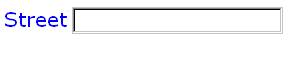
<input ref="order/shipTo/street" class="streetAddress">
  <label>Street</label>
  <hint>Please enter the number and street name</hint>
</input>
In the above, the class attribute can be used by a
style sheet to specify the display size of the form control. Note
that the constraints on how much text can be input are obtained
from the underlying XForms Model definition and not from these
display properties.
A graphical browser might render the above example as follows:
Data Binding Restrictions: Binds to any simpleContent (except
xsd:base64Binary, xsd:hexBinary or any
datatype derived from these).
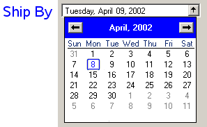
Implementation Requirements: Must allow entry of a lexical value
for the bound datatype. Implementations should provide a convenient
means for entry of datatypes and take into account localization and
internationalization issues such as representation of numbers. For
example, an input bound to an instance data node of
type xsd:date might provide a calendar control to
enter dates; similarly, an input control bound to data instance of
type boolean might be rendered as a checkbox.
<input ref="order/shipDate">
    <label>Ship By</label>
    <hint>Please specify the date ship date for this order.</hint>
</input>
A graphical browser might render the above example as follows:

The user can type a date into the text field in the box, or press the button to open a calendar:
8.1.3 The secret Element
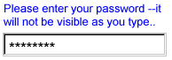
Description: This form control is used for entering information that is considered sensitive, and thus not echoed to a visual or aural display as it is being entered, e.g., password entry.
Common Attributes: Common, UI Common, Single Node Binding
Special Attributes:
- inputmode
-
This form control accepts an input mode hint. E Input Modes.
- incremental
-
when
true, this form control will generatexforms-value-changingevents. The default value for this attribute isfalse.
Example:
<secret ref="/login/password">
  <label>Password</label>
  <hint>Please enter your password --it will not
    be visible as you type.</hint>
</secret>
A graphical browser might render this form control as follows:
Data Binding Restrictions: Identical to input.
Implementation Requirements: In general, implementations, including accessibility aids, must render a "*" or similar character instead of the actual characters entered, and thus must not render the entered value of this form control. Note that this provides only a casual level of security; truly sensitive information will require additional security measures outside the scope of XForms.
8.1.4 The textarea Element
Description: This form control enables free-form data entry and is intended for use in entering multiline content, e.g., the body of an email message.
Common Attributes: Common, UI Common, Single Node Binding
Special Attributes:
- inputmode
-
This form control accepts an input mode hint. E Input Modes.
- incremental
-
when
true, this form control will generatexforms-value-changingevents. The default value for this attribute isfalse.
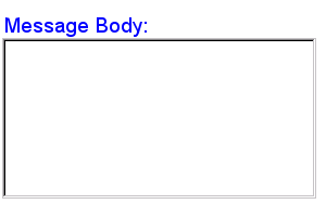
Example:
<textarea ref="message/body" class="messageBody">
  <label>Message Body</label>
  <hint>Enter the text of your message here</hint>
</textarea>
In the above, the class attribute can be used by a
style sheet to specify the display size of the form control. Note
that the constraints on how much text can be input are obtained
from the underlying XForms Model definition and not from these
display properties.
A graphical browser might render the above example as follows:
Data Binding Restrictions: Binds to xsd:string or
any derived simpleContent.
Implementation Requirements: Must allow entry of a lexical value for the bound datatype, including multiple lines of text.
8.1.5 The output Element
Description: This form control renders a value from the instance
data, but provides no means for entering or changing data. It is
typically used to display values from the instance, and is treated
as display:inline for purposes of layout.
Common Attributes: Common, Single Node Binding
Special Attributes:
- appearance
-
This form control does not use the UI Common attribute group, but nevertheless still contains an appearance attribute, as defined above.
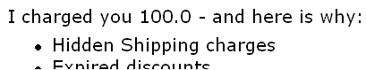
Example:
I charged you -
<output ref="order/totalPrice"/>
and here is why:
A graphical browser might render an output form control as follows:
Data Binding Restrictions: Binds to any simpleContent.
Implementation Requirements: Must allow display of a lexical value for the bound datatype. Implementations should provide a convenient means for display of datatypes and take into account localization and internationalization issues such as representation of numbers.
8.1.6 The upload Element
Description: This form control enables the common feature found on Web sites to upload a file from the local file system, as well as accepting input from various devices including microphones, pens, and digital cameras.
Common Attributes: Common, UI Common, Single Node Binding
Special Attributes:
- mediatype
-
List of suggested media types, used by the XForms Processor to determine which input methods apply.
- incremental
-
When
true, this form control will generatexforms-value-changingevents. The default for this form control isfalse.
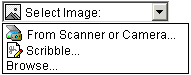
Example:
<upload ref="mail/attach1" mediatype="image/*">
  <label>Select image:</label>
</upload>
A graphical browser might render this form control as follows:
Data Binding Restrictions: This form control can only be bound
to datatypes xsd:base64Binary or
xsd:hexBinary, or types derived by restriction from
these.
Implementation Requirements: For suitable mediatypes:
-
Implementations with a file system should support file upload—selecting a specific file. The types of files presented by default must reflect the mediatype specified in the XForms Model, for example defaulting to only audio file types in the file dialog when the mediatype is "audio/*". In XForms 1.0, there is a 1:1 binding between a upload form control and one of the
binarydatatypes, although that single file may be compound (e.g. application/zip). -
Implementations with specific pen/digitizer hardware should (and implementations with other pointing devices may) support scribble—allowing in-place creation of pen-based data.
-
Implementations with specific audio recording capabilities should support record audio—in-place recording of an audio clip.
-
Implementations with a digital camera/scanner interface or screen capture should support acquire image—in-place upload of images from an attached device.
-
Implementations with video recording capability should provide a record video option.
-
Implementations with 3d capabilities should provide a 3d interface option.
-
Implementations may provide proprietary implementations (for example, a mediatype of text/rtf could invoke an edit window with a proprietary word processing application)
-
Implementations are encouraged to support other input devices not mentioned here.
-
Implementations which cannot support upload for the given mediatype must make this apparent to the user.
8.1.7 The range Element
Description: This form control allows selection from a sequential range of values.
Common Attributes: Common, UI Common, Single Node Binding
Special Attributes:
- start
-
Optional hint for the lexical starting bound for the range—a legal value for the underlying data.
- end
-
Optional hint for the ending bound for the range—a legal value for the underlying data.
- step
-
Optional hint to use for incrementing or decrementing the value. Should be of a type capable of expressing the difference between two legal values of the underlying data.
- incremental
-
When
true, this form control will generatexforms-value-changingevents. The default for this form control isfalse.
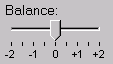
Example:
<range ref="/stats/balance" start="-2.0" end="2.0" stepSize="0.5">
  <label>Balance</label>
</range>
A graphical browser might render this as follows:
Data Binding Restrictions: Binds only the following list of
datatypes, or datatypes derived by restriction from those in the
list: xsd:duration, xsd:date,
xsd:time, xsd:dateTime,
xsd:gYearMonth, xsd:gYear,
xsd:gMonthDay, xsd:gDay,
xsd:gMonth, xsd:float,
xsd:decimal, xsd:double.
Implementation Requirements: Must allow input of a value corresponding to the bound datatype. Implementations should inform the user of the upper and lower bounds, as well as the step size, if any. In graphical environments, this form control may be rendered as a "slider" or "rotary control".
Notice that the attributes of this element encapsulate sufficient metadata that in conjunction with the type information available from the XForms Model proves sufficient to produce meaningful prompts when using modalities such as speech, e.g., when using an accessibility aid. Thus, in the example below, an aural user agent might speak a prompt of the form Please pick a date in the range January 1, 2001 through December 31, 2001.
Example:
<range ref="/order/shipDate" start="2001-01-01" end="2001-12-31">
  <label>Ship Date</label>
</range>
8.1.8 The trigger Element
Description: This form control is similar to the HTML element
button and allows for user-triggered actions. This
form control may also be used to construct other custom form
controls.
Common Attributes: Common, UI Common, Single Node Binding
Example:
<trigger>
  <label>Click here</label>
</trigger>
Data Binding Restrictions: Binds to any node. This form control does not directly interact with form data, but is affected by model item properties of the bound node.
Implementation Requirements: The user agent must provide a means
to generate an xforms-activate event on the form
control. Graphical implementations would typically render this form
control as a push-button with the label on the button face. Style
sheets can be used to style this form control as an image,
hyperlink, or other presentation.
8.1.9 The submit Element
Description: This form control initiates submission of all or part of the instance data to which it is bound.
Common Attributes: Common, UI Common, Single Node Binding
Special Attributes:
- submission
-
Required reference to element
submission.
Example:
<submit submission="timecard">
  <label>Submit Timecard</label>
</submit>
Data Binding Restrictions: Binds to any node. This form control does not directly interact with form data, but is affected by model item properties of the bound node.
Implementation Requirements: Upon receiving event
xforms-activate, this form control dispatches event
xforms-submit to the submission element
specified by required attribute submission.
8.1.10 The select Element
Description: This form control allows the user to make multiple selections from a set of choices.
Common Attributes: Common, UI Common, Single Node Binding
Special Attributes:
- incremental
-
When
true, this form control will generatexforms-value-changingevents. The default for this form control istrue.
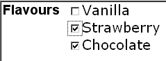
Example:
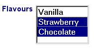
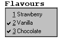
<select ref="my:flavors">
  <label>Flavors</label>
  <choices>
    <item>
      <label>Vanilla</label>
      <value>v</value>
    </item>
    <item>
      <label>Strawberry</label>
      <value>s</value>
    </item>
    <item>
      <label>Chocolate</label>
      <value>c</value>
    </item>
  </choices>
</select>
In the above example, more than one flavor can be selected.
A graphical browser might render form control
select as any of the following:
appearance="full" |
appearance="compact" |
appearance="minimal" |
|---|---|---|
|
|
|
Typically, a style sheet would be used to determine the exact
appearance of form controls, though a means is provided to suggest
an appearance through attribute appearance. The value
of the attribute consists of one of the following values:
"full": all choices should be rendered at all times.
"compact": a fixed number of choices should be rendered, with scrolling facilities as needed
"minimal": a minimum number of choices should be rendered, with a facility to temporarily render additional choices
Data Binding Restrictions: any simpleContent capable of holding
a sequence. The restriction to binding simpleContent exists when
the choices are authored as part of the user interface control as
shown in this section. Element itemset for creating
dynamic selections described in 8.2.3 The itemset Element
allows the available choices to be obtained from an XForms model,
and when using that construct, the data binding restriction to
simpleContent is relaxed.
Note:
A limitation of the XML Schema list datatypes is that whitespace
characters in the storage values (the value="..."
attribute of the item element) are always interpreted
as separators between individual data values. Therefore, authors
should avoid using whitespace characters within storage values with
list simpleContent.
<item>
  <value>United States of America</value>
  ...
</item>
When selected, this item would introduce not one but four additional selection values: "America", "of", "States", and "United".
Implementation Hints: An accessibility aid might allow the user to browse through the available choices and leverage the grouping of choices in the markup to provide enhanced navigation through long lists of choices.
8.1.11 The select1 Element
Description: This form control allows the user to make a single selection from multiple choices.
Common Attributes: Common, UI Common, Single Node Binding
Special Attributes:
- selection
-
Optional attribute determining whether free entry is allowed in the list.
- incremental
-
When
true, this form control will generatexforms-value-changingevents. The default for this form control istrue.
Example:
<select1 ref="my:flavor">
  <label>Flavor</label>
  <item>
    <label>Vanilla</label>
    <value>v</value>
  </item>
  <item>
    <label>Strawberry</label>
    <value>s</value>
  </item>
  <item>
    <label>Chocolate</label>
    <value>c</value>
  </item>
</select1>
In the above example, selecting one of the choices will result
in the associated value given by element value on the
selected item being set in the underlying data instance at the
location icecream/flavor.
A graphical browser might render this form control as any of the following:
| appearance="full" | appearance="compact" | appearance="minimal" |
|---|---|---|
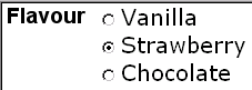
|
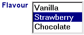
|
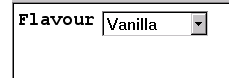 |
Data Binding Restrictions: Binds to any simpleContent. The
restriction to binding simpleContent exists when the choices are
authored as part of the user interface control as shown in this
section. Element itemset for creating dynamic
selections described in 8.2.3
The itemset Element allows the available choices to be
obtained from an XForms model, and when using that construct, the
data binding restriction to simpleContent is relaxed.
Implementation Requirements: The label for each choice must be
presented, allowing at all times exactly one selection. This form
control stores the value corresponding to the selected choice in
the location addressed by attribute ref. The value to
be stored is either directly specified as the contents of element
value, or specified indirectly through attribute
ref on element value.
Note that the datatype bound to this form control may include a
non-enumerated value space, e.g., xsd:string, or a
union of a enumeration and a non-enumerated datatype (called an
open enumeration). In this case, control select1 may
have attribute selection="open". The form control
should then allow free data entry, as described in 8.1.2 The input Element.
For closed selections:If the initial instance value matches the storage value of one of the given items, that item is selected. If there is no match, the first item is initially selected.
For open selections: If the initial instance value matches the
storage value specified by one of the items, the first such
matching item is selected. Otherwise, the selected value is the
initial lexical value. Free entry text is handled the same as form
control input 8.1.2
The input Element.
User interfaces may choose to render this form control as a
pulldown list or group of radio buttons, among other options. The
appearance attribute offers a hint as to which
rendering might be most appropriate, although any styling
information (such as CSS) should take precedence.
8.2 Common Markup for Selection Controls
8.2.1 The choices Element
This element is used within selection form controls to group
available choices. This provides the same functionality as element
optgroup in HTML.
Common Attributes: Common
8.2.2 The item Element
This element specifies the storage value and label to represent
an item in a list. It is found within elements select1
and select, or grouped in element
choices.
Common Attributes: Common
8.2.3 The itemset Element
This element provides repeat-like functionality for
lists, and is defined at 9.3.3 The itemset
Element.
8.2.4 The value Element
This element provides a storage value to be used when an
item is selected.
Common Attributes: Common, Single Node Binding
Data Binding Restriction: All lexical values must be valid according to the datatype bound to the selection control.
If inline content and a ref attribute are both
specified, the ref attribute is used.
8.3 Additional Elements
The child elements detailed below provide the ability to attach metadata to form controls.
Instead of supplying such metadata e.g., the label for a form
control as inline content of the contained element
label, the metadata can be pointed to by using a
simple linking attribute href on these elements.
Notice that systematic use of this feature can be exploited in
internationalizing XForms user interfaces by:
-
Factoring all human readable messages to a separate resource XML file.
-
Using URIs into this XML resource bundle within individual
labelelements -
Finally, an XForms implementation could use content negotiation to obtain the appropriate XML resource bundle, e.g., based on the
accept-languageheaders from the client, to serve up the user interface with messages localized to the client's locale.
8.3.1 The filename Element
This optional element provides a way for the upload
form control to insert a filename, when available, that represents
the chosen binary resource.
Common Attributes: Common, Single Node Binding
This specification does not define the format of a filename.
Example:
<upload ref="mail/attachment" mediatype="image/*">
  <label>Select an attachment</label>
  <filename ref="../filename"/>
  <mediatype ref="@type"/>
</upload>
In this example, the user is prompted to select an image of some
sort. The binary data of the image is placed under the element node
selected by "mail/attachment". The filename, perhaps "
/home/mdubinko/data/pictures/me.jpg", is placed under
the element node selected by "mail/filename", and the
mediatype, perhaps "image/jpeg" is placed under the
attribute node at "mail/attachment/@type".
8.3.2 The mediatype Element
This optional element provides a way for the upload
form control to insert a mediatype, when available, that represents
the chosen binary resource.
Common Attributes: Common, Single Node Binding
8.3.3 The label Element
This required element labels the containing form control with a descriptive label. Additionally, the label makes it possible for someone who can't see the form control to obtain a short description while navigating between form controls.
Common Attributes: Common, Single Node Binding
Special Attributes:
- Linking Attributes
-
Link to external label. If the link traversal fails, it is treated as an error (4.5.3 The xforms-link-error Event).
The label specified can exist in instance data, in a remote document, or as inline text. If more than one source of label is specified in this element, the order of precedence is: single node binding attributes, linking attributes, inline text.
An accessibility aid would typically speak the metadata encapsulated here when the containing form control gets focus.
8.3.4 The help Element
The optional element help provides a convenient way
to attach help information to a form control. This is equivalent to
a xforms:help event handler that responds with a
<message type="modeless">.
Common Attributes: Common, Single Node Binding
Special Attributes:
- Linking Attributes
-
Link to external help information. If the link traversal fails, it is treated as an error (4.5.3 The xforms-link-error Event).
The message specified can exist in instance data, in a remote document, or as inline text. If more than one source of message is specified in this element, the order of precedence is: single node binding attributes, linking attributes, inline text.
An example of this element is at 10.1.12 The message Element.
8.3.5 The hint Element
The optional element hint provides a convenient way
to attach hint information to a form control. This is equivalent to
a xforms:hint event handler that responds with a
<message type="ephemeral">.
Common Attributes: Common, Single Node Binding
Special Attributes:
- Linking Attributes
-
Link to external hint. If the link traversal fails, it is treated as an error (4.5.3 The xforms-link-error Event).
The message specified can exist in instance data, in a remote document, or as inline text. If more than one source of message is specified in this element, the order of precedence is: single node binding attributes, linking attributes, inline text.
An example of this element is at 10.1.12 The message Element.
8.3.6 The alert Element
The optional element alert provides a convenient
way to attach alert or error information to a form control.
Rendering of this element is implementation-defined.
Common Attributes: Common, Single Node Binding
Special Attributes:
- Linking Attributes
-
Link to external alert. If the link traversal fails, it is treated as an error (4.5.3 The xforms-link-error Event).
The message specified can exist at in instance data, in a remote document, or as inline text. If more than one source of message is specified in this element, the order of precedence is: single node binding attributes, linking attributes, inline text.