CSS3 module: Border
W3C Working Draft 7 November 2002
- This version:
- http://www.w3.org/TR/2002/WD-css3-border-20021107
- Latest version:
- http://www.w3.org/TR/css3-border
- Previous versions:
- none
- Editors:
- Tapas Roy (Openwave)
Copyright ©2002 W3C® (MIT, INRIA, Keio), All Rights Reserved. W3C liability, trademark, document use and software licensing rules apply.
CSS (Cascading Style Sheets) is a language for describing the rendering of structured documents (such as HTML and XML) on screen, on paper, in speech, etc. This draft describes the functionality that is proposed for CSS level 3 to describe borders, such as border styles, border colors and border images. It includes and extends the functionality of CSS level 2 [CSS2], which builds on CSS Level 1 [CSS1].
This document is a draft of one of the "modules" [CSS3-intro] for the upcoming CSS3 specification. It not only describes the border functionality that already exists in CSS1 and CSS2, but also proposes new functionality for CSS3 as well as for other languages that may need it.
This document is a working draft of the CSS working group which is part of the style activity (see summary).
Comments on, and discussions of this draft can be sent on the (archived) public mailing list www-style@w3.org (see instructions). W3C Members can also send comments directly to the CSS working group.
This is a working draft and may therefore be updated, replaced or rendered obsolete by other W3C documents at any time. It is inappropriate to use W3C Working Drafts as reference material or to cite them as other than "work in progress". Its publication does not imply endorsement by the W3C membership or the CSS Working Group (members only).
Patent disclosures relevant to CSS may be found on the Working Group's public patent disclosure page.
To find the latest version of this working draft, please follow the "Latest version" link above, or visit the list of W3C Technical Reports.
This document may be available in translations in the future. The English version of this specification is the only normative version.
Members of the CSS Working Group proposed during the Clamart meeting to modularize the CSS specification.
This modularization, and the externalization of the general syntax, of CSS will reduce the size of the specification and allow new types of specifications to use selectors and/or CSS general syntax.
This specification will contain its own test cases, one test per concept introduced in this document. These tests will not be conformance full tests but will be intended to provide users with a way to check if a part of this specification is implemented at least a minima or not or, on the contrary, not implemented at all.
| Name: | border-top-color , border-right-color, border-bottom-color, border-left-color |
| Value: | <color> |
| Initial: | the value of the 'color' property |
| Applies to: | all elements |
| Inherited: | no |
| Percentages: | N/A |
| Media: | visual |
| Computed value: | <color> |
| Name: | border-color |
| Value: | <border-color>{1,4} |
| Initial: | (see individual properties) |
| Applies to: | all elements |
| Inherited: | no |
| Percentages: | N/A |
| Media: | visual |
| Computed value: | see individual properties |
'Border-color' is a shorthand for the four 'border-*-color' properties.
When the border color is 'transparent', only the background is visible.
The background of the element extends into the border area. See the 'background' property.
| Name: | border-top-style , border-right-style, border-bottom-style, border-left-style |
| Value: | <border-style> |
| Initial: | none |
| Applies to: | all elements |
| Inherited: | no |
| Percentages: | N/A |
| Media: | visual |
| Computed value: | specified value |
| Name: | border-style |
| Value: | <border-style>{1,4} |
| Initial: | (see individual properties) |
| Applies to: | all elements |
| Inherited: | no |
| Percentages: | N/A |
| Media: | visual |
| Computed value: | see individual properties |
<border-style> is 'none | hidden | dotted | dashed | solid | double | dot-dash | dot-dot-dash | wave | groove | ridge | inset | outset', with the following meanings:
'Border-style' is a shorthand that sets the four 'border-*-style' properties.
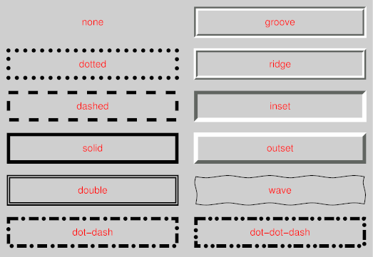
Note: There is no control over the spacing of the dots and dashes, nor over the length of the dashes. Implementations are encouraged to choose a spacing that makes the corners symmetrical.
Note: This specification does not define how borders of different styles should be joined in the corner. Also note that rounded corners may cause the corners and the contents to overlap, if the padding is less than the radius of the corner.
| Name: | border-top-right-radius, border-bottom-right-radius, border-bottom-left-radius, border-top-left-radius, border-radius |
| Value: | <length> <length>? |
| Initial: | 0 |
| Applies to: | all elements |
| Inherited: | no |
| Percentages: | N/A |
| Media: | visual |
| Computed value: | specified values |
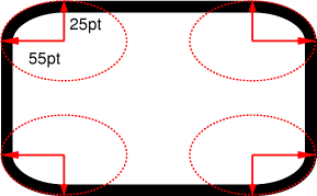
The two length values of the 'border-radius' properties define the radii of a quarter ellipse that defines the shape of the corner (see the diagram below). The first value is the horizontal radius (or vertical if the 'writing-mode' is vertical). If the second length is omitted it is equal to the first (and the corner is thus a quarter circle). If either length is zero, the corner is square, not rounded. The border radius also causes the element's background to be rounded (even if the border is 'none'). Negative values are not allowed.
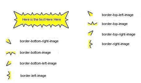
The border-image properties allow the author to assign images to borders. There are four groups of border image properties:
The border image properties override the border style properties.
The border image is specified as a URI, for two different groups:
| Name: | border-top-image , border-right-image, border-bottom-image, border-left-image |
| Value: | <uri> {1,3}| none | inherit |
| Initial: | none |
| Applies to: | all elements |
| Inherited: | no |
| Percentages: | N/A |
| Media: | visual |
| Computed value: | specified values |
| Name: | border-image |
| Value: | [<uri> | none] {1,4} | inherit |
| Initial: | none |
| Applies to: | all elements |
| Inherited: | no |
| Percentages: | N/A |
| Media: | visual |
| Computed value: | specified value |
'border-image' is a shorthand for 'border-top-image', 'border-right-image', 'border-bottom-image' and 'border-left-image' properties.
| Name: | border-top-left-image , border-top-right-image, border-bottom-right-image, border-bottom-left-image |
| Value: | <uri>| continue | none | inherit |
| Initial: | continue |
| Applies to: | all elements |
| Inherited: | no |
| Percentages: | N/A |
| Media: | visual |
| Computed value: | specified values |
| Name: | border-corner-image |
| Value: | [<uri> | continue] | [<uri> | continue] {1,4} | none | inherit |
| Initial: | continue |
| Applies to: | all elements |
| Inherited: | no |
| Percentages: | N/A |
| Media: | visual |
| Computed value: | specified value |
'border-corner-image' is a shorthand propery for 'border-top-left-image', 'border-top-right-image', 'border-bottom-right-image' and 'border-bottom-left-image' properties.
An example of doing border-image with eight images.
The border-fit properties determine if and how the border image(s) will tile. Meanings are as follows:
The border-fit properties are grouped into the 'border-fit-length' and the 'border-fit-width' properties. The 'border-fit-length' properties determine image handling in the border's length dimension, that is, horizontally for the top and bottom borders and vertically for the left and right borders. The 'border-fit-width' properties determine image handling in the border's width dimension, that is, vertically for the top and bottom borders and horizonatally for the left and right borders.
For the overwrite and overflow values of border-fit, the image may overflow into the content area, but it has to be clipped at the opposite edge of the content area.
| Name: | border-top-fit-length , border-right-fit-length, border-bottom-fit-length, border-left-fit-length, border-top-fit-width , border-right-fit-width, border-bottom-fit-width, border-left-fit-width |
| Value: | [clip | repeat | scale | stretch | overwrite | overflow | space ] {1,2} |
| Initial: | repeat |
| Applies to: | all elements |
| Inherited: | no |
| Percentages: | N/A |
| Media: | visual |
| Computed value: | specified values |
If the border-image property specified a center image, then the second value applies to that image. Otherwise, it is ignored.
| Name: | border-fit-length , border-fit-width |
| Value: | <border-fit>{1,4} |
| Initial: | repeat |
| Applies to: | all elements |
| Inherited: | no |
| Percentages: | N/A |
| Media: | visual |
| Computed value: | specified values |
| Name: | border-fit |
| Value: | <border-fit> <border-fit>? |
| Initial: | repeat |
| Applies to: | all elements |
| Inherited: | no |
| Percentages: | N/A |
| Media: | visual |
| Computed value: | specified values |
The second value in 'border-fit', if present, applies to the width. If there is only one value, it sets both border-fit-width and border-fit-length
| Name: | border-top-left-fit-length , border-top-right-fit-length, border-bottom-right-fit-length, border-bottoml-eft-fit-length, border-top-left-fit-width , border-top-right-fit-width, border-bottom-right-fit-width, border-bottom-left-fit-width |
| Value: | [clip | repeat | scale | stretch | overwrite | overflow | space ] {1,2} |
| Initial: | overwrite |
| Applies to: | all elements |
| Inherited: | no |
| Percentages: | N/A |
| Media: | visual |
| Computed value: | specified values |
These properties determines border corner image handling. If a second value is present, it applies to the horizontal dimension.
| Name: | border-corner-fit |
| Value: | <border-fit>| <border-fit> {2} | <border-fit>{4} |
| Initial: | overwrite |
| Applies to: | all elements |
| Inherited: | no |
| Percentages: | N/A |
| Media: | visual |
| Computed value: | specified values |
If one value is present in the 'border-corner-fit' shorthand property, it sets the border-corner-fit for all corners. If two values are present, the second value applies to the horizontal dimension. If four values are present, they set both dimensions for the top left, top right, bottom right, and bottom left corners respectively.
These properties are used to specify that an image on the corner is a transform of the border-top-left-image or the images on the edge is a transform of border-top-image and border-left-image.
The possible transforms on the corner images are:
The possible transforms on the edge images are:
| Name: | border-corner-image-transform |
| Value: | none | rotate | reflect |
| Initial: | none |
| Applies to: | all elements |
| Inherited: | no |
| Percentages: | N/A |
| Media: | visual |
| Computed value: | specified values |
| Name: | border-image-transform |
| Value: | none | rotate | reflect-xy | reflect-right | reflect-left |
| Initial: | none |
| Applies to: | all elements |
| Inherited: | no |
| Percentages: | N/A |
| Media: | visual |
| Computed value: | specified values |
| Name: | border-break |
| Value: | <border-style> |
| Initial: | none |
| Applies to: | elements with a border |
| Inherited: | yes |
| Percentages: | N/A |
| Media: | visual |
| Computed value: | specified value |
When a box that has a border is broken at a page break, column break, or, for inline elements, at a line break, a border can be inserted at the break, or the border can be left open. A border-style or a border-image will add padding and a border at the break, as if it was the normal end of the box. The value 'none' will not add padding or border at the break. The property has no effect if the border is absent.

| Name: | box-shadow |
| Value: | none | [ <length> <length> <length>? || <color> ] [ , <length> <length> <length>? || <color> ]+ |
| Initial: | none |
| Applies to: | all elements |
| Inherited: | no |
| Percentages: | N/A |
| Media: | visual |
| Computed value: | absolute values |
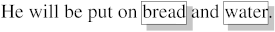
One or more drop-shadows can be attached to a box. They are drawn just outside the border. The property is a comma-separated list of shadows, each specified by 3 length values and a color. Omitted lengths are 0, omitted colors are equal to the computed value of the 'color' property.
Shadows do not influence the layout: they may overlap with other boxes. Like backgrounds and borders, if they overlap other boxes, they are drawn behind any text or replaced element.
The 3 lengths and the color of each shadow are interpreted as follows:
If an element has multiple boxes, all of them get drop shadows, but shadows are only drawn where borders would also be drawn, see 'border-break'. If the box has a non-zero border-radius', the shadow is rounded in the same way.
Here is an example of single words with a drop shadow. Assume the words were enclosed in <span> and the style rule was
span {border: thin solid; box-shadow: 0.2em 0.2em #CCC}
The result might look like this:
| Name: | 'border-top', 'border-right', 'border-bottom', 'border-left' |
| Value: | [ <border-width> || <border-style> || [<color> | transparent] || <uri>]| inherit |
| Initial: | See individual properties |
| Applies to: | all elements |
| Inherited: | no |
| Percentages: | N/A |
| Media: | visual |
| Computed value: | absolute values |
h1 { border-bottom: thick solid red url('lines.jpg')}
or
h1 { border-bottom: thick none transparent url('wavyredline.jpg') }
| Name: | 'border' |
| Value: | [ <border-width> || <border-style> || [<color> | transparent] || [<uri> <border-image-transform>?]] | inherit |
| Initial: | See individual properties |
| Applies to: | all elements |
| Inherited: | no |
| Percentages: | N/A |
| Media: | visual |
| Computed value: | absolute values |
For example, the first rule below is equivalent to the set of four rules shown after it:
p { border: solid red }
p {
  border-top: solid red;
  border-right: solid red;
  border-bottom: solid red;
  border-left: solid red
}
Since, to some extent, the properties have overlapping functionality, the order in which the rules are specified is important.
Consider this example:
blockquote {
  border-color: red;
  border-left: double;
  color: black
}
A Basic Profile of the border module includes support for the following properties:
This section will define conformance with the present specification only.
The inability of a user agent to implement part of this specification due to the limitations of a particular device does not imply non-conformance.
User agents must observe the rules for handling parsing errors.
This specification will contain a test suite allowing user agents to verify their basic conformance to the specification. This test suite does not pretend to be exhaustive and does not cover all possible combined cases of W3C background functionality.
The author would like to thank fantasai for providing the proposal for the border image properties. The author would like to thank Tantek Çelik for pointing out the need for border image transform properties.
| Property | Values | Initial | Applies to | Inh. | Percentages | Media |
|---|---|---|---|---|---|---|
| border-color border-top-color, border-right-color, border-bottom-color, border-left-color | <color> | the value of the 'color' property | all elements | no | N/A | visual |
| border-style border-top-style, border-right-style, border-bottom-style, border-left-style | <border-style> | none | all elements | no | N/A | visual |
| border-top-right-radius border-bottom-right-radius, border-bottom-left-radius, border-top-left-radius, border-radius | <length> <length>? | 0 | all elements | no | N/A | visual |
| border-top-image, border-right-image, border-bottom-color, border-left-image | <uri> {1,3}| none | inherit | none | all elements | no | N/A | visual |
| border-image | [<uri> | none] {1,4} | inherit | none | all elements | no | N/A | visual |
| border-top-left-image, border-top-right-image, border-bottom-right-color, border-bottom-left-image | <uri>| continue | none | inherit | continue | all elements | no | N/A | visual |
| border-corner-image | [<uri> | continue] | [<uri> | continue] {1,4} | none | inherit | none | all elements | no | N/A | visual |
| border-top-fit-length, border-right-fit-length, border-bottom-fit-length, border-left-fit-length border-top-fit-width, border-right-fit-width, border-bottom-fit-width, border-left-fit-width | [clip | repeat | scale | stretch | overwrite| overflow | space ] {1,2} | repeat | all elements | no | N/A | visual |
| border-fit-length border-fit-width | <border-fit>{1,4} | repeat | all elements | no | N/A | visual |
| border-fit | <border-fit> <border-fit>? | repeat | all elements | no | N/A | visual |
| border-top-left-fit-length, border-top-right-fit-length, border-bottom-right-fit-length, border-bottom-left-fit-length border-top-left-fit-width, border-top-right-fit-width, border-bottom-right-fit-width, border-bottom-left-fit-width | [clip | repeat | scale | stretch | overwrite| overflow | space ] {1,2} | overwrite | all elements | no | N/A | visual |
| border-corner-fit | <border-fit>| <border-fit> {2} | <border-fit>{4} | overwrite | all elements | no | N/A | visual |
| border-image-transform | none | rotate | reflect-xy | reflect-right | reflect-left | none | all elements | no | N/A | visual |
| border-break | <border-style> | none | elements with a border | yes | N/A | visual |
| box-shadow | none | [ <length> <length> <length>? || <color> ] [ , <length> <length> <length>? || <color> ]+ | none | all elements | no | N/A | visual |
| border-top, border-right, border-bottom, border-left | [ <border-width> || <border-style> || [<color> | transparent] || <uri>]| inherit | See individual properties | all elements | no | N/A | visual |
| border | [ <border-width> || <border-style> || [<color> | transparent] || [<uri> <border-image-transform>?]] | inherit | See individual properties | all elements | no | N/A | visual |
The following properties are defined in other modules: