7 Form Controls
7.1 Introduction
XForms User Interface controls, also called
form controls, are declared using
markup elements, and their behavior refined via markup attributes. This markup
may be further decorated with class attributes that can be set using
CSS stylesheets to deliver a customized look and feel. Form controls defined
here are bound to the underlying instance data using the
binding attributes as defined in the
chapter 5 The XForms Model.
Form controls enable accessibility by taking a uniform approach to such features as captions, help text, tabbing and keyboard shortcuts. Internationalization issues are addressed in conjunction with the Internationalization Working Group and are addressed by following the same design principles as within the rest of XHTML. All form controls defined here are suitable for implementation as Aural CSS (ACSS) form controls.
Form controls are as general and high-level as possible
without sacrificing the ability to deliver real implementations. For instance,
to select one or more items from a set, use the form controls
selectOne or selectMany, respectively. Form controls
distinguish the functional aspects of the underlying control, as well as
presentational aspects (through class attributes) and behavior
(through XForms Action elements). This separation enables the expression of the
meaning of a particular form control--see
[AUI97] for a definition of such high-level
user interaction primitives.
This chapter includes non-normative graphical examples of many form controls. The CSS Working Group is providing assistance with creating default CSS rules for producing visual renderings of standard form controls. This specification will also include non-normative rules for how these same controls might be rendered to alternative access modalities.
For each form control, the following aspects sections describe:
Description
Examples
Data Binding Restrictions
Implementation Hints
XML Representation
The form controls defined here use common attributes and elements that are defined later in this chapter (7.14 Common Markup ).
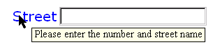
7.2 input
Description: This form control enables free-form data entry.
Examples:
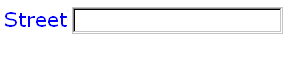
<input ref="order/shipTo/street" style="width:5cm; height:1.2cm">
  <caption>Street<caption>
  <hint>Please enter the number and street name</hint>
</input>
In the above, CSS style attributes (which are not defined in XForms but rather come from an external document type) specify the display size of the form control. Note that the constraints on how much text can be input are obtained from the underlying XForms Model definition and not from these display properties.
A graphical browser might render the above example as follows:
Data Binding Restrictions: The entered value of the form control (after processing as described in 11 Processing Model) is treated as a lexical value. Schema facets bound to this form control will be treated as a restriction upon the allowed entered value.
input>
<input
  (single node binding attributes)
  (common attributes)
>
  <!-- unordered: (caption, help?, hint?, alert?, action?) -->
</input>
(single node binding attributes) - Selection of instance data node, defined at 7.14.2 Single Node Binding Attributes
common attributes defined in 7.14.1 Common Attributes
7.3 textarea
Description: This form control enables free-form data entry and is intended for use in entering multiline content, e.g., the body of an email message.
| Editorial note | |
Control textarea has been added since we felt that the
semantic distinction between single line entry from multiline entry e.g.,
entering an email address vs typing an email message was significant and
amounted to more than just a presentational issue. We welcome comments on this
approach.
|
|
Examples:
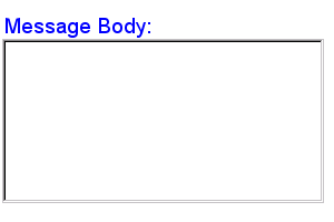
<textarea ref="message/body" style="width:8cm; height:5cm">
  <caption>Message Body:<caption>
  <hint>Enter the text of your message here</hint>
</textarea>
In the above, CSS style attributes (which are not defined in XForms but rather come from an external document type) specify the display size of the form control. Note that the constraints on how much text can be input are obtained from the underlying XForms Model definition and not from these display properties.
A graphical browser might render the above example as follows:
Data Binding Restrictions: The entered value of the form control (after processing as described in 11 Processing Model) is treated as a lexical value. Schema facets bound to this form control will be treated as a restriction upon the allowed entered value.
textarea>
<textarea
  (single node binding attributes)
  (common attributes)
>
  <!-- unordered: (caption, help?, hint?, alert?, action?) -->
</textarea>
(single node binding attributes) - Selection of instance data node, defined at 7.14.2 Single Node Binding Attributes
common attributes defined in 7.14.1 Common Attributes
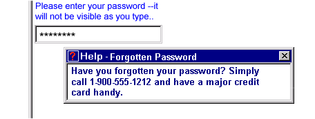
7.4 secret
Description: This form control is used for obtaining information that is considered sensitive, and thus not echoed to a visual or aural display as it is being entered, e.g., password entry.
Example:
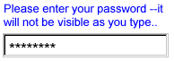
<secret ref="/login/password">
  <caption>Please enter your password --it will not be visible as you type.<caption>
</secret>
A graphical browser might render this form control as follows:
Data Binding Restrictions: Identical to input.
Implementation Hints: In general, implementations, including accessibility aids, would render a "*" or similar character instead of the actual characters entered, and thus would not render the entered value of this form control. Note that this provides only a casual level of security; truly sensitive information will require additional security measures outside the scope of XForms.
secret>
<secret
  (single node binding attributes)
  (common attributes)
>
  <!-- unordered: (caption, help?, hint?, alert?, action?) -->
</secret>
(single node binding attributes) - Selection of instance data node, defined at 7.14.2 Single Node Binding Attributes
common attributes defined in 7.14.1 Common Attributes
7.5 output
Description: This form control renders a value from the instance data, but
provides no means for entering or changing data. It is
typically used to display values from the instance, and is treated as display:inline for purposes of layout.
Example:
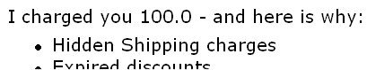
I charged you
<output ref="order/totalPrice"/>
and here is why:
A graphical browser might render an output form control as follows:
Data Binding Restrictions: The lexical value of the datatype bound to this
form control (or the result of
theformatexpression, if present) is displayed, after
processing as described in11 Processing Model.
Implementation Hints: An audio browser might apply properties to this form control to aurally highlight the displayed value to provide audio formatted output.
output>
<output
  id = xsd:ID
  (single node binding attributes)
  format = formatting-expression
>
  <!-- empty content -->
</output>
id = xsd:ID - Optional unique identifier used for linking.
(single node binding attributes) - Selection of instance data node, defined at 7.14.2 Single Node Binding Attributes
format = formatting-expression - Optional XPath format specifier
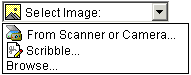
7.6 upload
Description: This form control enables the common feature found on Web sites to upload a file from the local file system, as well as accepting input from various devices including microphones, pens, and digital cameras.
Example:
<upload ref="mail/attach1" mediaType="image/*">
  <caption>Select image:</caption>
</upload>
A graphical browser might render this form control as follows:
Data Binding Restrictions: This form control can only be bound to datatypes xsd:base64Binary or xsd:hexBinary, or types derived by restriction from these.
Implementation Hints:
-
Implementations with a file system SHOULD support "file upload"--selecting a specific file, for all mediaTypes. The types of files presented by default MUST reflect the mediaType specified in the XForms Model, for example defaulting to only audio file types in the file dialog when the mediaType is "audio/*". In XForms 1.0, there is a 1:1 binding between a upload form control and one of the
xform:binarydatatypes, although that single file may be compound (e.g. application/zip). -
Implementations with specific pen/digitizer hardware SHOULD (and implementations with other pointing devices MAY) support "scribble"--allowing in-place creation of pen-based PNG image data, when the mediaType is "image/*" or "image/png". Other mediaTypes besides image/png MAY share this input method.
Note:
Commonly, people have trouble drawing recognizable figures or signatures with a conventional pointing device like a mouse or track ball. Hence, a reasonable implementation of XForms might not want this feature, hence the "MAY" here for generic pointing devices
-
Implementations with specific audio recording capabilities SHOULD support record--in-place recording of an audio clip, when the mediaType is "audio/*" or "audio/basic". Other mediaTypes besides "audio/basic" MAY share this input method.
-
Implementations with a digital camera/scanner interface SHOULD support send image--in-place upload of images from an attached device, when the mediaType is "image/*" or "image/jpeg". Other mediaTypes besides "image/jpeg" MAY share this input method.
-
Implementations with video recording capability SHOULD provide a "record" option for video/* mediaTypes.
-
Implementations with 3d capabilities SHOULD provide a 3d interface option for model/* mediaTypes.
-
Implementations MAY provide proprietary implementations (for example, a mediaType of text/rtf could invoke an edit window with a proprietary word processing application)
-
Implementations are encouraged to support other input devices not mentioned here.
upload>
<upload
  (single node binding attributes)
  (common attributes)
  mediaType = list of content types
>
  <!-- unordered: (caption, help?, hint?, alert?, action?) -->
</upload>
(single node binding attributes) - Selection of instance data node, defined at 7.14.2 Single Node Binding Attributes
common attributes defined in 7.14.1 Common Attributes
mediaType = list of media types - list of suggested media types, used by the XForms Processor to determine which input methods apply.
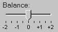
7.7 range
Description: This form control allows selection from a continuous range of values.
Example:
<range ref="/stats/balance" start="-2.0" end="2.0" stepSize="0.5">
  <caption>Balance:</caption>
</range>
A graphical browser might render this as follows:
Data Binding Restrictions: Only datatypes which represent a continuous range
where it is possible to express a difference value can be bound to this form
control. (For instance, xsd:decimal would be fine, while xsd:string would not). In terms of Schema datatypes, the datatype must be
either 1) have a total order relationship, or 2) an overall partial order
relationship, but totally ordered within the range specified between
thestart and end attributes.
Should an enumeration be allowed to bind to this form control? If yes, how should it be ordered?
Implementation Hints: In graphical environments, this form control would typically be rendered as a "slider" or "volume control".
Notice that the attributes of this element encapsulate sufficient metadata that in conjunction with the type information available from the XForms Model proves sufficient to produce meaningful prompts when using modalities like speech, e.g., when using an accessibility aid. Thus, an Aural CSS enabled user agent might speak a prompt of the form Please pick a date in the range January 1, 2001 through December 31, 2001.
range>
<range
  (single node binding attributes)
  (common attributes)
  start = datavalue
  end = datavalue
  stepSize = datavalue-difference
>
  <!-- unordered: (caption, help?, hint?, alert?, action?) -->
</range>
(single node binding attributes) - Selection of instance data node, defined at 7.14.2 Single Node Binding Attributes
common attributes defined in 7.14.1 Common Attributes
start = datavalue - Lexical starting bound for the range, of the same datatype bound to the form control
end = datavalue - Lexical ending bound for the range, of the same datatype bound to the form control
stepSize = datatype-difference - Prefered step-size to use for incrementing or decrementing the value within the form control, of a datatype that can express the difference between two values of the datatype bound to the form control
7.8 submit
Description: This form control submits all or part of the instance data to which it is bound.
Example:
<submit xform="timecard">
  <caption>Submit</caption>
</submit>
Implementation Hints: The default handling for this controls is equivalent
to the submitInstance XForms Action.
submit>
<submit
  (nodeset binding attributes)
  (common attributes)
>
  <!-- unordered: (caption, help?, hint?, alert?, action?) -->
</submit>
(nodeset binding attributes) - Selection of instance data for submit, defined at 7.14.3 Nodeset Binding Attributes
common attributes defined in 7.14.1 Common Attributes
7.9 button
Description: This form control is similar to the XHTML element of the same name and allows for user-triggered actions. This form control may also be used to advantage in realizing other custom form controls.
Example:
<button>
  <caption>Click here</caption>
</button>
Data Binding Restrictions:
Note:
Binding a model item has no direct effect on a button, but provides a context for any event handlers that are attached.
Implementation Hints: Graphical implementations would typically render this form control as a push-button.
button>
<button
  (single node binding attributes)
  (common attributes)
>
  <!-- unordered: (caption, help?, hint?, alert?, action?) -->
</button>
(single node binding attributes) - Selection of instance data node, defined at 7.14.2 Single Node Binding Attributes
common attributes defined in 7.14.1 Common Attributes
7.10 selectBoolean
Description: This form control represents an on/off or true/false or yes/no (or similar) choice.
Example:
<selectBoolean ref="questionnaire/married">
  <caption>Are you married?</caption>
  <help>We need this to determine your tax allowance</help>
  <true>Married</true>
  <false>Single</false>
</selectBoolean>
Data Binding Restrictions: This form control produces only two possible
lexical values: true or false. To be considered valid, the datatype bound to this
form control must be of type xsd:boolean. It is left to the rendering user agent to
decide whether to display this control as a single button/checkbox or as a pair
of mutually exclusive buttons.
Note:
Scenarios where the desired lexical value is anything other than
'true'/'false' are not suitable for the selectBoolean form control. For example, if the values placed into the instance data
were required to be either "male" or "female", the selectOne form control should be used instead.
Implementation Hints: Visual implementations would typically render this as
a checkbox. In some cases, like the above example or in aural environments, it
may be helpful to provide labels for the respective choices. This is
accomplished through true and false child
elements, which can contain display values.
selectBoolean>
<selectBoolean
  (single node binding attributes)
  (common attributes)
  selectUI = ("radioGroup" | "checkboxGroup" )
>
  <!-- unordered: (caption, help?, hint?, alert?, action?, true?, false?) -->
</selectBoolean>
(single node binding attributes) - Selection of instance data node, defined at 7.14.2 Single Node Binding Attributes
common attributes defined in 7.14.1 Common Attributes
selectUI = (TBD)
7.11 selectOne
Description: This form control allows the user to make a single selection from multiple choices.
Typically, a stylesheet would be used to determine the exact appearance of form controls, though a means is provided to suggest an appearance through an attribute. The value of the attribute consists of one of the following values, each of which may have a platform-specific look and feel:
radioGroup
checkboxGroup
pulldown
listbox
combo
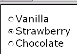
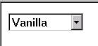
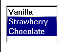
Example:
<selectOne ref="icecream/flavor">
  <caption>Flavor</caption>
  <choices>
    <item value="vanilla"><caption>Vanilla</caption></item>
    <item value="strawberry"><caption>Strawberry</caption></item>
    <item value="chocolate"><caption>Chocolate</caption></item>
  </choices>
</selectOne>
In the above example, selecting one of the choices will result in the
associated value given by attribute value on the selected
item being set in the underlying data instance at the location icecream/flavor. The values given in the user interface shown above may be
used in constructing a default schema if no schema is provided by the XForms
author.
A graphical browser might render this form control as any of the following:
| listbox | checkboxGroup | radioGroup | pulldown |
|---|---|---|---|
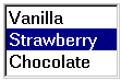
|
|
|
|
Data Binding Restrictions: This form control stores the storage
value corresponding to the selected choice at the location pointed to by
attribute ref. If the list of choices uses item elements to
list the choices, this storage value is found as the lexical value of
attributevalue of the selected item element; if the list of
choices uses element itemref then the storage value is found at the
location pointed to by the XPath value found as the value of
attributeref of the selected itemref element. If the
datatype of the location being populated by this form control does not permit
the selected value (for instance a datatype of xsd:decimal with an attribute value="abc"), the form control with that selection will be perpetually considered
invalid and it will not be possible to submit the form. Authors are encouraged
to avoid this situation.
If the datatype bound to this form control includes a non-enumerated value
space (for instance xsd:string, or xsd:string as part of a union), or if the "combo" UI hint is specified, the form
control then should allow free data entry, as described in7.2 input, in addition to the behavior defined here.
Some user interface combinations may allow a state of zero selected items, in which case the lexical value of a zero-length string is selected.
Implementation Hints: User interfaces may choose to render this form control as a pulldown list or group of radio buttons, among other options. The selectUI attribute offers a hint as to which rendering might be most appropriate, although any styling information (such as CSS) should take precedence.
selectOne>
<selectOne
  (single node binding attributes)
  (common attributes)
  selectUI = ("radioGroup" | "checkboxGroup" | "pulldown" | "listbox" | "combo")
>
  <!-- unordered: (caption, help?, hint?, alert?, action?, choices?) -->
</selectOne>
(single node binding attributes) - Selection of instance data node, defined at 7.14.2 Single Node Binding Attributes
common attributes defined in 7.14.1 Common Attributes
selectUI = ("radioGroup" | "checkboxGroup" | "pulldown" | "listbox" | "combo") - appearance override
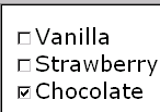
7.12 selectMany
Description: This form control allows the user to make multiple selections from a set of choices.
Example:
<selectMany ref="icecream/flavors">
  <caption>Flavors</caption>
  <choices>
    <item value="v"><caption>Vanilla</caption></item>
    <item value="s"><caption>Strawberry</caption></item>
    <item value="c"><caption>Chocolate</caption></item>
  </choices>
</selectMany>
In the above example, more than one flavor can be selected.
A graphical browser might render form control selectMany as any of
the following:
| listbox | checkboxGroup | radioGroup | pulldown |
|---|---|---|---|
|
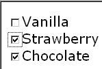
|
This configuration is not recommended. | N/A |
Data Binding Restrictions: The portion of the instance bound to by this form control must be capable of holding multiple selections, i.e. it must be a schema list type, (in which case the selected values are stored as a space separated list ) or an XML element capable of holding the selected choices as child elements. When no item is selected, the instance contains an empty list.
Note:
A limitation of the Schema list datatypes is that whitespace characters in
the storage values (the value="..." attribute of the item element) are always interpreted as
separators between individual data values. Therefore, authors should avoid
using whitespace characters within storage values with list
simpleTypes.
For instance, the following incorrect item declaration:
<item value="United States of America">...</item>
when selected, would introduce not one but four additional selection values: "America", "of", "States", and "United".
Implementation Hints: An accessibility aid might allow the user to browse through the available choices and leverage the grouping of choices in the markup to provide enhanced navigation through long lists of choices.
selectMany>
<selectMany
  (single node binding attributes)
  (common attributes)
  selectUI = ("radioGroup" | "checkboxGroup" | "pulldown" | "listbox" | "comboGroup")
>
  <!-- unordered: (caption, help?, hint?, alert?, action?, choices?) -->
</selectMany>
(single node binding attributes) - Selection of instance data node, defined at 7.14.2 Single Node Binding Attributes
common attributes defined in 7.14.1 Common Attributes
selectUI = ("radioGroup" | "checkboxGroup" | "pulldown" | "listbox" | "comboGroup") - appearance override
7.13 Common Markup
forselectOneand selectMany
7.13.1 item
This element is used within the selection form controls to represent a single item of the list, where the following conditions apply:
There is no XForms Model available
Or there is an XForms Model available, but the available choices are hard to address e.g., an enumeration facet from a schema type.
Notice that in the case where item is used, the storage
value is a string represented by the attribute value; as a
consequence, using item inside the selection controls described here
restricts the underlying data type that is being populated to a space separated
list of tokens.
item>
<item
  id = xsd:ID
  value = lexical-representation
>
  <!-- unordered: (caption, help?, hint?, alert?, action?) -->
</item>
id = xsd:ID - optional unique identifier.
value = lexical-representation - the "storage value" for the item, to be placed in the instance data when this item is chosen.
7.13.2 itemref
This element is used within the selection form controls to represent a single item of the list, where the following conditions apply:
There is an XForms Model available
And the author wishes to point at a node in an instancetree where the choice is stored. This element is also used when authoring forms where the available choices are only known at runtime.
Notice that in the case where element itemref is used,
thestorage value does not have the limitations that exist when
using element item.
Note:
Form authors should be aware that instance data selected by is directly
placed into the instance data. For example selecting an element node with /node makes the entire node element the storage value, while an expression
such as /node/text() selects just the text content. Combinations that produce mixed content
in the instance data are forbidden.
itemref>
<itemref
  id = xsd:ID
  ref = xpath-expression
>
  <!-- unordered: (caption, help?, hint?, alert?, action?) -->
</itemref>
id = xsd:ID - optional unique identifier.
ref = xpath-expression - XPath locator of the the "storage value" for the item, to be placed in the instance data when this item is chosen.
7.13.3 choices
This element is used within selection form controls to group items. This
provides the same functionality as element optgroup in HTML 4.
choices>
<choices
  id = xsd:IDREF
>
  <!-- (item | itemref | choices)+ -->
</choices>
id = xsd:ID - optional unique identifier.
7.14 Common Markup
The preceding form control definitions make reference to several child elements and attributes that are common to several of the form controls. This section defines these common markup components.
7.14.1 Common Attributes
The following attributes are common to many user-interface related XForms elements.
xml:lang = xsd:language
id = xsd:ID
class = space separated list of classes
navIndex = xsd:nonNegativeInteger : 0
accessKey = xsd:token
xml:lang = xsd:language - Optional standard XML attribute to specify a human language for this element.
id = xsd:ID - Optional unique identifier used for linking.
class = space separated list of classes - Optional selector for a style rule.
navIndex = xsd:nonNegativeInteger : 0 - Optional attribute is a non-negative integer in the range of 0-32767 used to define the navigation sequence. This gives the author control over the sequence in which form controls are traversed. The default navigation order is specified in the chapter 11 Processing Model.
accessKey = xsd:string - Optional attribute defines a shortcut for moving the input focus directly to a particular form control. The value of this is typically a single character which when pressed together with a platform specific modifier key (e.g. the alt key) results in the focus being set to this form control.
CSS properties for controlling the look and feel of XForms form controls are being defined in conjunction with the CSS Working Group. The CSS Working Group has agreed to help us develop a default CSS stylesheet capable of producing the sample default renderings illustrated in this working draft. The results of the above will be used to document the use of CSS properties within XForms user interface elements for the final version of the XForms specification.
7.14.2 Single Node Binding Attributes
The following attributes define a binding between a form control an a single node. The 'first node' rule is applied to the node-set that the XPath expression returns.
ref = binding-expression
xform = xsd:IDREF
bind = xsd:IDREF
ref = binding-expression - Binding expression. Details in the chapter 5 The XForms Model. The first-node rule applies to the nodeset selected here.
xform = xsd:IDREF - Optional instance data selector. Details in the chapter 5 The XForms Model.
bind = xsd:IDREF - Optional reference to a bind element
Note:
Behavior is undefined if the xform idref value refers to an id
not on anxform element, or if the bind idref value refers
to an id not on a bind element.
7.14.3 Nodeset Binding Attributes
The following attributes define a binding between a form control an a node-set, which is returned by the XPath expression.
nodeset = binding-expression
xform = xsd:IDREF
bind = xsd:IDREF
nodeset = binding-expression - Binding expression. Details in the chapter 5 The XForms Model.
xform = xsd:IDREF - Optional instance data selector. Details in the chapter 5 The XForms Model.
bind = xsd:IDREF - Optional reference to a bind element
Note:
Behavior is undefined if the xform idref value refers to an id
not on anxform element, or if the bind idref value refers
to an id not on a bind element.
7.14.4 Common Child Elements
The child elements detailed below provide the ability to attach human-readable metadata to form controls.
Instead of supplying such metadata e.g., the label for a form control, as
inline content of the contained element caption, the metadata can be
pointed to by using a simple XLink attribute xlink:href on these
elements. Notice that systematic use of this feature can be exploited in
internationalizing XForms user interfaces by:
-
Factoring all human readable messages to a separate resource XML file.
-
Using URIs into this XML resource bundle within individual caption elements
-
Finally, an XForms processor can use content negotiation to obtain the appropriate XML resource bundle, e.g., based on the
accept-languageheaders from the client, to serve up the user interface with messages localized to the client's locale.
7.14.4.1 caption
The required element caption labels the containing form control
with a descriptive label. Additionally, the caption makes it possible for
someone who can't see the form control to obtain a short description while
navigating between form controls.
caption>
<caption
  (common attributes)
>
  <!-- mixed content -->
</caption>
(common attributes) - defined in 7.14.1 Common Attributes
An accessibility aid would typically speak the metadata encapsulated here when the containing form control gets focus.
7.14.4.2 help
The optional element help provides a longer description that will
help users understand how to fill out this form control. The help text
will be shown only on request.
help>
<help
  (common attributes)
>
  <!-- mixed content -->
</help>
(common attributes) - defined in 7.14.1 Common Attributes
A graphical browser might render help as follows:
An accessibility aid might speak this information upon request.
7.14.4.3 hint
The optional element hint provides a short hint for the user,
typically represented as a tooltip by graphical user agents. The tooltip text
will normally be shown when the user remains on the form control for more than
a certain length of time. Accessibility aids might render such tooltips using
speech. This element is optional, and its content model is mixed.
hint>
<hint
  (common attributes)
>
  <!-- mixed content -->
</hint>
(common attributes) - defined in 7.14.1 Common Attributes
A graphical browser might render hints as follows:
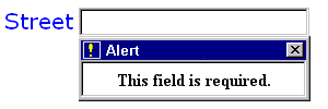
7.14.4.4 alert
Optional element alert encapsulates an explanatory message to be
displayed if the data bound to by the containing form control becomes
invalid.
alert>
<alert
  (common attributes)
>
  <!-- mixed content -->
</alert>
(common attributes) - defined in 7.14.1 Common Attributes
A graphical browser might render alert as follows:
An accessibility aid might speak this information when the validation error occurs, and make the message available for later perusal.
7.14.4.5 action
This element can be used to bind XForms Actionsto form controls. Details on XForms events can be found in the chapter11 Processing Model.
action>
<action
  id = xsd:ID
  evt:event = event-name
>
  <!-- Action handlers -->
</action>
This element declares an event listener by specifying the event to handle and the event handler to invoke.