
Copyright © 1999 W3C (MIT, INRIA, Keio), All Rights Reserved. W3C liability, trademark, document use and software licensing rules apply.
This is a W3C Working Draft for review by W3C members and other interested parties. It is a draft document and may be updated, replaced, or obsoleted by other documents at any time. The Internationalization Working Group (members only) will not allow early implementation to constrain its ability to make changes to this specification prior to final release. It is inappropriate to use W3C Working Drafts as reference material or to cite them as other than "work in progress". A list of current W3C working drafts can be found at http://www.w3.org/TR.
This document has been produced as part of the W3C Internationalization Activity and is related to the Style Activity. Since this proposal predates the efforts on the part of the XSL and CSS&FP groups (members only) to create a common formatting model, it focuses on CSS [CSS2] only. It is however the intention of all the groups involved for the model presented in this document and the model being developed by the XSL group to converge. The end result of this convergence is expected to form part of the common formatting model which will be expressed in both the CSS [CSS2] and XSL [XSL] syntaxes. Please send comments and questions regarding this document to i18n-editor@w3.org (archived for W3C members). Comments in languages other than English, in particular Japanese, are also welcome.
The HyperText Markup Language (HTML) is a simple markup language used to create hypertext documents that are portable from one platform to another. HTML documents are SGML documents with generic semantics that are appropriate for representing information from a wide range of applications. CSS is a style sheets language that can be applied to HTML to control the style of a document: which fonts and colors to use, how much white space to insert, etc. The following specification extends CSS to support East Asian and Bi-directional text formatting. Familiarity with both CSS 2 [CSS2] and HTML 4.0 [HTML4] is assumed.
International typography contains types of formatting that are not yet exposed in the existing web standards and thus impossible to achieve on the web without using special workarounds or graphics.
This document introduces a number of new CSS properties to represent such formatting. For example, the features this proposal covers include two of the most important features for East Asian typography: vertical layout flow and layout grid.
There is a number of illustrations in this document for which the following legend is used:
 - fullwidth character (e.g. Han) which is the n-th
character in the text run
- fullwidth character (e.g. Han) which is the n-th
character in the text run
 - non-fullwidth non-cursive character (e.g. Roman) which is the n-th
character in the text run
- non-fullwidth non-cursive character (e.g. Roman) which is the n-th
character in the text run
 - cursive (or RTL) character (e.g. Arabic) which
is the n-th character in the text run
- cursive (or RTL) character (e.g. Arabic) which
is the n-th character in the text run
The orientation which the above symbols assume in the diagrams corresponds to the orientation that the glyphs they represent are intended to assume when rendered in the UA. Spacing between these characters in the diagrams is usually symbolic, unless intentionally changed to make a point.
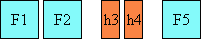
Most Latin based documents use a simple horizontal left-to-right text layout flow in which the next line always appears below the previous one. The example below shows three lines of mixed text in regular horizontal layout flow mode available to web authors today:

Figure 2.1.1: Mixed text in horizontal layout
Unfortunately HTML and CSS today provide support only for the above layout scenario. There are several others, however, which are especially important in East Asian documents. They are discussed in the following sections.
Value: horizontal | vertical | vertical-ideographic | horizontal-ideographic
Initial: horizontal
Applies to: all elements
Inherited: yes
Percentage values: N/A
This property sets the layout flow for the element. It is valid on all elements. Possible values:
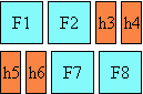
Figure 2.2.1: Mixed characters in horizontal layout
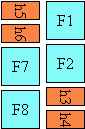

Figure 2.2.2: Mixed text in vertical-ideographic layout
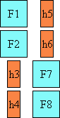
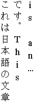
Figure 2.2.3: Mixed characters in vertical layout
The diagrams below illustrate character flow in this mode. They assume that the halfwidth characters' directionality is LTR. The second diagram is a real world example of this layout:
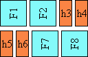
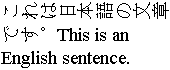
Figure 2.2.4: Mixed characters in horizontal-ideographic layout
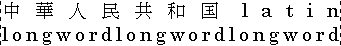
In East Asian documents, it is often preferred to display certain Latin-based strings, such as numerals in a year, always in a horizontal layout flow regardless of the flow mode of the line of text these strings appear in, as in:

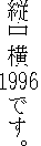
Figure 2.3.1: Horizontal in vertical (a.k.a "Tate-chu-yoko")
This effect is known as "Tate chu yoko". In order to achieve it, the Latin string should be enclosed within a SPAN element with a 'layout-flow: horizontal' setting in CSS, as in:
<span STYLE="layout-flow: horizontal">1996</span>
Also, line breaking is normally disabled for such runs of text. This can be accomplished using the CSS "white-space: nowrap" setting [CSS2].
The different layout flows discussed in the preceding sections determine the text flow independently of the inherent directionality of the content characters. This means that, unless special formatting is applied to them, Hebrew and Arabic characters will be read from right to left in a horizontal layout flow and bottom to top in the 'vertical-ideographic' layout flow.
The dir attribute will affect the base direction of the element that it is applied to, but will not affect the line to line flow. For example, an element with a 'vertical' (not 'vertical-ideographic') layout flow and an RTL direction will flow top to bottom and left to right. Worth mentioning is the case of Mongolian, related to Right to Left writing systems, that would use the vertical layout flow mode as its normal rendering mode. Blocks of Latin text in Mongolian context would have 'vertical-ideographic' applied to them directly.
Insofar, it has been assumed that ideographs have an inherent LTR directionality, and they are treated as such by the Unicode bi-directional algorithm. However it may be desirable to show ideographs flowing in arbitrary direction as this is found frequently in Asian writing systems. This may be achieved by mixing the layout flow modes, the dir attribute and the BDO element. For example, encapsulating ideographs with a <BDO dir="rtl"> in a horizontal flow will make them flow right to left and top to bottom. A case could also be made of creating other layout flow modes to capture additional writing systems usage.
Since CSS was originally designed with only horizontal layout in mind, special care needs to be taken in determining the proper interaction between the proposed vertical text model and both the existing CSS as well as the CSS addressed in this specification, when addressing layout flows other than horizontal. The behavior of several CSS properties needs to be revisited in the vertical layout context.
The 'vertical-align' property setting should be ignored entirely on text where 'layout-flow' is 'vertical' or 'vertical-ideographic'.
The position of the underline, controlled by the 'text-decoration' property, varies depending on the layout flow and the language of the text it is applied to. In Japanese, the underline appears on the right side of the column of vertical text. In Traditional and Simplified Chinese, however, the underline appears on the left side of the column. (See figure 2.5.1)
For the implications of vertical layout for ruby text positioning, see the table below (Figure 2.5.1) as well as 'ruby-position'.
For its implications for emphasis marks and their interaction with underline, see 'font-emphasize-position' as well as the table below (Figure 2.5.1).
The table below summarizes the underline, emphasis and ruby text positioning in vertical layout.
| Language | Underline | Emphasis | Ruby |
| Japanese | right | right | right |
| Chinese (Traditional) | left | right | right |
| Chinese (Simplified) | left | left | right |
Figure 2.5.1: Underline, emphasis and ruby position in vertical layout depending on the language
It is very common for the characters in documents written in East Asian languages, such as Chinese or Japanese, to be laid out on the page according to a specified one- or two-dimensional grid. The concept of grid can also be used in other, non-ideographic contexts such as Braille or monospaced layout.
The diagram below represents a fragment of horizontal text on a page with mixed fullwidth and halfwidth characters that a Japanese user intended to be laid out on a grid which resulted in 9 characters per line (gray grid lines shown for clarity):
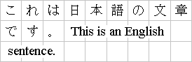
Figure 3.1.1: 'Genko' grid applied to mixed text
The grid affects not only the placement of the characters, but it can also modify the behavior of several other layout-related behaviors, such as indent size, margins or paragraph alignment.
One can distinguish between three types of grid: a strict one, used mostly in Chinese, but also occasionally in Japanese (a.k.a. "genko"), a loose one, frequently used in Japanese and sometimes in Korean, as well as a fixed one, potentially useful for non-ideographic text, such as Braille or mono-spaced layout in general.
The grid type entails a set of layout rules that determine how much flexibility the UA is allowed to have when laying out a line of text.
Different grids can be defined for different parts of the document.
The grid can be selectively disabled in either dimension on fragments of text.
Line grid can be disabled for individual paragraphs. If line grid is disabled for a paragraph, the lines of the paragraph are laid out just as if no line grid were specified. The characters in a paragraph with line grid disabled still follow the character grid, if one is specified.
The CSS model described in this section exposes the necessary grid parameters the author needs to control.
Value: loose | strict | fixed
Initial: loose
Applies to: block-level elements
Inherited: yes
Percentage values: N/A
Specifies the type of grid to use. Each grid type entails a different set of rules for rendering contents when a grid is enabled and specified. Possible values:
The diagram below illustrates this type of grid:
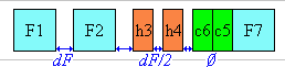
Figure 3.2.1: Spacing increment distribution in loose grid. dF represents the amount of spacing applied between fullwidth characters. In the loose grid context, that amount is set by 'layout-grid-char'.

Figure 3.2.2: Loose grid applied to mixed text
In this mode, if only wide characters or exact halfwidth characters (like some katakana characters) are used, the result may effectively look like a strict grid. However, since all other width adjustments are active (text justification, character width adjustment, text autospace, etc), the end result is typically a loosely aligned grid layout.
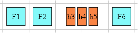
Figure 3.2.3: Mixed character layout in strict grid
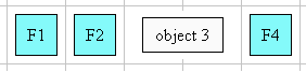
Figure 3.2.4: Object layout in strict grid
The strict mode disables all special text justification and character width adjustment normally applied to the contents of the element.
If a line break opportunity cannot be found in a text run going over the line boundary, then that text run will be pushed down to the next line and the last part of the previous line will be left blank.
Here is an example of mixed text in strict grid:
Figure 3.2.5: Strict grid applied to mixed text
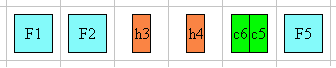
Figure 3.2.6: Mixed character layout in fixed grid
For example:
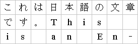
Figure 3.2.7: Fixed grid applied to mixed text
Value: none | auto | <length> | <percentage>
Initial: none
Applies to: block-level elements
Inherited: yes
Percentage values: relative to element height
This property sets the line grid value for an element. If the text layout flow of the element is horizontal, this property can be thought of as the "vertical" grid size or grid height. In other words, it always determines the line spacing increment, regardless of the layout flow mode. Its effect is visually somewhat similar to the effect of applying a 'line-height' value to an element. The following table shows the mapping between each of the 'layout-flow' values and the meaning of the 'layout-grid-line' property:
| 'layout-flow' | Meaning of 'layout-grid-line' |
| horizontal | vertical height of grid space |
| vertical | horizontal width of grid space |
| vertical-ideographic | horizontal width of grid space |
| horizontal-ideographic | vertical width of grid space |
Figure 3.3.1: Mapping between 'layout-flow' and the interpretations of 'layout-grid-line'
Note that in order for this property to have an effect, 'layout-grid-mode' must be set to 'line' or 'both'.
When this property is set to anything other than 'none', a line of text is vertically centered within the grid row and baseline-aligned by default. If the line contains a character or an object that is taller than the grid space, then the whole line is centered within the smallest number of grid rows necessary for its tallest object to fit in. This is illustrated below, where a represents the numerical 'layout-grid-line' value:
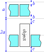
Figure 3.3.2: Layout of contents within line grid, where a represents the layout-grid-line value
Possible values:
The following markup:
DIV.section1 { layout-grid-line: .5in }
would make each line of text in a horizontally (including '-ideographic') laid out section of a document to be rendered within 0.5 inch of vertical space. It is also equivalent to having a line-height of 0.5 in, as shown below:
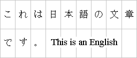
Figure 3.3.3: Enlarged line grid applied to mixed text in horizontal layout
If the section's layout flow is vertical (including '-ideographic'), then 0.5in is the width of each column of vertical text. This time, the 0.5in value applies to the 'width' of each cell:
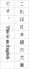
Figure 3.3.4: Enlarged line grid applied to mixed text in vertical-ideographic layout
If the author preferred a specific number of lines (20 for example) to appear in an element, he would use a percentage value:
DIV.section1 { layout-grid-line: 5% }
Value: none | auto | <length> | <percentage>
Initial: none
Applies to: block-level elements
Inherited: yes
Percentage values: relative to element width
This property affects the dimension perpendicular to that controlled by 'layout-grid-line'. It controls the character (or "horizontal", if in horizontal layout) grid size for an element if the 'layout-grid-type' property is set to 'strict' or 'fixed'. However, if 'layout-grid-type is 'loose', then this property sets the size of the increment added to each fullwidth character, and, indirectly, of that added to each halfwidth character, as per the description in the specification of 'layout-grid-type'. Its effect in 'loose' grid is somewhat similar to the effect of the 'letter-spacing' property.
Note that in order for this property to have an effect, 'layout-grid-mode' must be set to 'char' or 'both'.
Possible values:
DIV.section1 { layout-grid-char: .5in }
would make each character in a horizontally laid out part of a document rendered within 0.5 inch of horizontal space:
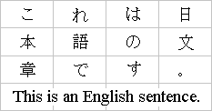
Figure 3.4.1: Enlarged character grid applied to mixed text in horizontal layout
If the section's layout flow is vertical, then 0.5in becomes the vertical distance between consecutive characters in a column:
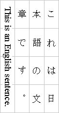
Figure 3.4.2: Enlarged character grid applied to mixed text in vertical-ideographic layout
If the author preferred a specific number of characters (5 for example) to appear in a line, he would set the character grid to a percentage value:
DIV.section1 { layout-grid-char: 20% }
Value: none | line | char | both
Initial: both
Applies to: all elements
Inherited: yes
Percentage values: N/A
This property selectively enables or disables the two dimensions of the grid. Possible values:
Value: none | [<mode> || <type> || [<line> [<char>]? ]
]
Initial: not defined for shorthand properties
Applies to: all elements
Inherited: yes
Percentage values: allowed on <char> and <line>
The 'layout-grid' property is a shorthand property for setting 'layout-grid-mode', 'layout-grid-type', 'layout-grid-line' and 'layout-grid-char' at the same time in the style sheet. Using the value 'none' on the shorthand property sets the 'layout-grid-mode' to 'none'. Using the value "none none" sets both the 'layout-grid-mode' and 'layout-grid-line' to 'none', and using the value "none none none" sets the previous properties as well as 'layout-grid-char' to 'none'.
The first numerical, percentage or 'auto' value specified sets 'layout-grid-line'. If a second numerical, percentage or 'auto' value is present, it sets 'layout-grid-char'. For example:
DIV.section1 { layout-grid: both strict .5in 20% }
The 'layout-grid' property above is set to have the 'layout-grid-type' set to 'strict', 'layout-grid-mode' to 'both', 'layout-grid-line' to 0.5in and the 'layout-grid-char' to 20% of the parent width.
Notes:
{ layout-grid: both loose none none }
as derived from the initial values of the contained properties. The 'none' values make the grid inactive. Setting any other values on the 'layout-grid-line' or 'layout-grid-char' will make the grid active in either or both of these modes.
DIV.section1 { layout-grid: strict line .5in 20% }
the 20% 'layout-grid-char' setting will not be active. However changing 'layout-grid-mode' later to either 'both' or 'char' would make it active. This amount of control is very useful for scenarios in which the same grid dimensions are used across the entire document, but the various dimensions are occasionally selectively disabled or enabled for fragments of text.
The existence of a grid in an element makes it possible and very useful to express various measurements in that element in terms of grid units. Grid units are used very frequently in East Asian typography, especially for the left, right, top and bottom element margins.
Therefore a new length unit is necessary: gd to enable the author to specify the various measurements in terms of the grid.
For example, consider the following style:
P { layout-grid: strict both 20pt 15pt; margin: 1gd 3gd 1gd 2gd }
This way, all P elements would effectively acquire a 15pt top margin, a 60pt right margin, a 15pt bottom margin and a 40pt left margin.
If no grid is specified, the gd unit should be treated the same as the em unit.
In documents written in Latin-based languages, where runs of characters make up words and words are separated by spaces or hyphens, line breaking is relatively simple. In the most general case, (assuming no hyphenation dictionary is available to the UA), a line break can occur only at whitespace characters or hyphens.
In ideographic typography, however, where what appears as a single glyph can represent an entire word and no spaces nor any other word separating characters are needed, a line breaking opportunity is not as obvious as a space. It can occur after or before many other characters. Certain line breaking restrictions still apply, but they are not as strict as they are in Latin typography.
(As a side note, Thai is another interesting example with its own special line breaking rules. Since Thai words are made up of runs of characters, it resembles Latin in that respect. But the lack of spaces as word delimiters, or in fact any consistent word delimiters, makes it similar to CJK. Thai, like Latin in the absence of a hyphenating dictionary, never breaks inside of words. In fact, a knowledge of the vocabulary is necessary to be able to correctly break a line of Thai text.)
A number of levels of line-breaking "strictness" can be used in Japanese typography. These levels add or remove line breaking restrictions. The model presented in this specification distinguishes between two most commonly used line breaking levels for Japanese text, using the 'line-break' property.
In ideographic typography, it is also possible, though not always preferred, to allow line breaks to occur inside of quoted Latin and Hangul (Korean) words without following the line breaking rules of those particular scripts. The model proposed in this document gives the author control over that behavior through the 'word-break' property.
Value: normal | strict
Initial: normal
Applies to: all elements
Inherited: yes
Percentage values: N/A
This property selects the set of line breaking rules to be used for text. The values described below are especially useful to CJK authors, but the property itself is open to other, not yet specified settings for non-CJK authors as well. (This is an area for future expansion.)
In Japanese, a set of line breaking restrictions is referred to as "Kinsoku". JIS X-4051 [JIS] is a popular source of reference for this behavior using the strict set of rules. This architecture involves character classification into line breaking behavior classes. Those classes are then analyzed in a two dimensional behavior table where each row-column position represents a pair action to be taken at the occurrence of these classes. For example, given a closing character class and an opening character class, the intersection in that table of these two classes (the first character belonging to the opening class and the second belonging to the closing class) will indicate no line breaking opportunity.
Note that both values, 'normal' and 'strict' imply that a set of line-breaking restrictions is in use. In fact, there appears to be no valid line breaking mode in CJK in which line breaks can appear just anywhere among ideographs.
Value: normal | break-all | keep-all
Initial: normal
Applies to: block-level elements
Inherited: yes
Percentage values: N/A
This property controls line-breaking behavior inside of words. The values described below are especially useful to Korean authors, but the property itself is open to further, not yet specified settings for non-CJK authors. Possible values:
P.anywordbreaks { word-break: break-all }
Value: auto | inter-word | inter-ideograph | distribute | distribute-all-lines
| newspaper
Initial: auto
Applies to: block-level elements
Inherited: yes
Percentage values: N/A
This property selects the type of justify alignment. It affects the text layout only if 'text-align' is set to 'justify'. That way, UA's that do not support this property will still render the text as fully justified, which most of the time is at least partially correct.
The possible values are:
The diagram below illustrates this mode, by showing how the characters are laid out in the last two lines of an element:
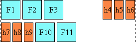
Figure 5.1.1: Mixed character layout in the last two lines in an inter-word justified element
For example a viewer could render an 'inter-word' justified paragraph in the following way:
Figure 5.1.2: Inter-word justification applied to mixed text
The diagram below illustrates this mode:
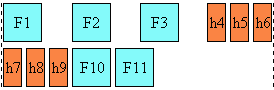
Figure 5.1.3: Mixed character layout in the last two lines in an inter-ideograph justified element
Below is an example of how this mode would work:
Figure 5.1.4: Inter-ideograph justification applied to mixed text
The diagram below illustrates this mode:
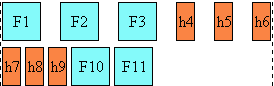
Figure 5.1.5: Mixed character layout in the last two lines of a distribute justified element
For example a viewer could render a 'distribute' justified paragraph in the following way:
Figure 5.1.6: Distribute justification applied to mixed text
The diagram below illustrates this mode:
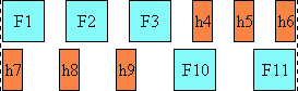
Figure 5.1.7: Mixed character layout in the last two lines of a distribute-all-lines justified element
For example a viewer could render a 'distribute-all-lines' justified paragraph in the following way:
Figure 5.1.8: Distribute-all-lines justification applied to mixed text
The diagram below illustrates this mode:
Figure 5.1.9: Mixed character layout in the last two lines of a newspaper justified element
Value: none | punctuation | punct-and-kana
Initial: punctuation
Applies to: block-level elements
Inherited: yes
Percentage values: N/A
This sets the individual font blank space compression permissions for the text justification algorithm, when 'text-justify' is anything other than 'inter-word'. This special type of space compression occurs on the font level, i.e. the blank space within the character area itself may be reduced without affecting the appearance of the glyph. This applies to full-width characters only. Possible values:
Figure 5.2.1: Character layout with no compression
Figure 5.2.2: Character layout with punctuation compression
Figure 5.2.3: Character layout with punctuation and Kana compression
Value: <percentage>
Initial: 0%
Applies to: block-level elements
Inherited: yes
Percentage values: as described
This property determines the minimum percentage of the text area width to be used for distribution among the "elongation opportunities" in Arabic text, when one of the justification modes is selected. Each elongation can be accomplished using a number of kashida characters or a single graphic, if the UA is capable of creating such a graphic. (The font itself determines the exact appearance of the kashida)
The UA is free to determine whether spaces inside of Latin text should be treated as elongation opportunities as well (and elongated using blank space) or not.
In the diagram below showing two identical paragraphs of Arabic text, the blue line in the second line (not justified) shows the length that is allocated for kashida and divided among the elongation opportunities in the first line (justified), as indicated by the red underlines:
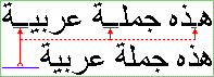
Figure 5.3.1: Kashida applied to Arabic text
Value: simple | hanging
Initial: simple
Applies to: block-level elements
Inherited: yes
Percentage values: N/A
This property determines whether a punctuation mark, if one is present, can be placed in the margin area at the end of a full line of text, or not. This is a common setting in East Asian typography.
Possible values:

Figure 6.1.1: No hanging punctuation allowed (the punctuation and the character preceding it shown in blue for clarity)
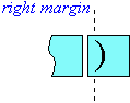
Figure 6.1.2: Hanging punctuation
Here is an example:
Figure 6.1.3: Hanging punctuation appearing in the margin area (the punctuation and the character preceding it shown in blue for clarity)
(Note that this property may in the future be expanded to cover other punctuation behaviors behaviors for other types of punctuation as well, not just full-width).
Value: none | leading
Initial: none
Applies to: block-level elements
Inherited: yes
Percentage values: N/A
This property determines whether or not a fullwidth punctuation mark character should be trimmed if it appears at the beginning of a line, so that its "ink" lines up with the first character in the line above and below. In some scenarios, it may be preferable for the author not to allow leading punctuation marks to be trimmed, for example when it is more important that the characters tend to line up vertically. In other scenarios such an effect is desirable, for example when it is more important for the author that as much text as possible fits on a single line.
Possible values:

Figure 6.2.1: Character layout with no leading punctuation compression

Figure 6.2.2: Character layout with leading punctuation compression
(Note that this property may in the future be expanded to cover other punctuation behaviors for other types of punctuation as well, not just full-width.)
Value: none | letters | lines
Initial: none
Applies to: all elements
Inherited: no
Percentage values: N/A
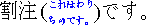
This property controls the creation of composite characters (a.k.a. "kumimoji") or lines (a.k.a. "warichu").
Possible values:
No more than 5 characters can be combined at a time. If more than five are included inside of the element with this property setting, only the first five should be combined. The rest should be rendered as regular text. The following texts shows the arrangement for 2, 3, 4 and 5 characters:
Figure 6.3.1: The valid "Kumimoji" arrangements
The following markup:
SPAN.kumimoji { text-combine: letters }
could make the following 4 characters appear as one (shown in blue for clarity):
Figure 6.3.2: "Kumimoji" applied to four characters
Figure 6.3.3: Character layout in "Warichu"
The following markup:
SPAN.warichu { text-combine: lines }
would make the enclosed text look like the following (shown in blue for clarity):
Figure 6.3.4: "Warichu" applied to 10 characters
Note that "warichu" is allowed to break across lines, though the exact algorithm to accomplish that can be non-trivial. Also, Warichu text is usually enclosed within parentheses. Those parentheses are inserted by the author.
Value: none | accent | dot | circle | disc
Initial: none
Applies to: all elements
Inherited: yes
Percentage values: N/A
This property sets the style for the emphasis formatting applied to text. East Asian documents use the following symbols on top of each character to emphasize a run of text: an 'accent' symbol, a 'dot', a hollow 'circle', or a solid 'disc'.
For example:
Figure 6.4.1: Accent emphasis (shown in blue for clarity) applied to Japanese text
Note, that unlike 'text-decoration', this property can affect the line height. Furthermore the emphasis style should be distinguished from the text-decoration which is another method to 'emphasize' text content.
Value: above | below
Initial: above
Applies to: all elements
Inherited: yes
Percentage values: N/A
This property sets the position of the emphasis symbols. They can appear either 'above' or 'below' the emphasized run of horizontal text. 'Above' and 'below' should be understood as relative to the line baseline.
In Japanese for example, the preferred position is 'above' when in horizontal layout:
Figure 6.5.1: Emphasis (shown in blue for clarity) applied above a fragment of Japanese text
In Chinese used in the PRC, on the other hand, the preferred position is 'below' when in horizontal layout:
Figure 6.5.1: Emphasis (shown in blue for clarity) applied below a fragment of Chinese text
The table below summarizes the preferred emphasis mark position in horizontal layout depending on the language:
| Language | Preferred emphasis position when horizontal |
| Japanese | above |
| Chinese (Traditional) | above |
| Chinese (Simplified) | below |
Figure 6.5.2: Underline, emphasis and ruby position in vertical layout depending on the language
In a vertical layout flow, if the position is set to 'above' then the emphasis marks should appear on the right side of the vertical text column. If the position is set to 'below', then the emphasis should appear the the left side of the column. (See figure 2.5.1)
Value: <style> || <position>
Initial: not defined for shorthand properties
Applies to: all elements
Inherited: yes
Percentage values: N/A
This property is shorthand for 'font-emphasize-style' and 'font-emphasize-position'.
Value: none | [ideograph-numeric || ideograph-alpha || ideograph-space ||
ideograph-parenthesis]
Initial: none
Applies to: all elements
Inherited: yes
Percentage values: N/A
When a run of non-ideographic or numeric characters appears inside of ideographic text, a certain amount of space is often preferred on both sides of the non-ideographic text to separate it from the surrounding ideographic characters. This property controls the creation of that space when rendering the text. That added width does not correspond to the insertion of additional space characters, but instead to the width increment of existing characters.
(A commonly used algorithm for determining this behavior is specified in JIS X-4051 [JIS].)
This property is additive with the 'word-spacing' and 'letter-spacing' [CSS2] properties, that is, the amount of spacing contributed by the 'letter-spacing' setting (if any) is added to the spacing created by 'text-autospace'. The same applies to 'word-spacing'.
Possible values:
<SPAN style="text-autospace:none">[ideographs]1997[ideographs]</SPAN>
would appear as:
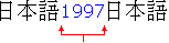
Figure 6.7.1: Mixed character layout when autospace is disabled
while:
<span STYLE="text-autospace:ideograph-numeric">[ideographs]1997[ideographs]</span>
would appear more like:
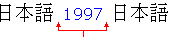
Figure 6.7.2: Mixed character layout when autospace is enabled
Value: auto | <length>
Initial: auto
Applies to: inline elements
Inherited: no
Percentage values: relative to line width
This property controls the amount of space a run of text is to fill or fit into. If the specified amount is greater than that required by the text, the characters are evenly distributed across that space. If the specified amount is less than that required by the text, the glyphs are scaled horizontally so as to make the text fit within the specified space.
The value 'auto' indicates that no special fill/fit behavior is to take place.
span.fitinseven { text-fit: 7em }
would cause a word to be rendered in the space of 7 'm' characters by adding inter-letter spacing.
This is a placeholder.
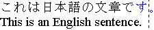
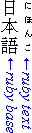
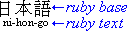
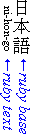
"Ruby" is the commonly used name for a run of text that appears in the immediate vicinity of another run of text, referred to as the "base", and serves as an annotation or a pronunciation guide associated with that run of text. Ruby, as used in Japanese, is described in JIS X-4051 [JIS]. The ruby structure and the HTML markup to represent it is described in the Ruby specification [RUBY]. This section describes the CSS properties relevant to ruby.
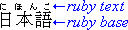
Figure 8.1.1: Labeled example of ruby used in Japanese
In a UA that supports ruby, the ruby structure consists of three boxes. The outermost container is the ruby [RUBY] element itself. It is a container for two non-overlapping boxes: the ruby text box and the ruby base box. The positioning of these two boxes relative to each other is controlled by 'ruby-position'.
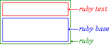
Figure 8.2.1: Ruby box model
The width of the ruby box is by default determined by its widest child element, whose width in turn is determined by its content. Both of ruby's children assume the width of the widest one of them. In this respect, the ruby box is much like a two-cell table element, with the following exceptions:
If the ruby text is not allowed to overhang anything, then the ruby behaves like a traditional box, i.e. only its contents are rendered within its boundaries and adjacent elements do not cross the box boundary:
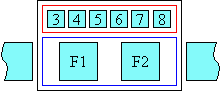
Figure 8.2.2: Ruby whose text is not allowed to overhang adjacent text
However, if ruby text is allowed to overhang adjacent elements and it happens to be wider than its base, then the adjacent content is partially rendered within the area of the ruby base box, while the ruby text may be partially overlapping with the upper blank parts of the adjacent content:
Figure 8.2.3: Ruby whose text is allowed to overhang adjacent text
Ruby text from one base can never overhang another ruby base.
The alignment of the contents of the base or the ruby text is not affected by the overhanging behavior. The alignment is achieved the same way regardless of the overhang behavior setting and it is computed before the space available for overlap is determined. It is controlled by the 'ruby-align' property.
The exact circumstances in which the ruby text will overhang other elements, and to what degree it will do so, will be controlled by ruby CSS properties.
This entire logic applies the same way in vertical ideographic layout, only the dimension in which it works in such a layout is vertical, instead of horizontal.
Note that the ruby text box may appear above or below the ruby base in horizontal layout, and on the left or on the right in vertical layout.
Value: above | below | inline
Initial: above
Applies to: ruby element
Inherited: yes
Percentage values: N/A
This property is used on the ruby [RUBY] element to control the position of the ruby text with respect to its base. Possible values:

Figure 8.3.1: Top ruby in horizontal layout applied to Japanese text
If the base appears in a vertical-ideographic layout mode, the ruby appears on the right side of the base and is rendered in the same layout mode as the base (i.e. vertical-ideographic).

Figure 8.3.2: Top ruby in vertical ideographic layout applied to Japanese text
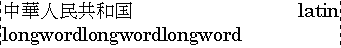
Note the special case of traditional Chinese as used especially in Taiwan: ruby (made of Bopomofo characters) in that context can appear along the right side of the base character, as if the text were in vertical layout, but the bases themselves are rendered on a horizontal line, since the actual layout is horizontal:
Figure 8.3.3: "Bopomofo" ruby in traditional Chinese (ruby text shown in blue for clarity) in horizontal layout
In order to achieve that effect, vertical-ideographic layout should be set on each individual ruby. That can be accomplished with the following simple CSS rule:
ruby.bopomofo { layout-flow: vertical-ideographic }
Figure 8.3.4: Markup to achieve Taiwanese-style ruby in horizontal layout
If the UA is capable of displaying ruby text above the base, then it must not display the contents of the rp element [ruby] when 'ruby-position' is set to 'above'.

Figure 8.3.5: Bottom ruby in horizontal layout applied to Japanese text
If the base appears in a vertical-ideographic layout mode, the bottom ruby appears on the left side of the base and is rendered in the same layout mode as the base (i.e. vertical-ideographic).

Figure 8.3.6: Top ruby in vertical ideographic layout applied to Japanese text
ruby { ruby-position: inline }
when applied to the following content:
<ruby>AAA<rp>(<rt>aaa<rp>)</ruby>
will be displayed as:
AAA(aaa)
Figure 8.3.7: Inline ruby markup and its result
Value: auto | left | center | right | distribute-letter | distribute-space |
line-edge
Initial: auto
Applies to: all elements
Inherited: yes
Percentage values: N/A
This property can be used on any element to control the text alignment of the ruby text and ruby base contents relative to each other. It applies to all the ruby's in the element. The alignment is applied to the ruby child element whose content is shorter: either the rb or the rt [RUBY]. Possible values:
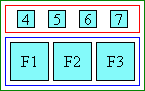

Figure 8.4.1: Fullwidth text in 'auto' ruby alignment is 'distribute-space' justified
The recommended behavior for a halfwidth character ruby is to be aligned in the 'center' mode.
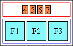
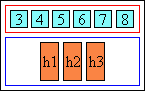
Figure 8.4.2: Halfwidth ruby text in 'auto' ruby alignment is centered
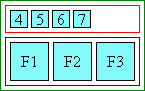

Figure 8.4.3: Left ruby alignment
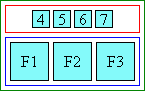
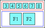
Figure 8.4.4: Center ruby alignment
Figure 8.4.5: Right ruby alignment
Figure 8.4.6: Distribute-letter ruby alignment
Figure 8.4.7: Distribute-space ruby alignment
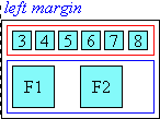
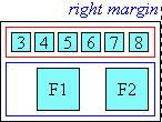
Figure 8.4.8: Line edge ruby alignment
Value: auto | start | end | none
Initial: auto
Applies to: ruby element
Inherited: yes
Percentage values: N/A
This property determines whether, and on which side, ruby text is allowed to partially overhang any adjacent text in addition to its own base, when the ruby text is wider than the ruby base. Note that ruby text is never allowed to overhang characters belonging to another ruby base. Also the UA is free to assume a maximum amount by which ruby text may overhang adjacent text. The UA may use the [JIS] recommendation of using one ruby text character length as the maximum overhang length.
Possible values:
Figure 8.5.1: Ruby overhanging adjacent text
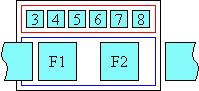
Figure 8.5.2: Ruby overhanging preceding text only
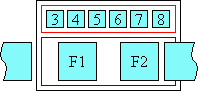
Figure 8.5.3: Ruby overhanging following text only
Figure 8.5.4: Ruby not allowed to overhang adjacent text
Value: ruby-text | ruby-base | ...
These two new values are added to the existing 'display' property to represent the rt and rb [RUBY] elements respectively. That way any element (e.g. SPAN) could be made to behave as ruby via CSS.
This specification would not have been possible without the help from:
Ayman Aldahleh, Bert Bos, Stephen Deach, Martin Dürst, Laurie Anna Edlund, Ben Errez, Yaniv Feinberg, Arye Gittelman, Richard Ishida, Koji Ishii, Masayasu Ishikawa, Michael Jochimsen, Eric LeVine, Chris Pratley, Rahul Sonnad, Frank Tang, Chris Thrasher, Masafumi Yabe, Steve Zilles.
| Section | Change |
|---|---|
| 1. Introduction |
|
| 2.2 'layout-flow' |
|
| 2.5 Relationship with other CSS |
|
| 4.2 line-break |
|
| 4.3 word-break |
|
| 6.1 punctuation-wrap |
|
| 6.2 punctuation-trim |
|
| 6.5 font-emphasize-position |
|
| 6.7 text-autospace |
|
| 8.2 Ruby box model |
|
| 8.3 'ruby-position' |
|
| 8.5 'ruby-overhang' |
|
| 9. Glossary |
|