In some cases, authors may want user agents to render content
that does not come from the document
tree. One familiar example of this is a numbered list; the author
does not want to list the numbers explicitly, he or she wants the
user agent to generate them automatically. Similarly, authors
may want the user agent to insert the word
"Figure" before the caption of a figure, or "Chapter 7" before the
seventh chapter title. For audio or braille in particular, user agents
should be able to insert these strings.
In CSS2, content may be generated by several mechanisms:
Below we describe the mechanisms associated with the 'content' property.
Authors specify the style and location of generated content with
the :before and :after pseudo-elements. As their names indicate, the
:before and :after pseudo-elements specify the location of content
before and after an element's document
tree content. The 'content'
property, in conjunction with these pseudo-elements, specifies what is
inserted.
Example(s):
For example, the following rule inserts the string "Note: "
before the content of
every P element whose "class" attribute has the value "note":
P.note:before { content: "Note: " }
The formatting objects (e.g., boxes) generated by an element include
generated content. So, for example, changing the above style sheet
to:
P.note:before { content: "Note: " }
P.note        { border: solid green }
would cause a solid green border to be rendered around the entire
paragraph, including the initial string.
The :before and :after pseudo-elements inherit any inheritable properties
from the element in the document tree to which they are attached.
Example(s):
For example, the following rules insert an open quote mark before every
Q element. The color of the quote mark will be red, but the font will
be the same as the font of the rest of the Q element:
Q:before {
  content: open-quote;
  color: red
}
In a :before or :after pseudo-element declaration, non-inherited
properties take their initial
values.
Example(s):
So, for example, because the initial value of the 'display' property is 'inline', the
quote in the previous example is inserted as an inline box (i.e.,
on the same line as the element's initial text content).
The next example explicitly sets the
'display' property to
'block', so that the inserted text becomes a block:
BODY:after {
    content: "The End";
    display: block;
    margin-top: 2em;
    text-align: center;
}
Note that an audio user agent would speak the words "The End" after
rendering the rest of the BODY content.
User agents must ignore the following properties with :before and
:after pseudo-elements: 'position', 'float', list
properties, and table properties.
The :before and :after pseudo-elements elements allow
values of the 'display'
property as follows:
- If the subject of the
selector is a block-level
element, allowed values are 'none', 'inline', 'block', and 'marker'.
If the value of the 'display'
has any other value, the pseudo-element will behave as if the value
were 'block'.
- If the subject of the
selector is an inline-level
element, allowed values are 'none' and 'inline'.
If the value of the 'display'
has any other value, the pseudo-element will behave as if the value
were 'inline'.
Note. Other values may be permitted in
future levels of CSS.
-
'content'
-
| Value: | [ <string> | <uri> | <counter> | attr(X) | open-quote | close-quote
| no-open-quote | no-close-quote ]+ | inherit
|
| Initial: | empty string
|
| Applies to: | :before and :after pseudo-elements
|
| Inherited: | no
|
| Percentages: | N/A
|
| Media: | all
|
This property is used with the :before and :after pseudo-elements
to generate content in a document. Values have the following
meanings:
- <string>
- Text content
(see the section on strings).
- <uri>
- The value is a URI that designates an external resource.
If a user agent cannot support the resource because of the
media types it supports, it must ignore the resource.
Note. CSS2 offers no
mechanism to change the size of the embedded object, or to provide a
textual description, like the "alt" or "longdesc" attributes do for
images in HTML. This may change in future levels of CSS.
- <counter>
- Counters may be specified
with two different functions: 'counter()' or 'counters()'.
The former has two forms:
'counter(name)' or 'counter(name,
style)'.
The generated text is the value of the named
counter at this point in the formatting structure; it
is formatted in the indicated
style ('decimal' by default).
The latter function also has two forms:
'counter(name, string)' or 'counter(name,
string, style)'. The generated text is the value of all
counters with the given name at this point in the formatting structure,
separated by the specified string. The counters are rendered
in the indicated style ('decimal' by default).
See the section on automatic counters and
numbering for more information.
- open-quote and
close-quote
- These values are replaced by the appropriate string
from the 'quotes' property.
- no-open-quote
and no-close-quote
- Inserts nothing (the empty string), but increments (decrements)
the level of nesting for quotes.
- attr(X)
- This function returns as a string the value of attribute X
for the subject of the selector. The
string is not parsed by the CSS processor. If the subject of the selector
doesn't have an attribute X, an empty string is returned. The
case-sensitivity of attribute names depends on the document language.
Note. In CSS2, it is not possible to refer to
attribute values for other elements of the selector.
The 'display' property
controls whether the content is placed in a block, inline, or marker
box.
Authors should put 'content'
declarations in @media rules when
the content is media-sensitive. For instance, literal
text may be used for any media group, but images only
apply to the visual + bitmap media groups, and sound files only
apply to the aural media group.
Example(s):
The following rule causes a sound file to be played
at the end of a quotation (see the section
on aural style sheets for additional
mechanisms):
@media aural {
   BLOCKQUOTE:after { content: url("beautiful-music.wav") }
   }
Example(s):
The next rule inserts the text of the HTML "alt" attribute before the
image. If the image is not displayed, the reader will still see the
"alt" text.
IMG:before { content: attr(alt) }
Authors may include newlines in the generated content by writing
the "\A" escape sequence in one of the strings after the 'content' property. This inserts a
forced line
break, similar to the BR element in HTML. See "Strings" and "Characters and case" for
more information on the "\A" escape sequence.
Example(s):
H1:before {
    display: block;
    text-align: center;
    content: "chapter\A hoofdstuk\A chapitre"
}
Generated content does not alter the document tree. In particular, it
is not fed back to the document language processor (e.g., for
reparsing).
Note. In future levels of CSS, the 'content' property may accept
additional values, allowing it to vary the style of pieces
of the generated
content, but in CSS2, all the content of the :before or :after
pseudo-element has the same style.
The following cases can occur:
- A 'run-in' or 'compact' element has a :before
pseudo-element of type 'inline': the pseudo-element is taken
into account when the size of the element's box is computed (for 'compact')
and is rendered inside the same block box as the element.
- A 'run-in' or 'compact' element has an :after
pseudo-element of type 'inline': The rules of the previous
point apply.
- A 'run-in' or 'compact' element has a :before
pseudo-element of type 'block': the pseudo-element is
formatted as a block above the element, and does not take part in the
computation of the element's size (for 'compact').
- A 'run-in' or 'compact' element has an :after
pseudo-element of type 'block': both the element and its
:after pseudo-element are formatted as block boxes. The element
is not formatted as an inline box in its own :after
pseudo-element.
- The element following a 'run-in' or 'compact' element has
a :before of type 'block': the decision how to format the
'run-in'/'compact' element is made with respect to the block box
resulting from the :before pseudo-element.
- The element following a 'run-in' or 'compact' element has
an :before of type 'inline': the decision how to format the
'run-in'/'compact' element depends on the 'display' value of the element to which
the :before is attached.
Example(s):
Here is an example of a 'run-in' header with an :after
pseudo-element, followed by a paragraph with a :before pseudo-element. All
pseudo-elements are inline (the default) in this example. When the
style sheet:
H3 { display: run-in }
H3:after { content: ": " }
P:before { content: "... " }
is applied to this source document:
<H3>Centaurs</H3>
<P>have hoofs
<P>have a tail
The visual formatting will resemble:
Centaurs: ... have hoofs
... have a tail
In CSS2, authors may specify, in a style-sensitive and
context-dependent manner, how user agents should render quotation
marks. The 'quotes' property
specifies pairs of quotation marks for each level of embedded
quotation. The 'content'
property gives access to those quotation marks and causes them to be
inserted before and after a quotation.
This property specifies quotation marks for any number of embedded
quotations. Values have the following meanings:
- none
- The 'open-quote' and 'close-quote' values of the
'content' property
produce no quotations marks.
- [<string>
<string>]+
- Values for the 'open-quote' and 'close-quote' values of the
'content' property are taken
from this list of pairs of quotation marks (opening and
closing). The first (leftmost) pair represents the outermost level of
quotation, the second pair the first level of embedding, etc. The user
agent must apply the appropriate pair of quotation marks according to
the level of embedding.
Example(s):
For example, applying the following style sheet:
/* Specify pairs of quotes for two levels in two languages */
Q:lang(en) { quotes: '"' '"' "'" "'" }
Q:lang(no) { quotes: "«" "»" "<" ">" }

/* Insert quotes before and after Q element content */
Q:before { content: open-quote }
Q:after  { content: close-quote }
to the following HTML fragment:
<HTML lang="en">
  <HEAD>
  <TITLE>Quotes</TITLE>
  </HEAD>
  <BODY>
    <P><Q>Quote me!</Q>
  </BODY>
</HTML>
would allow a user agent to produce:
"Quote me!"
while this HTML fragment:
<HTML lang="no">
  <HEAD>
  <TITLE>Quotes</TITLE>
  </HEAD>
  <BODY>
    <P><Q>Trøndere gråter når <Q>Vinsjan på kaia</Q> blir deklamert.</Q>
  </BODY>
</HTML>
would produce:
«Trøndere gråter når <Vinsjan på kaia> blir deklamert.»
Note.
While the quotation marks specified by 'quotes' in the previous examples are
conveniently located on computer keyboards, high quality typesetting
would require different ISO 10646 characters. The following
informative table lists some of the ISO 10646 quotation
mark characters:
| Approximate rendering | ISO 10646 code (hex) | Description
|
|---|
| " | 0022 | QUOTATION MARK [the ASCII double quotation mark]
|
| ' | 0027 | APOSTROPHE [the ASCII single quotation mark]
|
| < | 2039 | SINGLE LEFT-POINTING ANGLE QUOTATION MARK
|
| > | 203A | SINGLE RIGHT-POINTING ANGLE QUOTATION MARK
|
| « | 00AB | LEFT-POINTING DOUBLE ANGLE QUOTATION MARK
|
| » | 00BB | RIGHT-POINTING DOUBLE ANGLE QUOTATION MARK
|
| ` | 2018 | LEFT SINGLE QUOTATION MARK [single high-6]
|
| ' | 2019 | RIGHT SINGLE QUOTATION MARK [single high-9]
|
| `` | 201C | LEFT DOUBLE QUOTATION MARK [double high-6]
|
| '' | 201D | RIGHT DOUBLE QUOTATION MARK [double high-9]
|
| ,, | 201E | DOUBLE LOW-9 QUOTATION MARK [double low-9]
|
Quotation marks are inserted in appropriate places in a document
with the 'open-quote'
and 'close-quote' values of the
'content' property. Each
occurrence of 'open-quote' or 'close-quote' is replaced by one of the
strings from the value of 'quotes', based on the depth of
nesting.
'Open-quote' refers to the first of a pair of quotes, 'close-quote'
refers to the second. Which pair of quotes is used depends on the
nesting level of quotes: the number of occurrences of 'open-quote' in
all generated text before the current occurrence, minus the number of
occurrences of 'close-quote'. If the depth is 0, the first pair is
used, if the depth is 1, the second pair is used, etc. If the depth is
greater than the number of pairs, the last pair is repeated.
Note that this quoting depth is independent of the nesting
of the source document or the formatting structure.
Some typographic styles require open quotation marks to be repeated
before every paragraph of a quote spanning several paragraphs, but
only the last paragraph ends with a closing quotation mark. In CSS,
this can be achieved by inserting "phantom" closing quotes. The
keyword 'no-close-quote' decrements
the quoting level, but does not insert a quotation mark.
Example(s):
The following style sheet puts opening quotation marks on every
paragraph in a BLOCKQUOTE, and inserts a single closing quote at the
end:
BLOCKQUOTE P:before     { content: open-quote }
BLOCKQUOTE P:after      { content: no-close-quote }
BLOCKQUOTE P.last:after { content: close-quote }
This relies on the last paragraph being marked with a class "last",
since there are no selectors that can match the last child of an
element.
For symmetry, there is also a 'no-open-quote' keyword,
which inserts nothing, but increments the quotation depth by one.
Note. If a quotation is in a different language than the
surrounding text, it is customary to quote the text with the quote
marks of the language of the surrounding text, not the language of the
quotation itself.
Example(s):
For example, French inside English:
The device of the order of the garter is “Honi soit qui mal y
pense.”
English inside French:
Il disait: « Il faut mettre l'action en ‹ fast
forward ›.»
A style sheet like the following will set the 'quotes' property so
that 'open-quote' and 'close-quote' will work correctly on all elements.
These rules are for documents that contain only English, French, or
both. One rule is needed for every additional language.
Note the use of the child combinator (">") to set
quotes on elements based on the language of the surrounding
text:
[LANG|=fr] > *  { quotes: "«" "»" "\2039" "\203A" }
[LANG|=en] > *  { quotes: "\201C" "\201D" "\2018" "\2019" }
The quotation marks for English are shown here in a form that most
people will be able to type. If you can type them directly, they will
look like this:
[LANG|=fr] > * { quotes: "«" "»" "‹" "›" }
[LANG|=en] > * { quotes: "“" "”" "‘" "’" }
12.5 Automatic counters and numbering
Automatic numbering in CSS2 is controlled with two properties,
'counter-increment'
and 'counter-reset'. The
counters defined by these properties are used with the counter() and
counters() functions of the the 'content' property.
The 'counter-increment' property
accepts one or more names of counters (identifiers), each one
optionally followed by an integer. The integer indicates by how much the
counter is incremented for every occurrence of the element. The
default increment is 1. Zero and negative integers are allowed.
The 'counter-reset'
property also contains a list of one or more names of counters, each
one optionally followed by an integer. The integer gives the value that
the counter is set to on each occurrence of the element. The default
is 0.
If 'counter-increment' refers
to a counter that is not in the scope (see below) of any
'counter-reset', the
counter is assumed to have been reset to 0 by the root element.
Example(s):
This example shows a way to number chapters and sections with
"Chapter 1", "1.1", "1.2", etc.
H1:before {
    content: "Chapter " counter(chapter) ". ";
    counter-increment: chapter;  /* Add 1 to chapter */
    counter-reset: section;      /* Set section to 0 */
}
H2:before {
    content: counter(chapter) "." counter(section) " ";
    counter-increment: section;
}
If an element increments/resets a counter and also uses it (in the
'content' property of its
:before or :after pseudo-element), the counter is used after
being incremented/reset.
If an element both resets and increments a counter, the counter is
reset first and then incremented.
The 'counter-reset'
property follows the cascading rules. Thus, due to cascading, the
following style sheet:
H1 { counter-reset: section -1 }
H1 { counter-reset: imagenum 99 }
will only reset 'imagenum'. To reset both counters, they have to be
specified together:
H1 { counter-reset: section -1 imagenum 99 }
Counters are "self-nesting", in the sense that re-using a counter
in a child element automatically creates a new instance of the
counter. This is important for situations like lists in HTML, where
elements can be nested inside themselves to arbitrary depth. It would
be impossible to define uniquely named counters for each level.
Example(s):
Thus, the following suffices to number nested list items. The
result is very similar to that of setting 'display:list-item' and
'list-style: inside' on the LI element:
OL { counter-reset: item }
LI { display: block }
LI:before { content: counter(item) ". "; counter-increment: item }
The self-nesting is based on the principle that every element that
has a 'counter-reset' for
a counter X, creates a fresh counter X, the scope of which is the element, its
preceding siblings, and all the descendants of the element and its
preceding siblings.
In the example above, an OL will create a counter, and all children
of the OL will refer to that counter.
If we denote by item[n] the
nth instance of the "item"
counter, and by "(" and ")" the beginning and end of a
scope, then the following HTML fragment will use the indicated
counters. (We assume the style sheet as given in the example above).
<OL>               <!-- (set item[0] to 0          -->
  <LI>item         <!--  increment item[0] (= 1)   -->
  <LI>item         <!--  increment item[0] (= 2)   -->
    <OL>           <!--  (set item[1] to 0         -->
      <LI>item     <!--   increment item[1] (= 1)  -->
      <LI>item     <!--   increment item[1] (= 2)  -->
      <LI>item     <!--   increment item[1] (= 3)  -->
        <OL>       <!--   (set item[2] to 0        -->
          <LI>item <!--    increment item[2] (= 1) -->
        </OL>      <!--   )                        -->
        <OL>       <!--   (set item[3] to 0        -->
          <LI>     <!--    increment item[3] (= 1) -->
        </OL>      <!--   )                        -->
      <LI>item     <!--   increment item[1] (= 4)  -->
    </OL>          <!--  )                         -->
  <LI>item         <!--  increment item[0] (= 3)   -->
  <LI>item         <!--  increment item[0] (= 4)   -->
</OL>              <!-- )                          -->
<OL>               <!-- (reset item[4] to 0        -->
  <LI>item         <!--  increment item[4] (= 1)   -->
  <LI>item         <!--  increment item[4] (= 2)   -->
</OL>              <!-- )                          -->
The 'counters()' function generates a string composed of
the values of all counters with the same name, separated by a given string.
Example(s):
The following style sheet numbers nested list items
as "1", "1.1", "1.1.1", etc.
OL { counter-reset: item }
LI { display: block }
LI:before { content: counters(item, "."); counter-increment: item }
By default, counters are formatted with decimal numbers, but all the
styles available for the 'list-style-type' property are
also available for counters. The notation is:
counter(name)
for the default style, or:
counter(name, 'list-style-type')
All the styles are allowed, including 'disc', 'circle', 'square',
and 'none'.
Example(s):
H1:before        { content: counter(chno, upper-latin) ". " }
H2:before        { content: counter(section, upper-roman) " - " }
BLOCKQUOTE:after { content: " [" counter(bq, hebrew) "]" }
DIV.note:before  { content: counter(notecntr, disc) " " }
P:before         { content: counter(p, none) }
An element that is not displayed ('display' set to 'none') cannot
increment or reset a counter.
Example(s):
For example, with the following style sheet,
H2s with class "secret" do not increment 'count2'.
H2.secret {counter-increment: count2; display: none}
Elements with 'visibility'
set to 'hidden', on the other hand, do increment counters.
Most block-level elements in CSS generate one principal block
box. In this section, we discuss two CSS mechanisms that cause an
element to generate two boxes: one principal block box (for the
element's content) and one separate marker box (for decoration such as
a bullet, image, or number). The marker box may be positioned inside
or outside the principal box. Unlike :before and :after content, the
marker box does not affect the position of the principal box, whatever
the positioning scheme.
The more general of the two mechanisms is new in CSS2 and is called
markers.
The more limited mechanism involves the list
properties of CSS1. The list properties give authors quick results for
many common ordered and unordered list scenarios. However, markers
give authors precise control over marker content and position. Markers
may be used with counters to create new list
styles, to number margin notes, and much more.
For instance, the following example illustrates how markers may be
used to add periods after each numbered list item. This HTML program
and style sheet:
<!DOCTYPE HTML PUBLIC "-//W3C//DTD HTML 4.0//EN">
<HTML>
   <HEAD>
     <TITLE>Creating a list with markers</TITLE>
     <STYLE type="text/css">
	  LI:before {
	      display: marker;
	      content: counter(mycounter, lower-roman) ".";
	      counter-increment: mycounter;
	  }
     </STYLE>
  </HEAD>
  <BODY>
    <OL>
      <LI> This is the first item.
      <LI> This is the second item.
      <LI> This is the third item.
    </OL>
  </BODY>
</HTML>
should produce something like this:
   i. This is the first item.
  ii. This is the second item.
 iii. This is the third item.
With descendant
selectors and child
selectors, it's possible to specify different marker types
depending on the depth of embedded lists.
Markers are created by setting the 'display' property to 'marker' inside
a :before or :after pseudo-element. While 'block' and 'inline' :before
and :after content is part of the principal box generated by the
element, 'marker' content is formatted in an independent marker box,
outside the principal box. Marker boxes are formatted as a single
line (i.e., one line box), so they
are not as flexible as floats. The marker
box is only created if the 'content' property for the
pseudo-element actually generates content.
Marker boxes have padding and borders, but no margins.
For the :before pseudo-element, the baseline of text in the marker
box will be vertically aligned with the baseline of text in the first
line of content in the principal box. If the principal box contains no
text, the top outer edge of the marker box will be aligned with the
top outer edge of the principal box. For the :after pseudo-element,
the baseline of text in the marker box will be vertically aligned with
the baseline of text in the last line of content in the principal box.
If the principal box contains no text, the bottom outer edge of the
marker box will be aligned with the bottom outer edge of the
principal box.
The height of a marker box is given by the 'line-height' property. The
:before (:after) marker box participates in the height calculation of
the principal box's first (last) line box. Thus, markers are aligned
with the first and last line of an element's content, even though the
marker boxes live in distinct line boxes. If no first or last line
box exists in a principal box, the marker box establishes its line box
alone.
The vertical alignment of a marker box within its line box is
specified with the 'vertical-align' property.
If the value of the 'width'
property is 'auto', the marker box content width is that of the
content, otherwise it is the value of 'width'. For values of 'width' less than the content
width, the 'overflow' property
specifies overflow behavior. Marker boxes may overlap principal
boxes. For values of 'width'
greater than the content width, the 'text-align' property determines
the horizontal alignment of the content in the marker box.
The 'marker-offset'
property specifies the horizontal offset between a marker box and the
associated principal box. The
distance is measured between their nearest border edges. Note.
If a marker flows to the right of a float in a left-to-right
formatting context, the principal box will flow down the float's
right side, but the marker boxes will appear to the left of the float.
Since the principal box left border edge lies to the left
of the float (see the description of floats), and marker boxes lie outside
the border edge of the principal box, the marker will also lie
to the left of the float. Analogous behavior applies for right-to-left
formatting when a marker flows to the left of a float.
When the 'display' property
has the value 'marker' for content generated by an element with
'display: list-item', a marker box generated for ':before' replaces
the normal list item marker.
In the following example, the content is centered within a marker
box of a fixed width. This document:
<!DOCTYPE HTML PUBLIC "-//W3C//DTD HTML 4.0//EN">
 <HTML>
    <HEAD>
      <TITLE>Content alignment in the marker box</TITLE>
      <STYLE type="text/css">
           LI:before {
               display: marker;
               content: "(" counter(counter) ")";
               counter-increment: counter;
               width: 6em;
               text-align: center;
           }
      </STYLE>
   </HEAD>
   <BODY>
     <OL>
       <LI> This is the first item.
       <LI> This is the second item.
       <LI> This is the third item.
     </OL>
   </BODY>
 </HTML>
should produce something like this:
  (1)    This is the
         first item.
  (2)    This is the
         second item.
  (3)    This is the
         third item.
The next example creates markers before and after
list items.
This document:
<!DOCTYPE HTML PUBLIC "-//W3C//DTD HTML 4.0//EN">
<HTML>
  <HEAD>
    <TITLE>Markers before and after list items</TITLE>
    <STYLE type="text/css">
      @media screen, print {
         LI:before {
   	      display: marker;
	      content: url("smiley.gif");
         LI:after {
	      display: marker;
   	      content: url("sad.gif");
         }
      }
    </STYLE>
  </HEAD>
  <BODY>
    <UL>
      <LI>first list item comes first
      <LI>second list item comes second
    </UL>
  </BODY>
</HTML>
should produce something like this (ascii art is used instead of
smiley gif images here):
  :-) first list item
      comes first      :-(
  :-) second list item
      comes second     :-(
The next example uses markers to number notes (paragraphs).
The following document:
<!DOCTYPE HTML PUBLIC "-//W3C//DTD HTML 4.0//EN">
<HTML>
  <HEAD>
    <TITLE>Markers to create numbered notes4>/TITLE>
    <STYLE type="text/css">
      P { margin-left: 12 em; }
      @media screen, print {
         P.Note:before         {
  	      display: marker;
	      content: url("note.gif")
                       "Note " counter(note-counter) ":";
              counter-increment: note-counter;
              text-align: left;
              width: 10em;
         }
     }
    </STYLE>
  </HEAD>
  <BODY>
    <P>This is the first paragraph in this document.</P>
    <P CLASS="Note">This is a very short document.</P>
    <P>This is the end.</P>
  </BODY>
</HTML>
should produce something like:
            This is the first paragraph
            in this document.

  Note 1:   This is a very short
            document.

            This is the end.
This property specifies the distance between the nearest border edges of a marker box and its
associated principal box. The
offset may either be a user-specified (<length>) or chosen by
the UA ('auto'). Lengths may be negative, but there may be
implementation-specific limits.
The following example illustrates how markers may
be used to add periods after each numbered list item.
This HTML program and style sheet:
<!DOCTYPE HTML PUBLIC "-//W3C//DTD HTML 4.0 Transitional//EN">
 <HTML>
    <HEAD>
      <TITLE>Marker example 5</TITLE>
      <STYLE type="text/css">
           P { margin-left: 8em } /* Make space for counters */
           LI:before {
               display: marker;
               marker-offset: 3em;
               content: counter(mycounter, lower-roman) ".";
               counter-increment: mycounter;
           }
      </STYLE>
   </HEAD>
   <BODY>
     <P> This is a long preceding paragraph ...
     <OL>
       <LI> This is the first item.
       <LI> This is the second item.
       <LI> This is the third item.
     </OL>
     <P> This is a long following paragraph ...
   </BODY>
 </HTML>
should produce something like this:
        This is a long preceding
        paragraph ...

   i.   This is the first item.
  ii.   This is the second item.
 iii.   This is the third item.

        This is a long following
        paragraph ...
The list
properties allow basic visual formatting of lists. As
with more general markers, a element with 'display: list-item'
generates a principal box for
the element's content and an optional marker box. The other list
properties allow authors to specify the marker type (image, glyph, or
number) and its position with respect to the principal box (outside it
or within it before content). They do not allow authors to
specify distinct style (colors, fonts, alignment, etc.) for the list
marker or adjust its position with respect to the principal box.
Furthermore, when a marker M (created with 'display: marker') is used
with a list item created by the list properties, M replaces the
standard list item marker.
With the list properties, the background properties
apply to the principal box only; an 'outside' marker box is
transparent. Markers offer more control over marker box style.
-
'list-style-type'
-
| Value: | disc | circle | square | decimal | decimal-leading-zero |
lower-roman | upper-roman | lower-greek |
lower-alpha | lower-latin | upper-alpha | upper-latin |
hebrew | armenian | georgian |
cjk-ideographic | hiragana | katakana | hiragana-iroha | katakana-iroha |
none | inherit
|
| Initial: | disc
|
| Applies to: | elements with 'display: list-item'
|
| Inherited: | yes
|
| Percentages: | N/A
|
| Media: | visual
|
This property specifies appearance of the list item marker if
'list-style-image' has
the value 'none' or if the image pointed to by the URI cannot be
displayed. The value 'none' specifies no marker, otherwise there are
three types of marker: glyphs, numbering systems, and alphabetic
systems. Note. Numbered lists improve document
accessibility by making lists easier to navigate.
Glyphs are specified with
disc,
circle, and
square. Their exact
rendering depends on the user agent.
Numbering systems are specified with:
-
decimal
- Decimal numbers, beginning with 1.
- decimal-leading-zero
- Decimal numbers padded by initial zeros (e.g., 01, 02, 03, ..., 98, 99).
- lower-roman
- Lowercase roman numerals (i, ii, iii, iv, v, etc.).
- upper-roman
- Uppercase roman numerals (I, II, III, IV, V, etc.).
- hebrew
- Traditional Hebrew numbering.
- georgian
- Traditional Georgian numbering
(an, ban, gan, ..., he, tan, in, in-an, ...).
- armenian
- Traditional Armenian numbering.
- cjk-ideographic
- Plain ideographic numbers
- hiragana
- a, i, u, e, o, ka, ki, ...
- katakana
- A, I, U, E, O, KA, KI, ...
- hiragana-iroha
- i, ro, ha, ni, ho, he, to, ...
- katakana-iroha
- I, RO, HA, NI, HO, HE, TO, ...
A user agent that does not recognize a numbering system should use
'decimal'.
Note.
This document does not specify the exact mechanism of each
numbering system (e.g., how roman numerals are calculated).
A future W3C Note may provide further clarifications.
Alphabetic systems are specified with:
- lower-latin or lower-alpha
- Lowercase ascii letters (a, b, c, ... z).
- upper-latin or upper-alpha
- Uppercase ascii letters (A, B, C, ... Z).
- lower-greek
- Lowercase classical Greek
alpha, beta, gamma, ... (έ, ή, ί, ...)
This specification does not define how alphabetic systems wrap at
the end of the alphabet. For instance, after 26 list items,
'lower-latin' rendering is undefined. Therefore, for long lists, we
recommend that authors specify true numbers.
For example, the following HTML document:
<!DOCTYPE HTML PUBLIC "-//W3C//DTD HTML 4.0//EN">
<HTML>
   <HEAD>
     <TITLE>Lowercase latin numbering</TITLE>
     <STYLE type="text/css">
          OL { list-style-type: lower-roman }
     </STYLE>
  </HEAD>
  <BODY>
    <OL>
      <LI> This is the first item.
      <LI> This is the second item.
      <LI> This is the third item.
    </OL>
  </BODY>
</HTML>
might produce something like this:
  i This is the first item.
 ii This is the second item.
iii This is the third item.
Note that the list marker alignment (here, right justified)
depends on the user agent.
Note.
Future versions of CSS may provide more complete
mechanisms for international numbering styles.
This property sets the image that will be used as the list item
marker. When the image is available, it will replace the marker set
with the 'list-style-type' marker.
Example(s):
The following example sets the marker at the beginning of each list
item to be the image "ellipse.png".
UL { list-style-image: url("http://png.com/ellipse.png") }
This property specifies the position of the marker box in the
principal block box. Values have the following meanings:
- outside
- The marker box is outside the principal block box.
Note. CSS1 did not specify the precise location
of the marker box and for reasons of compatibility, CSS2 remains
equally ambiguous. For more precise control of marker boxes,
please use markers.
- inside
- The marker box is the first inline box in the
principal block box, after which the element's content flows.
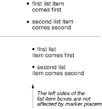
For example:
<HTML>
  <HEAD>
    <TITLE>Comparison of inside/outside position</TITLE>
    <STYLE type="text/css">
      UL         { list-style: outside }
      UL.compact { list-style: inside }
    </STYLE>
  </HEAD>
  <BODY>
    <UL>
      <LI>first list item comes first
      <LI>second list item comes second
    </UL>

    <UL class="compact">
      <LI>first list item comes first
      <LI>second list item comes second
    </UL>
  </BODY>
</HTML>
The above example may be formatted as:
In right-to-left text, the markers would have been on the right
side of the box.
The 'list-style' property
is a shorthand notation for setting the three properties 'list-style-type', 'list-style-image', and 'list-style-position' at
the same place in the style sheet.
Example(s):
UL { list-style: upper-roman inside }  /* Any UL */
UL > UL { list-style: circle outside } /* Any UL child of a UL */
Although authors may specify 'list-style' information directly
on list item elements (e.g., LI in HTML), they should do so with
care. The following rules look similar, but the first declares a descendant selector
and the second a (more specific) child
selector.
OL.alpha LI   { list-style: lower-alpha } /* Any LI descendant of an OL */
OL.alpha > LI { list-style: lower-alpha } /* Any LI child of an OL */
Authors who use only the descendant selector may
not achieve the results they expect. Consider the following rules:
<HTML>
  <HEAD>
    <TITLE>WARNING: Unexpected results due to cascade</TITLE>
    <STYLE type="text/css">
      OL.alpha LI  { list-style: lower-alpha }
      UL LI        { list-style: disc }
    </STYLE>
  </HEAD>
  <BODY>
    <OL class="alpha">
      <LI>level 1
      <UL>
         <LI>level 2
      </UL>
    </OL>
  </BODY>
</HTML>
The desired rendering would have level 1 list items with
'lower-alpha' labels and level 2 items with 'disc' labels. However,
the cascading order will
cause the first style rule (which includes specific class information)
to mask the second. The following rules solve the problem by employing
a child
selector instead:
OL.alpha > LI  { list-style: lower-alpha }
UL LI   { list-style: disc }
Another solution would be to specify 'list-style' information only on
the list type elements:
OL.alpha  { list-style: lower-alpha }
UL        { list-style: disc }
Inheritance will transfer the 'list-style' values from OL and
UL elements to LI elements. This is the recommended way to
specify list style information.
Example(s):
A URI value may be combined with any other value, as in:
UL { list-style: url("http://png.com/ellipse.png") disc }
In the example above, the 'disc' will be used when the image is
unavailable.
A value of 'none' for the 'list-style' property sets both
'list-style-type' and
'list-style-image' to
'none':
UL { list-style: none }
The result is that no list-item marker is displayed.