Requirements of Japanese Text Layout (English version)

W3C Editor's draft 2010-03-09


Table of Contents

3.7.2 Furiwake
4.2 Notes

Appendices


1 Introduction

1.1 Purpose of This Document

Each cultural community has its own language, script and writing system. In that sense, the transfer of each writing system into cyberspace is a task with very high importance for information and communication technology.

As one of the basic work items of this task force, this document describes issues of text composition in the Japanese writing system. The goal of the task force is not to propose actual solutions but describe important issues as basic information for actual implementations.

1.2 How This Document was Created

This document was created by the W3C Japanese Layout Task Force. The Task Force has discussed many issues and harmonized the requirements from user communities and solutions from technological experts. It includes the following participants:

  1. Japanese text composition experts (The editors of "JIS X 4051 : Formatting rules for Japanese documents").

  2. Internationalization and standardization experts in Japan (from Microsoft, Antenna House, JustSystems).

  3. Members of the W3C CSS, SVG, XSL and i18n Core, Working Groups.

This task force also constitutes an important innovation due to its bilingual work-flow. Discussion is mainly conducted in Japanese, because of the Japanese composition issues, but minutes and one mailing list were in English. To support development, the task force held face-to-face meetings with participating Working Groups.

The document itself was also developed bilingually, and is published bilingually. We carefully avoided using jargon for technical terms. Even if there were English words corresponding to the Japanese, we carefully studied any potential differences in the nuances of meaning, and if there were differences between corresponding concepts, we provided the Japanese jargon in romaji (Latin transliteration) for future discussion. Moreover, we prepared as many figures as possible, with clear and understandable English, to help non-Japanese readers.

1.3 Basic Principles for Development of this Document

Japanese composition exhibits several differences from Western composition. Major differences include:

  1. The use of not only horizontal writing mode but also vertical writing mode.

  2. In principle, all character frames of ideographic (cl-19), hiragana (cl-15) and katakana (cl-16) characters used in Japanese composition are designed in a square box, and these characters are composed without intervening spaces (i.e. set solid). In this document, notations such as ideographic (cl-19) and hiragana (cl-15) characters indicate character classes (see 3.9 About Character Classes).

This document mainly explains the characteristics of Japanese composition along the lines of the following policy.

  1. It does not fully cover all issues of the Japanese composition system, but mainly discusses the differences from Western composition systems.

  2. It focuses on the requirements for the Japanese visual presentation form of text composition. Technology-specific interpretations of the requirements and/or how to implement them are out of scope for this document.

  3. It explicitly refers to JIS X 4051 "Formatting rules for Japanese documents" as much as possible. This document focuses on fundamental and important issues of Japanese layout as much as possible, and for more detail references the corresponding clause of JIS X 4051. The JIS X 4051 topics that are not described in this document, are only for exceptional, corner cases or to provide some specific line composition algorithms. On the other hand, some topics that are not described in JIS X 4051 are described in detail. Accordingly, this document is sufficient to implement Japanese layout processing for most parts of the Japanese market.

    In accordance with the stated policy, this document provides tutorial- or summary-like, supplementary explanations, related background, and additional descriptions for JIS X 4051 information. This document covers all the fundamental issues of Japanese text layout, but the reader will need to refer to JIS X 4051 for advanced discussion of exceptional topics.

  4. It provides typical examples of actual use for key composition features, to enable better understanding of their usage.

  5. For non-Japanese readers, frequency of use is indicated for each requirement. These frequencies are not the outcome of any accurate research, but arise from the long experience of the authors. They are intuitive for ordinary Japanese text readers; however, for non-Japanese readers it may be difficult to imagine without explicit information. These frequencies are only rough information to prioritize the importance of issues. A couple of examples:

    "warichu (inline cutting note) is not frequently used, but is useful to simply annotate persons, things, and so on, at the place where the text appears, especially in classic texts or translations.", or "ruby is frequently used in modern documents, including newspapers."

  6. In consideration of non-Japanese readers of this document, figures are used for explanations wherever possible.

  7. Text layout rules and recommendations for readable design are different things, however these two issues are difficult to discuss independently. In this document, these two aspects are carefully separated. The aesthetic design recommendations are mainly described using notes.

  8. The main target of this document is common books. The authors' experiences are mainly related to common books, and the quality required for common books is the highest in the market. There are many kinds of books in the market, and the requirements are quite diverse. The task force has a lot of accumulated experience in requirements and solutions for Japanese text composition. Nonetheless, many issues, which have been discussed over a long period of time, are applicable for other kinds of publication.

    In terms of frequency of use, the importance of magazines, technical manuals, and Web documents rates alongside common books. However, there are several characteristics in these publications, which are different from common books. These issues should be treated more fully in future documents.

1.4 The Structure of This Document

This document consists of four parts:

1 Introduction

2 Basics of Japanese Composition

3 Line Composition

4 Approach to Hanmen Design

2 Basics of Japanese Composition explains the characteristics of letters and symbols which are used in Japanese composition, their differences in vertical writing mode and horizontal writing mode, and the design and adaptation of the kihon-hanmen.

3 Line Composition explains line composition methods for ideographic (cl-19), hiragana (cl-15), katakana (cl-16) characters and punctuation marks, together with ruby (inter-line pronunciation information and annotation) and Japanese and Western mixed text composition, i.e. mixtures of Japanese characters and Western characters (cl-27).

4 Approach to Hanmen Design describes construction methods and composition methods for headings, notes, illustrations and tables.

In principle, characters in Japanese composition are designed in a square box and positioned without spaces, i.e. solid setting. This is taken as a basic premise for the design of the kihon-hanmen, the basis of book layout. Furthermore, to understand Japanese layout, it is important to understand the design of the kihon-hanmen and how to position illustrations, characters, symbols etc. in relation to it. Hence, 2 Basics of Japanese Composition describes in detail the design of the kihon-hanmen and its dependencies. In particular, 2.5 Page wise Arrangement of Kihon-hanmen Elements provides prototypical patterns for the three guidelines listed after this paragraph: what recommendations need to be strictly taken into account, and what exceptions are possible. (The goal of these explanations is an understanding of Japanese composition. Since detailed explanations of the various elements of the kihon-hanmen are given in 3 Line Composition and 4 Approach to Hanmen Design, some explanations are repeated.)

  1. Keep to the basic size and column numbers of multi-column format that were decided upon in setting up the kihon-hanmen, with some exceptions.

  2. Keep to the line positions that were decided upon in setting up the kihon-hanmen, with some exceptions.

  3. Keep to the letter positions that were decided upon in setting up the kihon-hanmen, with some exceptions.

1.5 Reference of Definition and Others

The definitions of technical terms are described in the Appendix G Terminology appendix. Terms are linked to corresponding places in the Terminology appendix only at first appearance and in important places. If there is no appropriate English terminology for Japanese terminology, or the English terminology may possibly cause misunderstanding, the Japanese terminology is only transliterated to Hepburn style romaji notation (except that "m", not "n", is used before "b", "m" and "p").

Also, the definitions of terminology in the Terminology appendix are basically the same as the definitions of JIS X 8125 or JIS X 4051, with respect to common Japanese usage of terminology.

Each character class has its own character class number in parentheses. Members of each character class are listed in Appendix A Character Classes, except for CJK Ideographs. Each character in this document is named and referred to using the character names of ISO/IEC 10646 (UCS).

The formal title of the frequently mentioned Japanese Industrial Standard JIS X 4051 is as follows:

JIS X 4051 is available from the Japan Standards Association (http://www.jsa.or.jp/), but a PDF version is not available from JSA. The PDF version is accessible from the Japanese Industrial Standards Committee site (http://www.jisc.go.jp/), however it is not possible to download it.

2 Basics of Japanese Composition

2.1 Characters and the Principles of Setting them for Japanese Composition

2.1.1 Characters Used for Japanese Composition

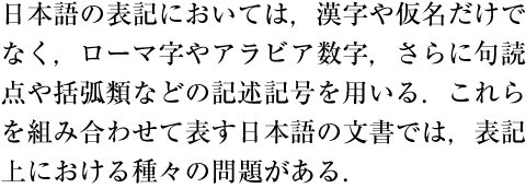
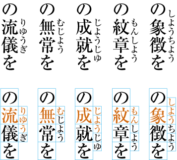
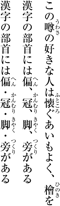
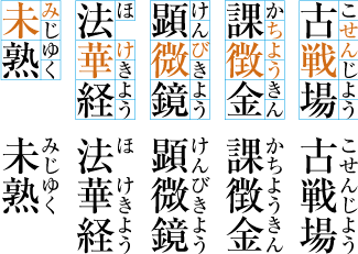
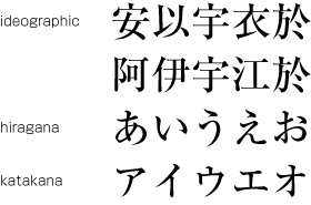
Japanese letters used for composing Japanese text mainly consist of ideographic (cl-19), hiragana (cl-15) and katakana (cl-16) characters (see [Fig.1]).

Kanji, hiragana and katakana.
[Fig.1]: Kanji, hiragana and katakana.

(note 1)

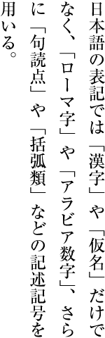
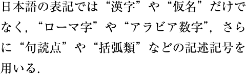
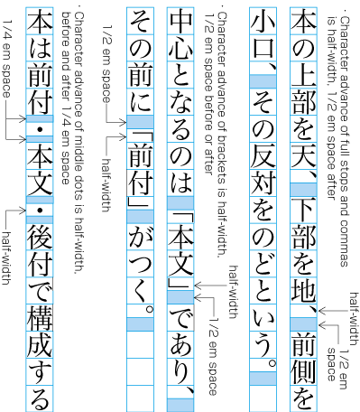
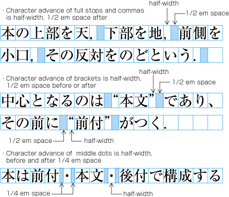
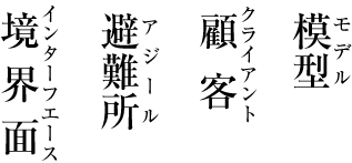
In addition to ideographic (cl-19), hiragana (cl-15) and katakana (cl-16) characters, various punctuation marks (see [Fig.2]) as well as Western characters (cl-27), such as European numerals, Latin letters and/or Greek letters, may be used in Japanese text. In this document these characters are classified into character classes, for which explanations are given describing their behavior in type-setting.

Examples of punctuation marks.
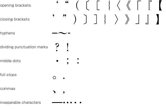
[Fig.2]: Examples of punctuation marks.

(note 2)

The details of character classes used in this document will be explained in 3.9 About Character Classes, as well as in [WARNING! No anchor for section reference: #character-classes-eb]. Also, in "Spacing between Characters" all non-Kanji characters included in ISO/IEC 10646 (UCS) Annex A collection 285 (Basic Japanese character set) and collection 286 (Extended non-Kanji character set) are explicitly classified by character class.

2.1.2 Kanji, hiragana and katakana

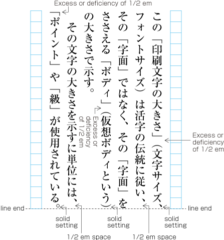
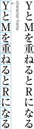
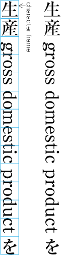
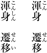
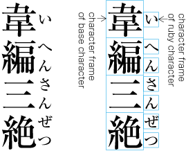
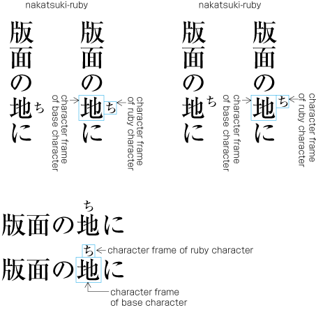
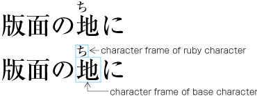
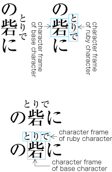
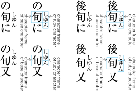
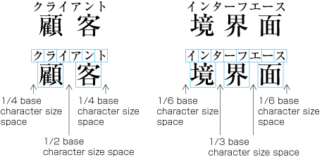
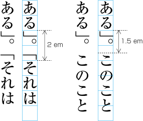
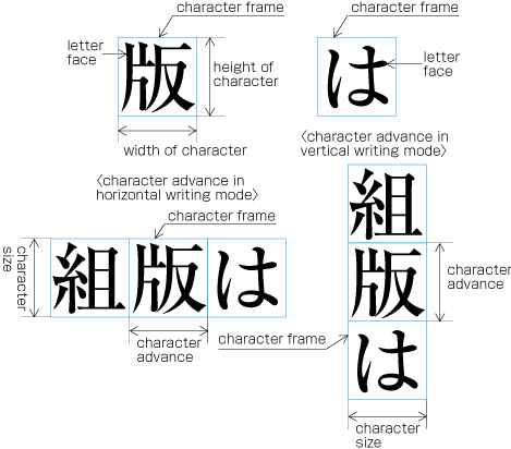
Ideographic (cl-19), hiragana (cl-15) and katakana (cl-16) characters are the same size, and have square character frames of equal dimensions. Aligned with the vertical and horizontal center of the character frame, there is a smaller box called the letter face, which contains the actual symbol. Character size is measured by the size of the character frame (see [Fig.3]). "Character advance" is a term used to describe the advance width of the character frame of a character. By definition, it is equal to the "width" of a character in horizontal writing mode, whereas it is the height of a character in vertical writing mode (see [Fig.3]).

The size of kanji and hiragana, and the character frames.
[Fig.3]: The size of kanji and hiragana, and the character frames.

(note 1)

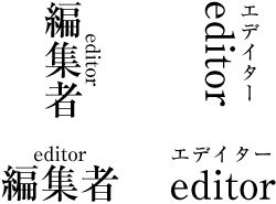
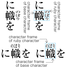
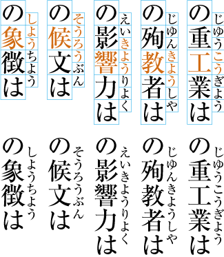
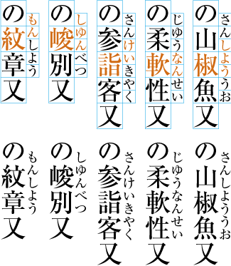
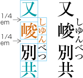
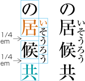
In vertical writing mode, the letter face of small kana (cl-11) characters (ぁぃぅァィゥ etc.) is placed at the vertical center and to the right of the horizontal center of the character frame; in horizontal writing mode, it is placed at the horizontal center and below the vertical center (see [Fig.4]). Also there are punctuation marks with letter faces that are not placed at the vertical and horizontal center of the character frame.

Small kana and the position of their letter face in the character frame.
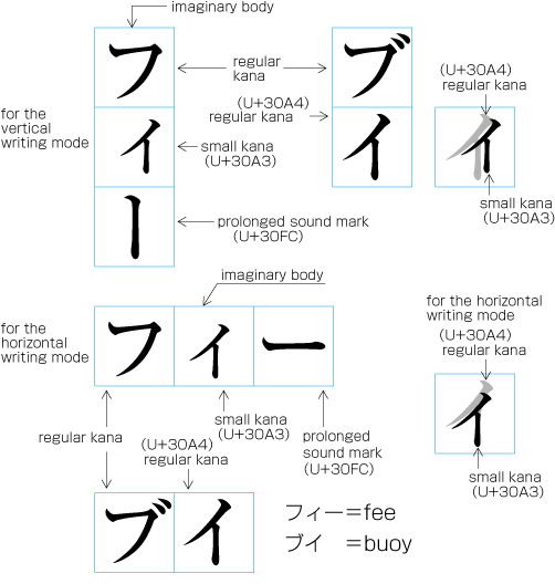
[Fig.4]: Small kana and the position of their letter face in the character frame.

2.1.3 Principles of Arrangement of Kanji and Kana Characters

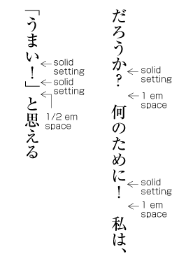
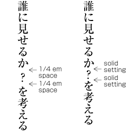
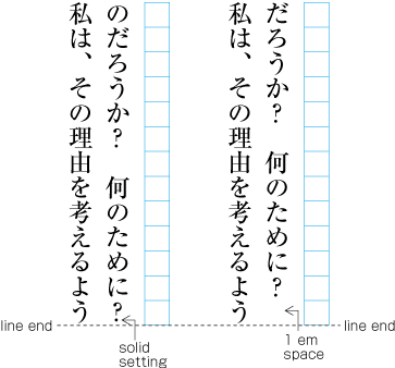
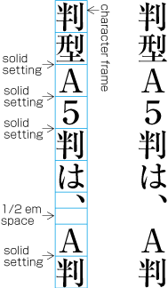
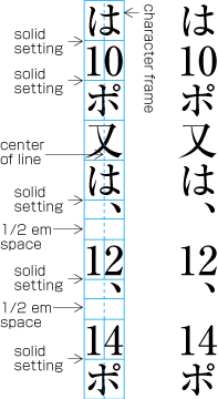
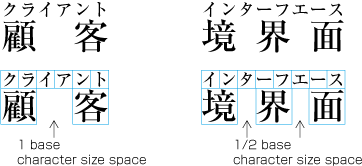
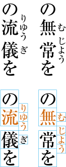
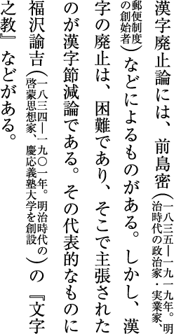
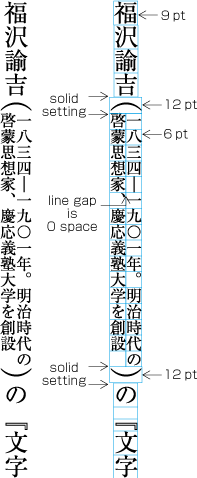
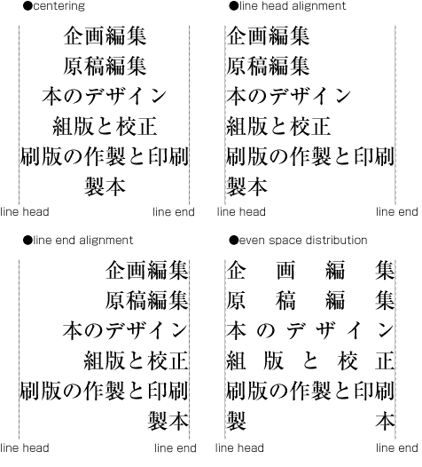
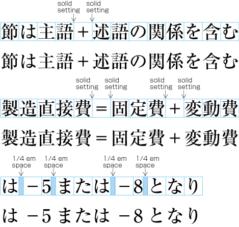
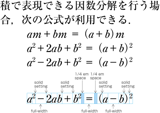
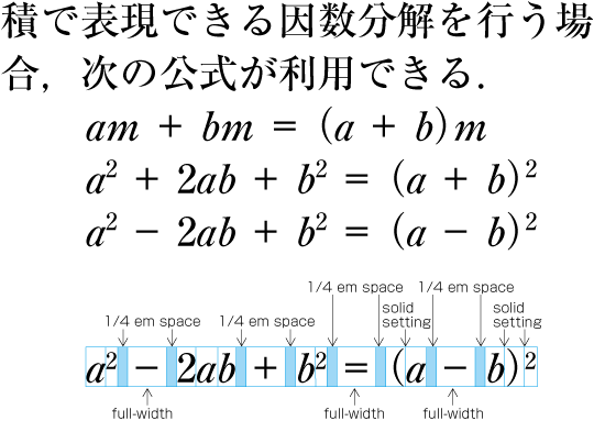
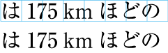
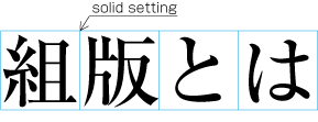
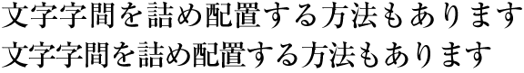
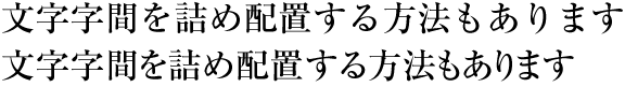
In principle, when composing a line with ideographic (cl-19), hiragana (cl-15) and katakana (cl-16) characters no extra space appears between their character frame. This is called solid setting (see [Fig.5]).

Example of solid setting in horizontal writing mode.
[Fig.5]: Example of solid setting in horizontal writing mode.

(note 1)

In the letterpress printing era ideographic (cl-19), hiragana (cl-15) and katakana (cl-16) characters were designed so that they were easy to read in solid setting, regardless of text direction. However, unlike the letterpress printing era, when several sizes of the original pattern of a letter were required to create matrices, in today's digital era the same original pattern is used for any size simply by enlargement or reduction. Because of this, it might be necessary to adjust the inter-character space when composing lines at large character sizes. When composing lines at small character sizes, hinting data is used to ensure that the width of the strokes that make up a character look correct.

(note 2)

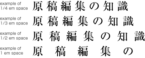
Depending on the context, there are several setting methods used in addition to solid setting, as shown below.

  1. Fixed inter-character spacing: Text set with a fixed size space between each character frame (see [Fig.6]). アキ修正あり

    Examples of fixed inter-character spacing in horizontal writing mode.
    [Fig.6]: Examples of fixed inter-character spacing in horizontal writing mode.

    Fixed inter-character spacing is used in books for the following cases:

    1. To achieve a balance between running heads with few and with many characters. Fixed inter-character spacing is used for the running heads with few characters. Examples of fixed inter-character spacing for running heads are given in JIS X 4051, annex 5.

    2. To achieve a balance between headings with few and with many characters. Fixed inter-character spacing is used for the headings with few characters. Examples of fixed inter-character spacing for headings are given in JIS X 4051, annex 6.

    3. For captions of illustrations and tables, which only have a few characters. Fixed inter-character spacing is used to balance with the size of the illustration or table.

    4. In some cases, fixed inter-character spacing is used for Chinese and Japanese poetry where one line has only a few characters.

    (note 1)

    Fixed inter-character spacing, including also even tsumegumi, is defined in JIS X 4051, sec. 4.18.1 b.

  2. Even inter-character spacing: Text set with equal inter-character spacing between characters on a given line, so that each line is aligned to the same line head and line end (see [Fig.7]).

    Example of even inter-character space setting in horizontal writing mode.
    [Fig.7]: Example of even inter-character space setting in horizontal writing mode.

    Even inter-character space setting is used in books for unifying the length of table headings with Japanese text (see [Fig.8]). There are also examples (e.g. lists of names) in which parts of a person names receive inter-character spacing.

    Example of a table with inter-character spacing.
    [Fig.8]: Example of a table with inter-character spacing.

    (note 1)

    Even inter-character spacing, including processing of jidori, is defined in JIS X 4051, sec. 4.18.1.

  3. Tsumegumi (kerning / tracking): Text is set with negative inter-character space by arranging characters so that a portion of two character frames overlap each other. This is divided further into two types, depending on the methods used for inter-character space reduction. One method involves reducing by the same amount of inter-character space (even tsumegumi or tracking, see [Fig.9]) and the other involves determining the amount of space to reduce based on the distance between the two letter faces of adjacent characters (face tsumegumi or letter face kerning, see [Fig.10]).

    Example of even tsumegumi in horizontal writing mode. (The 1st line is the same text with solid setting, for comparison.)
    [Fig.9]: Example of even tsumegumi in horizontal writing mode. (The 1st line is the same text with solid setting, for comparison.)
    Example of face tsumegumi in horizontal writing mode. (The 1st line is the same text with solid setting, for comparison.)
    [Fig.10]: Example of face tsumegumi in horizontal writing mode. (The 1st line is the same text with solid setting, for comparison.)

    In the main text of books, the most reader-friendly approach is to use solid setting. However, if the character size is larger, the distance between characters may become unbalanced, and tsumegumi will be applied. For example, there are books where tsumegumi is used with headings set in large character sizes. These methods are rarely used in books, since ease of reading is very important, but in magazines or advertisements there are many more examples of tsumegumi. Magazines tend to use type to differentiate themselves from others, and so devices like this are sometimes used for that purpose.

2.2 Page Formats for Japanese Documents

2.2.1 Specification of Page Formats

The page format of a Japanese document is specified by:

  • Firstly, preparing a template of the page format, which determines the basic appearance of pages of the document;

  • Then, specifying the details of actual page elements based on the templates.

2.2.2 Basic Templates of Page Formats

Generally, books use only one template for page format, whereas magazines often use several templates.

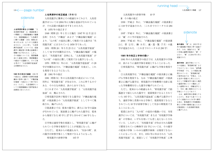
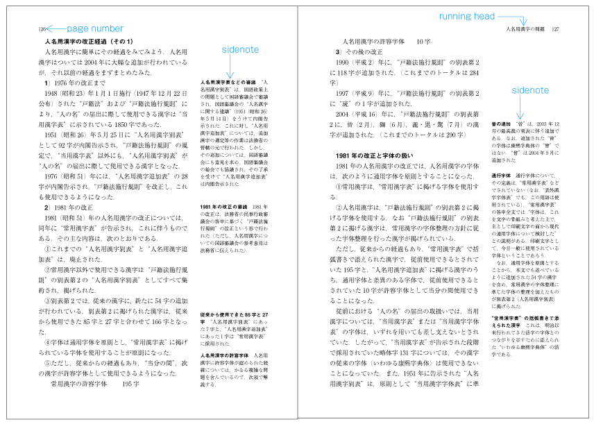
Although in books, as will be mentioned 2.2.5 Kihon-hanmen and Examples of Real Page Formatのcで解説, there tends to be one template for the page format, the basic pattern is typically adapted. For example, the table of contents may contain small modifications. Furthermore, there are many examples of indexes with a different page format than the basic page format, and vertically set books often have indexes in horizontal writing mode and sometimes multiple columns. This still holds true where the goal is to make the size of the hanmen for indexes close to the size of hanmen in the basic page format.

Magazines gather articles of different kinds. Often the page format will differ depending on the content of the article. For example, one part may have 9 point character size and 3 columns, and another part 8 point character size and 4 columns.

2.2.3 Elements of Page Formats

Example of a page format in vertical writing mode.
[Fig.11]: Example of a page format in vertical writing mode.

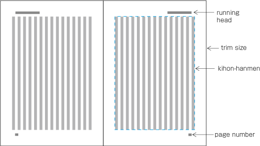
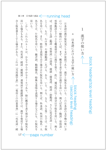
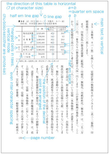
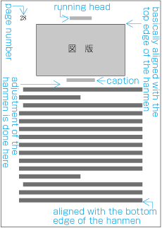
The following are the basic elements of a page format. [Fig.11] illustrates an example of a page format in vertical writing mode).

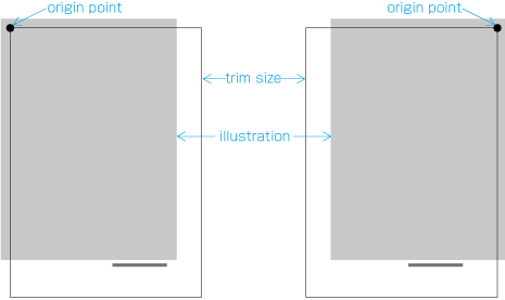
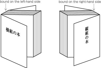
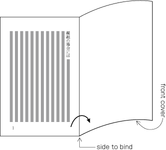
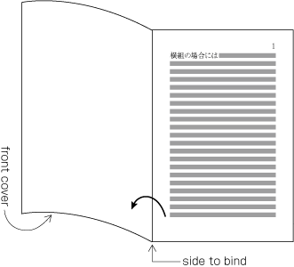
  1. Trim size and binding side (vertically set Japanese documents are bound on the right-hand side, and horizontally set documents are bound on the left-hand side. See [Fig.12].)

  2. Principal text direction (vertical writing mode or horizontal writing mode).

  3. Appearance of the kihon-hanmen and its position relative to the trim size.

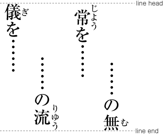
  4. Appearance of running heads and page numbers, and their positions relative to the trim size and kihon-hanmen.

Binding-side (bound on the right-hand side and bound on the left-hand side).
[Fig.12]: Binding-side (bound on the right-hand side and bound on the left-hand side).

(note 1)

Establishing a kihon-hanmen may be seen as defining not only a rectangular area on a page, but also within that area an underlying, logical grid, to guide the placement of such things as characters, headings, and illustrations. However, once a kihon-hanmen is established, there is no absolute requirement to align characters with the grid, especially when setting characters inside a line. The only factors that influence the placement of characters are strong gravitational forces that (i) attract the first and last characters on a line to align with the border of the kihon-hanmen, and (ii) attract each line position to the line positions on which the kihon-hanmen is based.

It may help in understanding the basic concepts of Japanese layout and kihon-hanmen to think in terms of a slit-based model, rather than a grid-based model. Each slit is the full length of the lines on which the kihon-hanmen is based.

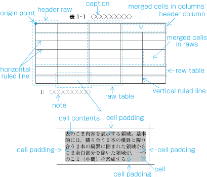
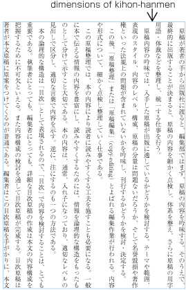
2.2.4 Elements of Kihon-hanmen

The kihon-hanmen is the hanmen style designed as the basis of a book. The following are the basic elements of the kihon-hanmen (see [Fig.13]).

(note 1)

To understand the characteristics of Japanese composition, it is important to understand how the various elements of the kihon-hanmen are applied to a real page. The details will be explained 2.5 Page wise Arrangement of Kihon-hanmen Elementsで解説.

(note 2)

The normative definition of kihon-hanmen is provided in JIS X 4051, sec. 7.5.

(note 3)

Format examples (including running heads and page numbers) and composition examples for kihon-hanmen in different trim sizes are available in JIS X 4051, annexes 3 and 4.

Elements of kihon-hanmen. (Example in vertical writing mode.)
[Fig.13]: Elements of kihon-hanmen. (Example in vertical writing mode.)
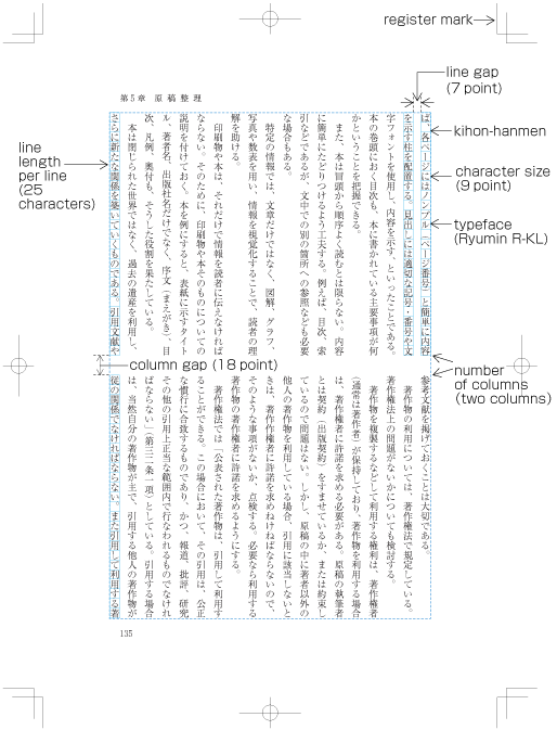
  1. Character size and typeface name

  2. Text direction (vertical writing mode or horizontal writing mode)

  3. Number of columns and column gap when using multi-column format

  4. Length of a line

  5. Number of lines per page (number of lines per column when using multi-column format)

  6. Line gap

2.2.5 Kihon-hanmen and Examples of Real Page Format

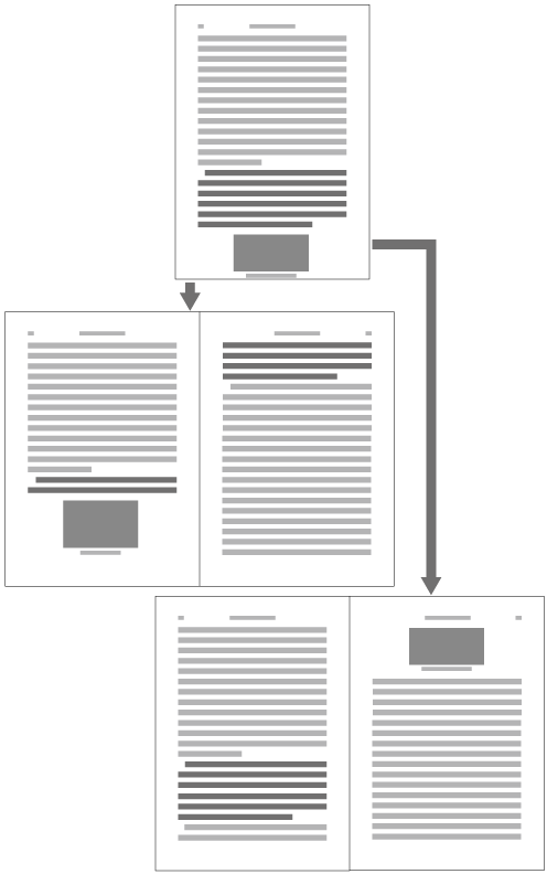
Below are several examples of how the basic page format is created, and how then various elements are placed on a real text page. (This and other aspects of how the various elements of the kihon-hanmen are arranged on each page are explained in 2.5 Page wise Arrangement of Kihon-hanmen Elements.)

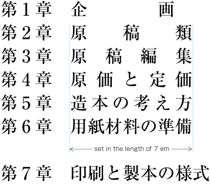
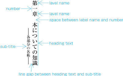
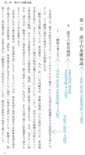
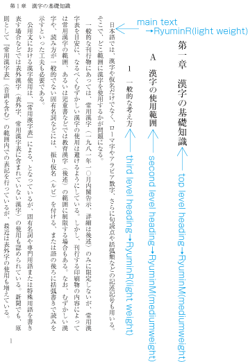
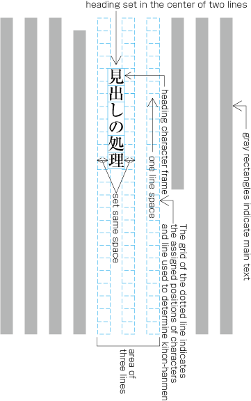
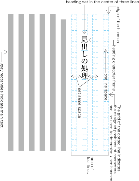
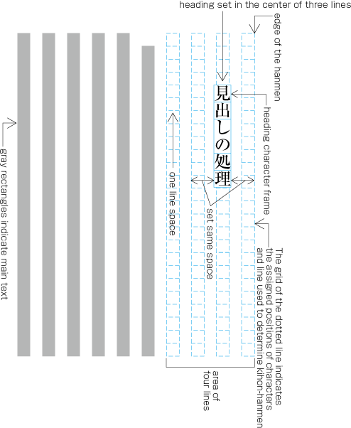
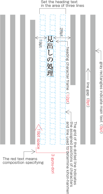
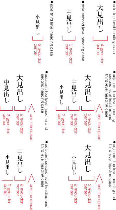
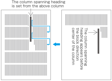
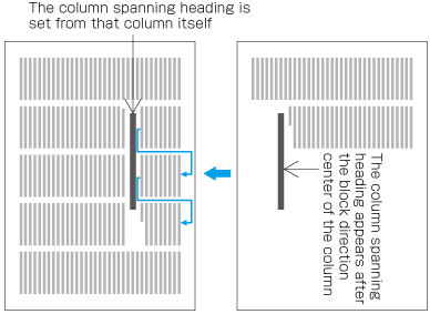
  1. Realm and position of headings

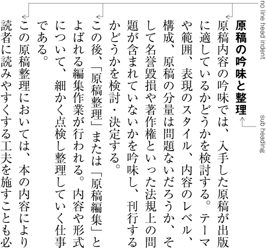
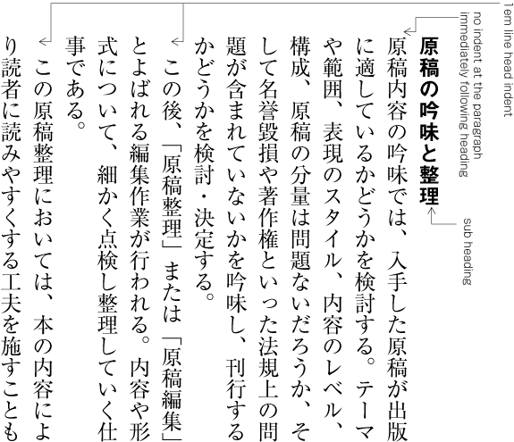
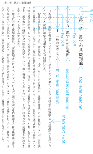
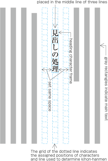
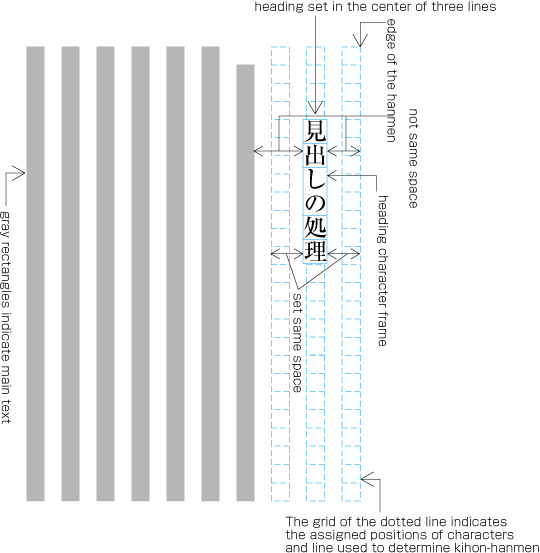
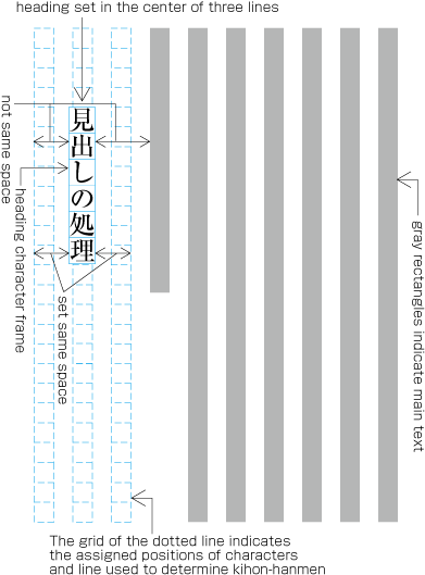
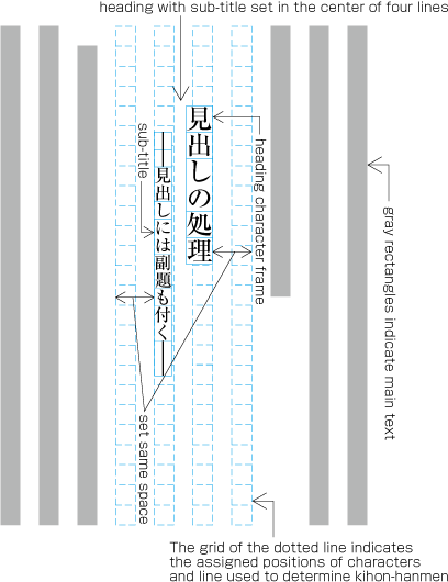
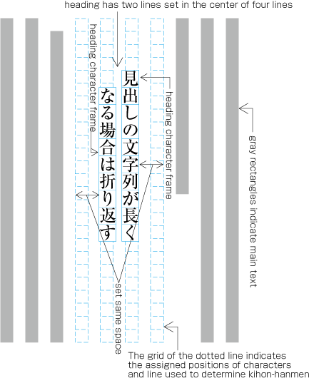
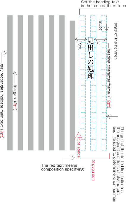
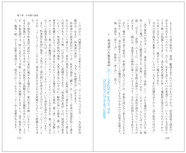
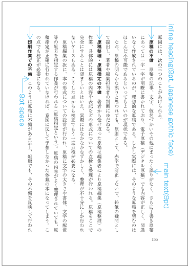
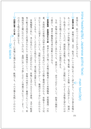
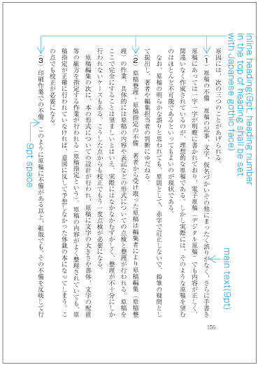
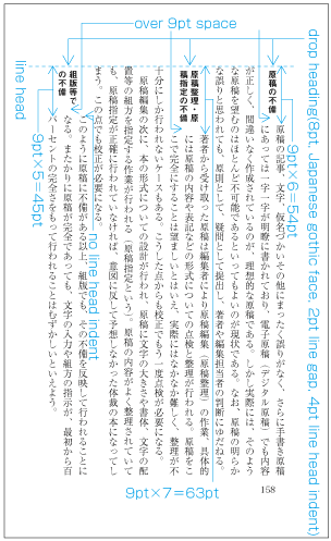
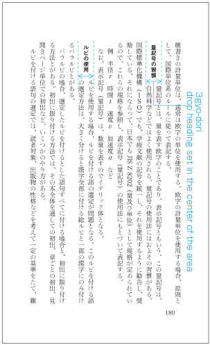
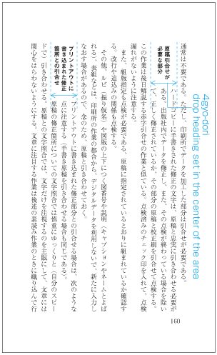
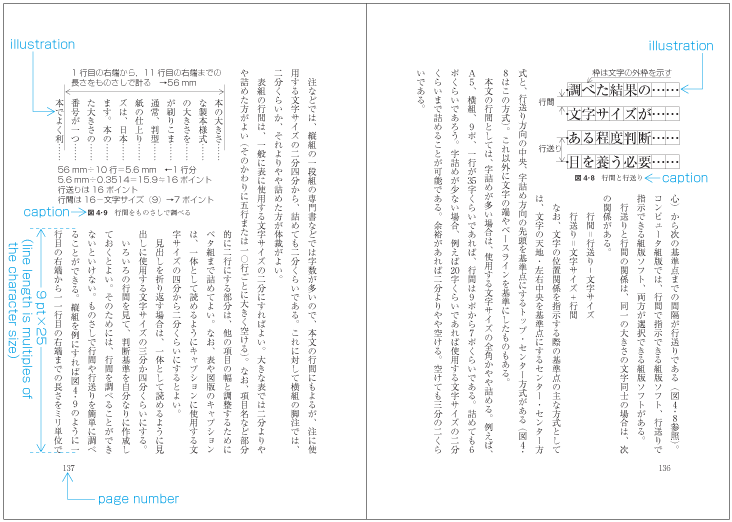
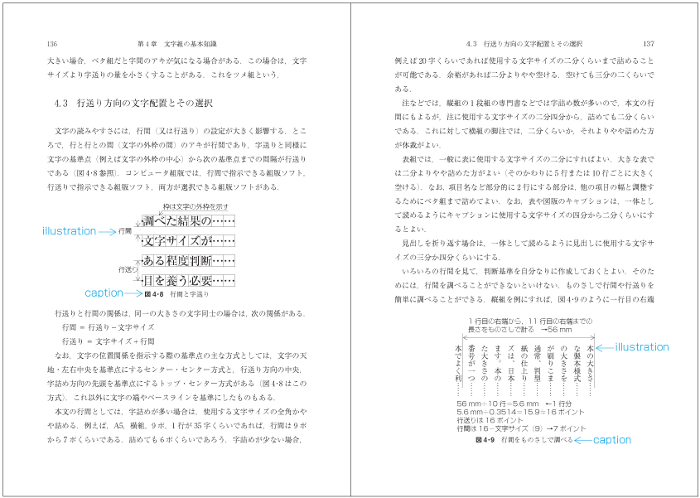
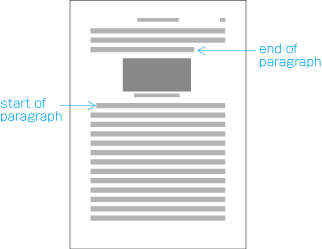
    To set a heading, first establish a rectangular space based on a number of lines in the kihon-hanmen. For example, a '3 line space' means (3 * the size of the character frame used for the kihon-hanmen + 2 * the line gap in the kihon-hanmen). (Details of this processing are defined in JIS X 4051, sec. 8.3.3.d). The heading text is usually set in the centre of the rectangular space in the block direction, and indented from the line head. The size of the indent is usually specified as a number of characters in the kihon-hanmen. For example, a '4 character indent' means (4 * the size of the character frames used for establishing the kihon-hanmen). (See the example at [Fig.14].)

    Layout example of a heading based on the line positions established by the kihon-hanmen.
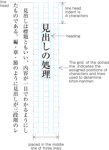
    [Fig.14]: Layout example of a heading based on the line positions established by the kihon-hanmen.

    (note 1)

    Details of the different types of heading, creation of headings, methods for placing headings, etc. will be explained in 4.1 Handling of Headings (including page breaks) in a future version of this document.

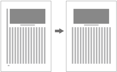
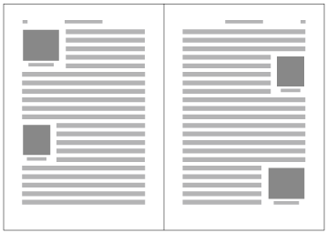
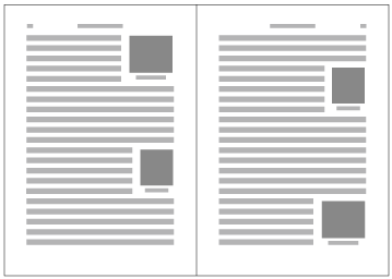
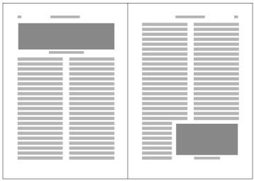
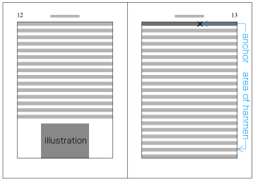
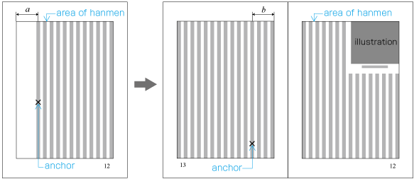
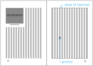
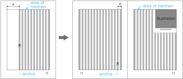
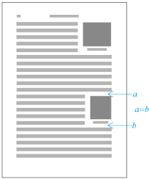
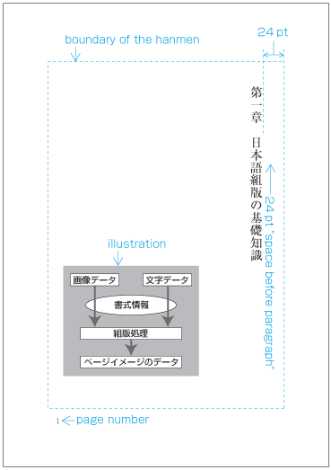
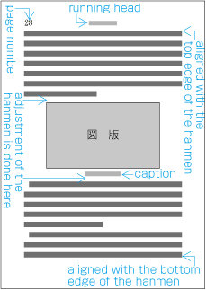
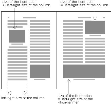
  2. Size of illustrations

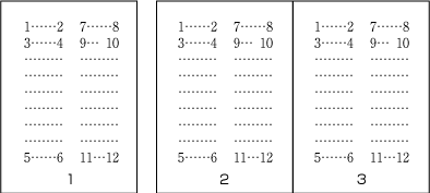
    In horizontal writing mode with two columns, for example, the width of illustrations should, if at all possible, be either the width of one kihon-hanmen column or the width of the kihon-hanmen (see [Fig.15]). The illustrations are usually set at the head or the foot of the page (see [Fig.15]).

    Example of illustrations in two columns, horizontal writing mode.
    [Fig.15]: Example of illustrations in two columns, horizontal writing mode.

    Also, in vertical writing mode, for example with three columns, the height of illustrations should, if at all possible, be either the height of one kihon-hanmen column or the height of the kihon-hanmen (see [Fig.16]). The illustrations are usually set at the right side or left side of the kihon-hanmen (see [Fig.16]).

    Example of illustrations in three columns, vertical writing mode.
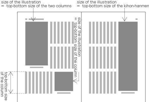
    [Fig.16]: Example of illustrations in three columns, vertical writing mode.

    (note 1)

    Details of illustration positioning will be explained in 4.3 Positioning of illustrations.

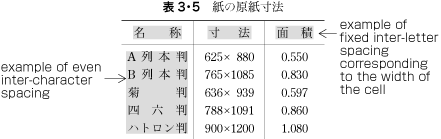
  3. Hanmen size for the table of contents

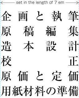
    The hanmen size for the table of contents of books is based on the size of the kihon-hanmen. There are many examples of tables of contents in vertical writing mode where the left-to-right size is identical to that of the kihon-hanmen, but the top-to-bottom size is a little bit smaller (see [Fig.17]).

    Example of the design of the table of contents (TOC) in vertical writing mode.
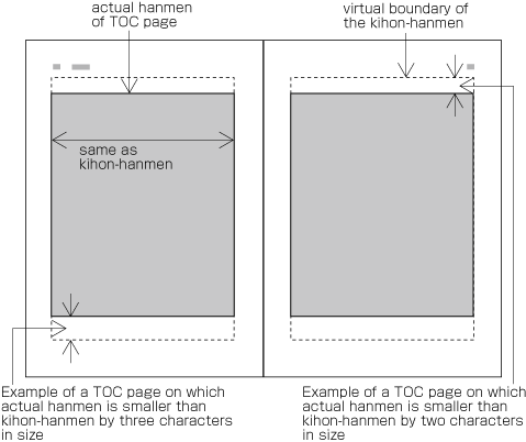
    [Fig.17]: Example of the design of the table of contents (TOC) in vertical writing mode.

    (note 1)

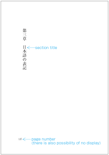
    There are cases when a different hanmen than the kihon-hanmen is used for positioning of running heads and page numbers. This will be discussed in 2.6.2 Principles of Arrangement of Running Heads and Page Numbers (see [Fig.51]).

2.3 Vertical Writing Mode and Horizontal Writing Mode

2.3.1 Directional Factors in Japanese Composition

Japanese composition has two text directions. One is vertical direction (vertical writing mode), the other is horizontal direction (horizontal writing mode).

(note 1)

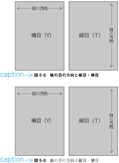
Ideographic (cl-19), hiragana (cl-15) and katakana (cl-16) characters for Japanese composition have basically been designed to have a square character frame from the letterpress printing era on. Thus the same collection of printing types can be used in either vertical writing mode or horizontal writing mode, simply by changing the direction of text, (see [Fig.18]). There were some attempts to develop printing types designed exclusively for horizontal writing mode, but they were not widely accepted.

Vertical writing mode and horizontal writing mode. (The arrows show the reading direction.)
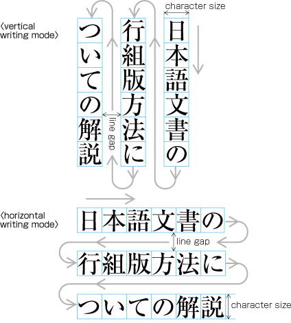
[Fig.18]: Vertical writing mode and horizontal writing mode. (The arrows show the reading direction.)

(note 2)

There is little market data comparing the number of pages with vertical writing mode and horizontal writing mode, but it is said that both are almost the same.

(note 3)

For official (e.g. governmental) documentation, horizontal writing mode is recommended. Educational material (with the exception of certain topics) is mostly in horizontal writing mode. Readers of "mobile novels" are increasing, and it is expected that in the future horizontal writing mode will increase in this area as well. However, most of the large newspapers are written completely in vertical writing mode, and most of the large journals for ordinary readers are almost completely set in vertical writing mode. In addition, novels, which are the most widely read kind of book publication, are almost completely in vertical writing mode (some readers say that they cannot read a novel if it is not in vertical writing mode). Hence it can be expected that the importance of vertical writing mode for Japanese will not change for the time being.

(note 4)

There is usually only one direction for all text throughout a book, but there are cases where horizontal writing mode is used in certain parts of vertically composed books (see [Fig.19]). Tables, captions for illustrations, running heads, and page numbers are usually composed horizontally in a page with a vertical writing mode.

Example of horizontal writing mode in parts of vertically set books.
[Fig.19]: Example of horizontal writing mode in parts of vertically set books.

2.3.2 Major Differences between Vertical Writing Mode and Horizontal Writing Mode

The following are major differences between vertical writing mode and horizontal writing mode.

  1. Arrangement of characters, lines, columns and pages; direction of page progression.

    (note 1)

    The positioning of characters, lines and paragraphs in vertical and horizontal writing mode is defined in JIS X 4051, sec. 7.4.4.

    1. Vertical writing mode. See [Fig.20] for an example of vertical writing mode with two columns per page.

      Direction of arrangement of characters in vertical writing mode.
      [Fig.20]: Direction of arrangement of characters in vertical writing mode.
      1. Characters are arranged from top to bottom, lines are arranged from right to left.

      2. Columns are arranged from top to bottom. A book starts with the left (recto) side and progresses from right to left (see [Fig.21]).

        Progression of pages for a vertically set books.
        [Fig.21]: Progression of pages for a vertically set books.
    2. Horizontal composition. See [Fig.22] for an example of horizontal text layout with two-columns per page.

      Direction of arrangement of characters in horizontal writing mode.
      [Fig.22]: Direction of arrangement of characters in horizontal writing mode.
      1. Characters are arranged from left to right, and lines are arranged from top to bottom.

      2. Columns are arranged from left to right. A book starts with the right (recto) side and progresses from left to right (see [Fig.23]).

        Progression of pages for a horizontally set book.
        [Fig.23]: Progression of pages for a horizontally set book.
  2. Orientation of Latin alphanumeric characters in a line.

    1. There are three ways to arrange Latin alphanumerics in vertical writing mode:

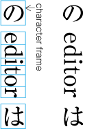
      1. One by one with the same normal orientation as that of Japanese characters. This is usually applied to one-letter alphanumerics or capitalized abbreviations (see [Fig.24]).

        Arrangement of alphanumerics in vertical writing mode - normal orientation.
        [Fig.24]: Arrangement of alphanumerics in vertical writing mode - normal orientation.

        (note 1)

        The alphanumeric characters used for this arrangement have different typographic features than those with proportional width used for Western text. They are of fixed-width and full-width design, and have been used this way since the letterpress printing era.

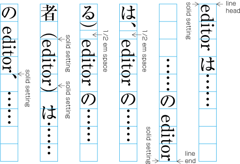
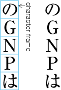
      2. Rotated 90 degrees clockwise. This is usually applied to English words or sentences (see [Fig.25]).

        Arrangement of alphanumerics in vertical writing mode - rotated 90 degrees clockwise.
        [Fig.25]: Arrangement of alphanumerics in vertical writing mode - rotated 90 degrees clockwise.

        (note 1)

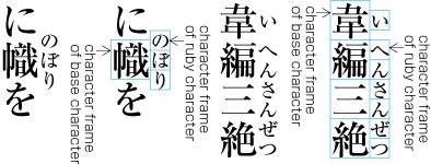
        In [Fig.25], there are spaces before and after the character frame for the Western word "editor". These spaces are necessary for composition of mixed Japanese and Western text, and details will be provided in 3.2.6 Handling of Western Text in Japanese Text using Proportional Western Fonts.

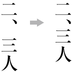
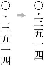
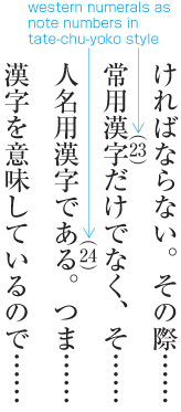
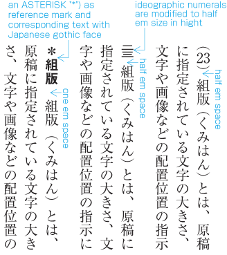
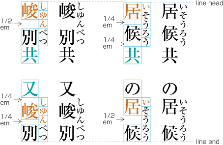
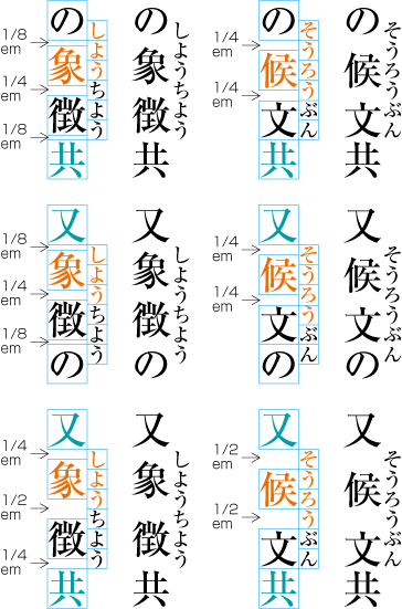
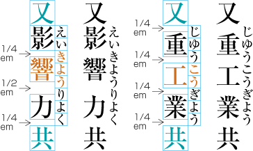
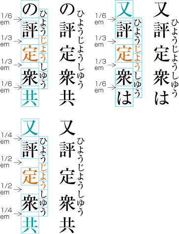
      3. Set horizontally without changing orientation (called tate-chu-yoko, which means horizontal-in-vertical composition) (see [Fig.26]). This is usually applied to two-digit numbers (see JIS X 4051, sec. 4.8 for the definition).

        Arrangement of alphanumerics in vertical writing mode - tate-chu-yoko.
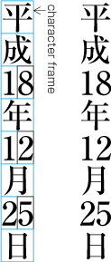
        [Fig.26]: Arrangement of alphanumerics in vertical writing mode - tate-chu-yoko.
    2. In horizontal writing mode there is only one way of arranging alphanumerics, i.e. normal orientation.

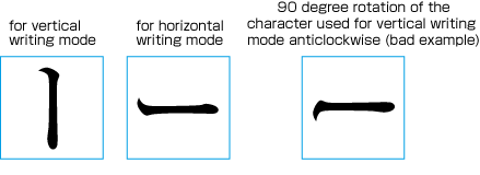
  3. Arrangement of tables and/or illustrations rotated 90 degrees clockwise or counter-clockwise for reasons of size. (This processing is defined in JIS X 4051, sec. 7.3.).

    1. In vertical writing mode, align the top of tables/illustrations to the right of the page (see [Fig.27]).

      Example of arrangement of a table rotated 90 degrees clockwise in vertical writing mode.
      [Fig.27]: Example of arrangement of a table rotated 90 degrees clockwise in vertical writing mode.
    2. In horizontal writing mode, align the top of tables/illustrations to the left of the page (see [Fig.28]).

      Example of arrangement of a table rotated 90 degrees counterclockwise in horizontal writing mode.
      [Fig.28]: Example of arrangement of a table rotated 90 degrees counterclockwise in horizontal writing mode.

      (note 1)

      The orientation is chosen to minimize interference with the overall reading flow of the book.

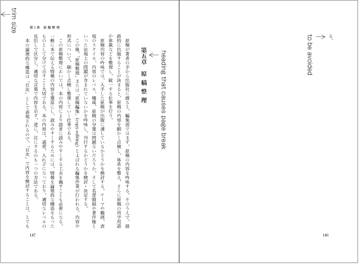
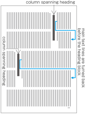
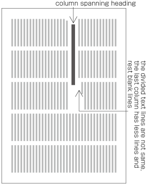
  4. Arrangement of an incomplete number of lines on a multi-column format page due to new recto, page break or other reasons. (The processing of new recto and page break is defined in JIS X 4051, sec. 8.1.1.).

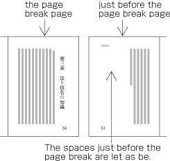
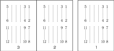
    1. In vertical writing mode, just finish the line where it ends ("nariyuki"). The number of lines in each column is not uniform (see [Fig.29]).

      How to process incomplete number of lines on a multi-column format page (vertically set book).
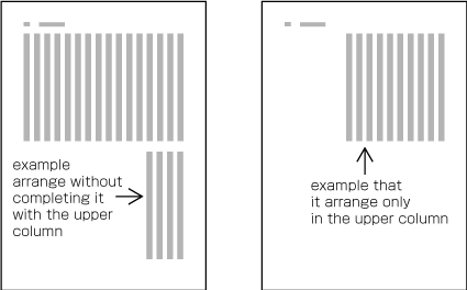
      [Fig.29]: How to process incomplete number of lines on a multi-column format page (vertically set book).
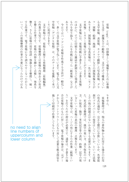
    2. In horizontal writing mode, re-arrange columns so that each column has the same number of lines. In case the number of lines is not divisible by the number of columns, add the smallest number to make it divisible and re-arrange columns using the quotient as the number of lines so that only the last column shall have the incomplete number of lines (see [Fig.30]).

      How to process incomplete number of lines on a multi-column format page (horizontally set book).
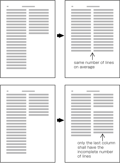
      [Fig.30]: How to process incomplete number of lines on a multi-column format page (horizontally set book).

      (note 1)

      Neither horizontal nor vertical balance of column arrangement would break the stability of vertical page layout very much, while horizontal balance of column arrangement is determinant for horizontal page layout. In vertical text it doesn't matter too much whether columns are balanced or not. For horizontally set text it is best to balance columns wherever possible.

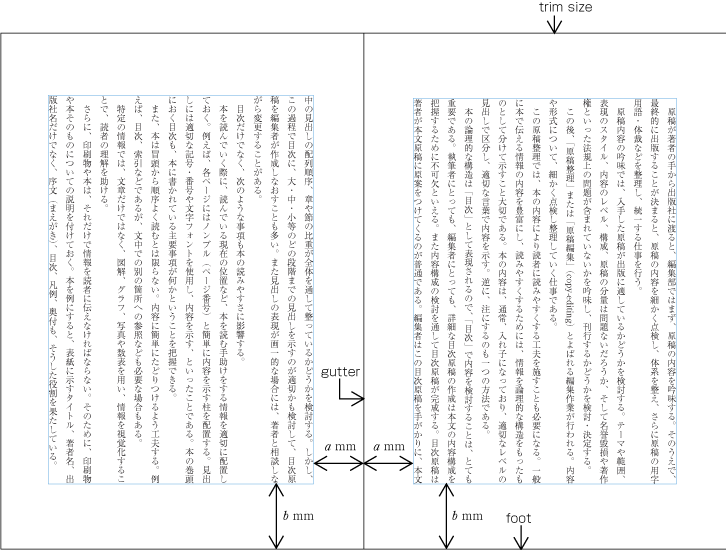
2.4 Specifying the Kihon-hanmen

2.4.1 Procedure for Defining the Kihon-hanmen

In Japanese composition, first the size of the kihon-hanmen is defined, using the square character frames of characters in solid setting. Taking this as a base, the position of the kihon-hanmen with regards to the trim size is then specified. The following are procedures for determining the size and position of the kihon-hanmen (see [Fig.31]).

  1. Specifying the dimensions of the kihon-hanmen.

    1. For a document with a single column per page, specify the character size, the line length (the number of characters per line), the number of lines per page, and the line gap.

    2. For a document with multiple columns per page, specify the character size, the line length (the number of characters per line), the number of lines per column, the line-gap, and the number of columns and the column gap.

      Procedures to determine the size and position of the kihon-hanmen, step 1.
      [Fig.31]: Procedures to determine the size and position of the kihon-hanmen, step 1.
  2. Determining the position of the kihon-hanmen relative to the trim size.

    There are various alternative methods for specifying the position of the kihon-hanmen relative to the trim size (see [Fig.32]):

    1. Position vertically by centering the kihon-hanmen. Position horizontally by centering the kihon-hanmen.

    2. Position vertically by specifying the space at the head (for horizontal writing mode) or the space at the foot (for vertical writing mode). Position horizontally by centering the kihon-hanmen. アキ修正あり

    3. Position vertically by centering the kihon-hanmen. Position horizontally by specifying the space of the gutter. アキ修正あり

    4. Position vertically by specifying the space at the head (for horizontal writing mode) or the space at the foot (for vertical writing mode). Position horizontally by specifying the space of the gutter. アキ修正あり

    Procedures to determine the size and position of the kihon-hanmen, step 2.
    [Fig.32]: Procedures to determine the size and position of the kihon-hanmen, step 2.

    (note 1)

    In most cases the kihon-hanmen is set at the horizontal and vertical center of the trim size, which should be the default positioning, but depending on the dimensions of the kihon-hanmen there may be cases where the default needs to be changed; for example, by moving the kihon-hanmen up, down, to the left or to the right of the default position.

    (note 2)

    It is technically possible to determine the dimensions of the kihon-hanmen by specifying the trim size and margins of all sides, but this method is not common in the tradition of Japanese composition. If this is the only way an implementation allows, the margins of each side need to be determined beforehand in relation to the dimensions of the kihon-hanmen and its position in the trim size.

2.4.2 Considerations in Designing the Kihon-hanmen

The following are considerations to take into account when designing the kihon-hanmen. (This topic is not about processing, but rather an explanation of design preferences. The definition of kihon-hanmen is given in JIS X 4051, sec. 7.4.1.)

  1. Trim size and margins. It would be best if the shape of the kihon-hanmen could be made similar to that of the trim size.

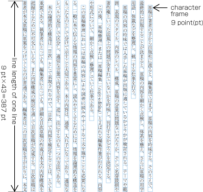
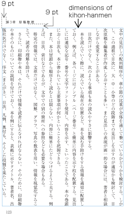
  2. Character size. Generally 9 point (about 3.2mm) type is common. Except for specialized publications such as dictionaries, the minimum size of type is 8 point (about 2.8mm).

    (note 1)

    In Western text layout, 10 point (about 3.5mm) or 12 point (about 4.2mm) type is common. This is mainly because of a difference in design principles between Japanese and Latin characters.

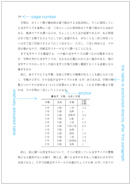
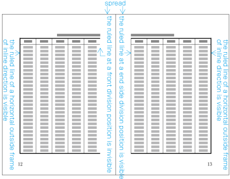
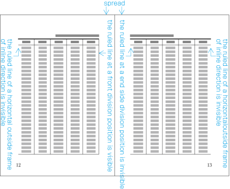
  3. Line length should be multiples of the character size (see [Fig.33]).

    Line length should be multiples of the character size.
    [Fig.33]: Line length should be multiples of the character size.

    (note 1)

    There are basically two reasons why line length should be multiples of the character size.

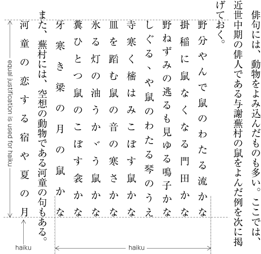
    1. For Japanese composition, all line lengths except that of the last line of the paragraph should, in principle, be the same.

    2. In principle, for printing, Japanese characters like ideographic (cl-19), hiragana (cl-15) and katakana (cl-16) characters are uniformly designed in the same square character frame and they are set solid (no extra space between adjacent character frames).

    (note 2)

    The best line length (number of characters per line) is around 52 characters, maximum, in vertical writing mode, and 40 characters, maximum, in horizontal writing mode. If the trim size would take lines beyond the recommended length, consider using a multi-column format and making the line length shorter.

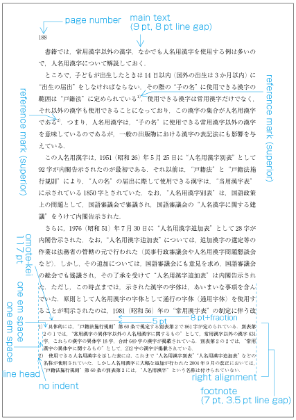
  4. Use the same amount of line gap throughout the book, except for special cases. The size of the kihon-hanmen in the block direction is specified using the number of lines and the size of the line-gap. アキ修正あり

    (note 1)

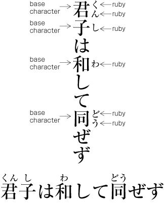
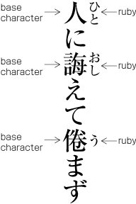
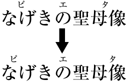
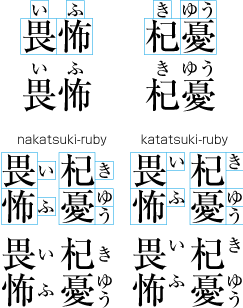
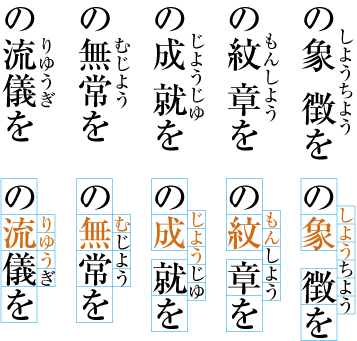
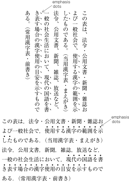
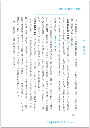
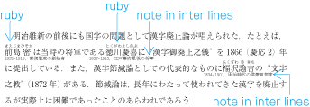
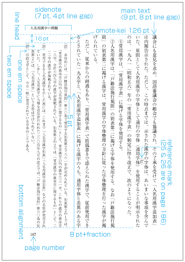
    In Japanese composition, there are cases where ruby or emphasis (emphasis dots, bousen, underlines, etc.) are inserted between lines. In such cases the line gap is not changed but is kept constant (see [Fig.34]). It is also possible to insert reference marks to notes between lines within the main text. This case is handled in the same manner. If these elements are likely to occur in text, the line gap established during the kihon-hanmen design needs to be of an adequate size to accommodate them. Further explanations about the placement of ruby will be given in 3 Line Composition.

    Inserting ruby or other items between lines.
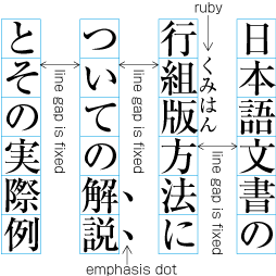
    [Fig.34]: Inserting ruby or other items between lines.

    (note 2)

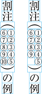
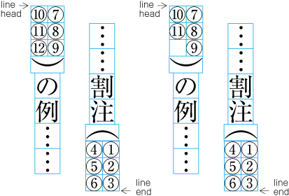
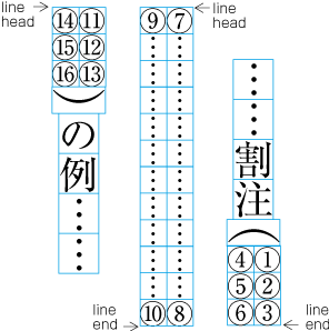
    Warichu (inline cutting note) juts into the line gap on either side of a line. The basic line gap isn't changed where warichu occurs (the line gap between warichu itself and the adjacent lines looks narrower than for the rest of the line), so when warichu is likely to occur in text, the line gap for the kihon-hanmen may be set slightly larger than normal to accommodate it. The same is true for tate-chu-yoko or subscript and superscript (ornament characters). Further explanation of the placement of warichu and other items is provided in 3 Line Composition.

    Example of inter-line processing with warichu between lines.
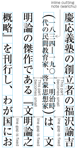
    [Fig.35]: Example of inter-line processing with warichu between lines.

    (note 3)

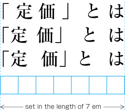
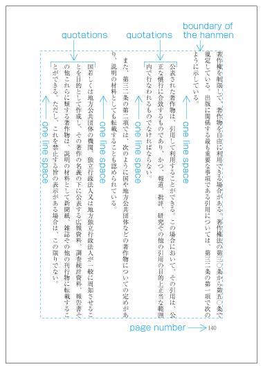
    It is common that the line gap for the kihon-hanmen is set to a value between a half em space and the one em space of the character frame used for the kihon-hanmen. A half em space can be chosen in cases where the line length is short, but a one em space or close to it is more appropriate when the line length is longer than 35 characters.

    (note 4)

    Unless ruby or other design elements are placed in the space between lines (e.g. for books such as classics, with many annotations), there is no need to make the line-gap larger than full-width, since this would decrease legibility.

    (note 5)

    It is said that the standard line-gap in Western text layout is a one third em space, which is smaller than that in Japanese composition. This difference again comes from the different approach to the design of Latin and Japanese characters.

    (note 6)

    There is another method of specifying the kihon-hanmen that uses line feeds rather than line gaps. Line feed is the distance between two adjacent lines measured from their reference points (see [Fig.36]). The reference point differs from implementation to implementation, however, in vertical writing mode the horizontal center of the character frame is usually used, and with horizontal writing mode, the vertical center of the character frame is used. When the character size is the same for every character, the following calculation is used:
    line feed = character size/2 + line gap + character size/2 i.e. character size + line gap
    line gap = line feed - character size

    Specifying kihon-hanmen with line feed.
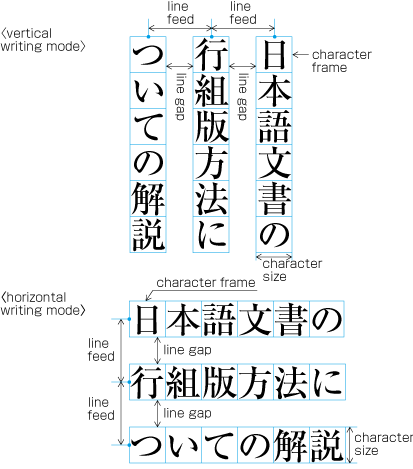
    [Fig.36]: Specifying kihon-hanmen with line feed.

The size of the kihon-hanmen in this case can be calculated by following method:

  • Vertical writing mode with one column

    Width of kihon-hanmen = character size * number of lines per page + line gap * (number of lines per page -1)

    e.g.

    9 point * 18 lines + 8 point (18 lines -1) = 298 point

    Height of kihon-hanmen = character size * number of characters per line

    e.g.

    9 point * 52 characters = 468 points

  • Vertical writing mode with multi columns

    Width of kihon-hanmen = character size * number of lines per column + line gap * (number of lines per column -1)

    e.g.

    9 point * 21 lines + 6 point * (21 lines -1) = 309 points

    Height of kihon-hanmen = (character size * number of characters per line) * number of columns + column gap * (number of columns - 1)

    e.g.

    9 point * 25 characters + 18 point * (2-1) = 468 points

  • Horizontal writing mode with one column

    Width of kihon-hanmen = character size * number of characters per line

    e.g.

    9 point * 35 characters = 315 points

    Height of kihon-hanmen = character size * number of lines per page + line gap * (number of lines per page -1)

    e.g.

    9 point * 28 lines + 8 point * (28 lines - 1) = 468 points

  • Horizontal writing mode with multi columns

    Width of kihon-hanmen = (character size * number of characters per line) * number of columns + column gap * (number of columns - 1)

    e.g.

    (8 point * 19 characters) * 2 + 16 point * (2-1) = 320 points

    Height of kihon-hanmen = character size * number of lines per column + line gap * (number of lines per column - 1)

    e.g.

    8 point * 40 lines + 4 point * (40 lines -1) = 476 points

2.5 Page wise Arrangement of Kihon-hanmen Elements

2.5.1 Examples of Items Jutting Out of the Kihon-hanmen

The various elements of a page should remain inside the boundaries of the kihon-hanmen. However, there are exceptions such as the following:

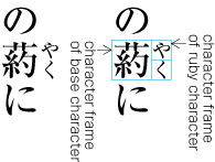
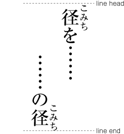
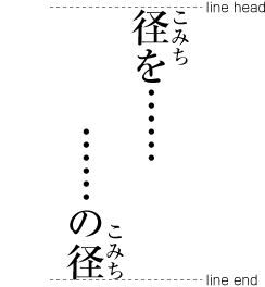
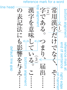
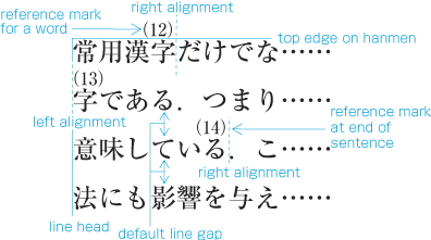
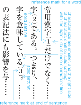
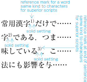
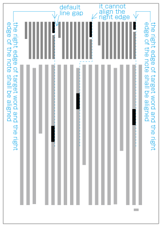
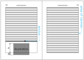
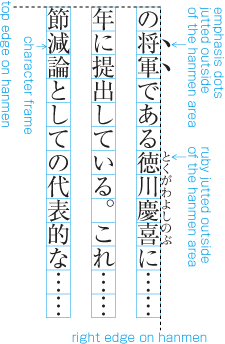
  1. Ruby or emphasis marks (bousen, emphasis dots, etc.) at the before edge of the hanmen, are placed outside the hanmen (see [Fig.37]). The same applies in cases where ruby, underline, etc. appear beyond the after edge of the hanmen. Like the handling of exceptions mentioned below, the purpose here is to preserve the line positions established for the kihon-hanmen. This technique can also be used for reference marks associated with lines of text.

    Example of ruby annotation placed outside of the kihon-hanmen.
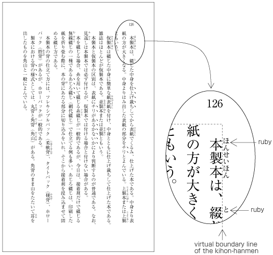
    [Fig.37]: Example of ruby annotation placed outside of the kihon-hanmen.
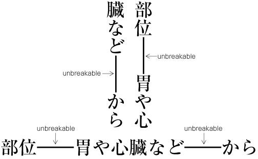
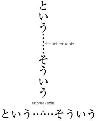
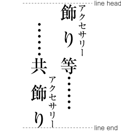
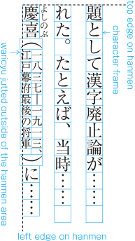
  2. When there are inline elements whose dimensions extend beyond the before edge and the after edge of a line of characters as determined by the kihon-hanmen, and when those elements appear in the first or last line of the hanmen, the parts that jut out beyond the regular line of characters also jut out of the hanmen area. For example, this is the case when the width of a sequence of characters which are set to tate-chu-yoko is wider than the characters set for the kihon-hanmen. In addition, warichu (inline cutting note) or subscript and superscript (ornament characters) are handled in the same way. (The processing rules for this item and the previous item are defined in JIS X 4051, sec. 12.1.1.)

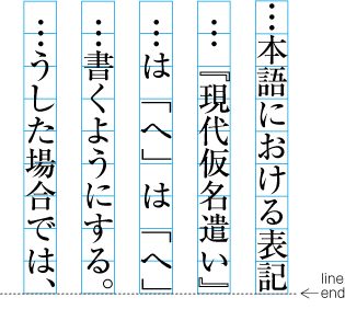
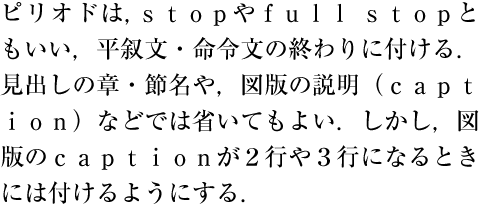
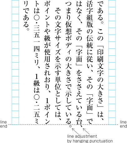
  3. Line adjustment by hanging punctuation is only necessary for full stops (cl-06) and commas (cl-07) when they would otherwise need to be wrapped to the line head. The character is placed so that it touches the hanmen at the line end (see [Fig.38]). (Hanging punctuation is not defined in JIS X 4051, but there is an explanation in sec. 8.1, c.)

    Example of IDEOGRAPHIC COMMA and IDEOGRAPHIC FULL STOP placed below the kihon-hanmen.
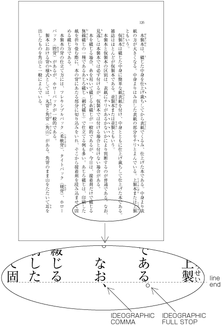
    [Fig.38]: Example of IDEOGRAPHIC COMMA and IDEOGRAPHIC FULL STOP placed below the kihon-hanmen.

    (note 1)

    Line adjustment by hanging punctuation is a way of reducing the processing cost of line adjustment by reducing the need to change inter-character space.

    (note 2)

    A lot of books apply hanging punctuation.

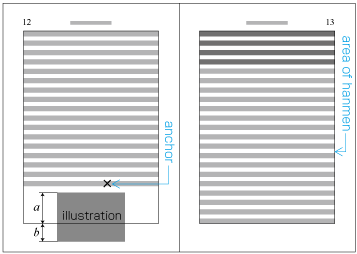
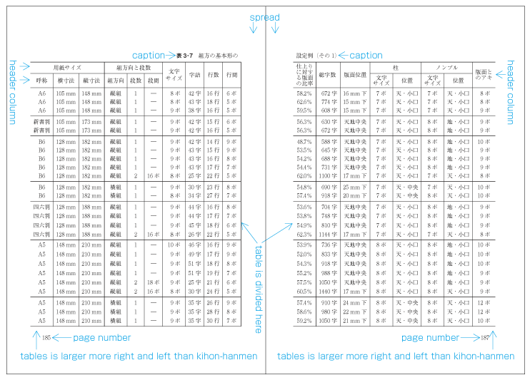
  4. Illustrations and tables are normally placed inside the area defined by the kihon-hanmen. However, there may also be cases in which a particular illustration or table juts outside the kihon-hanmen.

    1. Cases in which it is necessary to make the illustration or table larger than the kihon-hanmen, because reducing its size would make it unreadable.

    2. For the sake of visual effect, the illustration may bleed into the complete paper area. This is not often used in books, but is often used in magazines (see [Fig.39]).

      Example of bleeds.
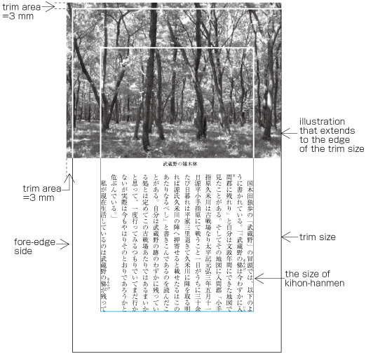
      [Fig.39]: Example of bleeds.
  5. Magazines may place the captions of illustrations outside the column area or in the column gap. (Some people regard this as bad style.)

2.5.2 Line Positioning based on the Kihon-hanmen Design

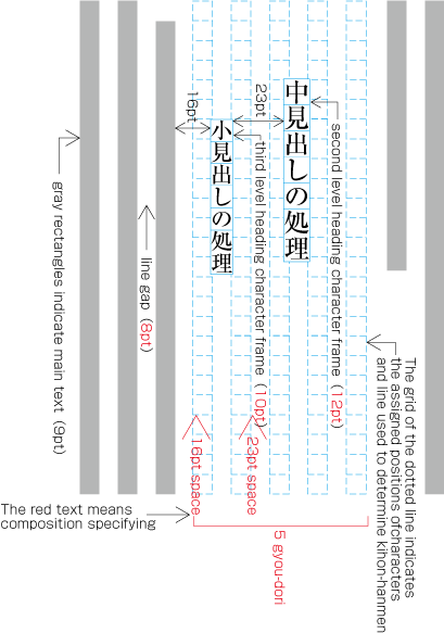
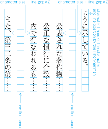
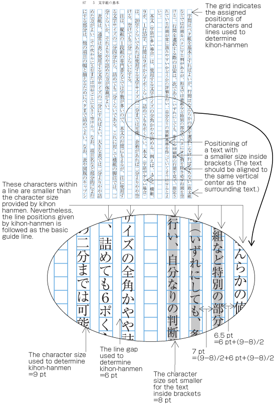
In principle, pagewise positioning of lines relies on the line positions established for the kihon-hanmen. This holds for lines with ruby or emphasis dots as shown in [Fig.34]. Even when lines contain characters that are smaller than the character size used for the kihon-hanmen (as shown in [Fig.40]), the line positions used for the kihon-hanmen continue to be used as the basic guide lines. This is so that following lines with normal-sized characters still naturally fall into the line positions established for the kihon-hanmen.

Positioning of lines with a smaller size of text.
[Fig.40]: Positioning of lines with a smaller size of text.

(note 1)

Characters within brackets are made smaller, since the text is an additional explanation. Such cases are handled in the following three ways. The first method, making only characters in restricted places smaller, is the most commonly used.

  1. Make the characters smaller only in restricted places, for example for references.

  2. Make all characters within brackets smaller (as shown in [Fig.40]).

  3. Make all characters within brackets the same size as the character size established for the kihon-hanmen.

The following are exceptions when handling line position:

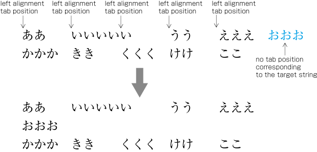
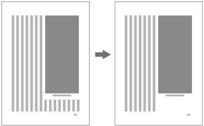
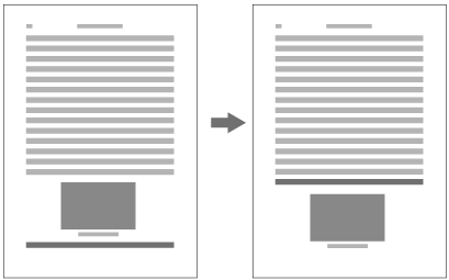
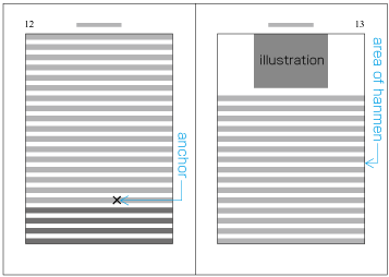
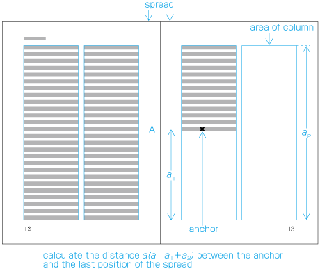
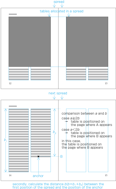
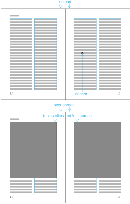
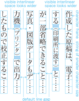
  1. When inserting more than one illustration or table item in horizontal writing mode, assuming that there is no text to the left or right of the items, the items may either slip off the lines established for the kihon-hanmen (see [Fig.41]), or stick to the lines (see [Fig.42]). The former approach is used, whenever possible, to achieve inter-character spacing before and after illustrations or tables . (This method is often used in books.) (This processing method is defined in JIS X 4051, sec. 10.3.2., d.) アキ修正あり

    Positioning of lines with multiple illustrations - 1.
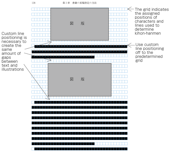
    [Fig.41]: Positioning of lines with multiple illustrations - 1.
    Positioning of lines with multiple illustrations - 2.
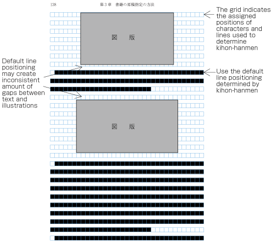
    [Fig.42]: Positioning of lines with multiple illustrations - 2.
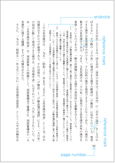
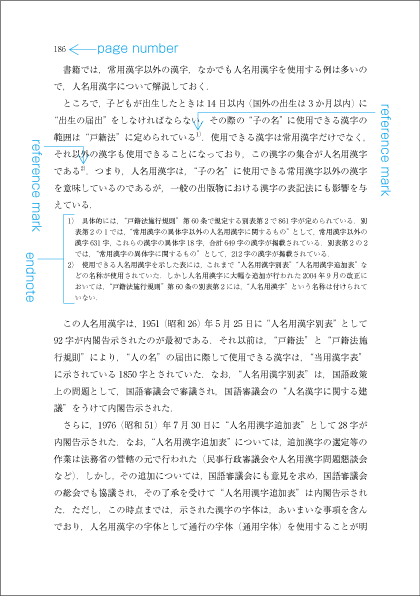
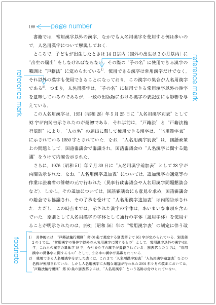
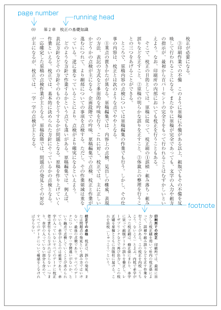
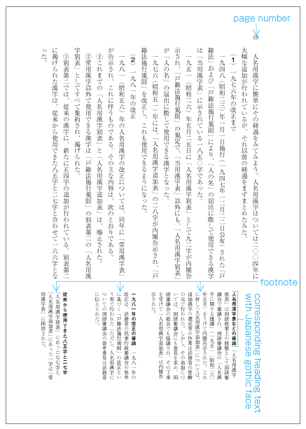
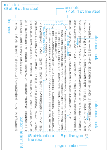
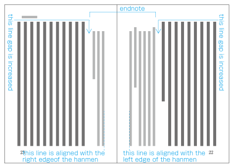
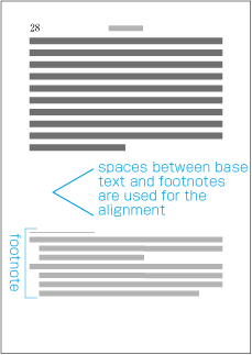
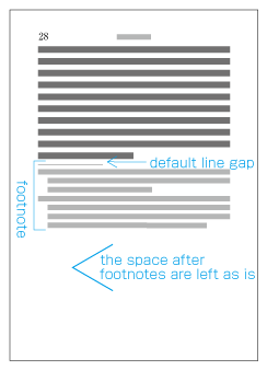
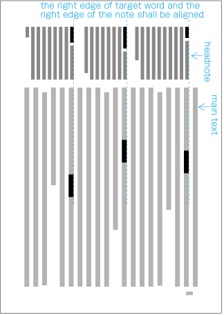
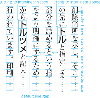
  2. The size of characters in endnotes inserted between paragraphs or those in footnotes at the bottom of the page (in horizontal writing mode) is smaller than the character size established for the kihon-hanmen. As a result, the character size and line gap are also smaller, and so the line positions are no longer identical to those established for the kihon-hanmen. As an example, [Fig.43] shows the position of an endnote between paragraphs in vertical writing mode. (The processing of endnotes is defined in JIS X 4051, sec. 9.3, and the processing of footnotes in sec. 9.4.)

    Positioning of an endnote in vertical writing mode.
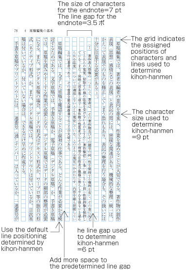
    [Fig.43]: Positioning of an endnote in vertical writing mode.
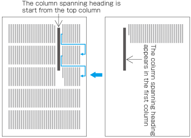
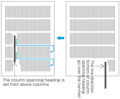
  3. As mentioned above, the position of a heading may not be identical to the lines established for the kihon-hanmen. Nevertheless, in the block direction, headings base their alignment on the line positions established for the kihon-hanmen (see [Fig.14]).

2.5.3 Character Positioning based on Kihon-hanmen Design

In principle, the characters in each line follow the solid setting positions of characters established for the kihon-hanmen. However, as already shown in some of the previous figures, there are examples where this is not the case. Such cases are rather common, and here we will show some prototypical examples (details will be given in 3 Line Composition).

(note 1)

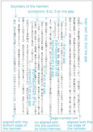
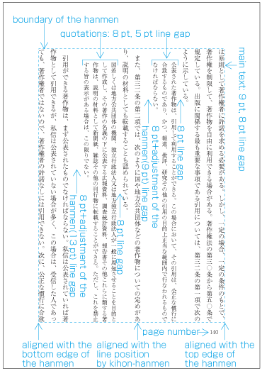
Where character sizes differ from the solid set sizes established for the kihon-hanmen, line lengths may not be identical with the line length of the kihon-hanmen; it is necessary to align the ends of the lines, with the exception of the last line in a paragraph. The processing method for this is explained in 3.8 Line Adjustment.

  1. When 9pt is the character size used to establish the kihon-hanmen, characters smaller than 9pt may be inserted in part of a line (see [Fig.40]). In such cases, the parts set at 9pt and any parts set at a smaller, say, 8pt size both use solid setting, with character frames at the respective sizes for each part.

  2. In cases where proportional Latin letters are rotated 90 degrees clockwise (see [Fig.25]), the proportional letters are placed according to their proportional widths. Hence, they do not fit to the character positions established for the kihon-hanmen (see [Fig.44]). Japanese letters following the Latin letters consequently slip away from the default positions as well.

    Positioning of a mixture of Western and Japanese letters in a line.
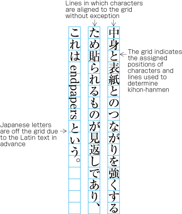
    [Fig.44]: Positioning of a mixture of Western and Japanese letters in a line.
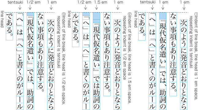
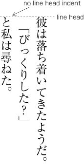
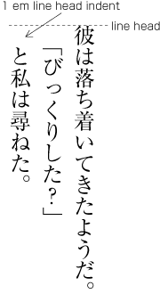
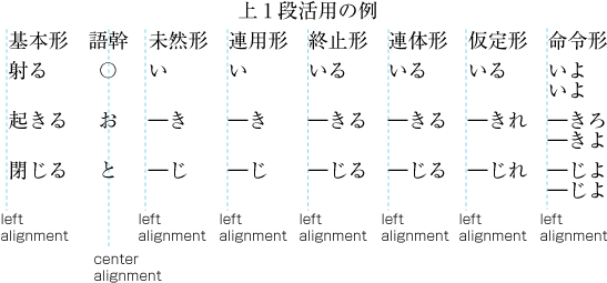
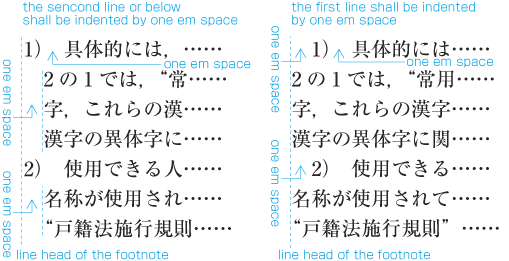
  3. There are several methods for positioning opening brackets (cl-01) at the beginning of a line (details are explained in 3.1.5 Positioning of Opening Brackets at Line Head). Because an opening bracket is not a full-width character, in cases where the indentation of the first line of a paragraph is a one em space, or if the tentsuki position is used for the bracket (that is, there is no space at the line head), the character following the bracket will be in a position which does not fit to the character positions established for the kihon-hanmen (see [Fig.45]). However, the adaptations made during the alignment of line ends will ensure that the character at the end of a line is at a position that fits with the kihon-hanmen. アキ修正あり

    Example of positioning of characters off the kihon-hanmen position due to opening brackets at the line head.
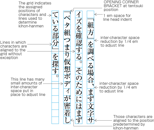
    [Fig.45]: Example of positioning of characters off the kihon-hanmen position due to opening brackets at the line head.
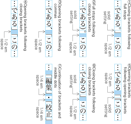
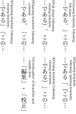
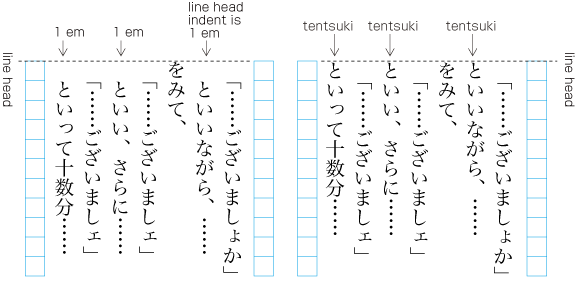
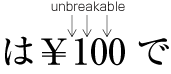
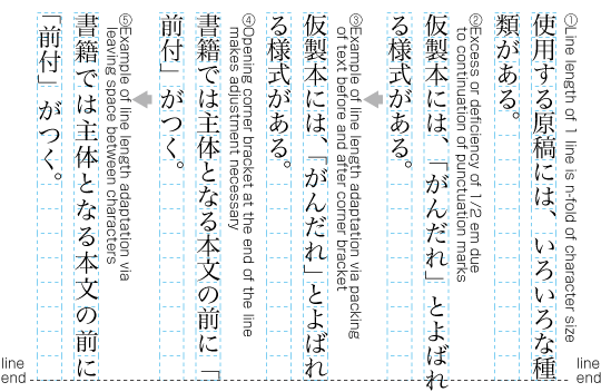
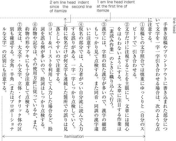
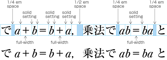
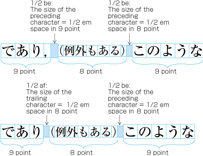
  4. 3 Line Composition explains that full stops (cl-06), commas (cl-07), opening brackets (cl-01) and closing brackets (cl-02) are half-width. If these punctuation marks and brackets are adjacent to ideographic (cl-19), katakana (cl-16) or hiragana (cl-15) characters, in principle there should be a half em space before or after the punctuation mark or brackets, so that these occupy in effect a full-width size. However, if they are adjacent to other punctuation marks or brackets, the half em space is not used. This is done to improve the visual appearance. In such cases, the character positions are different than the positions established when defining the kihon-hanmen (see [Fig.46]).

    Example of lines with consecutive punctuation marks.
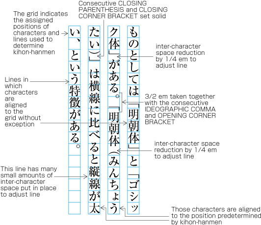
    [Fig.46]: Example of lines with consecutive punctuation marks.
  5. 3 Line Composition explains the principle that closing brackets (cl-02), full stops (cl-06) and commas (cl-07) should not be placed at the line head. If by simple sequential placement these characters would appear at the line head or at the line end, some kind of adjustment becomes necessary. A similar adjustment is required for characters that should not be placed at the end of a line, such as opening brackets (cl-01). As a result of such adjustment, it may happen that other characters are placed at positions which are different from those established for the kihon-hanmen.

    Example of line adjustment to avoid those characters which shall not start and end a line.
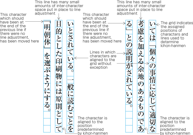
    [Fig.47]: Example of line adjustment to avoid those characters which shall not start and end a line.

2.6 Running Heads and Page Numbers

2.6.1 Positioning of Running Heads and Page Numbers

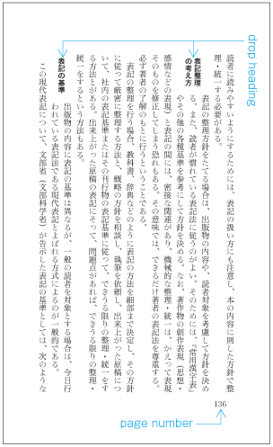
Typical positions of running heads and page numbers for vertically set books with double running heads (see 2.6.3 Ways of Arranging Running Heads and Page Numbers) are as shown in [Fig.48].

Typical positioning of running heads and page numbers for vertically set books with double running heads.
[Fig.48]: Typical positioning of running heads and page numbers for vertically set books with double running heads.

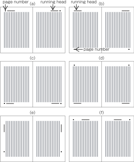
Typical positions of running heads and page numbers for horizontally set books with double running heads (see 2.6.3 Ways of Arranging Running Heads and Page Numbers) are as shown in [Fig.49].

Typical positioning of running heads and page numbers for horizontally set books with double running heads.
[Fig.49]: Typical positioning of running heads and page numbers for horizontally set books with double running heads.

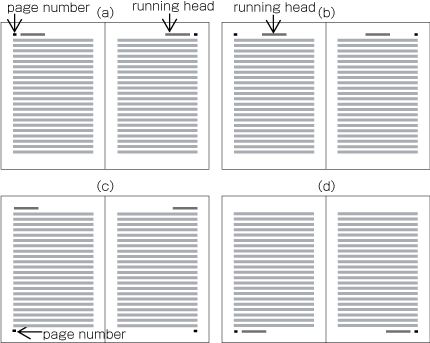
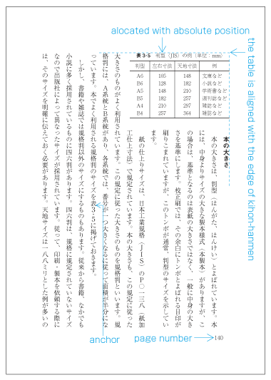
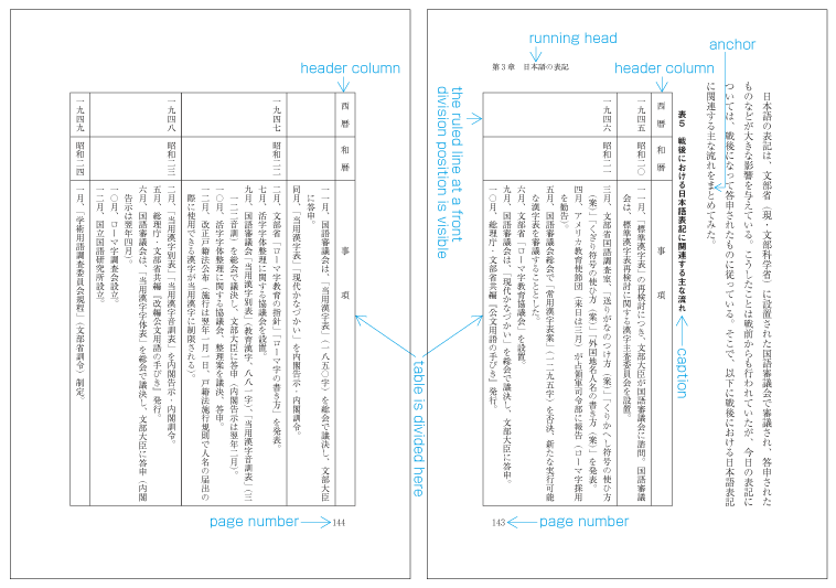
In principle, positions of running heads and page numbers should be specified relative to the kihon-hanmen, not with absolute coordinates in the trim size. (Positioning of running heads is defined in JIS X 4051, sec. 7.6.4. Positioning of page numbers is defined in JIS X 4051, sec. 7.5.4.)

Example:

Positioning a horizontal running head above the top left corner (to head and fore-edge) of the kihon-hanmen in a typical vertically set book (see [Fig.50]).

9 points above the kihon-hanmen (vertical space) アキ修正あり

9 points from the left edge of the kihon-hanmen (horizontal space) アキ修正あり

Positioning of a running head (vertical writing mode).
[Fig.50]: Positioning of a running head (vertical writing mode).

The following recommendations should be taken into account when positioning running heads and page numbers with reference to the kihon-hanmen.

  1. When positioning horizontal running heads and page numbers with reference to the kihon-hanmen in vertically set books, the amount of vertical space between the edge of the kihon-hanmen and the running head is a one em space as established for the kihon-hanmen. If the kihon-hanmen of the book is horizontally set, take more vertical space than the character size in the kihon-hanmen.

  2. Regardless of the direction of text in the kihon-hanmen of a book, horizontal running heads and page numbers on the left page should be aligned either at the left edge of the kihon-hanmen or one em space to the right of the left edge. On the right page, the tail of the running heads or page numbers should be aligned either at the right edge of the kihon-hanmen or one full-width space to left of the right edge.

  3. Regardless of the direction of text in a book, when arranging running heads and page numbers together on the same horizontal line, the space between the running head and the page number should be double or one and a half times the character size of the running head. On the left page, the page number should be set at the left side and the running head should be set at the right side. On right-hand pages, the page number should be set at the right side and the running head should be set at the left side. The exact positions of the page numbers are given by the instructions above (see b).

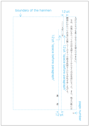
  4. When positioning running heads and page numbers vertically to the fore-edge of the kihon-hanmen in a vertically set book (see spread (e) in [Fig.48], for example), the minimum horizontal distance from the kihon-hanmen should be the same as that of the line gap of the kihon-hanmen. The top of the running head should be positioned approximately four kihon-hanmen characters below the head, and the bottom of the page numbers should be positioned approximately five kihon-hanmen characters above the foot.

    (note 1)

    In general, ideographic numerals (一二三四五六七八九〇) are used for vertically set page numbers, and European numerals for horizontal pagination. When using independent pagination for the front matter, small Roman numerals are used for horizontal pagination.

2.6.2 Principles of Arrangement of Running Heads and Page Numbers

Positioning of all running heads and page numbers in the same book should be consistent.

(note 1)

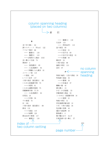
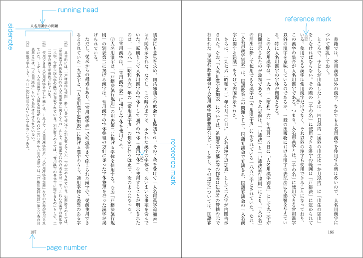
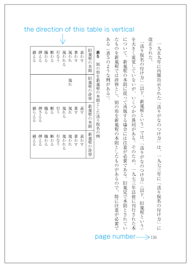
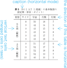
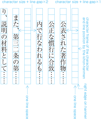
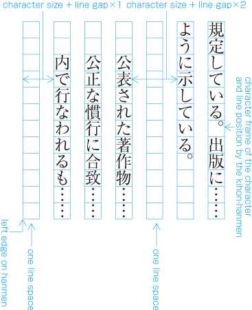
Even on a page with a text area smaller in size than that of the kihon-hanmen, such as for a table of contents or index, positioning of the running head and page number relative to the trim size will remain the same. Therefore, the positioning of running heads and page numbers relative to those areas smaller than the kihon-hanmen is different. [Fig.51] below demonstrates the respective positions of the hanmen for a table of contents and running heads or page numbers. As shown in [Fig.17], this hanmen is smaller than the kihon-hanmen. [Fig.52] demonstrates the related positions of running heads and page numbers and the hanmen of indexes. These hanmen are not only 4 points smaller at the left and right, but also 5 points smaller at the top and bottom.

Positioning of running heads and page numbers on TOC pages for which the hanmen is smaller in size than the kihon-hanmen.
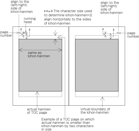
[Fig.51]: Positioning of running heads and page numbers on TOC pages for which the hanmen is smaller in size than the kihon-hanmen.
Positioning of running heads and page numbers on index pages for which hanmen is smaller in size than the kihon-hanmen.
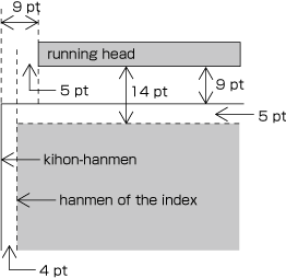
[Fig.52]: Positioning of running heads and page numbers on index pages for which hanmen is smaller in size than the kihon-hanmen.

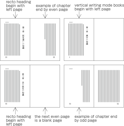
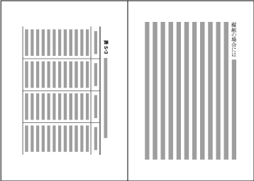
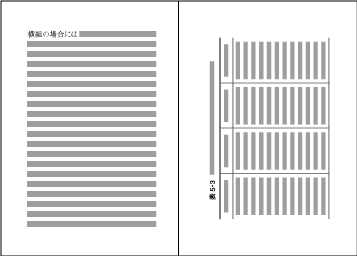
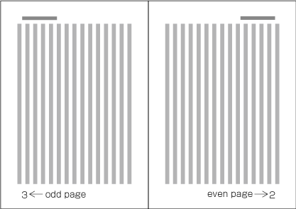
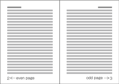
Because the start of a page will be on the recto side, the right-hand page of a spread in a vertically set book is always an even page and the left-hand page is always an odd page (see [Fig.53]). Likewise, the left-hand page of a spread in a horizontally set book is always an even page and the right-hand page is always an odd page (see [Fig.54]).

Page numbers on a spread in a vertically set book.
[Fig.53]: Page numbers on a spread in a vertically set book.
Page numbers on a spread in a horizontally set book.
[Fig.54]: Page numbers on a spread in a horizontally set book.

2.6.3 Ways of Arranging Running Heads and Page Numbers

There are two ways to arrange running heads. One is the single running head method and the other is the double running head method. (Arrangement of running heads is defined in JIS X 4051, sec. 7.6.2. Page Numbers are defined in sec. 7.5.2.).
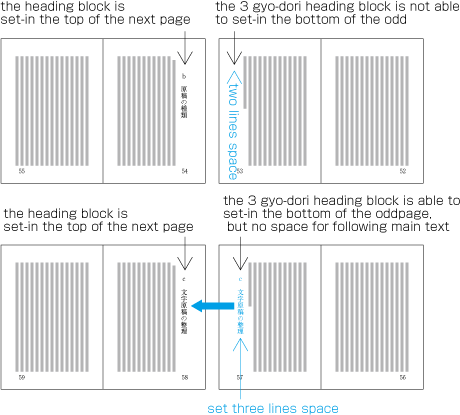
Double running head method.
[Fig.55]: Double running head method.
Single running head method.
[Fig.56]: Single running head method.

(note 1)

In general, there will be only one running head per page. However, in some cases, such as in dictionaries, multiple running heads are printed on each page to indicate contents.

(note 2)

In general, there will be only one page number per page. However in some cases multiple page numbers are printed on each page as in the following examples:

  1. When a horizontally set index and/or bibliography appears at the end of a volume in a vertically set book, both reverse pagination and continuous pagination are printed.

  2. For multivolume works, both serial page numbers throughout the work and page numbers per volume are printed.

  1. In the double running head method, a higher-level title, such as that of the chapter or book, is used for the running heads on the even pages, and a lower-level title, such as that for a section, on the odd pages. Where there are no differing levels of titles, such as on the page containing the table of contents, the same running head is used on both even and odd pages.

    (note 1)

    Which information is used for the running heads depends on the content of the book. Given that the main purpose of running heads is to signpost to readers what is written on each page, or the content of the current page, it does not make much sense to use the book title for the running head. The most common approach for a book with three levels of headings, such as chapter, section and subsection, is to use the highest level heading (i.e. chapter) and the second level heading (i.e. section).

  2. In the single running head method, one of the headings between the top and third levels is used.

  3. In principle, the contents of running heads will be the same as those of headings with the following differences:

    1. Numbers and words in Latin alphanumeric characters in vertically set headings in vertically set books should be changed to horizontal notation for horizontally set running heads (see 2.3.2 Major Differences between Vertical Writing Mode and Horizontal Writing Mode).

    2. If headings are too long, they should be made shorter by paraphrasing them in fewer characters. Running heads with too many characters will not look good.

    3. For certain publications, such as a collection of monographs, the names of authors may be added in parentheses at the end of the running head.

  4. In principle, the text direction of running heads and page numbers should be the same as that of the kihon-hanmen. For vertically set books, however, it is more common to set running heads and page numbers horizontally.

  5. In principle, for the single running head method running heads are printed on all odd pages, and for the double running head method on all even and odd pages. However, for the sake of appearance, running heads may be omitted as follows:

    1. Pages on which running heads should be hidden:

      1. Naka-tobira and han-tobira.

      2. Pages where a running head overlaps with other elements such as illustrations.

      3. Blank pages.

    2. Pages on which running heads may be hidden:

      1. Pages where a figure or a table is positioned adjacent to the running head.

      2. Pages with a heading right after a new recto or new page.

  6. In principle, page numbers are printed on all pages. However, for the sake of appearance, they may be omitted as follows:

    1. Pages on which page numbers should be hidden:

      1. Pages on which a illustration or a table is positioned adjacent to the page number.

      2. Blank pages.

    2. Pages on which page numbers may be hidden:

      1. Divisional title and simplified divisional title pages.

      2. Pages in horizontally set books with a page number placed in the margin at the top of the page, and with a heading at the beginning of a new recto or new page. (In this case, it is also possible to move the page numbers to the center of the margin at the foot of the page.)

    (note 1)

    Pages are not counted in cases such as the following:

    1. If a different type or color of paper is used for the main title page,

    2. if a frontispiece is inserted in the opening page of a book; or

    3. if an illustration of the enclosure or a divisional title is present in the main text.

  7. There are two types of page numbering. "Continuous pagination" means that page numbers continue throughout the whole book. "Independent pagination" means that page numbers start from "1" separately at beginning of the front matter and back matter. There is also, for example in manuals, the method of starting each chapter from page number "1". (In such cases, it is common that the name of the chapter is added as a prefix before the page number.)

    (note 1)

    If the front matter and the main text have different page numbers, each starts with page number "1". In this case, it is common to use Roman numerals for the pages of the front matter, in order to distinguish them from the main text.

    (note 2)

    For vertically set books with indexes in horizontal writing mode, the following methods are available.

    1. Reverse pagination. The index reads from the end of the book, and page numbers are added starting with "1" from the end of the book and flow in the same order as the index.

    2. Continuous pagination. The index reads from the end of the book, but page numbers start with "1" and flow in the same order as the book. (The index pages flow in the reverse order to the page numbers.)

    3. Both reverse pagination and continuous pagination. In this case, the page numbers for continuous pagination are in the same position as the page numbers of the main text, and page numbers in reverse pagination are in a different position (for example, if serial pagination is in the foot of the page, reverse pagination is in the head). Often other methods are applied to distinguish the different paginations. For example, Arabic numbers are used for both continuous pagination and reverse pagination, but for reverse pagination, brackets are added around the numbers.

3 Line Composition

3.1 Line Composition Rules for Punctuation Marks

3.1.1 Differences in Vertical and Horizontal Composition in Use of Punctuation Marks

There are some punctuation marks that are used uniquely in either vertical writing mode or horizontal writing mode. In this document, characters and symbols are treated as members of a character class, classified by their behavior for composition. Each class name is followed by class id, such as opening brackets (cl-01). Details are explained in 3.9 About Character Classes. The following are some typical examples:

  1. Full stops (cl-06) and commas (cl-07)

    1. In vertical writing mode, IDEOGRAPHIC FULL STOP "。" and IDEOGRAPHIC COMMA "、" are used for full stops (cl-06) and commas (cl-07).

    2. In horizontal writing mode, there are three conventions in choice of symbols for full stops (cl-06) and commas (cl-07):

      1. Using COMMA "," and FULL STOP "." (see [Fig.57]).

        Example text using COMMA and FULL STOP.
        [Fig.57]: Example text using COMMA and FULL STOP.
      2. Using COMMA "," and IDEOGRAPHIC FULL STOP "。" (see [Fig.58]).

        Example text using COMMA and IDEOGRAPHIC FULL STOP.
        [Fig.58]: Example text using COMMA and IDEOGRAPHIC FULL STOP.
      3. Using IDEOGRAPHIC COMMA "、" and IDEOGRAPHIC FULL STOP "。" (see [Fig.59]).

        Example text using IDEOGRAPHIC COMMA and IDEOGRAPHIC FULL STOP.
        [Fig.59]: Example text using IDEOGRAPHIC COMMA and IDEOGRAPHIC FULL STOP.

      (note 1)

      In horizontal writing mode, there are many cases of composition that mixes Japanese and Western text. The convention shown in (i) is a way to apply the same comma and full stop to both Western and Japanese texts for consistency, and is common in books on science and technology. The convention shown in (ii) was invented because in (i) FULL STOP "." appears too small for Japanese texts and using IDEOGRAPHIC FULL STOP "。" for period looks better. This convention has been adopted for Japanese official publications. (In the past, COMMA "," and FULL STOP "." were used for some official publications.)

  2. LEFT CORNER BRACKET "「", RIGHT CORNER BRACKET "」", LEFT DOUBLE QUOTATION MARK "“" and RIGHT DOUBLE QUOTATION MARK "”"

    1. In vertical writing mode, LEFT CORNER BRACKET "「" and RIGHT CORNER BRACKET "」" are used for quotations (see [Fig.60]).

      Examples of quoted text using LEFT CORNER BRACKET and RIGHT CORNER BRACKET.
      [Fig.60]: Examples of quoted text using LEFT CORNER BRACKET and RIGHT CORNER BRACKET.
    2. In horizontal writing mode, pairs of LEFT DOUBLE QUOTATION MARK "“" and RIGHT DOUBLE QUOTATION MARK "”" or pairs of LEFT SINGLE QUOTATION MARK "‘" and RIGHT SINGLE QUOTATION MARK "’" may be used in place of LEFT CORNER BRACKET "「" and RIGHT CORNER BRACKET "」" (see [Fig.61]).

      Examples of quoted text using LEFT DOUBLE QUOTATION MARK and RIGHT DOUBLE QUOTATION MARK.
      [Fig.61]: Examples of quoted text using LEFT DOUBLE QUOTATION MARK and RIGHT DOUBLE QUOTATION MARK.

      (note 1)

      This is because LEFT CORNER BRACKET "「" and (especially) RIGHT CORNER BRACKET "」" may not look good in horizontal writing mode, but adoption of corner brackets for horizontal writing mode seems to be increasing.

      (note 2)

      Though LOW DOUBLE PRIME QUOTATION MARK "〟" and REVERSED DOUBLE PRIME QUOTATION MARK "〝" are similar to double quotation marks in appearance (see [Fig.62]) they are exclusively used for vertical writing mode and are not to be used in horizontal writing mode.

      Examples of quoted text using LOW DOUBLE PRIME QUOTATION MARK and REVERSED DOUBLE PRIME QUOTATION MARK.
      [Fig.62]: Examples of quoted text using LOW DOUBLE PRIME QUOTATION MARK and REVERSED DOUBLE PRIME QUOTATION MARK.

      (note 3)

      LEFT DOUBLE QUOTATION MARK "“" and RIGHT DOUBLE QUOTATION MARK "”" are exclusively for horizontal writing mode and not to be used in vertical writing mode. Also, LEFT SINGLE QUOTATION MARK "‘" and RIGHT SINGLE QUOTATION MARK "’" are exclusively for horizontal writing mode and not to be used in vertical writing mode. However, in vertical writing mode, when Western characters (cl-27) are composed rotated 90 degrees clockwise, these quotation marks are sometimes used.

  3. LEFT SQUARE BRACKET "[", RIGHT SQUARE BRACKET "]", LEFT TORTOISE SHELL BRACKET "〔" and RIGHT TORTOISE SHELL BRACKET "〕"

    LEFT TORTOISE SHELL BRACKET "〔" and RIGHT TORTOISE SHELL BRACKET "〕" are vertical variants of LEFT SQUARE BRACKET "[" and RIGHT SQUARE BRACKET "]", which are used in horizontal writing mode. Square brackets should be used in horizontal writing mode except for special cases.

(note 1)

The position of the letter face of commas (cl-07) and full stops (cl-06) within the character frame differs in vertical and horizontal writing modes. The same letter face can be used for opening brackets (cl-01), closing brackets (cl-02) and hyphens (cl-03) in both vertical and horizontal writing mode by rotating clockwise 90 degrees to the inline direction. The position of the letter face of small kana (cl-11) symbols within the character frame is different in vertical and horizontal writing modes. For KATAKANA-HIRAGANA PROLONGED SOUND MARK "ー", the difference between vertical and horizontal writing modes is not only in the orientation of the letter form to the inline direction, but also the shape of the symbol (see [Fig.63]).

KATAKANA-HIRAGANA PROLONGED SOUND MARK for vertical and horizontal writing modes.
[Fig.63]: KATAKANA-HIRAGANA PROLONGED SOUND MARK for vertical and horizontal writing modes.

3.1.2 Positioning of Punctuation Marks (Commas, Periods and Brackets)

The positioning of punctuation marks (commas, periods and brackets) in a line proceeds as follows.

(note 1)

Basic processing of characters and symbols, including punctuation marks, which are subject to considerations of line head wrapping, line end wrapping and inter-character space adjustment, will be described in detail in 3.9 About Character Classes. All combinations of character class are provided as a complete table in Appendix B Spacing between Characters.

The character advance of commas (cl-07), full stops (cl-06), opening brackets (cl-01), closing brackets (cl-02) and middle dots (cl-05) is half-width (half em). But when those punctuation marks are placed side-by-side with ideographic (cl-19), hiragana (cl-15), or katakana (cl-16) characters, in principle, a given amount of space will be inserted before or after the symbols, which makes them appear as if they were intrinsically full-width (one em) (see [Fig.64]). Space is inserted before and after middle dots (cl-05). This principle makes the symbols consistent with ideographic (cl-19), hiragana (cl-15) and katakana (cl-16) characters in character width, and at the same time the space for punctuation helps to make the organization of text clearer. The space added before or after punctuation marks is subject, in principle, to line adjustment and may eventually be removed, except for that added after full stops (cl-06). (Details of line adjustment are discussed in 3.8 Line Adjustment). アキ修正あり

  1. After commas (cl-07), a half em space is added, in principle.

  2. After full stops (cl-06), in the middle of a line, a half em space is added. At the end of a line, a half em space is added, in principle.

  3. Before opening brackets (cl-01), a half em space is added, in principle.

  4. After closing brackets (cl-02), a half em space is added, in principle.

  5. Before and after middle dots (cl-05), a quarter em space is added, in principle.

Character widths of commas, periods, and the space appended before and/or after the symbols.  アキ修正あり
[Fig.64]: Character widths of commas, periods, and the space appended before and/or after the symbols. アキ修正あり

(note 1)

In font implementations, punctuation marks can be given a different character width, but it is expected that the font is capable of following the line composition rules explained here to produce the final result. For example, when opening brackets (cl-01) and closing brackets (cl-02) are implemented with full-width size, it is possible that a minus half em space is inserted between adjacent closing brackets (cl-02) and opening brackets (cl-01) (Some implementations prepare minus half em spaces and quarter em spaces). In letterpress printing, it was also common practice to combine punctuation marks with a half-width body and half em spaces in order to make it easier to remove the space later for adjustment. Because of that, the types were picked up except for the punctuation marks at the type-picking phase, following the manuscript, and the punctuation marks were picked only when they were necessary in composing a page. Later, with the increasing adoption of Monotype machines, punctuation marks with a full-width body became popular and both full-width and half-width punctuation marks have been used, mixed together, since then. 日本語変更あり

(note 2)

Among opening brackets (cl-01) and closing brackets (cl-02), LEFT PARENTHESIS "(", RIGHT PARENTHESIS ")", LEFT ANGLE BRACKET "〈" and RIGHT ANGLE BRACKET "〉" are used to indicate supplementary explanations, and in that case their usage differs slightly from other opening brackets (cl-01) and closing brackets (cl-02). To reflect the difference, there is an alternative convention to not append a half em space before or after the parentheses and angle brackets, and instead just set them solid (see [Fig.65]).

Positioning of parentheses and brackets. (The left-hand side shows an example of setting them solid.)
[Fig.65]: Positioning of parentheses and brackets. (The left-hand side shows an example of setting them solid.)

3.1.3 Exceptional Positioning of Ideographic Comma and Katakana Middle Dot

The space usually added after IDEOGRAPHIC COMMA "、" and the space before and after KATAKANA MIDDLE DOT "・" are omitted, in principle, for cosmetic reasons in the following cases. アキ修正あり

  1. In vertical writing mode, ideographic numerals and IDEOGRAPHIC COMMA "、" used as a decimal separator are set solid (as in the right line in [Fig.66]).

    Example of  exceptional positioning of the IDEOGRAPHIC COMMA.
    [Fig.66]: Example of exceptional positioning of the IDEOGRAPHIC COMMA.

    (note 1)

    In vertical writing mode, ideographic digits used with IDEOGRAPHIC COMMA "、" to represent an approximate number are expected to be set solid too (as in the right line in [Fig.67]).

    Example of the positioning of IDEOGRAPHIC COMMA with ideographic digits to represent an approximate number.
    [Fig.67]: Example of the positioning of IDEOGRAPHIC COMMA with ideographic digits to represent an approximate number.
  2. Ideographic digits and KATAKANA MIDDLE DOT "・" representing a decimal point are set solid (as in the right line in [Fig.68]). In vertical writing mode, when KATAKANA MIDDLE DOT "・" is used as a member of unit symbols (cl-25) in unit symbols, grouped numerals (cl-24), and Western characters (cl-27) in mathematical and chemical formulae, before and after KATAKANA MIDDLE DOT "・" is set solid.

    Example of the exceptional positioning of KATAKANA MIDDLE DOT.
    [Fig.68]: Example of the exceptional positioning of KATAKANA MIDDLE DOT.

3.1.4 Positioning of Consecutive Opening Brackets, Closing Brackets, Commas, Full Stops and Middle Dots

In cases where multiple punctuation marks, such as opening brackets (cl-01), closing brackets (cl-02), commas (cl-07), full stops (cl-06) and middle dots (cl-05), come one after the other, the following space adjustments are made for aesthetic reasons (see [Fig.69]). Note also that the half em and quarter em spaces added before or after punctuation marks, including the half em space after full stops (cl-06) appearing in the middle of a line, are subject, in principle, to line adjustment and may eventually be removed, except for those added after full stops (cl-06). (See 3.8 Line Adjustment for more about line adjustment.) For more information about the positioning of closing brackets (cl-02), full stops (cl-06), commas (cl-07) and middle dots (cl-05) at line end, see 3.1.9 Positioning of Closing Brackets, Full Stops, Commas and Middle Dots at Line End.

  1. When closing brackets (cl-02) come immediately after commas (cl-07) or full stops (cl-06), remove the default half em space between them and, in principle, add a half em space after the closing brackets (see [Fig.69] ①).

  2. When commas (cl-07) come immediately after closing brackets (cl-02), remove the default half em space between them and, in principle, add a half em space after the comma. When full stops (cl-06) come immediately after closing brackets (cl-02), remove the default half em space between them and, in middle of a line, add a half em space after the full stop; at the end of a line, in principle, add a half em space after the full stop (see [Fig.69] ②).

  3. When opening brackets (cl-01) come immediately after commas (cl-07), in principle, add a half em space between them (see [Fig.69] ③). When opening brackets (cl-01) come immediately after full stops (cl-06) in the middle of a line, add a half em space between them. Note that when full stops (cl-06) come in the bottom of lines, in principle, insert a half space after full stops (cl-06).

  4. When opening brackets (cl-01) come immediately after closing brackets (cl-02), in principle, add a half em space between them (see [Fig.69] ④).

  5. When opening brackets (cl-01) come immediately after other opening brackets (cl-01), set them solid and, in principle, add a half em space before the first one (see [Fig.69] ⑤).

  6. When closing brackets (cl-02) come immediately after other closing brackets (cl-02), set them solid and, in principle, add a half em space after the last closing bracket (see [Fig.69] ⑥).

  7. When middle dots (cl-05) come immediately after closing brackets (cl-02), in principle, add a quarter em space before the following middle dot (see [Fig.69] ⑦).

  8. When opening brackets (cl-01) come immediately after middle dots (cl-05), in principle, add a quarter em space after the preceding middle dot (see [Fig.69] ⑦).

Examples of line adjustment with multiple opening brackets, closing brackets, commas, full stops or middle dots.
[Fig.69]: Examples of line adjustment with multiple opening brackets, closing brackets, commas, full stops or middle dots.

The line adjustment rules shown above have been established because the default half em space before or after consecutive punctuation marks, or quarter em space before and after them, makes the line look sparse and doesn't make the line appear well-proportioned (see [Fig.70]). アキ修正あり

Examples of bad line composition with unadjusted spaces between multiple opening brackets, closing brackets, commas, full stops or middle dots.
[Fig.70]: Examples of bad line composition with unadjusted spaces between multiple opening brackets, closing brackets, commas, full stops or middle dots.

(note 1)

Japanese composition is based on the design of full-width characters, but strictly following full-width based composition sometimes produces an unbalanced appearance. In such exceptional cases, the appearance of the resulting composition must be given higher priority than the full-width design principle. When and how to invoke such exceptional procedures has a direct bearing on the quality of the text layout. In other words, it is a matter of how to resolve the conflicts between the principle and the products of it.

3.1.5 Positioning of Opening Brackets at Line Head

When starting a new line with opening brackets (cl-01) there are some patterns as shown in [Fig.71]. Note that the amount of line indent after the line feed (the first line indent of a new paragraph) is assumed to be a one em space across all the patterns.

  1. The first line indent after the line feed is set full-width (one em) and the next line after the first line break starts with no space (so-called tentsuki) (see [Fig.71] ①). アキ修正あり

  2. The first line indent after the line feed is set one and a half em and the next line indent after the first line break is set to a half em (see [Fig.71] ②).

  3. The first line indent after the line feed is set at a half em and the next line after the first line break is set tentsuki (see [Fig.71] ③).

Examples of positioning of opening brackets at line head.
[Fig.71]: Examples of positioning of opening brackets at line head.

(note 1)

Because the inherent character width of a bracket is half-width, [Fig.71] ① can be explained as the result of applying the principle that any line should start with no space. On the other hand, the principle represented by [Fig.71] ② is to assume that opening brackets should be always accompanied by the preceding half em space as if they were full-width and then apply the same principle as in [Fig.71] ①. JIS X 4051 adopts the principle shown in ① (the patterns shown in ② is offered as options) . The pattern shown in ③ was first invented in books such as novels, which use frequent line feeds and corner brackets in dialogues, for which the first line indent with one em or one and a half em would create the appearance of too much space (then this pattern was accepted and adopted by general books). Major Japanese publishers who deal with literature, such as Kodansha, Shinchosha, Bungei Shunju, Chuoh Kouronsha, and Chikuma Shobo, have adopted the pattern shown in ③. By contrast, Iwanami Shoten and other publishers adopted the pattern shown in ①. Because Iwanami Shoten once adopted pattern ② in vertical composition, there used to be many examples of it, but few examples of ② can be found today. アキ修正あり

(note 2)

The first line indent of a new paragraph is full-width in principle. However, the following exceptions can be found.

  1. The most popular scheme is to set the first line indent of all new paragraphs to full-width. However, even if there is a paragraph break and the new line looks like the beginning of new paragraph, in contexts where the new line is a continuation of the preceding line, the new line is set tentsuki as shown in [Fig.72]. (There are books such as novels which adopt full-width line indent without exception.) Similarly, in horizontal writing mode, the line indent is set tentsuki where the new line continues the preceding line of a mathematical expression connected by conjunctions such as "therefore".

    Examples of line indent followed by the preceding line with quoted text (as in dialogues).
    [Fig.72]: Examples of line indent followed by the preceding line with quoted text (as in dialogues).
  2. When headings have no line indent, the first line indent of the first paragraph after the heading can be also set tentsuki, for cosmetic reasons. However, it is not recommended to set the first line indent to tentsuki for all paragraphs, because it would make paragraph breaks unclear.

3.1.6 Positioning of Dividing Punctuation Marks (Question Mark and Exclamation Mark) and Hyphens

The dividing punctuation marks (cl-04) (QUESTION MARK "?" and EXCLAMATION MARK "!") should be full-width, and they are typeset as follows.

  1. Basically, add no space before dividing punctuation marks (cl-04) at the end of a sentence and add a one em space after them (see [Fig.73]). However when a closing bracket (cl-02) follows right after the dividing punctuation mark, add no space after the dividing punctuation mark and add a half em space after the closing bracket (see [Fig.73]).

    Positioning of dividing punctuation marks (Examples in vertical writing mode).
    [Fig.73]: Positioning of dividing punctuation marks (Examples in vertical writing mode).

    (note 1)

    Many implementations use full-width ideographic space (cl-14) for the one em space appended after dividing punctuation marks (cl-04).

    (note 2)

    No full stops (cl-06) should be appended after dividing punctuation marks (cl-04) at the end of a sentence.

    (note 3)

    There are some cases where dividing punctuation marks (cl-04) are used in the middle of a sentence, not at the end. In those cases, either add no space or a quarter em space before and after the dividing punctuation mark see [Fig.74]).

    Examples of positioning of dividing punctuation marks in the middle of a sentence (in vertical writing mode).
    [Fig.74]: Examples of positioning of dividing punctuation marks in the middle of a sentence (in vertical writing mode).

    (note 4)

    The details of composition rules for dividing punctuation marks (cl-04) and hyphens (cl-03) are described in Appendix B Spacing between Characters as a complete table, following the descriptions of character classes in 3.9 About Character Classes.

  2. When dividing punctuation marks (cl-04) at the end of a sentence reach the end of a line, apply the following rules (see [Fig.75]).

    Examples of positioning of dividing punctuation marks at the end of a line (in vertical writing mode).
    [Fig.75]: Examples of positioning of dividing punctuation marks at the end of a line (in vertical writing mode).
    1. If the line length is 13 character widths and a dividing punctuation mark (cl-04) occurs in the 12th character position, a one em space should be appended after it.

    2. If the line length is 13 character widths and a dividing punctuation mark (cl-04) occurs in the 13th character position, no space should be appended after it. In addition, do not carry over the one em space usually appended after the dividing punctuation marks to the line head of the next line; the line in this case should be set tentsuki.

The character width of hyphens (cl-03) varies according to the type of hyphen. HYPHEN "‐" should be quarter em width (i.e. one quarter of an em width), EN DASH "–" and KATAKANA-HIRAGANA DOUBLE HYPHEN "゠" should be half-width (a half em width), WAVE DASH "〜" should be full-width. Basically there should be no space before and after hyphens (cl-03). However, a half em space should be appended, in principle, when opening brackets (cl-01) follow right after a hyphen (cl-03) and a quarter em space when middle dots (cl-05) follow a hyphen (cl-03).

3.1.7 Characters Not Starting a Line

In principle, no line should begin with closing brackets (cl-02), hyphens (cl-03), dividing punctuation marks (cl-04), middle dots (cl-05), full stops (cl-06), commas (cl-07), iteration marks (cl-09), a prolonged sound mark (cl-10), small kana (cl-11) or warichu closing brackets (cl-29) (line-start prohibition rule). Otherwise the line would have an odd appearance.

(note 1)

Not a small number of books adopt a less strict set of rules which allow IDEOGRAPHIC ITERATION MARK "々" (one of the iteration marks (cl-09)), prolonged sound mark (cl-10) and small kana (cl-11) to start a line. There is another method whereby IDEOGRAPHIC ITERATION MARK "々" is replaced by a kanji character when it would otherwise be set at the head of a line. For example, 家 (at the end of a line) + 々 (at the head of the next line) will be changed to 家 (at the end of a line) + 家 (at the head of the next line).

(note 2)

There is yet another less strict rule that allows KATAKANA MIDDLE DOT "・" to start a line.

(note 3)

In the layout of newspaper text, dividing punctuation marks (cl-04) (QUESTION MARK "?" and EXCLAMATION MARK "!") are allowed to start a line. This is due to the fact that the line lengths are shorter in newspapers. When the line is very short, there are fewer opportunities for inter-character space adjustment, which makes it difficult to preserve the number of characters per line. It is thought that this is the reason why the less strict set of line head wrapping rules was adopted in newspaper text layout.

(note 4)

The details of the line-start prohibition rules and line-end prohibition rules are described in Appendix B Spacing between Characters as a complete table, following the description of character classes in 3.9 About Character Classes.

3.1.8 Characters Not Ending a Line

No line should end with opening brackets (cl-01) or warichu opening brackets (cl-28) (line-end prohibition rules). Otherwise the line would have an odd appearance.

(note 1)

The process of formatting lines to avoid non-starter characters at the line head, non-ending characters at the line end, spaces before and/or after inseparable characters, line breaking before and/or after unbreakable characters, etc., is generally called kinsokushori.

3.1.9 Positioning of Closing Brackets, Full Stops, Commas and Middle Dots at Line End

In principle, closing brackets (cl-02), commas (cl-07) or full stops (cl-06) at the line end have a half em space after them (see [Fig.76]). This half em space can be deleted for line adjustment (for more about line adjustment, see 3.8 Line Adjustment). However, the possibilities are only half em space or solid. Other spaces, such as a quarter em space should not be used. In principle, the middle dot (cl-05) character at the line end also has a quarter em space before and after, and is handled like a full-width character (see [Fig.76]). This quarter em space can also be deleted for line adjustment, namely middle dots (cl-05) can be set solid before and after (about line adjustment, see 3.8 Line Adjustment). However, in this case also, the only possibilities are quarter em space or solid setting. Other intermediate-sized spacing should not be used.

Example of handling closing brackets, full stops, commas and middle dots at the line end like full-width characters.
[Fig.76]: Example of handling closing brackets, full stops, commas and middle dots at the line end like full-width characters.

(note 1)

With regard to closing brackets (cl-02), full stops (cl-06), commas (cl-07) and middle dots (cl-05) at line end, the following processing is defined in JIS X 4051 (see [Fig.77]).

full stops (cl-06)

After full stops (cl-06), there must be a half em space, including at the line end. This half em space must not be a target for reduction during line adjustment.

commas (cl-07)

After commas (cl-07),solid setting is applied.

closing brackets (cl-02)

After closing brackets (cl-02), solid setting is applied.

middle dots (cl-05)

In principal, before middle dots (cl-05) there is a quarter em space, and after middle dots (cl-05) solid setting is applied.

Example of handling closing brackets, full stops, commas and middle dots at the line end in JIS X 4051.
[Fig.77]: Example of handling closing brackets, full stops, commas and middle dots at the line end in JIS X 4051.

(note 2)

In the letterpress printing era, the following methods were common (see [Fig.78]).

  1. For full stops (cl-06), commas (cl-07) and closing brackets (cl-02), if possible, a half em space was preserved. Using a half em space was the general approach. For middle dots (cl-05), if possible, quarter em space was preserved. Using a quarter em space was the general approach.

  2. If the line length was not sufficient or too great and line adjustment processing became necessary (see 3.8 Line Adjustment), the first priority was to replace the half em space after full stops (cl-06), commas (cl-07) and closing brackets (cl-02) with solid setting. The reason was that this was at the line end, and no problems would arise, even though the half em space became set solid. The option of replacing the half em space after punctuation marks with a quarter em space, instead of removing the whole half em space was not used. That meant that there was the choice between either a half em space after punctuation marks or solid setting. The second priority was to replace quarter em spaces before and after middle dots (cl-05) with solid setting. 日本語修正あり

Examples of closing brackets, commas and full stops at the end of a line with either a half em space after or set solid.
[Fig.78]: Examples of closing brackets, commas and full stops at the end of a line with either a half em space after or set solid.

(note 3)

In some DTP systems etc., after full stops (cl-06), commas (cl-07) or closing brackets (cl-02) at the line end, the line end is always set solid (see [Fig.79]).

Example of always applying solid setting after closing brackets, full stops, and commas at the line end.
[Fig.79]: Example of always applying solid setting after closing brackets, full stops, and commas at the line end.

3.1.10 Unbreakable Character Sequences

If the following characters and symbols appear in sequence there will be no line break between them. The reason is that these characters and symbols are to be handled as one unit.

(note 1)

Both line head wrap and line end wrap mean that there will be no line break between characters or symbols. For line head wrap there is no break between the line head wrap character and the character or symbol before. For line end wrap, there is no break between the line end wrap character and the following character or symbol.

(note 2)

The details of unbreakable character sequences are described in Appendix C Possibilities for Line-breaking between Characters as a complete table, following the description of character classes in 3.9 About Character Classes.

  1. Between a sequence of EM DASH "—" characters (to be more specific, for a double dash, see [Fig.80]). Note that some systems implement HORIZONTAL BAR "―" with very similar behavior to EM DASH "—".

    Sequence of EM DASH characters is unbreakable.
    [Fig.80]: Sequence of EM DASH characters is unbreakable.

    (note 1)

    Other characters and punctuation marks before and after EM DASH "—" are set solid. However, in the following cases some space should be set between EM DASH "—" and other characters. As mentioned in the next note, HORIZONTAL ELLIPSIS "…", TWO DOT LEADER "‥", prefixed abbreviations (cl-12) and postfixed abbreviations (cl-13) behave similarly to EM DASH "—". アキ修正あり

    1. Where closing brackets (cl-02) or commas (cl-07) are followed by EM DASH "—", a half em space is inserted between them, in principle. Also, in the middle of lines, where full stops (cl-06) are followed by EM DASH "—", a half em space is inserted between them. However, when full stops (cl-06) are placed at the end of a line a half em space is added after the full stops (cl-06).

    2. Where EM DASH "—" is followed by opening brackets (cl-01), a half em space is inserted between them, in principle.

    3. Where EM DASH "—" and middle dots (cl-05) are set side by side, a quarter em space is inserted between them, in principle.

    (note 2)

    A double dash is handled as one unit, hence a line break between them is forbidden. In letterpress printing, breaking of the double dash was forbidden very strongly by the fact that the double dash was created as a double full body (so it was actually not possible to break it). Nevertheless, if it was not possible to avoid a break, two EM DASH characters were used instead the double dash. That made it possible to have a line break between them.

  2. Between sequences of HORIZONTAL ELLIPSIS "…" or TWO DOT LEADER "‥" (to be more specific, double HORIZONTAL ELLIPSIS "……" or double TWO DOT LEADER "‥‥").

    Unbreakable sequence of HORIZONTAL ELLIPSIS.
    [Fig.81]: Unbreakable sequence of HORIZONTAL ELLIPSIS.

    (note 1)

    In the letterpress printing era, double HORIZONTAL ELLIPSIS etc. was created as a sequence of HORIZONTAL ELLIPSIS. Hence, compared to double dash, the line break between them was not so strongly forbidden.

  3. Between European numerals (see [Fig.82], [Fig.83], and [Fig.84].). European numerals indicate ranks via the position of a numeral.

    (note 1)

    It is possible to have a line break between ideographic numerals. Also it is possible to have a line break after IDEOGRAPHIC COMMA "、" used as a decimal separator or an indicator for approximate number, and KATAKANA MIDDLE DOT "・" as a decimal point. However, the position between ideographic numerals and IDEOGRAPHIC COMMA "、" used as a decimal separator or an indicator for approximate number, and KATAKANA MIDDLE DOT "・" used as a decimal point is unbreakable. The reason is that the natural usage of ideographic numerals is to write them like "二百三十五", that is with inserted rank indicators (Explanation: "二" means "two", "百" means "hundred". "二百" means "two hundred". "三" means "three", "十" means "ten". "三十" means "thirty"."五" means "five". The complete sequence "二百三十五" means "Two hundred and thirty five".). Hence, it is not necessary to express rank via position. In contrast, line breaks are forbidden for European numerals, since it is necessary to express the rank via the position. Furthermore, if in vertical writing mode European numerals are placed in the appropriate direction side by side, they are used like the ideographic numerals, and it is possible to have a line break between them.

    (note 2)

    When writing European numerals, FULL STOP "." is used as a decimal point, COMMA "," or space is used as a rank indicator. Line breaks cannot occur before and after these characters (see [Fig.84]: the space before "4" expresses a rank).

  4. Between prefixed abbreviations (cl-12) (YEN SIGN "¥"DOLLAR SIGN "$"CENT SIGN "¢" etc.) and the following arabic or ideographic numeral (see [Fig.82]). The reason is that such character sequences are to be handled as one unit.

    Unbreakable sequences between prefixed abbreviations and the following European numeral.
    [Fig.82]: Unbreakable sequences between prefixed abbreviations and the following European numeral.
  5. Between postfixed abbreviations (cl-13) (PERCENT SIGN "%", PER MILLE SIGN "‰" etc.) and the preceding European numeral or ideographic numeral (see [Fig.83]). The reason is that such character sequences are to be handled as one unit.

    Unbreakable sequences between postfixed abbreviations and the preceding European numeral.
    [Fig.83]: Unbreakable sequences between postfixed abbreviations and the preceding European numeral.

    (note 1)

    Some people think that it is appropriate to have a line break between the PERCENT SIGN "%" and the preceding arabic or ideographic numeral. The reason seems to be that PERCENT SIGN "%" has a high level of independence. Furthermore it is possible to have a line break between "0" and "パ" in cases like "50パーセント" (meaning "50 percent", where "percent" is written in katakana).

  6. Inter-letter space among Western characters (cl-27) in a word (or, sequence of letters, which it is not possible to hyphenate), or unit indicators (km, kg, mm etc.) in Latin letters (see [Fig.84]).

    It is not possible to break a line between letters in unit symbols using Latin letters.
    [Fig.84]: It is not possible to break a line between letters in unit symbols using Latin letters.

    (note 1)

    When using HYPHEN "‐" at the end of a line, it becomes possible to have a line break within Western characters (cl-27).

    (note 2)

    In this document, description of units with proportional Western characters, such as km and kg, are treated as unit symbols (cl-25).

    (note 3)

    In [Fig.84], there is a quarter em space between "4" and "k", because of the convention to insert a quarter em between unit symbols (cl-25) and following European numerals or Western characters (cl-27). It is permitted to break a line between "4" and "k". In this case, there is no quarter em space in either the head or the end of the line. Note that the space between "3" and "4" expresses a rank. アキ修正あり

  7. Inter-letter space among ruby letters, when composed as mono-ruby. Note that it is possible to break a line between base characters with mono-ruby (see [Fig.85]).

  8. Inter-letter space among ruby letters or base characters, composed as group-ruby (see [Fig.85]).

    Example of unbreakable sequences of ruby.
    [Fig.85]: Example of unbreakable sequences of ruby.

    (note 1)

    With ruby used for compound words (jukugo-ruby), a group of ruby characters is attached to each base character. It is possible to have a line break between such groups of ruby letters and base characters (see [Fig.86]), however, a line break should not occur between ruby characters related to a given base character.

    Example of a line break for jukugo-ruby.
    [Fig.86]: Example of a line break for jukugo-ruby.
  9. Between a subscript or superscript and an adjacent base character (preceding or following) (see [Fig.87]), or between base characters with ornament characters, or between ornament characters themselves. The reason is that these character sequences are to be handled as one object.

    Unbreakable sequences between a character and its related subscripts.
    [Fig.87]: Unbreakable sequences between a character and its related subscripts.
  10. In order to create a correspondence between notes and the related main text, reference marks (aijirushi) are often added. Line breaks are not allowed before the reference mark or between letters of the reference mark itself (see [Fig.88]). The application of the no-line-break rule here is a matter of style.

    Unbreakable sequences before an aijirushi (reference marks, European numerals or ideographic numerals).
    [Fig.88]: Unbreakable sequences before an aijirushi (reference marks, European numerals or ideographic numerals).

    (note 1)

    In this document, characters in reference marks are treated as characters as reference marks (cl-20).

    (note 2)

    Often there are full stops (cl-06) after reference marks. In these cases, line breaks are not allowed between the reference marks and the full stops. The reason is that full stops should not be set at the head of lines (see [Fig.88]).

  11. After warichu opening brackets (cl-28), which open warichu, or before warichu closing brackets (cl-29), which close warichu.

  12. A unit of furiwake. A unit of furiwake is handled as one object.

3.1.11 Character Sequences which Do Not Allow Space Insertion as Part of Line Adjustment Processing

For line adjustment processing, space must not be added between the following characters. (This is called the inseparable characters rule.) The reason is that these characters or symbols should appear as one unit (for more about line adjustment, see 3.8 Line Adjustment). アキ修正あり

(note 1)

The main places where solid setting may be dropped for line adjustment processing are the spaces among hiragana (cl-15), katakana (cl-16), and ideographic characters (cl-19). Furthermore, things such as the amount of space between words in Western text are also a target for space adaptation.

(note 2)

Combinations of character classes which allow spaces to be inserted for line alignment, are described as a complete table in Appendix E Opportunities for Inter-character Space Expansion during Line Adjustment, following 3.9 About Character Classes.

  1. There must be no space between any characters described in 3.1.10 Unbreakable Character Sequences.

    (note 1)

    Some people think that it is only permissible to increase space between letters in Western words for cases where there is no possibility of regular line adjustment processing.

  2. In addition to the cases mentioned above, the inseparable character rule has to be applied to the following cases.

    1. Before or after opening brackets (cl-01) or closing brackets (cl-02).

      (note 1)

      After opening brackets (cl-01) or before closing brackets (cl-02) the inseparable characters rule is always applied. In contrast, before opening brackets or after closing brackets the rule is not applied. Full stops (cl-06) and commas (cl-07) are handled the same as closing brackets.

    2. Before or after full stops (cl-06) or commas (cl-07).

    3. Before or after middle dots (cl-05).

    4. Before or after dividing punctuation marks (cl-04).

    5. Before or after hyphens (cl-03).

    6. Before or after one em, etc. spaces between Japanese characters.

    7. Among base characters with jukugo-ruby.

3.1.12 Examples of Line Adjustment

Methods of line adjustment processing are discussed in 3.8 Line Adjustment. However, since layout processing of punctuation marks is one reason for the need for line adjustment processing, we will here introduce two main examples of cases where line adjustment processing is necessary, and show adjustment examples (see [Fig.89]).

  1. The principal approach in Japanese composition is that with the exception of the last line of a paragraph, the length of all lines is the same, so all lines are aligned. As explained before, the line length is set to be n-times the character size established for the kihon-hanmen. Hence, as long as only full-width characters are used, all lines have the same length (see ① at [Fig.89]).

  2. In [Fig.89] at ②, there is an IDEOGRAPHIC COMMA "、" followed by a LEFT CORNER BRACKET "「", and the complete space taken by the two characters is one and a half em. That means that the line overshoots or runs short of the edge of the kihon-hanmen by a half em. To restore a uniform line length, line adjustment is applied as shown at ③ in [Fig.89]. The half em space overshoot or shortage is recovered by reducing inter-character space to a quarter em before the LEFT CORNER BRACKET "「" and after the RIGHT CORNER BRACKET "」". アキ修正あり

  3. At ④ in [Fig.89], the 15th character is an opening bracket (cl-01). This should not appear at the line end. Ideally, a full width space reduction would be applied, and the character "前" on the second line would be moved onto the first line in the 15th position. In that way, the problem could be avoided. However, in this example a full-width space reduction is not possible, so line adjustment processing is applied as shown at ⑤ in [Fig.89]. The opening bracket (cl-01) is moved to the second line, and line adjustment by inter-character space expansion is applied. That means that space is inserted in the first line at places where it is allowed.

    Examples of line adjustment.
    [Fig.89]: Examples of line adjustment.

3.2 Japanese and Western Mixed Text Composition (including Horizontal-in-Vertical Text Composition)

3.2.1 Composition of Japanese and Western Mixed Texts

There are a lot of examples of Japanese text in which Western and/or Greek letters are mixed among Japanese letters. Examples are as follows:

  1. Using one Latin letter as a symbol for something, like "A" and "B".

  2. Using a Western word in a Japanese context, like "editor".

  3. Using acronyms of things and organization names, like "DTP" and "GDP".

  4. Writing Western book titles and authors in lists of referred books with original spelling.

Latin letters are also used in itemized lists and numbering of headings, as well as symbols for units, symbols for chemical elements, and mathematical symbols. As can be judged from these examples, mixtures of Latin letters among Japanese letters are in daily use in Japanese composition.

(note 1)

There are some examples which include whole Western paragraphs in Japanese documents. However, there are few ordinary books that include such paragraphs. There are a lot of examples of textbooks for foreign languages, in which one or more Western paragraphs are followed by annotations in Japanese language. Also, there are some examples in treatises and journals, which contain whole Western paragraphs.

(note 2)

In vertical writing mode, symbols for units are usually described with katakana (cl-16), such as センチメートル (centimeter) or センチ(abbreviation of centimeter in katakana, "senchi"). In horizontal writing mode, the International System of Units (SI) is usually used, such as "cm".

(note 3)

The treatment of mixtures of Japanese and Western characters is also described in JIS X 4051 4.7.

3.2.2 Mixed Text Composition in Horizontal Writing Mode

In horizontal writing mode the basic approach is to use proportional Western fonts ([Fig.90]). For European numerals, both half-width fonts and proportional fonts are used. Note that Western word space (cl-26) is a one third em space, in principle, except at line head, line head of warichu, line end and line end of warichu. Western word space (cl-26) at line head, line head of warichu, line end and line end of warichu, is set solid.

Example of proportional Western fonts used in Japanese in horizontal writing mode.
[Fig.90]: Example of proportional Western fonts used in Japanese in horizontal writing mode.
Example of Western full-width fonts used in Japanese in horizontal writing mode. (In horizontal writing mode, Western full-width fonts are usually not recommended.)
[Fig.91]: Example of Western full-width fonts used in Japanese in horizontal writing mode. (In horizontal writing mode, Western full-width fonts are usually not recommended.)

(note 1)

As shown in [Fig.91], there are some examples of Western full-width fonts used in horizontal Japanese typesetting, this usage is not recommended, for cosmetic reasons.

(note 2)

Usually, in horizontal Japanese text, fonts are used with European numeric glyphs that are easy to balance and harmonize with Japanese fonts. Considering line adjustment, the use of fonts with half-width numeric glyphs is recommended. There are some cases of Japanese fonts with half-width glyphs for European digits.

(note 3)

There are two choices for including glyphs of Latin letters and numerals in Japanese and Western mixed text compositions. One way is to use the glyphs for Western characters built into the same Japanese font. The other is to combine an independent Western font for Western characters with a Japanese font for Japanese characters. (Example: [Fig.92] is composed using proportional glyphs for Latin letters and numerals included in Ryumin R-KL. [Fig.93] is composed with Ryumin R-KL for Japanese characters and Times New Roman for Latin letters and numerals.)

Example of Japanese and Western mixed text with the same font Ryumin R-KL for both Japanese characters and proportional Western
     characters.
[Fig.92]: Example of Japanese and Western mixed text with the same font Ryumin R-KL for both Japanese characters and proportional Western characters.
Example of Japanese and Western mixed text with two distinct fonts - Ryumin R-KL for Japanese characters and Times New Roman
     for Western characters.
[Fig.93]: Example of Japanese and Western mixed text with two distinct fonts - Ryumin R-KL for Japanese characters and Times New Roman for Western characters.

3.2.3 Mixed Text Composition in Vertical Writing Mode

As explained in 2.3.2 Major Differences between Vertical Writing Mode and Horizontal Writing Mode, there are three different styles for setting Latin letters and European numerals in vertical writing mode:

  1. Setting Latin letters and/or European numerals one by one in inline direction with Japanese characters (see [Fig.94]). This style is typically adopted when composing a single Latin letter or European numeral between the adjacent Japanese letters. Full-width glyphs are specified for Latin letters and European numerals in this style.

    Example of Latin letters in normal orientation.
    [Fig.94]: Example of Latin letters in normal orientation.
  2. Setting Latin letters and/or European numerals rotated 90 degrees clockwise in vertical text mode ([Fig.95]). This style is usually adopted when Latin letters compose a word or sentence. Proportional fonts are specified for characters in this style, as in horizontal writing mode (or half-width fonts for European numerals).

    Example of Latin letters rotated 90 degrees clockwise.
    [Fig.95]: Example of Latin letters rotated 90 degrees clockwise.
  3. Setting Latin letters and/or European numerals in tate-chu-yoko (horizontal-in-vertical setting, see [Fig.96]). Tate-chu-yoko layout is usually adopted when dealing with a two-digit number in European numerals, or a combination of two or three Latin letters, the length of which is equal to the default size of the line in paragraph direction or longer than that just to an acceptable extent. (A combination of two or three Latin letters may be rotated 90 degrees clockwise rather than set it in tate-chu-yoko layout.) Proportional glyphs (or half-width glyphs for European numerals) are used for characters in tate-chu-yoko layout.

    Example of European numerals in tate-chu-yoko (horizontal-in-vertical setting).
    [Fig.96]: Example of European numerals in tate-chu-yoko (horizontal-in-vertical setting).

    (note 1)

    Acronyms, such as "GNP", and abbreviations like "Web", are usually set one by one, character-wise in normal orientation (see [Fig.97]). However, there are some cases where acronyms and abbreviations are rotated 90 degrees clockwise (see [Fig.98]).

    Example of acronyms set one by one in normal orientation.
    [Fig.97]: Example of acronyms set one by one in normal orientation.
    Example of acronyms rotated 90 degrees clockwise.
    [Fig.98]: Example of acronyms rotated 90 degrees clockwise.

    (note 2)

    The ideographic numerals were traditionally used in vertical writing mode instead of European numerals. (Road numbers and car registration numbers were examples of a couple of exceptions). However, the more newspapers and other publications have been adopting European numerals in vertical writing mode, the more the use of tate-chu-yoko layout for European numerals has also been increasing.

3.2.4 Method for Setting Full-width Latin Letters and European Numerals

When full-width and fixed-width Western characters or European numerals are set in vertical writing mode as "quasi" Japanese characters, inter-character spaces between these characters and hiragana (cl-15), katakana (cl-16) or ideographic characters (cl-19) are set solid, similar to ordinary ideographic characters (cl-19) (see [Fig.99]). Also, in principle, when full-width and fixed-width Western characters or European numerals are set after full stops (cl-06), commas (cl-07) or closing brackets (cl-02), or before opening brackets (cl-01), insert a half em space after commas (cl-07) or closing brackets (cl-02), or before opening brackets (cl-01). In addition, in these cases, insert a half em space after full stops (cl-06). When full-width and fixed-width Western characters or European numerals are set before a full stop (cl-06), comma (cl-07) or closing bracket (cl-02), or after an opening bracket (cl-01), the inter-character space before the full stop, comma or closing bracket, or after the opening bracket is set solid.

Setting example of full-width Latin letters and European numerals.
[Fig.99]: Setting example of full-width Latin letters and European numerals.

(note 1)

In this document, full-width and fixed-space Western characters and European numerals are treated as members of the ideographic characters (cl-19) class. Accordingly, when KATAKANA MIDDLE DOT "・" appears before or after full-width and fixed-space Western characters and Western numerals, in principle, a quarter em space is inserted between KATAKANA MIDDLE DOT "・" and Western characters or Western numerals. However, when KATAKANA MIDDLE DOT "・" is used as a ranking symbol between Western numerals, in principle, it is set solid, like ideographic numerals. アキ修正あり

Example of setting KATAKANA MIDDLE DOT as a ranking symbol among full-width, fixed-space European numerals.
[Fig.100]: Example of setting KATAKANA MIDDLE DOT as a ranking symbol among full-width, fixed-space European numerals.

(note 2)

The details of ideographic characters (cl-19), including full-width and fixed-width Western characters and European numerals, are described as a complete table in Appendix B Spacing between Characters, following 3.9 About Character Classes.

3.2.5 Handling of Tate-chu-yoko (Horizontal-in-Vertical Settings)

To set strings as tate-chu-yoko (horizontal-in-vertical setting), first set from left to right using solid setting, then align the whole string to the center of the vertical line ([Fig.101]). When hiragana (cl-15), katakana (cl-16) or ideographic characters (cl-19) are set before/after tate-chu-yoko, the inter-character space is set solid. In principle, when tate-chu-yoko is set after a comma (cl-07) or closing bracket (cl-02), or before an opening bracket (cl-01), a half em space is inserted. In addition, when tate-chu-yoko is set after a full stop (cl-06) in the middle of a line, a half em space is inserted. When a full stop (cl-06) is set at the end of a line, a half em space is inserted after it, in principle. When tate-chu-yoko is set before full stops, commas or closing brackets, or after opening brackets, the inter-character space is set solid.

Example of setting tate-chu-yoko (horizontal-in-vertical text setting).
[Fig.101]: Example of setting tate-chu-yoko (horizontal-in-vertical text setting).

(note 1)

The details of handling of inter-character spaces between characters in tate-chu-yoko (cl-30) and adjacent other character classes are described as a complete table in Appendix B Spacing between Characters, following 3.9 About Character Classes.

3.2.6 Handling of Western Text in Japanese Text using Proportional Western Fonts

Composition rules for Western characters, Western text and European numerals, set rotated 90 degrees clockwise in vertical writing mode, and horizontal writing mode, are as follows:

  1. A sequence of Western characters in a Western word should not be broken across a line-break, except where hyphenation is allowed.

  2. When line adjustment is done with line adjustment by inter-character space reduction, Western word space (cl-26) is used as first priority. Also, when line adjustment is done with line adjustment by inter-character space expansion, Western word spaces are used as first priority.

  3. When line adjustment by inter-character space addition is used, inter-character spaces within Western words and European numerals are not used for expansion.

  4. Inter-character space, between hiragana (cl-15), katakana (cl-16) or ideographic characters (cl-19) and Western characters or European numerals, is a quarter em space (see [Fig.102]). The issue as to whether the quarter em space can be used for line end adjustment or not is discussed in 3.8.2 Reduction and Addition of Inter-Character Space and 3.8.4 Procedures for Inter-Character Space Expansion.

    Example of a quarter em inter-character space between hiragana, katakana and ideographic characters, and Latin characters.
    [Fig.102]: Example of a quarter em inter-character space between hiragana, katakana and ideographic characters, and Latin characters.

    In the following cases, a quarter em space is not inserted (see [Fig.103]).

    1. At the start of a line, there is no space before Latin characters or European numerals. At the end of the line, there is no space after Latin characters or European numerals.

    2. In the case where Latin characters and European numerals follow a comma (cl-07) or closing bracket (cl-02), or are followed by opening brackets (cl-01), in principle, a half em space is inserted. In the case where Latin characters and European numerals follow a full stop (cl-06) in the middle of a line, a half em space is inserted. When the full stop (cl-06) is set at the end of a line, in principle, a half em space is inserted after the full stop (cl-06).

    3. In the case where Latin characters and European numerals are set before a full stop (cl-06), comma (cl-07) or closing bracket (cl-02), or after an opening bracket (cl-01), the inter-character space is set solid.

Example of no inter-character space before and after Latin characters and European numerals.
[Fig.103]: Example of no inter-character space before and after Latin characters and European numerals.

(note 1)

In this document, proportional Western characters and European numerals are treated as members of the Western characters (cl-27) class. Note that half- and fixed-width European numerals, when mixed with Japanese text, are treated as members of the grouped numerals (cl-24) class.

(note 2)

The reason a quarter em space is needed between Western characters or European numerals and hiragana (cl-15), katakana (cl-16) or ideographic characters (cl-19), is that the design concept of Latin fonts and Japanese fonts are different from each other, so it looks too tight without the spaces ([Fig.104]).

Example of solid setting between, katakana and ideographic characters and Latin characters and European numerals. (This method is
     not recommended).
[Fig.104]: Example of solid setting between, katakana and ideographic characters and Latin characters and European numerals. (This method is not recommended).

3.3 Ruby and Emphasis Dots

3.3.1 Usage of Ruby

Ruby is a small-sized, supplementary text attached to a character or a group of characters in the main text. A run of ruby text, usually attached to the right of the characters in vertical writing mode or immediately above them in horizontal writing mode, indicates the reading or the meaning of those characters (see [Fig.105]). The characters in the main text that are annotated by ruby are called "base characters". Kana characters are often used for ruby to indicate how to read kanji characters; this is known as ruby annotation or as "furigana".

Ruby and base characters.
[Fig.105]: Ruby and base characters.

(note 1)

Societal change in the use of kanji when composing Japanese and changes in the use of ruby implementations in text layout methods have been affecting the usage of ruby itself. Ruby was not very popular while the Touyou Kanji Table (当用漢字表) (the list of kanji characters for everyday use, issued by the Government on November 16, 1946) was in effect because, in principle, it discouraged the use of furigana in its 'directions for use' section. The Jouyou Kanji Table (常用漢字表) (the list of kanji characters in common use, issued by the Government to replace the Touyou Kanji Table on October 10, 1981) has changed the scope of the list. (The Touyou Kanji Table defined the list of all kanji characters that can be used for any documents, while the Jouyou Kanji Table was designed to be a 'reference guide' for the use of kanji to compose contemporary Japanese for general use in society.) For example, the preface of the Jouyou Kanji Table states that one may consider the use of 'furigana (annotations to indicate pronunciation)' when the text appears too difficult to read. This is why the use of ruby has been increasing today. The use of ruby is common in magazines and books, and even newspapers have begun to use ruby these days.

(note 2)

The specification of ruby composition was first introduced in the second revision of JIS X 4051, which was further revised in 2004 to add jukugo-ruby, katatsuki-ruby and the dual ruby composition with which two distinct runs of ruby are attached to the same base characters (4.12 Ruby Composition).

In terms of annotation, ruby has several purposes as described below. Depending on the purpose and/or the function of the ruby, there are different ruby composition methods (the details of the composition methods will be provided in the 3.3.2 Choice of Base Characters to be Annotated by Rubyから3.3.8 Adjustments of Ruby with Length Longer than that of the Base Charactersで解説する).

  1. PURPOSE: Ruby annotation with kana (usually hiragana) to provide readings of kanji characters. There are two types of ruby for this purpose depending on the type of base character:

    1. Add one or more hiragana (cl-15) or katakana (cl-16) ruby character to indicate the reading (Japanese onyomi or kunyomi) for each base ideographic character (cl-19) (see [Fig.106]). This method, attaching one or several hiragana or katakana characters for each base ideographic character, is called mono-ruby.

      Example of ruby annotation  per Kanji Character.
      [Fig.106]: Example of ruby annotation per Kanji Character.
    2. In the Japanese writing system, compound words (jukugo) occasionally appear, usually constructed with a couple of kanji characters. There are two different methods of attaching ruby letters to base kanji characters for these compound words.

      1. Mono-ruby. Ruby letters are attached to each base kanji character, similarly to the previous section (see [Fig.107]).

        Example of mono-ruby method. Ruby letters are attached to each base kanji character in a compound word.
        [Fig.107]: Example of mono-ruby method. Ruby letters are attached to each base kanji character in a compound word.

        (note 1)

        In [Fig.107], there is a quarter em space between the base characters "凝" and "視". So when this line happens to appear in the middle of a paragraph, there needs to be some line adjustment processing.

      2. Jukugo-ruby. Pronunciation is indicated for each base character, but the positioning takes into account the fact that together they make up a compound word (see [Fig.108]). The intention when using jukugo-ruby is to handle the kanji phrase as one object.

        Example of jukugo-ruby method. Ruby letters are attached to groups of kanji characters in compound words.
        [Fig.108]: Example of jukugo-ruby method. Ruby letters are attached to groups of kanji characters in compound words.

        (note 1)

        There is no difference between [Fig.107] of mono-ruby and [Fig.108] of jukugo-ruby, when the number of ruby letters for each base kanji character is one or two. When the mono-ruby approach is adopted, the inter-character space between base kanji characters can be expanded for line adjustment (in [Fig.107], the inter-character space between "鬼" and "門", or, "方" and "角" can be expanded). When the jukugo-ruby approach is adopted, line adjustment cannot be applied to the base kanji characters.

        (note 2)

        The following examples show the relationship between ruby letters and base kanji characters.

        Example of mono-ruby:

        "凝+(ぎよう)" "視+(し)"

        Example of jukugo-ruby 1:

        "凝+(ぎよう) 視+(し)"

        Example of jukugo-ruby 2:

        "(凝視)+(ぎよう/し)"

        (note 3)

        Books commonly adopt kana-based jukugo-ruby for kanji compound words. However, due to technical difficulties for rendering jukugo-ruby in machine-assisted text layout, the adoption of kana-based mono-ruby is increasing. For example, newspapers do not use jukugo-ruby, and study aids generally use mono-ruby because it is considered more important to show the readings of each kanji character for students than to be concerned about the beauty of the layout.

        (note 4)

        Multiple kanji compound words can form one compound phrase. In this case, there are two ways to attach ruby, i.e. attaching ruby to the compound phrase as a whole, or to each word which forms the compound (see [Fig.109]). Similarly, a Japanese personal name consists of a given name and a family name, which together form a compound of a full name, and it is an editorial decision whether to attach two runs of ruby, one each for given name and family name, or to attach the full ruby text to the compound which represents the reading of the full name.

        Examples of ruby attachment for a compound phrase.
        [Fig.109]: Examples of ruby attachment for a compound phrase.

        (note 5)

        In most cases, the reading of a kanji compound word is just a concatenation of the readings of each individual kanji character, but some phrases have their own native readings (known as jukuji readings), which cannot be derived from the readings of each character. Attaching ruby to those phrases, which are usually sequences of two or three kanji characters, is essentially the same as attaching ruby in katakana to kanji and/or kana base characters (see [Fig.110]).

        Examples of ruby for jukuji readings.
        [Fig.110]: Examples of ruby for jukuji readings.
  2. PURPOSE: Ruby annotation that annotates a kanji or kana word with kana to provide its meaning, together with it's reading. In terms of ruby layout, attaching ruby text to a single character in kanji or kana is essentially the same as attaching the reading to a kanji character (e.g. attaching ruby text "バザール", 'Bazaar', in kana to a kanji character "市" is just like attaching the reading "いち" to that character). When attaching ruby text to a run of base text consisting of two or more characters in kanji and/or kana, the ruby text needs to be positioned as if it corresponds to the annotated text itself, no matter how the ruby characters are distributed across each base character. The most typical example of this is attaching ruby text to a kanji compound word to indicate a corresponding loan word in katakana (see [Fig.111]). The use of ruby text of this kind is on the increase in proportion to the growing need for translations and loan words. This type of ruby, namely ruby letters that are attached to two or more base characters as one object (ルビ文字列は片仮名に限らない。[Fig.110]及び[Fig.112]参照), is called group-ruby. Group-ruby and it's base characters are unbreakable, because of their behavior as one object (it is possible to break a line in the middle of the base characters where jukugo-ruby is in use).

    Examples of ruby for compound kanji words to indicate corresponding words in katakana.
    [Fig.111]: Examples of ruby for compound kanji words to indicate corresponding words in katakana.

    (note 1)

    Having said that, the layout of ruby text to a single kanji character is not entirely the same depending on the use of ruby, and may differ according to whether it is for indicating the reading or the meaning. In fact, the katatsuki, one of ruby layout per character which will be described in the later section, does allow the nakatsuki layout for those ruby which indicate meaning.

  3. PURPOSE: Ruby annotation, usually with katakana characters, to indicate the reading or the meaning of a Western word used in base text (see [Fig.112]). There are opposite cases where a synonymous Western word in Latin characters is attached as a ruby annotation to a Japanese word in kana or kanji (see [Fig.112]). These cases are less used than a and b, however they are quite common in study guides, translated books and travel guides.

    Examples of Latin characters used either in  base text or ruby text for Western words.
    [Fig.112]: Examples of Latin characters used either in base text or ruby text for Western words.

    (note 1)

    There is no difference in the positioning of ruby text whether attaching ruby characters in kana to a Western word in Latin characters or attaching ruby in Latin to a Japanese word in kanji or kana. The ruby text in either case should be positioned relative to a run of base text to be annotated as in b). However, 3.3.8 Adjustments of Ruby with Length Longer than that of the Base Charactersで解説 there is a difference in cases where the lengths of the base text and the ruby text are different. When the length of a ruby text in kana or kanji is shorter than the corresponding base text, the ruby text is, in general, stretched by adding inter-character spaces between ruby characters, and when the length of a ruby text in kana or kanji is longer than the corresponding base text, the base text is, in general, stretched by adding inter-character spaces between base characters, so that the ruby and base text look similar in length (see [Fig.111]). On the other hand, それぞれの文字の固有の字幅に応じて配置し no inter-character space will be added to any ruby or base text in Latin characters no matter how different the ruby and base text look in length (see [Fig.112]). Details will be explained later.

  4. PURPOSE: Ruby annotation using kanji for a base text word in hiragana. This is called furikanji, and is very rarely found.

Hereafter, mainly the usage of (a) and (b) will be explained.

3.3.2 Choice of Base Characters to be Annotated by Ruby

There are several methods of choosing how to attach ruby annotations to which base characters.

  1. 'General-ruby' is the method of attaching ruby annotations to all base characters in kanji.

  2. 'Para-ruby' is the method of attaching ruby annotations to only those base characters in kanji for which readings are difficult.

    (note 1)

    The 'para-ruby' method is further divided into the method of attaching ruby annotations regardless of multiple occurrences of the same base kanji character, and the method of attaching ruby annotations to only the first instance of the same base kanji character. Furthermore, the latter method has several variations in counting the first instance for the entire book, each chapter, or each spread, etc.

Note that ruby should be attached to all kanji characters in a compound word, to reflect the unitary nature of the text. To attach ruby to only some of the kanji characters in a compound word is not recommended (see [Fig.113]).

Examples of ruby on kanji characters in a compound word. (Left side, recommended. Right side, not recommended.)
[Fig.113]: Examples of ruby on kanji characters in a compound word. (Left side, recommended. Right side, not recommended.)

3.3.3 Choice of Size for Ruby Characters

The character size of ruby characters is, in principle, the half size of the base characters (see [Fig.114]).

Examples of ruby with half the size of the base characters.
[Fig.114]: Examples of ruby with half the size of the base characters.

The 'one-third-ruby' characters are used on rare occasions to attach three ruby characters to one full-width kanji character. One-third-ruby for vertical layout has the dimension of the half of the base character in width and the one third in height. Those for horizontal writing mode have the dimension of half of the base characters in height and one third in width (see [Fig.115]).

Examples of one third ruby.
[Fig.115]: Examples of one third ruby.

When ruby is attached to twelve point or larger base characters (usually used for headings), the size of the ruby letter is generally smaller than half the size of the base characters, considering the proportion of the sizes of base characters and ruby. When all is said and done, these cases are very rare.

Examples of ruby at a size smaller than half the size of the base characters.
[Fig.116]: Examples of ruby at a size smaller than half the size of the base characters.

(note 1)

There are cases where the body size is twelve points in books designed for infants or aged people. In these cases, the size of ruby can be six points, exactly the half size of the base characters.

(note 2)

When the size of base characters is very small (for e.g. smaller than seven points), ruby which is half the size, will be even more small and illegible. In such cases where the size of base characters is very small, ruby is not a suitable method of annotation. In those cases, consider other annotation methods such as adding the reading in parenthesis immediately after the base character.

(note 3)

Slightly different from the question of the size of ruby, there is a question of whether or not small kana (cl-11) characters should be used in ruby annotations. Because the size is so small, there was no choice of using small kana in letterpress printing. Today there are cases where small kana are used in ruby annotations, but taking legibility into consideration, these cases should be limited to those where accurate readings are needed, such as for proper nouns.

3.3.4 Choice of Sides for Ruby with Respect to Base Characters

In principle, ruby is attached to the right of base characters in vertical writing mode, and above in horizontal writing mode.

In some special cases, ruby can be seen to the left of base characters in vertical writing mode, and below in horizontal writing mode, but this is very rare.

There are cases where two kinds of ruby are attached, one to either side of the base characters, one for readings and the other for meanings (see [Fig.117]). This is also very rare.

An example of ruby attached to both sides of the base characters.
[Fig.117]: An example of ruby attached to both sides of the base characters.

In the following sections, the ruby composition methods will be explained on the assumption that the size of ruby is half the size of the base characters, and they will be attached to the right in vertical writing mode and above in horizontal writing mode. First we look at the basic composition rules of mono-ruby, group-ruby and jukugo-ruby, then the rules of positioning of ruby with respect to those characters which come before and after the base characters, and finally the composition rules at the line head and at the line end.

3.3.5 Positioning of Mono-ruby with Respect to Base Characters

When mono-ruby characters are Japanese, they are set solid. If mono-ruby characters have their own character widths such as Western characters or European numerals, they are set according to their own widths and then the ruby text is placed so that its center matches that of its base character. There are more variations depending on the combination of the base character and ruby text and accordingly various composition rules have been invented, which will be explained with examples.

When attaching two kana ruby characters to a single base character, the lengths of the ruby text and the base text are the same and they are positioned as shown in [Fig.118].

An example of composition with two ruby characters.
[Fig.118]: An example of composition with two ruby characters.

When attaching a single ruby character to a single base character, there are two ways of positioning the ruby character.

  1. In vertical writing mode, attach a ruby character so that its vertical center matches that of the base character (see [Fig.119]). In horizontal writing mode, attach a ruby character so that its horizontal center matches that of the base character (see [Fig.119]). This positioning of a ruby character is called 'nakatsuki' (center-alignment).

  2. In vertical writing mode, attach a ruby character so that the top of its virtual body is aligned with the top of that of the base character (see [Fig.119]). This positioning of a ruby character is called 'katatsuki' (top-alignment). For horizontal writing mode, 'katatsuki' should not be adopted. If a ruby character is attached so that the left-edge of its virtual body is aligned with the left-edge of that of the base character, it would result in the loss of the center of balance, which doesn't look good (see [Fig.120]).

Examples of nakatsuki and katatsuki alignment.
[Fig.119]: Examples of nakatsuki and katatsuki alignment.
Example of katatsuki alignment in horizontal layout (this is intentionally wrong and should not be applied).
[Fig.120]: Example of katatsuki alignment in horizontal layout (this is intentionally wrong and should not be applied).

(note 1)

Katatsuki alignment was commonly used in the letterpress printing era, but today the adoption of nakatsuki alignment is increasing even in vertical writing mode. However, there is still an opinion favoring katatsuki alignment, because it is familiar and readable.

When attaching more than three hiragana ruby characters to a single base character, the ruby characters are set solid. In this case, where the length of a ruby text is longer than that of its base character, positioning of the ruby text depends on which alignment has been adopted for a single ruby character. There is another issue: how to maintain the spatial balance of the ruby characters hanging over those characters which are not related base characters. The adjustment of inter-character spacing for those characters which come before and after the base character will be explained in 3.3.8 Adjustments of Ruby with Length Longer than that of the Base Charactersで解説.

  1. When nakatsuki alignment is adopted for a single ruby character, position a ruby text so that its vertical center is aligned with that of its base character in vertical writing mode (see [Fig.121]). In horizontal writing mode, position a ruby text so that its horizontal center is aligned with that of its base character (see [Fig.121]).

    Example 1 of positioning of ruby text with more than three characters.
    [Fig.121]: Example 1 of positioning of ruby text with more than three characters.
  2. When katatsuki alignment is adopted for a single ruby character, there are two methods, as follows.

    1. Position the ruby text so that its vertical center is aligned with that of its base character (see [Fig.121]).

    2. Depending on the type of script of the adjacent characters to the base character, and the number of ruby characters, a decision is made about whether ruby hangover is allowed on the character before its base character, or on the character after, or on both adjacent characters. At break-even situation, the hangover is usually on the character after its base character (see [Fig.122]).

Example 2 of positioning of ruby text with more than three characters (vertical writing mode).
[Fig.122]: Example 2 of positioning of ruby text with more than three characters (vertical writing mode).

(note 1)

The terms katatsuki and nakatsuki were originally used for ruby alignment only when a single ruby character is attached to a single base character. However there are cases where the meaning is stretched so that the terms can be used when more than three ruby characters are involved. We use the terms katatsuki and nakatsuki with their original meaning throughout this document.

(note 2)

The preference for the choice of hanging the ruby over the character after its base character is due to the preference to avoid adjustment of inter-character spacing between base characters and their adjacent characters, which was common in letterpress printing.

For mono-ruby, base characters and adjacent ruby characters are handled as one object, and internal line-breaks are prohibited.

3.3.6 Positioning of Group-ruby with Respect to Base Characters

When the length of a sequence of base characters (number of characters * advance-width of each character) and that of the ruby text are the same, each text is set solid and the center of both texts are aligned with each other (see [Fig.123]).

Examples of group-ruby where the length is the same as that of the base text.
[Fig.123]: Examples of group-ruby where the length is the same as that of the base text.

When the length of the ruby text is shorter than that of its base characters, set the base text solid and stretch the ruby text by adding a certain amount of inter-character space between each adjacent ruby character, so that both texts balance each other. To be more specific, where 2 units of inter-character space are used between ruby characters, add 1 unit of space between the start of the base text and the start of the ruby text, and between the end of the ruby text and the end of the base text. This will give a balanced appearance, and is the method specified in JIS X 4051 (see [Fig.124]). Another way is to first align the leading characters for both the base text and ruby text and the ends of both trailing characters, and then add the same amount of inter-character space between the rest of the ruby characters (see [Fig.125]). アキ修正あり

Example 1 of distribution of group-ruby alongside base characters where the length of the ruby is shorter than that of the base characters.
[Fig.124]: Example 1 of distribution of group-ruby alongside base characters where the length of the ruby is shorter than that of the base characters.
Example 2 of distribution of group-ruby alongside base characters where the length of the ruby is shorter than that of the base characters.
[Fig.125]: Example 2 of distribution of group-ruby alongside base characters where the length of the ruby is shorter than that of the base characters.

(note 1)

In letterpress printing, there were not many choices for adjustment of inter-character space between ruby characters. Therefore, depending on the number of characters in the base text and its ruby text, the choice was whether to add a certain amount of space before the leading ruby character and after the trailing character, or not. In the former case it had been said that for 2 units of inter-character space between each adjacent ruby characters, adding 1 unit of the leading and trailing space would give a balanced appearance. アキ修正あり

(note 2)

When the length of the ruby text is far shorter than that of the base text, the method specified in JIS X 4051 could result in space twice the size of a ruby character for the leading and the trailing space, which might give a misleading appearance. Therefore, a criterion for deciding whether or not to adopt the method of JIS X 4051 is to see if the amount of the leading and the trailing space exceeds the full-width size (or up to 1.5 times the size) of a ruby character (see [Fig.126]). アキ修正あり

Examples of distribution of group-ruby where the length is much shorter than that of the base text.
[Fig.126]: Examples of distribution of group-ruby where the length is much shorter than that of the base text.

When the length of the ruby text is longer than that of the base characters, balance the base characters with the ruby text by setting the ruby text solid and adding a certain amount of inter-character space between each adjacent base character. To be more specific, for 2 units of inter-character space, add 1 unit of space between the start of the ruby text and the start of the base text, and between the end of the base text and the end of the ruby text, as specified in JIS X 4051 (see [Fig.127]). Another way is to first align the start of both the leading characters and the end of the trailing characters, and then add a certain amount of inter-character space between each adjacent base character (see [Fig.128]). アキ修正あり

Example 1 of distribution of group-ruby where the length is longer than that of the base characters.
[Fig.127]: Example 1 of distribution of group-ruby where the length is longer than that of the base characters.
Example 2 of distribution of group-ruby where the length is longer than that of the base characters.
[Fig.128]: Example 2 of distribution of group-ruby where the length is longer than that of the base characters.

For group-ruby, base characters and adjacent ruby characters are handled as one object, and internal line-breaks are prohibited. Also, for an object constructed with base characters and adjacent ruby characters it is prohibited to insert additional spaces between each character for line adjustment.

3.3.7 Positioning of Jukugo-ruby with Respect to Base Characters

If the number of ruby characters are two or less for each kanji character which participates in a kanji compound word (or jukugo), then for each run of ruby text associated with each base character, compose ruby characters as described in 3.3.5 Positioning of Mono-ruby with Respect to Base Characters (see [Fig.129]).

Example 1 of distribution of jukugo-ruby.
[Fig.129]: Example 1 of distribution of jukugo-ruby.

If there is any kanji character in a given kanji compound word which needs more than three ruby characters, the jukugo-ruby layout cannot be used. In this case, attach the ruby text to the kanji compound word as a whole. The available methods include the layout as specified in JIS X 4051, which is similar to the group-ruby method described in 3.3.6 Positioning of Group-ruby with Respect to Base Characters (see [Fig.130]), and layout decided by the phonetic structure of the kanji compound word and the type of script of the adjacent characters (see [Fig.131]). The latter method can be used unless a run of ruby text for the base character hangs over another base character more than a full character width (or one and a half times the full-width) of a ruby character.

Example 2 distribution of jukugo-ruby.
[Fig.130]: Example 2 distribution of jukugo-ruby.
Example 3 distribution of jukugo-ruby.
[Fig.131]: Example 3 distribution of jukugo-ruby.

(note 1)

There are often cases where the jukugo-ruby consists of one ruby character followed by three ruby characters, and vice versa, for a kanji compound word of two base characters. If the mono-ruby layout were chosen for these cases, it would look like as shown in [Fig.132], which wouldn't be very beautiful.

Example of distribution as mono-ruby for jukugo.
[Fig.132]: Example of distribution as mono-ruby for jukugo.

Jukugo-ruby can be split into two lines at the boundary of each unit of ruby text attached to one kanji character. When a kanji compound word consists of two characters, each unit will be processed using the mono-ruby method. When dividing a compound word that consists of three kanji, use the mono-ruby method for the first kanji character and use the jukugo-ruby method for the remaining two kanji characters, and vice versa. In order to maintain the correspondence of each kanji to its ruby annotation, the layout of the ruby may be different after the division (see [Fig.133]). Note that jukugo-ruby and its base characters cannot be the subject of inter-character space expansion for line adjustment.

Examples of distribution of jukugo-ruby split across two lines.
[Fig.133]: Examples of distribution of jukugo-ruby split across two lines.

(note 1)

The composition of jukugo-ruby changes in accordance with the construction of the jukugo, the position at the head, middle or bottom of the line, and adjacent characters before or after. The detail of this issue is too complicated to discuss here, so it is discussed in Appendix F Positioning of Jukugo-ruby.

(note 2)

The complexes of base characters with ruby characters are classified as simple-ruby character complex (cl-22) and jukugo-ruby character complex (cl-23). The handling and positioning of these complexes with adjacent characters is discussed in Appendix B Spacing between Characters以下 as a complete table, following 3.9 About Character Classes.

3.3.8 Adjustments of Ruby with Length Longer than that of the Base Characters

When the length of any ruby text is shorter than that of the base characters, the main text can be just set solid because there is no need for any adjustment of the inter-character spacing between base characters and their adjacent characters in the main text.

Set solid when the length of ruby text is shorter than that of base characters.
[Fig.134]: Set solid when the length of ruby text is shorter than that of base characters.

When the length of the ruby text is longer than that of the base characters, the method of composing the main text depends on how much the ruby text hangs over the kanji or kana characters, or punctuation marks, which are adjacent to the principal characters. The following are the general rules (see [Fig.135] and [Fig.136]). They were established especially in order to avoid misreading and to maintain the beauty of the layout.

  1. Ruby text shall not hang over the ideographic characters (cl-19) adjacent to the base characters.

  2. When the adjacent character is a hiragana (cl-15), katakana (cl-16), prolonged sound mark (cl-10) or small kana (cl-11), the ruby text may overhang the character up to the full-width size of the ruby characters.

  3. The ruby letter may go over the base characters and overhang the half em spaces which are inserted after closing brackets (cl-02), full stops (cl-06) or commas (cl-07), set before the target ruby object, up to the full-width size of a ruby letter. Also, the ruby letter may go over the base characters and hang over the half em spaces which are inserted before opening brackets (cl-01), set after the target ruby object, up to the full -width size of a ruby letter. Note that when the spaces are reduced for line adjustment, the room for ruby letter overhang is also compressed. (For example, if the space is a quarter em in the base character size, the ruby letter can overhang by a half em in ruby letter size.) アキ修正あり

  4. When the adjacent character is an inseparable character (cl-08), the ruby text may overhang the character up to the full-width size of a ruby character.

  5. When the adjacent character is one of the middle dots (cl-05), the ruby text may overhang the middle dots, in principle, up to the full-width size of a ruby character. But if there is any reduction of space before and after the middle dots as a result of the line adjustment, the amount of the extension shall be up to the amount of space after the middle dots plus 1/2 a ruby character size when the middle dots are set before the ruby object, or the space before the middle dots plus 1/2 a ruby character size when the middle dots are set after the ruby object. アキ修正あり

  6. When the adjacent character is one of the closing brackets (cl-02), the ruby text may go over the principal characters up to the full-width size of a ruby character. Note that the overhang must not go beyond the closing bracket itself. アキ修正あり

  7. When the adjacent character is a comma (cl-07) or full stop (cl-06), the ruby text may go over the base characters and overhang the comma or full stop up to the full-width size of a ruby character. Note that the overhang must not go beyond the comma or the period itself. アキ修正あり

  8. Also, when the adjacent character is one of the opening brackets (cl-01) before the ruby object, the ruby text may go over the base characters and hang over the opening brackets up to the full-width size of a ruby character. Note that the overhang must not go beyond the opening brackets. アキ修正あり

Example 1 of distribution of ruby characters overhanging adjacent characters.
[Fig.135]: Example 1 of distribution of ruby characters overhanging adjacent characters.
Example 2 of distribution of ruby characters overhanging adjacent characters.
[Fig.136]: Example 2 of distribution of ruby characters overhanging adjacent characters.

(note 1)

There is an opinion that it is not good style to hang ruby characters over opening brackets (cl-01), especially LEFT CORNER BRACKET "「" and RIGHT CORNER BRACKET "」". When this opinion holds, there are two possibilities. One is not allow ruby characters to overhang the opening brackets (cl-01). The other is allow ruby characters to overhang the opening brackets up to 1/2 the size of a ruby character.

(note 2)

JIS X 4051 classifies katakana characters and kanji characters in same class. Accordingly, in JIS X 4051 it is prohibited for ruby characters to overhang adjacent katakana characters.

(note 3)

There is another variation that allows ruby text to overhang any ideographic characters (cl-19), hiragana (cl-15) or katakana (cl-16) up to the full-width size of a ruby character (see [Fig.137]).

Example 3 of distribution of ruby characters overhanging adjacent characters.
[Fig.137]: Example 3 of distribution of ruby characters overhanging adjacent characters.

(note 4)

There is a further variation that does not allow ruby text to overhang any ideographic (cl-19), hiragana (cl-15) or katakana (cl-16) characters (see [Fig.138]).

Example 4 of distribution of ruby characters overhanging adjacent characters.
[Fig.138]: Example 4 of distribution of ruby characters overhanging adjacent characters.

When the line head starts with ruby annotated text where the ruby text length is shorter than that of the base characters, compose the text so that the first base character is aligned with the line head. Similarly, when ruby annotated text ends at the line end and the ruby length is shorter than that of the basic characters, compose the text so that the last basic character is aligned with the line end.

When the line head starts with ruby annotated text where the ruby text length is longer than that of the base characters, compose the text so that the first ruby character which overhangs the base text is aligned with the line head, and vice versa (see [Fig.139]). Alternatively, there is a variation by which the text is composed so that the first base character is aligned with the line head, and vice versa (see [Fig.140]).

Example 1 of positioning of ruby characters at the line head and at the line end.
[Fig.139]: Example 1 of positioning of ruby characters at the line head and at the line end.
Example 2 of positioning of ruby characters at the line head and at the line end.
[Fig.140]: Example 2 of positioning of ruby characters at the line head and at the line end.

When aligning the first base character to the line head and the last base character to the line end, ruby text is not allowed to extend beyond the hanmen or the area of the column. If it does, the following adjustments should be considered in positioning base characters and ruby characters.

  1. Mono-ruby at the line head: Make adjustments so that the top of the ruby text is aligned with that of the base characters (see [Fig.140]).

  2. Mono-ruby at the line end: Make adjustments so that the bottom of the ruby text is aligned with that of the last base character (see [Fig.140]).

  3. Group-ruby at the line head: Make adjustments so that the top of the ruby text is aligned with that of the first base character, and add the same amount of inter-character spacing between the base characters and between the end of the last base character and the end of the last ruby character after the last base character (the method specified in JIS X 4051) (see [Fig.141]). アキ修正あり

    Example 3 of positioning of ruby characters at the line head and at the line end.
    [Fig.141]: Example 3 of positioning of ruby characters at the line head and at the line end.
  4. Group-ruby at the line end: Make adjustments so that the end of the ruby text is aligned with that of the last base character and add the same amount of inter-character space between the base characters and the space between the start of the base text and the start of the ruby text (the method specified in JIS X 4051) (see [Fig.141]). アキ修正あり

  5. Jukugo-ruby at the line head or at the line end: Make the same adjustments as described in (c) or (d) for the group-ruby.

  6. Jukugo-ruby at the line head: Make adjustments so that the top of the ruby text is aligned with that of the first base character. A run of ruby characters for a base character may overhang the adjacent base characters of the same kanji compound word, up to the full-width size (or one and a half of it) of a ruby character. If the extension should go beyond the limit, just force the ruby text out of the base characters, or make a further adjustment by adding inter-character space between the base characters.

  7. Jukugo-ruby at the line end: Make adjustments so that the end of the ruby text is aligned with that of the last base character. A run of ruby characters for a base character may overhang the adjacent base characters of the same kanji compound word, up to the full-width size (or one and a half of it) of the ruby characters. If the extension should go beyond the limit, just force the ruby text out of the base characters, or make a further adjustment by adding inter-character space between the base characters.

  8. Jukugo-ruby split across two lines: jukugo-ruby can be split across two lines, with one part at the line end and the other at the line head. In the case of a compound word with two kanji characters, it is as the same as dealing with one kanji character with a mono-ruby text at the line end and the other kanji character with another mono-ruby text at the next line head. In the case of a phrase with three kanji characters, handle one kanji character with mono-ruby text and the remaining two kanji characters with jukugo-ruby, and vice versa. The layout of one kanji character with mono-ruby text will be composed by method (a) or (b) described above. The layout of two kanji characters with jukugo-ruby text will be composed by method (f) or (g) above.

3.3.9 Composition of Emphasis Dots

Emphasis dots (also known as bouten or side dots) are symbols placed alongside a run of kanji or kana characters to emphasize the text.

(note 1)

There are many ways to emphasize a run of text in Japanese composition. Besides attaching emphasis dots, one may emphasize a certain run of text by selecting a different typeface (for example, Mincho face for normal text and Japanese gothic face for emphasis), a different color (for example, turning to red for emphasis), by enclosing the text within brackets (for example, LEFT CORNER BRACKET "「" and RIGHT CORNER BRACKET "」" or LEFT ANGLE BRACKET "〈" and RIGHT ANGLE BRACKET "〉"), by drawing a line alongside the text (or bousen, underlining the text), and so on. It is an editorial decision which emphasis method to adopt. Selecting a different typeface and enclosing text within brackets are generally used and popular emphasis methods. Attaching emphasis dots is not very common but one of the long-established and traditional methods typically used in kanbun composition (classic Chinese text).

(note 2)

In practice, emphasis dots are not used for commas (cl-07), full stops (cl-06), opening brackets (cl-01) or closing brackets (cl-02).

Composition of emphasis dots is as follows (see [Fig.142]).

  1. The character size of emphasis dots is the half size of the base characters to be emphasized.

  2. Emphasis dots are attached to the right of the base characters in vertical writing mode, or above them in horizontal writing mode. The center of emphasis dots is aligned with that of the base characters.

  3. There are many symbols that could be specified for use as emphasis dots. SESAME DOT "﹅" in vertical writing mode and BULLET "•" in horizontal writing mode are those used for emphasis dots in general.

Composition of emphasis dots.
[Fig.142]: Composition of emphasis dots.

3.4 Inline Cutting Note (Warichu)

3.4.1 Where the Inline Cutting Note (Warichu) is used

Warichu (inline cutting note) is a type of inline notation, where two lines of small characters are inserted into the text. Warichu divides a line into two sub lines. The frequency of use of the inline cutting note is not so high. However, the inline cutting note is very important for study guides, travel guides, reference books, encyclopedias and manuals, because it is very effective for inserting notes at the point in the text where they are needed (see [Fig.143]). Inline cutting note is usually used in vertical writing mode. It is very infrequently used in horizontal writing mode.

Warichu (inline cutting note).
[Fig.143]: Warichu (inline cutting note).

(note 1)

JIS X 4051 specifies inline cutting note in 4.16 "Handling of inline cutting note".

3.4.2 Character Size for Inline Cutting Notes and Line Gaps

Character size for an inline cutting note depends on the character size established for the kihon-hanmen. Usually, around six point size is used (see [Fig.143]).

The space between adjacent lines in an inline cutting note is zero, that is to say, there is no line gap between them (see [Fig.144]).

As shown in [Fig.144], an inline cutting note usually has two lines, and is surrounded by LEFT PARENTHESIS "(" and RIGHT PARENTHESIS ")" characters that are double the size of the characters in the inline cutting note itself. There is no space between the surrounding text and parentheses for the inline cutting note.

(note 1)

There is a style of inline cutting note, which has no opening brackets (cl-01) or closing brackets (cl-02), but is surrounded by spaces that have been added explicitly to act as delimiters. アキ修正あり

(note 2)

Handling of inter-character spacing between warichu opening brackets (cl-28) or warichu closing brackets (cl-29) and adjacent characters is described in Appendix B Spacing between Characters as a complete table, using the concept of character class described in 3.9 About Character Classes.

Example of construction of an inline cutting note.
[Fig.144]: Example of construction of an inline cutting note.

Symbols, like opening brackets (cl-01), closing brackets (cl-02), commas (cl-07) and full stops (cl-06) are also used in inline cutting note text. In such cases, the handling of such symbols is the same as for the main text.

In vertical text, the horizontal width of the inline cutting note area is wider than the width of a kihon-hanmen line. The horizontal centers of the kihon-hanmen line and inline cutting note area are aligned. The line gap used to establish the kihon-hanmen should not be affected by the horizontal width of the inline cutting note area. In other words, the line gap for the kihon-hanmen needs to be designed wider than usual in preparation for the use of the inline cutting note. Warichu is used also in horizontal text, however it is not so common, and usually occurs only in study guides and encyclopedias. ([Fig.35]及び[Fig.143]参照) どこに挿入すべきか??

The length of the two lines of the inline cutting note should be as near as possible the same. When the inline cutting note can be set in one kihon-hanmen line, the whole inline note text should be broken at a position where line breaking is permitted, and where the two resulting lines are as close as possible to the same length. The length of the second line should not be longer than the length of the first line. Note that the same line breaking rules are used as for basic text (see [Fig.145]).

Examples showing how the inline cutting note can be set in one line of base text.
[Fig.145]: Examples showing how the inline cutting note can be set in one line of base text.

3.4.3 Handling an Inline Cutting Note when it Straddles Two Kihon-hanmen Lines

When an inline cutting note will not fit on a single kihon-hanmen line, it will wrap onto the following line, and will be set as shown in [Fig.146] or [Fig.147].

Example of an inline cutting note straddling two base text lines.
[Fig.146]: Example of an inline cutting note straddling two base text lines.
Example of an inline cutting note straddling three base text lines.
[Fig.147]: Example of an inline cutting note straddling three base text lines.

(note 1)

Normally, an inline cutting note is short, and will therefore fit on a single kihon-hanmen line. There are cases where the note wraps onto the following line, but it is rare that it extends over three or more of the kihon-hanmen lines. If the note is too large, other styles of notation should be considered.

3.5 Paragraph Adjustment Rules

3.5.1 Line Head Indent at the Beginning of Paragraphs

A paragraph, a section of a document which consists of one or more sentences to indicate a distinct idea, usually begins on a new line. For the related line head indent at the beginning of paragraphs (in JIS 4051, this is called the "paragraph line head indent") the following methods are available. The amount of space used for the indentation is, in principle, one em space using the character size in the paragraph.

(note 1)

The definition of line head indent at the beginning of paragraphs is provided in JIS X 4051, sec. 4.17 "paragraph appearance processing". Note that "paragraph appearance processing" includes "line head indent", "line end indent" and "indent" in general.

(note 2)

The layout processing for opening brackets (cl-01) and closing brackets (cl-02) in the case of full-width line head indent at the beginning of paragraphs, is described in this document, 3.1.5 Positioning of Opening Brackets at Line Head.

  1. Line head indent at the beginning of paragraphs is applied to all paragraphs. Nearly all books and magazines make use of this method (see [Fig.148]).

    Example of line head indent at the beginning of paragraphs.
    [Fig.148]: Example of line head indent at the beginning of paragraphs.

    (note 1)

    In the case of written conversational text followed by, for example, "she said", if the conversational part is bounded by LEFT CORNER BRACKET "「" and RIGHT CORNER BRACKET "」" and the "she said" text appears after a line-break, the conversational text and the "she said" text are considered to be one continuous phrase. Hence, there is no line head indent at the beginning of the "she said" phrase, after the conversation part, i.e. so-called tentsuki (see [Fig.149]). When you have a (mathematical) formula on a separate line in horizontal writing mode, and a following line containing text such as "will be" there is also no line head indent at the beginning of the paragraph. On the other hand, there is also an approach in novels etc., where the first line indent is applied to paragraphs (see [Fig.150]).

    Layout example 1 of a line immediately following a written conversation.
    [Fig.149]: Layout example 1 of a line immediately following a written conversation.
    Layout example 2 of a line immediately following a written conversation.
    [Fig.150]: Layout example 2 of a line immediately following a written conversation.
  2. Line head indent at the beginning of paragraphs is not applied for any paragraph at all, and the tentsuki position is used (see [Fig.151]). There are examples of this method being used in certain books and magazines for the sake of styling, but this is rather hard to read.

    Example of no line head indent at the beginning of paragraphs.
    [Fig.151]: Example of no line head indent at the beginning of paragraphs.
  3. In principle, line head indent is applied at the beginning of a paragraph. However, a paragraph immediately following a tentsuki-set heading is also set tentsuki, so that the beginning of the heading and the paragraph are aligned (see [Fig.152]). In some books and magazines this method is applied to text in horizontal writing mode.

    Example of no line head indent at the beginning of paragraphs immediately following headings.
    [Fig.152]: Example of no line head indent at the beginning of paragraphs immediately following headings.

On the other hand, for example with itemization, there is also the method that indents the second and following lines of the paragraph (see [Fig.153]). This is the so-called "questions and answer" (Q&A) form. It has the effect that numbers (if used) stand out.

Layout example for itemization.
[Fig.153]: Layout example for itemization.

(note1)

The definition of itemization is provided in JIS X 4051, sec. 8.4 "itemization processing".

3.5.2 Line Head Indent and Line End Indent

The line head indent is the indentation of the line head by a fixed amount, starting from the line head side of the hanmen (in the case of one column) or of the column area (in the case of several columns). In contrast, the indentation of the line end position by a fixed amount, starting from the line head, is called line end indent.

There are examples of line head indent for quotations in separate lines (see [Fig.154]) or for headings in separate lines. Line end indent is used, for example, for headings or for quotations in separate lines.

Example of line head indent for a quotation in a separate line.
[Fig.154]: Example of line head indent for a quotation in a separate line.

(note 1)

For quotations on separate lines, there are the following approaches: either (a) the character size is the same as for the main text, and the difference from the main text is expressed only by the line head indent; or (b) the character size is made smaller than that of the main text. The former approach is applied frequently. With this approach, the line head indent is often set at double the normal character size of the main text. If large quotations are inserted frequently, there is also an approach that uses a full-width line head indent with an empty line inserted before and after the quotation. The approach where characters are made smaller than the main text is not discussed in this document (but may be addressed in a future version of this document, see 4.2.4 Processing of endnotes in vertical writing mode or horizontal writing mode). 日本語の最後の方は改訂されている。修正が必要

3.5.3 Single Line Alignment Processing

The Japanese "single line alignment method" is a process for setting alignment for a run of text that is shorter than a given line length. This method is frequently used for headings and poems. The following methods are available (see [Fig.155]).

(note 1)

The single line alignment method is defined in JIS X 4051, sec. 4.18 "Single Line Alignment Processing".

  1. Centering: The space between adjacent characters is, in principle, set solid. (If space is needed between Japanese text and western text, before opening brackets (cl-01) and after closing brackets (cl-02), that space is inserted based on the table in Appendix B Spacing between Characters.) Also, if there is an explicit instruction to insert spaces, such spaces are inserted. If there is not solid setting but a fixed space between characters, this is used; the amount of space at the line head and line end is made equal, and the center of the character sequence is unified with the center of the line.

  2. Line head alignment: The space between adjacent characters is, in principle, set solid. (If space is needed between Japanese text and western text, before opening brackets (cl-01) and after closing brackets (cl-02), that space is inserted based on the table in Appendix B Spacing between Characters.) Also, if there is an explicit instruction to insert spaces, such spaces are inserted. If there is not solid setting but a fixed space between characters, this is used; the start of the character sequence is unified with the line head, and if the line is not full, the line end is kept empty. アキ修正あり

  3. Line end alignment: The space between adjacent characters is, in principle, set solid. (If space is needed between Japanese text and western text, before opening brackets (cl-01) and after closing brackets (cl-02), that space is inserted based on the table in Appendix B Spacing between Characters.) Also, if there is an explicit instruction to insert spaces, such spaces are inserted. If there is not solid setting but a fixed space between characters, this is used; the end of the character sequence is unified with the line end, and if the line is not full, the line head is kept empty. アキ修正あり

  4. Even spacing distributionEven inter-character spacing: The space between adjacent characters is, in principle, set solid. (If space is needed between Japanese text and western text, before opening brackets (cl-01) and after closing brackets (cl-02), that space is inserted based on the table in Appendix B Spacing between Characters.) Also, if there is an explicit instruction to insert spaces, such spaces are inserted. In addition, using the space made available during line adjustment processing, equal character spacing is applied where possible (or character space reduction is applied where possible). The start of the character sequence is aligned to the position of the line head, and the end of the character sequence to the position of the line end. アキ修正あり。削除部分あり

Single line alignment processing.
[Fig.155]: Single line alignment processing.

(note 1)

Several justification methods are applied for positioning of headings or items of tables. For example, centering is often used for headings in horizontal writing mode, taking the left-right balance is taken into account. However, there are also examples of line head alignment.

(note 2)

Even spacing distributionEven inter-character spacing is often used for printing Haiku in separate lines (see [Fig.156]).

Example of Haiku positioning with  even inter-character spacing .
[Fig.156]: Example of Haiku positioning with even spacing distributioneven inter-character spacing.

3.5.4 Widow Adjustment of Paragraphs

The intent of widow adjustment of paragraphs is to avoid that the last line of a paragraph contains less than a given number of characters. This is also called "widow" processing.

(note 1)

Widow adjustment of paragraphs is defined in JIS X 4051, sec. 4.20 "Widow Adjustment of Paragraphs".

(note 2)

Widow adjustment of paragraphs is not regarded as very important in Japanese composition. However, care is taken to avoid cases such as a single character in the last line of a paragraph (often this is tolerated), or - even more extreme - just one character on a page just before a page break or a new recto (see [Fig.157]).

Example of just one character on a page just before a page break (to be avoided).
[Fig.157]: Example of just one character on a page just before a page break (to be avoided).

3.6 Tab Setting

3.6.1 Usage of Tab Setting

Tab setting is useful for alignment of table data, itemized lists, etc. where a series of characters need to be set at specific alignment positions within a line (see [Fig.158]).

Example of tab setting.
[Fig.158]: Example of tab setting.

(note 1)

Tab Setting is described in "JIS X 4051 4.21 Tab Setting".

For tab setting, it is necessary to identify tab positions, tab types (how to align the characters in the tab position), and the characters to be set. For this purpose, it is necessary to insert a tab sign before the tabbed character. The series of characters just after the tab sign are the target characters (see [Fig.159]). If there is more than one tab sign, it is necessary to set the same numbers of tab positions and tab types as the number of tab signs.

Tab signs and the target text of tab setting.
[Fig.159]: Tab signs and the target text of tab setting.

3.6.2 Types of Tab Settings

There are the following types of tab setting to align texts.

  1. Start alignment tab setting: the start position of the text is aligned to the tab position (see [Fig.160]).

    Examples of start alignment tab settings.
    [Fig.160]: Examples of start alignment tab settings.
  2. End alignment tab setting: the end position of the text is aligned to the tab position (see [Fig.161]).

    Examples of end alignment tab settings.
    [Fig.161]: Examples of end alignment tab settings.
  3. Center alignment tab setting: the center of the text is aligned to the tab position (see [Fig.162]).

    Examples of center alignment tab settings.
    [Fig.162]: Examples of center alignment tab settings.
  4. Alignment with a specified character tab setting: the start position of a specified character or sign (for example, a period) in the text is aligned to the tab position (see [Fig.163]).

    Examples of specified character alignment tab settings.
    [Fig.163]: Examples of specified character alignment tab settings.

3.6.3 The Method of Setting the Target Text

Set the text from the line head to the position before the tab sign in the first tab position, set the text from the first tab sign to the next tab sign in the second tab position, and so on. The behavior of opening brackets (cl-01) and closing brackets (cl-02), etc. is same as for the main text.

Following are some examples. The behavior of text before and after the tab positions are very difficult to anticipate, so it is necessary to design using trial and error.

  1. If the target string is the first series of the line, the characters should be set in the first tab position from the start of the line, and so on, one after another (see [Fig.164]).

    Example of tab setting 1.
    [Fig.164]: Example of tab setting 1.
  2. If the target string of text is too long to be set before the next tab position and overflows, the next string of text is aligned to the tag position after the end of the preceding string (see [Fig.165]).

    Example of tab setting 2.
    [Fig.165]: Example of tab setting 2.
  3. If the beginning of the string overlaps with the end of the preceding string as the result of the tab setting indication, the following string is set just after the preceding string (see [Fig.166]).

    Example of tab setting 3.
    [Fig.166]: Example of tab setting 3.
  4. If there is no tab position corresponding to the target string, the string should be set from the tab position of the next line, and so forth (see [Fig.167]).

    Example for tab setting 4.
    [Fig.167]: Example for tab setting 4.

3.7 Other Rules of Japanese Typesetting

3.7.1 Superscripts and Superscripts

Superscripts and subscripts are small letters associated with base characters, and typically used to indicate SI unit symbols, or used for mathematical or chemical formulae.

(note 1)

Superscripts and subscripts are described in JIS X 4051 sec.4.13.

Superscripts and subscripts are usually set after the base character, with some exceptions for chemical formulae (which appear before the base character). They should be set solid.

For examples of superscripts and subscripts see [Fig.168]. In this document, superscripts and subscripts and their base characters are handled as ornamented character complex (cl-21) characters.

Examples of superscripts and subscripts.
[Fig.168]: Examples of superscripts and subscripts.

(note 1)

Inter-letter space between ornamented character complex (cl-21) and adjacent characters is described in detail in Appendix B Spacing between Characters in accordance with the character class concept in 3.9 About Character Classes.

JIS X 4051 specifies the character size and the block direction positioning of superscripts and subscripts alongside the base character to be implementation definable parameters. However it is recommended that the size of superscripts and subscripts are around 60% of the base character, depending on the size of the base character.

It is prohibited to break lines within an ornamented character complex (cl-21) sequence. Also, it is prohibited to use inter-character spacing within an ornamented character complex (cl-21) sequence for line adjustment.

(note 1)

In vertical writing mode, characters with superscripts or subscripts, that is ornamented character complex (cl-21) characters, are rotated 90 degrees clock-wise. If the length of the sequence is short enough, the sequence can be set as tate-chu-yoko.

(note 2)

When both the superscript and the subscript follow the base character, usually the subscript is set first and set solid, followed by the superscript set with solid space. For chemical formulae sometimes both superscript and subscript are set vertically in the same position with respect to the base character, and with solid space between them and the base character.

3.7.2 Furiwake

Furiwake is a typesetting style for setting multiple phrases or sentences in in the middle of a line. Furiwake is also used to indicate options (see [Fig.169]). Study guides, manuals and reference books sometimes use furiwake. In many furiwake styles, multiple lines are indicated with opening brackets (cl-01) and closing brackets (cl-02), etc.

Example of furiwake.
[Fig.169]: Example of furiwake.

Furiwake is usually done as follows (see [Fig.170]). In this document, the lines which combine to make the furiwake are called furiwake-gyou.

  1. The character size of the furiwake-gyou is usually the same as that of the base paragraph. Sometimes, the furiwake-gyou is a little bit smaller than the size of the base paragraph. Sometimes, the font style of the furiwake-gyou is different typeface the style of the base paragraph.

  2. In the same furiwake block, the top positions of all the furiwake-gyou lines are aligned.

  3. The line length of the furiwake block is the line length of the longest furiwake-gyou. However, it is permitted to indicate the length of the furiwake block, and break the furiwake-gyou lines. In this style, the start positions of the broken lines should be explicitly indicated. When there are line break marks in the furiwake-gyou, the line is broken in the indicated places. In this style, the start positions of the wrapped lines are aligned to the first line. The space between wrapped lines should be set solid.

  4. The line-feed space of each furiwake block should be explicitly indicated.

  5. The center line of the furiwake block should be aligned with the center line of the main text.

  6. When the furiwake block is enclosed by opening brackets (cl-01) and closing brackets (cl-02), etc. the width of brackets should be the same as the width of the furiwake block.

  7. One furiwake block should be set per base text line. One furiwake block should not be extended across multiple base text lines.

Setting method of furiwake.
[Fig.170]: Setting method of furiwake.

The size of the line-feed space of the paragraph which contains the furiwake block, should be explicitly indicated. The space should be decided by considering the content of the furiwake block, and may therefore differ from the size of the line-feed space of kihon-hanmen.

In general, the width of the furiwake block is larger than the width of an inline cutting note block. However, unlike in the case of the inline cutting block, the whole furiwake block should be set inside of the kihon-hanmen, or a column of the kihon-hanmen Setting a furiwake block that extends beyond the border of the kihon-hanmen is prohibited.

3.7.3 Jidori Processing

In cases such as lists of names of Japanese people, the length of some part of the text may be explicitly defined. In such cases, different numbers of characters are set, using adjustment of the inter-character spacing, so that they are all aligned to the same length. This is called jidori processing (see [Fig.171]).

Example 1 of jidori processing.
[Fig.171]: Example 1 of jidori processing.

Sometimes, in horizontal writing mode, text in running heads (with the exception of chapter and section numbers) are set using jidori processing. For example, three to six characters are set in a 7 character space (based on the size of the characters in the running head (see [Fig.172]). Two characters are set in a 6 character space to avoid too much space. Seven characters are set solid in a seven character space, and eight or more characters are set solid in a space of eight or more characters. This rule can be applied to other numbers of characters, such as five, six and eight.

Example 2 of of jidori processing.
[Fig.172]: Example 2 of of jidori processing.

Jidori processing should be done as follows:

  1. The length for the jidori processing should be defined as a whole number of full-width characters at the size defined for the surrounding text.

  2. The jidori text should be adjusted using spacing between characters so that the sides of the text are aligned at the defined length. The following, however, should be set solid:

    1. Positions where line breaks are prohibited: inter-character spaces between European numerals; between two EM DASH "—" characters; between two TWO DOT LEADER "‥" characters; between two HORIZONTAL ELLIPSIS "…" characters; and so on. These sequences should be treated as a single block.

      (note 1)

      The handling of opening brackets (cl-01) and closing brackets (cl-02) in jidori processing is also very controversial. Usually, the space before opening brackets (cl-01) and space after closing brackets (cl-02) is set solid. In jidori processing, the space before opening brackets (cl-01) and the space after closing brackets (cl-02) may be used for line adjustment, but the space after opening brackets (cl-01) and the space before closing brackets (cl-02) should not used for adjustment, because it is prohibited to break lines in these positions. [Fig.173] shows one example with even spacing for all characters, a second example as explained here, and a third example that is set solid before and after the opening brackets (cl-01) and closing brackets (cl-02).

      Examples of jidori processing including opening brackets and closing brackets.
      [Fig.173]: Examples of jidori processing including opening brackets and closing brackets.
    2. Where Western word space (cl-26) or full-width ideographic space (cl-14) are inserted, the add same space as for other inter-character spaces to the value of the Western word space or the full-width ideographic space.

  3. If there is only one character, it should be aligned to the left of the jidori block.

3.7.4 Processing of Math Symbols and Math Operators

Math symbols and math operators, such as EQUALS SIGN "=", APPROXIMATELY EQUAL TO OR THE IMAGE OF "≒", PLUS SIGN "+" and MINUS SIGN "−" are commonly used not only for scientific and technical documents but also for ordinary books. In the Japanese composition system, there are two different groups of math symbols, which are each treated differently. So in this document math symbols are classified into two different classes; math symbols (cl-17) and math operators (cl-18).

(note 1)

The members of the math symbols (cl-17) and math operators (cl-18) classes are described in 3.9 About Character Classes. Also, the handling of inter-character spaces between these math symbols and adjacent characters is described in Appendix A Character Classes as a complete table, in accordance with the concept of character class, described in 3.9 About Character Classes.

(note 2)

Because the math symbols, such as SQUARE ROOT "√", INTEGRAL "∫" and GREEK CAPITAL LETTER SIGMA "Σ", are not frequently used in common books, the handling of these math symbols is considered to be out of scope for this document. Also, mathematical and scientific notations like numerical formulae are out of scope for this document.

Composition rules for math symbols (cl-17) and math operators (cl-18) are as follows:

  1. The width of math symbols (cl-17) and math operators (cl-18) is full-width, i.e. one em (see [Fig.174]).

  2. The inter-character space between math symbols (cl-17) or math operators (cl-18) and before and after adjacent characters, such as grouped numerals (cl-24), Western characters (cl-27), and ornamented character complex (cl-21) in one line is set solid (see [Fig.174]). However, when the top and/or the bottom of the mathematical formula is grouped numerals (cl-24) or Western characters (cl-27), the space between ideographic characters (cl-19), hiragana (cl-15) and katakana (cl-16) is quarter em space.

    Example of math symbols and math operators set within an ordinary line.
    [Fig.174]: Example of math symbols and math operators set within an ordinary line.

    (note 1)

    The inter-character space between ideographic characters (cl-19), hiragana (cl-15) or katakana (cl-16) and math symbols (cl-17) or math operators (cl-18) is solid. However, it is better to insert a quarter em space between ideographic characters (cl-19),hiragana (cl-15) or katakana (cl-16) and adjacent math operators (cl-18) when the math operators (cl-18) are followed by grouped numerals (cl-24) or Western characters (cl-27) which represent some mathematical value (see [Fig.174]).

    Example of math symbols and math operators set within an ordinary line.
    [Fig.175]: Example of math symbols and math operators set within an ordinary line.
  3. When math formulae or chemical formulae are set in one independent line, the inter-character space between math symbols (cl-17) and adjacent grouped numerals (cl-24), Western characters (cl-27) and ornamented character complex (cl-21) is quarter em. Also, when math formulae or chemical formulae are set in an individual line, the inter-character space between math operators (cl-18) and adjacent grouped numerals (cl-24), Western characters (cl-27) or ornamented character complex (cl-21) is set solid.

    Example of math symbols and math operators in one independent line.
    [Fig.176]: Example of math symbols and math operators in one independent line.

    (note 1)

    In most case when a math formula or chemical formula is set in one independent line, the position of the formula is the center of the line in horizontal writing mode, and has is indented by some indicated number of characters from the head of line in vertical writing mode.

    (note 2)

    In the formula in one independent line, there is another method to set the inter-character space between grouped numerals (cl-24) or Western characters (cl-27) and math symbols (cl-17), solid or half em. When the inter-character space before and after the math symbols (cl-17) is set to a quarter em or a half em, there is another method to set the inter-character space, between math operators (cl-18) and grouped numerals (cl-24) or Western characters (cl-27), that is, a quarter em.

    Another example of setting math symbols  and math operators in one independent formula line.
    [Fig.177]: Another example of setting math symbols and math operators in one independent formula line.
  4. A line can be broken between math symbols (cl-17) or math operators (cl-18) and adjacent grouped numerals (cl-24), Western characters (cl-27) or ornamented character complex (cl-21).

    (note 1)

    In an independent formula line, when there are more than one place where the line can be broken the first priority is before the math symbols (cl-17), and the next is before the math operators (cl-18).

    (note 2)

    The inter-character space before and after KATAKANA MIDDLE DOT "・", before opening brackets (cl-01) and after closing brackets (cl-02) in an independent formula line is set solid, except for the case to set space between these characters and adjacent math symbols (cl-17) or math operators (cl-18). アキ修正あり

3.8 Line Adjustment

3.8.1 Necessity for Line Adjustment

Line adjustment processing is applied where inter-character adjustments are needed to bring the line end into the correct alignment, e.g. because of line wrap or other reasons. Within a paragraph, lines are created by separating character sequences at places where line breaking is not prohibited. Except for the end of the last line of a paragraph, it is necessary to set the head and end of each line at predicable, aligned positions. For the last line of the paragraph, it is still necessary to set the head at the aligned position, however the line end may not aligned to the other alignment position. To achieve this, only inter-character spacing indicated in the table of Appendix B Spacing between Characters, or explicitly chosen spaces, are inserted, and other inter-character spaces are set solid. アキ修正あり

(note 1)

In Japanese composition, there is no concept corresponding to the Western "ragged right (flush left)", "ragged left (flush right)", or "ragged center". In Japanese composition, especially common book composition, usually only "justification" is applied. Note that, in Western composition, "justification" is usually applied for only word spaces. In Japanese composition, it is applied for not only Western word space (cl-26) but also in several other places as explained in following text. アキ修正あり

(note 2)

Usually, the last line of a paragraph needs no adjustment. However, when the last line of a paragraph is a little bit longer than the line length, inter-character space reduction is applied for opening brackets (cl-01) , closing brackets (cl-02) and at other places, if possible. アキ修正あり

(note 3)

There is another adjustment processing, besides line adjustment, called "single line alignment". Single line alignment is applied to align a run of the text that is shorter than a given line length to designated positions. Details are explained in 3.9 About Character Classes.

There are various reasons for line adjustment processing. Examples of the most important ones will be given below.

  1. Mixed use of characters and symbols (e.g. grouped numerals (cl-24) or Western characters (cl-27)) where not all characters are full-width (see [Fig.178]).

    Example of grouped numerals and Western characters.
    [Fig.178]: Example of grouped numerals and Western characters.
  2. Sequences of punctuation marks. For example, a sequence of a closing bracket (cl-02) and a full stop (cl-06) takes one and a half em spaces together (see [Fig.179]). However, if an opening bracket (cl-01) follows immediately after the full stop, these punctuation marks will need two em spaces together. Hence, no adjustment is needed to correctly align the line end (see [Fig.179]). アキ修正あり

    Examples of sequences of punctuation marks.
    [Fig.179]: Examples of sequences of punctuation marks.
  3. Mixtures of characters with different sizes (see [Fig.180]).

    Example of characters within brackets which are made a level smaller than the normal character size.
    [Fig.180]: Example of characters within brackets which are made a level smaller than the normal character size.

    (note 1)

    In cases where additional information like page references, explanations of terminology, etc. appear within brackets, sometimes the character size is a level smaller than the character size established by the kihon-hanmen.

  4. Cases where line head wrapping, line end wrapping or unbreakable character sequences should not be broken (see [Fig.89]).

3.8.2 Reduction and Addition of Inter-Character Space

Line adjustment processing targets places with a predefined space or solid setting. Methods for line adjustment are as follows. アキ修正あり

  1. Line adjustment by inter-character space reduction. This means that a half em space is reduced after commas (cl-07) or closing brackets (cl-02), or before opening brackets (cl-01), and Western word space (cl-26) is reduced within a defined limit. アキ修正あり

  2. Line adjustment by inter-character space expansion. Line adjustment by inter-character space expansion means expanding inter-character space for line adjustment, where inter-character space is allowed to be extended up to a defined limit, such as for Western word space (cl-26) or other places where it is not prohibited to extend inter-character space.

Normally line adjustment by inter-character space reduction is preferred. Only when there are no spaces that can be reduced is line adjustment by inter-character space expansion applied. The reason for the preference of line adjustment by inter-character space reduction comes from the thinking that characters in solid setting should not have more inter character space, if at all possible.

(note 1)

Line adjustment by hanging punctuation is a method of avoiding line head wrap of full stops (cl-06) and commas (cl-07). This method is not formally defined in JIS X 4051, however JIS X 4051 does provide explanatory material about it.

Line adjustment by hanging punctuation is a method which is only applied to full stops (cl-06) and commas (cl-07). These touch the hanmen and are set in a place outside the defined line length (see [Fig.181]). This is also applied, for example, in books, in order to avoid the addition of inter character space and maintain solid setting. However, line adjustment by hanging punctuation is not an appropriate method for dealing with a mixture of Japanese and Latin script text, since the latter principally does not apply line adjustment by hanging punctuation. In addition, there is another argument against line adjustment by hanging punctuation. Originally it was a method used in letterpress printing, to make the task of line adjustment easier. Furthermore, as shown at the end of line 1 and 5 of [Fig.181], if possible the full stops (cl-06) or commas (cl-07) are placed at the line end (the 18th position). In DTP there are examples of hanging punctuation like in line 3, but this may be regarded as unnecessary processing.

Examples of line adjustment by hanging punctuation.
[Fig.181]: Examples of line adjustment by hanging punctuation.

3.8.3 Procedures for Inter-Character Space Reduction

For line adjustment by inter-character space reduction decisions must first be made about the preferred order in which reduction processing options are applied, and the maximum amount of space reduction needed. Inter-character space reduction is processed with following priorities.

(note 1)

JIS X 4051 provides also definitions for the adaptation of inline cutting note, but for the purpose of this section, these are rather complex and hence left out.

(note 2)

The details of inter-character spaces and where reduction processing may be applied are described in the table of Appendix D Opportunities for Inter-character Space Reduction during Line Adjustment, following 3.9 About Character Classes.

  1. Western word space (cl-26), which is usually one third em, is reduced by equal amounts, to leave a minimum of a quarter em space between words. The same space reduction is applied to all spaces on the target line at the same time.

  2. The half em space after closing brackets (cl-02),commas (cl-07) and full stops (cl-06) at the end of a line, is deleted and set solid.

  3. The quarter em spaces both before and after the middle dots (cl-05) are deleted and set solid.

  4. The quarter em space before or after middle dots (cl-05), in the middle of a line, is reduced equally with proportional character size as far as solid setting.

  5. The half em spaces before opening brackets (cl-01) or after closing brackets (cl-02) or commas (cl-07), in the middle of a line, are reduced equally with proportional character size, as far as solid setting.

    (note 1)

    With the exception of the line end position, the half space after full stops (cl-06) should not adapted, since it plays an important role as a sentence separator.

    (note 2)

    Commas (cl-07) fulfill different roles to opening brackets (cl-01) and closing brackets (cl-02). Hence, there are examples where it is preferred to reduce the half em space before or after brackets, rather than to reduce the half em space after commas.

    (note 3)

    The reduction of the half em space before opening brackets (cl-01) or after closing brackets (cl-02) and commas (cl-07) up to solid setting is regarded as too much reduction. Hence, there are examples where the maximum amount of space reduction is up to quarter em space.

  6. The quarter em space between Japanese text (hiragana (cl-15), katakana (cl-16) and ideographic characters (cl-19)) and Latin script text (grouped numerals (cl-24), Western characters (cl-27) and unit symbols (cl-25)), is reduced equally with proportional character size, as far as one eighth em space.

    (note 1)

    There are also examples where the quarter em space between Japanese text (hiragana (cl-15), katakana (cl-16) and ideographic characters (cl-19)) and Latin script text (Western characters (cl-27), grouped numerals (cl-24) or unit symbols (cl-25)) is regarded as fixed space, and space adaptation is not applied. アキ修正あり

In JIS X 4051, the space after closing brackets (cl-02), commas (cl-07) and middle dots (cl-05) at the end of a line are set solid, and the space after commas (cl-07) at the end of a line is set to a half em. Accordingly, JIS X 4051 defines the priority of processing as follows:

(note 1)

The details of the inter-character spaces, where the inter-space reduction processing can be applied, which is defined in JIS X 4051, is described in detail in the table 5 of Appendix D Opportunities for Inter-character Space Reduction during Line Adjustment in accordance with the character class concept in 3.9 About Character Classes.

  1. Western word space (cl-26), which is usually one third em, is reduced by equal amounts, to leave a minimum of a quarter em space between words.

  2. The quarter em space before and after middle dots (cl-05) is reduced equally with proportional character size as far as solid setting. アキ修正あり

  3. The half em spaces before opening brackets (cl-01) and after closing brackets (cl-02) or commas (cl-07), are reduced equally with proportional character size as far as solid setting.

  4. The quarter em spaces between Japanese text (hiragana (cl-15), katakana (cl-16) and ideographic characters (cl-19)) and Latin script text (grouped numerals (cl-24), Western characters (cl-27) and unit symbols (cl-25)) are reduced equally with proportional character size, as far as a 1/8th em space.

3.8.4 Procedures for Inter-Character Space Expansion

As with line adjustment by inter-character space reduction, for line adjustment by inter-character space expansion at first the order of processing and the maximum amount of space to be added are defined. In JIS X 4051, the following processing order is defined.

  1. Western word space (cl-26), which is usually one third em, is added equally with proportional character size up to a maximum of a half em size for each space.

  2. The quarter em space between Japanese text (hiragana (cl-15), katakana (cl-16) and ideographic characters (cl-19)) and Latin script text (grouped numerals (cl-24), Western characters (cl-27) and unit symbols (cl-25)) is increased equally with proportional character size, up to half em space (or one third em space).

    (note 1)

    Like with inter-character space reduction, there are also examples there the quarter em space between Japanese text (hiragana (cl-15), katakana (cl-16) and ideographic characters (cl-19)) and Latin script text (Western characters (cl-27), grouped numerals (cl-24) and unit symbols (cl-25)) is regarded as a fixed space, and space adaptation is not applied. アキ修正あり

  3. For places which do not fall under (a) or (b) and which do not have bunrikinshi, space is added equally with proportional character size up to a quarter em space.

  4. In addition to the adaptation in the manner of (a), (b) and (c), in cases where such processing is not possible, space is added equally with proportional character size, with the exception of places which require bunrikinshi.

    (note 1)

    JIS X 4051 provides a definition in addition to (d). This says that it depends on each layout processing system whether inter-character space should be added equally. This includes the space between Western characters (cl-27).

    (note 2)

    The detail of the places where space expansion is possible for line adjustment is described in Appendix E Opportunities for Inter-character Space Expansion during Line Adjustment as a complete table, in accordance with the concept of character class in 3.9 About Character Classes.

3.9 About Character Classes

3.9.1 Differences in Positioning of Characters and Symbols

The positioning of characters and symbols may vary depending on the following.

  1. Is the character width full-width, half-width, or something else?

  2. Is it allowed or forbidden to place the character or symbol at the line head? If it is allowed, how will it be placed?

  3. Is it allowed or forbidden to place the character or symbol at the line end? If it is allowed, how will it be placed?

  4. Are characters and symbols appearing in sequence in solid setting, or will there be a fixed space between them? For example, sequences of ideographic characters (cl-19) and hiragana (cl-15) are set solid, and for Western characters (cl-27) following hiragana (cl-15) there will be quarter em space. アキ修正あり

  5. Is it allowed to have a line break within a sequence of characters? For example, there must not be a line break in a sequence of grouped numerals (cl-24).

  6. Is it allowed to use the space between characters in a sequence during line adjustment processing? For example, is inter-character space reduction or addition possible between the characters appearing in sequence? Another issue to be decided is the preferred order for adjustment processing, and the amount of the allowed adjustment.

3.9.2 Grouping of Characters and Symbols depending on their Positioning

During layout processing, the issues mentioned in the previous section are addressed by grouping characters and symbols according to their characteristics, and handling them as character classes.

JIS X 4051 also provides similar character classes but that are slightly different from this document. Furthermore JIS X 4051 states that it is implementation-defined how to handle characters that are not explicitly mentioned, e.g. whether they should belong to either class or not.

(note 1)

In JIS X 4051 Annex 1, the member characters and symbols of each character class are specified as a mapping table to JIS X 0213 character names.

A few character classes of this document are modified from JIS X 4051. In Appendix A Character Classes, there is a whole mapping table to ISO/IEC 10646 Annex A collection 285 (BASIC JAPANESE) and collection 286 (JAPANESE NON IDEOGRAPHIC EXTENSION). All character classes of this document are as follows:

  1. Opening brackets (cl-01)

    Example:

    ‘“(〔[{〈《「『【

    etc.

  2. Closing brackets (cl-02)

    Example:

    ’”)〕]}〉》」』】

    etc.

    (note 1)

    In JIS X 4051, IDEOGRAPHIC COMMA "、" and COMMA "," are classified as closing brackets (cl-02), because they have similar positioning methods. However, in this document, the handling of IDEOGRAPHIC COMMA "、" and COMMA "," are described as an independent class, named commas (cl-07).

  3. Hyphens (cl-03)

    Example:

    ‐〜

    etc.

  4. Dividing punctuation marks (cl-04)

    Example:

    ?!

    etc.

  5. Middle dots (cl-05)

    Example:

    ・:;

  6. Full stops (cl-06)

    Example:

    。.

  7. Commas (cl-07)

    Example:

    、,

  8. Inseparable characters (cl-08)

    Example:

    —…‥

    etc.

  9. Iteration marks (cl-09)

    Example:

    ヽヾゝゞ々

    etc.

    (note 1)

    In JIS X 4051, iteration marks such as IDEOGRAPHIC ITERATION MARK "々" are classified as "no line break allowed before" characters. In this document, IDEOGRAPHIC ITERATION MARK "々" etc. are classified as iteration marks (cl-09).

    (note 2)

    There is another method where it is permitted to break a line before IDEOGRAPHIC ITERATION MARK "々". In this case, IDEOGRAPHIC ITERATION MARK "々" is regarded as a member of ideographic characters (cl-19).

  10. Prolonged sound marks (cl-10)

    Example:

    (note 1)

    In JIS X 4051, KATAKANA-HIRAGANA PROLONGED SOUND MARK "ー" is a member of "Japanese characters with no line break allowed before". In this document KATAKANA-HIRAGANA PROLONGED SOUND MARK "ー" is the only member of prolonged sound mark (cl-10).

    (note 2)

    In JIS X 4051, it is permitted to exclude KATAKANA-HIRAGANA PROLONGED SOUND MARK "ー" from the "Japanese characters with no line break allowed before" character class.

    (note 3)

    When it is permitted to break a line before KATAKANA-HIRAGANA PROLONGED SOUND MARK "ー", KATAKANA-HIRAGANA PROLONGED SOUND MARK "ー" is regarded as a member of the katakana (cl-16) class.

  11. Small kana (cl-11)

    Example:

    ぁぃぅぇぉァィゥェォっゃゅょッャュョ

    etc.

    (note 1)

    In JIS X 4051, small katakana letters, such as KATAKANA LETTER SMALL TU "ッ", are regarded as members of "Japanese characters with no line break allowed before" character class. In this document, small katakana letters are classified in small kana (cl-11). Accordingly, the "Japanese characters with no line break allowed before" character class in JIS X 4051 is divided to three separate classes; iteration marks (cl-09), prolonged sound mark (cl-10) and small kana (cl-11).

    (note 2)

    In JIS X 4051, it is permitted to exclude small kana letters (ぁぃぅァィゥ etc.) from the "Japanese characters with no line break allowed before" character class as an implementation definable option.

    (note 3)

    When it is permitted to break a line before small hiragana (ぁぃぅ etc.) are regarded as members of the hiragana (cl-15) class, and small katakana (ァィゥ etc.) are regarded as members of the katakana (cl-16) class.

  12. Prefixed abbreviations (cl-12)

    Example:

    ¥$£#

    etc.

  13. Postfixed abbreviations (cl-13)

    Example:

    °′″℃¢%‰

    etc.

  14. Full-width ideographic space (cl-14)

    Example:

    U+3000 IDEOGRAPHIC SPACE

  15. Hiragana (cl-15)

    Example:

    あいうえおかがきぎ

    etc.

    (note 1)

    The reason kanji etc. (Japanese characters except 1. to 12.) and hiragana are regarded different classes in JIS X 4051, is the difference in the case of ruby, and specifically the handling in terms of characters jutting out of the base and overhanging adjacent characters.

  16. Katakana (cl-16)

    Example:

    アイウエオカガキギ

    etc.

    (note 1)

    In JIS X 4051, katakana and kanji are included in the same class (Japanese characters except for 1. to 12.). However, in this document, when ruby characters jut out of the base characters and overhang adjacent hiragana or katakana, the handling is same. That is the reason that in this document, katakana (cl-16) is an independent character class.

  17. Math symbols (cl-17)

    Example:

    =≠<>≦≧⊆⊇∪∩

    etc.

    (note 1)

    In JIS X 4051, math symbols (+-÷×etc.) and math operators (=≠<>≦≧⊆⊇∪∩etc.) are included in the "Japanese characters excluded from 1. to 12." class or Western character class. However, handling of math symbols and math operators adjacent to Western character or Arabic numerals is different from kanji. So, in this document, new math operators (cl-18) and math symbols (cl-17) classes are defined.

  18. Math operators (cl-18)

    Example:

    +-÷×

    etc.

  19. Ideographic characters (cl-19)

    Example:

    亜唖娃阿哀愛挨〃仝〆♂♀

    etc.

    (note 1)

    In JIS X 4051, corresponding character class for ideographic characters (cl-19) is "Japanese characters excluded from 1. to 12.".

  20. Characters as reference marks (cl-20)

    Characters which are inside verification seal (those are characters inside a verification seal that appear in the line just after the item applicable for reference marks of notes)

  21. Ornamented character complexes (cl-21)

    (note 1)

    The name of this class in JIS X 4051 is "Characters included in ornamented base characters complex". The meaning of "base characters complex" is characters in a complex including ruby, ornament characters and emphasis dots.

  22. Simple-ruby character complexes (cl-22)

    (note 1)

    The name of this class in JIS X 4051 is "Characters included in base characters complex with ruby (excluding jukugo-ruby)".

  23. Jukugo-ruby character complexes (cl-23)

    (note 1)

    The name of this class in JIS X 4051 is "Characters included in base characters complex with jukugo-ruby".

  24. Grouped numerals (cl-24)

    Sequences of European numerals which are not full-width and are handled as Japanese text, the decimal point or the comma and space used as grade indicator in number.

  25. Unit symbols (cl-25)

    Units described here include combinations of Latin script and Greek script characters used for international units (SI).

    (note 1)

    There are units created with combinations of Latin and Greek script characters with a full-width character frame (full-width units). Such units are not part of the characters for units described here. Furthermore, full-width characters for units are mainly used in vertical writing mode. Their usage in horizontal writing mode is regarded as bad style and should be avoided (see [Fig.182]).

    Example of a unit which encompasses a full-width unit character (upper part) and characters for Latin script text (lower part).
    [Fig.182]: Example of a unit which encompasses a full-width unit character (upper part) and characters for Latin script text (lower part).
  26. Western word space (cl-26)

  27. Western characters (cl-27)

    (note 1)

    Western characters (cl-27) include punctuation marks, such as commas, used in Western context. Among these punctuation marks, several marks are used both in a Japanese context and Western context. However, these marks have different character shapes depending on whether they are used in a Japanese context or Western context. For example, LEFT PARENTHESIS "(" and RIGHT PARENTHESIS ")" has not only different width (Japanese, half em, Western, proportional) but are also different in line position (Japanese, center of the character frame in the inline direction, Western, base line and descender line dependent) and design (Japanese, slightly bent and constant line thickness, Western, strongly curved and dynamic line thickness). The usage of these two differently designed commas should be explicit. Usually, in a Japanese context Japanese design is used, and in Western context Western design is used. However, there are some ambiguous cases, such as "エディター(editor)は……". In this case, English spelling is indicated using parentheses in a Japanese line of text. In this particular case, Japanese design is better.

  28. Warichu opening brackets (cl-28)

    Example:

    (〔[

    etc.

  29. Warichu closing brackets (cl-29)

    Example:

    )〕]

    etc.

    (note 1)

    warichu opening brackets (cl-28) and warichu closing brackets (cl-29) are used for surrounding inline cutting notes and the space before and after. They are in a separate class since they differ from normal brackets with regard to their processing. アキ修正あり

  30. Characters in tate-chu-yoko (cl-30)

3.9.3 Positioning Methods for each Character Class

For each character class it is possible to describe whether the characters may appear at the line head or line end or not, the positioning method for the line head or line end positions (if available), the amount of space between sequences of several characters, and the combination with character classes before or after the characters (in a 2 dimensional table). In JIS X 4051 this is shown in table 5 "Amount of space (between characters)".

(note 1)

For the presentation as a two dimensional table, it becomes necessary for each class to have separate items about "line head" (the column about the character classes appearing before) and "line end" (the column about the character classes appearing after). If it is forbidden that the characters of the class appear at the line head or line end, JIS X 4051 uses an "X" mark in the columns for "line head" and "line end".

Also, it can be defined for each combination of the character classes (in a two dimensional table) whether the characters of classes appearing in sequence allow for a line break between them, or whether it is possible during line adjustment processing to add inter character space between them. In JIS X 4051 these items are also shown in a two dimensional table. Table 6 shows whether a line break is possible, and table 7 shows if it is possible to add inter character space.

(note 1)

It is also possible to define for each combination of character classes whether it is possible to apply kerning during line adjustment processing for character classes appearing in sequence. However, JIS X 4051 does not provide this information as a two dimensional table, but only as a textual description.

The width, in principle, of the space between each character or symbol in character classes used in this document is described in the table of Appendix B Spacing between Characters.

The combinations of adjacent characters and symbols in character classes used in this document, and where text is breakable or not, is described in the table of Appendix C Possibilities for Line-breaking between Characters.

The width of spaces between each character or symbol in character classes used in this document, and which can be reduced, is described in the table of Appendix D Opportunities for Inter-character Space Reduction during Line Adjustment. Also, expandable spaces are described in the table of Appendix E Opportunities for Inter-character Space Expansion during Line Adjustment.

4 Approach to Hanmen Design

4.1 Handling of Headings (including page breaks)

4.1.1 Types of headings

There are four types of headings, in terms of text composition.

  1. Naka-tobira or han-tobira

  2. Block headings

  3. Run-in headings

  4. Cut-in headings

(note 1)

JIS X 4051 describes naka-tobira and han-tobira in "8.2 Handling of naka-tobira".

(note 2)

JIS X 4051 describes block heading, run-in heading and cut-in heading in "8.3 Handling of headings".

(note 3)

Punctuation marks are also used in headings, and usually used as same manner as in main text. However, sometimes, half em spaces before opening brackets (cl-01), and, after closing brackets (cl-02) and commas (cl-07) are changed to solid settings or quarter em spaces because of the larger character size of headings.

(note 4)

Some types of magazines use horizontal headings with extremely large character size, even in vertical writing mode, to emphasize the headings. Even inclined headings infrequently happen to seen. However, in common books, only vertical written headings shall be used in vertical writing mode.

Naka-tobira is used to separate sections of books. Whole one odd page is used for the section title and the following even page shall let be blank. Naka-tobira sometimes includes author's names and illustrations, besides section title (see [Fig.183]). Encyclopedias sometimes use different kind of Fig.paper from main text.

An example naka-tobira
[Fig.183]: An example naka-tobira

Han-tobira is simplified naka-tobira. Following even page shall not be blank, and used for main text.

Most books usually set naka-tobiras or han-tobiras, even when sections need not be separated with naka-tobira. In such cases, at the very top of the main text, namely just after the front matters, one naka-tobira is commonly set to show the book title itself.

Block heading is the heading occupaying a whole indipent line. Main text shall be set from the very next line. Top level heading and medium level heading are this type (see [Fig.184]).

An An example of block heading
[Fig.184]: An An example of block heading

(note 1)

Headings are sub titles, which separate and indicate the sub parts with one coherent content. Headings are usually classified into several levels, like naka-tobira or han-tobira, top level heading, medium level heading and low level heading.

(note 2)

The depth of heading levels depends on the content of the book itself. It is commonly said that the depth should be limited to three or four levels at the deepest case to make the structure of content clearer.

(note 3)

In multi-column format, block headings sometimes appear spanning over multiple columns. This style is called as "dan-nuki (full measure?)".

An example with Spanning block heading
[Fig.185]: An example with Spanning block heading

Run-in heading is heading immediately followed by main text without line break, and usually used as low level heading (see [Fig.186]). Noted that low level heading is also appears as block heading.

An example of run-in heading.
[Fig.186]: An example of run-in heading.

Drop heading is somewhat modified run-in heading style. Realm of the heading is followed by two or three main text lines without line break like drop cap (see [Fig.187]). Drop heading is usually used for low level heading.

An example of cut-in heading
[Fig.187]: An example of cut-in heading

4.1.2 Elements of block heading

JIS X 4051 describes the elements of block heading as follows:top level heading, medium level heading and low level heading have to have label name, number, heading title and heading sub-title (see [Fig.188]). Noted that label name, number and heading sub-title are not mandatory.

Elements of block heading
[Fig.188]: Elements of block heading

There are several different styles of headings as follows: heading is enclosed with some symbols on the top and the bottom, rules (or thin lines) are inserted before and after the heading line, heading is enclosed with rectangular rules (or thin lines).

4.1.3 Font selection and font size of heading

Headings have hierarchic structure. So, each level of heading has to have appropriate visual style. Following issues have to be considered:

  1. Character size for heading

    The character size of headings should be appropriately selected in accordance with the level of headings. For example; When the character size of main text is 9 point, the small-headings are usually set with 10 point, medium-headings are usually set with 12 point and large-headings are usually set with 14 point. The character size of headings are usually larger than main text, and the character size of higher level headings are larger than the size of smaller size headings.[Fig.189] is an example of this principle.

    An example for different character size corresponding to the heading levels
    [Fig.189]: An example for different character size corresponding to the heading levels

    (note 1)

    JIS X 4051 describes the character sizes for different heading levels as follows as informatives;

    1. According to the table 1 in JIS Z 8305 (basic sizes of fonts), use series of point sizes in left column (for 6, 7, 8, 9, 10, the differences are 1 point, for 12, 14, 16, 18, 20 point, the fifferences are 2 point, for 24, 28, 32, 36, 40 point, the differences are 4 point).

    2. Based on the character size of main text and scaling sizes with constant ratio. The ratio is usually 15% to 20%.

    (note 2)

    Small-headings are sometimes set with Japanese gothic face and smaller character size than the character size of the main text. Ex. for 8 point mincho main text, set the small-headings with 8 point Japanese gothic.

  2. Type faces for headings

    Both mincho and Japanese gothic are usually used. Other type face designs are seldomly used.

    (note 1)

    Usualy, character size for main text mincho is 8 point or 9 point and weight is light (Hoso-mincho). For these main text, heading font weight sometimes changes to more heavy weight for better balance (see [Fig.190]).

    An example of same mincho but different weight for headings
    [Fig.190]: An example of same mincho but different weight for headings
  3. Alignment of headings (inline direction)

    In case of horizontal writing mode, large-headings and medium-headings are in most cases aligned to center. In case of vertical writing mode, headings are usuallyaligned to the line head with some indent.

    (note 1)

    Character number of line head indent of heading depends on the heading level. If the heading level is higher, the indent character number is less, if the heading level is lower, the indent character numbers is more. The character size is based on the main text of kihon-hanmen. The differences of character numbers are usually around two characters. For example, when the character size of main text is 9 point, the indent of large-heading is 9 point by 4, medium-heading is 9 point by 6, small-heading is 9 point by 8.

    (note 2)

    The reason, why the value of indent is based on the main text, is to aligne the top of heading to the edge of character boundary of main text. Accordingly, in condition that the main text is solid set, the indent value of heading is recommened to be the integral multiplication of main character size (see [Fig.191]).

    An example of intended heading
    [Fig.191]: An example of intended heading
  4. Block direction space of headings

    Generally, block direction space of any element of layout, including figures, notes and headings, should be aligned to the line positions of kihon-hanmen. Accordingly, the lock direction sapce is set based on the line number of kihon-hanmen. This method is usually called "gyou-dori". "gyou-dori" is very complicated issue, and has many discussion, so the detail will be discussed in another clause with examples.

  5. The beginning position of heading around page break etc.

    The handling of heading around bage break and othe places will be discussed in another clause.

  6. In any level, when the character number of heading is two or three, heading is somethimes set with fixed inter-character spacing. Examples are shown below (see [Fig.192]).

    An example of the heading with fixed inter-character spacing
    [Fig.192]: An example of the heading with fixed inter-character spacing
  7. Fetch with solid lines, symboles on the top of heading and another decorations

4.1.4 How to handle headings with new recto, page break and new column

Large-heading sometimes start with new page following page break, to clarify the separation between sections. Following processing should be done:

(note 1)

Processing with new page is described in JIS X 4051 "8.1 New recto, Page break and new column".

  1. Always begin with odd pages i.e. new recto. Used for Naka-tobira, han-tobira and large-heading.

    (note 1)

    Books usually begin with page one. Accordingly, vertical writing mode and bounded on the right-hand side books begin with left page, horizontao writing mode and bounded on the left-hand side books begin with right page after new recto (see [Fig.193]).

    An example of new recto (vertical writing mode)
    [Fig.193]: An example of new recto (vertical writing mode)
  2. Always begin with new pages, both even pages and odd pages, i.e. page breaking. Used for large-heading.

  3. Always begin with even pages. Used formagazines articles begin with spread page. Begin with right pages when vertical writing mode and ound on the right-hand side. Begin with left pages when horizontal writing mode and bound on the left-hand side.

  4. In multi-culumn format, begin with new column.

  5. Following previous text (see [Fig.194]), i.e. "NARIYUKI". Medium-headings and small-headings are usually processed with "NARIYUKI". Note that medium-headings sometimes processed with page break. Even when "NARIYUKI" mode is adopted, small-headings sometimes happen to set at the top of new pages, also the headings at the very end of pages or columns are sometimes moved to the top of next page or column, for aesthetic reason. (Details are described at 4.1.7 Processing of gyou-dori heading set in the bottom of the page.)

    An example of "NARIYUKI" heading
    [Fig.194]: An example of "NARIYUKI" heading

4.1.5 Handling of spaces just before the new recto, page breaks and new edges

Spaces just before new rectos, page breaks and new columns are treated as follows (the last pages are treated as same):

  1. In case of one column setting, the spaces just before the new rectos and page breaks are let as be.

    An example of processing of the page just before a page break (one column setting)
    [Fig.195]: An example of processing of the page just before a page break (one column setting)
  2. In case of multi columns, the rest space of preceding columns are let as be.

  3. In case of vertical writing mode, columns are filled with text lines from upper right to lower left. No need to align line numbers of upper column and lower column, and rest spaces are let as be (see [Fig.196]).

    An example of text handling for vertical writing mode and multi-column format just before the page break.
    [Fig.196]: An example of text handling for vertical writing mode and multi-column format just before the page break.
  4. In horizontal writing mode and multi-column format, lines for each column is set same number, in condition that if the result of total line number divided by column number decided in kihon-hanmen has odd, the last colimn may have smaller line number and rest may let be blank (see [Fig.197]).

    An example of handring of spaces just before page breaks, in case of horizontal writing mode and multi-column format
    [Fig.197]: An example of handring of spaces just before page breaks, in case of horizontal writing mode and multi-column format

4.1.6 Processing of gyou-dori

GYODIRI is the process to specify the space of headings in the block direction by using the line positions provided by kihon-hanmen as a basis and by deciding how many times that need to be used. The length of the space in the block direction is calculated as follows: (line width in the block direction) * (line number) + (line gap) * (line number - 1). However, when the heading space happenens to appear in middle of the page or the column, the space has adjacent line gaps before and after, and when the heading space happenes to appear in the top of the page or the column, the space has an adjacent line gap after.

Following procedures are some of processings of BETSUGYOU heading based on GYOUDORI method:

  1. Set the heading text at the center of the space specified with multiple lines of kihon-hanmen. For exaple, when the heading is set at the center of three lines space, it is called as "center of three lines space". Following are some of the examples (see [Fig.198] et al). In these figures, gray rectangles indicate main text, blue background rectangles of heading texts indicate the space specified with kihon-hanmen text lines. Also, running headings and page numbers are indicated with gray rectangles.

    Example one of heading set in the center of indicated multiple lines (the heading is set around the center of the page).
    [Fig.198]: Example one of heading set in the center of indicated multiple lines (the heading is set around the center of the page).
    Example two of heading set in the center of indicated lines (The heading is set in the top of the page).
    [Fig.199]: Example two of heading set in the center of indicated lines (The heading is set in the top of the page).
    Example three of heading set in the center of indicated multiple lines (the heading is set in the bottom of even page).
    [Fig.200]: Example three of heading set in the center of indicated multiple lines (the heading is set in the bottom of even page).

    (note 1)

    The character size of sub-title is usually two third of the main heading character saize. Line gap is usually a half of heading character size, narrower than the line gaps of main text lines. In line head alignment case, sub heading is indented, and in centering case, the sub heading is also centered. The main heading and the sub heading should not be separated to two pages or two columns. The main heading and the sub heading are expected to be treated as one object.

    Example four of heading set in the center of indicated multiple lines (a heading with sub-title is set around the center of the page).
    [Fig.201]: Example four of heading set in the center of indicated multiple lines (a heading with sub-title is set around the center of the page).

    (note 2)

    When heading text happens to be line breaked, the breaking point should be decided with the consideration of the balance to the line head indent and the content itself. It is not aestheticcally good that the bottom of the indented heading reach near the bottom of the kihon-hanmen. For example, proper nouns should not be breaked, particles should not set at the top of the line. Line gap should be narrowed to be seen as one object. For example, line gap between line breaked heading lines is one third em or a half em of heading character size. The second line of line breaked heading is set with inline indent. The line breaked heading lines are treated as one object, and are not separatedly set to two pages or two columns.

    Example five of heading set in the center of indicated multiple lines (the heading has two lines and set in around the center of the page).
    [Fig.202]: Example five of heading set in the center of indicated multiple lines (the heading has two lines and set in around the center of the page).
  2. Set the heading text at the center of the space specified with number of multiple lines of kihon-hanmen, and add spaces before and/or after also specified with numbers of lines of kihon-hanmen. For example, when add one line space of kihon-hanmen, it is called as one line blank space. Followings are some of examples (see [Fig.203] et al).

    Example one of heading set in the center of indicated multiple lines with a blank line before (the heading is set around the center of the page).
    [Fig.203]: Example one of heading set in the center of indicated multiple lines with a blank line before (the heading is set around the center of the page).
    Example two of heading set in the center of indicated multiple lines with a blank line before (the heading is set in the top of the page).
    [Fig.204]: Example two of heading set in the center of indicated multiple lines with a blank line before (the heading is set in the top of the page).
    Example three of heading set in the center of indicated multiple lines with one blank line after (the heading is set in the top of the page).
    [Fig.205]: Example three of heading set in the center of indicated multiple lines with one blank line after (the heading is set in the top of the page).
  3. Set the heading text in the space specified with number of multiple lines of kihon-hanmen, with specific indication. In this case, the size of heading block in block direction is the total of the previous space, the character size and the after space, and the size should be same as the space occupied by multiple lines of kihon-hanmen. Following are some of examples (see [Fig.206] et al).

    Example one of heading set in the indicated position of multiple lines (the heading is set in around the center of the page).
    [Fig.206]: Example one of heading set in the indicated position of multiple lines (the heading is set in around the center of the page).
    Example two of heading set in the indicated position of multiple lines (the heading is set in the top of the page).
    [Fig.207]: Example two of heading set in the indicated position of multiple lines (the heading is set in the top of the page).
  4. Set one line heading at the place, decided as the kihon-hanmen design and set one blank line before the heading line. Blank lines may be more than one line, but such cases are very rare. This style is commonly used for small-headings. Following are some of examples (see [Fig.208] et al).

    Example one of heading with one blank line before (the heading is set in around the center of the page).
    [Fig.208]: Example one of heading with one blank line before (the heading is set in around the center of the page).
    Example two of heading set with one blank line before (the heading is set in the top of the page).
    [Fig.209]: Example two of heading set with one blank line before (the heading is set in the top of the page).
    Example three of heading set with one blank line before (the heading is set in the bottom of even page (This case is limitted to vertical writing mode and one column style)).
    [Fig.210]: Example three of heading set with one blank line before (the heading is set in the bottom of even page (This case is limitted to vertical writing mode and one column style)).
  5. When headings are multiple levels, set GYOUDORI headings with different line spaces per heading levels. There are two cases. One is solicit heading case, the other is adjacent multiple headings. 【ここわからない!】In these cases, spaces in block direction should look same in both one independent heading case and adjacent different level headings case. To carry out this appearance, in some cases, same level headings have different spaces depend on that the heading is isolated or headings are adjacent. There are some examples in [Fig.211].

    Example of top level,  medium level and low lever heading in gyou-dori style.
    [Fig.211]: Example of top level, medium level and low lever heading in gyou-dori style.
  6. Heading is set in multiple lines block, which is specified by using the line positions provied by kihon-hanmen as a basis, but is not set in the center of the block but specified with indication of line numbers and spaces before and after. See an example in [Fig.212] et al.

    Example one of heading set with indication of line numbers in kihon-hanmen and blank lines before and after (the heading is set in around the center of the page).
    [Fig.212]: Example one of heading set with indication of line numbers in kihon-hanmen and blank lines before and after (the heading is set in around the center of the page).
    Example one of instruction of line numbers in block direction for headings and blank lines before and after (The heading is set in the top of the page). 設定例1
    [Fig.213]: Example one of instruction of line numbers in block direction for headings and blank lines before and after (The heading is set in the top of the page). 設定例1

4.1.7 Processing of gyou-dori heading set in the bottom of the page

When the gyou-dori heading is set in the bottom of the page (or the top of the page), the processing is done as follows with the consideration of visual effect:

  1. Except for d of previous clouse, when the heading block is not able to set in the bottom of the page, the block shall be set in the top of the next page and rest of bottom space of the former page may be blank as is (see 4.1.8 Processing when one line space before low level heading is set for the previous clouse case).

  2. When there is space for the heading block in the bottom of the page but no space for following main text, in case vertical writing style, odd page, horizontal writing style odd page and horizontal writing style even page, the heading block shall be set in the top of the next page and rest of bottom space of the previous page may be blank as is (see [Fig.214]). In case vertical writing style even page, the heading block shall be set in the bottom of the page.

    An example of heading block set in the top of even page, when the heading block is come to the bottom of odd page of vertical writing style.
    [Fig.214]: An example of heading block set in the top of even page, when the heading block is come to the bottom of odd page of vertical writing style.

    (note 1)

    In vertical writing style the heading block in the bottom of even page is naturally followed by the main text in the next odd page (see [Fig.215]). Noted that there is the style to process to set the heading block to the top of the next page like odd page case.

    An example of heading set in the bottom of vertical writing style even page
    [Fig.215]: An example of heading set in the bottom of vertical writing style even page
  3. When the heading block of gyou-dori comes the bottom of the column, the bolock shall be moved to the top of next because of visual aesthetic reason. The blank space of the bottom of previous column need some processing, however may be set blank as is if there is no solution.

4.1.8 Processing when one line space before low level heading is set

When one line space before low level heading is set, there are following cases regarding the difference of the treatment of one line space, which comes in the top of the page.

  1. When the low level heading with one line space before comes at the top of the page, the one line space is always set before the heading. The reason is that the heading and the one line space before are regarded as one unified object.

    (note 1)

    With this policy, the tail of the prevous page can be following three cases: (1) the lines of the before page are filled with text, (2) the last one line is set blanck, (3) the last two lines are set blanck. Except (1), in case (2) and (3), the blank line before the low level heading is doubled (see [Fig.216]).

    Example one of low level heading with one blank line comes at the top of the page
    [Fig.216]: Example one of low level heading with one blank line comes at the top of the page
  2. When heading with one blank line comes at the top of the page, the blank line before shoul be deleted. At the top of the page there is space before, so there need no additional blank line.

    (note 1)

    With this principal, there there three cases: (1) the previous page is filled with text lines, (2) the bottom of previous page is one blank line, (3) the bottom of previous page is two blank lines. In case (1) there is no blank line, in case (2) and (3) the before blank line of heading is in the bottom of the previous page (see [Fig.217]).

    Example two of heading with one blank line comes at the top of page
    [Fig.217]: Example two of heading with one blank line comes at the top of page
  3. When heading with one blank line before comes at the top of the page, if the previous page is filled with text line, set the blank line before the heading, and if the bottom of the previous page has one or two blank lines, there is no blank line before the heading. いってみれば,“なりゆき”で処理するという方法である([Fig.218]).

    Example three of heading with one blank line before comes at the top of the page
    [Fig.218]: Example three of heading with one blank line before comes at the top of the page

4.1.9 Processing of run-in heading

Run-in heading usually used for low level headings. Following are some of examples of run-in headings. Inter-character space between run-in heading and following main text is usually one em space of base character size decided in kihon-hanmen. Noted that run-in heading may set at the last line of the page or the column in multi column style.

  1. Run-in heading is set with same character size as main text and Japanese gothic face (see [Fig.219]).

    Example one of run-in heading
    [Fig.219]: Example one of run-in heading
  2. Set run-in heading with one level smaller character size than main text and Japanese gothic face (see [Fig.220]).

    Example two of run-in heading
    [Fig.220]: Example two of run-in heading
  3. Set run-in heading with same character size and type face as main text. Note that heading number or Western characters (cl-27) in the top of heading shall be set with Japanese gothic face or bold face, to emphasize (see [Fig.221]).

    Example three of run-in heading
    [Fig.221]: Example three of run-in heading

4.1.10 Processing of cut-in heading

Drpo heading is also used for low level heading. Drop heading has no label name and heading number. Processing is as follows (see [Fig.222]):

(note 1)

Drop heading is frequently used in Shinsho-ban (Japanese non-fiction paper backs style, 105mm*173mm), because it is very easy to recognize the block of low level heading text.

An example of cut-in headings
[Fig.222]: An example of cut-in headings
  1. Set cut-in heading with one rank smaller character size than main text or same character saize as main text, and with Japanese gothic face.

  2. It is better that cut-in heading occupies maximum three lines and ten characters per one line. JIS X 4051 determines that cut-in heading with up to six characters shall be one line, up to twenty characters shall be two lines and more than twenty-one character shall be three lines. When cut-in heading has two lines, each line has a half character numbers of the heading text. When cut-in heading has three lines, each line has a third character numbers of the heading text. If lines have different number of characters, last line may have less characters, and rest may be blank space. The line gap of two or three lines of cut-in heading is usually a fourth em of heading character size.

  3. Line indent of cut-in heading is usually a half em of base character size for kihon-hanmen. In-line direction length of cut-in heading is usually multiples of character size for kihon-hanmen. The space between cut-in heading and main text is usually more than one em and less than two em of character size for kihon-hanmen.

  4. When cut-in heading has one line, the heading is set in the center of two lines space of kihon-hanmen and two lines of main text are set following the cut-in heading. When cut-in heading has two lines or three lines, the heading is set in the center of three lines space of kihon-hanmen and three lines of main text are following the cut-in heading.

    An example of one line cut-in heading
    [Fig.223]: An example of one line cut-in heading
    An example of two lines or three lines cut-in heading
    [Fig.224]: An example of two lines or three lines cut-in heading
  5. Cut-in heading may be set at the end of page or column. Noted that if the space is less than the block direction width of cut-in heading, the heading should be set that new page or new column and the blank before the heading may be let as is. One cut-in heading shall not be set across two pages or two columns.

    (note 1)

    When two lines cut-in heading comes at the end of page and only two lines of kihon-hanmen are left for the heading, two lines of main text may follow the cut-in text, in some case.

4.1.11 Processing of column spanning heading

In multi-column pages, the processing of headings spanning multiple columns are as follows:

(note 1)

In multi-column books, top level heading for start page is usually spanning to the whole columns designed as kihon-hanmen. In common magazines, title of start page of article is usually spanning to whole columns designed as kihon-hanmen. There are examples that medium headings are spanning not to whole columns but to less columns.

  1. The spanning heading spanning to whole columns designed as kihon-hanmen is usually set at the top of page after page bread or new recto. However, there are cases full spanning headings are set at around the middle of the page. In such cases, main text lines are turned back before the heading block, including before not full spanning headings (see [Fig.225]).

    Example one of spanning block heading turned back before the heading block
    [Fig.225]: Example one of spanning block heading turned back before the heading block
  2. When turn back before spanning block, if the divided text lines are not same, the last column has less lines and rest blank lines may be as is (see [Fig.226]). In vertical writing mode, the less lines column is the most bottom column, and in horizontal writing mode, the less lines column is the most right column.

    Example two of turning back of main text lines before spanning block heading
    [Fig.226]: Example two of turning back of main text lines before spanning block heading
  3. The less spanning block headings are usually set in middle of the page. In these cases, in which of multi column the heading block is set, is decided as follows:

    1. When set main text lines along with multi columns, if the spanning block heading appears in the first column, the first column is the spanning heading block is start from the top column ([Fig.227]).

      Example one of spanning block heading started from the first column
      [Fig.227]: Example one of spanning block heading started from the first column
    2. When main text lines are set following the multi column region, if a spanning block heading appears in not the top column, the heading is set at that colun or at the above column. If the heading block appears before the block direction center of the column, the heading is set from the above column (see [Fig.228]). If the heading block appears after the block direction center of the column, the heading is set from that column itself (see [Fig.229]). Noted that if the line direction bottom of heading block go over the hanmen, the heading block is set from above columns (see [Fig.230]).

      Example two of spanning block heading started from the first column
      [Fig.228]: Example two of spanning block heading started from the first column
      Example three of which  column the spanning block heading is set from
      [Fig.229]: Example three of which column the spanning block heading is set from
      Example four of which column the spanning block heading is set from
      [Fig.230]: Example four of which column the spanning block heading is set from
  4. Spanning block headings shall not set at the bottom of columns. Full spanning block heading is move to the top of next page. The bottom of the previous page is processed as same as new recto and page break cases. Less column spanning block headings shall be moved to other position, usually one column down.

4.2 Notes

4.2.1 Kinds of Notes

Following is kinds of notes used in Japanese text layout, besides notes between LEFT PARENTHESIS "(" and RIGHT PARENTHESIS ")" or warichu:

  1. Endnote : Notes used both in horizontal writing mode and vertical writing mode, set after a paragraph, a clause, a chapter or whole base text. In vertical writing mode this type is most frequently used (see [Fig.231]). In horizontal writing mode, this type is second frequency following footnote (see [Fig.232]).

    An example of endnote in vertical writing mode
    [Fig.231]: An example of endnote in vertical writing mode
    An example of endnote in horizontal writing mode
    [Fig.232]: An example of endnote in horizontal writing mode
  2. Headnote (in vertical writing mode) : Notes set above the kihon-hanmen used in vertical writing mode. The area for headnote is reserved at the upper part of the kihon-hanmen when kihon-hanmen is designed, and related notes in a page or spread are set in same page or spread (see [Fig.233]). Headnotes are frequently used as explanations for words and idioms of Japanese classic texts. Japanese classic texts are sometimes set with three vertical areas, the top area is used for head notes, the middle area is used for original text and the bottom area is used for modern Japanese translatin.

    An example of headnotes in vertical writing mode
    [Fig.233]: An example of headnotes in vertical writing mode
  3. Footnote (in horizontal writing mode) : Notes set beneath the kihon-hanmen (see [Fig.234]). In horizontal writing mode, footnotes are most frequently used.

    An example of footnote in horizontal writing mode
    [Fig.234]: An example of footnote in horizontal writing mode
  4. Footnote (in vertical writing mode) : The area of footonote for vertical writing mode is reserved at the bottom area of kihon-hanmen beforehand when the kihon-hanmen is designed and set in this area. Similar to headnote but the place is beneath the base text. Used in Japanese classic texts and KEIMOUSHO (enlightening books), as explanations for technical terms. When illustrations are included in footnote, basically, the illustrations should be set within the footnote area (see [Fig.235]).

    An example of footnote in vertical writing mode
    [Fig.235]: An example of footnote in vertical writing mode
  5. Sidenote (in vertical writing mode) : In vertical writing mode, related notes in a spread are set in the fore-edge of the left (recto) page (see [Fig.236]). In vertical writing mode, sidenotes are not frequently used. However, this style may be used more frequently, because this style little harms the reader to follow the flow of base text stream, and the notes can be set very near to the related base text.

    An example of sidenote in vertical writing style
    [Fig.236]: An example of sidenote in vertical writing style
  6. Sidenote (in horizontal writing mode) : Area for sidenote in horizontal writing mode is reserved in fore-edge side when kihon-hanmen is designed, and the related notes of the page are set in the sidenote area of the same page ([Fig.237]). Related illustrations are also set in the area. There are cases that sidenotes in horizontal writing style are set not in the fore-edge but right side of both recto and verso pages ([Fig.238]). There are not so many cases of sidenote in horizontal writing style. This style is sometimes used for enlightening books with many illustrations.

    Example one of sidenote in horizontal writing mode
    [Fig.237]: Example one of sidenote in horizontal writing mode
    Example two of sidenote in horizontal writing mode (sidenotes are set in the right side of the pages)
    [Fig.238]: Example two of sidenote in horizontal writing mode (sidenotes are set in the right side of the pages)

(note 1)

The processing of endnote (vertical writing mode, horizontal writing mode), footnote (horizonta writing mode) and sidenote (vertical writing mode) are described in JIS X 4051 clause 9 "The processing of notes".

(note 2)

Punctuation marks are also used in notes. The behaviors of punctuation marks in notes are same as in base text.

(note 3)

Justification process is also applied to text processing in notes like base text and paragraph processing. Accordingly, line adjustment process is also applied to notes like base text, and the details of line adjustment process is vety same as base text.

(note 4)

Sidenote in vertical writing mode is able to consider as modified footnote in horizontal writing mode, with conceiving a spread as a page.

(note 5)

Other than these styles of note, explanation of facts and persons in sdudy aid books and text of history, modern translation of Japanese classic text are sometimes set inter lines. These notes are called interlinear notes (see [Fig.239]).

An example of a note in inter lines
[Fig.239]: An example of a note in inter lines

(note 6)

Appropriate styles of notes are dependent to the purpose of the notes, the volume of the notes and the contents of the notes of each book. In general, it is preferable that notes are set as close as the corresponding position of the base text. However, because sometimes notes are skipped to follow the base text stream, notes should not prevent to read base text without reading notes.

4.2.2 Note numbers

Some notes have no explicit relation to specific position of base text, and describe issues only vaguely related to the issues in the same page. However, in most cases, notes are explicitly related to specific positions of base text with note numbers.

(note 1)

There are cases, in headnote for vertical writing mode and sidenote for horizontal writing mode, that notes are set without expicit relation to the position of base text.

(note 2)

Western numerals (for both vertical writing mode and horizontal writing mode) and ideographic numerals (for vertical writing mode) are frequently used for note numbers. Beside these numerals, series of ASTERISK "*" like "*", "**" and "***" or ASTERISK "*", DAGGER "†", DOUBLE DAGGER "‡", PILCROW SIGN "¶", SECTION SIGN "§", PARALLEL TO "∥", NUMBER SIGN "#" in this order are used as note numbers.

(note 3)

Sometimes western numerals and ideographic numerals as note numbers accompany parentheses. Usually, in vertical writing mode, LEFT PARENTHESIS "(" are RIGHT PARENTHESIS ")" are accompanied, and in horizontal writing mode, only RIGHT PARENTHESIS ")" are accompanied.

(note 4)

In vertical writing mode, western numerals as note numbers are usually set with tate-chu-yoko style (see [Fig.240]).

An example of western numerals as note numbers in tate-chu-yoko style.
[Fig.240]: An example of western numerals as note numbers in tate-chu-yoko style.

(note 5)

In vertical writing mode, shapes of ideographic numerals as note numbers are usually modified to half em size in hight. These ideographics are called hiraji (see [Fig.241]).

An example of ideographic numerals as note numbers with hiraji shape
[Fig.241]: An example of ideographic numerals as note numbers with hiraji shape

Note numbers in corresponding position of base text are called reference mark. The character class of reference mark is characters as reference marks (cl-20).

There are several principles how to reset the series of note numbers. Endnotes are usually reset every chapter or section. Sidenotes in vertical writing mode are usually reset in every spread. Footnotes in horizontal writing mode are usually reset in every page.

Headnote (in vertical writing mode), footnotes (vertical writing mode) and sidenote (in horizontal writing mode) sometimes have no note numbers and set corresponding heading text with Japanese gothic face at the top of the note text (see [Fig.242]).

An example of footnote (in vertical writing mode), with corresponding heading text with Japanese gothic face
[Fig.242]: An example of footnote (in vertical writing mode), with corresponding heading text with Japanese gothic face

4.2.3 The processing of the reference mark

There are two styles of reference marks (characters as reference marks (cl-20))'s setting. One is set the reference mark adjacent to the target word and interlinear right side (in vertical writing mode) or interniear upper side (in horizontal writing mode). The other is set the reference mark in line just after the target word.

(note 1)

characters as reference marks (cl-20) When the target word is at the bottom of the sentense, characters as reference marks (cl-20) are set before the full stops (cl-06). There is another method to set the characters as reference marks (cl-20) after the full stops (cl-06), but this method is very rare.

The method that the reference mark is set in right side (vertical writing mode) or above (horizontal writing mode) is as follows (see [Fig.243], [Fig.244]).

An example that reference marks are set in the right inter-line space in vertical writing mode
[Fig.243]: An example that reference marks are set in the right inter-line space in vertical writing mode
An example that reference marks are set in inter-line space above in horizontal writing mode
[Fig.244]: An example that reference marks are set in inter-line space above in horizontal writing mode
  1. Character size of reference marks are around 6 points.

  2. In vertical writing mode, bottom edges of the character frames of the target word and the characters as reference marks (cl-20) are aligned. In horizontal writing mode, right side of the characters as reference marks (cl-20) and the target word are aligned. The characters as reference marks (cl-20) shall not be set outside of the realm of hanmen or column, so in such cases, characters as reference marks (cl-20) are aligned in the top of the line. In this case, characters as reference mark may jut out the bottom of target word .

  3. The target word corresponding to the refference mark can be line breaked where permitted. However, characters as reference marks (cl-20) shall not be linebreaked including opening brackets (cl-01) and closing brackets (cl-02) and treated as one object.

  4. Reference marks shall not effect the default line gap.

  5. Reference marks, attached to the word set in the first line of the page or column, shall be set touching outside of the hanmen or column area (see ([Fig.243], [Fig.244]).

In vertical writing mode, the setting method of characters as reference marks (cl-20) set just after the target word inline is as follows (see [Fig.245]):

An example of reference marks set inline just after the target word in vertical writing mode
[Fig.245]: An example of reference marks set inline just after the target word in vertical writing mode
  1. Character size of reference marks are one or two level smaller than the character size defined as the kihon-hanmen.

  2. The right side of characters as reference marks (cl-20) shall be set aligned with the right side of base characters' line.

  3. characters as reference marks (cl-20) shall be set solid with base text before and after, except for followed by opening brackets (cl-01) (see Appendix B Spacing between Characters).

  4. characters as reference marks (cl-20) shall not be line breaked including opening brackets (cl-01) and closing brackets (cl-02), and shall be handled as one object. characters as reference marks (cl-20) shall not be used as the matters for line adjustment process, i.e., shall be set solid. Also, characters as reference marks (cl-20) and base characters before and after shall be set solid.

In horizontal writing mode, characters as reference marks (cl-20) set inline just after the target word is as follows ([Fig.246]):

An example of reference marks set inline just after the target word in horizontal writing mode
[Fig.246]: An example of reference marks set inline just after the target word in horizontal writing mode
  1. characters as reference marks (cl-20) are same kind to characters for superior scripts.

  2. characters as reference marks (cl-20) and base characters before and after shall be set solid, except for a characters as reference marks (cl-20) followed by opening brackets (cl-01).

  3. characters as reference marks (cl-20) shall not be line breaked including opening brackets (cl-01) and closing brackets (cl-02), and handled as a one object. characters as reference marks (cl-20) shall not be used as the matters for line adjustment process, i.e., shall be set solid. Also, characters as reference marks (cl-20) and base characters before and after shall be set solid.

4.2.4 Processing of endnotes in vertical writing mode or horizontal writing mode

Following figure is a common example of endnotes set at the end of paragraphs in vertical writing mode (see [Fig.247]).

An example of endnotes set  at the end of paragraphs in vertical writing mode
[Fig.247]: An example of endnotes set at the end of paragraphs in vertical writing mode

Specific issues of setting endnotes in vertical writing mode or horizontal writing mode are as follows:

  1. The character size of endnotes should be one or two level smaller than the character size of base text in kihon-hanmen.

    (note 1)

    For example, when character size of base text is nine points, character size of endnotes in B6 size or four by six size is seven points, and in A5 size is eight points or seven points.

  2. Indent length should be around two characters size of base text in kihon-hanmen. The line length of endnotes should be integer times of the endnote character size. The bottom of endnotes' line should be set aligned with the bottom edge of kihon-hanmen or column area. Accordingly, indent length of endnotes need to be adjusted and the length may sometimes different from integer times of base character size of kihon-hanmen.

    (note 1)

    For example, supposing the character size of base text in kihon-hanmen is nine point and one line contains fourty three characters, character size of endonote is seven point, the indent length is calculated as follows:

    line length of base text

    9 point * 43 characters = 387 point

    convert to 7 point based line length

    387 point = 7 point * 55 characters + 2 pints

    Suppose the line length of endnote is 7 point by 53 characters, the length of indent is 16 point with following calculation:

    387 point - 7 point * 53 characters = 16 point

    Suppose line length of endonote is 7 point by 52 characters, indent length is 23 point with following calculation:

    387 point - 7 point * 52 characters = 23 point

    Accordingly, in this case, indent length of endnote is 16 point or 23 point.

  3. The inter-letter space after the head endnote number is usually full-width of the character size of the endnote.

  4. When the endnote is two lines or more, the second line and after are indented one or two full-width character size longer than the first line.

  5. Line gaps of endnotes are narrower than the line gap of kihon-hanmen because of smaller character size of endnotes.

  6. When the new chapters are begun after page break or new recto, endnotes are set just before page of page break or new recto, and the space after the endnote may be let as is. Only the line gap between base text and endnote shoul be indicated. However, when the endnotes are set between paragraphs, the line gap before and after the endnote become the issue. Basically, minimum size of line gaps between the endnote and the base text before and after is the line gap decided as the kihon-hanmen, and usually, the line at the end of the hanmen or the column is aligned with the bottom of the hanmen or the column. In these cases, fraction of line gap is basically adjusted with the increase of the line gap after endnote, but when the endnote comes to the end of the hanmen or the column, the line gap before the endnote is increased ([Fig.248]).

    An example of the handling of line gaps before and after the endnotes
    [Fig.248]: An example of the handling of line gaps before and after the endnotes

4.2.5 Processing of footnotes in horizontal writing mode

set positions of footnotes in horizontal writing mode are at the bottom of the hanmen in the page where the target words and the reference marks appear in one column case, and at the bottom of the column space where the target words and the reference marks appear in two or more columns case. When footnotes overflow from the hanmen or the column, the overflowed part of the footonotes shall be inserted before the footnotes of next page or next column.

(note 1)

In multiple column cases, footnotes are set in the bottom of the column where correspoinding reference marks appear (see [Fig.249]). However, there are cases that all footnotes in the page are set at the bottom of the hanmen with one column (see [Fig.250]).

Example one of footnotes in multiple columns
[Fig.249]: Example one of footnotes in multiple columns
Example two of footnote in multiple columns
[Fig.250]: Example two of footnote in multiple columns

(note 2)

When footnotes are set just before the page breaks or new rectos, footnotes are set aligned with the bottom of the kihon-hanmen including rules, and spaces between base text and footnotes are used for the alignment (see [Fig.251]). There are cases that footnotes are set continuously following the base text and the space after footnotes are left as is, but in Japan these cases are seldom (see [Fig.252]).

Example one of footnotes before page break or new recto
[Fig.251]: Example one of footnotes before page break or new recto
Example two of footnotes before page break or new recto
[Fig.252]: Example two of footnotes before page break or new recto

(note 3)

When some part of a footnote overflows to the next page or the next column, it is recommended to set an arrow symbol or similar symbol at the very end of the part of the footnote set in the page or the column whiere the corresponding reference mark appears to indicate that the footnote is continuing to the next page or the next column. Especially, the overflew part of the footnote is set in the even page, such guidance is very useful. To put it the otherway around, it is better to avoid such cases. To treat such cases is not the matter of type setting methodology but the matter of editorial issues. One editorial solution is to change the position of the reference mark with modification of the page layout.

Following figure is an common example of footnotes in horizontal writing mode (see [Fig.253]).

An example of footnotes in single column horizontal writing mode
[Fig.253]: An example of footnotes in single column horizontal writing mode

Following items are outstanding issues to set footnotes in horizontal writing mode:

  1. The caracter size of footnotes shall be one or two level smaller than the character size of base text in kihon-hanmen.

  2. Usually footnotes are accompany lines to separate base text and footnotes (i.e. rules), indentation is needless. However because the line length of footnotes should be multiples of character size of footnotes, the difference of line length of base text and line length of footnotes shall be adjusted with the insert of left side spaces and the bottom of footnote shall be aligned with kihon-hanmen or column area.

    (note 1)

    For example, when base text line length is nine point by thirty four characters and footnote character size is seven point, the left spaces of footnotes are calculated as follows:

    line length of base text

    9 point * 34 characters = 306 point

    convert to 7 point based line length

    306 point = 7 point * 43 characters + 5 point

    When line length of footnotes is set as seven point by fourty thiree characters, the space inserted in the left side of footonote lines is 5 point.

    (note 2)

    For example, when base text line length is 9 point by thirty five characters and footnote character size is seven point, the left spaces of footnotes are calculated as follows:

    line length of base text

    9 point * 35 characters = 315 point

    convert to 7 point based line length

    315 point = 7 point * 45 characters

    when line length of footnote is seven point by 45 characters, there is no left space inserted.

  3. The inter character space between footnote numbers at the top of the line and footnote text is usually full-width of footnote text character size.

  4. When a footnote has two or more lines, the sencond line or below shall be indented by one em space, or the first line shall be indented by one em space of footnote character size ([Fig.254]).

    Examples of indent of footnote, first line indentation and second line and below indentation
    [Fig.254]: Examples of indent of footnote, first line indentation and second line and below indentation
  5. Line gaps of footnotes shall be narrower depending on the smaller size of footnote characters. The line gap of footnotes are recommended to be a half em of footnote character size or slightly narrower, depending on the base text line gap.

  6. A line called rule shall be inserted between base text and footnotes to distinguish the realm. For this purpose, omotekei is used. The length of the line is usually one third of line length of kihon-hanmen, depending on the kihon-hanmen design. The left side of the line is aligned to the left side of hanmen or column. The line gap between the line and the footnote shall slightly wider than usual line gap among footnotes.

    (note 1)

    There are cases without the line between base text and footnotes, but in Japan these cases are seldom.

  7. Minimum size of line gaps among base text, the rule, and footnotes is line gap size of base text in kihon-hanmen. The bottom line of footnotes is aligned to the edge of kihon-hanmen or column area. Accordingly, fraction will appear. This fraction shall be inserted between base text area and rule. Accordingly, the fraction between the rule and the base text area will change between line gap of kihon-hanmen and character size plus line gap of kihon-hanmen.

    (note 1)

    When rules are not used between base text and footnotes, the line gap between base text and footnotes shall be set wider than usual line gap between bese text of kihon-hanmen. For example, when the charecter size of base text in kihon-hanmen is nine point, the minimum suze of line gap between base text and footnotes is twelve point. Usually, the minimum size of line gap between base text and footnotes is recommended to be set larger than the character sizxe of base text in kihon-hanmen.

4.2.6 Processing of sidenote in vertical writing mode

Following figure is a common example of sidenotes in vertical writing mode (see [Fig.255]).

An example of sidenotes in vertical writing dome
[Fig.255]: An example of sidenotes in vertical writing dome

Side notes in vertical writing mode are similar to footnotes in horizontal writing mode. Accordingly, General methods for footnotes in hirizontal writing mode are able to apply to sidenotes in vertical writing mode. Following items are outstanding issues only applied to sidenotes in vertical writing mode:

  1. Sidenotes in vertical writing mode are set at the left side of the odd page of the spread which corresponding reference marks appears. In multiple columns, sidenotes are aligned to left side of the lowest column.

  2. When the volume of sidenotes are too much, the sidenotes may overfow to the even page. In multiple columns, the sidenotes may overflow to the column above.

  3. When whole sidenotes or a part of a sidenotes are not able to be set in a spread, the overflew parrt may be inserted before the sidenotes corresponding to the next reference mark in odd page or lowest column in odd page of next spread.

  4. In the pages just before a page break or a new recto, the sidenotes are set in the last page of the section following the base text, even if the last page is even. If the side notes is not able to set in the page, the jet part of the notes are set from the top of next page or the top of the first column, then the page followed by page break or new recto.

  5. In above cases, the rest space is usually inserted after the sidenote, different from the case of footnotes inserted between base text and footnotes in horizontal writing mode.

  6. A thin line is inserted between to distinguish the base text and sidenotes. The line is OMOTEKEI. The length of the line depend to the line length of the kihon-hanmen, but usually one third of the line length, and the top end of the line is aligned to the top edge of the kihon-hanmen. It is recommended the gap between the line and sidenotes is a little bit wider than footnote cases.

    (note 1)

    There are cases that the lines to distinguish base text and sidenotes are not inserted.

  7. The minimun value of line gap between the line to distinguish base text and sidenotes shall be the value of line gap desided in kihon-hanmen. The left side of the last line of the sidenotes are aligned to the left edge of the kihon-hanmen or the column. Accordingly, fraction space in block direction shall be inserted between base text area and the rule, and the fraction between the rule and the base text area will change between line gap of kihon-hanmen and character size plus line gap of kihon-hanmen.

4.2.7 Processing of headnote (in vertical writing mode), footnote (in vertical writing mode) and sidenote (in horizontal writing mode)

Processing of headnote in vertical writing mode, footnote in vertical writing mode and sidenote in horizontal writing mode are very similar, so these processing will be described together in this section. These types of notes will be called parallel-note, here after.

(note 1)

There is no description about headnote in vertical writing mode, footnote in vertical writing mode and sidenote in horizontal writing mode in JIS X 4051.

There are following relations between the parallel-note and the main text:

  1. Setting note number as reference mark: Set a number as a reference mark (characters as reference marks (cl-20)) at corresponding main text position, and set the same number at the very top of the parallel-note.

    (note 1)

    Processing of reference marks (characters as reference marks (cl-20) are very same to the processing of endnotes and footnotes in horizontal writing mode.

  2. Setting symbols as reference mark: Set a symbol (ex. ASTERISK "*") beside corresponding main text position or change the font style or corresponding main text position to other font style (ex. Japanese Gothic) ([Fig.256], [Fig.257]).

    Examples of mumbers and a symbol to indicate corresponding reference marks
    [Fig.256]: Examples of mumbers and a symbol to indicate corresponding reference marks
    Examples of changed font style to indicate corresponding reference marks
    [Fig.257]: Examples of changed font style to indicate corresponding reference marks
  3. Set parallel-notes in the same spread where corresponding main text positions appear without referencemarks. Only the key words are emphasized with the difference of font style (ex. Japanese Gothic).

There are some specific issues to set paralles-notes as follows:

  1. Character size of parallel-notes shall be one or two rank smaller than the character size of main text in kihon-hanmen.

  2. Line length of parallel-notes shall be integer times of the character size of notes. It depend on the book size, around fifteen characters to twenty characters in a line is recommended. In some case around twenty five characters is acceptable.

  3. The line gap of parallel-notes are basically a half em of the character size of the parallel-notes. When the volume of parallel-notes is much, there are cases of one third em.

  4. The size of parallel-note area in block direction shall be same as the size of main text in kihon-hanmen.

    (note 1)

    The size of main text in kihon-hanmen in block direction is calculated with character size, number of lines and line gap. The block direction size of the parallel-note area shall be same to the result of the calculaton. Accordingly, the block direction size of the parallel-note area might be different from the result of following calculation: (character size of parallel-note) * (number of lines of parallel-note + line gap of note * (number of lines of parallel-note - 1).

  5. The space between parallel-notes and main text in inline direction is recommended to set around double em character size of main text in kihon-hanmen.

  6. Usually, indentation of second line and after, like endonotes, is not applied to parallel-note. The major case is to set he first line ot parallel-note as tentsuki. Thera are casese to indent the first line with one em character size of the parallel-notes like common paragraphs.

  7. The inter-letter space between note number and following parallel-note text shall be around one em of parallel-note character size. There are cases to change the note number and target word to different font style (ex. Japanese Gothic) and to set the note number and the target word solid. The inter-letter space between the target word and parallel-note text shall be one em of parallel-note text size (see [Fig.258]).

    Examples of headnote in vertical writing mode
    [Fig.258]: Examples of headnote in vertical writing mode

The setting arrangements of parallel-note and main text area are as follows:

  1. The position of target text and the position of parallel-note in block direction shall be aligned as nearer as possible. In vertical writingn mode, the right edge of target word and the right edge of the parallel-note shall be aligned. In horizontal writing mode, the upper edge of the target word and the upper edge of the parallel-note shall be aligned (see [Fig.259]).

    Example one of headnotes in vertical writing mode
    [Fig.259]: Example one of headnotes in vertical writing mode
  2. After these methods are applied, if the parallel-note text overflows, there need some arrangement within the page. In vertical writing mode, the parallel-note positions are shift to right, and in horizontal writing mode, the parallel-note positions are shift above (see [Fig.260]). This arrangement will be done until the first parallel-note reaches to the right edge in vertial writing mode or top edge in horizontal writingmode. If there is more overflow, the overflew part of the parallel-notes will be set in the top of next page. In vertical writing mode, arrangement not within the page but within the spread may be applied.

    Example two of headnote in vertical writing mode
    [Fig.260]: Example two of headnote in vertical writing mode

    (note 1)

    When the overflwe part of the parallel-notes will be set in the next page, there are cases to insert a line between the overflew part and the parallel-notes in the page.

  3. When there are multiple parallel-notes are set in the same page or the same spread, following methods will be applied:

    1. Line gap between two different parallel-notes will be explicitly indicated, or the value for line gap within parallel-note itself will be applied if there is no explicit instruction.

    2. The arrangement of position will be done as follows: Firstly, the parallel-note positions will be settled from first parallel-note, and second parallel-note and after will be set with instructed line gap or corresponding position to target word in main text. Secondly, if the parallel-note will overflow, the parallel-notes are set from the bottom of parallel-note area. Thirdly, if the parallel-notes are still overflow, parallel-notes will be set from the top of the parallel-note area with appropriate line gap, and overflew part of the parallel-notes will be set in the top of next page or next spread.

    3. When the parallel-notes will overflow to the next page or next spread, the instructed line gap will be inserted between the overflew part of the parallel-notes and the original parallel-note part. The realm after the overflew part will be the area for the original parallel-notes.

4.3 Positioning of illustrations

4.3.1 Specification of the Position of illustrations

There are two methods for specifying the position of illustrations.

  1. With this method, first, the in slip for the body of the book is being created. Then, for each page, layout processing is executed, and the positioning of illustrations on a specific page and its position in that page are specified.

  2. With this method, the relation between the main text and the illustration is specified, and the position of the illustration within the page is specified only in principle.

    (note 1)

    Normally, if there are many illustrations inserted, method "a" is used. If there are not so many illustrations, method "b" is used. With method "b", the concrete page for a given figure is determined as the result of the layout process. Hence, it is often the case that the choice of odd page or even page for a figure is determined as a result of the layout process.

    (note 2)

    Normally, when applying method "b" for vertical layout, the illustration is placed on the Head or Fore-edge (see [Fig.261]). For even pages, the figure will be on the left, for odd pages, it will be on the right side.

    Common example of illustration positioning
    [Fig.261]: Common example of illustration positioning

    (note 3)

    The prototypical method for horizontal layout as method "b" is to position the illustration centered, without characters to the left or to the right. In this case, normally the illustration is either positioned between paragraphs (see left page in [Fig.262]), or at the Foot or Head (see right page in [Fig.262]).

    Common example of figure positioning in horizontal layout
    [Fig.262]: Common example of figure positioning in horizontal layout

    (note 4)

    Illustrations are often accompaigned by captions or notes. Captions are normally positioned below the illustration. Captions also frequently encompass illustration numbers. The character size in captions is smaller than in the main text, and often a different font is used. If the caption streches across more than 2 lines, inter-line spacing is not too large, so that the caption looks compact. If the font of the caption is changed, the whole caption will be in a gothic typeface, or only the Illustration number will be in a gothic typeface. The latter case means a moderate emphasis of the illustration and can be used for putting the figure into the background (see [Fig.263]).

    Example for layout of captions
    [Fig.263]: Example for layout of captions

The explanation below is restriced to method b). Illustration, captions and notes will be regarded as one piece of data. The positioning method for this single piece of data will be explained.

4.3.2 Basic Concepts about Illustration Positioning

In the case that the position of an illustration within a page is specified only by the relation between illustration and main text, it is desirable that the explanation of the illustration in the main text and the illustration are as close as possible to each other.

(note 1)

Depending on the size of an illustration, it may not be possible to have references to the illustration and the illustration itself on the same page. In such cases, the following considerations for illustration positioning are taken into account.

  1. It is better to position the illustration on the page after the page with references to the illustration, and not on the page before the references.

  2. Sometimes not references to an illustration, but an explanation of the illustration is appearing before it. That means that it cannot be avoided in every case that illustrations appear on the page before (or after) the references. If illustration and its references are on the same spread it is often possible to be tolerant with illustration positioning.

  3. For the positioning of illusrations, many aspects have to be taken into account. That means that, even if automatic processing is used as much as possible, depending on the layout result it is necessary to change the position of references or the size of the illustration manually.

4.3.3 Requirements for Illustration Positioning in Vertical Layout

For vertical layout as in [Fig.261], the following requirements for illustration positioning apply.

  1. In books, the spread is the basis for the design, and the illustration position is specified towards the Head and Fore-edge. Hence it is necessary to use the spread as the basis for the specification of the position. Concretely it means that the position has to correspond "towards the Fore-edge" or towards the gutter.

  2. In vertical layout, often the upper part of an illustration touches the head of hanmen, or the left or right part touches the Fore-edge. This makes it necessary to position the illustration relying on hanmen (or the final size). Furthermore, even if the complete hanmen is occupied by the illustration, depending on illustration content, in some cases it is better style to position the illustration about 1mm inside hanmen.

    (note 1)

    The reason for the positioning 1mm inside hanmen is that in that way, the character area of hanmen and the Illustration appear arranged together.

  3. As said in "b", normally, a position specification starting from hanmen is appropriate. However, in the case of bleed, it is necessary to jut out the final size and position the illustration (see [Fig.39]).. Furthermore, in such cases an intuitive position specification is possible, if position specification uses the edge of trim size as the origion (see [Fig.264]).

    Bleed Positioning
    [Fig.264]: Bleed Positioning
  4. If base text is placed around illustrations, normally the smallest space size between them is specified. The smallest space size is the character size used for the main text (which is specified for kihon-hanmen), or the line gap (also specified for kihon-hanmen). It is also necessary to specify the line length of surrounding text as the integral multiple of the character size in use.

    (note 1)

    Here an example is shown of the smallest and largest space size between illustration and characters, for a character size of 9 points in kihon-henmen and 8 points for line gap (see [Fig.265]).

    Space in the inline direction

    9points≦space size of illustration and surrounding characters<18points

    Space in the block direction

    9points≦space size of illustration and surrounding characters<26points

    or, Space in the block direction

    8points≦space size of illustration and surrounding characters<25points

    An example of space around illustration
    [Fig.265]: An example of space around illustration

    (note 2)

    If possible it is appropriate to unify the space between illustrations and surrounding main texts. For example it can be unfied to be 1.5 times of the character size used in the main text. Depending on the size of the illustration it may happen that such unification is not possible, since it is necessary that the line-length will be integral multiple of the character size in use. But, at the design step, some modifications of the illustration size are possible. Accordingly it is possible to unify the space around illustrations, by creating an overview of the various sizes of illustrations and the related numbers of characters and lines, and choose from that overview the applicable numbers and apply these during the design step.

  5. If the number of characters of main texts to be placed around illustrations in inline direction is very short (for example 1/4 of line length of the kihon-hanmen or less than 9 characters), it will be better to not place the characters and leave the space free (see [Fig.266]). Also, as shown in the left part of [Fig.267], for the arrangement of illustrations in the block direction, it is bad style and should be avoided to have only one line of main text (in [Fig.267], the right side shows the appropriate way).

    Case that number of characters of main text in inline direction is very short
    [Fig.266]: Case that number of characters of main text in inline direction is very short
    Example of only one full length line of vertical text after  illustrations in the block direction (the left case should be changed to the right case)
    [Fig.267]: Example of only one full length line of vertical text after illustrations in the block direction (the left case should be changed to the right case)

    (note 1)

    The placement of characters around illustrations in inline direction is called ENTnbsp;MAWARIKOMI.

4.3.4 Requirements for Illustration Positioning in Horizontal Layout

In case of horizontal layout as in [Fig.262], the following requirements for illustration positioning apply.

(note 1)

Below, the discussion is restriced to problems arising within one print space.

  1. In case of [Fig.262], the basis is to position the illustration directly after the paragraph with its explanatation (see [Fig.268]).

    Positioning directly after the explaining paragraph
    [Fig.268]: Positioning directly after the explaining paragraph

    If due to space it is not possible to position the illustration in that place, it is placed at the Head or Foot of hanmen (see [Fig.269]).

    Placing the illustration at the Foot or Head of hanmen
    [Fig.269]: Placing the illustration at the Foot or Head of hanmen

    (note 1)

    In the case of a print space (out of several ones), the illustration is placed at the Foot or Head of that print space.

  2. As shown in [Fig.262], often characters are not put to the right or left of an illustration, and the space is left blank. However, there is also the possibility of placing the illustration at the side of the Fore-edge (see [Fig.270]) or the right side (see [Fig.271]). Also in these cases, the illustrations are not placed - like in vertical layout - at the side of the Head, but often in linkage with the main text. That is, the illustrations are placed on the page with their explanations, beside of the anchor point of midway paragraph or on the Head or Foot (see [Fig.270] and [Fig.271]).

    Example of placing an illustration at the Fore-edge of hanmen
    [Fig.270]: Example of placing an illustration at the Fore-edge of hanmen
    Example of placing an illustration at the right side of hanmen
    [Fig.271]: Example of placing an illustration at the right side of hanmen
  3. As shown in the left part of [Fig.272], like in vertical layout, it is bad style and must be avoided to have just one line of the main text around an illustration in the block direction. In the example in [Fig.272], the problem is solved by transfering the one line below the illustration above it and placing the illustration at the bottom Fore-edge of hanmen.

    Example for horizontal layout of having just only one line after the illustration in the block direction (should change the left case to the right case)
    [Fig.272]: Example for horizontal layout of having just only one line after the illustration in the block direction (should change the left case to the right case)
  4. Illustrations which stretch across several columns in a print space are normally placed at the Head or Foot (see [Fig.273]).

    Example of illustration stretching across several columns
    [Fig.273]: Example of illustration stretching across several columns

4.3.5 Basic Ideas about Illustration Positioning in JIS X 4051

To provide some premises of the preceding discussion, the main definitions of JIS X 4051 will be introduced below.

  1. JIS X 4051 defines for illustration positioning two methods: "relative position specification" and "absolute position specification". Below the definitions from this standard are described.

    Relative position specification: the specification of block units appears together with the flow of e.g. paragraphs of the main text within lines. The lines are the basis for positioning, and segementation of the line feed is not possible. ("block unit": a general term for blocks of figures, images etc. and tables)

    Absolute position specification: the specification of block units appears within hanmen or spread. An absolute position based on these is the basis for illustration placement.

    In the case of [Fig.261], where the position is specified from two directions (from the Head or the Fore-edge), the absolute position specification method is used.

    As shown in [Fig.262], [Fig.270] or [Fig.271], when the position in the inline direction is given as specified, and the position in the block direction is determined depending on the position of the main text which refers to the block unit, the adopted method is the relative positioning (of course for placement at the Head or Foot absolute positioning is possible too).

    Furthermore, JIS X 4051 defines the placement of the spefication method for gutter and Fore-edge with absolute positioning method, but not with relative positioning. It is desireable to allow for a positioning based upon a specification method of gutter and Fore-edge, also for relative positioning.

  2. When both of the main text (or the main paragraph in JIS X 4051 terminology) and the illustration are on the same page, either method does not raise any problem unless there is only a single line of the main text to be laid out before the illustration in the block direction on the top of the content page area or after the illustration at the bottom as shown in [Fig.267] or in [Fig.272]. The problematic cases are if via the relation to the corresponding text or the size of the illustration, the illustration juts out of the hanmen or the area of the column, or the page of the main text and the page of the illustration are different. About these issues JIS X 4051 makes the following definitions.

    1. With the relative positioning method, the illustration is placed directly after the line in which the anchor in the main text is defined. If as a result of the positioning the illustration juts out of hanmen or the column, the length of the part of the illustration inside hanmen or the column (a), and the part outside the area (b) will be compared (see [Fig.274]). Since it should be avoided (if possible) that an illustration appears before its explanation in the main text, the comparison uses not simple 1/2, but a relative weight. If concretely like in [Fig.274] the relation between a and b is a≧2b, the illustration is placed on that page (in the final stage), and the lines which overlap with the area of the illustration (including the line with the anchor) are put on the following page, they are put out (see [Fig.275]).

      Example of positioning on the same page with relative positioning specification (before the adaptation in case of  a ≧2 b )
      [Fig.274]: Example of positioning on the same page with relative positioning specification (before the adaptation in case of a≧2b)
      Example of positioning on the same page with relative positioning specification (after the adaptation in case of  a ≧2 b )
      [Fig.275]: Example of positioning on the same page with relative positioning specification (after the adaptation in case of a≧2b)

      Also, in the case of a<2b (see [Fig.276]), the illustration is placed on the following page, and the free area is filled with main text taken from the following page.

      Example of positioning on the following page with relative positioning specification (before the adaptation in case of  a < 2b )
      [Fig.276]: Example of positioning on the following page with relative positioning specification (before the adaptation in case of a<2b)
      Example of positioning on the following page with relative positioning specification (after the adaptation in case of  a < 2b )
      [Fig.277]: Example of positioning on the following page with relative positioning specification (after the adaptation in case of a<2b)

      (note 1)

      There are many examples that the explanation of the illustration is not necessarily at a restricted, specific place, but it is within a given area. Hence, up to a certain extend it is regarded as ok to be permissive and have the anchor later.

      (note 2)

      Not in every case it is the right approach to set the relative weight of parts outside the area and inside the area to 1/3 (1:2). Consequently, it is save to assume that these proportions can be modified. Nevertheless, with specifying 1/3, many cases can be matched.

      (note 3)

      In the case of taking the illustration out, the free space on the page is naturally filled with text from the main text of the following page. For this purpose, processing is necessary to put text from that part of the main text on the following page.

    2. The same basic ideas apply also for absolute positioning. However, the portions to be compared are different than with relative positioning.

      With the absolute positioning method, first the distance between the specification of the position via the anchor in the main text, and the distance to the end of the area of hanmen or the column are calculated (see a in the left part of [Fig.278]). Next, as a result of the positioning of the illustration, the anchor will be moved. If the moved anchor is on the same page, the illustration will be placed on that page.

      If the anchor has moved to the following page, the distance between that anchor and the beginning of the area of hanmen or the column will be computed (see b in the reght part of [Fig.278]).

      Example of positioning with absolute positioning specification (in case of  a <2 b )
      [Fig.278]: Example of positioning with absolute positioning specification (in case of a<2b)

      In addition, a and b are compared. If a≧2b, the illustration is placed on the page where the anchor appeared first. In the case of a<2b, the illustration is placed after the page where the anchor appeared first. In the example in [Fig.278], a<2b, the illustration is moved to the left page (page 13), see [Fig.279].

      Illustration positioning example 1, final position
      [Fig.279]: Illustration positioning example 1, final position

      [Fig.280] shows an example that an anchor firstly appears in the 5th line of a page (page 12), and as a result of illustration placement, the anchor is moved to the second line of the left page (page 13). In this case a≧2b, and the illustration is left on the right page (page 12).

      Absolute positioning example 2 (left is before illustration positioning, right is after)
      [Fig.280]: Absolute positioning example 2 (left is before illustration positioning, right is after)
  3. In addition some more definitions related to illustration positioning are introduced below.

    1. With the absolute positioning method, a stranded line before or after the illustration in the block direction can be predicted and hence avoided. In contrast, with the relative positioning method, it happens that a stranded line in the block direction is left out as a result. This is bad style, and JIS X 4051 defines a processing method for avoiding it.

    2. Several elements come inbetween e.g. paragraphs, and it is necessary to adapt the area of hanmen size in the block direction. For this case, there are several approaches about style designed via kihon-henmen (character size, line spacing etc.) and different style elements: the approach of unifying the space around such elements, or the approach of maintaining (if ever possible) the position of lines specified during the design of hanmen. JIS X 4051 defines two methods for this topic (see Sec. 4.5 Block direction setting process of lines, paragraphs etc.).

    3. When the space around an illustration is maintained and main text is inserted in the free area, it is necessary to adapt the line length to integral multiple of the characters used. Such aspects are defined in JIS X 4051 as well (see [Fig.261]).

    4. Also, if the niumber of surrounding characters is extremely low, it is better to keep the surrounding free. If the number of surrounding characters is 1/4 of the line length of kihon-hanmen or 9 characters below, JIS X 4051 specifies that no main text should surround an illustration. In [Fig.270] or [Fig.271] the illustration is placed midway the page using the relative positioning method, so it is necessary to unify the space above and below the illustration. JIS X 4051 also provides definitions for this aspect (see [Fig.281]).

      Space between an illustration placed midway a page and the characters above and below it
      [Fig.281]: Space between an illustration placed midway a page and the characters above and below it
    5. For positioning of illustrations relying on the spread, JIS X 4051 defines a method using the absolute positioning method (see 4.4.5 Processing of tables allocated in a spread)..

4.4 Processing of Tables

4.4.1 Elements of Tables

Table is set of cells, which include numbers, facts or information, arranged in rows across and down lines for easy recognition at a glance.

(note 1)

There are descriptions in "JIS X 4051 11. Processing of tables".

In JIS X 4015, there is a figure as a example of structure of table in horizontal writing mode as follows (see [Fig.282]). Following descriptions will use the terminologies in this figure.

Structure of a table (from JIS X 4051)
[Fig.282]: Structure of a table (from JIS X 4051)

Tables are used in various purposes, and there are a lot of instructions about the processing of tables, so, only Japanese language related issues are discussed here.

4.4.2 Direction of tables themselves

Tables themselves are able to classified to horizontal mode and vertical mode.

(note 1)

Text direction of each cell may change cell by cell, but the direction of a table itself is dicided by the majority of the cells direction. Almost all of direction of tables themselves, especially containing numerals, are horizontal mode and vertical mode tables are rare. However, In vertical writing mode books, there are many examples of chronological history and chronological table as back matter.

An example of table, with vertical direction
[Fig.283]: An example of table, with vertical direction

(note 2)

There are examples of tables containing cells with different text direction from dominant text direction of the table, but not so many. This style is used to display item name in header raw.

An example of horizontal table with vertical text cells
[Fig.284]: An example of horizontal table with vertical text cells

When the direction of a table itself is horizontal, the position of the origin and the setting order of cell contents is as follows ([Fig.285]):

  1. The origin is left upper top of the table.

  2. The order of cells in a line is from left to right.

  3. The order of lines in a table is from top to bottom.

  4. When there are merged cells in raws, the series of cell contents are only once correspond to the merged cells as the members of the first column. In [Fig.285], first raw, second column coreespond to the fourth cell content, first raw third column, merged to first raw second column, does not correspond to the eighth cell content, but the eighth cell content corresponds second raw third column.

    An example of the position of the origin and the setting order of cell contents in horizontal table
    [Fig.285]: An example of the position of the origin and the setting order of cell contents in horizontal table

When the direction of a table itself is vertical, the position of the origin and the setting order of cell contents is as follows ([Fig.286]).

  1. The origin is right upper top of the table.

  2. The order of cells in a line is from top to bottom.

  3. The order of lines in a table is from right to left.

  4. When there are merged cells in raws, the series of cell contents are only once correspond to the merged cells as the members of the first column. In [Fig.286], first raw, second column coreespond to the fourth cell content, first raw third column, merged to first raw second column, does not correspond to the eighth cell content, but the eighth cell content corresponds second raw third column.

    An example of the position of the origin and setting order of cell contents in vertical table
    [Fig.286]: An example of the position of the origin and setting order of cell contents in vertical table

The text direction in a cell content shall be vertical or horizontal only, not permitted to be mixed. When different text directions are needed in a cell, the cell shall be devided to two cells.

4.4.3 An example of layout with a table

Followings is an example of vertical writing mode book with a table (see [Fig.287]). The issues to be noted are as follows:

An example of a vertical writing mode book with a table.
[Fig.287]: An example of a vertical writing mode book with a table.
  1. The direction of kihon-hanmen is vertical, and the table itself is horizontal writing mode dominated. However, some cells of the header raw are cell merged and vertically set.

  2. The character size of table text is smaller than the character size of the kihon-hanmen (kihon-hanmen: nine point, table: seven point or eight point). The caption of table is also seven point with the number emphasized with Japanese Gothic (there are cases that all the caption texts are emphasized with Japanese Gothic). The note attached to the table is six point, smaller than the table text.

  3. The usage of visible lines to distinguish cells are limited. In this case, the top horizontal line is emphasized with 0.25m.m. width, other horizontal lines are 0.12m.m. width. There are cases that the top horizontal line is 0.4m.m. or 0.12 m.m.

    (note 1)

    In JIS X 4051, the widthes of OMOTEKEI, CHUUBOSOKEI and URAKEI are described as informative.

    OMOTEKEI

    0.12 mm

    CHUUBOSOKEI

    0.25 mm

    URAKEI

    0.4 mm

    (note 2)

    The notations of OMOTEKEI, URAKEI and CHUUBOSOKEI are inherited from letterpress printing age, and has been used in computerized type setting. The physical shape of KEISEN in letterpress printing is shown in [Fig.288]. OMOTEKEI is printed with sharp edge itself and URAKEI is printed with bottom flat edge. The width of top edge of CHUUBOSOKEI is casted between top edge of OMOTEKEI and bottom edge of OMOTEKEI, so CHUUBOSOKEI is able to use as URAKEI when bottom edge is used. Furthermore, in letterpress printing, the width of OMOTEKEI, CHUUBOSOKEI and URAKEI are different but the width of the bottom of the KEISENs are same each other. However, there are two kind of bottom of KEISEN, one is 1/8 of one point, the other is 1/8 of one GOU (i.e. 10.5 point), namely 1.3 point. When the GOU-KEISEN is used, the URAKEI shall be more thick than the POINT-KEISEN.

    Physical OMOTEKEI and URAKEI in letterpress printing
    [Fig.288]: Physical OMOTEKEI and URAKEI in letterpress printing

    (note 3)

    In JIS X 4051, there are descriptions about table as follows: Table is two dimensional layout style of items separated with lines. Note:Tables without lines can be accepted as using invisible lines.

    (note 4)

    In a note of JIS X 4051, there is a description that the distance between KEISEN and other items (i.e.cell paddings) are measured with the center of the withd of KEISEN. Accordingly, with this description KEISEN is regarded as if the width of KEISEN is zero. OMOTEKEI can be regarded as zero width, however, the width of URAKEI should be considered, and cell paddings are measured from the edge of the KEISEN. In this document, the cell paddings are mesured from the edge of KEISEN. However, as for OMOTEKEI, the difference between the senter of KEISEN and the edge of KEISEN can be ignored.

  4. The top column of the table is used for raw header names. and the first two raws from letf are used for column header names, partially merged to one raw.

  5. The width of each raw is calculated as follows: fisrtly, calculate the width of widest cell content in the column, and add space saze of a half em of the character size of the cell to both edge of the text. Secondly, adjust to the multiples of the character size used for the table. Thirdly, if the cell contents among different raws are similar, the width of the raws are set same (in fourth and fifth raws from the left).

    (note 1)

    In tables with horizontal writing mode, the minimum space between the content and the KEISEN is usually, a half of the basic character size of the table, at least a fourth of the basic character size of the table. The space should not reduced to solid.

  6. Some of the raw header have two lines with no line gap to keep appropriate proportion to the cell contents.

  7. Column header names and row header names are set with even inter-character spacing, except for vertically set KANJI cells and "total" cells. "Total" cells shall be distinguished from other ordinally cells.

  8. The horizontal position of names of header raws and the header column are horizontally centered.

  9. As for cells except headder raws and header columns, all numerics are set aligned with decimal point, or line end aligned as for currency. Numerics are centered with the longest numeric cell, but the space after shall not be longer than the space before.

  10. The block direction spaces between KEISEN and cell contents are as follows: The spaces between visible KEISEN and cell content are half em space of basic table character size. The spaces between invisible KEISEN and cell content are fourth em space of basic table character size. Namely, it can be said that the visible line gaps are one half em except header raw. In this example, there are two lines cells as header, the block direction spaces between KEISEN and cell contents are set with minimum gap one fourth em (see Fig.286a and Fig.286 b). The reason is not to make the space between KEISEN and cell contents for other one line cells.

    (note 1)

    It is basically recommended that the spaces between visible KEISEN and cell content should be a half em and between invisible KEISEN and cell content should be a fourth em from aesthetic view point. However, when the table is enough large to occupy one full page, it might seem that the half em spaces are to large. In such cases, the spaces may be reduced to a fourth em, and set exceptional spaces in every five or ten lines.

4.4.4 Kinds of Tables from alocation to page position

There are several kinds of tables as follows:

  1. Tables treated as one object with captions and notes together with the table itsellf, and prohibited to devide to two or more pages or columns.

    1. Linked with an anchor of the base text, and moved with the anchor. The position of table is relative (see [Fig.289] and 4.3.5 Basic Ideas about Illustration Positioning in JIS X 4051).

      An example of relatively allocated table
      [Fig.289]: An example of relatively allocated table
    2. Tables alocated with absolute position in kihon-hanmen, except for the tables alocated with absolute position in a spread (see [Fig.290]).

      An example of a table alocated with absolute position
      [Fig.290]: An example of a table alocated with absolute position
  2. Tables alocated in a spread with absolute position (see [Fig.291]).

    (note 1)

    It is preferable to set tha tables within the kihon-hamnem, even if the table is larage enough to occupy a spread, however, usually these tables are too large to set within a kihon-hanmen, so there are many cases that tables are spill out from the kihon-hanmen (see [Fig.291]).

    An example of a table alocated in a spread with absolute position
    [Fig.291]: An example of a table alocated in a spread with absolute position
  3. Tables linked to anchor of base text and move with the position of the anchor, also admitted to be devided two or more pages or columns. In JIS X 4051, this type of tables are called "continuously alocated tables" (see [Fig.292]).

    An example of a table continuously allocated through two pages
    [Fig.292]: An example of a table continuously allocated through two pages

(note 1)

Allocation method of a is similar to illustrations.

(note 2)

Allocation method of b is similar to illustrations, except for the dividing method.

(note 3)

The writing mode of a and b may be different from the writing mode of kihon-hanmen. However, c must be same to the hihon-hanmen, because of division of the table.

(note 4)

Tables of a-1 style are frequently used in horizontal writing mode books, like illustrations. The usage of a-1 style tables in vertical writing mode books has been decreasing together with the decrease of tables with ideographic numerals. Tables of a-2 style are mainly used in vertical writing mode books as horizontal writing mode tables. Tables of b style are used for large tables, however, the usages are not so frequent. Tables of c style are used for chronology or biographical sketch in table style.

4.4.5 Processing of tables allocated in a spread

When a table is indicated to allocate in a spread, it is desirable to allocate within the spread. However, sometimes it is impossible to allocate in the same spread where the table is linked to. In such cases, the spread where table is allocated is decided as follows (see 4.3.5 Basic Ideas about Illustration Positioning in JIS X 4051): Firstly, calculate the distance between the anchor position of the base text and the last position of the spread (see [Fig.293]). Secondly, calculate the distance between the original position of the anchor and the position of the anchor when the table is allocated at the spread where the anchor was originally positioned, and consequently the position of the anchor is overfrew to the next spread (see [Fig.294]). Finally, compare these two distances, and decide to allocate the table to the original spread or next spread (see [Fig.295]).

First step of the calculation of the distance of the allocation method to a spread.
[Fig.293]: First step of the calculation of the distance of the allocation method to a spread.
Second step of the calculation of the distance of the allocation method to a spread.
[Fig.294]: Second step of the calculation of the distance of the allocation method to a spread.
Last setp of the calculation of the distance of the allocation method to a spread.
[Fig.295]: Last setp of the calculation of the distance of the allocation method to a spread.

Next problem is where to divide a table. In some sense, illustrations are able to devide where ever indicated or kihon-hanmen border. On the oterhand, there are some limitations and issues to consider to devide tables as follows:

  1. Tables are devided at the border of raws or columns, with condition that the border between header and adjoining cells shall not be devided, also it is prohibited to devide just after captions.

  2. When there is a visible KEISEN at the expected dividing position, the common handling method is as follows:

    1. When the outer frame KEISENs of inline direction are visible, the top side KEISEN at dividing position shall be invisible and the bottom side KEISEN at dividing position shall be visible (see [Fig.296]).

      Example one of KEISEN of a table set in a spread
      [Fig.296]: Example one of KEISEN of a table set in a spread
    2. When the outer frame KEISENs of inline direction are invisible, the top side KEISEN at dividing position shall be visible and the bottom side KEISEN at dividing position shall be invisible (see [Fig.297]).

      Example two of KEISEN of a table set in a spread
      [Fig.297]: Example two of KEISEN of a table set in a spread
    3. When the tables are devided by column units, the KEISEN at the dividing position of the top part shall be invisible, and the bottom part KEISEN shall be visible.

4.4.6 Processing of dividable tables

Processing of dividable tables is as follows:

  1. Dividable tables are allocated from the positon just after the corresponding link of the base text with at least instructed space size.

    (note 1)

    These dividable tables are frequently started just after the page brakes.

  2. The inline length of table shall not hang out from the inline length of the kihon-hanmen or the column.

  3. Dividable tables are divided at the bottom of the kihon-hanmen or the column and between lines of table. When there are other tables or illustrations are set in the page, the space for the other tables or illustrations should be kept beforehand.

    (note 1)

    Usually, dividable tables are divided by columns of the tables. This method is based on the description of JIS X 4051. However, some kinds of tables may be divided between lines of a column, in conjunction with the cell contents.

  4. Captions and header line shall not be divided in following cases:

    1. Between header with two lines.

    2. Between caption and header column.

    3. Between header column.

    4. Between header column and the first column of the content.

  5. The same header column shall also be set at the top of the divided tables. Noted that when the kihon-hanmen is vertical writing mode, if the following page is odd, there usually is no header column, i.e. the divided tables on even pages have header column (see [Fig.298]).

    An example of divided tables with same header columns in vertical writing mode.
    [Fig.298]: An example of divided tables with same header columns in vertical writing mode.
  6. When the table is divided by columns, the top KEISEN of divided position shall be invisible, and the bottom KEISEN of divided position shall be visible. However, there are methods that both top and bottom KEISENs are visible.

4.5 Block direction setting process of lines, paragraphs etc.

4.5.1 Line gap arrangement with ruby and other objects

When setting lines to pages or columns basically each line should be set aligning the line positons decided in kihon-hanmen.

Also the last line of each page or each column should be set at the very end of the kihon-hanmen area or the column area.

Accordingly following object should be set at the interlinear space.

  1. Rubies

  2. Emphasis dots

  3. Underlines and sidelines

  4. Interlinear reference marks

Following objects might jut to the interlinear space in conjunction with the character size and other factors.

  1. tatechuuyoko processed texts

  2. ornament characters

  3. warichu

  4. The strings some of character positions are moved to block direction.

  5. The strings of which charactr size is larger than the size indicated in kihon-hanmen (see [Fig.299]).

    An example of strings  some of characters' size is larger than kihon-hanmen character size
    [Fig.299]: An example of strings some of characters' size is larger than kihon-hanmen character size

On the contrary when smaller characters than basic character size of paragraph are inserted to keep the line gap of paragraph the visible interlinear space looks wider as follows (see [Fig.300]).

An example of inserted smaller characters than basic paragraph character size
[Fig.300]: An example of inserted smaller characters than basic paragraph character size

When following interlinear objects are set at the very top of the page or the column, these objects shall be set out of the hanmen or the column area (see [Fig.301]):

  1. In vertical writing mode, ruby, emphasis dot and side line in the right side of the character.

  2. In horizontal writing mode, ruby and emphasis dot in above of the character.

  3. In horizontal writing mode and vertical writing mode, reference mark between lines.

An example of objects set out of the kihon-hanmen
[Fig.301]: An example of objects set out of the kihon-hanmen

When following objects jetting to interlenear realm are set at the very top line of the hanmen or column area, the jetting part of the object shall be set outside of the hanmen or column area:

  1. characters processed with tatechuyoko

  2. ornamented character

  3. warichu

  4. characters, each base line is changed to block direction

  5. characters, size are larger than the size instructed in kihon-hanmen

Following interlinear objects are set outside the hanmen or column area, when set at the very last line of the hanmen or column area:

  1. in vertical writing mode, ruby and sideline set leftside of the base character

  2. in horizontal writing mode, underline under base text

When following objects jetting to the interlinear realm are set at the very end line of the hanmen or column area, the jetting part of the objects are set outside of the hanmen or column realm (see [Fig.302]):

  1. characters processed with tatechuyoko

  2. ornamented characters

  3. warichu

  4. characters each position is changed to block direction

  5. characters, size are larger than the size instructed in kihon-hanmen

An example of warichu jutting from kihon-hanmen
[Fig.302]: An example of warichu jutting from kihon-hanmen

4.5.2 Processing of spaces between paragraphs

The space between paragraphs is usually same as line gap indicated for the paragraphs.

(note 1)

JIS X 4051 determines that "the space between paragraphs having different character sizes are indicated shall be the lline gap indicated for kihon-hanmen".

Sometimes the space between paragraphs is indicated. JIS X 4051 determines the space before the paragraph as "space before paragraph" and the space after the paragraph as "space after paragraph". When the "space before paragraph" or the "space after paragraph" is indicated the space will be kept between paragraphs. These "space before paragraph" or "space after paragraph" in JIS X 4051 context are usually indicated with absolute size (see [Fig.303]) or number of lines (see [Fig.304]). アキ修正あり

Example one of the "space before paragraph" or the "space after paragraph" is indicated
[Fig.303]: Example one of the "space before paragraph" or the "space after paragraph" is indicated
Example one of the "space before paragraph" or the "space after paragraph" is indicated (quotations are inserted)
[Fig.304]: Example one of the "space before paragraph" or the "space after paragraph" is indicated (quotations are inserted)

(note 1)

JIS X 4051 describes "space before paragraph" and "space after paragraph" at the top or the bottom of the hanmen or column as follows (see [Fig.307] [Fig.308] and [Fig.309] about the space indicated with number of lines):

  1. When the space is indicated with "space before paragraph" the last line of paragraph is at the bottom of the hanmen or column or there are not enough space to fill the indicated space the top of the next page or column will be used to fill the "space before paragraph" followed by the next paragraph (see [Fig.305]). Noted that the remaining unexpected blanck in previous page or column shall let as is. アキ修正あり

    An example of "space before paragraph" in the top of the hanmen (an example of a naka-tobira)
    [Fig.305]: An example of "space before paragraph" in the top of the hanmen (an example of a naka-tobira)
  2. When the last line of the paragraph with "space after paragraph" is at the bottom of the hanmen or column or there are not enough blanck to fill the indicated space after paragraph the next paragraph shall start from the top of the next hanmen or the next column. Noted that the space after the previous paragraph shall let as is (see [Fig.306]).

    An example of "space after paragraph" at the bottom of hanmen or column (an example of nakatobira)
    [Fig.306]: An example of "space after paragraph" at the bottom of hanmen or column (an example of nakatobira)

(note 2)

JIS X 4051 determines that when the previous paragraph is accompanied with "space after paragraph" and the next paragraph is accompained with "space before paragraph" the space between these two paragraphs is sum of the "space after paragraph" and the "space before paragraph". アキ修正あり

When the "sculcupace before paragraph" or the "space after paragraph" is indicated with number of lines the space is calculated with the basic character size and line gap of the paragraph. The space accompanying the header is calculated with the character size and the line gap of kihon-hanmen. When the spaces are indicated as one line space the results are as follows: 日本語変更あり

Example one of the space between paragraphs with number of lines (at the middle of the hanmen)  アキ修正あり
[Fig.307]: Example one of the space between paragraphs with number of lines (at the middle of the hanmen) アキ修正あり
Example two of the space between paragraphs with number of lines (at the top of the hanmen)  アキ修正あり
[Fig.308]: Example two of the space between paragraphs with number of lines (at the top of the hanmen) アキ修正あり
Example two of the space between paragraphs with number of lines (at the bottom of the hanmen)  アキ修正あり
[Fig.309]: Example two of the space between paragraphs with number of lines (at the bottom of the hanmen) アキ修正あり

4.5.3 Adjustment of processing of in block direction

行などを配置していく場合,改ページ等の直前のページを除いて,版面の末尾又は段の領域の末尾に配置する行などは,版面の末尾又は段の領域の末尾にそろえて配置するのが原則である.しかし,次のような場合には,行などが末尾にそろわなくなる.

  1. 基本版面で設定した文字サイズや行間とは異なったサイズの段落などを配置する.その結果,特に調整しない場合は,版面又は段の領域に配置する最終行が,版面の末尾又は段の領域の末尾にそろわない.別行見出しや段落の間に挿入される後注などが,その例である.

  2. 版面又は段の末尾への配置が禁止されている要素(例えば別行見出し)がきたために,それを次のページ又は次の段に配置し,その結果,版面又は段の末尾に空白の領域が発生する.

この場合,次のいずれにするか判断し,処理する必要がある.なお,ここでは,次のaの調整処理を“行送り方向の領域の調整処理”とよぶことにする.

  1. 版面又は段の領域に配置する最終行を版面又は段の末尾にそろえるため,発生した空白分を版面又は段の領域内の適当な箇所に追加して調整処理を行う.

  2. 版面又は段の末尾に発生する空白の領域は,そのままとしておく.

以下では,行送り方向の領域の調整処理に関連した事項をまとめておく.

まず,できるだけ行送り方向の領域の調整処理が必要にならないようにすることである. Some examples not to let jolted objects make effect to following objects to align the kihon-hanmen lines are as follows:

  1. Block heading: Block heading: The block area of the block heading is indicated by number of lines (see 4.1.6 Processing of gyou-dori).

    (note 1)

    Some mathematical formulas of which the block direction width is wider than hanmen or column character size like fractional foumulas have two ways of setting. One is to indicate the space of area with number of lines and when the area has some aliguant space in block direction the adjustment is done within the hanmen or within the column.

  2. Block direction space between paragraphs: To indicate the space area with number of lines (see 4.5.2 Processing of spaces between paragraphs). アキ修正あり

  3. Other cases such as Haiku with larger character the space of block is indicated with number of lines.日本語変更

    (note 1)

    When haiku and other short texts are quoted in block area the inter-letter-space is sometimes set as half em or fourth em or settle the length of the line and set the text with even inter-letter spacing method (see [Fig.156]).

When there is a following object and the properties of the object are different from the properties of the kihon-hanmen set the object aligning the bottom edge of hanmen or column and adjust the space between the object and the text before. Examples are as follows:日本語変更

  1. Footnote in horizontal writing mode (see 4.2.5 Processing of footnotes in horizontal writing mode).

  2. Sidenote in vertical writing mode (see 4.2.6 Processing of sidenote in vertical writing mode).

When there are following text and objects and there is a blank as the result to set text and objects with indicated spaces adjustment is done with the block direction space among text lines and objects. Examples are as follows:日本語変更

  1. Cases that a illustration or a table is inserted with "relative positioning and no turn around mode" in terms of JIS X 4051 (see 4.3.5 Basic Ideas about Illustration Positioning in JIS X 4051). この場合は,次のように調整する

    1. When only one illustration or table with "relative positioning and no turn around mode" is allocated at the top or the bottom of the hanmen or the column the adjustment of the hanmen or the collumn is done between the illustration or the table and the base text (see [Fig.310]). 日本語変更あり

      (note 1)

      絶対位置指定により配置した図版又は表(回り込みはなし)が,版面又は段の先頭又は末尾に1点だけ配置される場合も1と同様である.

      Example one of adjustment of allocation of a illustration with"relative positioning mode" (at the top of a hanmen)
      [Fig.310]: Example one of adjustment of allocation of a illustration with"relative positioning mode" (at the top of a hanmen)
    2. When only one illustration or table with "relative positioning and no turn around mode" is allocated in the middle of a hanmen or a column the adjustment of the hanmen or the column is done in the space before and after the illustration or table evenly (see [Fig.311]). The example with two illustrations is shown as follows (see [Fig.41] and [Fig.42]): 日本語変更あり

      Example two of adjustment of allocation of a illustration with "relative positioning mode" (at the middle of a hanmen)
      [Fig.311]: Example two of adjustment of allocation of a illustration with "relative positioning mode" (at the middle of a hanmen)
    3. 図版が2点以上挿入された場合は,本文と図版又は表の前及び後ろの複数の箇所で調整を均等に行う (see [Fig.41]).

      (note 1)

      図版が2点以上挿入された場合,複数の箇所で調整を均等に行うと,本文の行の位置が基本版面で設定した行の位置とずれるケースも出てくる.そこで,図版の後ろに本文を配置する場合に,基本版面で設定した行の位置を基準に配置する方法もある([Fig.42]参照).[Fig.41]の処理方法は,図版の前後の空き量が均一になるが,[Fig.42]の方法では,1つの図版の前及び後ろのアキは均一にするが,異なる図版では異なるケースも出てくる.

      (note 2)

      絶対位置指定により配置した図版又は表(回り込みはなし)が,版面又は段の先頭及び末尾に各1点配置する場合も注1)で述べた問題がでてくる.図版の前後の空き量を均一にする方法と,基本版面で設定した行の位置を基準に配置する方法とがある.

  2. Cases to insert endnote (see 4.2.4 Processing of endnotes in vertical writing mode or horizontal writing mode). この場合は,原則として後注とその後ろにくる本文の間で行送り方向の領域の調整処理を行う.ただし,版面又は段の末尾にだけ後注を配置する場合は,後注とその前にくる本文の間で行送り方向の領域の調整処理を行う.

  3. Cases that inserted block of quotation has smaller character size and narrower line gap than kihon-hanmen. この場合の字下げ及び行間の処理並びに行送り方向の領域の調整処理の方法は,段落の間に挿入する後注の処理と基本は同じである([Fig.312][Fig.WARNING! No anchor for figure reference: #fig3_6_3_2-en]参照).

    eFirst example of a case quoted text block has smaller character size than kihon-hanmen
    [Fig.312]: eFirst example of a case quoted text block has smaller character size than kihon-hanmen
    Second example of a case quoted text block has smaller character size than kihon-hanmen
    [Fig.313]: Second example of a case quoted text block has smaller character size than kihon-hanmen

なお,行送り方向の領域の調整処理が必要であるが,調整を行う箇所がない場合は,版面又は段の末尾を空けておく.例えば,後注の分量が多くなり,それだけで1ページを構成する場合などである.

There are cases that there is not enough blanck to set the following object and there happen to remain blanck at the bottom of the 領域hanmen or the column. The examples to let the rest space as is are as follows:

  1. Cases that the heading is set at the bottom of the hanmen or column and move hte heading to the next page or next column (see 4.1.7 Processing of gyou-dori heading set in the bottom of the page).

  2. Cases that the space before or after the paragraph is indicated and set the paragraph at the top or bottom of a hanmen or a column (see 4.5.2 Processing of spaces between paragraphs). アキ修正あり

  3. Cases that there are no dividable position in the first part of a dividable table and set the table at the top of the next page or the next column and there rest some blank at the bottom of the previous hanmen or the previous column. Also cases that a dividable table is divided and there rest some blank at the bottom of the previous hanmen or the previous column.

Appendix A Character Classes

The following are lists of (non-ideographic) characters from a subset of ISO/IEC 10646 (collection number 285 "BASIC JAPANESE" and 286 "JAPANESE NON IDEOGRAPHICS EXTENSION") grouped by character class according to the classification explained in 3.9.2 Grouping of Characters and Symbols depending on their Positioning.

(note 1)

General punctuation marks are script neutral in ISO/IEC 10646 and there is no "Opening Ideographic Parenthesis" specifically encoded for CJK scripts in the standard. However, because of the typographic difference among scripts with respect to base line position as well as width and glyph design, the same set of punctuation marks usually do not fit to both Latin and Japanese text. To work around this issue, many existing implementations use compatibility characters encoded separately in the standard for the purpose of round-trip integrity with the legacy encoding standards. For example, while this document lists U+0028 LEFT PARENTHESIS as a member of opening brackets (cl-01), the compatibility counterpart U+FF08 FULLWIDTH LEFT PARENTHESIS is used in the Japanese context in most Japanese text layout software.

A.1 Opening brackets (cl-01)

Character UCS Name Remark
2018 LEFT SINGLE QUOTATION MARK used horizontal composition
201C LEFT DOUBLE QUOTATION MARK used horizontal composition
0028 LEFT PARENTHESIS
3014 LEFT TORTOISE SHELL BRACKET
005B LEFT SQUARE BRACKET
007B LEFT CURLY BRACKET
3008 LEFT ANGLE BRACKET
300A LEFT DOUBLE ANGLE BRACKET
300C LEFT CORNER BRACKET
300E LEFT WHITE CORNER BRACKET
3010 LEFT BLACK LENTICULAR BRACKET
2985 LEFT WHITE PARENTHESIS
3018 LEFT WHITE TORTOISE SHELL BRACKET
3016 LEFT WHITE LENTICULAR BRACKET
« 00AB LEFT-POINTING DOUBLE ANGLE QUOTATION MARK
301D REVERSED DOUBLE PRIME QUOTATION MARK used vertical composition

A.2 Closing brackets (cl-02)

Character UCS Name Remark
2019 RIGHT SINGLE QUOTATION MARK used horizontal composition
201D RIGHT DOUBLE QUOTATION MARK used horizontal composition
0029 RIGHT PARENTHESIS
3015 RIGHT TORTOISE SHELL BRACKET
005D RIGHT SQUARE BRACKET
007D RIGHT CURLY BRACKET
3009 RIGHT ANGLE BRACKET
300B RIGHT DOUBLE ANGLE BRACKET
300D RIGHT CORNER BRACKET
300F RIGHT WHITE CORNER BRACKET
3011 RIGHT BLACK LENTICULAR BRACKET
2986 RIGHT WHITE PARENTHESIS
3019 RIGHT WHITE TORTOISE SHELL BRACKET
3017 RIGHT WHITE LENTICULAR BRACKET
» 00BB RIGHT-POINTING DOUBLE ANGLE QUOTATION MARK
301F LOW DOUBLE PRIME QUOTATION MARK used vertical composition

A.3 Hyphens (cl-03)

Character UCS Name Remark
2010 HYPHEN quarter em width
301C WAVE DASH
30A0 KATAKANA-HIRAGANA DOUBLE HYPHEN half-width
2013 EN DASH half-width

A.4 Dividing punctuation marks (cl-04)

Character UCS Name Remark
003F QUESTION MARK
0021 EXCLAMATION MARK
203C DOUBLE EXCLAMATION MARK
2047 DOUBLE QUESTION MARK
2048 QUESTION EXCLAMATION MARK
2049 EXCLAMATION QUESTION MARK

A.5 Middle dots (cl-05)

Character UCS Name Remark
30FB KATAKANA MIDDLE DOT
003A COLON
003B SEMICOLON used horizontal composition

A.6 Full stops (cl-06)

Character UCS Name Remark
3002 IDEOGRAPHIC FULL STOP
002E FULL STOP used horizontal composition

A.7 Commas (cl-07)

Character UCS Name Remark
3001 IDEOGRAPHIC COMMA
002C COMMA used horizontal composition

A.8 Inseparable characters (cl-08)

Character UCS Name Remark
2014 EM DASH Some systems implement U+2015 HORIZONTAL BAR very similar behavior to U+2014 EM DASH
2026 HORIZONTAL ELLIPSIS
2025 TWO DOT LEADER
3033 VERTICAL KANA REPEAT MARK UPPER HALF used vertical composition
U+3035 follows this
3034 VERTICAL KANA REPEAT WITH VOICED SOUND MARK UPPER HALF used vertical composition
U+3035 follows this
3035 VERTICAL KANA REPEAT MARK LOWER HALF used vertical composition

A.9 Iteration marks (cl-09)

Character UCS Name Remark
30FD KATAKANA ITERATION MARK
30FE KATAKANA VOICED ITERATION MARK
309D HIRAGANA ITERATION MARK
309E HIRAGANA VOICED ITERATION MARK
3005 IDEOGRAPHIC ITERATION MARK
303B VERTICAL IDEOGRAPHIC ITERATION MARK

A.10 Prolonged sound mark (cl-10)

Character UCS Name Remark
30FC KATAKANA-HIRAGANA PROLONGED SOUND MARK

A.11 Small kana (cl-11)

Character UCS Name Remark
3041 HIRAGANA LETTER SMALL A
3043 HIRAGANA LETTER SMALL I
3045 HIRAGANA LETTER SMALL U
3047 HIRAGANA LETTER SMALL E
3049 HIRAGANA LETTER SMALL O
30A1 KATAKANA LETTER SMALL A
30A3 KATAKANA LETTER SMALL I
30A5 KATAKANA LETTER SMALL U
30A7 KATAKANA LETTER SMALL E
30A9 KATAKANA LETTER SMALL O
3063 HIRAGANA LETTER SMALL TU
3083 HIRAGANA LETTER SMALL YA
3085 HIRAGANA LETTER SMALL YU
3087 HIRAGANA LETTER SMALL YO
308E HIRAGANA LETTER SMALL WA
3095 HIRAGANA LETTER SMALL KA
3096 HIRAGANA LETTER SMALL KE
30C3 KATAKANA LETTER SMALL TU
30E3 KATAKANA LETTER SMALL YA
30E5 KATAKANA LETTER SMALL YU
30E7 KATAKANA LETTER SMALL YO
30EE KATAKANA LETTER SMALL WA
30F5 KATAKANA LETTER SMALL KA
30F6 KATAKANA LETTER SMALL KE
31F0 KATAKANA LETTER SMALL KU
31F1 KATAKANA LETTER SMALL SI
31F2 KATAKANA LETTER SMALL SU
31F3 KATAKANA LETTER SMALL TO
31F4 KATAKANA LETTER SMALL NU
31F5 KATAKANA LETTER SMALL HA
31F6 KATAKANA LETTER SMALL HI
31F7 KATAKANA LETTER SMALL HU
31F8 KATAKANA LETTER SMALL HE
31F9 KATAKANA LETTER SMALL HO
31FA KATAKANA LETTER SMALL MU
31FB KATAKANA LETTER SMALL RA
31FC KATAKANA LETTER SMALL RI
31FD KATAKANA LETTER SMALL RU
31FE KATAKANA LETTER SMALL RE
31FF KATAKANA LETTER SMALL RO
ㇷ゚ <31F7, 309A> <KATAKANA LETTER SMALL HU, COMBINING KATAKANA-HIRAGANA SEMI-VOICED SOUND MARK>

A.12 Prefixed abbreviations (cl-12)

Character UCS Name Remark
00A5 YEN SIGN
0024 DOLLAR SIGN
00A3 POUND SIGN
0023 NUMBER SIGN
20AC EURO SIGN
2116 NUMERO SIGN

A.13 Postfixed abbreviations (cl-13)

Character UCS Name Remark
° 00B0 DEGREE SIGN proportional
2032 PRIME proportional
2033 DOUBLE PRIME proportional
2103 DEGREE CELSIUS
00A2 CENT SIGN
0025 PERCENT SIGN
2030 PER MILLE SIGN
33CB SQUARE HP
2113 SCRIPT SMALL L

A.14 Full-width ideographic space (cl-14)

Character UCS Name Remark
  3000 IDEOGRAPHIC SPACE

A.15 Hiragana (cl-15)

Character UCS Name Remark
3042 HIRAGANA LETTER A
3044 HIRAGANA LETTER I
3046 HIRAGANA LETTER U
3048 HIRAGANA LETTER E
304A HIRAGANA LETTER O
304B HIRAGANA LETTER KA
304C HIRAGANA LETTER GA
304D HIRAGANA LETTER KI
304E HIRAGANA LETTER GI
304F HIRAGANA LETTER KU
3050 HIRAGANA LETTER GU
3051 HIRAGANA LETTER KE
3052 HIRAGANA LETTER GE
3053 HIRAGANA LETTER KO
3054 HIRAGANA LETTER GO
3055 HIRAGANA LETTER SA
3056 HIRAGANA LETTER ZA
3057 HIRAGANA LETTER SI
3058 HIRAGANA LETTER ZI
3059 HIRAGANA LETTER SU
305A HIRAGANA LETTER ZU
305B HIRAGANA LETTER SE
305C HIRAGANA LETTER ZE
305D HIRAGANA LETTER SO
305E HIRAGANA LETTER ZO
305F HIRAGANA LETTER TA
3060 HIRAGANA LETTER DA
3061 HIRAGANA LETTER TI
3062 HIRAGANA LETTER DI
3064 HIRAGANA LETTER TU
3065 HIRAGANA LETTER DU
3066 HIRAGANA LETTER TE
3067 HIRAGANA LETTER DE
3068 HIRAGANA LETTER TO
3069 HIRAGANA LETTER DO
306A HIRAGANA LETTER NA
306B HIRAGANA LETTER NI
306C HIRAGANA LETTER NU
306D HIRAGANA LETTER NE
306E HIRAGANA LETTER NO
306F HIRAGANA LETTER HA
3070 HIRAGANA LETTER BA
3071 HIRAGANA LETTER PA
3072 HIRAGANA LETTER HI
3073 HIRAGANA LETTER BI
3074 HIRAGANA LETTER PI
3075 HIRAGANA LETTER HU
3076 HIRAGANA LETTER BU
3077 HIRAGANA LETTER PU
3078 HIRAGANA LETTER HE
3079 HIRAGANA LETTER BE
307A HIRAGANA LETTER PE
307B HIRAGANA LETTER HO
307C HIRAGANA LETTER BO
307D HIRAGANA LETTER PO
307E HIRAGANA LETTER MA
307F HIRAGANA LETTER MI
3080 HIRAGANA LETTER MU
3081 HIRAGANA LETTER ME
3082 HIRAGANA LETTER MO
3084 HIRAGANA LETTER YA
3086 HIRAGANA LETTER YU
3088 HIRAGANA LETTER YO
3089 HIRAGANA LETTER RA
308A HIRAGANA LETTER RI
308B HIRAGANA LETTER RU
308C HIRAGANA LETTER RE
308D HIRAGANA LETTER RO
308F HIRAGANA LETTER WA
3090 HIRAGANA LETTER WI
3091 HIRAGANA LETTER WE
3092 HIRAGANA LETTER WO
3093 HIRAGANA LETTER N
3094 HIRAGANA LETTER VU
か゚ <304B, 309A> <HIRAGANA LETTER KA, COMBINING KATAKANA-HIRAGANA SEMI-VOICED SOUND MARK>
き゚ <304D, 309A> <HIRAGANA LETTER KI, COMBINING KATAKANA-HIRAGANA SEMI-VOICED SOUND MARK>
く゚ <304F, 309A> <HIRAGANA LETTER KU, COMBINING KATAKANA-HIRAGANA SEMI-VOICED SOUND MARK>
け゚ <3051, 309A> <HIRAGANA LETTER KE, COMBINING KATAKANA-HIRAGANA SEMI-VOICED SOUND MARK>
こ゚ <3053, 309A> <HIRAGANA LETTER KO, COMBINING KATAKANA-HIRAGANA SEMI-VOICED SOUND MARK>

A.16 Katakana (cl-16)

Character UCS Name Remark
30A2 KATAKANA LETTER A
30A4 KATAKANA LETTER I
30A6 KATAKANA LETTER U
30A8 KATAKANA LETTER E
30AA KATAKANA LETTER O
30AB KATAKANA LETTER KA
30AC KATAKANA LETTER GA
30AD KATAKANA LETTER KI
30AE KATAKANA LETTER GI
30AF KATAKANA LETTER KU
30B0 KATAKANA LETTER GU
30B1 KATAKANA LETTER KE
30B2 KATAKANA LETTER GE
30B3 KATAKANA LETTER KO
30B4 KATAKANA LETTER GO
30B5 KATAKANA LETTER SA
30B6 KATAKANA LETTER ZA
30B7 KATAKANA LETTER SI
30B8 KATAKANA LETTER ZI
30B9 KATAKANA LETTER SU
30BA KATAKANA LETTER ZU
30BB KATAKANA LETTER SE
30BC KATAKANA LETTER ZE
30BD KATAKANA LETTER SO
30BE KATAKANA LETTER ZO
30BF KATAKANA LETTER TA
30C0 KATAKANA LETTER DA
30C1 KATAKANA LETTER TI
30C2 KATAKANA LETTER DI
30C4 KATAKANA LETTER TU
30C5 KATAKANA LETTER DU
30C6 KATAKANA LETTER TE
30C7 KATAKANA LETTER DE
30C8 KATAKANA LETTER TO
30C9 KATAKANA LETTER DO
30CA KATAKANA LETTER NA
30CB KATAKANA LETTER NI
30CC KATAKANA LETTER NU
30CD KATAKANA LETTER NE
30CE KATAKANA LETTER NO
30CF KATAKANA LETTER HA
30D0 KATAKANA LETTER BA
30D1 KATAKANA LETTER PA
30D2 KATAKANA LETTER HI
30D3 KATAKANA LETTER BI
30D4 KATAKANA LETTER PI
30D5 KATAKANA LETTER HU
30D6 KATAKANA LETTER BU
30D7 KATAKANA LETTER PU
30D8 KATAKANA LETTER HE
30D9 KATAKANA LETTER BE
30DA KATAKANA LETTER PE
30DB KATAKANA LETTER HO
30DC KATAKANA LETTER BO
30DD KATAKANA LETTER PO
30DE KATAKANA LETTER MA
30DF KATAKANA LETTER MI
30E0 KATAKANA LETTER MU
30E1 KATAKANA LETTER ME
30E2 KATAKANA LETTER MO
30E4 KATAKANA LETTER YA
30E6 KATAKANA LETTER YU
30E8 KATAKANA LETTER YO
30E9 KATAKANA LETTER RA
30EA KATAKANA LETTER RI
30EB KATAKANA LETTER RU
30EC KATAKANA LETTER RE
30ED KATAKANA LETTER RO
30EF KATAKANA LETTER WA
30F0 KATAKANA LETTER WI
30F1 KATAKANA LETTER WE
30F2 KATAKANA LETTER WO
30F3 KATAKANA LETTER N
30F4 KATAKANA LETTER VU
カ゚ <30AB, 309A> <KATAKANA LETTER KA, COMBINING KATAKANA-HIRAGANA SEMI-VOICED SOUND MARK>
キ゚ <30AD, 309A> <KATAKANA LETTER KI, COMBINING KATAKANA-HIRAGANA SEMI-VOICED SOUND MARK>
ク゚ <30AF, 309A> <KATAKANA LETTER KU, COMBINING KATAKANA-HIRAGANA SEMI-VOICED SOUND MARK>
ケ゚ <30B1, 309A> <KATAKANA LETTER KE, COMBINING KATAKANA-HIRAGANA SEMI-VOICED SOUND MARK>
コ゚ <30B3, 309A> <KATAKANA LETTER KO, COMBINING KATAKANA-HIRAGANA SEMI-VOICED SOUND MARK>
セ゚ <30BB, 309A> <KATAKANA LETTER SE, COMBINING KATAKANA-HIRAGANA SEMI-VOICED SOUND MARK>
ツ゚ <30C4, 309A> <KATAKANA LETTER TU, COMBINING KATAKANA-HIRAGANA SEMI-VOICED SOUND MARK>
ト゚ <30C8, 309A> <KATAKANA LETTER TO, COMBINING KATAKANA-HIRAGANA SEMI-VOICED SOUND MARK>
30F7 KATAKANA LETTER VA
30F8 KATAKANA LETTER VI
30F9 KATAKANA LETTER VE
30FA KATAKANA LETTER VO

A.17 Math symbols (cl-17)

Character UCS Name Remark
003D EQUALS SIGN
2260 NOT EQUAL TO
003C LESS-THAN SIGN
003E GREATER-THAN SIGN
2266 LESS-THAN OVER EQUAL TO
2267 GREATER-THAN OVER EQUAL TO
2208 ELEMENT OF
220B CONTAINS AS MEMBER
2286 SUBSET OF OR EQUAL TO
2287 SUPERSET OF OR EQUAL TO
2282 SUBSET OF
2283 SUPERSET OF
222A UNION
2229 INTERSECTION
2284 NOT A SUBSET OF
2285 NOT A SUPERSET OF
228A SUBSET OF WITH NOT EQUAL TO
228B SUPERSET OF WITH NOT EQUAL TO
2209 NOT AN ELEMENT OF
2305 PROJECTIVE
2306 PERSPECTIVE
2227 LOGICAL AND
2228 LOGICAL OR
21D2 RIGHTWARDS DOUBLE ARROW
21D4 LEFT RIGHT DOUBLE ARROW
2225 PARALLEL TO
2226 NOT PARALLEL TO
2261 IDENTICAL TO
2252 APPROXIMATELY EQUAL TO OR THE IMAGE OF
226A MUCH LESS-THAN
226B MUCH GREATER-THAN
223D REVERSED TILDE (lazy S)
221D PROPORTIONAL TO
2262 NOT IDENTICAL TO
2243 ASYMPTOTICALLY EQUAL TO
2245 APPROXIMATELY EQUAL TO
2248 ALMOST EQUAL TO
2276 LESS-THAN OR GREATER-THAN
2277 GREATER-THAN OR LESS-THAN
22A5 UP TACK
2194 LEFT RIGHT ARROW
22DA LESS-THAN EQUAL TO OR GREATER-THAN
22DB GREATER-THAN EQUAL TO OR LESS-THAN

A.18 Math operators (cl-18)

Character UCS Name Remark
002B PLUS SIGN
2212 MINUS SIGN
± 00B1 PLUS-MINUS SIGN
× 00D7 MULTIPLICATION SIGN
÷ 00F7 DIVISION SIGN
2295 CIRCLED PLUS
2296 CIRCLED MINUS
2297 CIRCLED TIMES
2213 MINUS-OR-PLUS SIGN

A.19 Ideographic characters (cl-19)

In addition to CJK Ideographs, ideographic characters (cl-19) also includes some handful of other symbols. The following is the list of all non-ideographic characters assigned to this character class.

Character UCS Name Remark
3003 DITTO MARK
4EDD CJK UNIFIED IDEOGRAPH-4EDD
3006 IDEOGRAPHIC CLOSING MARK
3007 IDEOGRAPHIC NUMBER ZERO
002F SOLIDUS
005C REVERSE SOLIDUS
2016 DOUBLE VERTICAL LINE
007C VERTICAL LINE
221E INFINITY
2234 THEREFORE
2642 MALE SIGN
2640 FEMALE SIGN
0026 AMPERSAND
002A ASTERISK
0040 COMMERCIAL AT
§ 00A7 SECTION SIGN
2606 WHITE STAR
2605 BLACK STAR
25CB WHITE CIRCLE
25CF BLACK CIRCLE
25CE BULLSEYE
25C7 WHITE DIAMOND
25C6 BLACK DIAMOND
25A1 WHITE SQUARE
25A0 BLACK SQUARE
25B3 WHITE UP-POINTING TRIANGLE
25B2 BLACK UP-POINTING TRIANGLE
25BD WHITE DOWN-POINTING TRIANGLE
25BC BLACK DOWN-POINTING TRIANGLE
203B REFERENCE MARK
3012 POSTAL MARK
2192 RIGHTWARDS ARROW
2190 LEFTWARDS ARROW
2191 UPWARDS ARROW
2193 DOWNWARDS ARROW
3013 GETA MARK
303C MASU MARK
30FF KATAKANA DIGRAPH KOTO
309F HIRAGANA DIGRAPH YORI
221A SQUARE ROOT
2235 BECAUSE
222B INTEGRAL
222C DOUBLE INTEGRAL
266F MUSIC SHARP SIGN
266D MUSIC FLAT SIGN
266A EIGHTH NOTE
2020 DAGGER
2021 DOUBLE DAGGER
00B6 PILCROW SIGN
266E MUSIC NATURAL SIGN
266B BEAMED EIGHTH NOTES
266C BEAMED SIXTEENTH NOTES
2669 QUARTER NOTE
25EF LARGE CIRCLE
25B7 WHITE RIGHT-POINTING TRIANGLE
25B6 BLACK RIGHT-POINTING TRIANGLE
25C1 WHITE LEFT-POINTING TRIANGLE
25C0 BLACK LEFT-POINTING TRIANGLE
2197 NORTH EAST ARROW
2198 SOUTH EAST ARROW
2196 NORTH WEST ARROW
2199 SOUTH WEST ARROW
21C4 RIGHTWARDS ARROW OVER LEFTWARDS ARROW
21E8 RIGHTWARDS WHITE ARROW
21E6 LEFTWARDS WHITE ARROW
21E7 UPWARDS WHITE ARROW
21E9 DOWNWARDS WHITE ARROW
2934 ARROW POINTING RIGHTWARDS THEN CURVING UPWARDS
2935 ARROW POINTING RIGHTWARDS THEN CURVING DOWNWARDS
0030 DIGIT ZERO
0031 DIGIT ONE
0032 DIGIT TWO
0033 DIGIT THREE
0034 DIGIT FOUR
0035 DIGIT FIVE
0036 DIGIT SIX
0037 DIGIT SEVEN
0038 DIGIT EIGHT
0039 DIGIT NINE
⦿ 29BF CIRCLED BULLET
25C9 FISHEYE
303D PART ALTERNATION MARK
25E6 WHITE BULLET
2022 BULLET
0041 LATIN CAPITAL LETTER A
0042 LATIN CAPITAL LETTER B
0043 LATIN CAPITAL LETTER C
0044 LATIN CAPITAL LETTER D
0045 LATIN CAPITAL LETTER E
0046 LATIN CAPITAL LETTER F
0047 LATIN CAPITAL LETTER G
0048 LATIN CAPITAL LETTER H
0049 LATIN CAPITAL LETTER I
004A LATIN CAPITAL LETTER J
004B LATIN CAPITAL LETTER K
004C LATIN CAPITAL LETTER L
004D LATIN CAPITAL LETTER M
004E LATIN CAPITAL LETTER N
004F LATIN CAPITAL LETTER O
0050 LATIN CAPITAL LETTER P
0051 LATIN CAPITAL LETTER Q
0052 LATIN CAPITAL LETTER R
0053 LATIN CAPITAL LETTER S
0054 LATIN CAPITAL LETTER T
0055 LATIN CAPITAL LETTER U
0056 LATIN CAPITAL LETTER V
0057 LATIN CAPITAL LETTER W
0058 LATIN CAPITAL LETTER X
0059 LATIN CAPITAL LETTER Y
005A LATIN CAPITAL LETTER Z
0061 LATIN SMALL LETTER A
0062 LATIN SMALL LETTER B
0063 LATIN SMALL LETTER C
0064 LATIN SMALL LETTER D
0065 LATIN SMALL LETTER E
0066 LATIN SMALL LETTER F
0067 LATIN SMALL LETTER G
0068 LATIN SMALL LETTER H
0069 LATIN SMALL LETTER I
006A LATIN SMALL LETTER J
006B LATIN SMALL LETTER K
006C LATIN SMALL LETTER L
006D LATIN SMALL LETTER M
006E LATIN SMALL LETTER N
006F LATIN SMALL LETTER O
0070 LATIN SMALL LETTER P
0071 LATIN SMALL LETTER Q
0072 LATIN SMALL LETTER R
0073 LATIN SMALL LETTER S
0074 LATIN SMALL LETTER T
0075 LATIN SMALL LETTER U
0076 LATIN SMALL LETTER V
0077 LATIN SMALL LETTER W
0078 LATIN SMALL LETTER X
0079 LATIN SMALL LETTER Y
007A LATIN SMALL LETTER Z
29FA DOUBLE PLUS
29FB TRIPLE PLUS
Α 0391 GREEK CAPITAL LETTER ALPHA
Β 0392 GREEK CAPITAL LETTER BETA
Γ 0393 GREEK CAPITAL LETTER GAMMA
Δ 0394 GREEK CAPITAL LETTER DELTA
Ε 0395 GREEK CAPITAL LETTER EPSILON
Ζ 0396 GREEK CAPITAL LETTER ZETA
Η 0397 GREEK CAPITAL LETTER ETA
Θ 0398 GREEK CAPITAL LETTER THETA
Ι 0399 GREEK CAPITAL LETTER IOTA
Κ 039A GREEK CAPITAL LETTER KAPPA
Λ 039B GREEK CAPITAL LETTER LAMDA
Μ 039C GREEK CAPITAL LETTER MU
Ν 039D GREEK CAPITAL LETTER NU
Ξ 039E GREEK CAPITAL LETTER XI
Ο 039F GREEK CAPITAL LETTER OMICRON
Π 03A0 GREEK CAPITAL LETTER PI
Ρ 03A1 GREEK CAPITAL LETTER RHO
Σ 03A3 GREEK CAPITAL LETTER SIGMA
Τ 03A4 GREEK CAPITAL LETTER TAU
Υ 03A5 GREEK CAPITAL LETTER UPSILON
Φ 03A6 GREEK CAPITAL LETTER PHI
Χ 03A7 GREEK CAPITAL LETTER CHI
Ψ 03A8 GREEK CAPITAL LETTER PSI
Ω 03A9 GREEK CAPITAL LETTER OMEGA
2664 WHITE SPADE SUIT
2660 BLACK SPADE SUIT
2662 WHITE DIAMOND SUIT
2666 BLACK DIAMOND SUIT
2661 WHITE HEART SUIT
2665 BLACK HEART SUIT
2667 WHITE CLUB SUIT
2663 BLACK CLUB SUIT
α 03B1 GREEK SMALL LETTER ALPHA
β 03B2 GREEK SMALL LETTER BETA
γ 03B3 GREEK SMALL LETTER GAMMA
δ 03B4 GREEK SMALL LETTER DELTA
ε 03B5 GREEK SMALL LETTER EPSILON
ζ 03B6 GREEK SMALL LETTER ZETA
η 03B7 GREEK SMALL LETTER ETA
θ 03B8 GREEK SMALL LETTER THETA
ι 03B9 GREEK SMALL LETTER IOTA
κ 03BA GREEK SMALL LETTER KAPPA
λ 03BB GREEK SMALL LETTER LAMDA
μ 03BC GREEK SMALL LETTER MU
ν 03BD GREEK SMALL LETTER NU
ξ 03BE GREEK SMALL LETTER XI
ο 03BF GREEK SMALL LETTER OMICRON
π 03C0 GREEK SMALL LETTER PI
ρ 03C1 GREEK SMALL LETTER RHO
σ 03C3 GREEK SMALL LETTER SIGMA
τ 03C4 GREEK SMALL LETTER TAU
υ 03C5 GREEK SMALL LETTER UPSILON
φ 03C6 GREEK SMALL LETTER PHI
χ 03C7 GREEK SMALL LETTER CHI
ψ 03C8 GREEK SMALL LETTER PSI
ω 03C9 GREEK SMALL LETTER OMEGA
ς 03C2 GREEK SMALL LETTER FINAL SIGMA
24F5 DOUBLE CIRCLED DIGIT ONE
24F6 DOUBLE CIRCLED DIGIT TWO
24F7 DOUBLE CIRCLED DIGIT THREE
24F8 DOUBLE CIRCLED DIGIT FOUR
24F9 DOUBLE CIRCLED DIGIT FIVE
24FA DOUBLE CIRCLED DIGIT SIX
24FB DOUBLE CIRCLED DIGIT SEVEN
24FC DOUBLE CIRCLED DIGIT EIGHT
24FD DOUBLE CIRCLED DIGIT NINE
24FE DOUBLE CIRCLED NUMBER TEN
2616 WHITE SHOGI PIECE
2617 BLACK SHOGI PIECE
3020 POSTAL MARK FACE
260E BLACK TELEPHONE
2600 BLACK SUN WITH RAYS
2601 CLOUD
2602 UMBRELLA
2603 SNOWMAN
2668 HOT SPRINGS
25B1 WHITE PARALLELOGRAM
А 0410 CYRILLIC CAPITAL LETTER A
Б 0411 CYRILLIC CAPITAL LETTER BE
В 0412 CYRILLIC CAPITAL LETTER VE
Г 0413 CYRILLIC CAPITAL LETTER GHE
Д 0414 CYRILLIC CAPITAL LETTER DE
Е 0415 CYRILLIC CAPITAL LETTER IE
Ё 0401 CYRILLIC CAPITAL LETTER IO
Ж 0416 CYRILLIC CAPITAL LETTER ZHE
З 0417 CYRILLIC CAPITAL LETTER ZE
И 0418 CYRILLIC CAPITAL LETTER I
Й 0419 CYRILLIC CAPITAL LETTER SHORT I
К 041A CYRILLIC CAPITAL LETTER KA
Л 041B CYRILLIC CAPITAL LETTER EL
М 041C CYRILLIC CAPITAL LETTER EM
Н 041D CYRILLIC CAPITAL LETTER EN
О 041E CYRILLIC CAPITAL LETTER O
П 041F CYRILLIC CAPITAL LETTER PE
Р 0420 CYRILLIC CAPITAL LETTER ER
С 0421 CYRILLIC CAPITAL LETTER ES
Т 0422 CYRILLIC CAPITAL LETTER TE
У 0423 CYRILLIC CAPITAL LETTER U
Ф 0424 CYRILLIC CAPITAL LETTER EF
Х 0425 CYRILLIC CAPITAL LETTER HA
Ц 0426 CYRILLIC CAPITAL LETTER TSE
Ч 0427 CYRILLIC CAPITAL LETTER CHE
Ш 0428 CYRILLIC CAPITAL LETTER SHA
Щ 0429 CYRILLIC CAPITAL LETTER SHCHA
Ъ 042A CYRILLIC CAPITAL LETTER HARD SIGN
Ы 042B CYRILLIC CAPITAL LETTER YERU
Ь 042C CYRILLIC CAPITAL LETTER SOFT SIGN
Э 042D CYRILLIC CAPITAL LETTER E
Ю 042E CYRILLIC CAPITAL LETTER YU
Я 042F CYRILLIC CAPITAL LETTER YA
а 0430 CYRILLIC SMALL LETTER A
б 0431 CYRILLIC SMALL LETTER BE
в 0432 CYRILLIC SMALL LETTER VE
г 0433 CYRILLIC SMALL LETTER GHE
д 0434 CYRILLIC SMALL LETTER DE
е 0435 CYRILLIC SMALL LETTER IE
ё 0451 CYRILLIC SMALL LETTER IO
ж 0436 CYRILLIC SMALL LETTER ZHE
з 0437 CYRILLIC SMALL LETTER ZE
и 0438 CYRILLIC SMALL LETTER I
й 0439 CYRILLIC SMALL LETTER SHORT I
к 043A CYRILLIC SMALL LETTER KA
л 043B CYRILLIC SMALL LETTER EL
м 043C CYRILLIC SMALL LETTER EM
н 043D CYRILLIC SMALL LETTER EN
о 043E CYRILLIC SMALL LETTER O
п 043F CYRILLIC SMALL LETTER PE
р 0440 CYRILLIC SMALL LETTER ER
с 0441 CYRILLIC SMALL LETTER ES
т 0442 CYRILLIC SMALL LETTER TE
у 0443 CYRILLIC SMALL LETTER U
ф 0444 CYRILLIC SMALL LETTER EF
х 0445 CYRILLIC SMALL LETTER HA
ц 0446 CYRILLIC SMALL LETTER TSE
ч 0447 CYRILLIC SMALL LETTER CHE
ш 0448 CYRILLIC SMALL LETTER SHA
щ 0449 CYRILLIC SMALL LETTER SHCHA
ъ 044A CYRILLIC SMALL LETTER HARD SIGN
ы 044B CYRILLIC SMALL LETTER YERU
ь 044C CYRILLIC SMALL LETTER SOFT SIGN
э 044D CYRILLIC SMALL LETTER E
ю 044E CYRILLIC SMALL LETTER YU
я 044F CYRILLIC SMALL LETTER YA
2153 VULGAR FRACTION ONE THIRD
2154 VULGAR FRACTION TWO THIRDS
2155 VULGAR FRACTION ONE FIFTH
2713 CHECK MARK
2318 PLACE OF INTEREST SIGN
2423 OPEN BOX
23CE RETURN SYMBOL
3251 CIRCLED NUMBER TWENTY ONE
3252 CIRCLED NUMBER TWENTY TWO
3253 CIRCLED NUMBER TWENTY THREE
3254 CIRCLED NUMBER TWENTY FOUR
3255 CIRCLED NUMBER TWENTY FIVE
3256 CIRCLED NUMBER TWENTY SIX
3257 CIRCLED NUMBER TWENTY SEVEN
3258 CIRCLED NUMBER TWENTY EIGHT
3259 CIRCLED NUMBER TWENTY NINE
325A CIRCLED NUMBER THIRTY
325B CIRCLED NUMBER THIRTY ONE
325C CIRCLED NUMBER THIRTY TWO
325D CIRCLED NUMBER THIRTY THREE
325E CIRCLED NUMBER THIRTY FOUR
325F CIRCLED NUMBER THIRTY FIVE
32B1 CIRCLED NUMBER THIRTY SIX
32B2 CIRCLED NUMBER THIRTY SEVEN
32B3 CIRCLED NUMBER THIRTY EIGHT
32B4 CIRCLED NUMBER THIRTY NINE
32B5 CIRCLED NUMBER FORTY
32B6 CIRCLED NUMBER FORTY ONE
32B7 CIRCLED NUMBER FORTY TWO
32B8 CIRCLED NUMBER FORTY THREE
32B9 CIRCLED NUMBER FORTY FOUR
32BA CIRCLED NUMBER FORTY FIVE
32BB CIRCLED NUMBER FORTY SIX
32BC CIRCLED NUMBER FORTY SEVEN
32BD CIRCLED NUMBER FORTY EIGHT
32BE CIRCLED NUMBER FORTY NINE
32BF CIRCLED NUMBER FIFTY
25D0 CIRCLE WITH LEFT HALF BLACK
25D1 CIRCLE WITH RIGHT HALF BLACK
25D2 CIRCLE WITH LOWER HALF BLACK
25D3 CIRCLE WITH UPPER HALF BLACK
© 00A9 COPYRIGHT SIGN
® 00AE REGISTERED SIGN
¼ 00BC VULGAR FRACTION ONE QUARTER
½ 00BD VULGAR FRACTION ONE HALF
¾ 00BE VULGAR FRACTION THREE QUARTERS
2776 DINGBAT NEGATIVE CIRCLED DIGIT ONE
2777 DINGBAT NEGATIVE CIRCLED DIGIT TWO
2778 DINGBAT NEGATIVE CIRCLED DIGIT THREE
2779 DINGBAT NEGATIVE CIRCLED DIGIT FOUR
277A DINGBAT NEGATIVE CIRCLED DIGIT FIVE
277B DINGBAT NEGATIVE CIRCLED DIGIT SIX
277C DINGBAT NEGATIVE CIRCLED DIGIT SEVEN
277D DINGBAT NEGATIVE CIRCLED DIGIT EIGHT
277E DINGBAT NEGATIVE CIRCLED DIGIT NINE
277F DINGBAT NEGATIVE CIRCLED NUMBER TEN
24EB NEGATIVE CIRCLED NUMBER ELEVEN
24EC NEGATIVE CIRCLED NUMBER TWELVE
24ED NEGATIVE CIRCLED NUMBER THIRTEEN
24EE NEGATIVE CIRCLED NUMBER FOURTEEN
24EF NEGATIVE CIRCLED NUMBER FIFTEEN
24F0 NEGATIVE CIRCLED NUMBER SIXTEEN
24F1 NEGATIVE CIRCLED NUMBER SEVENTEEN
24F2 NEGATIVE CIRCLED NUMBER EIGHTEEN
24F3 NEGATIVE CIRCLED NUMBER NINETEEN
24F4 NEGATIVE CIRCLED NUMBER TWENTY
2170 SMALL ROMAN NUMERAL ONE
2171 SMALL ROMAN NUMERAL TWO
2172 SMALL ROMAN NUMERAL THREE
2173 SMALL ROMAN NUMERAL FOUR
2174 SMALL ROMAN NUMERAL FIVE
2175 SMALL ROMAN NUMERAL SIX
2176 SMALL ROMAN NUMERAL SEVEN
2177 SMALL ROMAN NUMERAL EIGHT
2178 SMALL ROMAN NUMERAL NINE
2179 SMALL ROMAN NUMERAL TEN
217A SMALL ROMAN NUMERAL ELEVEN
217B SMALL ROMAN NUMERAL TWELVE
24D0 CIRCLED LATIN SMALL LETTER A
24D1 CIRCLED LATIN SMALL LETTER B
24D2 CIRCLED LATIN SMALL LETTER C
24D3 CIRCLED LATIN SMALL LETTER D
24D4 CIRCLED LATIN SMALL LETTER E
24D5 CIRCLED LATIN SMALL LETTER F
24D6 CIRCLED LATIN SMALL LETTER G
24D7 CIRCLED LATIN SMALL LETTER H
24D8 CIRCLED LATIN SMALL LETTER I
24D9 CIRCLED LATIN SMALL LETTER J
24DA CIRCLED LATIN SMALL LETTER K
24DB CIRCLED LATIN SMALL LETTER L
24DC CIRCLED LATIN SMALL LETTER M
24DD CIRCLED LATIN SMALL LETTER N
24DE CIRCLED LATIN SMALL LETTER O
24DF CIRCLED LATIN SMALL LETTER P
24E0 CIRCLED LATIN SMALL LETTER Q
24E1 CIRCLED LATIN SMALL LETTER R
24E2 CIRCLED LATIN SMALL LETTER S
24E3 CIRCLED LATIN SMALL LETTER T
24E4 CIRCLED LATIN SMALL LETTER U
24E5 CIRCLED LATIN SMALL LETTER V
24E6 CIRCLED LATIN SMALL LETTER W
24E7 CIRCLED LATIN SMALL LETTER X
24E8 CIRCLED LATIN SMALL LETTER Y
24E9 CIRCLED LATIN SMALL LETTER Z
32D0 CIRCLED KATAKANA A
32D1 CIRCLED KATAKANA I
32D2 CIRCLED KATAKANA U
32D3 CIRCLED KATAKANA E
32D4 CIRCLED KATAKANA O
32D5 CIRCLED KATAKANA KA
32D6 CIRCLED KATAKANA KI
32D7 CIRCLED KATAKANA KU
32D8 CIRCLED KATAKANA KE
32D9 CIRCLED KATAKANA KO
32DA CIRCLED KATAKANA SA
32DB CIRCLED KATAKANA SI
32DC CIRCLED KATAKANA SU
32DD CIRCLED KATAKANA SE
32DE CIRCLED KATAKANA SO
32DF CIRCLED KATAKANA TA
32E0 CIRCLED KATAKANA TI
32E1 CIRCLED KATAKANA TU
32E2 CIRCLED KATAKANA TE
32E3 CIRCLED KATAKANA TO
32FA CIRCLED KATAKANA RO
32E9 CIRCLED KATAKANA HA
32E5 CIRCLED KATAKANA NI
32ED CIRCLED KATAKANA HO
32EC CIRCLED KATAKANA HE
2051 TWO ASTERISKS ALIGNED VERTICALLY
2042 ASTERISM
2460 CIRCLED DIGIT ONE
2461 CIRCLED DIGIT TWO
2462 CIRCLED DIGIT THREE
2463 CIRCLED DIGIT FOUR
2464 CIRCLED DIGIT FIVE
2465 CIRCLED DIGIT SIX
2466 CIRCLED DIGIT SEVEN
2467 CIRCLED DIGIT EIGHT
2468 CIRCLED DIGIT NINE
2469 CIRCLED NUMBER TEN
246A CIRCLED NUMBER ELEVEN
246B CIRCLED NUMBER TWELVE
246C CIRCLED NUMBER THIRTEEN
246D CIRCLED NUMBER FOURTEEN
246E CIRCLED NUMBER FIFTEEN
246F CIRCLED NUMBER SIXTEEN
2470 CIRCLED NUMBER SEVENTEEN
2471 CIRCLED NUMBER EIGHTEEN
2472 CIRCLED NUMBER NINETEEN
2473 CIRCLED NUMBER TWENTY
2160 ROMAN NUMERAL ONE
2161 ROMAN NUMERAL TWO
2162 ROMAN NUMERAL THREE
2163 ROMAN NUMERAL FOUR
2164 ROMAN NUMERAL FIVE
2165 ROMAN NUMERAL SIX
2166 ROMAN NUMERAL SEVEN
2167 ROMAN NUMERAL EIGHT
2168 ROMAN NUMERAL NINE
2169 ROMAN NUMERAL TEN
216A ROMAN NUMERAL ELEVEN
3349 SQUARE MIRI
3314 SQUARE KIRO
3322 SQUARE SENTI
334D SQUARE MEETORU
3318 SQUARE GURAMU
3327 SQUARE TON
3303 SQUARE AARU
3336 SQUARE HEKUTAARU
3351 SQUARE RITTORU
3357 SQUARE WATTO
330D SQUARE KARORII
3326 SQUARE DORU
3323 SQUARE SENTO
332B SQUARE PAASENTO
334A SQUARE MIRIBAARU
333B SQUARE PEEZI
339C SQUARE MM
339D SQUARE CM
339E SQUARE KM
338E SQUARE MG
338F SQUARE KG
33C4 SQUARE CC
33A1 SQUARE M SQUARED
216B ROMAN NUMERAL TWELVE
337B SQUARE ERA NAME HEISEI
2116 NUMERO SIGN
33CD SQUARE KK
2121 TELEPHONE SIGN
32A4 CIRCLED IDEOGRAPH HIGH
32A5 CIRCLED IDEOGRAPH CENTRE
32A6 CIRCLED IDEOGRAPH LOW
32A7 CIRCLED IDEOGRAPH LEFT
32A8 CIRCLED IDEOGRAPH RIGHT
3231 PARENTHESIZED IDEOGRAPH STOCK
3232 PARENTHESIZED IDEOGRAPH HAVE
3239 PARENTHESIZED IDEOGRAPH REPRESENT
337E SQUARE ERA NAME MEIZI
337D SQUARE ERA NAME TAISYOU
337C SQUARE ERA NAME SYOUWA
221F RIGHT ANGLE
22BF RIGHT TRIANGLE
2756 BLACK DIAMOND MINUS WHITE X
261E WHITE RIGHT POINTING INDEX

A.20 Characters as reference marks (cl-20)

Any character may participate in reference marks.

A.21 Ornamented character complexes (cl-21)

Any character may participate in ornamented character complex.

A.22 Simple-ruby character complexes (cl-22)

Any character may participate in simple-ruby character complex.

A.23 Jukugo-ruby character complexes (cl-23)

Any character may participate in jukugo-ruby character complex.

A.24 Grouped numerals (cl-24)

Character UCS Name Remark
0 0030 DIGIT ZERO half-width
1 0031 DIGIT ONE half-width
2 0032 DIGIT TWO half-width
3 0033 DIGIT THREE half-width
4 0034 DIGIT FOUR half-width
5 0035 DIGIT FIVE half-width
6 0036 DIGIT SIX half-width
7 0037 DIGIT SEVEN half-width
8 0038 DIGIT EIGHT half-width
9 0039 DIGIT NINE half-width
0020 SPACE quarter em width
, 002C COMMA quarter em width or half-width
. 002E FULL STOP decimal point
quarter em width or half-width

A.25 Unit symbols (cl-25)

Character UCS Name Remark
0020 SPACE quarter em width
30FB KATAKANA MIDDLE DOT half-width
/ 002F SOLIDUS one third em width, half-width or proportional
( 0028 LEFT PARENTHESIS
) 0029 RIGHT PARENTHESIS
2212 MINUS SIGN
212B ANGSTROM SIGN proportional
1 0031 DIGIT ONE half-width or proportional
2 0032 DIGIT TWO half-width or proportional
3 0033 DIGIT THREE half-width or proportional
4 0034 DIGIT FOUR half-width or proportional
A 0041 LATIN CAPITAL LETTER A proportional
B 0042 LATIN CAPITAL LETTER B proportional
C 0043 LATIN CAPITAL LETTER C proportional
D 0044 LATIN CAPITAL LETTER D proportional
E 0045 LATIN CAPITAL LETTER E proportional
F 0046 LATIN CAPITAL LETTER F proportional
G 0047 LATIN CAPITAL LETTER G proportional
H 0048 LATIN CAPITAL LETTER H proportional
I 0049 LATIN CAPITAL LETTER I proportional
J 004A LATIN CAPITAL LETTER J proportional
K 004B LATIN CAPITAL LETTER K proportional
L 004C LATIN CAPITAL LETTER L proportional
M 004D LATIN CAPITAL LETTER M proportional
N 004E LATIN CAPITAL LETTER N proportional
O 004F LATIN CAPITAL LETTER O proportional
P 0050 LATIN CAPITAL LETTER P proportional
Q 0051 LATIN CAPITAL LETTER Q proportional
R 0052 LATIN CAPITAL LETTER R proportional
S 0053 LATIN CAPITAL LETTER S proportional
T 0054 LATIN CAPITAL LETTER T proportional
U 0055 LATIN CAPITAL LETTER U proportional
V 0056 LATIN CAPITAL LETTER V proportional
W 0057 LATIN CAPITAL LETTER W proportional
X 0058 LATIN CAPITAL LETTER X proportional
Y 0059 LATIN CAPITAL LETTER Y proportional
Z 005A LATIN CAPITAL LETTER Z proportional
2127 INVERTED OHM SIGN proportional
a 0061 LATIN SMALL LETTER A proportional
b 0062 LATIN SMALL LETTER B proportional
c 0063 LATIN SMALL LETTER C proportional
d 0064 LATIN SMALL LETTER D proportional
e 0065 LATIN SMALL LETTER E proportional
f 0066 LATIN SMALL LETTER F proportional
g 0067 LATIN SMALL LETTER G proportional
h 0068 LATIN SMALL LETTER H proportional
i 0069 LATIN SMALL LETTER I proportional
j 006A LATIN SMALL LETTER J proportional
k 006B LATIN SMALL LETTER K proportional
l 006C LATIN SMALL LETTER L proportional
m 006D LATIN SMALL LETTER M proportional
n 006E LATIN SMALL LETTER N proportional
o 006F LATIN SMALL LETTER O proportional
p 0070 LATIN SMALL LETTER P proportional
q 0071 LATIN SMALL LETTER Q proportional
r 0072 LATIN SMALL LETTER R proportional
s 0073 LATIN SMALL LETTER S proportional
t 0074 LATIN SMALL LETTER T proportional
u 0075 LATIN SMALL LETTER U proportional
v 0076 LATIN SMALL LETTER V proportional
w 0077 LATIN SMALL LETTER W proportional
x 0078 LATIN SMALL LETTER X proportional
y 0079 LATIN SMALL LETTER Y proportional
z 007A LATIN SMALL LETTER Z proportional
Ω 03A9 GREEK CAPITAL LETTER OMEGA proportional
μ 03BC GREEK SMALL LETTER MU proportional

A.26 Western word space (cl-26)

Character UCS Name Remark
0020 SPACE

A.27 Western characters (cl-27)

Character UCS Name Remark
, 002C COMMA proportional
. 002E FULL STOP proportional
: 003A COLON proportional
; 003B SEMICOLON proportional
? 003F QUESTION MARK proportional
! 0021 EXCLAMATION MARK proportional
´ 00B4 ACUTE ACCENT proportional
` 0060 GRAVE ACCENT proportional
¨ 00A8 DIAERESIS proportional
^ 005E CIRCUMFLEX ACCENT proportional
203E OVERLINE proportional
_ 005F LOW LINE proportional
2014 EM DASH proportional
2010 HYPHEN proportional
/ 002F SOLIDUS proportional
\ 005C REVERSE SOLIDUS proportional
2016 DOUBLE VERTICAL LINE proportional
| 007C VERTICAL LINE proportional
2026 HORIZONTAL ELLIPSIS proportional
2025 TWO DOT LEADER proportional
2018 LEFT SINGLE QUOTATION MARK proportional
2019 RIGHT SINGLE QUOTATION MARK proportional
201C LEFT DOUBLE QUOTATION MARK proportional
201D RIGHT DOUBLE QUOTATION MARK proportional
( 0028 LEFT PARENTHESIS proportional
) 0029 RIGHT PARENTHESIS proportional
[ 005B LEFT SQUARE BRACKET proportional
] 005D RIGHT SQUARE BRACKET proportional
{ 007B LEFT CURLY BRACKET proportional
} 007D RIGHT CURLY BRACKET proportional
+ 002B PLUS SIGN proportional
2212 MINUS SIGN proportional
± 00B1 PLUS-MINUS SIGN proportional
× 00D7 MULTIPLICATION SIGN proportional
÷ 00F7 DIVISION SIGN proportional
= 003D EQUALS SIGN proportional
2260 NOT EQUAL TO proportional
< 003C LESS-THAN SIGN proportional
> 003E GREATER-THAN SIGN proportional
2266 LESS-THAN OVER EQUAL TO proportional
2267 GREATER-THAN OVER EQUAL TO proportional
2234 THEREFORE proportional
2642 MALE SIGN proportional
2640 FEMALE SIGN proportional
° 00B0 DEGREE SIGN proportional
2032 PRIME proportional
2033 DOUBLE PRIME proportional
¥ 00A5 YEN SIGN proportional
$ 0024 DOLLAR SIGN proportional
¢ 00A2 CENT SIGN proportional
£ 00A3 POUND SIGN proportional
% 0025 PERCENT SIGN proportional
# 0023 NUMBER SIGN proportional
& 0026 AMPERSAND proportional
* 002A ASTERISK proportional
@ 0040 COMMERCIAL AT proportional
§ 00A7 SECTION SIGN proportional
2606 WHITE STAR proportional
2605 BLACK STAR proportional
25CB WHITE CIRCLE proportional
25CF BLACK CIRCLE proportional
25CE BULLSEYE proportional
25C7 WHITE DIAMOND proportional
25C6 BLACK DIAMOND proportional
25A1 WHITE SQUARE proportional
25A0 BLACK SQUARE proportional
25B3 WHITE UP-POINTING TRIANGLE proportional
25B2 BLACK UP-POINTING TRIANGLE proportional
25BD WHITE DOWN-POINTING TRIANGLE proportional
25BC BLACK DOWN-POINTING TRIANGLE proportional
2192 RIGHTWARDS ARROW proportional
2190 LEFTWARDS ARROW proportional
2191 UPWARDS ARROW proportional
2193 DOWNWARDS ARROW proportional
' 0027 APOSTROPHE proportional
" 0022 QUOTATION MARK proportional
- 002D HYPHEN-MINUS proportional
~ 007E TILDE proportional
221E INFINITY proportional
2208 ELEMENT OF proportional
220B CONTAINS AS MEMBER proportional
2286 SUBSET OF OR EQUAL TO proportional
2287 SUPERSET OF OR EQUAL TO proportional
2282 SUBSET OF proportional
2283 SUPERSET OF proportional
222A UNION proportional
2229 INTERSECTION proportional
2284 NOT A SUBSET OF proportional
2285 NOT A SUPERSET OF proportional
228A SUBSET OF WITH NOT EQUAL TO proportional
228B SUPERSET OF WITH NOT EQUAL TO proportional
2209 NOT AN ELEMENT OF proportional
2205 EMPTY SET proportional
2305 PROJECTIVE proportional
2306 PERSPECTIVE proportional
2227 LOGICAL AND proportional
2228 LOGICAL OR proportional
¬ 00AC NOT SIGN proportional
21D2 RIGHTWARDS DOUBLE ARROW proportional
21D4 LEFT RIGHT DOUBLE ARROW proportional
2200 FOR ALL proportional
2203 THERE EXISTS proportional
2295 CIRCLED PLUS proportional
2296 CIRCLED MINUS proportional
2297 CIRCLED TIMES proportional
2225 PARALLEL TO proportional
2226 NOT PARALLEL TO proportional
2220 ANGLE proportional
22A5 UP TACK proportional
2312 ARC proportional
2202 PARTIAL DIFFERENTIAL proportional
2207 NABLA proportional
2261 IDENTICAL TO proportional
2252 APPROXIMATELY EQUAL TO OR THE IMAGE OF proportional
226A MUCH LESS-THAN proportional
226B MUCH GREATER-THAN proportional
221A SQUARE ROOT proportional
223D REVERSED TILDE (lazy S) proportional
221D PROPORTIONAL TO proportional
2235 BECAUSE proportional
222B INTEGRAL proportional
222C DOUBLE INTEGRAL proportional
2262 NOT IDENTICAL TO proportional
2243 ASYMPTOTICALLY EQUAL TO proportional
2245 APPROXIMATELY EQUAL TO proportional
2248 ALMOST EQUAL TO proportional
2276 LESS-THAN OR GREATER-THAN proportional
2277 GREATER-THAN OR LESS-THAN proportional
2194 LEFT RIGHT ARROW proportional
212B ANGSTROM SIGN proportional
2030 PER MILLE SIGN proportional
266F MUSIC SHARP SIGN proportional
266D MUSIC FLAT SIGN proportional
266A EIGHTH NOTE proportional
2020 DAGGER proportional
2021 DOUBLE DAGGER proportional
00B6 PILCROW SIGN proportional
266E MUSIC NATURAL SIGN proportional
266B BEAMED EIGHTH NOTES proportional
266C BEAMED SIXTEENTH NOTES proportional
2669 QUARTER NOTE proportional
25EF LARGE CIRCLE proportional
25B7 WHITE RIGHT-POINTING TRIANGLE proportional
25B6 BLACK RIGHT-POINTING TRIANGLE proportional
25C1 WHITE LEFT-POINTING TRIANGLE proportional
25C0 BLACK LEFT-POINTING TRIANGLE proportional
2197 NORTH EAST ARROW proportional
2198 SOUTH EAST ARROW proportional
2196 NORTH WEST ARROW proportional
2199 SOUTH WEST ARROW proportional
21C4 RIGHTWARDS ARROW OVER LEFTWARDS ARROW proportional
21E8 RIGHTWARDS WHITE ARROW proportional
21E6 LEFTWARDS WHITE ARROW proportional
21E7 UPWARDS WHITE ARROW proportional
21E9 DOWNWARDS WHITE ARROW proportional
2934 ARROW POINTING RIGHTWARDS THEN CURVING UPWARDS proportional
2935 ARROW POINTING RIGHTWARDS THEN CURVING DOWNWARDS proportional
0 0030 DIGIT ZERO proportional
1 0031 DIGIT ONE proportional
2 0032 DIGIT TWO proportional
3 0033 DIGIT THREE proportional
4 0034 DIGIT FOUR proportional
5 0035 DIGIT FIVE proportional
6 0036 DIGIT SIX proportional
7 0037 DIGIT SEVEN proportional
8 0038 DIGIT EIGHT proportional
9 0039 DIGIT NINE proportional
25E6 WHITE BULLET proportional
2022 BULLET proportional
A 0041 LATIN CAPITAL LETTER A proportional
B 0042 LATIN CAPITAL LETTER B proportional
C 0043 LATIN CAPITAL LETTER C proportional
D 0044 LATIN CAPITAL LETTER D proportional
E 0045 LATIN CAPITAL LETTER E proportional
F 0046 LATIN CAPITAL LETTER F proportional
G 0047 LATIN CAPITAL LETTER G proportional
H 0048 LATIN CAPITAL LETTER H proportional
I 0049 LATIN CAPITAL LETTER I proportional
J 004A LATIN CAPITAL LETTER J proportional
K 004B LATIN CAPITAL LETTER K proportional
L 004C LATIN CAPITAL LETTER L proportional
M 004D LATIN CAPITAL LETTER M proportional
N 004E LATIN CAPITAL LETTER N proportional
O 004F LATIN CAPITAL LETTER O proportional
P 0050 LATIN CAPITAL LETTER P proportional
Q 0051 LATIN CAPITAL LETTER Q proportional
R 0052 LATIN CAPITAL LETTER R proportional
S 0053 LATIN CAPITAL LETTER S proportional
T 0054 LATIN CAPITAL LETTER T proportional
U 0055 LATIN CAPITAL LETTER U proportional
V 0056 LATIN CAPITAL LETTER V proportional
W 0057 LATIN CAPITAL LETTER W proportional
X 0058 LATIN CAPITAL LETTER X proportional
Y 0059 LATIN CAPITAL LETTER Y proportional
Z 005A LATIN CAPITAL LETTER Z proportional
2213 MINUS-OR-PLUS SIGN proportional
2135 ALEF SYMBOL proportional
210F PLANCK CONSTANT OVER TWO PI proportional
2127 INVERTED OHM SIGN proportional
a 0061 LATIN SMALL LETTER A proportional
b 0062 LATIN SMALL LETTER B proportional
c 0063 LATIN SMALL LETTER C proportional
d 0064 LATIN SMALL LETTER D proportional
e 0065 LATIN SMALL LETTER E proportional
f 0066 LATIN SMALL LETTER F proportional
g 0067 LATIN SMALL LETTER G proportional
h 0068 LATIN SMALL LETTER H proportional
i 0069 LATIN SMALL LETTER I proportional
j 006A LATIN SMALL LETTER J proportional
k 006B LATIN SMALL LETTER K proportional
l 006C LATIN SMALL LETTER L proportional
m 006D LATIN SMALL LETTER M proportional
n 006E LATIN SMALL LETTER N proportional
o 006F LATIN SMALL LETTER O proportional
p 0070 LATIN SMALL LETTER P proportional
q 0071 LATIN SMALL LETTER Q proportional
r 0072 LATIN SMALL LETTER R proportional
s 0073 LATIN SMALL LETTER S proportional
t 0074 LATIN SMALL LETTER T proportional
u 0075 LATIN SMALL LETTER U proportional
v 0076 LATIN SMALL LETTER V proportional
w 0077 LATIN SMALL LETTER W proportional
x 0078 LATIN SMALL LETTER X proportional
y 0079 LATIN SMALL LETTER Y proportional
z 007A LATIN SMALL LETTER Z proportional
2013 EN DASH proportional
29FA DOUBLE PLUS proportional
29FB TRIPLE PLUS proportional
Α 0391 GREEK CAPITAL LETTER ALPHA proportional
Β 0392 GREEK CAPITAL LETTER BETA proportional
Γ 0393 GREEK CAPITAL LETTER GAMMA proportional
Δ 0394 GREEK CAPITAL LETTER DELTA proportional
Ε 0395 GREEK CAPITAL LETTER EPSILON proportional
Ζ 0396 GREEK CAPITAL LETTER ZETA proportional
Η 0397 GREEK CAPITAL LETTER ETA proportional
Θ 0398 GREEK CAPITAL LETTER THETA proportional
Ι 0399 GREEK CAPITAL LETTER IOTA proportional
Κ 039A GREEK CAPITAL LETTER KAPPA proportional
Λ 039B GREEK CAPITAL LETTER LAMDA proportional
Μ 039C GREEK CAPITAL LETTER MU proportional
Ν 039D GREEK CAPITAL LETTER NU proportional
Ξ 039E GREEK CAPITAL LETTER XI proportional
Ο 039F GREEK CAPITAL LETTER OMICRON proportional
Π 03A0 GREEK CAPITAL LETTER PI proportional
Ρ 03A1 GREEK CAPITAL LETTER RHO proportional
Σ 03A3 GREEK CAPITAL LETTER SIGMA proportional
Τ 03A4 GREEK CAPITAL LETTER TAU proportional
Υ 03A5 GREEK CAPITAL LETTER UPSILON proportional
Φ 03A6 GREEK CAPITAL LETTER PHI proportional
Χ 03A7 GREEK CAPITAL LETTER CHI proportional
Ψ 03A8 GREEK CAPITAL LETTER PSI proportional
Ω 03A9 GREEK CAPITAL LETTER OMEGA proportional
2664 WHITE SPADE SUIT proportional
2660 BLACK SPADE SUIT proportional
2662 WHITE DIAMOND SUIT proportional
2666 BLACK DIAMOND SUIT proportional
2661 WHITE HEART SUIT proportional
2665 BLACK HEART SUIT proportional
2667 WHITE CLUB SUIT proportional
2663 BLACK CLUB SUIT proportional
α 03B1 GREEK SMALL LETTER ALPHA proportional
β 03B2 GREEK SMALL LETTER BETA proportional
γ 03B3 GREEK SMALL LETTER GAMMA proportional
δ 03B4 GREEK SMALL LETTER DELTA proportional
ε 03B5 GREEK SMALL LETTER EPSILON proportional
ζ 03B6 GREEK SMALL LETTER ZETA proportional
η 03B7 GREEK SMALL LETTER ETA proportional
θ 03B8 GREEK SMALL LETTER THETA proportional
ι 03B9 GREEK SMALL LETTER IOTA proportional
κ 03BA GREEK SMALL LETTER KAPPA proportional
λ 03BB GREEK SMALL LETTER LAMDA proportional
μ 03BC GREEK SMALL LETTER MU proportional
ν 03BD GREEK SMALL LETTER NU proportional
ξ 03BE GREEK SMALL LETTER XI proportional
ο 03BF GREEK SMALL LETTER OMICRON proportional
π 03C0 GREEK SMALL LETTER PI proportional
ρ 03C1 GREEK SMALL LETTER RHO proportional
σ 03C3 GREEK SMALL LETTER SIGMA proportional
τ 03C4 GREEK SMALL LETTER TAU proportional
υ 03C5 GREEK SMALL LETTER UPSILON proportional
φ 03C6 GREEK SMALL LETTER PHI proportional
χ 03C7 GREEK SMALL LETTER CHI proportional
ψ 03C8 GREEK SMALL LETTER PSI proportional
ω 03C9 GREEK SMALL LETTER OMEGA proportional
ς 03C2 GREEK SMALL LETTER FINAL SIGMA proportional
24F5 DOUBLE CIRCLED DIGIT ONE proportional
24F6 DOUBLE CIRCLED DIGIT TWO proportional
24F7 DOUBLE CIRCLED DIGIT THREE proportional
24F8 DOUBLE CIRCLED DIGIT FOUR proportional
24F9 DOUBLE CIRCLED DIGIT FIVE proportional
24FA DOUBLE CIRCLED DIGIT SIX proportional
24FB DOUBLE CIRCLED DIGIT SEVEN proportional
24FC DOUBLE CIRCLED DIGIT EIGHT proportional
24FD DOUBLE CIRCLED DIGIT NINE proportional
24FE DOUBLE CIRCLED NUMBER TEN proportional
260E BLACK TELEPHONE proportional
2600 BLACK SUN WITH RAYS proportional
2601 CLOUD proportional
2602 UMBRELLA proportional
2603 SNOWMAN proportional
25B1 WHITE PARALLELOGRAM proportional
А 0410 CYRILLIC CAPITAL LETTER A proportional
Б 0411 CYRILLIC CAPITAL LETTER BE proportional
В 0412 CYRILLIC CAPITAL LETTER VE proportional
Г 0413 CYRILLIC CAPITAL LETTER GHE proportional
Д 0414 CYRILLIC CAPITAL LETTER DE proportional
Е 0415 CYRILLIC CAPITAL LETTER IE proportional
Ё 0401 CYRILLIC CAPITAL LETTER IO proportional
Ж 0416 CYRILLIC CAPITAL LETTER ZHE proportional
З 0417 CYRILLIC CAPITAL LETTER ZE proportional
И 0418 CYRILLIC CAPITAL LETTER I proportional
Й 0419 CYRILLIC CAPITAL LETTER SHORT I proportional
К 041A CYRILLIC CAPITAL LETTER KA proportional
Л 041B CYRILLIC CAPITAL LETTER EL proportional
М 041C CYRILLIC CAPITAL LETTER EM proportional
Н 041D CYRILLIC CAPITAL LETTER EN proportional
О 041E CYRILLIC CAPITAL LETTER O proportional
П 041F CYRILLIC CAPITAL LETTER PE proportional
Р 0420 CYRILLIC CAPITAL LETTER ER proportional
С 0421 CYRILLIC CAPITAL LETTER ES proportional
Т 0422 CYRILLIC CAPITAL LETTER TE proportional
У 0423 CYRILLIC CAPITAL LETTER U proportional
Ф 0424 CYRILLIC CAPITAL LETTER EF proportional
Х 0425 CYRILLIC CAPITAL LETTER HA proportional
Ц 0426 CYRILLIC CAPITAL LETTER TSE proportional
Ч 0427 CYRILLIC CAPITAL LETTER CHE proportional
Ш 0428 CYRILLIC CAPITAL LETTER SHA proportional
Щ 0429 CYRILLIC CAPITAL LETTER SHCHA proportional
Ъ 042A CYRILLIC CAPITAL LETTER HARD SIGN proportional
Ы 042B CYRILLIC CAPITAL LETTER YERU proportional
Ь 042C CYRILLIC CAPITAL LETTER SOFT SIGN proportional
Э 042D CYRILLIC CAPITAL LETTER E proportional
Ю 042E CYRILLIC CAPITAL LETTER YU proportional
Я 042F CYRILLIC CAPITAL LETTER YA proportional
а 0430 CYRILLIC SMALL LETTER A proportional
б 0431 CYRILLIC SMALL LETTER BE proportional
в 0432 CYRILLIC SMALL LETTER VE proportional
г 0433 CYRILLIC SMALL LETTER GHE proportional
д 0434 CYRILLIC SMALL LETTER DE proportional
е 0435 CYRILLIC SMALL LETTER IE proportional
ё 0451 CYRILLIC SMALL LETTER IO proportional
ж 0436 CYRILLIC SMALL LETTER ZHE proportional
з 0437 CYRILLIC SMALL LETTER ZE proportional
и 0438 CYRILLIC SMALL LETTER I proportional
й 0439 CYRILLIC SMALL LETTER SHORT I proportional
к 043A CYRILLIC SMALL LETTER KA proportional
л 043B CYRILLIC SMALL LETTER EL proportional
м 043C CYRILLIC SMALL LETTER EM proportional
н 043D CYRILLIC SMALL LETTER EN proportional
о 043E CYRILLIC SMALL LETTER O proportional
п 043F CYRILLIC SMALL LETTER PE proportional
р 0440 CYRILLIC SMALL LETTER ER proportional
с 0441 CYRILLIC SMALL LETTER ES proportional
т 0442 CYRILLIC SMALL LETTER TE proportional
у 0443 CYRILLIC SMALL LETTER U proportional
ф 0444 CYRILLIC SMALL LETTER EF proportional
х 0445 CYRILLIC SMALL LETTER HA proportional
ц 0446 CYRILLIC SMALL LETTER TSE proportional
ч 0447 CYRILLIC SMALL LETTER CHE proportional
ш 0448 CYRILLIC SMALL LETTER SHA proportional
щ 0449 CYRILLIC SMALL LETTER SHCHA proportional
ъ 044A CYRILLIC SMALL LETTER HARD SIGN proportional
ы 044B CYRILLIC SMALL LETTER YERU proportional
ь 044C CYRILLIC SMALL LETTER SOFT SIGN proportional
э 044D CYRILLIC SMALL LETTER E proportional
ю 044E CYRILLIC SMALL LETTER YU proportional
я 044F CYRILLIC SMALL LETTER YA proportional
22DA LESS-THAN EQUAL TO OR GREATER-THAN proportional
22DB GREATER-THAN EQUAL TO OR LESS-THAN proportional
2153 VULGAR FRACTION ONE THIRD proportional
2154 VULGAR FRACTION TWO THIRDS proportional
2155 VULGAR FRACTION ONE FIFTH proportional
2713 CHECK MARK proportional
2318 PLACE OF INTEREST SIGN proportional
2423 OPEN BOX proportional
23CE RETURN SYMBOL proportional
3251 CIRCLED NUMBER TWENTY ONE proportional
3252 CIRCLED NUMBER TWENTY TWO proportional
3253 CIRCLED NUMBER TWENTY THREE proportional
3254 CIRCLED NUMBER TWENTY FOUR proportional
3255 CIRCLED NUMBER TWENTY FIVE proportional
3256 CIRCLED NUMBER TWENTY SIX proportional
3257 CIRCLED NUMBER TWENTY SEVEN proportional
3258 CIRCLED NUMBER TWENTY EIGHT proportional
3259 CIRCLED NUMBER TWENTY NINE proportional
325A CIRCLED NUMBER THIRTY proportional
325B CIRCLED NUMBER THIRTY ONE proportional
325C CIRCLED NUMBER THIRTY TWO proportional
325D CIRCLED NUMBER THIRTY THREE proportional
325E CIRCLED NUMBER THIRTY FOUR proportional
325F CIRCLED NUMBER THIRTY FIVE proportional
32B1 CIRCLED NUMBER THIRTY SIX proportional
32B2 CIRCLED NUMBER THIRTY SEVEN proportional
32B3 CIRCLED NUMBER THIRTY EIGHT proportional
32B4 CIRCLED NUMBER THIRTY NINE proportional
32B5 CIRCLED NUMBER FORTY proportional
32B6 CIRCLED NUMBER FORTY ONE proportional
32B7 CIRCLED NUMBER FORTY TWO proportional
32B8 CIRCLED NUMBER FORTY THREE proportional
32B9 CIRCLED NUMBER FORTY FOUR proportional
32BA CIRCLED NUMBER FORTY FIVE proportional
32BB CIRCLED NUMBER FORTY SIX proportional
32BC CIRCLED NUMBER FORTY SEVEN proportional
32BD CIRCLED NUMBER FORTY EIGHT proportional
32BE CIRCLED NUMBER FORTY NINE proportional
32BF CIRCLED NUMBER FIFTY proportional
25D0 CIRCLE WITH LEFT HALF BLACK proportional
25D1 CIRCLE WITH RIGHT HALF BLACK proportional
25D2 CIRCLE WITH LOWER HALF BLACK proportional
25D3 CIRCLE WITH UPPER HALF BLACK proportional
Ǎ 01CD LATIN CAPITAL LETTER A WITH CARON proportional
ǎ 01CE LATIN SMALL LETTER A WITH CARON proportional
ǐ 01D0 LATIN SMALL LETTER I WITH CARON proportional
1E3E LATIN CAPITAL LETTER M WITH ACUTE proportional
ḿ 1E3F LATIN SMALL LETTER M WITH ACUTE proportional
Ǹ 01F8 LATIN CAPITAL LETTER N WITH GRAVE proportional
ǹ 01F9 LATIN SMALL LETTER N WITH GRAVE proportional
Ǒ 01D1 LATIN CAPITAL LETTER O WITH CARON proportional
ǒ 01D2 LATIN SMALL LETTER O WITH CARON proportional
ǔ 01D4 LATIN SMALL LETTER U WITH CARON proportional
ǖ 01D6 LATIN SMALL LETTER U WITH DIAERESIS AND MACRON proportional
ǘ 01D8 LATIN SMALL LETTER U WITH DIAERESIS AND ACUTE proportional
ǚ 01DA LATIN SMALL LETTER U WITH DIAERESIS AND CARON proportional
ǜ 01DC LATIN SMALL LETTER U WITH DIAERESIS AND GRAVE proportional
20AC EURO SIGN proportional
  00A0 NO-BREAK SPACE proportional
¡ 00A1 INVERTED EXCLAMATION MARK proportional
¤ 00A4 CURRENCY SIGN proportional
¦ 00A6 BROKEN BAR proportional
© 00A9 COPYRIGHT SIGN proportional
ª 00AA FEMININE ORDINAL INDICATOR proportional
« 00AB LEFT-POINTING DOUBLE ANGLE QUOTATION MARK proportional
­ 00AD SOFT HYPHEN proportional
® 00AE REGISTERED SIGN proportional
¯ 00AF MACRON proportional
² 00B2 SUPERSCRIPT TWO proportional
³ 00B3 SUPERSCRIPT THREE proportional
· 00B7 MIDDLE DOT proportional
¸ 00B8 CEDILLA proportional
¹ 00B9 SUPERSCRIPT ONE proportional
º 00BA MASCULINE ORDINAL INDICATOR proportional
» 00BB RIGHT-POINTING DOUBLE ANGLE QUOTATION MARK proportional
¼ 00BC VULGAR FRACTION ONE QUARTER proportional
½ 00BD VULGAR FRACTION ONE HALF proportional
¾ 00BE VULGAR FRACTION THREE QUARTERS proportional
¿ 00BF INVERTED QUESTION MARK proportional
À 00C0 LATIN CAPITAL LETTER A WITH GRAVE proportional
Á 00C1 LATIN CAPITAL LETTER A WITH ACUTE proportional
 00C2 LATIN CAPITAL LETTER A WITH CIRCUMFLEX proportional
à 00C3 LATIN CAPITAL LETTER A WITH TILDE proportional
Ä 00C4 LATIN CAPITAL LETTER A WITH DIAERESIS proportional
Å 00C5 LATIN CAPITAL LETTER A WITH RING ABOVE proportional
Æ 00C6 LATIN CAPITAL LETTER AE (ash) proportional
Ç 00C7 LATIN CAPITAL LETTER C WITH CEDILLA proportional
È 00C8 LATIN CAPITAL LETTER E WITH GRAVE proportional
É 00C9 LATIN CAPITAL LETTER E WITH ACUTE proportional
Ê 00CA LATIN CAPITAL LETTER E WITH CIRCUMFLEX proportional
Ë 00CB LATIN CAPITAL LETTER E WITH DIAERESIS proportional
Ì 00CC LATIN CAPITAL LETTER I WITH GRAVE proportional
Í 00CD LATIN CAPITAL LETTER I WITH ACUTE proportional
Î 00CE LATIN CAPITAL LETTER I WITH CIRCUMFLEX proportional
Ï 00CF LATIN CAPITAL LETTER I WITH DIAERESIS proportional
Ð 00D0 LATIN CAPITAL LETTER ETH (Icelandic) proportional
Ñ 00D1 LATIN CAPITAL LETTER N WITH TILDE proportional
Ò 00D2 LATIN CAPITAL LETTER O WITH GRAVE proportional
Ó 00D3 LATIN CAPITAL LETTER O WITH ACUTE proportional
Ô 00D4 LATIN CAPITAL LETTER O WITH CIRCUMFLEX proportional
Õ 00D5 LATIN CAPITAL LETTER O WITH TILDE proportional
Ö 00D6 LATIN CAPITAL LETTER O WITH DIAERESIS proportional
Ø 00D8 LATIN CAPITAL LETTER O WITH STROKE proportional
Ù 00D9 LATIN CAPITAL LETTER U WITH GRAVE proportional
Ú 00DA LATIN CAPITAL LETTER U WITH ACUTE proportional
Û 00DB LATIN CAPITAL LETTER U WITH CIRCUMFLEX proportional
Ü 00DC LATIN CAPITAL LETTER U WITH DIAERESIS proportional
Ý 00DD LATIN CAPITAL LETTER Y WITH ACUTE proportional
Þ 00DE LATIN CAPITAL LETTER THORN (Icelandic) proportional
ß 00DF LATIN SMALL LETTER SHARP S (German) proportional
à 00E0 LATIN SMALL LETTER A WITH GRAVE proportional
á 00E1 LATIN SMALL LETTER A WITH ACUTE proportional
â 00E2 LATIN SMALL LETTER A WITH CIRCUMFLEX proportional
ã 00E3 LATIN SMALL LETTER A WITH TILDE proportional
ä 00E4 LATIN SMALL LETTER A WITH DIAERESIS proportional
å 00E5 LATIN SMALL LETTER A WITH RING ABOVE proportional
æ 00E6 LATIN SMALL LETTER AE (ash) proportional
ç 00E7 LATIN SMALL LETTER C WITH CEDILLA proportional
è 00E8 LATIN SMALL LETTER E WITH GRAVE proportional
é 00E9 LATIN SMALL LETTER E WITH ACUTE proportional
ê 00EA LATIN SMALL LETTER E WITH CIRCUMFLEX proportional
ë 00EB LATIN SMALL LETTER E WITH DIAERESIS proportional
ì 00EC LATIN SMALL LETTER I WITH GRAVE proportional
í 00ED LATIN SMALL LETTER I WITH ACUTE proportional
î 00EE LATIN SMALL LETTER I WITH CIRCUMFLEX proportional
ï 00EF LATIN SMALL LETTER I WITH DIAERESIS proportional
ð 00F0 LATIN SMALL LETTER ETH (Icelandic) proportional
ñ 00F1 LATIN SMALL LETTER N WITH TILDE proportional
ò 00F2 LATIN SMALL LETTER O WITH GRAVE proportional
ó 00F3 LATIN SMALL LETTER O WITH ACUTE proportional
ô 00F4 LATIN SMALL LETTER O WITH CIRCUMFLEX proportional
õ 00F5 LATIN SMALL LETTER O WITH TILDE proportional
ö 00F6 LATIN SMALL LETTER O WITH DIAERESIS proportional
ø 00F8 LATIN SMALL LETTER O WITH STROKE proportional
ù 00F9 LATIN SMALL LETTER U WITH GRAVE proportional
ú 00FA LATIN SMALL LETTER U WITH ACUTE proportional
û 00FB LATIN SMALL LETTER U WITH CIRCUMFLEX proportional
ü 00FC LATIN SMALL LETTER U WITH DIAERESIS proportional
ý 00FD LATIN SMALL LETTER Y WITH ACUTE proportional
þ 00FE LATIN SMALL LETTER THORN (Icelandic) proportional
ÿ 00FF LATIN SMALL LETTER Y WITH DIAERESIS proportional
Ā 0100 LATIN CAPITAL LETTER A WITH MACRON proportional
Ī 012A LATIN CAPITAL LETTER I WITH MACRON proportional
Ū 016A LATIN CAPITAL LETTER U WITH MACRON proportional
Ē 0112 LATIN CAPITAL LETTER E WITH MACRON proportional
Ō 014C LATIN CAPITAL LETTER O WITH MACRON proportional
ā 0101 LATIN SMALL LETTER A WITH MACRON proportional
ī 012B LATIN SMALL LETTER I WITH MACRON proportional
ū 016B LATIN SMALL LETTER U WITH MACRON proportional
ē 0113 LATIN SMALL LETTER E WITH MACRON proportional
ō 014D LATIN SMALL LETTER O WITH MACRON proportional
Ą 0104 LATIN CAPITAL LETTER A WITH OGONEK proportional
˘ 02D8 BREVE proportional
Ł 0141 LATIN CAPITAL LETTER L WITH STROKE proportional
Ľ 013D LATIN CAPITAL LETTER L WITH CARON proportional
Ś 015A LATIN CAPITAL LETTER S WITH ACUTE proportional
Š 0160 LATIN CAPITAL LETTER S WITH CARON proportional
Ş 015E LATIN CAPITAL LETTER S WITH CEDILLA proportional
Ť 0164 LATIN CAPITAL LETTER T WITH CARON proportional
Ź 0179 LATIN CAPITAL LETTER Z WITH ACUTE proportional
Ž 017D LATIN CAPITAL LETTER Z WITH CARON proportional
Ż 017B LATIN CAPITAL LETTER Z WITH DOT ABOVE proportional
ą 0105 LATIN SMALL LETTER A WITH OGONEK proportional
˛ 02DB OGONEK proportional
ł 0142 LATIN SMALL LETTER L WITH STROKE proportional
ľ 013E LATIN SMALL LETTER L WITH CARON proportional
ś 015B LATIN SMALL LETTER S WITH ACUTE proportional
ˇ 02C7 CARON (Mandarin Chinese third tone) proportional
š 0161 LATIN SMALL LETTER S WITH CARON proportional
ş 015F LATIN SMALL LETTER S WITH CEDILLA proportional
ť 0165 LATIN SMALL LETTER T WITH CARON proportional
ź 017A LATIN SMALL LETTER Z WITH ACUTE proportional
˝ 02DD DOUBLE ACUTE ACCENT proportional
ž 017E LATIN SMALL LETTER Z WITH CARON proportional
ż 017C LATIN SMALL LETTER Z WITH DOT ABOVE proportional
Ŕ 0154 LATIN CAPITAL LETTER R WITH ACUTE proportional
Ă 0102 LATIN CAPITAL LETTER A WITH BREVE proportional
Ĺ 0139 LATIN CAPITAL LETTER L WITH ACUTE proportional
Ć 0106 LATIN CAPITAL LETTER C WITH ACUTE proportional
Č 010C LATIN CAPITAL LETTER C WITH CARON proportional
Ę 0118 LATIN CAPITAL LETTER E WITH OGONEK proportional
Ě 011A LATIN CAPITAL LETTER E WITH CARON proportional
Ď 010E LATIN CAPITAL LETTER D WITH CARON proportional
Ń 0143 LATIN CAPITAL LETTER N WITH ACUTE proportional
Ň 0147 LATIN CAPITAL LETTER N WITH CARON proportional
Ő 0150 LATIN CAPITAL LETTER O WITH DOUBLE ACUTE proportional
Ř 0158 LATIN CAPITAL LETTER R WITH CARON proportional
Ů 016E LATIN CAPITAL LETTER U WITH RING ABOVE proportional
Ű 0170 LATIN CAPITAL LETTER U WITH DOUBLE ACUTE proportional
Ţ 0162 LATIN CAPITAL LETTER T WITH CEDILLA proportional
ŕ 0155 LATIN SMALL LETTER R WITH ACUTE proportional
ă 0103 LATIN SMALL LETTER A WITH BREVE proportional
ĺ 013A LATIN SMALL LETTER L WITH ACUTE proportional
ć 0107 LATIN SMALL LETTER C WITH ACUTE proportional
č 010D LATIN SMALL LETTER C WITH CARON proportional
ę 0119 LATIN SMALL LETTER E WITH OGONEK proportional
ě 011B LATIN SMALL LETTER E WITH CARON proportional
ď 010F LATIN SMALL LETTER D WITH CARON proportional
đ 0111 LATIN SMALL LETTER D WITH STROKE proportional
ń 0144 LATIN SMALL LETTER N WITH ACUTE proportional
ň 0148 LATIN SMALL LETTER N WITH CARON proportional
ő 0151 LATIN SMALL LETTER O WITH DOUBLE ACUTE proportional
ř 0159 LATIN SMALL LETTER R WITH CARON proportional
ů 016F LATIN SMALL LETTER U WITH RING ABOVE proportional
ű 0171 LATIN SMALL LETTER U WITH DOUBLE ACUTE proportional
ţ 0163 LATIN SMALL LETTER T WITH CEDILLA proportional
˙ 02D9 DOT ABOVE (Mandarin Chinese light tone) proportional
Ĉ 0108 LATIN CAPITAL LETTER C WITH CIRCUMFLEX proportional
Ĝ 011C LATIN CAPITAL LETTER G WITH CIRCUMFLEX proportional
Ĥ 0124 LATIN CAPITAL LETTER H WITH CIRCUMFLEX proportional
Ĵ 0134 LATIN CAPITAL LETTER J WITH CIRCUMFLEX proportional
Ŝ 015C LATIN CAPITAL LETTER S WITH CIRCUMFLEX proportional
Ŭ 016C LATIN CAPITAL LETTER U WITH BREVE proportional
ĉ 0109 LATIN SMALL LETTER C WITH CIRCUMFLEX proportional
ĝ 011D LATIN SMALL LETTER G WITH CIRCUMFLEX proportional
ĥ 0125 LATIN SMALL LETTER H WITH CIRCUMFLEX proportional
ĵ 0135 LATIN SMALL LETTER J WITH CIRCUMFLEX proportional
ŝ 015D LATIN SMALL LETTER S WITH CIRCUMFLEX proportional
ŭ 016D LATIN SMALL LETTER U WITH BREVE proportional
ɱ 0271 LATIN SMALL LETTER M WITH HOOK proportional
ʋ 028B LATIN SMALL LETTER V WITH HOOK proportional
ɾ 027E LATIN SMALL LETTER R WITH FISHHOOK proportional
ʃ 0283 LATIN SMALL LETTER ESH proportional
ʒ 0292 LATIN SMALL LETTER EZH proportional
ɬ 026C LATIN SMALL LETTER L WITH BELT proportional
ɮ 026E LATIN SMALL LETTER LEZH proportional
ɹ 0279 LATIN SMALL LETTER TURNED R proportional
ʈ 0288 LATIN SMALL LETTER T WITH RETROFLEX HOOK proportional
ɖ 0256 LATIN SMALL LETTER D WITH TAIL proportional
ɳ 0273 LATIN SMALL LETTER N WITH RETROFLEX HOOK proportional
ɽ 027D LATIN SMALL LETTER R WITH TAIL proportional
ʂ 0282 LATIN SMALL LETTER S WITH HOOK proportional
ʐ 0290 LATIN SMALL LETTER Z WITH RETROFLEX HOOK proportional
ɻ 027B LATIN SMALL LETTER TURNED R WITH HOOK proportional
ɭ 026D LATIN SMALL LETTER L WITH RETROFLEX HOOK proportional
ɟ 025F LATIN SMALL LETTER DOTLESS J WITH STROKE proportional
ɲ 0272 LATIN SMALL LETTER N WITH LEFT HOOK proportional
ʝ 029D LATIN SMALL LETTER J WITH CROSSED-TAIL proportional
ʎ 028E LATIN SMALL LETTER TURNED Y proportional
ɡ 0261 LATIN SMALL LETTER SCRIPT G proportional
ŋ 014B LATIN SMALL LETTER ENG (Sami) proportional
ɰ 0270 LATIN SMALL LETTER TURNED M WITH LONG LEG proportional
ʁ 0281 LATIN LETTER SMALL CAPITAL INVERTED R proportional
ħ 0127 LATIN SMALL LETTER H WITH STROKE proportional
ʕ 0295 LATIN LETTER PHARYNGEAL VOICED FRICATIVE proportional
ʔ 0294 LATIN LETTER GLOTTAL STOP proportional
ɦ 0266 LATIN SMALL LETTER H WITH HOOK proportional
ʘ 0298 LATIN LETTER BILABIAL CLICK proportional
ǂ 01C2 LATIN LETTER ALVEOLAR CLICK proportional
ɓ 0253 LATIN SMALL LETTER B WITH HOOK proportional
ɗ 0257 LATIN SMALL LETTER D WITH HOOK proportional
ʄ 0284 LATIN SMALL LETTER DOTLESS J WITH STROKE AND HOOK proportional
ɠ 0260 LATIN SMALL LETTER G WITH HOOK proportional
Ɠ 0193 LATIN CAPITAL LETTER G WITH HOOK proportional
œ 0153 LATIN SMALL LIGATURE OE proportional
Π0152 LATIN CAPITAL LIGATURE OE proportional
ɨ 0268 LATIN SMALL LETTER I WITH STROKE proportional
ʉ 0289 LATIN SMALL LETTER U BAR proportional
ɘ 0258 LATIN SMALL LETTER REVERSED E proportional
ɵ 0275 LATIN SMALL LETTER BARRED O proportional
ə 0259 LATIN SMALL LETTER SCHWA proportional
ɜ 025C LATIN SMALL LETTER REVERSED OPEN E proportional
ɞ 025E LATIN SMALL LETTER CLOSED REVERSED OPEN E proportional
ɐ 0250 LATIN SMALL LETTER TURNED A proportional
ɯ 026F LATIN SMALL LETTER TURNED M proportional
ʊ 028A LATIN SMALL LETTER UPSILON proportional
ɤ 0264 LATIN SMALL LETTER RAMS HORN proportional
ʌ 028C LATIN SMALL LETTER TURNED V proportional
ɔ 0254 LATIN SMALL LETTER OPEN O proportional
ɑ 0251 LATIN SMALL LETTER ALPHA proportional
ɒ 0252 LATIN SMALL LETTER TURNED ALPHA proportional
ʍ 028D LATIN SMALL LETTER TURNED W proportional
ɥ 0265 LATIN SMALL LETTER TURNED H proportional
ʢ 02A2 LATIN LETTER REVERSED GLOTTAL STOP WITH STROKE proportional
ʡ 02A1 LATIN LETTER GLOTTAL STOP WITH STROKE proportional
ɕ 0255 LATIN SMALL LETTER C WITH CURL proportional
ʑ 0291 LATIN SMALL LETTER Z WITH CURL proportional
ɺ 027A LATIN SMALL LETTER TURNED R WITH LONG LEG proportional
ɧ 0267 LATIN SMALL LETTER HENG WITH HOOK proportional
ɚ 025A LATIN SMALL LETTER SCHWA WITH HOOK proportional
æ̀ <00E6, 0300> <LATIN SMALL LETTER AE, COMBINING GRAVE ACCENT> proportional
ǽ 01FD LATIN SMALL LETTER AE WITH ACUTE (ash) proportional
1F70 GREEK SMALL LETTER ALPHA WITH VARIA proportional
1F71 GREEK SMALL LETTER ALPHA WITH OXIA proportional
ɔ̀ <0254, 0300> <LATIN SMALL LETTER OPEN O, COMBINING GRAVE ACCENT> proportional
ɔ́ <0254, 0301> <LATIN SMALL LETTER OPEN O, COMBINING ACUTE ACCENT> proportional
ʌ̀ <028C, 0300> <LATIN SMALL LETTER TURNED V, COMBINING GRAVE ACCENT> proportional
ʌ́ <028C, 0301> <LATIN SMALL LETTER TURNED V, COMBINING ACUTE ACCENT> proportional
ə̀ <0259, 0300> <LATIN SMALL LETTER SCHWA, COMBINING GRAVE ACCENT> proportional
ə́ <0259, 0301> <LATIN SMALL LETTER SCHWA, COMBINING ACUTE ACCENT> proportional
ɚ̀ <025A, 0300> <LATIN SMALL LETTER SCHWA WITH HOOK, COMBINING GRAVE ACCENT> proportional
ɚ́ <025A, 0301> <LATIN SMALL LETTER SCHWA WITH HOOK, COMBINING ACUTE ACCENT> proportional
1F72 GREEK SMALL LETTER EPSILON WITH VARIA proportional
1F73 GREEK SMALL LETTER EPSILON WITH OXIA proportional
͡ 0361 COMBINING DOUBLE INVERTED BREVE proportional
ˈ 02C8 MODIFIER LETTER VERTICAL LINE proportional
ˌ 02CC MODIFIER LETTER LOW VERTICAL LINE proportional
ː 02D0 MODIFIER LETTER TRIANGULAR COLON proportional
ˑ 02D1 MODIFIER LETTER HALF TRIANGULAR COLON proportional
̆ 0306 COMBINING BREVE (Vrachy) proportional
203F UNDERTIE (Enotikon) proportional
̋ 030B COMBINING DOUBLE ACUTE ACCENT proportional
́ 0301 COMBINING ACUTE ACCENT (Oxia, Tonos) proportional
̄ 0304 COMBINING MACRON proportional
̀ 0300 COMBINING GRAVE ACCENT (Varia) proportional
̏ 030F COMBINING DOUBLE GRAVE ACCENT proportional
̌ 030C COMBINING CARON proportional
̂ 0302 COMBINING CIRCUMFLEX ACCENT proportional
˥ 02E5 MODIFIER LETTER EXTRA-HIGH TONE BAR proportional
˦ 02E6 MODIFIER LETTER HIGH TONE BAR proportional
˧ 02E7 MODIFIER LETTER MID TONE BAR proportional
˨ 02E8 MODIFIER LETTER LOW TONE BAR proportional
˩ 02E9 MODIFIER LETTER EXTRA-LOW TONE BAR proportional
˩˥ <02E9, 02E5> <MODIFIER LETTER EXTRA-LOW TONE BAR, MODIFIER LETTER EXTRA-HIGH TONE BAR> proportional
˥˩ <02E5, 02E9> <MODIFIER LETTER EXTRA-HIGH TONE BAR, MODIFIER LETTER EXTRA-LOW TONE BAR> proportional
̥ 0325 COMBINING RING BELOW proportional
̬ 032C COMBINING CARON BELOW proportional
̹ 0339 COMBINING RIGHT HALF RING BELOW proportional
̜ 031C COMBINING LEFT HALF RING BELOW proportional
̟ 031F COMBINING PLUS SIGN BELOW proportional
̠ 0320 COMBINING MINUS SIGN BELOW proportional
̈ 0308 COMBINING DIAERESIS (Dialytika) proportional
̽ 033D COMBINING X ABOVE proportional
̩ 0329 COMBINING VERTICAL LINE BELOW proportional
̯ 032F COMBINING INVERTED BREVE BELOW proportional
˞ 02DE MODIFIER LETTER RHOTIC HOOK proportional
̤ 0324 COMBINING DIAERESIS BELOW proportional
̰ 0330 COMBINING TILDE BELOW proportional
̼ 033C COMBINING SEAGULL BELOW proportional
̴ 0334 COMBINING TILDE OVERLAY proportional
̝ 031D COMBINING UP TACK BELOW proportional
̞ 031E COMBINING DOWN TACK BELOW proportional
̘ 0318 COMBINING LEFT TACK BELOW proportional
̙ 0319 COMBINING RIGHT TACK BELOW proportional
̪ 032A COMBINING BRIDGE BELOW proportional
̺ 033A COMBINING INVERTED BRIDGE BELOW proportional
̻ 033B COMBINING SQUARE BELOW proportional
̃ 0303 COMBINING TILDE proportional
̚ 031A COMBINING LEFT ANGLE ABOVE proportional
2776 DINGBAT NEGATIVE CIRCLED DIGIT ONE proportional
2777 DINGBAT NEGATIVE CIRCLED DIGIT TWO proportional
2778 DINGBAT NEGATIVE CIRCLED DIGIT THREE proportional
2779 DINGBAT NEGATIVE CIRCLED DIGIT FOUR proportional
277A DINGBAT NEGATIVE CIRCLED DIGIT FIVE proportional
277B DINGBAT NEGATIVE CIRCLED DIGIT SIX proportional
277C DINGBAT NEGATIVE CIRCLED DIGIT SEVEN proportional
277D DINGBAT NEGATIVE CIRCLED DIGIT EIGHT proportional
277E DINGBAT NEGATIVE CIRCLED DIGIT NINE proportional
277F DINGBAT NEGATIVE CIRCLED NUMBER TEN proportional
24EB NEGATIVE CIRCLED NUMBER ELEVEN proportional
24EC NEGATIVE CIRCLED NUMBER TWELVE proportional
24ED NEGATIVE CIRCLED NUMBER THIRTEEN proportional
24EE NEGATIVE CIRCLED NUMBER FOURTEEN proportional
24EF NEGATIVE CIRCLED NUMBER FIFTEEN proportional
24F0 NEGATIVE CIRCLED NUMBER SIXTEEN proportional
24F1 NEGATIVE CIRCLED NUMBER SEVENTEEN proportional
24F2 NEGATIVE CIRCLED NUMBER EIGHTEEN proportional
24F3 NEGATIVE CIRCLED NUMBER NINETEEN proportional
24F4 NEGATIVE CIRCLED NUMBER TWENTY proportional
24D0 CIRCLED LATIN SMALL LETTER A proportional
24D1 CIRCLED LATIN SMALL LETTER B proportional
24D2 CIRCLED LATIN SMALL LETTER C proportional
24D3 CIRCLED LATIN SMALL LETTER D proportional
24D4 CIRCLED LATIN SMALL LETTER E proportional
24D5 CIRCLED LATIN SMALL LETTER F proportional
24D6 CIRCLED LATIN SMALL LETTER G proportional
24D7 CIRCLED LATIN SMALL LETTER H proportional
24D8 CIRCLED LATIN SMALL LETTER I proportional
24D9 CIRCLED LATIN SMALL LETTER J proportional
24DA CIRCLED LATIN SMALL LETTER K proportional
24DB CIRCLED LATIN SMALL LETTER L proportional
24DC CIRCLED LATIN SMALL LETTER M proportional
24DD CIRCLED LATIN SMALL LETTER N proportional
24DE CIRCLED LATIN SMALL LETTER O proportional
24DF CIRCLED LATIN SMALL LETTER P proportional
24E0 CIRCLED LATIN SMALL LETTER Q proportional
24E1 CIRCLED LATIN SMALL LETTER R proportional
24E2 CIRCLED LATIN SMALL LETTER S proportional
24E3 CIRCLED LATIN SMALL LETTER T proportional
24E4 CIRCLED LATIN SMALL LETTER U proportional
24E5 CIRCLED LATIN SMALL LETTER V proportional
24E6 CIRCLED LATIN SMALL LETTER W proportional
24E7 CIRCLED LATIN SMALL LETTER X proportional
24E8 CIRCLED LATIN SMALL LETTER Y proportional
24E9 CIRCLED LATIN SMALL LETTER Z proportional
2051 TWO ASTERISKS ALIGNED VERTICALLY proportional
2042 ASTERISM proportional
2460 CIRCLED DIGIT ONE proportional
2461 CIRCLED DIGIT TWO proportional
2462 CIRCLED DIGIT THREE proportional
2463 CIRCLED DIGIT FOUR proportional
2464 CIRCLED DIGIT FIVE proportional
2465 CIRCLED DIGIT SIX proportional
2466 CIRCLED DIGIT SEVEN proportional
2467 CIRCLED DIGIT EIGHT proportional
2468 CIRCLED DIGIT NINE proportional
2469 CIRCLED NUMBER TEN proportional
246A CIRCLED NUMBER ELEVEN proportional
246B CIRCLED NUMBER TWELVE proportional
246C CIRCLED NUMBER THIRTEEN proportional
246D CIRCLED NUMBER FOURTEEN proportional
246E CIRCLED NUMBER FIFTEEN proportional
246F CIRCLED NUMBER SIXTEEN proportional
2470 CIRCLED NUMBER SEVENTEEN proportional
2471 CIRCLED NUMBER EIGHTEEN proportional
2472 CIRCLED NUMBER NINETEEN proportional
2473 CIRCLED NUMBER TWENTY proportional
222E CONTOUR INTEGRAL proportional
221F RIGHT ANGLE proportional
2756 BLACK DIAMOND MINUS WHITE X proportional
261E WHITE RIGHT POINTING INDEX proportional

A.28 Warichu opening brackets (cl-28)

Character UCS Name Remark
0028 LEFT PARENTHESIS
3014 LEFT TORTOISE SHELL BRACKET
005B LEFT SQUARE BRACKET

A.29 Warichu closing brackets (cl-29)

Character UCS Name Remark
0029 RIGHT PARENTHESIS
3015 RIGHT TORTOISE SHELL BRACKET
005D RIGHT SQUARE BRACKET

A.30 Characters in tate-chu-yoko (cl-30)

Any character may participate in tate-chu-yoko composition.

Appendix B Spacing between Characters

The amount of space between two adjacent characters of given character classes explained in 3.9.2 Grouping of Characters and Symbols depending on their Positioning is determined by table 2 below. For methods to determine the amounts of space reduction and addition by line adjustments, see Appendix D Opportunities for Inter-character Space Reduction during Line Adjustment and Appendix E Opportunities for Inter-character Space Expansion during Line Adjustment.

See "Table 2 Spacing between characters" (PDF).

B.1 Legend of Table 2

  1. The left-most column, labeled "before", lists preceding character classes, and the top row, labeled "after", lists trailing character classes. Each cell indicates the amount of space between two characters of the corresponding character classes at the intersection of a given row and column.

  2. The last row, labeled "line head", lists amounts of space inserted between the line head and a character of the corresponding character class in each column. Likewise, the last column, labeled "line end", lists amounts of space inserted between a character of the corresponding character class in each row and the line end.

  3. The following notations in cells are used to indicate the amount of space or other related information.

    1. blank: Set solid between two adjacent characters (it can be that the preceding character is actually the line head or the trailing character is actually the line end).

    2. × mark: The combination is not allowed due to line breaking rules or other restrictions.

    3. 1/2 be: Insert a half em space, where the em here indicates the size of the preceding character.

    4. 1/2 af: Insert a half em space, where the em here indicates the size of the trailing character.

      (note)

      The reason for the distinction between the two half em spaces ("be" stands for "before" and "af" stands for "after") is necessary because there are cases where a line is composed with different sizes of characters, as shown in [Fig.314] where it is necessary to disambiguate which em size we are referring to. Likewise, other instances of the notation "be" or "af" in this appendix are for the same disambiguation.

      Referent for em in half em space.
      [Fig.314]: Referent for em in half em space.
    5. 1/2 be hang: Identical to "1/2 be" in the amount of space. Ruby text can be extended up to the size of the ruby character over this "1/2 be hang" space as long as it is not reduced due to line adjustments. When it is reduced, ruby text can be extended up to the size of the reduced space and shall not be extended over the other character.

    6. 1/2 af hang: Identical to "1/2 af" in the amount of space. Ruby text can be extended up to the size of the ruby character over this "1/2 af hang" space as long as it is not reduced due to line adjustments. When it is reduced, ruby text can be extended up to the size of the reduced space and shall not be extended over the other character.

    7. 1/4 be: Insert a quarter em space, where the em here indicates the size of the preceding character.

    8. 1/4 af: Insert a quarter em space, where the em here indicates the size of the trailing character.

    9. 1/4 be hang: Identical to "1/4 be" in the amount of space. Ruby text can be extended up to half the size of the ruby character over this "1/4 be hang" space as long as it is not reduced due to line adjustments. When it is reduced, ruby text can be extended up to the size of the reduced space and shall not be extended over the other character.

    10. 1/4 af hang: Identical to "1/4 af" in the amount of space. Ruby text can be extended up to half the size of the ruby character over this "1/4 af hang" space as long as it is not reduced due to line adjustments. When it is reduced, ruby text can be extended up to the size of the reduced space and shall not be extended over the other character.

    11. ruby hang: Set solid. Ruby text can be extended up to the size of the ruby character over the other character (see also 7 of B.2 Notes).

B.2 Notes

  1. When opening brackets (cl-01) are followed by a simple-ruby character complex (cl-22) or jukugo-ruby character complex (cl-23), the preferred approach is to allow the ruby text to be extended up to the size of the ruby character over the opening brackets (cl-01). One alternative approach is to not allow ruby text to be extended over opening brackets, and another is to allow it to be extended up to half the size of the ruby character.

  2. The preferred spacing between closing brackets (cl-02) and the line end is a half em. The alternative is to set solid (see 3.1.9 Positioning of Closing Brackets, Full Stops, Commas and Middle Dots at Line End).

  3. Character spacing between two consecutive middle dots (cl-05) shall be the sum of a quarter em of the preceding middle dots and a quarter em of the trailing middle dots.

  4. The preferred spacing between middle dots (cl-05) and the line end is a quarter em. The alternative is to set solid.

  5. In this document, character spacing between a full stop (cl-06) or comma (cl-07) and a following middle dot (cl-05) is the sum of the half em space of the full stop or comma and the quarter em space of the middle dot. On the other hand, JIS X 4051 classifies commas (cl-07) as a subset of closing brackets (cl-02), and, therefore, where a comma (cl-07) is followed by a middle dot (cl-05) in JIS X 4051 the character spacing between them is just the quarter em space of the following middle dot (cl-05).

  6. The preferred spacing between full stops (cl-06) or commas (cl-07) and the line end is a half em. The alternative is to set solid (see 3.1.9 Positioning of Closing Brackets, Full Stops, Commas and Middle Dots at Line End).

  7. When a simple-ruby character complex (cl-22) or jukugo-ruby character complex (cl-23) is adjacent to katakana (cl-16), the preferred approach is to allow the ruby text to be extended up to the size of the ruby character over the katakana. However, if it is required to conform to JIS X 4051, ruby text shall not be extended over the katakana because katakana characters belong to the ideographic character class in JIS X 4051.

    There are alternative methods, one of which is to allow ruby text to be extended up to the size of the ruby character over any character including ideographic (cl-19) as well as hiragana (cl-15) and katakana (cl-16) characters, and another is NOT to allow ruby text to be extended over any character from hiragana (cl-15), katakana (cl-16) and ideographic characters (cl-19).

  8. Ruby text can be extended up to the size of the ruby character over the full-width ideographic space (cl-14). The preferred approach is to apply the same for the full-width line head indent at the beginning of a paragraph. The alternative approach is not to allow ruby text to be extended over the line head indent.

  9. When two adjacent characters belong to the same ornamented character complex (cl-21) run, set them according to the method explained in 3.7.1 Superscripts and Superscripts. When two adjacent characters belong to two distinct ornamented character complex runs, set them solid.

  10. When two adjacent characters belong to the same simple-ruby character complex (cl-22) run, set them according to the method explained in 3.3.5 Positioning of Mono-ruby with Respect to Base Characters. When two adjacent characters belong to two distinct simple-ruby character complex runs, set them solid.

  11. When two adjacent characters belong to the same jukugo-ruby character complex (cl-23) run, set them according to the method explained in 3.3.7 Positioning of Jukugo-ruby with Respect to Base Characters. When two adjacent characters belong to two distinct simple-ruby character complex runs, set them solid.

  12. Character spacing between a preceding unit symbol (cl-25) and a trailing middle dot (cl-05) shall be a quarter em of the trailing character. Note that KATAKANA MIDDLE DOT "・" can be used either as a unit symbol (cl-25) or as a middle dot. When it is used as a unit symbol (cl-25), both preceding and trailing spacing of KATAKANA MIDDLE DOT "・" shall be zero.

  13. There shall be no visible space occupied by Western word space (cl-26) at the line head and that of warichu (inline cutting note), the line end and that of warichu (inline cutting note). If the condition is changed for the same text, restore the default visible space for Western word space (cl-26).

  14. In principle iteration marks (cl-09) should be placed neither at the line head nor at the head of an inline cutting note. When it happens with IDEOGRAPHIC ITERATION MARK "々", there are three ways to deal with this situation.

    1. Follow the principle by applying some sort of line adjustment. In this case, IDEOGRAPHIC ITERATION MARK "々" remains in iteration marks (cl-09).

    2. Allow IDEOGRAPHIC ITERATION MARK "々" to be placed either at the line head or at the head of an inline cutting note. In this case, the character shall be treated as part of the ideographic characters (cl-19) class.

    3. Replace IDEOGRAPHIC ITERATION MARK "々" with the corresponding character.

      e.g.

      line end: 国

      line head: 々

      <is replaced with>

      line end: 国

      line head: 国

      line end: 人

      line head: 々

      <is replaced with>

      line end: 人

      line head: 人

  15. In principle, a prolonged sound mark (cl-10) should be placed neither at the head of a line nor that of an inline cutting note. If it were allowed, the character shall be treated as part of the katakana (cl-16) class.

  16. In principle, small kana (cl-11) should be placed neither at the head of a line nor that of an inline cutting note in principle. If it were to be allowed, HIRAGANA LETTER SMALL * shall be treated as part of the hiragana (cl-15) class, and KATAKANA LETTER SMALL * as part of the katakana (cl-16) class.

  17. The preferred character spacing between the line head and opening opening brackets (cl-01) is zero. An alternative way is not to remove a conditional half em space accompanying the characters (see 3.1.5 Positioning of Opening Brackets at Line Head including methods of positioning of opening brackets at the beginning of paragraphs).

Appendix C Possibilities for Line-breaking between Characters

Line break opportunities between two adjacent characters of given character classes explained in 3.9.2 Grouping of Characters and Symbols depending on their Positioning shall be determined by table 3 below.

See "Table 3 Possibility of separation between characters" (PDF).

C.1 Legend of Table 3

  1. The left-most column, labeled "before", lists preceding character classes, and the top row, labeled "after", lists trailing character classes. Each cell indicates the type of line break opportunity between two adjacent characters of the corresponding character classes at a given row and column.

  2. The type of line break opportunity is indicated in each cell in the table using the following notation.

    1. blank: A line is allow to end between the two characters (breakable).

    2. not: A line is not allowed to end between the two characters (unbreakable).

    3. × mark: the combination is not allowed due to line breaking rules or other restrictions.

C.2 Notes

  1. If IDEOGRAPHIC ITERATION MARK "々" is allowed to appear at the line head or that of inline cutting note, the character shall be treated as a member of the ideographic character (cl-19) class. (For how it behaves in combination with other character classes, see the cells for ideographic characters (cl-19).)

  2. If a prolonged sound mark (cl-10) is allowed to appear at the head of a line or that of inline cutting note, the character shall be treated as a member of the katakana (cl-16) class. (For how it behaves in combination with other character classes, see the cells for katakana (cl-16).)

  3. If small kana (cl-11) are allowed to appear at the head of a line or that of inline cutting note, the character shall be treated as a member of the hiragana (cl-15) or katakana (cl-16) classes accordingly, depending on the script type of the character. (For how it behaves in combination with other character classes, see the cells for hiragana (cl-15) or katakana (cl-16).)

  4. For the default one em space after dividing punctuation marks (cl-04) at the end of a sentence, full-width ideographic space (cl-14) can be used. See 3.1.6 Positioning of Dividing Punctuation Marks (Question Mark and Exclamation Mark) and Hyphens for more detail on how to deal with this case.

  5. There is no line break opportunity between consecutive inseparable characters (cl-08) of the same kind. If two consecutive inseparable characters (cl-08) are of different kinds, a line break opportunity exists between them. For example, a line shall not be broken between two consecutive EM DASH "―" characters, but it is breakable between EM DASH "―" followed by HORIZONTAL ELLIPSIS "…".

  6. There is no line break opportunity between two consecutive characters belonging to the same ornamented character complex (cl-21). If two consecutive characters belong to different ornamented character complexes (cl-21), a line break opportunity exists between them.

  7. There is no line break opportunity between two consecutive characters belonging to the same simple-ruby character complex (cl-22). If two consecutive characters belong to different simple-ruby character complexes (cl-22), a line break opportunity exists between them.

  8. A line break opportunity exists between two consecutive base characters belonging to different jukugo-ruby character complexes (cl-23). There is also a line break opportunity between two consecutive base characters belonging to the same jukugo-ruby character complex (cl-23) and between two runs of ruby text accompanying the corresponding base characters. However, a base character and the accompanying ruby text shall be indivisible, hence there is no line break opportunity between any two consecutive ruby characters in a run of ruby text accompanying a base character.

  9. There is no line break opportunity between preceding grouped numerals (cl-24) and trailing postfixed abbreviations (cl-13). The alternative approach is to allow a line to break before trailing PERCENT SIGN "%", in which case PERCENT SIGN "%" shall be treated as a member of the ideographic character (cl-19) class.

  10. There are two approaches: one is to allow a line to break between preceding grouped numerals (cl-24) and trailing Western characters (cl-27), and the other is not to.

  11. A line break opportunity generally exists between preceding Western characters (cl-27) and trailing postfixed abbreviations (cl-13), unless the preceding Western character (cl-27) is used as a symbol of a quantity or a European numeral, in which case a line break is not allowed between them.

  12. There is no line break opportunity between two consecutive Western characters (cl-27). In order to break a line in the middle of a Western word, it needs to be divided into two syllables first. Then a line can be broken between the two by adding HYPHEN "-" at the line end.

  13. There is no line break opportunity between two consecutive characters belonging to the same set of characters in tate-chu-yoko (cl-30). If two consecutive characters belong to different sets of characters in tate-chu-yoko (cl-30), there a line break opportunity exists between them.

C.3 Addendum

As noted in Appendix B Spacing between Characters and C.2 Notes, there are several conventions for line-start prohibition, line-end prohibition and unbreakable character rules. The following lists four levels of convention. Note that breaking a line after opening brackets (cl-01) and before closing brackets (cl-02), full stops (cl-06) or commas (cl-07) is prohibited at all levels. Likewise, those rules common to all levels are not listed below.

  1. Very loose (Newspapers)

    Breaking a line is allowed before or after the following character classes even though table 3 prohibits it.

  2. Loose (Magazines)

    Breaking a line is allowed before or after the following character classes (or characters) even though table 3 prohibits it.

  3. Strict (Default, general publications)

    Breaking a line is allowed before or after the following character classes (or characters) even though table 3 prohibits it.

  4. Very strict (General publications)

    Breaking a line is not allowed for any place where table 3 prohibits it (no alternate rule explained in C.2 Notes is applied.).

    The difference between the strict and the very strict rules described above is as follows. The very strict line-breaking rule is the convention that attaches greater importance to the line-start prohibition and unbreakable character rules, and therefore it is more likely to lead to the need for line adjustment processing. In comparison, the strict line-breaking rule is the convention that weakens line-start prohibition in order to avoid line adjustment as much as possible to make it easier to achieve solid setting. In other words, the very strict rule is for the best appearance at the line head, while the strict rule is best to avoid inter-character space adjustment.

Appendix D Opportunities for Inter-character Space Reduction during Line Adjustment

The following tables indicate if an opportunity exists for inter-character space reduction during line adjustment between two adjacent characters of given character classes as explained in 3.9.2 Grouping of Characters and Symbols depending on their Positioning. (For more detail on line adjustment, see 3.8 Line Adjustment.) In the process of line adjustment by inter-character space reduction, the first place to look (the first stage of inter-character space reduction in priority order) is for Western word spaces (cl-26), each of which is reducible equally, to leave a minimum of a quarter em space (or a one fifth em space) with respect to the corresponding character size. The tables are for the second and subsequent stages of inter-character space reduction in priority order, assuming the first stage of the reduction for Western word spaces (cl-26) is already done. The default unadjusted space between two adjacent characters of given character classes shall be determined according to Appendix B Spacing between Characters.

There are several conventions for line adjustment, especially when it is to be achieved by inter-character space reduction. Table 4 follows the method adopted by this document, Table 5 supplies an alternative way specified by JIS X 4051, and Table 6, taking partially different approaches from the previous two, represents yet another method which can be seen in books or other publications.

See "Table 4 Opportunity of inter-character space reduction" (PDF).

See "Table 5 Opportunity of inter-character space reduction (the method specified by JIS X 4051)" (PDF).

See "Table 6 Opportunity of inter-character space reduction (the method adopted by books)" (PDF).

D.1 Legend of Tables 4, 5 and 6

  1. The left-most column, labeled "before", lists preceding character classes, and the top row, labeled "after", lists trailing character classes. Each cell indicates the type of opportunities of inter-character space reduction between two adjacent characters of the corresponding character classes at a given row and column.

  2. The cells in the row "line head" or the column "line end" should read if there exists opportunity for space reduction at line head or line end respectively. Tables 4, 5 and 6 all prohibit space reduction at line head. While Table 5 prohibits space reduction at line end too, Tables 4 and 6 allow it for several character classes at line end.

  3. The type of opportunity for space reduction is indicated in each cell in the tables using the following notation.

    1. Cells with a white background: No opportunity for space reduction because the two characters are set solid and there is no adjustable space between them, or because it is prohibited by rule to reduce the inter-character space for the given combination.

      1. Blank: No opportunity for space reduction because the given combination of characters is set solid (or there is no space before or after the given character at line head or at line end respectively).

      2. × mark:The combination is not allowed due to line breaking rules or other restrictions.

      3. 1/2: The amount of inter-character space shall be a half em, and this space shall not be reduced (no opportunity of inter-character space reduction).

      4. 1/4: The amount of inter-character space shall be a quarter em, and this space shall not be reduced (no opportunity of inter-character space reduction).

    2. Cells with a colored or gray background: An opportunity for inter-character space reduction exists.

      1. Priority order in space reduction: The second highest and subsequent priorities of inter-character space reduction are indicated by the given background colors of the cells. The cells with the colors in the left are higher in priority than ones in the right. Space reduction shall be processed in this order.

        Priority order in space reduction.
        [Fig.315]: Priority order in space reduction.
      2. Amount of space reducible: the amount of space to be reduced is indicated using the following notation.

        1. 1/2–0: A half em space by default, which is reducible equally, with respect to the corresponding character size, with no minimum space required (set solid).

        2. 1/2–1/4: A half em space by default, which is reducible equally, with respect to the corresponding character size, to leave a minimum of a quarter em space.

        3. 1/2=0: A half em space by default, which can be removed to set solid (it is not allowed to leave any intermediate size of space between zero to a half em, such as a quarter em space).

        4. 1/4–0: A quarter em space by default, which is reducible equally, with respect to the corresponding character size, with no minimum space required (set solid).

        5. 1/4–1/8: A quarter em space by default, which is reducible equally, with respect to the corresponding character size, to leave a minimum of a one eighth em space.

Note that JIS X 4051 specifies to not leave any space after the closing brackets (cl-02) or commas (cl-07) at the line end. Therefore, Table 5 also indicates that there is no opportunity for space reduction after closing brackets (cl-02) and commas (cl-07) at the line end. Likewise, because middle dots (cl-05) at the line end are supposed to have no space, Table 5 indicates there is no opportunity for space reduction for middle dots (cl-05) at the line end. On the other hand, while JIS X 4051 specifies to pad with a half em space after full stops (cl-06) at the line end, which is not allowed to reduce this space for line adjustment, Table 4 and 6 allow the removal of the default half em space after closing brackets (cl-02), full stops (cl-06) and commas (cl-07) at the line end for line adjustment. Table 4 further allows the removal of the default quarter em space padding before and after middle dots (cl-05) at the line end for line adjustment, while Table 6 does not.

D.2 Notes

  1. The default unadjusted space when a middle dot (cl-05) is followed by a middle dot (cl-05), is the sum of the conditional quarter em space accompanying the preceding middle dot (cl-05) and the conditional quarter em space accompanying the trailing middle dot (cl-05). Tables 4 and 5 allow these two quarter em spaces to be reduced, to leave no space as a minimum. The priority order in space reduction is the fourth in Table 4, and it is the second priority in Table 5.

  2. The default unadjusted space when a full stop (cl-06) is followed by a middle dot (cl-05), is the sum of the conditional half em space accompanying the preceding full stop (cl-06) and the conditional quarter em space accompanying the trailing middle dot (cl-05). Tables 4 and 5 allow the quarter em space accompanying the trailing middle dot (cl-05) to be reduced, to leave no space as a minimum. The priority order in space reduction is the fourth in Table 4, and it is the second priority in Table 5.

  3. The default unadjusted space when a comma (cl-07) is followed by a middle dot (cl-05), is the sum of the conditional half em space accompanying the preceding comma (cl-07) and the conditional quarter em space accompanying the trailing middle dot (cl-05). Table 6 allows the conditional half em space accompanying the trailing comma (cl-07) to be reduced, to leave a quarter em space as a minimum. The priority order in space reduction for the conditional space accompanying middle dots (cl-05) is the fourth in Table 4, and it is the second priority in Table 5. The priority order in space reduction for the conditional space accompanying commas (cl-07) is the fifth in Table 4, and it is the third priority in Table 5 and 6.

  4. There is no opportunity for space reduction for a Western word space (cl-26) at the line head and at the line end since there is supposed to be no visible space. The same applies to the Western word space (cl-26) at the line head or the line end of warichu (inline cutting note). If the condition is changed for the same text, restore the default visible space for Western word space (cl-26).

  5. Table 4, and only Table 4, allows the preceding and trailing conditional quarter em space accompanying middle dots (cl-05) to be reduced to leave no space. The priority order is the third.

Appendix E Opportunities for Inter-character Space Expansion during Line Adjustment

The following table indicates if an opportunity exists for inter-character space expansion during line adjustment between two adjacent characters of given character classes as explained in 3.9.2 Grouping of Characters and Symbols depending on their Positioning. (For more detail on line adjustment, see 3.8 Line Adjustment.) In the process of line adjustment by inter-character space expansion, the first place to look (the first stage of inter-character space expansion in priority order) is for Western word spaces (cl-26), each of which is expandable equally, to take up and maximum of a half em space with respect to the corresponding character size. The tables are for the second and subsequent stages of inter-character space expansion in priority order, assuming the first stage of the expansion for Western word spaces (cl-26) is already done. The default unadjusted space between two adjacent characters of given character classes shall be determined according to Appendix B Spacing between Characters.

See "Table 7 Opportunity of inter-character space expansion" (PDF).

E.1 Legend of Table 7

  1. The left-most column, labeled "before", lists preceding character classes, and the top row, labeled "after", lists trailing character classes. Each cell indicates the type of opportunities for inter-character space expansion between two adjacent characters of the corresponding character classes at a given row and column. Note that there are no cells involving "line head" or "line end" because there is no opportunity for inter-character space expansion before any character at the line head or after any character at the line end.

  2. The type of opportunity for space expansion is indicated in each cell in the table using the following notation.

    1. Cells with a white background: No opportunity for space expansion.

      1. Blank: Inter-character space expansion is not allowed because there is no line break opportunity between the given combination of characters.

      2. × mark: The combination is not allowed due to line breaking rules or other restrictions.

    2. Cells with a colored or gray background: An opportunity exists for inter-character space expansion.

      1. Priority order in space expansion: The second highest and subsequent priorities of inter-character space expansion are indicated by the given background colors of the cells. The cells with the colors in the left are higher in priority than ones in the right. Space expansion shall be processed in this order.

        Priority order in space expansion.
        [Fig.316]: Priority order in space expansion.
      2. Amount of space expandable: The amount of space to be expanded is indicated using the following notation.

        1. 1/4–1/2: A quarter em space by default, which is expandable equally, with respect to the corresponding character size, to take up to a maximum of a half em space. However if Table 5 is adopted as the method of inter-character space reduction for line adjustment, this quarter em space shall not be expanded.

        2. 1/4: No inter-character space by default, which is expandable equally, with respect to the corresponding character size, to take up to a maximum of a quarter em space.

        3. blank: Expandable equally with respect to the corresponding character size, only after no other expandable inter-character space is left.

E.2 Notes

  1. If the IDEOGRAPHIC ITERATION MARK "々" is allowed to appear at the head of a line or that of inline cutting note, the character shall be treated as a member of the ideographic character (cl-19) class. (For how it behaves in combination with other character classes, see the cells for ideographic characters (cl-19).)

  2. If a prolonged sound mark (cl-10) is allowed to appear at the line head or that of inline cutting note, the character shall be treated as a member of the katakana (cl-16) class. (For how it behaves in combination with other character classes, see the cells for katakana (cl-16).)

  3. If small kana (cl-11) are allowed to appear at the head of a line or that of inline cutting note, the character shall be treated as a member of the hiragana (cl-15) or katakana (cl-16) class accordingly, depending on the script type of the character. (For how it behaves in combination with other character classes, see the cells for hiragana (cl-15) or katakana (cl-16).)

  4. A third order opportunity exists for inter-character space expansion, to take up to a maximum of a quarter em space, with respect to the corresponding character size, between two consecutive inseparable characters (cl-08) which are of different kinds.

  5. A third order opportunity exists for inter-character space expansion, to take up to a maximum of a quarter em space, with respect to the corresponding character size, between the two consecutive characters which belong to different ornamented character complexes (cl-21)

  6. A third order opportunity exists for inter-character space expansion, to take up to a maximum of a quarter em space, with respect to the corresponding character size, if the two consecutive characters belong to different simple-ruby character complexes (cl-22). If not, inter-character space expansion is not allowed.

  7. A third order opportunity exists for inter-character space expansion, to take up to a maximum of a quarter em space, with respect to the corresponding character size, if the two consecutive base characters belonging to different jukugo-ruby character complexes (cl-23). If not, inter-character space expansion is not allowed.

  8. There is no opportunity for inter-character space expansion between a preceding grouped numeral (cl-24) and a trailing postfixed abbreviation (cl-13), unless the alternative approach is chosen which allows a line to break between a preceding grouped numeral (cl-24) and the trailing PERCENT SIGN "%", where PERCENT SIGN "%" shall be treated as a member of the ideographic character (cl-19) class, in front of which inter-character space is expandable.

  9. There is an alternative way to give a third order opportunity for inter-character space expansion, to take up to a maximum of a quarter em space, with respect to the corresponding character size, between a preceding grouped numeral (cl-24) and a trailing Western character (cl-27).

  10. A fourth order opportunity exists for inter-character space expansion between a preceding Western character (cl-27) and a trailing postfixed abbreviation (cl-13), unless the preceding Western character (cl-27) is used as a symbol of a quantity or a European numeral, in which case no inter-character space expansion is allowed between them.

  11. There is an alternative way to give a fourth order opportunity for inter-character space expansion with respect to the corresponding character size, between two consecutive Western characters (cl-27).

  12. A third order opportunity exists for the inter-character space expansion, to take up to a maximum of a quarter em space, with respect to the corresponding character size, if two consecutive characters belong to different runs of characters in tate-chu-yoko (cl-30). If not, inter-character space expansion is not allowed.

Appendix F Positioning of Jukugo-ruby

Positioning of ruby characters is explained in [3.3 Ruby and Emphasis Dots], including that of jukugo-ruby, however it is limited to the basic principles. This appendix provides supplementary notes on jukugo-ruby distribution in terms of the structure of a kanji compound word (jukugo) and the type of script of the characters adjacent to the kanji compound word. All explanations hereafter in this appendix assume we are going to compose ruby characters with 'katatsuki' distribution (top-alignment in vertical writing mode).

F.1 Principles of Jukugo-Ruby Distribution: Part 1

The following are principles of jukugo-ruby distribution, taking account of the structure of a kanji compound word and the type of script of the adjacent characters surrounding the compound word.

  1. Because the purpose of ruby annotation, including jukugo-ruby, is to supply the reading of each base kanji character, attach each run of ruby text which represents the reading to the corresponding base kanji character.

    If each run of ruby characters representing the reading of a given base kanji character participating in a kanji compound word is less than or equal to two, attach each ruby text to the corresponding base kanji character (see [Fig.317]). The following figures supply a pair of examples of the same text per line, with and without character frames displayed. Ruby characters and base characters in the same color indicate that they correspond to each other. Those ideographic characters (cl-19) which are not part of the jukugo-ruby, and which, therefore, ruby characters are not allowed to overhang, are presented in yet different colors.

    Jukugo-ruby distribution 1.
    [Fig.317]: Jukugo-ruby distribution 1.
  2. Because the intention when using jukugo-ruby is to handle the kanji compound word (jukugo) as one object, a run of ruby text for a base kanji character is allowed to overhang the adjacent base character participating to the same compound word, up to a maximum of one em in the ruby character size (alternatively, the maximum size for the ruby overhang can be one and a half em, but the explanation hereafter assumes the maximum overhang to be one em in the ruby size.).

  3. When the number of ruby characters is so great that the length of the ruby text is longer than that of the base characters forming the kanji compound word, the decision to what extent the ruby text can overhang the adjacent characters, if allowed, shall be made according to the methods explained in 3.3.8 Adjustments of Ruby with Length Longer than that of the Base Characters. The explanation hereafter adopts one of the methods that prohibits any ruby text to overhang ideographic characters (cl-19) but allows ruby to overhang the characters of a certain character class such as hiragana (cl-15) or katakana (cl-16), up to a maximum of one em in the ruby character size.

F.2 Principles of Jukugo-Ruby Distribution: Part 2

In letterpress printing, ruby text was composed according to "principles part one" in the previous section, but on a case by case basis. Therefore, ruby texts were often composed differently for the same kanji compound word in the same situation. In some cases they differed according to the person in charge of the composition. In this section, one consistent method of ruby composition is presented as "principles part two", which is established with reference to those adopted in books and other publications.

  1. As long as jukugo-ruby can fit the kanji compound word by allowing ruby characters to overhang an adjacent base character that is part of the same compound word or those characters adjacent to the compound word which are of a certain character class such as hiragana (cl-15), inter-character spacing between base characters in the kanji compound word and that between the kanji compound word and the adjacent characters, should not be expanded.

  2. When a base character is accompanied by more than three ruby characters, decide the positioning of the ruby characters in the following order.

    1. Let a run of ruby text for a given base character overhang either or both of the adjacent base characters up to a maximum of one em in the ruby character size. The first choice should be the succeeding base character. For example, suppose we have a kanji compound word consisting of three ideographic characters, each of which is accompanied by three, two and one ruby characters respectively. In this case, let the third character for the first base character overhang the second base character, by letting the second ruby character for the second base character overhang the third base character (see [Fig.318]). In cases where there is no possible arrangement of ruby characters that follows the first choice, let them overhang the preceding base characters as in the following illustrations. [Fig.319] shows examples where the succeeding base characters overhang, while [Fig.320] are examples where the preceding base characters overhang since there is no arrangement of ruby characters to take the succeeding ones.

      Jukugo-ruby distribution 2.
      [Fig.318]: Jukugo-ruby distribution 2.
      Jukugo-ruby distribution 3 (ruby characters to overhang the succeeding base characters).
      [Fig.319]: Jukugo-ruby distribution 3 (ruby characters to overhang the succeeding base characters).
      Jukugo-ruby distribution 4 (ruby characters to overhang the preceding base characters).
      [Fig.320]: Jukugo-ruby distribution 4 (ruby characters to overhang the preceding base characters).
    2. When there is no possible arrangement of ruby characters even by allowing them to overhang the base characters participating to the same kanji compound word, at maximum by one em in ruby character size, then look at the adjacent characters in the main text surrounding the kanji compound word if they are of such character classes which ruby characters are allowed to overhang as in hiragana (cl-15). If they are, allow ruby characters to overhang these characters. The same principle applies here as to the choice of the adjacent (base or non-base) character to be the succeeding one in priority. For example, suppose we have a kanji compound word consisting of two ideographic characters, each of which is accompanied by three and two ruby characters respectively. In this case, let the third ruby character for the first base character overhang the second base character, by letting the second ruby character for the second base character overhang the succeeding non-base character of hiragana (cl-15) class or the like (see [Fig.321]). The following are some examples. [Fig.322] shows examples of ruby characters that overhang the succeeding non-base characters and [Fig.323] are examples of ruby characters that overhang the preceding non-base characters since there is no possible arrangement to allow ruby characters to take the succeeding ones. The last illustration shows examples of ruby characters that overhang both of the non-base characters adjacent to the kanji compound word (see [Fig.324]).

      Jukugo-ruby distribution 5.
      [Fig.321]: Jukugo-ruby distribution 5.
      Jukugo-ruby distribution 6 (examples of ruby characters to overhang the succeeding non-base characters).
      [Fig.322]: Jukugo-ruby distribution 6 (examples of ruby characters to overhang the succeeding non-base characters).
      Jukugo-ruby distribution 7 (examples of ruby characters to overhang the preceding non-base characters).
      [Fig.323]: Jukugo-ruby distribution 7 (examples of ruby characters to overhang the preceding non-base characters).
      Jukugo-ruby distribution 8 (examples of ruby characters to overhang both of non-base characters).
      [Fig.324]: Jukugo-ruby distribution 8 (examples of ruby characters to overhang both of non-base characters).
    3. If the succeeding character in the main text adjacent to the kanji compound word accompanied by ruby characters is of a character class which does not allow ruby to overhang, as with ideographic characters (cl-19), then look at the preceding character and allow ruby to overhang the character if it is of a character class that allows it. If the examples shown in [Fig.321] or [Fig.322] had ideographic characters (cl-19) next to the kanji compound word accompanied by ruby characters, let ruby characters overhang the preceding character in all cases but two examples with "居候" and "古代紫" (see [Fig.325]).

      Jukugo-ruby distribution 9 (examples of ruby characters to overhang the preceding non-base characters).
      [Fig.325]: Jukugo-ruby distribution 9 (examples of ruby characters to overhang the preceding non-base characters).
    4. When both of the preceding and succeeding characters adjacent to the kanji compound word accompanied by ruby characters are of character classes which do not allow ruby to overhang, or there are too many ruby characters and it is impossible to fit them in using the approaches described above, the last thing to consider is to fit them in by expanding the inter-character spacing of the kanji compound word. There could be various methods, depending on what priorities are chosen, and in fact many different ways have been adopted. The following section will explain one of these methods.

To sum up the aforementioned, first try to let ruby characters overhang other base characters associated with the same kanji compound word, then look for adjacent non-base characters to see if they allow ruby to overhang. Finally when both approaches still cannot settle the positioning of the ruby characters, combine the method of expanding inter-character spacing of the compound word with the previous two.

F.3 Principles of Jukugo-Ruby Distribution with Inter-Character Space Expansion

Principles for a method of jukugo-ruby distribution which allows inter-character spacing to expand, are as follows.

  1. Try first to let ruby characters overhang other base characters associated with the same kanji compound word. If ruby still does not fit, then look for adjacent non-base characters that allow ruby to overhang. Lastly when both approaches still cannot settle the positioning of the ruby characters, combine the method of expanding inter-character spacing of the compound word with the previous two.

  2. Inter-character spacing can be expanded only for those base characters which are accompanied by more than two ruby characters.

  3. The total amount of inter-character spacing should be determined as follows.

    Total inter-character space = (the sum of the length of those ruby characters forced out from the corresponding base character) - (the sum of the length of those ruby characters which overhang other base characters) - (the sum of the length of those ruby characters which overhang other non-base characters).

  4. Distribute the amount of space across those base characters accompanied by more than two ruby characters in accordance with the number of ruby characters (or the length of ruby characters when set solid).

  5. For each base character, expand the preceding and succeeding inter-character space equally by half of the assigned space. Note that, depending on the position of the base character, it could be the expansion of inter-character spacing between two base characters, or it could be the expansion between the base character and a non-base character.

  6. In a special case where a jukugo-ruby character complex is at the line-head and the base character and the ruby character at the line-head are supposed to be aligned, expand only the succeeding inter-character space of the base character by all of the assigned space. Similarly, when a jukugo-ruby character complex is at the line-end and the base character and the ruby character at the line-end are supposed to be aligned, expand the preceding inter-character space of the base character by all of the assigned space.

F.4 Examples of Jukugo-Ruby Distribution with Inter-Character Space Expansion

The following are examples of jukugo-ruby distribution in accordance with the principles mentioned in the previous section.

The jukugo-ruby shown in [Fig.326] requires expansion of inter-character spacing by one ruby character. Expand the preceding and succeeding inter-character spacing for the base character "峻" accompanied by three ruby characters by a quarter em each in base character size.

Jukugo-ruby distribution with inter-character space expansion 1.
[Fig.326]: Jukugo-ruby distribution with inter-character space expansion 1.

The jukugo-ruby shown in [Fig.327] requires expansion of inter-character spacing by one ruby character. Expand the preceding and the succeeding inter-character spacing for the base character "候" accompanied by four ruby characters by a quarter em each in base character size.

Jukugo-ruby distribution with inter-character space expansion 2.
[Fig.327]: Jukugo-ruby distribution with inter-character space expansion 2.

[Fig.328] are examples with the same jukugo-ruby as in [Fig.326] and [Fig.326] except their positions in the lines are at the line-head or at the line-end, where the base character and the ruby character at the line-head or at the line-end are both aligned.

Jukugo-ruby distribution with inter-character space expansion 3 (examples at the line-head and at the line-end).
[Fig.328]: Jukugo-ruby distribution with inter-character space expansion 3 (examples at the line-head and at the line-end).

Examples shown in [Fig.329] are those with two base characters accompanied by six ruby characters. Distribution of ruby varies depending on the position of ideographic characters (cl-19) and whether it is adjacent to the kanji compound word.

Jukugo-ruby distribution with inter-character space expansion 4.
[Fig.329]: Jukugo-ruby distribution with inter-character space expansion 4.

Examples shown in [Fig.330] are those with three base characters accompanied by eight ruby characters. Distribution of ruby varies depending on the position of ideographic characters (cl-19) and whether it is adjacent to the kanji compound word.

Jukugo-ruby distribution with inter-character space expansion 5.
[Fig.330]: Jukugo-ruby distribution with inter-character space expansion 5.

Examples shown in [Fig.331] are those with three base characters accompanied by nine ruby characters. Distribution of ruby varies depending on the position of ideographic characters (cl-19) and whether it is adjacent to the kanji compound word.

Jukugo-ruby distribution with inter-character space expansion 6.
[Fig.331]: Jukugo-ruby distribution with inter-character space expansion 6.

Appendix G Terminology

The definitions with (JIS Z 8125) and (JIS X 4051) at the end are those adopted for the corresponding terms by JIS Z 8125 ("Graphic arts - Glossary - Digital printing terms") and JIS X 4051 ("Formatting rules for Japanese documents") respectively.

TerminologyJapaneseRomanized transliterationDefinition
mawarikomi???回り込みmawarikomi NEW
back matter後付atozuke Appendices, supplements, glossary of terms, index and/or bibliography, and so on, appended at the end of a book.
base character親文字oya mojiA character to be annotated by ruby, ornament characters, or emphasis dots.
base line並び線narabi senA virtual line on which almost all glyphs in Western fonts are designed to be aligned. (JIS Z 8125)
bibliography参考文献sankō bunkenA list of works and papers related to the subjects in the text. (JIS Z 8125)
blank page白ページshiro pējiAn empty page.
bleed裁切りtachikiriTo print a picture or a tint to run off the edge of a trimmed page. (JIS Z 8125)
block direction行送り方向gyō okuri hōkōThe direction lines progress, one after the other. (JIS Z 8125)
block heading別行見出しbetsugyōmidashiNEW
bold太字futojiNEW
bound on the left-hand side左綴じhidari tojiBinding of a book to be opened from the left.
bound on the right-hand side右綴じmigi tojiBinding of a book to be opened from the right.
bousen傍線bōsenA line drawn by the left or right side of a character or a run of text in vertical writing mode. (JIS Z 8125)
break (a line)(2行に)分割bunkatsu To place the first of two adjacent characters at the end of a line and the second at the head of a new line.
captionキャプションkyapushon A title or a short description accompanying a picture, an illustration, or a table. (JIS Z 8125)
cellこまkomaNEW
cell contentsこま内容komanaiyōNEW
cell paddingこま余白komayohakuNEW
centering中央そろえchūō soroeTo align the center of a run of text that is shorter than a given line length to the center of a line. (JIS Z 8125)
character advance字幅jihaba Size of a character frame in the inline direction, generally indicated as a ratio of the size of a full-width character, as in full-width, half-width, or quarter em width. Character advance is the width of a given character in horizontal writing-mode, while it is the height in vertical writing-mode.
character frame(文字の)外枠sotowakuRectangular area occupied by a character when it is set solid.
character shape字形jikeiIncarnation of a character by handwriting, printing or rendering to a computer screen. (JIS Z 8125)
character size文字サイズmoji saizuDimensions of a character. Unless otherwise noted, it refers to the size of a character frame in the block direction.
characters not ending line行末禁則文字gyōmatsu kinsoku mojiAny character for which "line-end prohibition rule" is invoked. (JIS Z 8125)
characters not starting line行頭禁則文字gyōtō kinsoku mojiAny character for which "line-start prohibition rule" is invoked. (JIS Z 8125)
chronological history年譜nenpuNEW
chronological table年表nenpyōNEW
chu-boso-kei中細罫chūbosokeiNEW
columndanA partition on a page in multi-column format. (JIS Z 8125)
column gap段間dankanAmount of space between columns on a page. (JIS Z 8125)
column spanning段抜きdannukiNEW
column spanning heading段抜きの見出しdannuki no midashiNEW
composition組版kumihanProcess of arrangement of text, figures and/or pictures, etc on a page in a desired layout (design) in preparation for printing.
compound word (jukugo)熟語jukugo A combination of two or more kanji characters which makes one word.
continuous pagination通しノンブルtōshi nonburu
a) To number the pages of a book continuously across all those in the front matter, the text and the back matter.
b) To number the pages continuously across those of all books, such as a series published in separate volumes. Also to number the pages continuously across those of all issues of a periodical published in a year, aside from pagination per issue.
(JIS Z 8125)
descender lineディセンダラインdisenda rain A descender is the part of a letter extending below the base line, as in 'g', 'j', 'p', 'q', or 'y'. A descender line is a virtual line drawn at the bottom of descender parallel to base line.
double running head method両柱方式ryōbashira hōshiki A method that prints running heads on both even and odd pages. (JIS Z 8125)
cut-in heading窓見出しmadomidashiNEW
emphasis dots圏点kenten Symbols attached alongside a run of base characters to emphasize them. (JIS Z 8125)
endnote後注kōchūA set of notes placed at the end of a part, chapter, section, paragraph and so on, or at the end of a book. (JIS Z 8125)
European numeralsアラビア数字arabia sūjiAny of the symbols in [0-9] used to represent numbers. (JIS Z 8125)
even inter-character spacing均等割りkintō wariA text setting with uniform inter-character spacing per line so that each line is aligned on the same line-head and line-end. (JIS Z 8125)
even tsumegumi均等詰めkintō zumeAdjustment of inter-character space by subtracting the same amount of space. (JIS Z 8125)
face tsumegumi字面詰めjizura zume Adjustment of inter-character space by subtracting space to the extent that two letter faces are placed adjacent. (JIS Z 8125)
fixed inter-character spacingアキ組aki gumiA text setting with a uniform inter-character spacing. (JIS Z 8125)
fixed-widthモノスペースmonosupēsuA characteristic of a font where the same character advance is assigned for all glyphs. (JIS Z 8125)
fontフォントfontoA set of character glyphs of a given typeface. (JIS Z 8125)
footnote脚注kyakuchūA note in a smaller face than that of main text, placed at the bottom of a page. (JIS Z 8125)
fore-edge小口koguchi
a) The three front trimmed edges of pages in a book.
b) The opposite sides of the gutter in a book.
(JIS Z 8125)
front matter前付maezukeThe first part of a book followed by the text, usually consisting of a forward, preface, table of contents, list of illustrations, acknowledgement and so on.
full-width全角zenkaku
a) Relative index for the length which is equal to a given character size.
b) Character frame which character advance is equal to the amount referred to as a). A full-width character frame is square in shape by definition.
furigana振り仮名furigana A method of ruby annotation using kana characters to indicate how to read kanji characters. This term derives from a Japanese verb "furu (to attach alongside)" and "kana", and has been used synonymously with "ruby". This document prefers to use the term "ruby".
furikanji振り漢字furikanji A method of ruby annotation using Kanji characters for ruby instead of kana characters.
furiwake振分けfuriwakeA method of placing multiple runs of text in a line. (JIS Z 8125)
general-ruby総ルビsō rubi A method of ruby annotation that attaches ruby text for all Kanji characters in the text. (JIS Z 8125)
group-rubyグループルビgurūpu rubi A method of ruby character distribution such that the length of ruby text matches to that of the base text by giving the same adjusted amount of space between ruby characters.
gutterのどnodo
a) The binding side of a spread of a book.
b) the margin between the binding edge of a book and the hanmen (text area).
c) The part of a book where all pages are bound together to the book spine.
(JIS Z 8125)
gyodori?行取りgyōdoriNEW
half em二分nibuHalf of the full-width size. (JIS Z 8125)
half em space二分アキnibu akiAmount of space that is half size of em space.
half-width半角hankaku Character frame which has a character advance of a half em.
hanmen (page content area)版面hanmen Actual printed area in a page excluding the margins. (note: Running heads and page numbers are not part of hanmen.) (JIS Z 8125)
han-tobira半扉hantobira A simplified version of naka-tobira, the verso side of which text of the new part starts. (JIS Z 8125)
heading見出しmidashi
a) A title of a paper or an article.
b) A title for each section of a book, paper or article.
(JIS Z 8125)
headnote頭注tōchūNEW
horizontal writing mode横組yokogumi The process or the result of arranging characters on a line from left to right, of lines on a page from top to bottom, and/or of columns on a page from left to right. (JIS Z 8125)
hyphenationハイフネーションhaifunēshon A method of breaking a line by dividing a Western word at the end of a line and adding a hyphen at the end of the first half of the syllable.
ideographic numerals漢数字kansūji Ideographic characters representing numbers.
illustrations図版zuhanA general term referring to a diagram, chart, cut, figure, picture and the like, to be used for printed materials.
independent pagination別ノンブルbetsu nonburuTo number the pages of the front matter, the text and the back matter independently. (JIS Z 8125)
index索引sakuin A list of terms or subjects with page numbers for where they are referred to in a single or multiple volumes of a book. (JIS Z 8125)
inline direction字詰め方向jizume hōkōText direction in a line. (JIS Z 8125)
inseparable characters rule分離禁止bunri kinshi A line adjustment rule that prohibits inserting any space between specific combinations of characters. (JIS Z 8125)
inter-character space字間jikanAmount of space between two adjacent character frames on the same line.
itemization箇条書きkajō gakiTo list ordered or unordered items one under the other. (JIS Z 8125)
Japanese and Western mixed text composition和欧文混植waō konshokuTo mix Japanese text and Western text in the same composition.
Japanese characters和文文字wabun mojiCharacters used to compose Japanese text.
Japanese gothic faceゴシック体goshikku tai A Japanese typeface, with strokes almost the same in thickness, and no special ornament on a stroke such as a triangular element commonly seen in the Mincho typeface. Used for text emphasis and/or headings.
jidori字取りjidoriA method of aligning a run of text to both edges which is specified by a position to start and the length calculated by a specified number of a given size of characters. (JIS Z 8125)
Jouyou Kanji Table常用漢字表jōyō kanji hyōThe official list of Kanji characters "for general use in society. such as in legal and official documents, newspapers, magazines, broadcasting and the like". It was established in 1981 as a reference guide for people in composing contemporary Japanese. It listed 1,945 of Kanji characters together with their orthographic shapes, Japanese native reading (Kun), Chinese derived reading (On) and other useful information.
jukugo-ruby熟語ルビjukugo rubiA method of ruby character distribution determined by two functions, one is to provide reading for each Kanji character, the other is to give a united appearance attached to a word.
kabeかべkabeNEW
kanbun composition漢文kanbunChinese classic text (or text in the same style) with various auxiliary symbols so that it can be read as Japanese text.
katatsuki (katatsuki-ruby)肩付き(肩付きルビ)katatsuki (katatsuki rubi)A method of attaching ruby at the upper right of each base character. (JIS Z 8125)
kihon-hanmen基本版面kihon hanmenThe default dimensions of the main area of a typeset page specified by text direction, number of columns, character size, number of characters in a line, number of lines in a column, inter-line spacing and inter-column spacing. (JIS X 4051)
label name?ラベル名raberumeiNEW
letter face字面jizuraArea in which glyph is drawn. (JIS Z 8125)
letterpress printing活字組版katsuji kumihanThe traditional printing method using movable type.
line adjustment行の調整処理gyō no chōsei shoriA method of aligning both edges of all lines to be the same given length by removing or adding adjustable spaces.
line adjustment by hanging punctuationぶら下げ組burasage gumiA line breaking rule to avoid commas or full stops at a line head (which is prohibited in Japanese typography) by taking them back to the end of the previous line beyond the specified line length. (JIS Z 8125)
line adjustment by inter-character space expansion追出し処理oidashi shori A line breaking rule that aligns both edges of a line by expanding inter-character spaces. (JIS Z 8125).
line adjustment by inter-character space reduction追込み処理oikomi shori A line breaking rule that aligns both edges of a line by removing adjustable spaces such as conditional spaces for punctuation marks. (JIS Z 8125).
line breaking rules禁則処理kinsoku shoriA set of rules to avoid prohibited layout in Japanese typography, such as "line-start prohibition rule", "line-end prohibition rule", inseparable or unbreakable character sequences and so on. (JIS Z 8125)
line end行末gyōmatsu The position at which a line ends. (JIS Z 8125)
line end alignment行末そろえgyōmatsu soroeTo align a run of text to the line end. (JIS Z 8125)
line end indent字上げjiageTo reserve a certain amount of space before the default position of a line end. (JIS Z 8125)
line-end prohibition rule行末禁則gyōmatsu kinsoku A line breaking rule that prohibits specific characters at a line end. (JIS Z 8125)
line feed行送りgyō okuri The distance between two adjacent lines measured by their reference points. (JIS Z 8125)
line gap行間gyoukanThe smallest amount of space between adjacent lines.
line head行頭gyoutou The position at which a line starts. (JIS Z 8125)
line head alignment行頭そろえgyōtō soroeTo align a run of text to the line head. (JIS Z 8125)
line head indent字下げjisageTo reserve a certain amount of space after the default position of a line head. (JIS Z 8125)
line length行長gyōchō Length of a line with a pre-defined number of characters. When the line is indented at the line head or the line end, it is length of the line from the specified amount of line head indent to the specified amount of line end indent.
line-start prohibition rule行頭禁則gyōtō kinsoku A line breaking rule that prohibits specific characters at a line head. (JIS Z 8125)
main text本文honbun
a) The principal part of a book, usually preceded by the front matter, followed by the back matter.
b) The principal part of an article excluding figures, tables, heading, notes, leads and so on.
c) The content of a page excluding running heads and page numbers.
d) The net contents of a book excluding covers, end papers, insets and so on.
(JIS Z 8125)
matrix母型bokeiA metal mold from which movable type is cast.
Mincho typeface明朝体minchōtaiNEW
mixed text composition混植konshoku
a) To interleave Japanese text with Western text in a line (Japanese and Western mixed text composition).
b) To compose text with different sizes of characters (mixed size composition).
c) To compose text with different typefaces (mixed typeface composition).
(JIS Z 8125)
mono-rubyモノルビmono rubi A method of ruby distribution where a run of ruby text is attached to each base character. (JIS Z 8125)
multi-column format段組dangumi A format of text on a page where text is divided into two or more sections (columns) in the inline direction and each column is separated by a certain amount of space (column space). (JIS Z 8125)
multivolume work多巻物takanmonoA set of work published in two or more volumes, as in the complete work or the first/last half volumes.
naka-tobira中扉naka tobiraA recto or a page inserted to divide two different parts in a book. It often has a title or other text to describe the new part. (JIS Z 8125)
nakatsuki (nakatsuki-ruby)中付き(中付きルビ)nakatsuki (nakatsuki rubi) A method of ruby character distribution where each ruby character is aligned to the vertical center of the corresponding base character in vertical writing mode, or to the horizontal center of the base character in horizontal writing mode. (JIS Z 8125)
new column改段kaidanNEW
new recto改丁kaichōTo start a new heading or something on a odd page. (JIS Z 8125)
notechūExplanatory information added to terms, figures or tables. (JIS Z 8125)
number of characters per line字詰めjizumeNumber of characters in a line to specify the length of lines. (JIS Z 8125)
number of columns段数dansūNumber of columns on a page. (JIS Z 8125)
omote-kei表罫omotekeiNEW
one em space全角アキzenkaku akiAmount of space that is full-width size.
original pattern原図genzuAn original drawn pattern of a character image to be used for a printing type or a digitized glyph.
ornament characters添え字soeji A superscript or subscript attached to a base character. (JIS Z 8125)
pageページpējiA side of a sheet of paper in a written work such as a book. (JIS Z 8125)
page break改ページkai pējiTo end a page even if it is not full and to start a new page with the next paragraph, a new heading and so on. (JIS Z 8125)
page format組体裁kumi teisaiThe layout and presentation of a page with text, graphics and other elements for a publication such as a book.
page numberノンブルnonburuA sequential number to indicate the order of pages in a publication. (JIS Z 8125)
para-rubyパラルビpara rubi A method of ruby annotation where ruby text is only attached to selected Kanji characters in the text. (JIS Z 8125)
paragraph段落danraku A group of sentences to be processed for line composition. A paragraph consists of one or more lines. (JIS Z 8125)
paragraph break改行kaigyōTo start a new line to indicate a new paragraph.
paragraph format段落整形danraku seikeiA format of a paragraph, as in line head indent or line end indent.
parallel-note並列注heiretsuchūNEW
pointポイントpointo A measurement unit of character size. 1 point is equal to 0.3514mm (see JIS Z 8305). There is another unit to measure character sizes called Q, where 1Q is equivalent to 0.25mm.
printing types活字katsujiMovable type used for letterpress printing.
proportionalプロポーショナルpuropōshonaru A characteristic of a font where character advance is different per glyph. (JIS Z 8125)
punctuation marks約物yakumono A general term referring to the symbols used in text composition to help make the meaning of text clearer, as in commas, full stops, question marks, brackets, diereses and so on. (JIS Z 8125)
quarter em四分shibuQuarter size of full-width.
quarter em space四分アキshibu aki Amount of space that is a quarter of an em space in size.
quarter em width四分角shibu kaku Character frame which has a character advance of a quarter em. (JIS X 4051)
quotation引用文in-yōbunExcerps from other published works. (JIS Z 8125)
reference marks合印aijirushiA symbol or short run of text attached to a specific part of text, to which notes are provided followed by the corresponding marks.
reverse pagination逆ノンブルgyaku nonburuNumbering pages of a book backwards. (JIS Z 8125)
Roman numeralsローマ数字rōma sūjiNumerals represented by upper case or lower case of Latin letters. (JIS Z 8125)
rubyルビrubiSupplementary small characters indicating pronunciation, meaning, etc. for the character or the block of characters they annotate. (JIS Z 8125) (Sometimes these annotations are referred to as "furigana".)
run-in heading同行見出しdōgyōmidashiNEW
running headhashira A page element which contains information on the title of the book, chapter, section and so on, printed outside the area of the hanmen. (JIS Z 8125)
second level heading中見出しnakamidashiNEW
sidenote傍注bōchūNEW
single line alignment methodそろえsoroeTo align a run of text that is shorter than a given line length to designated positions.
single running head method片柱方式katabashira hōshiki A method that puts running heads only on odd pages. (JIS Z 8125)
small kana小書きの仮名kogaki no kana Kana with smaller letter faces to be used mainly for representing contracted sounds or prolonged vowels. (JIS Z 8125)
solid settingベタ組beta gumiTo arrange characters with no inter-character space between adjacent character frames.
spaceアキakiAmount of space between adjacent characters or lines. It also refers to the blank area between the edges of a hanmen or an illustration and text or other hanmen elements.
spread見開きmihirakiAny two facing pages when opening a book and the like. (JIS Z 8125)
subscript (inferior)下付きshitatsukiSmaller face of characters, attached to the lower right or the lower left of a normal size character. (JIS Z 8125)
subtitle副題fukudaiNEW
superscript (superior)上付きuwatsukiSmaller face of characters, attached to the upper right or the upper left of a normal size character. (JIS Z 8125)
tab settingタブ処理tabu shoriA method of line composition to align one or more runs of text to designated positions on a line.
tablehyō Formatted data consisting of characters or numbers, arranged in cells and sometimes divided by lines, in order to present the data in a way that is easier to understand. (JIS Z 8125)
table of contents目次mokujiA list of headings of contents of a book in page order or arranged by subjects, with page numbers on which each section begins. (JIS Z 8125)
tate-chu-yoko縦中横tate chū yoko To typeset a (small) group of characters horizontally within a vertical line of main text.
tentsuki天付きtentsuki
a) To remove conditional space from opening brackets at a line head to align the line head to the ones of the adjacent lines.
b) Not to add the default line head indent for the first line of a paragraph so as to align all line heads.
(JIS Z 8125)
text direction組方向kumi hōkōHorizontal setting or vertical setting. (JIS Z 8125)
third level heading小見出しkomidashiNEW
top level heading大見出しōmidashiNEW
Touyou Kanji Table当用漢字表tōyō kanji hyōThe official list of Kanji characters established in 1946, which was designed to restrict the Kanji characters for general use in society to only those 1850 specified in the list. The list together with other related tables was superseded by the Jouyou Kanji Table.
trim size仕上りサイズshiagari saizuDimensions of a full page in a publication, including margins. (JIS Z 8125)
tsumegumi詰め組 tsumegumiAdjustment of inter-character space by making the distance between the letter face of adjacent characters shorter than that produced by solid setting. (JIS Z 8125)
type-picking文選bunsen To select metal type for characters needed to print a manuscript. (Metal type is stored in a type case, but because the number of Japanese characters is very large, an extra operation was invented that involves collecting type in a so-called 'bunsen box' before typesetting a manuscript using a composing stick.)
typeface書体shotaiA set of letters or symbols, which are designed to have coherent patterns to be used for printing or rendering to a computer screen. (JIS Z 8125)
unbreakable characters rule分割禁止bunkatsu kinshi A line breaking rule that prohibits breaking a line between consecutive dashes or leaders, or between other specific combinations of characters.
underline下線kasenA line drawn under a character or a run of text in horizontal writing mode. (JIS Z 8125)
ura-kei裏罫urakeiNEW
vertical writing mode縦組tate gumi The process or the result of arranging characters on a line from top to bottom, of lines on a page from right to left, and/or of columns on a page from top to bottom. (JIS Z 8125)
warichu (inline cutting note)割注warichūA note of two or more lines inserted in the text. It includes brackets which surround the note (JIS Z 8125)
weightウェイトweitoNEW
widowウィドウwidō The term in Western text layout to describe that the last line of a paragraph with only a few words appears at the top of a new page or a column. (JIS Z 8125)
widow adjustment段落末尾処理danraku matsubi shoriA method of line composition to adjust lines in a paragraph so that the last line consists of more than a given number of characters.

Appendix H References

Appendix I Revision Log

This is the first publication of this document as a Working Group Note.

Appendix J Acknowledgements

This document has been developed with contributions from participants of the Japanese Layout Taskforce.