 PANOSE: An Ideal Typeface
Matching System for the Web
PANOSE: An Ideal TypefaceThis document describes the PANOSE Typeface Matching System and proposes its use as a World Wide Web document standard.
PANOSE is the industry-standard font classification and matching system. It greatly reduces many of the font replacement problems arising from missing fonts and incompatible font names, particularly in cross-platform environments. PANOSE is used by many popular software vendors. PANOSE Partners include Lotus, Corel and Adobe.
PANOSE is particularly well suited to the World Wide Web, given
the Web's emphasis on flexibility in document display, rather
than on strict document layout conformance. PANOSE is now owned
by Hewlett Packard Co., as a result of its recent acquisition
of ElseWare Corp. While PANOSE is currently a commercial standard,
HP is actively working to place it into the hands of an appropriate
standards body.
PANOSE provides a trademark-free, objective, multi-platform mechanism for selecting and replacing fonts in documents. The system contains three main components.
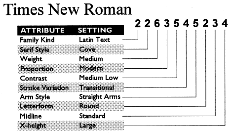
The key to the PANOSE system is the PANOSE Typeface Classification Number, a compact 10-byte description of a font's critical visual characteristics, such as contrast, weight, and serif style. PANOSE numbers are stored in TrueType fonts from many leading font foundries, and in files created by PANOSE-aware applications. The ten classification attributes are:
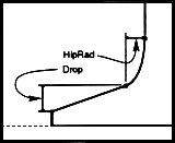
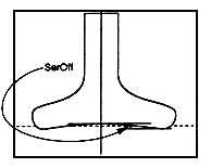
Classification Procedures are objective measurement techniques used to assign a PANOSE number to a font. Hewlett Packard's PANOSE Classification Guide, "The Grey Book," helps font vendors assign PANOSE numbers to their library. Hewlett Packard Co. also provides type classification and verification services. The following diagrams demonstrate some of the objective measurements used in assigning PANOSE numbers.
The PANOSE Mapper software determines the closest possible font match on any given system by comparing the PANOSE numbers of the requested and available fonts. The individual PANOSE digits are compared, weighted by their typographic importance, and summed to provide a numerical visual distance. Typographic importance is derived by assigning weights to each digit; for example, a font's weight (regular, bold, demibold, etc.) is more important than its contrast (difference between thick and thin strokes).
The PANOSE Mapper includes a database of registered PANOSE numbers
for most common font names. This allows accurate replacements
should a document only provide the missing font's name, or request
a font without an embedded PANOSE number.
With the advent of Cascading Style Sheets, font selection and replacement has become an important issue for Web designers and User Agents alike.
From the W3C CSS1 Working Draft of 20-Feb-96:
" Unfortunately, there exists no well-defined and universally accepted taxonomy for classifying fonts, and terms that apply to one font family may not be appropriate for others. ... This specification suggests a liberal terminology for describing fonts, and a level of detail similar to common desktop publishing applications."
PANOSE is a well defined and well accepted taxonomy for both font classification and font selection and replacement. The font replacement strategy embodied in the CSS1 Working Draft consists of a designer-specified list of font names, with reserved terms for generic font types. This places a considerable burden on the designer, and will often not result in best-case font replacement. It is also User Agent- and platform-dependent. Again, from the Working Draft:
"Ideally, the style sheet designer should specify only one font, and the font manager should return the best alternative (perhaps by taking visual similarity, visual quality and performance into account). Unfortunately, current rendering environments do not offer this level of service, and it is beyond the style sheet mechanism to do so. Therefore, a prioritized list of alternative families can be supplied. This practice poses one problem: the UA must be able to determine if a font selection has been successful or not to know how far it should proceed in the list. One example: if the style sheet asks for 'Univers' and the window system is smart enough to suggest 'Helvetica' (which looks almost identical) as a replacement, is this a success or failure? This specification leaves the answer undefined for now."
PANOSE addresses exactly this problem. It allows the style sheet designer to specify only a single font and returns the best alternative based on objective visual qualities. It obviates the need for a prioritized list of alternative families (which are only supported by the "font-family" tag, not the "font" tag). It also gives User Agents a platform-independent definition of "success" in font replacement.
Although we will of course leave the implementation of PANOSE support to the appropriate entity, one could imagine simply appending an ASCII representation of the PANOSE number to the font name in appropriate style sheet properties, as follows:
P {font-family: 'Times New Roman#2263545234'}
BODY {font: 12pt/14pt 'Times New Roman#2263545234' small-caps}
PANOSE digits can have values between 0 and 15, so a hexadecimal ASCII (0-9, A-F) representation would work quite well.
This type of scheme could also work well with Microsoft Internet Explorer's face attribute extension to the FONT element, although to provide backward compatibility it may be necessary to use their font list feature like this:
<FONT face="Times New Roman,#2263545234">Times New Roman or the next best thing.</FONT>
The font-family style sheet property could also support PANOSE via the font list, but the font list has the disadvantage of being incompatible with the font property:
P {font-family: 'Times New Roman' #2263545234}
Perhaps the font property itself could be extended to support PANOSE, the disadvantage being a different syntax than that used with font-family and face:
Value: font-size[/line-height]? font-family font-weight? font-style? panose?
The font-weight attribute described in the CSS1 Working Draft works very nicely with PANOSE. While PANOSE's Weight classification is a superset of the one described in the Working Draft, a mapping between the two is straightforward. PANOSE can also easily work with the relative weight feature (e.g. +1).
The italic/oblique aspect of the font-style attribute is also easily handled by PANOSE. Small-caps, on the other hand, is outside the scope of PANOSE 1.0, which considers small caps to be a stylistic variant.
Key PANOSE benefits for the World Wide Web include:
As a simple, fast, small industry standard with a sound technical basis, PANOSE is an appropriate technology for the World Wide Web.
As mentioned in the Introduction, PANOSE is currently a commercial standard owned by Hewlett Packard Co. PANOSE Partners have licensed the technology from Hewlett Packard Co. What does this mean for the World Wide Web? If adopted as a World Wide Web standard, the PANOSE technology would currently have to be licensed by each User Agent that wants to support PANOSE (unless they want to create their own equivalent to the Core Mapper Services and MAI). Hewlett Packard Co. is not interested in profiting from PANOSE, and will negotiate licenses on a time and materials basis.
Current PANOSE Partners include Adobe Corp. (PageMaker), AGFA, Bitstream Inc., Caere Corp., Corel Corp. (CorelDRAW), Hewlett Packard Co. (FontSmart), Lotus Development Corp. (Word Pro), Microsoft Corp., No Hands Inc. (Common Ground).
In 1998, A Manual of Comparative Typography, by Benjamin Bauermeister, was published by Van Nostrand Reinhold Company Inc. (ISBN 0-442-21187-2). This initial version of the PANOSE system was comprised of seven classification categories and was based on subjective visual parameters.
Microsoft was interested in PANOSE as a trademark-free method of mapping between its Monotype fonts and the PostScript 35.
The Weight category was added, and the Arm Style category was split off from the Stroke Variation category, bringing the number of classification categories to 9. Objective classification criteria were also added at this time.
The Family Kind category was added, completing the PANOSE 1.0 definition.
Kanji is not supported by current PANOSE tools, but some work has been done both on classifying kanji typefaces and on "transliteral mapping," which, for example, given a kanji font, suggests the most appropriate Latin typeface to use with it. Transliteral Mapping could also be used to match between, say, decorative or script faces and text equivalents.
The Mapper Application Interface (MAI) was developed.
PANOSE 2.0 is a second generation PANOSE architecture which is the basis for Hewlett Packard's Infinifont font synthesis technology. It stores actual measurement data rather than bucketing it, which allows the matching system to use mathematical distance rather than penalty tables. It would be better capable of driving an Adobe Multiple Master font, although PANOSE 1.0 can also deal with morphable fonts by means of the "any" value in PANOSE digits. PANOSE 2.0 is not complete as a font matching and replacement technology, but is an obvious next step for future PANOSE development.
Today, PANOSE continues to enjoy broad support across both the software and type industries. We continue to classify significant numbers of fonts, and continue to negotiate PANOSE licenses with software vendors. PANOSE remains a key part of Hewlett Packard's font matching and substitution strategy.
Hewlett Packard hopes to find a standards body interested in making PANOSE an open standard. The Unicode Consortium is one such possibility. It would be up to this body to continue development of PANOSE. The work done on PANOSE 2.0 so far would be a good starting point for a second generation font matching and replacement system.
Hewlett Packard continues to rely on PANOSE technology for current and future products. Although we prefer to make PANOSE an open standard, we will continue to develop and support it both for our own use and for use by PANOSE Partners as long as the need exists.
The PANOSE Mapper software consists of the Core Mapper Services, which contains the actual PANOSE mapper, and the Mapper Application Interface (MAI), which provides additional services for developers.
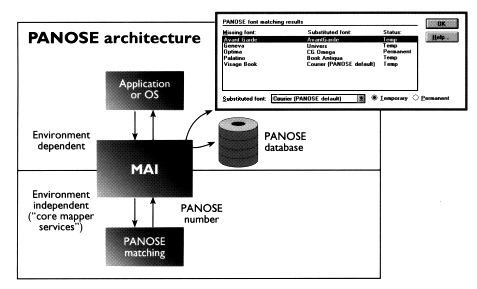
As shown in the accompanying illustration, the application or operating system requests a font match from the MAI, which first looks for an exact name match to the request. If none is found, it scans its exception database for custom overrides provided by the user. If there is no override, it uses the Core Mapper Services to locate the best substitute. A results dialog box shows the user the closest matching font and provides the option to change the suggested replacement (stored in the exceptions database). We should point out that, while any PANOSE implementation would probably want to make use of the Core Mapper Services, use of the MAI is optional.
The MAI provides a user interface for all components of the PANOSE mapping algorithm:
The MAI includes sample Windows and Macintosh dialogs, database services for retrieving PANOSE numbers, and an API that makes it simple to integrate PANOSE mapping into an application or operating system. All code is ANSI 'C'.
A Manual of Comparative Typography, Benjamin Bauermeister, Van Nostrand Reinhold, 1988. ISBN 0-442-21187-2.
PANOSE Classification Guide, Version 1.2, Hewlett Packard Co., 1992
Cascading Style Sheets, level 1, W3C Working Draft, 20-Feb-96
Copyright ©1996, Hewlett Packard Co. All rights reserved. FontSmart, Infinifont and PANOSE are registered trademarks of Hewlett Packard Co. Other software and typeface names are trademarks or registered trademarks of their respective holders and are used here for identification only.