Abstract
Grid Layout contains features targeted at web application authors.
The Grid can be used to achieve many different layouts. It excels at dividing
up space for major regions of an application, or defining the relationship in terms of
size, position, and layer between parts of a control built from HTML primitives.
Like tables, the Grid enables an author to align elements into columns and rows,
but unlike tables, the Grid doesn't have content structure, and thus enables a wide
variety of layouts not possible with tables. For example, the children of the Grid
can position themselves with Grid Lines such that they overlap and layer similar to
positioned elements.
In addition, the absence of content structure in the Grid helps to manage changes to layout
by using fluid and source order independent lay out techniques. By combining media queries
with the CSS properties that control layout of the Grid and its children, authors can adapt
their layout to changes in device form factors, orientation, and available space, without needing to
alter the semantic nature of their content.
Status of This Document
This section describes the status of this document at the time of its publication. Other documents may supersede this document. A list of current W3C publications and the latest revision of this technical report can be found in the W3C technical reports index at http://www.w3.org/TR/.
This is a First Public Working Draft of Grid Layout.
This document was published by the
CSS Working Group as an Working Draft.
If you wish to make comments regarding this document, please send them to
www-style@w3.org
(subscribe, archives).
All feedback is welcome.
Publication as a Working Draft does not imply endorsement by the W3C Membership. This is a draft document and may be updated, replaced or obsoleted by other documents at any time. It is inappropriate to cite this document as other than work in progress.
This document was produced by a group operating under the 5 February 2004 W3C Patent Policy. W3C maintains a public list of any patent disclosures made in connection with the deliverables of the group; that page also includes instructions for disclosing a patent. An individual who has actual knowledge of a patent which the individual believes contains Essential Claim(s) must disclose the information in accordance with section 6 of the W3C Patent Policy.
1. Dependencies on other modules
This CSS3 module has normative references to the following other CSS3 modules:
This CSS3 module has non-normative (informative) references to the following other CSS3 modules:
2. Introduction
2.1 Basic Capabilities of the Grid
As websites evolved from simple documents into complex, interactive applications, tools for document lay out, e.g. floats, were not necessarily well suited for application lay out. By using a combination of tables, JavaScript, or careful measurements on floated elements, authors discovered workarounds to achieve desired layouts. Layouts that adapted to the available space were often brittle and resulted in counter-intuitive behavior as space became constrained. As an alternative, authors of many web applications opted for a fixed layout that cannot take advantage of changes in the available rendering space on a screen.
The lay out capabilities of the Grid address these problems. The Grid provides a mechanism for authors to divide available space for lay out into columns and rows using a set of predictable sizing behaviors. Authors can then precisely position and size the building block elements of their application by referencing the Grid Lines between the columns and rows, or by defining and referencing a Grid Cell, which is a rectangular space covering an intersection of columns and rows. Figure 1 illustrates a basic layout which can be achieved with the Grid.
2.2 Adapting Layouts to Available Space
The Grid element can be used to intelligently reflow elements within a webpage.
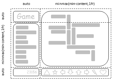
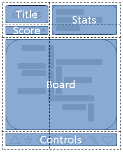
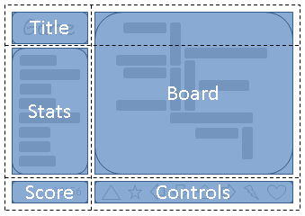
Figure 2 represents a game with five major areas in the layout: the game title, stats area, game board, score area, and control area.
The author's intent is to divide the space for the game such that:
- The stats area always appears immediately under the game title.
- The game board appears to the right of the stats and title.
- The top of the game title and the game board should always align.
- The bottom of the game board and the stats area align when the game has reached its minimum height,
but otherwise the game board will stretch to take advantage of all the screen real-estate available to it.
- The score area should align into the column created by the game and stats area, while the controls are centered under the board.
As an alternative to using script to control the absolute position, width, and height of all elements, the author can use the Grid element, as shown in Figure 3.
The following example shows how an author might achieve all the sizing, placement, and alignment rules declaratively.
Note that there are multiple ways to specify the structure of the Grid and to position and size Grid Items, each optimized for different scenarios.
This example illustrates one that an author may use to define the position and space for each Grid Item using the
grid-rows and grid-columns properties of the Grid element,
and the grid-row, grid-column, grid-row-span and grid-column-span properties on each Grid Item.
<style type="text/css">
    #grid     { display: grid;
                /* Two columns: the first sized to content, the second receives the remaining space,   */
                /* but is never smaller than the minimum size of the board or the game controls, which */
                /* occupy this column. */
                grid-columns: auto minmax(min-content, 1fr);

                /* Three rows: the first and last sized to content, the middle row receives the remaining */
                /* space, but is never smaller than the minimum height of the board or stats areas.       */
                grid-rows: auto minmax(min-content, 1fr) auto
              }

    /* Each part of the game is positioned between grid lines by referencing the starting grid line and */
    /* then specifying, if more than one, the number of rows or columns spanned to determine the ending */
    /* grid line, which establishes bounds for the part. */
    #title    { grid-column: 1; grid-row: 1 }
    #score    { grid-column: 1; grid-row: 3 }
    #stats    { grid-column: 1; grid-row: 2; grid-row-align: start }
    #board    { grid-column: 2; grid-row: 1; grid-row-span: 2 }
    #controls { grid-column: 2; grid-row: 2; grid-column-align: center }
</style>

<div id="grid">
    <div id="title">Game Title</div>
    <div id="score">Score</div>
    <div id="stats">Stats</div>
    <div id="board">Board</div>
    <div id="controls">Controls</div>
</div>
2.3 Source Independence
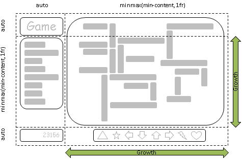
Continuing the prior example, the author also wants the game to adapt to the space available on traditional computer monitors, handheld devices,
or tablet computers. Also, the game should optimize the placement of the components when viewed either in landscape or portrait orientation
(Figures 4 and 5). By combining the CSS markup for the Grid element with media queries, the author is able to use
the same semantic markup, but rearranged independent of its source order, to achieve the desired layout in both orientations.
The following example leverages the Grid's ability to name the space which will be occupied by a Grid Item. This allows the author
to avoid rewriting rules for Grid Items as the Grid's definition changes.
<style type="text/css">
    @media (orientation: portrait) {
        #grid {
            display: grid;

            /* The rows, columns and cells of the grid are defined visually using the grid-template property.        */
            /* Each string is a row, and each letter a cell.  The max number of letters in any one string determines */
            /* the number of columns. */
            grid-template: "ta"
                           "sa"
                           "bb"
                           "cc";

            /* Columns and rows created with the template property can be assigned a sizing function with the */
            /* grid-columns and grid-rows properties. */
            grid-columns: auto minmax(min-content, 1fr);
            grid-rows: auto auto minmax(min-content, 1fr) auto
        }
    }

    @media (orientation: landscape) {
        #grid {
            display: grid;

            /* Again the template property defines cells of the same name, but this time positioned differently */
            /* to better suit a landscape orientation. */
            grid-template: "tb"
                           "ab"
                           "sc";

            grid-columns: auto minmax(min-content, 1fr);
            grid-rows: auto minmax(min-content, 1fr) auto
        }
    }

    /* The grid-cell property places a grid item into named region (cell) of the grid. */
    #title    { grid-cell: "t" }
    #score    { grid-cell: "s" }
    #stats    { grid-cell: "a" }
    #board    { grid-cell: "b" }
    #controls { grid-cell: "c" }
</style>

<div id="grid">
    <div id="title">Game Title</div>
    <div id="score">Score</div>
    <div id="stats">Stats</div>
    <div id="board">Board</div>
    <div id="controls">Controls</div>
</div>
2.4 Grid Layering of Elements
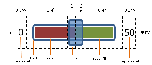
In the example shown in Figure 6, the author is creating a custom slider control.
The control has six parts. The lower and upper labels align to the left and right edges of the control.
The track of the slider spans the area between the labels.
The lower and upper fill parts touch beneath the thumb, and the thumb is a fixed width and height
that can be moved along the track by updating the two fraction-sized columns.
Prior to the Grid element, the author would have likely used absolute positioning to control the top and left coordinates,
along with the width and height of each HTML element that comprises the control.
The z-index property would have been used to control element drawing order.
By leveraging the Grid element, the author can instead limit script usage to handling mouse events on the thumb,
which snaps to various positions along the track as the grid-columns property of the Grid element is updated.
The grid-layer property provides capabilities which are analagous to z-index for Grid Items.
<style type="text/css">
    #grid {
        display: grid;

        /* The grid-columns and rows properties also support naming grid lines which can then be used */
        /* to position grid items.  The line names are assigned on either side of a column or row     */
        /* sizing function where the line would logically exist. */
        grid-columns:
            "start"        auto
            "track-start"  0.5fr
            "thumb-start"  auto
            "fill-split"   auto
            "thumb-end"    0.5fr
            "track-end"    auto
            "end";
    }

    /* Grid-column and grid-row accept a starting and optional endling line.  Below the lines are referred to by name. */
    /* Beyond any semantic advantage, the names also allow the author to avoid renumbering the grid-row and column     */
    /* properties of the grid items.  This is similar to the concept demonstrated in the prior example with the        */
    /* grid-template property during orientation changes, but grid lines can also work with layered grid items that    */
    /* have overlapping cells of different shapes like the thumb and track parts in this example. */
    #lower-label { grid-column: "start" }
    #track       { grid-column: "track-start" "track-end"; grid-row-align: center }
    #upper-label { grid-column: "track-end"; }

    /* Fill parts are drawn above the track so set grid-layer to 5. */
    #lower-fill  { grid-column: "track-start" "fill-split"; grid-row-align: center; grid-layer: 5 }
    #upper-fill  { grid-column: "fill-split" "track-end"; grid-row-align: center; grid-layer: 5 }

    /* Thumb is the topmost part; assign it the highest grid-layer value. */
    #thumb       { grid-column: "thumb-start" "thumb-end"; grid-layer: 10 }
</style>

<div id="grid">
    <div id="lower-label">Lower Label</div>
    <div id="upper-label">Upper Label</div>
    <div id="track">Track</div>
    <div id="lower-fill">Lower Fill</div>
    <div id="upper-fill">Upper Fill</div>
    <div id="thumb">Thumb</div>
</div>
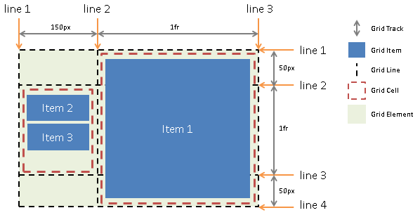
3 Core Concepts of the Grid
A Grid element is declared in markup by setting the display property of an element to 'grid'. Child elements of the Grid are termed Grid Items and may be positioned and sized by the Grid element by leveraging the following logical concepts.
- Grid Tracks
- Grid Lines
- Grid Cells
Figure 7 illustrates the relationship between these concepts and the markup in the subsections that follow produce the result shown in the figure.
3.1 Grid Tracks
Grid Tracks are the columns and rows of the Grid defined with the grid-rows and grid-columns properties on the Grid element. Each Track is defined by declaring a sequential list of sizing functions, one for each Track. Tracks define the space between Grid Lines.
<style type="text/css">
    #grid {
        display: grid;
        grid-columns: 150px 1fr; /* two columns */
        grid-rows: 50px 1fr 50px /* three rows  */
    }
</style>
3.2 Grid Lines
Grid Lines are the horizontal or vertical dividing lines that exist on either side of a column or row. Grid Lines may be referred to by their Grid Line number, or they may be named by the author. Authors use one or more quoted strings to assign names to a Line before or after a Track definition wherever the desired Line would logically exist. A Grid Item then uses the Grid Lines to determine its position and available space within the Grid by referencing the Grid Lines using the properties grid-row and grid-column. Grid-row and grid-column accept a starting and optional ending Line.
The following two examples create three column Grid Lines and four row Grid Lines. The first example demonstrates how an author would refer to the Grid Lines using Grid Line numbers. The second example uses explicitly named Grid Lines.
<style type="text/css">
    #grid {
        display: grid;
        grid-columns: 150px 1fr;
        grid-rows: 50px 1fr 50px
    }

    #item1 { grid-column: 2; grid-row: 1 4 }
</style>
<style type="text/css">
    /* equivalent layout to the prior example, but using named lines */
    #grid {
        display: grid;
        grid-columns: 150px "item1-start" 1fr "item1-end";
        grid-rows: "item1-start" 50px 1fr 50px "item1-end"
    }

    #item1 {
        grid-column: "item1-start" "item1-end";
        grid-row: "item1-start" "item1-end"
    }
</style>
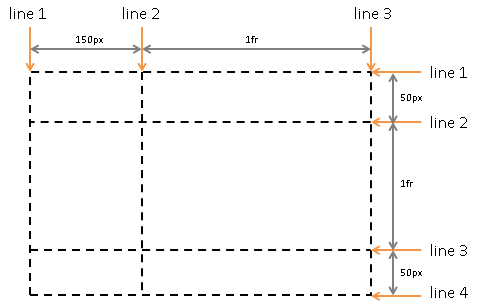
3.3 Grid Cells
Grid Cells are the logical space used to lay out one or more Grid Items. Grid Cells may be defined explicitly using the grid-template property or the grid-cell pseudo-element. The grid-cell pseudo-element uses a functional syntax which accepts a string name for the Cell. The space for the explicitly defined Cell is then defined by referencing Grid Lines. When a Grid Cell is explicitly defined, multiple Grid Items may be stacked or layered into the same Grid Cell. When a Grid Item refers to Grid Lines directly, an anonymous Grid Cell is created which contains only the single Grid Item.
<style type="text/css">
    #grid  {
        display: grid;
        grid-columns: 150px "cell-start" 1fr "cell-end";
        grid-rows: "cell-start" 50px 1fr 50px "cell-end"
    }

    #grid::grid-cell("cell") {
        grid-column: "cell-start" "cell-end";
        grid-row: "cell-start" "cell-end"
    }

    #item2 { grid-cell: "cell" }
    #item3 { grid-cell: "cell" }
</style>
<style type="text/css">
    /* equivalent layout compared to the prior, but using the template syntax */
    #grid  {
        display: grid;
        grid-template: "ad"
                       "bd"
                       "cd";
        grid-columns: 150px 1fr;
        grid-rows: 50px 1fr 50px
    }

    #item2 { grid-cell: "b" }
    #item3 { grid-cell: "b" }
</style>
4. Grid Declaration
A Grid element is declared by setting the display property.
| Name: |
display |
| Value: |
[ ...existing values... | grid | inline-grid |
|
| Computed value: |
specified value |
- grid
- A value of grid causes an element to display as a block-level Grid element.
- inline-grid
- A value of inline-grid causes an element to display as an inline-level Grid element.
5. Grid Items
The Grid element performs lay out on Grid Items. Block-level children, replaced, inline-block children, and atomic, inline-level children of the Grid are considered Grid Items.
Contiguous runs of non-replaced, inline content are wrapped in an anonymous, block-level box, which is then treated as a Grid Item for the purposes of Grid lay out.
Out-of-flow elements (except floats, which are out-of-flow, but are irrelevant to Grid lay out since Grid Items can't float) leave behind a "placeholder" in their original source location which is treated like a non-replaced, inline element for the purpose of this wrapping.
Any indirect descendants of the Grid element, including block elements that are contained in inline elements, are not Grid Items.
The following example produces two Grid Items: the first Grid Item is the anonymous block-level box
wrapping the A and the subsequent <span>; the second Grid Item is created by the block-level box of the C <div>.
<div style="display:grid;">A<span>B</span><div>C</div></div>
6. Defining Grid Rows, Columns and Lines
6.1 Grid Rows, Columns and Implicit Grid Lines
Grid elements use Grid Lines to divide their space. There are two sets of Grid Lines: one set defined by the columns that run in the direction of block progression, and another orthogonal set defined by rows. Block progression is a writing-mode term that defines a logical direction. In English it means vertical.
A Grid Track is a generic term for a column or row which separates two Grid Lines. Each Grid Track is assigned a sizing function, which controls how wide or tall the column or row may grow, and thus how far apart two Grid Lines are. The sizing function specified can be a length, a percentage of the Grid element's size, derived from the contents occupying the column or row, or a proportion of the space which remains in the Grid element. In the last case, remaining space refers to the width or height of the Grid element after accounting for space already consumed by columns and rows sized with a length, percentage or content. The size can also be specified as a range using a minmax function, which can combine any of the previously mentioned mechanisms to define a min and max size for the column or row.
In the following example there are two columns and three rows. The first column is 150px wide beginning from the starting edge of the Grid element's content box. The second column uses fractional sizing, which is a function of the remaining space in the Grid. Its size will vary as the width of the Grid element changes. If the used width of the Grid element is 200px, then the second column 50px wide. If the used width of the Grid element is 100px, then the second column is 0px and any content positioned in the column will be overflowing the Grid element. Sizing occurs in a similar fashion for the rows.
<style type="text/css">
    #grid {
        display: grid;
        grid-columns: 150px 1fr;
        grid-rows: 50px 1fr 50px
    }
</style>
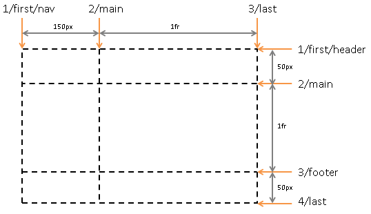
6.2 Named Grid Lines
A Grid Line exists on either side of a column or row. The Grid Line may be named using one or more quoted strings which are positioned in the grid-rows or grid-columns definitions where the Grid Line would logically occur (in between the sizing functions that define the Grid's columns and rows). Each name associated with a Grid Line must be unique for the set of columns or rows. If the name is specified multiple times in the same column or row definition, it is associated with the first Grid Line to which the name was assigned. When a name is not specified, Grid Lines can be referred to in the order which they occur. The first line is 1, the second 2 and so on. The next example builds on the prior by assigning each line one or more names.
<style type="text/css">
    #grid {
        display: grid;
        grid-columns: "first" "nav" 150px "main" 1fr "last";
        grid-rows: "first" "header" 50px "main" 1fr "footer" 50px "last";
    }
</style>
6.3 Starting and Ending Grid Lines
In addition to any explicitly named Grid Lines defined by the author, a Grid element also has four implicitly defined Grid Lines: a start and end line for both columns and rows. The start line is always positioned on the starting edge of the Grid element's content box. The end line is positioned at the ending edge of the Grid element's content box, or at the same location as the last explicitly or implicitly defined Grid Line when it extends past the content box of the Grid element.
In the following example, the 'end' column Grid Line is positioned on the ending edge of the Grid element's content box. The 'end' row Grid Line is positioned past the ending edge in overflow at the same location as the Grid Line named "last."
<style type="text/css">
    #grid {
        display: grid;
        width: auto;
        height: 500px;
        grid-columns: 50px 1fr;
        grid-rows: "first" 250px 250px 250px "last";
    }

    #item {
        /* cover explicitly defined columns and rows */
        grid-column: 1 3;
        grid-row: "first" "last";

        /* equivalent (assuming no implicitly created tracks) */
        grid-column: start end;
        grid-row: start end;
    }
</style>
6.4 Repeating Columns and Rows
If there are large number of columns or rows that are the same or exhibit a recurring pattern, a repeat syntax can be applied to define the columns or rows in a more compact form.
The next two examples are equivalent. There is a single row, and a pattern of repetitive column Grid Lines: a 250px column followed by a 10px gutter. Note that when repeat syntax is used with Grid Line naming, that the names are assigned to the first occurrence of the pattern.
<style type="text/css">
    #grid {
        display: grid;
        grid-columns: 10px "content" 250px 10px 250px 10px 250px 10px 250px 10px;
        grid-rows: 1fr;
    }

    /* Equivalent definition. */
    #grid {
        display: grid;
        grid-columns: 10px ("content" 250px 10px)[4];
        grid-rows: 1fr;
    }
</style>
6.5 Grid-columns and Grid-rows Properties
The following grammar expresses the allowable values for the grid-rows and grid-columns properties.
<track-list>    => [ <track-group> ]+ | 'none'
<track-group>   => [ <string>* '(' <string>* [ <track-minmax> ]+ <string>* ')' [ '[' <positive-number> ']' ]? <string>*
                   | <string>* <track-minmax> <string>*
<track-minmax>  => 'minmax(' <track-breadth> ',' <track-breadth> ')' | 'auto' | <track-breadth>
<track-breadth> => <length> | <percentage> | <fraction> | 'min-content' | 'max-content'
Where:
- length is as defined by CSS3 Values. [CSS3VAL]
- percentage expresses a size for a Grid Track as a percentage of the Grid element's logical width (for columns) or logical height (for rows).
When the width or height of the Grid element is undefined, the percentage is ignored and the Grid Track will be auto-sized.
- fraction is a non-negative floating-point number followed
by 'fr'. Each
fraction value takes a share of the remaining space proportional to
its number. See fraction values for more details.
- max-content is a keyword which refers to the maximum of the max sizes of Grid Items occupying
the Grid Track.
- min-content is a keyword which refers to the maximum of the min sizes of Grid Items occupying
the Grid Track.
- minmax(min, max) defines a size range. The size used
should be greater than or equal to
min and less than or equal to max. If max < min,
then max is ignored and minmax(min,max) is treated as minmax(min,min).
- fit-content is equivalent to
minmax(min-content, max-content).
- auto is quivalent to
fit-content.
Flex should also be allowed as a sizing function for a Grid Track. Update the grammar to accept the flex function when the Flexbox spec
stabilizes.
| Name: |
grid-columns |
| Value: |
see grammar above |
| Initial: |
none |
| Applies to: |
non-replaced elements with a computed value of 'grid' or 'inline-grid' for display. |
| Inherited: |
no |
| Percentages: |
n/a |
| Media: |
visual, paged |
| Computed value: |
see text |
| Name: |
grid-rows |
| Value: |
see grammar above |
| Initial: |
none |
| Applies to: |
non-replaced elements with a computed value of 'grid' or 'inline-grid' for display. |
| Inherited: |
no |
| Percentages: |
n/a |
| Media: |
visual, paged |
| Computed value: |
see text |
The following example:
- Adds one Grid Line 100 pixels from the 'start' of the grid.
- Adds another Grid Line 1/2 of the remaining space away.
- Adds another Grid Line whose distance from the prior Grid Line will be based on the maximum content size of elements
occupying the column.
- Adds another Grid Line whose distance from the prior Grid Line is based on
the minimum content size of all elements occupying the column, or 1/2 the
remaining space, whichever is greater.
div { grid-columns: 100px 1fr max-content minmax(min-content, 1fr) }
Additional examples of valid Grid Track definitions:
    /* examples of valid track definitions */
    grid-rows: 1fr minmax(min-content, 1fr);
    grid-rows: 10px (1fr auto minmax(30%, 1fr))[2];
    grid-rows: (10px);
    grid-rows: calc(4em - 5px)
6.5.1 Fraction Values: 'fr'
Fraction values are new units applicable to the grid-rows and grid-columns properties:
- fr
- Fraction of available space.
The distribution of fractional space occurs after all <length>
or content-based row and column sizes have reached their maximum.
The total size of the rows or columns is then subtracted from the available space and the remainder is
divided proportionately among the fractional rows and columns.
Each column or row's proportional share can be computed as the column or row's
<fraction> * <remaining space> / <sum of all fractions>.
Note that fractions occurring within a minmax function are only counted in the sum if in the max position.
Further, fractions that occur in the min position are treated as an absolute length of 0px.
When remaining space cannot be determined because the width or height of the Grid element is undefined, fraction-sized Grid Tracks
are sized to their contents while retaining their respective proportions. In such cases the size of each fractional Grid Track can
be computed by determining the max-content size of each fractional Grid Track and dividing that size by the respective
fraction. The maximum value is of those results is treated as the 1fr value, which is then multiplied
by each Grid Track's fraction to determine its final size.
6.5.2 Computed Values for Grid-rows and Grid-columns
The computed size of all Grid Tracks as returned for the grid-rows and grid-columns properties are normalized to used pixel values.
All Grid Tracks are included in the computed value reported for grid-rows and grid-columns regardless of how the Grid Tracks were created, e.g. implicit tracks may be created by Grid Items referencing a Grid Line not explicitly defined by a grid-rows or grid-columns property.
The computed value includes any used values for named lines; any duplicate names must be removed. User agents may use the repeat syntax to avoid expansive string length due to implicit Grid Track creation,
large spanning values or high repeat counts specified by the author.
The algorithm used to apply repeat syntax to used Grid Track values and Grid Line names is User agent specific. See below for example inputs and outputs.
<style type="text/css">
    #grid {
        width: 500px;
        grid-columns: "a" auto "b" minmax(min-content, 1fr) "b" "c" "d" ("e" 40px)[2] (auto)[5];
    }
</style>
<div id="grid">
    <div style="grid-column:1; width:50px"></div>
    <div style="grid-column:9; width:50px"></div>
</div>
<script type="text/javascript">
    // Returns '"a" 50px "b" 320px "c" "d" ("e" 40px)[2] (0px)[4] 50px'.
    window.getComputedStyle(document.getElementById("grid"), null).getPropertyValue("grid-columns")
</script>
7. Placing Grid Items
The properties grid-row and grid-column are used to place Grid Items and explicitly defined Grid Cells in the Grid.
| Name: |
grid-column |
| Value: |
[ [ <integer> | <string> | 'start' | 'end' ] [ <integer> | <string> | 'start' | 'end' ]? ] | 'auto' |
| Initial: |
auto |
| Applies to: |
Grid Item elements |
| Inherited: |
no |
| Percentages: |
n/a |
| Media: |
visual, paged |
| Computed value: |
see text |
| Name: |
grid-row |
| Value: |
[ [ <integer> | <string> | 'start' | 'end' ] [ <integer> | <string> | 'start' | 'end' ]? ] | 'auto' |
| Initial: |
auto |
| Applies to: |
Grid Item elements |
| Inherited: |
no |
| Percentages: |
n/a |
| Media: |
visual, paged |
| Computed value: |
see text |
7.1 Anonymous Grid Cells
Grid Items are placed into Grid Cells. A Grid Cell defines the available space for a Grid Item. The dimensions of the Grid Cell are specified by naming the starting and ending lines which define the columns and rows that the Grid Cell occupies. The starting and ending lines may be referred to by a string name, if one was defined by the author, the start and end line keywords, or the Grid Line's number.
The following example positions the first Grid Item to cover all rows and columns of the Grid element using the start and end keywords. The second Grid Item is positioned to cover the first row. Note that when only the starting Grid Line of the grid-row or grid-column properties are specified for the Grid Cell, that the Grid Cell is assumed to extend to the subsequent Grid Line.
<style type="text/css">
    /* covers the Grid element's content box */
    #item1 {
        grid-row: start end;
        grid-column: start end;
    }

    /* covers the first row */
    #item2 {
        grid-row: start; /* extends to row Grid Line 2 */
        grid-column: start end;
    }
</style>
The next example defines rows for header and footer Grid Items sized to content, as well as a main region that receives all remaining space. A single column which receives all horizontal space in the Grid's content box is also defined.
<style type="text/css">
    #grid {
        display: grid;
        grid-rows: "header" auto "main" 1fr "footer" auto;
        grid-columns: 1fr;
    }

    #header { grid-row: "header"; grid-column: start }
    #main   { grid-row: "main"; grid-column: start }
    #footer { grid-row: "footer"; grid-column: start }

    /* Equivalent to the above using grid line numbers instead of names. */
    #header { grid-row: 1; grid-column: 1 }
    #main   { grid-row: 2; grid-column: 1 }
    #footer { grid-row: 3; grid-column: 1 }
</style>
7.2 Explicitly Defined Grid Cells
The prior example created an anonymous Grid Cell that holds a single Grid Item. Grid Cells can be created explicitly using the grid-cell pseudo element function. The function accepts as its only parameter a string name to associate with the Grid Cell. Grid Cells are positioned and sized using the grid-row and grid-column properties. Once defined, multiple Grid Items can be placed into the Grid Cell by referring to it by name using the grid-cell property.
When multiple items are placed into a single Grid Cell, they can be stacked or layered. Layering places each Grid Item over the other in accordance with the grid-layer property (described in Drawing Order of Grid Items). Stacking places Grid Items one after the other in the direction of increasing column or row numbers depending on the value of the grid-cell-stacking property.
Grid-cell-stacking introduces behavior that is similar to Flexbox. Why not just allow an author to specify a display on explicitly defined Grid Cells
to control how its contents lay out instead? Setting #grid::grid-cell("foo") { display:flexbox } would trigger creation of an anonymous Flexbox that performs lay out
on every item placed into the Grid Cell as though they were Flex Items. display:block would cause items to lay out as though they were part
of the normal flow. What type of display would allow behavior that is consistent with the default layering though? display: grid-item?
The following example explicitly defines a Grid Cell 'nav' and stacks all child links of the Grid element into the 'nav' Grid Cell.
<style type="text/css">
    #grid {
        grid-columns: auto 1fr;
        grid-rows: auto 1fr;
    }
    #grid::grid-cell("nav") {
        grid-column: start; /* first column */
        grid-row: start end; /* all rows */

        /* stack items placed into this cell one after the other in the 'rows' direction */
        grid-cell-stacking: rows;
    }
    #grid > a {
        display:block; /* make anchor tags valid Grid Items */
        grid-cell: "nav";
    }
</style>
7.2.1 Grid-cell Pseudo-element Selector
The ::grid-cell(<string>) psuedo-element selector applies to Grid elements. It's string parameter explicitly names the Grid Cell.
A ::grid-cell(<string>) pseudo-element appearing multiple times with the same name on the same Grid element matches the same Grid Cell.
Property definitions are additive and applied according to the normal cascade as with any selector.
7.2.2 Grid-cell Property
The grid-cell is valid on Grid Items and places the Grid Item inside the explicitly named Grid Cell.
| Name: |
grid-cell |
| Value: |
<string> | 'none' |
| Initial: |
none |
| Applies to: |
Grid Item elements |
| Inherited: |
no |
| Percentages: |
n/a |
| Media: |
visual, paged |
| Computed value: |
specified value |
7.2.3 Grid-cell-stacking Property
The grid-cell-stacking property defines the stacking direction used to place Grid Items within a Grid Cell. When the value is 'columns', Grid Items
are stacked one after the other in the inline direction. Similarly for 'rows', Grid Items are stacked one after the other in the direction
of block progression. When the value is 'layer', Grid Items are layered on top of one another. The order that Grid Items are stacked is
determined by source order. The order that items are layered is specified by the grid-layer property. When two or more Grid Items have the same vlaue for grid-layer, source order determines
which is layered first.
When Grid Items are stacked, the Grid Item alignment properties only apply in the direction orthogonal to block progression. If the grid-cell-stacking
property is 'columns', then grid-row-align property operates normally on the Grid Items stacked in the Grid Cell and the grid-column-align property is
ignored. If the grid-cell-stacking property is 'rows', the opposite is true. When grid-cell-stacking is 'layer' both alignment properties are honored
on the Grid Item.
The Grid alignment properties can also be applied to the Grid Cell. When applied to the Grid Cell, the alignment properties define the default
alignment behavior for each Grid Item in the Grid Cell in whatever alignment directions are valid giving the value of the grid-cell-stacking property.
If the grid-cell-stacking property is not 'layer', then the alignment property relevant to the direction parallel to block progression controls the
alignment of the entire stack of Grid Items. For example, if the grid-cell-stacking property is 'rows' and the grid-row-alignment property is 'end', then
the ending edge of the last Grid Item will meet the row end Grid Line for the Grid Cell.
| Name: |
grid-cell-stacking |
| Value: |
'columns' | 'rows' | 'layer' |
| Initial: |
'layer' |
| Applies to: |
Grid Cell pseudo-element |
| Inherited: |
no |
| Percentages: |
n/a |
| Media: |
visual, paged |
| Computed value: |
specified value |
7.3 Defining Grid Cells with a Template
Grid Cells can also be defined explicitly using one-letter names via the grid-template property. The grid-template property provides a visualization of the Grid element's structure while simultaneously defining the Grid Cells which can be used to layer or stack the child elements of the Grid.
In the following example, a grid-template property is used to create a page layout where cells are defined for header content 'h', navigational content 'n', footer content 'f', and main content 'm'. In English, a row is created for every separate string listed for the grid-template property, and a column is created for the maximum number of letters found in any one string. In orthogonal writing modes the roles of rows and columns are reversed. See Grid Writing Modes for more details.
<style type="text/css">
    #grid {
        display: grid;
        grid-template: "hh"
                       "nm"
                       "ff"
    }
    #grid > a {
	    display:block; /* make anchor tags valid Grid Items */
	    grid-cell: "n";
    }
</style>
7.3.1 Grid-template Property
| Name: |
grid-template |
| Value: |
<string>+ | 'none' |
| Initial: |
none |
| Applies to: |
Grid elements |
| Inherited: |
no |
| Percentages: |
n/a |
| Media: |
visual, paged |
| Computed value: |
specified value |
7.4 Grid-row-span and Grid-column-span
As an alternative to specifying an ending line for a Grid Cell or Grid Item, grid-row-span and grid-column-span properties are available to specify a distance (line count) from the starting line to the ending line to define the dimensions of a Grid Cell.
Note that when grid-column-span and a grid-column ending line are both specified for a Grid Item, that the ending line has priority. In such cases the computed value of grid-column-span will be the Grid Line number of the specified column ending line minus the Grid Line number of the specified column starting line.
The same holds true for the related row properties.
<style type="text/css">
#item {
	/* the following two property definitions are equivalent */
	/* both place the item between the first and third line */
	/* which is covering the first and second row of the Grid */
	grid-row: 1 3;
	grid-row: 1; grid-row-span: 2;
}
</style>
| Name: |
grid-column-span |
| Value: |
<integer> |
| Initial: |
1 |
| Applies to: |
Grid Item elements |
| Inherited: |
no |
| Percentages: |
n/a |
| Media: |
visual, paged |
| Computed value: |
specified value |
| Name: |
grid-row-span |
| Value: |
<integer> |
| Initial: |
1 |
| Applies to: |
Grid Item elements |
| Inherited: |
no |
| Percentages: |
n/a |
| Media: |
visual, paged |
| Computed value: |
specified value |
7.5 Implicit Columns and Rows
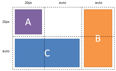
Grid Line numbers referred to by grid-row or grid-column properties on a Grid Item or Grid Cell are not required to refer to a Grid Line that was defined using the grid-columns or grid-rows properties on the Grid element. In cases where the specified position is outside those explicitly specified on the Grid element, implicit columns and rows fill gaps added as needed to create additional Grid Lines until the reference can be resolved.
Note that quoted Grid Line names that don't resolve to an explicitly defined Grid Line are treated as thought the author specified the 'start' Grid Line and don't trigger implicit Grid Track creation.
Figure 10 illustrates the placement of Grid Items resulting from the markup shown in the following example. Note that Grid Item 'B' is positioned on Grid Line 5 which creates a 5th column to contain Grid Item 'B'. Further, columns 3 and 4 are created as implicit auto-width columns without content resulting in a used column width of 0px.
<style type="text/css">
    #grid { display: grid; grid-columns: 20px; grid-rows: 20px }
    #A { grid-column: 1; grid-row: 1; grid-column-align: start; grid-row-align: start }
    #B { grid-column: 5; grid-row: 1; grid-row-span: 2; }
    #C { grid-column: 1; grid-row: 2; grid-column-span: 2; }
</style>

<div id="grid">
    <div id="A">A</div>
    <div id="B">B</div>
    <div id="C">C</div>
</div>
7.5.1 Defining a Default Size for Implicit Columns and Rows
By default, any implicit columns or rows created are auto sized to content. The default size can be changed using the grid-column-sizing and grid-row-sizing properties. The properties accept any valid single column or row sizing function.
| Name: |
grid-column-sizing |
| Value: |
<track-minmax> (see Grid Track Definition) |
| Initial: |
auto |
| Applies to: |
Grid elements |
| Inherited: |
no |
| Percentages: |
see Grid Track Definition |
| Media: |
visual, paged |
| Computed value: |
see Grid Track Definition |
| Name: |
grid-row-sizing |
| Value: |
<track-minmax> (see Grid Track Definition) |
| Initial: |
auto |
| Applies to: |
Grid elements |
| Inherited: |
no |
| Percentages: |
see Grid Track Definition |
| Media: |
visual, paged |
| Computed value: |
see Grid Track Definition |
7.6 Automatic Placement of Grid Items
This section describes early thinking around automatic placement of Grid Items. Multiple algorithms are possible for such a feature.
One is proposed here.
Grid Items can be automatically placed into an unoccupied space of the Grid.
The grid-flow property controls the direction in which the search for unoccupied space takes place, and whether rows or columns are added as needed to accomodate the content.
Note that Grid Cells cannot be automatically placed.
A grid-flow value of 'rows' will search across columns and then rows for unoccupied space, and will create additional rows
as needed to accomodate content. Similarly, a grid-flow value of 'columns' searches rows first and creates additional
columns as needed until sufficient space is found.
| Name: |
grid-flow |
| Value: |
'none' | 'rows' | 'columns' |
| Initial: |
none |
| Applies to: |
Grid elements |
| Inherited: |
no |
| Percentages: |
n/a |
| Media: |
visual, paged |
| Computed value: |
specified value |
The search for unoccupied space is conducted one Grid Item at a time.
First Grid Items which have a constraint on either their grid-row or grid-column are placed, followed by
Grid Items which have both a grid-row and grid-column value of 'auto'.
If grid-flow is 'rows', Grid Items having an auto value for grid-row are placed before those with
an auto value for grid-column. The reverse is true when grid-flow is 'columns'.
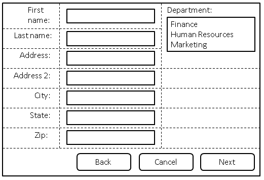
In the following example, there are three columns, each auto-sized to their contents.
No rows are explicitly defined. The grid-flow property is 'rows' which instructs the grid
to search across its three columns starting with the first row, then the next, adding rows
as needed until sufficient space is located to accomodate the position of any auto-placed
Grid Item.
Figure 11 illustrates the result.
<style type="text/css">
form {
display: grid;
grid-columns: "labels" auto "controls" auto "oversized" auto;
grid-flow: rows
}
form > input, form > select {
/* Place all controls in the "controls" column and automatically find the next available row. */
grid-column: "controls";
grid-row: auto
}
form > label {
/* Ensure that label is a valid grid item by setting its display to 'block'. */
display: block;
/* Place all labels in the "labels" column and automatically find the next available row. */
grid-column: "labels";
grid-row: auto
}
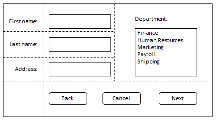
#department {
/* Auto place this item in the "oversized" column in the first row where a cell that spans three rows */
/* won't overlap other explicitly placed items or cells or any items automatically placed prior to */
/* this cell. */
grid-column: "oversized";
grid-row: auto;
grid-row-span: 3;
}
/* Place all the buttons of the form in the explicitly defined grid cell. */
#buttons {
grid-row: auto;
/* Ensure the button cell spans the entire grid element in the column direction. */
grid-column: start end;
grid-column-align: end
}
</style>
<form action="#">
<label for="firstname">First name:</label>
<input type="text" id="firstname" name="firstname" />
<label for="lastname">Last name:</label>
<input type="text" id="lastname" name="lastname" />
<label for="address">Address:</label>
<input type="text" id="address" name="address" />
<label for="address2">Address 2:</label>
<input type="text" id="address2" name="address2" />
<label for="city">City:</label>
<input type="text" id="city" name="city" />
<label for="state">State:</label>
<select type="text" id="state" name="state">
<option value="WA">Washington</option>
</select>
<label for="zip">Zip:</label>
<input type="text" id="zip" name="zip" />
<div id="department">
<label for="department">Department:</label>
<select id="department" name="department" multiple>
<option value="finance">Finance</option>
<option value="humanresources">Human Resources</option>
<option value="marketing">Marketing</option>
<option value="payroll">Payroll</option>
<option value="shipping">Shipping</option>
</select>
</div>
<div id="buttons">
<button id="cancel">Cancel</button>
<button id="back">Back</button>
<button> id="next">Next</button>
</div>
</form>
7.6.1 Automatic Grid Item Placement Algorithm
The following summarizes the algorithm for auto placement of Grid Items. For each Grid Item in source order:
- If both grid-row and grid-column are not 'auto' the Grid Item is placed as specified:
- If grid-row is not auto, the Grid Item is placed between the starting and ending lines specified by the grid-row property. An implicit Grid Line number is assigned as the starting line for grid-column such that the Grid Item does not overlap Grid Items already placed in the Grid. If necessary, new column Grid Lines are created to satisfy this constraint.
- If grid-column is not auto, the Grid Item is placed between the starting and ending lines specified by the grid-column property. An implicit Grid Line number is assigned as the starting line for grid-row such that the Grid Item does not overlap Grid Items already placed in the Grid. If necessary, new row Grid Lines are created to satisfy this constraint.
- Otherwise when both grid-column and grid-row are 'auto', beginning with the implicit Grid Line numbers of the previously placed Grid Item, or (1, 1) if this is the first Grid Item to be automatically placed:
- Place the Grid Item in the Grid Cell currently defined by the grid-row and grid-column auto position if not already occupied by another Grid Item.
- Otherwise:
- If grid-flow is 'rows', increment the grid-column. If the grid-column value is outside of bounds of the grid (as defined at this point, explicitly or by previously placed items), set grid-column to one and increment grid-row (creating new row Grid Lines as needed).
- If grid-flow is 'columns', increment grid-row. If the grid-row value is outside of bounds of the grid (as defined at this point, explicitly or by previously placed items), set grid-row to one and increment grid-column (creating new column Grid Lines as needed).
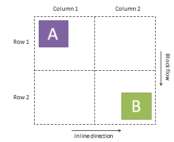
8. Grid Item Alignment
A Grid Item's alignment within its Cell can be controlled by using the
grid-column-align and grid-row-align properties.
Alignment refers to the logical edges of the Grid Item's Cell.
The start edge of a column is defined by the text flow direction.
The start edge of a row is defined by block flow direction.
The alignment values refer to the edge of the Grid Item's Cell against which the
Grid Item will align one of its edges.
Which edge of the Grid Item actually aligns against the specified edge of the Cell is dependent on
whether the Grid Item shares the same inline text direction and block flow direction as the Grid element.
All descriptions below assume that the Grid Item shares the same inline text direction and block flow direction
as the Grid element.
Refer to the CSS Writing Modes Module Level 3 for more details about the relationship between parent and child elements with differing writing-modes,
and for the definitions of inline direction and block flow direction. [CSS3WRITINGMODES]
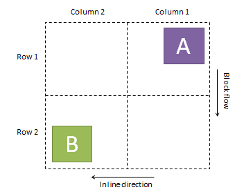
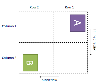
Figures 12, 13, and 14 illustrate the placement and orientation of the Grid element's rows, columns, and
Grid Items using different writing modes on the Grid element.
In each of the figures, the markup shown in the following example is used to place Grid Item A in column 1, row 1, and Grid Item B in column 2, row 2.
Grid Item A is aligned in each figure to the starting edges of its row and column.
Grid Item B is aligned in each figure to the ending edges of its row and column.
<style type="text/css">
    #grid { display: grid; grid-columns: 1fr 1fr; grid-rows: 1fr 1fr }
    #A { grid-column: 1; grid-row: 1; grid-column-align: start; grid-row-align: start }
    #B { grid-column: 2; grid-row: 2; grid-column-align: end; grid-row-align: end }
</style>

<div id="grid">
    <div id="A">A</div>
    <div id="B">B</div>
</div>
| Name: |
grid-column-align |
| Value: |
'start' | 'end' | 'center' | 'stretch' |
| Initial: |
'stretch' |
| Applies to: |
Grid Item elements |
| Inherited: |
no |
| Percentages: |
n/a |
| Media: |
visual, paged |
| Computed value: |
specified value |
- start aligns the starting edge of the Grid Item's margin box to the starting edge of the Grid Item's column.
- end aligns the end edge of the Grid Item's margin box to the end edge of the Grid Item's column.
- center places the center of the Grid Item's margin box at the center of the the Grid Item's column.
- stretch ensures that the Grid Item's margin box is equal to the size of the Grid Item's column.
| Name: |
grid-row-align |
| Value: |
'start' | 'end' | 'center' | 'stretch' |
| Initial: |
'stretch' |
| Applies to: |
Grid Item elements |
| Inherited: |
no |
| Percentages: |
n/a |
| Media: |
visual, paged |
| Computed value: |
specified value |
- start aligns the starting edge of the Grid Item's margin box to the starting edge of the Grid Item's row.
- end aligns the end edge of the Grid Item's margin box to the end edge of the Grid Item's row.
- center places the center of the Grid Item's margin box at the center of the the Grid Item's row.
- stretch ensures that the Grid Item's margin box is equal to the size of the Grid Item's row.
8.1 Grid Item Alignment and Overflow
The values start, end, and center all cause the Grid Item
to produce a box sized shrink-to-fit for its cell.
If the min-content size of the Grid Item's box is greater than the size of its Cell,
it will overflow the bounds of its Cell in a direction determined by its alignment.
A value of stretch causes the Grid Item's box model to shrink or grow to satisfy the following equations:
margin-left + border-left + content-width + border-right + margin-right = <cell width>

margin-top + border-top + content-height + border-bottom + margin-bottom = <cell height>
When stretching a Grid Item box, negative margins can produce a box which is larger than the Grid Item's Cell.
Also, stretching can produce a Grid Item box that is smaller than the min-content size of the Grid Item.
In such cases the contents of the Grid Item element will overflow its box in accordance with its overflow property.
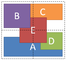
9. Drawing Order of Grid Items
Grid Items do not directly affect each other's placement in the Grid element.
A Grid Item may affect the position of a Grid Line in a column or row that uses a contents-based relative size,
which in turn affects the position or size of another Grid Item, but there is no direct interaction between Grid Items.
Grid Items may overlap because the Grid Item's Cell is defined to intersect with the Cell of another Grid Item.
Grid Item boxes in non-intersecting Cells may also overlap because of negative margins.
In cases where boxes overlap, a new property, grid-layer, is introduced to provide control over the drawing order of Grid Items.
Grid-layer is similar in concept to z-index, but avoids overloading the meaning of the z-index property,
which is applicable only to positioned elements.
In cases where Grid Items occupy the same grid-layer, source order determines which item will be drawn first.
Figure 15 illustrates the drawing order of the markup shown in the following example.
<style type="text/css">
    #grid { display: grid; grid-columns: 1fr 1fr; grid-rows: 1fr 1fr }
    #A { grid-column: 1; grid-row: 2; grid-column-span: 2; grid-row-align: end }
    #B { grid-column: 1; grid-row: 1; grid-layer: 10 }
    #C { grid-column: 2; grid-row: 1; grid-row-align: start; margin-left: -20px }
    #D { grid-column: 2; grid-row: 2; grid-column-align: end; grid-row-align: start }
    #E { grid-column: 1; grid-row: 1;
         grid-column-span: 2; grid-row-span: 2; grid-layer: 5;
         grid-column-align: center; grid-row-align: center
    }
</style>

<div id="grid">
    <div id="A">A</div>
    <div id="B">B</div>
    <div id="C">C</div>
    <div id="D">D</div>
    <div id="E">E</div>
</div>
| Name: |
grid-layer |
| Value: |
<integer> |
| Initial: |
0 |
| Applies to: |
Grid Item elements |
| Inherited: |
no |
| Percentages: |
n/a |
| Media: |
visual, paged |
| Computed value: |
specified value |
A. Acknowledgements
This specification is made possible by input from Kathy Kam,
Chris Jones, Erik Anderson, Sylvain Galineau, Rossen Atanassov, and Eugene Veselov. Thanks to Eliot Graff
for editorial input.