SVG 1.2 - 27 October 2004
SVG 1.2 enables the author to specify a paint server which will be used to fill the viewport of any element that creates a viewport, such as the root svg element. The referenced paint server is restricted to being a solid color.
The background-fill property defines the paint used to fill the viewport created by a particular element.
| Value: | <paint> |
| Initial: | none |
| Applies to: | viewport-creating elements |
| Inherited: | no |
| Percentages: | N/A |
| Media: | visual |
| Animatable: | yes |
It is an error to reference a fill that is not a solid color operation. Below is an example of background-fill.
<svg xmlns="http://www.w3.org/2000/svg" version="1.2"
     background-fill="red">

  <!-- Everything here has a red background -->

  <!-- This rectangle is not filled, so the red background
        will show through -->
  <rect x="20" y="20" width="100" height="100"
        fill="none" stroke="black"/>

  <svg x="40" y="100" width="200" height="200"
       background-fill="green">

    <!-- Everything here has a green background -->

  </svg>

</svg>
The filling of the backgound is the first operation in the rendering chain of an element. Therefore:
The background-fill-opacity property specifies the opacity of the background-fill.
| Value: | <float> |
| Initial: | 1.0 |
| Applies to: | viewport-creating elements |
| Inherited: | no |
| Percentages: | N/A |
| Media: | visual |
| Animatable: | yes |
<svg xmlns="http://www.w3.org/2000/svg" version="1.2"
     background-fill="red">

  <!-- Everything here has a red background -->

  <svg x="40" y="100" width="200" height="200"
       background-fill="green" background-fill-opacity="0.5">

    <!-- Everything here has a half transparent
         green background -->

  </svg>

</svg>
The shadowInherit attribute applies to elements that establish shadow trees and controls property inheritance in those shadow trees. In SVG 1.0 and 1.1, this behavior was fixed depending on the element name. This attribute regularizes control over the inheritance method and gives more flexibility to content creators.
The shadowInherit attribute is added to all elements that create shadow trees. It can take one of four values, described below:
Properties inherit into the shadow tree at their point of definition, in other words from the element that defines the shadow tree. For example, marker elements in SVG 1.1 behave in this way. It is easy to make red markers that are used on multiple paths, and difficult to make markers that are the color of the path on which they are used.
Properties inherit into the shadow tree at their point of use, in other words from the element that generates the shadow tree. For example, symbol elements in SVG 1.1 behave in this way. It is easy to make symbols that are used in multiple places and inherit from the use element that references them.
This keyword results in special behavior only in special host-language dependent circumstances where shadow inheritance behavior is variable and dependent on the run-time context. For SVG, the 'dynamic' keyword is equivalent to 'onDefine' except for the feImage element. For feImage, when referencing a document resource, 'dynamic' is equivalent to 'onUse', but when referencing an element node within a document it is equivalent to 'none'.
The default value for shadowInherit is 'onUse' except for the following:
The following example illustrates shadowInherit:
<svg viewBox="0 0 1000 300"
    xmlns="http://www.w3.org/2000/svg" version="1.2">

  <desc>Example shadowInherit01 - Illustrate the effect of
        shadowInherit</desc>

  <defs fill="yellow">
    <rect id="rect1" x="0" y="0" width="200" height="100"/>
  </defs>

  <use x="100" y="100"
       xlink:href="#rect1" shadowInherit="onDefine"
       fill="red"/>

  <use x="400" y="100"
       xlink:href="#rect1" shadowInherit="onUse"
       fill="green"/>

  <use x="700" y="100"
       xlink:href="#rect1"  shadowInherit="none"
       fill="blue"/>
</svg>
The three rectangles will be colored as follows:
The solidColor element is a paint server that provides a single color with opacity. It can be referenced like the other paint servers (gradients and patterns).
solidColor Schema
  <define name='solidColor'>
    <element name='solidColor'>
      <ref name='attlist.solidColor'/>
      <ref name='SVG.solidColor.content'/>
    </element>
  </define>

  <define name='attlist.solidColor' combine='interleave'>
    <ref name='SVG.Core.attrib'/>
    <ref name='SVG.Style.attrib'/>
    <ref name='SVG.Color.attrib'/>
    <ref name='SVG.SolidColor.attrib'/>
    <ref name='SVG.External.attrib'/>
  </define>

  <define name='SVG.SolidColor.attrib' combine='interleave'>
    <optional>
      <attribute name='solid-color' svg:animatable='true' svg:inheritable='false'>
        <ref name='SVGColor.datatype'/>
      </attribute>
    </optional>
    <optional>
      <attribute name='solid-opacity' svg:animatable='true' svg:inheritable='false'>
        <ref name='OpacityValue.datatype'/>
      </attribute>
    </optional>
  </define>

  <define name='SVG.solidColor.content'>
    <zeroOrMore>
      <ref name='SVG.Description.class'/>
    </zeroOrMore>
    <zeroOrMore>
      <choice>
        <ref name='stop'/>
        <ref name='animate'/>
        <ref name='set'/>
        <ref name='animateTransform'/>
      </choice>
    </zeroOrMore>
  </define>
The solid-color property indicates what color to use for this solidColor element. The keyword currentColor and ICC colors can be specified in the same manner as within a <paint> specification for the fill and stroke properties.
| Value: | currentColor | <color> [icc-color( <name> [, <icccolorvalue>]* ) ] | inherit |
| Initial: | black |
| Applies to: | solidColor elements |
| Inherited: | no |
| Percentages: | N/A |
| Media: | visual |
| Animatable: | yes |
The solid-opacity property defines the opacity of a given solid color.
| Value: | <opacity-value> | inherit |
| Initial: | 1 |
| Applies to: | solidColor elements |
| Inherited: | no |
| Percentages: | N/A |
| Media: | visual |
| Animatable: | yes |
Certain print applications can improve printing quality by specifying colors by name or in an alternative color format. This is commonly referred to as using 'spot' colors, device colors or inks, and usually means that a particular ink will be used for the color when it is printed. Furthermore, there are applications in the printing press industry where presses can be set up with different inks for different jobs. This means that the content creator will need to create content tailored to the particular press setup in order to obtain the best results.
The deviceColor element can be used to indicate an alternative color for a particular paint. This element will be mostly used in closed workflows, since the names of the inks and the parameters (percentages of each ink's color components) rarely have meaning outside the domain of the target device.
deviceColor Schema
  <define name='deviceColor'>
    <element name='deviceColor'>
      <ref name='attlist.deviceColor'/>
      <ref name='SVG.deviceColor.content'/>
    </element>
  </define>

  <define name='attlist.deviceColor' combine='interleave'>
    <ref name='SVG.Core.attrib'/>
    <attribute name='name' svg:animatable='false' svg:inheritable='false'/>
    <attribute name='uri' svg:animatable='false' svg:inheritable='false'>
      <ref name='URI.datatype'/>
    </attribute>
  </define>

  <define name='SVG.deviceColor.content'>
    <empty/>
  </define>
A URI used to identify the device-specific information included in this element. If the User Agent does not recognize the URI (ie. is not able to recognize the particular device parameters) then the element should be ignored and should not be part of the rendering process.
Animatable: no
The name of this device-specific color information. The name attribute is used within the device-color specification within <paint> to reference this deviceColor element.
Animatable: no
The deviceColor element uses attributes from external namespaces to define the device specific properties that are to be used when the deviceColor is referenced from a <paint>.
The following example illustrates the use of deviceColor. There are two things to note:
<svg xmlns="http://www.w3.org/2000/svg" version="1.2"
     xmlns:xlink="http://www.w3.org/1999/xlink"
     xmlns:ecpi="http://www.example.com/press/inks">

  <defs>
     <!-- describe a particular output device -->
     <deviceColor name="device-inks"
                  xlink:href="http://www.example.com/pressInks"
             ecpi:value="Cyan, Magenta, Yellow, Black, Silver, Gray, Green"/>
  </defs>

  <text x="100" y="150" font-family="Verdana" font-size="35"
        fill="rgb(22,33,44) device-color(device-inks, 11,55,66,77,0,0,88)" >

     Hello, out there

  </text>

</svg>
In the example above, a supplemental attribute, value, from a private namespace has been added. This example value attribute provides the definitions of colors or inks to be interpreted in the context of the URI specified. It is in a private namespace so that content and context authors can use any understood format to convey the necessary information. When the particular deviceColor element is referenced later by a device-color keyword specification, it is generally expected that the number of parameters following the name reference (1st parameter) in the function-like representation for the value of device-color alternate in a fill or stroke attribute (for example) will have an understood one-to-one correspondence with the information specified for the value attribute in the the deviceColor element. The interpretation of the parameters is implied specifically by the context set by the URI.
The device-color keyword for specifying device specific <paint> colors is to be used only by those agents that understand the full meaning of the context set by the URI in the referred to DeviceColor element. The keyword can only be used with a corresponding color definition, such as a color keyword or RGB definition. The color definition, with ICC Color specification when present, is used if the agent does not understand the rendering context implied by the referenced device-color URI. The priority of the use of color specifications are as follows: device-color if understood, color-profile if present and understood and finally the sRGB specification.
The first parameter in the function like representation device-color must be the name for a defined deviceColor element, in a manner similar to color-profile. The remainder of the parameters are interpreted entirely in light of the information provided in the deviceColor element. There is a correspondence between the parameters after the name in the functional representation for device-color and the external attributes on the referenced deviceColor. In the example above, the interpretation of the values meaning (ink volume to use, percent of total ink volume, or whatever) is strictly in the context of the specification or convention implied by the URI in the referenced deviceColor element.
Interface SVGDeviceColorElement provides access to the deviceColor element.
interface SVGDeviceColorElement : SVGURIReference {
  readonly attribute DOMString name; // raises DOMException on setting
};
The icc-named-color keyword is used to specify so-called 'spot' colors, also known as named colors. Examples of named colors include Pantone colors.
SVG 1.2 supports device independent ICC named color profiles. These profiles will be of class "Named Color profile" as defined in section 6.1.4 of the ICC profile specification version 4.0.0 . Such profiles may be included in an SVG file via use of the color-profile element.
The icc-named-color keyword indicates what named color to use for specifying paint for a given element.
The fill and stroke properties are defined as a value of type paint, which is specified as follows:
<paint> : none | currentColor | ((color)) [icc-color(<name>[,<icccolorvalue>]*)][device-color(<name>[,<devicecolorvalue>]*)][icc-named-color(<name>,<colorname>)] |
<uri> [ none | currentColor | <color> [icc-color(<name>[,<icccolorvalue>]*)] [device-color(<name>[,<devicecolorvalue>]*)] [icc-named-color(<name>,<colorname>)]] | inherit <http://www.w3.org/TR/REC-CSS2/cascade.html#value-def-inherit>
Indicates that no paint is applied.
Indicates that painting is done using the color specified by the color property. This mechanism is provided to facilitate sharing of color attributes between parent grammars such as other (non-SVG) XML. This mechanism allows you to define a style in your HTML which sets the color property and then pass that style to the SVG user agent so that your SVG text will draw in the same color.
The <color> is the explicit color (in the sRGB color space) to be used to paint the current object. SVG supports all of the syntax alternatives for color defined in CSS2-color-types, with the exception that SVG contains an expanded list of recognized color keywords names. There are three optional syntaxes for specifying icc profile defined and device colors to aid color accuaracy in applications such as printing. These are icc-color, device-color and icc-named-color.
If an optional icc-color specification is provided, then the user agent searches the color profile description database for a color profile description entry whose name descriptor matches <name> and uses the last matching entry that is found. (If no match is found, then the ICC color specification is ignored.) The comma-separated list (with optional white space) of <icccolorvalue>'s is a set of ICC-profile specific color values, expressed as <number>. (In most cases, the <icccolorvalue> will be in the range 0-to-1.)
The device-color keyword for specifying device specific colors is to be used only by those agents that understand the full meaning of the context set by the URI in the referred to DeviceColor element. The color definition, with icc-color specification when present, is used if the agent does not understand the rendering context implied by the referenced device-color URI.
The first parameter in the function like representation device-color, <name>, must be the name for a defined deviceColor element, resolved in the same manner as color-profile. The remainder of the parameters are interpreted entirely in light of the information provided in the deviceColor element. There is a correspondence between the parameters after the name in the functional representation for device-color and the external attributes on the referenced deviceColor.
If an optional icc-named-color specification is provided, then the user agent searches the color profile description database in the same manner as for icc-color. The <colorname> string is a profile specific color name. (In most cases, the <colorname> will match a string in the ICC named color profile.)
If the paint contains a icc-color, device-color or icc-named-color, it must first specify a <color> for fallback. If the user agent cannot render a particular optional color definition, they should fallback to the next color definition of lower priority. The priority for the use of color specifications is as follows:
NOTE:
Note that color interpolation occurs in an RGB color space even if an ICC-based color specification is provided (see color-interpolation and {color-interpolation-filters | http://www.w3.org/TR/SVG11/painting.html#ColorInterpolationFiltersProperty]). Percentages are not allowed on <icccolorvalue>'s. For more on ICC-based colors, refer to Color profile descriptions.
The <uri> is how you identify a paint server such as a gradient, a pattern or a custom paint defined by an extension. The <uri> provides the ID of the paint server (e.g., a gradient, pattern or solidColor) to be used to paint the current object. If the URI reference is not valid (e.g., it points to an object that doesn't exist or the object is not a valid paint server), then the paint method following this defintion is used if provided; otherwise, the document is in error (see Error processing.
SVG 1.2 adds a new property to give increased control over the color space used for rendering.
The rendering-color-space property defines the color space that an element's rendering operations will take place in. Conceptually this involves the creation of an offscreen buffer with color space is defined by the ICC profile referenced by the property. All fill/stroke/gradient/pattern specifications must be converted to this color space before elements are rendered. Images and the results of filtering must be color converted, when required, to the specified color space before being composited. After the object/group is rendered the offscreen image must be converted to the color space defined by the rendering-color-space property on the object/group's parent before being composited into the parent's offscreen buffer.
The ICC profile referenced must provide forward and reverse conversion, as the implementation will need to convert to and from the specified color space; most ICC profiles provide both conversions. To limit the burden on implementors only three channel ICC profiles are required to be supported. In cases where the specified ICC profile can not be used (such as not being available, or because it has more than three channels of output) the implementation must use the rendering-color-space specification from the first ancestor that has a usable profile associated (i.e. it is as if a value was not provided for this property for this element).
Note that standard SVG compositing rules are used. As a consequence highly non-linear color spaces (such as HSV) or non-orthogonal color spaces (such as CMYK) may give unintuitive results when blending colors.
| Value: | auto | sRGB | linearRGB | <name> | <uri> |inherit |
| Initial: | auto |
| Applies to: | outermost SVG elements |
| Inherited: | yes |
| Percentages: | N/A |
| Media: | visual |
| Animatable: | yes |
The color-interpolation property on gradients and color-interpolation-filters property on filter primitives are also extended to support <name> and <uri> references. This enables gradients and filters where interpolation occurs in an alternate color space. When the gradient is rendered the colors must be converted to the rendering-color-space of the object the gradient is applied to (consistent with the current definition of color-interpolation).
The color-interpolation property on graphics elements is deprecated. The current definition of color-interpolation states that when the property is set on an element it controls what color space is used when the child is composited with it's parent.
The problem with this definition is that it implicitly requires converting the content already rendered into the parents buffer to the color space specified by color-interpolation for compositing with the child. This made sense when the only supported color spaces were sRGB and linear sRGB, because presumably the compositing code would perform the conversion, composite and convert back all at once, thus preserving the fidelity of the parent buffer. However it would be extremely difficult and computationally expensive for implementations to do this for arbitrary ICC color spaces.
Given this definition, for the use of the color-interpolation property to be make sense, the property would generally have to be set on all the children of a grouping element, but not be set on the grouping element. This would allow an implementation to composite all the children in the desired color space, and only convert to the 'parent' color space at the end of the group. However having to set a property on all the children but not on the parent would be extremely fragile as well as error prone for generators of SVG content.
Thus the SVG working group has decided that rendering-color-space should replace color-interpolation for use on graphics elements, it allows a clearer expression of the authors intent, and makes costly mistakes (both in speed and quality) less likely.
The user agent will go into error if the value of rendering-color-space is anything but 'auto' when color-interpolation has a value of 'linearRGB'. If color-interpolation is removed a future version of the specification the 'auto' value for rendering-color-space will be defined to mean 'sRGB'.
In SVG 1.1, a filter defines the area upon which it applies. This makes it difficult to develop a generic filter that can be applied to arbitrary graphics, since the filter must define a large enough area to cover any graphical object to which it is applied. An example of this is a generic "drop shadow" filter, which is commonly specified as a combination of a Gaussian blur feGuassianBlur) that is offset feOffset) and then composed feComposite) with the original source graphic. Since the shadow has to extend beyond the original graphic's boundaries, the filter must be defined to have a larger area than the original graphic. Overestimating this margin has a negative effect on performance, since the complex filter operation has to touch a larger amount of user space (ie. pixels).
In order to solve this problem, SVG 1.2 adds margins to the filter and filter primitive elements. These margins are added to the filter region, once any conversion of the filter region from object space into user space has been made.
In particular, the filterMarginsUnits, filterPrimitiveMarginsUnits, dx, dy, dw and dh are added to the filter element. The filterMarginsUnits specifies the coordinate space of the new margin attributes, which are used to increase or decrease the filter element's x, y, width and height attributes (once they have been calculated). The filterPrimitiveMarginsUnits specifies the units for the new margin attributes on the filter primitives, also named dx, dy, dw, dh. These margins attribute override those set on the parent filter element.
An example of the new attributes, which defines a generic dropShadow filter:
<filter id="dropShadow" x="0" y="0" width="1" height="1"
          filterMarginsUnits="userSpaceOnUse"
          dx="0" dy="0" dw="5" dh="5" >
      <feGaussianBlur stdDeviation="2" in="SourceAlpha" />
      <feOffset dx="2" />
      <feMerge>
           <feMergeNode />
           <feMergeNode in="SourceGraphic" />
      </feMerge>
</filter>
In the above example, the filter region by default covers the entire bounds of the object (which is not enough to show the shadow). Adding the new margins extends the width and height by 5 user units each, which is always enough to display the blur (which has a standard deviation of 2 user units) and offset (which is another 2 units).
In SVG 1.1 it is not clear when an user agent should begin downloading references media, particularly when the media is not used in the initial document state (e.g. it is offscreen or hidden). SVG 1.2 does not require user agents to download referenced media that is not visual at the time the document is loaded. This means there may be a pause to download the file the first time a piece of media is displayed. More advanced user agents may wish to predict that particular media streams will be needed and therefore download them in anticipation.
SVG 1.2 also adds functionality (adapted from Section 4.4 of SMIL 2.0 - The PrefetchControl Module) to allow content developers to suggest fetching content from the server before it is needed to improve the rendering performance of the document.
The prefetch element will give a suggestion or hint to a user agent that media will be used in the future and the author would like part or all of it fetched ahead of time to make the document playback smoother. User-agents can ignore prefetch elements, though doing so may cause an interruption in the document playback when the resource is needed. It gives authoring tools and authors the ability to schedule retrieval of resources when they think that there is available bandwidth or time to do it.
When instead of referring to external media, prefetch refers to the same document it occurs in, then it can only reference a page element. In this case the prefetch element must appear in a defs block before all defined pagesets and pages in the document. In such cases, prefetch is used to tell the user agent how much it needs to buffer in order to be able to play content back in a smooth and predictable manner.
None of the attributes on the prefetch element are animatable or inherited.
prefetch Schema
  <define name='prefetch'>
    <element name='prefetch'>
      <ref name='attlist.prefetch'/>
    </element>
  </define>

  <define name='attlist.prefetch' combine='interleave'>
    <ref name='SVG.Core.attrib'/>
    <ref name='SVG.XLinkRequired.attrib'/>
    <optional>
      <attribute name='mediaSize' svg:animatable='false'
         svg:inheritable='false'>
        <ref name='NumberOrPercentage.datatype'/>
      </attribute>
    </optional>
    <optional>
      <attribute name='mediaTime' svg:animatable='false'
         svg:inheritable='false'/>
    </optional>
    <optional>
      <attribute name='mediaCharacterEncoding' svg:animatable='false'
         svg:inheritable='false'/>
    </optional>
    <optional>
      <attribute name='mediaContentEncodings' svg:animatable='false'
        svg:inheritable='false'/>
    </optional>
    <optional>
      <attribute name='bandwidth' svg:animatable='false'
        svg:inheritable='false'>
        <ref name='NumberOrPercentage.datatype'/>
      </attribute>
    </optional>
  </define>
Defines how much of the media to fetch as a function of the file size of the media. To fetch the entire media without knowing its size, specify 100%. The default is 100%.
When prefetch refers to a resource in the same document (e.g. a page element), the mediaSize attribute indicates the size in bytes of the referred page. That size corresponds to the encodings used when transmitting the document. If the document is encoded in UTF-8 and gzipped, then the size of the gzipped UTF-8 fragment applies. If that same document were decompressed and transcoded to UTF-16, the hints will become stale. Since streaming hints are to be used primarily in streaming scenarii, it is not expected that hint staleness will occur frequently.
Defines how much of the media to fetch as a function of the duration of the media. To fetch the entire media without knowing its duration, specify 100%. The default is 100%. For discrete media (non-time based media like image/png) using this attribute causes the entire resource to be fetched.
When prefetch refers to a resource in the same document (e.g. a page element), this is the active duration of the referenced page element. In cases where the exact active duration can not be calculated before hand (e.g. end of an animation depends on user interaction), it is suggested that the content author estimate the minimum active duration for the referenced page. This estimate, even if zero, will allow the user agent to calculate how much of the overall document to download before beginning playback in a streaming scenario.
Defines how much network bandwidth the user agent should use when doing the prefetch. To use all that is available, specify 100%. The default is 100%. Any attribute with a value of "0%" is ignored and treated as if the attribute wasn't specified.
The mediaCharacterEncoding attribute indicates the XML character set encoding (UTF-8, ISO-8859-1, etc.) that the mediaSize attribute applies to. Tools that produce SVG must include this attribute if they specify the mediaSize attribute. The main use of this attribute is to know what character encoding was used when measuring mediaSize so that staleness of the hints may be easily detected.
The mediaContentEncodings attribute is a white space separated list of the content encodings (gzip, compress, etc.) that the mediaSize attribute applies to. The order of the list is the order in which the content encodings were applied to encode the data. Note that while situations in which multiple content codings are applied are currently rare, they are allowed by HTTP and thus that functionality is supported by SVG. Tools that produce SVG must include this attribute if they specify the mediaSize attribute. The main use of this attribute is to know what parameters were used when measuring mediaSize so that staleness of the hints may be easily detected.
When prefetch refers to external media, if both mediaSize and mediaTime are specified, then mediaSize is used and mediaTime is ignored.
When prefetch refers to a resource in the same document (e.g. a page element), both the mediaSize and mediaTime attributes can be used together by a more advanced user agent to determine how much it needs to buffer in order to be able to play content back in a smooth manner.
Below is an example of the prefetch element when it refers to external media:
<svg width="400" height="300" version="1.2"
     xmlns="http://www.w3.org/2000/svg"
     xmlns:xlink="http://www.w3.org/1999/xlink">
  <desc>
     Prefetch the large images before starting the animation
     if possible.
  </desc>

  <defs>
    <prefetch id="pf1" xlink:href="http://www.example.com/images/huge1.png"/>
    <prefetch id="pf2" xlink:href="http://www.example.com/images/huge2.png"/>
    <prefetch id="pf3" xlink:href="http://www.example.com/images/huge3.png"/>
  </defs>

  <image x="0" y="0" width="400" height="300"
     xlink:href="http://www.example.com/images/huge1.png"
     display="none">

     <set attributeName="display" to="inline" begin="10s"/>

     <animate attributeName="xlink:href" values="
            http://www.example.com/images/huge1.png;
            http://www.example.com/images/huge2.png;
            http://www.example.com/images/huge3.png"
         begin="15s" dur="30s"/>
  </image>

</svg>
Below is an example of the prefetch element when it refers to a resource (e.g. a page element in the same document):
<svg width="400" height="300" version="1.2"
     xmlns="http://www.w3.org/2000/svg"
     xmlns:xlink="http://www.w3.org/1999/xlink">
  <desc>
     Example of using prefetch for progressive downloading.
  </desc>

  <defs>
    <prefetch id="pf1" xlink:href="#scene1"
              mediaCharacterEncoding="UTF-16"
              mediaTime="5s" mediaSize="48" mediaEncodings="UTF-8"/>
    <prefetch id="pf2" xlink:href="#scene2"
              mediaCharacterEncoding="UTF-16"
              mediaTime="10s" mediaSize="1234" mediaEncodings="UTF-8"/>
    <prefetch id="pf3" xlink:href="#scene3"
              mediaCharacterEncoding="UTF-16"
              mediaTime="5s" mediaSize="62" mediaEncodings="UTF-8"/>
  </defs>

  <pageSet>
    <page id="scene1">
      <!-- graphics for scene 1 go here -->
    </page>

    <page id="scene2">
      <!-- graphics for scene 2 go here -->
    </page>

    <page id="scene3">
      <!-- graphics for scene 3 go here -->
    </page>
  </pageSet>
</svg>
SVG 1.2 adds the xlink:href attribute to the style element, allowing the reference of external stylesheets. The attribute behaves in the same way as the corresponding attribute on the script element.
SVG 1.2 allows the switch element as a child of any element.
The min-unit-scale and max-unit-scale attributes refer to the scale factor in the transform between the element's user space and the viewport space. These attributes are allowed to provide one or two values. If two values are provided then the first refers to the scale factor in the horizontal direction and the second value refers to the scale factor in the vertical direction. If one value is provided it is used for both the horizontal and vertical scale factors.
When implementations evaluate these attributes they should pay attention to the possibility that the content is being rendered in a filter using the filterRes attribute when calculating the scale factor from the current coordinate system to the viewport coordinate system.
If the scale factor from the current user coordinate system to the viewport coordinate system is greater than min-unit-scale, then the test evaluates to true. If the scale factor from the current user coordinate sytsem to the viewport coordinate system is smaller than max-unit-scale, then the test evaluates to true. Otherwise, the tests evaluate to false.
The min-unit-scale and max-unit-scale attributes are often used in conjunction with the switch element. If the min-unit-scale and/or max-unit-scale attributes are used in other situations, then they represents a simple switch on the given element whether to render the element or not.
Many resources, especially media such as audio and video, have a wide range of formats. As it is often not possible to require support for a particular format, due to legal or platform restrictions, it is often necessary to provide alternatives so that user agents can choose the format they support.
The requiredFormats attribute is a generic conditional processing attribute that can be used to enable or disable particular branches in the SVG document. It defines a list of resource formats. Each format is defined by the format definition with the syntax varied according to the specific type of resource. The User Agent must support all of the resource types for the attribute to evaluate to true.
requiredFormats = list-of-format-definitions
Each format definition is separated by whitespace. A format definition can be a MIME-type beginning "image/", "video/" or "audio/", or must use one of the following formats:
For a list of MIME types for audio/video codecs, see the IANA registry and RFC2361.
Given that several important file formats are still not registered or not specific enough, the following format definitions are also understood:
The following requiredFormats are must always evaluate to true in compliant SVG viewers:
If the attribute is not present, then its implicit return value is "true". If an empty string value is given to attribute requiredFormats, the attribute returns "false". Format definitions that are not understood by the user agent return "false".
Also the following method is exposed on SVGSVGElement:
boolean isFormatSupported( in dom::DOMString formatDefinition );
If the author wishes to have complete control over the appearance and location of text in the document then they must ensure that the correct font is used when rendering the text. This can be achieved by using SVG Fonts and embedding the font in the document. However, this is not practical in all cases, especially when the number of glyphs used is very large or if the licensing of the font forbids such embedding.
The requiredFonts attribute is a generic conditional processing attribute that can be used to enable or disable particular branches in the SVG document. It defines a list of fonts, separated by commas. The User Agent must have access to all of the fonts, either installed on the system or as an SVG font defined or embedded within the document, for the attribute to evaluate to true.
requiredFonts = list-of-font-names
Below is an example of the requiredFonts attribute.
<switch>
   <text requiredFonts="FancyPants" id="txt" font-family="FancyPants">
      <tspan x="..." y="...">....</tspan>
      <tspan x="..." y="...">....</tspan>
      <tspan x="..." y="...">....</tspan>
   </text>
   <flowRoot>
      <flowRegion>
        ...
      </flowRegion>
    <flowPara><flowTRef xlink:href="#txt"></flowPara>
  </flowRoot>
</switch>
In the above example, if the FancyPants font is available on the system, or has been declared as an SVG font elsewhere in the document, then the first child of the switch evaluates to true, and the precise layout of the tspan is used (with the FancyPants font). If the FancyPants font is not available, then the system default font is used inside a flowing region, with the text referenced from the precise layout.
There are many cases when it is necessary for graphical objects to be drawn above the canvas.
The overlay property controls how an element's canvas is composited into the document canvas.
| Value: | 'top' | 'none' |
| Initial: | 'none' |
| Applies to: | svg element |
| Inherited: | no |
| Percentages: | N/A |
| Media: | visual |
| Animatable: | yes |
The SVG 1.1 specification says:
Grouping elements such as the g have the effect of producing a temporary separate canvas initialized to transparent black onto which child elements are painted. Upon the completion of the group, any filter effects specified for the group are applied to create a modified temporary canvas. The modified temporary canvas is composited into the background, taking into account any group-level masking and opacity settings on the group.
For elements that have the overlay property is set to "top" the element's "temporary separate canvas" is not composited to the background as usual. Instead that "temporary separate canvas" is set aside. In other words, the element gets drawn to its canvas, but that canvas is not drawn into to the background yet (and instead drawn later in the whole document's compositing process). Such canvases are commonly referred as overlays, hence the name.
The overlay-host property affects how all "temporary separate canvases" of this element descendants are composited.
| Value: | 'true' | 'false' |
| Initial: | 'false' |
| Applies to: | svg element |
| Inherited: | no |
| Percentages: | N/A |
| Media: | visual |
| Animatable: | yes |
If the value of overlay-host is true, then after the "modified temporary canvas is composited into the background" for this svg element, all "temporary separate canvases" that were set aside in the course of this element's drawing are composited into the background. In other words, overlay host draws all the overlays on top of the other content of the element. Overlays are drawn in the order they were created.
The following example shows how to use the 'overlay' property to create a simple popup menu:
<svg xmlns="http://www.w3.org/2000/svg" version="1.2"
     viewBox="0 0 1000 180">
  <!-- draw the outline of the viewable area -->
  <rect id="myRect" x="1" y="1" width="998" height="178"
        fill="none" stroke="blue"/>

  <g transform="translate(500,60)">
    <!-- This is the prompt label for the popup -->
    <text x="-10" y="0" text-anchor="end"
          font-size="40">
      Make a selection:
    </text>

    <!-- This shows the current choice for the popup -->
    <rect x="0" y="-40" width="150" height="54"
        fill="#CCF" stroke="black"/>
    <text x="10" y="0" text-anchor="start"
          font-size="40" font-weight="bold">Yes</text>

    <!-- The user must click on this triangle to expose the popup -->
    <path id="triangle" transform="translate(100,-30)"
          d="M0,0 L 40,0 L 20,30 z"/>

    <!-- This is the popup menu, which is invisible initially -->
    <g id="popup" display="none" overlay="top">
      <rect x="0" y="-40" width="150" height="105"
            fill="#CCF" stroke="black"/>
      <text x="10" y="0" text-anchor="start"
            font-size="40" font-weight="bold">Yes</text>
      <text x="10" y="45" text-anchor="start"
            font-size="40" font-weight="bold">No</text>
    </g>
    <!-- Illustrative declarative animation to expose popup. -->
    <set xlink:href="#popup" attributeName="display"
         to="inline" begin="triangle.mousedown" end="mouseup"/>
  </g>

  <!-- Additional graphics and text at the bottom -->
  <rect x="100" y="80" width="800" height="60" fill="#FF8" stroke="black"/>
  <text id="Note" x="500" y="120" text-anchor="middle" font-size="36">
    This example illustrates how overlays work
  </text>

</svg>
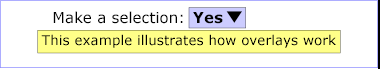
In this example, the popup menu is hidden initially. When the user initiates a mousedown event on the triangle, then the popup appears. Here is how the example appears initially:
Here is how the example appears once the user has initiated a mousedown event on the triangle but before any mouseup events occur:
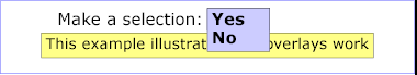
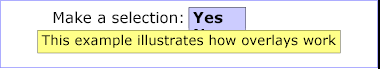
The key thing to observe in this example is the overlay="top" value on the g element whose ID is "popup". Because the g specifies overlay="top", when the popup is displayed, it will be drawn above the rest of the graphics because its rendering will be on a temporarily canvas when is composited onto the background after the rest of the document is rendered. Without overlay="top", the popup would be obscured by the graphics that appears later in the document. In particular, if overlay="top" were not specified on the popup, the document would have shown the popup as follows:
In SVG 1.2, the cursor property adds a new value "progress", as defined in CSS 2.1. It is often rendered as a spinning beach ball, or an arrow with a watch or hourglass.
SVG 1.2 allows cursor appearance to be defined using SVG content. The following is a replacement for the SVG 1.1 section on the cursor element:
The cursor element can be used to define a platform-independent custom cursor. A recommended approach for defining a platform-independent custom cursor is through a cursor element with either PNG [PNG01] or SVG to define cursor's image and identify the exact position within the image which is the pointer position (i.e., the hot spot). If the cursor element has an xlink:href attribute, it is assumed that cursor shape is defined through an external image, otherwise cursor element's content is drawn into a separate canvas and the result is used as cursor's image.
If a bitmap image is used, the PNG format is recommended because it supports the ability to define a transparency mask via an alpha channel. If a different image format is used, this format should support the definition of a transparency mask (two options: provide an explicit alpha channel or use a particular pixel color to indicate transparency). If the transparency mask can be determined, the mask defines the shape of the cursor; otherwise, the cursor is an opaque rectangle. Typically, the other pixel information (e.g., the R, G and B channels) defines the colors for those parts of the cursor which are not masked out. Note that cursors usually contain at least two colors so that the cursor can be visible over most backgrounds.
If xlink:href attribute is specified the width, height, viewBox and preserveAspectRatio attributes are meaningless and must not be used.
If the cursor image is defined through SVG, the rules are the following:
Attribute definitions:
SVG 1.1 allows a target object to be denoted, either with a view element or with a viewTarget as part of an SVG view specification in a fragment identifier. The target object(s) are to be highlighted.
While there are some common highlighting strategies, e.g. a thick red outline for black and white schematics, in the fully general case there is no one presentation of highlighting that is guaranteed to be visible in all cases. An element might already have a thick red outline, for example. Approaches using filter effects for color inversion can also be non-obvious in certain cases.
Accordingly, the SVG 1.1 description: "Indicates the target object associated with the view. If provided, then the target element(s) will be highlighted." does not specify how the highlighting is to be achieved or even if the highlighting must be visually distinct from the non-highlighted case.
In SVG 1.2, highlighting in a conforming SVG viewer must be visually detectable. The default rendering is left application dependent, it just has to be visible. Since content creators are in a much better position to decide on an appropriate visual effect for their graphics, a dynamic pseudo-class ':highlight' is provided in SVG 1.2. It matches the target element(s) that are to be highlighted. Appropriate styling can thus be specified by the author.
:highlight { stroke-width: 5; stroke-color: red }
#map .country:highlight {filter: url(#DropShadowBehind)}
The first example applies a thick red stroke to elements that are highlighted. The second applies a filter effect, but only to elements of class "country" which are descendents of the element with id="map".
The SVG 1.2 vector effects have a nice synergy with highlighting, since they allow (for example) multiple strokes to be applied to an element.
:highlight { vector-effect: url(#ThickRedSecondStroke) }
SVG 1.2 adds a new keyword, "auto", to the allowed values of the textLength attribute.
The author's computation of the total sum of all of the advance values that correspond to character data within this element, including the advance value on the glyph (horizontal or vertical), the effect of properties kerning, letter-spacing and word-spacing and adjustments due to attributes dx and dy on tspan elements. This value is used to calibrate the user agent's own calculations with that of the author.
The purpose of this attribute is to allow the author to achieve exact alignment, in visual rendering order after any bidirectional reordering, for the first and last rendered glyphs that correspond to this element; thus, for the last rendered character (in visual rendering order after any bidirectional reordering), any supplemental inter-character spacing beyond normal glyph advances are ignored (in most cases) when the user agent determines the appropriate amount to expand/compress the text string to fit within a length of textLength.
A negative value is an error.
The "auto" value is as if the author's computation exactly matched the value calculated by the user agent; thus, no advance adjustments are made.
If the attribute is not present, it is as if "auto" was specified.
There exist cases where a user agent could achieve better performance if it were able to cache an offscreen buffer for a particular group or element. An example of such a use case are commonly called sprites.
SVG 1.2 adds three new properties that provide rendering hints to the user agent.
The cache property suggests how much resources should be allocated to dynamic update.
| Value: | 'true' | 'false' | 'auto' |
| Initial: | 'auto' |
| Applies to: | graphical elements |
| Inherited: | no |
| Percentages: | N/A |
| Media: | visual |
| Animatable: | yes |
The value 'true' means that the element is expected to be redrawn often. The user agent may be able to assign extra resources in order to increase the rendering performance.
The value 'false' means that the element is not expected to be redrawn often. The user agent may be able to conserve resources that it normally allocated to redrawing.
The default value 'auto' means that the user agent is expected to use a reasonable compromise between speed of redraw and resource allocation.
The static property suggests whether or not an element is expected to be modified often.
| Value: | 'true' | 'false' | 'auto' |
| Initial: | 'auto' |
| Applies to: | graphical elements |
| Inherited: | no |
| Percentages: | N/A |
| Media: | visual |
| Animatable: | yes |
The value 'false' means that the element is expected to be modified often.
The value 'true' means that the element is not expected to be modified often. This suggests that user agent may be able to allocate resources, such as an offscreen buffer, that would allow increased performance in redraw. It does not mean that the element will never change. If an element is modified when static has the value 'true', then redraw might have reduced performance.
The default value 'auto' means that the user agent is expected to use a reasonable compromise between speed of update and resource allocation.
The snap property suggests whether or not an element is expected to be displayed in many places and to appear close to identical in each display.
| Value: | 'true' | 'false' | 'auto' |
| Initial: | 'auto' |
| Applies to: | graphical elements |
| Inherited: | no |
| Percentages: | N/A |
| Media: | visual |
| Animatable: | yes |
The value 'false' means that the element is not expected to be displayed in many locations, or that it is not required to look identical in every location.
The value 'true' means that the element is expected to be rendered in many places and different instances are expected to look as close as possible if all rendering parameters are the same and the user space transformation matrices differ only in the translation component. A typical use of this would be a symbol on a map. A user agent could choose to implement this hint by applying an additional translation to user space before drawing in order to align the user space with device pixels.
The default value 'auto' means that the user agent is expected to use a reasonable compromise between the two values above.