Steven Pemberton, W3C/CWI
Version date: 2010-08-27
This is the second part of XForms for HTML Authors, introducing XForms 1.1. Part 1 dealt mostly with features that have some equivalent in HTML. This part introduces completely new concepts that have little or no HTML equivalence.
XForms uses XML Events for
handling events: this is a more flexible way of doing the onclick
style of event handling used in HTML. The important thing to know about XML
Events is that it uses exactly the same event mechanism as HTML, only
written differently.
Consider this simple HTML example:
<button name="OK" onclick="alert("You clicked me!"); return true;">
This says that if the <button> element (or any of its
children) gets the click event, then the piece of code in the
onclick attribute is performed.
We say "or any of its children" because in a case like
<a href="..." onclick="...">A <em>very</em> nice place to go</a>
or
<a href="..." onclick="..."><strong>More</strong></a>
you want the onclick to be performed even if the click actually
happens on the <em> or <strong> elements.
In these cases we call the element that was clicked on the target, and
the element that responds to the event an observer (though target and
observer are often the same element).
So what you see is that there are three important things involved: an event, an observer, and a piece of script (called a handler). As you can see from the above, we usually aren't worried about which element was the target.
There are some problems with the way HTML specifies the relationship between the three:
onflash if an event called
flash were introduced.click, when in fact you don't care how the button is
activated, only that is has been activatedonclick, one for JavaScript and one for
VB)XML Events specifies the relationship between the event, observer and handler in a different way. The equivalent to:
<button name="OK" onclick="alert("You clicked me!"); return true;">
in XForms would be:
<trigger>
   <label>OK</label>
   <message level="modal" ev:event="DOMActivate">You clicked me!</message>
</trigger>
This says that the <message> element is a handler for the
DOMActivate event (which is used in preference to
click, because triggers can be activated in different ways, not
just by clicks), and in the absence of any other information, the parent
element is the observer (<trigger> in this case). Note that
elements that have ev: attributes are evaluated only when the
event happens, and not when the document is loading, as
<script> is in HTML.
Note that the event attribute has a prefix ev: for
the XML Events namespace; this means that you have to have a declaration for
the prefix somewhere suitable in your document:
xmlns:ev="http://www.w3.org/2001/xml-events".
You can catch more than one event by having more handlers for an element:
<trigger>
   <label>OK</label>
   <message level="modal" ev:event="DOMActivate">You clicked me!</message>
   <message level="modal" ev:event="DOMFocusIn">You focused on me!</message>
</trigger>
Try it (to focus on the button, click on the input field, and then tab to the button):
(Source)
If you need to do more than one action for an event, you can enclose them in
an <action> element:
<trigger>
   <label>Default</label>
   <action ev:event="DOMActivate">
       <setvalue ref="min" value="0"/>
       <setvalue ref="max" value="100"/>
   </action>
</trigger>
(In case you didn't guess, setvalue sets a value in an
instance)
Try it:
(Source)
We'll be seeing more actions later on.
All of XForms processing, from the initial loading of the instance, to the
submission, is based on events; you can listen to almost every part of the
processing model; see the XForms Events
Overview for details. Most examples here use DOMActivate.
For more details of XML Events, see XML Events for HTML Authors.
The switch element allows you to expose and hide different parts of the user
interface, for example to give wizard-like behavior. Here is an example that
first asks for name, city, and email address, and then asks for favorite food,
drink and music. (Try it; you don't need to enter anything, just click on
next)
(Source)
By default the first case is selected first; the <toggle>
action causes another case to be selected:
<switch>
   <case id="start">
      <group>
         <label>About you</label>
         <input ref="name"><label>Name:</label></input>
         <input ref="city"><label>City:</label></input>
         <input ref="email"><label>Email:</label></input>
      </group>
      <trigger>
         <label>Next</label>
         <toggle case="preferences" ev:event="DOMActivate"/>
      </trigger>
   </case>
   <case id="preferences">
      <group>
         <label>Your preferences</label>
         <input ref="food"><label>Food:</label></input>
         <input ref="drink"><label>Drink:</label></input>
         <input ref="music"><label>Music:</label></input>
      </group>
      <trigger>
         <label>Next</label>
         <toggle case="history" ev:event="DOMActivate"/>
      </trigger>
   </case>
   <case id="history">
      ...
   </case>
   ...
</switch>
Adding a back button is trivial:
(Source)
<switch>
   <case id="start">
      ...
   </case>
   <case id="preferences">
      <group>
         <label>Your preferences</label>
         <input ref="food"><label>Food:</label></input>
         <input ref="drink"><label>Drink:</label></input>
         <input ref="music"><label>Music:</label></input>
      </group>
      <trigger>
         <label>Back</label>
         <toggle case="start" ev:event="DOMActivate"/>
      </trigger>
      <trigger>
         <label>Next</label>
         <toggle ev:event="DOMActivate" case="history"/>
      </trigger>
   </case>
   <case id="history">
      ...
   </case>
   ...
</switch>
You can use it for simple/advanced views:
(Source)
<switch>
<case id="simple">
<input ref="to"><label>To:</label></input>
<input ref="subject"><label>Subject:</label></input>
<trigger>
<label>Advanced >>></label>
<toggle case="advanced" ev:event="DOMActivate"/>
</trigger>
</case>
<case id="advanced">
<input ref="to"><label>To:</label></input>
<input ref="subject"><label>Subject:</label></input>
<input ref="cc"><label>Cc:</label></input>
<input ref="bcc"><label>Bcc:</label></input>
<trigger>
<label><<< Simple</label>
<toggle case="simple" ev:event="DOMActivate"/>
</trigger>
</case>
</switch>
You can use it for display/edit interactions:
(Source)
<switch>
   <case id="show">
      <output ref="name"><label>Name:</label></output>
      <output ref="city"><label>City:</label></output>
      <output ref="email"><label>Email:</label></output>
      <trigger>
         <label>Edit</label>
         <toggle case="edit" ev:event="DOMActivate"/>
      </trigger>
   </case>
   <case id="edit">
      <input ref="name"><label>Name:</label></input>
      <input ref="city"><label>City:</label></input>
      <input ref="email"><label>Email:</label></input>
      <trigger>
         <label>Done</label>
         <toggle case="show" ev:event="DOMActivate"/>
      </trigger>
   </case>
</switch>
As another example, consider the bank name and address example from part 1. Here we can split it so that the prefill part is one case.
When the account number has been filled in, pressing Find causes it to be submitted and the next case to be displayed. There you see
This mock-up gives you an idea how it works, but the submission doesn't actually do anything here:
(Source)
<switch>
   <case id="start">
      <input ref="accountnumber"><label>Account</label></input>
      <trigger>
         <label>Find</label>
         <action ev:event="DOMActivate">
            <send submission="prefill"/>
            <toggle case="show"/>
         </action>
      </trigger>
   </case>
   <case id="show">
      <output ref="accountnumber"><label>Account: </label></output>
      <input ref="name"><label>Name; </label></input>
      <textarea ref="address"><label>Address</label></textarea>
      <trigger>
         <label>Submit</label>
         <action ev:event="DOMActivate">
            <send submission="change"/>
            <toggle case="start"/>
            <setvalue ref="accountnumber"/>
         </action>
      </trigger>
      <trigger>
         <label>Cancel</label>
         <action ev:event="DOMActivate">
            <toggle case="start"/>
            <setvalue ref="accountnumber"/>
         </action>
      </trigger>
   </case>
</switch>
In fact this is slightly too simple, since you shouldn't really toggle to the start case until you know that the submission has been successful. To do that you should submit, and then wait for the success event. We can fix this by replacing the Submit trigger above with the following:
<submit submission="change">
    <label>Submit</label>
    <action ev:event="xforms-submit-done" ev:observer="change">
        <toggle case="start"/>
        <setvalue ref="accountnumber"/>
    </action>
</submit>
Note that the xforms-submit-done event is sent to the
submission element, so in this case the observer is not the submit control, and
has been explicitly set to the submission element.
Repeat can be used for shopping-cart like behavior where items can be added and deleted. The essence of a repeat is that it binds to a repeating element in an instance.
For example, a simple to-do application (adding and deleting items will work here, but saving won't):
(Source)
The instance in this case consists of a number of to-do items, where each item consists of a task name, a status, and a date (these are not XForms elements, but elements in the instance that we want to change using XForms controls):
<items>
   <todo>
      <task>Update website</task>
      <status>started</status>
      <date>2010-12-31</date>
   </todo>
   <todo>
      ...
   </todo>
   ...
</items>
Firstly to define the model. We get the initial values from a
file, and add a submission that allows you to save the instance back to the
same file, and we bind the type of the date field:
<model>
   <instance src="todo-list.xml"/>
   <submission method="put" action="todo-list.xml" replace="none"/>
   <bind nodeset="todo/date" type="xsd:date"/>
</model>
In the body, we can bind controls to this structure in the following way:
<repeat nodeset="todo">
   <input ref="date"><label>Date</label></input>
   <select1 ref="status" selection="open">
      <label>Status</label>
      <item><label>Not started</label><value>unstarted</value></item>
      <item><label>In Progress</label><value>started</value></item>
      <item><label>Done</label><value>finished</value></item>
   </select1>
   <input ref="task"><label>Task</label></input>
</repeat>
This binds to existing to-do items, and lets you edit them. Note the
selection="open" on the select1. This means that the
possible values are not restricted to just those displayed.
To add items, you use the insert action. The following trigger
inserts a new element before (position="before") the first item in
the to-do list (at="1"):
<trigger>
   <label>New</label>
   <insert nodeset="todo" position="before" at="1" ev:event="DOMActivate"/>
</trigger>
To add an item at the end you insert it after
(position="after") the last item
(at="count(todo)"):
<insert nodeset="todo" position="after" at="count(todo)" ev:event="DOMActivate"/>
Each repeat has an index associated with it that indicates the
'current item' in that repeat. It is initially 1, but if you use a control in a
repeat, the index gets set to that row. You can also set it explicitly with a
<setindex/> action. You can make the current row visible by
styling it with the CSS ::repeat-index selector (see the later
section on styling):
<style type="text/css">
      ...
   ::repeat-index {background-color: yellow}
      ...
</style>
If a repeat element has an id, then you can access its index
with the function index using the id value to
identify the repeat. So using that you can add elements to a repeating set
relative to the current element as well as at the beginning and end. If we add
an id to the repeat above:
<repeat nodeset="todo" id="todo-repeat">
we can then insert a new item after (position="after") the
current position (at="index('to-do-repeat')") with:
<insert nodeset="todo" position="after" at="index('todo-repeat')" ev:event="DOMActivate"/>
Since any new item is initialized from the last item in the initial data,
you will probably want to copy values into any new element inserted in a list.
So instead of just an insert, we bundle all the actions in an
<action> element, and we set each value with a
setvalue action:
<trigger>
   <label>New</label>
   <action ev:event="DOMActivate">
      <insert nodeset="todo" position="after" at="count(todo)"/>
      <setvalue ref="todo[last()]/status">unstarted</setvalue>
      <setvalue ref="todo[last()]/task"/>
      <setvalue ref="todo[last()]/date" value="substring-before(now(), 'T')"/>
   </action>
</trigger>
The first setvalue just sets the status of the
inserted item to the string "unstarted"; the second sets its task
to the empty string, and the third calculates today's date. The function
now() returns a date and time string like
2010-11-26T09:19:33+1:00 (this is a standard format described by
ISO) which consists of the date, the letter T, the local time (on your
computer) and then the offset of the local time from the universal timezone UTC
(+ or - some number of hours and minutes, or Z if you are in the
UTC time zone). So the substring-before expression just returns
all the text before the letter T, i.e. today's date.
To delete an item, you can use this, for example next to the 'new'
button:
<trigger>
   <label>Delete</label>
   <delete nodeset="todo" at="index('todo-repeat')" ev:event="DOMActivate"/>
</trigger>
However, the best place to include it is in the repeat, so you get one
delete button per item (as in the example above), making it obvious which item
is being deleted (since the repeat current item gets set to the row the button
is in when you press it). Since within the repeat the context has already been
set to the item set, you use nodeset=".":
<repeat nodeset="todo" id="todo-repeat">
   <input ref="date"><label>Date</label></input>
   <select1 ref="status" selection="open">
      <label>Status</label>
      <item><label>Not started</label><value>unstarted</value></item>
      <item><label>In Progress</label><value>started</value></item>
      <item><label>Done</label><value>finished</value></item>
   </select1>
   <input ref="task"><label>Task</label></input>
   <trigger>
      <label>Delete</label>
      <delete ev:event="DOMActivate" nodeset="." at="1" />
   </trigger>
</repeat>
Finally of course you need the button to save the result:
<submit><label>Save</label></submit>
Above we inserted a new todo item into the list with the action
<insert nodeset="todo" position="after" at="count(todo)"/>
What this does is takes the last item from the existing list, and copies it to the position given. However, this doesn't work when the list is empty (for example, if you delete all existing items), and this is for two reasons: there is no list to insert into any more, and there is no item to make a copy of. For this reason, if the list can ever be empty you have to extend the insert action with two pieces of information, the context, and a template of what to copy. First we make an extra instance containing a template.
<instance id="template">
    <items xmlns="">
        <todo><task/><status>unstarted</status><date/></todo>
    </items>
</instance>
and then replace the trigger to add a new item with:
<trigger>
   <label>New</label>
   <action ev:event="DOMActivate">
      <insert nodeset="todo" context="/items" origin="instance('template')/todo"
              position="after" at="count(todo)"/>
      <setvalue ref="todo[last()]/date" value="substring-before(now(), 'T')"/>
   </action>
</trigger>
Note that we don't now have to initialize the task and status fields, since that is done for us from the template.
In all examples up to now, user interface text such as labels have been text directly in the controls. However, XForms allows you to include such text from instance values as well.
The most obvious example of wanting to get values from an instance is for a
select or select1. For example, suppose you want to
offer a choice of languages in a select1:
<select1 ref="lang">
    <label>Language:</label>
    <item><label>English</label><value>en</value></item>
    <item><label>Français</label><value>fr</value></item>
    <item><label>Deutsch</label><value>de</value></item>
</select1>
but later discover you want to add another language not only to this form but also to several others that offer the same choice. Better then to put the choices in a single file, and then load that into an instance, and refer to that instead:
<instance id="languages" src="languages.xml"/>
where languages.xml contains something like this:
<languages>
    <language><name>English</name><code>en</code></language>
    <language><name>Français</name><code>fr</code></language>
    <language><name>Deutsch</name><code>de</code></language>
</languages>
Then you can rewrite the select1 to use this instance, using
<itemset> instead of a sequence of
<item>s:
<select1 ref="lang">
    <label>Language:</label>
    <itemset nodeset="instance('languages')/language">
        <label ref="name"/>
        <value ref="code"/>
    </itemset>
</select1>
(Source)
Then any time you want to add a new language, you only have to edit the
languages.xml file (with an XForm using repeat of
course!) and all forms using it will be updated with the new value.
In the same way, the text for any <label> can be got from
an instance as well, either with:
<label ref="instance('labels')/name" />
or:
<label><output ref="instance('labels')/name"/></label>
(they both work the same) using an instance like this:
<labels>
   <name>Name:</name>
   <age>Age:</age>
   ...
</labels>
which makes localization very easy.
Although you could use HTTP language negotiation to load the correct language version of the labels for you, you could also make it a user choice, for example like this:
<model>
    <instance id="labels" src="labels.xml"/>
    <submission id="en" action="labels-en.xml" replace="instance" instance="labels" method="get"/>
    <submission id="nl" action="labels-nl.xml" replace="instance" instance="labels" method="get"/>
</model>
 ...
<submit submission="en"><label>English</label></submit>
<submit submission="nl"><label>Nederlands</label></submit>
(Source)
Another option is to have all the messages for all the languages in one place. The format could be any one of a number, for example first one message in each language, then the next message in each language, and so on:
<messages>
   <message name="name">
      <language code="en">Name:</lang>
      <language code="nl">Naam:</lang>
      <language code="fr">Nom:</lang>
      ...
   </message>
   <message name="age">
      ...
</messages
or first all messages for one language, then all the messages for the next language:
<translations>
   <language code="en>
      <message name="name">Name:</message>
      <message name="age">Age:</message>
      ...
   </language>
   <language code="nl">
      <message name="name">Naam:</message>
      <message name="age">Leeftijd:</message>
      ...

</translations>
Then the user can select the user interface language of the form:
<select1 ref="instance('choices')/lang">
<item><label>English</label><value>en</value></item>
<item><label>Nederlands</label><value>nl</value></item>
 ...
</select1>
and labels can be selected on the basis of this choice, either this for the languages within messages form:
<label ref="instance('messages')/message[@name='age']/language[@code=instance('choices')/lang]"/>
or this for the messages within languages form:
<label ref="instance('translations')/language[@code=instance('choices')/lang]/message[@name='age']"/>
(Source)
You will have noticed in the introduction to the <select>
element in XForms that the values of the selected items are all packed into a
string. For example
<select ref="colors">
   <label>Colors</label>
   <item><label>Red</label><value>red</value></item>
   <item><label>Green</label><value>green</value></item>
   <item><label>Blue</label><value>blue</value></item>
</select>
would leave a value like "red green blue" in the value
colors.
This has two downsides: firstly it is very un-XML like, since it is essentially packing several values into a single string, forcing you to unpack it later. Secondly it means that you can't include values that contain a space: you can't select from a list of cities like New York, San Francisco, Las Vegas.
The reason that the basic form is like this is because it is what HTML Forms do, and XForms needs to be able to talk to servers that expect data in the HTML Forms style.
However, XForms also allows you to select on structured data, which does allow you to have spaces in the data.
For example, suppose we want to select from a set of cities, and return data like:
<instance>
   <country xmlns="">
      <name>USA</name>
      <visited>
         <city>Las Vegas</city>
         <city>New York</city>
         <city>San Francisco</city>
      </visited>
   </country>
</instance>
To do this, we need an instance to hold the city values we wish to use:
<instance id="places">
   <cities xmlns="">
         <city>Atlanta</city>
         <city>Boston</city>
         <city>Las Vegas</city>
         <city>New Orleans</city>
         <city>New York</city>
         <city>San Francisco</city>
   </cities>
</instance>
and then refer to that with the following select. Note that we
now use itemset instead of item, since we are getting
the values from an instance, and we use copy instead of
value because we are copying a whole structure (such as
<city>New York</city>, and not just a value such as
"New York":
<select ref="visited">
   <label>Cities visited</label>
   <itemset nodeset="instance('places')/city">
      <label ref="."/>
      <copy ref="."/>
   </itemset>
</select>
All controls with the exception of <output> can also have
<help>, <hint> and
<alert> elements as well as a <label>
element. These are to give extra information to the user for different
purposes:
help key;<input ref="code">
<label>Security code</label>
<hint>The 3 or 4 digit number on the back or front of your card</hint>
<help>This is a three or four digit security code that is usually either
on the front of your card just above and to the right of your
credit card number, or the last three digits of the number printed
on the signature space on the back of the card.</help>
<alert>Must be three or four digits.</alert>
</input>
This is not the place for a tutorial on XML Schema, but suffice to say that if you already have a schema defining some data types, then all you have to do to use it in your XForms is to refer to it from the model element:
<model schema="http://www.example.com/schemas/types.xsd">
   ...
or you can include a schema directly in the body of the model element:
<model>
    <instance>...</instance>
    <xsd:schema xmlns:xsd="http://www.w3.org/2001/XMLSchema">...</xsd:schema>
    ...
</model>
Of all the facilities that XML Schema provides for defining data types,
XForms has equivalents for them all with one exception: patterns. These define,
using regular expressions, the pattern that a value must conform to. For
example, here is a new simpleType called curse, that
is a restriction on the base type string:
<model>
   <instance><data xmlns=""><flw/></data></instance>
   <schema xmlns="http://www.w3.org/2001/XMLSchema">
      <simpleType name="curse">
         <restriction base="xsd:string">
            <pattern value="[a-z][a-z][a-z][a-z]"/>
         </restriction>
      </simpleType>
   </schema>
   <bind nodeset="flw" type="curse" />
   ...
</model>
Bear in mind that support for XML Schema is optional in an XForms user agent (without Schema it is then called XForms Basic), though almost all user agents do support the use of Schema.
Forms are often used to collect data that are privacy-related, such as name, address, birthdate, and so on.
XForms has a way of allowing you to document which values are privacy related by using a set of datatypes from a specification called P3P.
To use these you can use a binding for p3ptype:
<bind nodeset="surname" p3ptype="user.name.family"/>
<bind nodeset="tel" p3ptype="user.home-info.telecom.telephone"/>
Apart from documenting the use of privacy-related values, this also gives the opportunity for user agents to prefill such values for you, and to warn you about their use.
XForms elements are styled using CSS. The only thing that you have to watch out for is that different implementations use different levels of CSS, so that sometimes you have to repeat some styling rules.
The main problem is with CSS1 and 2, which don't know about namespaces, so that if you have written your XForms elements using prefixes such as
<xf:label>Age:</xf:label>
then you have to write your CSS selectors including the same namespace prefix:
xf\:label {background-color: yellow}
However, a CSS3 and higher stylesheet doesn't need the prefix, and so
(assuming there are no <label> elements from other
namespaces in your document), you can just write:
label {background-color: yellow}
There are some special selectors in CSS3 for addressing particular dynamic cases of XForms use, and many implementations already support them. In particular, you will see:
*:invalid { background-color: red}
Note that in the invalid case, the <alert> element
becomes activated as well, probably by using rules like:
alert {display: none}
*:invalid alert {display: block; border: thin red solid}
<hint> elements will be made active using similar
techniques:
hint {display: none}
*:hover hint {display: block}
range controls where the instance value does not fall
within the bounds, and select1 and select
controls where the instance value does not match any of the items.*:required {border: thin red solid}
*:read-only {color: gray}
*:disabled {display: none}
input::value {width: 10em}
::repeat-index {background-color: #ccf}
Implementations that only support CSS1 or 2 often implement these as special values of the 'class' attribute. For example:
input.invalid {border: thin red solid}
and you should check in your implementation documentation which get used. However, implementors have recently agreed to coordinate these values, so that they will all use the same names. The agreement is to start class names representing pseudo-classes with "-pc-" and then the name of the class, and for pseudo-elements "-pe-" and then the element name. For example:
input.-pc-invalid {border: thin red solid}
 .-pe-repeat-item {background-color: yellow}
The traditional technique to display how many people have visited a page is to keep a count of the number of hits, and when the page is requested to generate an image for that number, which then gets displayed in the page. An image of several thousands of bytes is of course a rather inefficient way of transferring about half a dozen bytes of information .
With XForms it is much simpler. You just keep a file with a count of the number of hits:
<n>56356</n>
import it into an instance:
<instance src="hits.xml"/>
and display the number of hits with an <output>:
<output ref="/n"><label>Number of hits:</label></output>
When you use a bind for a value, like:
<bind nodeset="today" calculate="substring-before(now(), 'T')"/>
then the value 'today' will be set invariantly to that value: you can never
change it. However, if you just want to initialize a value when the form gets
loaded, and let the user change it, then you can use a setvalue
action, listening for the event xforms-ready, which gets sent to
the model element:
<model>
   <instance>
      <data xmlns="">
         <date/>
         ...
      </data>
   </instance>
   <action ev:event="xforms-ready">
      <setvalue ref="date" value="substring-before(now(), 'T')"/>
      ...
   </action>
</model
Although not defined as such in the XForms specification, an emerging
practice amongst implementations is to style <trigger
appearance="minimal"> as text instead of as a button. So for example
instead of using the show/edit style of <switch> above, you
can make each individual field switchable:
<switch>
<case id="showName">
<trigger
appearance="minimal">
<label ref="name"/>
<toggle case="editName" ev:event="DOMActivate"/>
</trigger>
</case>
<case id="editName">
<input ref="name">
<label>Name:</label>
<toggle case="showName" ev:event="DOMFocusOut"/>
</input>
</case>
</switch>
Note the use of DOMFocusOut to revert to the displayed value:
when you finish editing the value and exit the field, the view reverts. Try it
(click on the name, edit it, and tab away):
(Source)
<switch> allows you to present a tabbed interface to
data. First you have your triggers to select a pane, and then the switch for
the different panes. The rest is styling. Here is a simple example:
<trigger id="togglehome" appearance="minimal">
    <label>Home</label>
    <toggle case="home" ev:event="DOMActivate"/>
</trigger>
<trigger id="toggleproducts" appearance="minimal">
    <label>Products</label>
    <toggle case="products" ev:event="DOMActivate"/>
</trigger>
<trigger id="togglesupport" appearance="minimal">
    <label>Support</label>
    <toggle case="support" ev:event="DOMActivate"/>
</trigger>
<trigger id="togglecontact" appearance="minimal">
    <label>Contact</label>
    <toggle case="contact" ev:event="DOMActivate"/>
</trigger>
<switch>
    <case id="home">
        <h1>Home</h1>
        ...
    </case>
    <case id="products">
        <h1>Products</h1>
        ...
    </case>
    <case id="support">
        <h1>Support</h1>
        ...
    </case>
    <case id="contact">
        <h1>Contact</h1>
        ...
    </case>
</switch>
(Source)
Although using <switch> is useful for exposing and hiding
parts of the interface, sometimes it is useful to be able to affect the display
on the basis of values in the instance. With CSS-based implementations, you can
do this using a technique called 'model-based switching'.
The essence of the idea is to bind a <group> to a value
that can be made relevant or not, and to hide irrelevant groups:
<group ref="...">
   ...
</group>
and in the CSS (although this is usually the default anyway):
group:disabled {display: none}
So for example, we don't want to ask questions about someone's husband or wife if they are not married:
<instance>
   <details xmlns="">
      <name/>
      <age/>
      <maritalstatus/>
      <spouse>
         <name/>
         <age/>
         ...
      </spouse>
   </details>
</instance>
<bind nodeset="spouse" relevant="../maritalstatus='m'" />
 ...
<select1 ref="maritalstatus">
   <label>Marital status</label>
   <item><label>Single</label><value>s</value></item>
   <item><label>Married</label><value>m</value></item>
   <item><label>Widowed</label><value>w</value></item>
   <item><label>Divorced</label><value>d</value></item>
</select1>
 ...
<group ref="spouse">
   <label>Spouse</label>
   <input ref="name"><label>Name</label></input>
   ...
</group>
(Source)
Using this technique, you can use a trigger to change a value that causes
some controls to become available. Here, the value called toggle
is used to control which cases are visible. It is initially 1, and so initially
the value case[1] is relevant. A trigger causes
toggle to be set to 2, making the next case relevant:
<instance id="control">
   <cases xmlns="">
      <toggle>1</toggle>
      <case>1</case>
      <case>2</case>
      <case>3</case>
      <case>4</case>
   </cases>
</instance>
<bind nodeset="instance('control')/case" relevant=". = ../toggle"/>
 ...
<group ref="instance('control')/case[1]">
   <input ...>
   ...
   <trigger>
      <label>Next</label>
      <setvalue ref="instance('control')/toggle" value="2" ev:event="DOMActivate"/>
   </trigger>
</group><group ref="instance('control')/case[2]">
   ...
   <trigger>
      <label>Next</label>
      <setvalue ref="instance('control')/toggle" value="3" ev:event="DOMActivate"/>
   </trigger>
</group>
 ...
(Source)
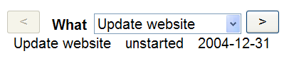
There are times when you don't want to look at all the items in a repeating structure, but want to make a selection, or you want to see a summary, and then select items for detailed inspection. This is when you can use master/detail forms. There are several ways to achieve this. Let us take the to-do list example from earlier, and treat it in a different way. In the example above we displayed all the elements from the list. Now we are going to display just one.
To remind you, the to do list looks like this:
<items>
   <todo>
      <task>Update website</task>
      <status>started</status>
      <date>2004-12-31</date>
   </todo>
   <todo>
      ...
   </todo>
   ...
</items>
This is stored in the file todo-list.xml:
<instance id="todo" src="todo-list.xml"/>
However, now we are going to create a second instance to hold a value that indicates which of the items we are looking at:
<instance id="admin">
    <data xmlns="">
        <index>1</index>
    </data>
</instance>
Using this we can look at just one of the to do items:
<group ref="todo[instance('admin')/index]">
    <output ref="date"/> <output ref="status"/> <output ref="task"/>
</group>
This lets us look at just the first item:
(Source)
Now we can add controls to step through the items:
<group ref="todo[instance('admin')/index]">
<trigger>
<label><</label>
<setvalue ev:event="DOMActivate"
ref="instance('admin')/index" value=". - 1"/>
</trigger>
<output ref="date"/> <output ref="status"/> <output ref="task"/>
<trigger>
<label>></label>
<setvalue ev:event="DOMActivate"
ref="instance('admin')/index" value=". + 1"/>
</trigger>
</group>
Thanks to this we can step through the items one by one by clicking on the buttons:
(Source)
You'll notice that if you click through past the beginning or end of the
list that nothing more gets displayed (including the buttons). This is because
of the way that todo[instance('admin')/index] works: if
index goes below 1 or above the number of items in the to do list,
nothing is selected. (If the triggers had been outside the group, they would
have remained visible.)
What we need to do is disable the triggers when they reach the end items, so
you can't go any further. To do this we add two more elements to the
admin instance, along with a couple of binds:
<instance id="admin">
<data xmlns="">
<index>1</index>
<notfirst/>
<notlast/>
</data>
</instance>
<bind nodeset="instance('admin')/notfirst"
relevant="../index > 1"/>
<bind nodeset="instance('admin')/notlast"
relevant="../index < count(instance('todo')/todo)"/>
We don't care about the value of the two new elements (they are both empty
strings), but we do care when they are relevant. The element
notfirst is relevant when index is greater than one,
and the element notlast is relevant when index is
less than the number of items in the to do list. The reason we want these is to
bind the triggers to them:
<group ref="todo[instance('admin')/index]">
<trigger ref="instance('admin')/notfirst">
<label><</label>
<setvalue ev:event="DOMActivate"
ref="instance('admin')/index" value=". - 1"/>
</trigger>
<output ref="date"/> <output ref="status"/> <output ref="task"/>
<trigger ref="instance('admin')/notlast">
<label>></xforms:label>
<setvalue ev:event="DOMActivate"
ref="instance('admin')/index" value=". + 1"/>
</trigger>
</group>
Then when index is 1, the first trigger will be disabled, since
notfirst will not be relevant:
(Source)
and likewise, the second trigger will be disabled at the last item in the to do list.
Now, with this basic structure, you can do what you like with the selected item: edit it, expand it, and so on.
select1Another approach is to select the task with a select1, and use
that to display the relevant item:
(Source)
To do this we will store the selected task in the admin instance like above:
<instance id="admin">
   <data xmlns=""><selected/></data>
</instance>
The select1 stores the result there, getting the tasks from the
to-do data; the label and the value are the same thing:
<select1 ref="instance('admin')/selected">
   <label>What</label>
   <itemset nodeset="instance('todo')/todo">
      <label ref="task"/>
      <value ref="task"/>
   </itemset>
</select1>
We can then use the selected task to display all the details for that item:
<group ref="todo[task=instance('admin')/selected]">
   <output ref="task"/>
   <output ref="status"/>
   <output ref="date"/>
</group>
Note that if there are several to-do items with the same title, this will
only show the first one. You can fix this by replacing the
group+ref with a repeat+nodeset:
<repeat nodeset="todo[task=instance('admin')/selected]">
   <output ref="task"/>
   <output ref="status"/>
   <output ref="date"/>
</repeat>
Using more or less the same approach, we can do a master/detail view with a
search box. Instead of the select1, we use an
input:
<input ref="instance('admin')/selected">
   <label>What</label>
</input>
However, we would like to show all items that match the input, so
we use a repeat again:
<repeat nodeset="todo[contains(task,instance('admin')/selected)]">
   <output ref="task"/>
   <output ref="status"/>
   <output ref="date"/>
</repeat>
This selects all todo items where the task string
contains the selected string. For instance, searching for
"house":
(Source)
This example has an added incremental="true" to the
input, so that the repeat gets updated as you
type!
<input incremental="true" ref="instance('admin')/selected">
   <label>What</label>
</input>
Note that the search is case sensitive: try searching for "paint" and "aint" in the above example, and you'll see that the second also matches "Paint".
This is because the contains function is case sensitive. To do
a case-insensitive match, you have to use the XPath translate
function:
translate(string, 'ABCDEFGHIJKLMNOPQRSTUVWXYZ', 'abcdefghijklmnopqrstuvwxyz')
which returns the string in the first parameter with all the upper-case
letters replaced by lower-case. So the contains expression has to
be written:
contains(translate(task,
                   'ABCDEFGHIJKLMNOPQRSTUVWXYZ',
                   'abcdefghijklmnopqrstuvwxyz'),
         translate(instance('admin')/selected,
                   'ABCDEFGHIJKLMNOPQRSTUVWXYZ',
                   'abcdefghijklmnopqrstuvwxyz'))
(Source)
Finally, let's combine approaches 1 and 2, where you can select a task on the basis of its title, but also step through them one by one with nudge buttons:
The data instance remains the same:
<instance id="todo" src="todo-list.xml"/>
The admin instance is more or less the same, with an element for the selected task, but we'll add the two elements for the trigger relevance, as in the first example:
<instance id="admin">
   <data xmlns=""><selected/><notfirst/><notlast/></data>
</instance>
The select1 is exactly the same, but we will add triggers
before and after it, one to get the previous item and one to get the next item.
For the previous item what we want to do is set the selected string in the
admin instance to the task of the previous item:
<trigger>
<label><</label>
<action ev:event="DOMActivate">
<setvalue
ref="instance('admin')/selected"
value="...something here..."/>
</action>
</trigger>
Now what goes in "...something here..."? We know how to find the to-do item that has the selected task:
todo[task=instance('admin')/selected]
To find the previous to-do item we use preceding-sibling, which
returns a list of all the to-do items before the one selected:
todo[task=instance('admin')/selected]/preceding-sibling::todo
and then take the first of these (i.e. the first preceding sibling)
todo[task=instance('admin')/selected]/preceding-sibling::todo[1]
and finally we select the task field of that item:
todo[task=instance('admin')/selected]/preceding-sibling::todo[1]/task
The trigger to find the next item is exactly the same, except you use
following-sibling instead of preceding-sibling.
Finally, what should we bind to notfirst and
notlast in order to make the triggers irrelevant when they are at
the first and last item? Well, the 'previous' trigger is only relevant when
there are previous items available:
 <bind
  nodeset="instance('admin')/notfirst"
  relevant="instance('todo')/todo[task=instance('admin')/selected]/preceding-sibling::todo"/>
For notlast, replace preceding-sibling with
following-sibling again.
Here it is all put together:
<model>
<instance id='todo' src="todo.xml" />
<instance id='admin'>
<data xmlns="">
<notfirst/><selected/><notlast/>
</data>
</instance>
<bind nodeset="instance('admin')/notfirst"
relevant="instance('todo')/todo[task=instance('admin')/selected]/preceding-sibling::todo"/>
<bind nodeset="instance('admin')/notlast"
relevant="instance('todo')/todo[task=instance('admin')/selected]/following-sibling::todo"/>
</model>
...
<trigger ref="instance('admin')/notfirst">
<label><</label>
<action ev:event="DOMActivate">
<setvalue
ref="instance('admin')/selected"
value="instance('todo')/todo[task=instance('admin')/selected]/preceding-sibling::todo[1]/task"/>
</action>
</trigger>
<select1 ref="instance('admin')/selected">
<label>What</label>
<itemset nodeset="instance('todo')/todo">
<label ref="task"/>
<value ref="task"/>
</itemset>
</select1>
<trigger ref="instance('admin')/notlast">
<label>></label>
<action ev:event="DOMActivate">
<setvalue
ref="instance('admin')/selected"
value="instance('todo')/todo[task=instance('admin')/selected]/following-sibling::todo[1]/task"/>
</action>
</trigger>
<group ref="todo[task=instance('admin')/selected]">
<output ref="task"/>
<output ref="status"/>
<output ref="date"/>
</group>
One of the new features of XForms 1.1 is the ability to use
<output> to display an image. For instance, the excellent Open Streetmap project is producing a
street map of the world that anyone can edit, like Wikipedia. Their street map
is represented by images called tiles that can be tiled together, and
cover the whole world. For instance a tile for the centre of London is at
"http://a.tile.openstreetmap.org/10/511/340.png":
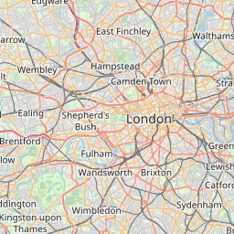
To output this in XForms you can write:
<output mediatype="image/*" value="'http://a.tile.openstreetmap.org/10/511/340.png'"/>
which interprets the value as a URL and displays it as an image.
If we investigate the URL above, we find that "10" represents the zoom level, and "511" and "340" represent horizontal and vertical dimensions, so that the next tile east from the above one is "http://a.tile.openstreetmap.org/10/512/340.png" and the one north would be "http://a.tile.openstreetmap.org/10/511/339.png". So let's express that:
<model>
    <instance>
        <data xmlns="">
            <zoom>10</zoom><x>511</x><y>340</y>
        </data>
    </instance>
</model>
 ...
<output mediatype="image/*" value="concat('http://a.tile.openstreetmap.org/', zoom, '/' , x, '/', y, '.png')"/>
Hopefully, from this you can already see lots of possibilities.
So, let's first rearrange this:
<model>
    <instance>
        <data xmlns="">
            <zoom>10</zoom><x>511</x><y>340</y><url/>
        </data>
    </instance>
    <bind nodeset="url"
          calculate="concat('http://a.tile.openstreetmap.org/', zoom, '/' , x, '/', y, '.png')"
</model>
 ...
<output mediatype="image/*" ref="url"/>
Now, if we further investigate the structure of the Open Streetmap URLs, we find that the world is split into tiles, so that at zoom level 0 there is one tile, zoom level 1, 4 tiles, zoom level 2, 16 tiles, and so on. Furthermore tile 0,0 is the most northern, most western. What this means is that as you zoom out, you have to halve the values of x and y. So we will keep our current position as the x and y coordinates at the innermost zoom level, and calculate the current tile based on that:
<model>
    <instance>
        <data xmlns="">
            <zoom>10</zoom><posx>87140</posx><posy>130979</posy>
            <x/><y/><scale/><max/><url/>
        </data>
    </instance>
    <bind nodeset="scale" calculate="power(2, 18 - ../zoom)"/>
    <bind nodeset="maxpos" calculate="power(2, 18)-1"/>
    <bind nodeset="x" calculate="floor(../posx div ../scale)"/>
    <bind nodeset="y" calculate="floor(../posy div ../scale)"/>
    <bind nodeset="url"
          calculate="concat('http://a.tile.openstreetmap.org/', zoom, '/' , x, '/', y, '.png')"/>
</model>
 ...
<output mediatype="image/*" ref="url"/>
And then we can add controls that zoom and pan:
<trigger>
<label>-</label>
<setvalue ev:event="DOMActivate" ref="zoom" value="if(. = 0, 0, . - 1)"/>
</trigger>
<trigger>
<label>+</label>
<setvalue ev:event="DOMActivate" ref="zoom" value="if(. = 18, ., . + 1)"/>
</trigger>
<trigger>
<label>←</label>
<setvalue ev:event="DOMActivate" ref="posx" value="if(. - ../scale < 0, ., . - ../scale)"/>
</trigger>
<trigger>
<label>→</label>
<setvalue ev:event="DOMActivate" ref="posx" value="if(. + ../scale > ../maxpos, ., . + ../scale)"/>
</trigger>
<trigger>
<label>↓</label>
<setvalue ev:event="DOMActivate" ref="posy" value="if(. + ../scale > ../maxpos, ., . + ../scale)"/>
</trigger>
<trigger>
<label>↑</label>
<setvalue ev:event="DOMActivate" ref="posy" value="if(. - ../scale < 0, ., . - ../scale)"/>
</trigger>
Here it is in action:
(Source)
Similarly to how we have used dynamic URLs in output above, you
can use them in submissions. Instead of
<model>
   ...
   <submission method="get" action="http://example.com/search"/>
</model>
you can write something like:
<model>
   <instance><data xmlns="">...<url>http://example.com/search</url>...</instance>
   ...
   <submission method="get">
      <resource value="url"/>
   </submission>
</model>
As an example, earlier we had:
<model>
    <instance id="labels" src="labels.xml"/>
    <submission id="en" action="labels-en.xml" replace="instance" instance="labels" method="get"/>
    <submission id="nl" action="labels-nl.xml" replace="instance" instance="labels" method="get"/>
</model>
 ...
<submit submission="en"><label>English</label></submit>
<submit submission="nl"><label>Nederlands</label></submit>
which we could replace with
<model>
    <instance id="labels" src="labels.xml"/>
    <instance id="lang"><data xmlns=""><lang>en</lang></data></instance>
    <submission replace="instance" instance="labels" method="get">
        <resource value="concat('labels-', instance('lang')/lang, '.xml'"/>
    </submission>
</model>
 ...
<select ref="instance('lang')/lang">...</select>
<submit><label>OK</label></submit>
For an overview of all features, elements and attributes of XForms 1.1, see the Xforms 1.1 Quick Reference.
It's not easy reading, but the final arbiter in questions of doubt is the XForms 1.1 Specification.
The implementation used for the examples in this tutorial is XSLTForms.