{{ page.title }}

W3C

CSS Highlights

Florian RIVOAL

AC 2017 logo with fancy background.

Who’s this guy?

Slides at florian.rivoal.net{{ page.url }}

CSS WG: a broad scope

TR documents: https://www.w3.org/Style/CSS/current-work
Editor Drafts: https://drafts.csswg.org/

The CSS Snapshot

[...] includes only specifications that we consider stable and for which we have enough implementation experience that we are sure of that stability.

https://www.w3.org/TR/CSS/

天下一网

蒂姆伯李

Writing modes: i18n victory

ᠮᠣᠩᠭᠣᠯ ᠺᠡᠯᠡ (Mongolian)
ᠮᠠᠨᠵᡠ ᡤᡳᠰᡠᠨ (Manchu)
ꆈꌠꁱꂷ (Yi)
日本語(Japanese)
中文、简体(Simplified Chinese)
中文、繁体(Traditional Chinese)
한국어 (Korean)

Writing modes: also for Latin text

logo using mixed writing modes
Credit: Jen Simmons
Table with column headers set vertically to save space

Writing modes: untangling directions

In horizontal text, the inline direction is horizontal, the block direction is vertical and downwards, and the line orientation is vertical and upwards In vertical-rl text, the inline direction is vertical, the block direction is horizontal and leftwards, and the line orientation is horizontal and righwards In vertical-lr text, the inline direction is vertical, the block direction is horizontal and rightwards, and the line orientation is horizontal and righwards

Writing modes: status

Caniuse.com reports that writing modes is supported in all major browsers

Expecting to reach REC this year
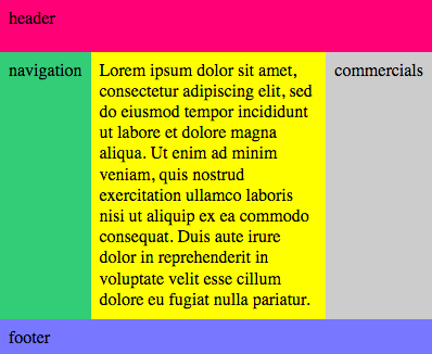
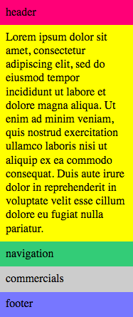
More power
Fewer hacks
Cleaner markup

A History of layout on the Web

Classic designs

The so-called holygrail layout has a header, a footer, and in between a main section flanked on each side by side bars, typicaly for ads or navigation. The main section and the sidebards have the same height, regardless of which has more content.
A very common design nowadays has a giant top image banner with overlay text, and a long column of content below it, separated into panes, many of wich have content split into 3 columns.
Credit: Dave Ellis

“Holy grail” layout with Grid, markup

<body>
  <header>Header</header>
  <main>Lorem Ipsum…</main>
  <nav>Navigation</nav>
  <aside>Commercials</aside>
  <footer>Footer</footer>
</body>

“Holy grail” layout with Grid, CSS

body {
	display: grid;
	grid: "head head head" 3em
	      "nav  main ads"
	      "foot foot foot" 2em
	     / 1fr  auto 1fr;
	min-height: 100vh;
}
header { grid-area: head }
footer { grid-area: foot }
main   { grid-area: main }
nav    { grid-area: nav }
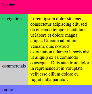
aside   { grid-area: ads }
This is all you need to get the holygrail layou

Grid & Media queries

@media (width<24em) { body {
	grid-template:
		"head head" 3em
		"nav  main" 2fr
		"ads  main" 1fr
		"foot foot" 2em
		/ 1fr auto }}
@media (width<18em) { body {
	display: block }}
A variant of the layout, on two columns, for narrower screens a simple one-column layout for very narrow screens

CSS Grid Zoo

Jen Simmons has made lots of cool demos. Look them up.

CSS Grid: status

Caniuse.com reports that CSS Grid shipped almost simultaneously in Firefox, Chrome, Safari and Opera both on desktop and mobile. IE & Edge have been shipping an earlier version for a while

CSS Grid: Special Thanks

To learn more about Grid

Fewer hacks
Cleaner markup

part 2

display: contents

Suppress a box while keeping its descendants

<main>
	<h1>foo</h1>
	<ul><li>bar<li>baz</ul>
</main>
main { display: flex }
main * { flex: 1 }
				
Result of laying out the previous code: bar and baz are stacked

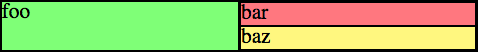
ul { display: contents }
Result of laying out the previous code: bar and baz are stacked

display: content: status

CSS for Publishing

CSS for Publishing

CSS for Publishing: status survey

CSS for Publishing: status

Demo time

Theses demos are running in Vivliostyle, a JavaScript based layout engine that can run in interactively in the browser, or server side to generate pdfs.

CSS for Publishing: conclusion

Be wary of gaps and sharp edges
but use it in production today
and come help push it all forward.

Thank you for listening

AC 2017 logo with fancy background.